Hi guys! This post will be featuring my design process for the cover page.
Artist/Layout Inspiration:
For the cover, I was aiming to create something that is wholly simplistic, one that can perfectly speak to my target audience – The Millennials. I was looking through Behance & Pinterest for an interesting looking design, the kind of design that is worth stopping by and picking up while we’re on the go.
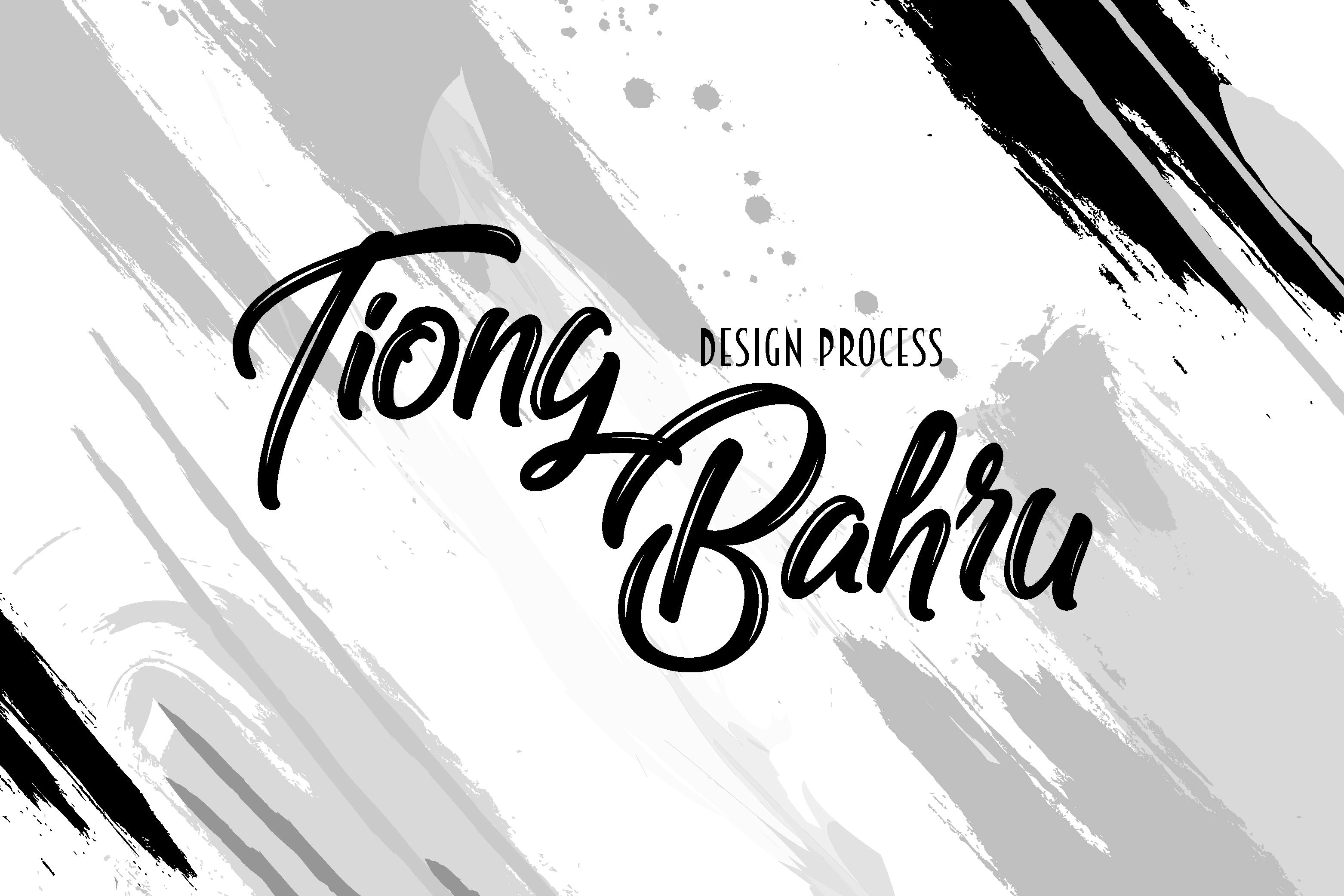
Since my zine primarily consists of blue as one of the main colour, the best possible way for the book cover to translate the idea/theme is for it to be blue too. I came across a few interesting typeface arrangements which are unlike the typical layout > 

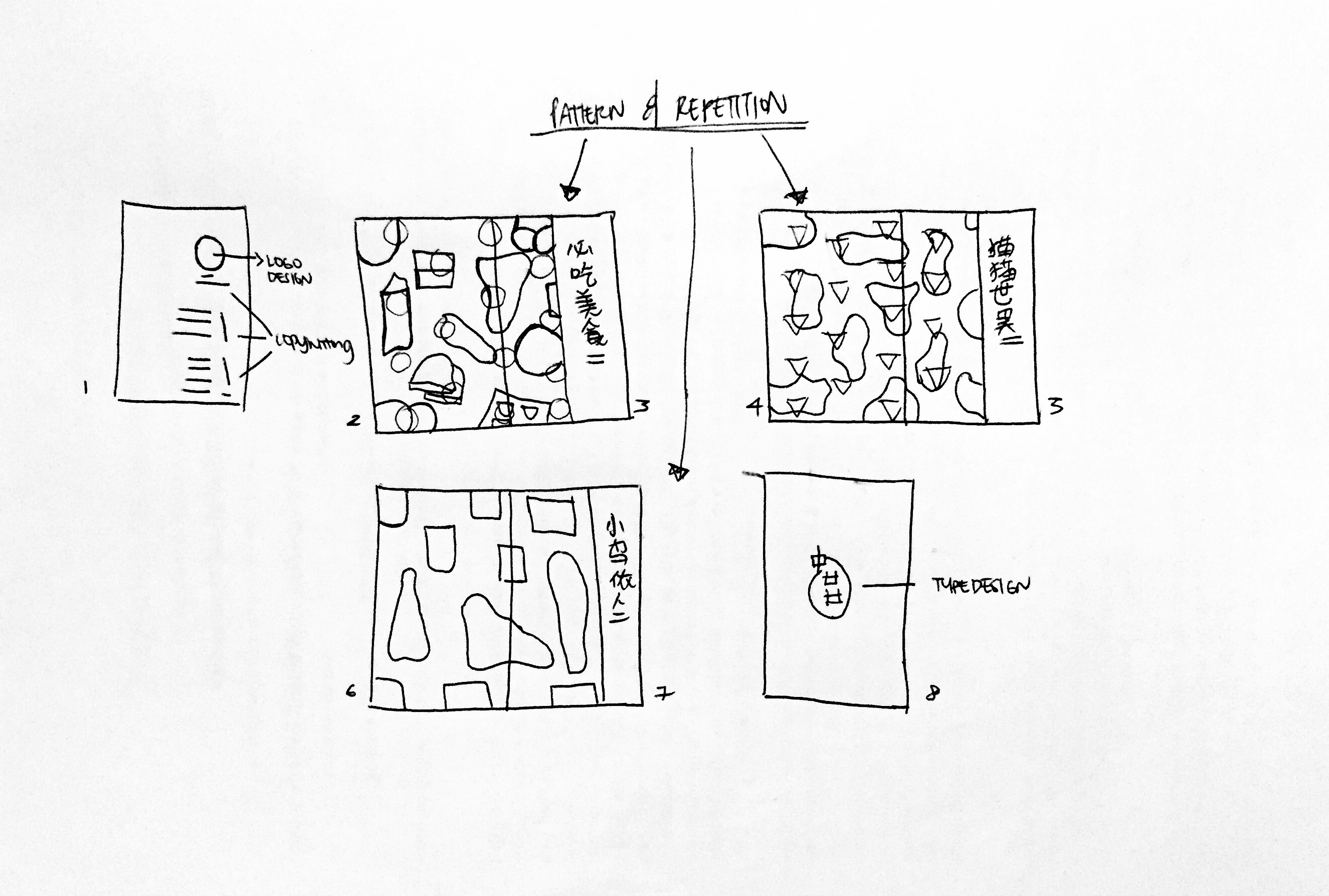
A quick draft of how my overall layout should look like –
Making use of Pattern and Repetition to create a sense of rhythm across all 6 pages (excluding cover and back page)
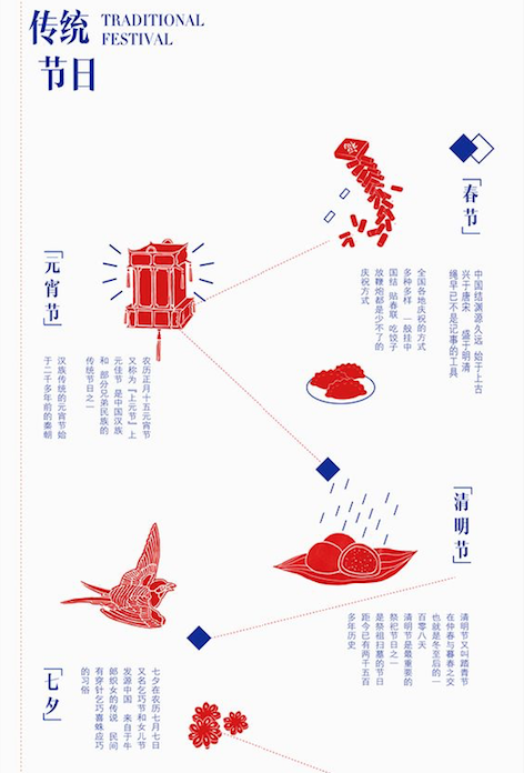
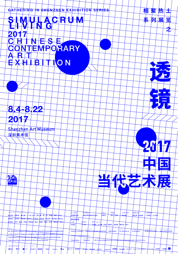
Moodboard: Layout, Typeface, Color palette
An overview of the sense of design direction I am heading towards > Monochromatic (blue), Sans Serif Typeface, an old-school yet modern layout

Notice how the type arrangement gave the layout so much more character? I love it! I decided to give it a shot and see how it will progress and these are my attempts:
this one lacked something I can’t describe. perhaps it is too dead centre? will try to spice it up in my next layout!
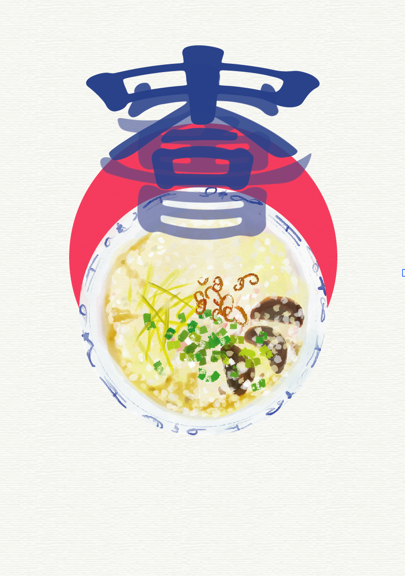
It has more dimension now, but it looks like an eatbook instead, so no go for sure 🙁
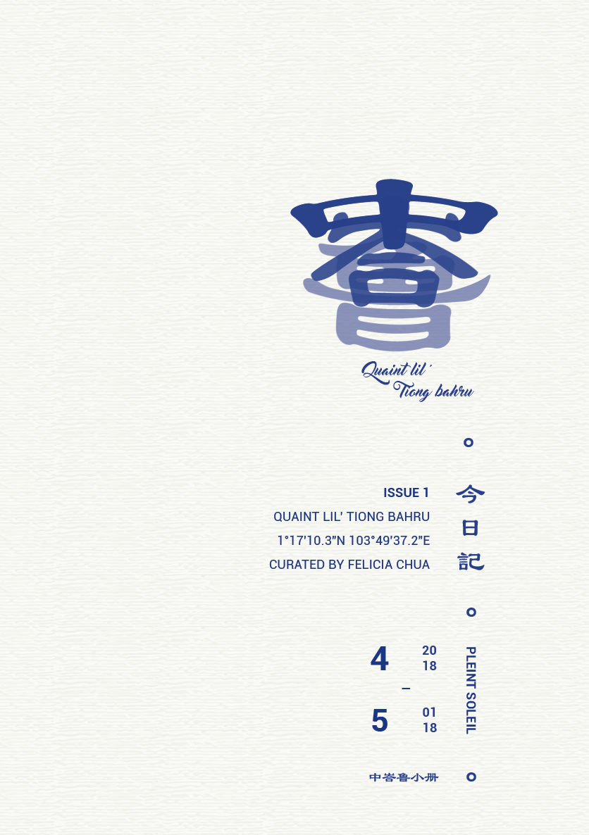
went to consult this layout with Mimi and she raised an interesting point: are there too many ‘Tiong Bahru” all over? so I decidedd that I would amend the logo from Tiong Bahru to a name that represents a magazine series
Overall, I want to keep the cover’s type and colour design to a minimum as the content of my magazine are pretty visual heavy, so a simple cover (front and back) can better balance out the visual weight!
Not forgetting to mention, the magazine series (top typography) is read as Zhou Chu, which means ‘In the Initial’ and ‘Picturesquesly, Tiong Bahru’ is the volume’s title (with it still being Volume 1 at this point).
I imagine having a series of location documentation in the ‘Zhou Chu’ series, with the exact format of a magazine series like 8 Days & Teenage magazine. So there will be Vol.2, Vol.3 and so on in future – This is the possible prospect for my Zine series.
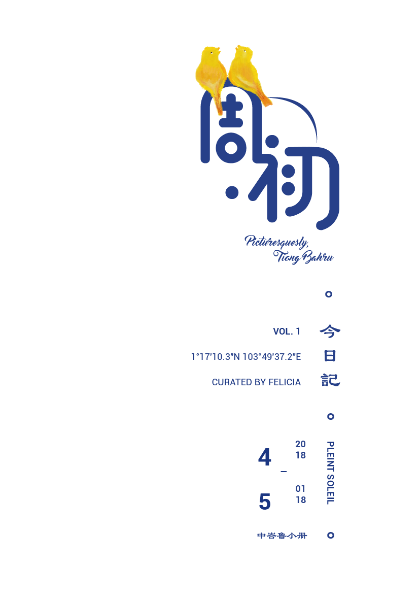
Final layout for Zine! I left the textures out since the papers I’d gotten from RJ is off-white.
Fitting in the elements: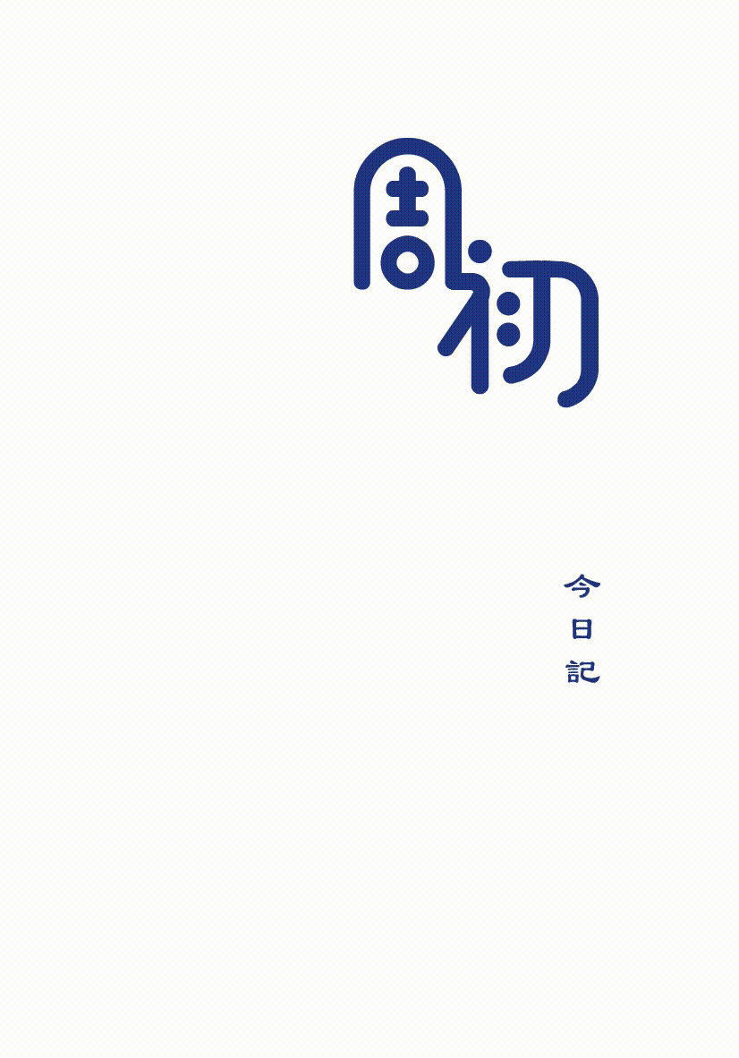
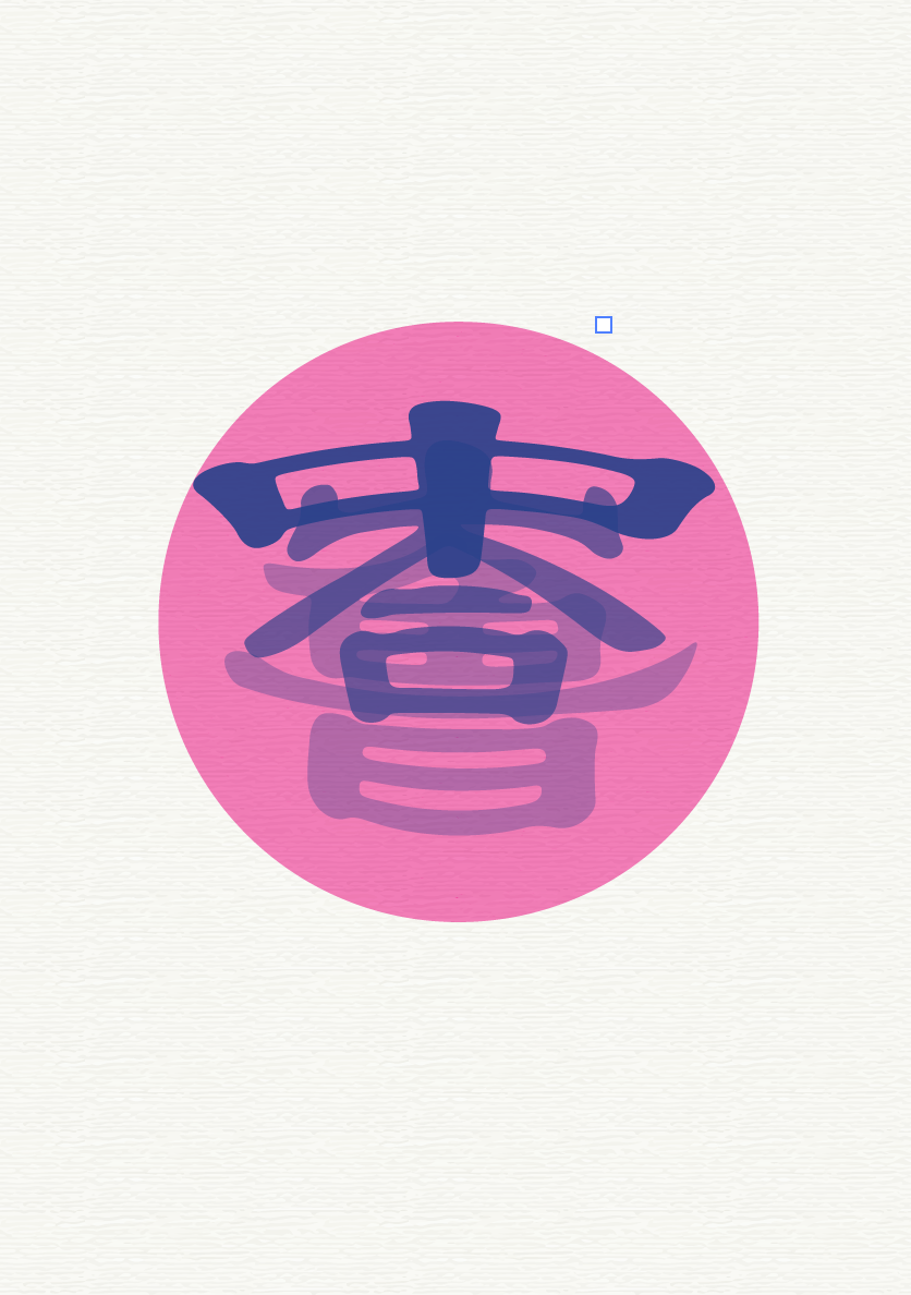
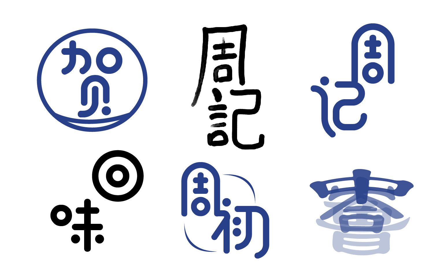
Logo Design & Exploration for my Zine series:
Here are a few of my tries on the creation of a logo for my zine series. These Chinese characters represent my publication’s name. The different character shows my experimentation with different shapes and forms and how they look when they are pieced together.
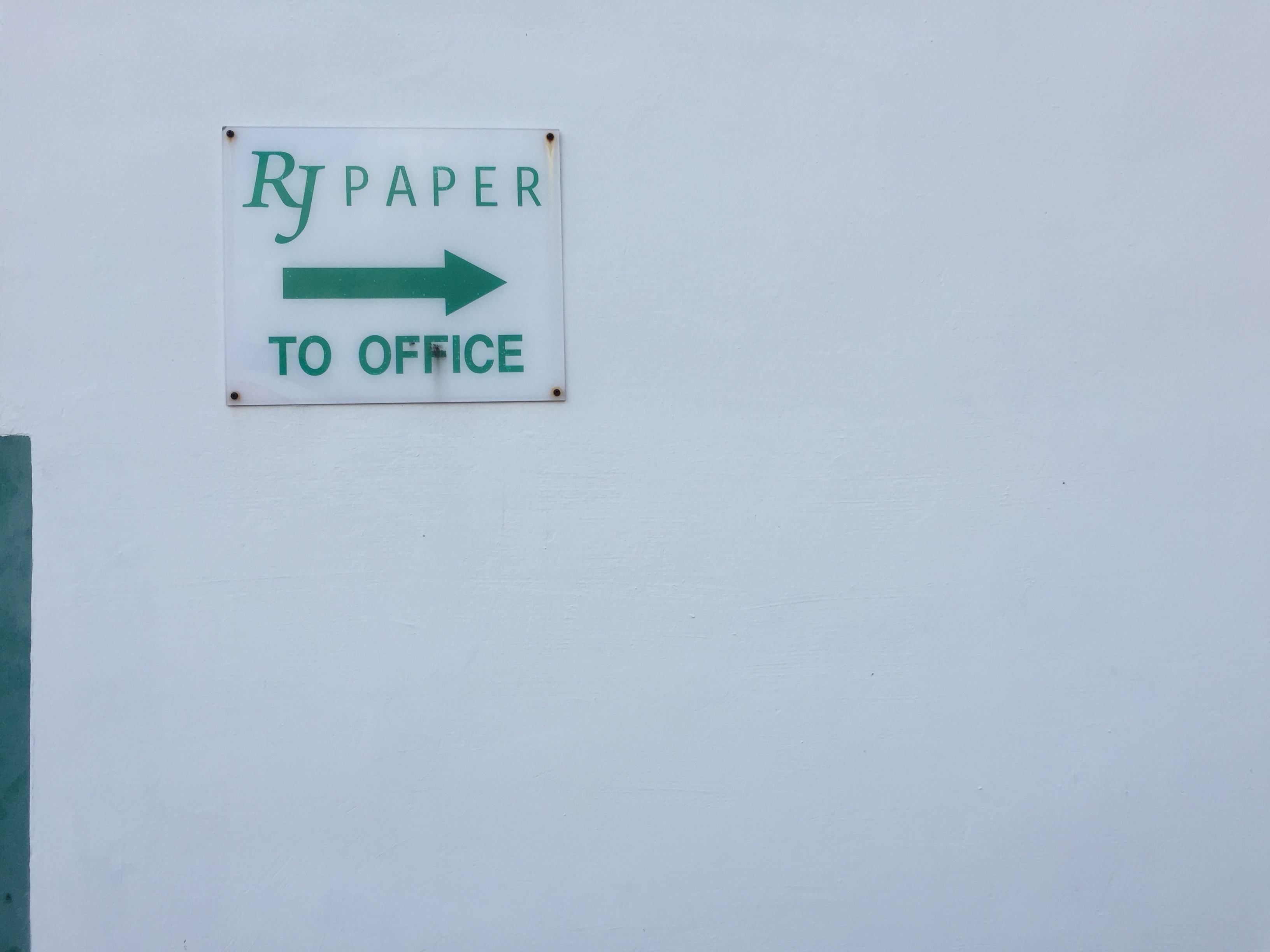
Then off to RJ Paper!!!!
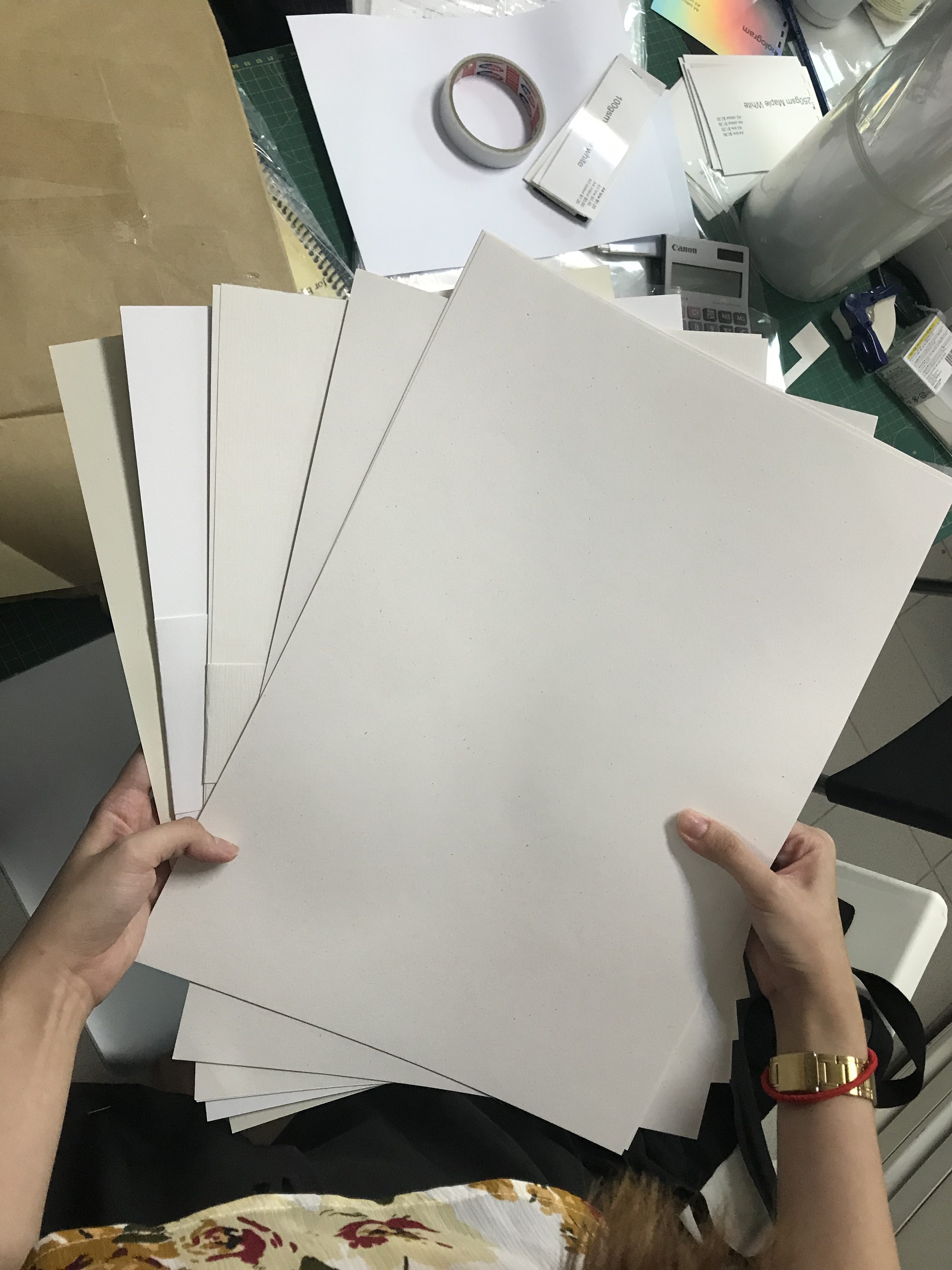
Got a couple of samples and variety for my print, might want to keep a couple of booklets for myself! The type of textures I have in mind is – Munken Pure Rough, Wudii, and a few others I can’t recall. I love that natural off-white colour and speckled dust effect from some of the 160gsm paper.
These are some of the A3 sized papers I got. Ranging from pure white to yellowish white – That is to see how it will turn out in print! The pure white one didn’t really work out eventually, so I stuck with the off-white coloured ones. Per print was $4 and it was the colour payoff was on point too! Really recommend ‘Colour De Something’… I really cannot recall at this moment!!! Will get back to it later.
Up next: Content Design Process
See you there!
Thank you Felicia! I enjoyed the process of your design.