It was a pity that I could not make it for INTER—MISSION performance. I’ve heard many mixed reviews on the performance from my friends, while most said that it was a rather abstract work that was hard to understand, which I guess was probably an avant-garde one. As such, I had to research about INTER—MISSION, and to select one of their interactive projects presented from https://inter-mission.art/.
So, what is INTER—MISSION?
INTER—MISSION is an art collective initiated in 2016 by Singaporean artists Marcel Gaspar, Urich Lau, Shengen Lim, and Teow Yue Han. It focuses on interdisciplinary and collaborative works in video art, audiovisual, performance, installation, interactive art, and discourses of technology in art. Having collaborated on various projects both locally and abroad, the collective aims to inhabit the gap between technologically engaged artworks, artists and audiences — using technology not only as to enforce utilization of tools and medium, but to explore notions of human cognition and sentience. INTER—MISSION builds transnational networks to promote sustained dialogue and engagement with media practices. It creates a space that encourages collaboration, reflection, and participation in our ever-changing technological environment through interactive performances, installation, video screenings, international and interdisciplinary dialogues, and knowledge sharing.
In short, INTER—MISSION is an art collective that aims to alter the audience’s minds into deep mental activity through making heavy use of technology to bring the artwork and audience together over interactivity.
After reading on INTER—MISSION’s works on https://inter-mission.art/, I have chosen to research the work:
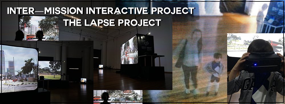
THE LAPSE PROJECT
“Does technology help us to remember, or forget?
As we develop new visions and modes of interaction with Singapore the city, how does our relationship to her monuments change? What constitutes our collective reality?
Toggling between the physical and the imaginary, and responding to the accelerated digitisation of our environment, The Lapse Project imagines a world that is constituted through interfaces where places of artistic and cultural identities become editable, and can just as easily be switched on or off. Through processes of digital manipulation, the multimedia installation “erases” familiar landmarks that now serve as spaces for the arts around Singapore’s Civic District – Singapore’s oldest building, The Arts House, National Gallery Singapore, National Museum of Singapore and the Singapore Art Museum.
The Lapse Project takes a multi-dimensional approach to question memory, space and legacy through lapses in structure, time, particle, text and image. Visitors are invited to embody these lapses, contemplating the presence and absence of sights and sites.”
The Lapse Project is split into 5 components:
- VR Lapse
- Particle Lapse
- 24HR Lapse
- Panorama Lapse
- Journal Lapse
Here is an overview of each component.
1. VR Lapse
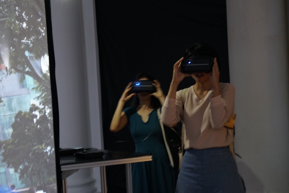
VR stands for virtual reality, a computer-generated simulation of a three-dimensional image or environment that can be interacted with in a seemingly real or physical way by a person using special electronic equipment, such as a helmet with a screen inside or gloves fitted with sensors.
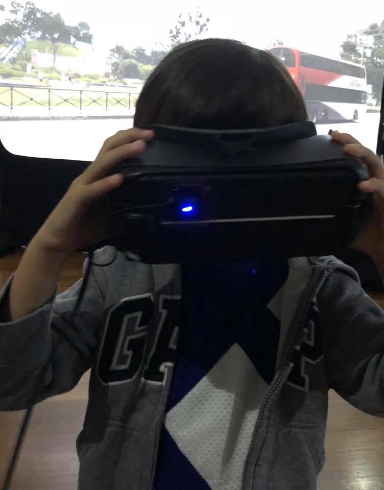
VR is getting more and more popular in this current era, taking over many forms of art as well. In VR Lapse, Singapore’s oldest colonial building, presently known as The Arts House, is digitally erased. The neo-Palladian architecture has gone through various uses and inhabitants, previously serving the former parliament prior to its present day function as a venue for the arts. This digital intervention suspends the viewer in a 360-degree view of the vicinity, as they situate themselves around the blank expanse of where The Arts House was supposed to stand and consider the absence of a historical monument. Photogrammetry is used to remove the familiar landmark, allowing for the viewers to experience the simulated reality of The Arts House’s disappearance. VR Lapse aims to trigger emotions of the audience by the experience of such a disappearance.
2. Particle Lapse
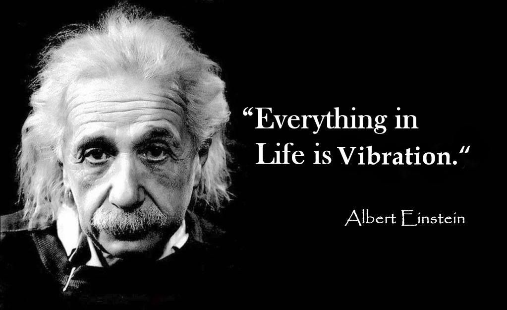
Everything lively has a vibration, particles vibrate and atoms are in a constant state of motion with their speed determining different states. Sound and thought are also vibration, a manifestation of life. Synergising with VR Lapse, the micro vibrations of The Arts House and its visitors are collected via contact microphones and amplified as feedback directly to the viewer, confusing the experience of a singular reality through spectral sounds that suggest other variations of embodied experiences. Pitting the vibration of sound against the physical infrastructure of the building, a lapse in particle occurs.
3. 24HR Lapse
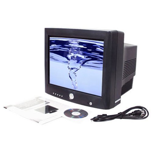
Viewers from exactly 24 hours ago float into the gallery on the CRT monitor, spectators of the past appear to coexist in the same space and time collapses, showing no clear distinction between the past or the present.
CRT stands for cathode-ray tube, a vacuum tube that contains one or more electron guns and a phosphorescent screen, and is used to display images
These apparitions are also suggestive of the seemingly obsolete technology of CCTV surveillance that is being rapidly replaced by data mining. The overlapping of spaces and people converges in a complex web of algorithmic analysis that challenges our perception of reality as an eerie simulacrum.
It might be hard to understand so here is a live video of what went down for this component:
4. Panorama Lapse
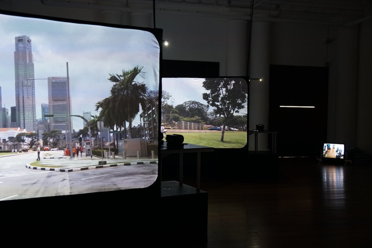
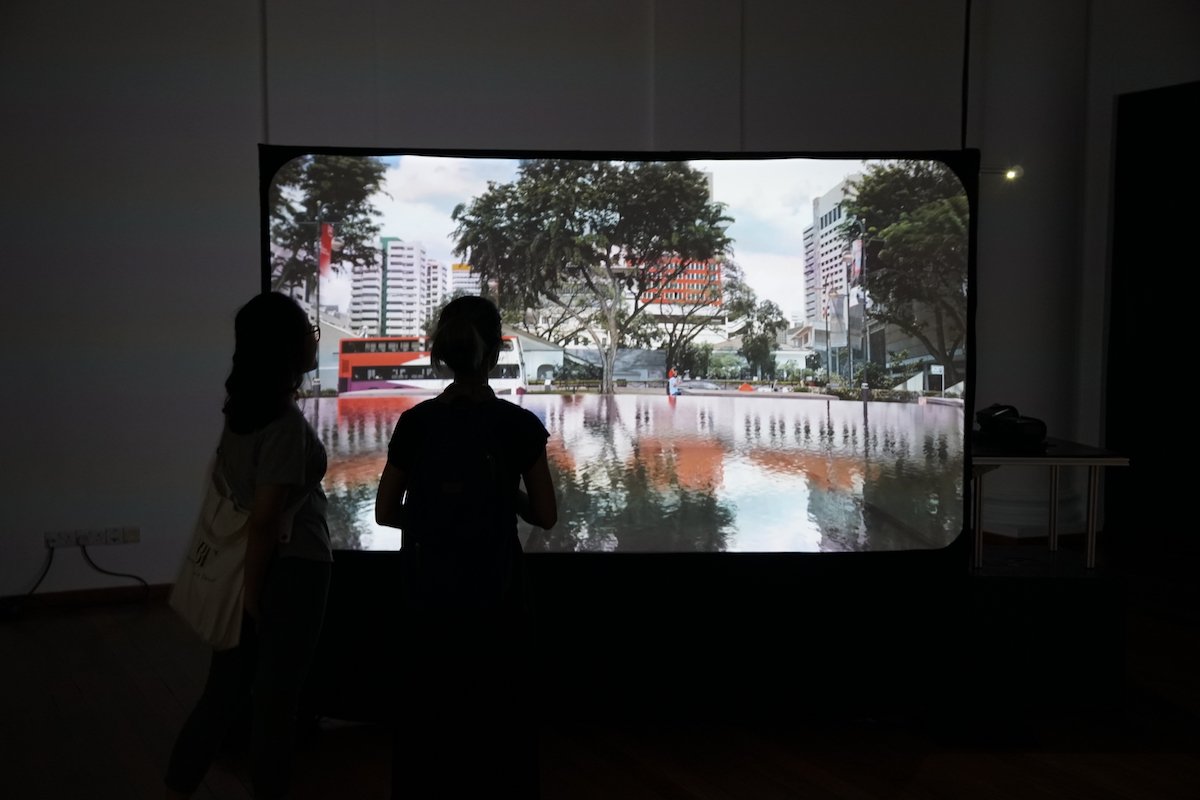
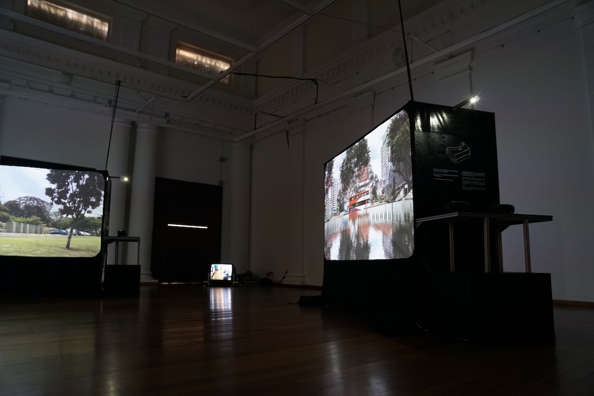
In Panorama Lapse, The National Museum of Singapore, National Gallery Singapore, Singapore Art Museum are erased digitally from their respective locations in the city, as though they were never extant within the Singaporean landscape. As relics from Singapore’s colonial past, these institutions also complement The Arts House as bastions of culture and the arts in Singapore today. Panorama Lapse is presented as a video projection triptych that shows the surrounding street views from various vantage points in the vicinity of the three major cultural institutions. In their absence, what is left behind is a haunting expanse of space, left perhaps to incubate other imaginative possibilities.
Here are some examples of what were shown on the screens:
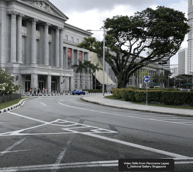
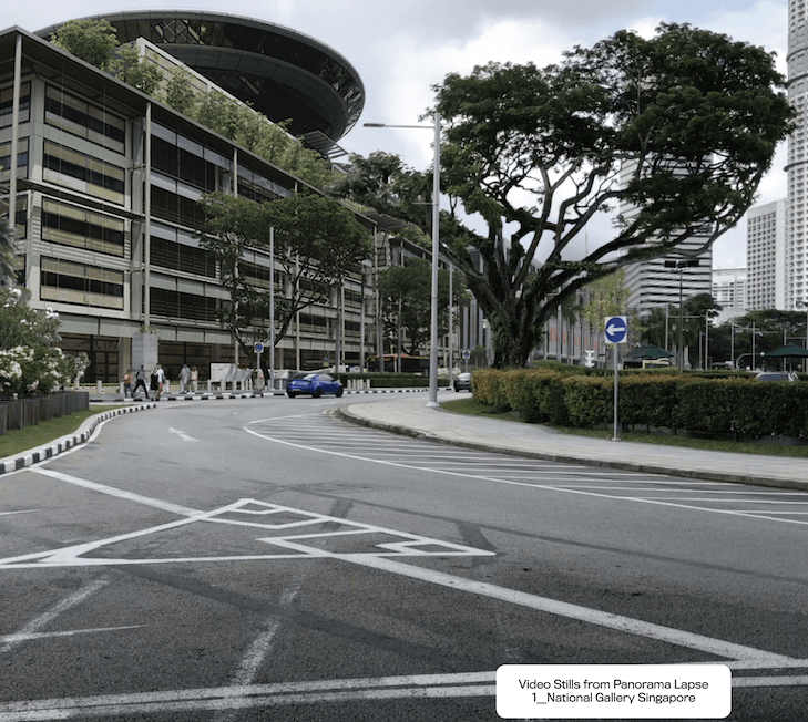
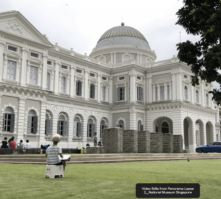
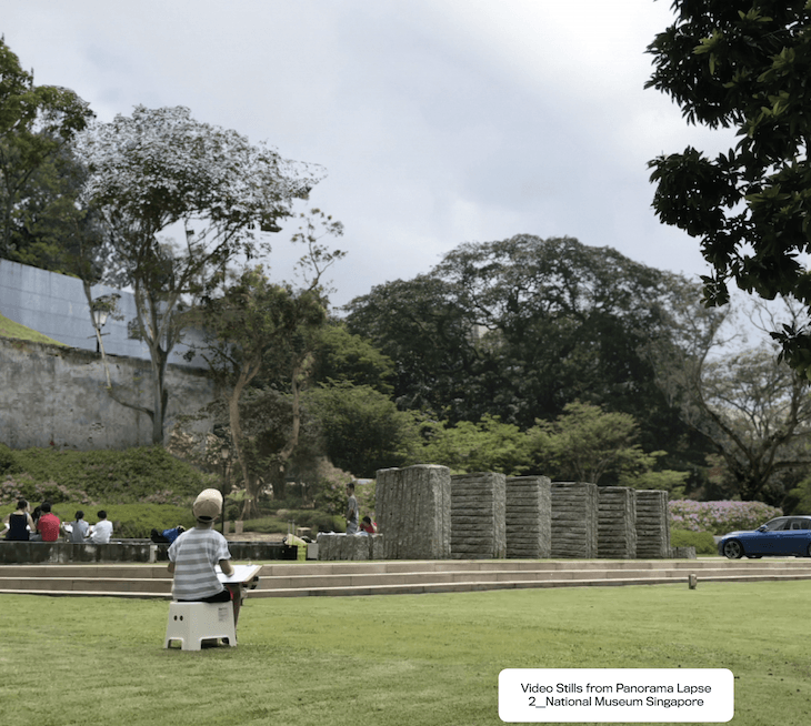
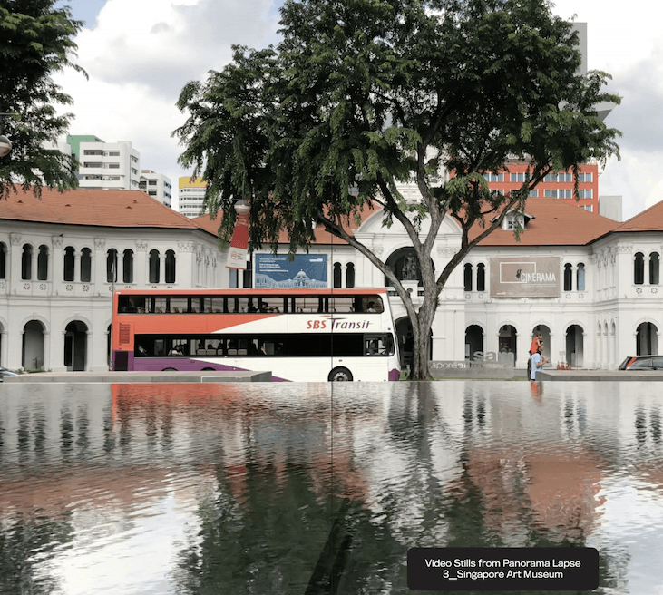
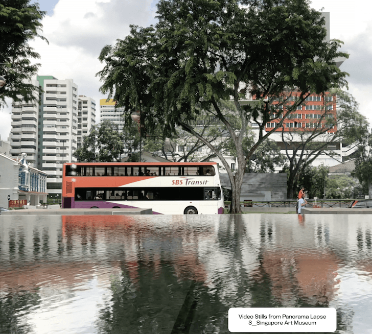
Panorama Lapse negotiates the imaged landscape as a digital canvas, opening up discussions concerning vantage points, territorial boundaries and the ethics of digital manipulation. In this altered world, passers-by and visitors are still seen on location going about the usual interactions but with the absence of the physical buildings.
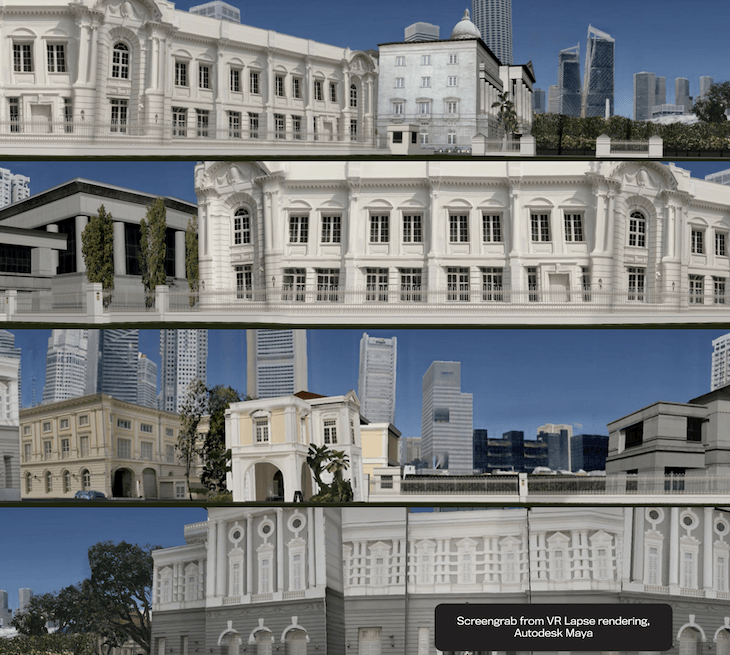
The screengrabs on screens were all rendered using Autodesk Maya, yet again another software that requires technology:
5. Journal Lapse
Integral to our collective’s collaborative approach, The Lapse Journal features the writings of Steve Dixon, Seng Yu Jin and Christina J. Chua. The writings engage with INTER-MISSION’s work from various perspectives and flesh out considerations of lapse as an artistic method, as an experience and also as a means of intervention. Steve Dixon introduces ideas of “lapse” that are central to the project, Seng Yu Jin expands on “lapse” as a strategy that disrupts the representation of realities and time and Christina J. Chua relates the disappearance of institutions to amnesiac breaks in memory.
Through these 5 components, we could tell that The Lapse Project is an art collective dedicated to discourses of technology in art. It inhabits the gap between technologically engaged artworks by the artists, with the audience.
Although all 5 components made use of technology, each component is special and different in its own way. I realized these components focuses on different interactivity, mainly:
- Visual (VR Lapse & Panorama Lapse)
- Sound (Particle Lapse)
- Mind (24HR Lapse & Journal Lapse)
So how do I feel about The Lapse Project?
In today’s world, digital media is taking over everything else. People are slowly losing sense of what is real and what is virtual. The virtual world provides perfection and contentment and they dive deep into it unknowingly, not knowing that it is filled with manipulation and fake news.
The art of The Lapse Project’s was to present a world filled with flaws and glitches. As such, The Lapse Project uses different forms of technology which includes visual and sound to reproduce a representation of the real world, to twist and contort the audience into thinking that it is the reality.
In VR Lapse and Panorama Lapse, the concept of removing cultural places was a response to Urich Lau’s The End of Art Report (2013), which was showcased at Singapore Biennale 2013. The End of Art Report engaged the media to investigate the worth and importance of The Singapore Art Museum, The National Museum of Singapore and The National Art Gallery, by creating fabricated news report which says that all three museums were compelled to close down due to economic, political and societal reasons. As such, the goal behind VR Lapse and Panorama Lapse was to allow the audience to feel what it would be like if all three museums were really demolished through visual disruption. Some might not even realize the removal of these cultural places. Thus, different audience will experience different emotions, from a sense of loss to apathy.
24hr Lapse could be influenced, from the dialogue with Urich Lau and Warren Khong’s collaborative exhibition titled Light-Space at Objectifs — Centre for Film and Photography in 2016. Light-Space was an exhibit where the audience views themselves in a room through a live feed that was projected as fragmented images with static-interference. The overlap of past and present in 24hr Lapse destroys the Greenwich Mean Time, which is the mean solar time at the Greenwich meridian, adopted as the standard time in a zone. As such, audiences were able to view themselves and also people who were at the exhibit 24 hours ago at the same time, distorting their presence at that very moment as they see “specters” surrounding them. Both Light-Space and 24hr Lapse intended for the audience to be the main focus of the work of art.
Particle Lapse comes into play by projecting the vibrations that were caught inside the microphone 24 hours ago, into the surroundings. The idea of having eerie static vibrations could be traced to philosopher Jacques Derrida in Spectres de Marx (1993). Derrida likes the idea of having incorporeal spirits in his works, as he felt that it could warp reality into an uncertain virtual world.
Therefore, all five components work together to form The Lapse Project. The Lapse actually simulates the audience, forcing them to think and reflect on the importance of having culture in this generation, where the real and virtual are starting to get progressively more and more obscure. This is truly impressive as it follows INTER—MISSION’s vision as mentioned by me above- to alter the audience’s minds into deep mental activity through making heavy use of technology to bring the artwork and audience together over interactivity.
I must say that there was a lot of thought bring put into making such a deep interactive art, and I am very dazzled by the whole process, to the final execution of the whole work of art.