Something I remembered clearly while watching my favourite childhood show “Peter Pan” and it has been on my mind for a great deal of time. I wanted to make use of this quote for so long now and yay, I am able to use it in art.
The saying implies that, once you grow up, you’ll be thrown into a turmoil of emotional and monetary debt, unfair responsibility, a dull work-life.
I love how the creator of Peter Pan is basically revealing the harshness of ‘reality’, discretely telling the audience (the kids watching) of what to expect when you grow up.
I remembered clearly when I was a kid I wanted so badly to grow up fast, my friends did too. But growing up now and remembering this quote, I realise it was a warning – it’s been telling me “you wish you did not”. Because growing up leads to misery. And there’s no way back to childhood again where I can be innocent, enjoy freedom, bliss in the most simplest things.
Ok well as a whole I really just love this movie.
NEXT.
“It’S SO FLUFFY I’M GONNA DIE!” – Agnes, Despicable Me.
Yes yes Agnes, we all love fluffy things.
ONTO THE NEXT ONE which I really love:
“I wish I could freeze this moment right here, right now and live in it forever” – Peeta, The Hunger Games: Catching Fire
Not to be mushy but there’s so much love here I could die. *fangirls even after 3 years since the release*
These are the few quotes I want to be focusing on, ranging on the 1st one that I will be tapping on (the Peter Pan quote). This post might still be edited to update more quotes and inspo.
EDIT: Like stated above, here’s 1 more quote I would want to share.
This one’s from the “Fight Club”.
“Then you’re trapped in your lovely nest, and the things you used to own, now they own you.” – Chuck, Fight Club
This is such a late post but I’m gonna do it anyway so that i can look back at it and say I did it.
Final outcome. Maybe I could have done better in exploring the materials and different mediums, but I am proud of some of it at least to say because it suits the emotions I was really feeling at that point of time of my story in 2015 (my concept). It took alot of stepping outside your comfort zone to venture out, and in a way to let myself learn to embrace those feelings I felt. This “My Line Is Emo” project was one of a kind, but I’m glad we went through it.
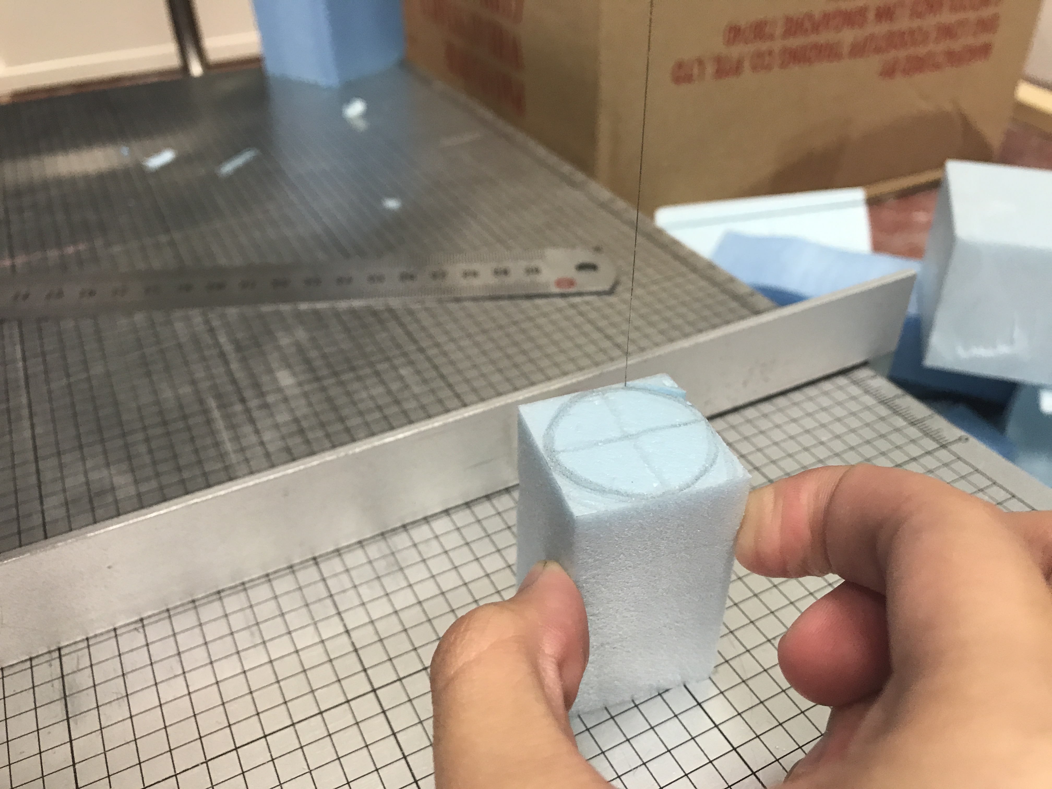
I missed out on the previous lesson where the class was told to explore circular cuttings to get spheres, cylinders, and cones. So that’s one thing I learned from my friends when I caught up with some of what I was missing out. And I panicked. Because foaming curvilinear volumes??? (When it took me so long to even get my cuboids right in the first place)
Apparently we are using the same method, just on curvilinear volumes this time. So we have to input the same method of D, SD, SO and y-axis to x-axis. But this time, it can’t be perpendicular and instead diagonally. Of course, there’s more I have yet to learn on this because I was slightly confused at first, but I think I got a slight jist of it now. (will consult on this soon!)
YAY with the help of my kind friends, I learnt how to sculpt cylinders and cones using foam!
STRUCTURE DRAFT 1:
If I have a favourite CUPCAKE, this is what it will look like:
D: sphere SD: cone SO: tiny cylinder
STRUCTURE DRAFT 2:
My ‘Sam’ satellite. Orrr mini speakers.
D: cone SD: thin cylinder SO: short but thick cylinder
Reevaluation:
Only after this whole post I realised my 1st structure was off – my D and SD looks the saaaameee, the same kind of volume 🙁 I think I should have cut the cone to be a little smaller but bigger than the SO. Or I could turn my sphere to the smallest size so it can act as the SO instead and my tiny cylinder can be my SD. (I still have yet to learn to sculpt a sphere hmm)
Then I also realised in my 2nd structure, the cone lying on my small cylinder creates a right-angle, making it perpendicular? It shouldn’t be perpendicular. Maybe I could have just cut the bottom of the cone a little bit so it doesn’t touch the ground and still stick at about 1/3 of it’s height.
Ahh I still have so much more to learn and figure out, because what about the radius too? I’m pretty sure I have to take note of that next time. I’ll be sure to clarify more tomorrow during lesson.
[Will leave this space to add on for improvements based on the above structures after consulting]
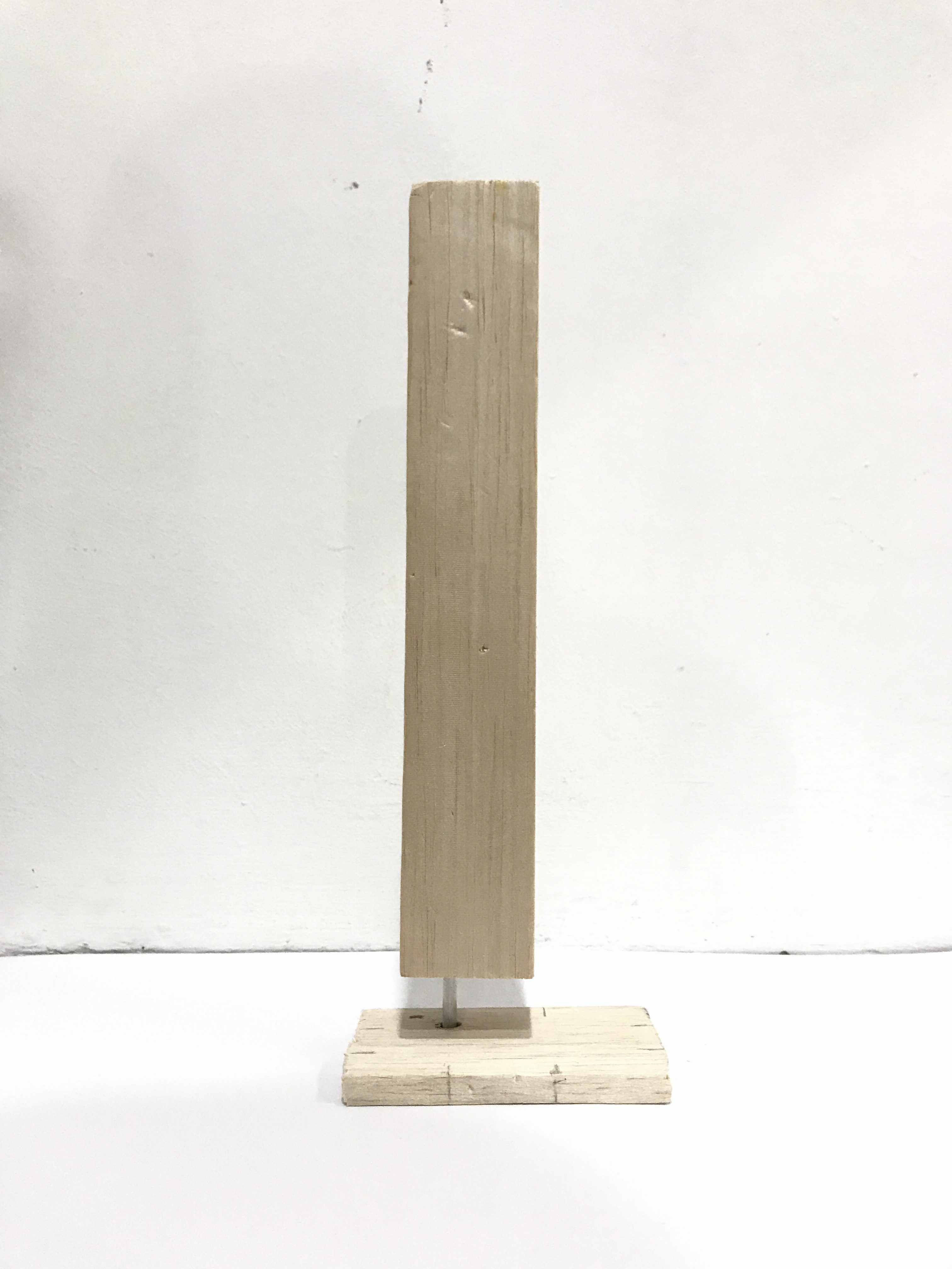
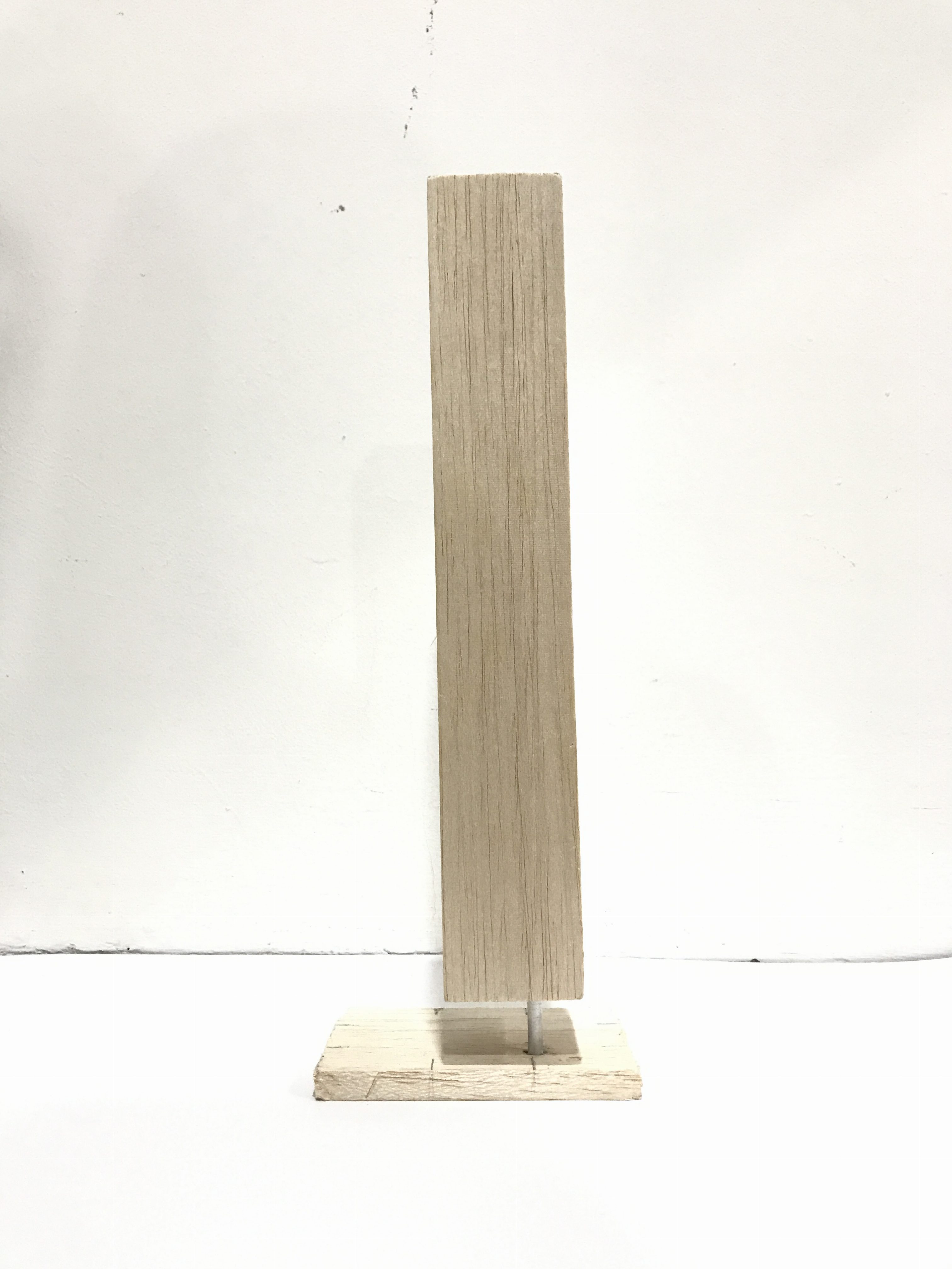
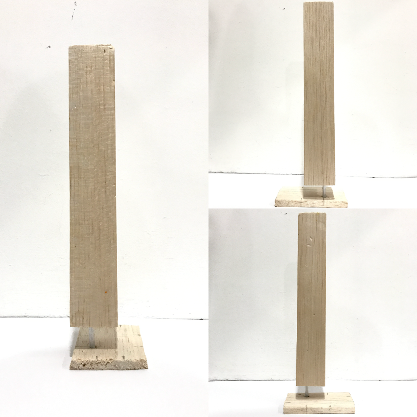
I already posted my process to getting to this. This is my final ‘Counter-balance’ structure.
The all-sides view of the structure and showing that at least 4/6 of it went right.
The reason why I wanted to use a metal rod for the SO was because metal can easily be the backbone of alot of things. And the material of this metal is specifically aluminium as it is known for not rusting or corroding easily. Hence if it touches water, it won’t rust. IN ALL HONESTY, this was hard to create to balance it well. I had to get the right measurements for everything. I thought of making it into a floating building, or a hardy bar soap dispenser.
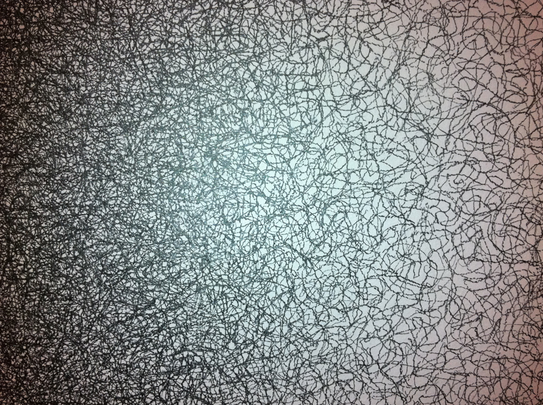
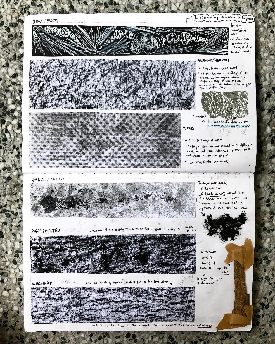
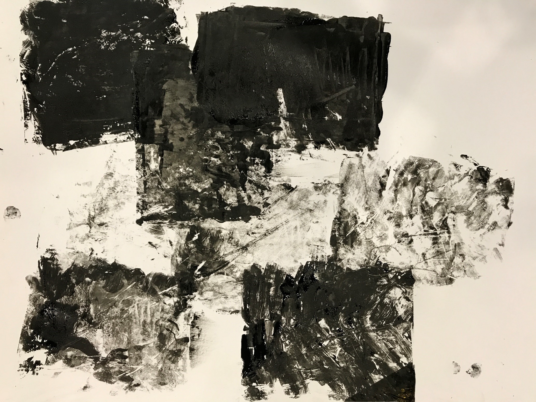
So initially before our consultation, I looked up to works from Sol Lewitt alot because of how he could make simple, easily done scribbles, look so intricate and beautiful when we step back and look at his work in a bigger picture.
Sol Lewitt’s ‘Scribbles’.
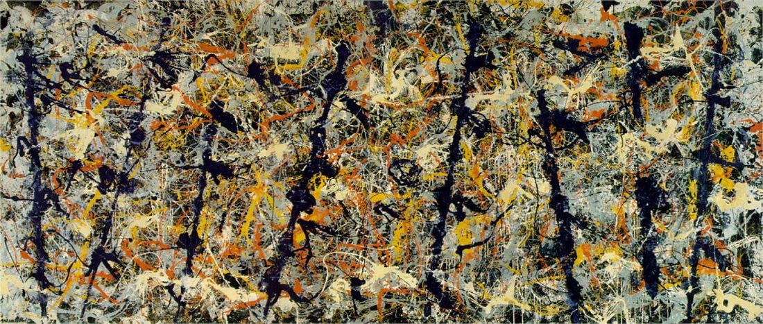
I also looked up to Jackson Pollock because of his unique style of drip painting, splashing technique.
Jackson Pollock’s ‘Blue Poles’.
Aside from artist reference, I wanted to know what ‘Decalcomania’ and ‘Frottage’ means and so I searched up on TATE that Decalcomania is a “blotting process whereby paint is squeezed between two surfaces to create a mirror image” and Frottage is “a surrealist and ‘automatic’ method of creative production that involves creating a rubbing of a textured surface using a pencil or other drawing material”.
So i input that into some of my works too.
After the consultation, I began to look further more into other artists as my research as that could really help me with the end result i wanted to get for my final work.
There are more (I put them in my sketchbook) but the ones I posted here are the ones important to me as I made use of their works as a source of inspiration to create lines/mark-making in different ways.
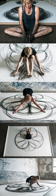
Like for e.g Jen Lewis’s macrophotography of menstrual blood gives off this outcome that’s so raw and beautiful, and related to bodies and blood as the idea of lust so it really spoke to me. And for Heather Hansen’s kinetic illustration, the way she uses her body movement and get herself dirty from charcoal to realyy get involved in creating those powerful cursive flowy lines inspired me to do the same for my emotion of love.
For Sol Lewitt’s scribbles, they may just be scribbles but i feel a sort of satisfying feeling from it, a positive emotion hence i wanted to do something different by doing something like he did for my ‘happy’ emotion.
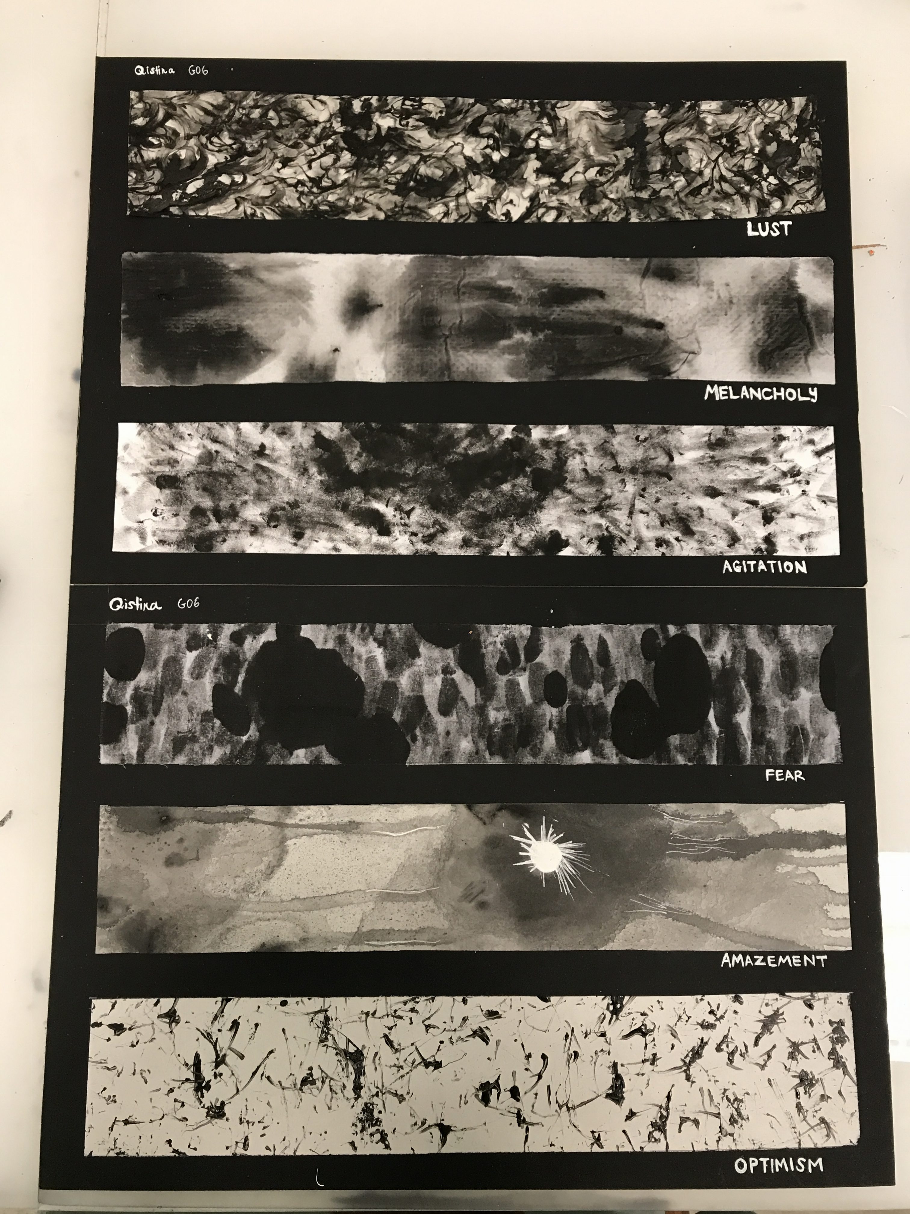
For this project, we went through alot of ways to get deep into our emotions. SUCH AN EMOTIONAL DRAINING FEW WEEKS IT HAS BEEN. Especially after our consultation because I felt that we were suppose to get real with our emotions and bring out our raw inner self even more (I hope I make sense). So I’m going to share the processes – some from the start, some from after the consultation.
Mindmap: FEEL(TH)INGS
EXPLORATIONS
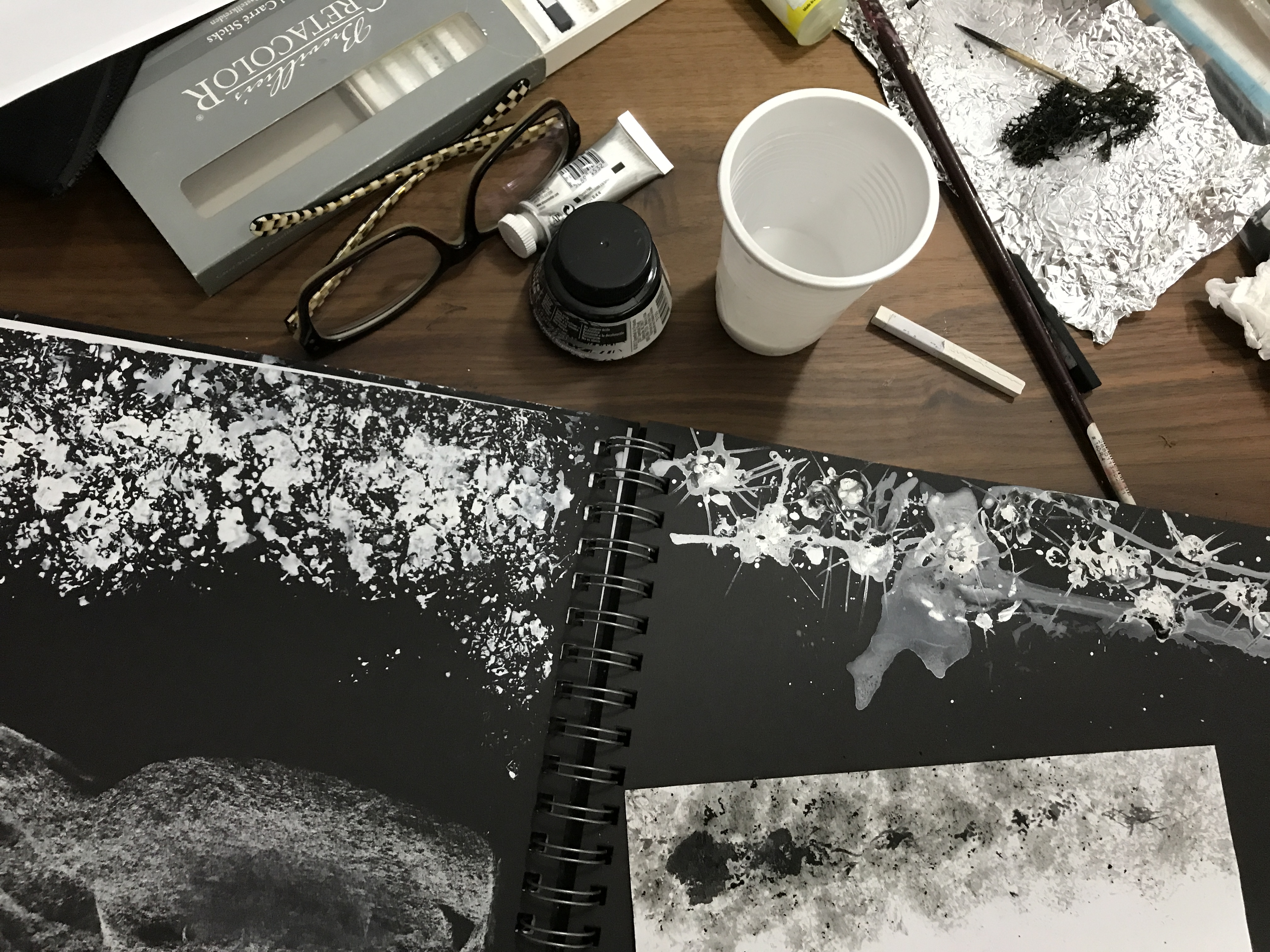
Starting off by using basic materials first like pen, chalk, white paint, white marker etc.
Creating the ‘shock’ emotion using toothpick and ink amongst the spreaded white watercolour. Toothpick to create the sharp lines jutting out.
I went to explore more than just using white markers on balck papers or pens on white papers – I wanted to explore more on techniques first. So in the picture below, I explored on materials to use for mark-making while using the technique of ‘frottage’. For some I used crushed aluminium foil, table mat, sponge, dead moss and tree bark. And for the mediums I used basic stuff like ink, charcoal, and white titanium pen.
It’s interesting how the mark lines changes depending on how much force you used to create it, and the different directions you draw it on could create different marks.
I tried using 1 different technique wondering what if poster colours or acrylic works different ways seeing the different lines and texture they give on canvas. (seen below) Maybe the silver could represent the love entering my dull life (like a flow from the left) hence looking like it’s the overwhleming colour, and then the specks of gold to represent the lust in my life at that point of time. Black as the background to show the initial stagnant dull life I had.
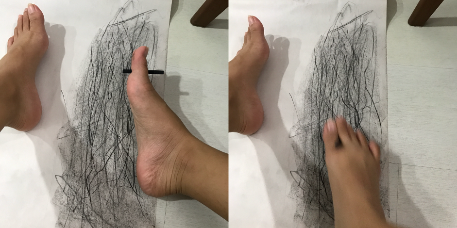
I explored more techniques after doing my research (we’ll get to that later hehe) like in here, using my toes haha I never thought of that. I used this as i was inspired to make something like Sol Lewitt’s Scribbles – messy, rough, awkward lines, anxious feelings.
Black chalk in between my toe. The feeling is different as it is harder to control your movement unlike using your own hands to scribble. Thus I felt that in this way, it really emphasizes on the meaning and portrayal of “scribble”.
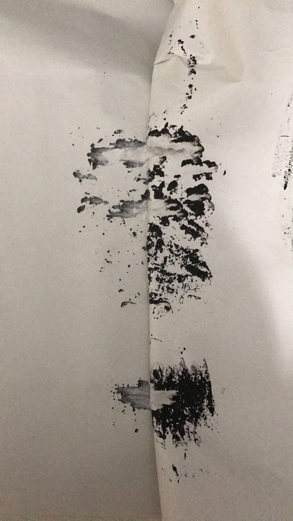
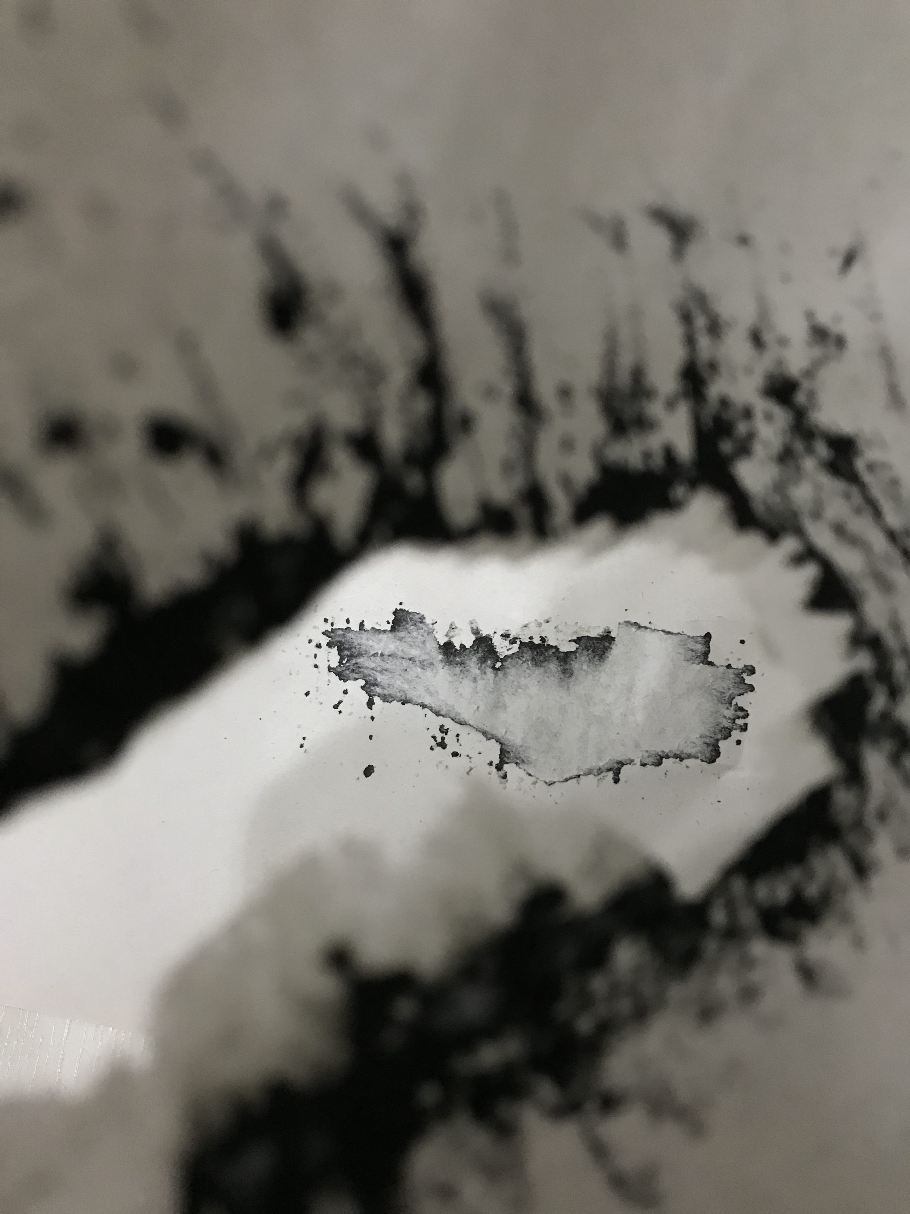
I did this ink mark thing on newspriont paper and realised it wasn’t drying fast so I thought putting another paper on top of it will be okay. But of course when i tried separating them the initial mark tore, causing this to happen. (seen below) It looks like it could come off as a method called Decalcomania – a blotting process whereby paint is squeezed between two surfaces to create a mirror image.
The outcome was left with that image on another paper. Very interesting I must say.
That was just another exploration I made during the process.
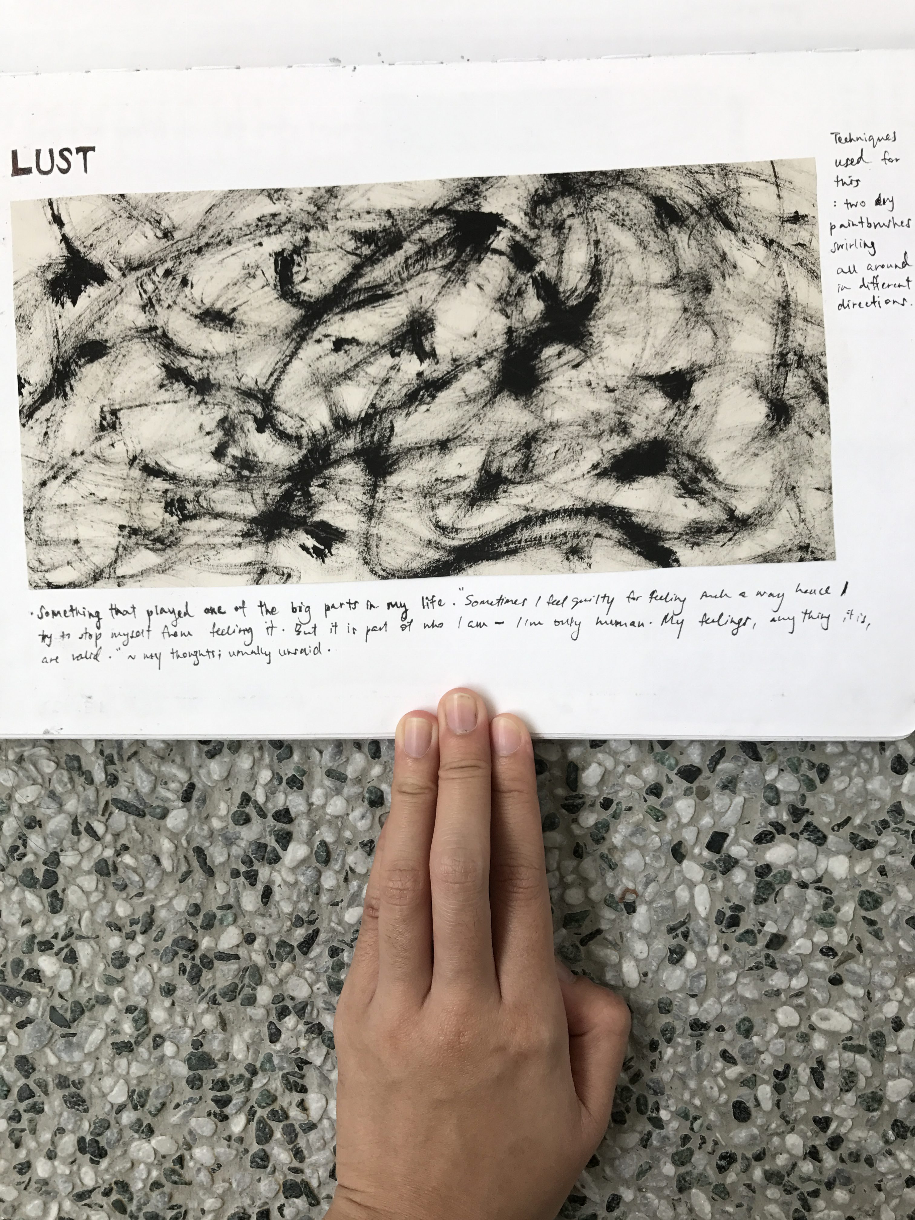
I wanted to tap into a feeling that impacted me the most – it would be the emotion LUST. If i were to share a story that is significant to me in my life, that feeling would pop out the most other than the negative feeling that follows. I will share about that reallll soon.
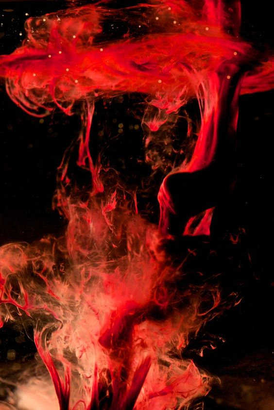
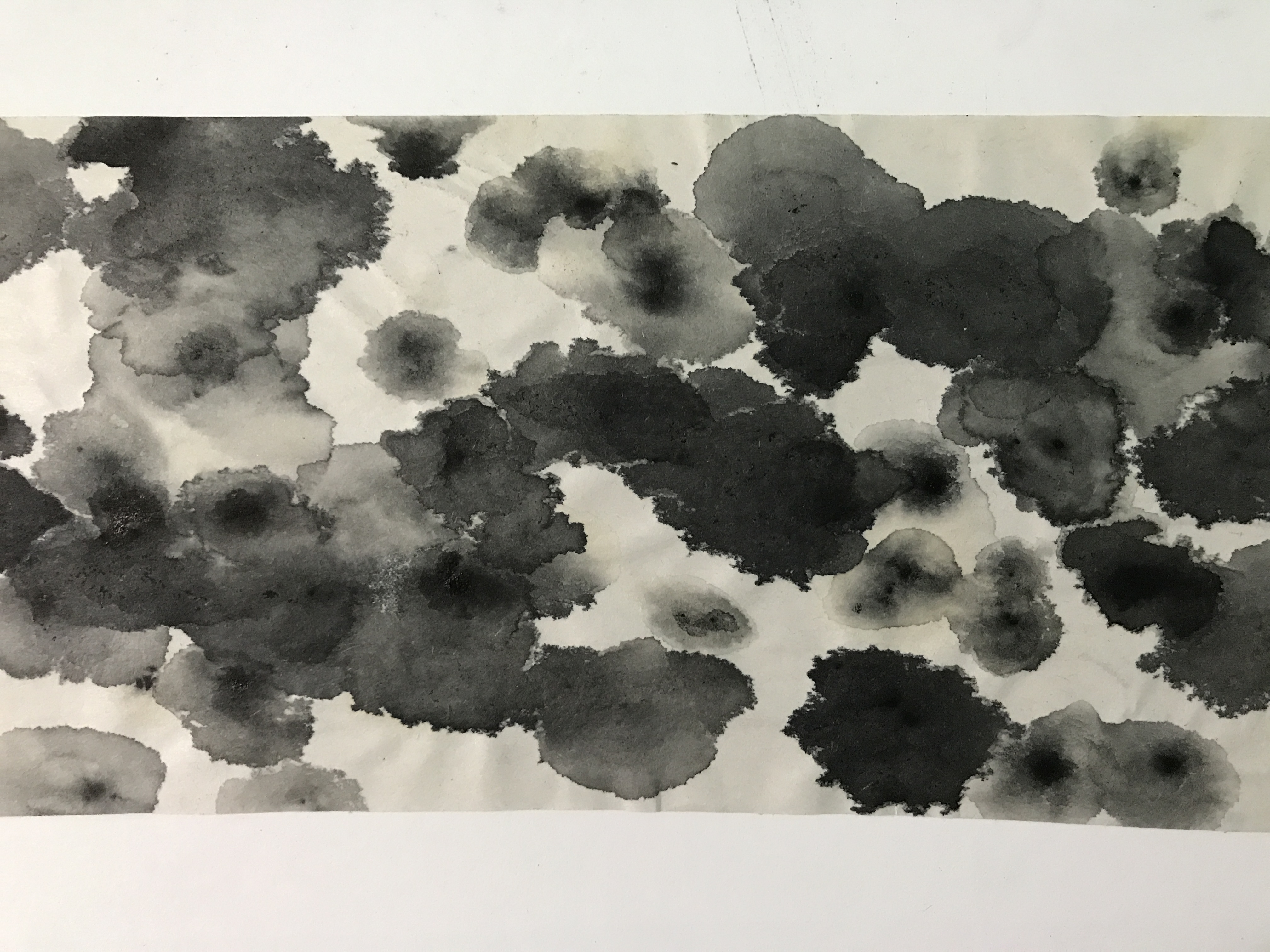
Using ink on two dry paintbrushes and swirling them altogether everywhere slowly. My idea of lust is that it’s slow but passionate hence the prominent black lines and spots in some places. It’s like a resemblance of body intertwining, skin to skin connection.
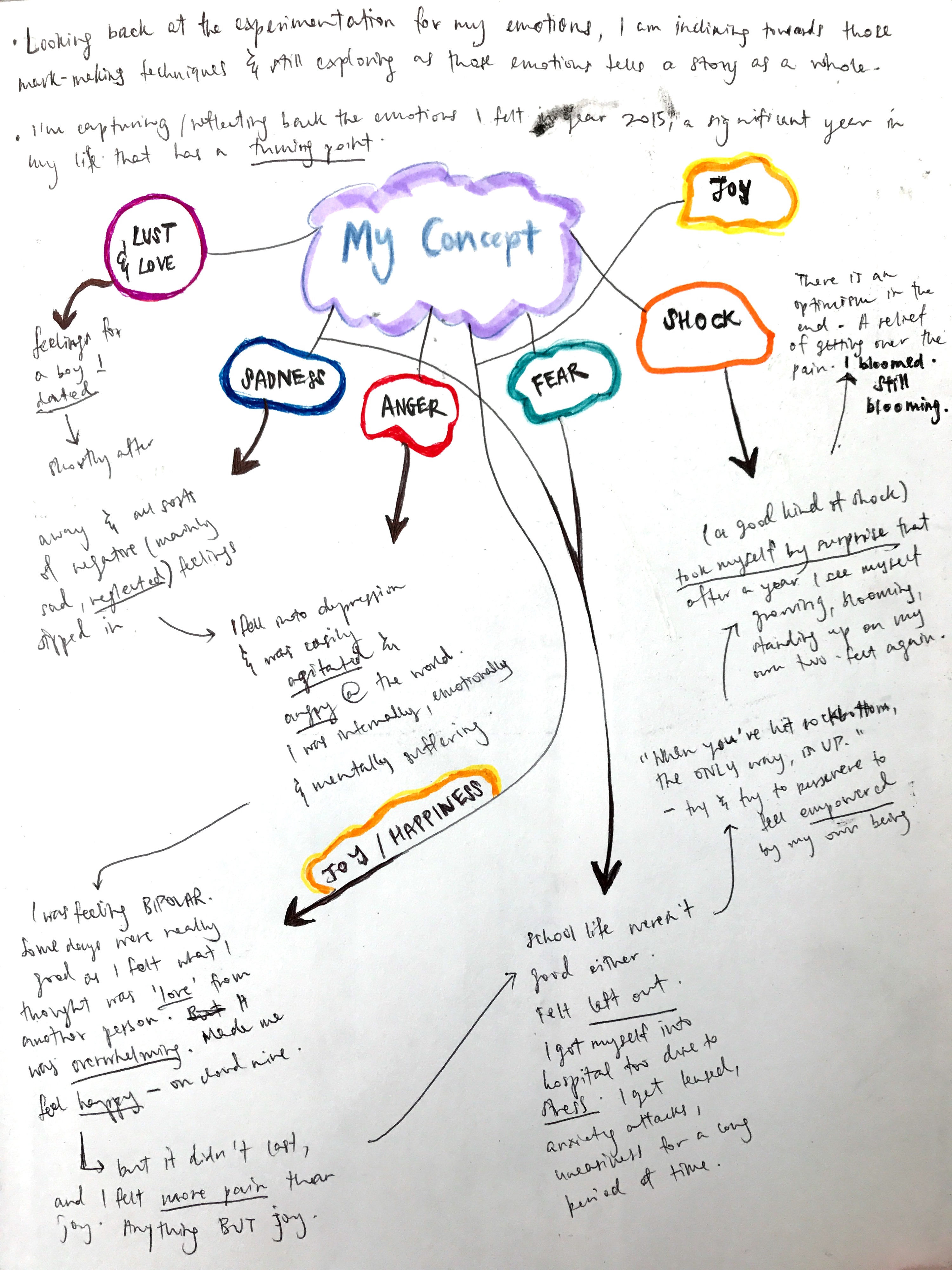
MY CONCEPT
Here, the story I wanted to share as my concept. 2015 was the year alot of things i would call “life” happening, that plays with alot of my emotions. It was a significant, difficult time of my life and I wanted to dig this past, to embrace it all, including the emotions I felt at that point of time that was hard for me to accept.
During the consultation, we were told to look more into objects that revolved the most in our lifes, at any point of significant time and that we should see that in 2d form – lines, shapes, perhaps inputting Cubism to express Abstract Expressionism.
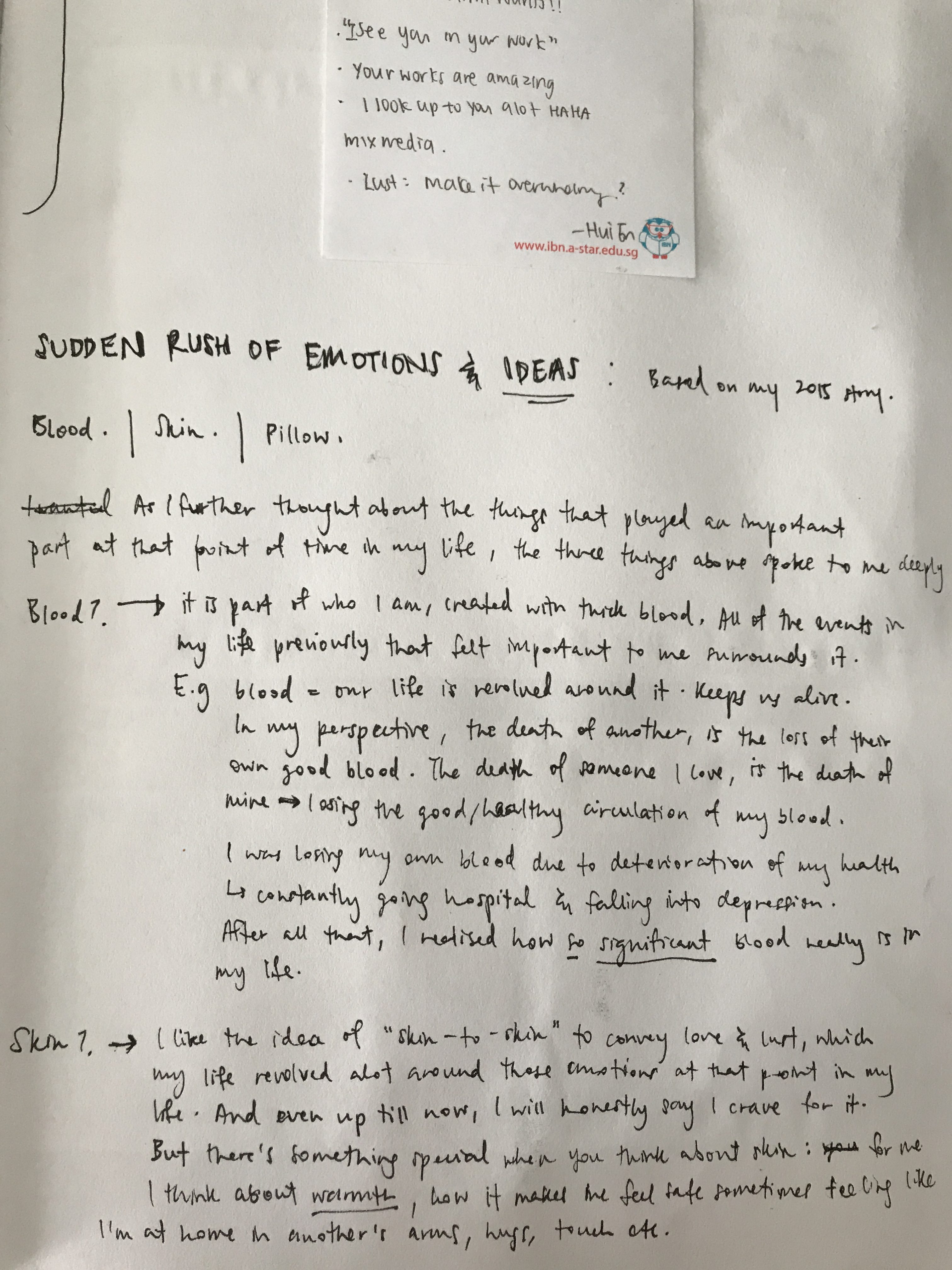
So the main 3 things that really revolved around my life at that period of time (2015), it was blood, skin, pillow.
Although blood and skin are not objects, they are still something you can touch and that to me is important enough to feel something off from it.
So for blood I will immediately think of the thickness, the flowy effect it has on skin (blood oozing out from our skin, bodies) and in water, just like how an artist named Jen Lewis’s works on menstrual blood photography.
Jen Lewis’s mentrual blood photography.
I wanted to portray something like this into my ‘love/lust’ emotion.
I tried different brushstrokes technique but I wasn’t happy with the above. So i thought if I wanted a real flowy effect and thickness I had to include other materials for my ink to seem thick enough to create flowy lines. Hence i mixed Cetaphil soap with ink to spread it on paper, and then used toothpick to create the flowy connections between them. (seen below)
‘Lust’. Using Cetaphil soap + ink, and toothpick.
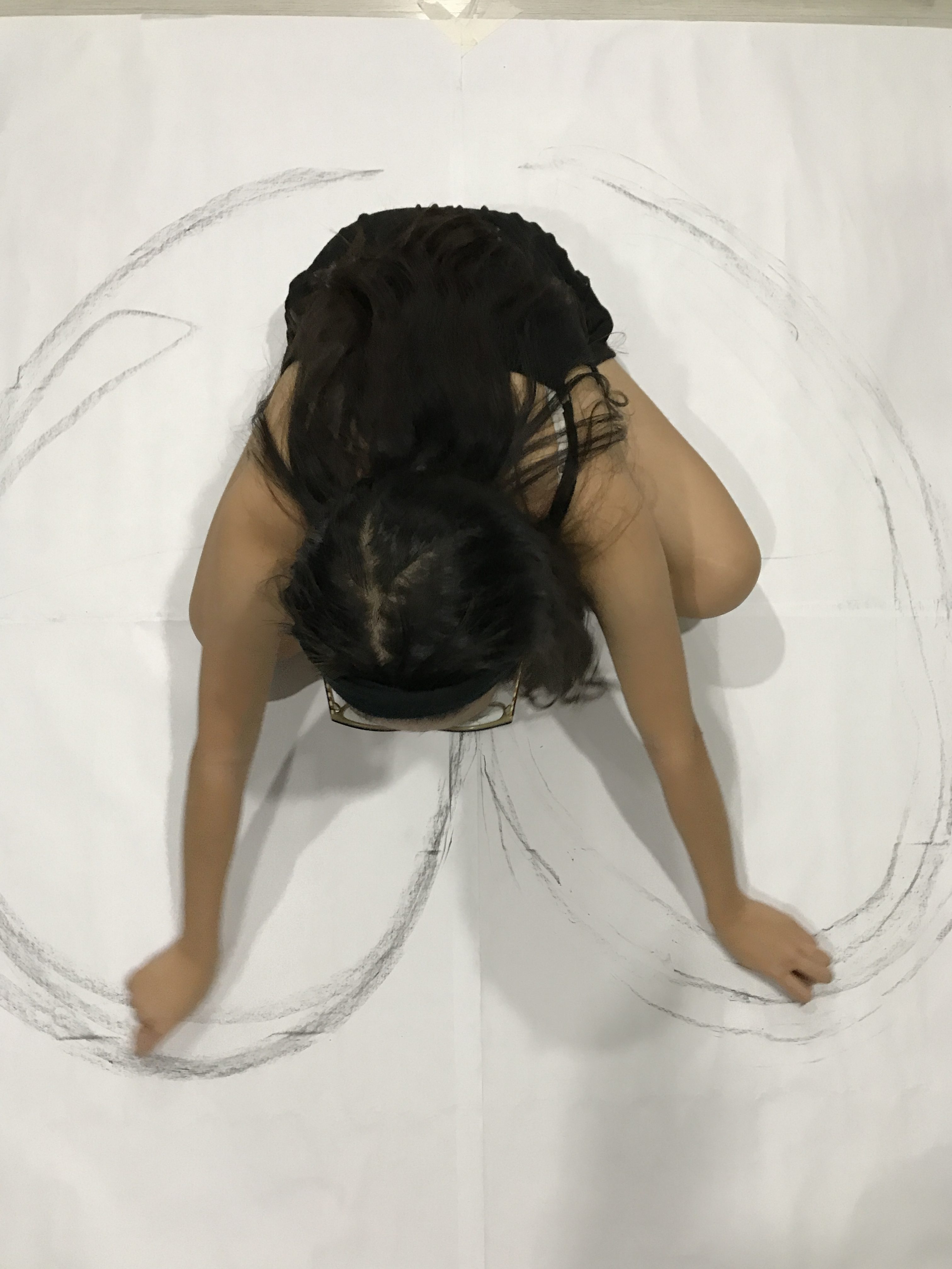
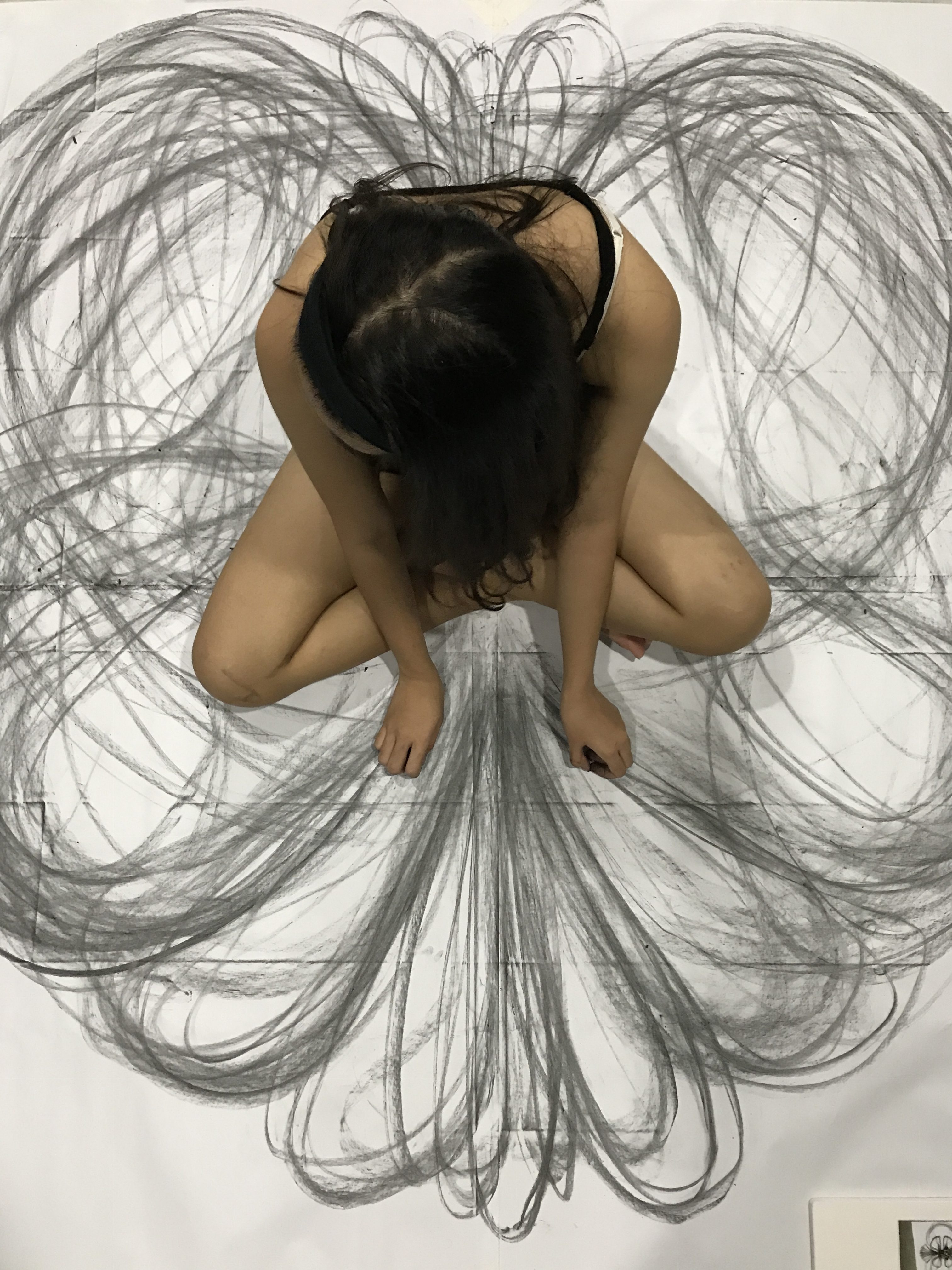
When it comes to the idea of ‘skin’ because skin is also a symbolism of body connections and thus lust or love, I wanted to create lines with my skin touching paper to spread out the lines – I focused more on body movement too to show how love makes me feel while doing my mark making.
This is seen below where i made use of 4 mahjong paper pasted altogether to created a huge piece of paper and do a sort of kinetic movement while I sit in the middle of it – inspired by Heather Hansen’s Kinetic Illustrations.
I think the outcome was really intriguing and beautiful to me in a sense that yes, this is what I would feel when I feel someone else’s touch or love, that’s my emotions spiralling in kinetic motion.
When I think of anything negative that’s going on in my life, I would immediately think of my bed, my pillow. Because that’s where I will throw myself in to hide my face away and my feelings too – i would sleep on it or scream in my pillow, or i would hide my face from the world just because i don’t want them to see me cry. Then i realised they all have 1 thing in common: cloth. Something about cloth gives a sense of comfort. Which is also why I feel a sense of bliss whenever I’m wrapped up in comfy clothes or sleeping on one comfy bed sheet.
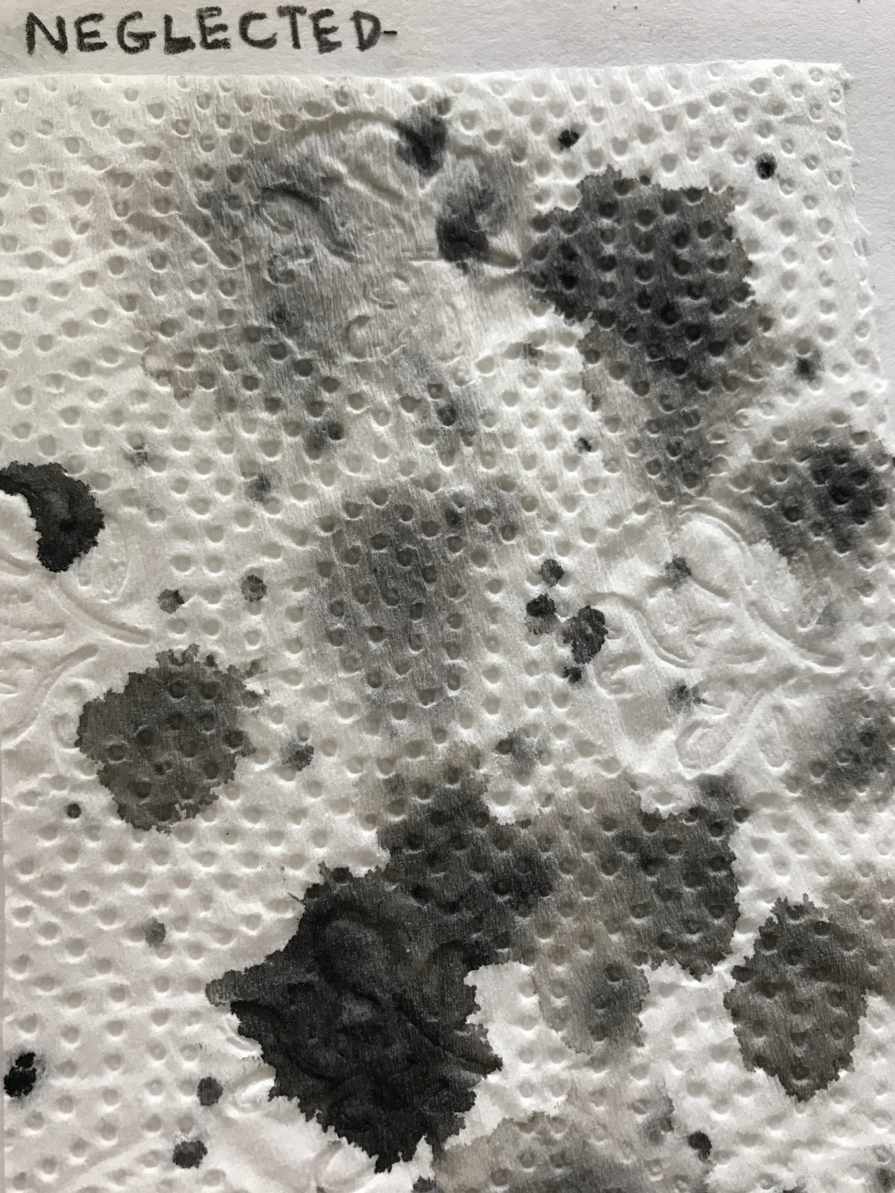
Tissues are also another kind of object that I always needed by my side in that year itself because i was depressed and sad and just in a surge of negative emotions. So tissues was my friend.
Hence i decided to associate negative sad feelings with tissues. Because I always needed it to wipe them tears away.
Surge of melancholy.
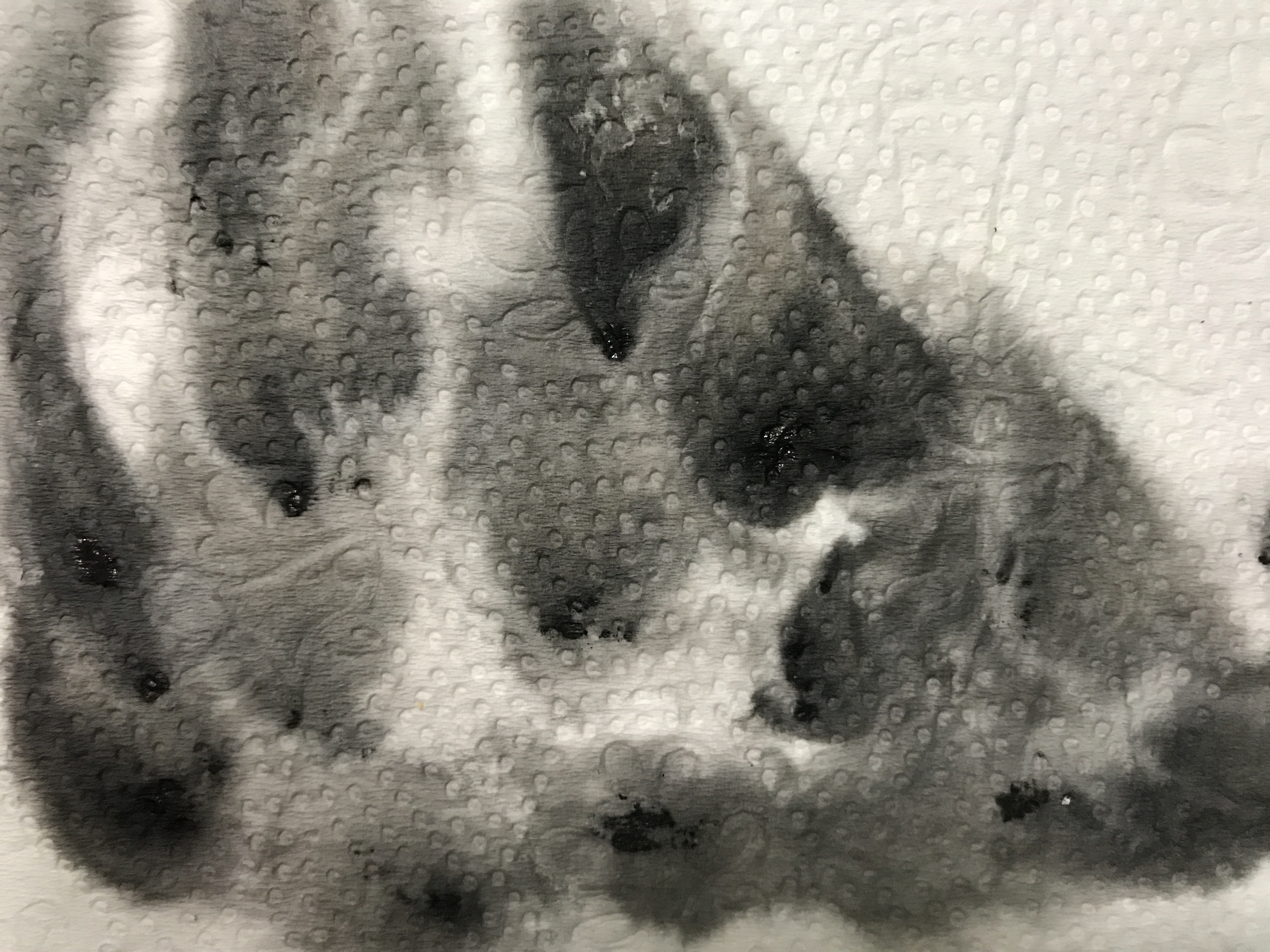
Aside from tissues, I tried doing something wayyy different. Like by listening to sad songs on repeat and legit crying to make my tears fall onto the newsprint paper ( the idea of fragility on the paper too) and then putting a small dot of black ink on the tear droplet to create the effect below.
My tears + black ink.
I reaaaaally really liked this idea and technique but it’s just tiring to cry all the way but i wanted to just show how authentic of a feeling there is there to portray my sadness. It’s raw. It’s me, because no lie, i’m an emotional bag who cries alot.
I did something rather dangerous and needed precaution to come out with something for ‘sadness’ too. I wanted to do the technique of fumage, where you light a fire under the paper, not so close to just create smoky marks on top of the paper. And so I tried it at like 1am. Perhaps i was too tired i don’t know but i got too close and my whole newsprint (a large one) paper easily caught fire and everything was burnt and well yes, i burnt my left hand fingers as well.
:'(
SO, BE CAREFUL GUYS. Don’t be careless like me. Don’t do it when you’re tired. 🙁
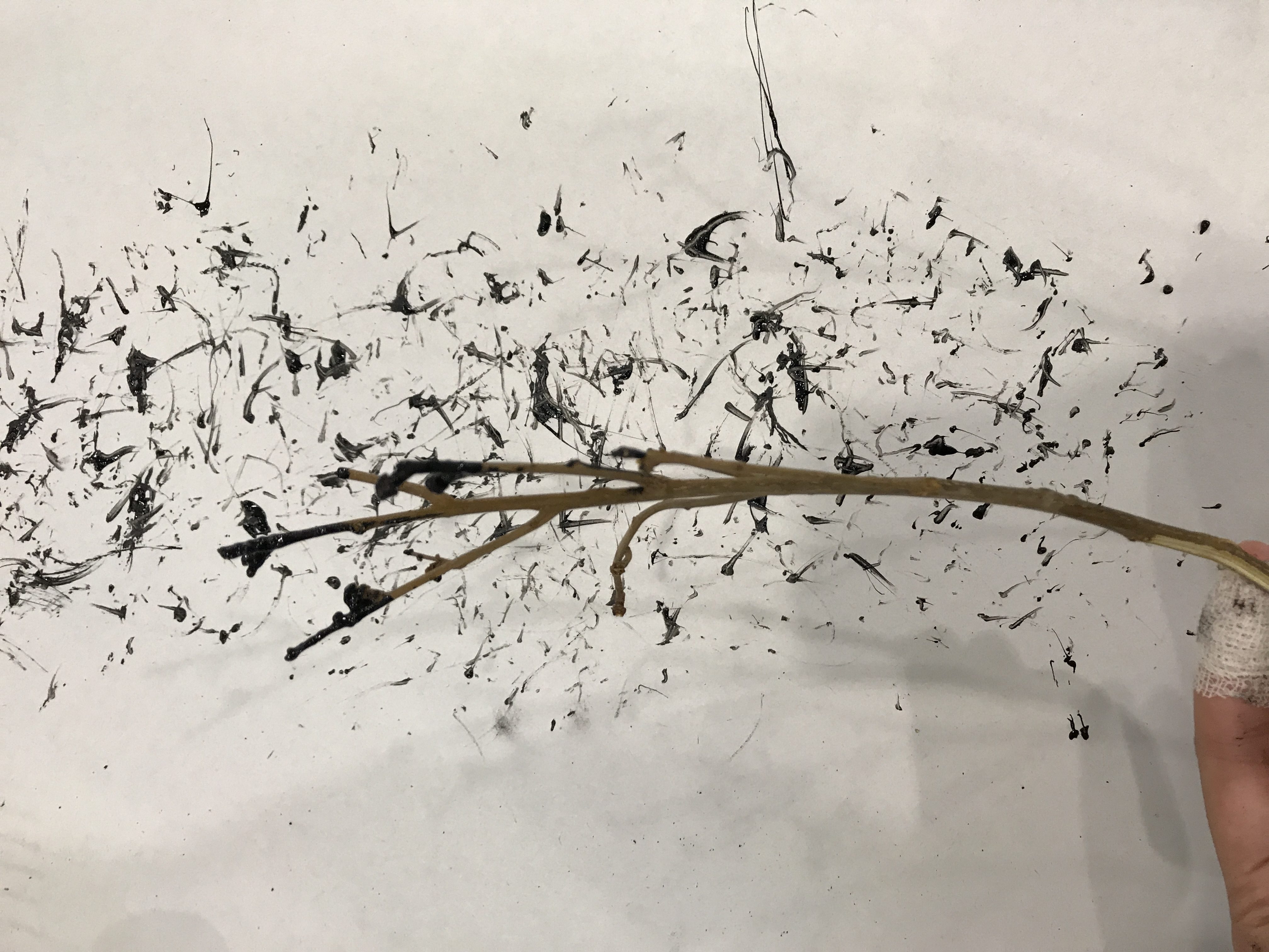
For my other emotions such as happiness, I wanted to do something different. I know usually circular shapes brings out joy as it shows the bubbly effect. But i wanted to try something different by just using lines. I was inspired by Jackson Pollock’s and Sol Lewitt’s works for this idea too.
‘Happy’. Using twig and ink.Using cabbage because of their flowy lines.
I tried using the Cubism idea for happiness in the above by cutting square shaped plastic buttttt it didn’t turn out nice as I expected it would be. So yeah.
WELP. Too much digging into emotions for this till I AM UNABLE TO FEEL NOW haha. That’s it for now, more on my final project post!
PREPAAARE, a really (thought-through and reflective) long post incoming.
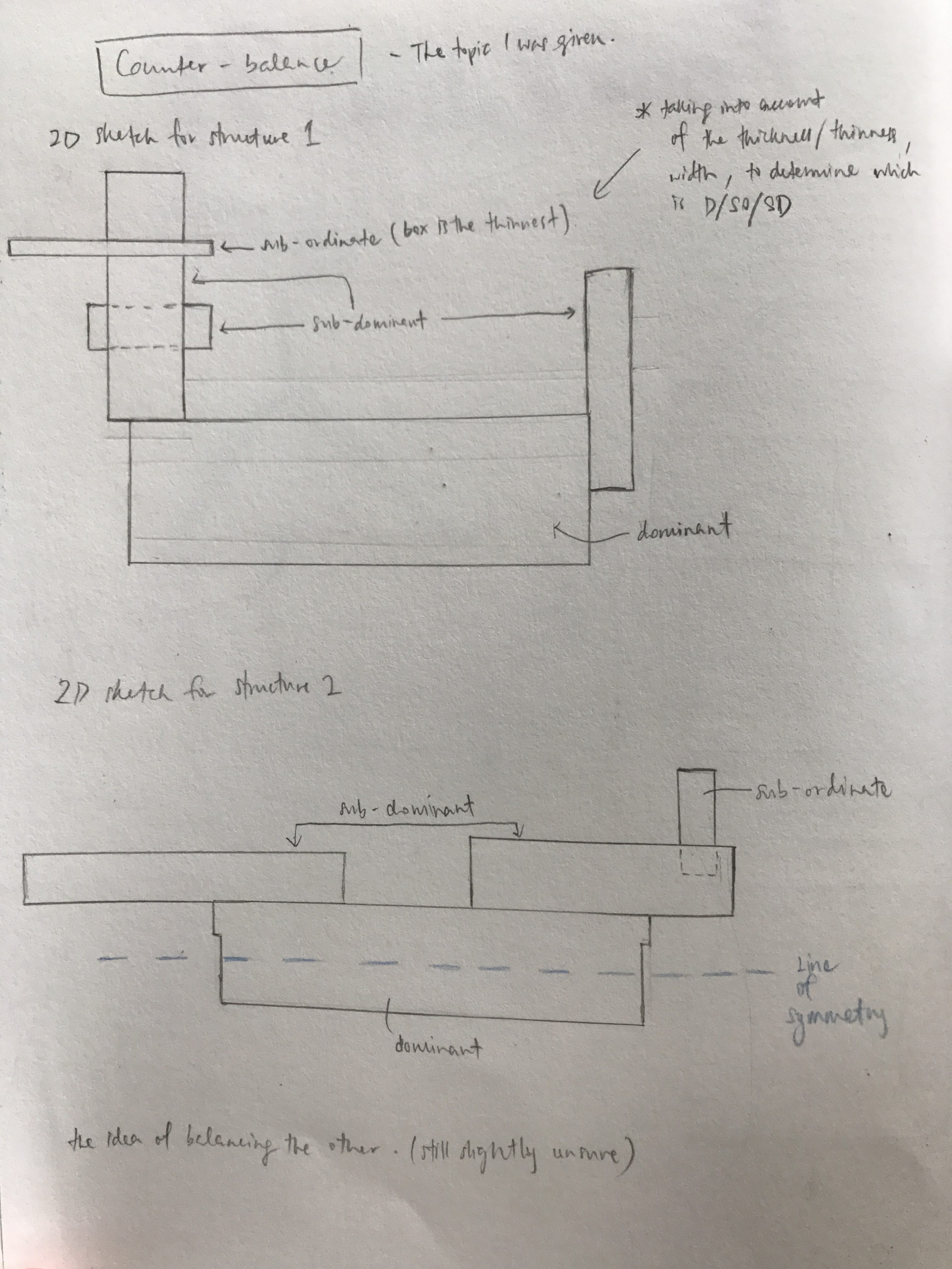
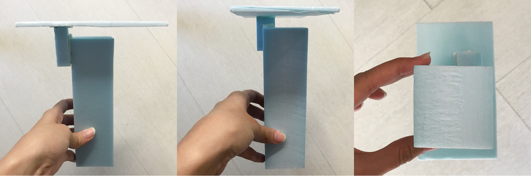
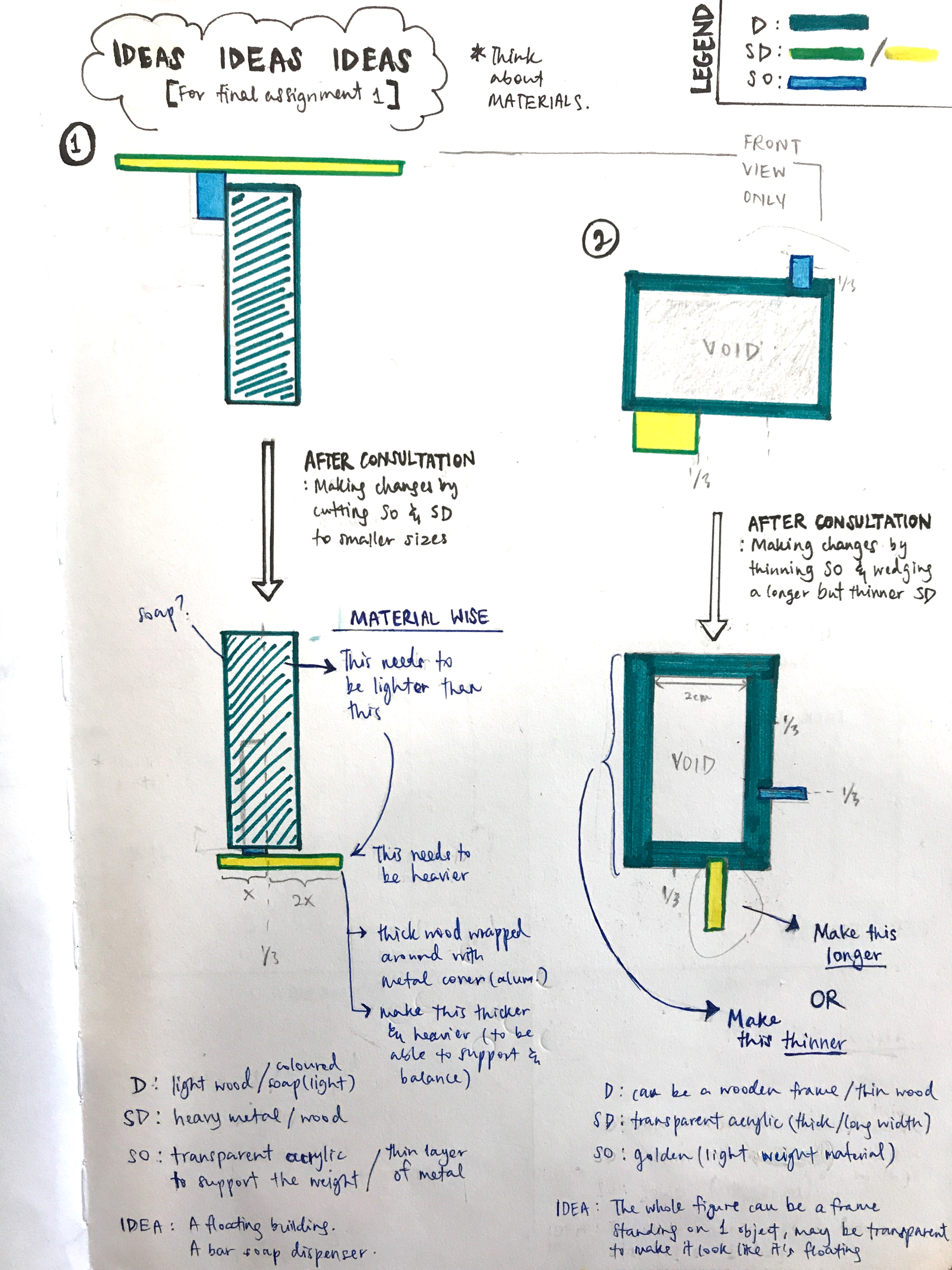
In last week’s lesson, we went through each and everyone’s boxes and consulted our professor. After my consultation for my ‘counter-balance’ work I went to make some changes to my boxes. So there are two structures that I’m planning to create (as seen below):
In my 1st structure, I went to make changes to the SO and SD to make my D block more dominant, and basically make an interesting counter-balance figure. It was quite hard to ensure that my figure balances as my D foam block was thick, tall and mainly weighs more than the SD could handle. So I decided that the D block had to be lighter than SD and the SD had to be heavier to be able to support the whole structure.
In my 2nd structure, I went to also make changes to my D and SD by making the D thinner and choosing an acrylic slightly longer to try and support the D and SO.
Of course taking into account of the length and width of the blocks too, it wasn’t easy. ESPECIALLY when we have to start including the materials we want to use.
So in this post, I will be sharing a few of my fails when creating structure 2 and structure 1 with other materials. And then I will show how I finally made progression towards a successful structure through structure 1 draft model (as I shifted more of my focus onto it).
LET’S BEGIN!
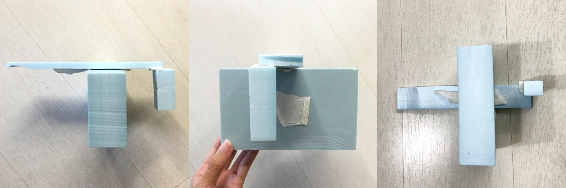
TRYING TO MAKE STRUCTURE 2
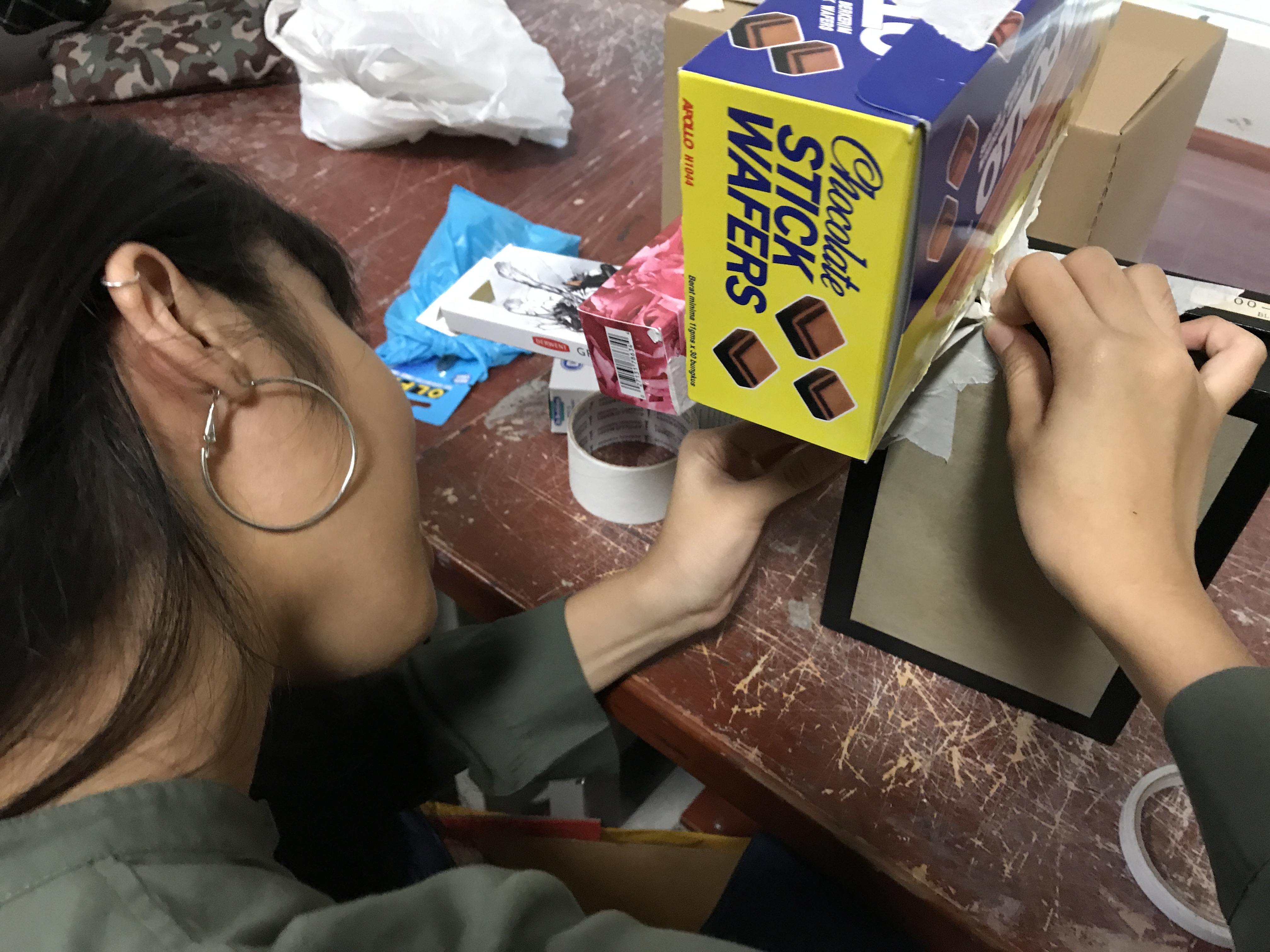
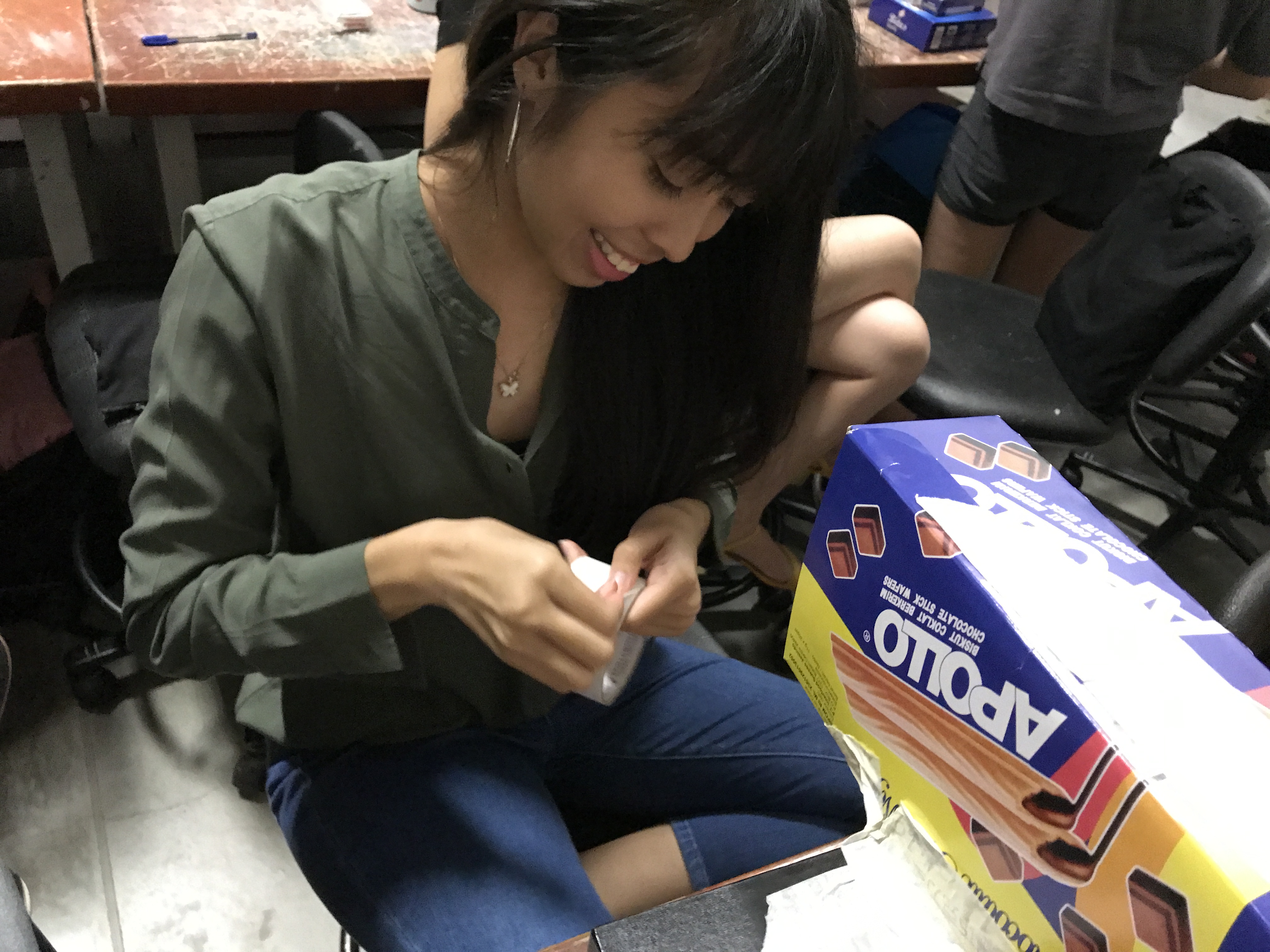
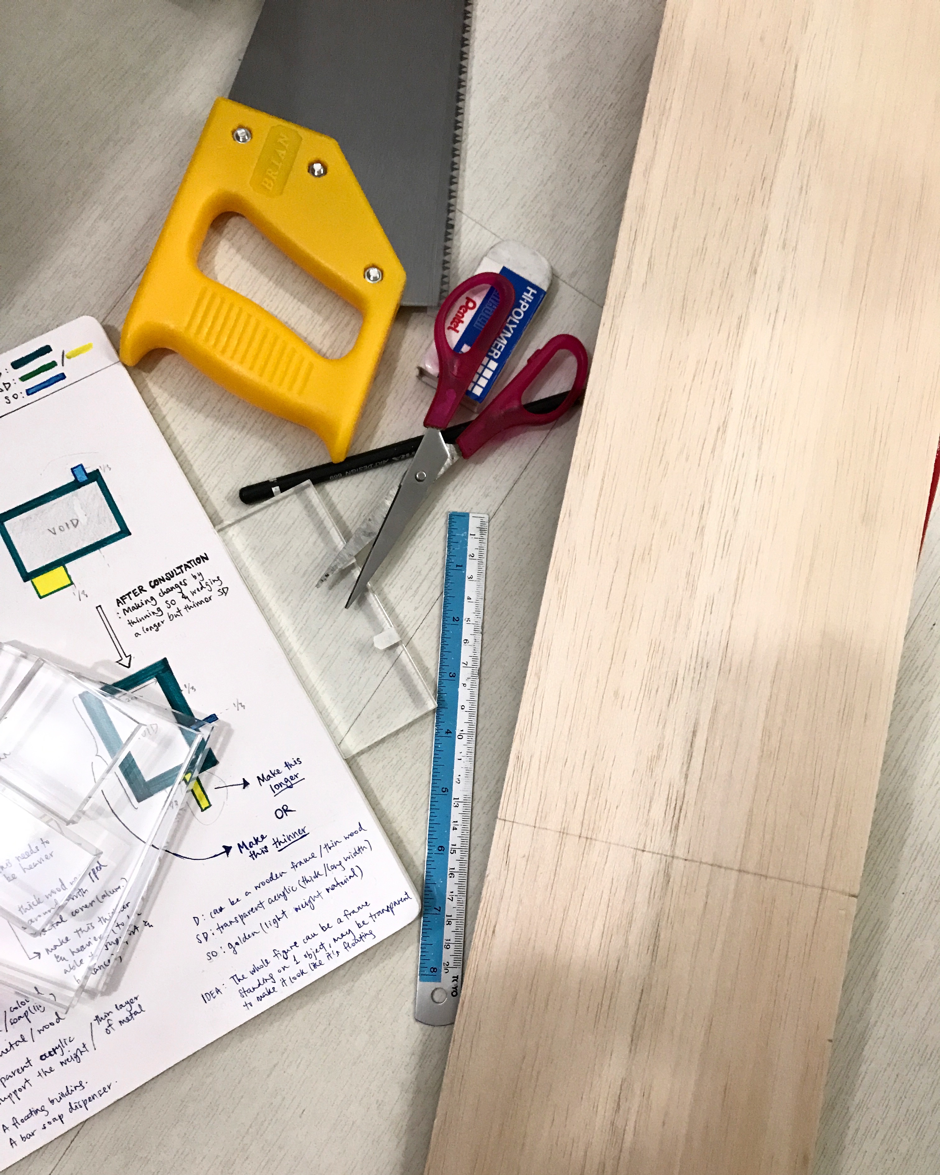
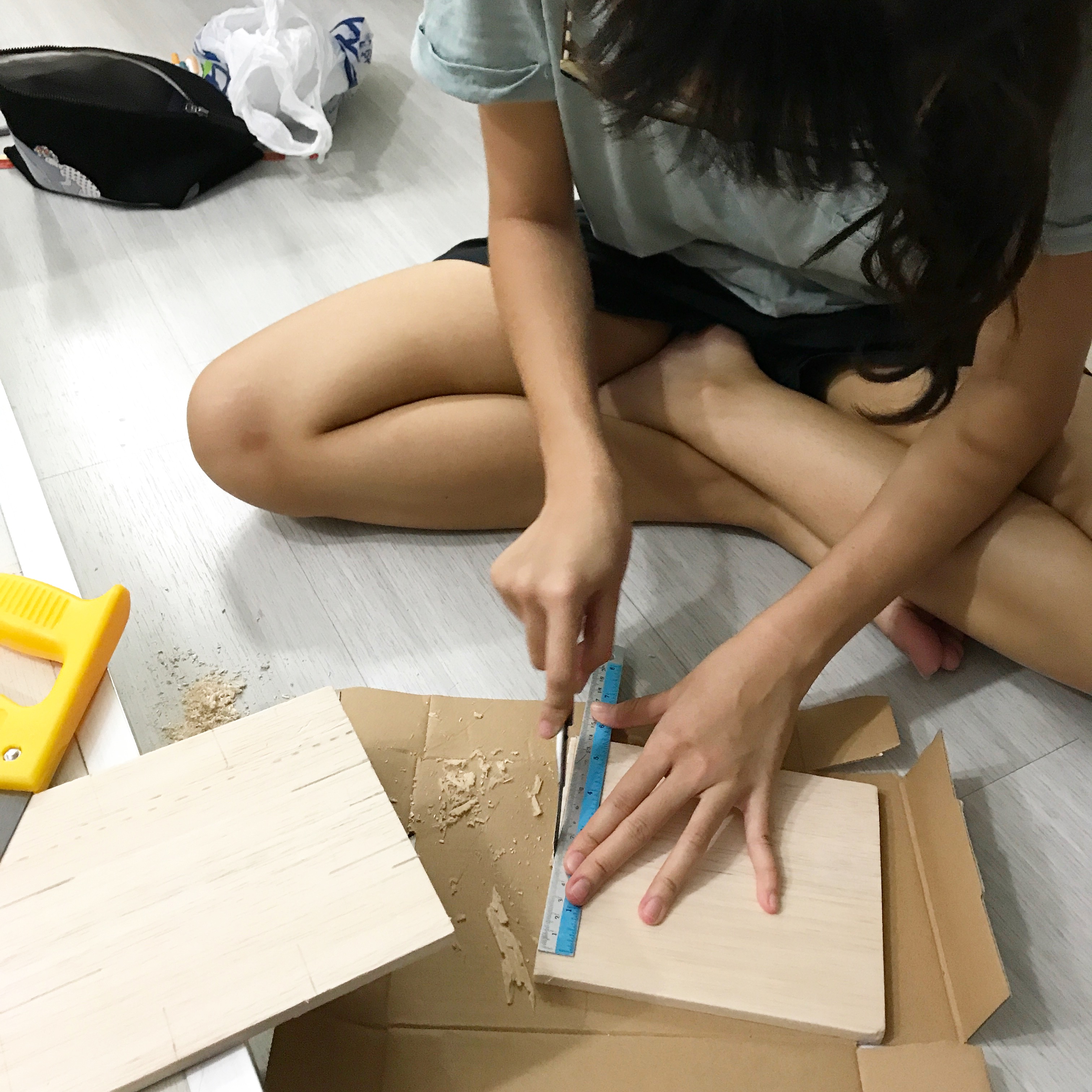
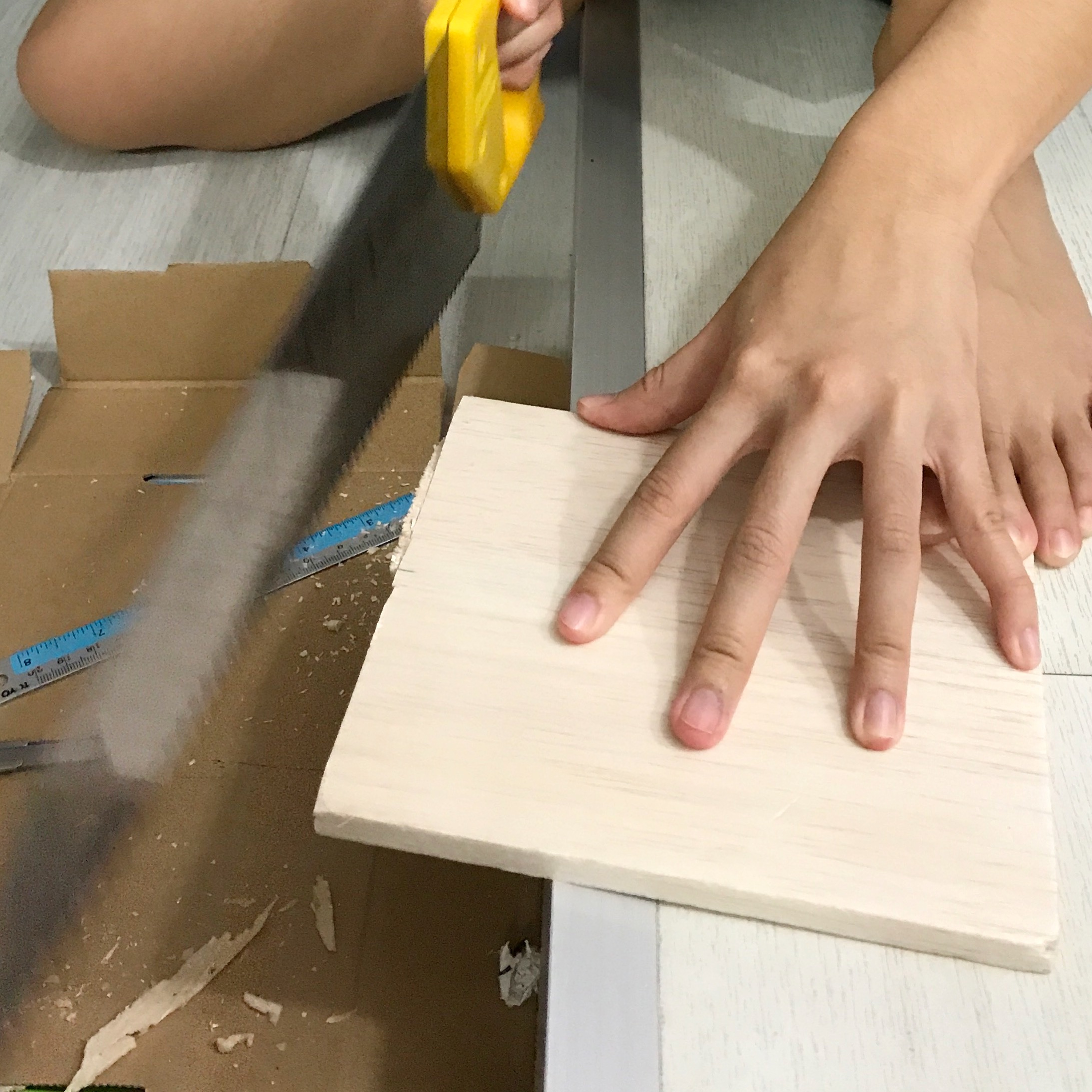
I started by trying to come up with a good structure using wood and acrylic and aluminium metal for structure 2. The wood for my Dominant block, the acrylic for my Sub-dominant block, and the aluminium metal for my Sub-ordinate block. Here below are some progress shots.
It was definitely tough to cut out the portion of the wood that I wanted, despite using a saw because there are some problems I encountered while doing so:
some parts of the wood are made harder hence harder to have a clean cut
when cutting through them, it is hard to maintain the same measurement at the length and the width
it is EVEN harder to carve the middle of the wood out to turn it into a frame!!! 🙁
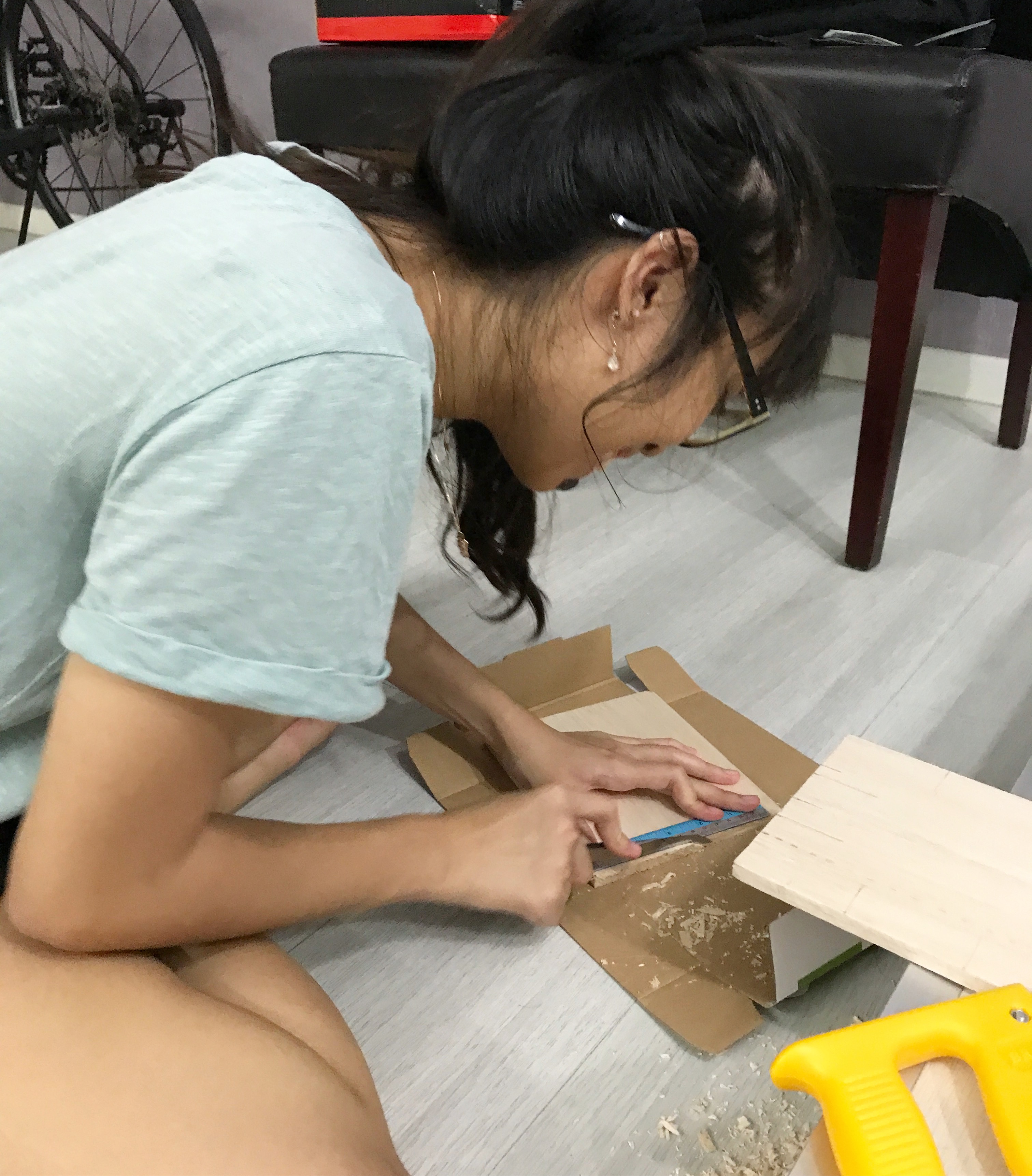
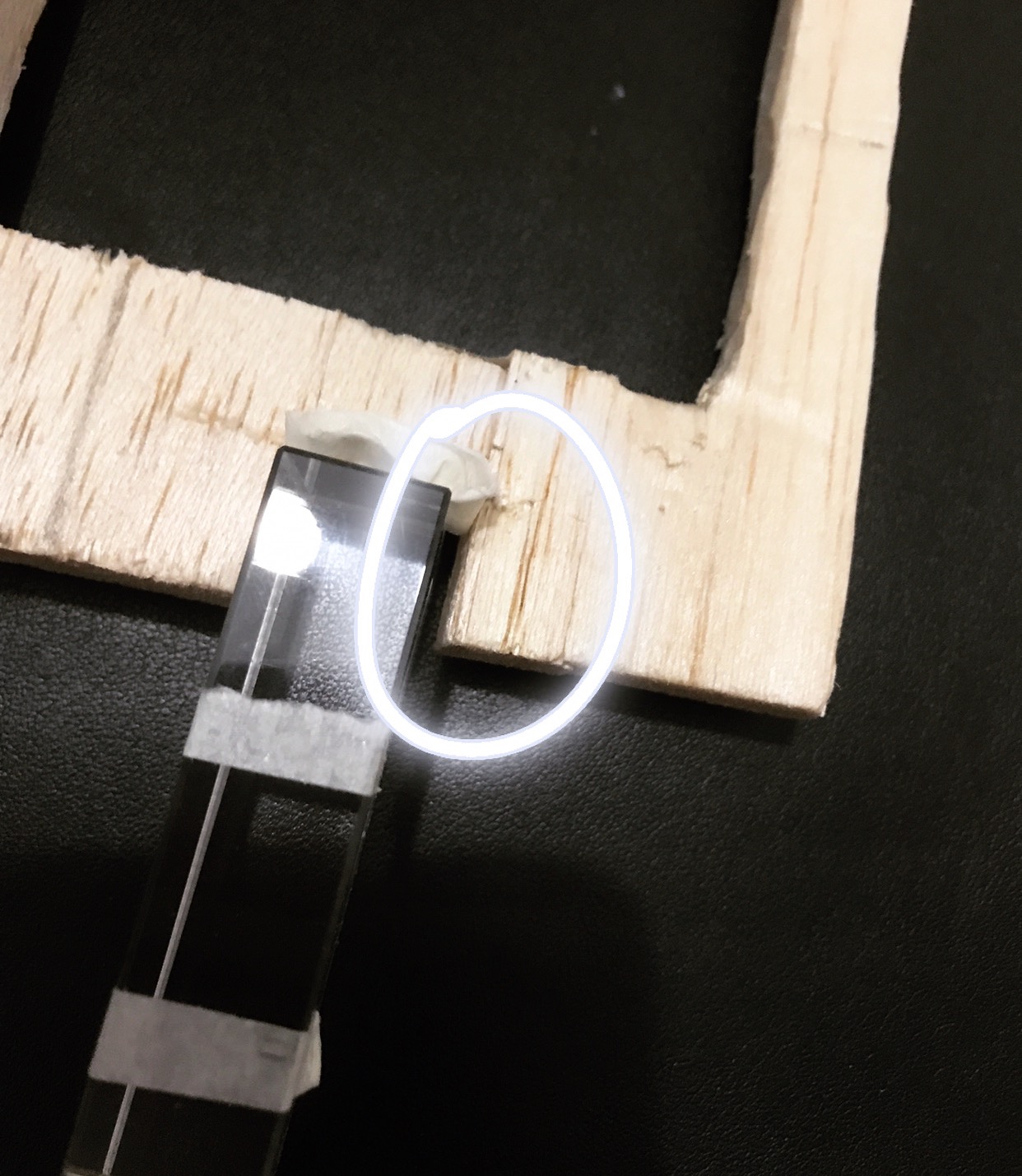
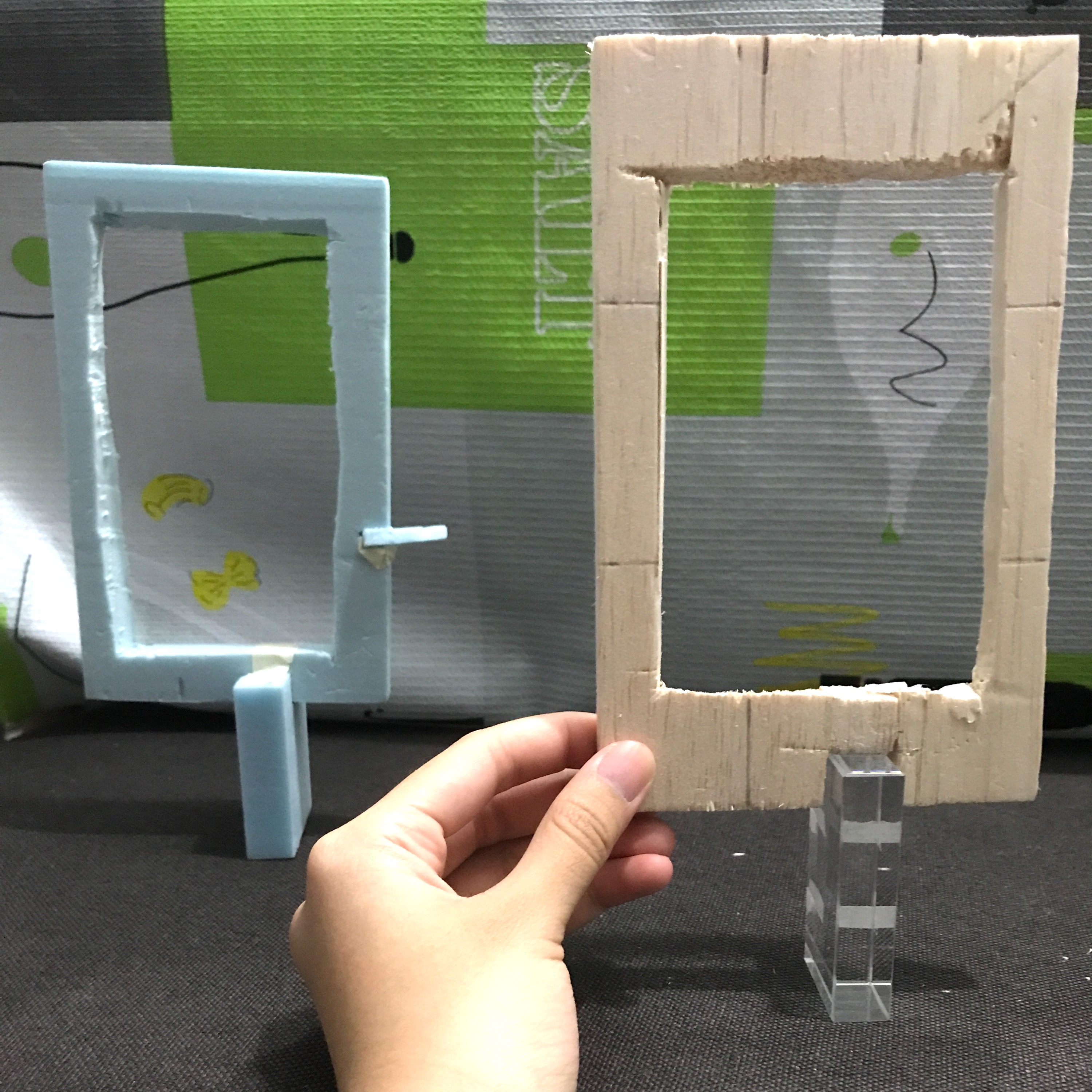
When I was trying (very) hard to carve it out, the thin portion at the sides starts to break and I’d have to super glue them back together. And even though it works and everything finally looks like a frame, I still had to do some wedging at the bottom of the frame to insert my medium acrylic block for my SD. But the chaos happened here: my saw couldn’t wedge through the hard part of the wood properly and I ended up cutting the space for my SD a little wider. 🙁
This in turn could not let my whole figure balance, unlike my foam model, as it was too spacious there and the acrylic could not hold the wood frame better.
Seen here below shows that I had to balance it by holding it unlike my foam model which could just stand/balance on it’s own. I haven’t even wedge the side (like seen on the foam model) to insert my aluminium metal as my SO because i know it still wouldn’t balance if the wedging is too spacious below (it can’t hold the whole blocks above).
Conclusion: Failed attempt at structure 2.
So instead of wasting time on finishing it and since I knew what my problem was in that structure, I decided to just move on to doing the other structure. STRUCTURE 1.
PROGRESSION TO STRUCTURE 1
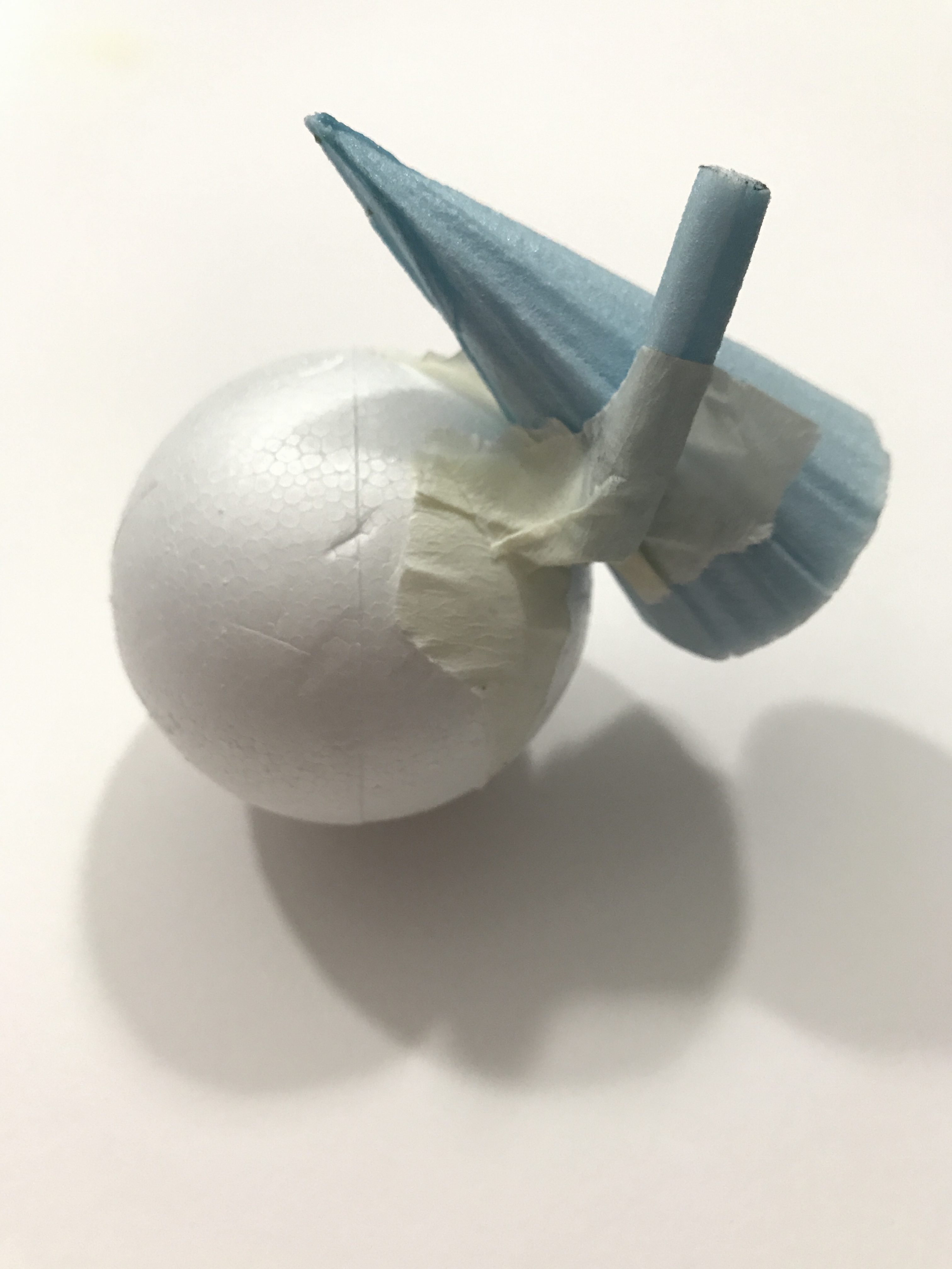
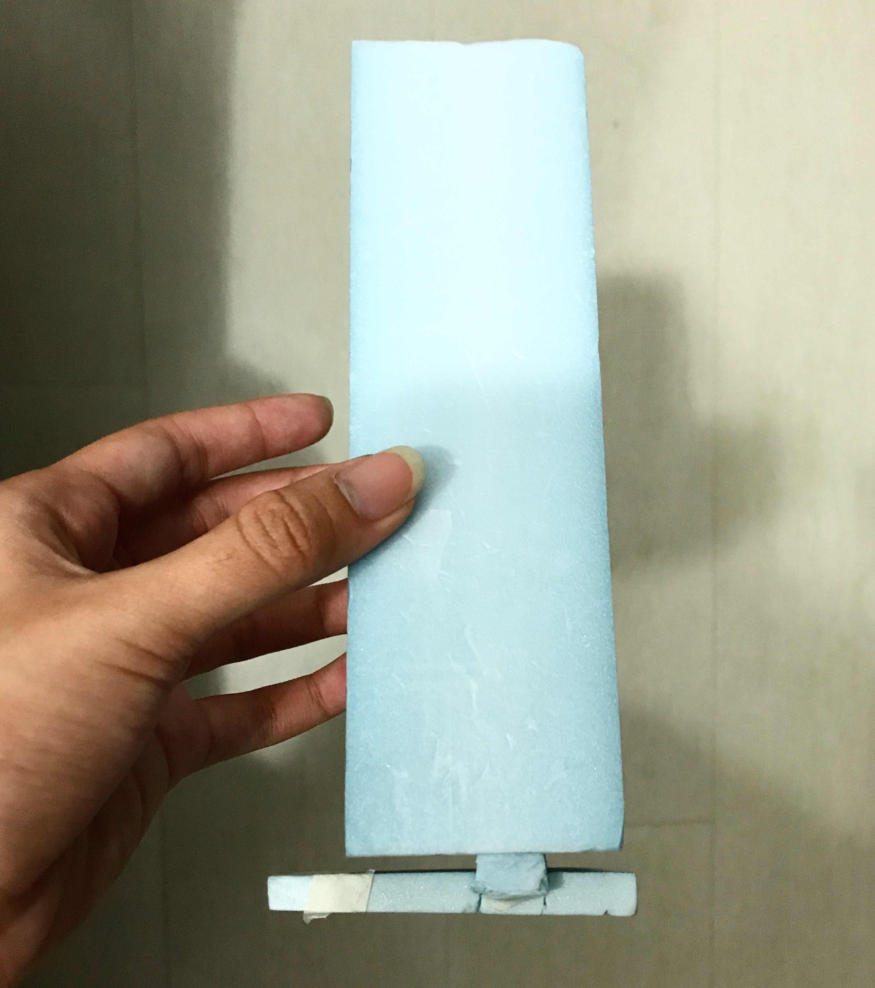
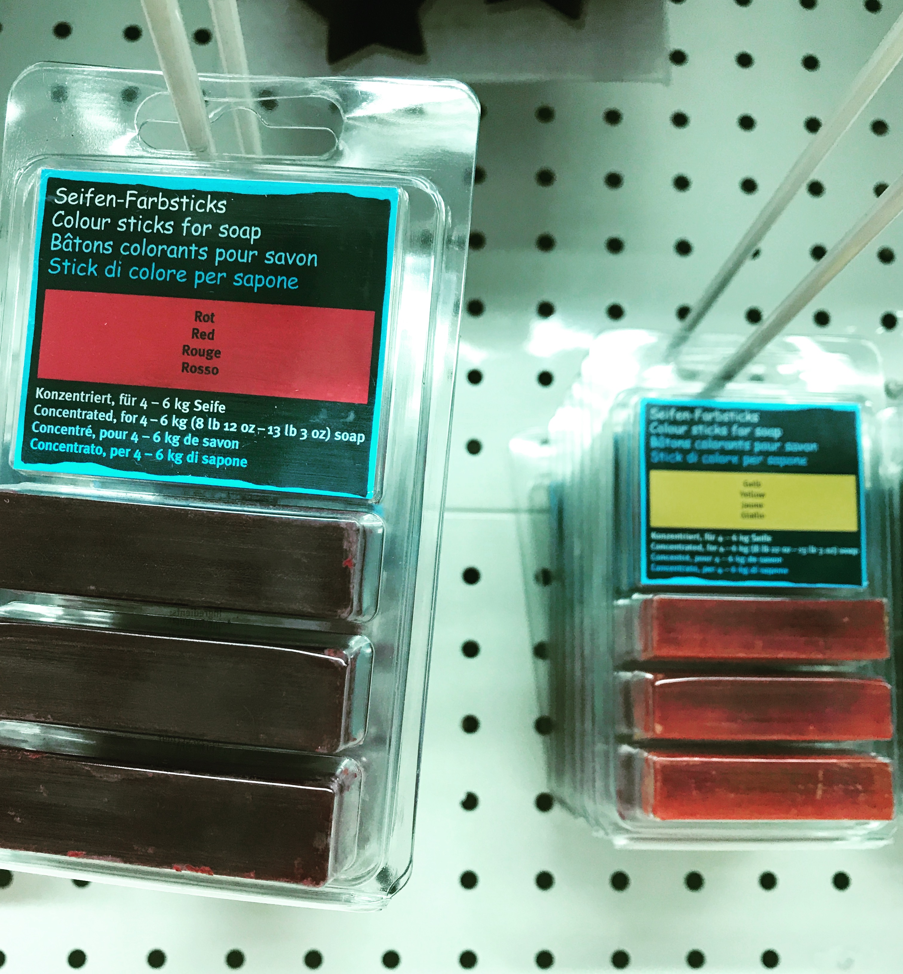
My initial idea for this was to create perhaps a ‘bar soap dispenser’ strictly for 1 person use only (mainly for people who is allergic to sharing soaps). I wanted to create it using this interesting coloured-hardy soap bar I found in store as my Dominant. (seen below: the kinds of coloured sticks for soap)
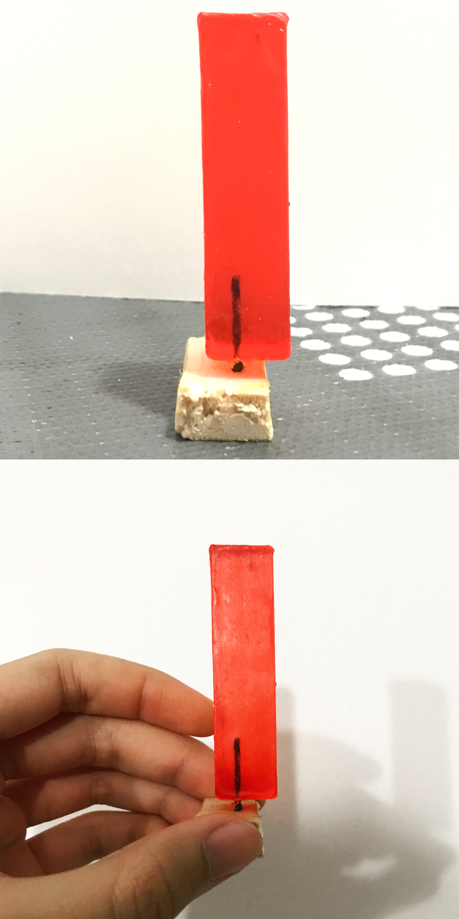
So I tried and as you can see in the figure below when I’m holding it, it’s a mini model.
Now why this one failed too:
Yes it could balance like you see it balance in the first picture BUT only for a first few minutes
This is partly due to the veryyy thin and small Sub-Ordinate which was just a thick wire stick into the D and wedged into the small-based SD. There’s no good material to create a good support there.
The soap is not hardy of a material enough, it will slowly tilt to the right when not handled with care or moving around while holding it and then fall off, hence not balanced at all on it’s own. I’d have to hold both the SD and D together.
Conclusion: Failed too due to fragility of soap that i bought – could cut through so easily it will fall off. Defeats the purpose of me wanting it to be soap bar dispenser if it’s not hardy enough.
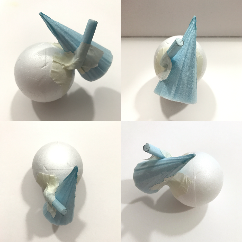
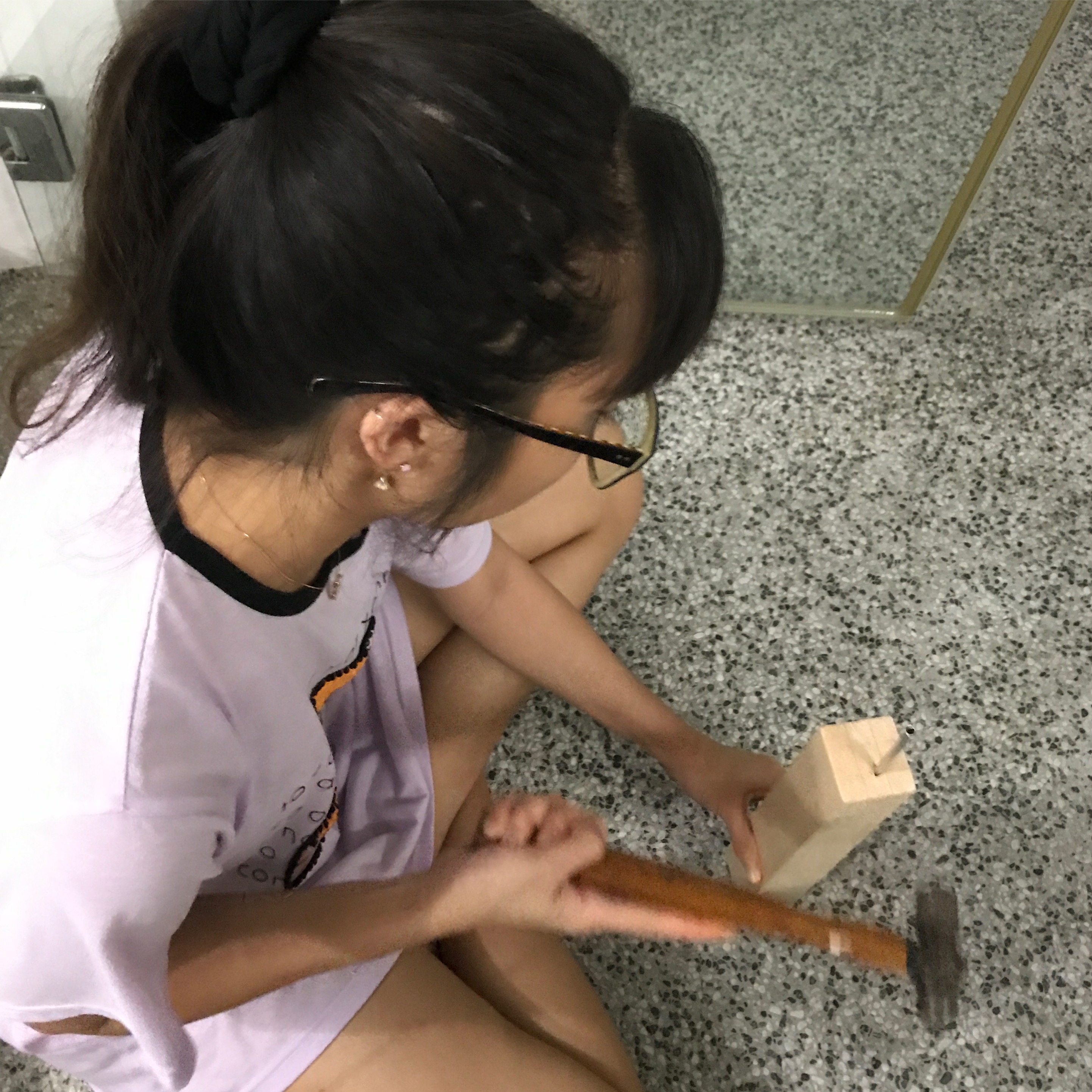
I decided to redo by using other materials and not to make a small-scaled structure. This time, I tried using wood for both D and SD. I chose a kind of wood that’s not so heavy-weighted so as to balance it off in the end of counter-balance.
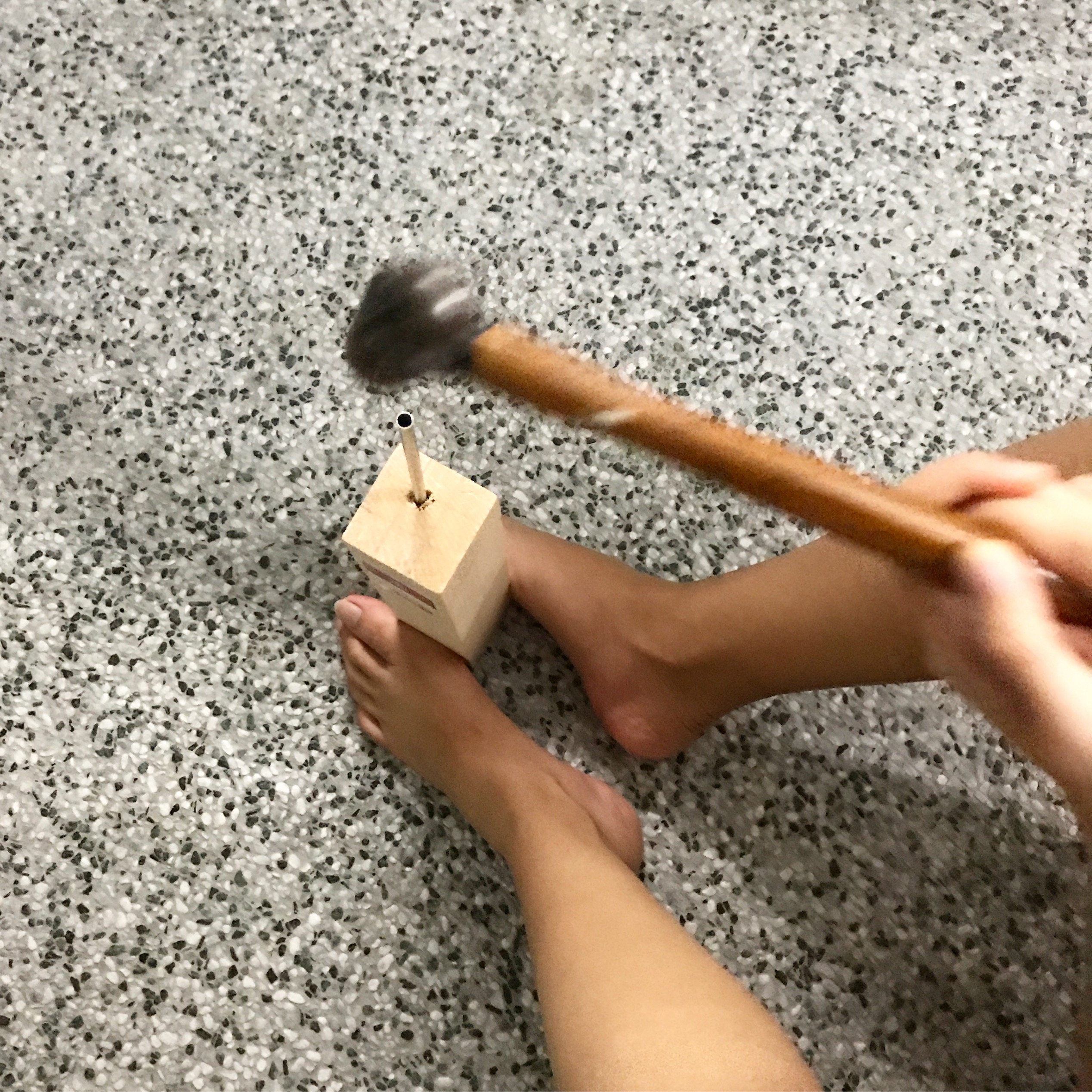
The process that made it hard to work with was wedging a small deep hole in D to insert my long thin but HARDY aluminium metal rod into it, and also into the SD which acts as my base. Hence desperate times calls for desperate measures – if you cannot create a deep hole, you hammer the rod into it to force it to make a deep hole.
Progress shots while making use of other materials and not soap.
And surprisingly, IT WORKS. IT STAYS BALANCING DESPITE THE COUNTER-BALANCE. FINALLY.
TAAA DAAA.
Continuation of this will be on my next post where I will go into detail on this final work. See ya there!
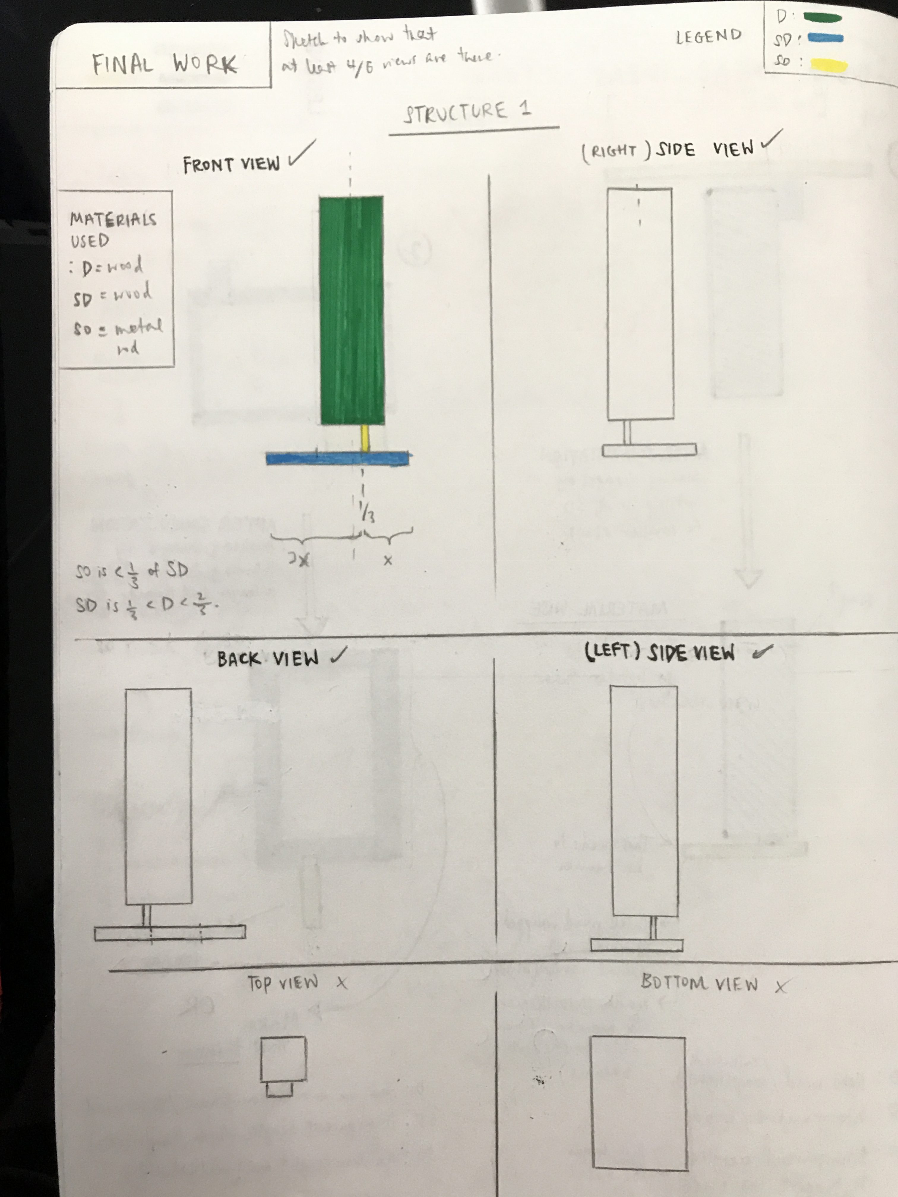
So in our 1st 3D lesson, we learnt about the “rule of thirds” and applied it while attaching our boxes.
HAHA i look like i had fun doing it but it was actually quite tough figuring out which sizes of boxes to stick together and taking note of their thickness just to ensure that in all sides the “D, SD, and SO” stays the same in the figure. Considering the void and line-of-symmetry too. WELP, at least I tried. I was given the word ‘Counter-balance’ and here’s my sketch of the boxes i attached together after the 1st lesson.
Yes I agree, it is abit sketchy and it isn’t well thought through. This is also because i was unsure what counter-balance really meant and how to really visualize it in boxes (even though i did try to research on internet to help me out abit, didn’t really work).
BUT after the 2nd lesson which was just this week, I learnt a few more critical things to take note of when putting these boxes together.
I learnt about the Gestalt Principle where the whole is > than it’s parts, we have to try not to align the boxes together, and that we should at least aim for 4/6 right views in portraying the D, SD, SO as mentioned before. (I also learnt about the 3 ways of joining boxes such as wedging butttt we’ll get further more into that later)
So here is the aftermath of going through it during lesson about my topic and recreating my figure of boxes.
STRUCTURE 1
STRUCTURE 2
2D SKETCH ANALYSIS OF BOTH
In Structure 1, the Bottom View is slightly bigger than the one you see in picture, but that’s because in real life when I physically hold it up, the SD box can be also seen to be smaller than the D box hence the difference in scale.
I learnt quite alot by the 2nd lesson and I’m still learning and I think that’s the best part, especially after making mistakes first time round because you learn more. I’m still trying to keep in mind about the 4/6 D, SD, SO views in every angle because that is quite hard to maintain when creating since we are used to focusing on one view haha and hence the importance in choosing our boxes. 🙂


 IT STAYS BALANCING DESPITE THE COUNTER-BALANCE. FINALLY.