Reflection: There was a lot of things learned in the making of the zine. Patience is definitely one of them, especially when trying to make repetitive kaleidoscope and making sure everything is detailed. I guess I should have vectorised the rest of my works and not leave out some because in the end they look pixelated (my 2nd spread) but that was one learning lesson and something I can avoid in the future, now that I know how to make a zine. I will definitely make more, both for fun and practice!
Here below is a video of what it looks like on the inside of my zine.
Before the consultation, I initially thought of doing abstract cubism, or simply just a mixture of colours and abstract since I was thinking of touching on every culture and the very vibrant colours found in Joo Chiat.
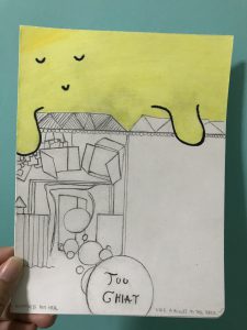
For the first draft, the one with the yellow cartoonised sky, I was inspired by Dallas Clayton – an American author and illustrator famous for his children’s works and cute little illustrations with impactful poems. But for this zine, I thought it could just be an initial idea.
Dallas Clayton’s works:
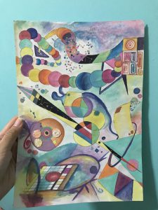
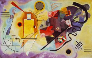
For the abstract piece that I did, I was inspired by Wassily Kandinsky – a Russian painter and art theorist, where his works are centred in abstract art. I love it because of his use of vibrant colours and different shapes and even weird lines that makes his works come to life.
Wassily Kandinsky’s works:
But after consultation, I realised it was easier to just focus on one thing but have a different set of ideas set on it. I agreed with Mimi that focusing on the Peranakan culture would be a much better decision as I had a lot of documentation on it. And focusing on it meant that I needed to work around something more than just my inspirational artists above, as it did not bring a touch to what Chinese Peranakan culture is like.
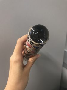
Since I wanted it to be colourful and also in a Peranakan style, I decided to make a Kaleidoscope art. So I tried the few below.
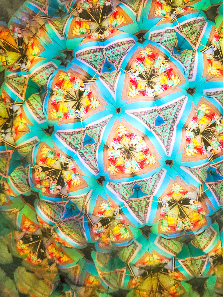
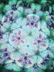
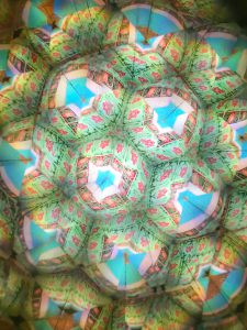
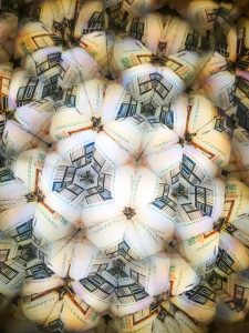
1st try: To use a legit kaleidoscope to see the Peranakan shophouses and capture the colours and details.
These are the outcome:
Pros: They are actually beautiful and the colours simply reflect the vibrant zine I had in mind BUT
Cons: They did not reflect off what a Peranakan style or culture looks like. So I had to do more to make sure I get those factors out.
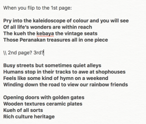
What I had in mind was to also write a poetry based on it. I wanted to tell a story that makes readers feel excited to see some sort of treasure if they look closely into my abstract work. (seen below)
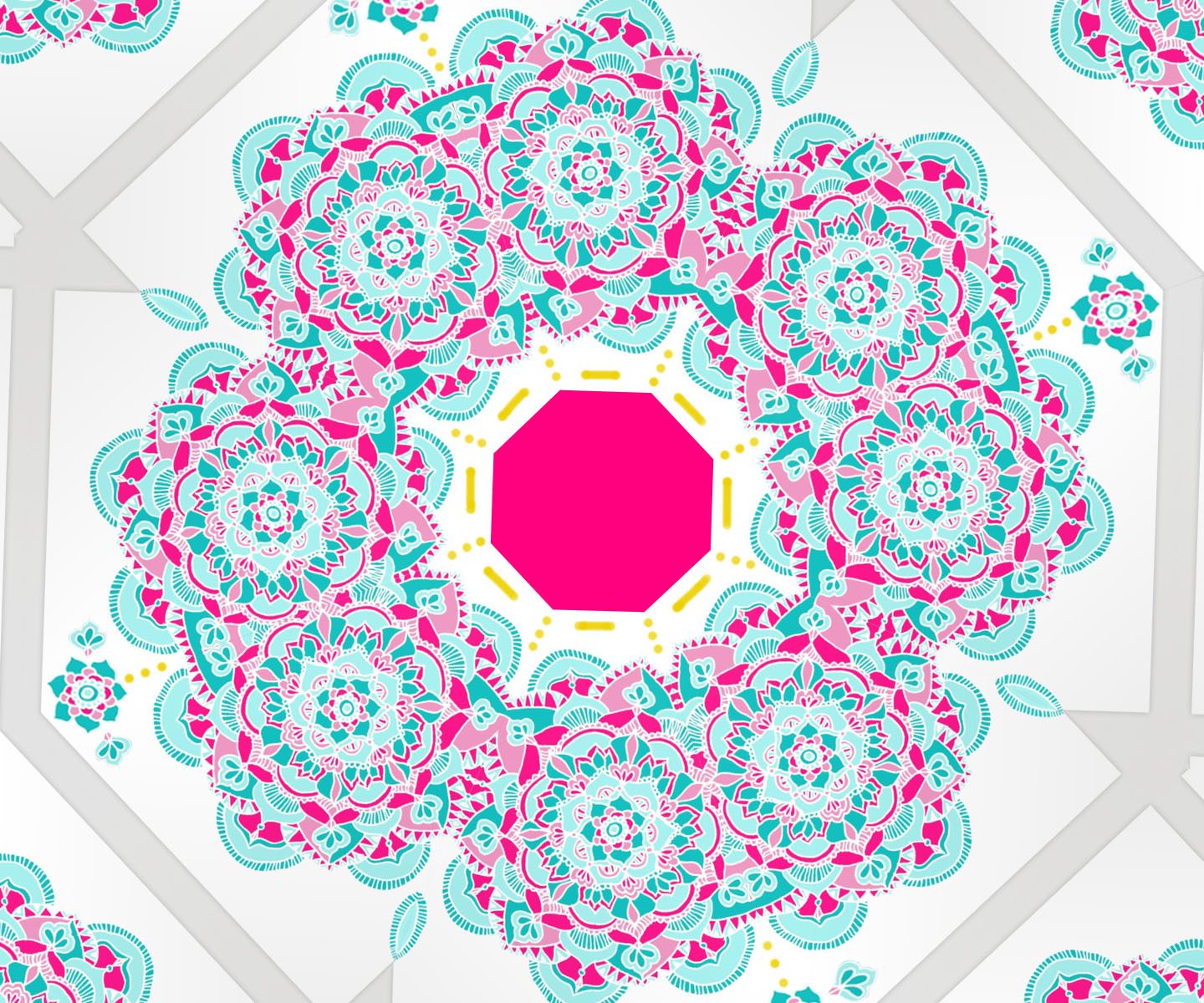
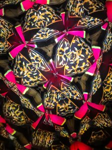
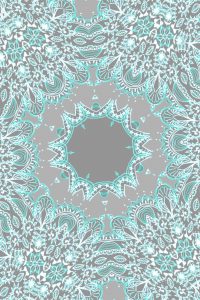
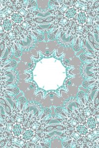
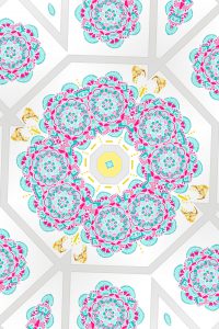
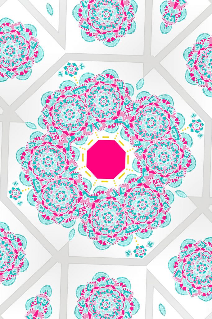
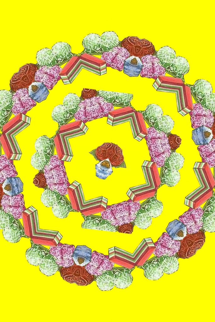
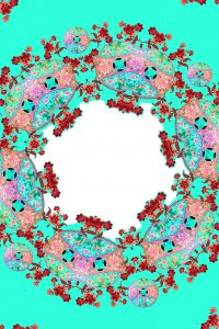
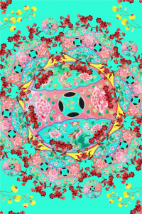
2nd try: To actually create my own mandala and see what comes of it as a Kaleidoscope. Why ‘mandala’? Because it is found on most of the Chinese Peranakan kebaya clothes and patterns on tiles.
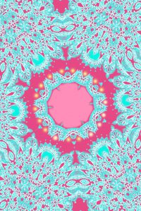
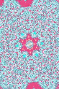
For these two, it looked plain and dull so I decided to change it up a bit with different colours: hot pink and turquoise.
Like these ones:
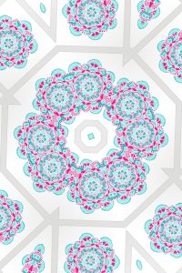
I consulted Mimi again to ask for feedback because at this point I had a few processes but not knowing which to pick and what felt right or wrong. And after that, we both agreed that it would be better to stick to one form and I chose the illustrated kind to be included in my zine, instead of the 1st try of real Kaleidoscope photography.
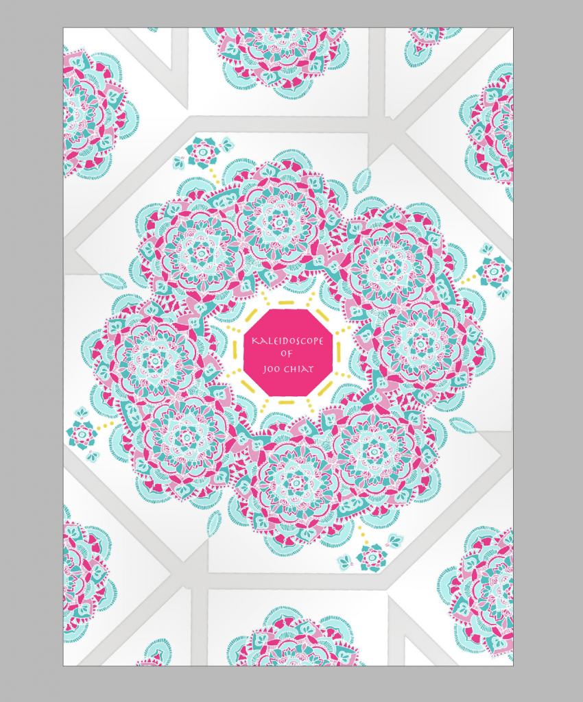
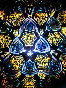
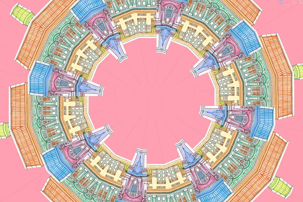
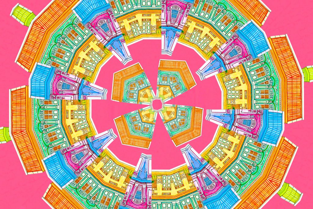
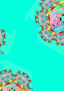
So 3rd try:
From this
and this
to this (for my front and back cover)
I consulted Mimi again because I wanted to ensure that this style that I want to go for, is actually good to follow throughout. Thankfully she agreed that it is, it’s just the adding of patterns on the outer parts that I had to play with and edit as I did not want it to be plain like the one from the start of the 3rd try.
Likewise, for the rest, I work a couple of times to find the balance and get it right.
For 2nd spread:
For 3rd spread:
For 4th spread:
All will come together for final and thankfully, I see the balance in my work.
Joo Chiat was formerly known as the Confederate Estate Road. It was filled with coconut and cotton plantations back then. A wealthy Chinese businessman and philanthropist of the name “Chew Joo Chiat” acquired considerable amounts of the land, including the plantations and also freehold lands for building developments. At that point of time aside from the attap kampongs and luxurious bungalow houses, there was an influx of Peranakans and Eurasians as well. Hence why there are a lot of churches in the area and Peranakan shophouses. But also till today, we can still see the kampong design being spared as seen in Geylang Serai’s Kampong Market. We see a lot of different cultures in one place, that is, Joo Chiat.
The recce in Joo Chiat got me overwhelmed as there were heaps of things I discovered but I was excited because that means a lot of ideas could possibly come out of it. This post will give more insight.
I went to Joo Chiat twice for this project. On the first day, I went with a friend a few days after Chinese New Year was over and it was quite empty. The shops were closed and I didn’t think it would still be closed having known that it was 2 weeks past Chinese New Year. So we could not go into any interesting Peranakan places or heritage sites. But we still managed to come across interesting architecture and colours such as the famous Peranakan shophouse of Koon Seng Road.
I stayed at that area for a while to take a closer look and aside from the vibrant colours, they had intricate gate design and also window and wall patterns.
Aside from that, we were in the bus when we came across another row of different kind of houses such as the one below. It only has 1 door and it looks like it overlaps over one another. So cool! I wonder how the interior looks like.
We got lost after and found ourselves in the deeper end of the streets. However, we still found a few little treasures such as this pottery place we passed by, as seen below. They sell their vases and pots too.
We came across numerous Catholic and Christian churches or places selling things relating to them too.
And the famous ‘Katong Church’, the Church of The Holy Family. The church has rich history, being first consecrated in 1932. Thus it served as an important place of worship for the Roman Catholic Eurasian community that used to live in Katong.
We found temples too.
Then we came across this (figure below) when we were on the bus. I was intrigued by it because I couldn’t exactly see the temple. We saw what looked like an iconography of a deity. So I went to do my research on it and it is actually the Kuan Im Tng temple.The main deity in the temple is Avalokiteshvara or the Goddess of Mercy. Before the temple was built, it had coconut plantation surrounding it. But in 1919, that same land was donated by a devotee and has since been upgraded to a bigger building to accommodate masses.
(the picture is blurry as i was in a moving bus when i took it)
That was it for the 1st day of JOO CHIAT RECCE. Now onto the 2nd day, where we found more interesting things about Peranakan culture and other culture as well.
First stop was the world-renowned and famous 328 Katong Laksa. It is, of course, known for it’s Laksa and it is actually a Peranakan dish that stars rice noodles submerged in a spicy coconut broth. Fun fact: Gordon Ramsay came to Singapore before and tried replicating and creating his own laksa dish but was defeated by 328 Katong Laksa.
Down the road nearby this food outlet, we found another landmark of Joo Chiat which is the Sri Senpaga Vinayagar temple. It has been there for more than 150 years (wow) and hence had a very ancient but lively look on it which makes it different and interesting, following closely to the art style in the Ceylon Period in depicting the Hindu deities. The temple began in an attap shed under a champak (known as “senpaga” in Tamil) tree in 1875. The main deity being worshipped here is Lord Vinayagar. Hence, the name for the temple. Rebuilt between 2000 and 2003, it has the entrance tower as shown below with at least 159 sculptures of the temple’s main deities.
In Joo Chiat road, there are Peranakan shophouses that were open for customers to take a look. We were lucky enough and was awed by all of them such as the Rumah Bebe and Kim Choo (located directly beside it).
Rumah Bebe below.
Inside Rumah Kim Choo.
The owner was really nice and allowed us to head upstairs for free to view more and understand the Peranakan culture. There was even a guest-list!
They had a detailed history of the Peranakan Chinese culture, and everything in the shophouse was just full of ancient Peranakan treasures. I was intrigued by it all.
Below this, they have a store filled with their pastries also known as “kueh”. Kim Choo is known for their Nonya rice dumplings or also known as Bak Chang and also for their kueh.
Upon all these variations of culture found, I realised most of it was on Chinese Peranakan culture and the things that come with it. The colours, the vibrant atmosphere, it intrigued me the most. Hence, it led me to think maybe it could be something I’m mainly focusing on. We’ll see.
Groupmates: Jing Yi, Felicia, Yuol Mae, Me (Qistina)
For our final, we had numerous ideas but could not come up with a concrete good one. Either way, it is important to show the research and ideas we had throughout, that leads us to our main idea. That way you can see our progress! The link below is the document to our initial ideas (not the main one):
From there, you can see the brainstorming that eventually led us to come up with a proper game idea: A Lost Dementia Person in IKEA. The link below will lead you to the important processes noted down in the making of our interactive game – how we included DIWO and the Third Space as well.
REFLECTION: After going through everything in the above, there were definitely some setbacks and challenges in the process of the game. When we tried doing the trial run first, we realised that we are confused with the posts Yuolmae (the Lost Dementia Person in this game) posted on the functions of Instagram (Instagram Story and Posts). This was a huge problem because as players on that trial run day, we did not understand how to even play it. The goal wasn’t met and we were stuck. We then realised that it was because we did not have proper instructions, restrictions and purpose in our game.
Another challenge was on the real game day. This was because somehow Yuolmae wasn’t at a hiding spot and roamed around close to where she gave her clues at, which made it easier for the players to find her when it was not even past half an hour. So maybe we should have made it more challenging. But overall, I really loved this Final Project and what we have come up with for it. It’s a new experience, a good one with cooperative teammates, and I definitely learn something too along the way. Think big, and really put yourself in the game like as if you are the player. Or even the missing person.
And last but not least, here is the link to our short video of the game. Enjoy.
My focus for this project of bag making (prototype) is on two things:
cushiony and water-resistant
SKETCHES:
(inserts picture of sketches)
PROCESS OF BAG CREATION:
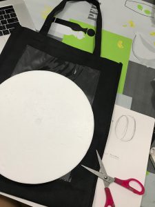
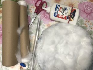
Materials used: black biodegradable bag, round hard styrofoam, hardcover plastic, cotton wool and thin sponges made to slot into bags.
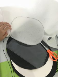
For my cushion bag, I wanted it to be in a circular shape. So I place it on top of the black bag and cut it according to the shape. The back and front cover of my bag will be made out of the black bag cover.
Using double-sided tape to attach the cushion sides. This black fabric portion will serve as the front and back sides of the bag.
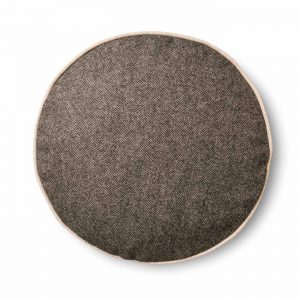
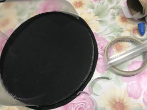
I was inspired by the cushion idea below and I wanted my front bag to look as close as that.
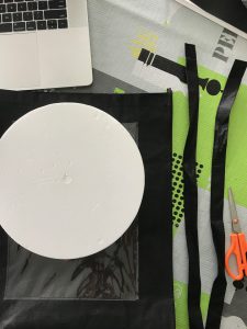
So I cut out the thin sponges in circular sizes, about 4 of them – 2 to be attached to front cover. 2 to be attached to the back.
Because I want my bag to feel cushiony and comfortable for users to use, I need those thin cushions to be stuffed in. I also cut out 2 cardboards of the same size and shape to ensure the front and back of my bag has a backbone.
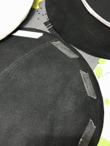
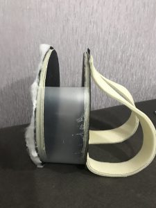
I wanted my prototype to be durable AND sturdy, hence I thought of making use of the hardcover plastic so it wouldn’t be too flimsy. By attaching it to the sides of the circular front and back using super-glue, it ensures the sturdiness, at least at the side of the bag. (as seen below)
I also used cotton wool as I wanted to show that I want my bag to be as comfy as a cushion so I pasted the wool at the front side of my bag.
As for the straps, I decided to follow closely to my normal bag’s straps measurement. I then cut the measurement of length 44cm to 5cm breadth out from the sponges.
I glued everything together using super-glue as it was hard to stick real materials together.
In the end, it did not look aesthetically pleasing but that was not the point. I made it in such a way that people (and even me) can see that the material was what I was focusing on the entire time.
And reflection: Making a bag that is actually functional like the way I want it to be and has its aesthetics, is not easy. You gotta work your way around it for quite a while to figure how you want to do it right.
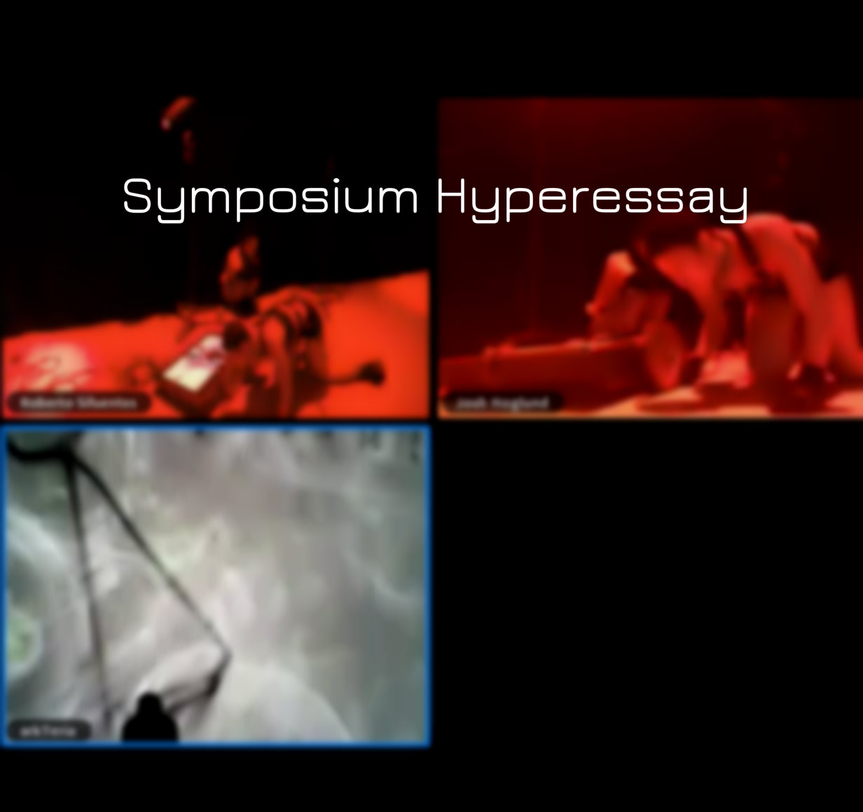
On the 29th to 31st March, the Symposium was held using the third space network to have a more inclusive and global gathering, with collaborative network performance performed live. Here below is the link to my Hyperessay.
Reflection: After watching and sitting through the Symposium, I realise how the third space really brings about a new form of meaning and intimacy. This is highlighted in my essay above. And I start to appreciate the network, even more, seeing that it could bring about evolvement in art. This experience was different and definitely gave me a lot to think about.
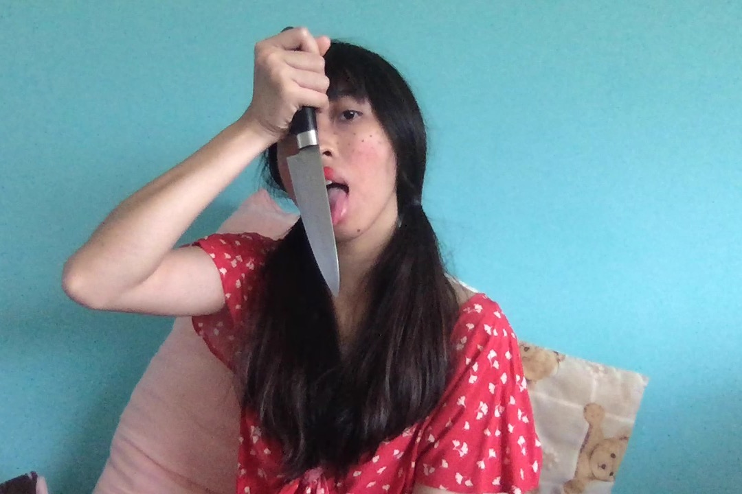
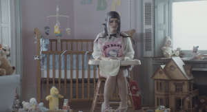
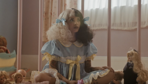
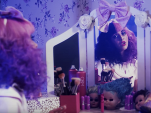
When we were asked to do this project, to mimic our favourite artist’s (singers, painters, actors etc) persona, I knew for sure who I wanted to be.
Melanie Martinez.
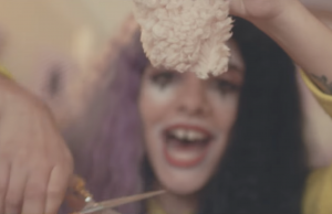
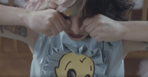
She is an American singer who became famous because of her appearance on The Voice. She has this crazy, sad, childish persona and even dressed as one in all her music videos such as Pity Party, Dollhouse, Cry Baby, Pacify Her and more.
Bits and pieces of her persona in the music video are shown in her actions such as playing with dolls, cracking their head, playing with soft toys and cutting them when she’s upset, being upset at random timing, screaming, laughing and crying. I’m in love with her music videos because her acting and emotions makes her persona so real in them. And because of that persona she portrays, she manages to bring out the meaning behind her music videos very well.
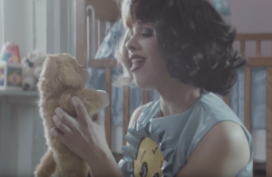
So what I did to mimic her was to dress up close to her: bright-coloured dress, piggy-tailed hairstyle that’s usually associated with some kiddy style, red lips make-up because she always has dark coloured or bright coloured full on lipstick on her lips. I decided to do fake freckles on my face too using eyeliner.
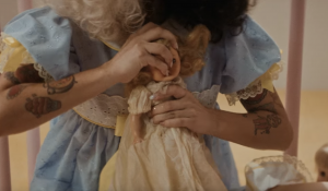
Then i did the setting in my room, on the bed with some of me and my sister’s soft toys and a knife to show how crazy I am to play with something so dangerous that can cut, along with the soft toys and myself (who can bleed).