Before diving into the processes of my final, there were a few ideas I had in mind. It didn’t work out because of the little time we had to do this final project, and it was difficult to do what I wanted to initially in a short span of time. I stick to basing my archetypes on The Hunger Games: Catching Fire though.
MY INITIAL IDEAS
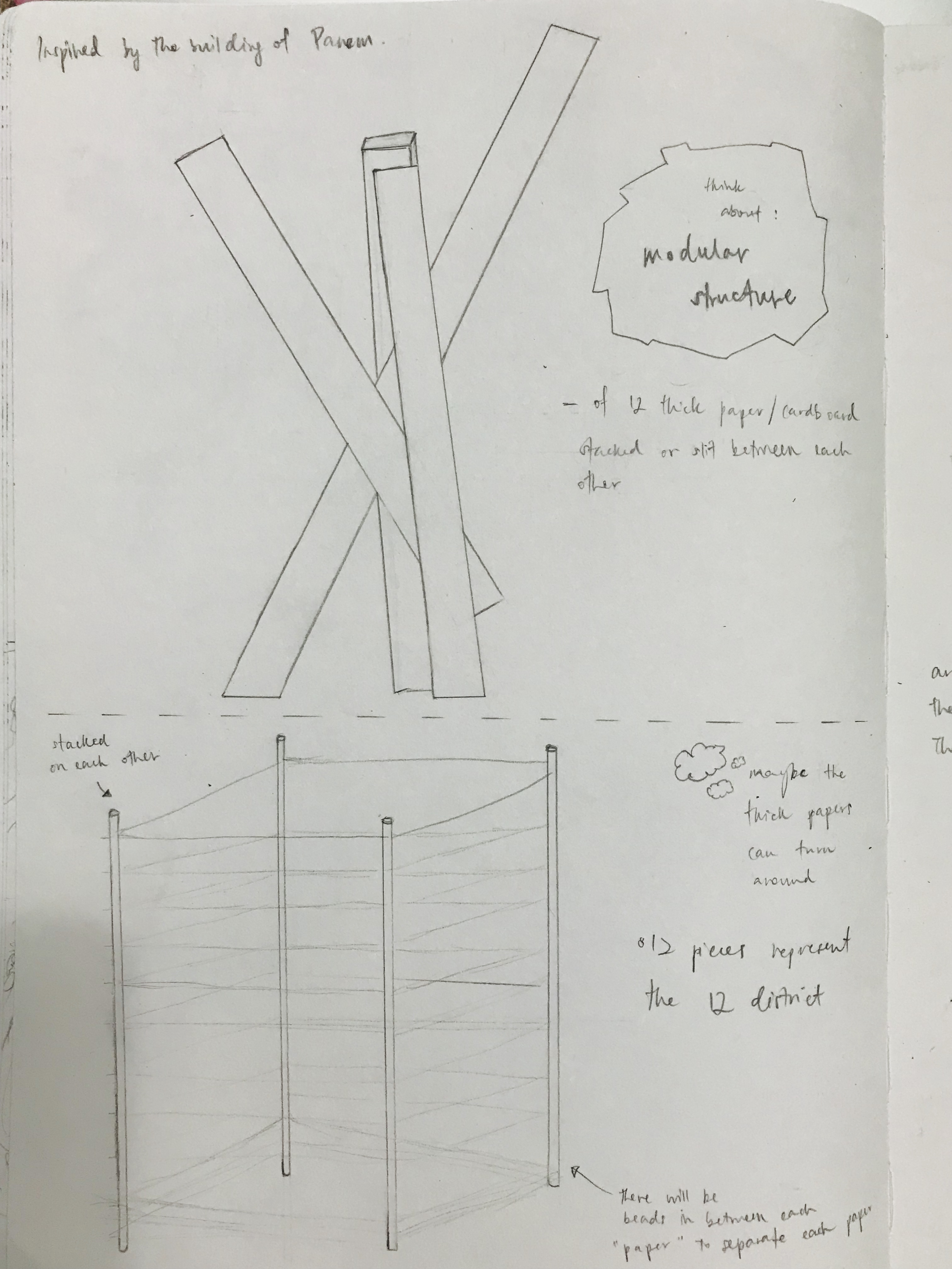
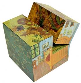
I thought of doing it like a 3d modular structure (an organic-looking building):
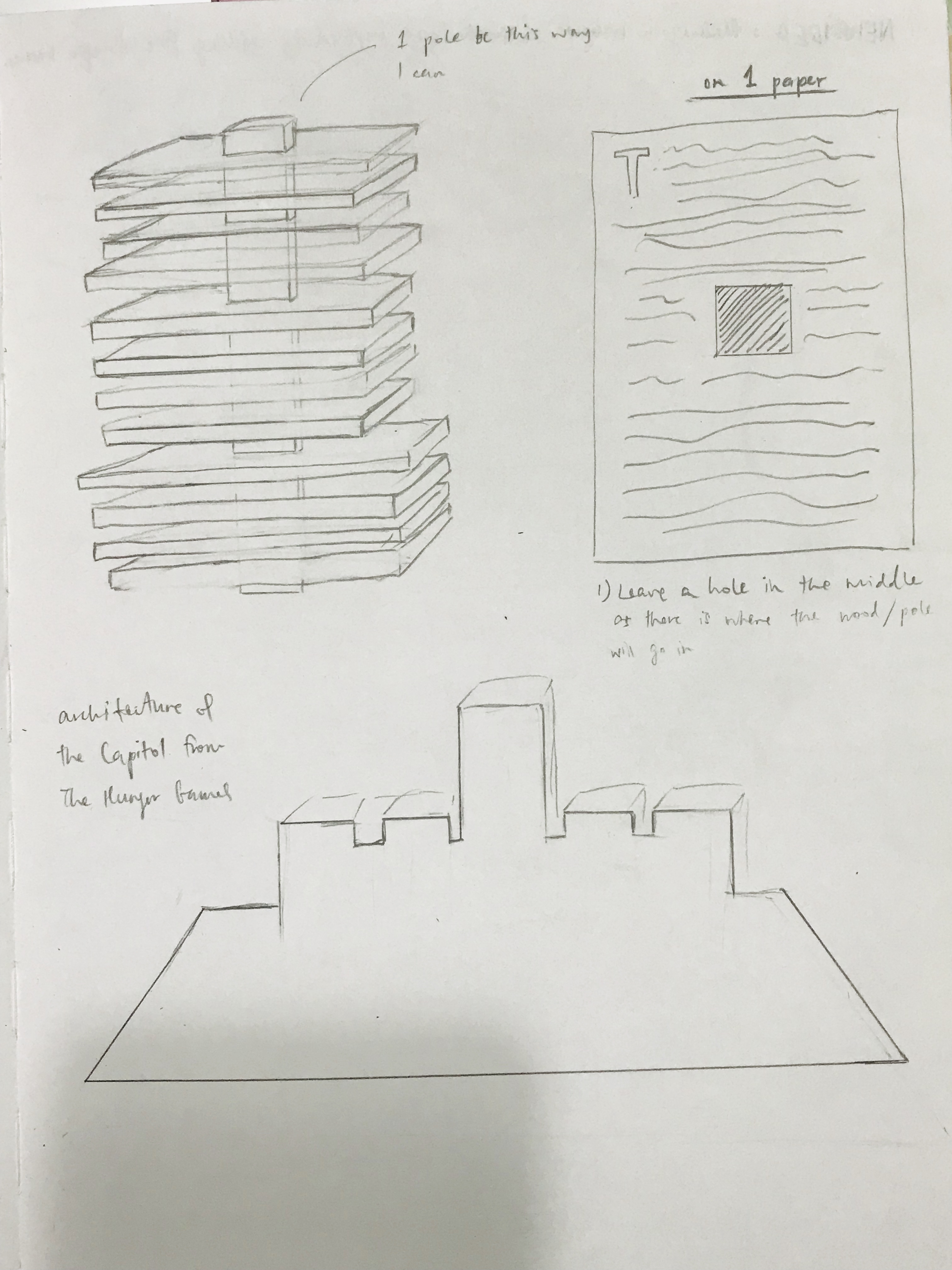
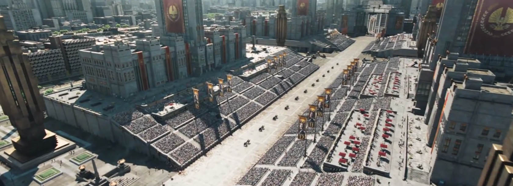
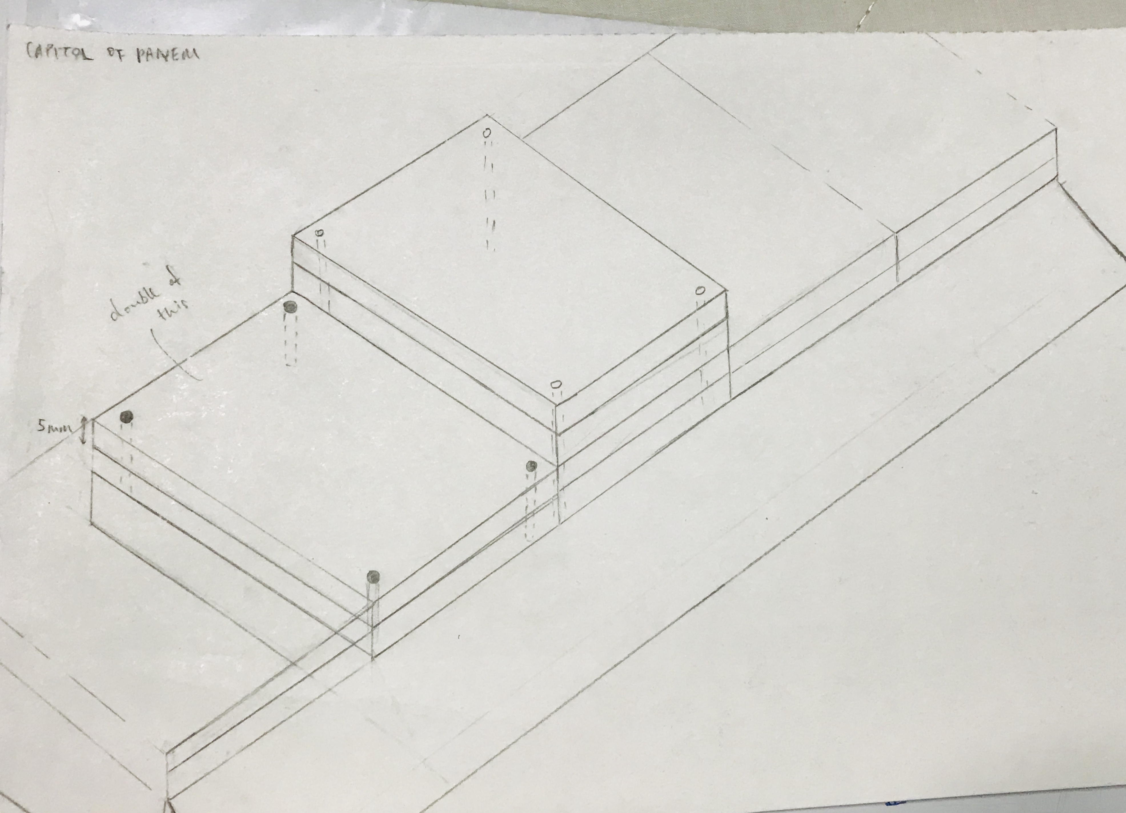
I thought of doing it like the Capitol building using thick poster blocks:
I also thought of doing something like cubes (the ones that could turn some part of itself):
There were simply too many ideas I had that I wish I could do with more time given, but I knew I had to figure something new out soon – a simple but different work that ticks the boxes of the objectives of the Archetype project.
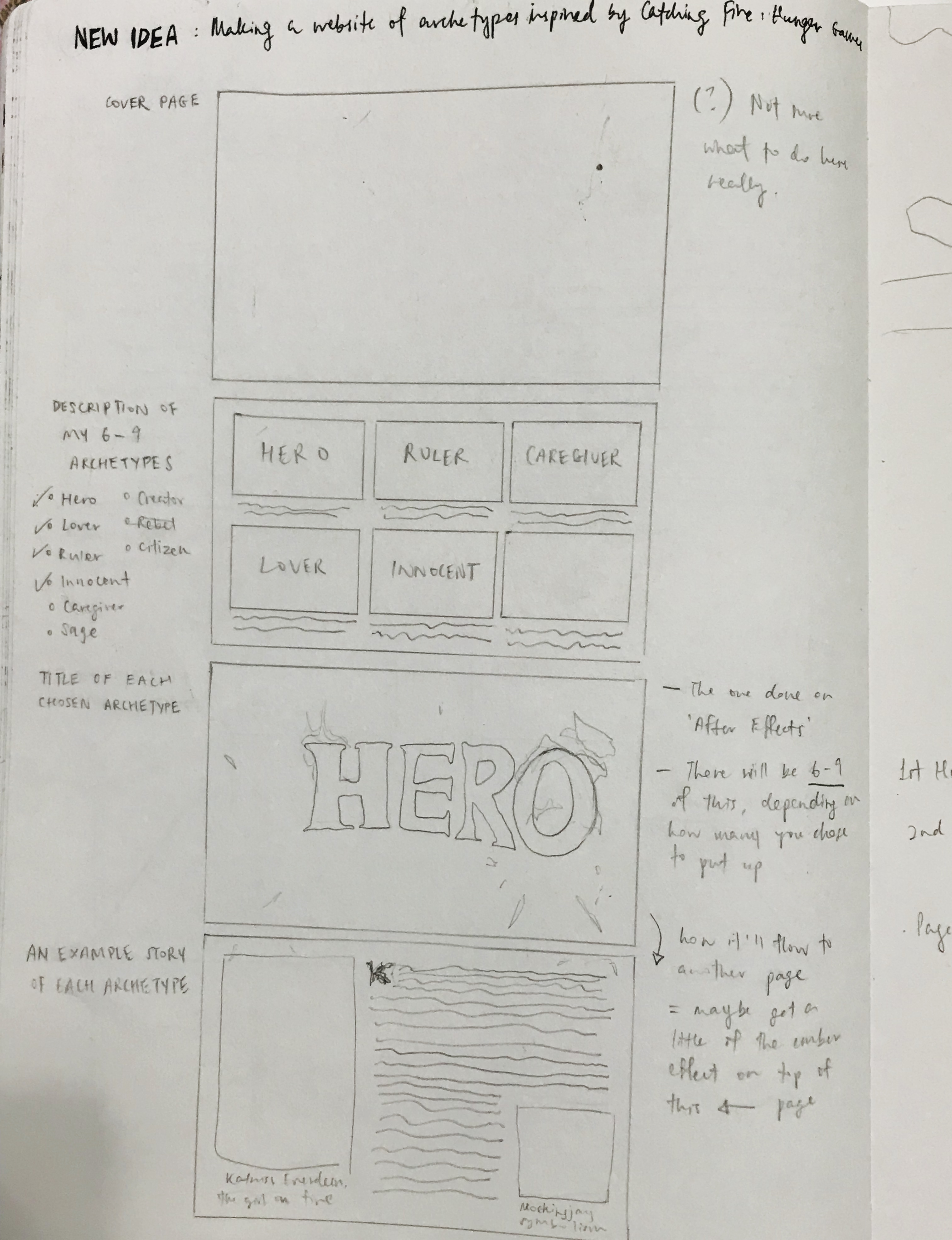
Hence coming up with the website idea, but having my typography done through mostly After Effects and Illustrator. The layout of my paragraphs is simply through repeated double column sizes and heights, and space. And of course, the font and type size for them is standardised as well. I put this whole idea onto paper to roughly sketch out how I want my website to look like. (seen below)
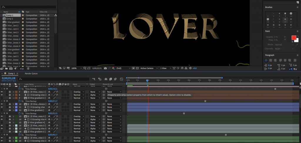
MOVING ONTO….. THE CREATION OF MY TYPO FOR ARCHETYPES
The 6 archetypes I planned on doing:
Lover (Peeta Mellark)
Hero (Katniss Everdeen)
Ruler (President Snow)
Caregiver (Mrs Everdeen)
Innocent (Primrose Everdeen)
Creator (Cinna)
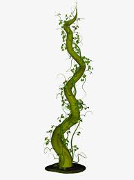
L O V E R
Now I see Peeta Mellark as Lover because of his soft nature, his loving nature for people for Katniss especially, and for nature itself (He can camouflage himself in nature because he’s good in the art as well). Hence I decided to create vines surrounding him.
It’s my first time using after effects so I was worried I couldn’t get it almost good enough. I tried anyway.
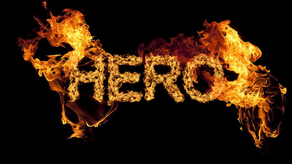
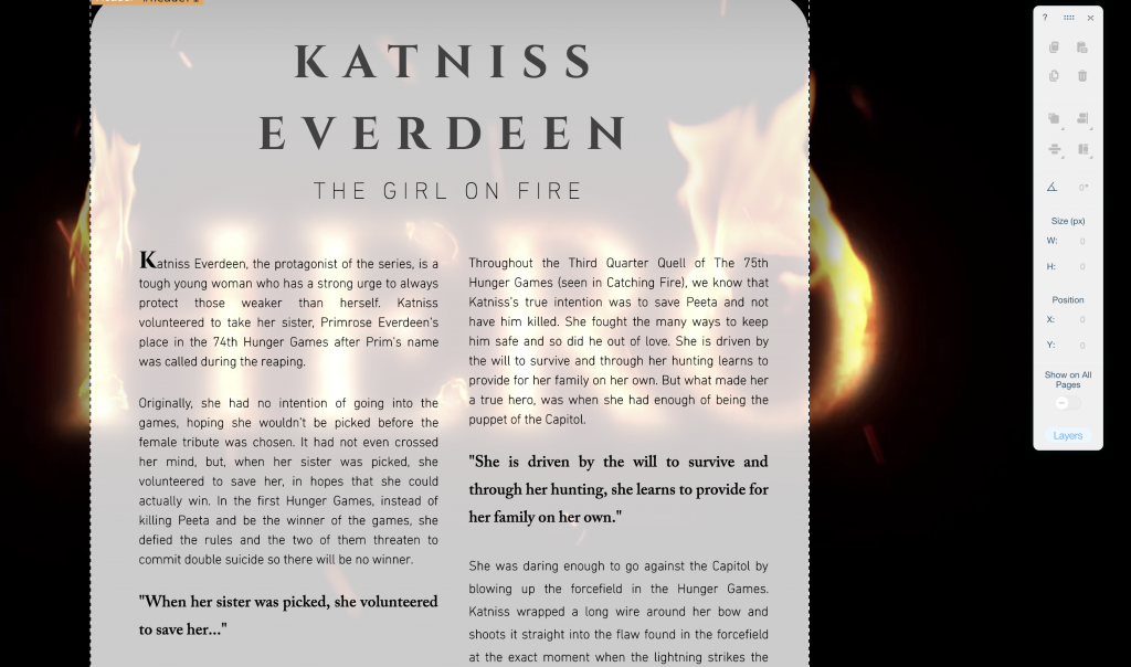
H E R O
We all know the ‘girl on fire’ is the hero – Katniss Everdeen. A rebel and all but for the good cause of everyone. Because she’s the famous ‘girl on fire’, I literally made the letterings of H E R O on fire (looks more badass that way too).
This one below is a photoshop version of what I did, what I had in mine. The flames will be moving once I create this on After Effects.
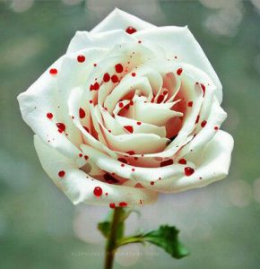
R U L E R
This is the ruthless, high-class looking President Snow. Hence white to represent what we think he is – sophisticated, high-status with a white rose tucked in the pocket of his suits. But he’s the poison that kills people, the blood that’s indirectly on his hands. Hence the bloody red colour gradient in the letters (seen below) that I simply did on illustrator first.
C A R E G I V E R
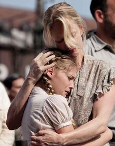
Mrs Everdeen – considered one of the weakest and emotional character but strongest in what she does – healing. She’s a healer for a lot of people, a mother of two, a caregiver really. I used the ripple effect for this one.
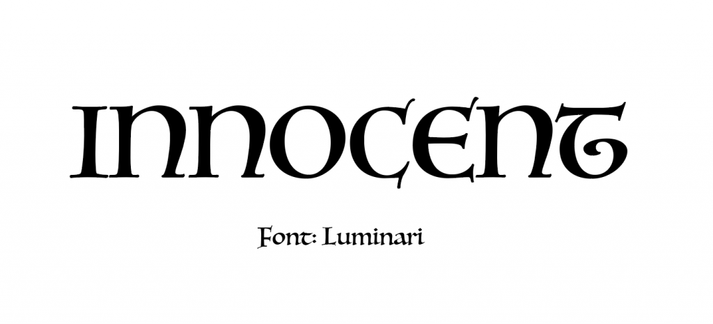
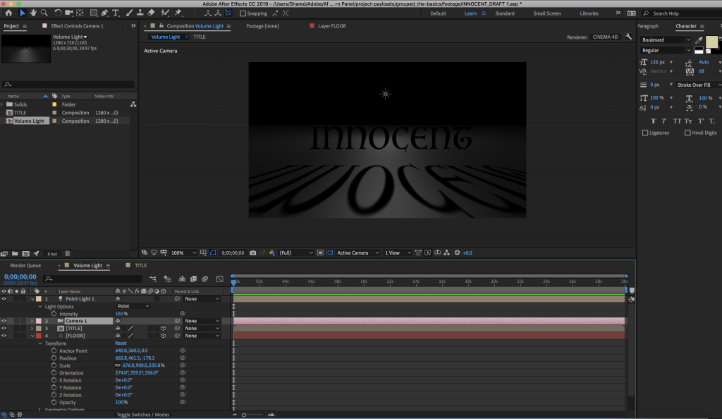
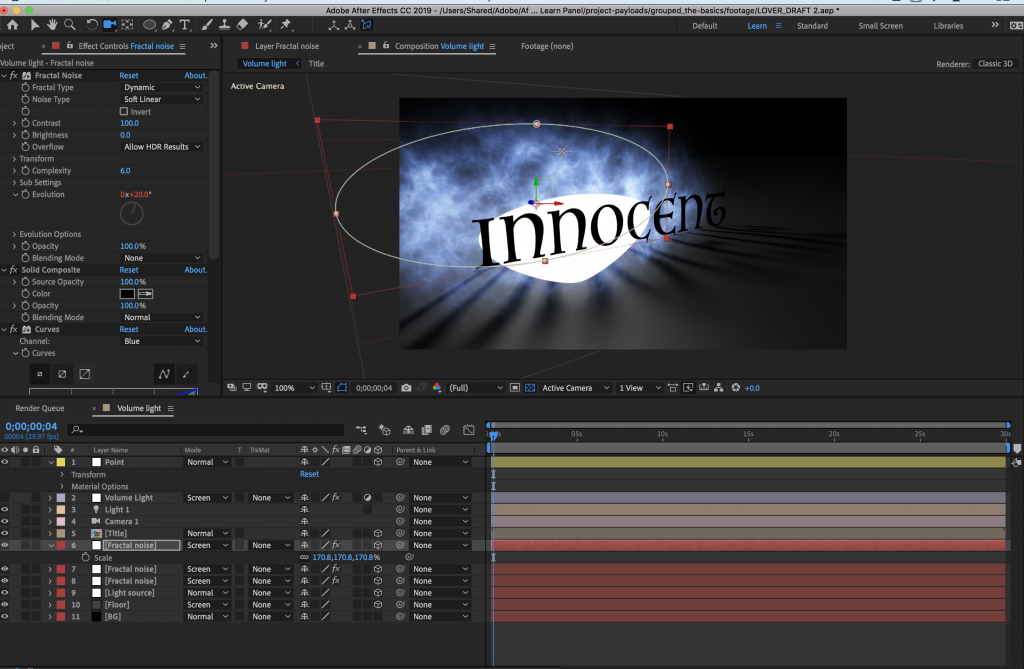
I N N O C E N T
Little Prim, lovely one that got called out for Hunger Games but instead her sister volunteered for her. Little Prim that cries over animals being killed, sweet one she is. But brave as well to help do anything to make sure Katniss is safe, and the people she helps to heal as well.
Here are some fonts I thought would look good for her archetype:
In the end, I stuck with this:
Ok so sadly I DIDN’T SAVE THIS ONE PROCESS ON AFTER EFFECTS, why why why. But here’s the final one for innocent:
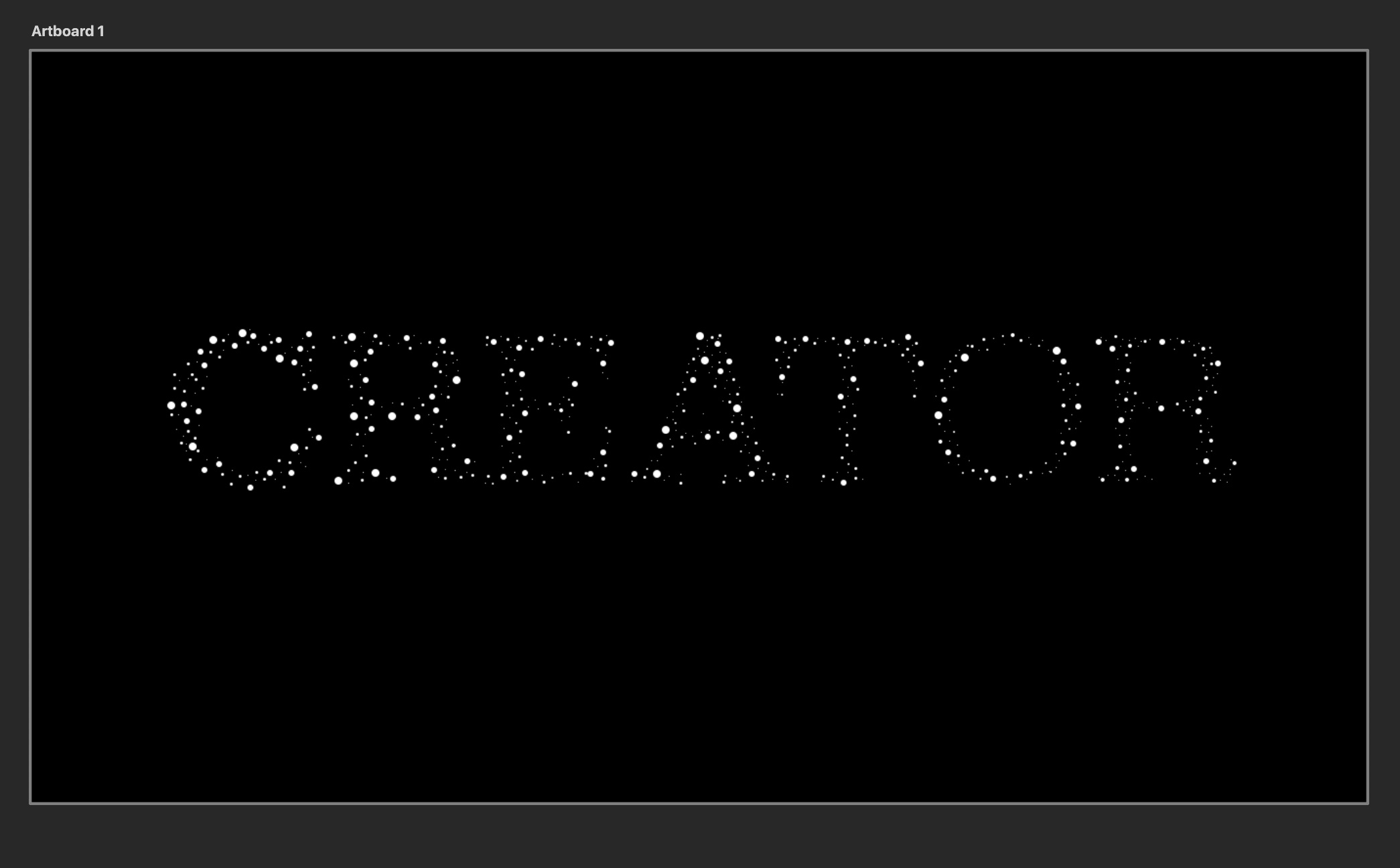
C R E A T O R
And I chose this as Cinna – a very important character I feel…where what he creates with Katniss’s outfits really emphasizes the kind of person she is. A strong brave girl ready to fight.
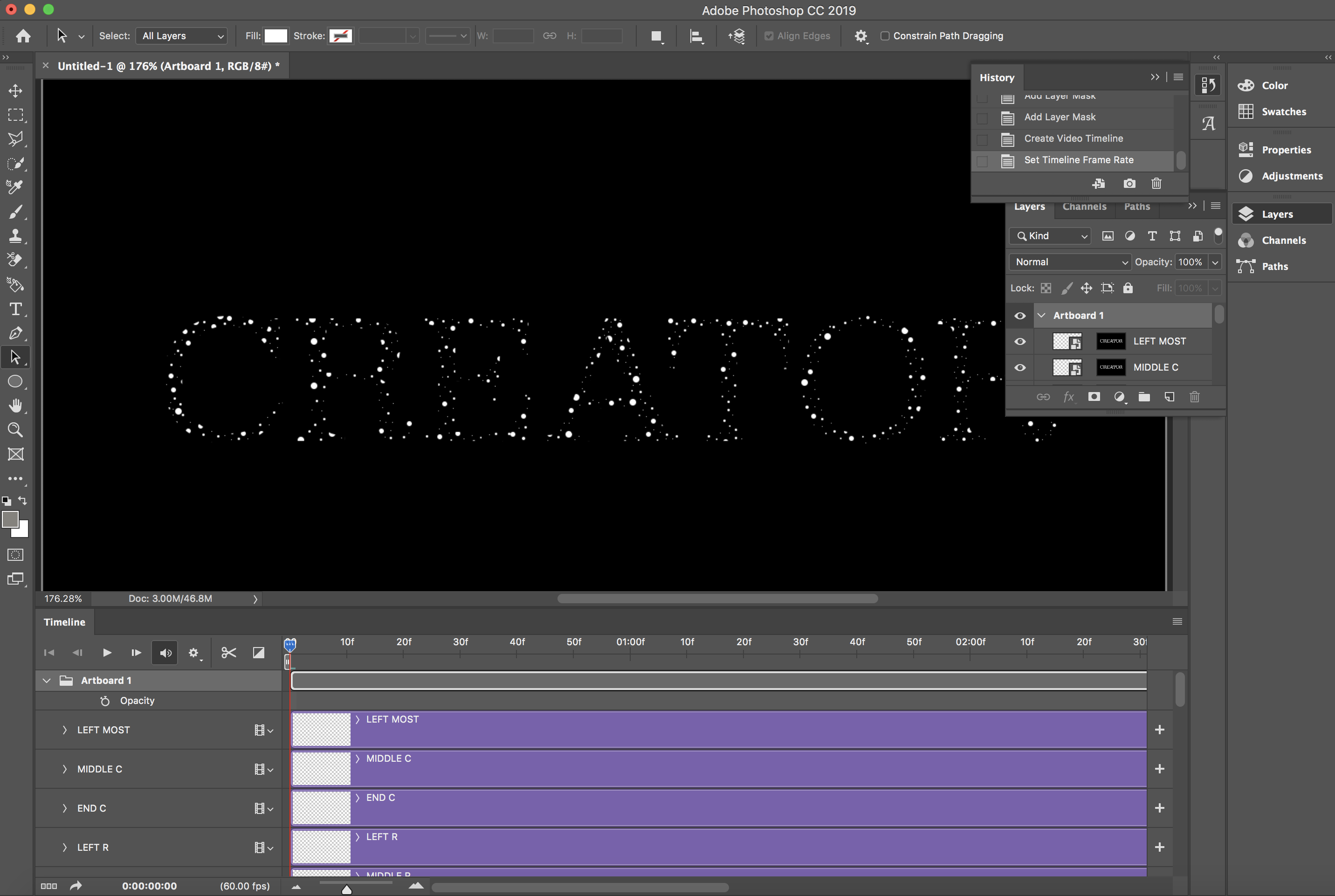
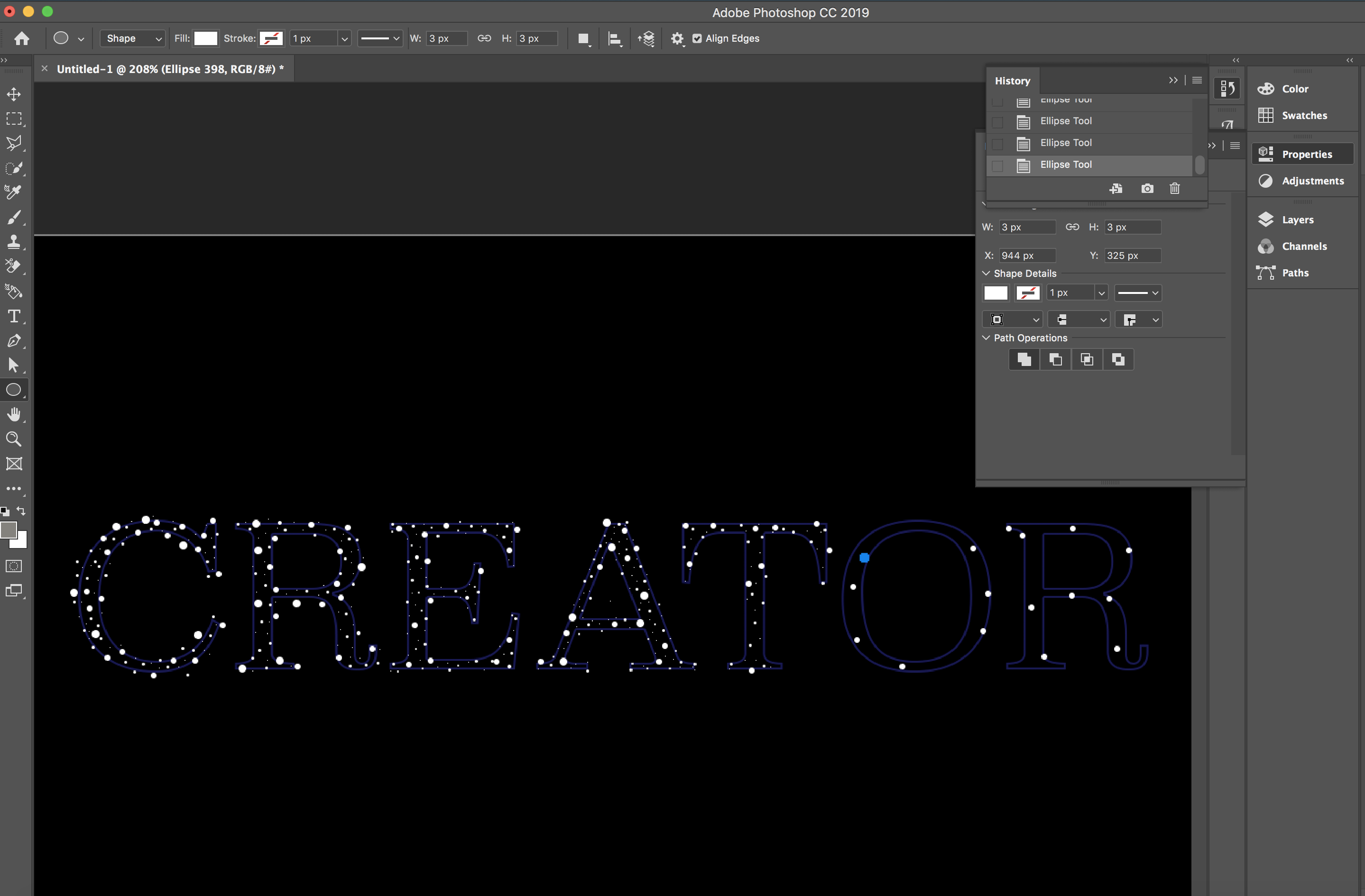
Here below I manually did the white glow on Photoshop by simply making dots over the letters each.
And then to make each different sides of each letter to glow in different colours, I manually did it on Photoshop’s video timeline.
I further added on a touch of dark bluish glow, slowly increasing in brightness to make it look more magical – like what Cinna does with Katniss’s wedding dress that turned out to be a majestic looking Mockingjay dress. That’s magical.
And as for the layout, I chose a double column grid and it’s all standardized throughout every page for every archetype. This was all done in WIX.
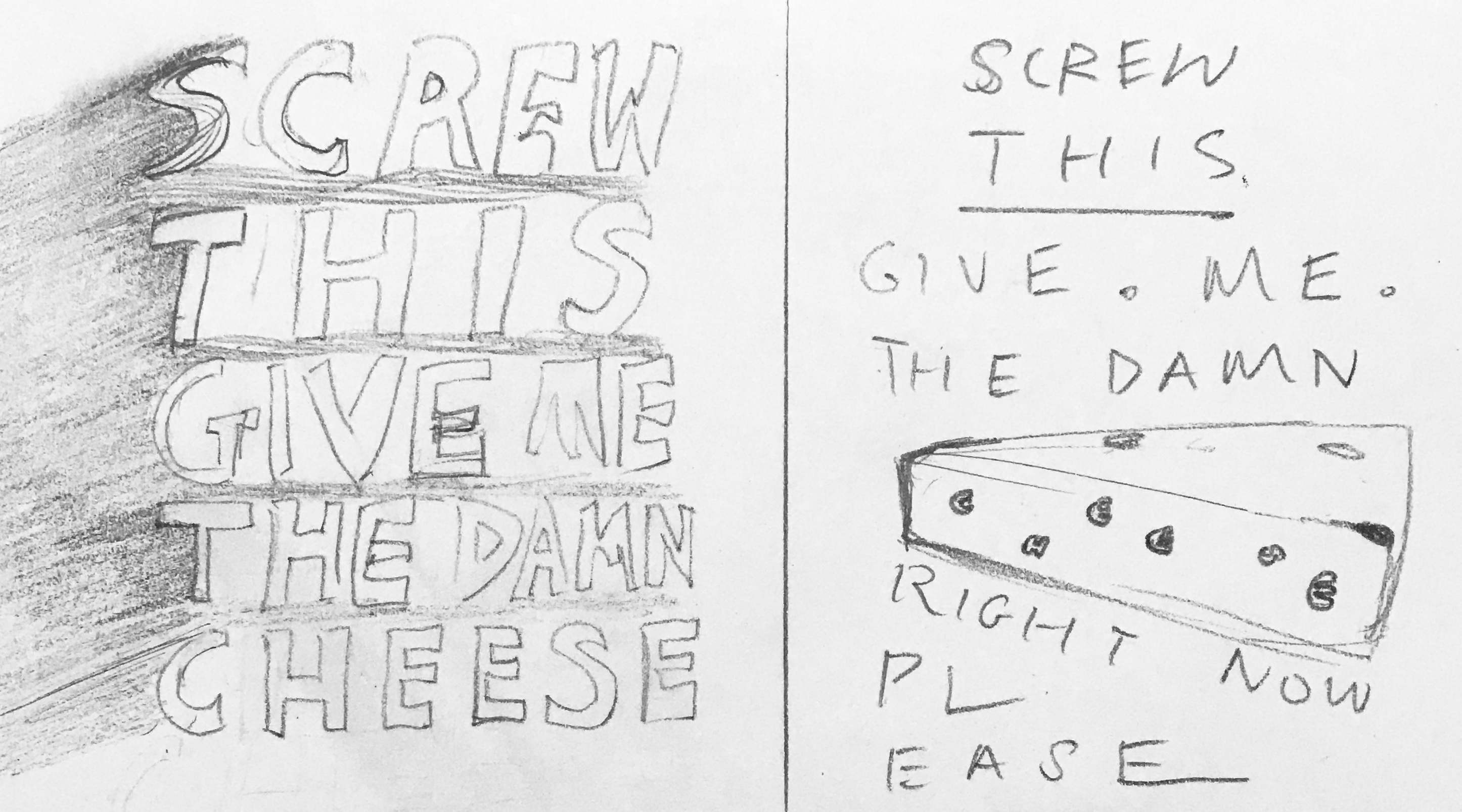
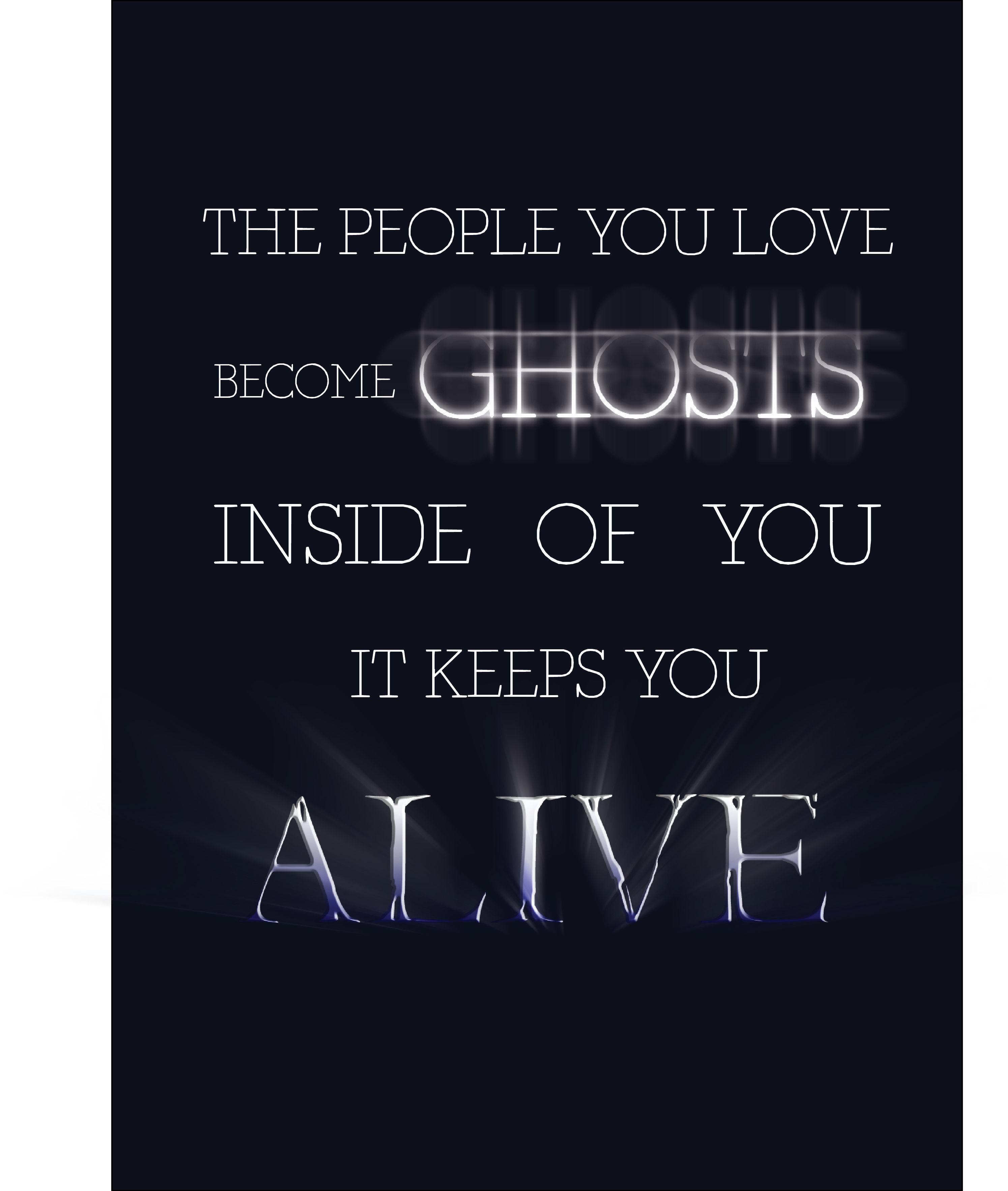
Here are the sentences I’ve chosen from convos I’ve eavesdropped:
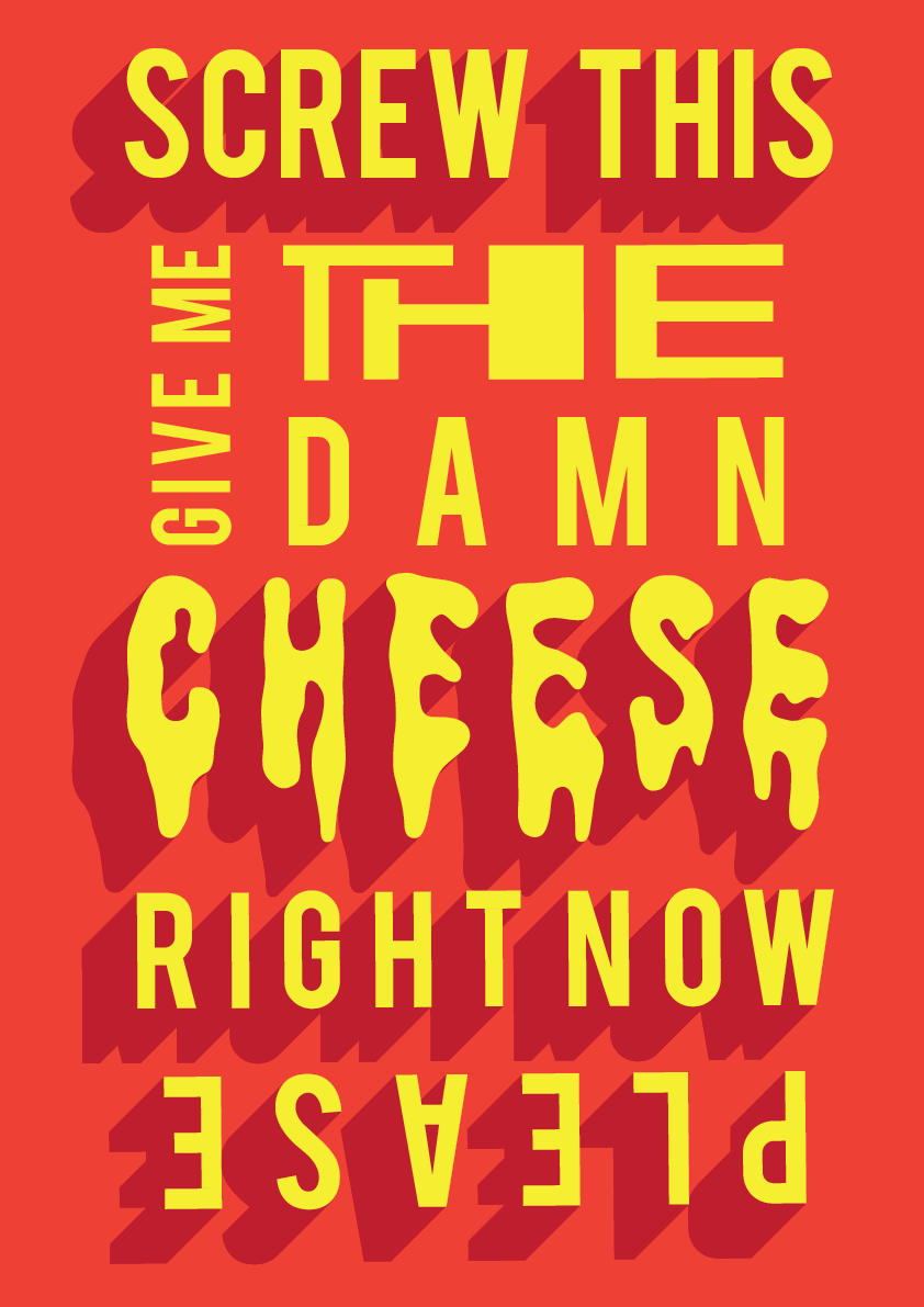
Screw this I really want some cheese right now please (10 words)
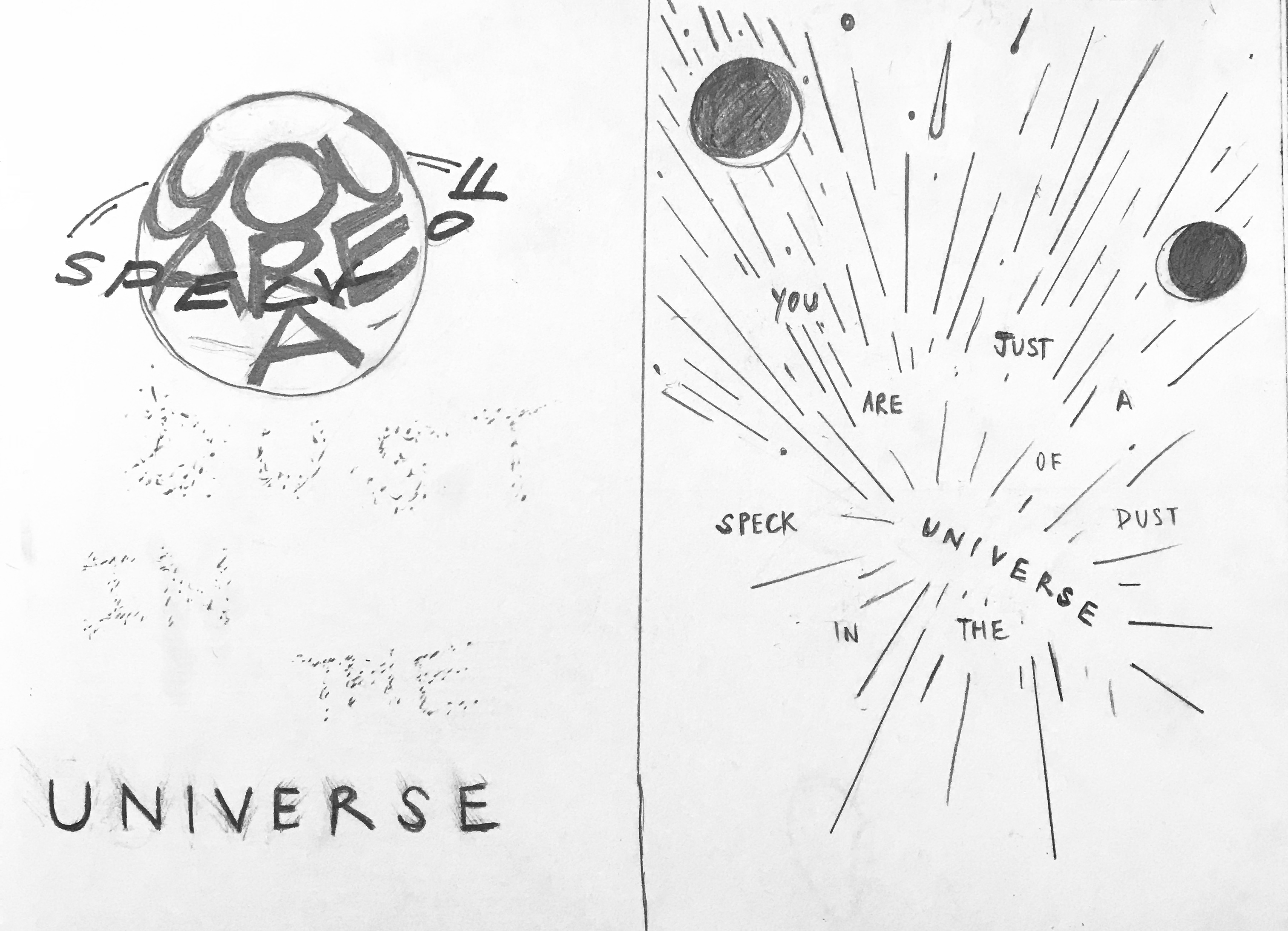
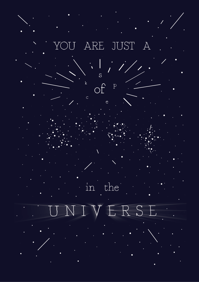
You are just a speck of dust in the universe (10 words)
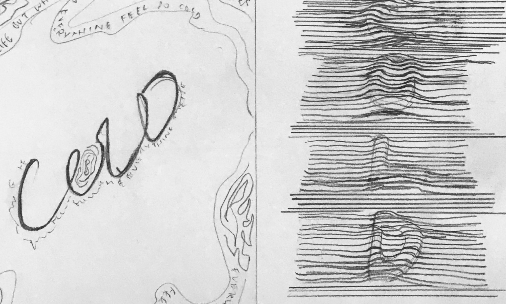
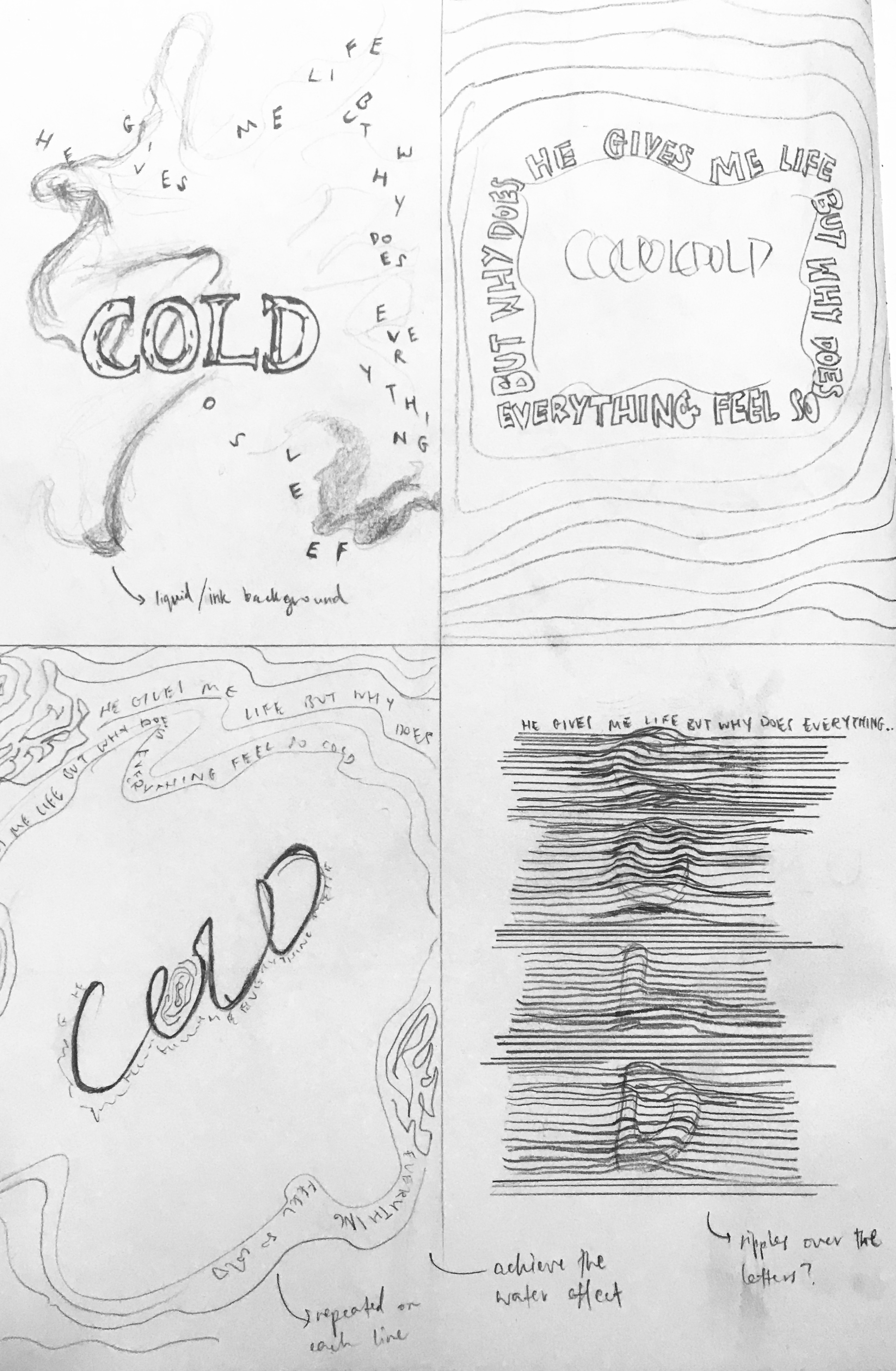
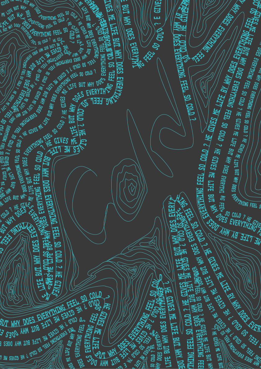
He gives me life but why does everything feel so cold? (10 words)
Behind these sentences:
For 1
“Screw this I really want some cheese right now please”
You know how when you hear people’s conversations, you’d expect it to be so scandalicious BUT NAHHH. I thought it was funny that this lady beside me was super hungry and it’s true that a hungry woman is an angry woman, because hell, she looked super cranky alright. JUST BECAUSE HER FRIEND TOLD HER CHEESE IS BAD FOR HER DIET. It’s hilarious I had to look at my phone and laugh silently so that they’d think I’m laughing at something on my phone.
For 2
“You are just a speck of dust in the universe”
Ok, I’ll be honest, this was actually taken from a deep conversation I had with a guy. And it just ticked me off when he said those words and I could sorta remember that it went like this: “we are just a speck of dust looking like we have big problems now but…in a bigger perspective, in the universe, we are just that tiny.” So I summarised what he said in that line and yeah, deep sch-tuff.
For 3
“He gives me life but why does everything feel so cold?”
We were at this waterfall in Selangor at that time and was just playing in the water when I overheard my friend (a girl) saying this but instead of saying “cold” she said “empty”. My guess is, she feels empty even being with this ‘guy’. I decided why not change it to the word ‘cold’ because (haha) WE WERE ALL FEELING COLD THERE IN THE WATERFALL yet we play in the water anyway. Also, the water was super cold. Yeahhhh there’s no link or context to her words but haha it makes sense right? Now that you read the whole sentence -“He gives me life but why does everything feel so cold?” – it sounds deeper too.
Here are my draft sketches before I move onto Illustrator to create the poster designs.
“You are just a speck of dust in the universe”
“He gives me life but why does everything feel so cold?”
“Screw this I really want some cheese right now please”
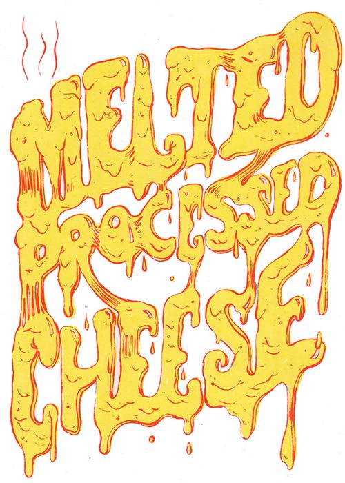
INSPO
PAULA SCHER’S, IDEA FOR ‘COLD’FOR THE ‘CHEESE’ EFFECTIDEA FOR THE CHEESE TYPO
FINAL
“He gives me life but why does everything feel so cold?”“You are just a speck of dust in the universe”“Screw this I really want some cheese right now please”
‘Confessions’ is about inflating interstice thoughts (mental interstice) into a physical space. The experience starts with a person traversing through an interstice place. An example would be through a corridor, where people do not usually spend a lot of time in, much less thinking deeply as they travel across these places. We will have a small enclosed booth at the ‘corridor’ where they can enter to input their own random thoughts into the computer placed after being prompted by a thought-evoking poetry which will be displayed on the screen. To prompt the people passing by to enter our small enclosed booth, we will entice them with the aesthetics of/in it – the black coverage making it mysterious and hence will trigger their curiosity, the usage of white balloons, and blankets and cushions inside the enclosed booth for their comfort. The fairy lights will also make the atmosphere dreamy. Participants will be given a pair of headphones so as to listen to atmospheric music for the entire experience.
Participants can then continue their journey out of the enclosed space, eventually arriving in another room outside an enclosed tunnel (which they have been travelling through) with a balloon-structured screen. Here, their thoughts are projected onto these balloon screens.
The participant can choose to shoot and destroy their words if they want to, using a NERF gun to shoot the balloon where the sentence is at. Successful destroying off the balloon would cause the sentence or word to disappear after a set timer which will be displayed on the screen. They can also shoot thoughts that do not belong to them/were not written by them. However, they are also free to leave their thoughts on the screen as well, and whether it disappears or not afterwards will then be left to the jurisdiction of the next participant.
CONCEPT
Our interactive installation is a representation of mental Interstice; fleeting interstice thoughts that happen in fleeting interstice spaces which are usually discarded and forgotten quickly. Our project not only makes the thoughts more tangible, but it also makes the whole process, from thought creation to deletion, more tangible by lengthening the process and making the process bigger through the use of technology. The mind’s subconsciousness lies in that space between concentration periods, and this subconsciousness is our innate selves. By extracting these innate thoughts that usually lie unbothered at the back of our heads, we are essentially forcing people to think about these thoughts. The first one will induce participants to bring these thoughts to the forefront of their consciousness through poetry and comfort. The projection room where the intersticed-mind is being projected into the room itself, expanded and inflated. This room represents the end process where thoughts are forgotten. We make this part of the process more tangible through the use of a big action required for the participants to delete their thoughts – hence them having to shoot those sentences/words with a nerf gun.
We referenced this to the work of Candy Chang’s Confessions. It’s almost similar: explores public rituals for catharsis, consolation, and intimacy. “Inspired by Catholicism and Japanese Shinto shrine prayer walls, Chang invited people to write and submit a confession on a wooden plaque in the privacy of confession booths.”. Then these confessions will be displayed in the room.
Confessions in the room placed outside the confession booths. Image obtained by http://candychang.com/work/confessions/
The difference is, her work only involves people writing them in a small booth so that it serves as their secret and safe space. Whereas our work involves more technical work such as coding and thinking of pulley systems to make the balloons pop according to the words our participants want to destroy. It involves typing thoughts onto the computer and not being able to go ‘backspace’ on your thoughts because that’s the whole point of it: your thoughts are usually jumbled up and what you type can sometimes be what you initially thought of without even realising (your subconscious thoughts as well) hence documenting that – the bit of interstice.
Based on the Week 9’s Characteristics of Interfaces, our interactive project falls under the nearing end of “interactive”. (based on the chart below)
We have high interactivity because of the feedback the computer receives when one types their thoughts and then shown to a big screen. Hence there is immediate visibility. And it is basically a form of communication between the person and the ‘cyber cloud’. Words will also destroy itself when it needs to based on the timer and whether the participant wants it to and that’s when it gets more interactive because of the physical aspect of our work. This falls under creativity because tools like the nerf-gun serve as a destructive force from the participant once they ‘pull the trigger’, seen below.
Then the pulley system attached to the balloon (seen below),
contributes to how the words could be deleted – using a timer and photoresistors. Using this combination, only when two seconds remain and the photoresistors read as low, the words were able to be deleted effectively. With the pulley system in place, it allows each box covering the photoresistors to close when their respective balloons were popped. There’s also a structure where the participants have to move from one place to another, so it gets them involved in the whole interstice process.
In terms of technicalities, there was a lot of time taken to get the processing sorted.
Programming aspects:
Programming wise, there were 2 things we had to do.
Transfer messages from 1 computer to the other
Link 1 computer to the Arduino and delete messages based on light received by the photoresistor
For the first task, we used Processing’s ability to create a client and a server. And be able to send data through ports.
One computer will be designated as the server and be tasked to send data through 2 ports.
1 port will send the “messages” data which controls the messages being shown on screen and the second port sends “entervalue” which ensures that messages are only being sent once when the enter key is being pressed.
The second computer will be designated as the client. The client reads the data from the designated server computer
The server computer then translates the data into 2 variables. A string variable which are the messages and an integer variable that ensures that messages are only read once when the enter key from the server computer is pressed.
The client computer then takes the msg data, puts it in 3 different array fonts and displays these messages on the screen.
As for the second task we first have to programme the Arduino so that it can send data to Processing.
The data here is being sent in “one line” to the processing, but we are separating it using commas such that it would be easier to read by processing.
Next, we have to programme the client computer such that it can read this data.
To do this we use Processing’s serial library.
To test this out whether the words can be read in processing we created another simple programme with 3 circles whose size is determined by the amount of light received by the Arduino. (seen below)
Processing then translates the data into an array and we can translate the data within the slots in the array into variables. Here we have 3 variables for the 3 different photoresistors.
Lastly, the messages are deleted when there is low light. More variables are included such the messages are only deleted once when light is low.
The videos below are some processes of the technical bits.
( testing sending data from Arduino with multiple resistors to processing)
(testing sending data from Arduino with 1 resistor to processing)
Physical setup aspect:
The balloons and the black ‘fort’ where they actually enter a small narrow space and into a comfortable space for them to relax and type their thoughts, and leave through another narrow space
Tanya: Setup, Pulley system for triggering Resistor
Qistina: Setup, Deliverables, Poetry
Individual Reflections (Challenges and how you overcame them):
Shah:
Programming wise, when creating this project it was not too difficult. After discovering the two main tasks that the programme should do, it was simply finding the right tools or example codes online that will help us solve this problem. Creating a code to transfer data from one computer to the other was relatively easy as Processing already had a server-client function and the idea to use multiple ports to send different variables was pretty intuitive. Creating the code for processing to be able to read data from different photoresistors was a lot harder. We were stumped at first as it was easy enough to be able to read the data from one resistor, but we couldn’t find a way to separate the data when multiple resistors are added. After googling we managed to find a way to separate the string of data by using commas and store the data into one array first before tying the values in the array to different integers. What I had the most trouble with, however, was getting the code to work with the whole installation. When creating the code, I tested it with my own computer and it worked fine. However, when the code was first transferred to another computer, for some reason it started to be a lot more buggy and problems started to appear(for example the video was not playing properly) and when left for long periods of time, the code will start to bug too. Though these problems were solved with “duct tape” such as resetting when the code starts to bug, I think we could have mitigated these problems if we had set up the whole installation earlier and did a proper dry run which we were not able to do that due to time constraints. All in all, though, I am happy with how much we have progressed with the code and proud at how we were able to ultimately solve how to create the code ourselves. My only takeaway for coding is that you can’t solve something at that moment of time. It is best to just leave it to ferment for a while and work on it after. Sometimes it takes a day and sometimes even a week, but trust me, your brain will subconsciously your brain will work on it and you will be able to solve the problem after a while.
Tanya:
It took us a while to figure out which two variables we should use to control the deletion of words that appeared on the screen. One variable combination we tried out was with ultrasonic sensors and photoresistors. However, that proved to be ineffective as the ultrasonic sensors would lag and cause inaccuracies readings. We eventually solved the problem by swapping out the ultrasonic sensor with a timer. Using this combination, only when two seconds remain and the photoresistors read as low, the words were able to be deleted effectively. With the concept in place, I was able to start working with the pulley system that would allow each box covering the photoresistors to close when their respective balloons were popped. The first test with the pulley system was with one string, and everything went smoothly, but I noticed that when too many strings were strung through the same eye-pin, there was a high chance of causing friction, preventing the box from closing despite the balloons being popped. To resolve this, two more eye-pins were added, each with three strings strung through. As for the method of popping balloons, we were unable to get a whole array of weapons to throw, but I did have a nerf gun that could serve that purpose. Due to the nerf bullet’s rubber tip, I had to modify them with thumbtacks to ensure they could pop the balloons upon impact. I tested with a variety of mods, mainly to find one where the bullets weren’t too front-heavy, allowing them to be fired at a greater distance and still hit their target. Eventually, I managed to create five bullets that were lightweight and effective. Lastly, for the setup, we initially thought of using black cloth to create the first interstice space, but, on second thought, proved to be costly. So, we got creative and used tape and black trash bags to create the walls and roof of the first space.
Qistina:
Aside from the programming, we were also having a little issue with the way we deliver our physical setup. I realised that the reason why our participants (previously during the test-run) typed out things that are not related to their deep genuine thoughts (confessions and such) was due to their inappropriate surrounding atmosphere. It wasn’t comfortable enough for them to sit and let their thoughts flow. Also, people were constantly videoing them a.k.a me (I had to for the process videos). So I knew we needed a comforting surrounding and hence the placement of soft furry blankets, cushions and fairy-lights. And soothing music. It is scientifically known that it calms people’s nerves and minds when surrounded with soft comfy things and slow soothing music so there you go. And then once we get that part settled, for them to further on think or delve into their deeper thoughts, we have to let them read something that helps guide them to do so. Hence I came up with the poetry and edited it a couple of times because I realised the previous ones done for test-run was too long for them to read, too ‘deep’ and just wasn’t the right one. They spend more time trying to understand what the poem meant and hence could not be bothered to think deeply about something they want to share. We want something simple and nice, but also makes them feel connected to the cyber-cloud to share something personal of theirs to do so. Hence we end up sticking to the latest poetry I updated which is:
“Though darkness may try to tear your mind apart,
May light ever-run like a river through your heart
Take grit, and with grace, let your thoughts leak
You deserve to breathe and let your soul speak”
It makes me feel happy to be working with a few mediums for this whole interstice installation to make it work. I learnt how exploring those different ways could enhance the level of immersion in our project. We truly explored different ways the ‘technicals’ and ‘physicals’ could come together and make something interactive and fun for everyone.
Joey:
The challenges faced ranged in all sorts of things from circuit to the programming itself. Regarding my part in the programming, I was supposed to reconcile a working photoresistor and ultrasonic sensor function on Arduino and then make it such that Processing was able to transfer instructions over to Arduino. I did manage to make the two work in unison on the Arduino. However, even after utilizing standardFirmata and serial port, I couldn’t get it to work through processing. After consultations, we realized that while the photoresistor was able to work with processing, the ultrasonic sensor would eventually result in a lag due to its sensitivity and its rapid data transfer. We were going through too many mediums (from Arduino circuit to Arduino platform to Processing Platform). In the end, we had to change our idea by making use of Tanya’s pulley system to cover the photoresistor instead and mark the deletion of words with Shah’s timer. The circuit I made was also initially not working, but in the end, it was because the photoresistor legs were too close together, resulting in a technical glitch. During the setup, we also could not portray the right conditions accordingly to what we envisioned due to logistical difficulties and a lack of time as well. Our trash bag fort, whilst comfortable, could have been more aesthetic (but the budget was an issue too). Ideally, the projector area should have been more enclosed as well, but the location we were at simply did not allow for such a setup since it was very public and not in a room setting as we previously planned for. The concept of the balloons, while conceptually well-received, was also tedious to set up and took very long to reset after each person underwent the experience. If given more time, we could have adjusted these conditions better and found a better place to conduct our installation. Processing tended to crash sometimes too if left stagnant for a period of time. However, I feel that it was a very rewarding experience overall despite the backups and hefty improvisations because the environment was not kind to us. Processing via Arduino is not an easy setup and all in my opinion (probably because I am still a novice at programming to begin with) but I think we did well in managing to achieve a high level of interactivity (for the installation to operate) and to combine mixed mediums to make the installation more immersive.
FINAL OUTCOME
Managed to get the words on the balloons.There’s the timer placed.Shah explaining our work.Prof interacting with our work. This is the exit part of the small ‘fort’.Prof interacting with our work by shooting the balloons down.Another participant interacting with our work. (He’s so into the shooting part)
After all that, Lei’s advice was that maybe we should not force the participant to take the headphone out and instead let them choose if they want to keep it on to keep listening to the music while shooting their words down so that it could allow them to feel a bit more cathartic. And so that it does not suddenly interfere with the flow of them feeling calm and at ease from being in the comfortable small fort.
It’s good that we learnt a lot during the processes and even in the final outcome of this project. This has been a fruitful experience for us.
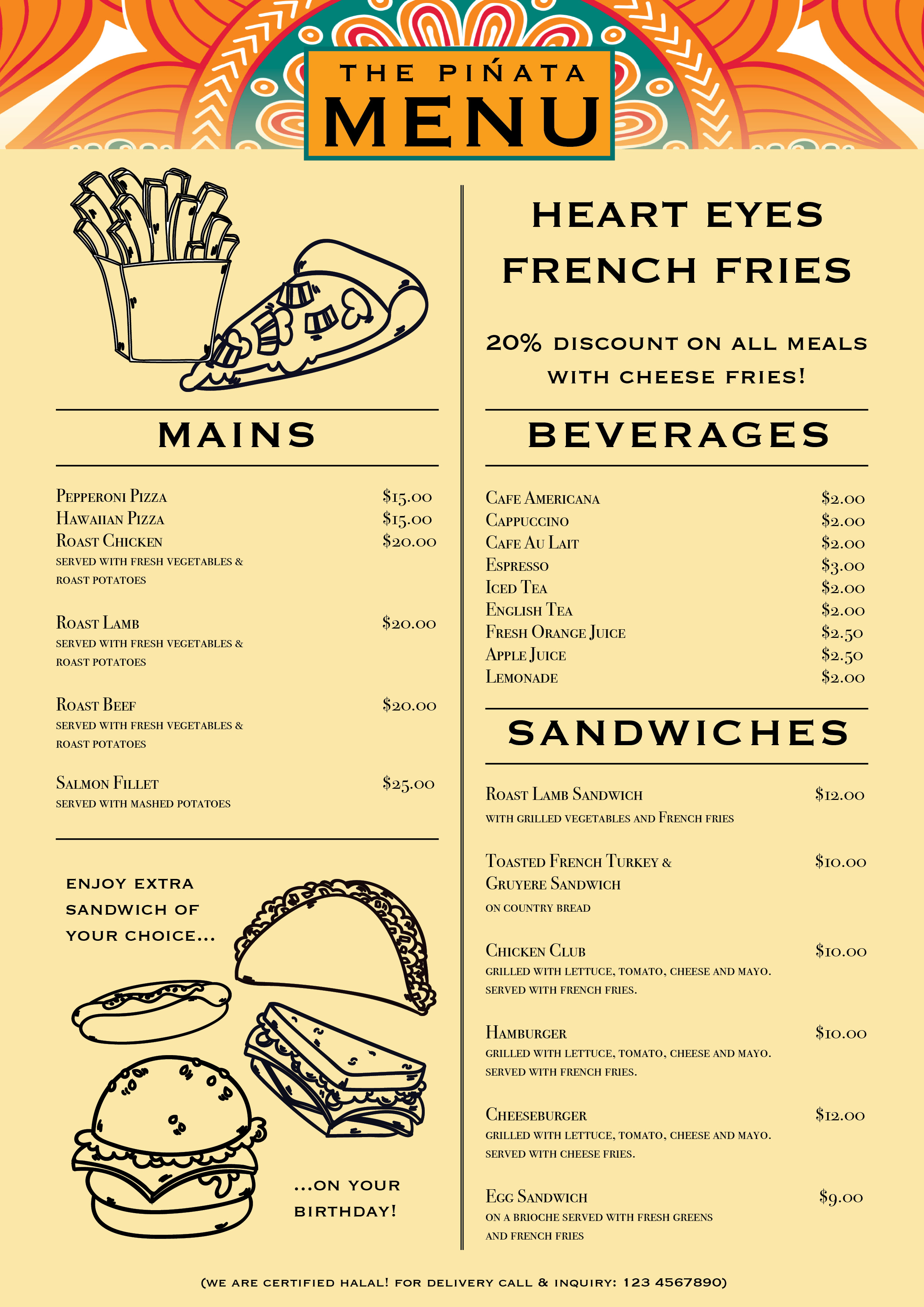
WeeeewOOOO this was fun but took too much of my time trying to get the grids and layout right. Not sure whether I like this ‘baseline grid’ guy at all.
(look Mummm, I finally made my own menu page, and I even made it HALAL!)
In his seven years in Font Bureau Inc, Boston as a senior designer, Frere-Jones created many of Font Bureau’s best-known typefaces, including Interstate, and Poynter Oldstyle and Gotham. He began work with Jonathan Hoefler and formed a company operated under the name Hoefler & Frere-Jones, collaborated on projects for Martha Stewart Living, GQ, Esquire, Nike, Pentagram, Hewlett-Packard, the New York Times Magazine and the Wall Street Journal.
HIS WORKS
Frere-Jones wanted to give something to the community, and to users, that would set a precedent. Like his past work, Mallory looks and is timeless, utilitarian and reliable. It’s able to do the heavy lifting for a range of uses, and is intended to be, according to the designer, “an asset to users” and “durable.”
Mallory typeface
Mallory began as an experiment in mixing typographic traditions, building a new design with British and American traits. The family offers a broad range of voices, from the prim and austere Thin to the loud and gregarious Ultra.
Mallory was built to be a reliable tool, readily pairing with other typefaces to organize complex data and fine-tune visual identities. This release also marks the debut of the MicroPlus series.
Till this day, Frere-Jones is still drawing new designs on typefaces and looks forward to designing condensed versions of Mallory.
Gotham typeface
Gotham typeface is a distillation of the “letters of paint, plaster, neon, glass and steel that figure so prominently in the urban landscape,” create under his collaboration with Jonathan Hoefler.
LEARNING POINTS
“Typeface design can be artistic expressions and cultural artefacts if they are…properly executed, they can be a solution to every problem” – from the video in ‘Tobias Frere-Jones: Break Things Deliberately’
I reaaally like this presentation of his in the video. It’s interesting to see this point of view of Frere-Jones where he sees problems as an opportunity because then he can use typefaces as a form of a solution. He taught us to learn to see the beauty in taking risks. Frere-Jones explains that in order to do our best creative work, we must not just permit moments of confusion, but actually, go chase them. Hence how I see this as: see if you can make your typeface worse, then if there is a problem, you sorta know how to fix it. Break it down to know how to make it better. I guess it’s like reverse-manipulation. It shows how a structure can really describe itself as it falls apart and I think this really is something thought-provoking, something I would start thinking about immediately when trying to improve my works/designs.
“In all of that mess, in all of that wreckage, you can find something pretty amazing.”
When I read about the 10 things we didn’t know about Herb Lubalin, it’s interesting to know more about him through those little facts. Like how he supports liberal causes. I wish he was still alive – I would wanna know what are his views on the politics in this day and age.
Like Herb, I would like to devote my life to painting too after I retire! But it’s sad that he did not get to do both the retiring and painting as he died early.
Herb Lubalin was the famous typographer and designer behind the creation of the typeface Avant Garde. Aside from creating works meant for positive political changes, Lubalin was a constant boundary breaker on both a visual and social level. Part of the founding team of the International Typeface Corporation (ITC) and the principal of Herb Lubalin, Inc it was hard to escape the reach of Herb during the 1960s and 70s.
Coming to terms with Herb Lubalin’s work takes us quickly to the heart of a very big subject: the theory of meaning and how meaning is communicated—how an idea is moved, full and resonant, from one mind to another. Not many have been able to do that better than Lubalin.
HIS WORKS
The Avant Garde Gothic typeface was originally designed for the Avant Garde magazine. It can also be noted that Lubalin Graph is a typeface family on its own but was derived from Avant Garde Gothic.
The Avant Garde Gothic typeface was based on Lubalin’s late 1960’s logo. Despite the overuse and misuse of Avant Garde Gothic in the 1970s, it’s still extremely influential and remains as one of Lubalin’s most iconic fonts. This font could be described as a reproduction of art-deco and is seen in logos created in the 1990s and 2000s.
Herb Lubalin devised the logo concept and its companion headline typeface, and then he and Tom Carnase, a partner in Lubalin’s design firm, worked together to transform the idea into a full-fledged typeface.
Announcement for Avant Garde magazine’s antiwar poster contest, designed by Herb Lubalin, 1968.
As mentioned by Adrian Shaughnessy, a graphic designer: “Lubalin was…a political designer. He was never a radical‚ but a progressive liberal at a time when such sympathies were undoubtedly ‘bad for business.’ When this is compounded with his work with Ginzburg‚ which put him at the forefront of the 1960s free speech and anti-censorship movements‚ we see he was unafraid to declare his political allegiances and sympathies.”
We see this in the above poster he created for. Herb Lubalin’s work punches straight at the gut simply using letterforms. Look at that bold red using every letter in caps-lock. The typeface he uses as well. How smart it is of him to use every negative space (The black but bold exclamation mark at the side catches my attention too somehow). As a viewer, this whole poster evokes some strong attitude and emotion in you. Don’t you feel it? I do.
U&lc magazine
Lubalin spent the last ten years of his life working on a variety of projects, notably his typographic journal U&lc and the newly founded International Typographic Corporation. U&lc (short for Upper and lower case) served as both an advertisement for Lubalin’s designs and a further plane of typographic experimentation.
Here, he tested just how far smashed and expressive lettering might be taken. Unlike other most designers, he had the freedom of being his own client where nobody tells him what to do, and he enjoys it.
LEARNING POINTS
Hence relating that to my learning point: I admire how he had his own personal convictions and stood by them. You could tell his character by the kind of work he produces, and hence has helped him shape his works as a designer. He stands firmly on what he believed in so that he would design works that are true to himself, instead of simply following with the trend. Lubalin is definitely in a class from his own.
Wooo my ‘type as pattern’ work. Quite interesting to know we could make a sort of mandala using letters. Letters used above are letters found in my name: Q, I, T and N.
Erik Spiekermann: “You have to think of everything a little more…”
Spiekermann is a German typographer, designer and writer. He and his wife, Joan, started FontShop, the first mail-order distributor for digital fonts. His family of typefaces for Deutsche Bahn (German Railways), designed with Christian Schwartz, received a Gold Medal at the German Federal Design Prize in 2006, the highest such award in Germany. Hence more than anyone else, the Berlin communication and type designer Erik Spiekermann has shaped Germany’s visual culture.
United Designers Network was renamed after him, SpiekermannPartners merged with Dutch design agency Eden Design & Communication and continued its operations under the name Edenspiekermann. Edenspiekermann currently runs offices in Amsterdam, Berlin, Singapore, San Francisco and Los Angeles.
HIS WORKS
Specimens of typefaces by Erik Spiekermann. 1) Berliner Grotesk (original is from 1913, digitization is from c. 1978) 2) FF Meta (1991–1998) 3) ITC Officina Serif (1990) 4) ITC Officina Sans (1990)
Spiekermann’s work in communication design has involved so many different projects: books, advertisements, posters, editorial, corporate design—“typography is the element that connects them.”
What I find interesting about Spiekermann is his devotion to clarity and grid-based design. He says that the result of the natural chaos of his mind actually causes this, “I need order. I need systems. I don’t really do anything without a design grid.” And I also think that’s the reason why the kind of fonts he designed could convey information accurately and convey it well.
I can see that Spiekermann strives to always represent content appropriately with the strong discipline and self-awareness he has. He mentioned that “a font must fit into the culture”. And as a designer, he’s done well in doing his job to bring a text to the public. It also shows Spiekermann’s sensitivity to his intended audience, the public, and viewers – the thought that he puts whilst designing something. And I, as a beginner, definitely need to start learning to do that. Also, especially the part of using a ‘design grid’ and not throwing it off like it’s unnecessary because it really is the opposite of that.
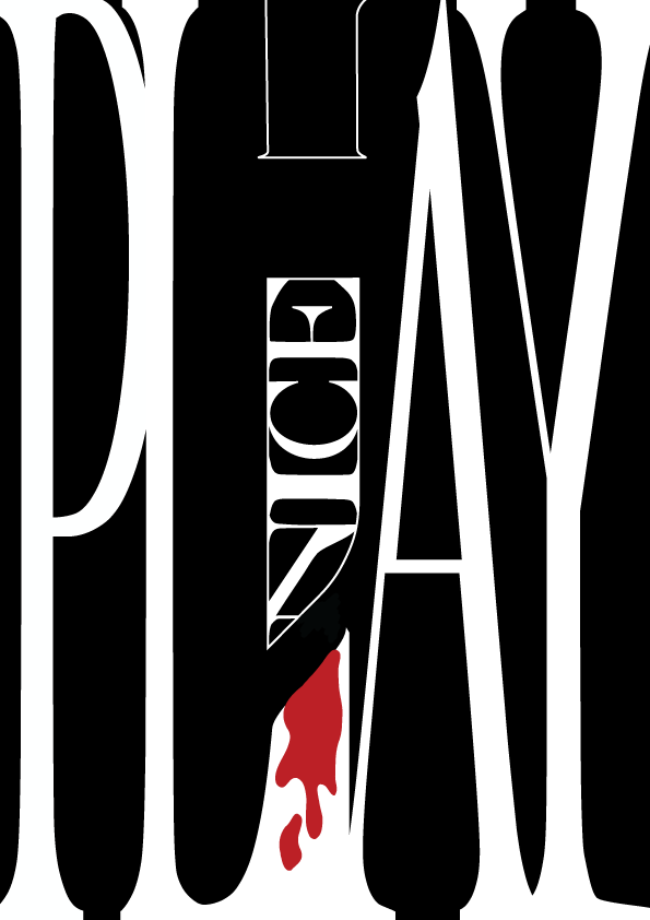
‘PLAY NICE’ – seems a bit more dangerous than the idea of ‘play’ to me, so I just did ‘nice’ within a knife-outlined image. Every letter in caps lock and bold to signify something screaming “beware”. The main challenge I had with this was the spacing in between each letter, especially in ‘Play’. Like the spacing between the Y at the end, AGH. I tried I really did.