Reflection: There was a lot of things learned in the making of the zine. Patience is definitely one of them, especially when trying to make repetitive kaleidoscope and making sure everything is detailed. I guess I should have vectorised the rest of my works and not leave out some because in the end they look pixelated (my 2nd spread) but that was one learning lesson and something I can avoid in the future, now that I know how to make a zine. I will definitely make more, both for fun and practice!
Here below is a video of what it looks like on the inside of my zine.
Before the consultation, I initially thought of doing abstract cubism, or simply just a mixture of colours and abstract since I was thinking of touching on every culture and the very vibrant colours found in Joo Chiat.
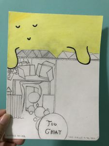
For the first draft, the one with the yellow cartoonised sky, I was inspired by Dallas Clayton – an American author and illustrator famous for his children’s works and cute little illustrations with impactful poems. But for this zine, I thought it could just be an initial idea.
Dallas Clayton’s works:
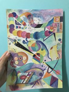
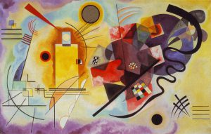
For the abstract piece that I did, I was inspired by Wassily Kandinsky – a Russian painter and art theorist, where his works are centred in abstract art. I love it because of his use of vibrant colours and different shapes and even weird lines that makes his works come to life.
Wassily Kandinsky’s works:
But after consultation, I realised it was easier to just focus on one thing but have a different set of ideas set on it. I agreed with Mimi that focusing on the Peranakan culture would be a much better decision as I had a lot of documentation on it. And focusing on it meant that I needed to work around something more than just my inspirational artists above, as it did not bring a touch to what Chinese Peranakan culture is like.
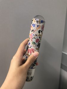
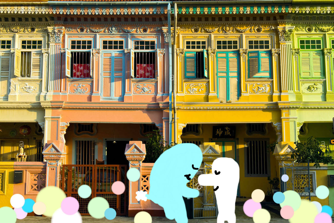
Since I wanted it to be colourful and also in a Peranakan style, I decided to make a Kaleidoscope art. So I tried the few below.
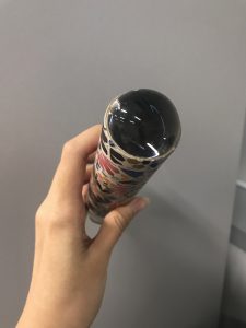
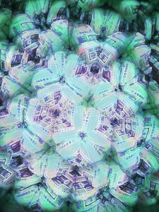
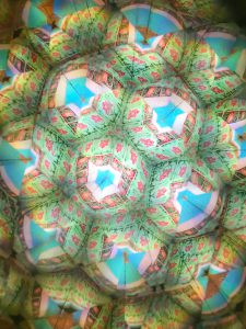
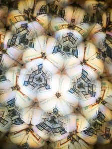
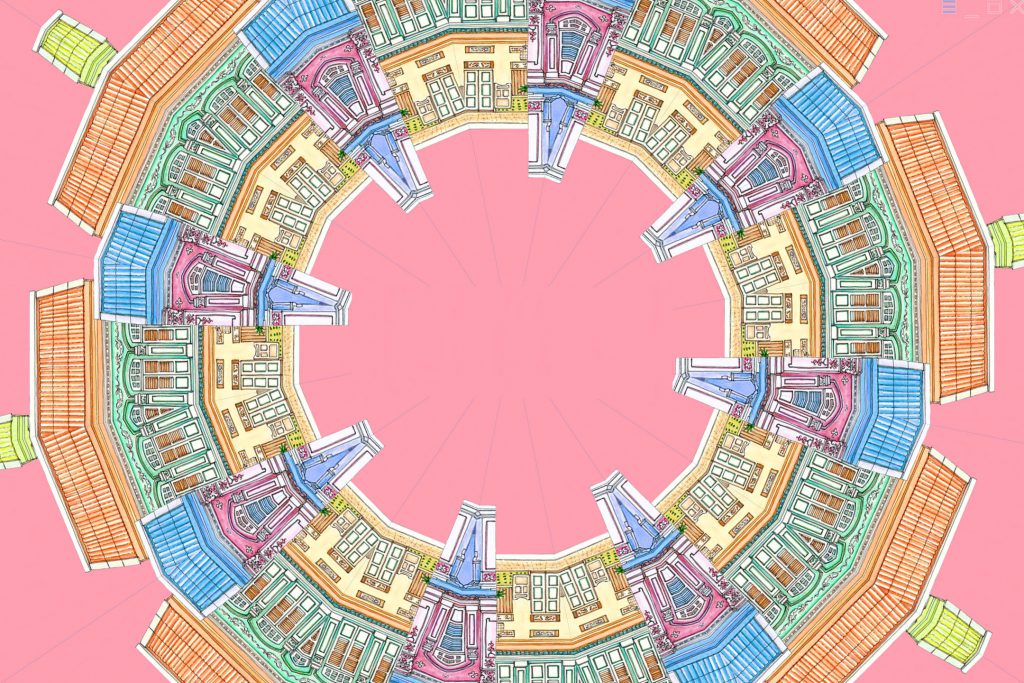
1st try: To use a legit kaleidoscope to see the Peranakan shophouses and capture the colours and details.
These are the outcome:
Pros: They are actually beautiful and the colours simply reflect the vibrant zine I had in mind BUT
Cons: They did not reflect off what a Peranakan style or culture looks like. So I had to do more to make sure I get those factors out.
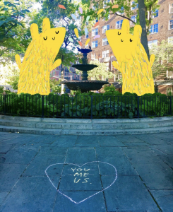
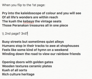
What I had in mind was to also write a poetry based on it. I wanted to tell a story that makes readers feel excited to see some sort of treasure if they look closely into my abstract work. (seen below)
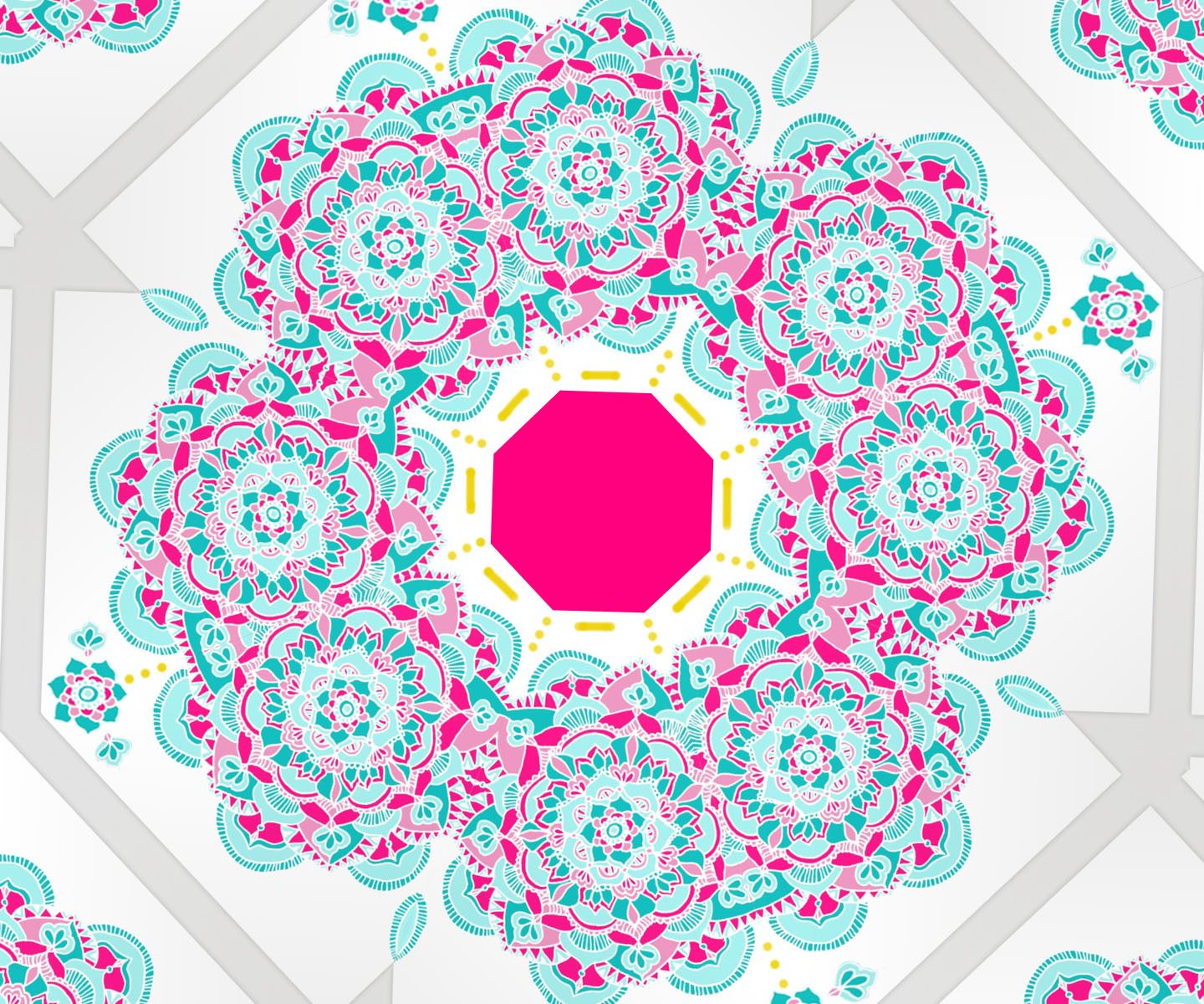
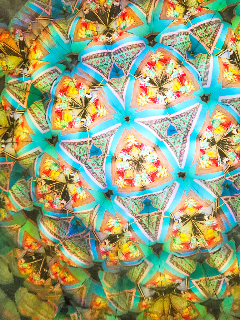
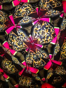
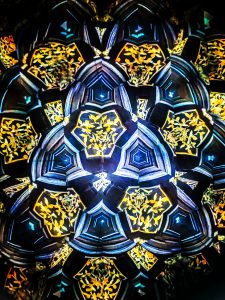
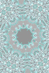
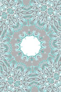
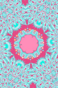
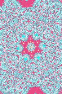
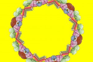
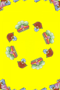
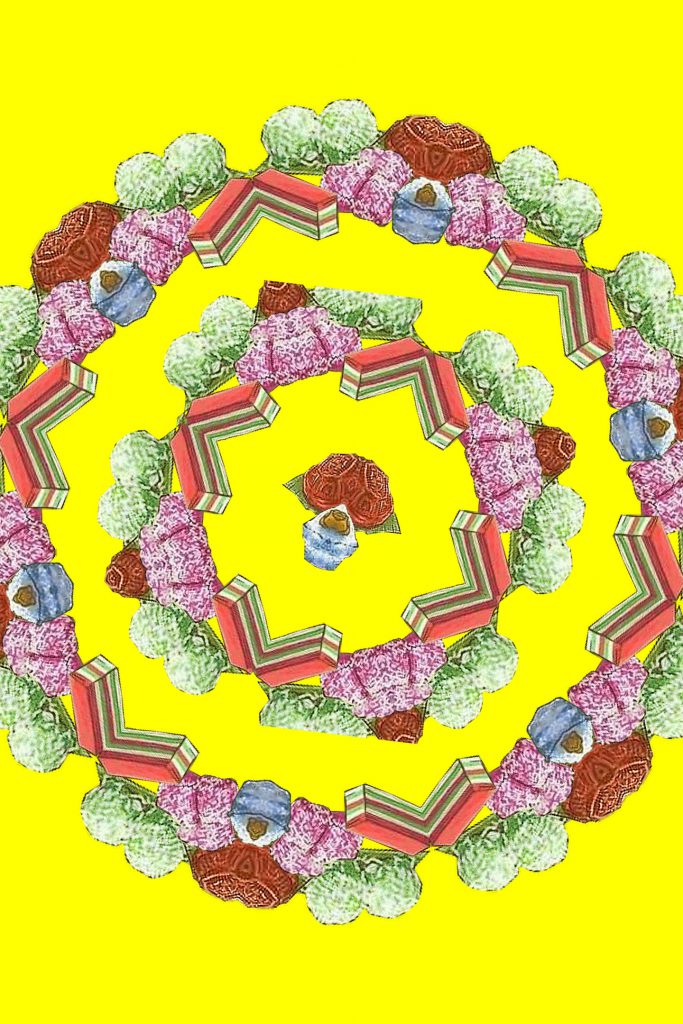
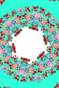
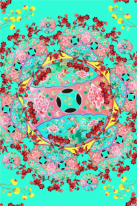
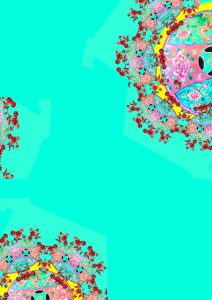
2nd try: To actually create my own mandala and see what comes of it as a Kaleidoscope. Why ‘mandala’? Because it is found on most of the Chinese Peranakan kebaya clothes and patterns on tiles.
For these two, it looked plain and dull so I decided to change it up a bit with different colours: hot pink and turquoise.
Like these ones:
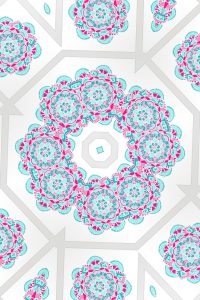
I consulted Mimi again to ask for feedback because at this point I had a few processes but not knowing which to pick and what felt right or wrong. And after that, we both agreed that it would be better to stick to one form and I chose the illustrated kind to be included in my zine, instead of the 1st try of real Kaleidoscope photography.
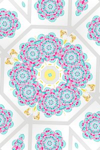
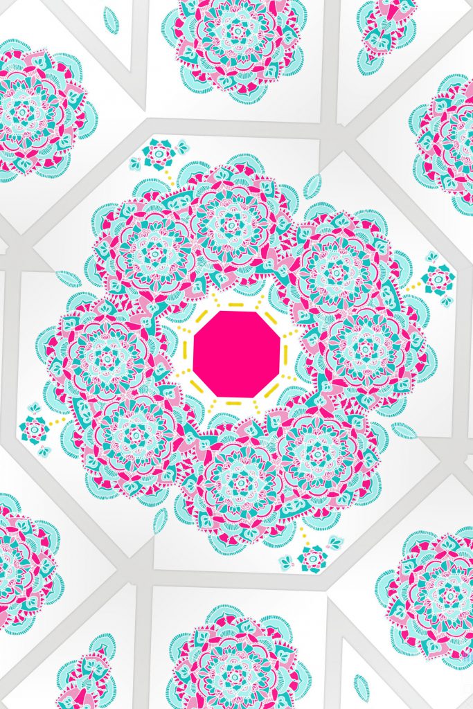
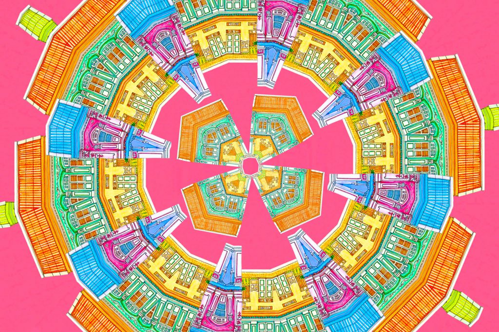
So 3rd try:
From this
and this
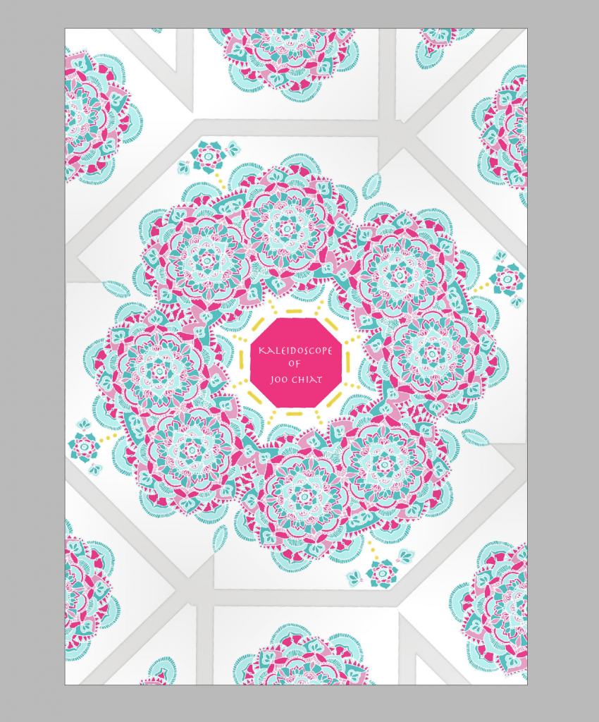
to this (for my front and back cover)
I consulted Mimi again because I wanted to ensure that this style that I want to go for, is actually good to follow throughout. Thankfully she agreed that it is, it’s just the adding of patterns on the outer parts that I had to play with and edit as I did not want it to be plain like the one from the start of the 3rd try.
Likewise, for the rest, I work a couple of times to find the balance and get it right.
For 2nd spread:
For 3rd spread:
For 4th spread:
All will come together for final and thankfully, I see the balance in my work.
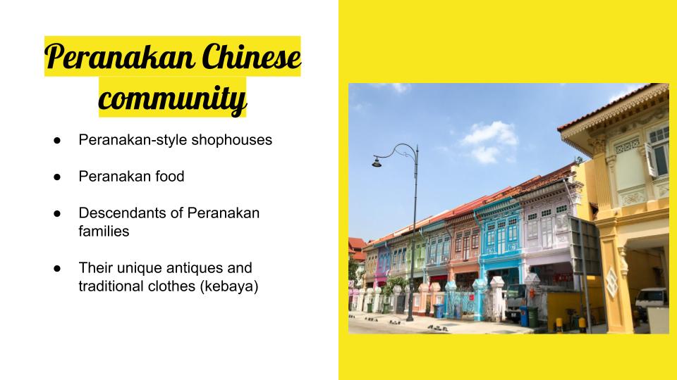
Joo Chiat was formerly known as the Confederate Estate Road. It was filled with coconut and cotton plantations back then. A wealthy Chinese businessman and philanthropist of the name “Chew Joo Chiat” acquired considerable amounts of the land, including the plantations and also freehold lands for building developments. At that point of time aside from the attap kampongs and luxurious bungalow houses, there was an influx of Peranakans and Eurasians as well. Hence why there are a lot of churches in the area and Peranakan shophouses. But also till today, we can still see the kampong design being spared as seen in Geylang Serai’s Kampong Market. We see a lot of different cultures in one place, that is, Joo Chiat.
The recce in Joo Chiat got me overwhelmed as there were heaps of things I discovered but I was excited because that means a lot of ideas could possibly come out of it. This post will give more insight.
I went to Joo Chiat twice for this project. On the first day, I went with a friend a few days after Chinese New Year was over and it was quite empty. The shops were closed and I didn’t think it would still be closed having known that it was 2 weeks past Chinese New Year. So we could not go into any interesting Peranakan places or heritage sites. But we still managed to come across interesting architecture and colours such as the famous Peranakan shophouse of Koon Seng Road.
I stayed at that area for a while to take a closer look and aside from the vibrant colours, they had intricate gate design and also window and wall patterns.
Aside from that, we were in the bus when we came across another row of different kind of houses such as the one below. It only has 1 door and it looks like it overlaps over one another. So cool! I wonder how the interior looks like.
We got lost after and found ourselves in the deeper end of the streets. However, we still found a few little treasures such as this pottery place we passed by, as seen below. They sell their vases and pots too.
We came across numerous Catholic and Christian churches or places selling things relating to them too.
And the famous ‘Katong Church’, the Church of The Holy Family. The church has rich history, being first consecrated in 1932. Thus it served as an important place of worship for the Roman Catholic Eurasian community that used to live in Katong.
We found temples too.
Then we came across this (figure below) when we were on the bus. I was intrigued by it because I couldn’t exactly see the temple. We saw what looked like an iconography of a deity. So I went to do my research on it and it is actually the Kuan Im Tng temple.The main deity in the temple is Avalokiteshvara or the Goddess of Mercy. Before the temple was built, it had coconut plantation surrounding it. But in 1919, that same land was donated by a devotee and has since been upgraded to a bigger building to accommodate masses.
(the picture is blurry as i was in a moving bus when i took it)
That was it for the 1st day of JOO CHIAT RECCE. Now onto the 2nd day, where we found more interesting things about Peranakan culture and other culture as well.
First stop was the world-renowned and famous 328 Katong Laksa. It is, of course, known for it’s Laksa and it is actually a Peranakan dish that stars rice noodles submerged in a spicy coconut broth. Fun fact: Gordon Ramsay came to Singapore before and tried replicating and creating his own laksa dish but was defeated by 328 Katong Laksa.
Down the road nearby this food outlet, we found another landmark of Joo Chiat which is the Sri Senpaga Vinayagar temple. It has been there for more than 150 years (wow) and hence had a very ancient but lively look on it which makes it different and interesting, following closely to the art style in the Ceylon Period in depicting the Hindu deities. The temple began in an attap shed under a champak (known as “senpaga” in Tamil) tree in 1875. The main deity being worshipped here is Lord Vinayagar. Hence, the name for the temple. Rebuilt between 2000 and 2003, it has the entrance tower as shown below with at least 159 sculptures of the temple’s main deities.
In Joo Chiat road, there are Peranakan shophouses that were open for customers to take a look. We were lucky enough and was awed by all of them such as the Rumah Bebe and Kim Choo (located directly beside it).
Rumah Bebe below.
Inside Rumah Kim Choo.
The owner was really nice and allowed us to head upstairs for free to view more and understand the Peranakan culture. There was even a guest-list!
They had a detailed history of the Peranakan Chinese culture, and everything in the shophouse was just full of ancient Peranakan treasures. I was intrigued by it all.
Below this, they have a store filled with their pastries also known as “kueh”. Kim Choo is known for their Nonya rice dumplings or also known as Bak Chang and also for their kueh.
Upon all these variations of culture found, I realised most of it was on Chinese Peranakan culture and the things that come with it. The colours, the vibrant atmosphere, it intrigued me the most. Hence, it led me to think maybe it could be something I’m mainly focusing on. We’ll see.
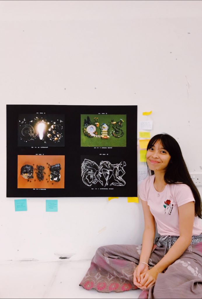
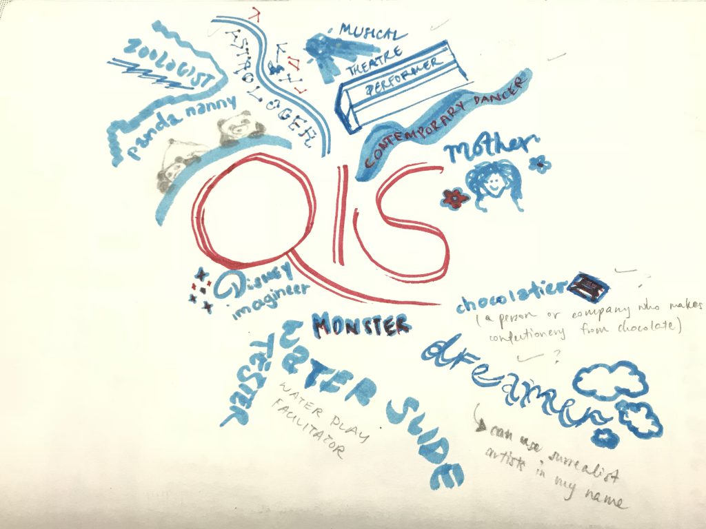
After all the job search done, I have decided on being an Astrologer, Chocolatier, Landscape Designer and Contemporary Dancer.
Process for typography of job for:
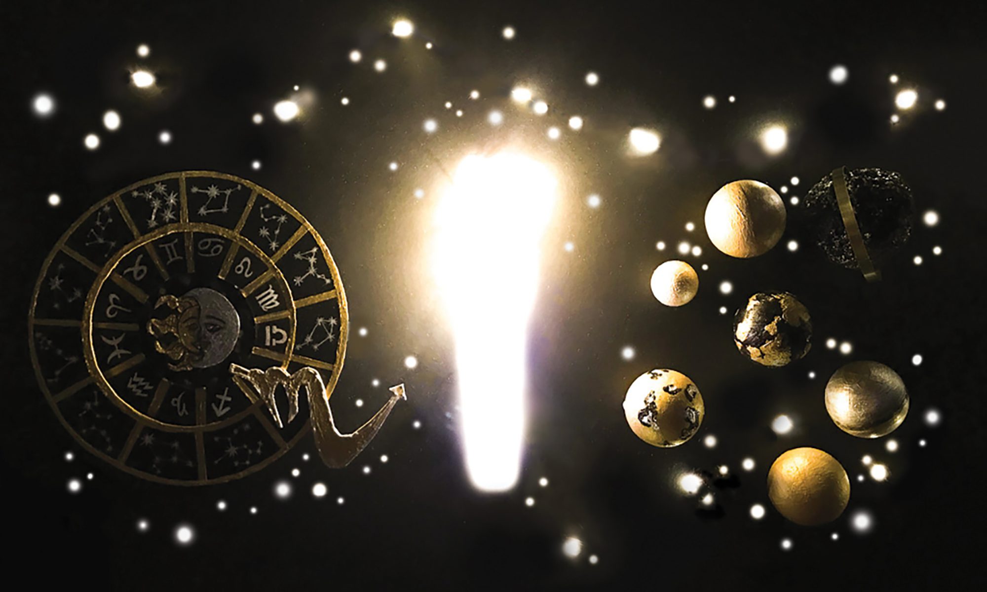
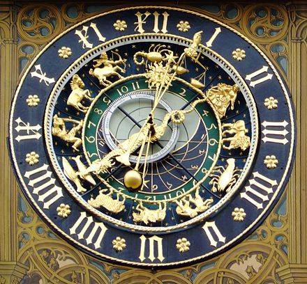
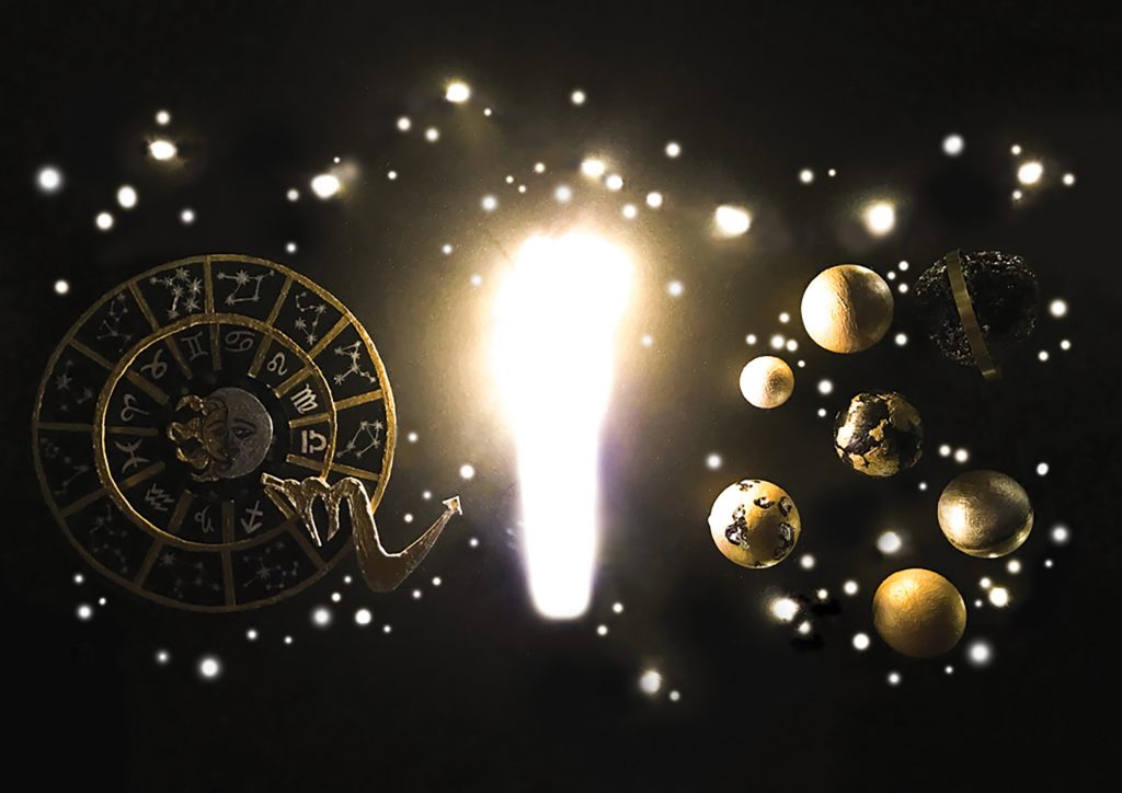
ASTROLOGER
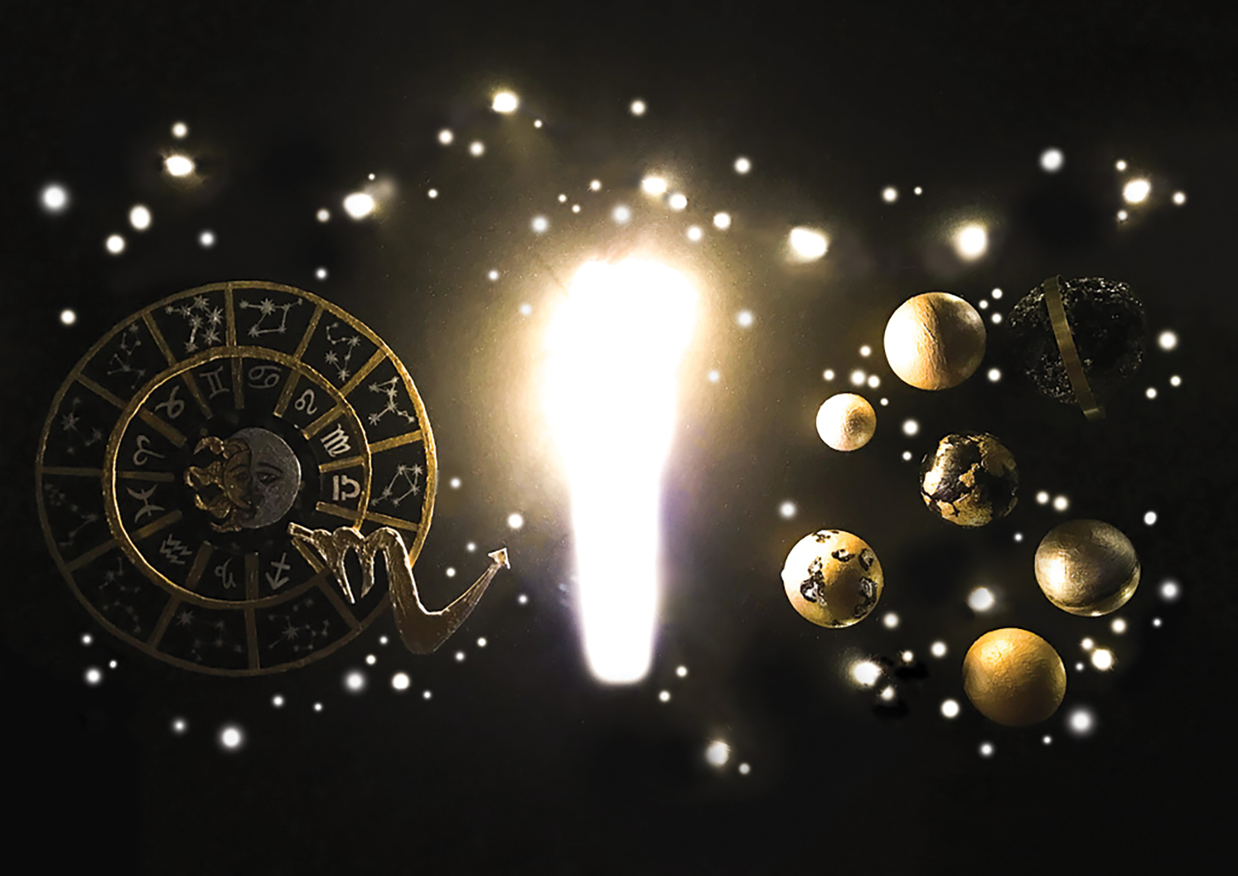
I was inspired by a few things I’ve researched on when i think about “astrologer” such as the ones below:
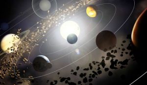
Astrologist zodiac chartThe bright stars – galaxyPlanets orbiting around one another and meteors
So I based my main sketch for Astrologer on these:
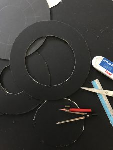
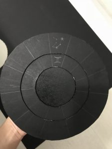
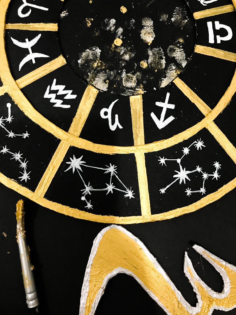
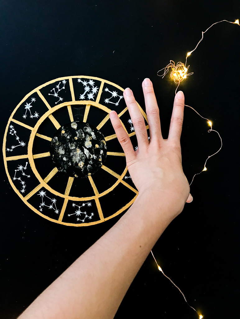
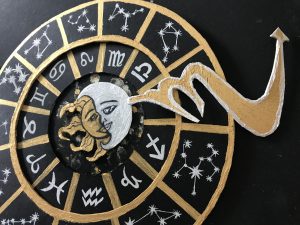
I cut out different sizes of the circle to create the astrologist/zodiac chart, so that they will look popped up on the board I pasted it on. I needed it popped up so that it looks like it has the same kind of thickness as the planets i’m creating later on later on.
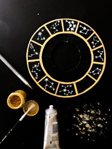
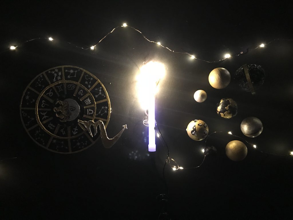
Painted these circles as gold, white/silver – the constellations are drawn in white pen. Hence the three colours I have for this are just going to be black, white/silver, gold.
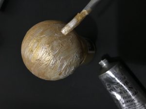
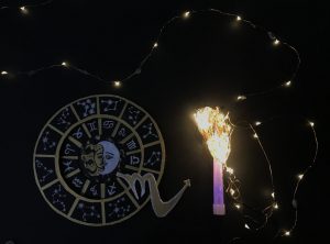
Using styrofoam balls and painted them to make the gold/silver/black planetsThe logo that’s sticking out is my horoscope sign – a Scorpio, and I purposely made it pop out so it will add to the line on letter ‘Q’
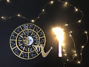
Initially I just wanted to use fairy lights to make the stars and constellations so as to create the ‘I’ in my name and for my background. But I also incorporated what Mimi told me to do which is using party light sticks! This is so that it will have almost the same “thickness” or width as the rest of the letters in my name in this specific work.
Without light exposureWith light exposure
And of course I had to do some editing using light-room and photoshop to get the contrast and bring out the bright light and covering up the wire liens of the fairy lights.
Before:
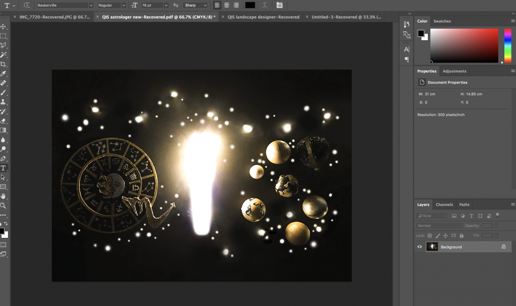
Photoshopping in the making
After:
And that above is my final for Astrologer!
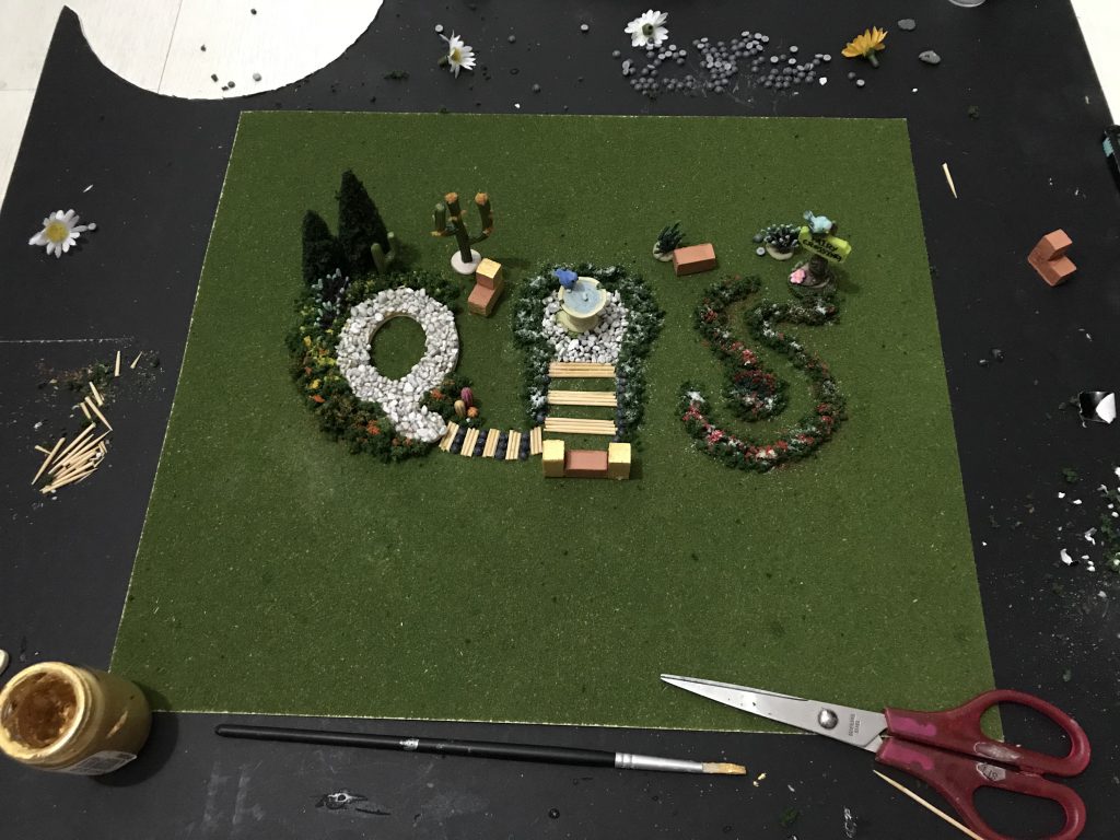
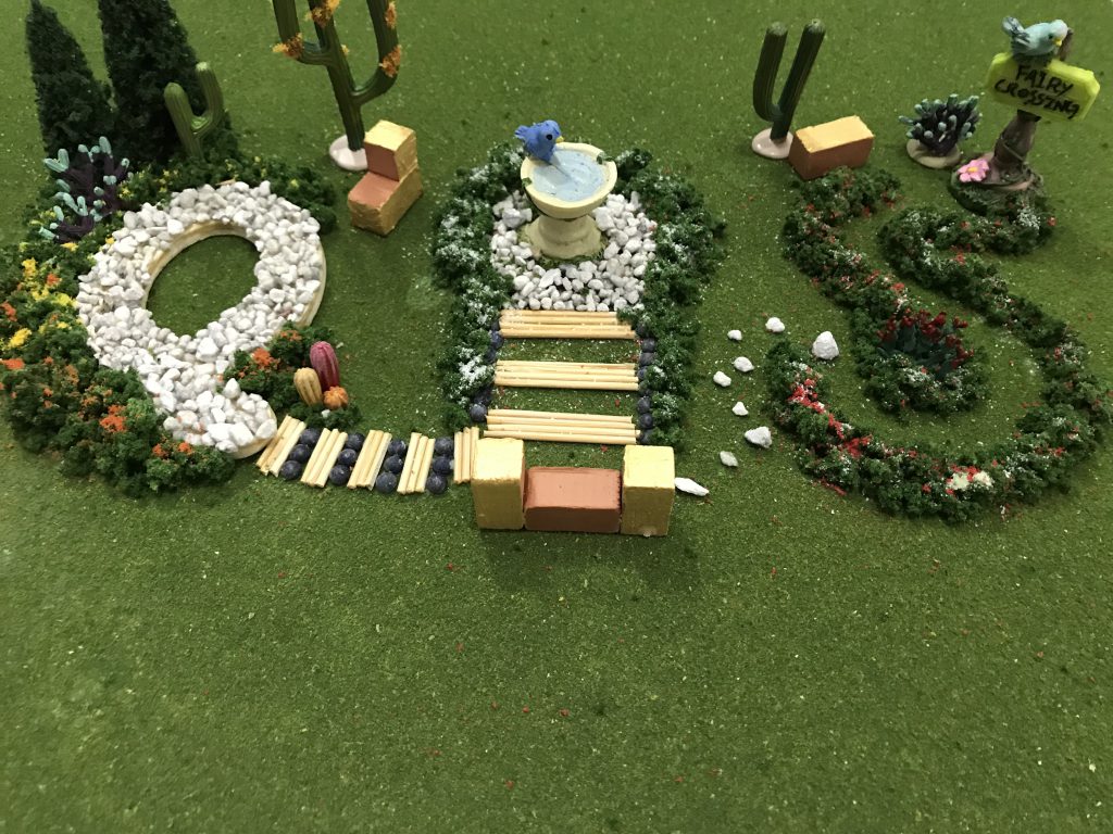
LANDSCAPE DESIGNER
I was excited to get started on this because it’s something I haven’t done in a long time – designing and decorating like as if it’s my own backyard haha.
To start off:
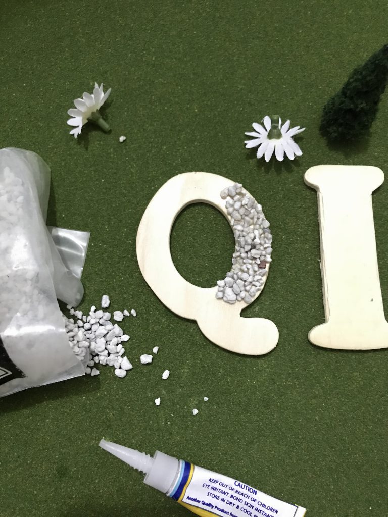
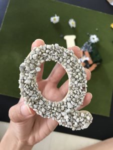
Making the little pool out of my letter using wood and small pebbles.
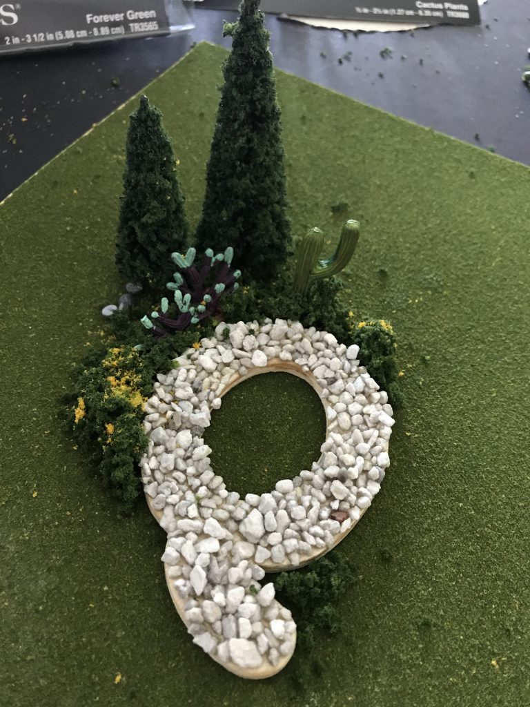
Adding the fake trees, cactus for decor and bushes with little yellow flowers surrounding itBasically a big mess for something that looks small!Close to finishing, going to paint the inner part of the pool to blue to make it look real
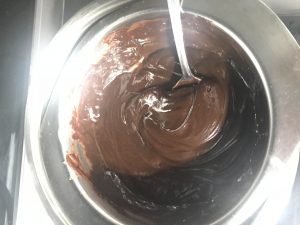
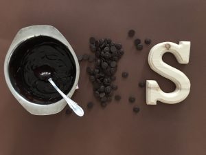
CHOCOLATIER
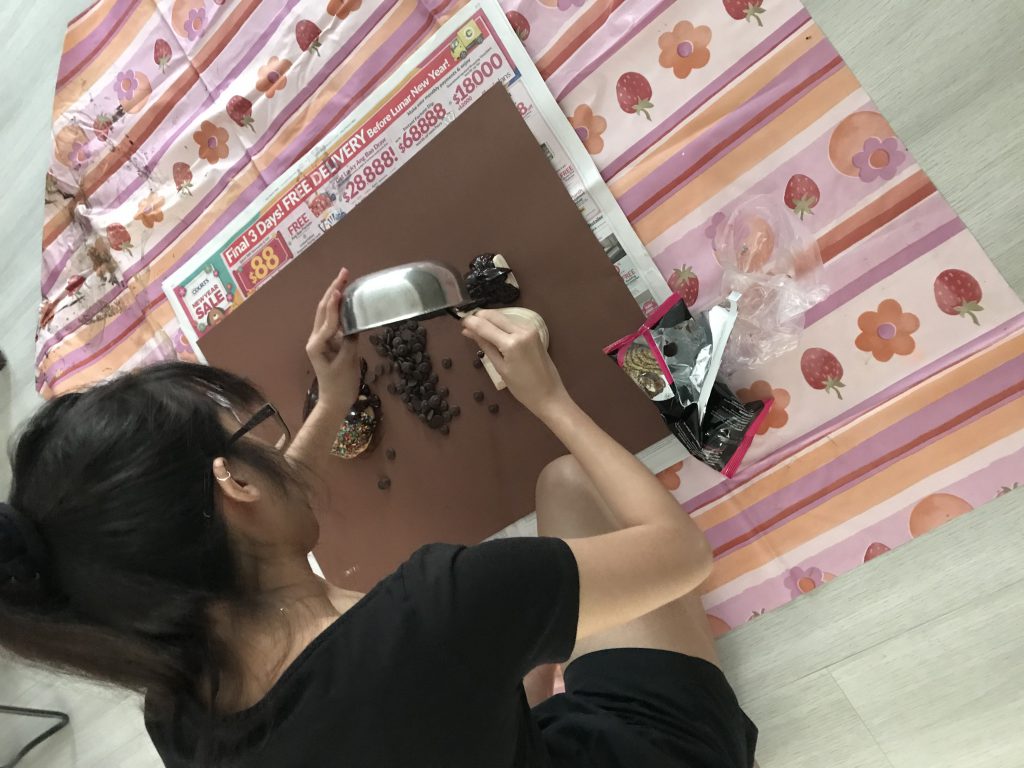
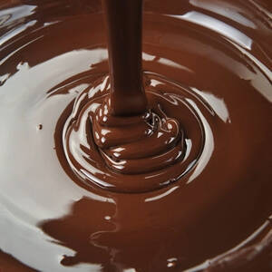
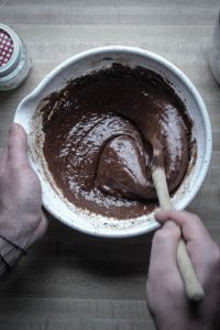
I had to melt the chocolates first to get the gooey-melting effect.
Initially thought of this idea where the chocolate melts are in the bowl and the spatula too so it could make into my initial ‘Q’ but that would be too simple.
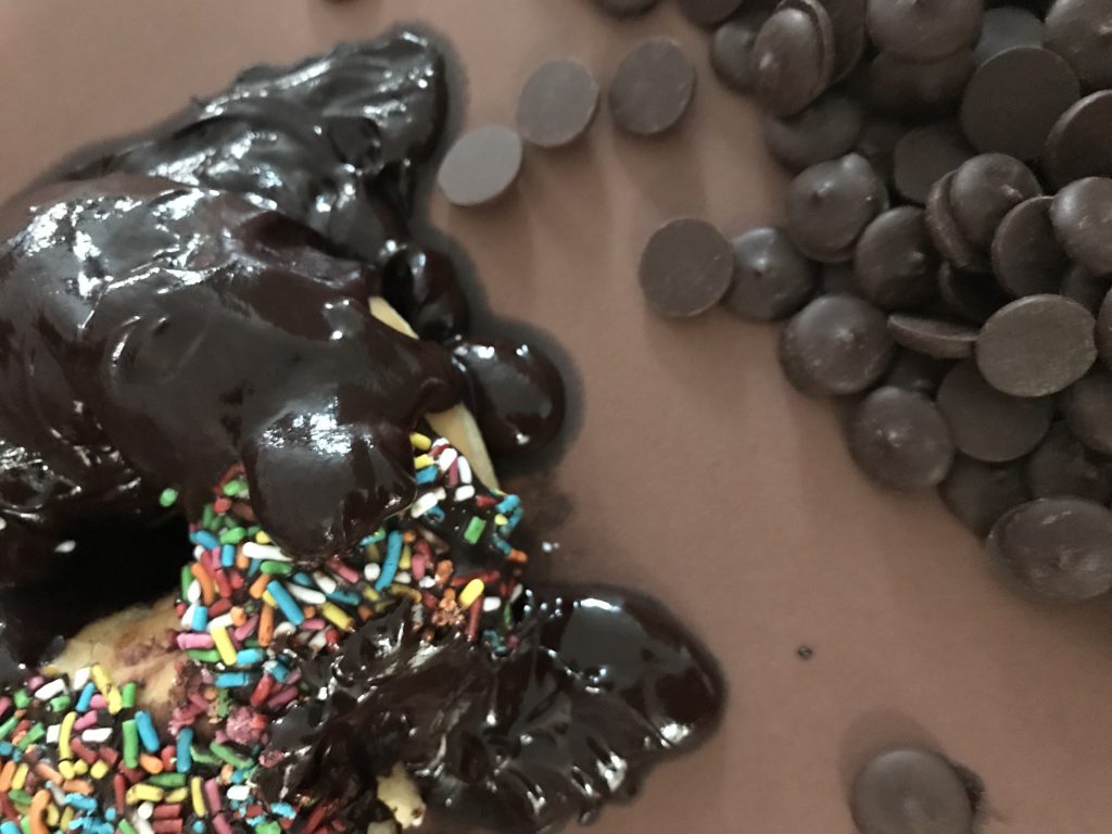
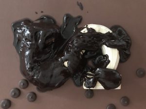
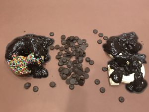
Pouring the chocolate melts slowly hoping to get the effect:
DetailsDetailsFinal before photoshop!
CONTEMPORARY DANCER
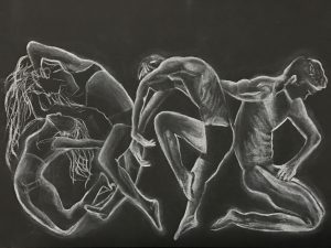
Processes of my drawings:
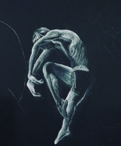
I erased some parts of the white off because I wanted more shadows and to really have more prominent lines on their bodies.
Finished drawing but before photshop
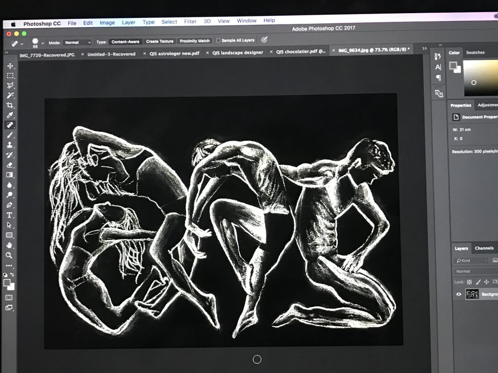
I had to do some editing in photoshop too to have more contrast and emphasise more on the white outline on them for the movement.
Before diving into the processes, I went for some “job search”!
MINDMAP:
But in my work, I wanted to portray the occupations that speaks to me – what I’ve admired about those jobs and the people who get to work as such.
Hence in the end I picked:
Astrologer
Landscape Designer
Chocolatier
Contemporary Dancer
RESEARCH:
When it comes to the typography, I relate it back to what we learnt in our first class exercise, seeing letters out of the ordinary, and also the ‘Image and Transformation’ presentation we had to do as well.
This was what I have set my mind to making by using images to transform it closely to the initials of my name “Qis”.
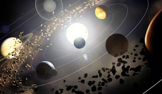
Astrologer
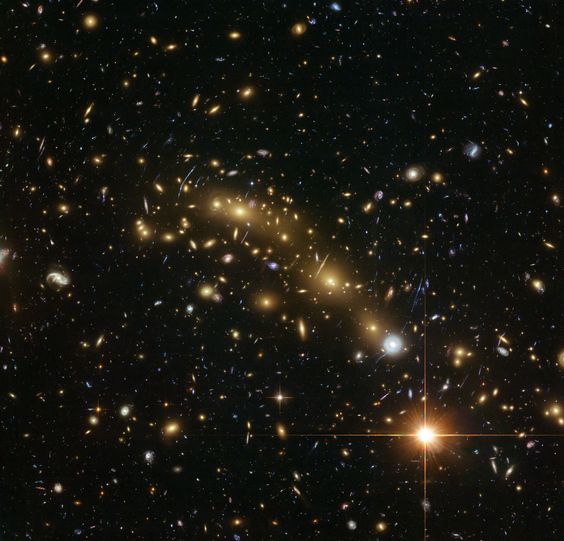
I’ve always admired Astrologers who gets to study astrology itself: thestudyofthemotionsandrelativepositionsoftheplanets,sun, and moon,interpretedintermsofhumancharacteristicsand activities.
So I looked up on images that came up to mind when I think of the things relating to astrology: planets (them orbiting to emphasise on it’s motions), zodiac charts, constellations in the sky where Astrologers usually associate it back to human characteristics.
The motion and movement of planets: orbiting around one anotherThe illuminating stars in the sky, the thought of constellations as wellAstrologer zodiac charts
Landscape Designer
Initially I wanted to be a Gardener because of the concept I had which is to use real life mini shrubs and trees to create my name out. But after consultation, I agreed with Mimi that it seems better to make the job title as a Landscape Designer.
I usually watch home designs on Lifestyle channel and get amazed at how these designers could transform a normal mundane backyard into something so beautiful.
They design attractive and functional gardens, parks, playgrounds, residential areas, college campuses, and public spaces. They also plan the locations of buildings, roads, walkways, flowers, shrubs, and trees within these environments.
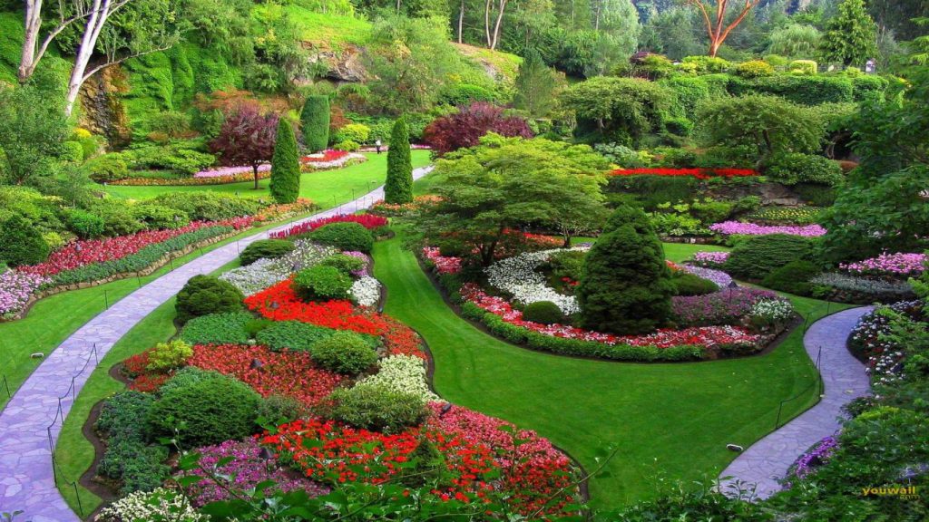
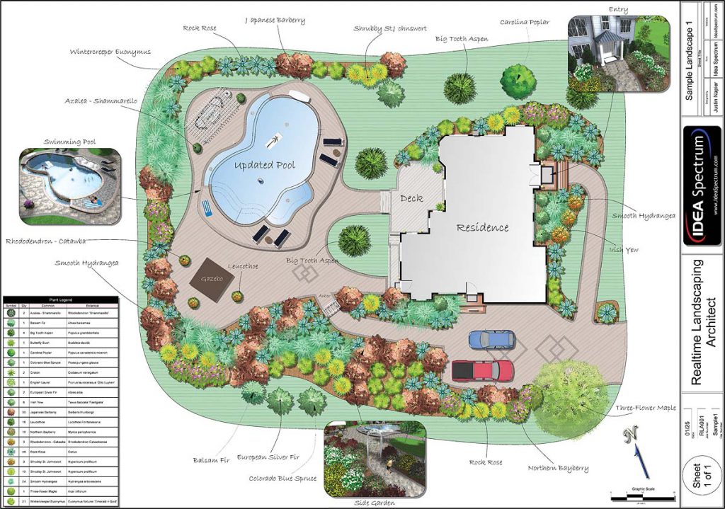
The bright colours in the flowers of the bushes, the greenery in the landscape – makes it all the more beautifulAn example of a blue print of a landscape designAn example with loads of rocks on them, the focus on the short staircase
Chocolatier
It’s all so interesting if someone gets to work with CHOCOLATES. I would love that job – I think I’d be in heaven having to taste all kinds of chocolates when being in the chocolate factory to make different kinds of chocolate. Or having to bring them back home for free!
When I think of chocolates, I think of thick-gooey-melting effect chocolates. So I searched up on things like that below.
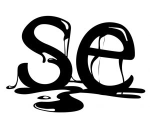
Maybe even the letters in my name could have a dripping effect:
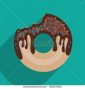
It could even be on a donut since my letter ‘Q’ has a shape ‘O’ in it
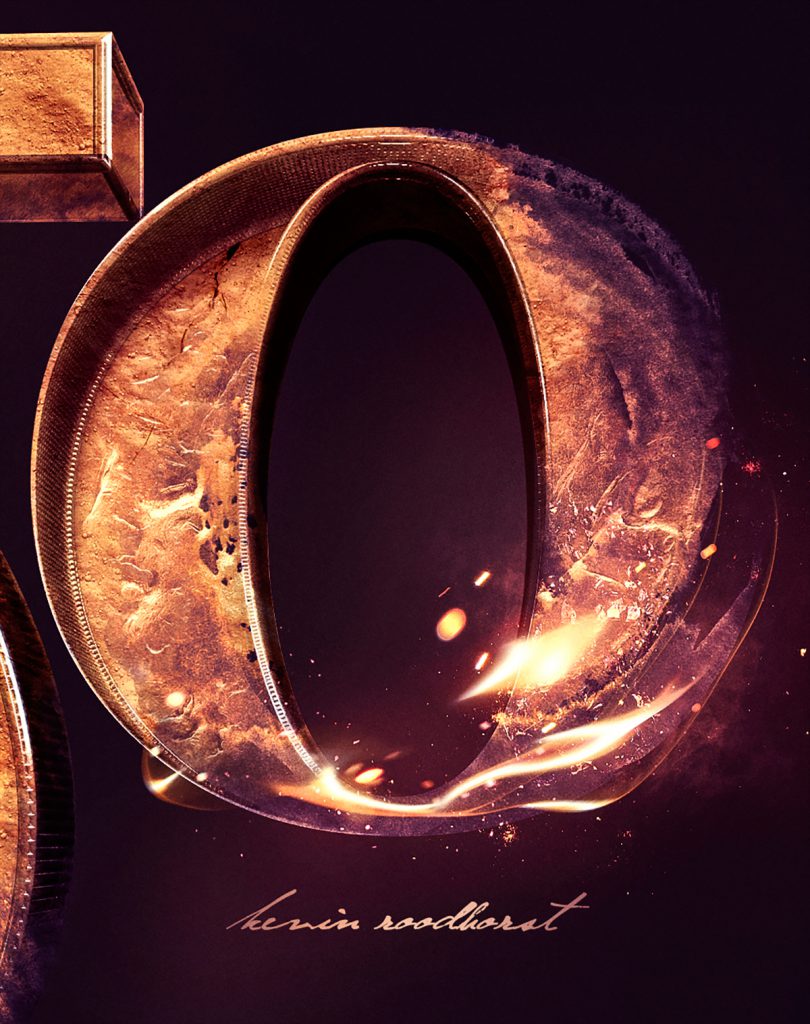
I also searched up on Behance to get more inspiration and ideas on especially the initial of my name ‘Q’ such as the one below – how he photoshopped the light into the ‘O’.
https://www.behance.net/kevinroodhorst
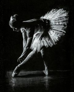
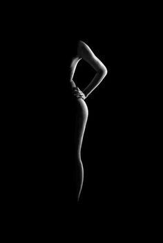
Contemporary Dancer
I adore the movements and flexibility in these Contemporary Dancers, they seem to show more feelings in their movements more than any other dancers.
That is exactly the main characteristics in a contemporary dancer. When I watch the videos of these contemporary dancers dancing, I realise that the lighting also plays a huge part on bringing the mood to bring out the movement and beauty of their dance moves.
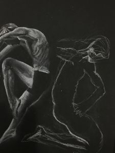
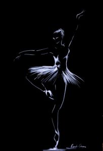
So I decided to search up on ways to emphasise the curves and lines on their movements. I like the idea of white charcoal on black paper, like the ones below as it brings out the light on them.
It can be as simple and minimal as the one below. Also because most of the time these contemporary dancers dance with little to no clothes on them, to emphasise on the raw and beauty of their movement while dancing.
With all that, I began incorporating these ideas into my sketches in my CPJ and next, on my process post.


 and I am an Astrologer
 and I am a Landscape Designer
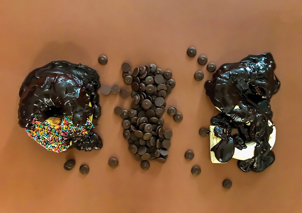 and I am a Chocolatier
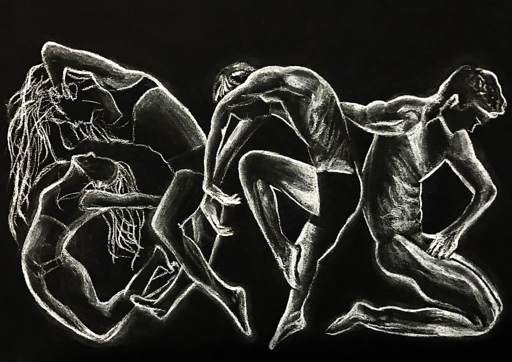 and I am a Contemporary Dancer