
After all the job search done, I have decided on being an Astrologer, Chocolatier, Landscape Designer and Contemporary Dancer.
Process for typography of job for:
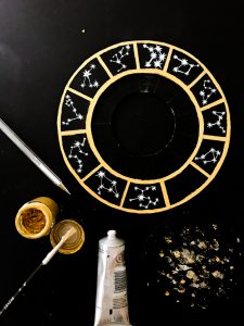
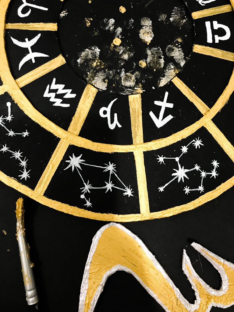
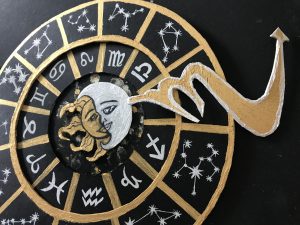
ASTROLOGER
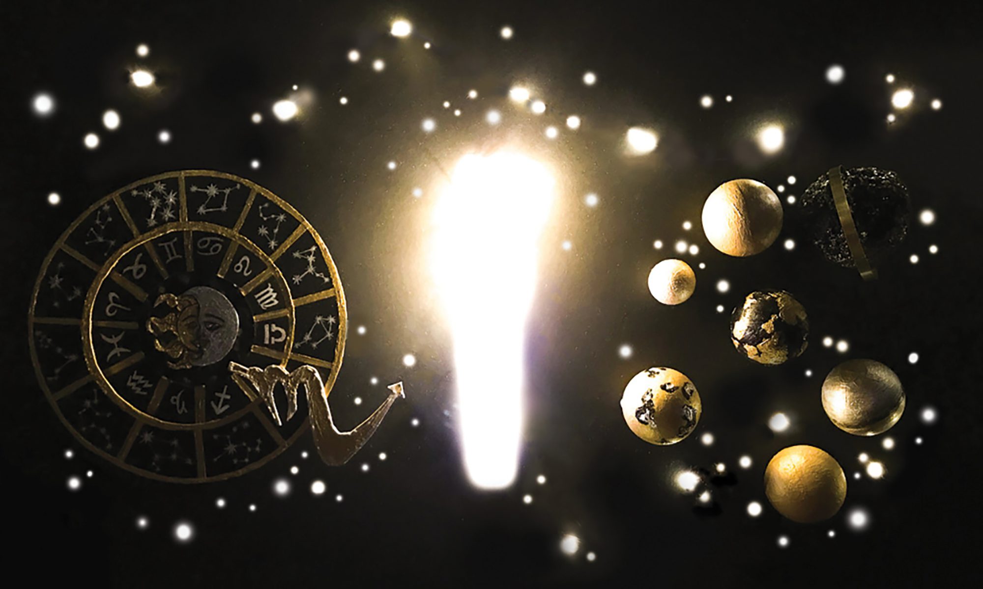
I was inspired by a few things I’ve researched on when i think about “astrologer” such as the ones below:
So I based my main sketch for Astrologer on these:
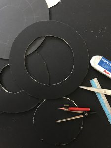
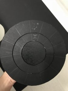
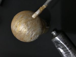
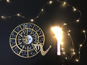
I cut out different sizes of the circle to create the astrologist/zodiac chart, so that they will look popped up on the board I pasted it on. I needed it popped up so that it looks like it has the same kind of thickness as the planets i’m creating later on later on.
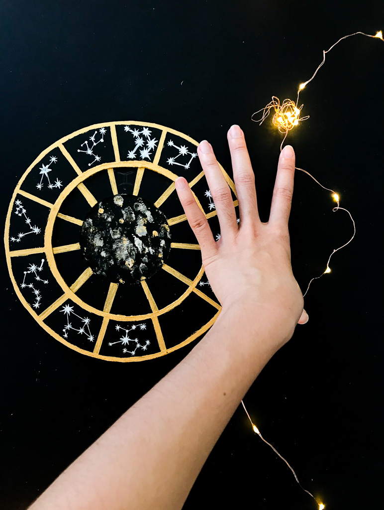
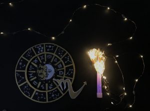
Initially I just wanted to use fairy lights to make the stars and constellations so as to create the ‘I’ in my name and for my background. But I also incorporated what Mimi told me to do which is using party light sticks! This is so that it will have almost the same “thickness” or width as the rest of the letters in my name in this specific work.
And of course I had to do some editing using light-room and photoshop to get the contrast and bring out the bright light and covering up the wire liens of the fairy lights.
Before:
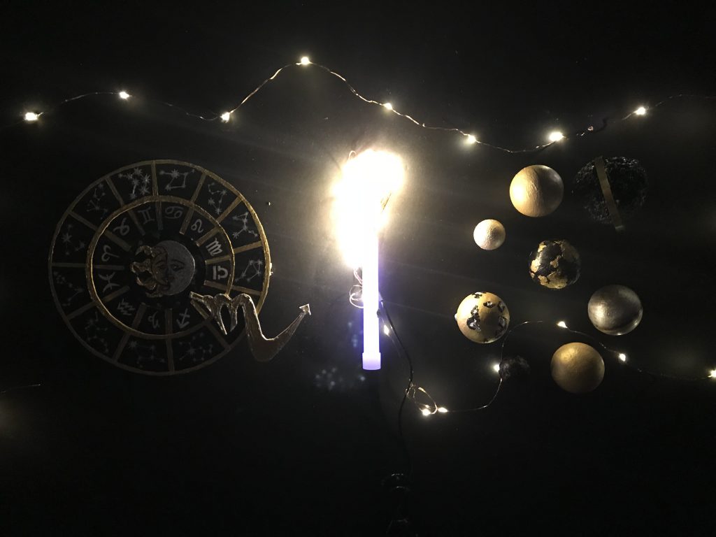
After:
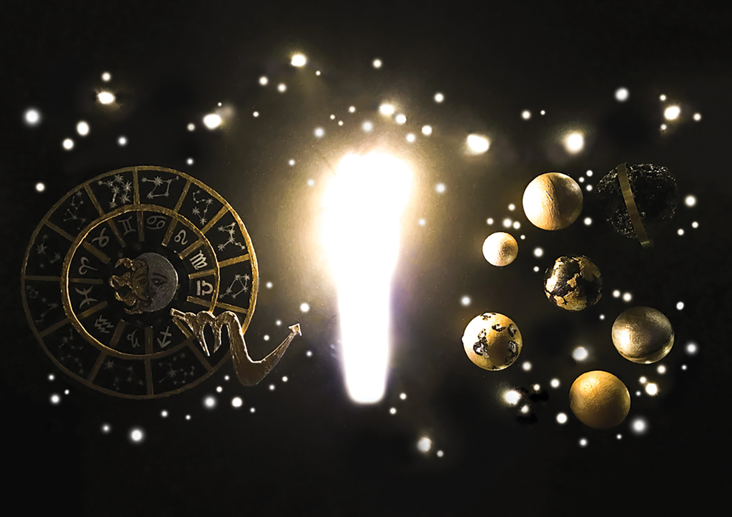
And that above is my final for Astrologer!
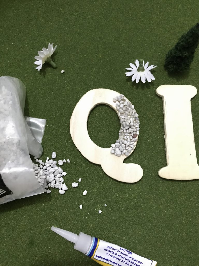
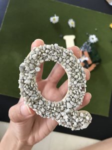
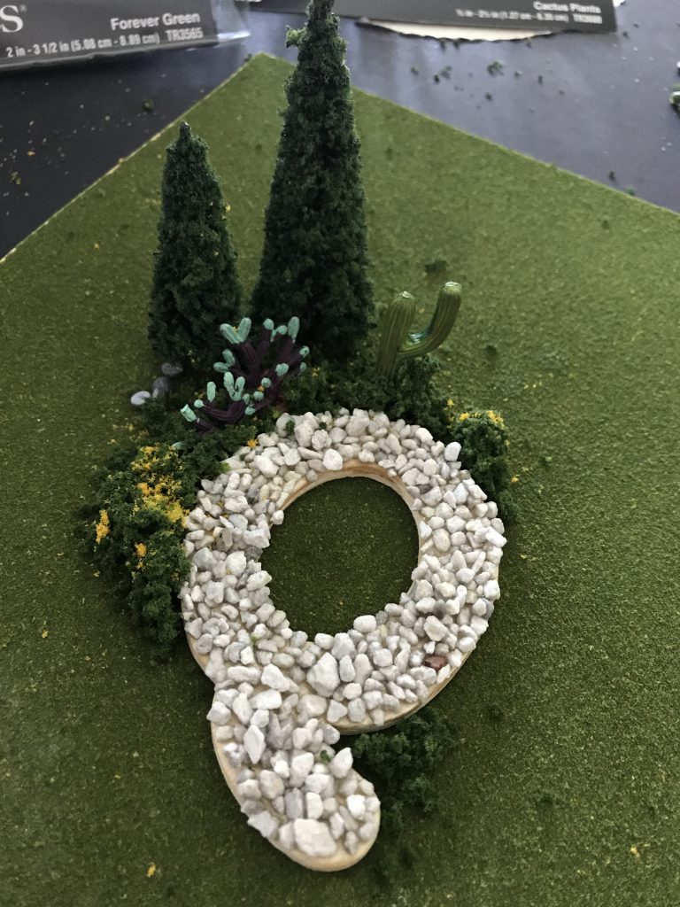
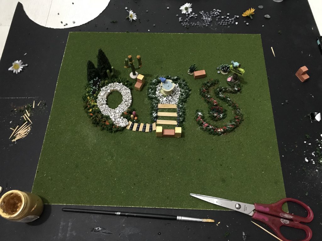
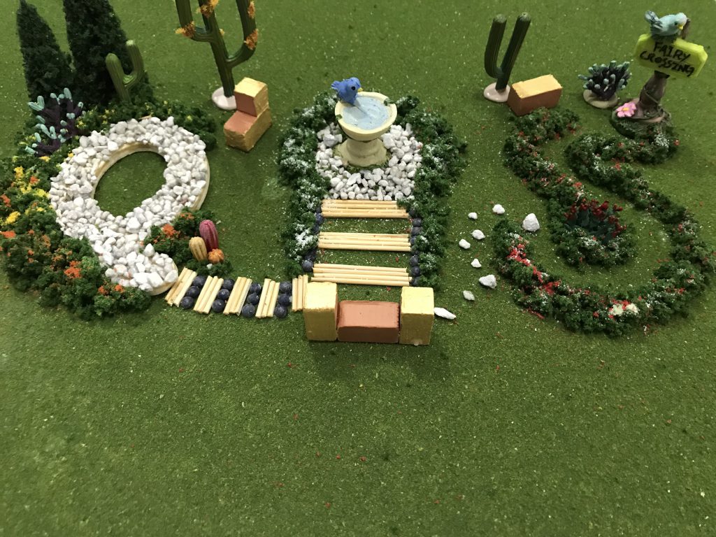
LANDSCAPE DESIGNER
I was excited to get started on this because it’s something I haven’t done in a long time – designing and decorating like as if it’s my own backyard haha.
To start off:
Making the little pool out of my letter using wood and small pebbles.
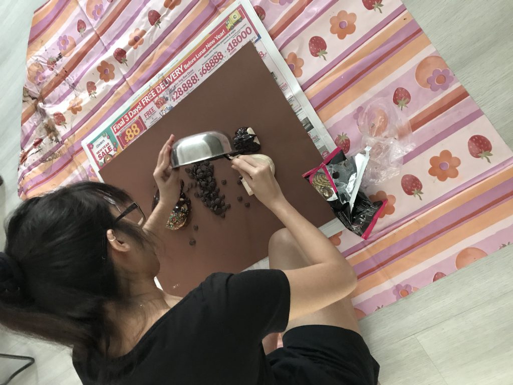
CHOCOLATIER
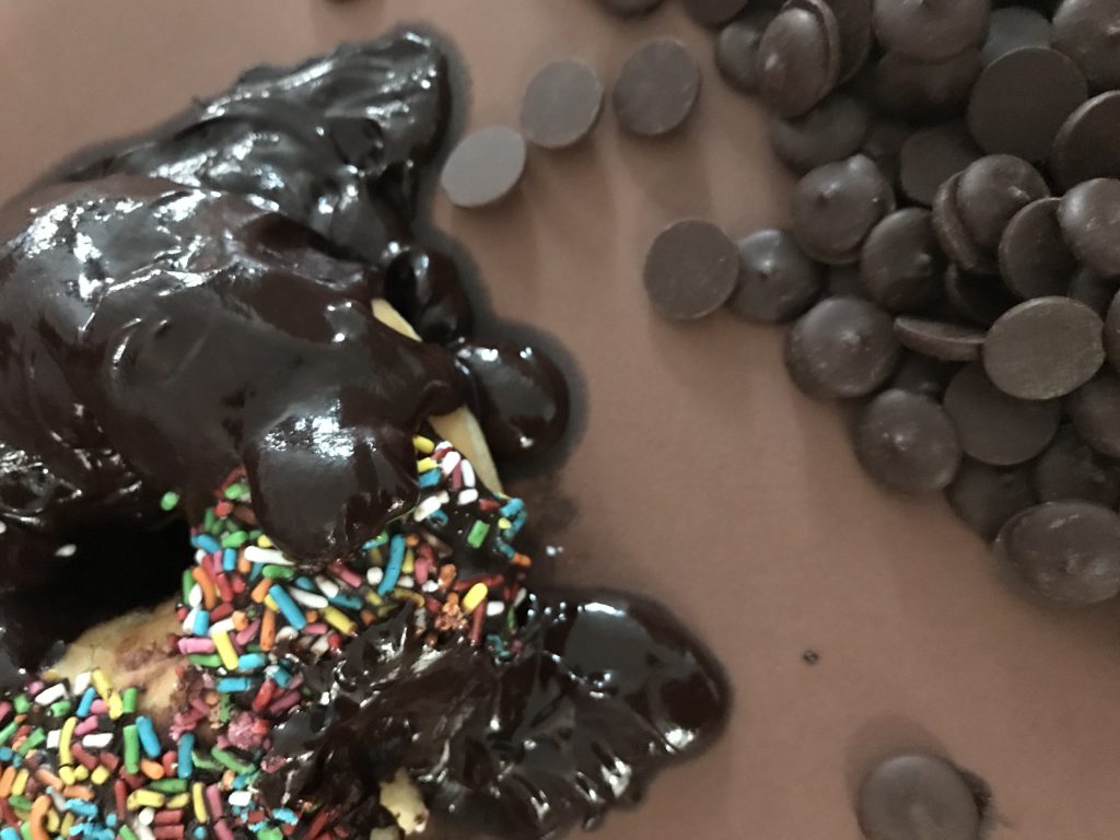
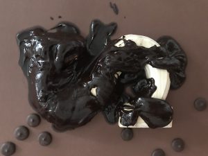
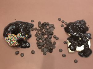
I had to melt the chocolates first to get the gooey-melting effect.
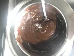
Initially thought of this idea where the chocolate melts are in the bowl and the spatula too so it could make into my initial ‘Q’ but that would be too simple.
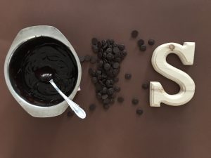
Pouring the chocolate melts slowly hoping to get the effect:
CONTEMPORARY DANCER
Processes of my drawings:
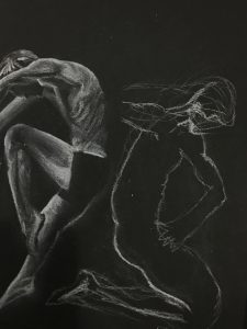
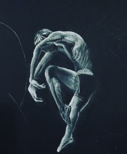
I erased some parts of the white off because I wanted more shadows and to really have more prominent lines on their bodies.
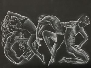
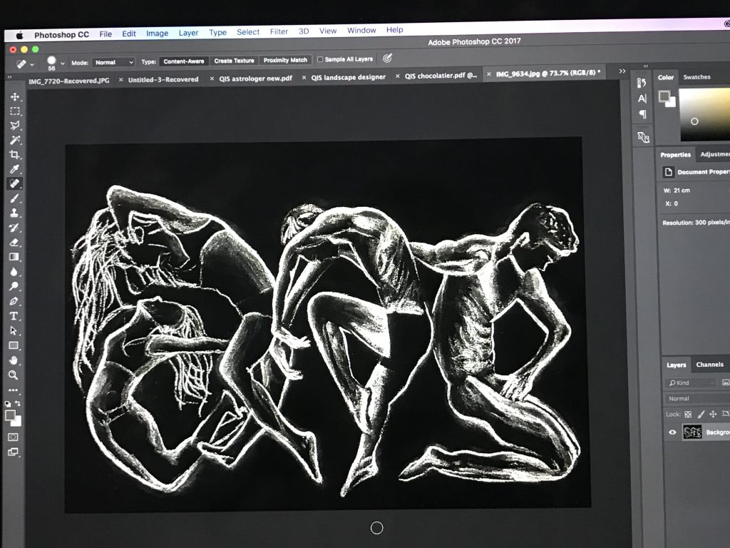
I had to do some editing in photoshop too to have more contrast and emphasise more on the white outline on them for the movement.
Next post will show my final results!