
Before diving into the processes, I went for some “job search”!
MINDMAP:
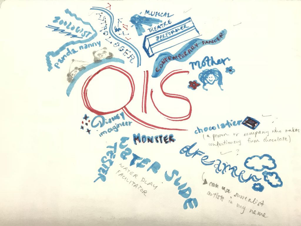
But in my work, I wanted to portray the occupations that speaks to me – what I’ve admired about those jobs and the people who get to work as such.
Hence in the end I picked:
Astrologer
Landscape Designer
Chocolatier
Contemporary Dancer
RESEARCH:
When it comes to the typography, I relate it back to what we learnt in our first class exercise, seeing letters out of the ordinary, and also the ‘Image and Transformation’ presentation we had to do as well.
This was what I have set my mind to making by using images to transform it closely to the initials of my name “Qis”.
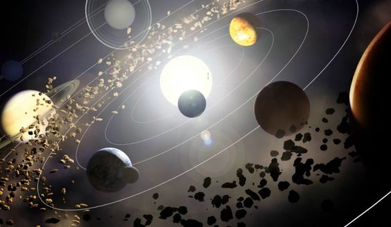
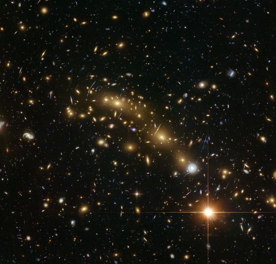
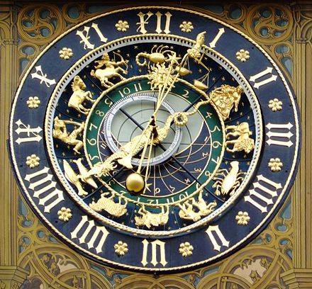
Astrologer
I’ve always admired Astrologers who gets to study astrology itself: the study of the motions and relative positions of the planets, sun, and moon, interpreted in terms of human characteristics and activities.
So I looked up on images that came up to mind when I think of the things relating to astrology: planets (them orbiting to emphasise on it’s motions), zodiac charts, constellations in the sky where Astrologers usually associate it back to human characteristics.
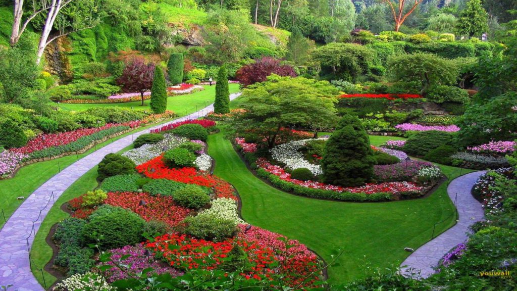
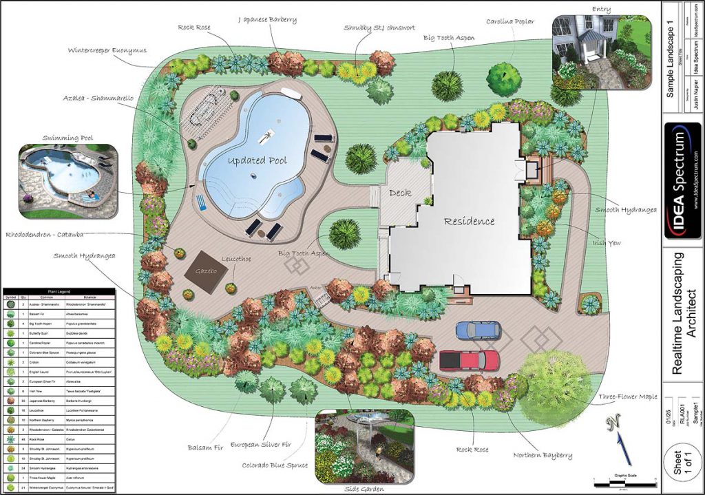
Landscape Designer
Initially I wanted to be a Gardener because of the concept I had which is to use real life mini shrubs and trees to create my name out. But after consultation, I agreed with Mimi that it seems better to make the job title as a Landscape Designer.
I usually watch home designs on Lifestyle channel and get amazed at how these designers could transform a normal mundane backyard into something so beautiful.
They design attractive and functional gardens, parks, playgrounds, residential areas, college campuses, and public spaces. They also plan the locations of buildings, roads, walkways, flowers, shrubs, and trees within these environments.

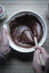
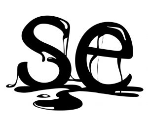
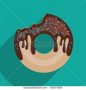
Chocolatier
It’s all so interesting if someone gets to work with CHOCOLATES. I would love that job – I think I’d be in heaven having to taste all kinds of chocolates when being in the chocolate factory to make different kinds of chocolate. Or having to bring them back home for free!
When I think of chocolates, I think of thick-gooey-melting effect chocolates. So I searched up on things like that below.
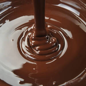
Maybe even the letters in my name could have a dripping effect:
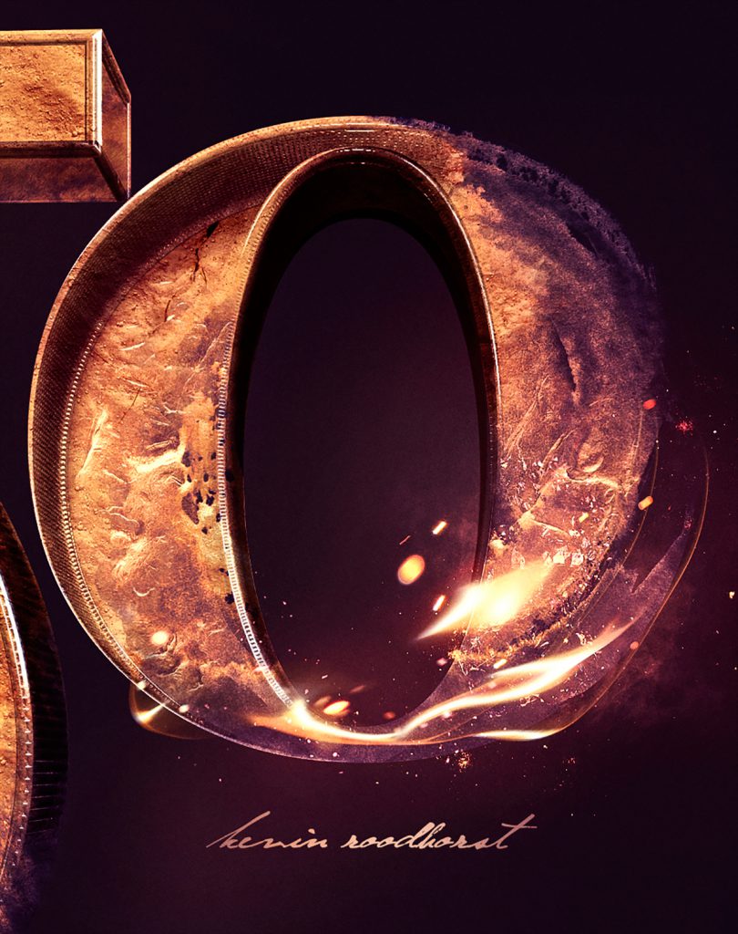
I also searched up on Behance to get more inspiration and ideas on especially the initial of my name ‘Q’ such as the one below – how he photoshopped the light into the ‘O’.
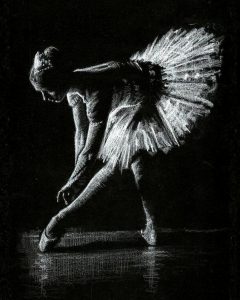
Contemporary Dancer
I adore the movements and flexibility in these Contemporary Dancers, they seem to show more feelings in their movements more than any other dancers.
That is exactly the main characteristics in a contemporary dancer. When I watch the videos of these contemporary dancers dancing, I realise that the lighting also plays a huge part on bringing the mood to bring out the movement and beauty of their dance moves.
So I decided to search up on ways to emphasise the curves and lines on their movements. I like the idea of white charcoal on black paper, like the ones below as it brings out the light on them.
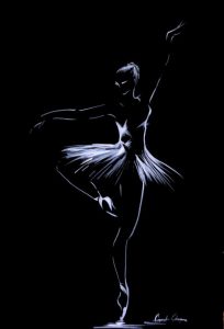
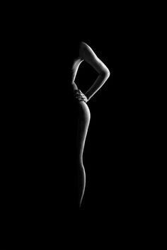
It can be as simple and minimal as the one below. Also because most of the time these contemporary dancers dance with little to no clothes on them, to emphasise on the raw and beauty of their movement while dancing.
With all that, I began incorporating these ideas into my sketches in my CPJ and next, on my process post.