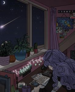
In addition to my previous post, I’m going to talk more on the concept for my idea behind my EGO project.
IDEATION
I chose to be a Moon instead of any other thing or human beings because I have always thought Moon are beautiful, despite it having their phases, just like humans. I have always associated myself with the moon, so why not be…a Moon this time? Haha.
I researched more on the Moon phases because the meaning behind each tells a significant part of a story in my life and how I can show that the Moon cycle is also a growing cycle for me. Here’s the Moon theory, a concept I use for this final project.

So the arrows pointing to the numbers in circles, is to show how i will be representing myself in the panel of that number.
For example for the 1st, I am a ‘New Moon’ because my first panel is:
Me looking forward to JC life + Toxic friends = Sad me, not excited anymore
For my 2nd, I am a ‘Crescent Moon’ because my second panel is:
Me wanting to get through JC life + Books (Me working hard) = Happy me holding an award
For my 3rd, I am a ‘First Quarter Moon’ because my third panel is:
Depressed me + Loved by friends and family = I’m slowly healing, becoming a stronger me
And last but not least, for my 4th, I am a ‘Full Moon’ because my fourth panel is:
Happy me, renewed + Met someone new that I can vibe with = Happier me, in love
So I drew out my ideas and how I would want it to look. Since I decided to do traditional illustration because I’m better by doing things traditionally (and not digitally), now is my time to make full use of it. I chose to execute this by making a tall black board with 12 square panels to make a pop-up within each empty panel, of my illustration of the Moon (me).

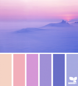
And for the colour scheme…

There’s a contrast between the first moon panel, New Moon, and the last moon panel, Full Moon because one shows the beginning of my “sad” stage, and the last shows the beginning of my happier journey. Hence why the first panel the moon is in red colour, because I was a new moon, and new moon are silhouettes but here I needed to put colour so I preferred a dark colour like red. And for the 4th panel, it starts off with yellow because I’m now a full moon, supposedly glowing. There’s a difference in the analogous colour scheme in the 2nd and 3rd panel – the 2nd one is more warm as I added a green colour touch to it, supposedly to symbolise the touch of happiness and proud moment because my hard work has paid off. But the 3rd panel the colour scheme is cooler and darker, to symbolise the start of my depression stage, and the struggle to get back up.
PROCESS
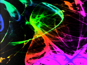
I also wanted to make my pop-up illustration glow in the dark, because the whole idea of this was to make it seem like i’m living in space and so i thought it’d be great to have different colours glow, like how a moon does. Hence i tried using Mod-Podge Glow Paint as layer on top of my painting.


However the biggest problem here is, it only glows in ONE colour which was super annoying because the whole point of this project was to have different colours shown in harmony. I just needed them to GLOWWW.
Fret not, I decided to buy fluorescent paints that will glow when UV light is being shone on it.


And I was limited to 5 colours so I mixed it with each other and tested to see if they can give me different colours for the analogous effect, and glad to say for most it did.