Ah. A new learning point again…..SILKSCREEN, YAY. It was my first time trying it out and it takes patience for the process but the outcome of it all amazed me.
Here’s the red room where most of the silkscreen processes were done.
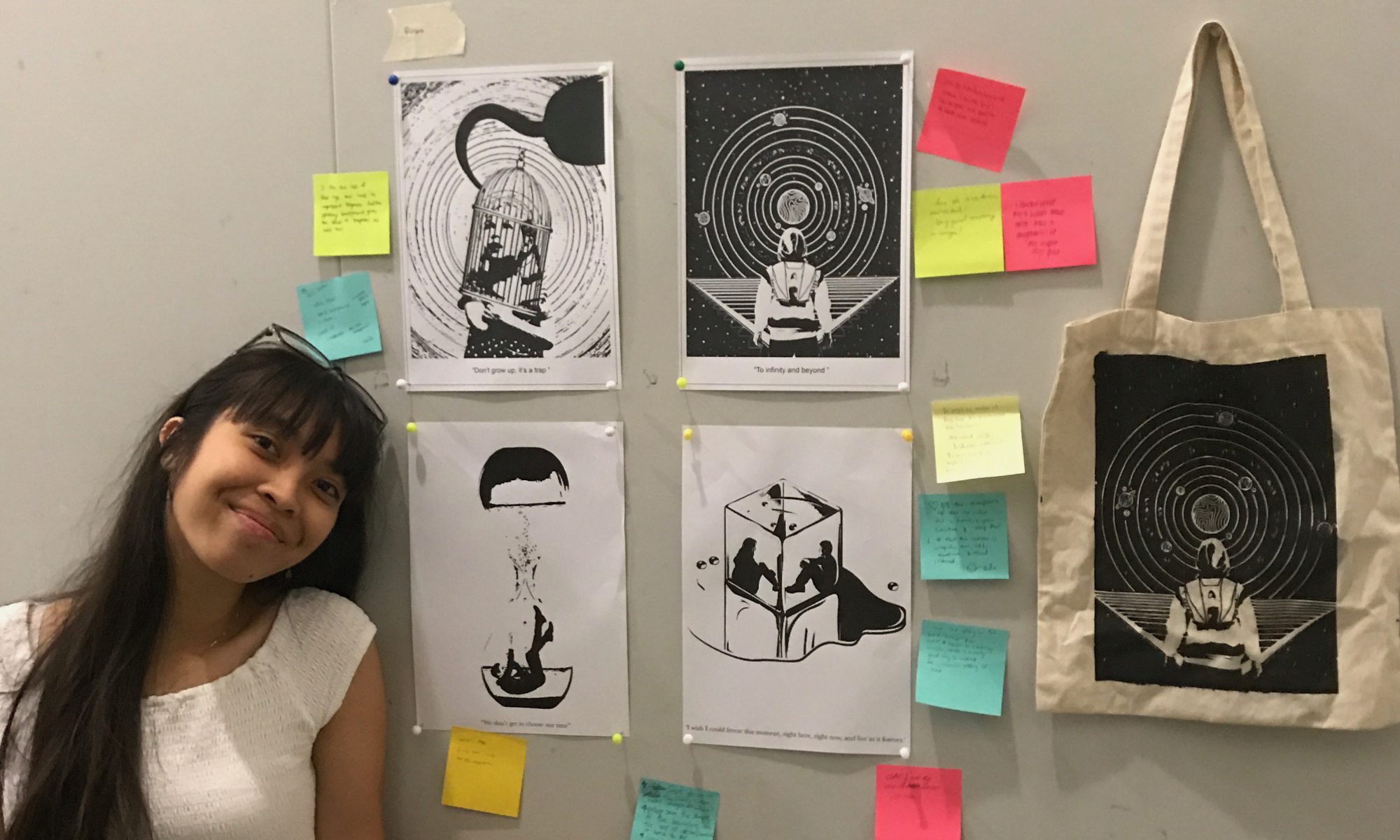
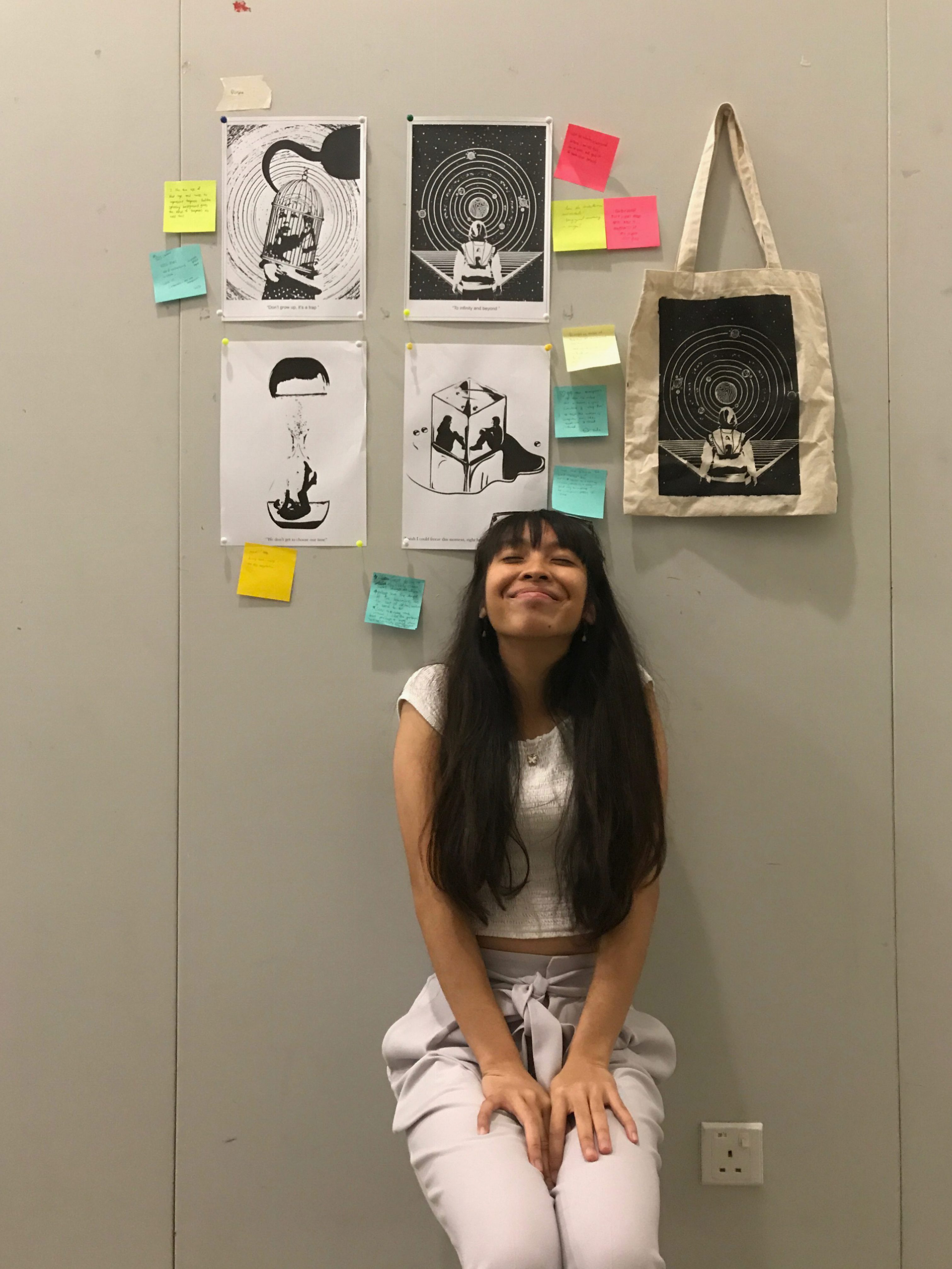
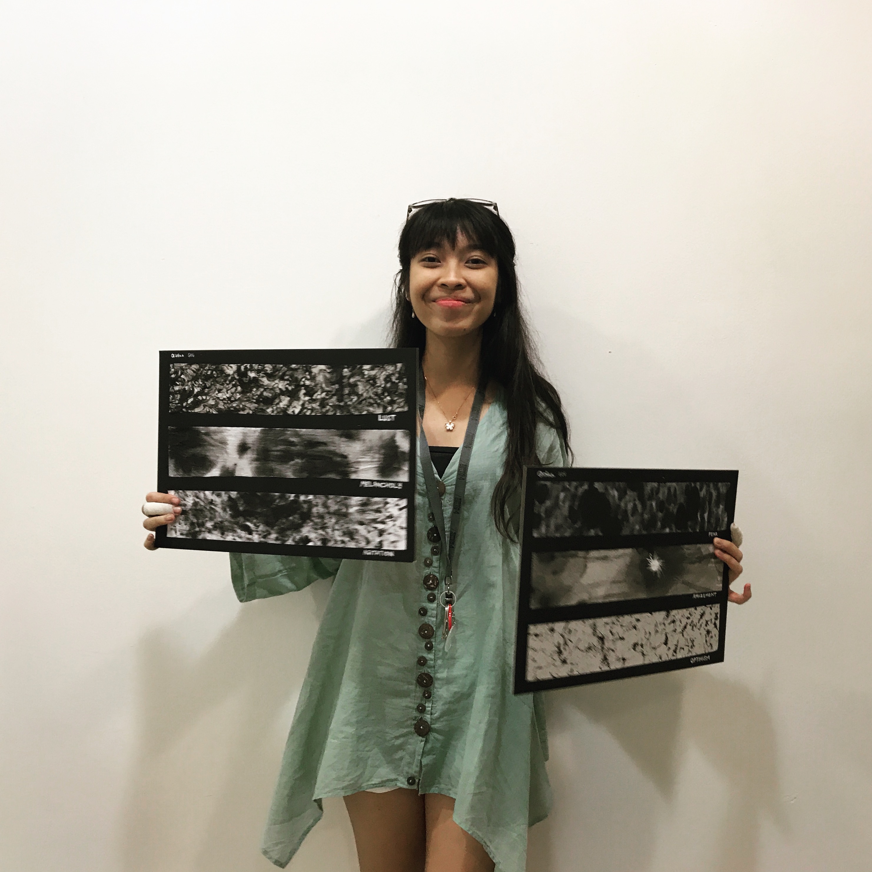
That’s me holding my work printed on transparency paper.
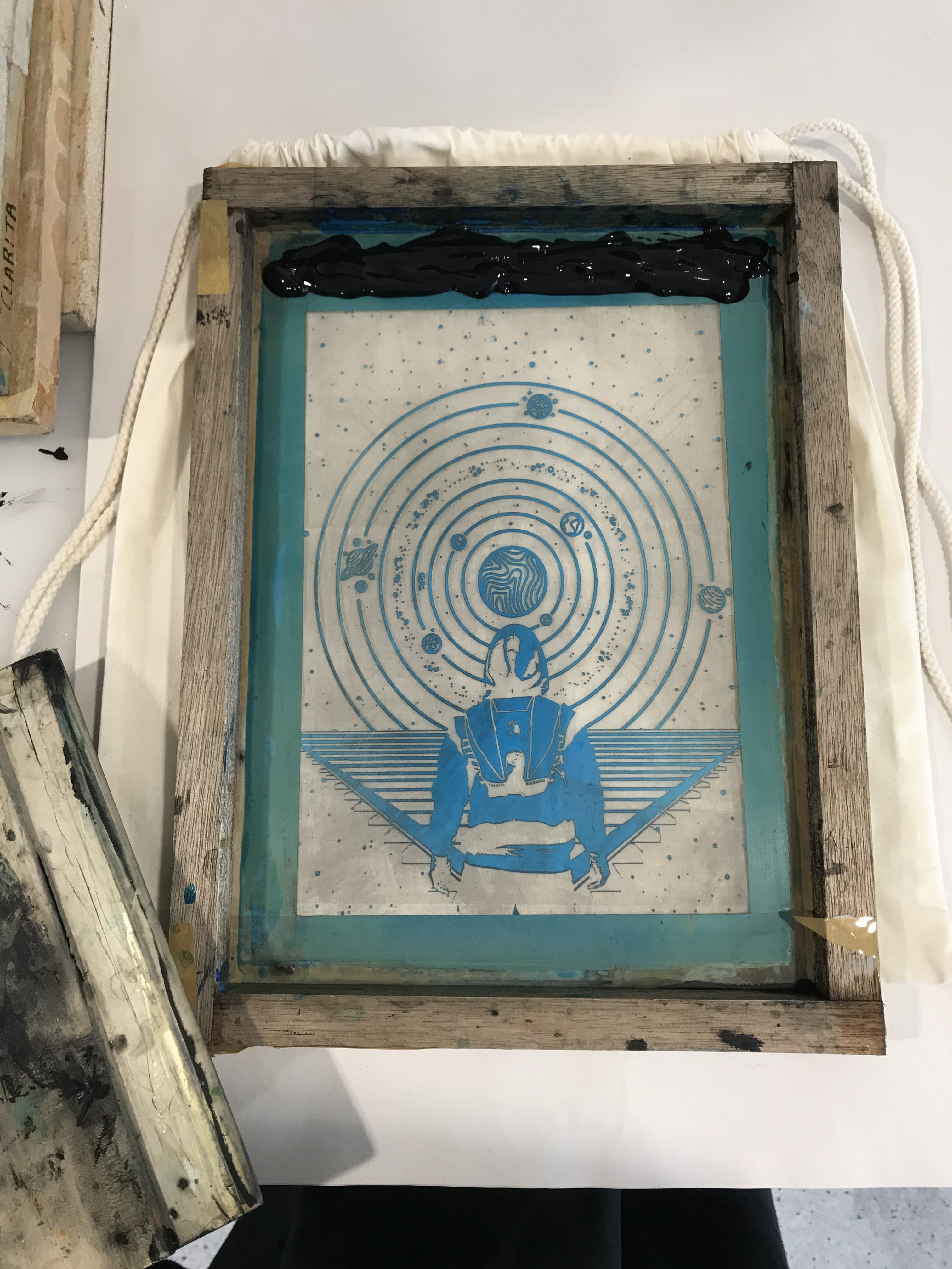
Preparing to do the silkscreen.Washing away the blue stuff on it to get the pattern out.This is before all that blue stuff is being poured on it, also before washing them off. This is to heat it to get the pattern to sort of stay on the silkscreen material permanently.Ready to put on clothe.
TA DAAAA ahhh see why it amazes me now?
Before doing it on all the above bags, in the previous lesson I tried it out on paper and just ragged cloth first to test it out. What I learnt was to control the amount of ink you want to put on your silkscreen, as it will affect the outcome of it – you want the ink to seep into the blank spaces just enough to look decent on paper/cloth.
Done on the previous lesson.
So in the end, for my final outcome, this is it:
This was a challenging project because firstly I’m a beginner in photoshop and so I had no photoshop skills but I try and try and ask for help again and again in a short period of time. Although I felt that I could have done much better for the below two works printed on paper (as seen above), I knew I improved further on my works as seen on the 2 works placed above them.
Learning point to myself is: Don’t be scared to try new things and ASK for help. And maybe next time input what you learn from your presentation such as the principles of Gestalt into your projects. Take what you can from those presentations in class and use them into your works, that’s the whole point of learning new things after all.
Just to refresh back from previous post. These are my final quotes:
“To infinity and beyond.” by Buzz Lightyear from the movie ‘Toy Story’
“We don’t get to choose our time.” by The Ancient One from the movie ‘Dr Strange’
“Don’t grow up, it’s a trap.” by Peter from the movie ‘Peter Pan’
“I wish I could freeze this moment, right here, right now and live in it forever.” by Peeta from the movie ‘The Hunger Games’
Inititially I wanted to focus more on the quote from Peter Pan – “Don’t grow up it’s a trap”. So here are my processes:
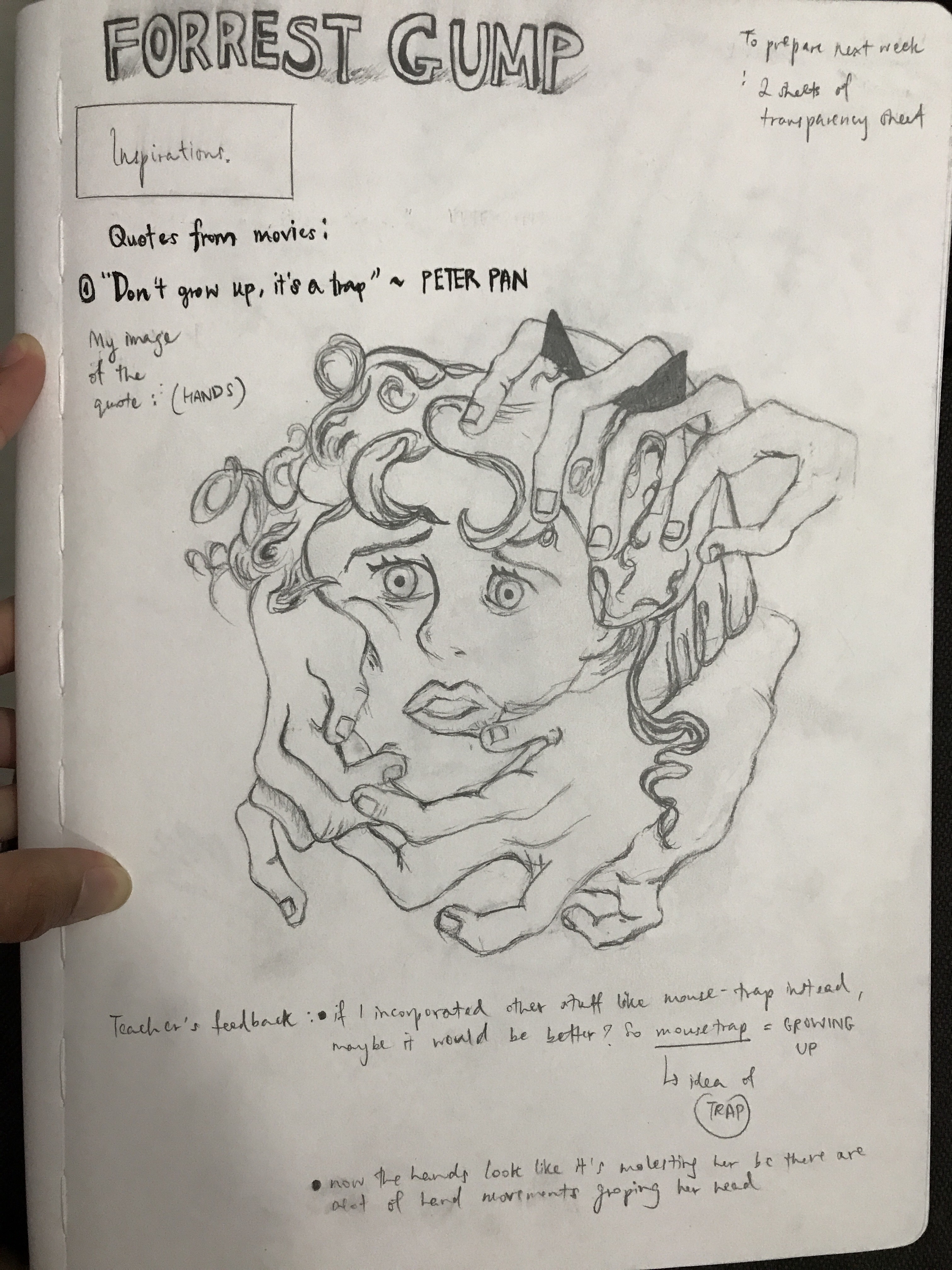
I focused on the idea of “trap” and not “growing up”. Since i didn’t have photoshop initially, I sketched my first idea out which was having the innocent but “scared” Wendy look being trapped through the symbolism of hands around her. ( as seen below)
But after consultation, my professor and I agreed that it looked like as if she’s being groped or molested and that was definitely not how i want it to come across.
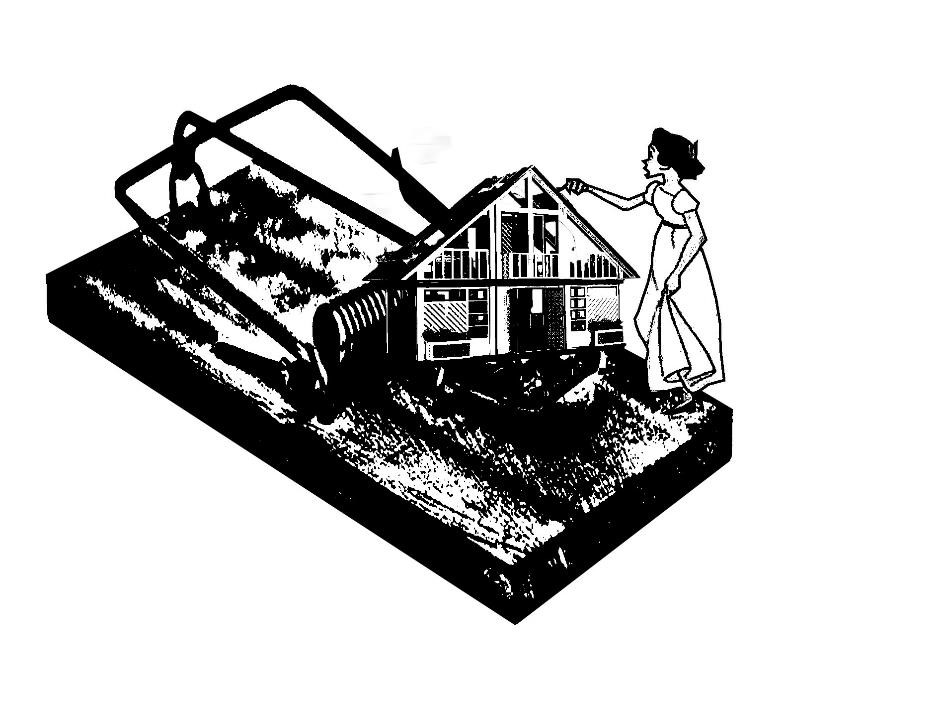
So i came up with a few more ideas. Why not Wendy being trapped in a mousetrap and the stuff that she is going for is a ‘dream house’ that resembles adulthood? Which was also part of growing up? (seen below)
But in the end I didn’t like how it turned out as it looked abit literal, and i wanted a minimalistic kind of work which was not represented here.
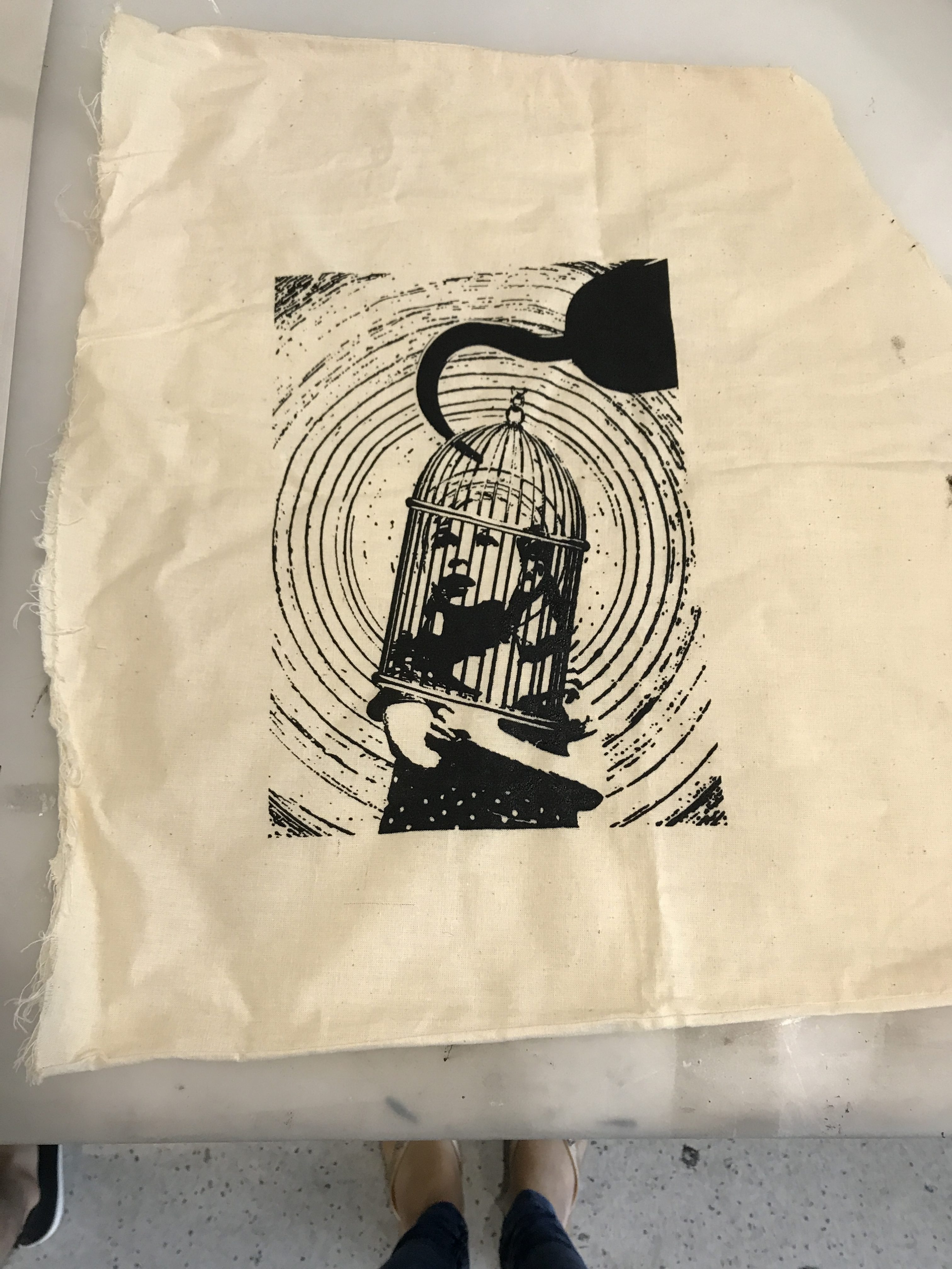
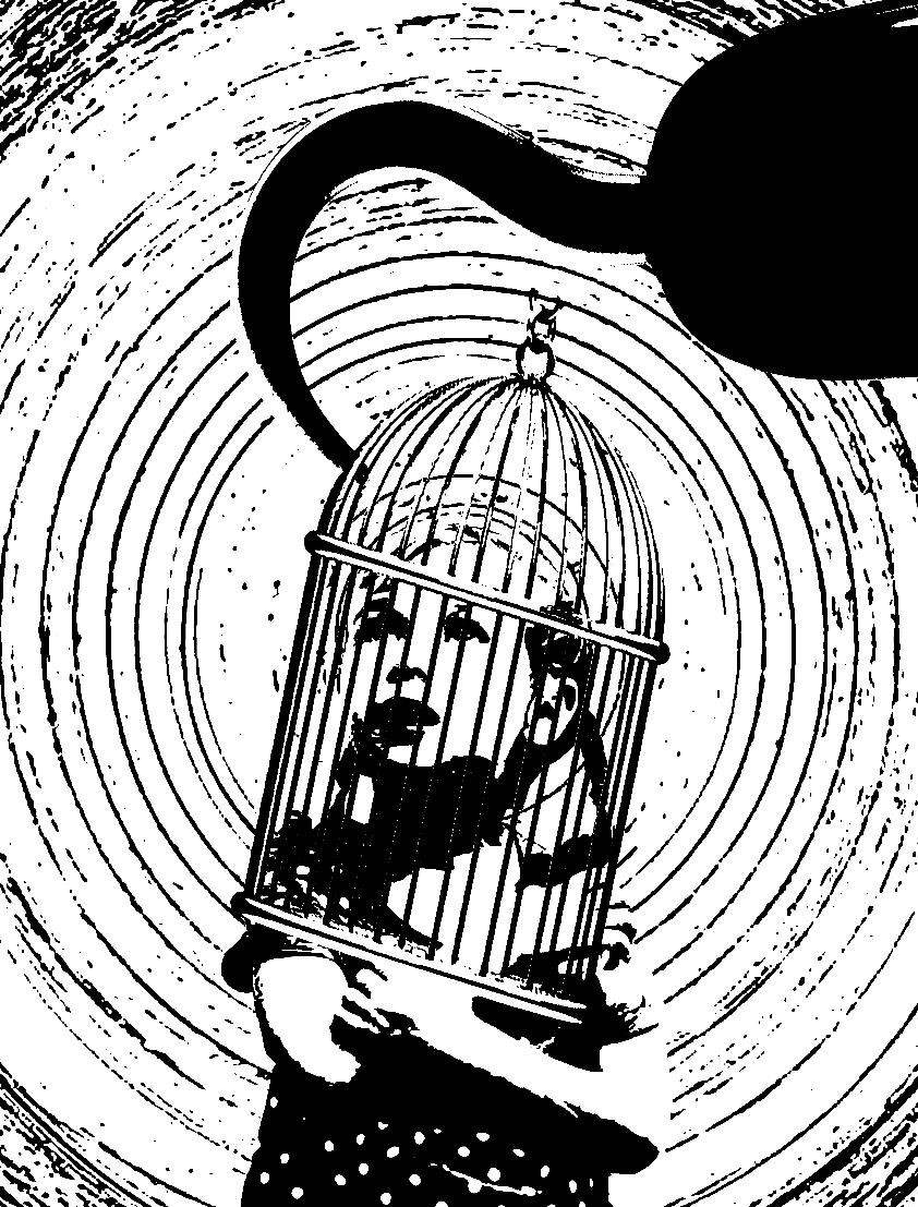
I tried using the cage as a trap instead and a huge hand that was suppose to resemble the ‘bigger’ person in adulthood. And the ghostly-shaped blackhole was suppose to represent her going into a ‘lost’ zone once she grows up.
I liked where i was going from here but i felt that some things was abit off for example: Wendy is too literal here, I didn’t want people to know who or what this person is suppose to be. And I felt that the blackhole was taking most of the attention hence it was not necessary for it to be there in the first place. And then I had an idea where the big hand could be replaced by a hook, you know, to put a touch of Captain Hook (the evil man) in the movie Peter Pan.
So then I ended up with the one below, and I liked it.
I used a normal innocent-looking girl that looks slightly lost hence the circular motions behind to represent her state of confusion and lost after being trapped in the cage, stopping her from growing. Ands this cage supposedly comes from an evil thing or person, as symbolised from the hook, the hook which in Peter Pan’s context, is part of a grown man that is evil (hence representing adulthood).
That’s for my final idea for the quote on “Don’t grow up, it’s a trap.”
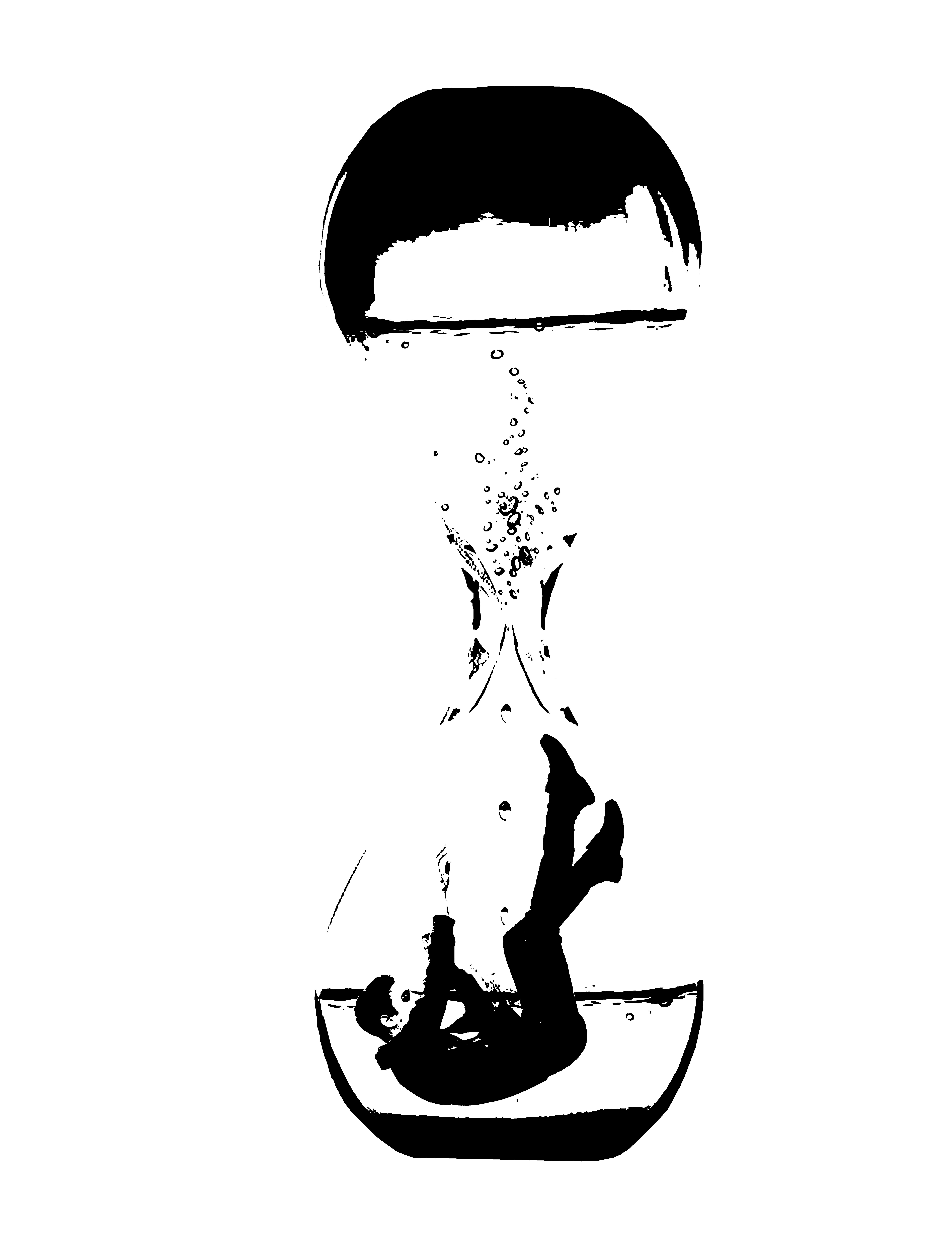
For the quote: “We don’t get to choose our time” – Dr Strange, I chose to do a simple one where the man is in an hour glass, trying to grab hold of time itself as seen from him floating grasping for something that he couldn’t. (seen below)
But i felt that the lines could have been clearer to show that it is an hour glass. Also the reason for the water inside the hour glass is to show the illusion, since in the movie Dr Strange they played with illusions and time very well. They were intertwined, which was what I tried to do here.
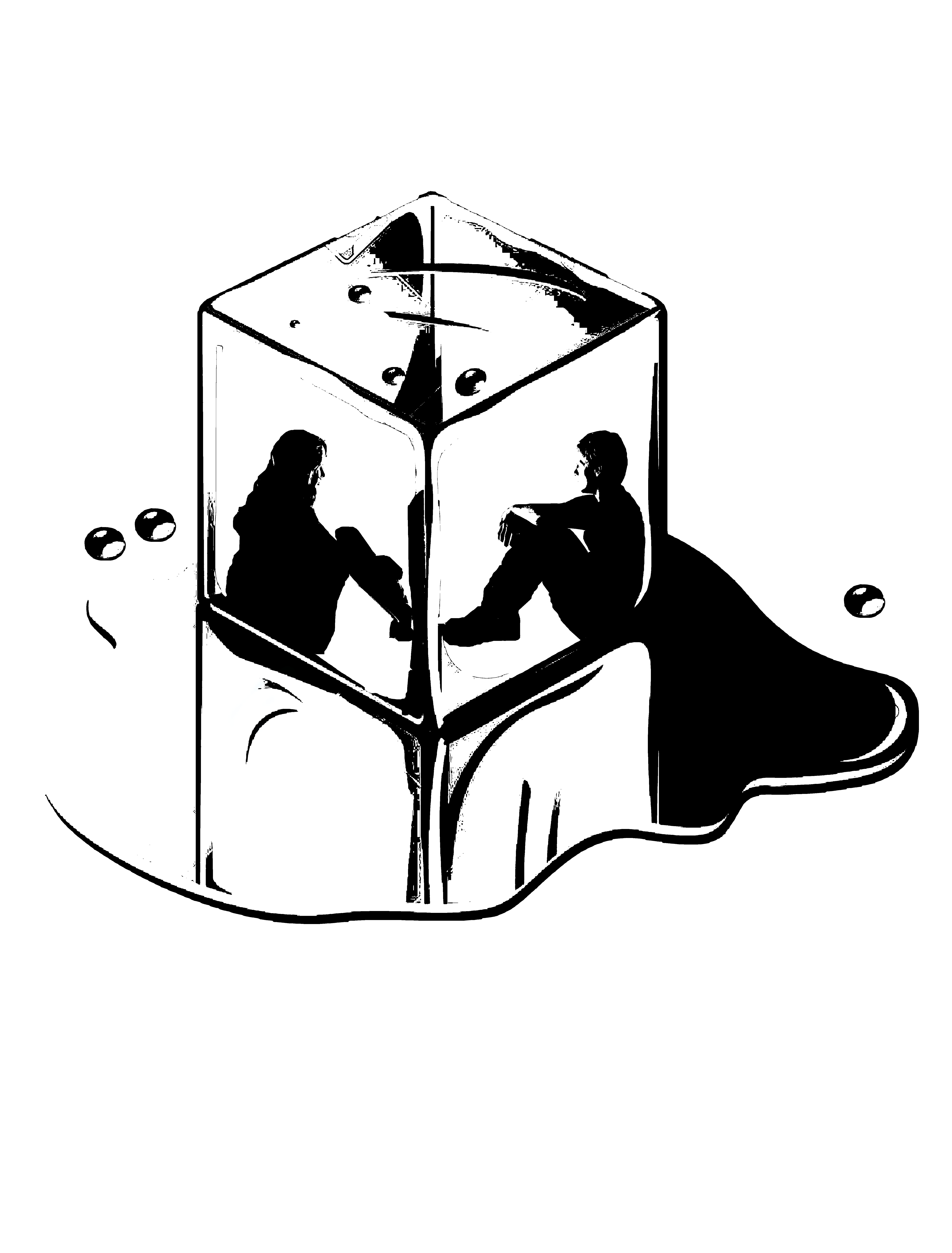
For the quote “I wish I could freeze this moment, right here, right now, and live in it forever.” – The Hunger Games, I wanted to put both the silhoutte of Katniss and Peeta in an ice cube to show like as if they ARE in the moment, and frozen in it – like as if that ice cube is also their home to live in. (seen below)
I just felt that it was too simple, maybe i could have added a slight touch of simple geometrical designs behind? Hmmm.
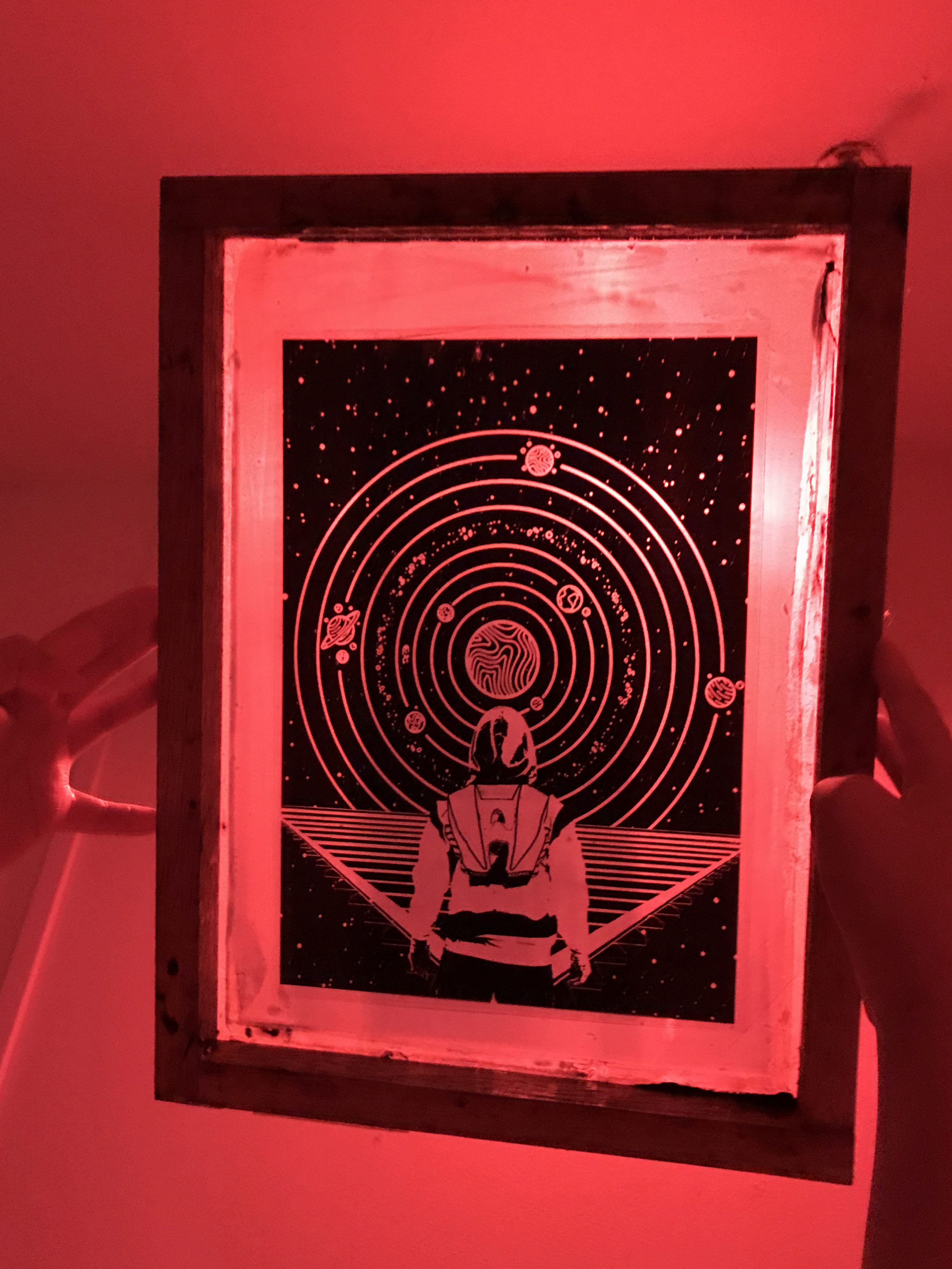
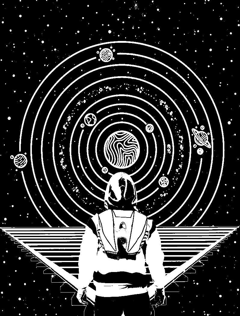
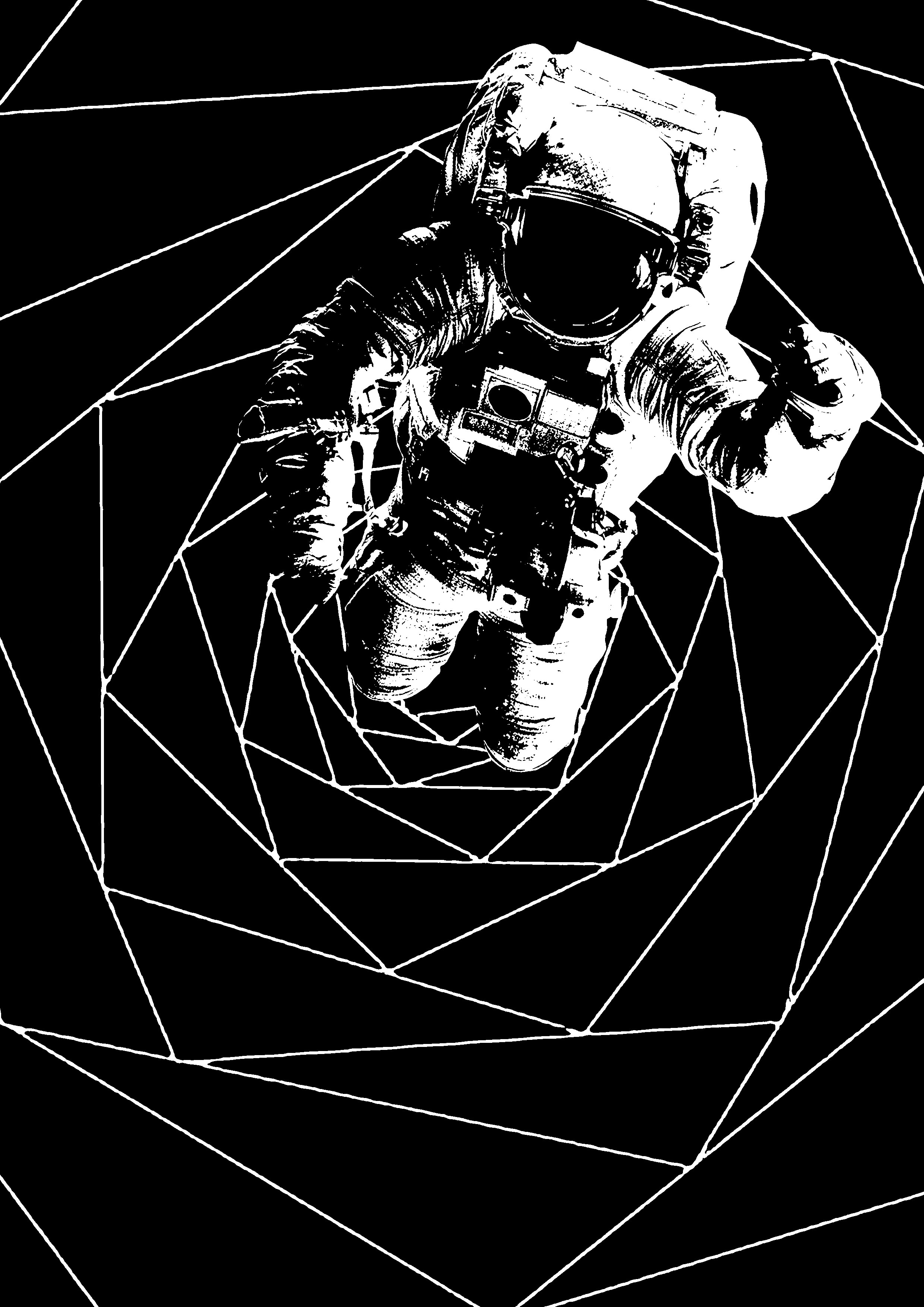
Aaanyways here comes my favourite work of all for the quote on “To infinity and beyond.” – Toy Story. Like the movie Peter Pan, I grew up watching this too and I will never get tired of it. I focused on the keywords of “infinity” and “beyond”.
To portray the infinity, I made it look like theres a galaxy behind and also include the circular portion as circles are always the clsoest to symbolise something infinite. Oooh and the planets in there too because when I think of infinity, i think of the vast space and galaxies which have planets included.
To represent the beyond, the triangular pedestal infront of the man is suppose to portray the fact that there’s a horizon and BEYOND that is something more, something infinite. Hence to infinity and beyond. I added a touch of Buzz Lightyear (the character who said this in Toy Story) in it as seen from the ‘bagpack’ design in the man’s hoodie at the back, because that’s the rocket ‘bagpack’ Buzz had on him.
I did another as a process:
Buttttt I didn’t like it.
Overall I ended up liking the work above this one the most because I made use of the background space and to me this may not be so minimalistic but it was aesthetically pleasing, and it shows the huge meaning behind it.
I was excited to see this on my totebag so…..let’s go all infinity annnnnd beyoooonnnddd!
but I decided to add on new ones which will be part of my finalised quotes (plus using some from previous post) behind my final works.
The new ones that I will be focusing on is:
“To infinity and beyond.” by Buzz Lightyear from the movie ‘Toy Story’
and
“We don’t get to choose our time.” by The Ancient One from the movie ‘Dr Strange’
In overall, the all 4 final quotes behind my works will be those stated above and 2 from the previous post which are:
“Don’t grow up, it’s a trap.” by Peter from the movie ‘Peter Pan’
and
“I wish I could freeze this moment, right here, right now and live in it forever.” by Peeta from the movie ‘The Hunger Games’
MY INSPIRATION-RESEARCH.
One of my inspirations for illustration is this artist named Dan Hillier
and another from an Instagram user called @oasis_of_hate.
The reason being, some of their works focus on filling the empty white spaces and made good use of it. Some managed to give off the dark-fantasy effect with the use of black portions and that was something I was inclining towards.
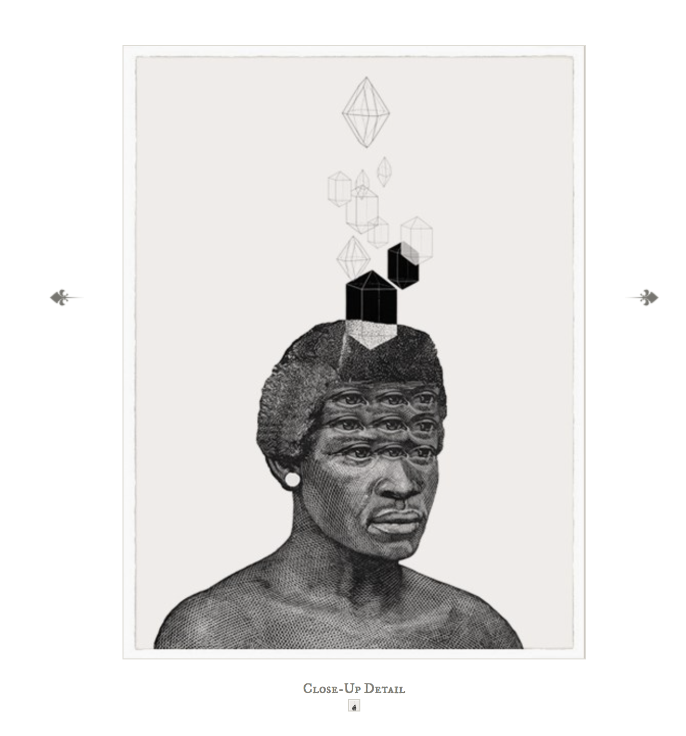
I was also intrigued by how in some of Dan Hillier’s works, he makes use of geometry or cubes as his background or part of his illustration (such as the one below) and I wanted to do the same in my works.
Above all, most of the good illustration-artists have one thing in common: their works are centralised and minimalistic hence giving it a touch of simplicity. I strive to achieve that in my works.
This is such a late post but I’m gonna do it anyway so that i can look back at it and say I did it.
Final outcome. Maybe I could have done better in exploring the materials and different mediums, but I am proud of some of it at least to say because it suits the emotions I was really feeling at that point of time of my story in 2015 (my concept). It took alot of stepping outside your comfort zone to venture out, and in a way to let myself learn to embrace those feelings I felt. This “My Line Is Emo” project was one of a kind, but I’m glad we went through it.
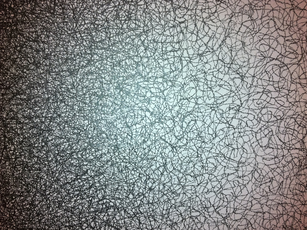
So initially before our consultation, I looked up to works from Sol Lewitt alot because of how he could make simple, easily done scribbles, look so intricate and beautiful when we step back and look at his work in a bigger picture.
Sol Lewitt’s ‘Scribbles’.
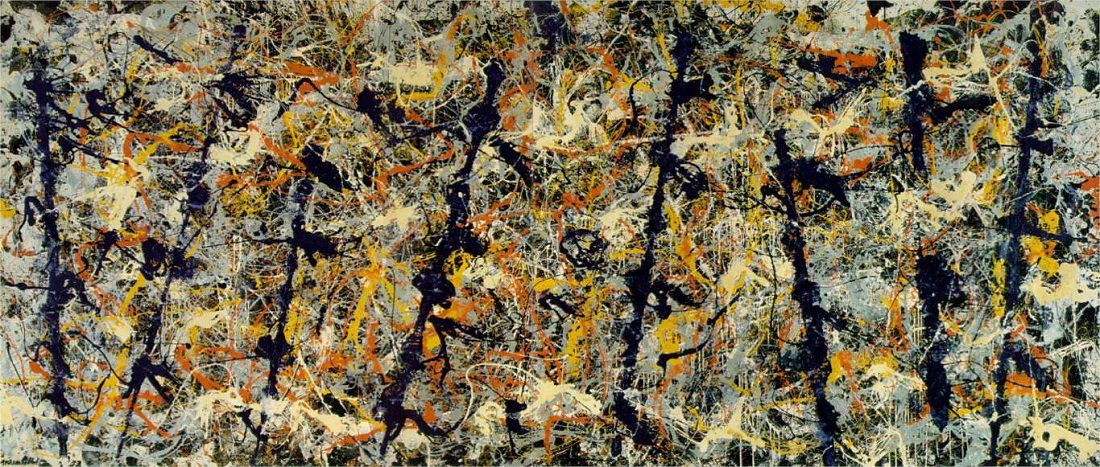
I also looked up to Jackson Pollock because of his unique style of drip painting, splashing technique.
Jackson Pollock’s ‘Blue Poles’.
Aside from artist reference, I wanted to know what ‘Decalcomania’ and ‘Frottage’ means and so I searched up on TATE that Decalcomania is a “blotting process whereby paint is squeezed between two surfaces to create a mirror image” and Frottage is “a surrealist and ‘automatic’ method of creative production that involves creating a rubbing of a textured surface using a pencil or other drawing material”.
So i input that into some of my works too.
After the consultation, I began to look further more into other artists as my research as that could really help me with the end result i wanted to get for my final work.
There are more (I put them in my sketchbook) but the ones I posted here are the ones important to me as I made use of their works as a source of inspiration to create lines/mark-making in different ways.
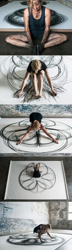
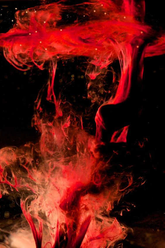
Like for e.g Jen Lewis’s macrophotography of menstrual blood gives off this outcome that’s so raw and beautiful, and related to bodies and blood as the idea of lust so it really spoke to me. And for Heather Hansen’s kinetic illustration, the way she uses her body movement and get herself dirty from charcoal to realyy get involved in creating those powerful cursive flowy lines inspired me to do the same for my emotion of love.
For Sol Lewitt’s scribbles, they may just be scribbles but i feel a sort of satisfying feeling from it, a positive emotion hence i wanted to do something different by doing something like he did for my ‘happy’ emotion.
For this project, we went through alot of ways to get deep into our emotions. SUCH AN EMOTIONAL DRAINING FEW WEEKS IT HAS BEEN. Especially after our consultation because I felt that we were suppose to get real with our emotions and bring out our raw inner self even more (I hope I make sense). So I’m going to share the processes – some from the start, some from after the consultation.
Mindmap: FEEL(TH)INGS
EXPLORATIONS
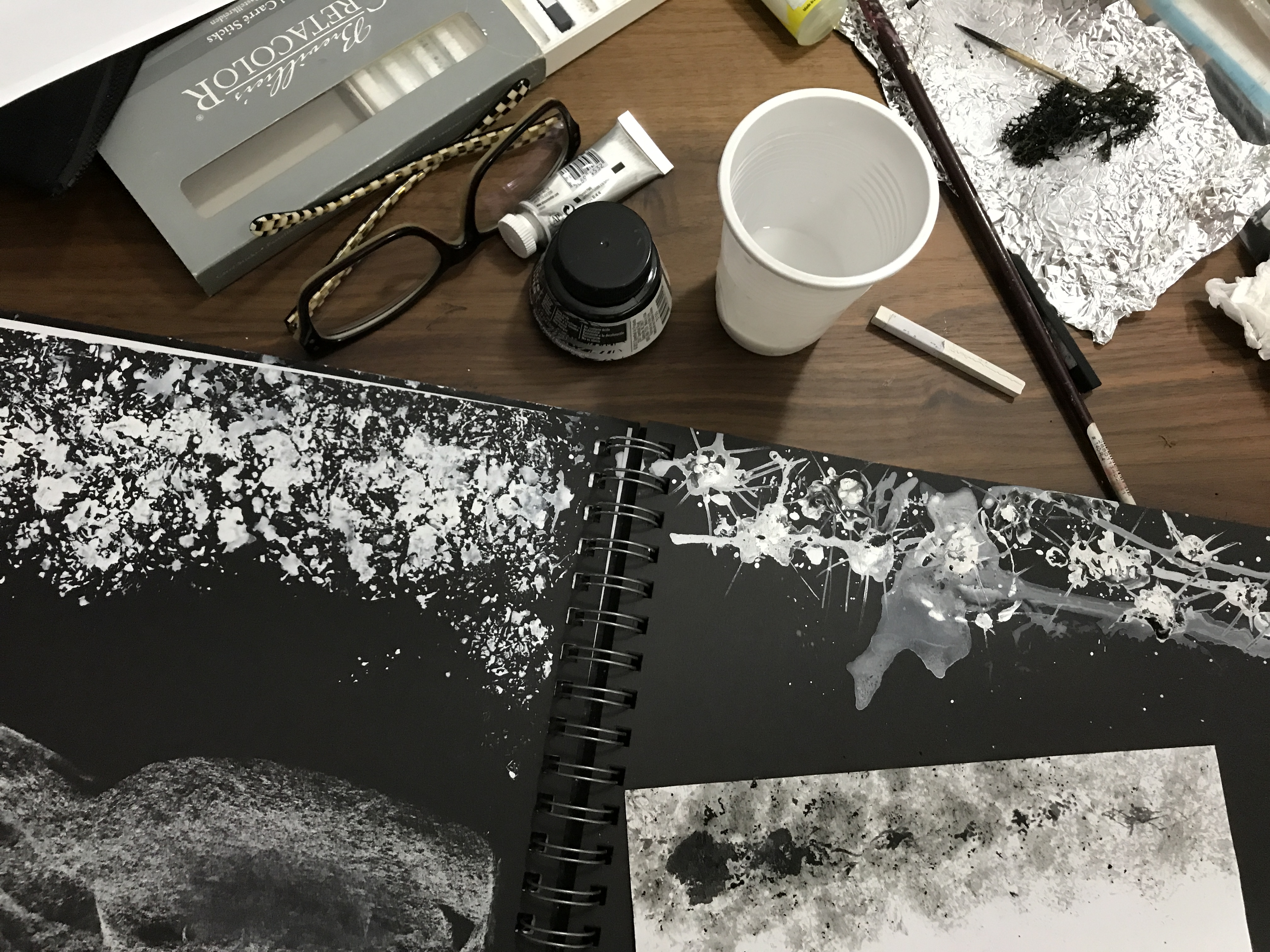
Starting off by using basic materials first like pen, chalk, white paint, white marker etc.
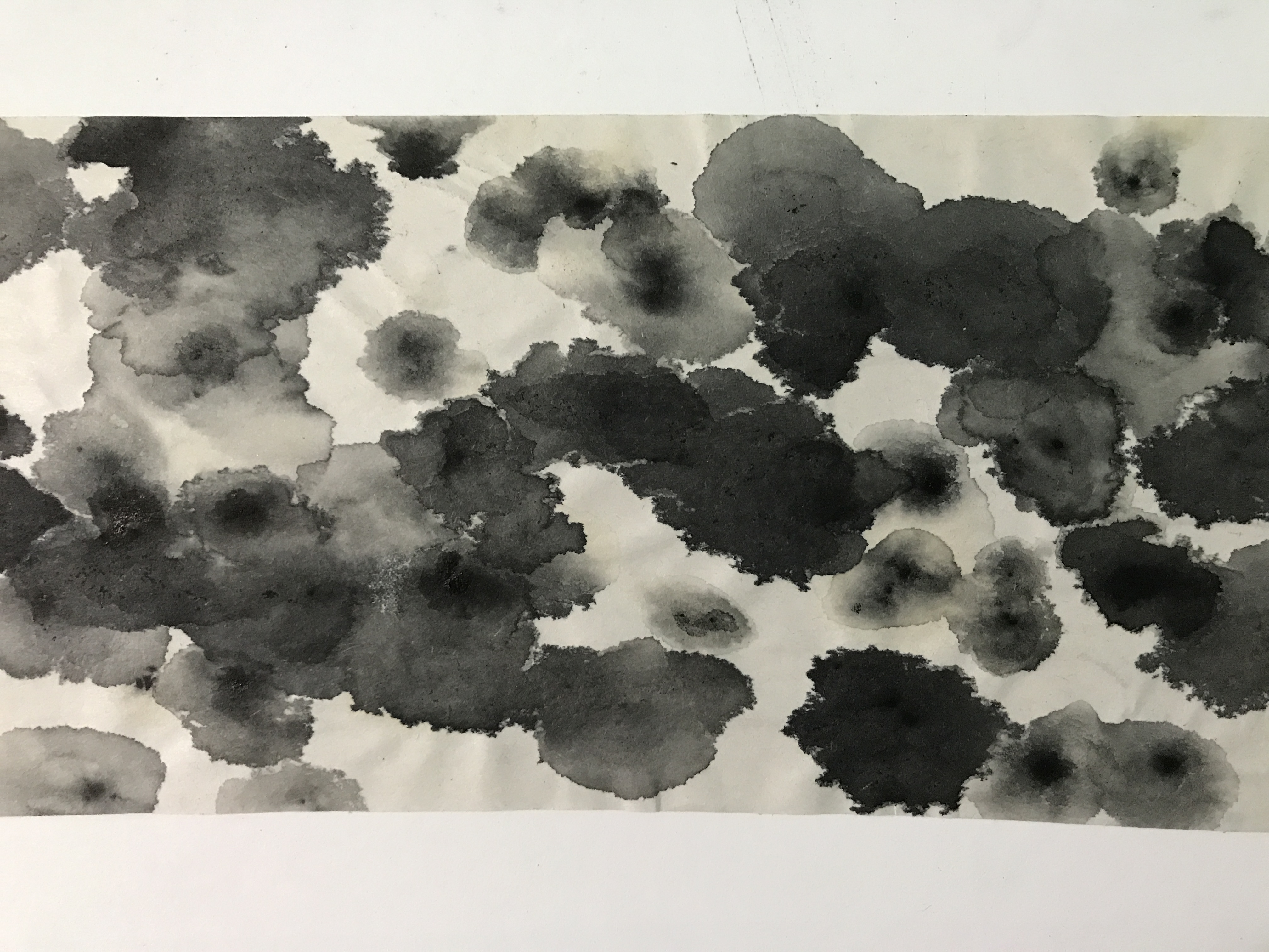
Creating the ‘shock’ emotion using toothpick and ink amongst the spreaded white watercolour. Toothpick to create the sharp lines jutting out.
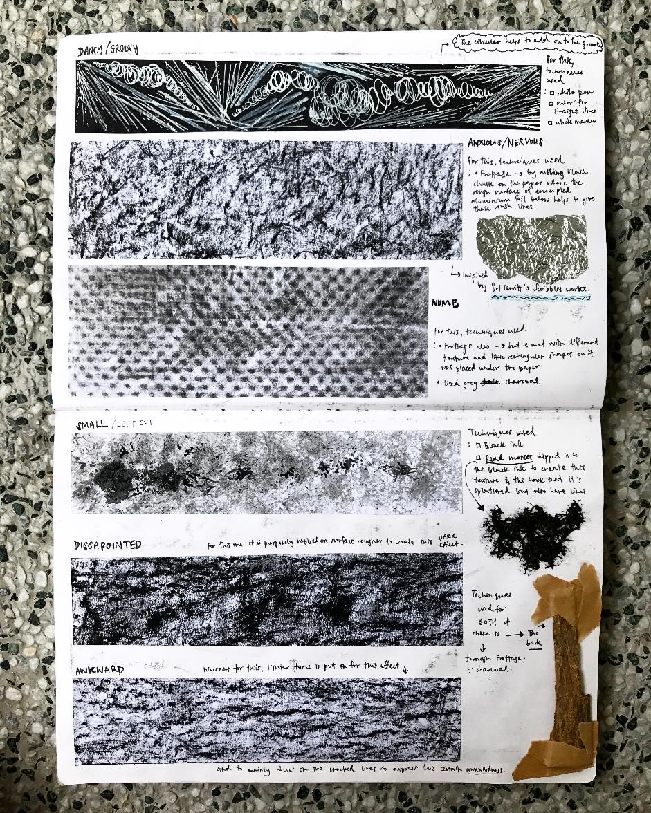
I went to explore more than just using white markers on balck papers or pens on white papers – I wanted to explore more on techniques first. So in the picture below, I explored on materials to use for mark-making while using the technique of ‘frottage’. For some I used crushed aluminium foil, table mat, sponge, dead moss and tree bark. And for the mediums I used basic stuff like ink, charcoal, and white titanium pen.
It’s interesting how the mark lines changes depending on how much force you used to create it, and the different directions you draw it on could create different marks.
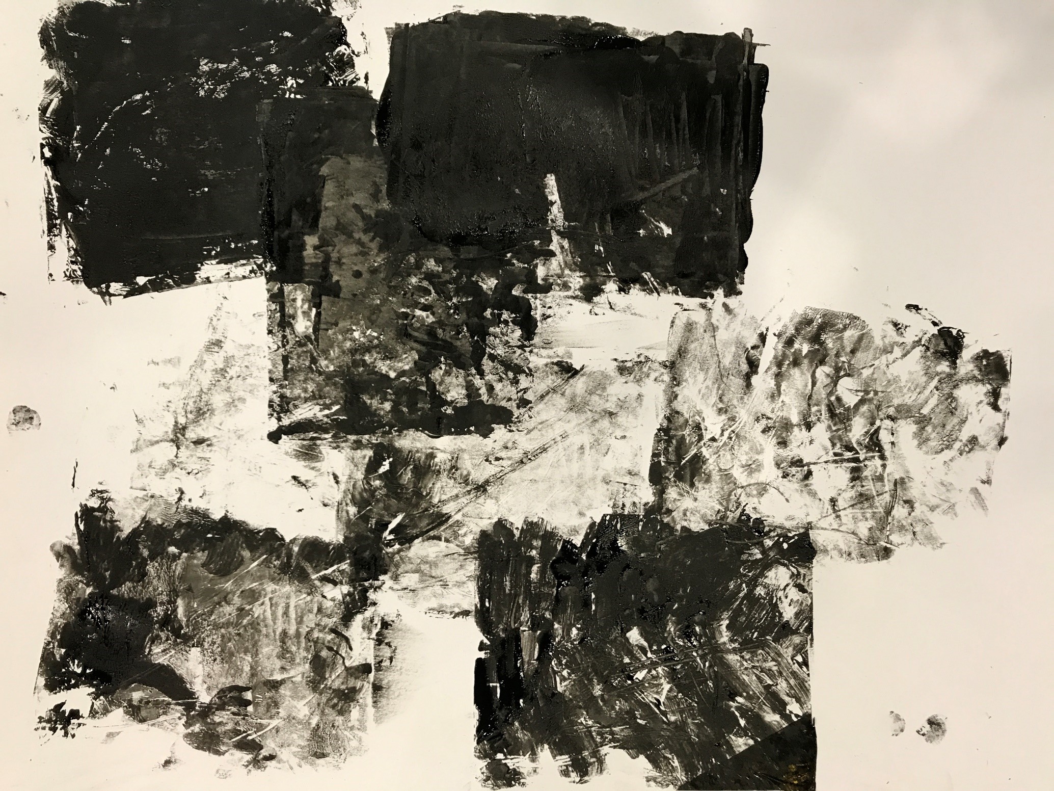
I tried using 1 different technique wondering what if poster colours or acrylic works different ways seeing the different lines and texture they give on canvas. (seen below) Maybe the silver could represent the love entering my dull life (like a flow from the left) hence looking like it’s the overwhleming colour, and then the specks of gold to represent the lust in my life at that point of time. Black as the background to show the initial stagnant dull life I had.
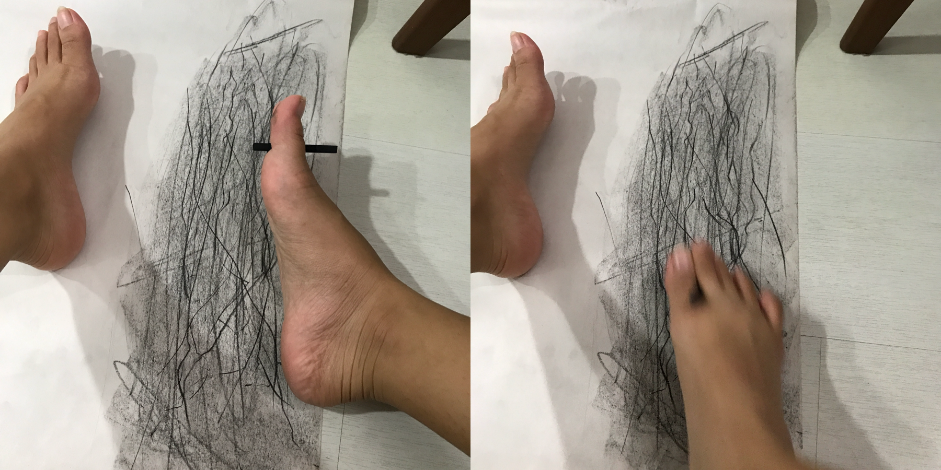
I explored more techniques after doing my research (we’ll get to that later hehe) like in here, using my toes haha I never thought of that. I used this as i was inspired to make something like Sol Lewitt’s Scribbles – messy, rough, awkward lines, anxious feelings.
Black chalk in between my toe. The feeling is different as it is harder to control your movement unlike using your own hands to scribble. Thus I felt that in this way, it really emphasizes on the meaning and portrayal of “scribble”.
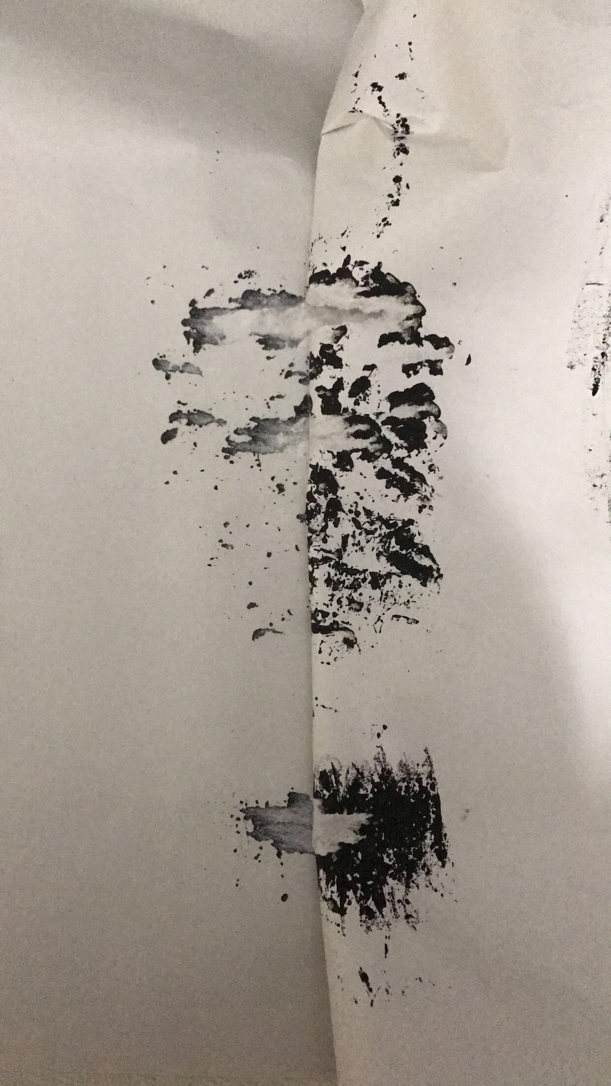
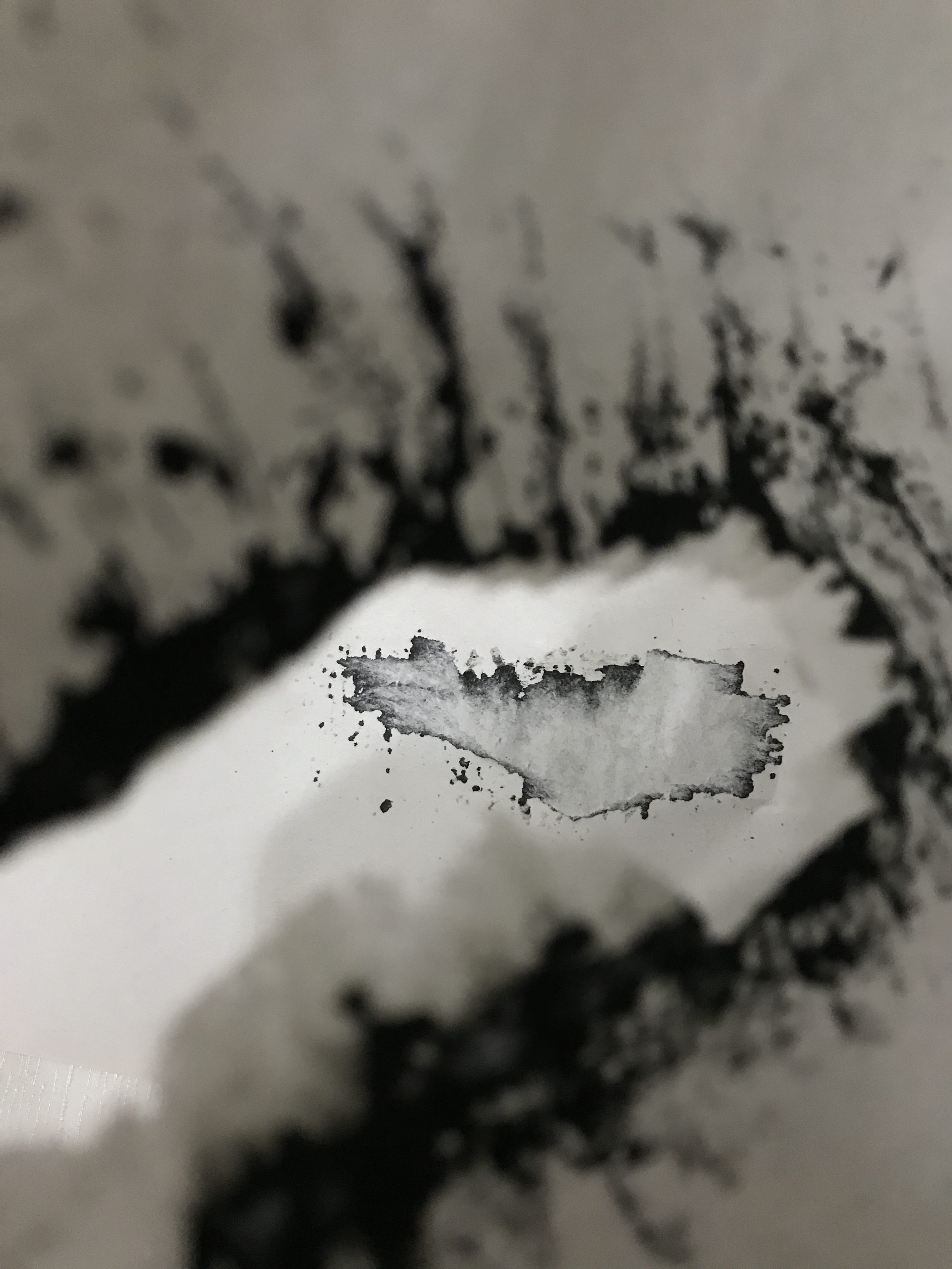
I did this ink mark thing on newspriont paper and realised it wasn’t drying fast so I thought putting another paper on top of it will be okay. But of course when i tried separating them the initial mark tore, causing this to happen. (seen below) It looks like it could come off as a method called Decalcomania – a blotting process whereby paint is squeezed between two surfaces to create a mirror image.
The outcome was left with that image on another paper. Very interesting I must say.
That was just another exploration I made during the process.
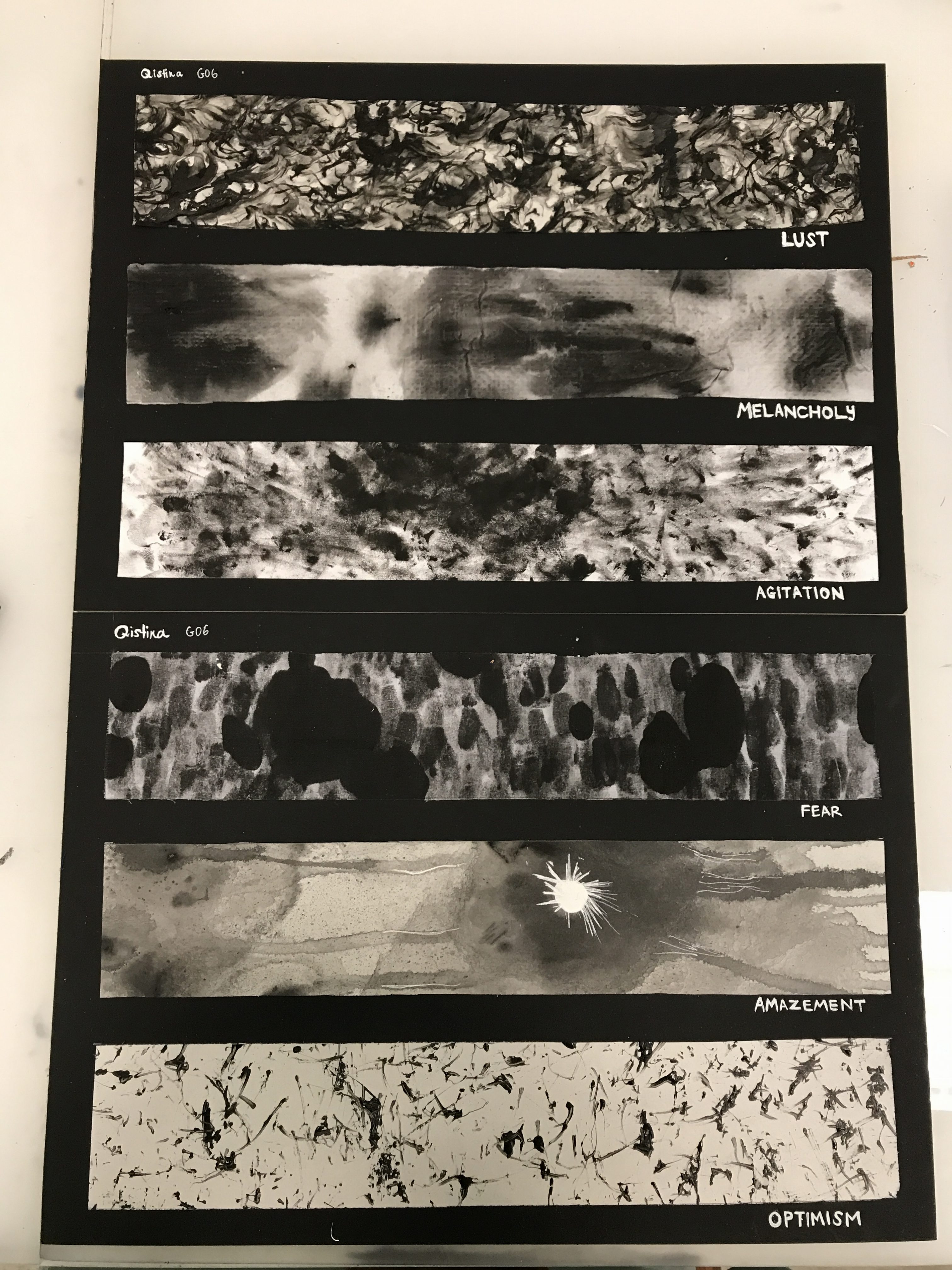
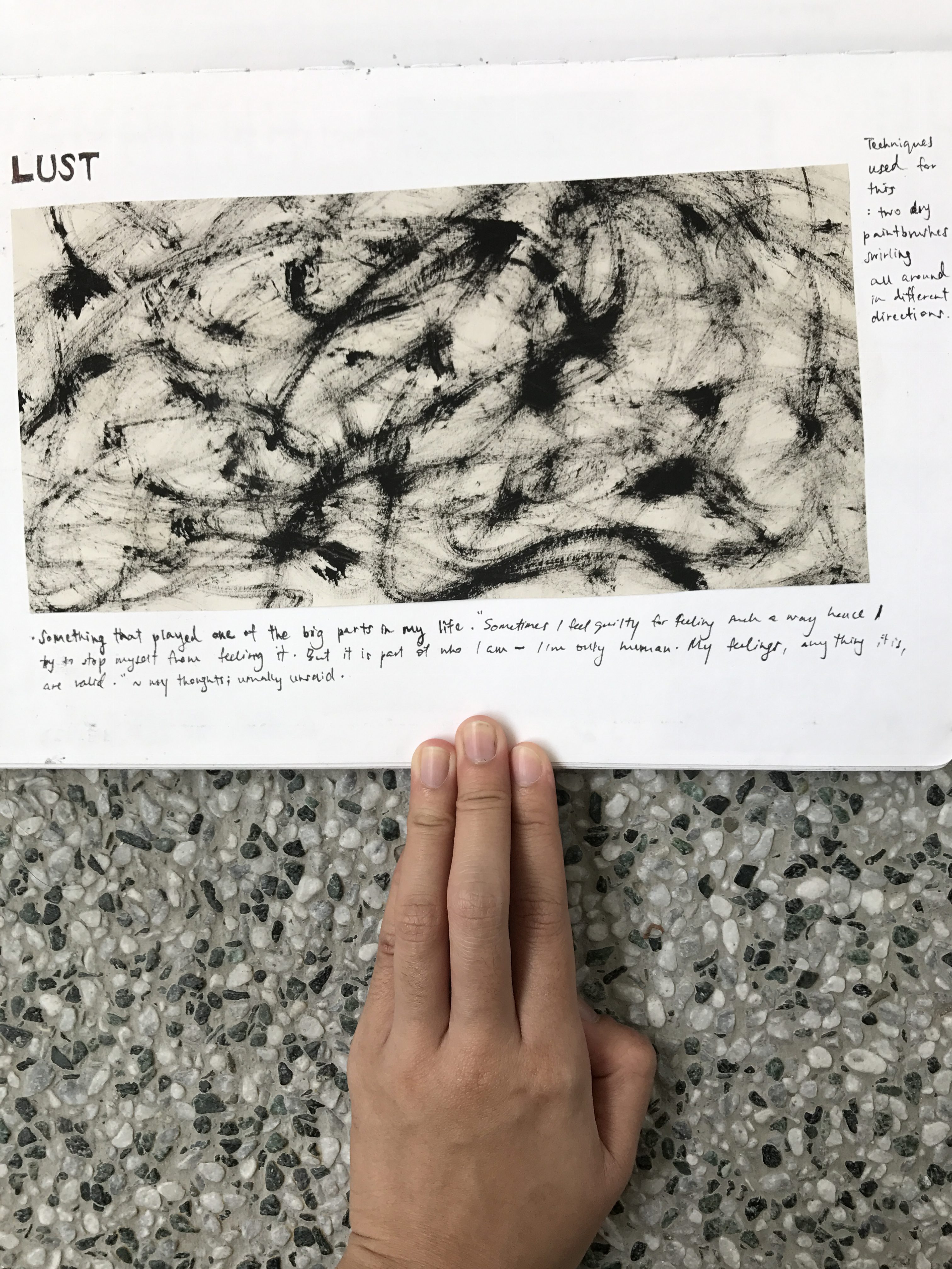
I wanted to tap into a feeling that impacted me the most – it would be the emotion LUST. If i were to share a story that is significant to me in my life, that feeling would pop out the most other than the negative feeling that follows. I will share about that reallll soon.
Using ink on two dry paintbrushes and swirling them altogether everywhere slowly. My idea of lust is that it’s slow but passionate hence the prominent black lines and spots in some places. It’s like a resemblance of body intertwining, skin to skin connection.
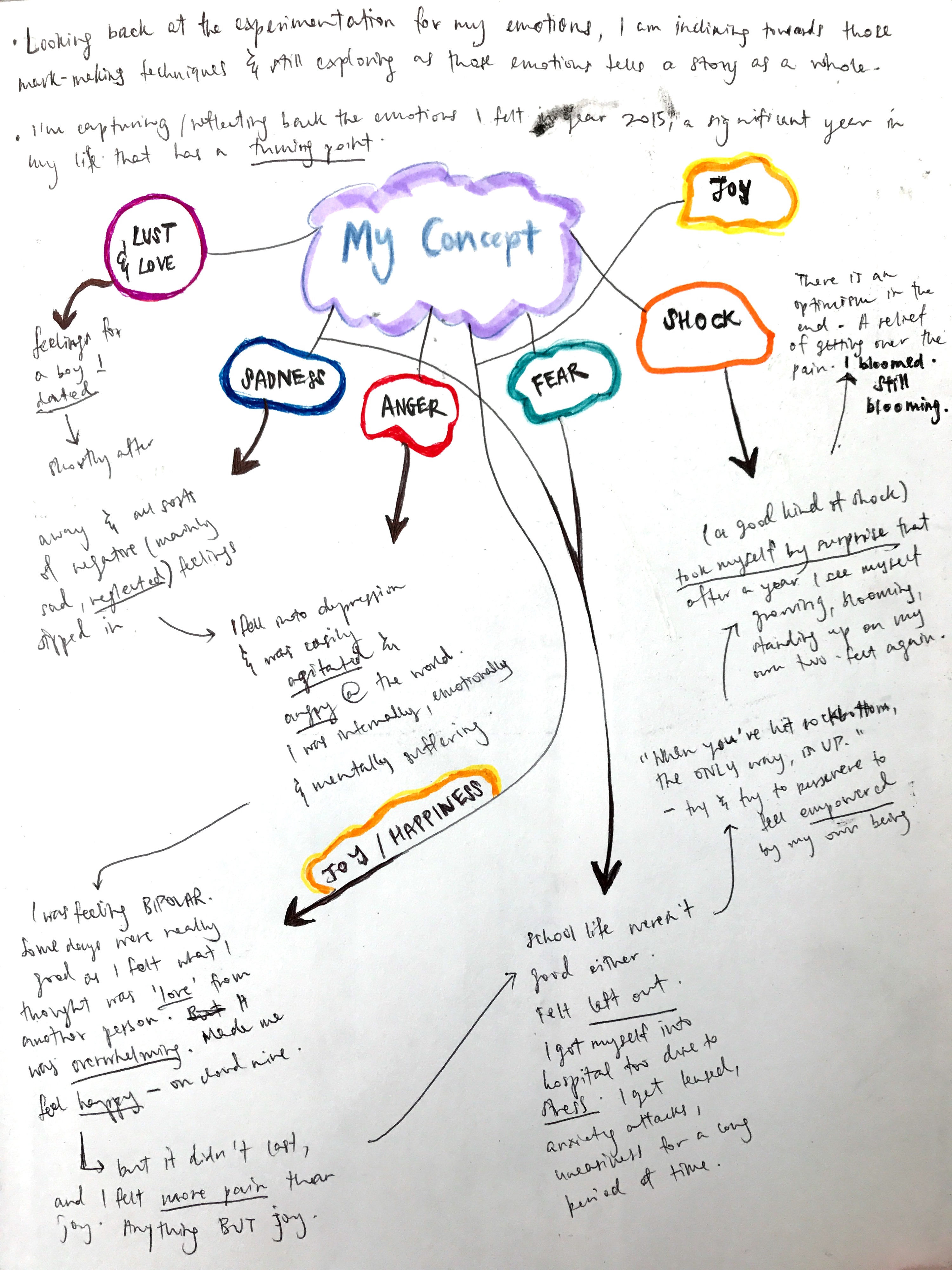
MY CONCEPT
Here, the story I wanted to share as my concept. 2015 was the year alot of things i would call “life” happening, that plays with alot of my emotions. It was a significant, difficult time of my life and I wanted to dig this past, to embrace it all, including the emotions I felt at that point of time that was hard for me to accept.
During the consultation, we were told to look more into objects that revolved the most in our lifes, at any point of significant time and that we should see that in 2d form – lines, shapes, perhaps inputting Cubism to express Abstract Expressionism.
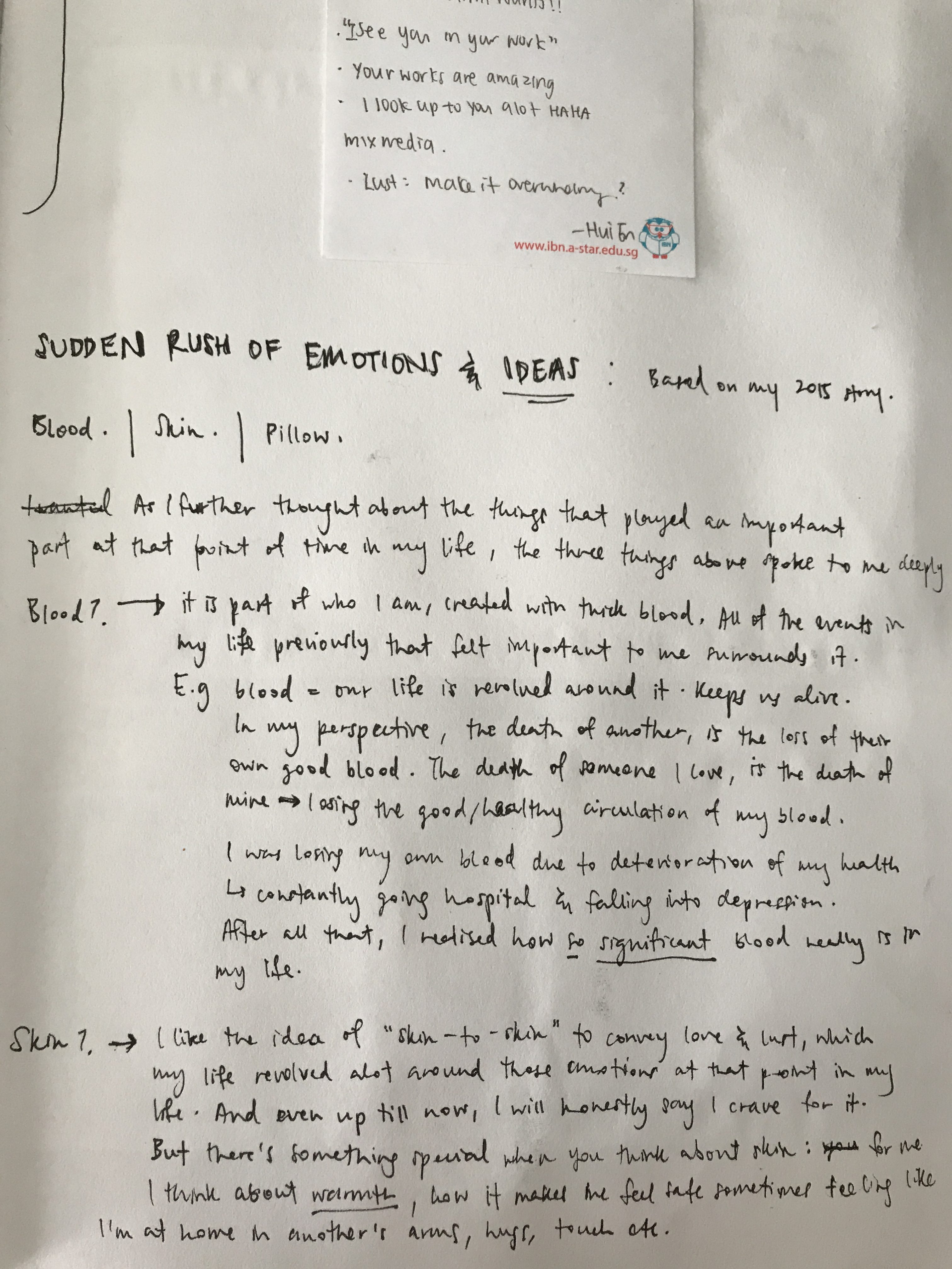
So the main 3 things that really revolved around my life at that period of time (2015), it was blood, skin, pillow.
Although blood and skin are not objects, they are still something you can touch and that to me is important enough to feel something off from it.
So for blood I will immediately think of the thickness, the flowy effect it has on skin (blood oozing out from our skin, bodies) and in water, just like how an artist named Jen Lewis’s works on menstrual blood photography.
Jen Lewis’s mentrual blood photography.
I wanted to portray something like this into my ‘love/lust’ emotion.
I tried different brushstrokes technique but I wasn’t happy with the above. So i thought if I wanted a real flowy effect and thickness I had to include other materials for my ink to seem thick enough to create flowy lines. Hence i mixed Cetaphil soap with ink to spread it on paper, and then used toothpick to create the flowy connections between them. (seen below)
‘Lust’. Using Cetaphil soap + ink, and toothpick.
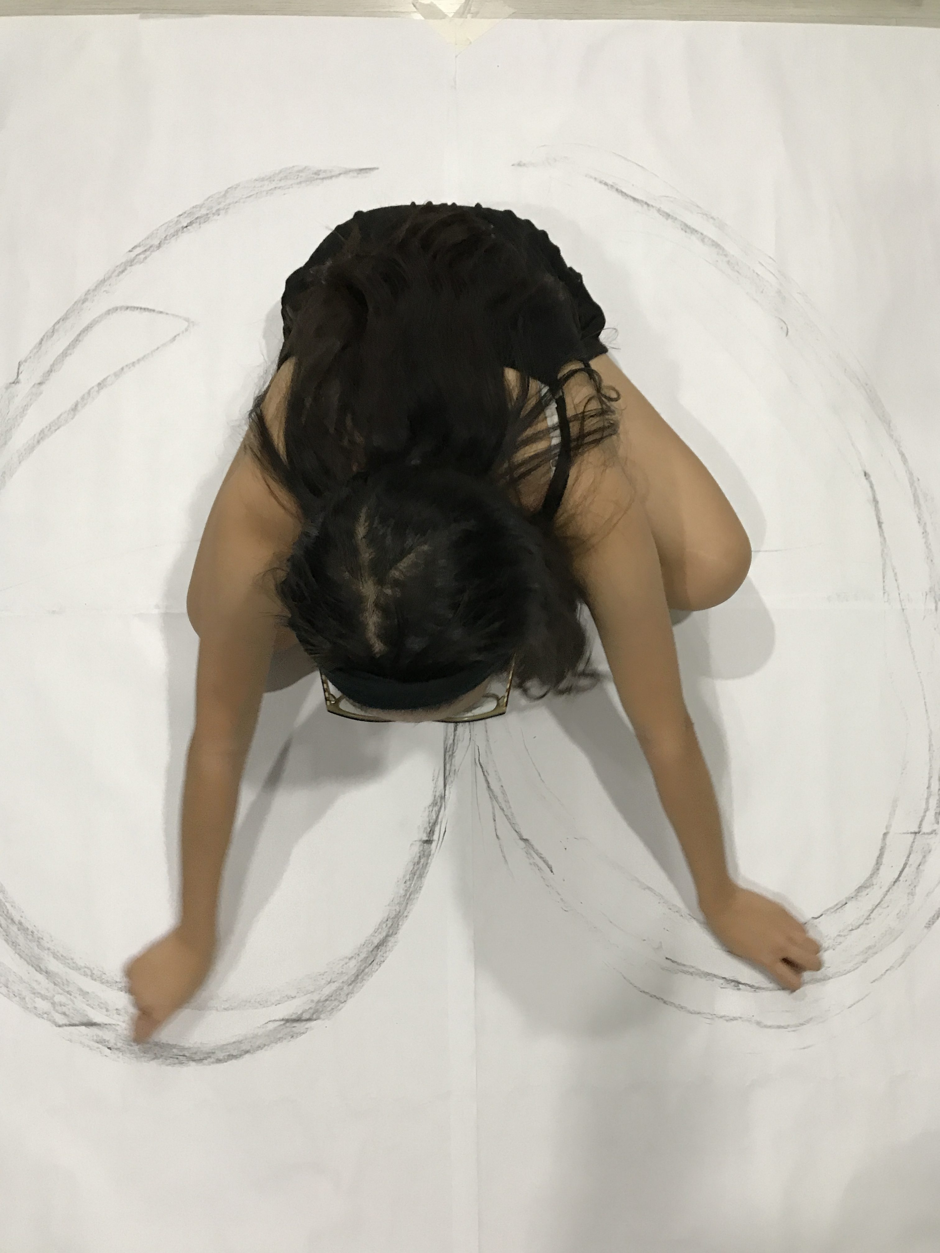
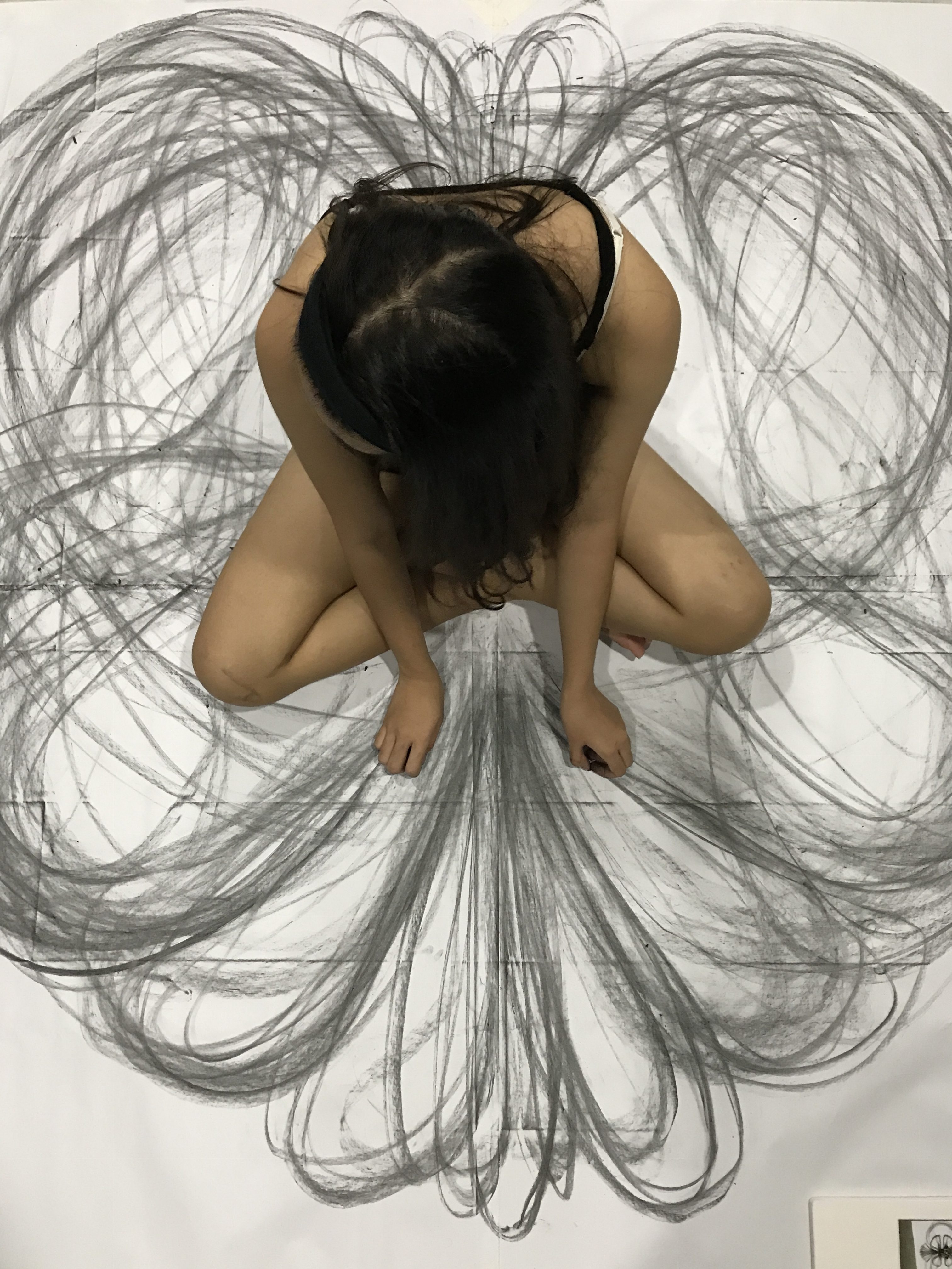
When it comes to the idea of ‘skin’ because skin is also a symbolism of body connections and thus lust or love, I wanted to create lines with my skin touching paper to spread out the lines – I focused more on body movement too to show how love makes me feel while doing my mark making.
This is seen below where i made use of 4 mahjong paper pasted altogether to created a huge piece of paper and do a sort of kinetic movement while I sit in the middle of it – inspired by Heather Hansen’s Kinetic Illustrations.
I think the outcome was really intriguing and beautiful to me in a sense that yes, this is what I would feel when I feel someone else’s touch or love, that’s my emotions spiralling in kinetic motion.
When I think of anything negative that’s going on in my life, I would immediately think of my bed, my pillow. Because that’s where I will throw myself in to hide my face away and my feelings too – i would sleep on it or scream in my pillow, or i would hide my face from the world just because i don’t want them to see me cry. Then i realised they all have 1 thing in common: cloth. Something about cloth gives a sense of comfort. Which is also why I feel a sense of bliss whenever I’m wrapped up in comfy clothes or sleeping on one comfy bed sheet.
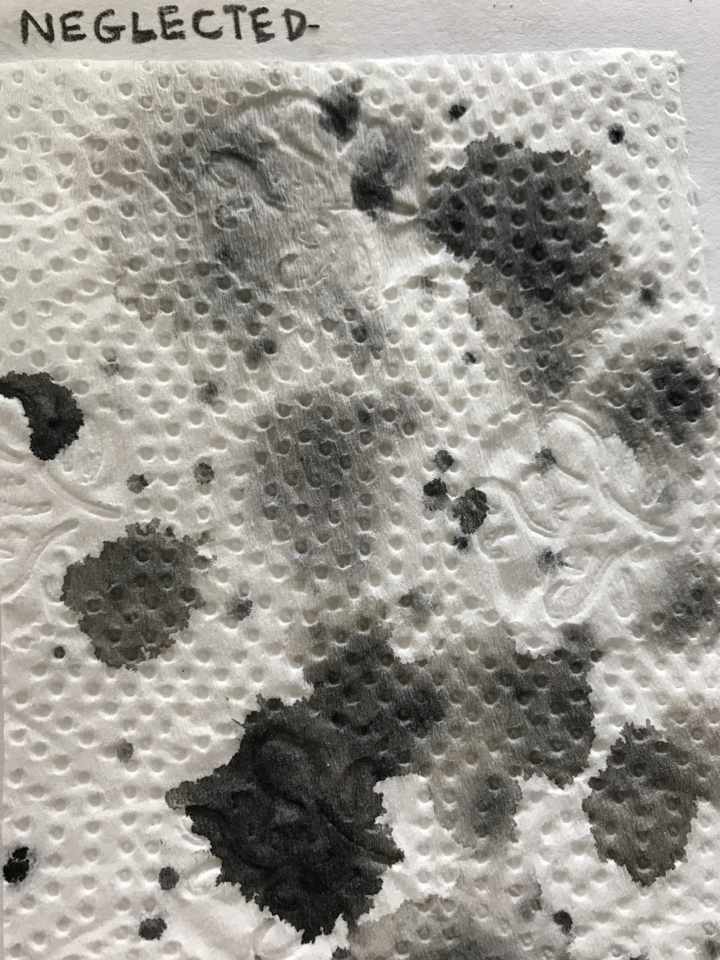
Tissues are also another kind of object that I always needed by my side in that year itself because i was depressed and sad and just in a surge of negative emotions. So tissues was my friend.
Hence i decided to associate negative sad feelings with tissues. Because I always needed it to wipe them tears away.
Surge of melancholy.
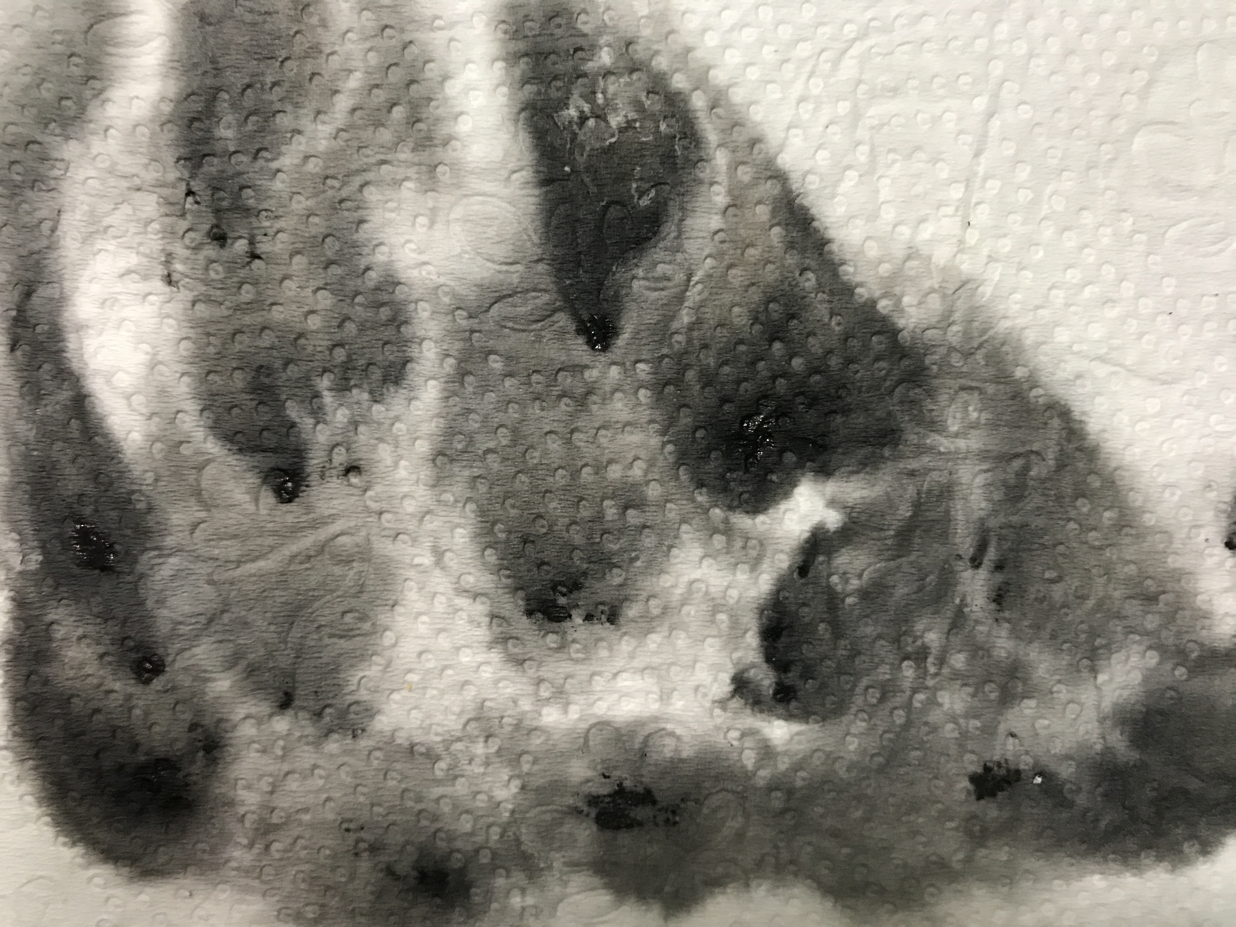
Aside from tissues, I tried doing something wayyy different. Like by listening to sad songs on repeat and legit crying to make my tears fall onto the newsprint paper ( the idea of fragility on the paper too) and then putting a small dot of black ink on the tear droplet to create the effect below.
My tears + black ink.
I reaaaaally really liked this idea and technique but it’s just tiring to cry all the way but i wanted to just show how authentic of a feeling there is there to portray my sadness. It’s raw. It’s me, because no lie, i’m an emotional bag who cries alot.
I did something rather dangerous and needed precaution to come out with something for ‘sadness’ too. I wanted to do the technique of fumage, where you light a fire under the paper, not so close to just create smoky marks on top of the paper. And so I tried it at like 1am. Perhaps i was too tired i don’t know but i got too close and my whole newsprint (a large one) paper easily caught fire and everything was burnt and well yes, i burnt my left hand fingers as well.
:'(
SO, BE CAREFUL GUYS. Don’t be careless like me. Don’t do it when you’re tired. 🙁
For my other emotions such as happiness, I wanted to do something different. I know usually circular shapes brings out joy as it shows the bubbly effect. But i wanted to try something different by just using lines. I was inspired by Jackson Pollock’s and Sol Lewitt’s works for this idea too.
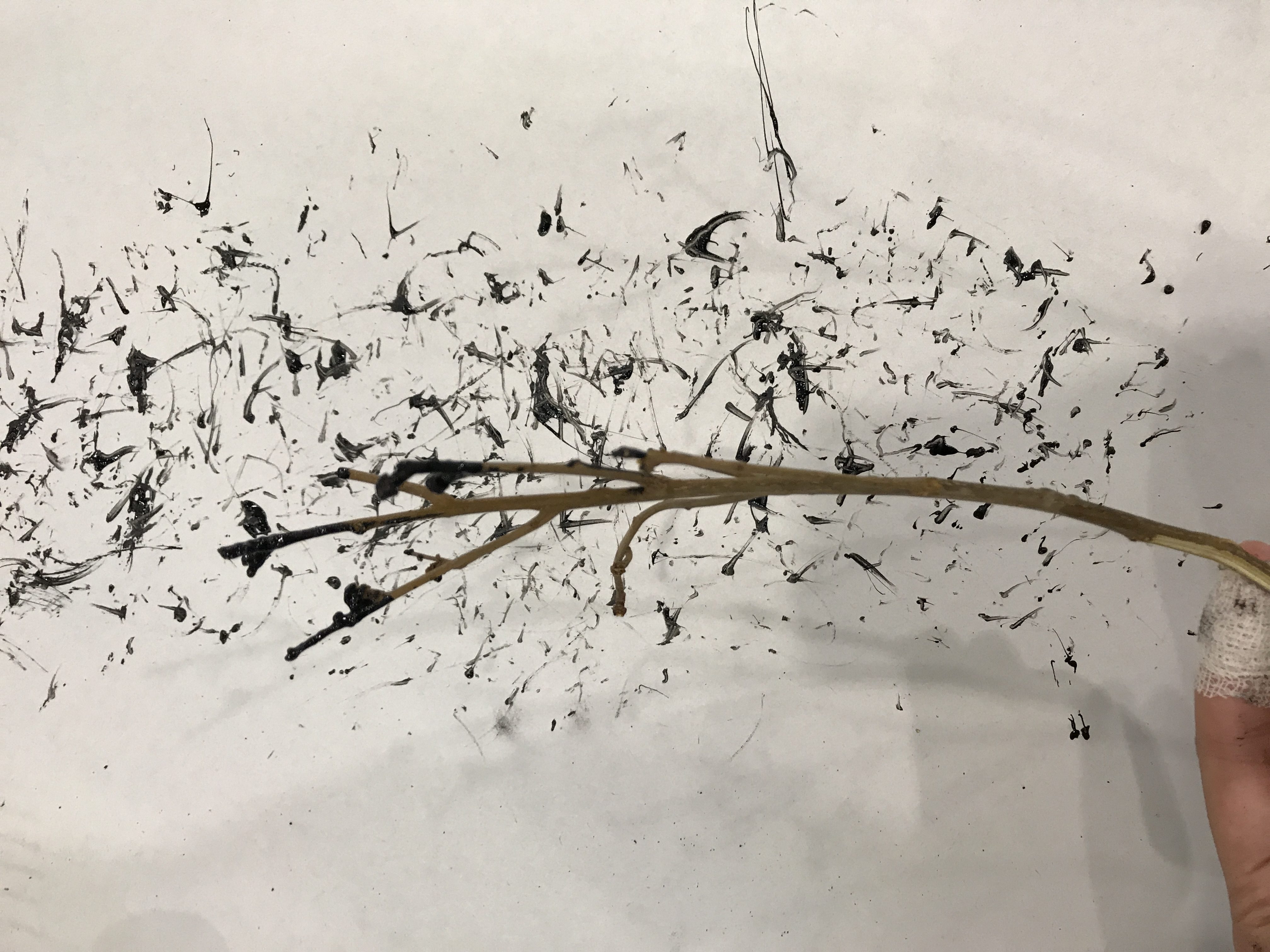
‘Happy’. Using twig and ink.Using cabbage because of their flowy lines.
I tried using the Cubism idea for happiness in the above by cutting square shaped plastic buttttt it didn’t turn out nice as I expected it would be. So yeah.
WELP. Too much digging into emotions for this till I AM UNABLE TO FEEL NOW haha. That’s it for now, more on my final project post!
MY LINE IS EMO. Literally, that’s our assignment title. Our prof knows what’s up.
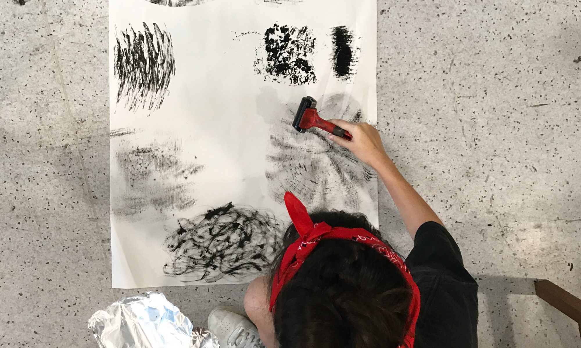
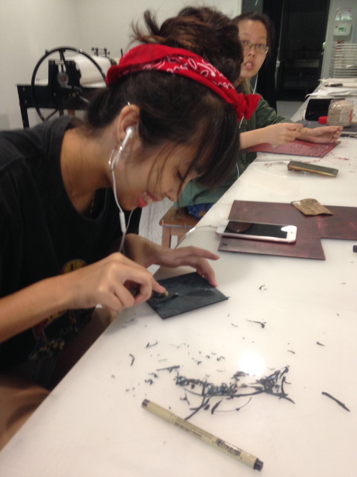
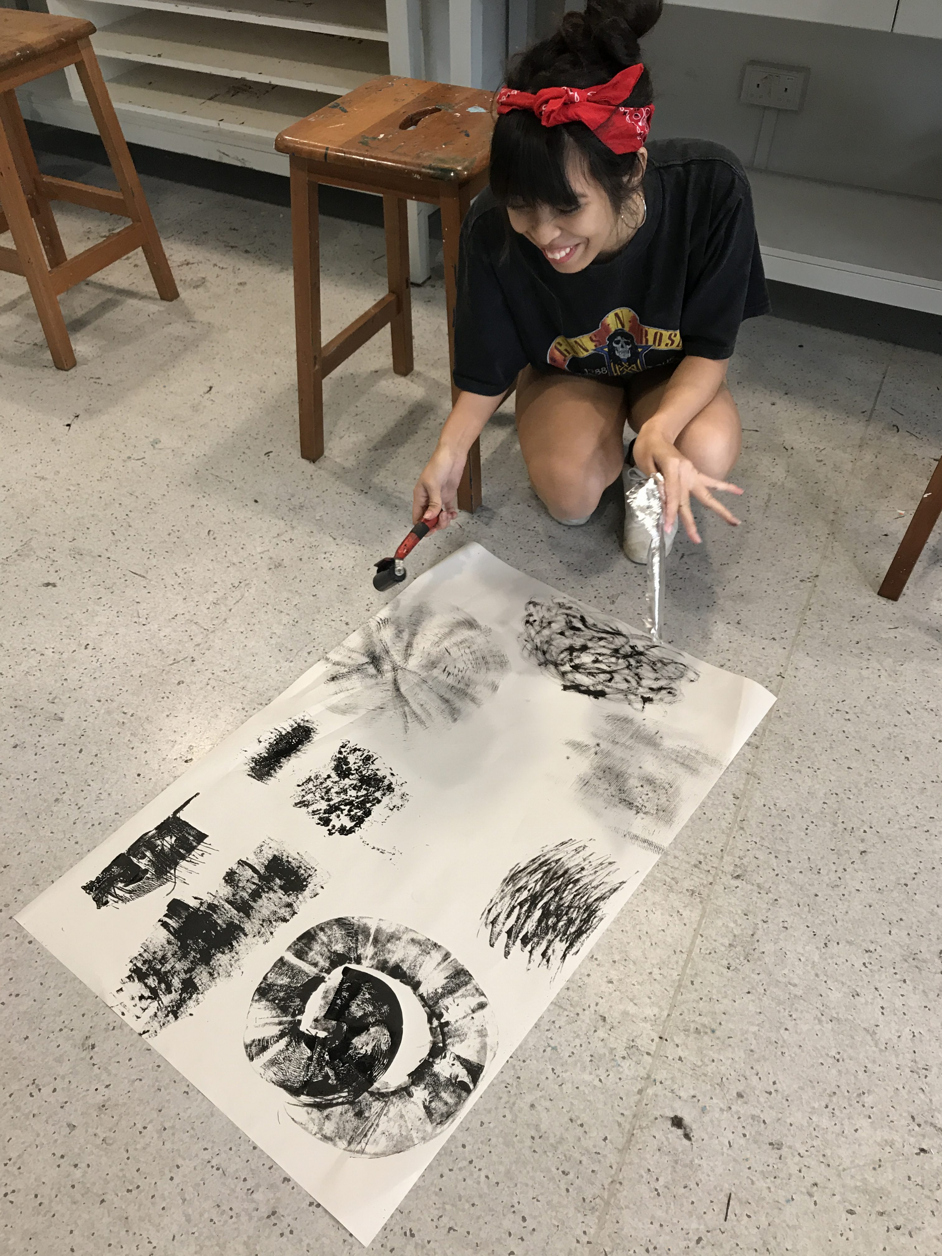
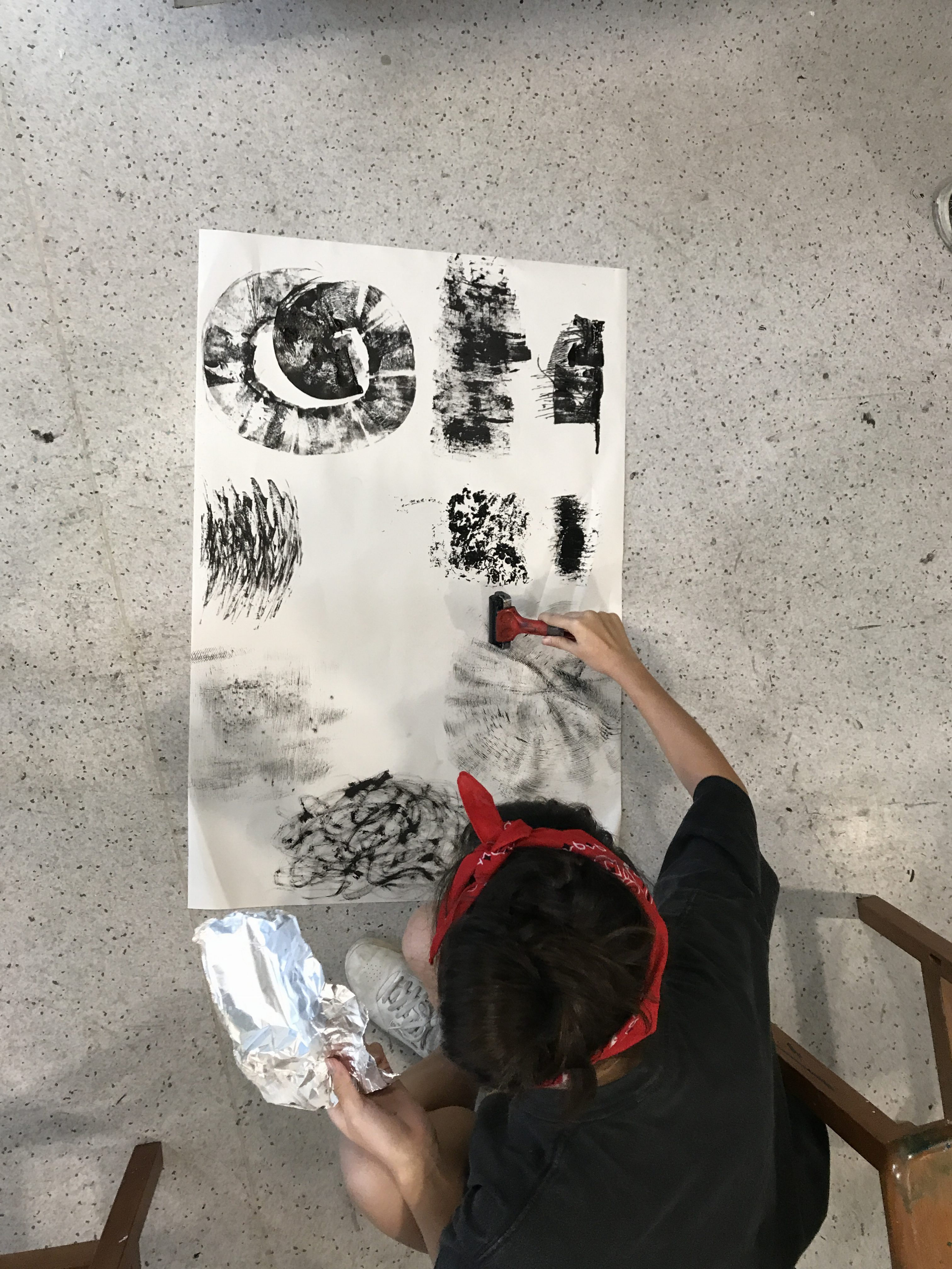
Personal reflection: So far so good, I have been loving the assignments thrown at us, alot to be done but gives us the chance to experience something new. And i haven’t done assignments like this in soooo long, so it feels good to start again! In this case, on the Friday of 25th Aug, we started with all sorts of different mark-making using different materials. I was looking forward to this lesson because of all the creativity i had imagined coming from my artsy friends – and this all seem so exciting. SO before the lesson, I tried to come up with few techniques and just have fun with expressing myself through ink, paint and paper. 🙂
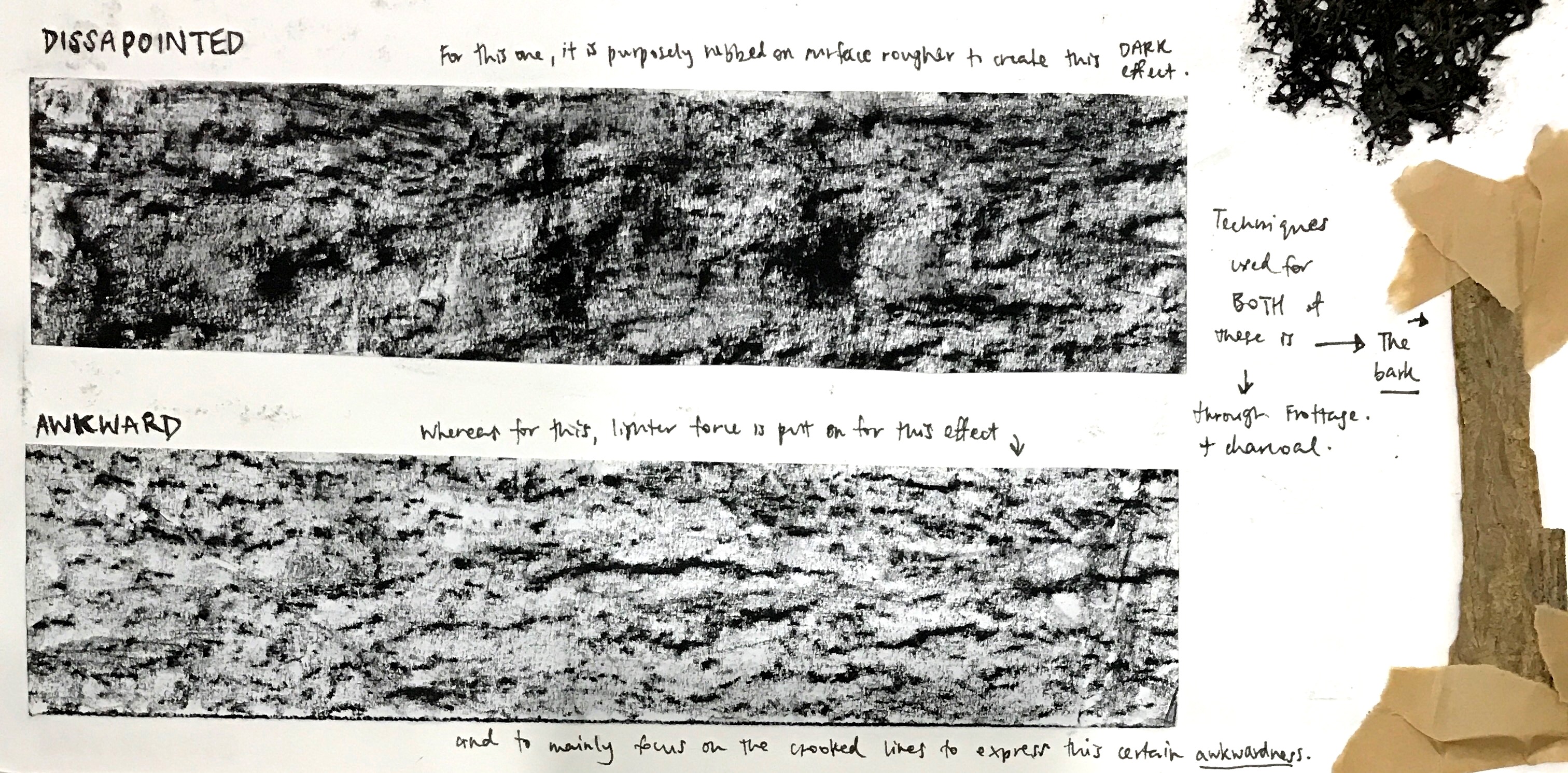
I experimented with different paintbrushes to produce different texture and lines, used crushed aluminium foil to apply one of the automatic techniques such as ‘frottage’ for the lines that will be produced on paper. I also used different materials such as ink, white marker, charcoal, pencil of different thickness and pen. I used the same technique on even a scrap from the bark tree to try out and see how the lines will turn out.
Interestingly, the lines are clearer but rougher when i put less force on rubbing the charcoal on the paper (the ‘Awkward’ lines). But when I put more force, using the same technique and same material, I get a different outcome – it doesn’t just show lines but also a more messy, aggressive-looking print. (the ‘Disappointed’ lines) seen below
Here in the picture below was me in the process of doing lino-printing and experimenting different ways to use all sorts of brushes there were. It was a good Friday indeed. Felt at peace and full of imagination doing what we did in 2D that day. So many emotions present to do this. Fun fun.
I am still progressing by exploring other ways to make different kinds of mark making, whether or not the materials used can be found at home or even on the sidewalk and anywhere else. Also, thanks to the friends that took all the vids and pictures for us in class for progress shots – you are all a bunch of blessings HAHA. Forward we go, and soon onto our own group task!