
For this final project, we were tasked to do some folding exercises from useful websites such as
https://www.foldfactory.com/shop/super-cool-folds#cp=1&cph=4881
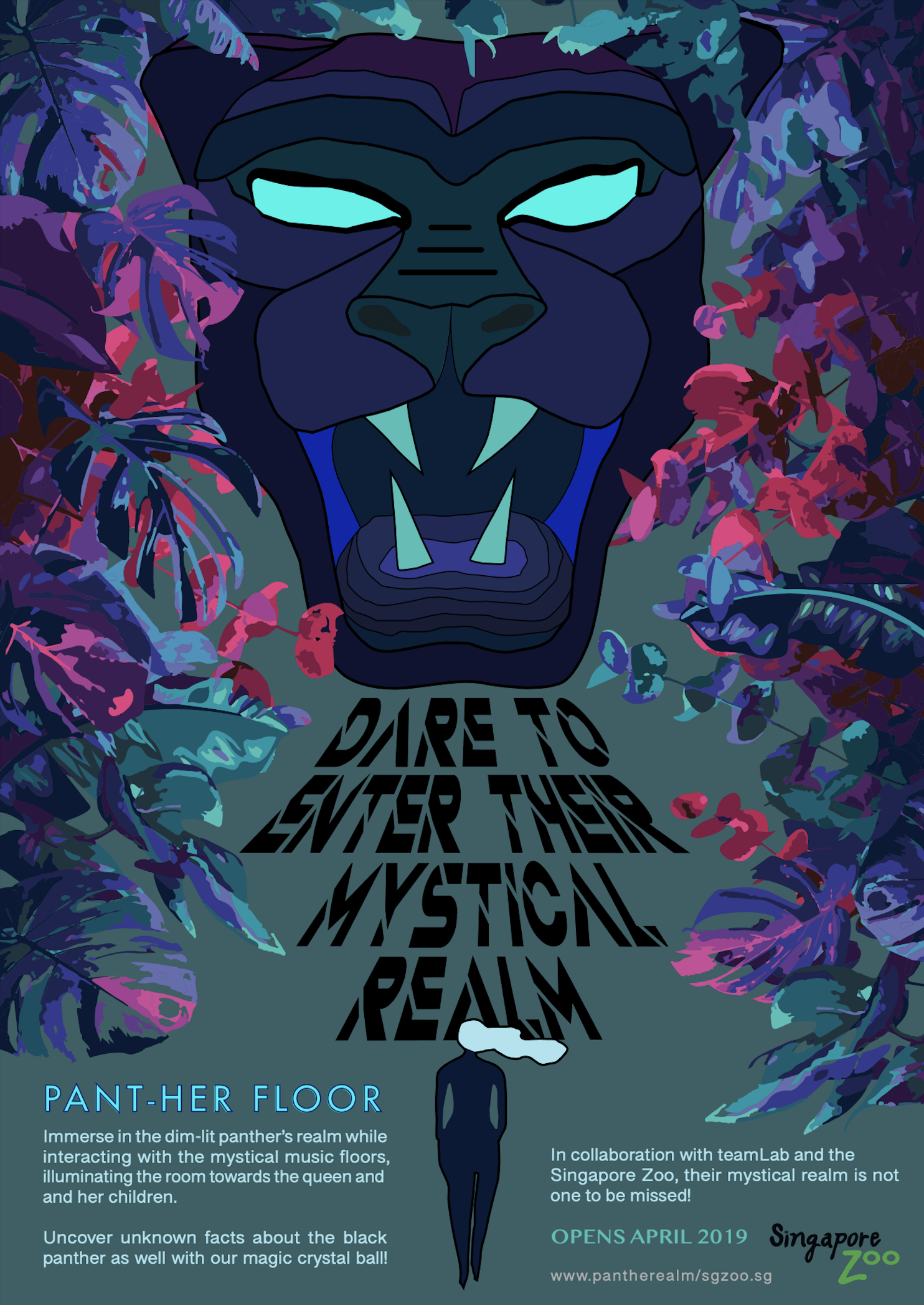
But I found my idea from a youtube video and decided it was by far the most fitting idea that can easily relate to my Black Panther’s poster:
Like an accordion fold, but a different one. I’ll explain along with the pictures of my processes.
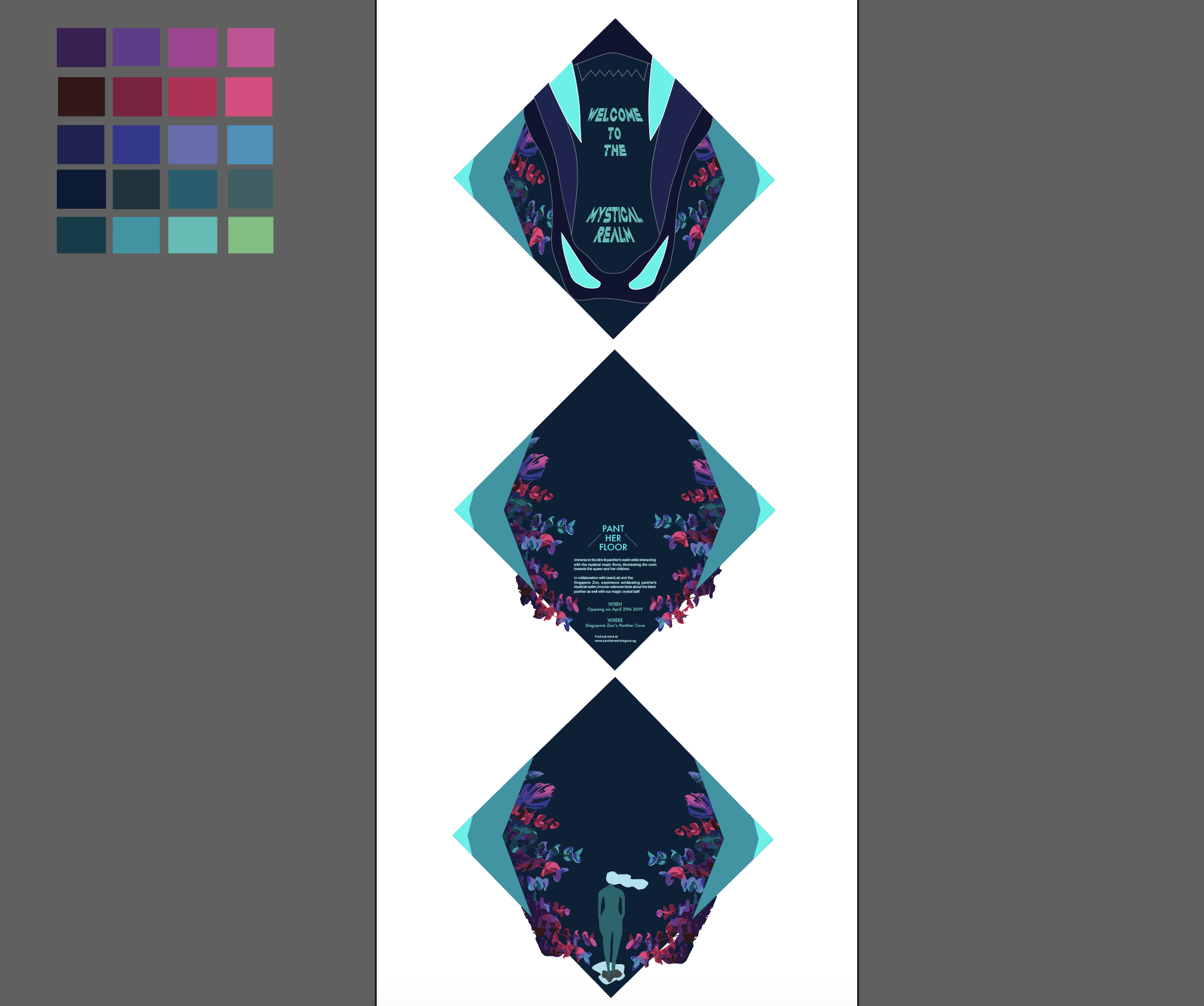
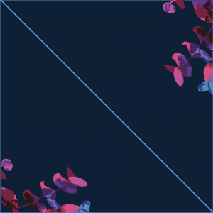
Following my previous poster mood board and colours:
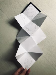
This was my brochure mock-up:
I like the sharp ends it gives, representing the claws or teeth of the panther when you open up the simple-to-hold brochure. Then I made that one of the prominent aspects of my brochure using bright teal colour for the sharp edge of each square. Below is as it shows. The rest is simply following how my poster looked like, but this time with the coloured foliage sticking out of the edges.
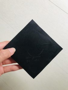
Some challenges were definitely the printing. The background colour was supposed to be dark blue and not black, and the sharp edges were supposed to be teal not blue. It came out like the ones shown below. But this is still part of my processes to show that before the folding, I needed 3 squares of 15×15 cm sizes first to be pasted on top of one another. The blacks are simply for the outer layer of the brochure. BUT it was the wrong printing because my illustration for the panther’s eye wasn’t supposed to be as big as that and should only take up a small square portion (1/4) of my initial big square below.
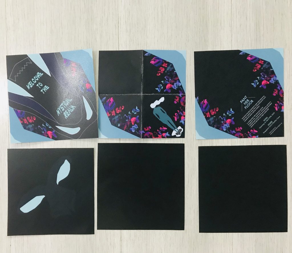
I also printed on a 350gsm thickness kind of a paper. Which is the worse idea ever because of the folding lines it gave me below.
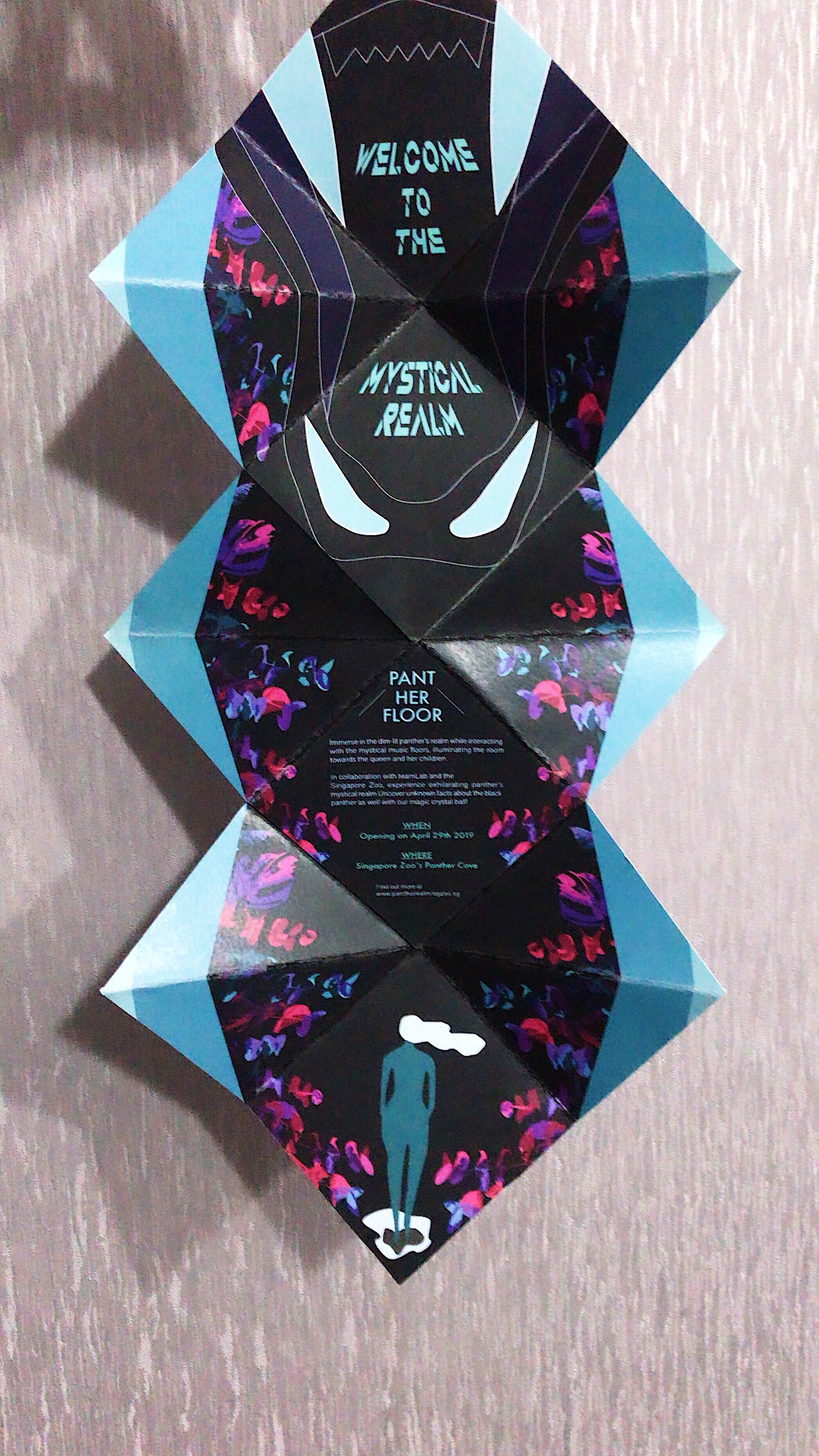
So I reprinted (thank you Lisa for this chance to do so) and it gave a much better result. I will post that in my next ‘Final’ post.