Assignment 2 required us to create a poster for our chosen animal. I find it interesting to think “if we have them in the Singapore Zoo, what would you do? How would you showcase your event to excite your audience?
My chosen animal is still the Black Panther. Following my previous mindmap, I chose to go for the ‘Mystical Forest’ theme for my poster layout.
(Just edited in) Poster project statement:
- ‘Mystical panther realm’ with the technology aspect (decided to use this as my main poster idea)
- ‘Tropical forest’ theme
- ‘Dark safari’ – leaning more towards the ‘fear of the panther’ part

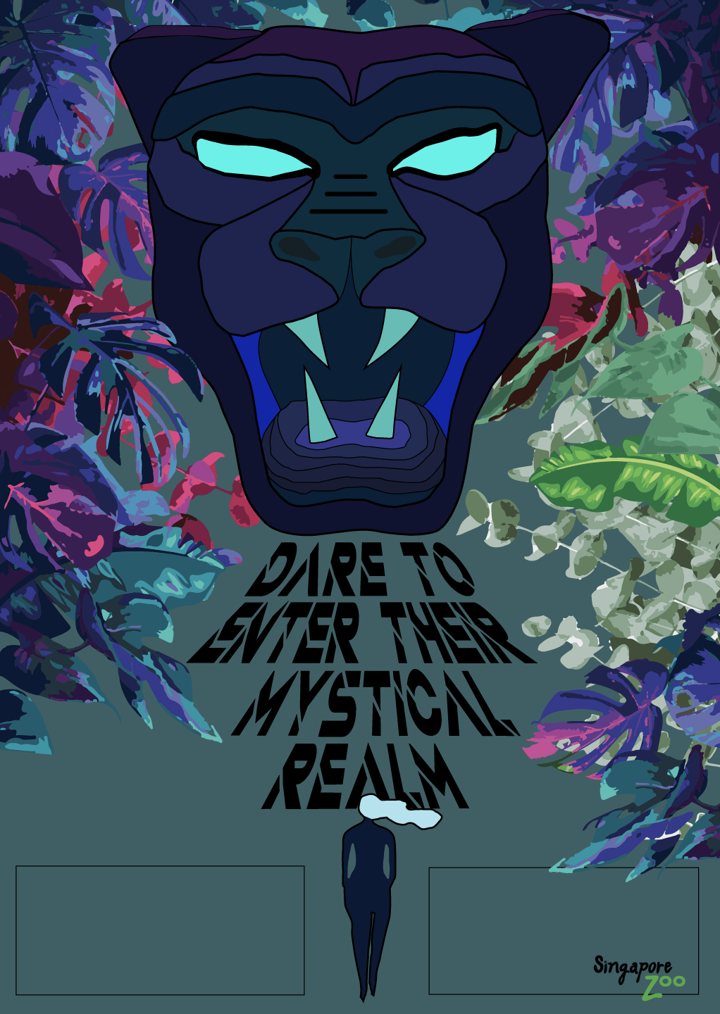
I didn’t want to use the previous geometric design. I decided to go for something simple instead but effective enough to show the mystique and fearsome aspect of the Black Panther. So i still kept the idea of using the head only but making it look how i want it to. Below is the sketch.

Then I did the same on illustrator and added in the foliage.

The foliage was all originally just shades of green so I had to manually change the colours (that, was super tiring to do oh my goodness) – from a darker shade of pink, turquoise, blue and purple colour, to lighter shades of them pointing towards the panther as that is my intended subject.

I chose those colours as well to further accentuate the mystical effect in the poster. I was inspired by the movie Aladdin, specifically the scene below.

And took most of my colours from one of my mood boards which is this one below.

And because it is a mystical realm, the activities I chose to have is the immersive coloured-musical floor, with mystical sounds or ‘roar(s)’ leading to the queen which is the Black Panther.
The sides of the walls will have a few holograms of the panthers living life in a colourful but dark-spirited forest (I imagine it with the colour palette I used for this poster) – it will look something like this specific scene from Disney’s Brother Bear below, where the animal spirits flew up into the northern lights.

Initially, this is what I printed for my poster that was shown in class just now:

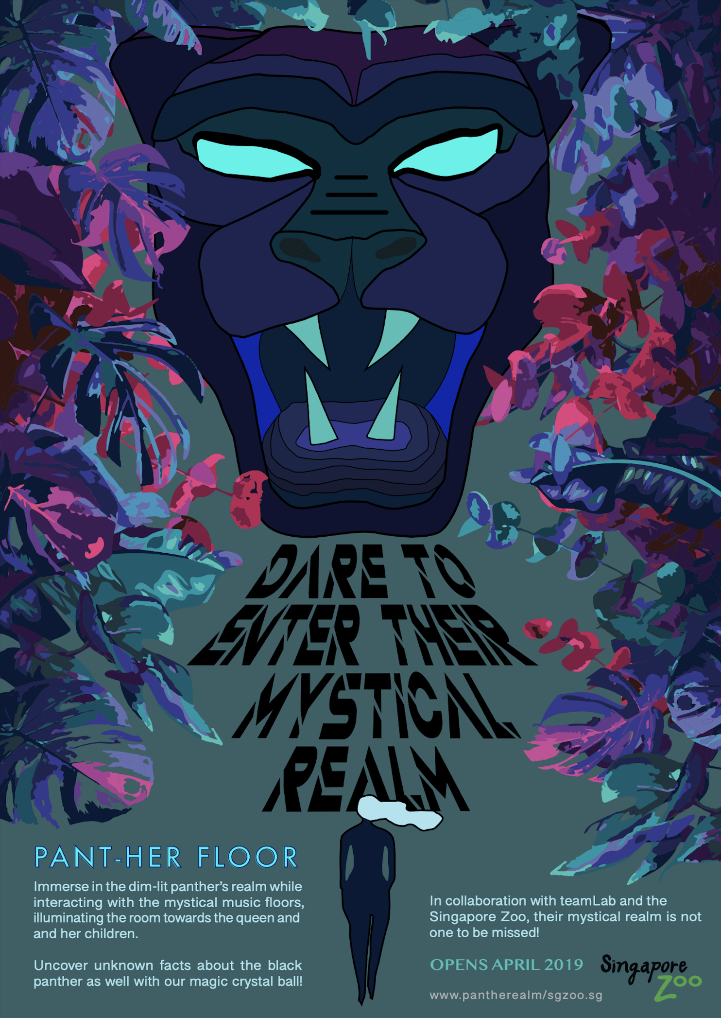
I consulted a little bit too late but I did amendments anyway on the digital version as I felt that it looks better and there is more obvious contrast now in this new digital poster, as well as for the visual hierarchy. Unfortunately, it looks better digitally as compared to print. 🙁
So here below is my final FINAL poster haha. Onto the next (and final!) assignment!


