Illustration for Designers: Varoom Magazine Cover (PROCESS + RESEARCH)

*My long-overdue process but still hoping it will be looked into to get graded (bless my soul I hope so)*

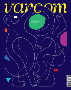
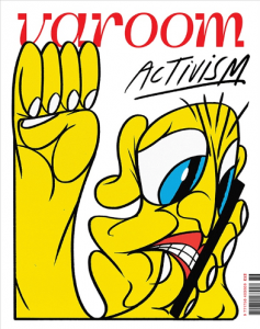
Hello! For this project, we dived into the cover design of a globally leading illustration magazine that features a unique combination of industry insight and critical analysis of the field of illustration. This magazine is non-other than VAROOM.

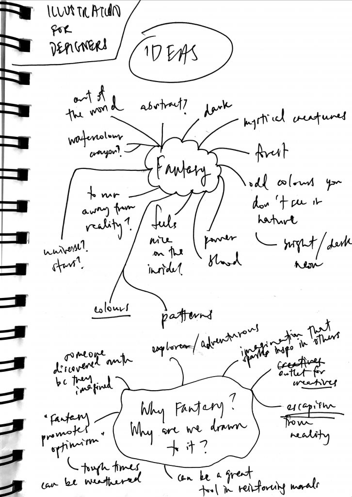
We are given 3 different choices of which theme to pick for the magazine cover design – Activism, Fantasy or Play. I picked Fantasy! Here are just some thought processes on why I picked Fantasy and who would be keen to take up a magazine on the issue.

But before diving into my process, I did some research to understand better what Varoom magazine is about.

RESEARCH

They have an intention for each issue: “[to convey] a live reflection of what is happening in illustration at any given moment… presenting new work and giving insight into how it’s done, but also asking questions about it – why make it? – what does it mean to people?”

Varoom 36 – Rhythm
Varoom 38 – Activism

Varoom’s subject-matter helps us understand that all wider-world ideas are equally as pertinent to illustration as other creative disciplines.

Whether the work is personal or commissioned, an illustrator’s unique voice is always embedded in the work, “even a tight brief to advertise a product can tell us a lot about society and what’s considered ‘desirable’”.

Like their editor, Olivia Ahmad, said: “Illustrators have a toolkit of largely unrecognised skills that are essential for coming up with the images for which they are commissioned” and what better way than to have Varoom be a hub of discussion for the illustration community and advocate their innovative approaches to these discussions? I, as a growing creative, strongly support this.

PROCESS

Now we will go onto my initial stages/processes of my creation behind a Fantasy-themed cover for the magazine.

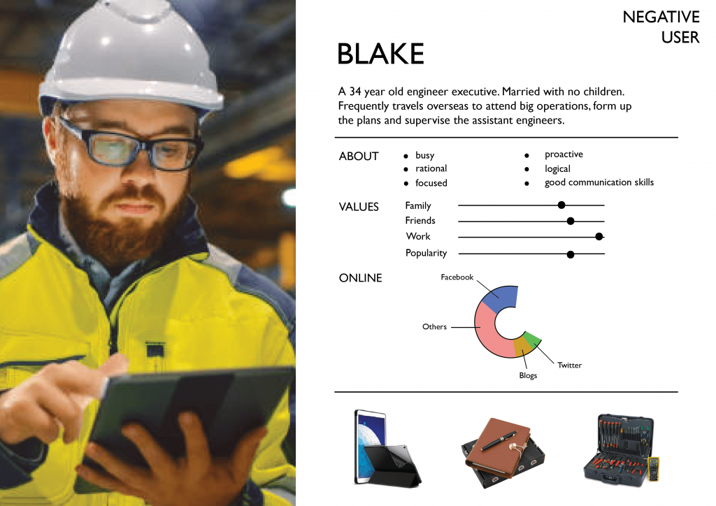
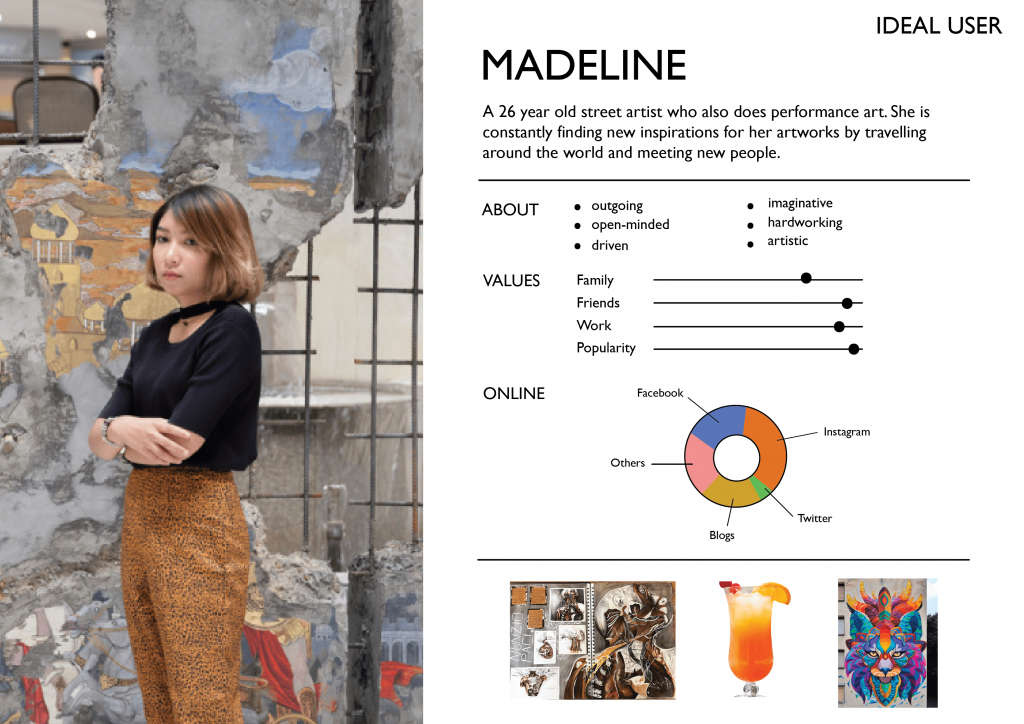
Firstly, to better showcase who my target audience is for my magazine, I created a few user personas – 1 on a negative user, 2 on ideal users of my Fantasy-themed magazine, as shown below. This was inspired and was given as a good suggestion by Lisa.

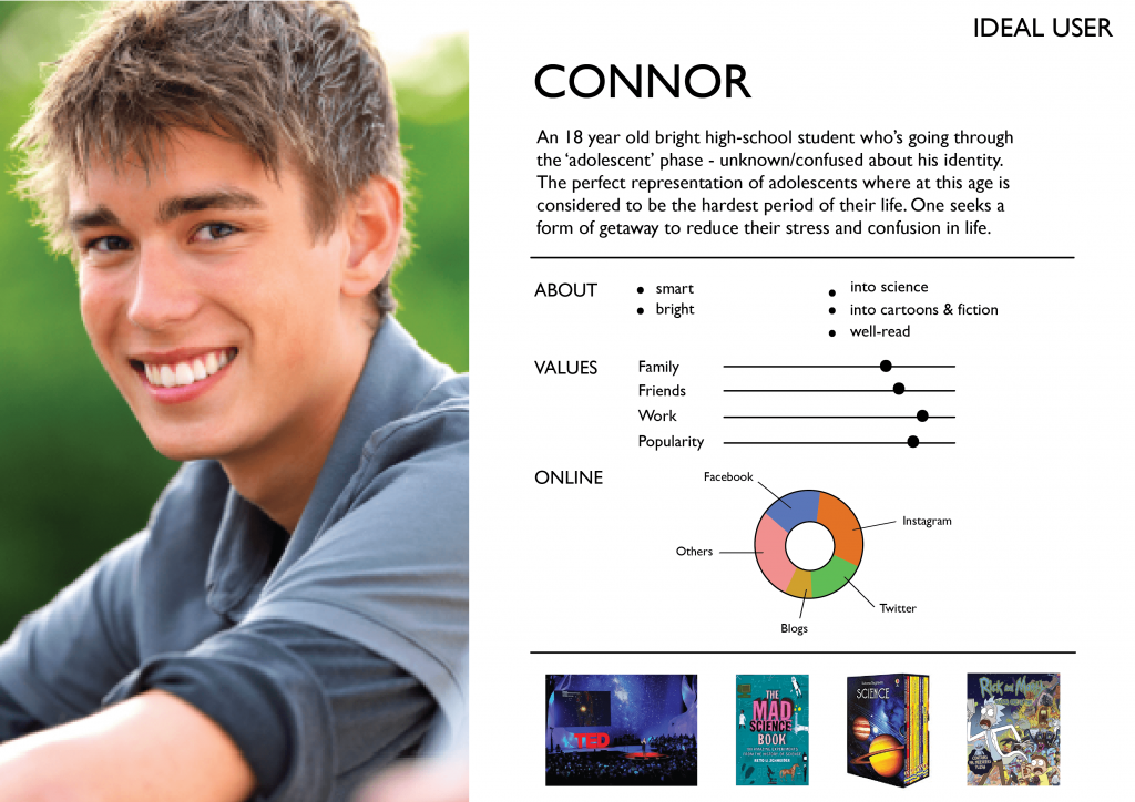
I had to narrow down and focus entirely on one user so I picked Connor as my ideal user instead. This is because I wanted to lean more towards fantasy designs for kids his age, and things related to science (but also including other weird elements) so ideas are made based on adolescents like him!

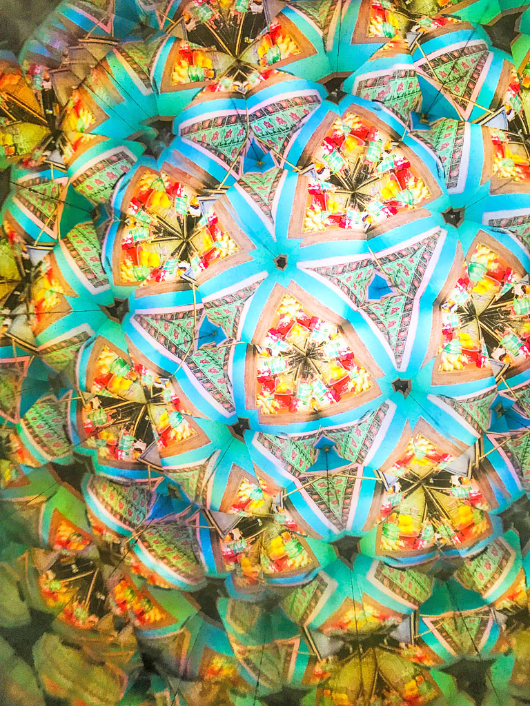
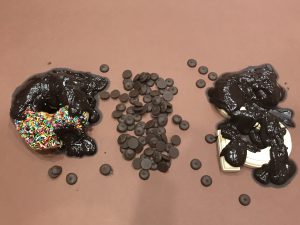
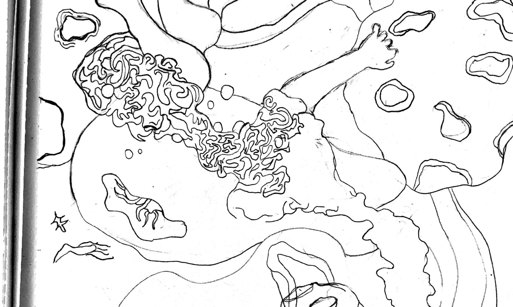
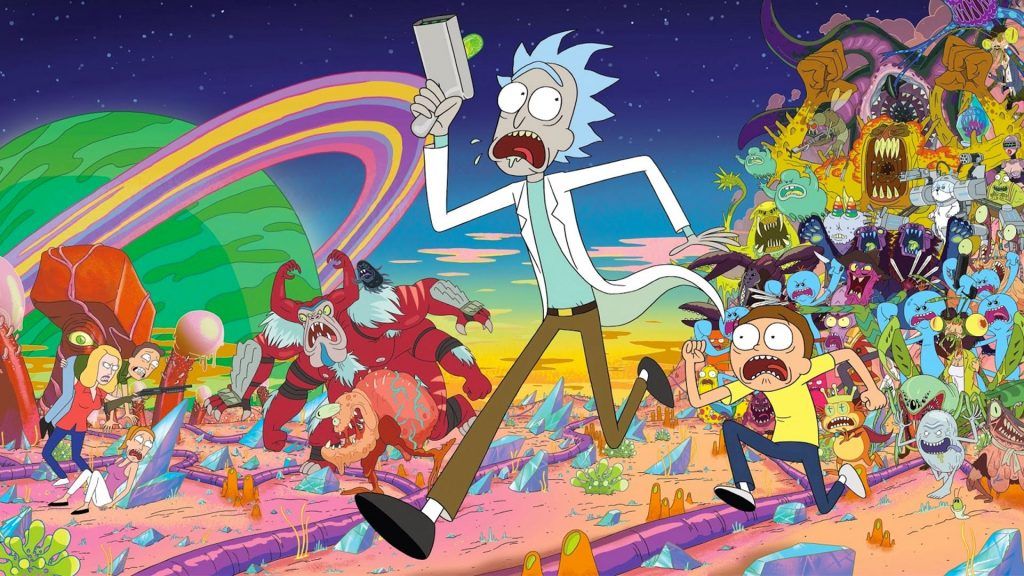
I was very inspired by the show Rick & Morty because of their bright colour palettes used in the cartoon, and the crazy bacteria elements that I love. I love weird things.

When will Rick and Morty season 4 return in 2020? | TechRadar

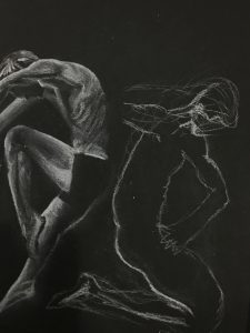
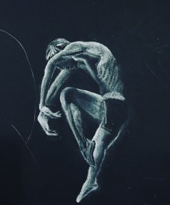
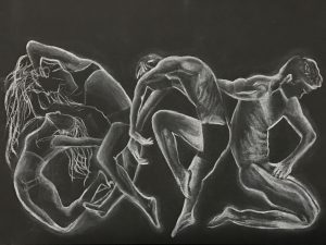
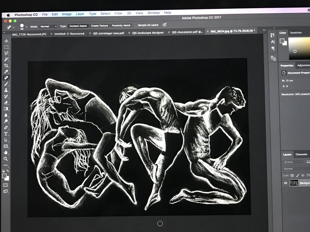
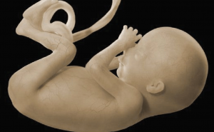
I have always been into body movements as well – how the human body works. So some of my inspiration came from that too as seen in the images below – even the fetus position is something worth pondering for me. There’s a beauty in the way we move and unfold ourselves.

Gefällt 1,543 Mal, 39 Kommentare - Stepha Lawson (@thelanguageofbirth) auf Instagram: „A high holy project I was commissioned for by @harvardcommon, birthed by Mrs. Lindsey Bliss over at…“

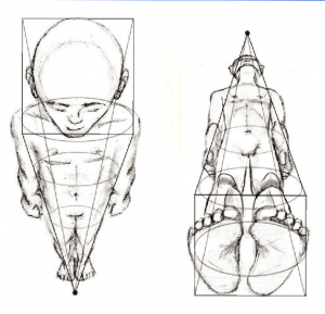
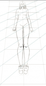
so I looked more into figure drawings, just for inspirations.

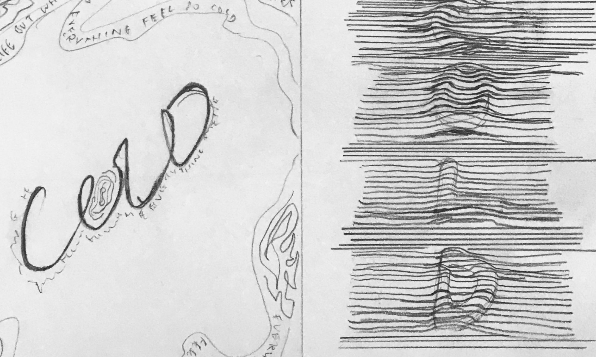
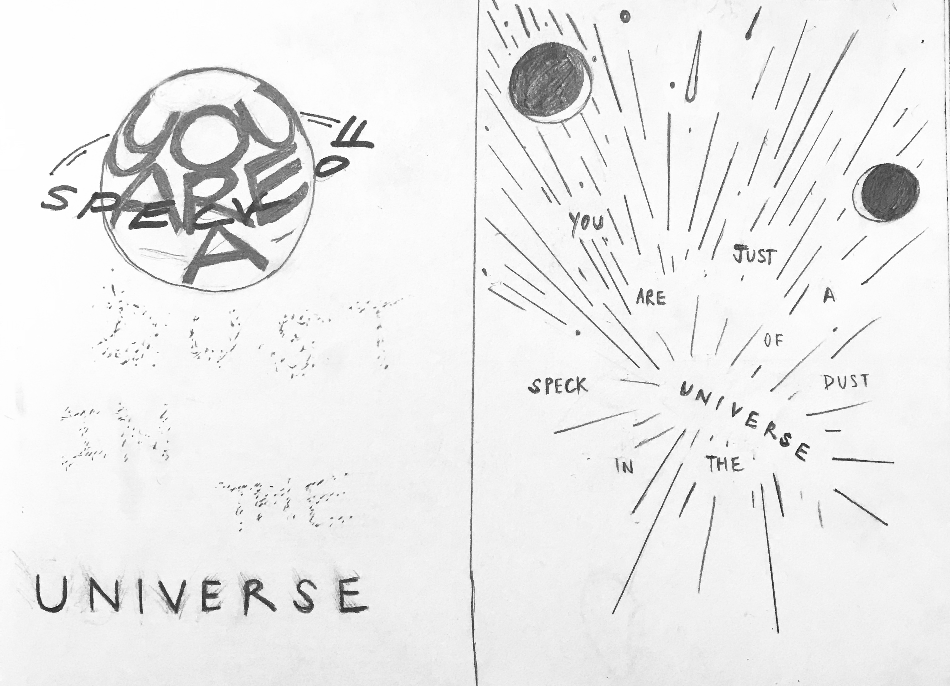
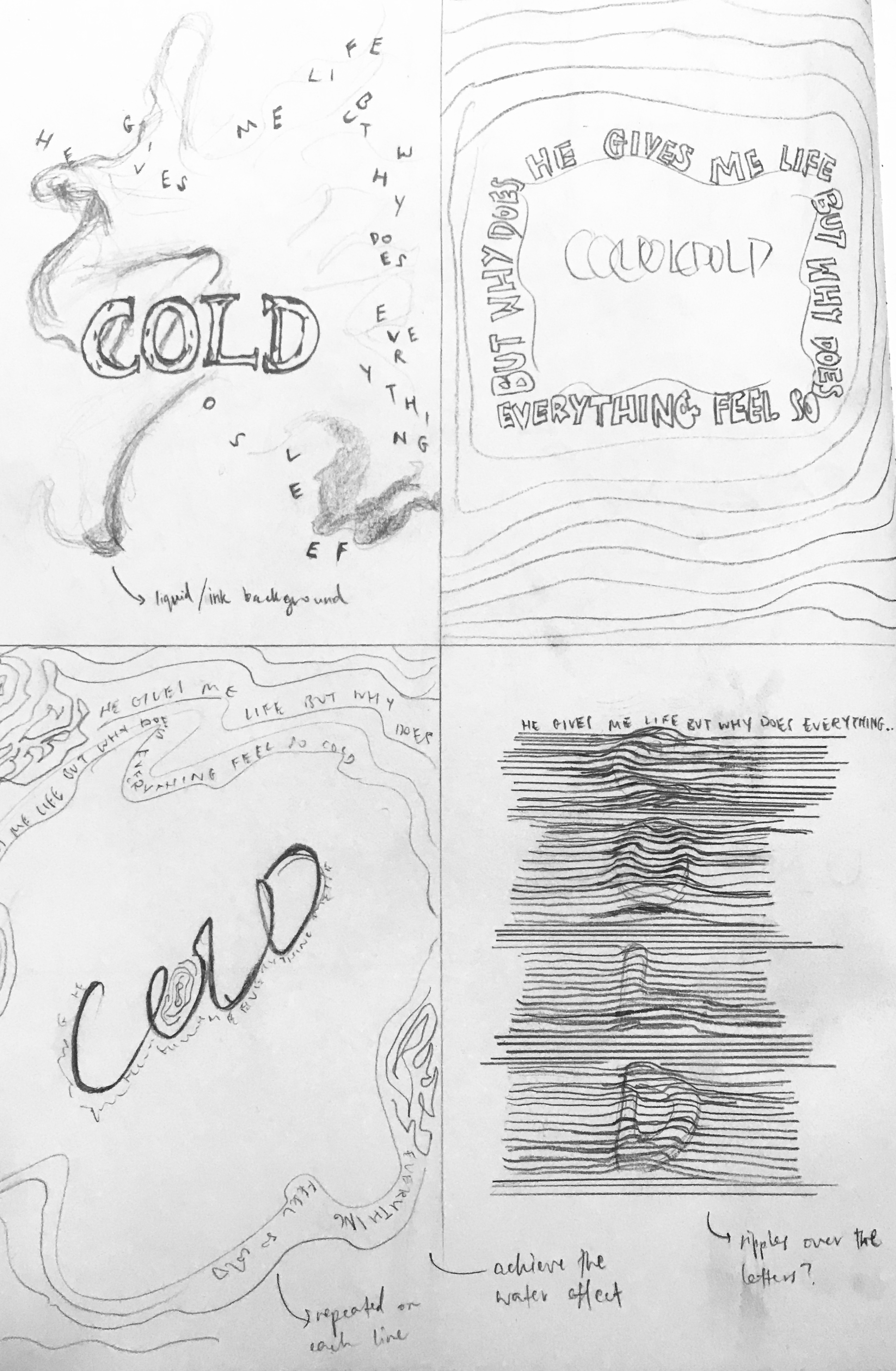
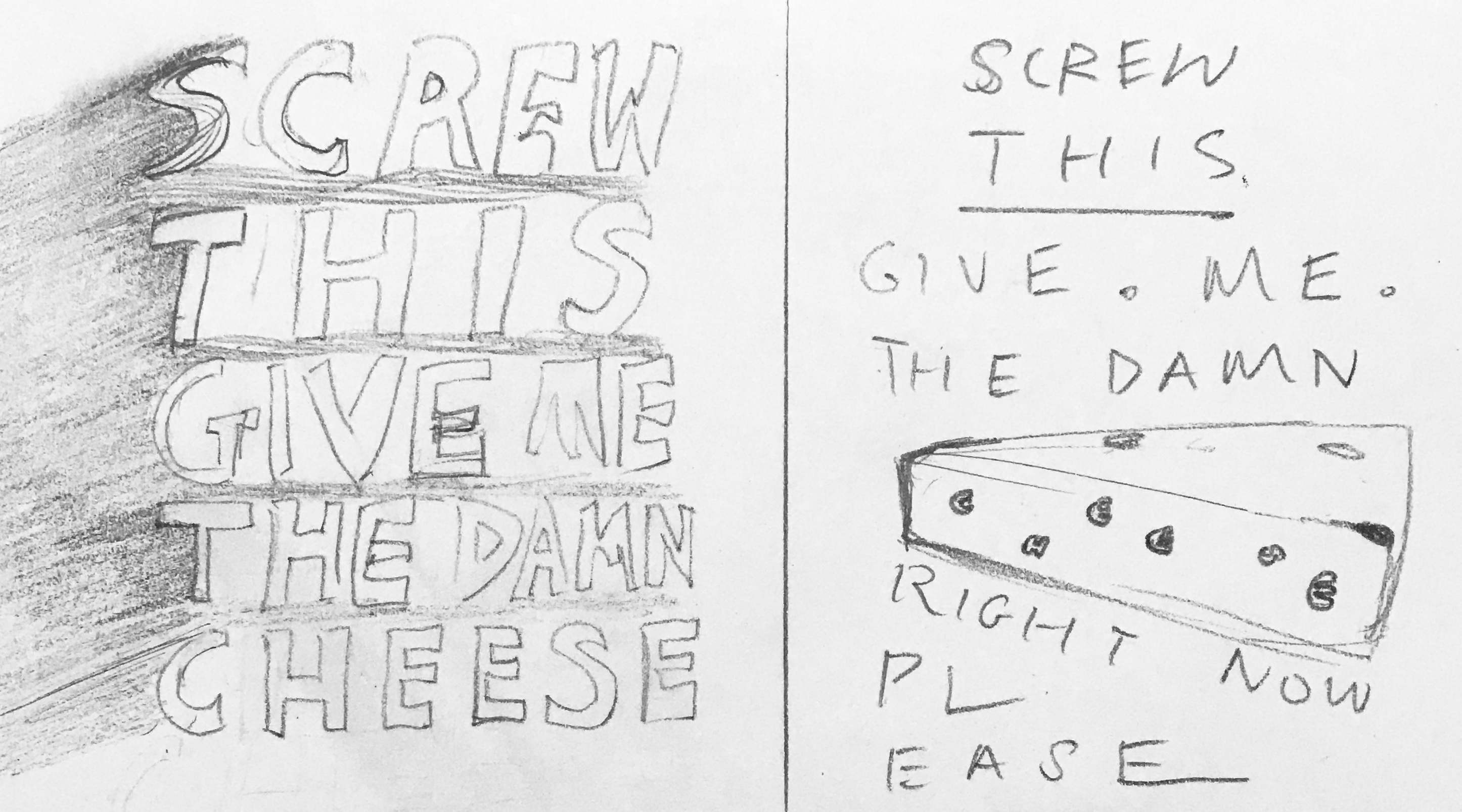
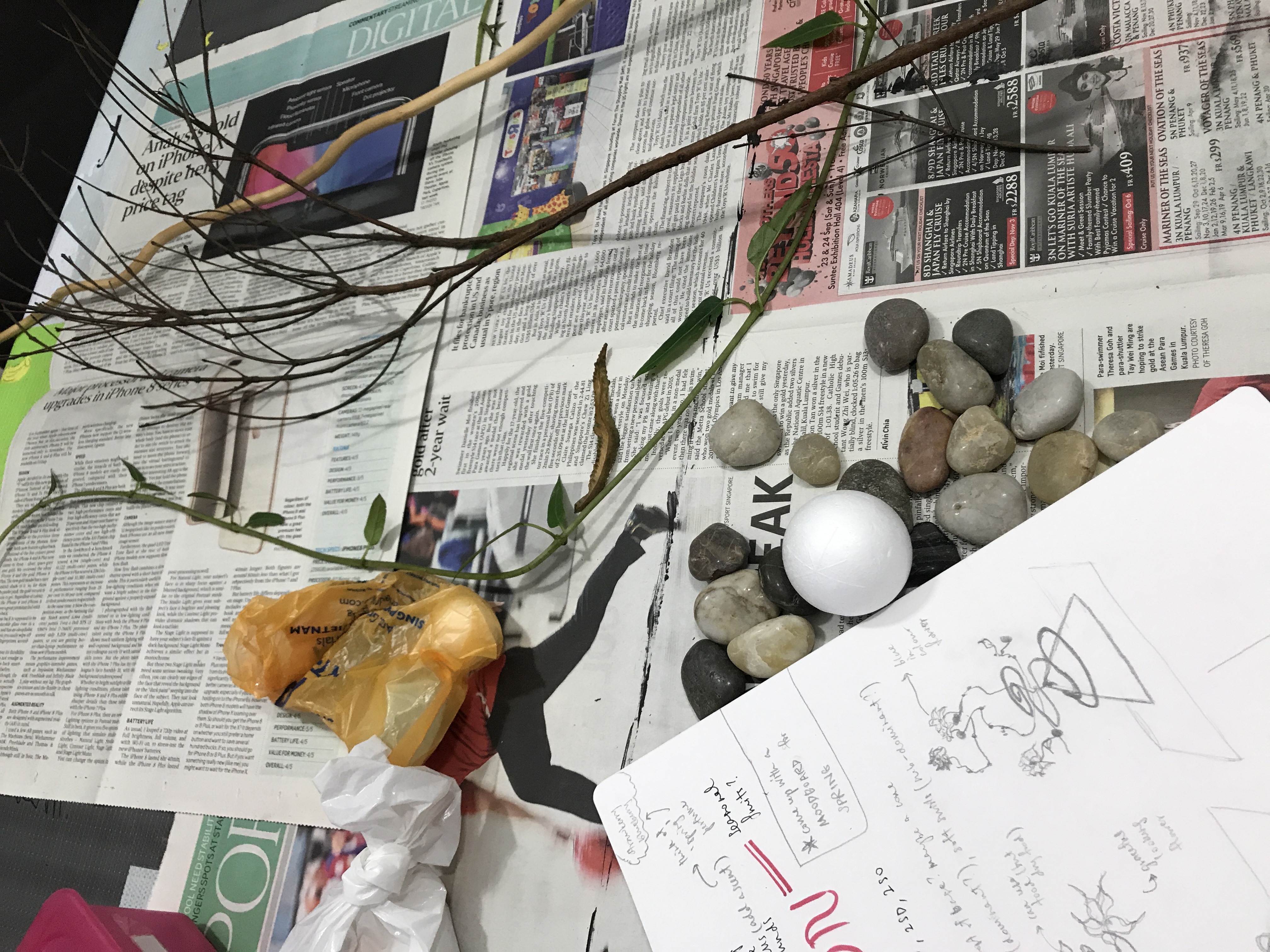
I then decided to do 12 note-pad sketches for ideation and further explore my choices.


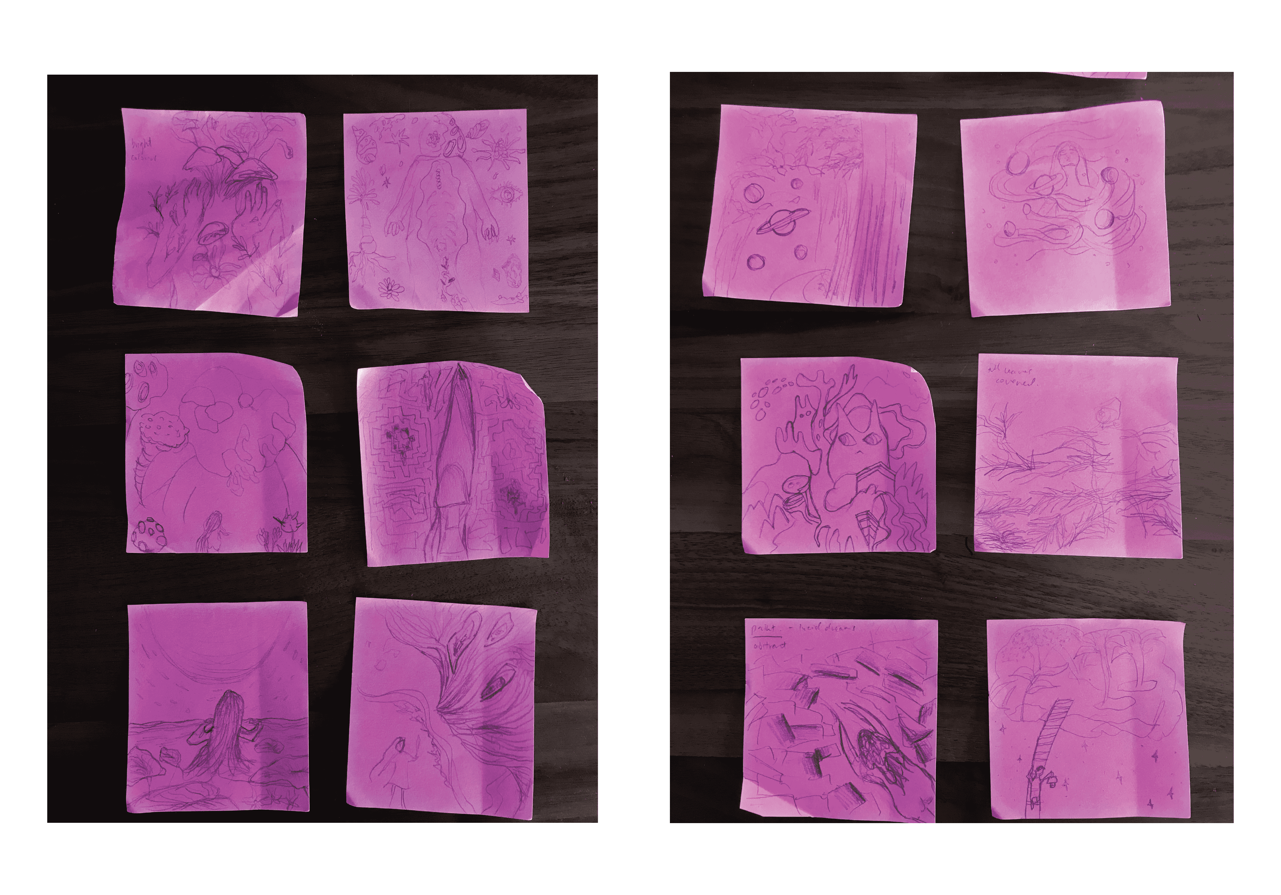
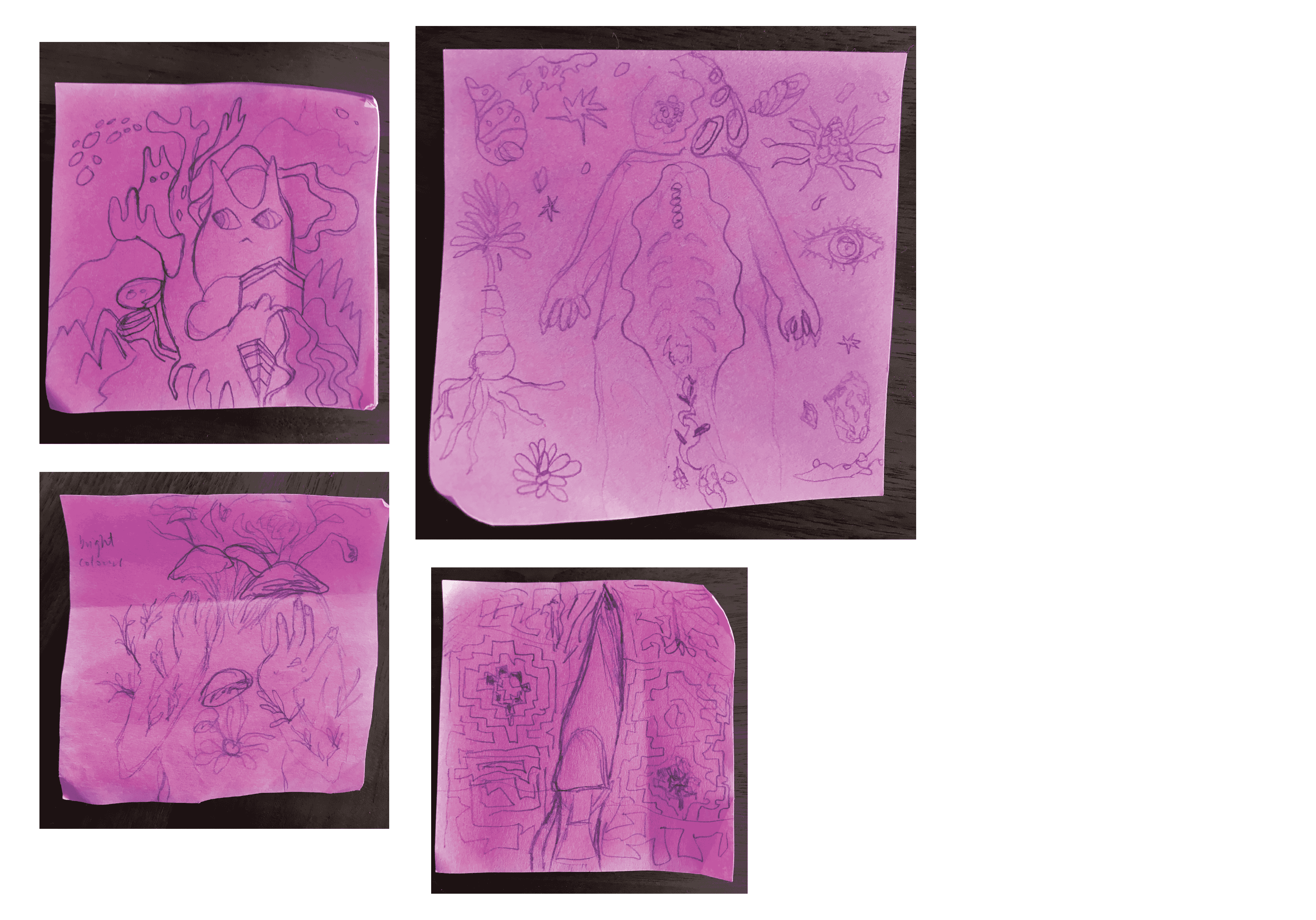
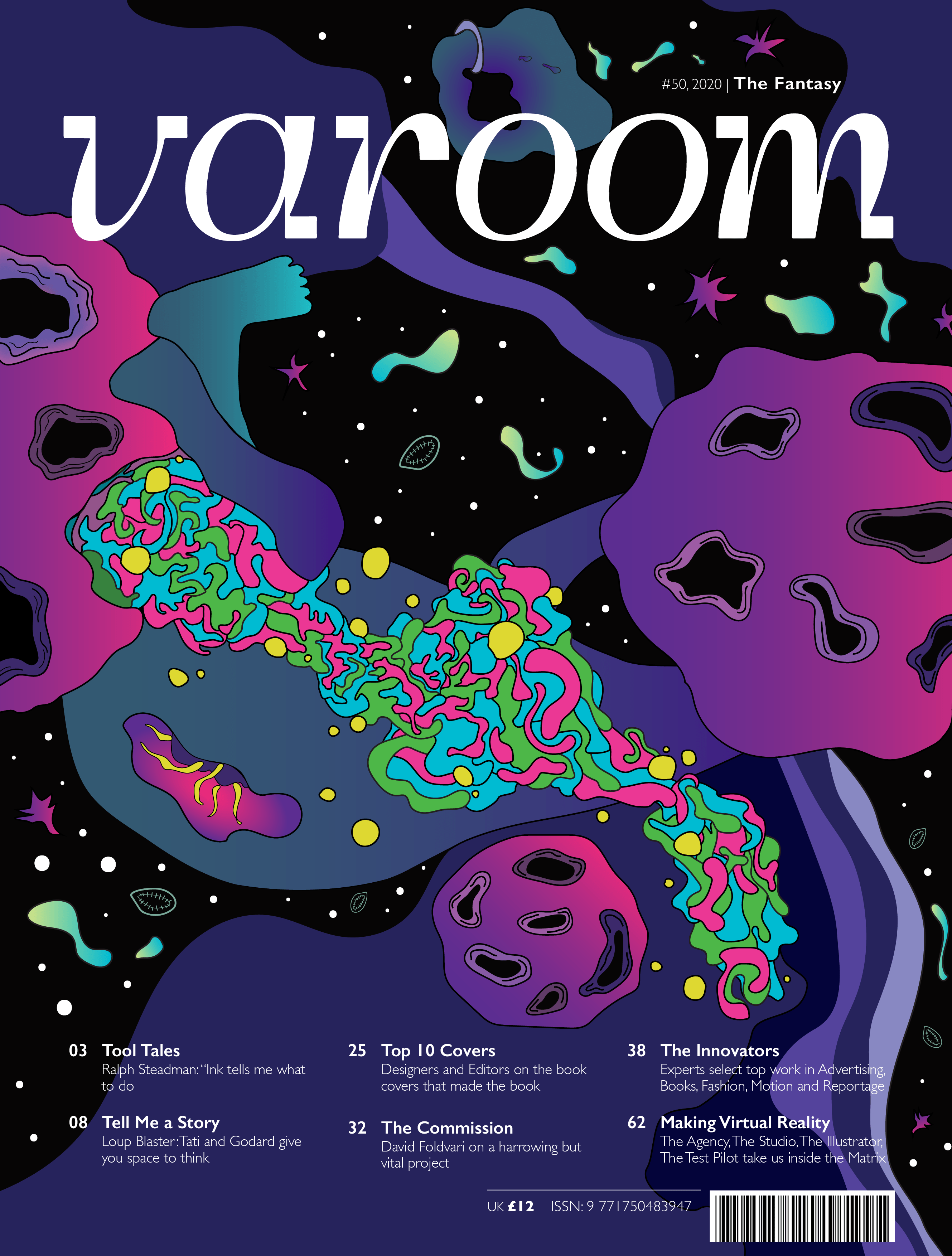
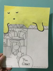
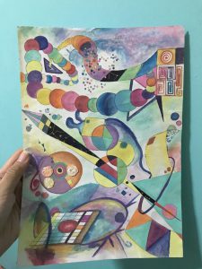
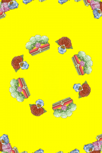
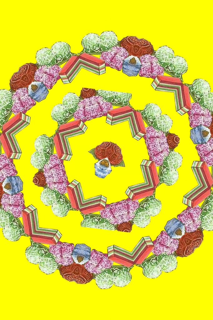
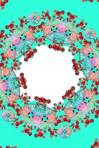
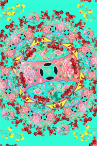
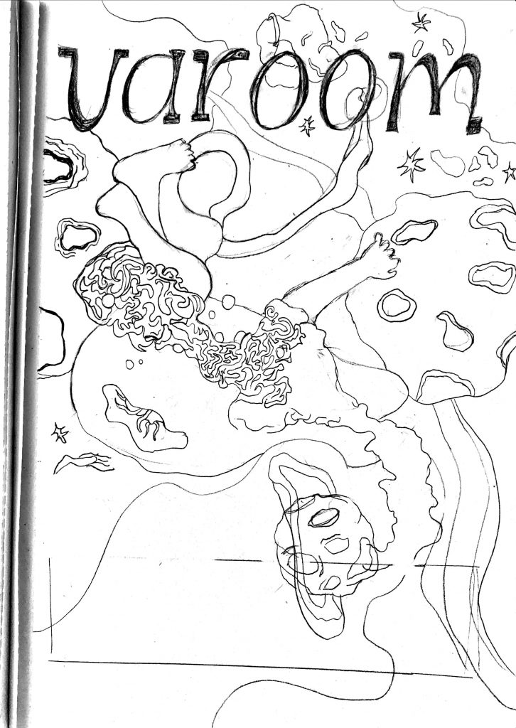
Looking back at my scribbled sketches, I realised I lean more towards things that include germs and bacterias along with the human body as well. (The one that’s purposely sized bigger than the other 3 above!) Surrealistic, in a way. And this brings me to my overarching theme for Fantasy: a world that drug users would probably see – psychedelic human melting-bacteria.  Weird, I know.

I even did a few simple illustrations to push my idea further.

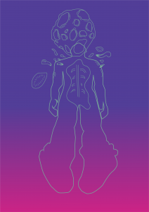
I then went on to draw what I visioned in my mind:

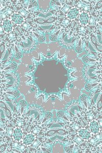
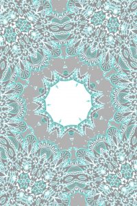
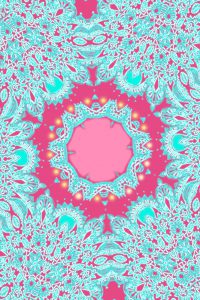
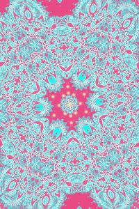
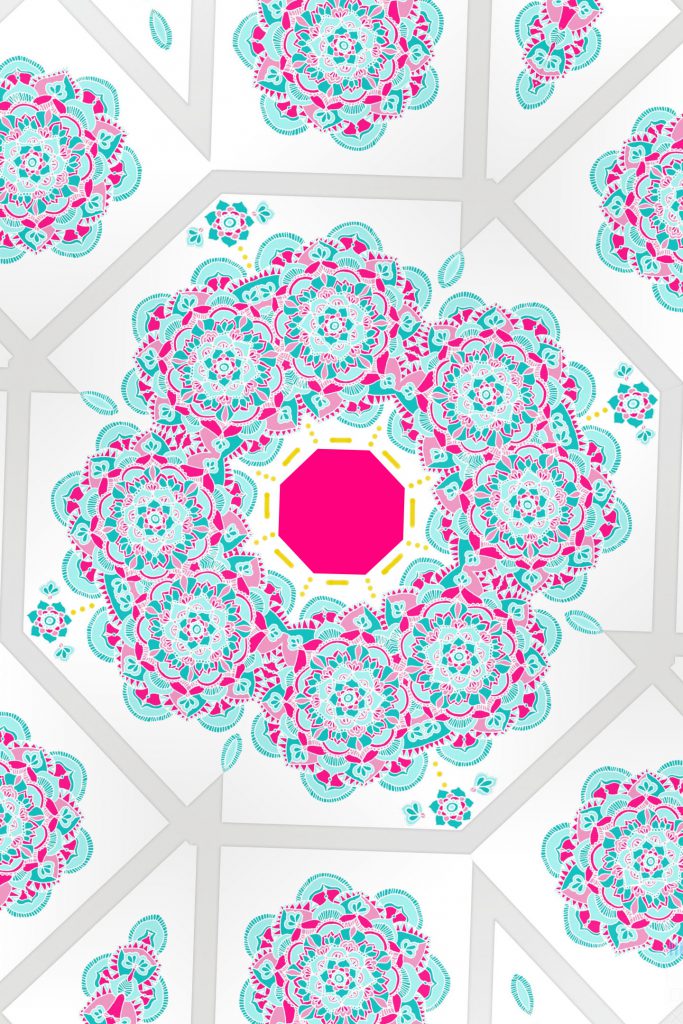
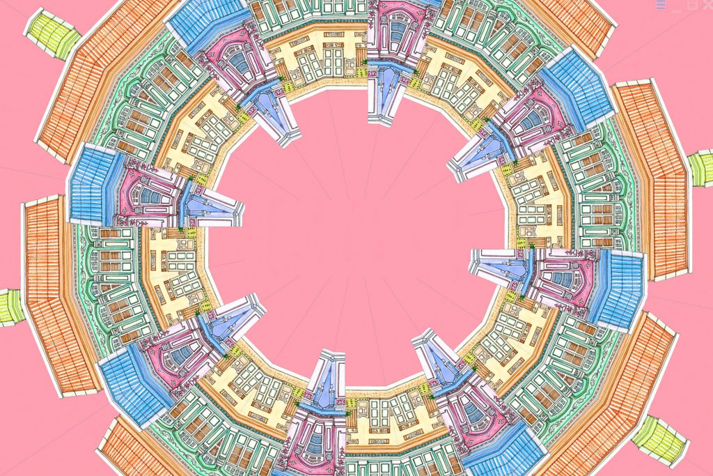
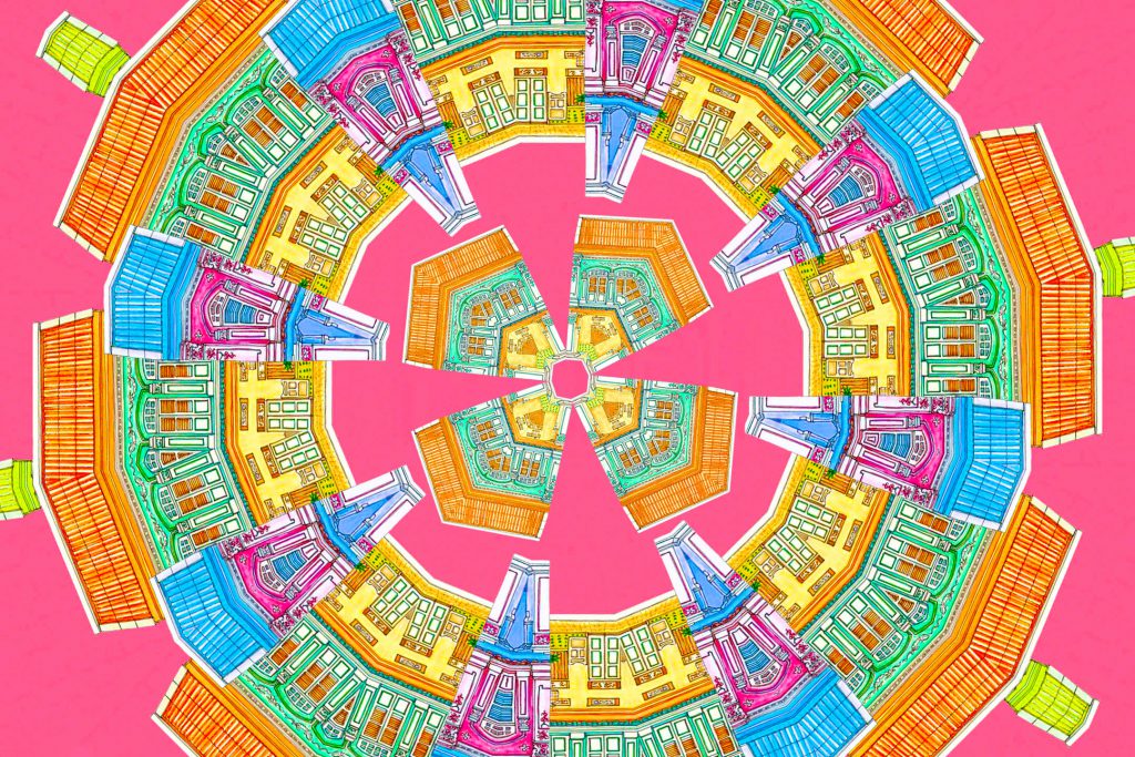
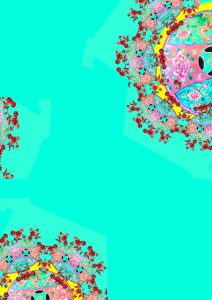
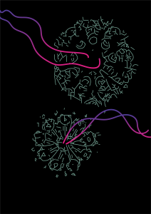
I went to further digitize it and then think about the colours there:

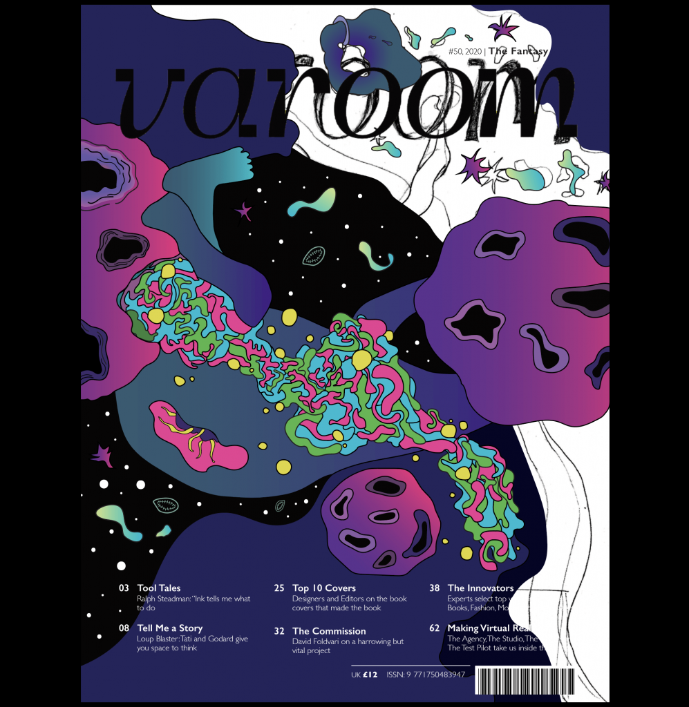
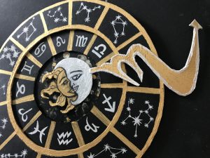
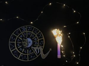
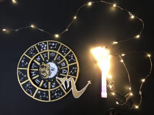
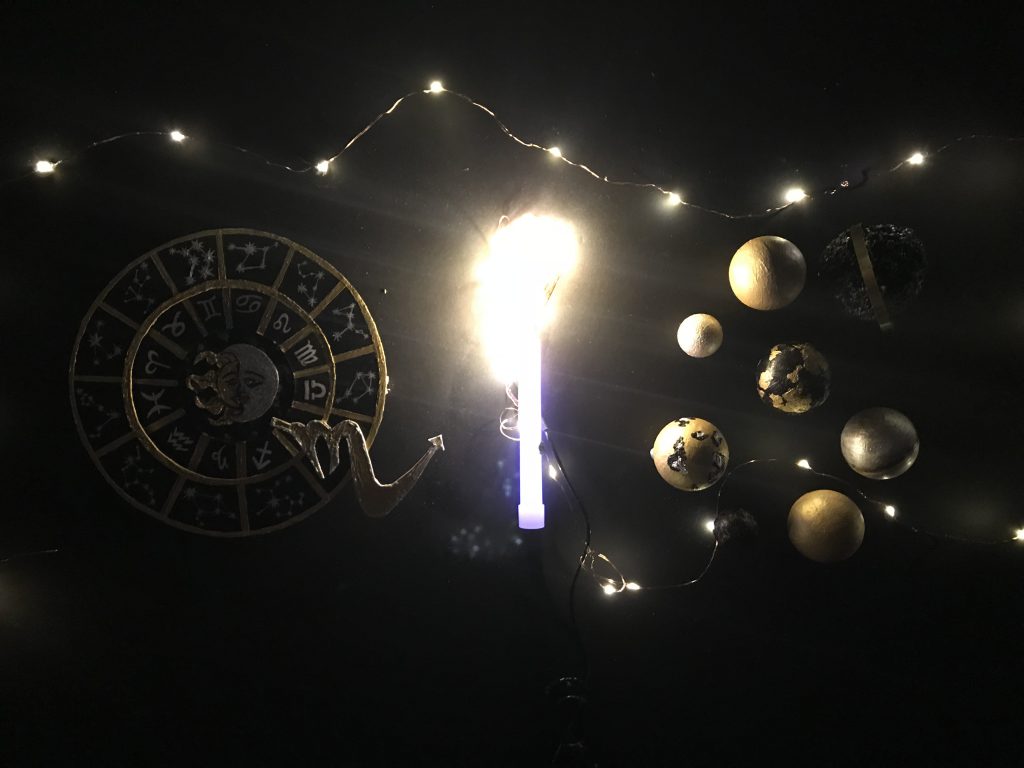
And hence, just to recap, my final! You can look into the previous post to see more as a final submission. I apologise again for this late process post but I wanted it to be close to perfect and unfortunately didn’t have time to do so before. So here you go, thank you for reading all the way if you did!


VC: Process for final brochure project

For this final project, we were tasked to do some folding exercises from useful websites such as

https://www.foldfactory.com/shop/super-cool-folds#cp=1&cph=4881

https://www.foldfactory.com/

But I found my idea from a youtube video and decided it was by far the most fitting idea that can easily relate to my Black Panther’s poster:

Like an accordion fold, but a different one. I’ll explain along with the pictures of my processes.

Following my previous poster mood board and colours:

This was my brochure mock-up:

I like the sharp ends it gives, representing the claws or teeth of the panther when you open up the simple-to-hold brochure.  Then I made that one of the prominent aspects of my brochure using bright teal colour for the sharp edge of each square. Below is as it shows. The rest is simply following how my poster looked like, but this time with the coloured foliage sticking out of the edges.

Following some grid lines as well

Some challenges were definitely the printing. The background colour was supposed to be dark blue and not black, and the sharp edges were supposed to be teal not blue. It came out like the ones shown below. But this is still part of my processes to show that before the folding, I needed 3 squares of 15×15 cm sizes first to be pasted on top of one another. The blacks are simply for the outer layer of the brochure. BUT it was the wrong printing because my illustration for the panther’s eye wasn’t supposed to be as big as that and should only take up a small square portion (1/4) of my initial big square below.

I also printed on a 350gsm thickness kind of a paper. Which is the worse idea ever because of the folding lines it gave me below.

So I reprinted (thank you Lisa for this chance to do so) and it gave a much better result. I will post that in my next ‘Final’ post.


Process – Prototype I

Before diving into it, I want to show the process behind creating the prototype – my ideation. It stems from the story structure I had, a poem that I wrote where I tried connecting the science + spirituality aspect together. I made it flow like how I wanted it to based on the presentation I talked about – ‘Mortals of the Universe’. So below I tried what was said about how “Your poem presents the verbal equivalent of entangled states.”

The poem I wrote:

And below is the storyboard I had in mind. Drew it out as it’s easier for me to visualize my ideas and make it come to life.

Hence following closely to my 1st idea of what a venom-like structure would be, I created almost the same – a liquid simulation + animation through Cinema 4D.

But instead of initially wanting it to look like a venom, I decided to change it up to look more like blood to represent that flowy chunk as a human body, a being.

Below is the artwork I got most of my inspiration from for my 1st part of the motion graphics.

this is the visual sequence idea. I'm not sure what is it.This looks like something"slime" it is a bit disgusting. black liquid from its branches enlarge look we get the details of the theory, it is sticky also could be moved. Graphic sequence design only using black and white to present it is really cool.

Texture, colour and the way it is being animated plays an important part in how I want my bloody being to flow. Hence using C4D was my main go-to to achieve this.

A part of the process:

Seen below is the first few seconds of it. A zoomed out and zoomed in version (I can’t seem to pick which is better yet) (I’ll keep this post updated).

Have a good day ahead!

Typography I – The Walls Have Ears Project: Process & Final

“The walls….they can hear you.”

Here are the sentences I’ve chosen from convos I’ve eavesdropped:

  1. Screw this I really want some cheese right now please (10 words)

  2. You are just a speck of dust in the universe (10 words)

  3. He gives me life but why does everything feel so cold? (10 words)

Behind these sentences:

For  1

“Screw this I really want some cheese right now please”

You know how when you hear people’s conversations, you’d expect it to be so scandalicious BUT NAHHH. I thought it was funny that this lady beside me was super hungry and it’s true that a hungry woman is an angry woman, because hell, she looked super cranky alright. JUST BECAUSE HER FRIEND TOLD HER CHEESE IS BAD FOR HER DIET. It’s hilarious I had to look at my phone and laugh silently so that they’d think I’m laughing at something on my phone.

For  2

“You are just a speck of dust in the universe”

Ok, I’ll be honest, this was actually taken from a deep conversation I had with a guy. And it just ticked me off when he said those words and I could sorta remember that it went like this: “we are just a speck of dust looking like we have big problems now but…in a bigger perspective, in the universe, we are just that tiny.” So I summarised what he said in that line and yeah, deep sch-tuff.

For  3

“He gives me life but why does everything feel so cold?”

We were at this waterfall in Selangor at that time and was just playing in the water when I overheard my friend (a girl) saying this but instead of saying “cold” she said “empty”. My guess is, she feels empty even being with this ‘guy’. I decided why not change it to the word ‘cold’ because (haha) WE WERE ALL FEELING COLD THERE IN THE WATERFALL yet we play in the water anyway. Also, the water was super cold. Yeahhhh there’s no link or context to her words but haha it makes sense right? Now that you read the whole sentence -“He gives me life but why does everything feel so cold?” – it sounds deeper too.


Here are my draft sketches before I move onto Illustrator to create the poster designs.

“You are just a speck of dust in the universe”

“He gives me life but why does everything feel so cold?”

“Screw this I really want some cheese right now please”

INSPO

PAULA SCHER’S, IDEA FOR ‘COLD’
FOR THE ‘CHEESE’ EFFECT
IDEA FOR THE CHEESE TYPO

FINAL

“He gives me life but why does everything feel so cold?”
“You are just a speck of dust in the universe”
“Screw this I really want some cheese right now please”


Links used for inspo:

https://fromupnorth.com/design-inspiration-roundup-04-2018-c1868b4594c9

https://www.shutterstock.com/explore/fall-for-shutterstock?utm_source=designtaxi&utm_medium=acq_display&utm_campaign=image_us_directbuy&utm_term=1_allvisitors_interstitial_1&utm_content=fall2018_en_2000x1200&dclid=CjkKEQjwlejcBRDr64efna2Y44kBEiQA5qe1wRnw25AvgLHgDMHCduv4TXJZeqKgMQGtYWBTUqFxTLHw_wcB

http://theinspirationgrid.com/creative-typography-artworks-by-mat-brown/

http://theinspirationgrid.com/new-typographic-artworks-by-carlo-cadenas/

https://www.behance.net/gallery/11541583/3D-Typography


Graphic Form: Zine Process

Before the consultation, I initially thought of doing abstract cubism, or simply just a mixture of colours and abstract since I was thinking of touching on every culture and the very vibrant colours found in Joo Chiat.

For the first draft, the one with the yellow cartoonised sky, I was inspired by Dallas Clayton – an American author and illustrator famous for his children’s works and cute little illustrations with impactful poems. But for this zine, I thought it could just be an initial idea.

Dallas Clayton’s works:

For the abstract piece that I did, I was inspired by Wassily Kandinsky – a Russian painter and art theorist, where his works are centred in abstract art. I love it because of his use of vibrant colours and different shapes and even weird lines that makes his works come to life.

Wassily Kandinsky’s works:

But after consultation, I realised it was easier to just focus on one thing but have a different set of ideas set on it. I agreed with Mimi that focusing on the Peranakan culture would be a much better decision as I had a lot of documentation on it. And focusing on it meant that I needed to work around something more than just my inspirational artists above, as it did not bring a touch to what Chinese Peranakan culture is like.

Since I wanted it to be colourful and also in a Peranakan style, I decided to make a Kaleidoscope art. So I tried the few below.

1st try: To use a legit kaleidoscope to see the Peranakan shophouses and capture the colours and details.

These are the outcome:


Pros: They are actually beautiful and the colours simply reflect the vibrant zine I had in mind BUT

Cons: They did not reflect off what a Peranakan style or culture looks like. So I had to do more to make sure I get those factors out.

What I had in mind was to also write a poetry based on it. I wanted to tell a story that makes readers feel excited to see some sort of treasure if they look closely into my abstract work. (seen below)

2nd try: To actually create my own mandala and see what comes of it as a Kaleidoscope. Why ‘mandala’? Because it is found on most of the Chinese Peranakan kebaya clothes and patterns on tiles.

For these two, it looked plain and dull so I decided to change it up a bit with different colours: hot pink and turquoise.

Like these ones:

I consulted Mimi again to ask for feedback because at this point I had a few processes but not knowing which to pick and what felt right or wrong. And after that, we both agreed that it would be better to stick to one form and I chose the illustrated kind to be included in my zine, instead of the 1st try of real Kaleidoscope photography.

So 3rd try:

From this

and this

to this (for my front and back cover)

I consulted Mimi again because I wanted to ensure that this style that I want to go for, is actually good to follow throughout. Thankfully she agreed that it is, it’s just the adding of patterns on the outer parts that I had to play with and edit as I did not want it to be plain like the one from the start of the 3rd try.

Likewise, for the rest, I work a couple of times to find the balance and get it right.

For 2nd spread:

For 3rd spread:

For 4th spread:

All will come together for final and thankfully, I see the balance in my work.

Form and Visualisation: Process of bag making and final

Process 

My focus for this project of bag making (prototype) is on two things:

cushiony and water-resistant

SKETCHES:

(inserts picture of sketches)

PROCESS OF BAG CREATION:

Materials used: black biodegradable bag, round hard styrofoam, hardcover plastic, cotton wool and thin sponges made to slot into bags.

For my cushion bag, I wanted it to be in a circular shape. So I place it on top of the black bag and cut it according to the shape. The back and front cover of my bag will be made out of the black bag cover.

Using double-sided tape to attach the cushion sides. This black fabric portion will serve as the front and back sides of the bag.

I was inspired by the cushion idea below and I wanted my front bag to look as close as that.

So I cut out the thin sponges in circular sizes, about 4 of them – 2 to be attached to front cover. 2 to be attached to the back.

Because I want my bag to feel cushiony and comfortable for users to use, I need those thin cushions to be stuffed in. I also cut out 2 cardboards of the same size and shape to ensure the front and back of my bag has a backbone.

I wanted my prototype to be durable AND sturdy, hence I thought of making use of the hardcover plastic so it wouldn’t be too flimsy. By attaching it to the sides of the circular front and back using super-glue, it ensures the sturdiness, at least at the side of the bag. (as seen below)

I also used cotton wool as I wanted to show that I want my bag to be as comfy as a cushion so I pasted the wool at the front side of my bag.

As for the straps, I decided to follow closely to my normal bag’s straps measurement. I then cut the measurement of length 44cm to 5cm breadth out from the sponges.

I glued everything together using super-glue as it was hard to stick real materials together.

In the end, it did not look aesthetically pleasing but that was not the point. I made it in such a way that people (and even me) can see that the material was what I was focusing on the entire time.

And reflection: Making a bag that is actually functional like the way I want it to be and has its aesthetics, is not easy. You gotta work your way around it for quite a while to figure how you want to do it right.

Graphic Form: Image Making Through Type (Process)

After all the job search done, I have decided on being an Astrologer, Chocolatier, Landscape Designer and Contemporary Dancer.

Process for typography of job for:

 ASTROLOGER

I was inspired by a few things I’ve researched on when i think about “astrologer” such as the ones below:

Astrologist zodiac chart
The bright stars – galaxy
Planets orbiting around one another and meteors

So I based my main sketch for Astrologer on these:

I cut out different sizes of the circle to create the astrologist/zodiac chart, so that they will look popped up on the board I pasted it on. I needed it popped up so that it looks like it has the same kind of thickness as the planets i’m creating later on later on.

Painted these circles as gold, white/silver – the constellations are drawn in white pen. Hence the three colours I have for this are just going to be black, white/silver, gold.

Using styrofoam balls and painted them to make the gold/silver/black planets
The logo that’s sticking out is my horoscope sign – a Scorpio, and I purposely made it pop out so it will add to the line on letter ‘Q’

Initially I just wanted to use fairy lights to make the stars and constellations so as to create the ‘I’ in my name and for my background. But I also incorporated what Mimi told me to do which is using party light sticks! This is so that it will have almost the same “thickness” or width as the rest of the letters in my name in this specific work.

Without light exposure
With light exposure

And of course I had to do some editing using light-room and photoshop to get the contrast and bring out the bright light and covering up the wire liens of the fairy lights.

Before:

Photoshopping in the making

After:

And that above is my final for Astrologer!

LANDSCAPE DESIGNER 

I was excited to get started on this because it’s something I haven’t done in a long time – designing and decorating like as if it’s my own backyard haha.

To start off:

Making the little pool out of my letter using wood and  small pebbles.

Adding the fake trees, cactus for decor and bushes with little yellow flowers surrounding it
Basically a big mess for something that looks small!
Close to finishing, going to paint the inner part of the pool to blue to make it look real

CHOCOLATIER 

I had to melt the chocolates first to get the gooey-melting effect.

Initially thought of this idea where the chocolate melts are in the bowl and the spatula too so it could make into my initial ‘Q’ but that would be too simple.

Pouring the chocolate melts slowly hoping to get the effect:

Details
Details
Final before photoshop!

CONTEMPORARY DANCER

Processes of my drawings:

I erased some parts of the white off because I wanted more shadows and to really have more prominent lines on their bodies.

Finished drawing but before photshop

I had to do some editing in photoshop too to have more contrast and emphasise more on the white outline on them for the movement.

Next post will show my final results!

Gaia’s Ikebana (III) – process and final

Hi – welcoming you to this post with my newfound buddy on that day, my twigs. I call them “autumn”, for some reason idk.

Funny story behind this is, I was trying to look like i’m just taking a stroll around our neighbourhood field but my friend which is also my neighbour drove past me when I was almost done with picking branches and he caught me anyways. Hahahaha how lovely.

Before getting those branches done for art, of course i would clean them to rid of any insects.

Preparing for ikebana 1:

Using pebbles of different sizes and almost same tone of colours that resembles nature, to create my sphere, my dominant:

End result of sphere:

Then making fake pastel pink flowers to be poked through the twigs, to make them look like spring flowers. I also tried to use real little flowers you usually see growing out of those vast grasses:

Wedging the twigs into the pebble sphere, putting it in the right order and placement to make the long leaves hang loose like one of the Japan’s flowers that bloom during Spring, the Japan wisteria tree annnnnd voilaaa!

Initially I didn’t want to show this in class because for me, i was not satisfied as I couldn’t find a right place to put a cone, it just seemed lovely this way. BUT after viewing it in class, the best ideas came from professor and my friends where they suggested I could just get more of those long flowy leaves and stack them like the direction you see above and it will already be shaped into a loose cone on the other end!

HOW INTERESTING.

So because I didn’t know this, and because I still was excited to create more, I just decided to create 1 more. A different style.

Ikebana 2: I used 3 bendable gold wires for this, to create another huge sphere as my dominant.

In the end after putting marshmallows (i thought of spring flowers as something that scented vanilla and sweet) and fake red flowers made out of ribbons wedged into the twigs, this is the outcome:

I could have made the cone be less obvious by simply just attaching 4 wires at the top and shape it into a cone as the handler. But overall I liked this one too, and the previous ikebana too. There’s room for improvements but I like what I did and that’s just something to be proud of.

So here my 2 SO(s) are the red and white ‘flowers’ that represent my hopeless romantic state whenever i think of Spring and their new beginnings. My 2 SD(s) are the twigs and the cone/wires on top as the handler (that could have been more obvious if i just amde the cone out of long thin wires). And my D is of course, the huge gold wire sphere. Purposely made it gold so it also seemed simple but elegant.

Overall, this was probably the best 3D class i’ve had because I truly enjoyed what I did and I loved the Gaia Ikebana idea – so enriching! And my classmates’ works are so unique it makes me smile so much, it was honestly a fun lesson. The process towards this made it worthwhile. smile

These beautiful works from these beautiful faces.