Illustration for Designers: Varoom Magazine Cover (PROCESS + RESEARCH)

*My long-overdue process but still hoping it will be looked into to get graded (bless my soul I hope so)*

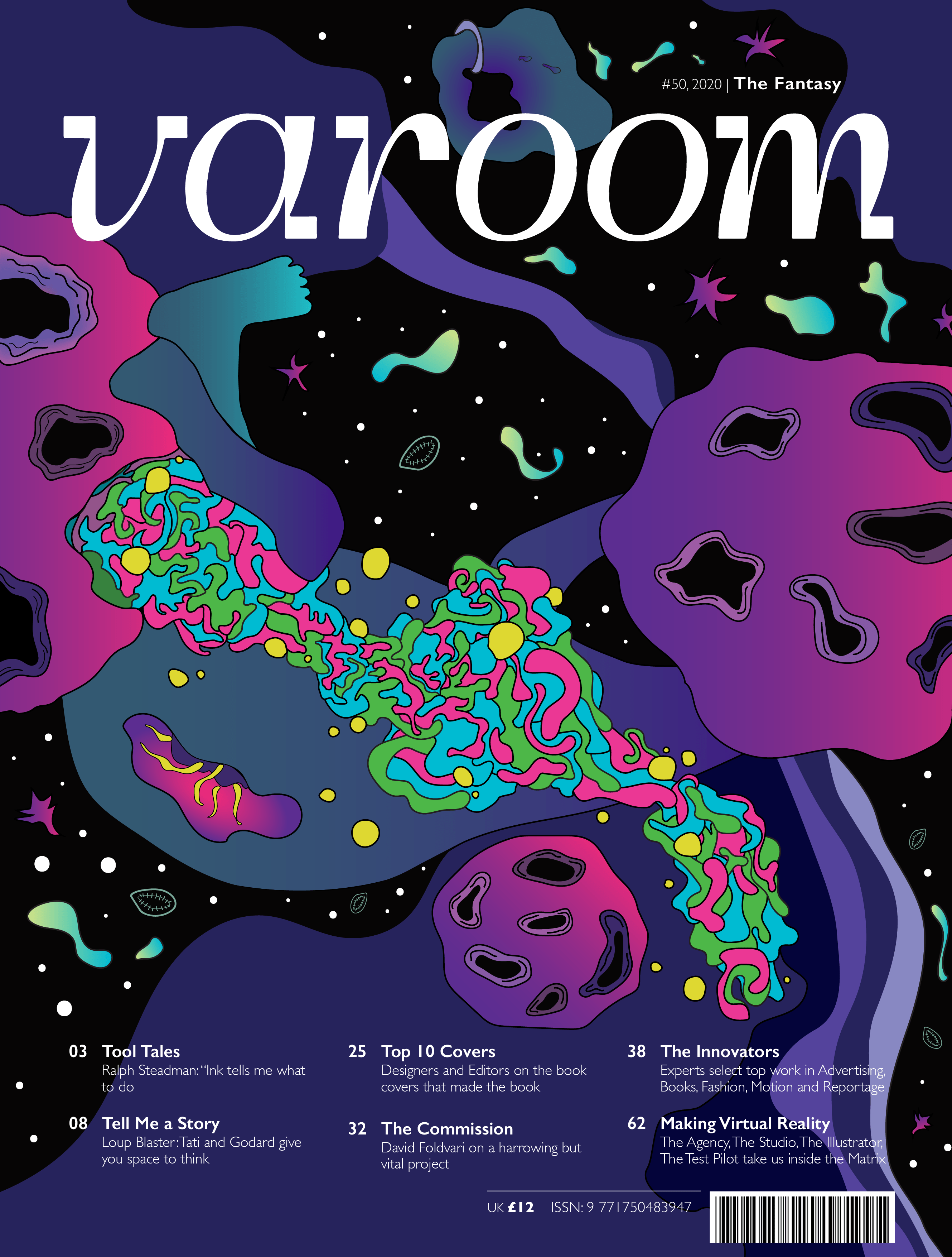
Hello! For this project, we dived into the cover design of a globally leading illustration magazine that features a unique combination of industry insight and critical analysis of the field of illustration. This magazine is non-other than VAROOM.

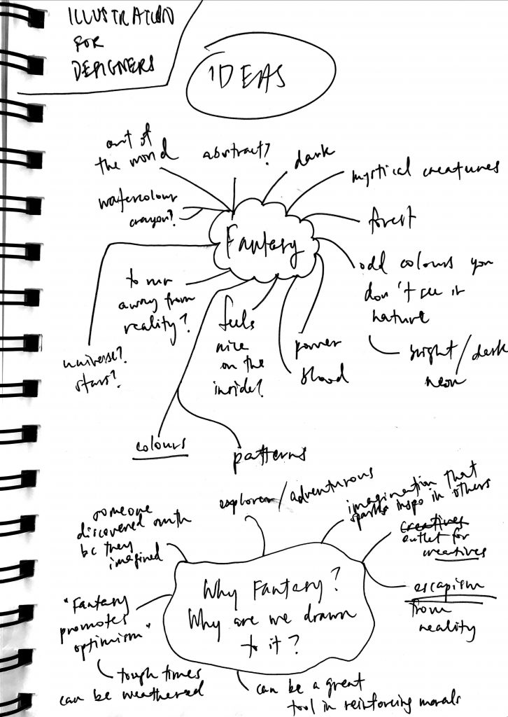
We are given 3 different choices of which theme to pick for the magazine cover design – Activism, Fantasy or Play. I picked Fantasy! Here are just some thought processes on why I picked Fantasy and who would be keen to take up a magazine on the issue.
But before diving into my process, I did some research to understand better what Varoom magazine is about.

RESEARCH

They have an intention for each issue: “[to convey] a live reflection of what is happening in illustration at any given moment… presenting new work and giving insight into how it’s done, but also asking questions about it – why make it? – what does it mean to people?”
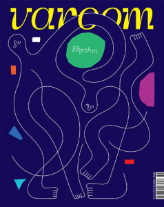
Varoom 36 – Rhythm
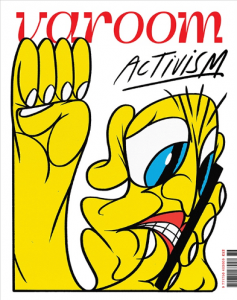
Varoom 38 – Activism

Varoom’s subject-matter helps us understand that all wider-world ideas are equally as pertinent to illustration as other creative disciplines.

Whether the work is personal or commissioned, an illustrator’s unique voice is always embedded in the work, “even a tight brief to advertise a product can tell us a lot about society and what’s considered ‘desirable’”.

Like their editor, Olivia Ahmad, said: “Illustrators have a toolkit of largely unrecognised skills that are essential for coming up with the images for which they are commissioned” and what better way than to have Varoom be a hub of discussion for the illustration community and advocate their innovative approaches to these discussions? I, as a growing creative, strongly support this.

PROCESS

Now we will go onto my initial stages/processes of my creation behind a Fantasy-themed cover for the magazine.

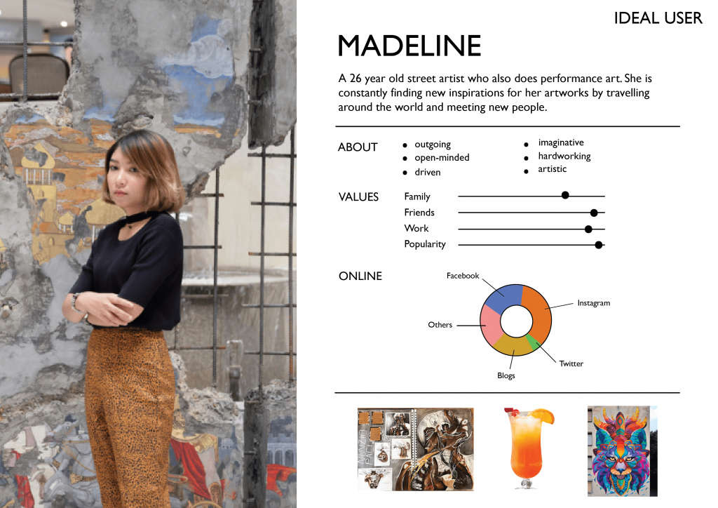
Firstly, to better showcase who my target audience is for my magazine, I created a few user personas – 1 on a negative user, 2 on ideal users of my Fantasy-themed magazine, as shown below. This was inspired and was given as a good suggestion by Lisa.

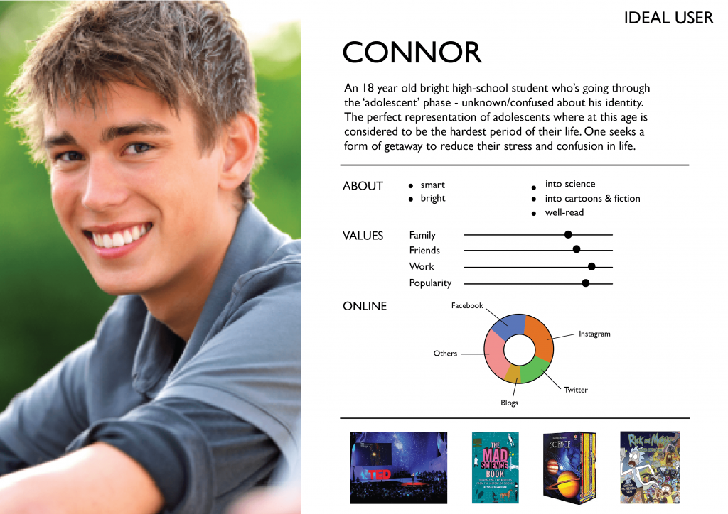
I had to narrow down and focus entirely on one user so I picked Connor as my ideal user instead. This is because I wanted to lean more towards fantasy designs for kids his age, and things related to science (but also including other weird elements) so ideas are made based on adolescents like him!

I was very inspired by the show Rick & Morty because of their bright colour palettes used in the cartoon, and the crazy bacteria elements that I love. I love weird things.
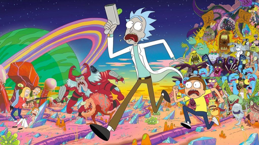
When will Rick and Morty season 4 return in 2020? | TechRadar

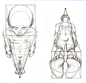
I have always been into body movements as well – how the human body works. So some of my inspiration came from that too as seen in the images below – even the fetus position is something worth pondering for me. There’s a beauty in the way we move and unfold ourselves.


Gefällt 1,543 Mal, 39 Kommentare - Stepha Lawson (@thelanguageofbirth) auf Instagram: „A high holy project I was commissioned for by @harvardcommon, birthed by Mrs. Lindsey Bliss over at…“

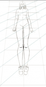
so I looked more into figure drawings, just for inspirations.
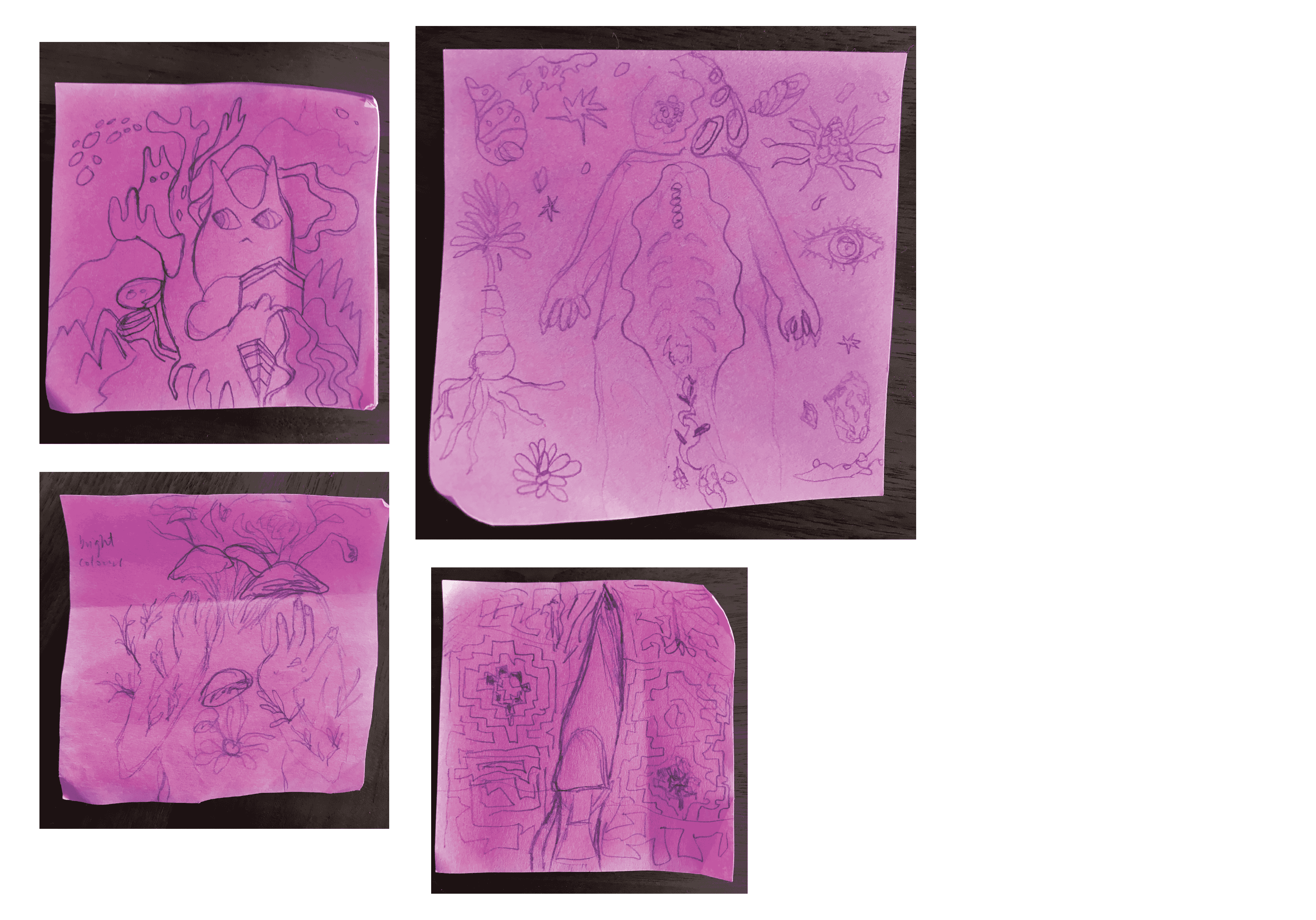
I then decided to do 12 note-pad sketches for ideation and further explore my choices.
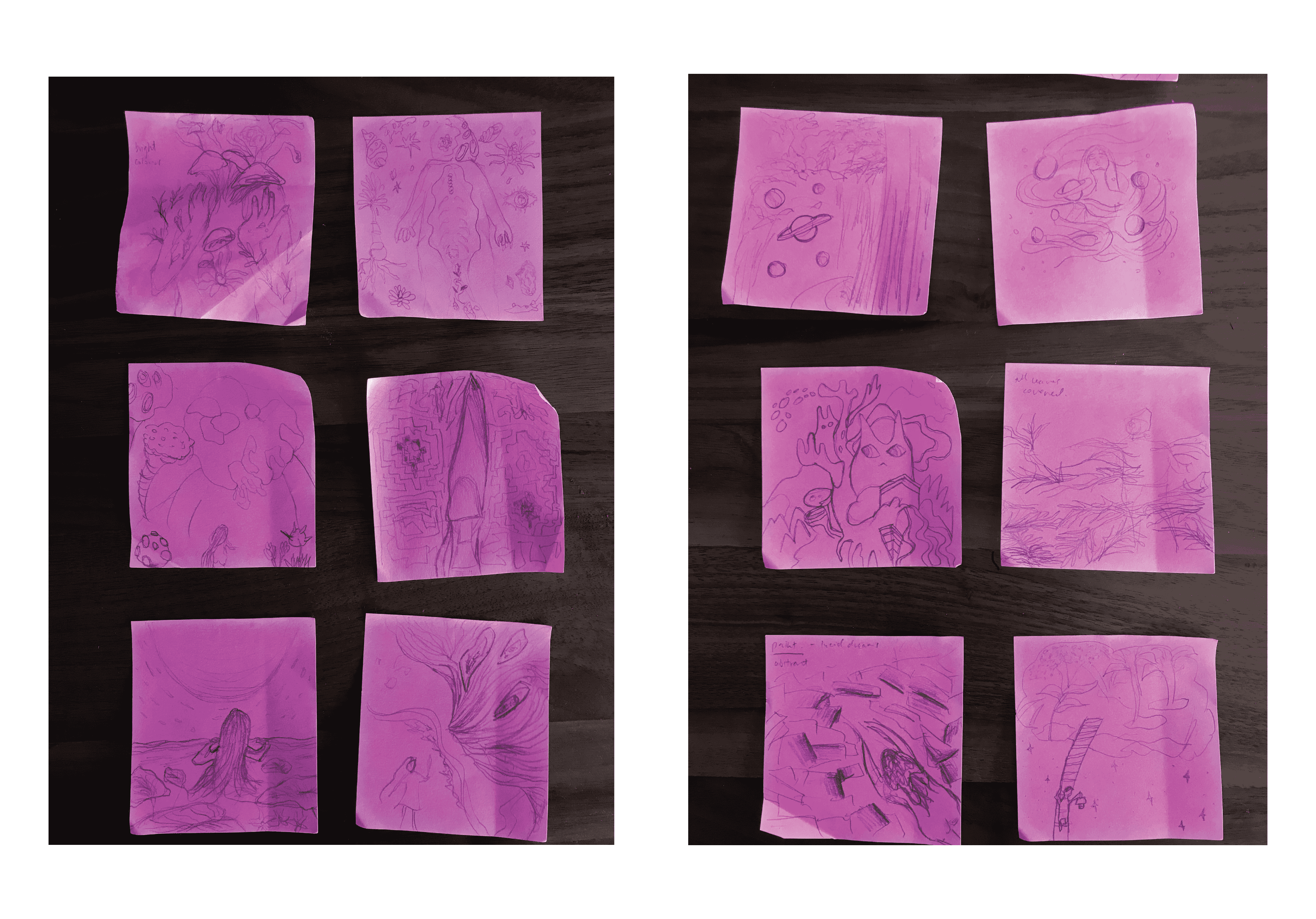
 

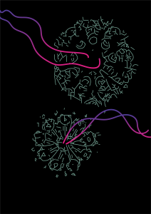
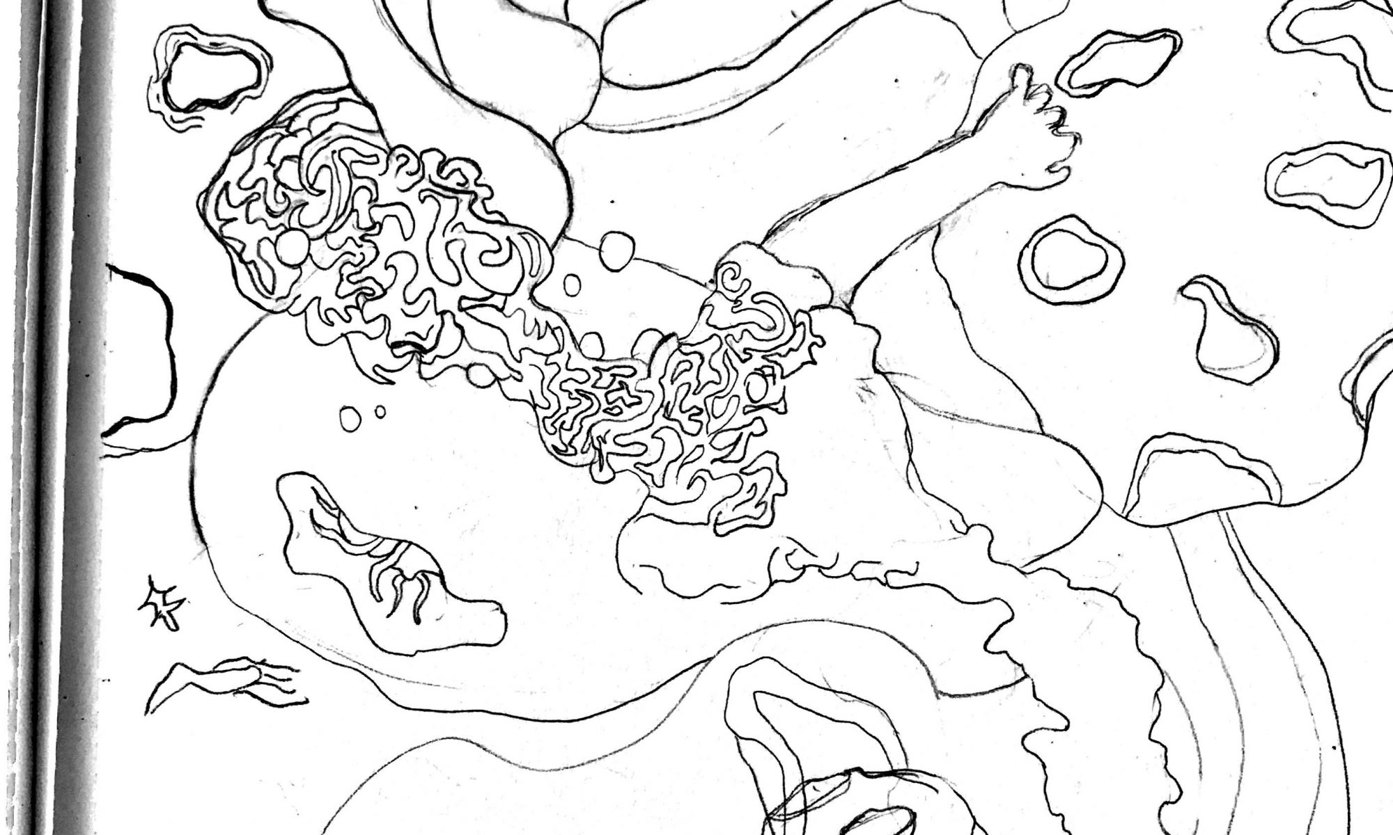
Looking back at my scribbled sketches, I realised I lean more towards things that include germs and bacterias along with the human body as well. (The one that’s purposely sized bigger than the other 3 above!) Surrealistic, in a way. And this brings me to my overarching theme for Fantasy: a world that drug users would probably see – psychedelic human melting-bacteria.  Weird, I know.

I even did a few simple illustrations to push my idea further.
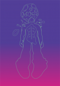
I then went on to draw what I visioned in my mind:
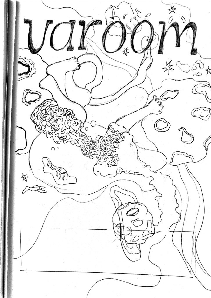
I went to further digitize it and then think about the colours there:
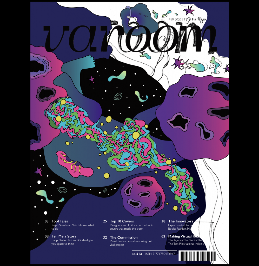
And hence, just to recap, my final! You can look into the previous post to see more as a final submission. I apologise again for this late process post but I wanted it to be close to perfect and unfortunately didn’t have time to do so before. So here you go, thank you for reading all the way if you did!
 

Typography I – Typographer of Week 7: Erik Spiekermann

ABOUT THE ARTIST

Erik Spiekermann: “You have to think of everything a little more…”

Spiekermann is a German typographer, designer and writer. He and his wife, Joan, started FontShop, the first mail-order distributor for digital fonts. His family of typefaces for Deutsche Bahn (German Railways), designed with Christian Schwartz, received a Gold Medal at the German Federal Design Prize in 2006, the highest such award in Germany. Hence more than anyone else, the Berlin communication and type designer Erik Spiekermann has shaped Germany’s visual culture.

United Designers Network was renamed after him, SpiekermannPartners merged with Dutch design agency Eden Design & Communication and continued its operations under the name Edenspiekermann. Edenspiekermann currently runs offices in Amsterdam, Berlin, Singapore, San Francisco and Los Angeles.

HIS WORKS

Specimens of typefaces by Erik Spiekermann. 1) Berliner Grotesk (original is from 1913, digitization is from c. 1978) 2) FF Meta (1991–1998) 3) ITC Officina Serif (1990) 4) ITC Officina Sans (1990)

Image result for erik spiekermann works

Related imageRelated image

Spiekermann’s work in communication design has involved so many different projects: books, advertisements, posters, editorial, corporate design—“typography is the element that connects them.”

What I find interesting about Spiekermann is his devotion to clarity and grid-based design. He says that the result of the natural chaos of his mind actually causes this, “I need order. I need systems. I don’t really do anything without a design grid.” And I also think that’s the reason why the kind of fonts he designed could convey information accurately and convey it well.

I can see that Spiekermann strives to always represent content appropriately with the strong discipline and self-awareness he has. He mentioned that “a font must fit into the culture”. And as a designer, he’s done well in doing his job to bring a text to the public. It also shows Spiekermann’s sensitivity to his intended audience, the public, and viewers – the thought that he puts whilst designing something. And I, as a beginner, definitely need to start learning to do that. Also, especially the part of using a ‘design grid’ and not throwing it off like it’s unnecessary because it really is the opposite of that.

Typography I – Typographer of Week 6: Jonathan Barnbrook

ABOUT THE ARTIST

Raised in the UK, Jonathan Barnbrook is a famous contemporary British graphic designer, typographer and filmmaker. He is best known for designing David Bowie’s album Heathen in 2002. He has also collaborated with Damien Hirst and Adbusters. He is also seen as one of the early innovators in the world of motion graphics, and his contribution to graphic design was recognised by a major exhibition at the Design Museum, London in 2007. Currently, he runs his own studio Barnbrook Design which he founded in 1990. We can often find him exchanging the measured world of type design for the more spontaneous activity of VJing (broad designation for real-time visual performance).

HIS WORKS

< TYPEFACES

The infamous and ubiquitous Mason and Exocet fonts were designed by him and were first released through Californian innovators Emigre. In 1997 he established his own font company VirusFonts and that is where he releases other typefaces. The typeface Mason later became one of the first digital acquisitions of the Museum of Modern Art, New York.

Mason typeface. Images (including the one below this) obtained from https://www.myfonts.com/person/Jonathan_Barnbrook/

Exocet typeface. Image (including the one below this) obtained from https://www.myfonts.com/fonts/emigre/exocet-ot/

< ALBUM COVERS

He’s known mainly for designing the packaging for David Bowie’s albums from Heathen (2002) to Blackstar (2016).

Heathen (2002)

Back in 2002, he produced an album cover for David Bowie’s Heathen. Here he incorporated his “Priori” typeface. That was his first time using the font for commercial purposes. Bowie then requested Barnbrook to design cover art for other albums such as Blackstar (2016) and Reality.

Blackstar (2016)

Image (including the one below) obtained by https://www.itsnicethat.com/features/review-of-the-year-2016-graphic-design-jonathan-barnbrook-151216
(I REALLY LOVE THIS DESIGN SO MUCH, HELP)

Look at those lines above. Oh my goodness. Symmetrical and carefully put together. And then down to the middle, he slowly created curvy ends, making it look like there’s a hole beneath.

< BOOK COVERS

Barnbrook Bible, 2007

17th Biennale of Sydney Catalogue, 2010

The design above was inspired in part by the work of Harry Everett-Smith and his Anthology of American Folk Music. It also takes heavy influence from antique educational books and encyclopaedias. It is a catalogue design for the 17th Biennale of Sydney: Beauty of Distance, Songs of survival in a Precarious Age. The publication features 17 individually designed essays, an extensive plates section and a series of typographic interludes.

Daydreaming with Stanley Kubrick, 2016

The usage of bold and bright complementary colours, orange and blue, really makes the cool weird eyes stand out in the book. I think it matches up with the ‘daydreaming’ part and overall a lively design. I noticed the typefaces used here are all different yet SO suitable. They look just right together.

< POSTER DESIGNS

Friendly Fire at Ginza Graphic Gallery

Image (including the one below) obtained by http://www.barnbrook.net/work/ggg-friendly-fire/

I personally like the one above. This poster was designed to announce the Barnbrook retrospective exhibition at Ginza Graphic Gallery, Tokyo, Japan in 2005. The poster features a detail of Barnbrook’s self-generated works, which is a Tibetan mandala made up of corporate logos.

HOW COOL IS THAT.

LEARNING POINTS

I really don’t know where to begin. After learning about Barnbrook, now I’m wishing I work for him, or at least be a student of his because I admire so much of his works. I want to compare his works to another of my favourite typographer, Paula Scher, as I feel that they are quite similar in terms of the colours they choose to use, which are most of the time so very colourful. Both are also similar as they differ – you can tell both of their works apart very easily as they are both unique with the way they put their words out to create the visual aesthetic of a document.

I find it interesting how Barnbrooks managed to create unique typefaces that embody personalities and moods, but at the same time, refrain from making it look too tacky. Like for the Mason typeface, you could tell it’s representing the medieval period. This can be seen in the sharp ascender on the uppercase of ‘M’ that reminds me of the boldness in a knight’s armour back then. Also, the curved-in bowl (?) in ‘A’ makes it look like a knight’s shield (in the medieval period) turned upside down.

Here’s how I pictured it for the letter ‘A’:

– original medieval knight shield– turned upside down. LOOKS LIKE THE ‘A’ RIGHT? Looks like it to me.

OR it could even be the knight’s helmet:

Alright alright, I’m done with the examples but you get what I mean.

The typeface is unique and different from today’s modern-looking ones but the readability is still there and remains visually-pleasing to the eye.

As for the designs, oh I’m completely in love with them. Minimal but yet it gives me the fun vibes – like I might actually enjoy reading the books because of how the design is like at the front. And even inside (like the ones in 17th Biennale of Sydney Catalogue, 2010).

Kudos to Barnbrook. I’ve found yet another favourite typographer of mine.

Typography I – Typographer of Week 4: Neville Brody


ABOUT THE ARTIST

Neville Brody is an English graphic designer, typographer and art director currently working in his own design practice called Research Studios.

Back then, he enrolled himself at the London College of Printing for a 3-year Bachelor of Arts degree in graphics but his designs were often condemned by his teachers for having ‘uncommercial’ quality to them. The era of punk rock highly influenced Brody’s work and motivation in the late 1970s. However, his tutors disagree with his experimentation of punk rock art and got him almost expelled. Even then, he continued to explore the new boundaries in graphic design.  Therefore, his first-year thesis focused on the subject of comparison between Dadaism and Pop Art.

He’s also a leading typographer and internationally recognised brand strategist.

HIS WORKS 

He is best known for his work on ‘The Face’ and ‘Arena’ magazines and various record covers for several famous music artists, including Cabaret Voltaire and Depeche Mode.

‘The Face’ and ‘Arena’ magazines
Cabaret Voltaire Record Cover – Designed in 1984

Brody is also one of the founding members of Fontworks and the leading website the FontShop. He designed numerous notable typefaces for the website. A well-known FUSE project was also the result of his initiation which featured the fusion of a magazine, typeface and graphics design.

He co-founded a typeface library, the FontFont, with Erik Spiekermann, in 1990.

Typefaces by Neville Brody

He has designed many typefaces such as Industria, Insignia and Blur, which was included in the Museum of Modern Art’s architecture and design collection in 1992.

Industria font by Neville Brody
Insignia font by Neville Brody (image obtained from https://www.behance.net/gallery/21328109/Insignia-Type-Specimen-Poster)
Brand Strategy for Nike – Designed in 1988


LEARNING POINT

I’m inspired by how his experimentation of the punk rock art was noticeable in some of his works and that created an interesting approach in forming portraits. And for his typefaces, it’s interesting how he could make them look simple but at the same time, possessed features that made them distinguishable and less boring.

Typography I – Typographer of Week 3: Massimo Vignelli

ABOUT THE ARTIST

An Italian, Massimo Vignelli was born in Milan in 1931. There, he first studied art and architecture, until he came to America in 1957. He was the co-founder of Vignelli Associates, with his wife, Lella. in 1971 they formed Vignelli Associates, and in 1978, Vignelli Designs. Vignelli worked in a number of areas ranging from package design through houseware design and furniture design to public signage and showroom design.

HIS WORKS 

Vignelli believes that a designer needs only 6 typefaces and his six preferred typefaces are Garamond, Bodoni, Century Expanded, Futura, Times, Helvetica (shown below):

Here are some of the typographic works he did:

    • Official redesign of 1972 map of the New York subway system
    • Poster and graphics programme for Milan’s Piccolo Teatro, 1964 and 1965
    • the “AA” logo used by American Airlines up until 2013


  • The 1972 map of the New York subway system

Around 1965, Vignelli and his business partner Bob Noorda established Unimark International, a new design consultancy, in New York. They worked with Mildred Constantine, an influential design curator at the Museum of Modern Art, who is well connected in the New York City’s social scene.

There was a desperate need for a transformation of the city’s nightmarish subway navigation system, hence Vignelli helped to redesign the subway map. Following the Beck London Underground diagram, Vignelli produced a diagram of subway lines. Although the map is widely admired for its beauty and utility, it was rejected by commuters as the New Yorkers disliked its indifference to above-ground geography. They felt that it looked too abstract and it did not accurately represent the subway routes and cities.

  • Poster and graphic programme for Milan’s Piccolo Teatro, 1964 and 1965

The Piccolo Teatro di Milano posters such as the one above illustrate the powerful philosophical connection between Zurich and Milan in the 1960s. Vignelli’s uses closely set Helvetica in two sizes and strong horizontal rules. His effortless ordering of information has been echoed in print, blog themes and app design right up to the present day.

LEARNING POINT

In his interview with Big Think, he mentioned how it’s important for graphic designers to stay away from trends and think more about the quality of the typographic design where “a timeless design is powerful”. I agree with him, how when it comes to designing things, I would still want it to be looked in respect in 100 years time and not laughed about. This is reflected in some of his works that are still present up to this day such as the ones mentioned above (Piccolo Teatro di Milano posters and American Airlines logo (1967 till 2013)”. There needs to be “guts, expression, intellectually elegant”.

In most projects he has done, he has this same design: “..the heavy black rules, the red, black and yellow, the large Garamond Italic or Bodoni type going over the gutter..” (like the picture above). He explained that he wanted to achieve an effect and clarity. When comparing his works with Jan Tschihold, both of them are similar as clarity seems to be their focal point for these designers. To create assets that would help people to navigate their daily lives, both of them stand by the idea of limited type fonts and design as well and apply these similar styles to most of the work they do even for different companies.

Vignelli’s work is recognizable, even when working with different companies. Hence, we see that design is a voice, and for him, making a design that is timeless is important. That is his core set of beliefs, and similarly, with other designers, they have their own set of beliefs. And this is something that is incapable of being replicated.

Vignelli is the “fearless critic of junk” and that is a constant reminder for me whenever I feel like my work is junk. He emphasizes the coherence of elements, clarity, discipline and continuity. There’s a certain discipline we must put into our work, and we ought to put pride in it. There is always a way to make our own typography work look better than it is before.


References:

http://www.designculture.it/interview/massimo-vignelli.html

http://www.eyemagazine.com/feature/article/reputations-massimo-vignelli

Massimo Vignelli: Creator of Timeless Design and Fearless Critic of “Junk”


Form and Visualisation: Research for Assignment 1

Research 

For this project, we needed a model structure where it could function as two things: a speaker and as a phone holder where the phone could charge as well. I researched on the form and structure – how I imagined it too look like first.

Initially I wanted it flat, something that could be put into a carved out book cover:

Or when the phone could be charged on the palm of a hand, literally:

But I didn’t want it too simple like the book idea, and I was more attracted into the minimal designs that are of both organic and geometrical, and unique like the ones below:

So I decided to cut out the styrofoam into the measurement and styles I wanted as close to above, such as an Octagon form or a Diamond form which could also hold my phone well. (You can see this on my “Sketch and Model-Making” post!)

I also searched up on the usage of speakers and the kinds of structure they come in.

Experimental Interaction: Research Critique 1 (Micro Proj 2 + DIWO)

(Making this my first post back on OSS and in the new year, HELLO 2018! HELLO SEM 2!)

For the previous two lessons on Experimental Interaction,  we had to read Marc Garrett’s Do-It-With-Others (DIWO) article and discussed it as a class. In the following lesson we were given our Micro-Project 2: Crowd-sourced Artwork with our specific groups. In my group, which includes Jing Yi, Azizah and me, we did a crowd-source project by using the Instagram app and it’s “POLL” function under Instagram Story.

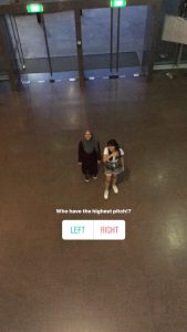
In this project, we did a short poll game where  two people (me and Azizah) does the same actions but compete each other on who does it better and the judgement is based on the online public. Jing Yi records us and immediately put it up on Instagram ‘story’ function to show it to the audience on Instagram.

Since we only had a short period of time to do this mini project/game, we decided to limit it to 4 polls only and time ourselves to 3 minutes to collect the number of votes to see who wins. This took place in our school outside class so we can have it at an open space where not only our classmates could see our actions, but others in school too. It’s interesting to get people looking at you and questioning what you are doing, because it means they are curious about the idea behind it and wants to engage in it.

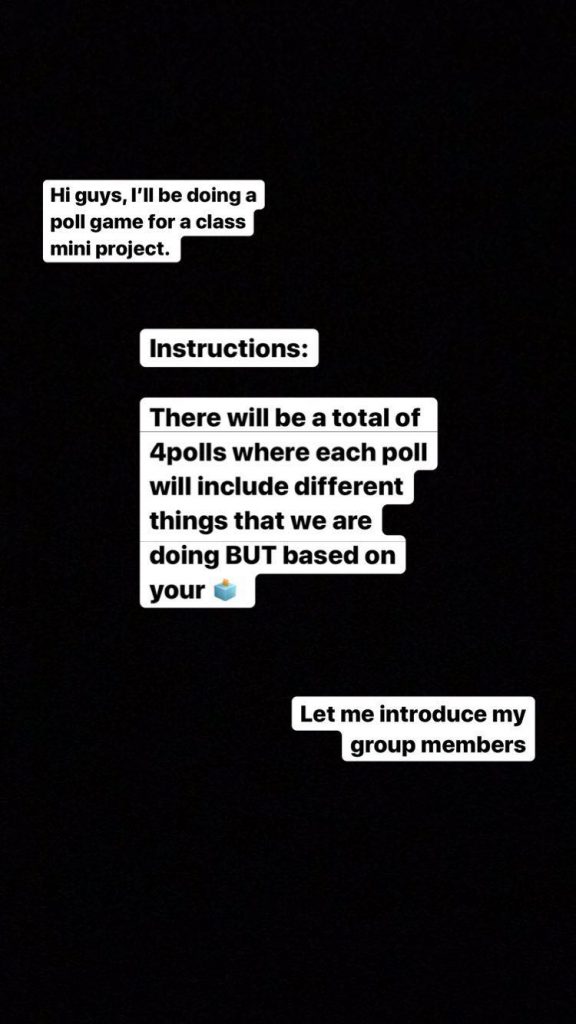
Our first Instagram story is a post on the short instructions to our mini poll game.

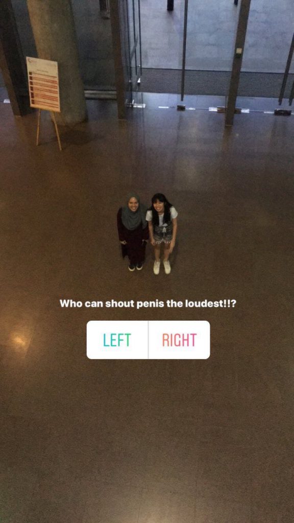
Immediately after posting the videos of what we do, in real time, Jing Yi then upload another post where the voting takes place. The viewers of our Instagram story vote based on the questions on these posts pertaining to the actions we do. We made it open to Instagram users and also made our classmates follow one of our group mates account to follow our Instagram story for this poll game. This is so that they can participate too. So for example, we will ask questions like the ones in the pictures below and they will simply click 1 of the 2 options:

And whoever has more votes, wins for that particular round (the post).

It’s simple but it’s interactive. And that’s the point of it. We used a popular social media platform as a way to reach out to the crowd online for their opinion. We allow everyone on Instagram to take part in the game as they, who watches, are the ones who gets to choose who wins in each question asked in each post. They play a huge part in getting the game going. In a way, we are doing crowd-sourcing.

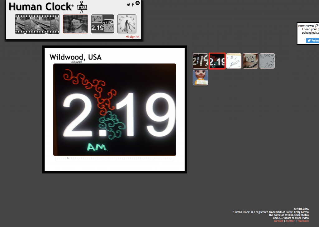
One of our inspirations was from the open-source artist like Craig D. Giffen and his “Human Clock”, where he allows people all over the world to submit their picture of numbers found on any places, that corresponds to the current timing.

Sent pictures of the current timing numbers from people all over the world.

The site will automatically refresh itself after a minute has gone by and the same thing happens! It’s a brilliant idea of reaching out to the public as it allows more creativity to tell the time, and it connects with them all to engage in this “Human Clock”.

The same goes for art and I want to relate this back to the Marc Garrett’s DIWO article because yes, there is “a new form of participatory art emerging, in which artists engage with communities and their concerns.” With the elements of DIWO, the ecological, social and the networks we use, it allows this kind of autonomous communication in many media (such as Instagram, Facebook, Béhance etc). And that’s what we did using Instagram. But before thinking of this poll game that includes sourcing from others outside, it is obvious that we had to think of the public because “critically engaged activities were thought as an essential nourishment not only for ‘individual’ artists but ALSO as an effective form of artistic collaboration with others”.

This crowd-source based artwork is a departure from traditional art making by a single artist, simply because we see that nowadays traditional art has become more self-referential and divorced from social life, whereas artworks sourcing from everyone else has helped my group-mates and I to thrive together and come up with a more collaborative form of art. It engages everyone to come together in this game, this artwork we made in a short span of time.

At the same time, unlike traditional proprietary modes of artistic creation and production, by initiating projects together we get to come up with creative ideas faster by sharing these different ideas and in the end still come up with an artwork that includes everyone else.  There’s a “mass diffusion of human intellect through interaction”. Those traditional art creates a divide with all the “market-led appropriation” in it’s creation and production. However, through peer-to-peer interaction (DIWO), we allow ourselves to break away from the norm and do not conform to strategies. It is more open – it turns our attention as “creators, viewers and participants to connectedness and free interplay between (human and non-human) entities and conditions.”.


Artist Reference – Research for Task 1 and 2

FOR TASK 1

NAN GOLDIN

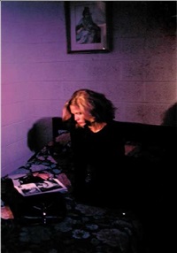
“Untitled Variety #71, 1983

Nan Goldin is an American photographer known for her deeply personal and candid portraiture. Goldin’s images act as a visual autobiography documenting herself and those closest to her, and in most of her works, she focuses on the LGBT community.

I used her as a reference as I was inspired by the film photography she does and the way she could capture emotions well in her films. The colours in her photos and the lack of lighting. It sets the right mood and tone on all the topics she touches on – love, fluid sexuality, glamour, beauty, death, intoxication and pain. Goldin’s photographs feature her life and those in it. And this is what i love about it, the way she documents topics such as beauty, pain, love and such. She stated that “My work has been about making a record of my life that no one can revise. I photograph myself in times of trouble or change in order to find the ground to stand on in the change. I was coming out of a melancholic phase. ”

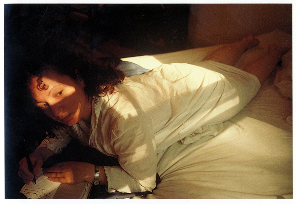
“Self Portrait writing in my diary”, Boston 1989

Looking into the picture above, I admire the way she could portray such a melancholic mood using her body posture which is very important here. The lighting is also a key point to the way her film photos turned out. She said she was “coming out of her melancholic phase”. It is well portrayed here in her body posture – she may be lying down but her upper body onwards rises, her head is tilted up, she’s looking out.  It’s darker on the other side of the picture but she’s inclining more towards the light by looking out towards it. Thus it could perhaps suggest the idea of “looking up” and “hope”. Hence coming out of her sad moments while  jotting it down in her diary.

That itself inspired me to take the pictures i take. I do not have a film camera to produce such shots but i do want to focus on the melancholic phase, the nostalgia that is present – I wanted to show that that itself is part of my story and I wanted people to see it visually. I figured that even the smallest object I have picked out, a butterfly necklace I have been wearing for the longest time now, that is significant to me, could also allow me to portray the way i feel about it and what it symbolises through the use of of  light in my pictures and also the importance of body posture and facial expression. All of that elevates the photo by giving it a meaning, a symbolism, it helps to give off the mood I intend on portraying.

Another artist (female too) that I would like to touch on is Sally Mann.

SALLY MANN

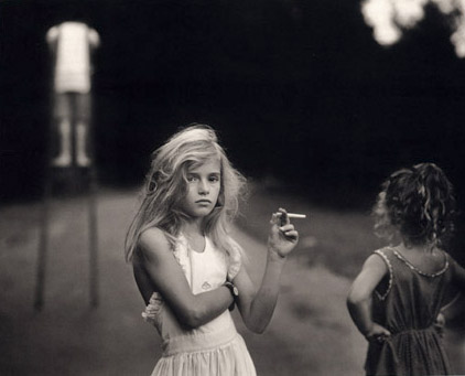
Sally Mann is an American photographer known for her intimate black-and-white portraits of her family and for her documentation of the landscape of the American South. Her images appear antique due to her interest in early photographic technology. She experiments on bromide printing process to achieve that ‘old’ effect in her photos.

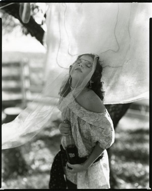
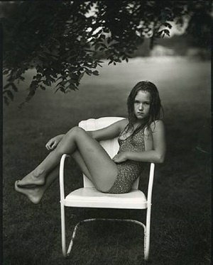
I was pulled into her photography works because of her portraits of girls captured in ephereal moments between childhood innocence and womanly sophistication. I loved her works produced in one of her photography book called At Twelve: Portraits of Young Women (1988)”. (some of her works from it as seen below)


1. “Untitled, At Twelve Series (Lisa and her Tab)”

2. “Untitled, At Twelve Series (Juliet in the Chair)”

She has the ability to capture them beautifully, portraying something dark – sad but moving. Something purely female. I also like how her photos involve those young girls – it gives a sort of story behind young girls. An image of a child with a dark story. And I would want that image to stick as my inspiration for my photography works as the object I am relating it to has a story to tell behind my childhood. It would make a perfect reference.

“Candy Cigarrette, 1989”

I would also want to reference a huge inspiration of mine. Alessio Albi

Most of his works focuses on the looking-away gaze, expression & emotios and lighting too. I am just a huge fan of his works.

FOR TASK 2

WOLFGANG TILLMANS

“Louisiana, 1996”

I referenced to Wolfgang Tillmans as I was intrigued by Tillman’s diaristic photography, large-scale abstraction, and commissioned magazine work. “I want the pictures to be working in both directions,” the artist has said. “I accept that they speak about me, and yet at the same time, I want and expect them to function in terms of the viewer and their experience.”
That is exactly what i would want to portray in my photos. I want the viewer to interpret what they want to from the picture of “my world”, give their own thoughts but at the same time see it as the way i do, to step in my shoes and see how the place fascinates me.
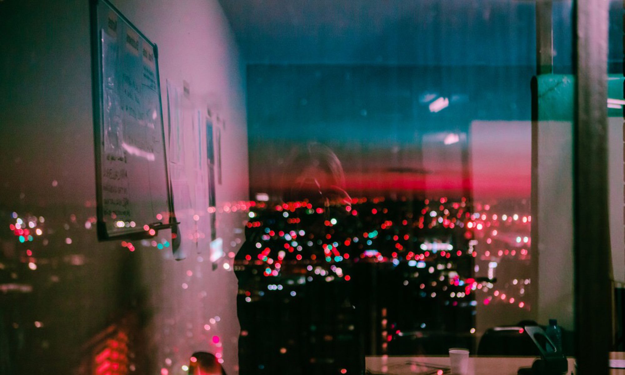
“In the back”, 2010

In the photo above, I like how Tillman experimented in dark room and played with the shadows and warm light to capture this image – it’s dark and gloomy but at the same time the bright yellow light from outside tries to overpower the darkness inside hence it makes you feel warm and cozy.

I used this especially as a reference to play with the lights and shadows at the place i took my pictures at, as i chose to take it when sun sets and during night time. Thus this specific work of his plays an important part to how my pictures turn out.
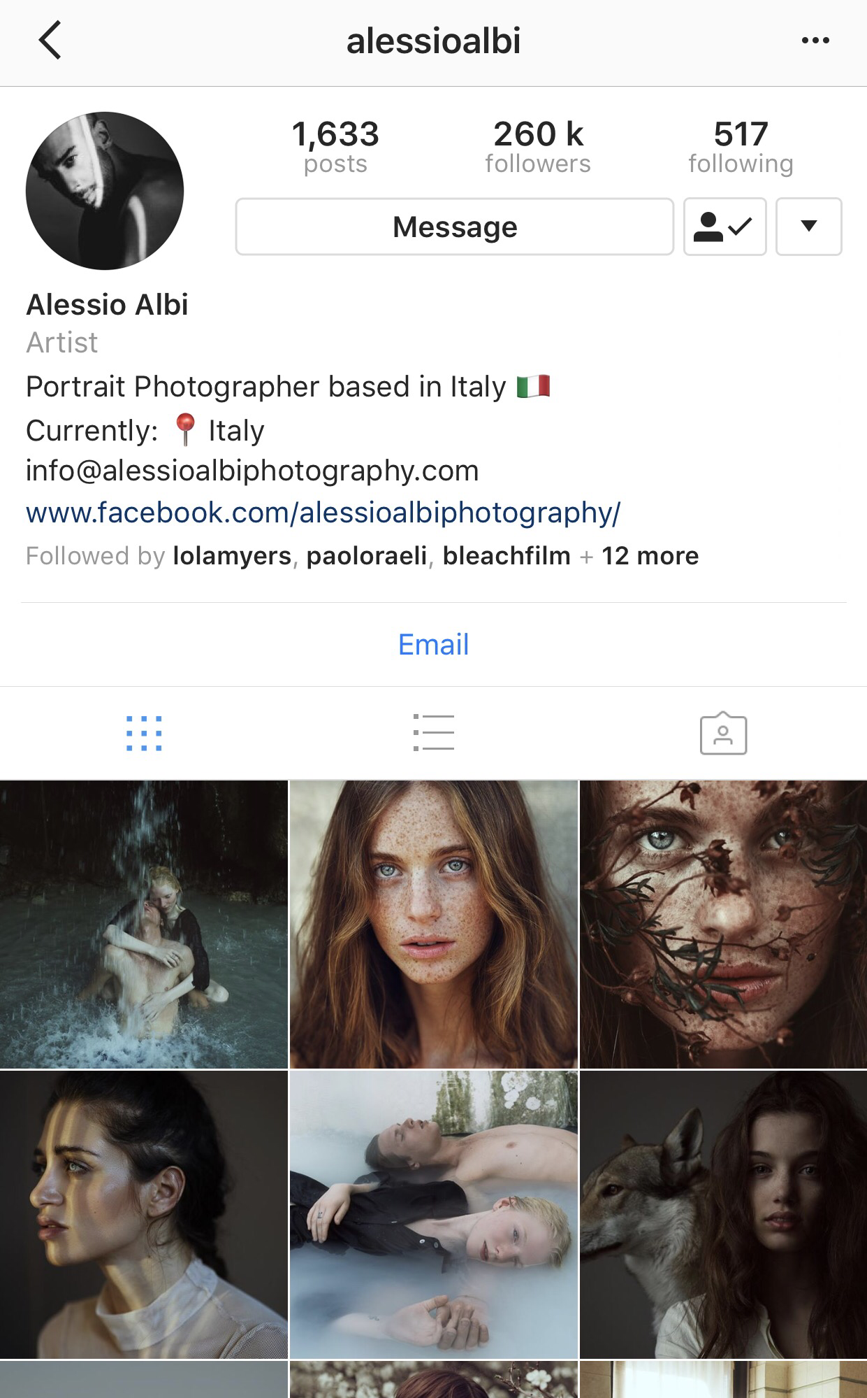
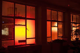
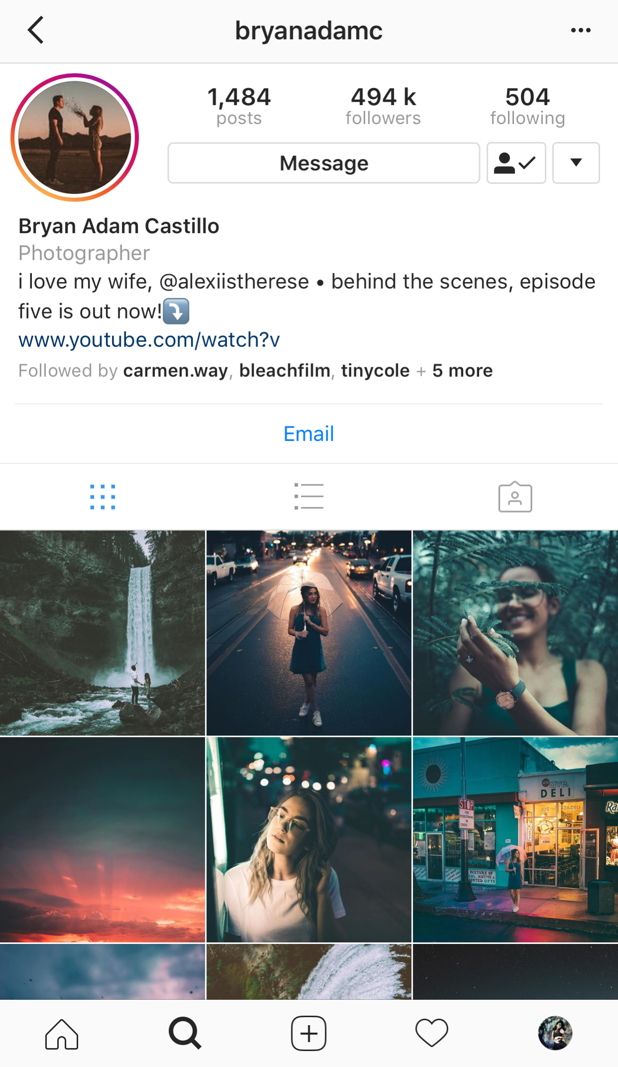
I was also inspired by this photographer i found on instagram.

His works inspired me in terms of getting the vibrancy, colours that just makes me feel like joy, and all the lights and bokeh in dark surroundings, which i was planning to use in my photos.