
Before diving into the processes of my final, there were a few ideas I had in mind. It didn’t work out because of the little time we had to do this final project, and it was difficult to do what I wanted to initially in a short span of time. I stick to basing my archetypes on The Hunger Games: Catching Fire though.
MY INITIAL IDEAS
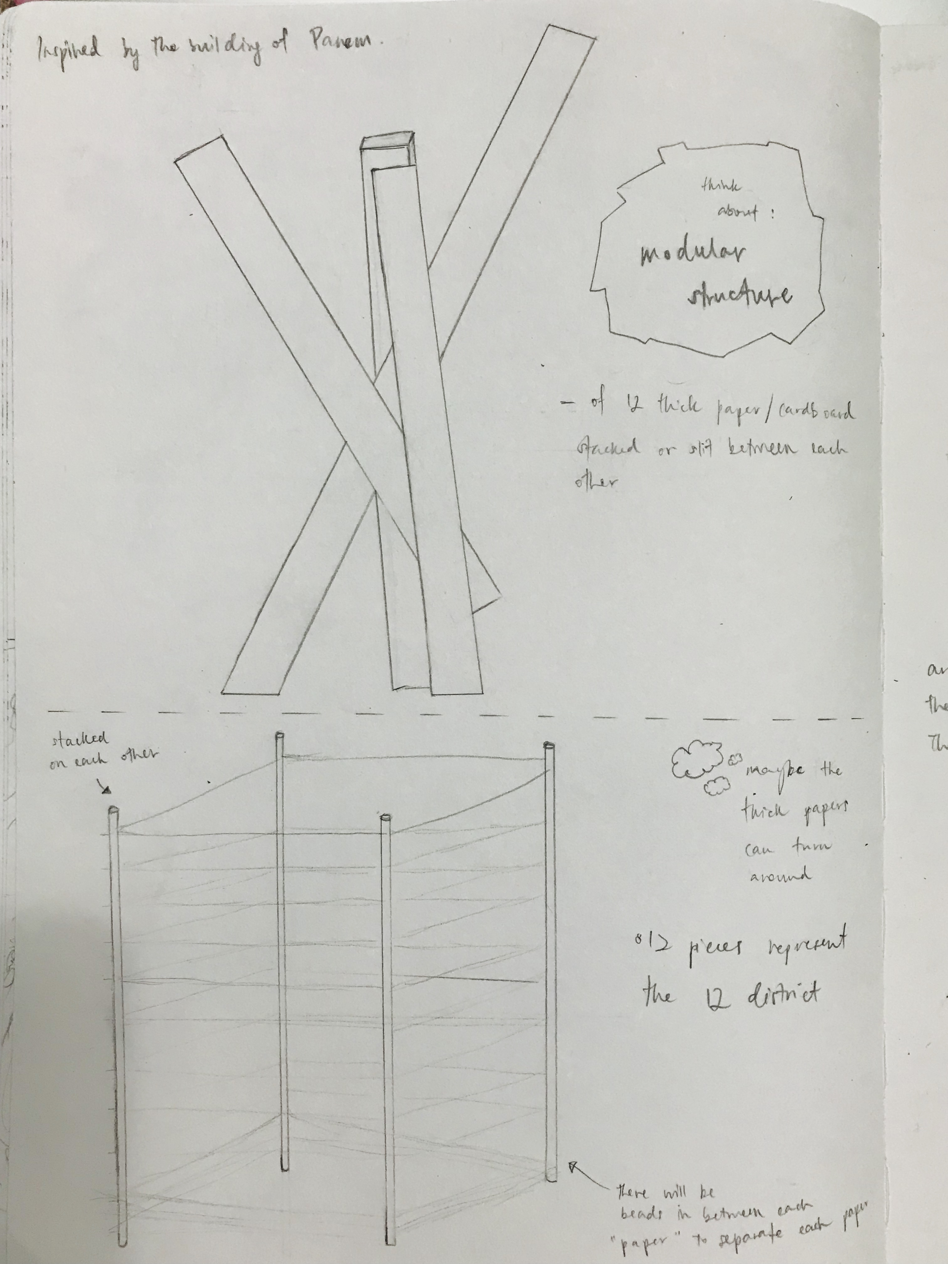
I thought of doing it like a 3d modular structure (an organic-looking building):
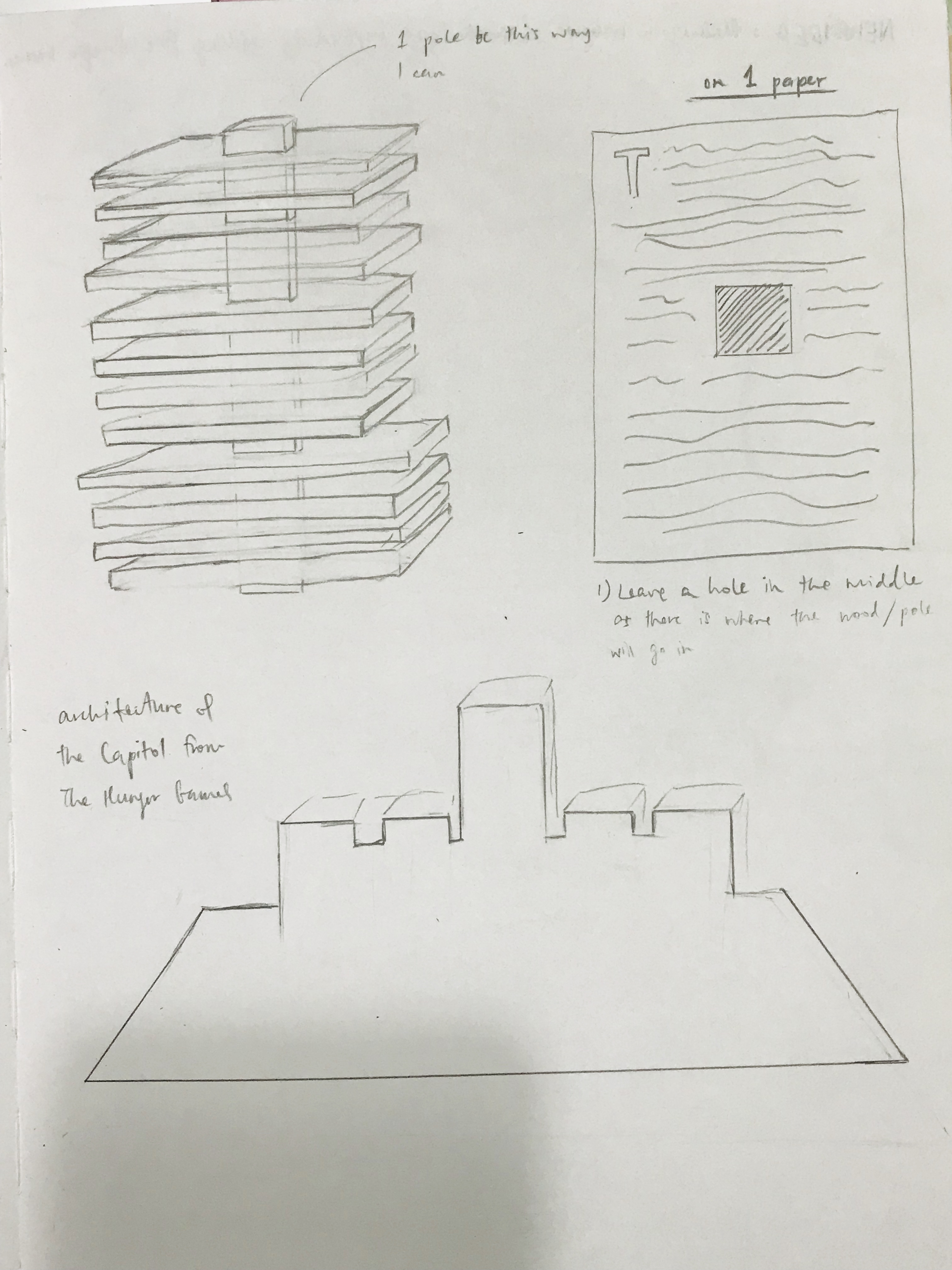
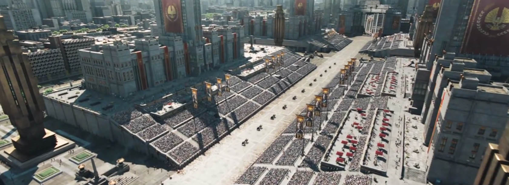
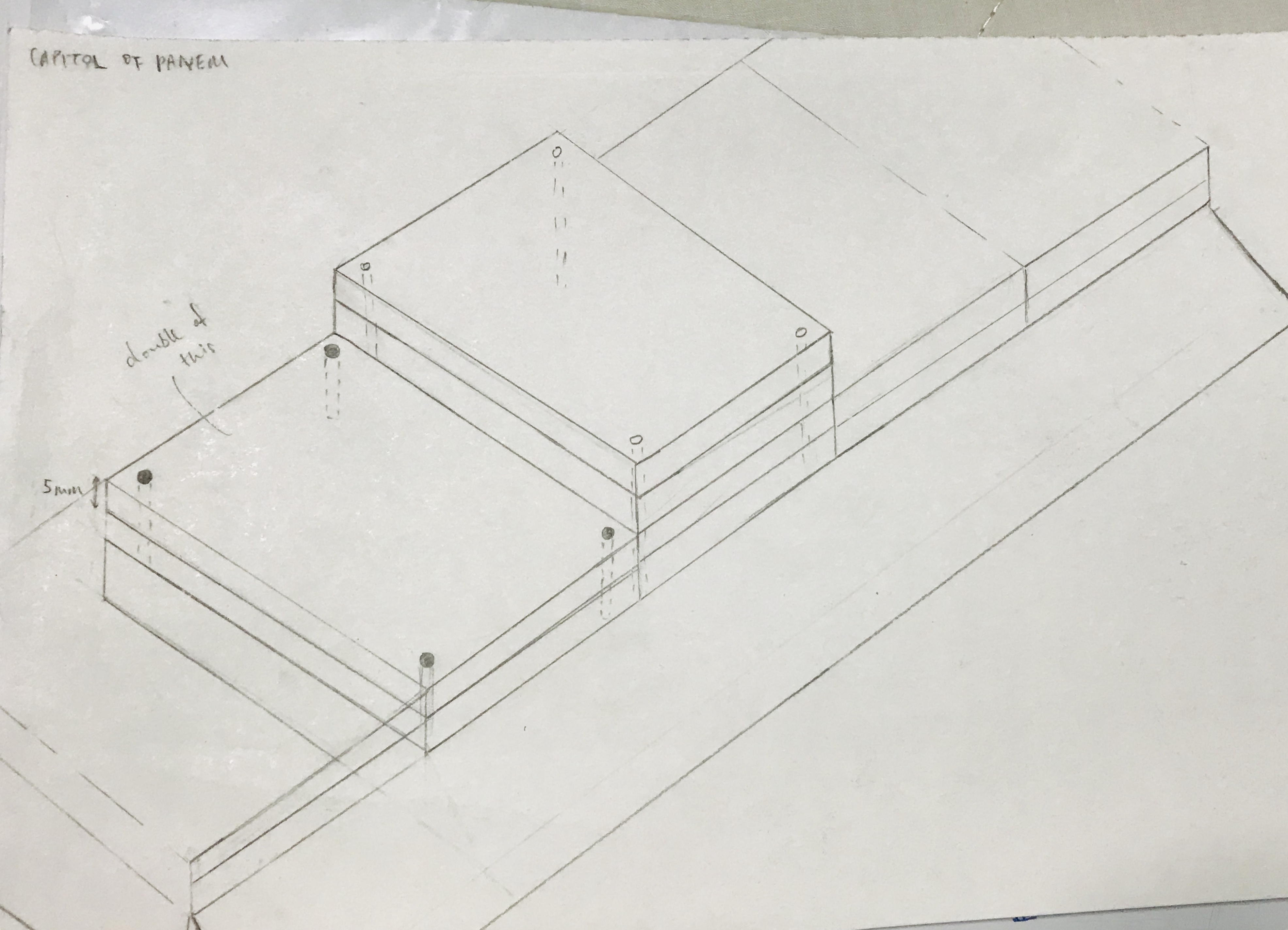
I thought of doing it like the Capitol building using thick poster blocks:
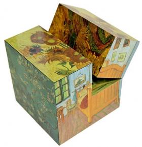
I also thought of doing something like cubes (the ones that could turn some part of itself):
There were simply too many ideas I had that I wish I could do with more time given, but I knew I had to figure something new out soon – a simple but different work that ticks the boxes of the objectives of the Archetype project.
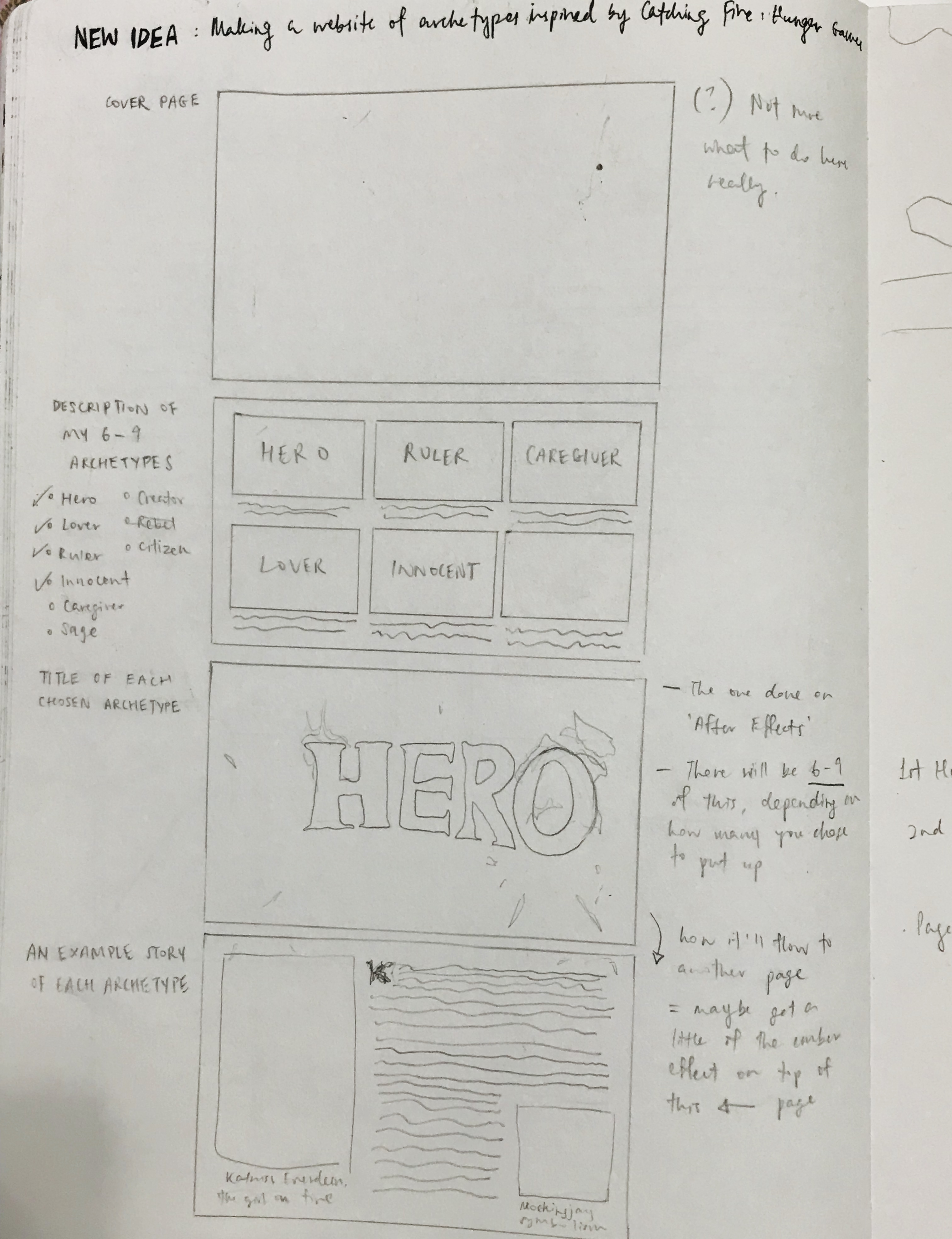
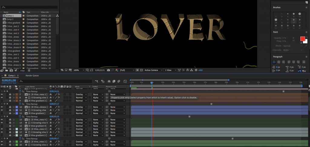
Hence coming up with the website idea, but having my typography done through mostly After Effects and Illustrator. The layout of my paragraphs is simply through repeated double column sizes and heights, and space. And of course, the font and type size for them is standardised as well. I put this whole idea onto paper to roughly sketch out how I want my website to look like. (seen below)
MOVING ONTO….. THE CREATION OF MY TYPO FOR ARCHETYPES
The 6 archetypes I planned on doing:
- Lover (Peeta Mellark)
- Hero (Katniss Everdeen)
- Ruler (President Snow)
- Caregiver (Mrs Everdeen)
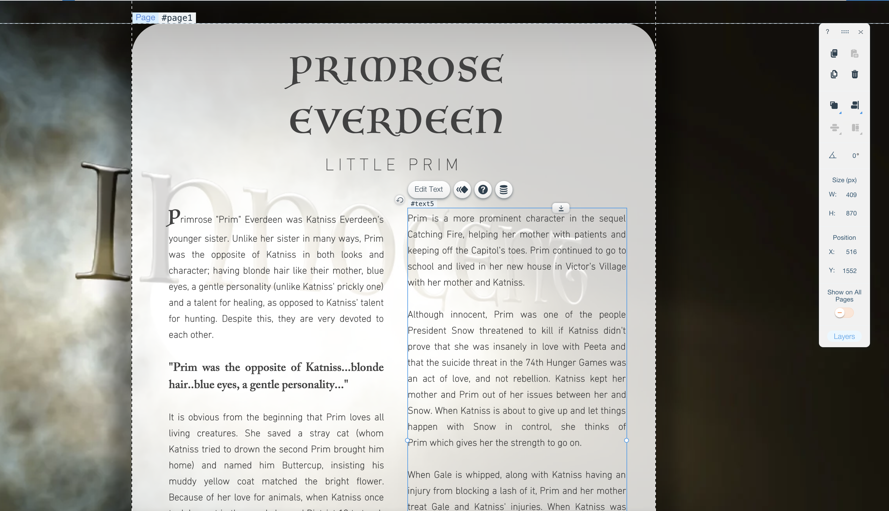
- Innocent (Primrose Everdeen)
- Creator (Cinna)
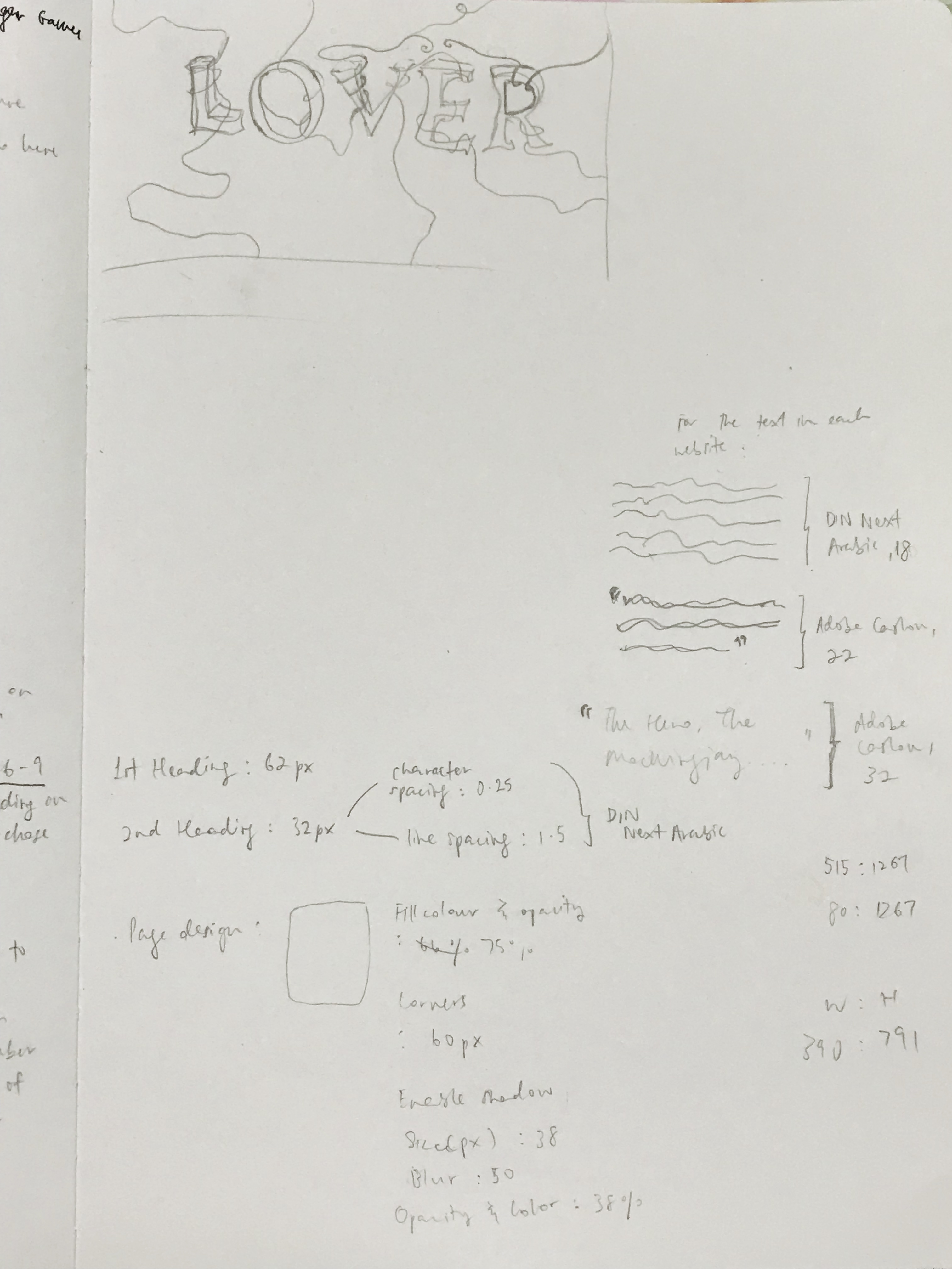
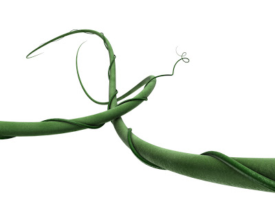
L O V E R
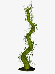
Now I see Peeta Mellark as Lover because of his soft nature, his loving nature for people for Katniss especially, and for nature itself (He can camouflage himself in nature because he’s good in the art as well). Hence I decided to create vines surrounding him.
It’s my first time using after effects so I was worried I couldn’t get it almost good enough. I tried anyway.
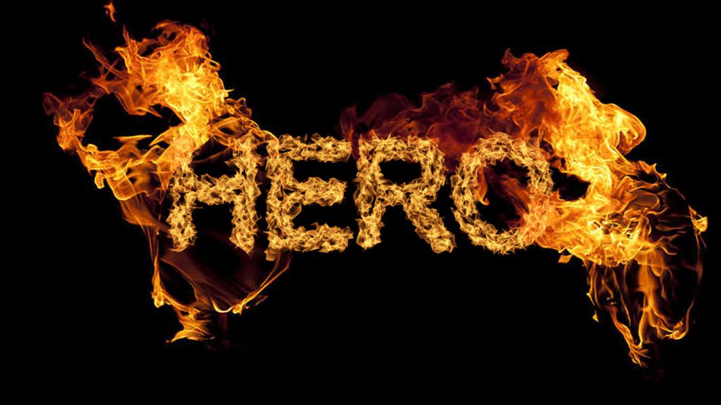
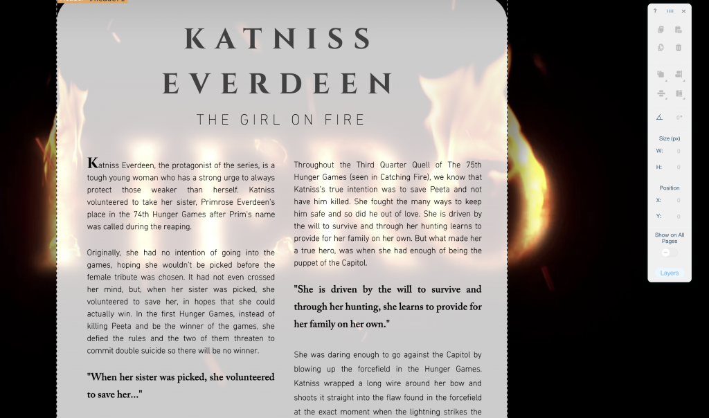
H E R O
We all know the ‘girl on fire’ is the hero – Katniss Everdeen. A rebel and all but for the good cause of everyone. Because she’s the famous ‘girl on fire’, I literally made the letterings of H E R O on fire (looks more badass that way too).
This one below is a photoshop version of what I did, what I had in mine. The flames will be moving once I create this on After Effects.
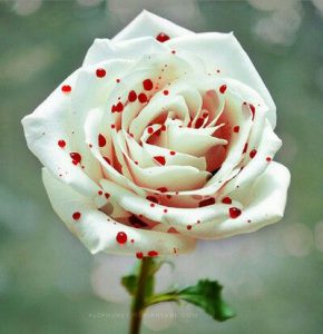
R U L E R
This is the ruthless, high-class looking President Snow. Hence white to represent what we think he is – sophisticated, high-status with a white rose tucked in the pocket of his suits. But he’s the poison that kills people, the blood that’s indirectly on his hands. Hence the bloody red colour gradient in the letters (seen below) that I simply did on illustrator first.


C A R E G I V E R
Mrs Everdeen – considered one of the weakest and emotional character but strongest in what she does – healing. She’s a healer for a lot of people, a mother of two, a caregiver really. I used the ripple effect for this one.
I N N O C E N T
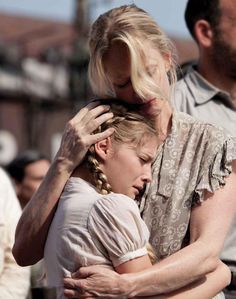
Little Prim, lovely one that got called out for Hunger Games but instead her sister volunteered for her. Little Prim that cries over animals being killed, sweet one she is. But brave as well to help do anything to make sure Katniss is safe, and the people she helps to heal as well.
Here are some fonts I thought would look good for her archetype:

In the end, I stuck with this:
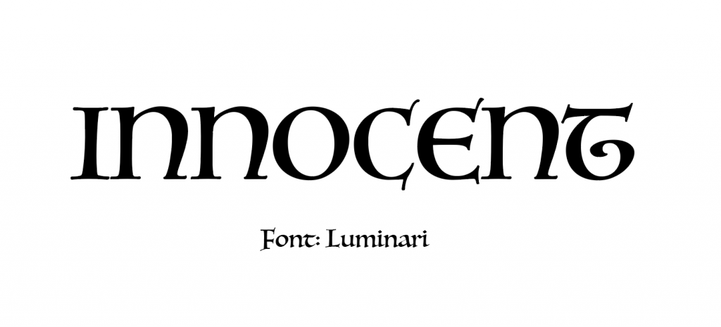
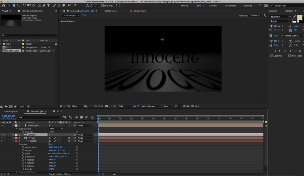
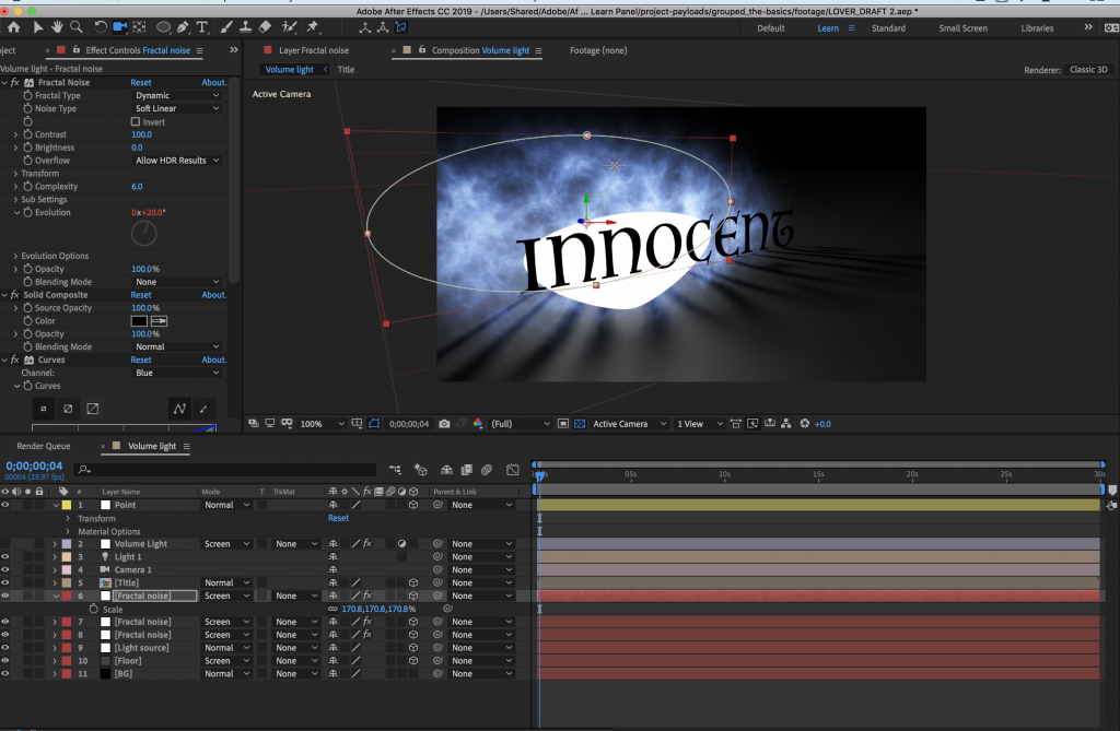
Ok so sadly I DIDN’T SAVE THIS ONE PROCESS ON AFTER EFFECTS, why why why. But here’s the final one for innocent:
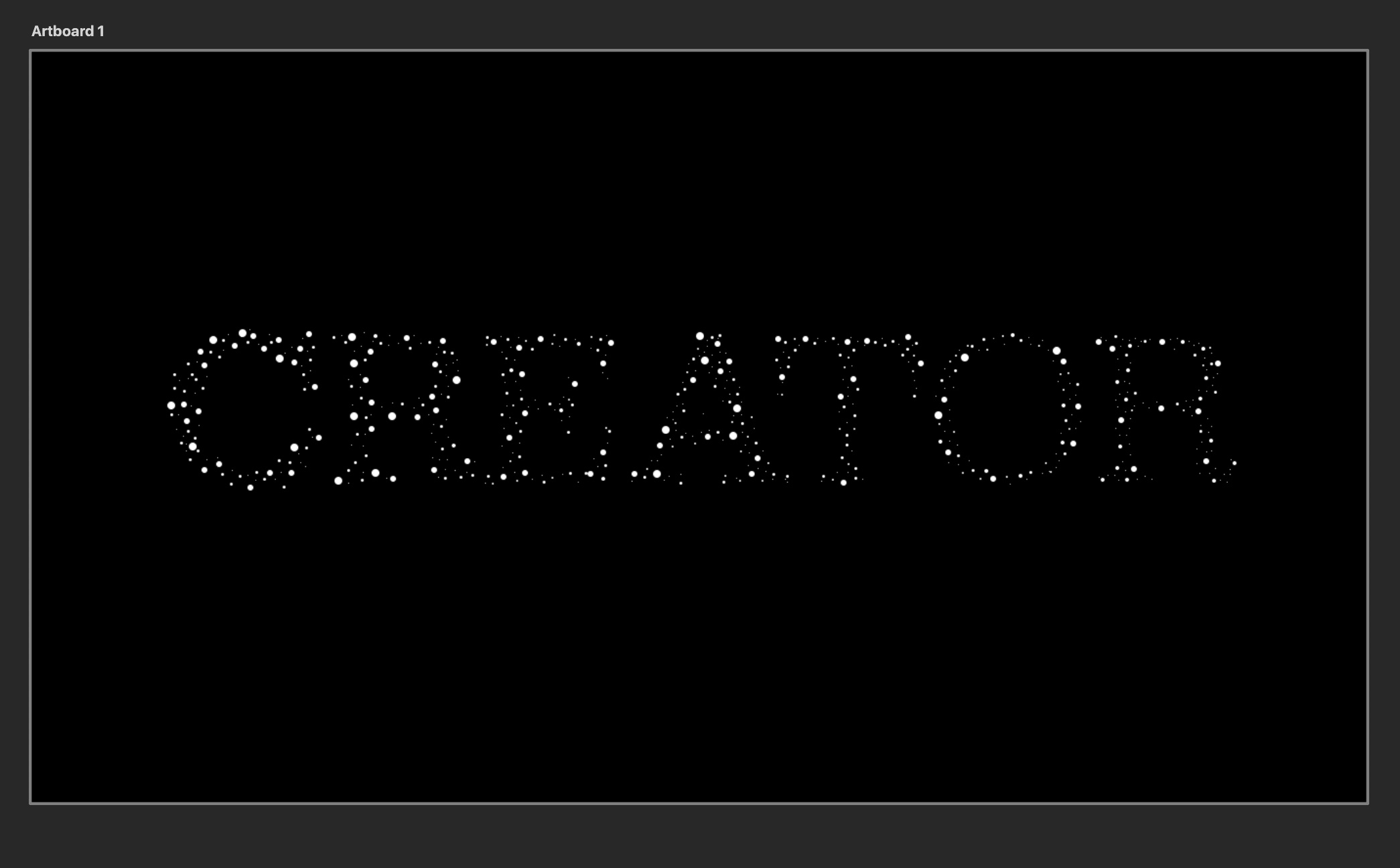
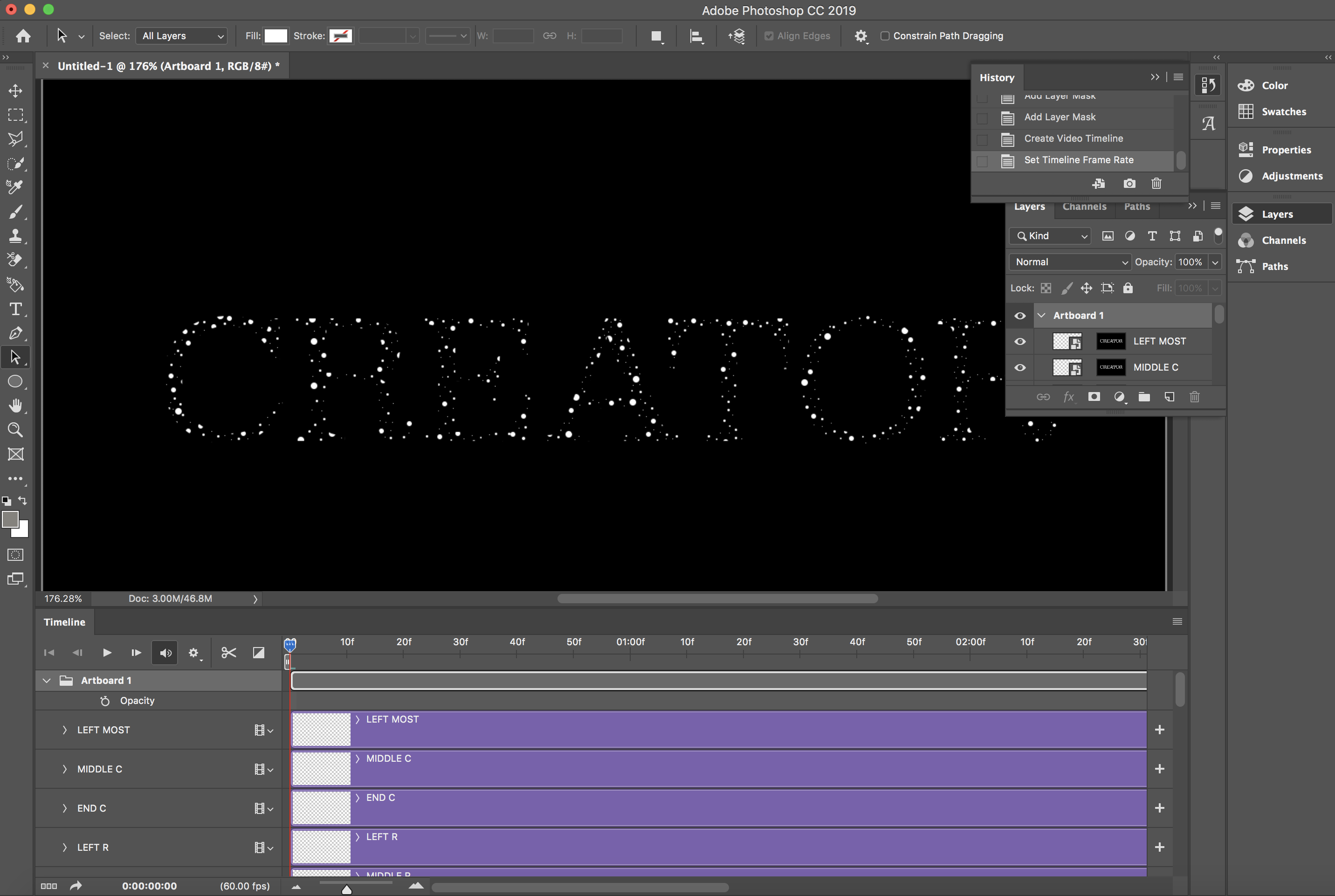
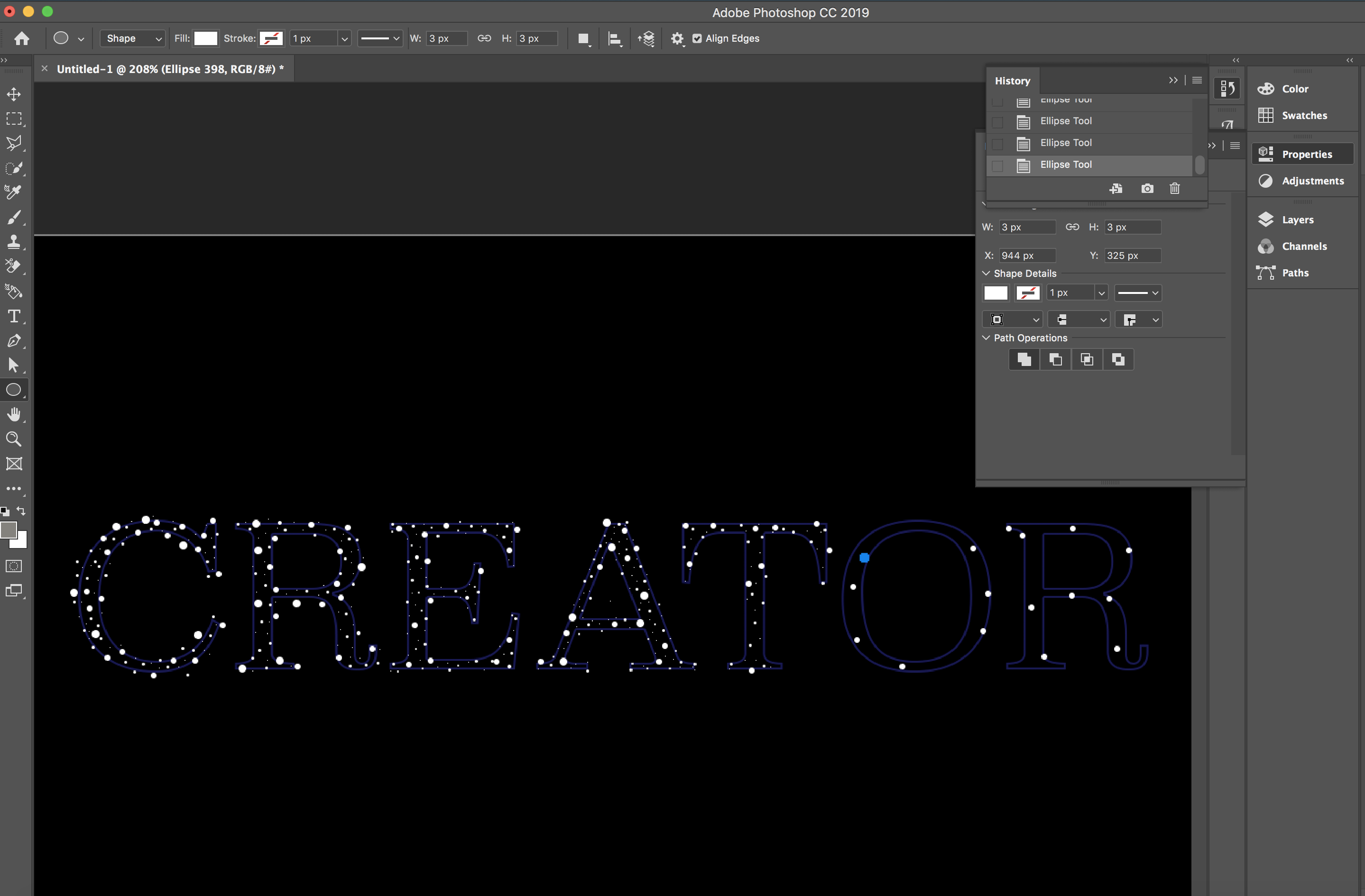
C R E A T O R
And I chose this as Cinna – a very important character I feel…where what he creates with Katniss’s outfits really emphasizes the kind of person she is. A strong brave girl ready to fight.
Here below I manually did the white glow on Photoshop by simply making dots over the letters each.
And then to make each different sides of each letter to glow in different colours, I manually did it on Photoshop’s video timeline.
I further added on a touch of dark bluish glow, slowly increasing in brightness to make it look more magical – like what Cinna does with Katniss’s wedding dress that turned out to be a majestic looking Mockingjay dress. That’s magical.
And as for the layout, I chose a double column grid and it’s all standardized throughout every page for every archetype. This was all done in WIX.
FINAL
https://qissinclaire.wixsite.com/50shadesofhungergame