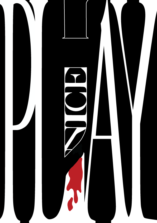
‘PLAY NICE’ – seems a bit more dangerous than the idea of ‘play’ to me, so I just did ‘nice’ within a knife-outlined image. Every letter in caps lock and bold to signify something screaming “beware”. The main challenge I had with this was the spacing in between each letter, especially in ‘Play’. Like the spacing between the Y at the end, AGH. I tried I really did.
*lets out a long sighhhhhhhhh*