

ABOUT THE ARTIST
Raised in the UK, Jonathan Barnbrook is a famous contemporary British graphic designer, typographer and filmmaker. He is best known for designing David Bowie’s album Heathen in 2002. He has also collaborated with Damien Hirst and Adbusters. He is also seen as one of the early innovators in the world of motion graphics, and his contribution to graphic design was recognised by a major exhibition at the Design Museum, London in 2007. Currently, he runs his own studio Barnbrook Design which he founded in 1990. We can often find him exchanging the measured world of type design for the more spontaneous activity of VJing (broad designation for real-time visual performance).
HIS WORKS
< TYPEFACES
The infamous and ubiquitous Mason and Exocet fonts were designed by him and were first released through Californian innovators Emigre. In 1997 he established his own font company VirusFonts and that is where he releases other typefaces. The typeface Mason later became one of the first digital acquisitions of the Museum of Modern Art, New York.


< ALBUM COVERS
He’s known mainly for designing the packaging for David Bowie’s albums from Heathen (2002) to Blackstar (2016).
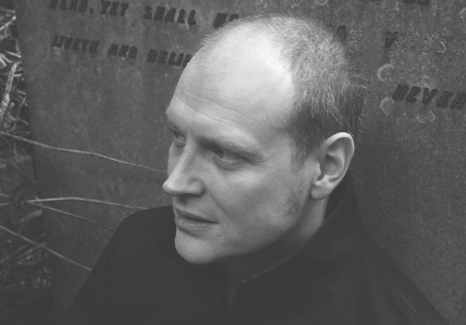
Heathen (2002)

Back in 2002, he produced an album cover for David Bowie’s Heathen. Here he incorporated his “Priori” typeface. That was his first time using the font for commercial purposes. Bowie then requested Barnbrook to design cover art for other albums such as Blackstar (2016) and Reality.
Blackstar (2016)


Look at those lines above. Oh my goodness. Symmetrical and carefully put together. And then down to the middle, he slowly created curvy ends, making it look like there’s a hole beneath.
< BOOK COVERS
Barnbrook Bible, 2007

17th Biennale of Sydney Catalogue, 2010

The design above was inspired in part by the work of Harry Everett-Smith and his Anthology of American Folk Music. It also takes heavy influence from antique educational books and encyclopaedias. It is a catalogue design for the 17th Biennale of Sydney: Beauty of Distance, Songs of survival in a Precarious Age. The publication features 17 individually designed essays, an extensive plates section and a series of typographic interludes.
Daydreaming with Stanley Kubrick, 2016

The usage of bold and bright complementary colours, orange and blue, really makes the cool weird eyes stand out in the book. I think it matches up with the ‘daydreaming’ part and overall a lively design. I noticed the typefaces used here are all different yet SO suitable. They look just right together.
< POSTER DESIGNS
Friendly Fire at Ginza Graphic Gallery


I personally like the one above. This poster was designed to announce the Barnbrook retrospective exhibition at Ginza Graphic Gallery, Tokyo, Japan in 2005. The poster features a detail of Barnbrook’s self-generated works, which is a Tibetan mandala made up of corporate logos.
HOW COOL IS THAT.
LEARNING POINTS
I really don’t know where to begin. After learning about Barnbrook, now I’m wishing I work for him, or at least be a student of his because I admire so much of his works. I want to compare his works to another of my favourite typographer, Paula Scher, as I feel that they are quite similar in terms of the colours they choose to use, which are most of the time so very colourful. Both are also similar as they differ – you can tell both of their works apart very easily as they are both unique with the way they put their words out to create the visual aesthetic of a document.
I find it interesting how Barnbrooks managed to create unique typefaces that embody personalities and moods, but at the same time, refrain from making it look too tacky. Like for the Mason typeface, you could tell it’s representing the medieval period. This can be seen in the sharp ascender on the uppercase of ‘M’ that reminds me of the boldness in a knight’s armour back then. Also, the curved-in bowl (?) in ‘A’ makes it look like a knight’s shield (in the medieval period) turned upside down.


Here’s how I pictured it for the letter ‘A’:
 – original medieval knight shield
 – turned upside down. LOOKS LIKE THE ‘A’ RIGHT? Looks like it to me.
OR it could even be the knight’s helmet:

Alright alright, I’m done with the examples but you get what I mean.
The typeface is unique and different from today’s modern-looking ones but the readability is still there and remains visually-pleasing to the eye.
As for the designs, oh I’m completely in love with them. Minimal but yet it gives me the fun vibes – like I might actually enjoy reading the books because of how the design is like at the front. And even inside (like the ones in 17th Biennale of Sydney Catalogue, 2010).
Kudos to Barnbrook. I’ve found yet another favourite typographer of mine.