For our final 4D project, it’s a group work!
i grouped with Gladys and Jamie.

Upon receiving the project brief, we were told to work on an object/location within the compounds of ADM, and we began brainstorming.

Unanimously, we all came up with the same thing!
We decided to work on Vending Machine – the best place to go for our hungry souls. We wanted to make the vending machine interactive, fun and to promote healthy living!

Our idea was planned with the mindset of having a collaboration with Health Promotion Board (HPB)

We will have a vending machine that vends out healthy food, instead of the usual unhealthy snacks and drinks.

For example, instead of having potato chips, we have veggie chips! Or if we have salted peanuts, we can change to almonds instead!

However, the buyer will not know about the change in product, until they selected their choice.

To explain better, we built a small vending machine prototype, with iPad as our machine screen.

Watch the video to see how the vending machine works!

The whole process starts when a passer-by walks past the vending machine. It will light up and greet the passer-by, attracting their attention and asking if they want anything. Next up, it will show the panel of food, letting the customer select the choice he/she wants.

Upon pressing, a surprise animation comes out, and we can see the changing animation of the original product changing into a healthier alternative!

It will then vend out the healthier alternative for the customer, ending with a quote to promote healthy living.

During the process of vending, we will have a unique jingle for each product – to keep the customer occupied while waiting.

We intend to have the interface appear more futuristic, while keeping the elements of it quirky and fun.

After presenting to the class about our project, it seemed pretty well-received!
Although it was voiced out that some customers might get angry for not receiving the item they wanted, the issue was resolved, as we intend to place a line of text on the vending machine stating “What you see might not be what you get“. Furthermore, our plan of collaborating with HPB will come into handy, as if used for a HPB roadshow, the audience will know this vending machine is promoting health!

All in all, I am satisfied with how the vending machine worked out! Although we kept changing our ideas, I am glad that we stuck to this final idea!

Initially, we wanted to host a competition between all the food in the vending machine, like a pageant contest. But we realised that the contest has no purpose, and if someone is there to buy food, they might get irritated by the long contest process.

But our final idea, has a clear purpose on promoting health and is a shorter process than our original!

And thankfully, we had a 3D vending machine prototype to aid us with the presentation of our project, if not, it will be difficult trying to explain our idea!

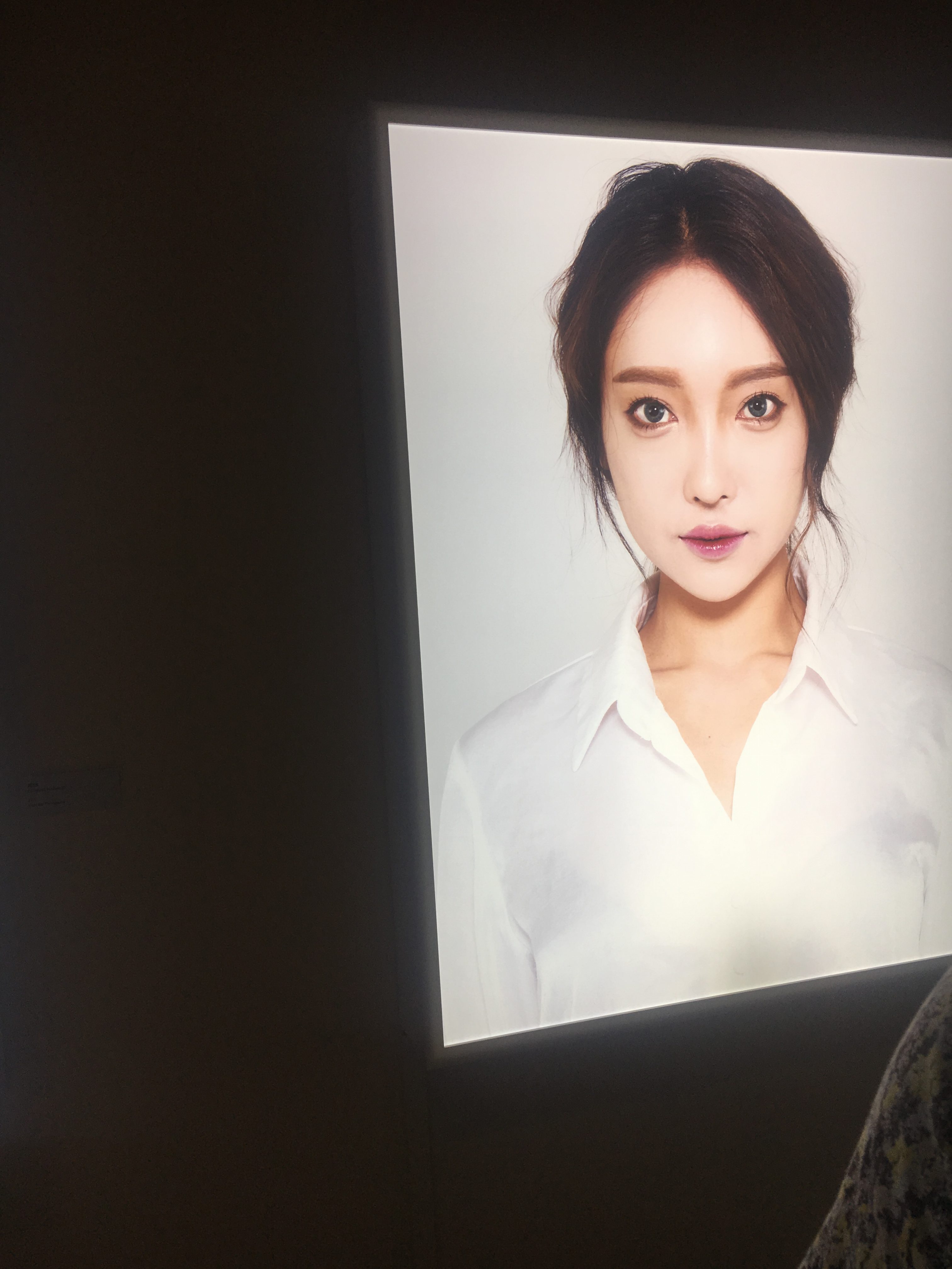
 

One work that caught my eye was ‘Fake I Real Me’ by Corinne Mariaud. It consists of 3 pictures of South Korean women who cares about their outer appearances alot and has had plastic surgery done before to look ‘prettier’.

When I first saw them, I found them to be creepy looking as their eyes looked too huge (almost to the extent where they look like dolls) and devoid of emotions. It makes me a little crept out. They look beautiful but to me, they looked beautiful in a ghost like way. When I first saw it, I thought it has something to do with beauty standards and plastic surgery. I think it touches on how looks have become more and more important such that some would go lengths to physically alter themselves. I think it is a critique on pressing beauty standards and increasing superficiality in our society. I think the simplicity of the work made it possible to gather such information-it is just three women and the most striking thing about them is their flawless beauty. I think the fact that it is very simple portraits of them that adds another layer to the artwork because portraits like this typically show people in their most natural state (poker faced, expressionless) but there is nothing natural about their features since they have gone under the knife before and emphasises on the fact that these are alterations to what was natural.

After reading text, I confirmed what I had inferred but I think that it might be because I am interested in korean culture and know what is the korean beauty standards. If a viewer does not have prior knowledge, it may be hard to understand the work. I think that if the artist added perhaps marks (the ones they draw on you before they cut you up for plastic surgery) that are not so visible from afar to the face and obvious as one approaches the artwork, it would be perhaps more effective but it may be too obvious and take away the subtlety and simplicity (which I find to be the stunning point) of this artwork.

The next artwork is ‘The Optimisation of Parenting part 2’ by Addie Wagenknecht and it consists of a mechanical arm rocking a baby cot. My first impression was that it felt lonely? I felt quite sad because I would expect seeing a mother beside a cot but inside it is a mechanical arm and there is a lack of parental warmth which I find a pity. I thought that it would be about the lack of time resulting in parents turning to machines to take care of their children and a critique on the reliance on machinery. The juxtaposition of the cozy baby’s cot and the rigid mechanical arm (between life and a mimicry of life) directs me towards the direction of machinery replacing us in carrying out tasks even the most intimate and the consequences of it.

After reading the text, I realised that I was partly wrong. The artist is much more optimistic and even supportive as she stands in the shoe of a busy parent and question if small tasks like rocking a cot can be handed to robots. The artist also questions if this will affect the child’s growth.

I think that if she wants to emphasise on the parent being relieved of her duty, she can add a pair of female hands alongside the robot’s doing her work and the lighting can be less harsh. The harsh lighting makes it look sad and devastating.

Interactive Artworks

http://www.notabenevisual.com/works/in-order-to-control/

The first interactive artwork I’ve chosen to discuss about is called “In order to control” by NOTA BENE and it consists of lines discussing the grey areas and ironies of/debates on morality being screened and projected on the floor. Viewers who step onto the projected area has their silhouettes projected onto the wall before them and their silhouettes are filled with the same lines on the floor.

I think this is a very interesting artwork as it gets one to consider the slippery slopes of morality and the hypocrisy of the righteous. In projecting the words onto the viewer’s silhouettes, it catches their attention and also implies that they are guilty of these slippery slopes. I think that projecting the lines onto the silhouettes makes it feel sort of like a personal attack/accusation and gets one to really ponder and think about these grey areas.

The second art piece is ACCESS by Marie Sester:

IN this work, web users track strangers with a light beam that follows them around and the ones being tracked are in the dark and hears a sound that only they can hear.

This artwork touches on surveillance and I think that is a very important topic as the value of privacy becomes more debatable with the emergence of social media (also, safety vs. privacy, how much should the government know about you?) The light beam that follows you around (like a spotlight, a mark) makes one feels anxious as spotlight typically means all attention is on you. I think that anxiety that one feels can open up deeper discussions on vigilance and surveillance in today’s society.


Image Sound and Memories Process and Research

When I first thought about memory and the idea of portraying that through space/physical settings, I wanted to do something personal like my house. When I heard that the story can be told from any object, I thought about a few ideas:

  1. Being a cereal box at the lowest shelf of the supermarket (interesting to see the legs of people: a child’s, a woman’s etc.)
  2. Telling in the POV of a memory itself: a girl has another ‘copy’ of herself which is her memories and she pushes her memories away (for some reason: don’t want to remember her heartbreak, wants to let go of someone etc.) but embraces her (memories her) to be part of herself in the end
  3. Being a peephole/door
  4. Use apples to describe a relationship that derails and ends up badly, with the girl concluding that “you were the apple of my eye” (punnnnnn)

I decided to use the peephole as I thought it would be interesting to say a story from the pov of an inanimate object. Furthermore, when I thought of memories as a theme, I came to want to do on the idea of letting go of someone and realised that this story is always told either from the pov of the person being left behind or the pov of the person leaving. I realised that by being a peephole and using the door as a metaphor for the threshold between reality and memories would be quite powerful. The threshold is between reality and memories such that once someone crosses over, that someone chooses to ceases to be a part of your reality and to confine his or her presence to only memories.

I needed a house with a peephole and had to borrow my friend’s.

When I first started, I didn’t think carefully enough about the peephole’s Pov and realised that if she is to tape up the pov the peephole has to be able to
“turn around” and see the inside of the house (at first I envisioned the images to only show the corridor/ a little of the inside of the house).

The first house I went to, I didn’t take any sounds as it was too noisy and I thought I could borrow another house for the sounds but it didn’t sound right to me so I took the images at the second house instead.

House 1 pics:

House 2 pics

For sounds, I took mostly ambience noise.

Ambience noise in this work symbolises the world outside and when she fully closes the door, you can hear the ambience noise decrease then snuff out completely, giving off a sense of isolation and loneliness.

I also shamelessly asked whoever I could to send me sounds of their footsteps as I wanted it to sound natural.


2D Ego final

The equations are:

Me when I was young + Father’s encouragement and influence=growth

Me when I was in school + expectations from school and parents = desire to escape

Me venturing out to achieve my dreams + rejection = devastation

Me at the brink of losing all hope + ADM’s acceptance = search for a new sense of identity

For the first panel, I use split complementary as it gives a more vibrant feel to it which was what I was going for as the first panel was my childhood that was the starting point of my art journey where my passion and enthusiasm is at its highest. I used green for the girl’s head and the plant as green typically represents health and it shows that I had a healthy mental state (rep by the plant AKA me) and a healthy environment (rep by the girl’s head)  as compared to now and the green I used is often the green associated to fresh vegetables. I also tilted the girl’s head upwards to portray hope and more literally “looking up to” my father who used to be an artist and designer, the one who first taught me art.

For the second and third panel, I used analogous color scheme as such a scheme do not have much variation and looks duller which coincides with what I was trying to portray. I did grow artistically, from my friends and art teacher (hence I did not use a monochromatic scheme) but the growth was minimal and not as much as I would like it to be. The heads of the girl is also dull in color to show the misery and sadness I felt during those periods. In the second panel, the head is looking straight forward, no longer smiling and the head is not tilted because I think this position shows the “one track” mindset that people were trying to force onto me (that I have to get good grades and get into uni to be successful) and for the third panel, I tilted her head downwards slightly to show the sadness and disappointment after rejection/ after abandoning the one track mindset and deciding to go against my parents’ wishes and school’s expectations. I used crows for the last square in the third panel as they represent death and autumn colors too as autumn is a season of “dying” (withering). I did some foreshortening to the axe as I wanted it to feel like the axe pops out from the girl’s head in a way to show that it was an external factor and not my environment that caused my rejection (in fact, it was trying to break out of my environment and looking to external means for hope-e.g. poly that resulted in my rejection). For the second panel, the tree’s growth is restricted by the girl’s head that represents my environment and for the first square of the third panel, I dispelled half the girl’s head as it is “Me venturing out to achieve my dreams” and my dream was to be an author and to be recognised for the characters in my head. Hence, my dream was not bound by reality and so the tree would not be restricted.

In the last panel, I used complementary colors orange and blue as it is more bright and vibrant and signifies more positive things which is the main point of the last panel. I made half the girl’s head into a sun to portray the “daylight after night” idea and so the sky clears up and is not as dark anymore. Also, as ADM’s acceptance signifies that now the characters in my head and my plots are recognised and that gives me hope, the sun coming out of her mind fits that idea and I made the hair of the girl more wavy to signify more dynamism (not confined/restricted to straight lines or curves).


Ego process and research

For this project, I considered various themes and narrowed down to my growth in art or anxiety and decided on the former as I found it apt to wrap up last project of 2D with it (and anxiety’s just depressing to talk about so…)

I decided on these equations:

Me when I was young + Father’s encouragement and influence=growth

Me when I was in school + expectations from school and parents = desire to escape

Me venturing out to achieve my dreams + rejection = devastation

Me at the brink of losing all hope + ADM’s acceptance = search for a new sense of identity

I wanted to use a girl to represent myself at first and to show her growth both physically and stylistically (through digital art/painting) but thought it to be too direct. I chose to represent myself as a plant in the end as I think that plants are good symbols of growth.

As I was thinking about color schemes, I realised that analogous scheme has yellow, orange and red orange close together and it reminds me of autumn. Hence, I was inspired to use the seasons to further emphasise on my emotional and mental state during these stages of growth.

I did this as an initial draft, with two blocks of blue at the back for the sky as a full blue would be too plain. However, I found the design uninteresting and lacking. Prof suggested that I look at minimalistic styles that make the items pop out due to their colors and I found that many blends the different shades of a color to create a stronger gradient and depth. Below are some examples that I have found.


Although the second picture uses the monochromatic color scheme, the buildings were able to pop out due to the shading and the blending of shades that create depth.

So I tried to do blending and got this. Prof also suggests that I use colors in the background as my shadow and highlight.

After doing some research, I found an artist called James White who likes to use colors in the background as his highlight and shadow.

The blue in the background is used as the highlight and a sort of variation of the red/pink in the background circle is used as shadow. I believe that this makes the object in focus pop out a lot and decided to do so too for mine.

I used blue in the background as the shadow and red orange as my highlight and this made my shoot look more 3D.

I still found it quite boring and as I was researching, I came across these.

This reminds me of a series of superhero posters that I saw and I really like the image within an image idea.

These posters show the heroes’ origins and their outcome and I decided that I can do the same for mine by containing my plant with a girl’s head and showing my growth through changes in the girl’s head (head tilting, features more sharpened etc. to show physical growth and changes in mental state).

It also feels like a window into my head (literally) and thus my inner world.

At first I wanted to portray the restriction I suffered from in school with a bell jar that the tree breaks and grows out of.

But the bell jar looked out of place and I realised that I can contain the tree with the girl’s head instead (it effectively becomes a mold). I then used the head to represent the environment that I was in.

This panel is for the “desire to escape” part. The mold then symbolises my restrictive environment (dull coloured as I hated the environment and was miserable in it).

At first I was told that it doesn’t look like a little girl so I made her features less defined and made her smile more to contrast with the frustration and lack of happiness later on.

Also, compared to the first draft, I changed the two blocks of blue into bands of different shades of blue. After reading some feedback, I realised that I should have looked more into smooth gradients (gradual) change in shades instead of bands of color as it would look smoother and more natural.

For the last panel, I was quite worried as I could not think of a way to reverse the environment to make it a “sunshine after the rain” situation when a rebirth/regrowth happens.

However, I came across this poster during research.

And I found it very interesting the way the black swan was morphed into the shoe and realised that if I am to use complementary orange and blue colors for my last panel, I could make a sun “grow” out of the girl’s head.

And this fits into my concept as in ADM I am now recognised for the ideas in my head instead of my memorisation skills.


I had a lot of fun with this project but I think that I could have done better had I learnt vectorising (instead of using the brush tool and drawing with a tablet which =rough lines/wayward lines that are ugly :((((((( ) and I could have done more subtle changes to the design to make it more meaningful (e.g. the girl can smile and tilt her head upwards in the end). I will pay more attention to details in the future and be less sloppy!!