Hyperreal Self-Portrait

Original

Edited:

Artist Statement:

For this hyperreal self portrait, I wanted to present the idea that the best way in which I can show a person who I am is through my artwork.

Before coming to adm, I made a promise to myself to put a piece of myself into every artwork that I do here and my classmate once told me that she can hear my “voice” through my art. I had ironically laughed to myself because I never thought that I had much of a “voice” in social settings, always silenced by my awkwardness, inability to mingle, tendency to blurb out one or two anti-climatic sentences etc. Hence, I decided to present a part of my identity that deals with communication.

I juxtaposed my verbal communication with a communication of my ideas through art, one represented by the opening of a door while the other, a stitched mouth. The opening of the door being positioned at the forehead is because it is the closest to our mind, where my ideas stem from. I chose Natalie Portman to represent myself because she I wanted a famous actress as I feel that it pushes the idea of communication as a portrayal of oneself, an image of oneself that may deviate from one’s true self. Also, she won an academy award for the film, “the Black Swan” which I deeply connected with as I sometimes wonder “how far would I go to pursue perfection in my art?” I also put the door at the forehead as it is positioned like a “third eye” of a cyclops which usually represents clairvoyance and I think that I experienced many more things through the eyes of my characters hence the positioning added another layer of meaning.

For the girl from the door, I chose Alice from Alice in Wonderland, not Natalie Portman, to push further the idea of the represented self and the true self as two separate beings. I chose Alice because she discovered Wonderland and my mind is filled with wonky fantasy ideas that sometimes feels like wonderland compared to our mundane world. I also chose Alice instead of another actress and narrowed down to a character because my mind is full of characters and people like Alice who have found a place and belonged to a place unlike our world. I leave Alice coloured and the rest of my face (excluding the strings) black and white to draw the focus to these two as juxtaposition tools, also because my social world that I kind of wrecked because of my inability to communicate well verbally has become a dread and sometimes seems dead (colourless) whereas the communications that my characters have with one another and the drive that they give me makes me feel alive.

I used strings to stitch up the mouth, because continuing from the previous artworks, red strings represents my wish to connect my audience with more people but in reality, my red strings are a mess because of my communication skills. Hence, I stitched my mouth up in untidy strings and cuts across each other.

I created the vignette and put on some green to create a spooky and evil effect as the red strings and the person popping out would already give off but I wanted to push it further. I wanted to put more blood and gore at first but it looked weird and I felt that I wanted to drive at a more sickly and perverse kind of horror instead of a full on gory and disgusting one. I went for the horror look because I find that it personally scary navigating through social circumstances and I find that it is scary how much I like to present myself through art as it leads to think how far would I then shrink from the social world and keep looking inwards in a place of suffering and pain (which is where most of my art comes from) to find comfort and purpose.

Techniques:

I cleaned up Natalie Portman’s face, removing the obvious blemishes but not cleaning up her face as clearly as possible because the photo is very hd and I can see her pores but I like the imperfection? (It adds the meaning that an image is not perfect, I hope I don’t come off as being lazy, I would actually clean it down to a tee if I think that I should:() I took a door and B and W it because it was too white and I blended in the sides using the clone stamp and healing brush tools so that it doesn’t look out of place. I added Alice in and had to play with dodge and burn and the shadowing and stuff because the lighting of postman’s face is straight on while for Alice it was from the side. The same goes with the strings (photos that I took). I sized the strings down and put it at postman’s mouth and added redness and wound marks to them. I made the ones at the most far corner of her mouth darker to suit the lighting and clone stamped/healing brushed over the places where the strings end off (would look more natural).

References:


I am inspired by this artist called Diana Dihaze, whose photography are disturbing and scary to say the least but I like that they have a silently creepy and eerie effect. The horror is not in the exaggerated blood or facial distortions but in less loud ways and I like the misty effect that she uses which I tried to use here too as it gives off an otherworldly and scary look.


I also took some ideas from Erik Johansson  whose works I noticed often includes sizing things up or sizing things down and using objects that are of the same color or texture to pass off as one another (blanket and snow). I wanted to do a door with a person walking out at first. But after seeing his works, I realised that I can play with size a little more to make it look more surreal hence the door and Alice being much smaller and fitting the forehead instead. Also, I realised that a white door can be blended into a forehead (black and white) and passed off as a natural part of the forehead.

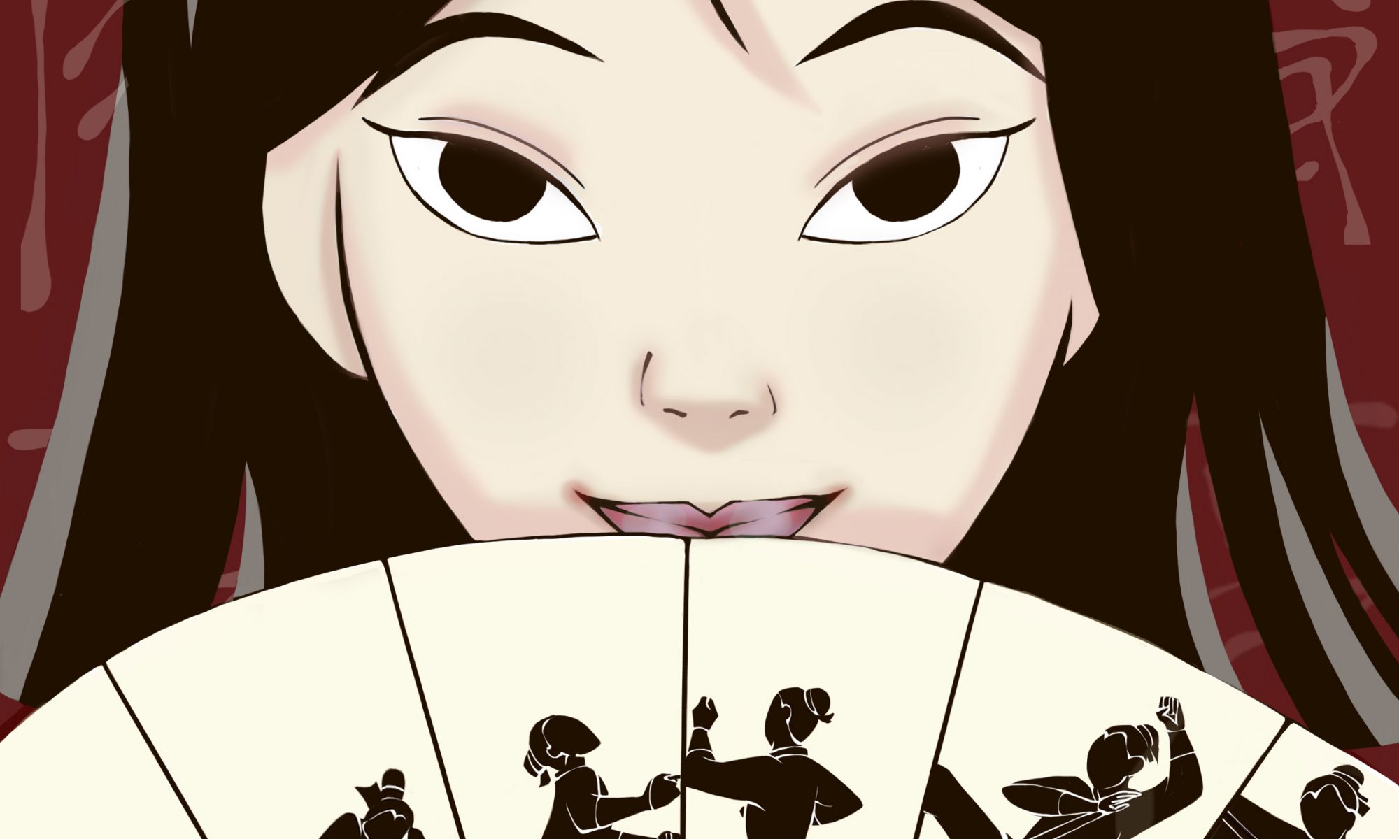
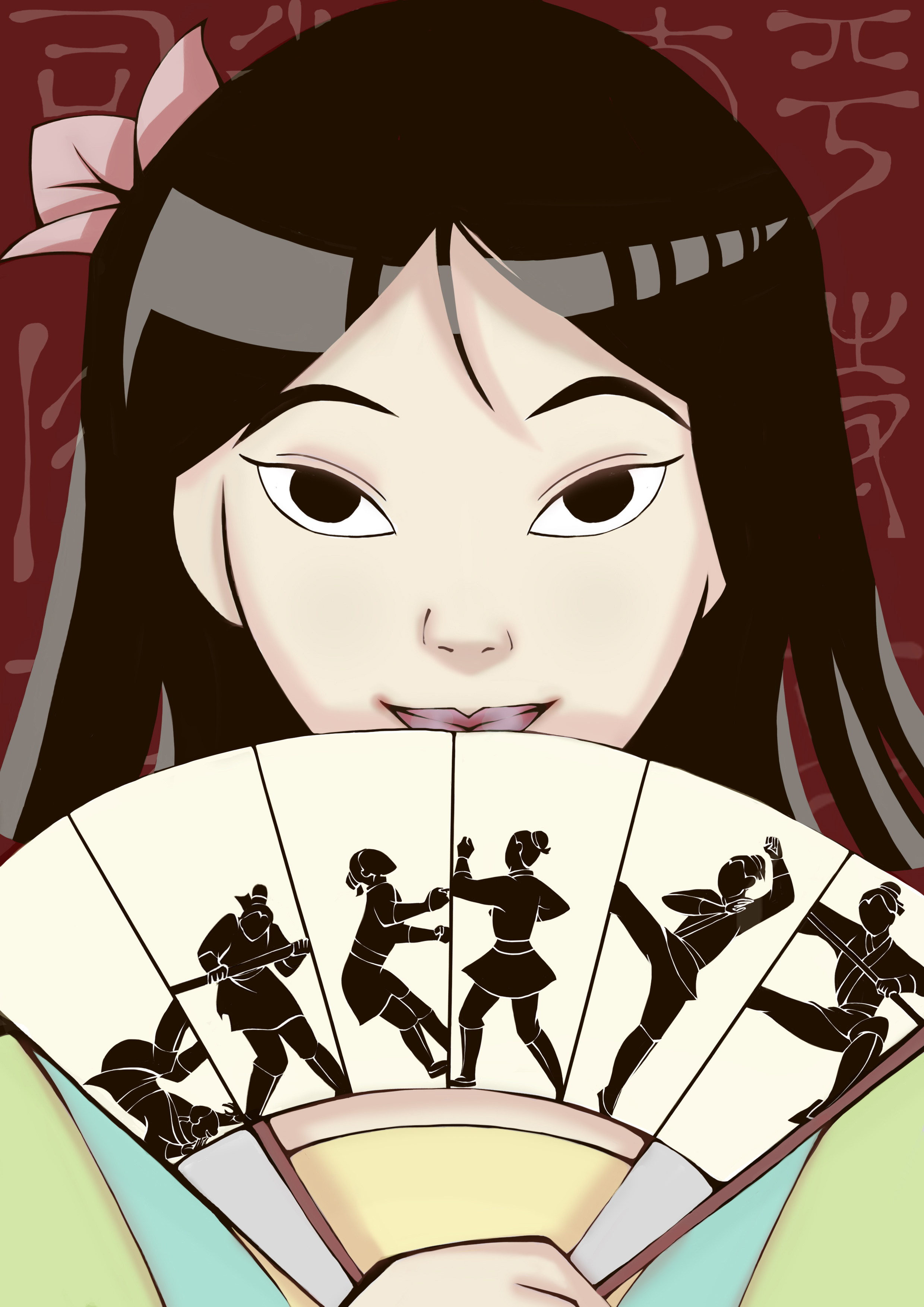
Mulan

Description:

In this image, I strive to reflect Mulan’s identity as a woman. In the Disney movie, Mulan struggles to come to terms with the “femininity” that was expected of Chinese women in her time. The movie can be seen as a “coming of age” film that chronicles her realisation that a woman is not only of cosmetics and beauty but also of strength and wits. Hence,  I tried to depict that with a Mulan that has undergone the Huns invasion (hence short hair and in female clothing) for it is this Mulan who has come to terms with herself as a Chinese woman and portrayed her warrior side with the fan that chronicles her training process (from being weak to strong, in accordance with the positions).

Visual Analysis: 

I decided to place both her “warrior” side and her feminine side in one picture and decided to portray her in the aftermath of the Huns invasion in which she now has short hair and is discharged from the military. She is in female clothing and has a flower blossoming on her hair to signify her womanhood (the bloom of flowers in both the movie and Chinese culture, signifies the growth of a women). The colors that I used are also softer and brighter to show a more optimistic outlook and the enlightenment she experiences after going through the military.

The background is red to signify the  boldness and strength of a warrior and I used a lighter shade of red as her shadows to signify that the strength she has as a warrior is a part of her strength as a woman and a person too.

The fan chronicles her journey as a warrior and her growth too-from falling down and tumbling to flying in midst air with a kick and I used her position to signify her growth too (from a low position to a flying position) and I placed that in the fan because a fan was used in the earlier part of a movie to be an essential of a woman and is used to hide a woman’s face from her to be husband. Instead of using the fan to hide her identity (that suggests the inferiority of women who must “hide”), I subverted it and used it to show her identity and strength as a warrior instead, suggesting that a woman does not have to hide her strengths, much less herself.

Behind, in the background, I used the “Chinese words” (traditional) that are used in the movie as in the critique, it was suggested and I found the background plain. Plus, fading out the words suggests that Mulan is no longer trapped by the “Chinese culture (rules regarding femininity)” that she felt victimised by.


Narrative Self-Portrait: Scarlet

Before:

After:

Concept:

When I first thought about what I wanted to present as my self-portrait, I thought about what was important to me I found two answers: softball and writing. I love both of them but both journeys have been tough and testing of my willpower. I wanted to represent the frustration, the endurance and the pain that I felt after experiencing constant setbacks and more often than not feeling inferior etc. because this pain has shaped me into who I am today-persevering on, jaded, struggling still.

I wanted to convey the idea of a certain death-the death of my ideals of how one should chase after dreams or goals or how things would always work out in the end. I went for a more zombified look because I wanted to convey the feelings of being weighed down by death yet constantly struggling to reach the light and also because the undead cannot really die and there’s some victory in that.

I also wanted to show the messiness of my inner world and my mind which was why I tore up the papers (also to show frustration) and wrote the words over and over again (also to show repetitions, editing) across my hand. This is why I also used a variety of writings, all that’s been done by me and not just writings-there are drawings, sketches, scripts, mind maps, everything that came out while I brainstorm.

I put up the red strings because it reminded me of the ‘Crazy Wall’ that detectives are often portrayed to make when they are trying to find connections in cases and this reminded me of my mind when I try to come up with plots and link characters together. Secondly, in eastern mythology, red strings are used to connect people and I wanted to represent my desire to connect my characters to a wider audience (why the strings are attached to the paper and extends out from it) yet the strings also creates a very suffocating look, especially when red reminds one of danger and blood and I think that perfectly conveyed the idea that something that I want to do so badly is hurting me instead and making me feel trapped.

I used masking tape because during my softball days, when we had blisters, we used masking tape to go over our hands because we didn’t have time or the money to afford bandages and it hurts when we do that because the tape sticks to your wounds and that pain has stuck with me till now.

Technical Decisions:

I used a zoom lens to take the photo because I wanted a rather close up shot of my hand. I cut the hand off at my forearm so it does not look too weird (previously had cut it at my wrist and Bryan mentioned that it looks weird and chopped off). I took the photo in portrait instead of landscape to really get the whole of my forearm and to push the effect and idea of reaching out for something.

In photoshop, I added a ring of light above to show the reaching out for the light. I used the gradient tool with the diffused circle of light as it felt a little like a diffused and blurred spotlight that gave the hand a little more of a dramatic effect. At first I had made the picture quite saturated and tinted with red but during critique, it was pointed out that the redness clashes with the strings. To push the idea of sadness and dismay, there were suggestions to use blue. So I did and I liked the look better because it feels sadder and heavier and a little more ghostlike. It also allows the strings to pop out and I can then mask them and make them bolder.

I masked the string in front and the strings at the back differently because the string in front was brighter and when I tried to toggle the brightness of all the strings as a single mask, it popped out too much.

Using smudge and brush, I added some redness and blackness to stimulate rawness/dirt (?) and it gave the hand a more rugged look. I tried to mask out some blisters and add them onto the hand but my incompetencies made it looked like some monstrous experimentation was going on and kind of destroyed the work (I SHALL BE ABLE TO DO THIS ONE DAY).

Artist References:

When I was looking through pictures for references, I remembered a photographer (Tyler Shields) whose art I quite liked and I came across this picture.

‘Pointe’ by Tyler Shields

This kind of sparked me to do something about sufferings and passion. Because I have not yet succeeded, I don’t think that it is right to portray a ‘success’ part like the feet on the left on pointe. Instead I wanted to portray a more reaching out for the light idea, hence the zombified look. However, I wanted to portray the wounds and the injuries like the feet on the right hence the masking tape and black red marks in my piece.

I wanted a zombified look and I liked that the idea of the ‘Undead’ fit into my concept so I searched for the hand gestures that zombies often have before they die as they try to reach out for something.

The Crazy Wall came to my mind next when I thought of strings and I went to search up some references.

‘Teen Wolf’ Introduction
‘Sherlock Holmes: A Game of Shadows’

I immediately thought of Sherlock and Stiles from teen wolf (as I’ve seen the intro a lot of times before) and I really liked the look of the strings. In the second picture, I found the strings a little too flat and I prefer the layering/depth effect that the first picture has hence I try to achieve some depth by attaching the end of one string to the camera and letting my hand go through another string (layering of strings to not look flat).