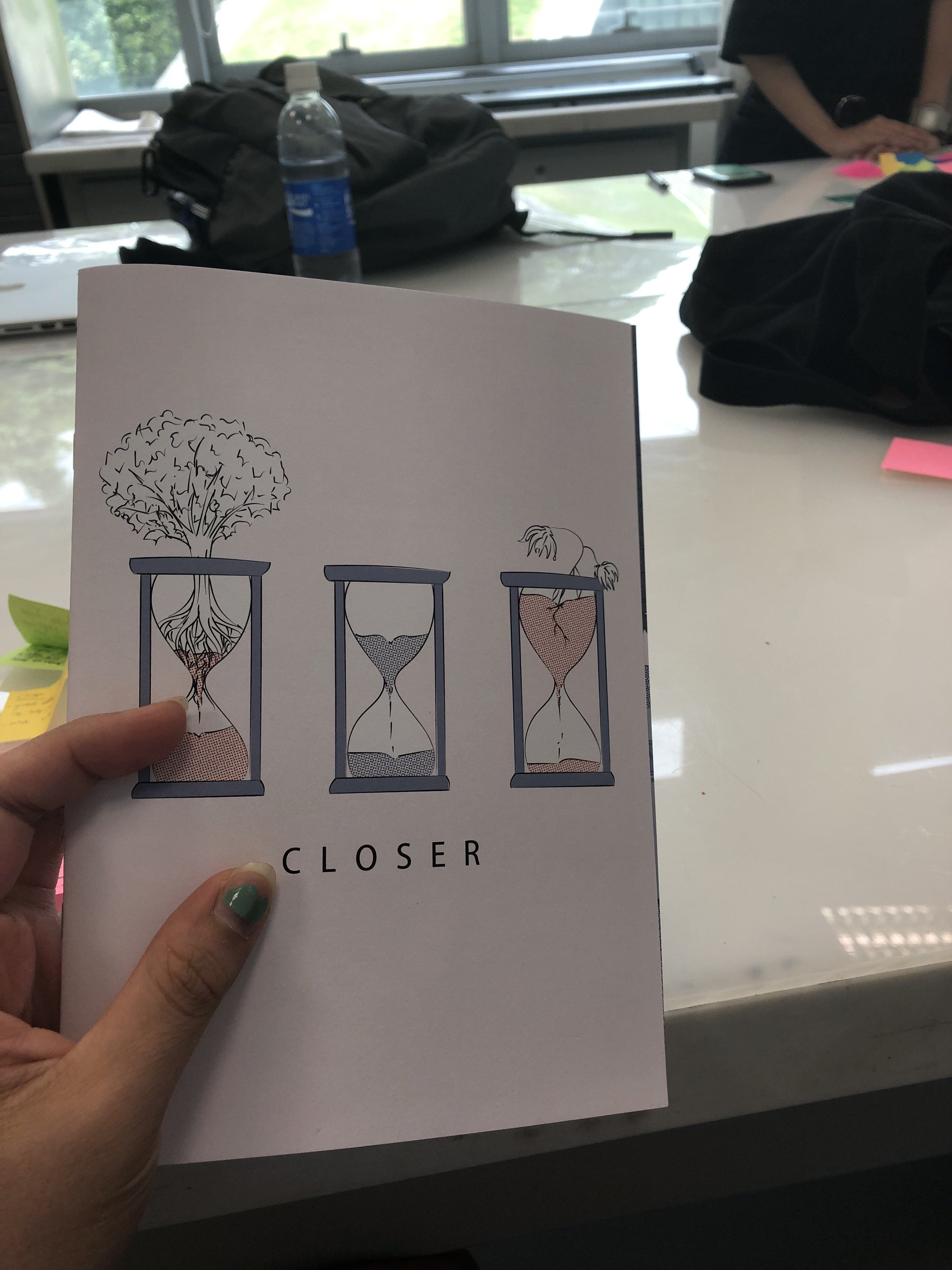
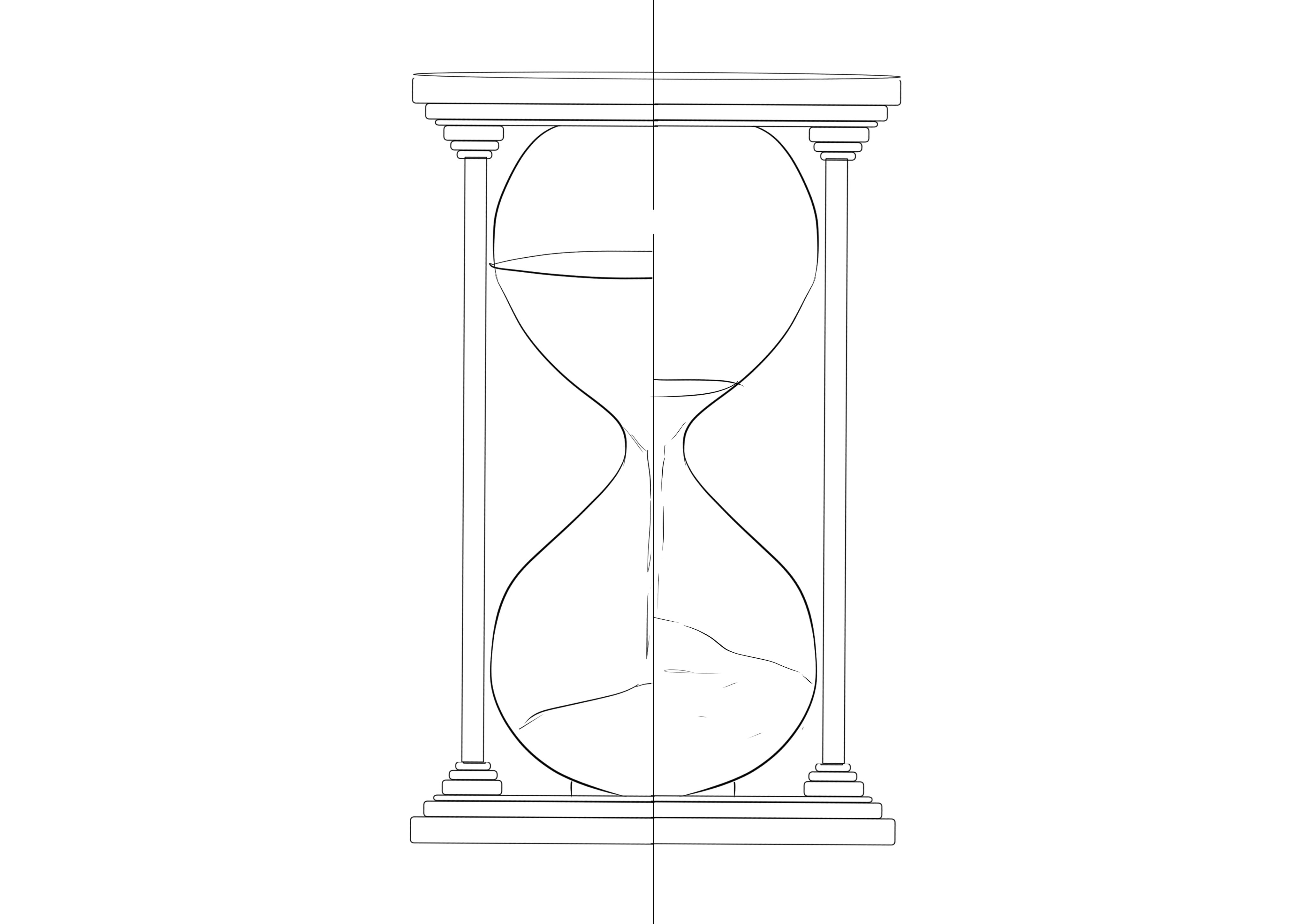
Final Project: Clos-sue

Description:

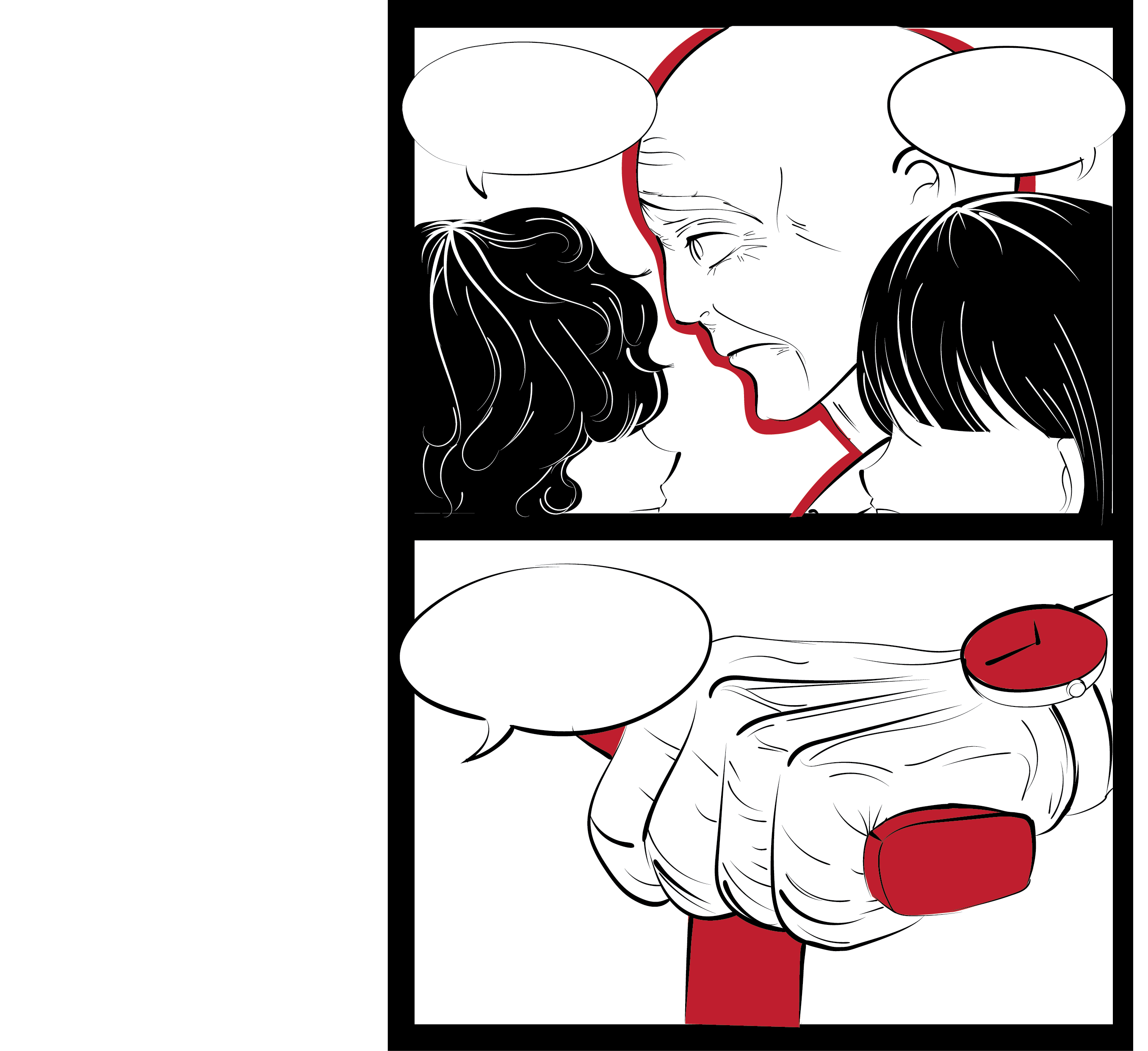
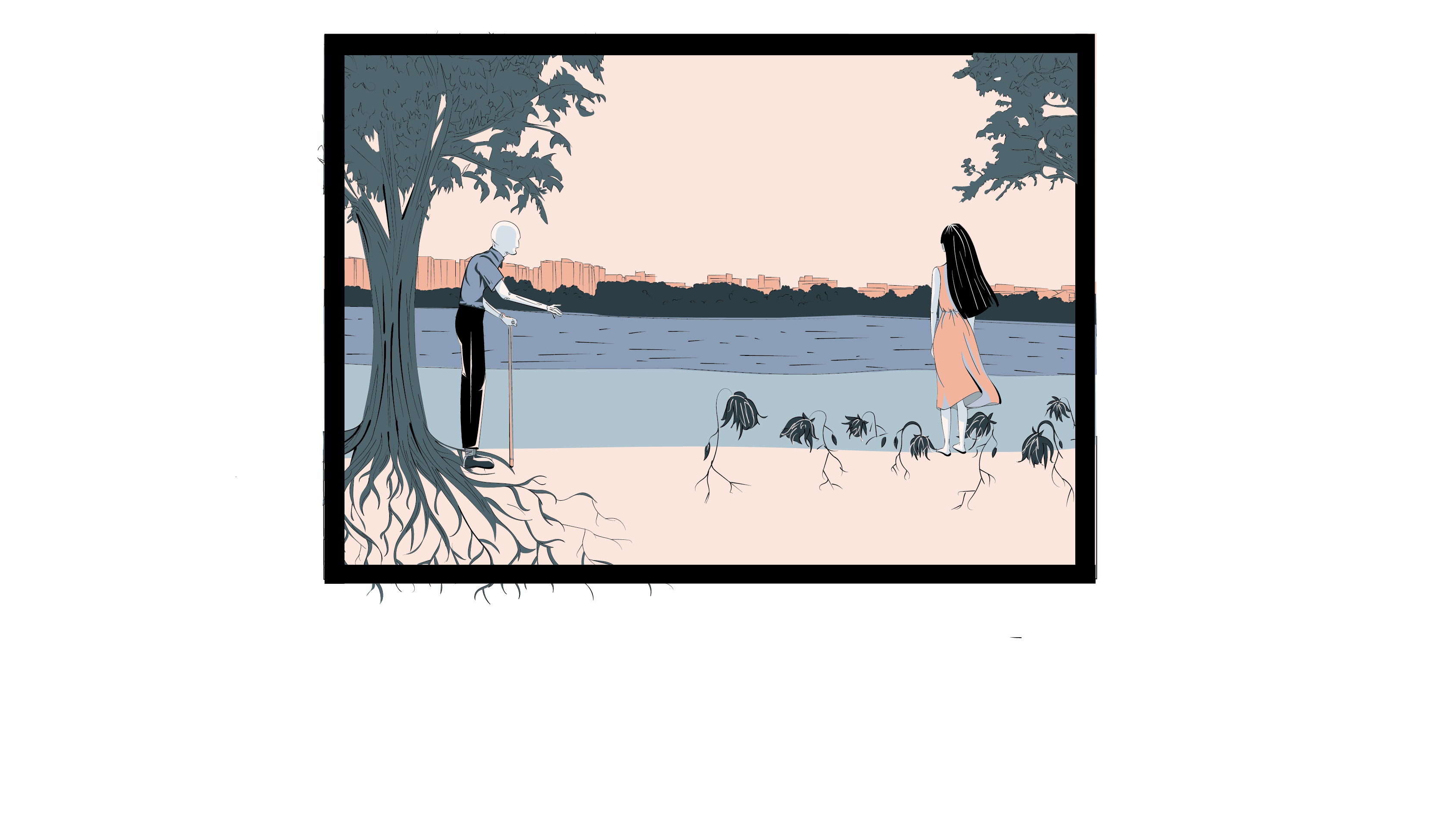
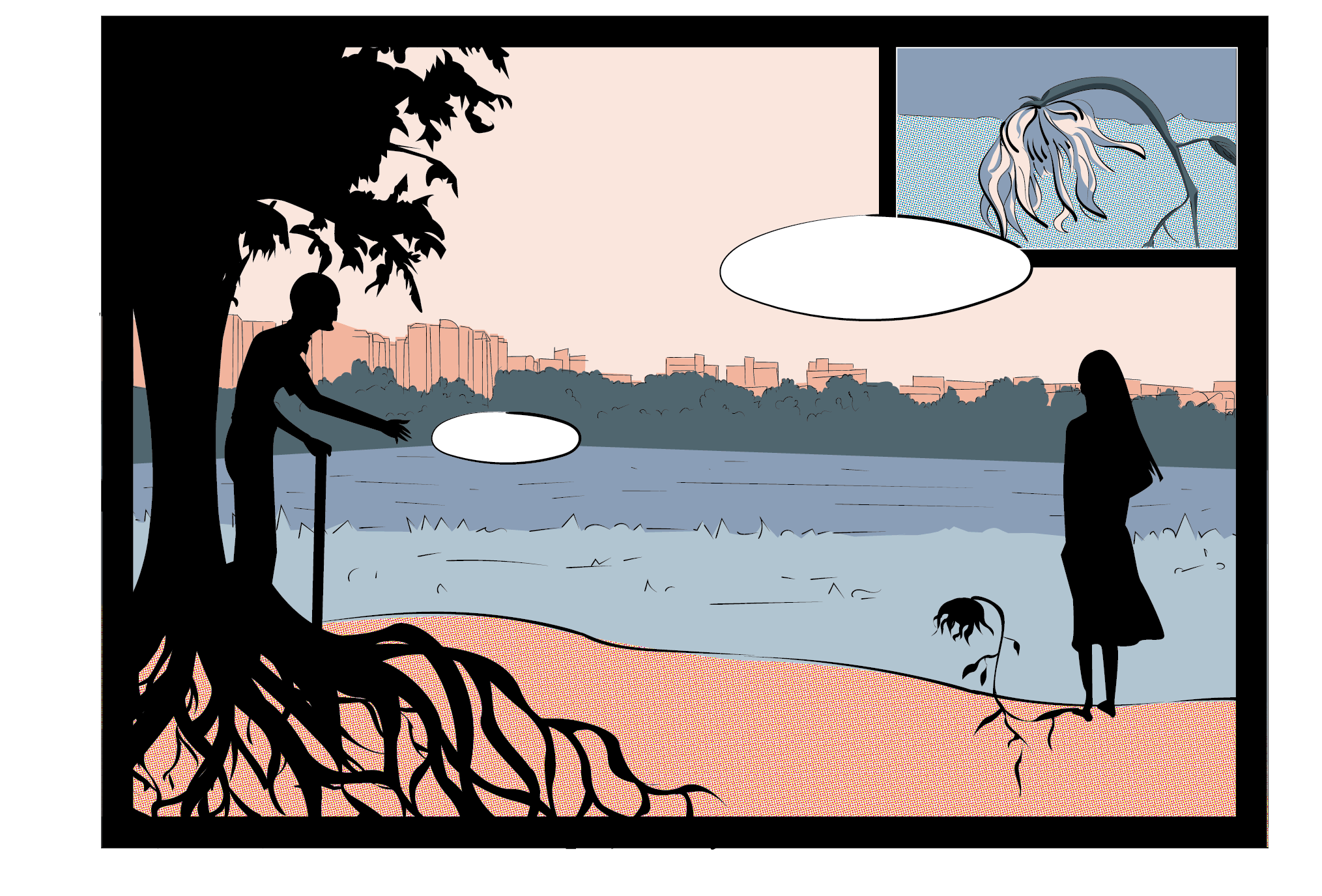
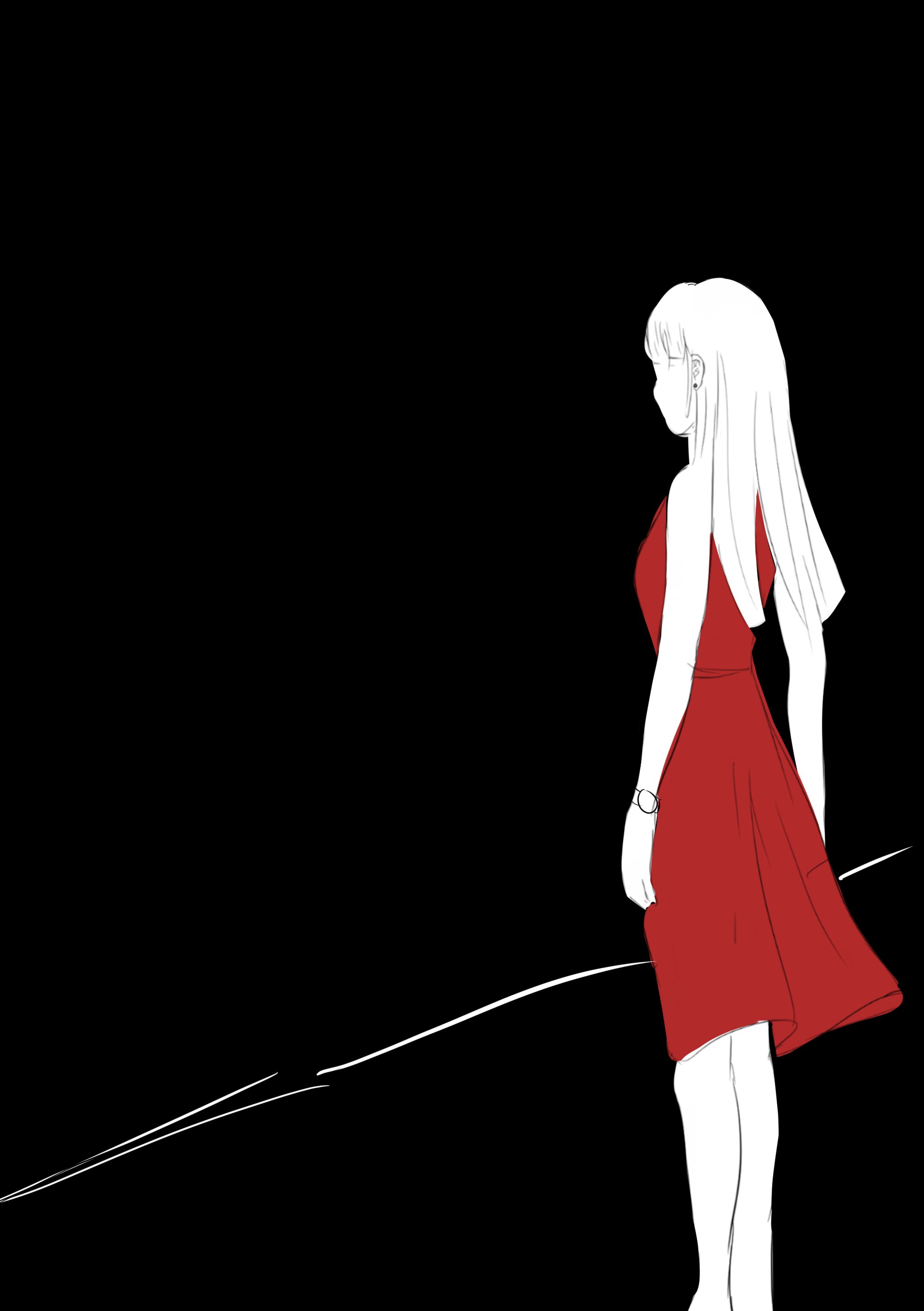
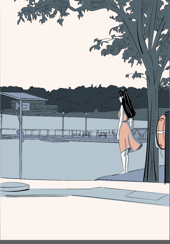
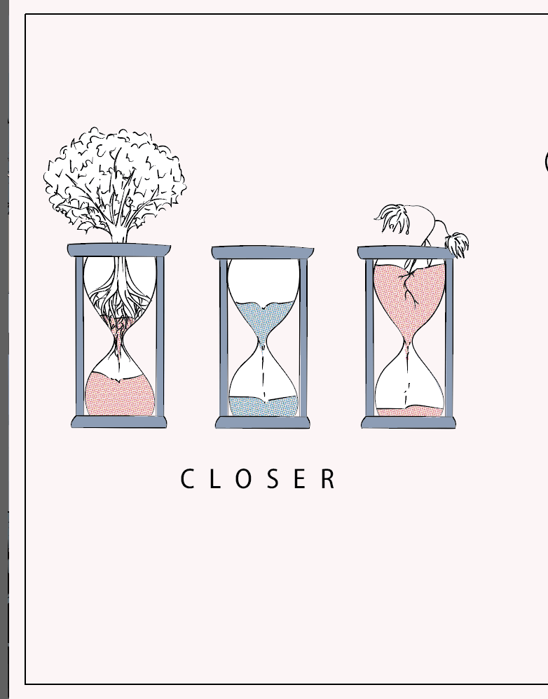
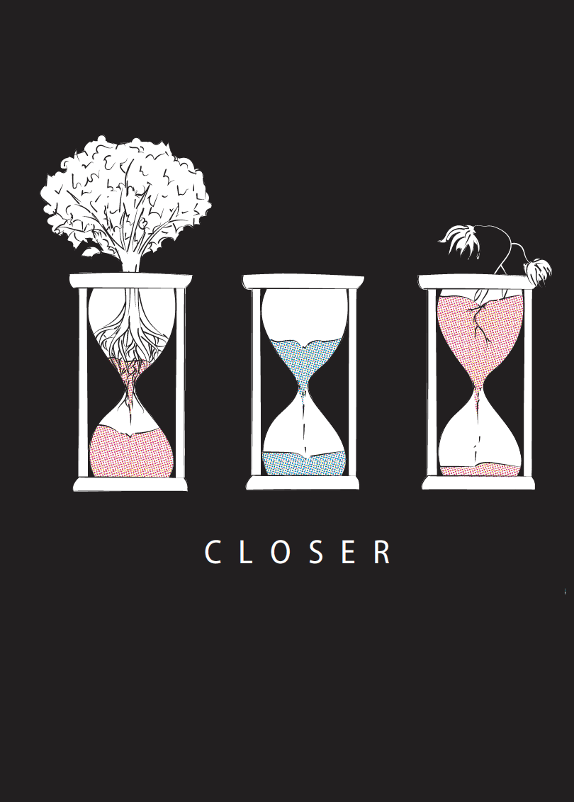
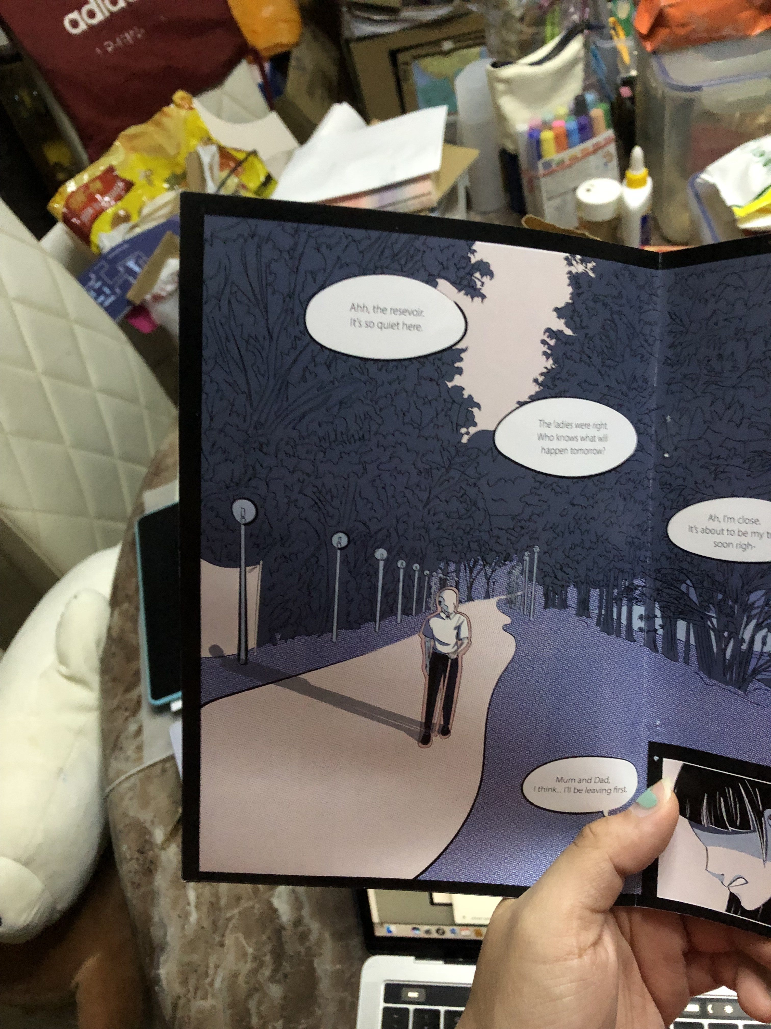
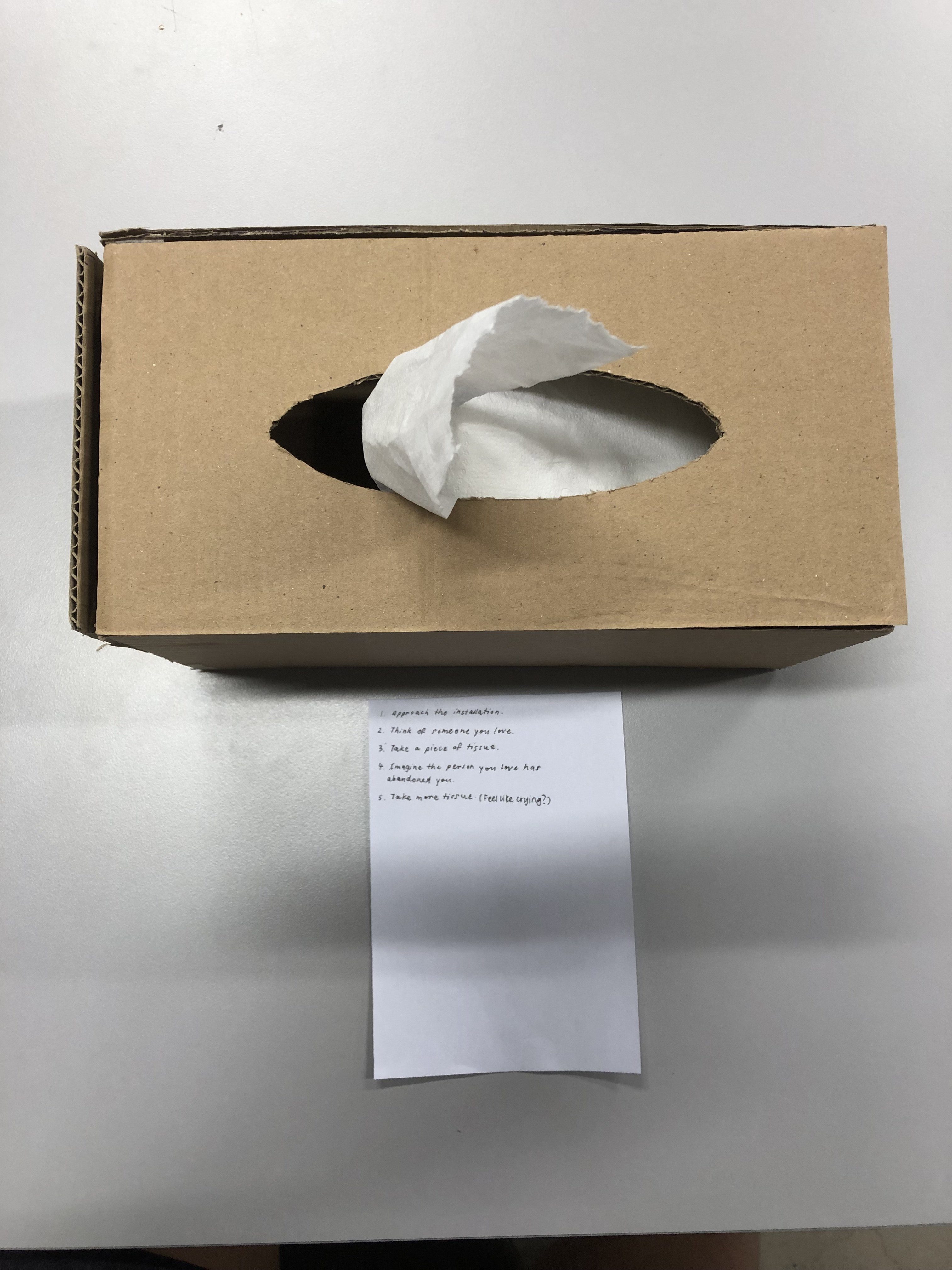
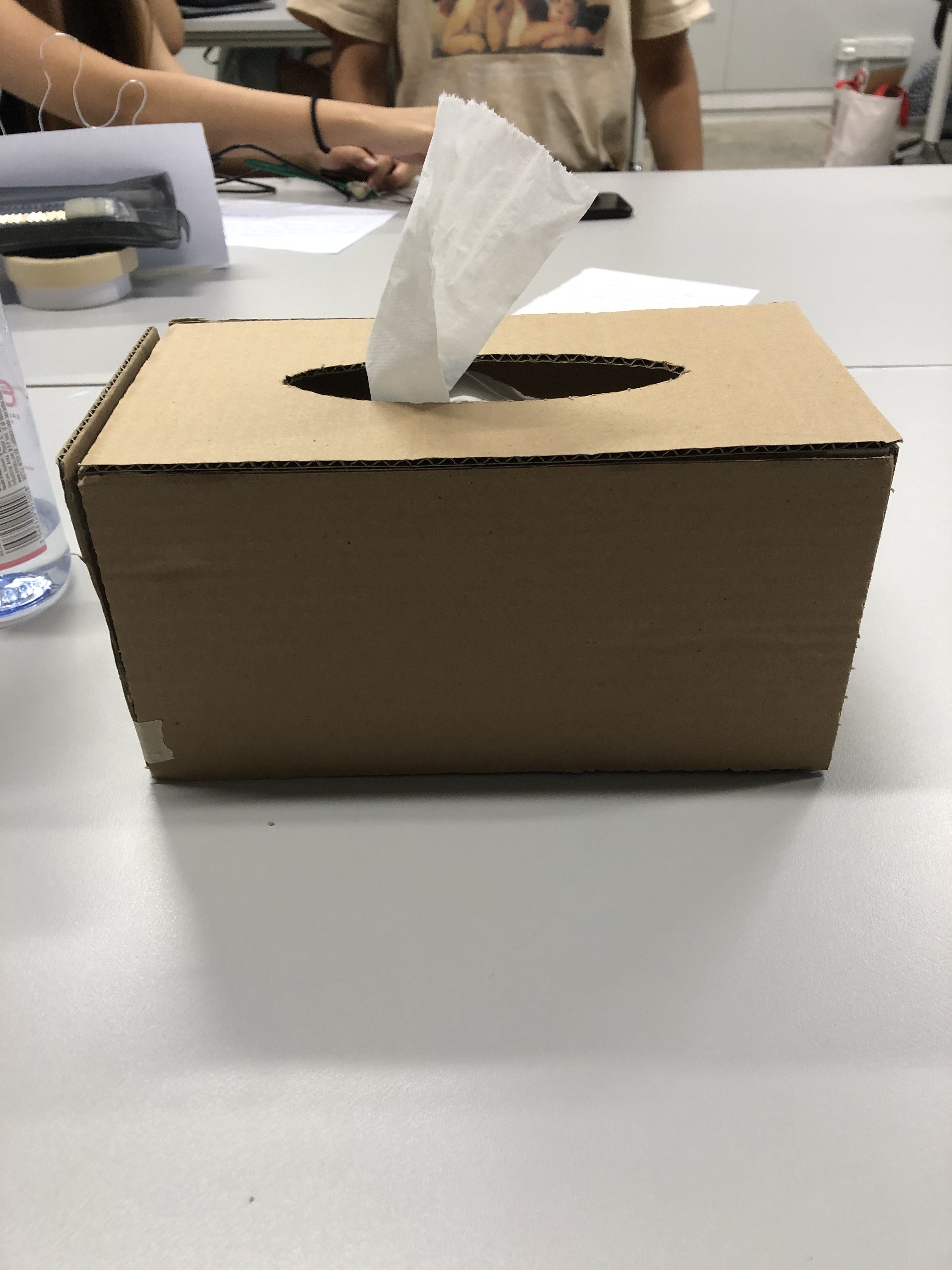
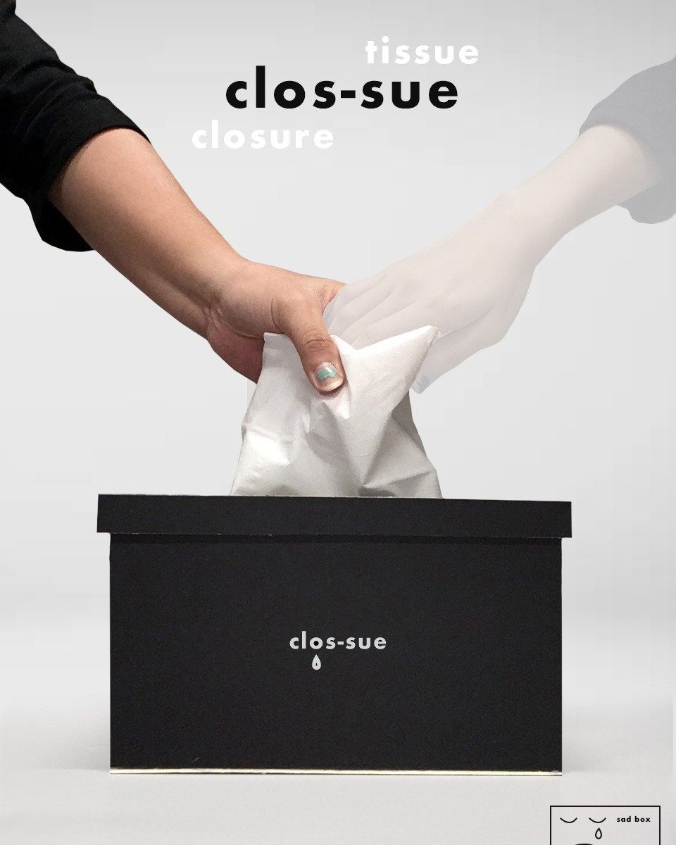
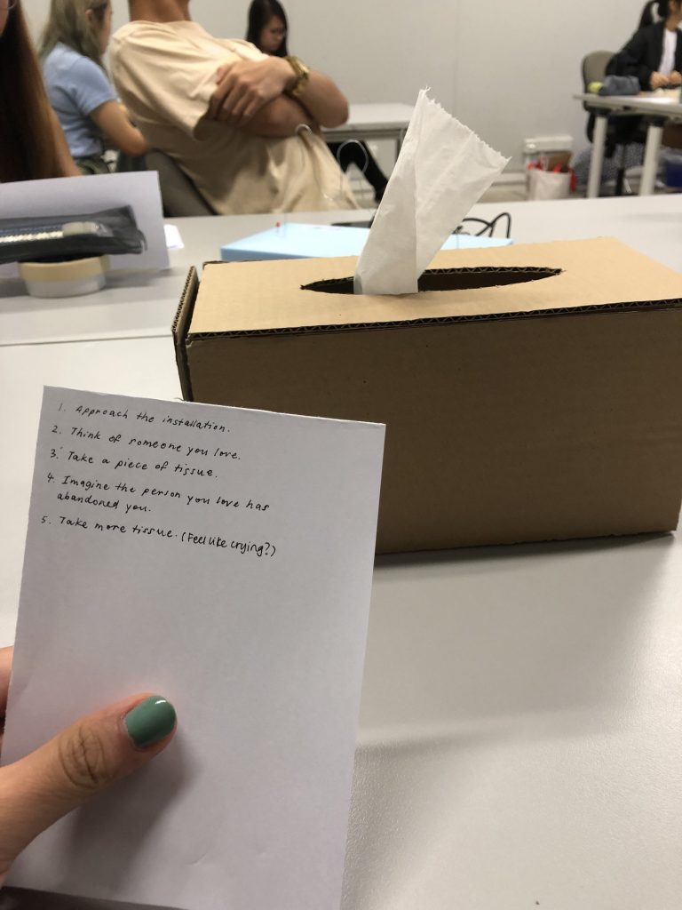
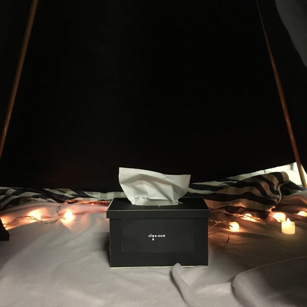
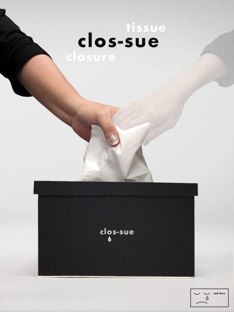
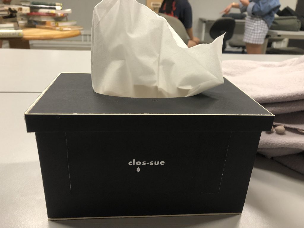
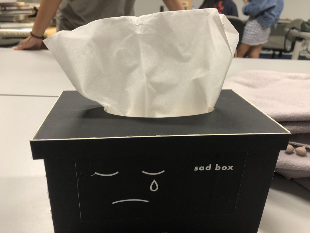
Our project is a tissue box that offers phrases of comfort to those who have been abandoned and are crying over their loss. Users will sit inside a tent, visualise the person that has abandoned them, and take a piece of tissue that will offer them phrases of comfort, in hopes of helping them to find closure.

Observational Documentation for user tests: 

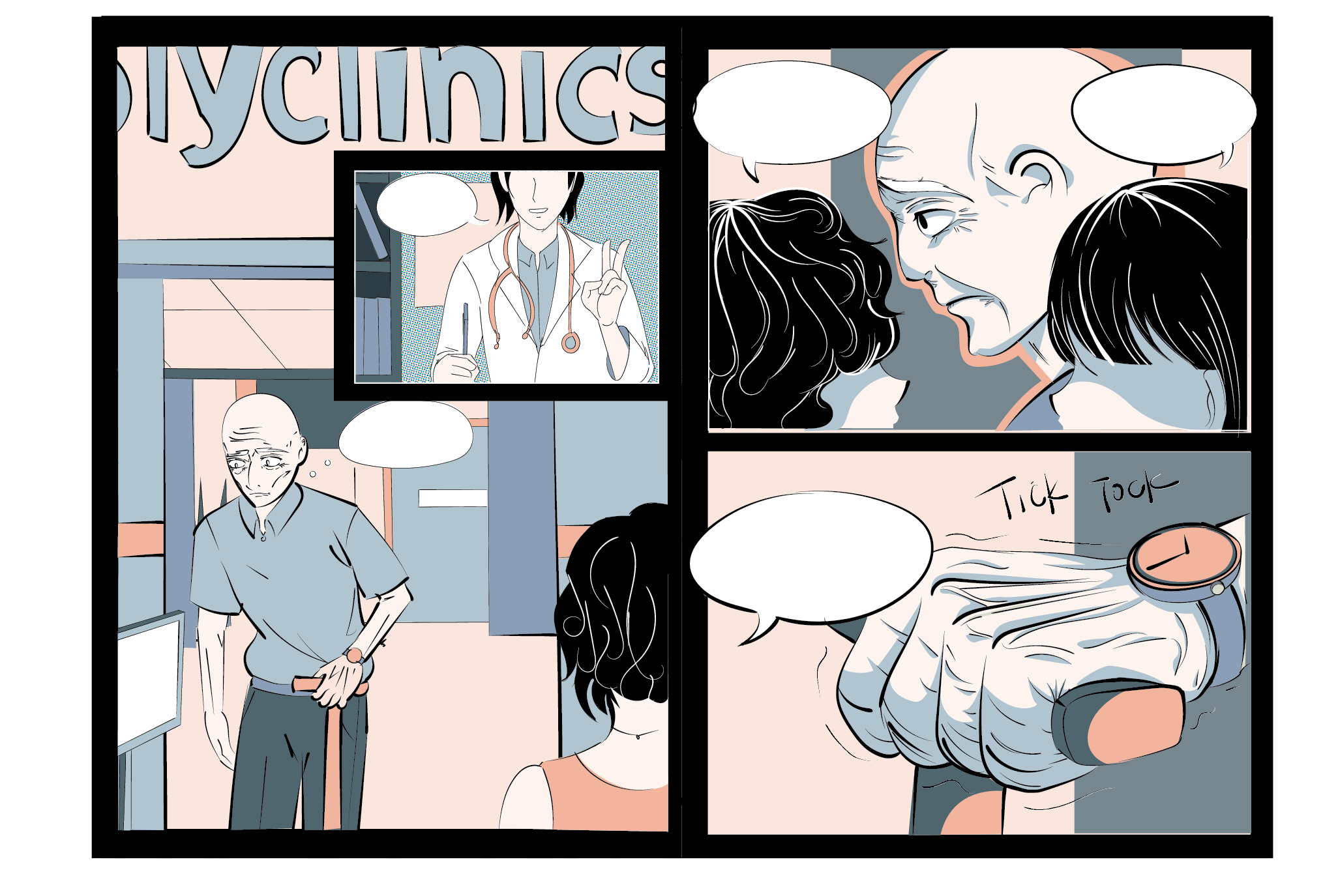
Our users found that the set-up was very appropriate and well done. It gave them a private space even though the entire class was watching and they did not think of the people outside. Even though one of them have not lost anyone, he said that the mechanical voice and set up eased him into a reflective/sad mood required to aptly experience the object. For the two who have lost somebody, one of them said that she was comforted while the other thought that the mechanical voice made her sadder as it reminded her that the person she lost is irreplaceable but it’s more of a positive reflective kind of sad instead of a negative one.

Design Process documentation: 

Initial ideations:

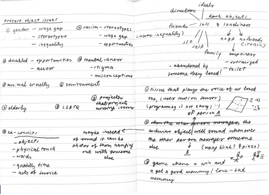
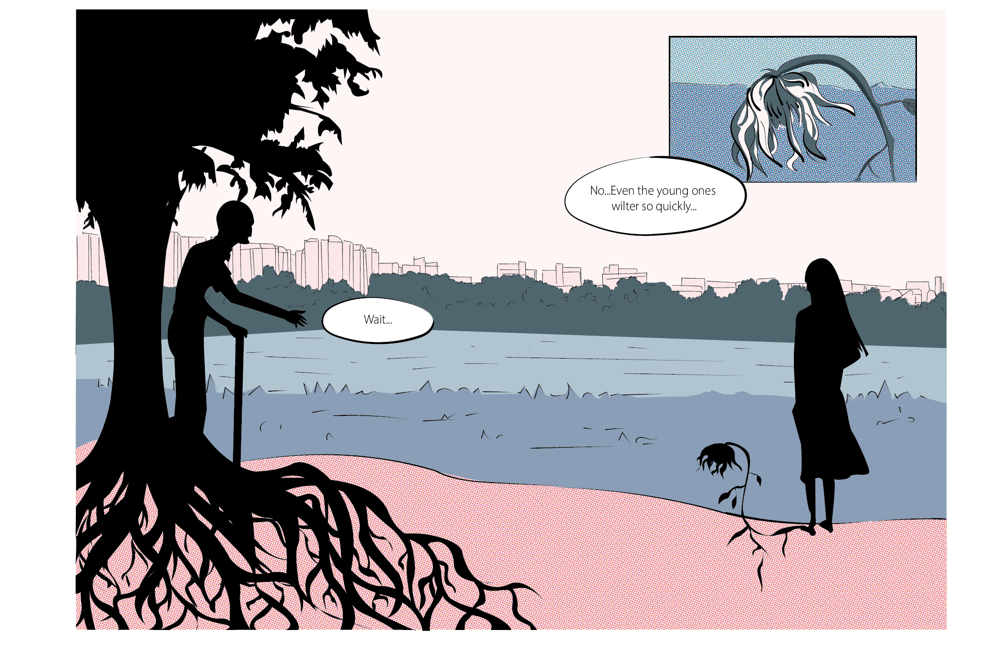
Initially when we developed it, we envisioned it as an object tailored to a person who has just been abandoned so we thought of using the voice of the person who has been abandoned as it will be more powerfully hearing words of comfort that you might never be ever to hear again from the person. However, we then realised that for the demonstration, it is hard to do this as not everybody has lost somebody and the voice has to be specific to a singular person so we decided to use a universal mechanical voice instead. We also thought that the mechanical voice can emphasise on the fact that that person is gone and push our audience into facing reality and finding closure .

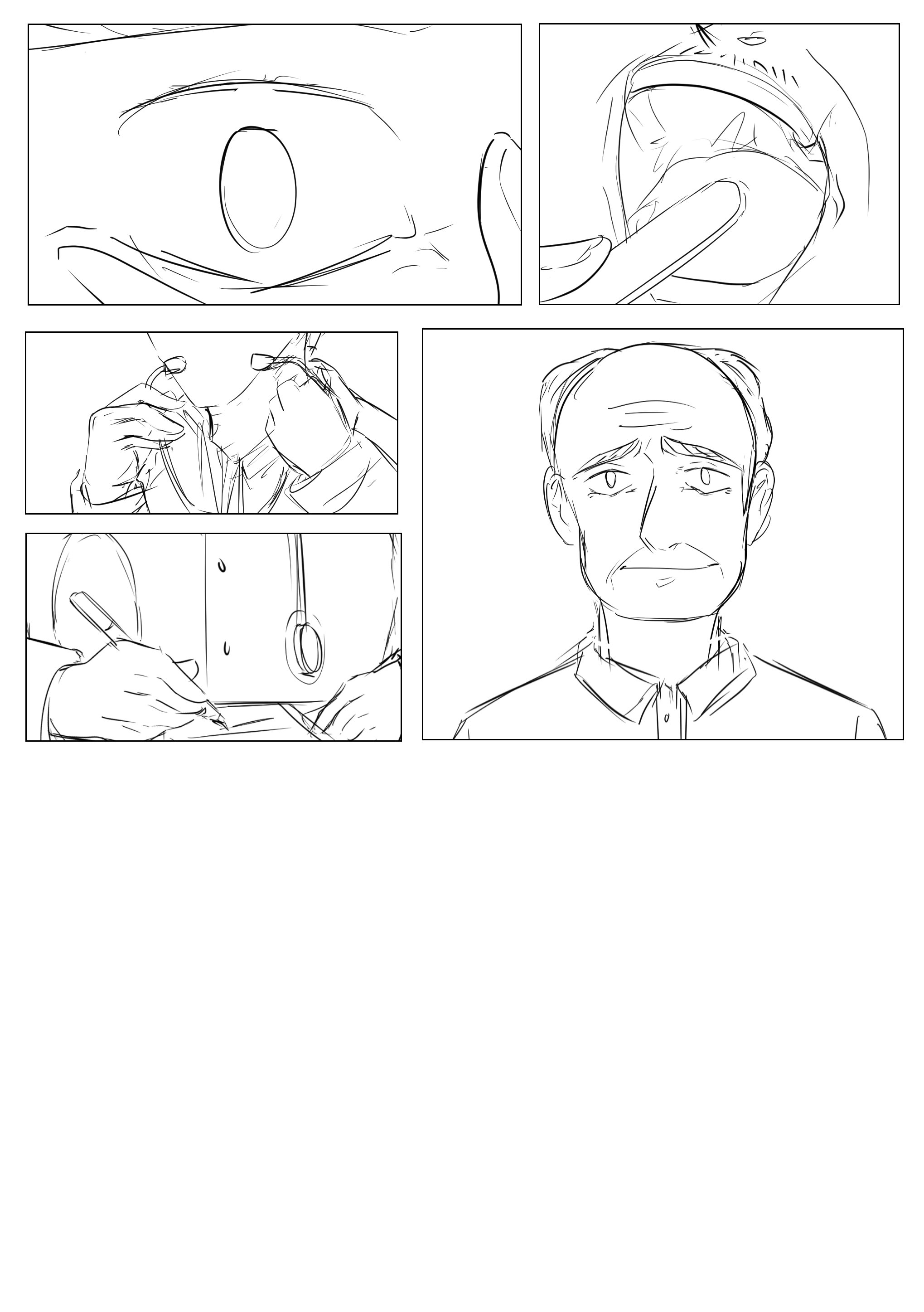
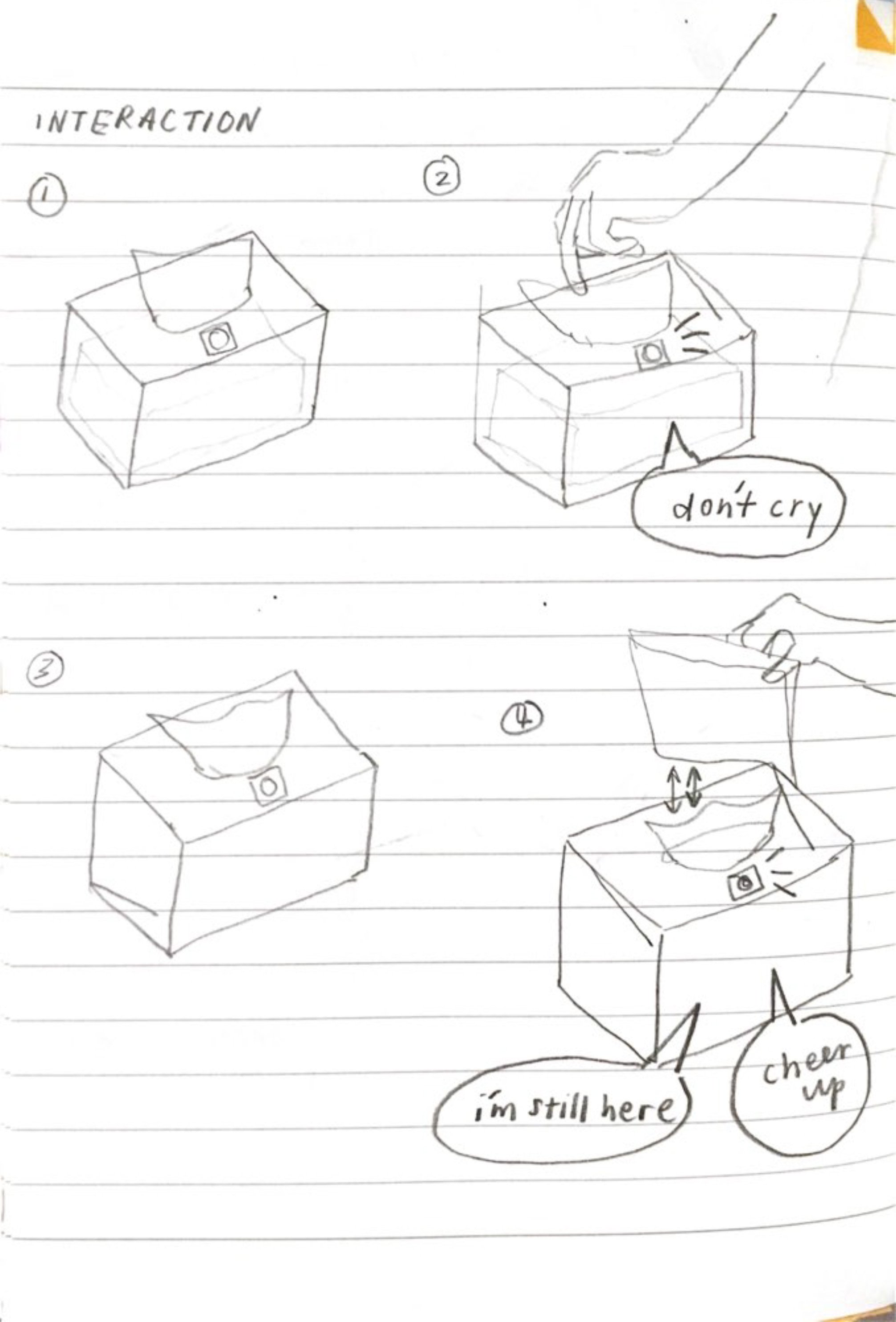
Development drawings:

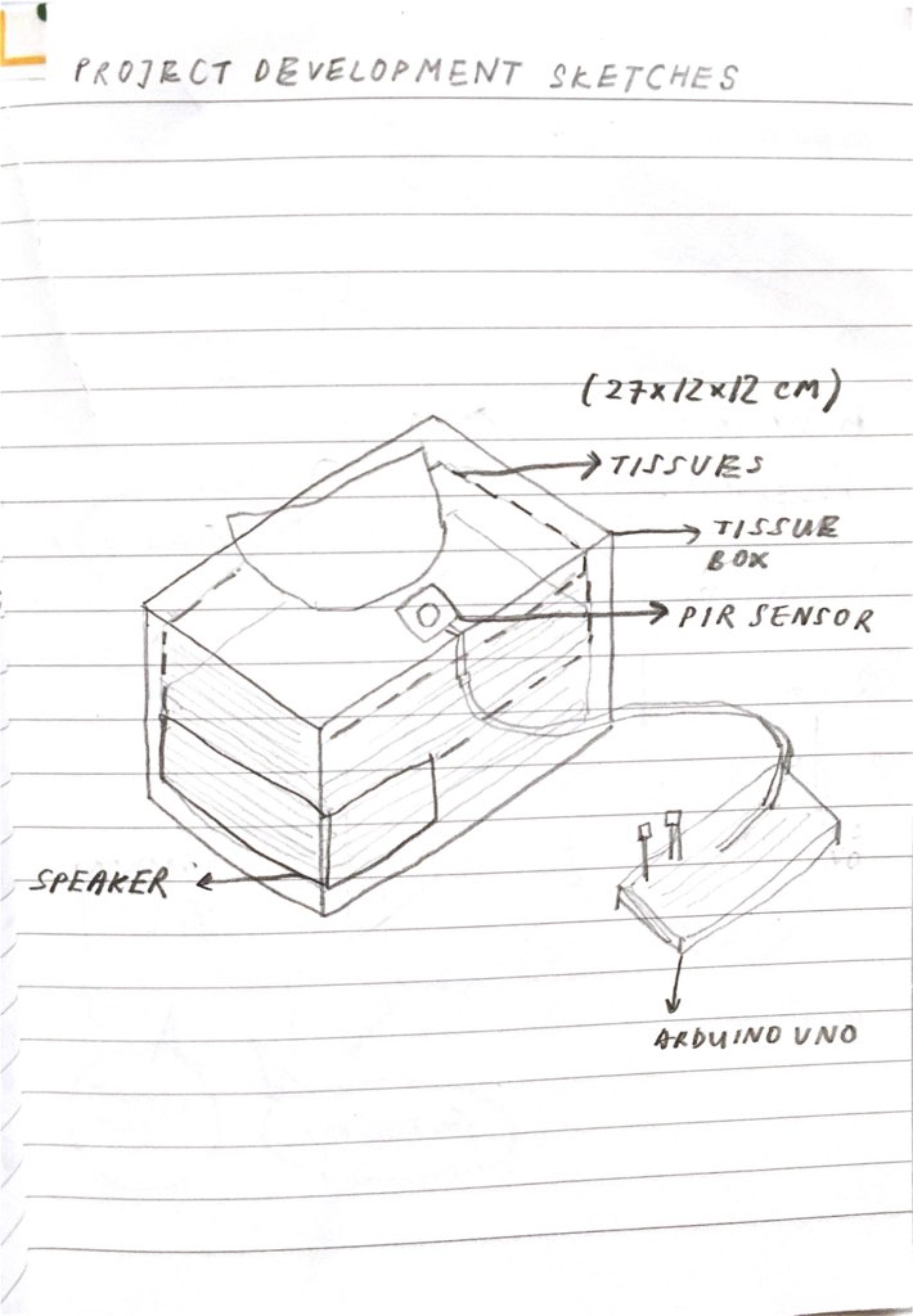
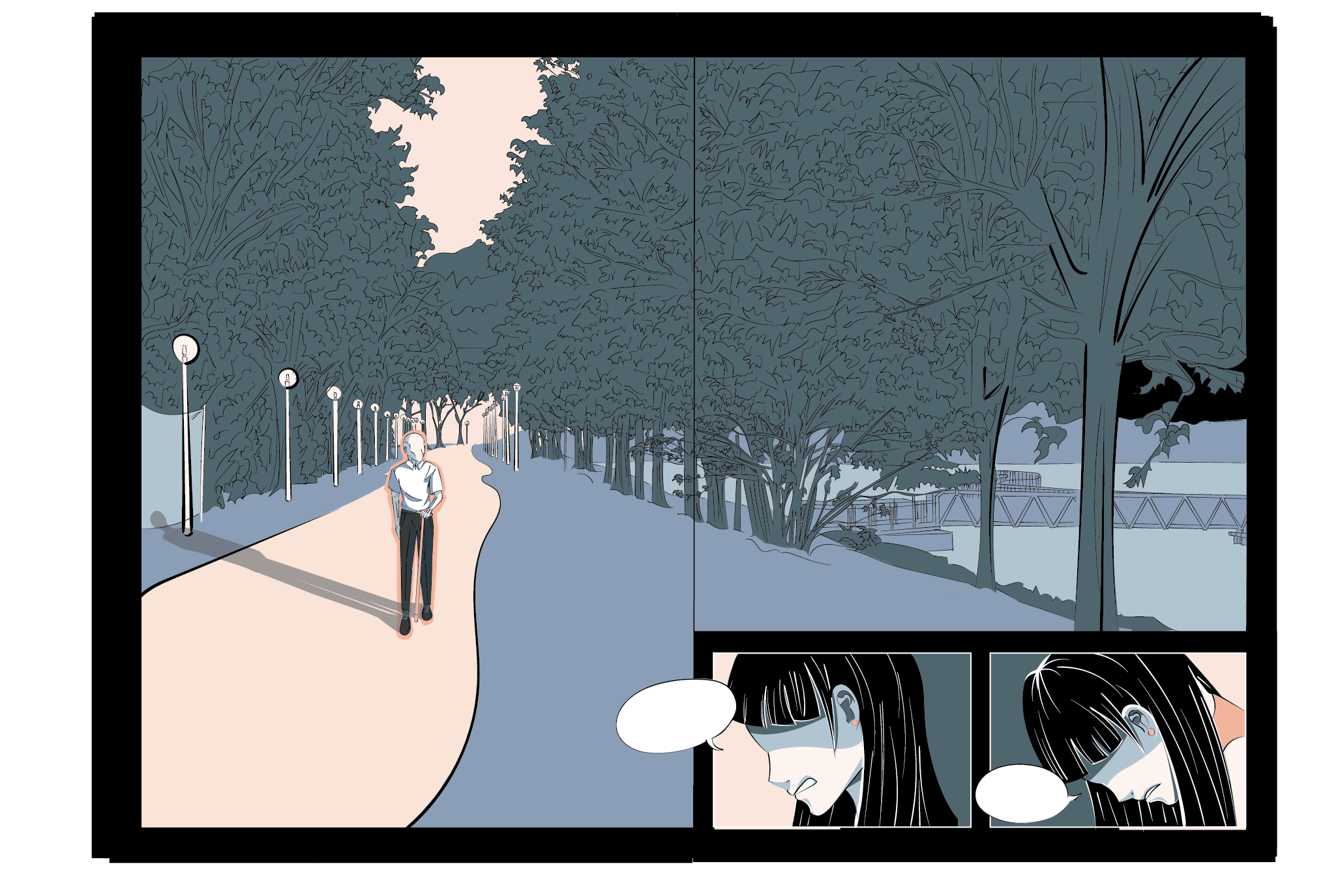
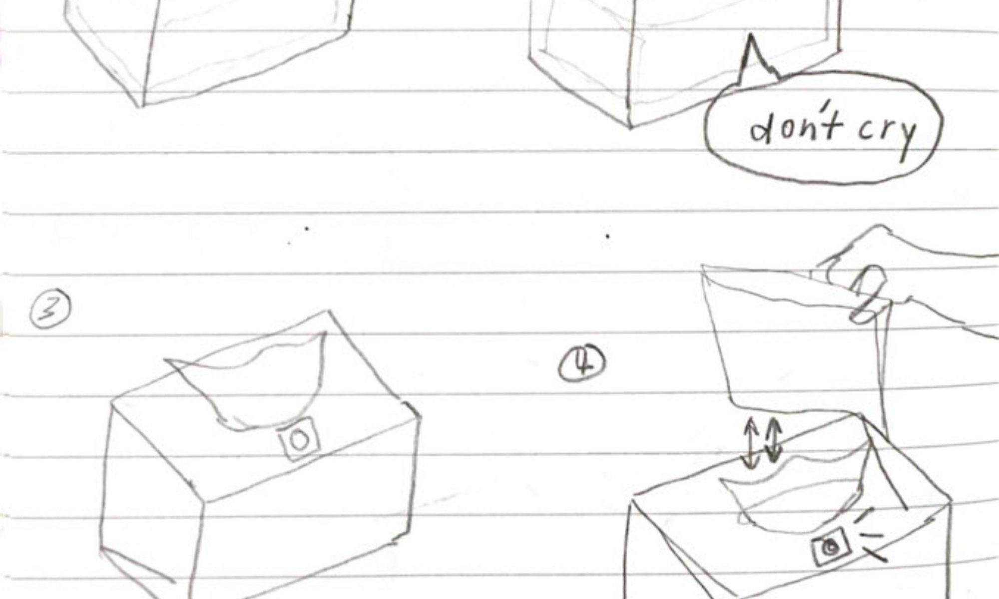
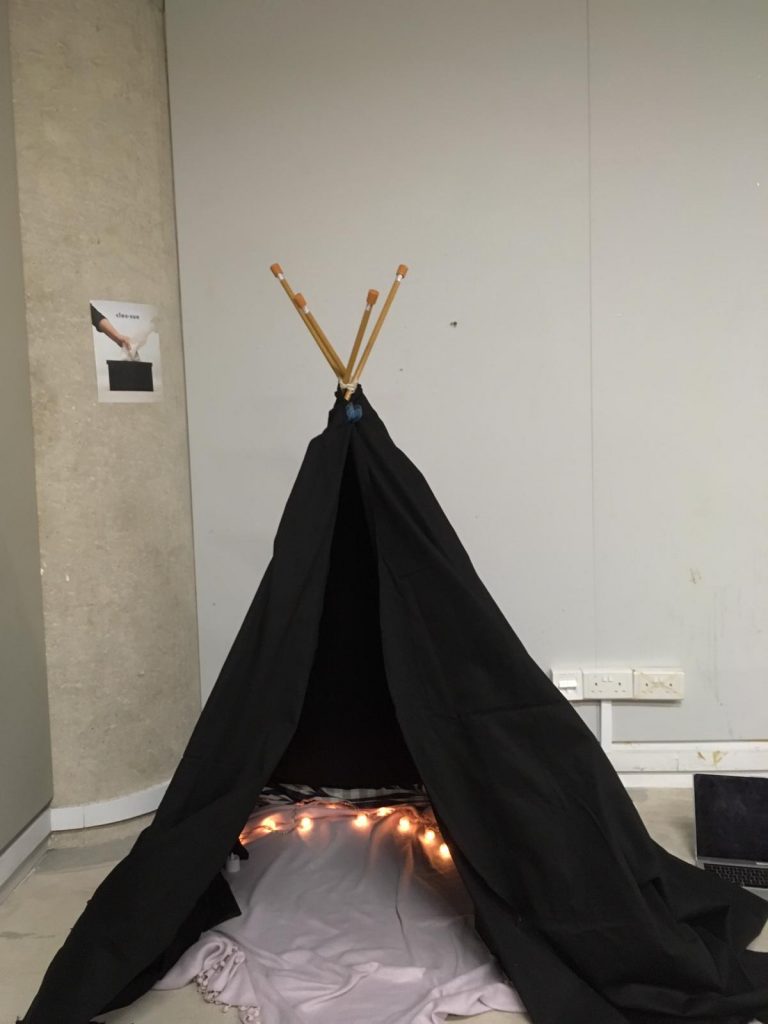
This was our bodystorming prototype and after the feedback gathered, we realised that we should create an environment for the audience to immerse themselves in in order to experience this project ideally as it is hard to get into a reflective/sad mood with just a tissue box. 

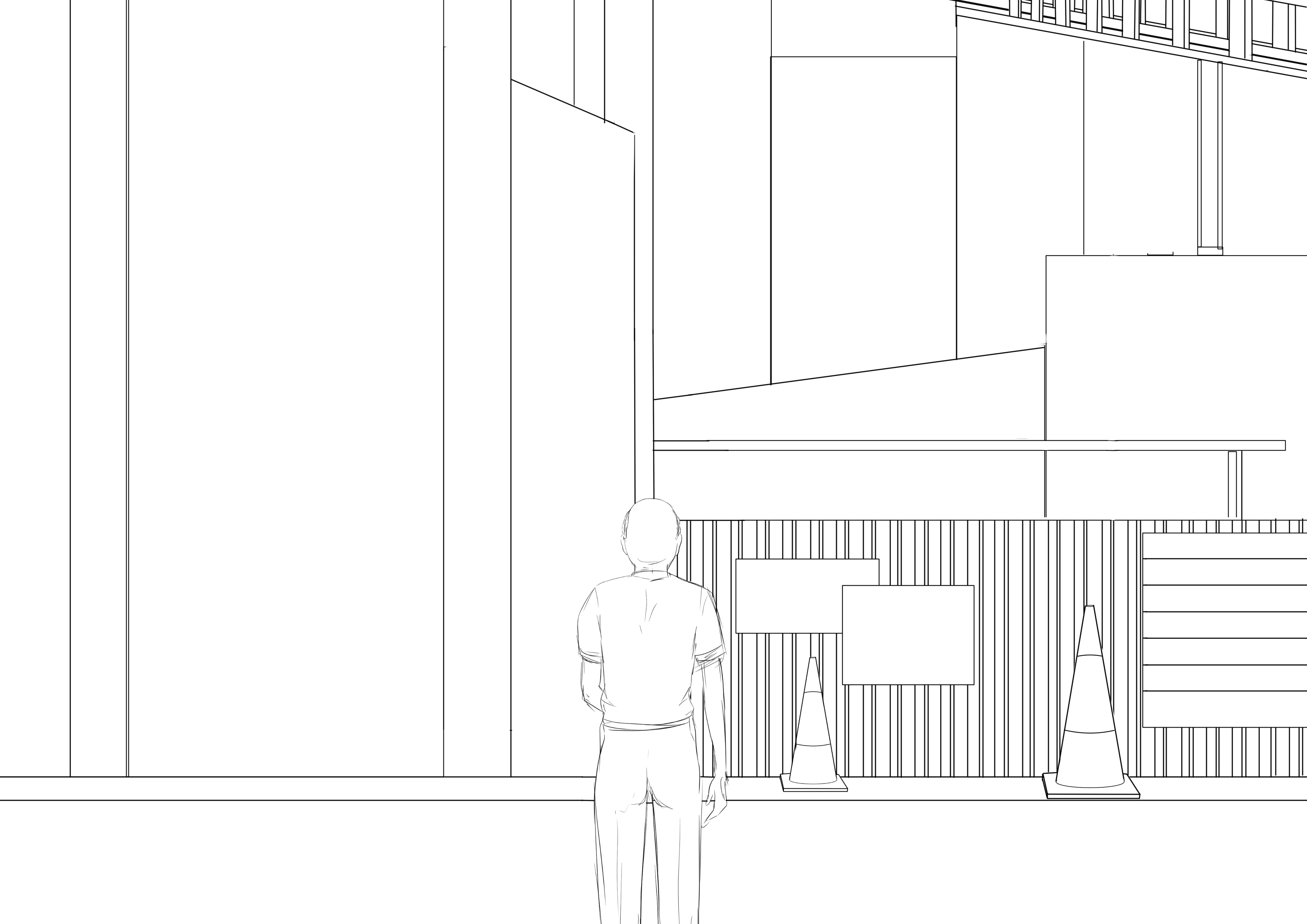
We decided to set up a private space.

We thought of giving the audience a scenario (and Lei asked us to do such that even those who hasn’t lost anybody can experience the box with the right mood) but instead of doing so, decided that we should market this as a product instead such that only those who have lost anybody would buy it which is what we envisioned it to be at first.

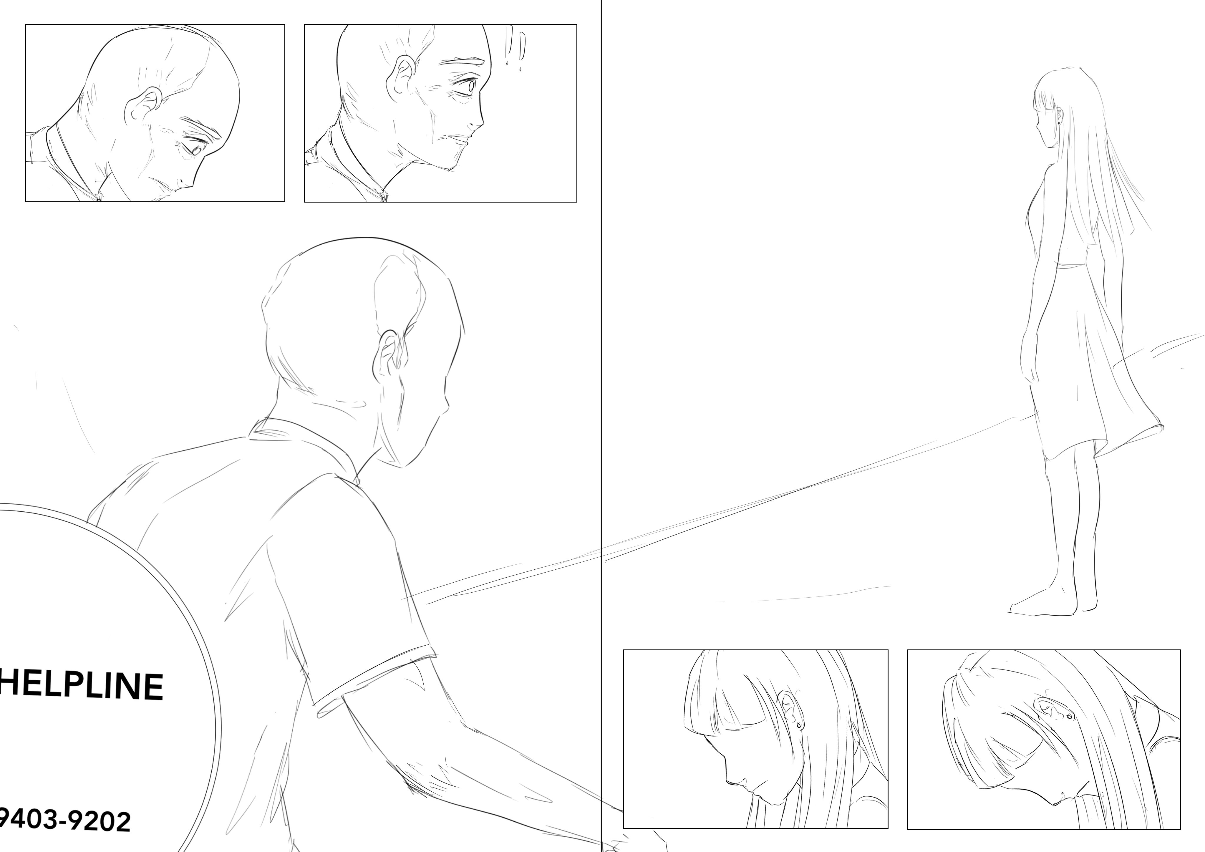
Hence, for the demonstration, there are instructions for those who have lost somebody and those who haven’t. And for those who haven’t, we gave them instructions to take tissues for somebody else whom they know have lost someone and mourn for their loss instead (to put them in the same reflective mood).

WHAT TO DO IF YOU HAVE LOST SOMEONE BEFORE:

  1. Imagine the person you lost and what you would like them to say to you.
  2. Enter tent. Sit comfortably.
  3. Take five pieces of tissue.
  4. Listen.
  5. Feel comforted and/or sad.
  6. Exit tent whenever.


WHAT TO DO IF YOU HAVEN’T:

  1. Someone around you, or someone you have heard of has probably
    lost someone dear to them. Think of them and the person they lost.
  2. Enter tent. Sit comfortably.
  3. Take five pieces of tissue.
  4. Listen.
  5. Mourn on behalf of the person you thought of.
  6. Exit tent whenever.

Stand-alone Video 

Password: hello

Instructables-style process document 

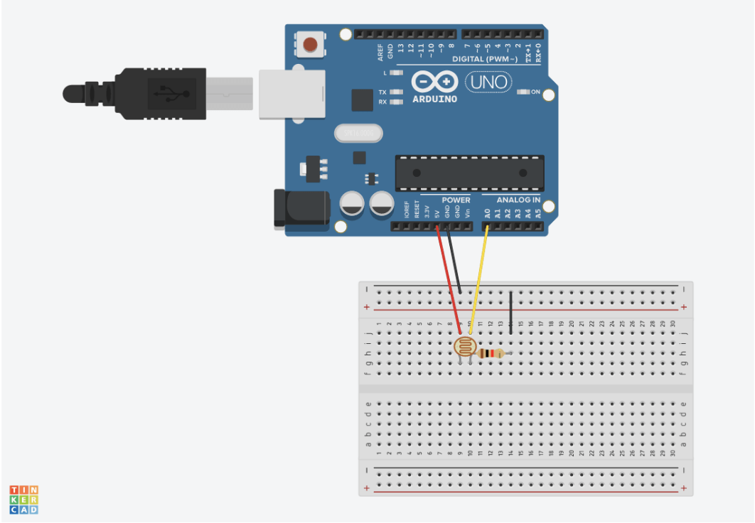
Step 1:  PARTS REQUIRED
This simple project can be done with minimal components. The parts list are given below

Arduino Uno – 1
LDR Sensor – 1
Breadboard – 1
Resistor 10k ohm – 1
Connecting Wires – 4
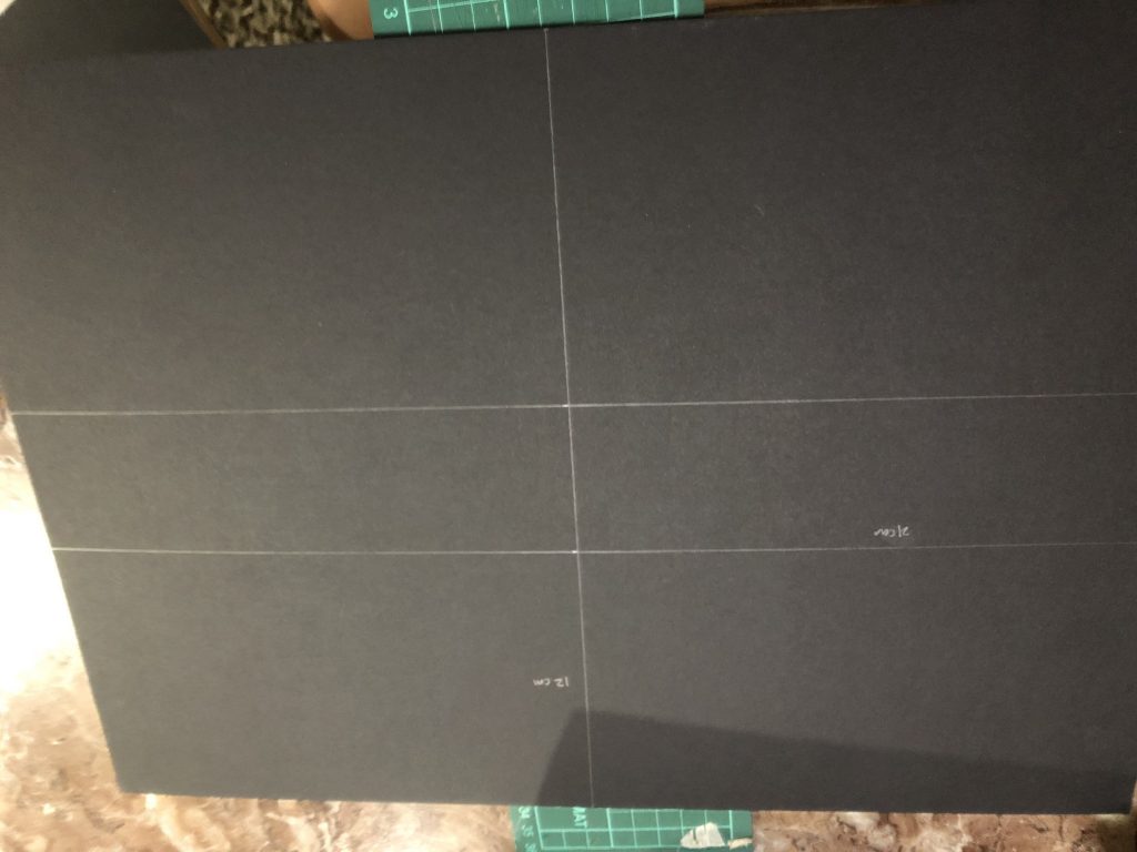
Step 2:  DESIGN

Measure out 4 (12 cm x 21 cm) board pieces and 2 (12 cm x 12 cm) board pieces

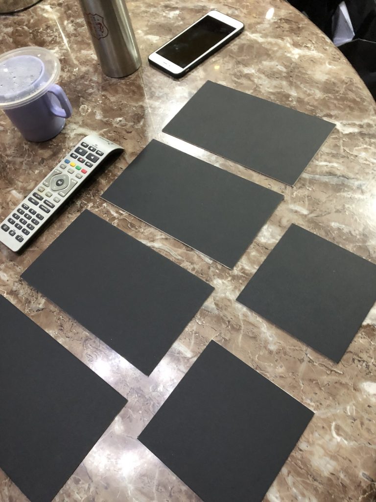
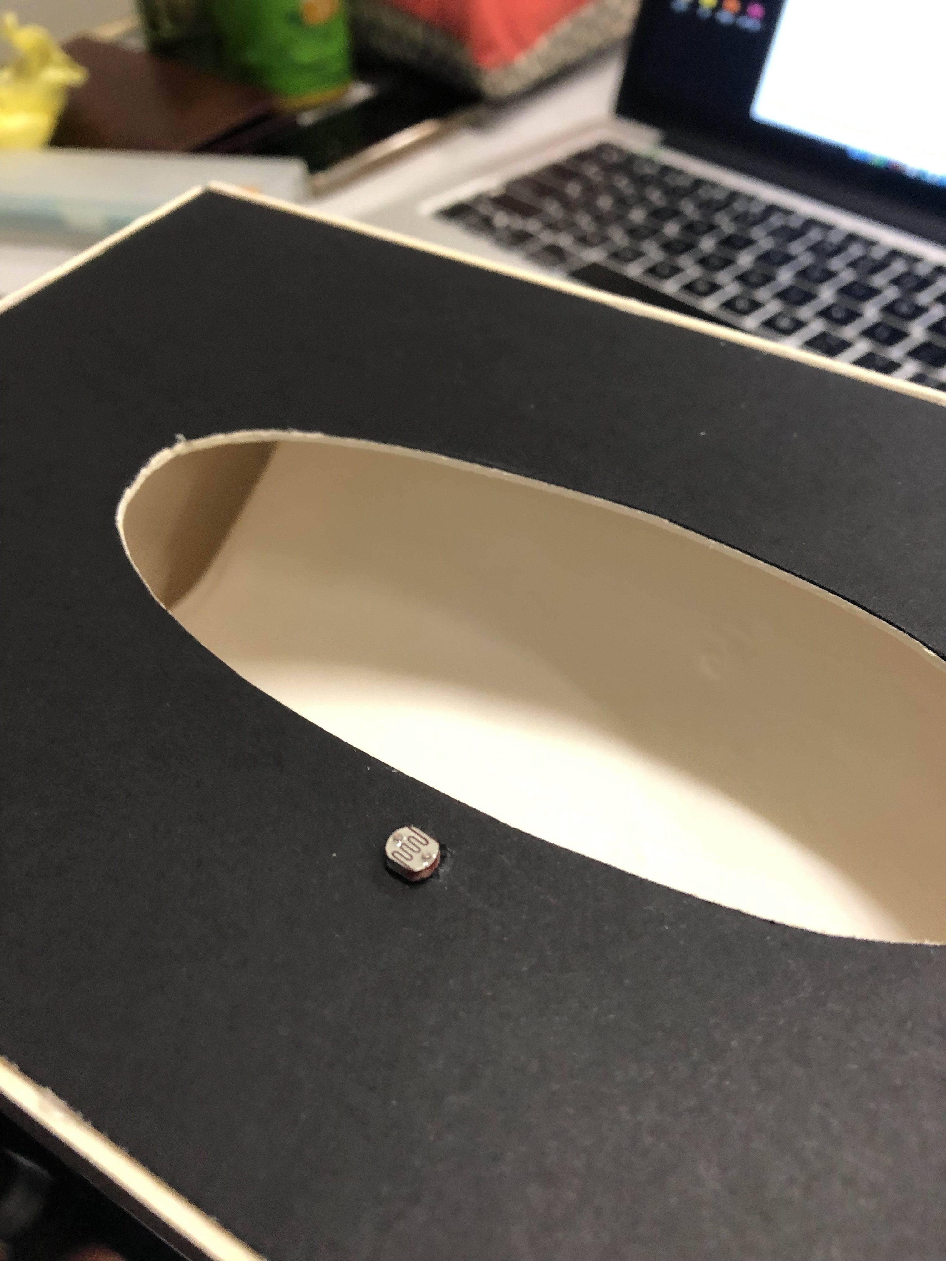
Step 3: Cut out a small 1 cm x 1 cm hole for the LDR sensor to pass through on one of the four bigger boards

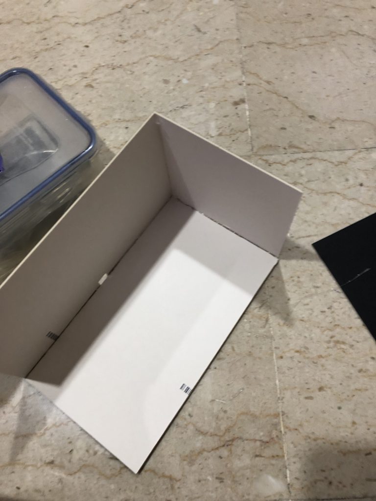
Step 4: Assemble the boards to form a cuboid using glue

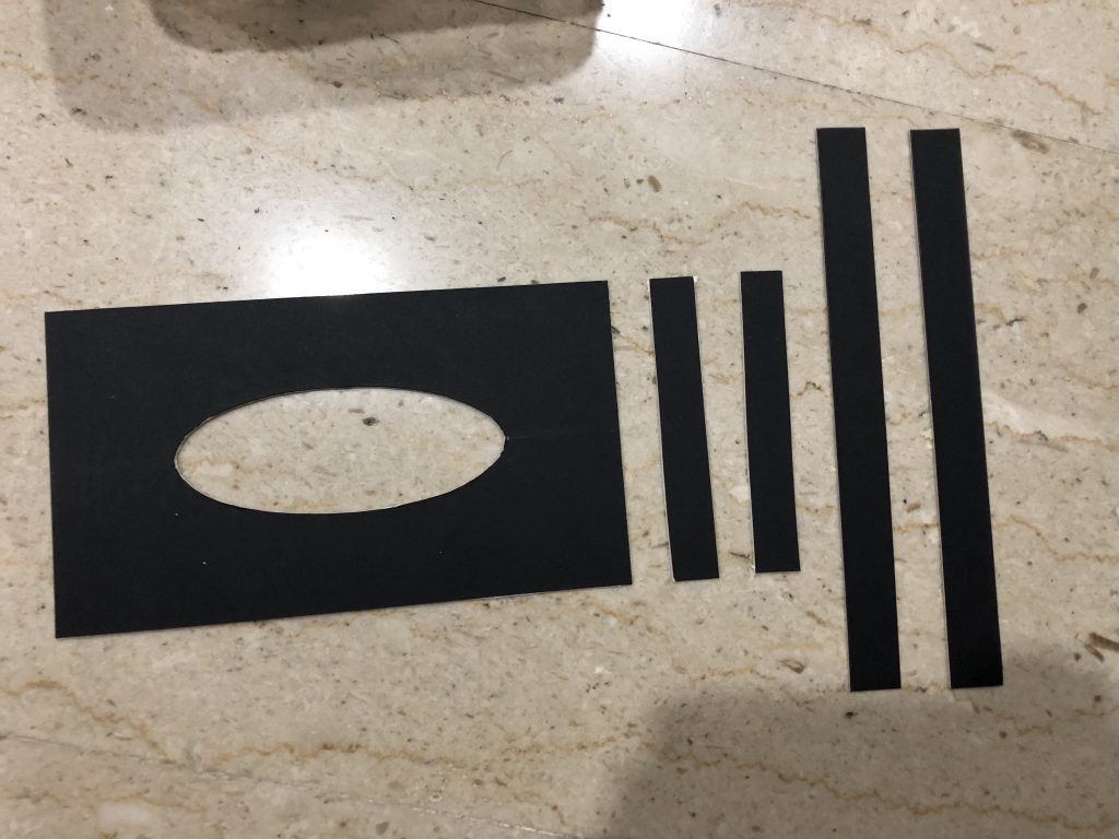
Step 5: For the cover, measure out 1 (12.7 cm x 21.7 cm) board piece for the body and 2 (22 cm x 1.6 cm) and 2 (12.7 cm x 1.6 cm) side pieces

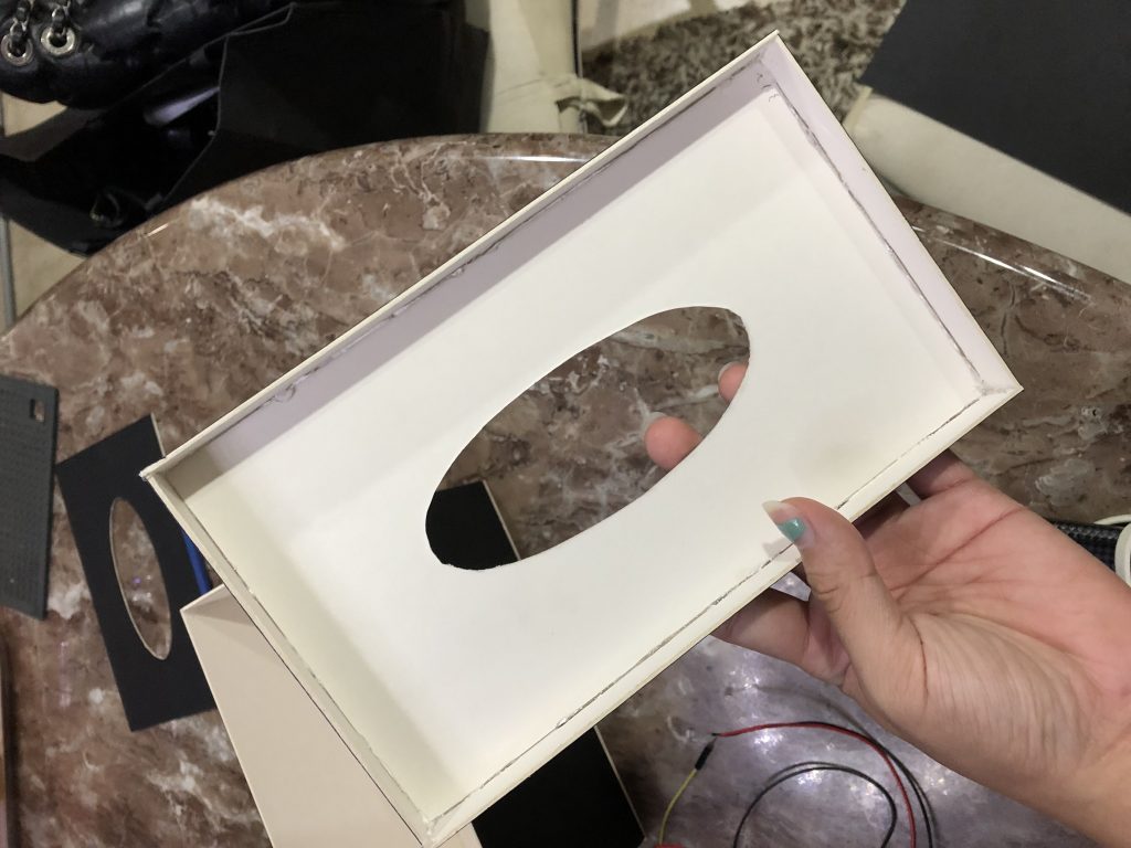
Step 6: Assemble them to form the cover with some glue

Step 7: Add tissues


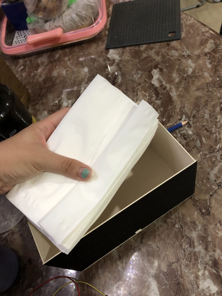
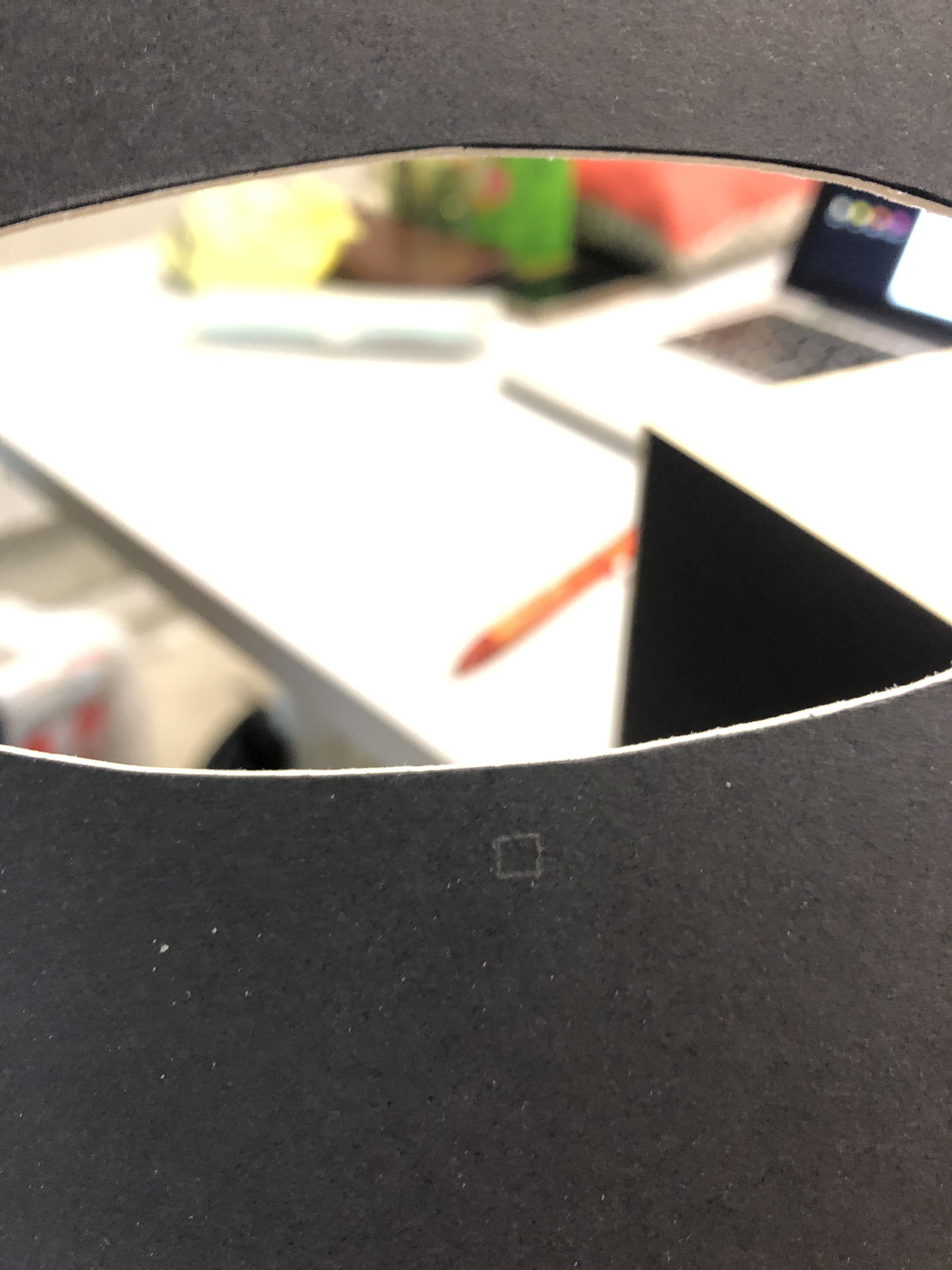
Step 8: Cut a small hole for the LDR sensor  on the cover (center of it near the edge of the opening)

Step 9: Put the LDR sensor through and pull it out from the other side

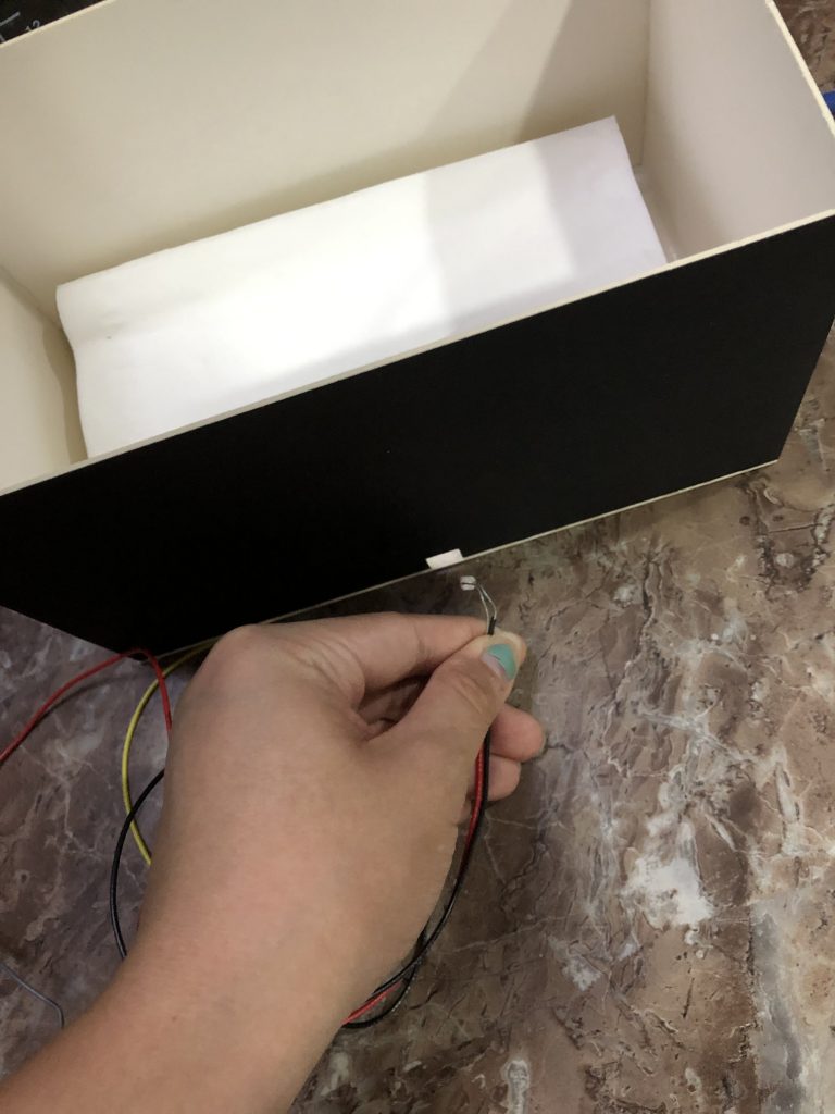
Step 10: push the photocell through the tiny hole on the cover

Step 11: Build Arduino circuit (one leg of the photocell is connected to 5V, the other is connected to A0, add the resistor to the leg of the photocell connected to A0 connect the other leg of the resistor to Ground)
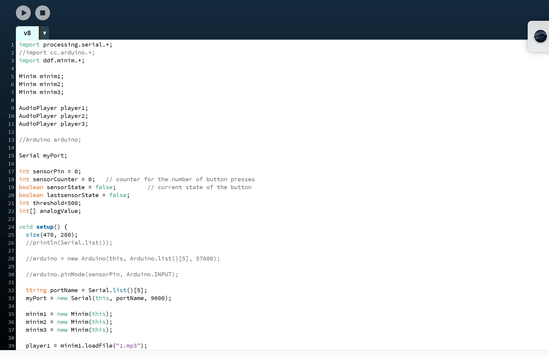
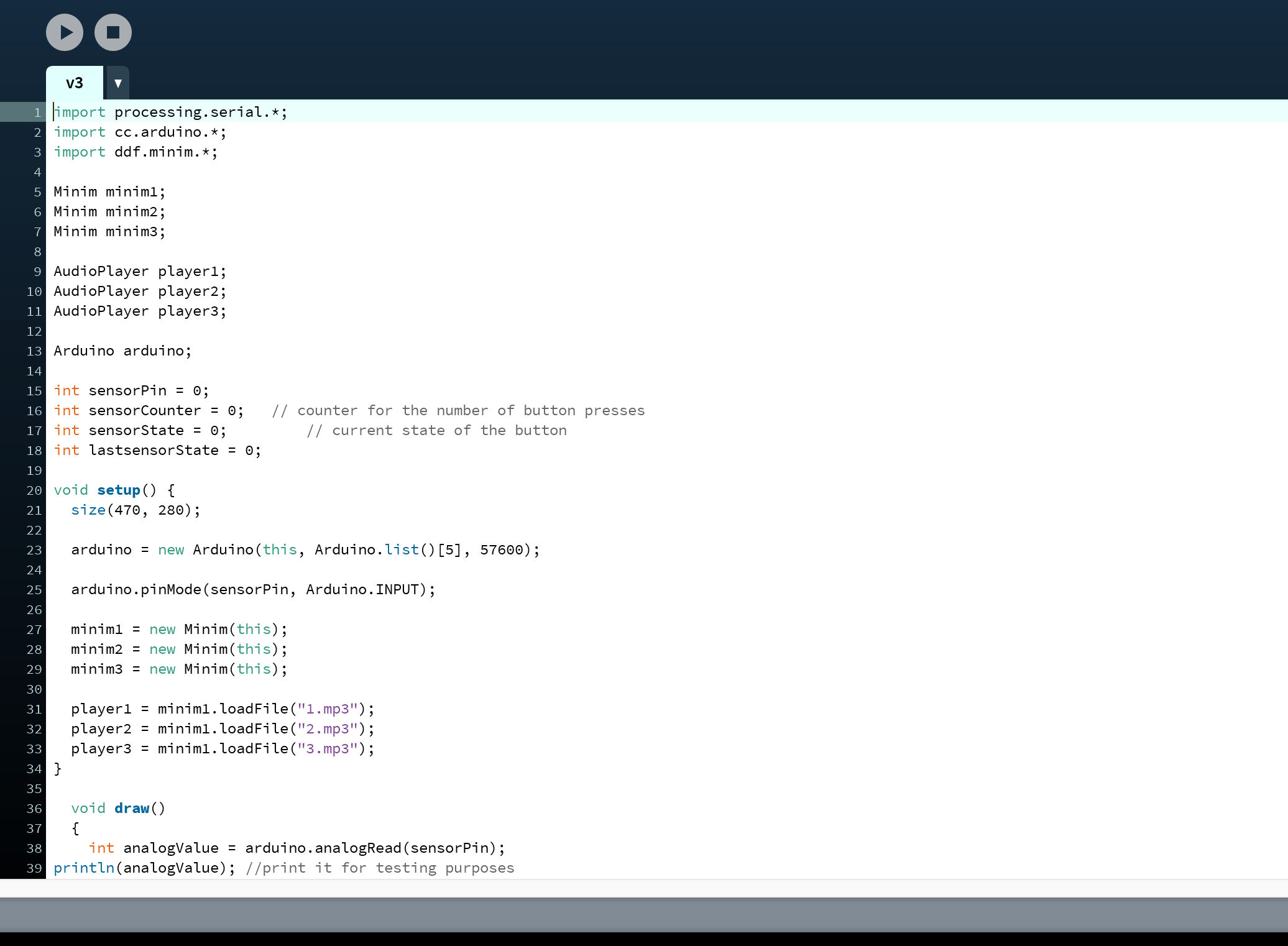
Step 3: CODING

Step 12: Insert this code into Arduino

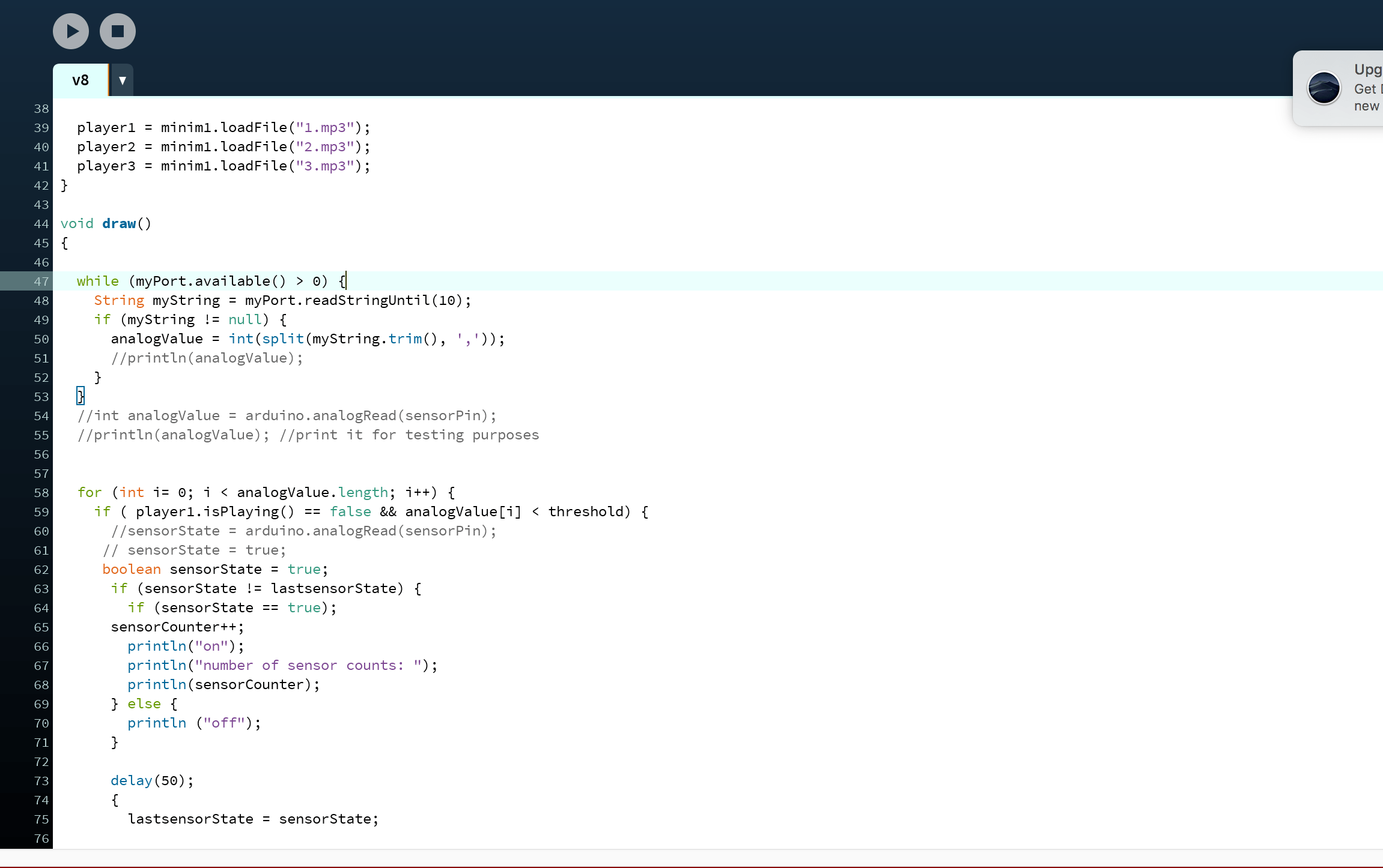
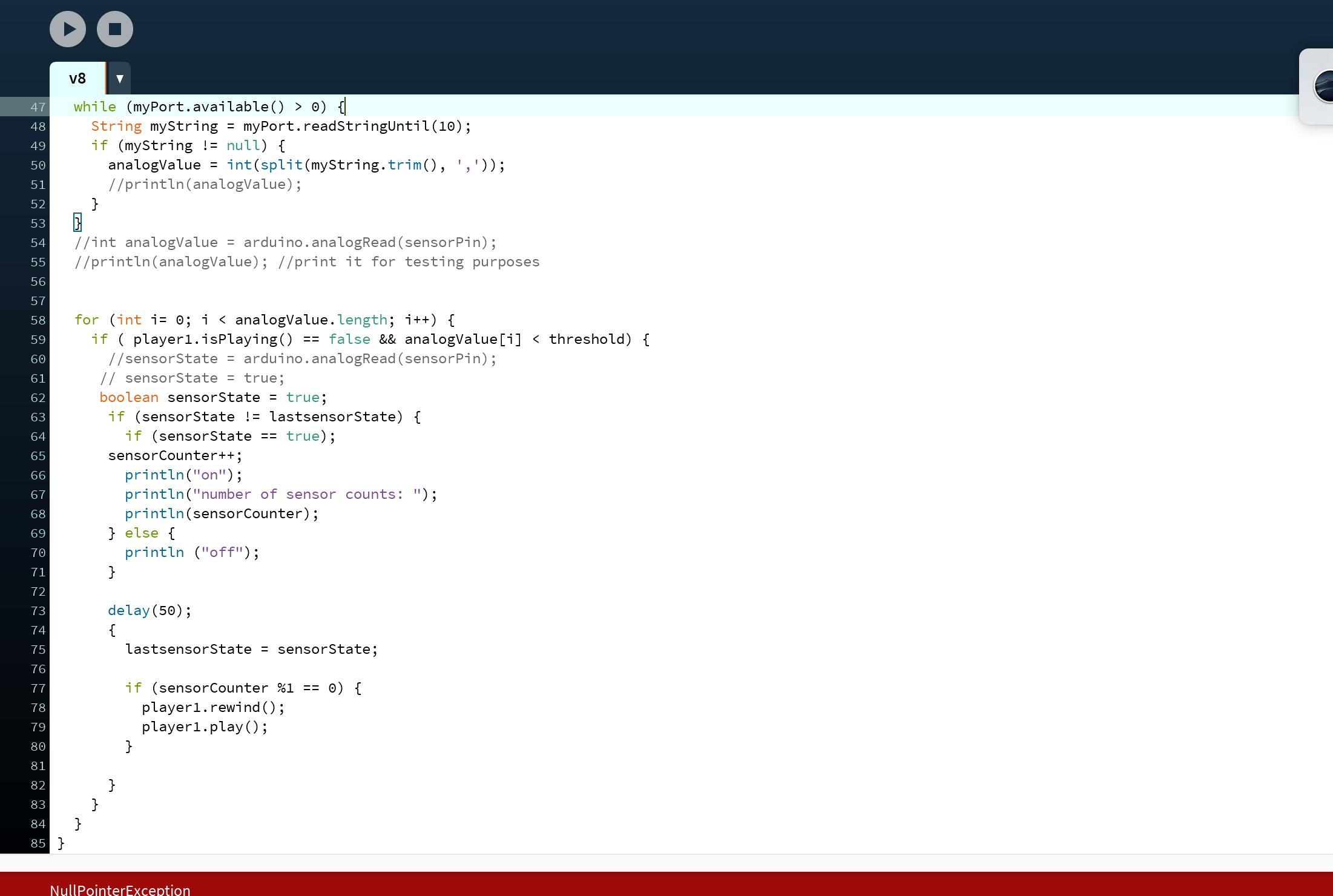
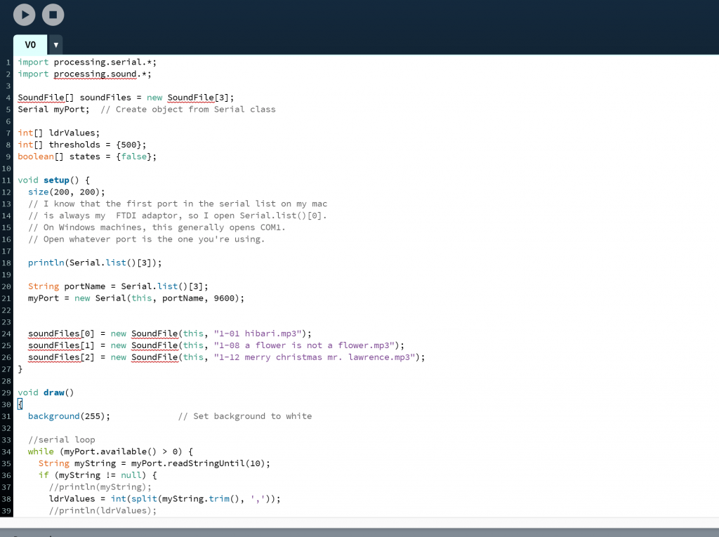
Step 13: Insert this code into Processing

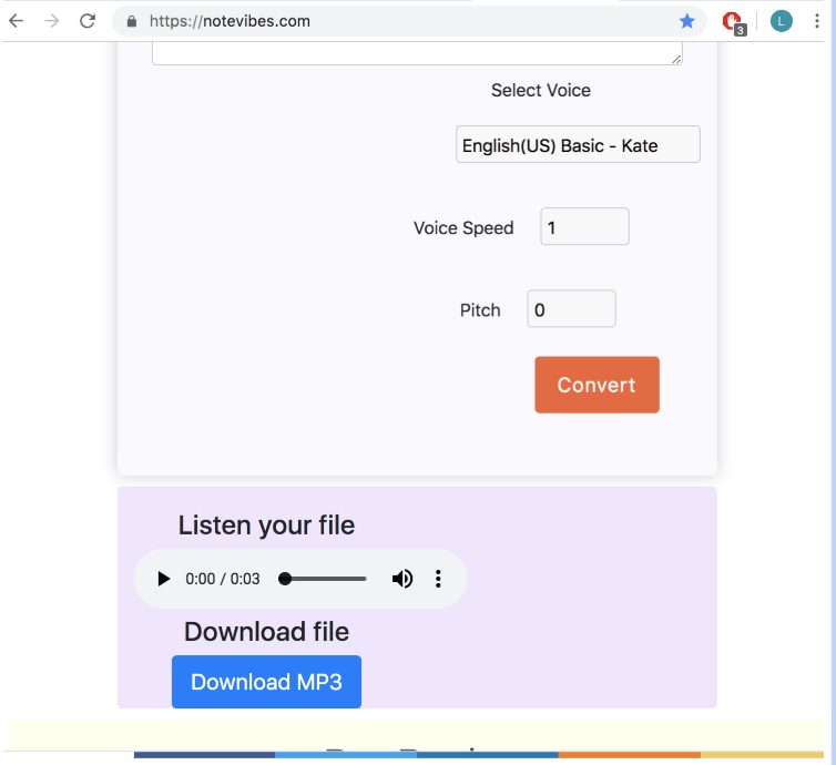
Step 14: Generate comforting messages sounded by robotic voices on: https://notevibes.com/

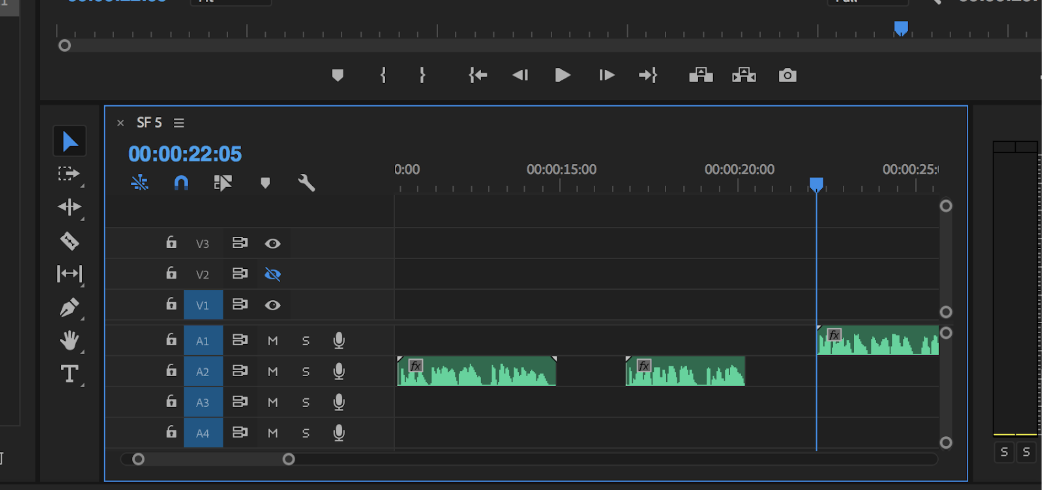
Step 15: Prep Sound files (edit and cut) and insert into processing file

Step 16: Sit in your bedroom, think about your lost one, cry a little, pull out some tissues and get some closure

Codes required + process: 
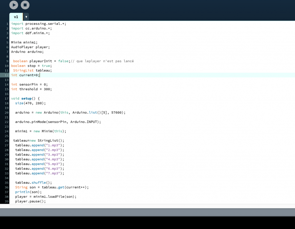
Arduino code used:

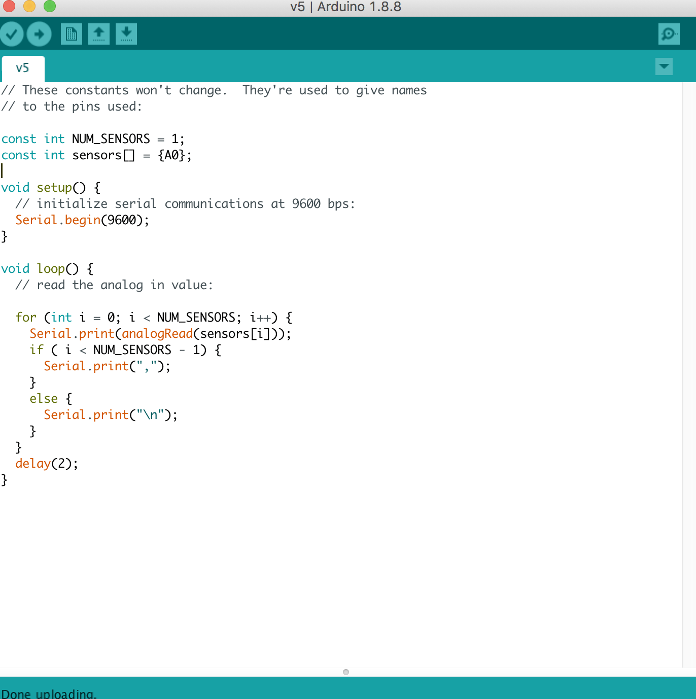
We found this code online and it was for a project with 5 sensors so we had to change it to 1 sensor and only A0.

The same project used this processing code but when we tried to adapt it, only when the hand hovers above the photocell, the sound is triggered and it cuts off when the hand is removed. It can only be triggered three times too.


Lei sent us a code too but it didn’t work for our project:

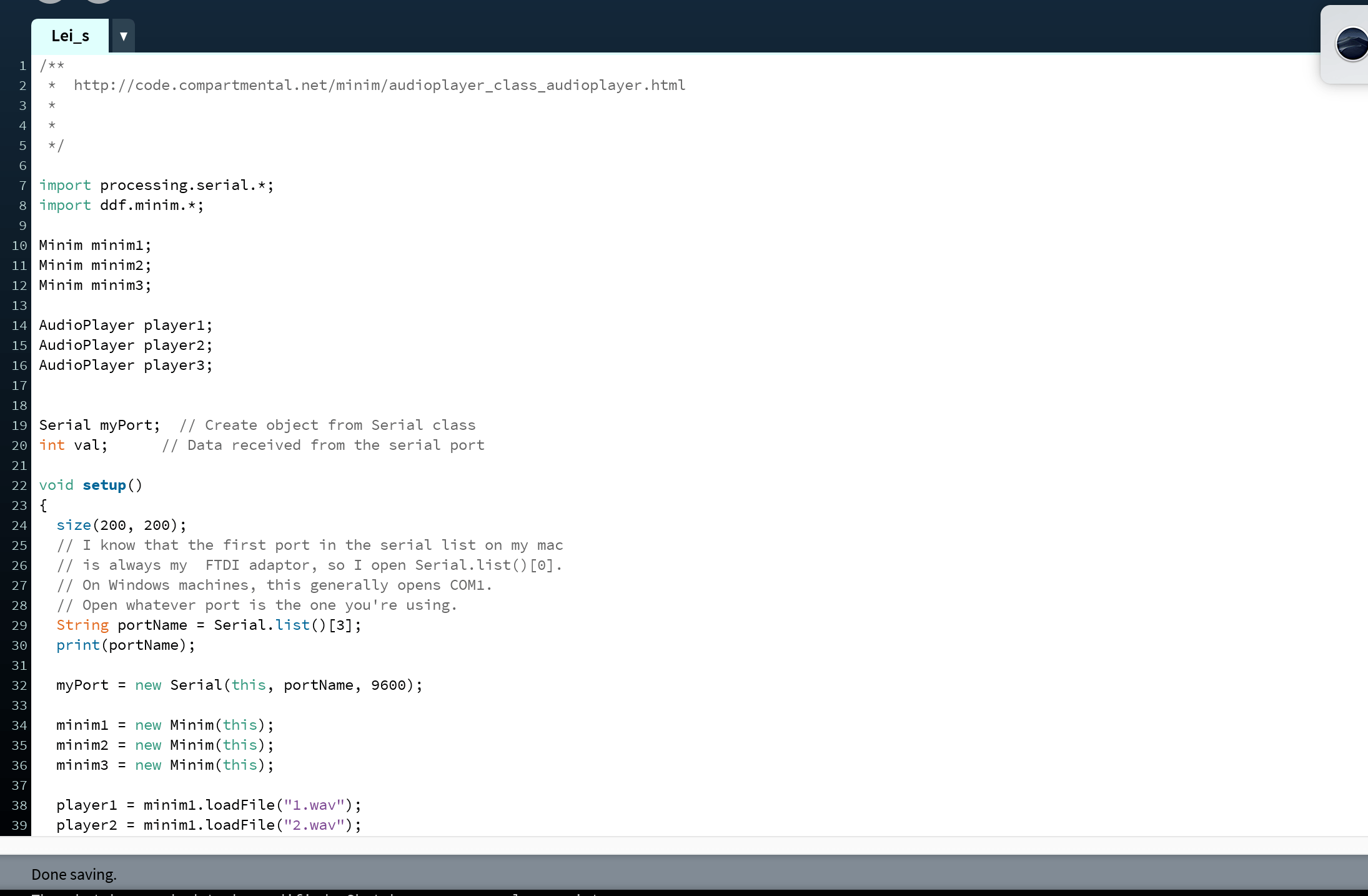
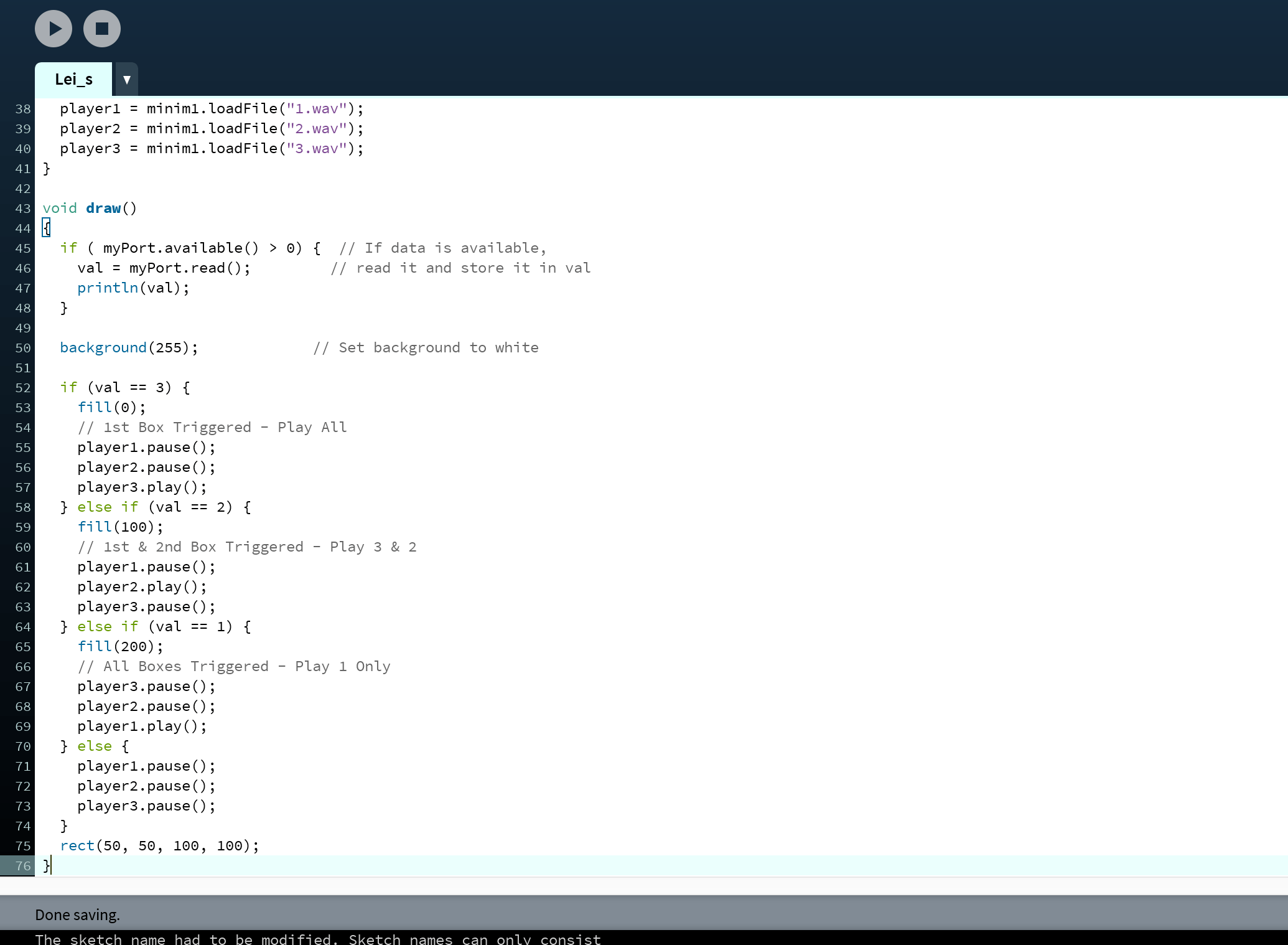
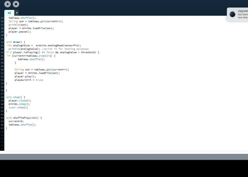
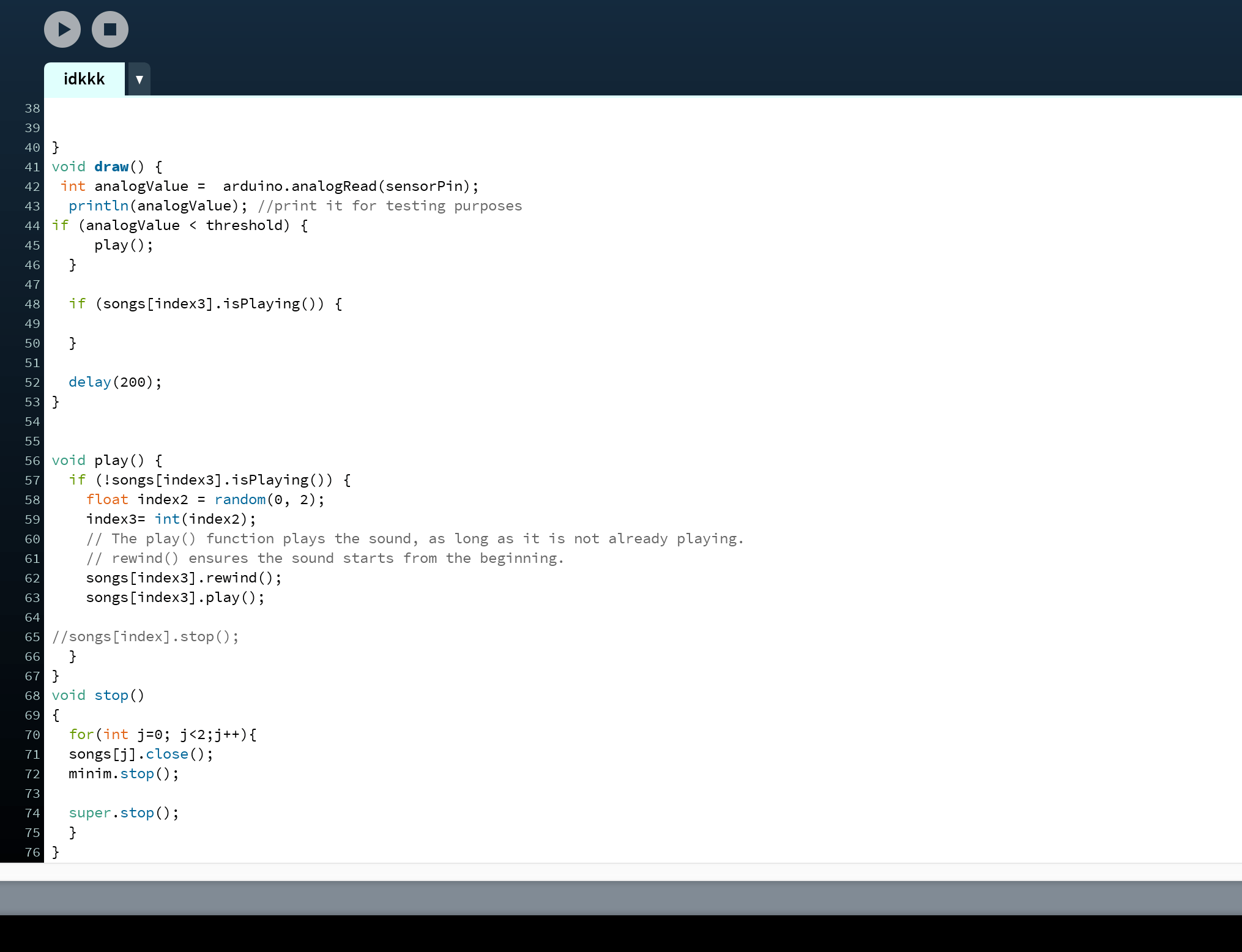
We tried to adapt it to ours by removing the parts of the code that deals with graphics and changing the void draw () part:

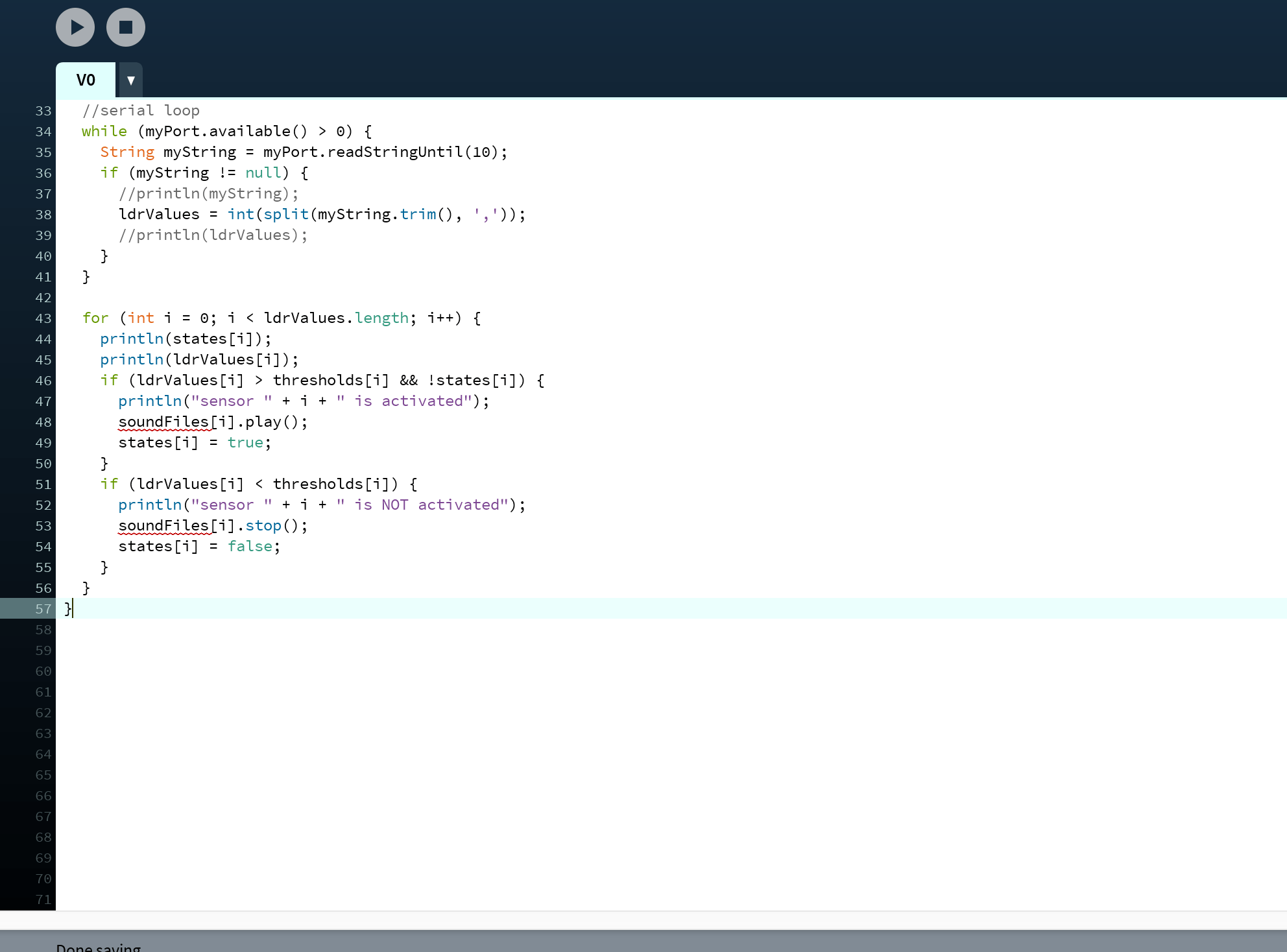
So that when the amount of light received is lower than threshold (meaning it’s being covered), the sound plays. It worked for only once or twice and did not anymore so we had to find other ways.

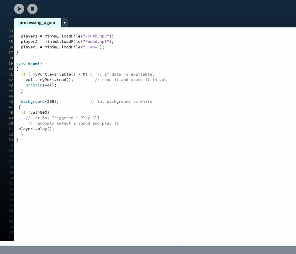
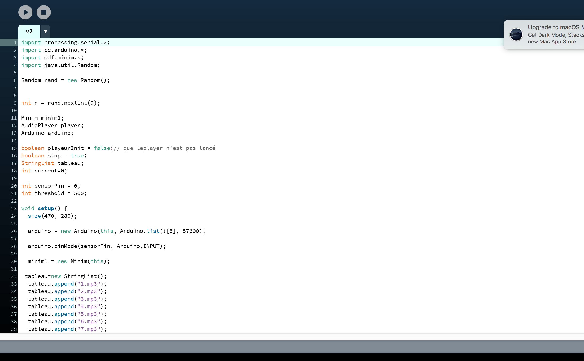
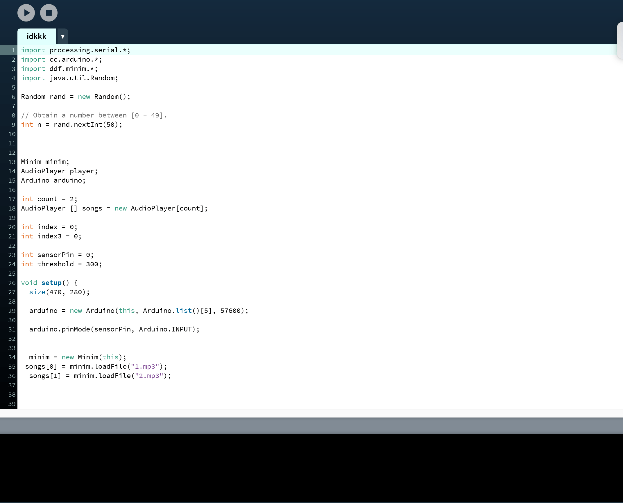
We found out that one can link processing directly to arduino boards through Firmata and using Cc. arduino for the code and we tried it out using a playlist and array.

The sounds only play through the playlist once and we thought that firmata actually worked at first but then realised that even without a hand covering it, the sound still played so the trigger does not work.

While we thought that firmata worked, we also managed to get only one sound to play instead of the entire playlist. The one random sound loops thought and we thought that a person can hit the stop button manually to prevent it from looping and the code will trigger another random sound but then we realised that even without triggering, it plays the sounds so this does not work too:


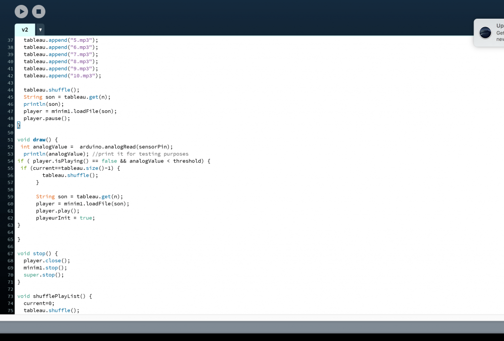
Lei pointed us to sensor counts and we needed to adapt the code for buttonpush counter for arduino into sensor counter for processing.

We tried using firmata too because we weren’t sure how to adapt the code from arduino to processing and firmata supposedly links the code from processing directly to the hardware so we got this:

But firmata is quite a lost cause so we abandoned it and Lei helped us adapt the code to processing without firmata and we got this:

The problem with this code though, is that the counter only counts the first time the sensor is covered and not the rest but the sound recording plays once through and only plays when it is sensed. In the end, Lei told us that it’s okay if it does not play consecutively and we can generate a single audio that is long and with pauses to mimic the sensor being not triggered.

Some other codes that were tried:

Personal Reflections:

I think that if given more time, we would have worked on the code more and come up with a working one. Nevertheless, we tried our best and were glad that the users didn’t realise that the code was a one-off trigger producing a long recording timed to mimic several triggers. This project made me realise that to do an installation, a lot of things has to be considered, particularly the universality of the subject/theme. As ours was designed specifically for a person who has been abandoned, it’s hard to adopt it into an installation as not all of the audience has been through such an experience and every experience differs. Even if one has experienced it, setting up a context to facilitate and draw out the emotions are vital to the success of the object.

This project also encouraged me to not always come up with ideas with the good in mind for that restricts creativity. Ours was aimed at first to facilitate loss and loneliness and make the person sadder after hearing words of comfort from that person who abandoned him/her but the final version of it provided closure and encouraged one to face reality. I think that even if we don’t design with good/practical intentions in mind, it’s a natural instinct for us as empathetic humans to head towards a good cause and the object designed in the end would eventually be something positive or value add to others even if it was designed to house negative emotions/purposes and that opened my eyes to the possibilities of design.


Graphic Form Project 2 Research and Process

The location I got was Bedok and these were some ideas at first:

  • Comparing old and new Bedok using traditional sketches vs. digital illustrations (as not many knows about Bedok’s rich history as a sea side Kampong area)
  • A narrative on suicide and the Elderly (as Bedok has the highest Elderly population and there were the many cases of suicide during 2011-2012)

After asking Mimi, she advised that I play on my strengths instead of trying to do traditional just to fit into the theme and that comparisons of past and future need not be done in a traditional vs digital way. I decided to go towards the narrative as I’ve always liked to tell stories and this is one that I feel rather attached to.

The narrative is simple but I wish it to be thought provoking: An old man comes out of his checkup worrying about death only to meet a suicidal woman at the resevoir and wonder, ‘who is closer to death?’

I was having troubles with the colours mostly as I wanted to differentiate mine from the previous Bedok’s zine. 

And I did some research on some potential colour schemes:

One artist that I really like and would wish to imitate his style is Avogado6

Illustration by Avogado6

I found his works to be very thought provoking using rather simple metaphors and motifs to put across a strong message and I was inspired by the first picture to use flowers/plants as a metaphor (will touch more on this). For the first picture especially too, I realised that I need not have super dark aesthetics to put across a deep message, sometimes a cleaner and calmer image that contrasts with the weight of the message can work too which inspired me to go towards ‘quieter’ visuals instead of loud ones.

With his use of spot colours, I also found ‘Emily the Strange’ which is a collection of stories and the illustrations have an iconic black and white with red colour scheme.

‘Emily the Strange’ cover page
‘Emily the Strange’ Cover page

The mood conveyed by these colours differ so much from those by Avogado6. They are darker and more mysterious and for fear of not being able to play with colours, I wanted to use this at first.

I also looked at some analogous colour schemes and with references. I looked more at analogous colours as I wanted to head towards a calmer overall visual and tone and analogous colours can make this happen + give a more sombre and quiet mood overall.

A. Green-blue and yellowish tones (analogous) 

Page from ‘The Few’ by Hayden Sherman

These are illustrations from a comic ‘The Few’ by writer Sean Lewis and artist Hayden Sherman. I looked up on Sherman’s works and he uses his signature blue-green and cream yellow tones very well. He also uses spot color red/pink and the complementary colours work well to bring certain things out (focus of the visuals).

B. Blue and Pinkish Tones (analogous)


Art by Bev Gelndining http://lgions.com/


Art by Bev Gelndining http://lgions.com/


The next scheme I saw was this pink and blue + purplish tones and I think that they convey a sense of loneliness well as blue is a colour related to ‘sadness’ and ‘calmness’ and pink has a softness to it that is welcoming. I’m not sure if this is a thing but the images above using this colour scheme conveys a sense of sadness and isolation too.

I was particularly inspired by artist Bev Glendining’s colours as she uses a lot of this scheme and her works have a sense of loneliness to them.

Another inspiration is freelance artist Choodraws (tumblr/instagram account)

Art by @Choodraws https://choodraws.tumblr.com/post/181911538358
Art by @Choodraws https://choodraws.tumblr.com/page/2

Who uses this scheme too but with simpler backgrounds and I feel that i incorporate the colours both into my characters as well as the Bedok landscape behidn them

So some experimentation with colours goes as below:

I used the colours mainly inspired by/taken from ‘The Few’ and I liked how it works though it gives an almost oppressing sense of sadness as the colours are dull and dull. I also felt that I wasn’t innovating much because I simply took the colours from him so I didn’t like it that much.

I do like the spot colours idea to highlight certain things though and I tried doing so with black and white too. This below has a very ‘Emily the Strange’ look.

It does give a cleaner feel but it feels very empty and a little lacking. I also thought that it might be too similar to the previous zine on Bedok that Mimi showed us.

SO, I decided to try the last pinkish bluish tones and i got these:

And I really like the colors that gives off a sense of serenity but sadness at the same time. I emailed Mimi and she said they work as well but i can select more pinkish instead of peachy tones.

And I tried to contrast lighter and stronger pinks and I like the overall feel they have.

Narrative wise,

I initially wanted to use motifs of construction (bedok has plenty of it) to represent the old man as i felt that construction=destruction and demolition which he can reflect upon on old age and the destruction of the body. But mimi pointed out that construction can mean life too and rebirth and renewal and we wanted to steer the story in the direction of him realising that old age does not =death but a new life (?) instead but I felt that that was trying to tell too much in 8 pages.

INitial drafts:

This was the initial cover page and I used Gestalt to rep the construction for the old man and waves for the lady. I like the juxtaposition too.

For the other pages: I initially showed Mimi this

And she said that the structure was too rigid and too traditional comics so she asked me to play more with the spreads and layouts (to occupy landscape with two pages).

After this, I went back and thought more of the narrative structure first and came up with a backbone:

1-cover, 2-3: him visiting Doc and contemplating on death after meeting some aunties talking about this old man who suddenly died although he was healthy and fine, 4-5: old man sees construction site and ponders about being ‘replaced’ and being a relic of the past, 6-7: old man sees lady and is shocked and 8: he wonders who is closer to death. 

These were sketches for pg 3-4 and 6-7


I tried to work with the spreads more and I think they were quite effective! Mimi also said that she didn’t see much of Bedok and I had to feature it so I did this

And I felt that I could play on symbols of plants instead of construction as that’s quite risky. So I thought of representing the old man as a huge old tree that is old but well rooted and the lady as a young flower but withering due to her spirit being broken.

This was the initial sketch I had in mind. And before the color schemes were decided I tried some orangey analogous just to convey the sombre mood and I liked how it turns out.

After decided the scheme and cleaning up the illustrations: i had some difficulty trying to bring across the symbolism:

These are some variations:

I tried to zoom in on the feet and roots and plants but they look too claustrophobic and I think I should capitalise on the resevoir landscape haha

so I tried using colors too and they look okay but i think they were too distracting and you will not immediately link the man and the tree and the girl and the flowers.

I initially wanted more flowers to represent those who suicided too (around 6-8) but they would be too confusing so:

I changed them into silhouttes and connectig the flower to the girl’s feet.

I was afraid that it’s not strong enough so I decided to zoom in on the withering flower and use words to direct attention to it: Even the young ones wither so quickly so you immediately link the plants to the people metaphorically.


So getting rid of the construction motif, I got to focus more on the greenery:

Initially wanted to use the below scenery but felt that the angle was more appropriate for pg 67 so I zoomed in and cleared some trees for 67 and changed the scenery of 45 to a lane so i can put the old man walking there hahha

I also had trouble trying to feature him in the resevoir so initially i had the idea of using a bench with him alone (and not showing his face and focusing on the empty spot between him to emphasise on his loneliness and his friends who have all left). But the bench didn’t work as well and after changing the scenery, i felt that the old man walkign alone with a long shadow behind suggests quite the same and has a sense of isolation too.

I also wanted to justapose him and the girl by giving her a close-up to emphasise on how when she’s suicidal, she gives looking inside to herself and not outside but the old man looks outside and feels sad because of that. So there’s the difference between them.

INitially for pg 2 and 3 I felt that i crowded it too much

I wanted to do not a basic layout so I put the doctor in a small box but that’s too confusing. After some thought, i realised that this page contrasts with the other pages in terms of space usage and i think it brings across a rather claustrophobic feels like the old man is too drowned out by all these information and i think that that reflects his state well as compared to when he goes to the resevoir later where he has more space to relax and think and the sparing use of panels on pages 4567 conveys so.

For the last page (and I’m so not organised I’m so sorry), this was my initial draft and Mimi said that I could put her smaller to justapose her to the outside world and feature the resevoir more so I found a picture with a perfect angle (thank the lords)

This is with the spot colours scheme but I opted for the below scheme instead.

I placed her smaller and highlighted the life buoy same color as her to put a connection between the as life buoy=symbolism of help and perhaps she’s crying for help silently too.

For the cover page, i didn’t know what to do now without the gestalt so I wanted to use their heads too but I put them with clocks instead but it looked super creepy so

SO I did a simpler flower one but mimi said that there were no associations to death so I decided to experiment with hourglasses and this was the main idea to juxtapose the amount of time they have left

Then irealised that sand in hourglass can serve as soil so i planted’ their respective motives into the sand and justaposed that!

I also added a middle hourglass to show like a ‘constant’ like the norm and highlight the sand of the other two as the spot color i used for the other panels to highlight the characters.

as be seen from the above, at first my drafts had a black border and a black cover:

but the printing resulted in misalignment that is hard to ignore with the black borders:

This border is clearly thinner than

The border on the previous page and it is a spread so it’s hard to ignore 🙁 i tried two printing shops and both gave the same and the aunties say that it’s almost impossible to try and get the borders right so…

I decided to get rid of it and change my cover to pinkish background so that it fits more with the rest!

Overall, it’s been really fulfilling and fun and i do think that i could have looked at other styles more but i felt that i’ve done that for the previous project alot and for this i wanted my illustration style to show through more so i referenced color schemes and motifs instead! I had a lot of fun too:) thank you!


Project Development Body Storming

Pictures: 

Video:

What did you learn from the process?

QW: We learnt that setting the context up for our object is very important. If we do not have an isolated set-up/scenario that leads our audience into a gloomy mood, they may take the object as a laughing matter and pull out the tissues just to see how the mechanical voice sounds and what it will say. Hence, we need to give the audience more time and space to get into the right frame of mind so that they can treat our object seriously.

ZK: Before Body Storming, I thought that our object was pretty straightforward in terms of concept and interactivity, but afterwards, I realised that we needed to provide context / curate the environment around our object in order for people to truly understand and empathise with it. On the other hand, some people may not be able to empathise with our work because they have not lost someone.

What surprised you while going through the process?

QW: Even though our tester pulled out more tissues subsequently to see what the box will say, we were surprised that there was the desire to hear more and if we set up a right context, we believe that we can get the audience to pull out the tissues not because they just wanted to tease the box but because they really desired comfort.

We also realised that since a tissue will replace another tissue when one is being pulled out, we cannot use an IR sensor (which we were planning to) since a tissue will always interrupt the laser and cause it to constantly trigger the sound.

Because we didn’t have actual tissues for the session, we used toilet paper and that made the object easier to be taken as a comical one so we now know to be more careful about the materials used.

ZK: I was mostly surprised that the type of tissue used would affect how our tester perceived our work (Man Wei felt that toilet paper wasn’t sad at all and instead reminded her of the toilet).

  1. How can your apply what you have discovered to the designing of your installation?

QW: We plan to set up a context and isolate the audience using a tent and with a more cosy setting (blanket, pillow etc.) so as to give them time to explore their own emotions and interact with our object in a right frame of mind.

We plan to use a photocell that pops out from the opening instead to trigger the sound so that every time a person reaches for the tissue, the recording plays.

ZK: If possible, the tent would mimic a bedroom, or at least an incredibly intimate space, as that is where most people cry / use tissues! We could also play soft, low frequency music that’s kinda like those you hear in art galleries / installations. Personally, I feel that that kind of sound helps to immerse me if the installation is supposed to be a reflective / meditative experience.

We will also dress up the tissue box, and maybe use fancy tissue paper (heavier gsm, patterned) to add to the whole experience.

Project Development Drawings

Team: Lee Qiu Wen, Goh Sze Kei 

Development Sketches: 

  1. How does your audience experience your project?

Let’s take the audience as the person who has been abandoned. With every tissue that the audience pulls out from the tissue box (our object), a different sound recording plays. The sound recordings are not words of loath or despise but of comfort instead.

  1. Is it for a single person to engage with your project or for multiple participants concurrently?

It is for a single person to engage with at a time.

  1. What is the interaction or situation you are creating for your audience?

Our audience has just been abandoned by a loved one and requires/desires comfort to ease their sadness. Our object does so but in a mechanical voice reminding them of the loved one’s absence instead, hence facilitating feelings of emptiness and loneliness.

  1. What is the intention of this interaction?

After being abandoned, one may possibly shut oneself out and the words of comfort from friends and family may fall on deaf ears. A tissue box represents the audience’s desire for comfort/need to be comforted as crying is a sign of struggle and crying aloud can be taken as a call for help. The mechanical voice—meant to substitute that of the loved one—and the recordings remind the audience that the comfort they desire from the loved cannot be attained for he/her has left. The lack of tone and human presence in the voice emphasises this, hence forcing them to face harsh reality of the loved one’s absence. We hope this also encourages/reminds them to seek/accept comfort from the friends and family around them instead and to cherish the presence of present companions instead of lingering over a lost love.