
For the first lesson, I experimented with some mark making tools. However, I went home and decided to do some conceptualisation before making the marks instead of making the marks first then matching them with emotions as I feel that doing this can express my emotions more.
General Idea (from initial conceptualisation): Emotions
Joy-hope
Anger-outrage
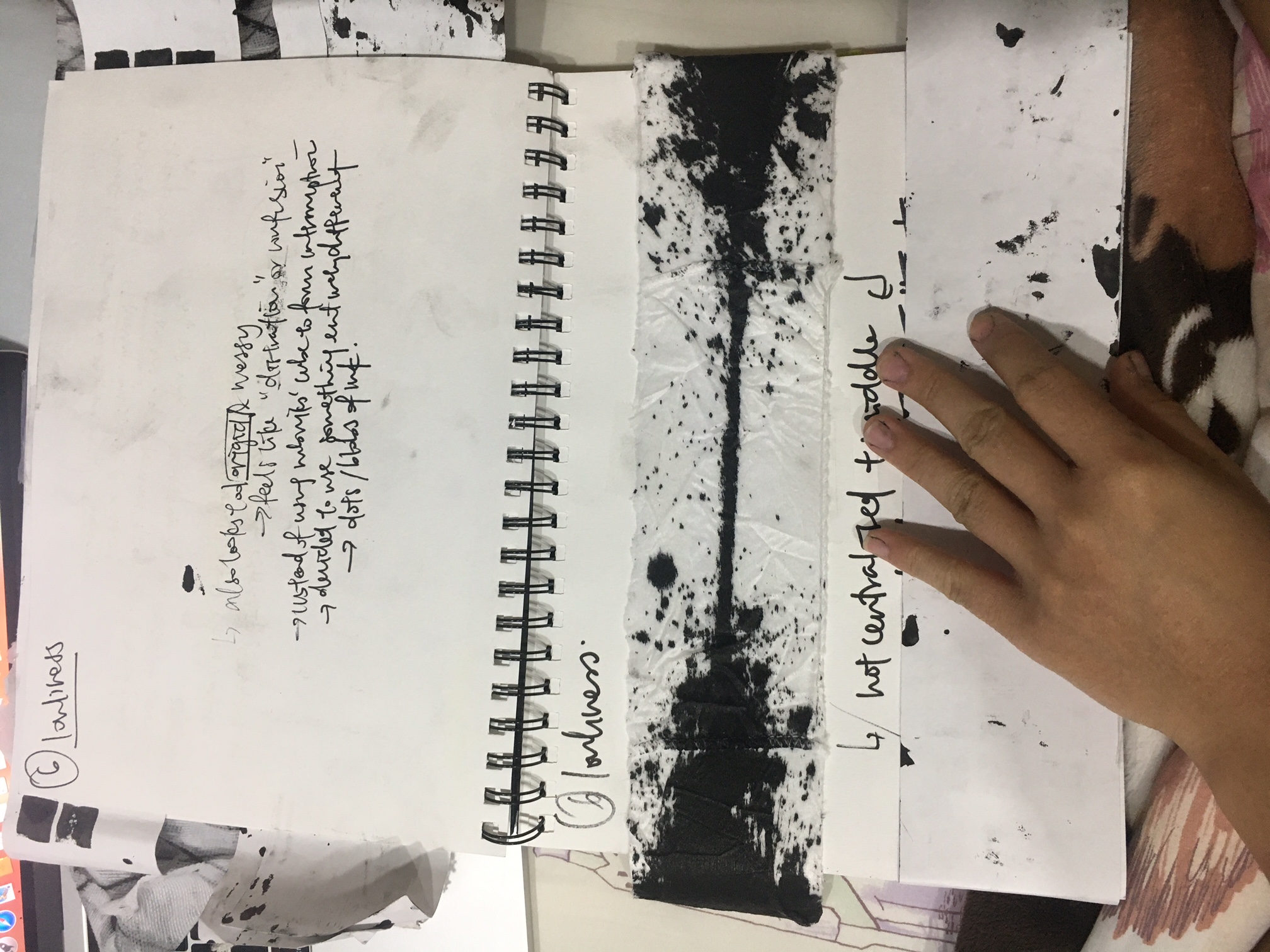
Sadness-loneliness
Surprise
Fear-Anxiety
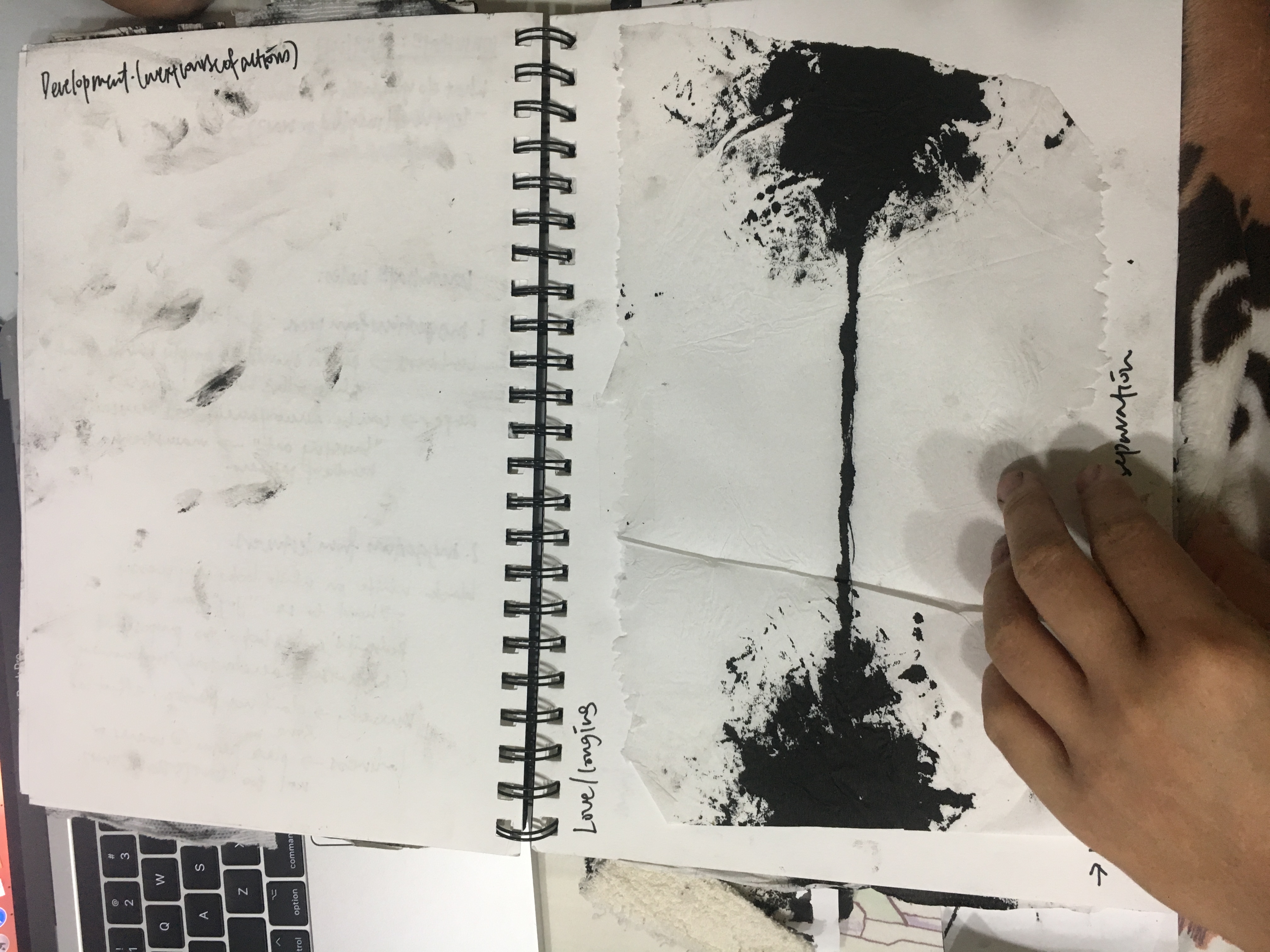
Love-Longing
For hope, I wanted to do white on black as I felt that it represents light in darkness.
For loneliness, I wanted to do either a ‘I vs. the world’ (ostracisation) or a ‘I am surrounded by people yet I feel lonely’ kind of idea.
For anxiety, I wanted to bring out the suffocation that I feel whenever I have a panic attack.
For Longing, I wanted to bring out the idea of that someone having been there and now not anymore (the lingering traces of a person who has departed from your life) as well as the attempts at sustaining a connection or reconnecting.
For anger, I wanted to convey the idea of holding it in then outbursting (calm before the storm yet the anger released will engulf your rationality).
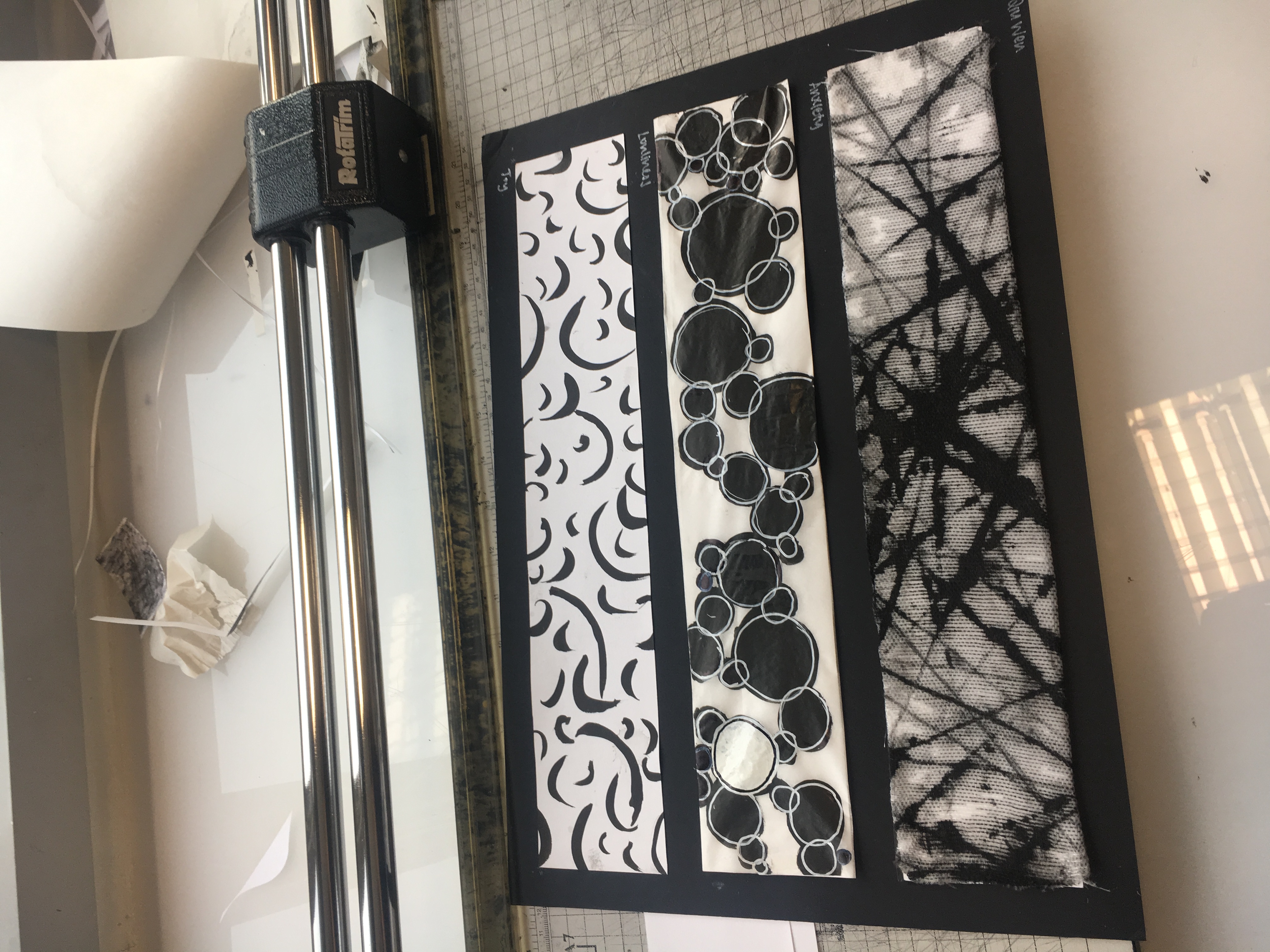
For surprise, I thought of an interruption in a pattern, something that breaks the mold and the norm.
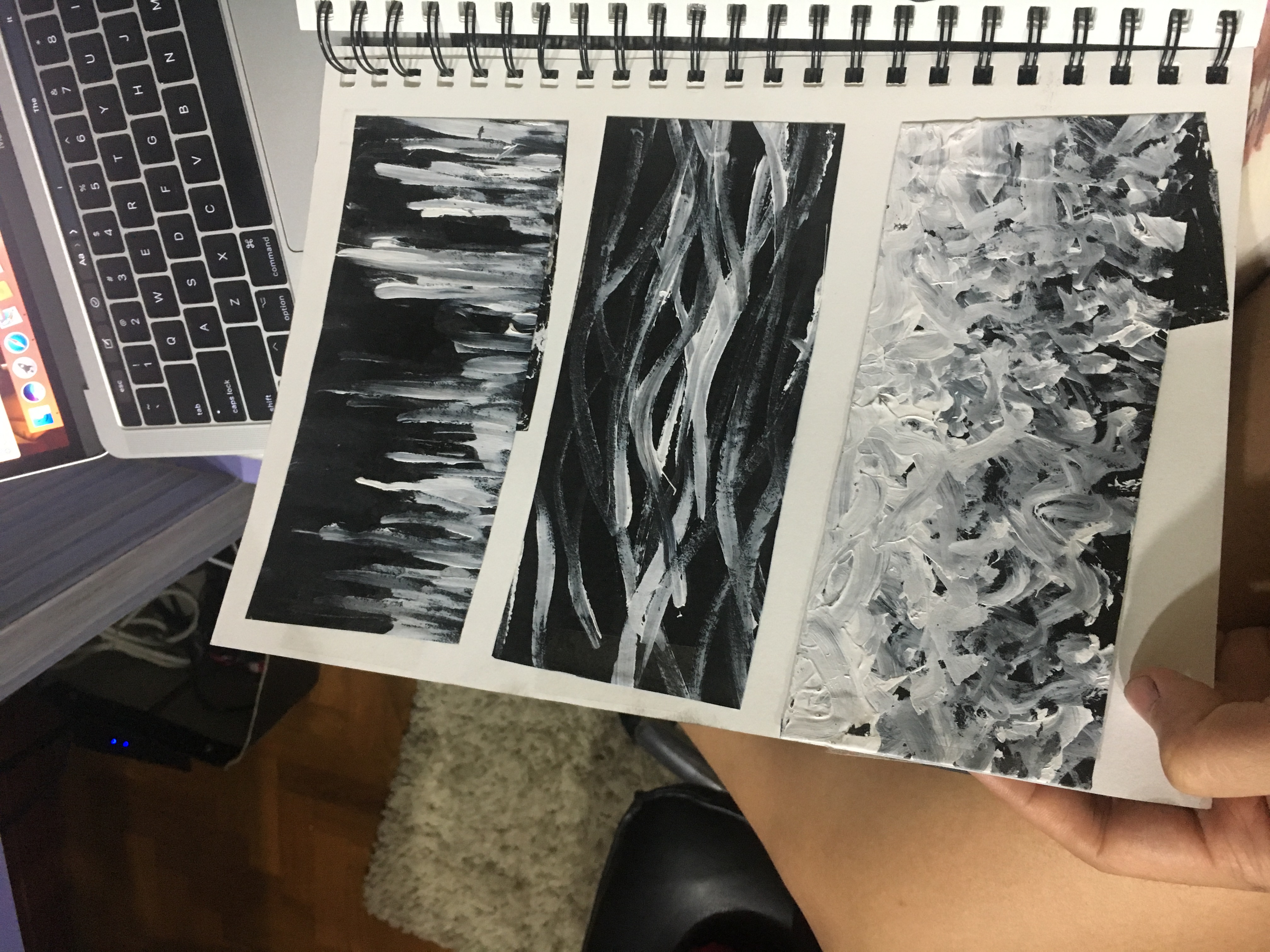
For hope, the first one was supposed to convey hope that arises (brush strokes in an upward direction makes it feel like the white is rising up against the black that is weighing down on it). To me, that looked like hope.
For the second one, I used curves because there is a certain motion and fluidity to it and it conveys a sense of serenity to me.
For the third one, I wanted to use irregular brush strokes to convey a sense of fluidity and light heartedness. I chose a gradient with the white becoming more prominent and covering up the black almost entirely at the top as it conveys triumph.
However, white on black looks too messy, especially acrylic. I should have tried other forms of white (correction fluid, pens, etc.) The white here is also not very high contrast compared to the black and it makes one’s focus gets pulled away by the darkness instead which defeats the purpose of using white on black.
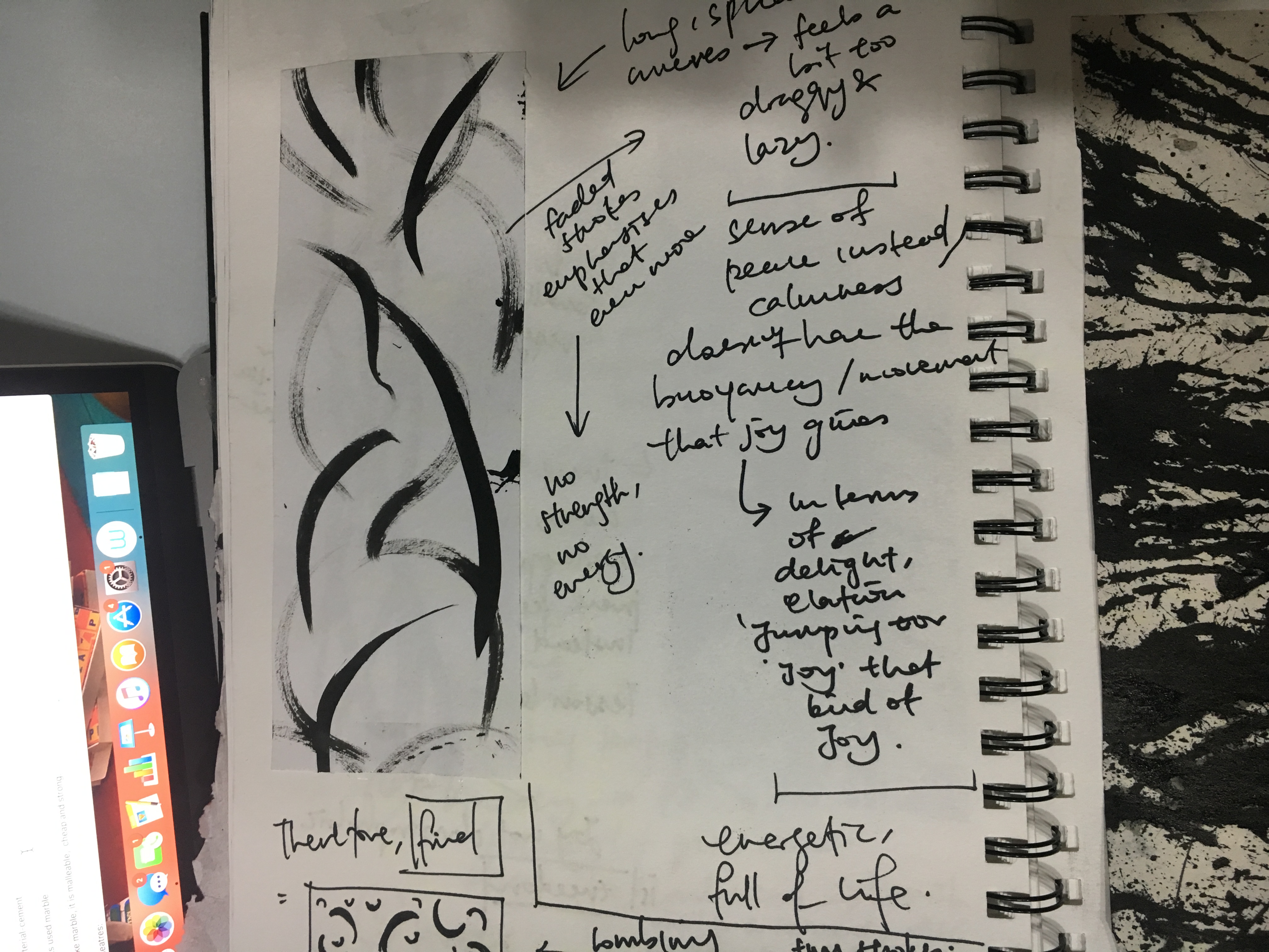
In the end, I decided to still use curves as I liked the ‘bounce’ and dynamism that they have compared to horizontal lines (lack motion and energy) and vertical lines (conveys stability, too strong and forceful).
The long strokes seemed a little too lazy hence for the final one, I used a mix of small and large strokes. I sense some sadness from the faded brush strokes (and also, faded strokes contains the idea of loss) and they don’t have as much energy as bold black strokes on clean paper.
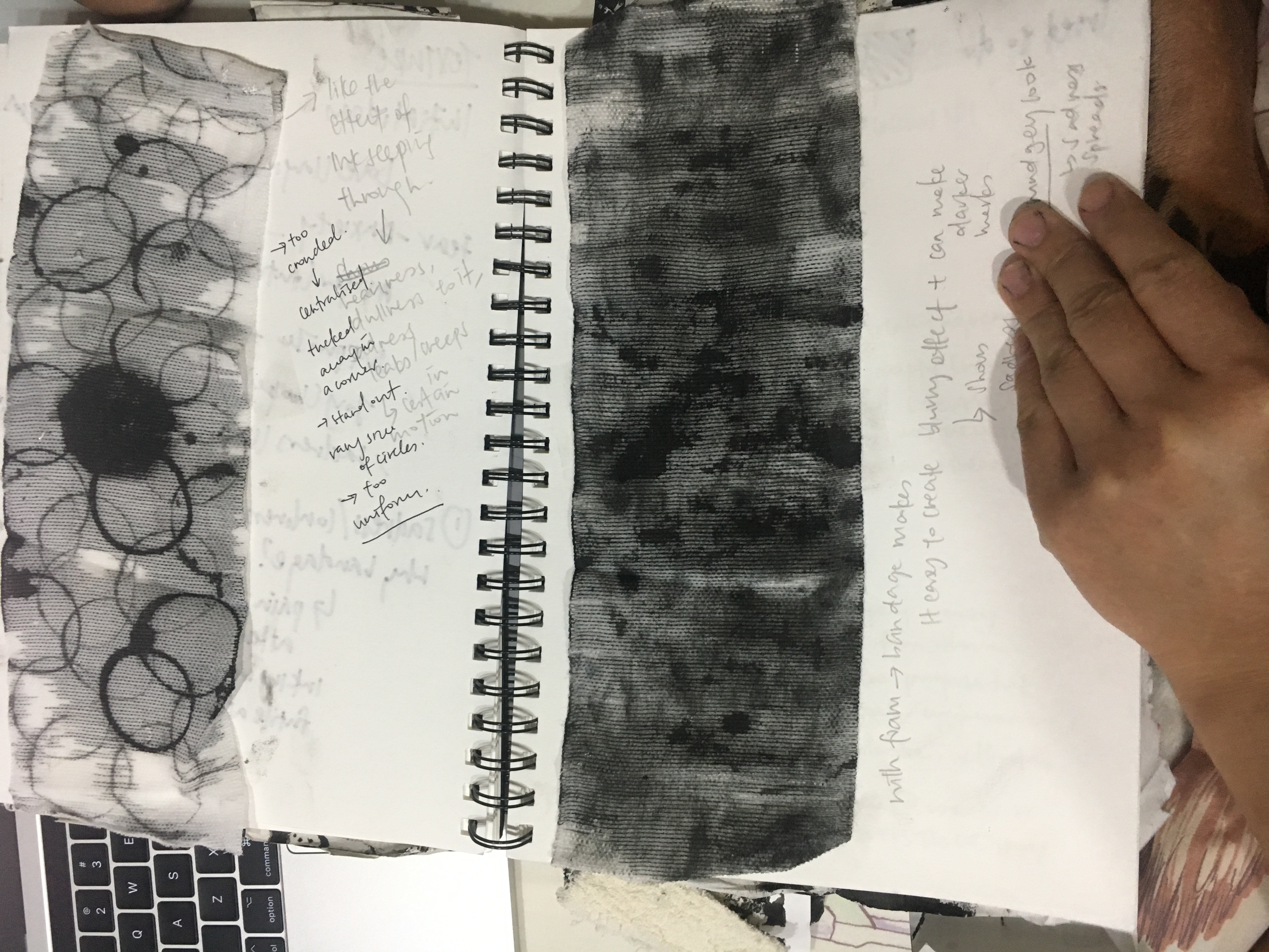
For anxiety,
I wanted to convey suffocation and the feeling of being trapped during a panic attack.
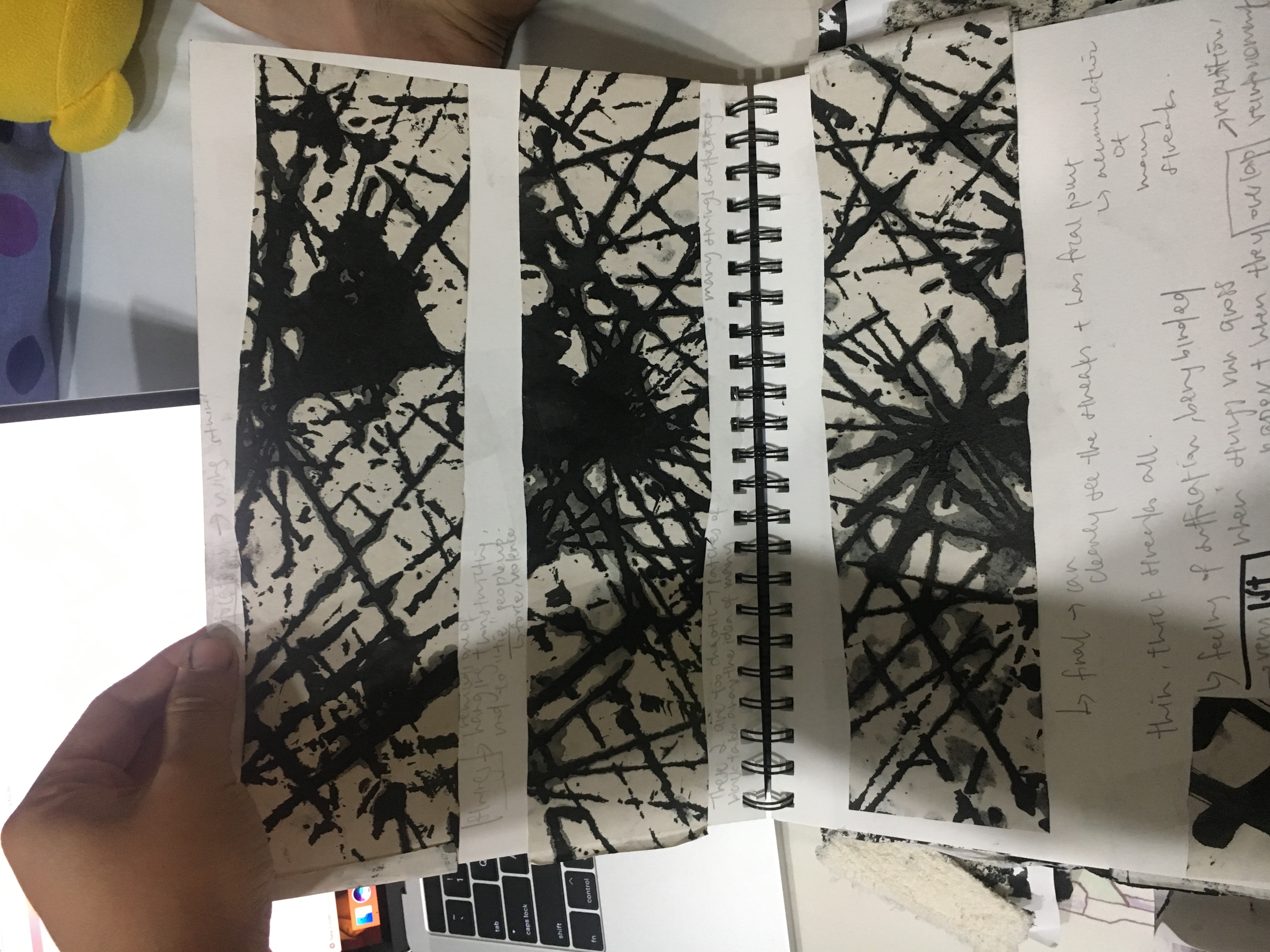
I used ruffia strings as suffocation reminds me of a noose and hence strings too (normally used for suffocation and can be tightened). I liked the bleeding effect that the ink has on newsprint and I experimented with trying to give it a focal point.
In the final one, I decided to create an illusion of depth by using thin and thicker lines to create distance and make the thick ones seem closer to us. It gives off the idea of overlapping and the constant and consistent piling up of negativity and thoughts that are incessant and that is what Feel corresponds to anxiety.
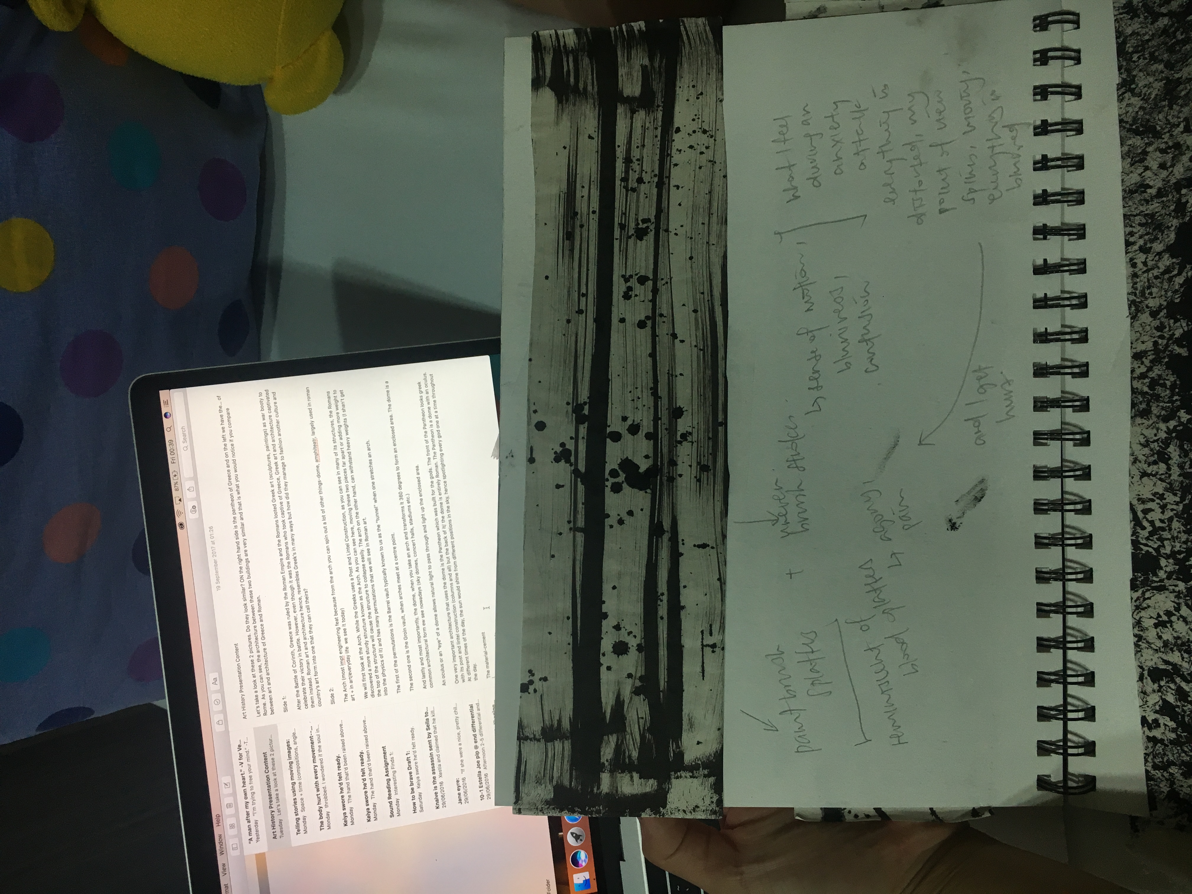
Another idea I had was to use uneven brush strokes that conveys a sense of blurriness and motion which I feel is what happens during an attack because I’ve not much of an idea as to what is happening and I become very woozy and a bit giddy and I blank out a lot so the negative space can represent that. The ink splatters that has some force to it then represents pain or violence to some extent.
However, I preferred the first idea and had a good reception to it hence I decided to use it.
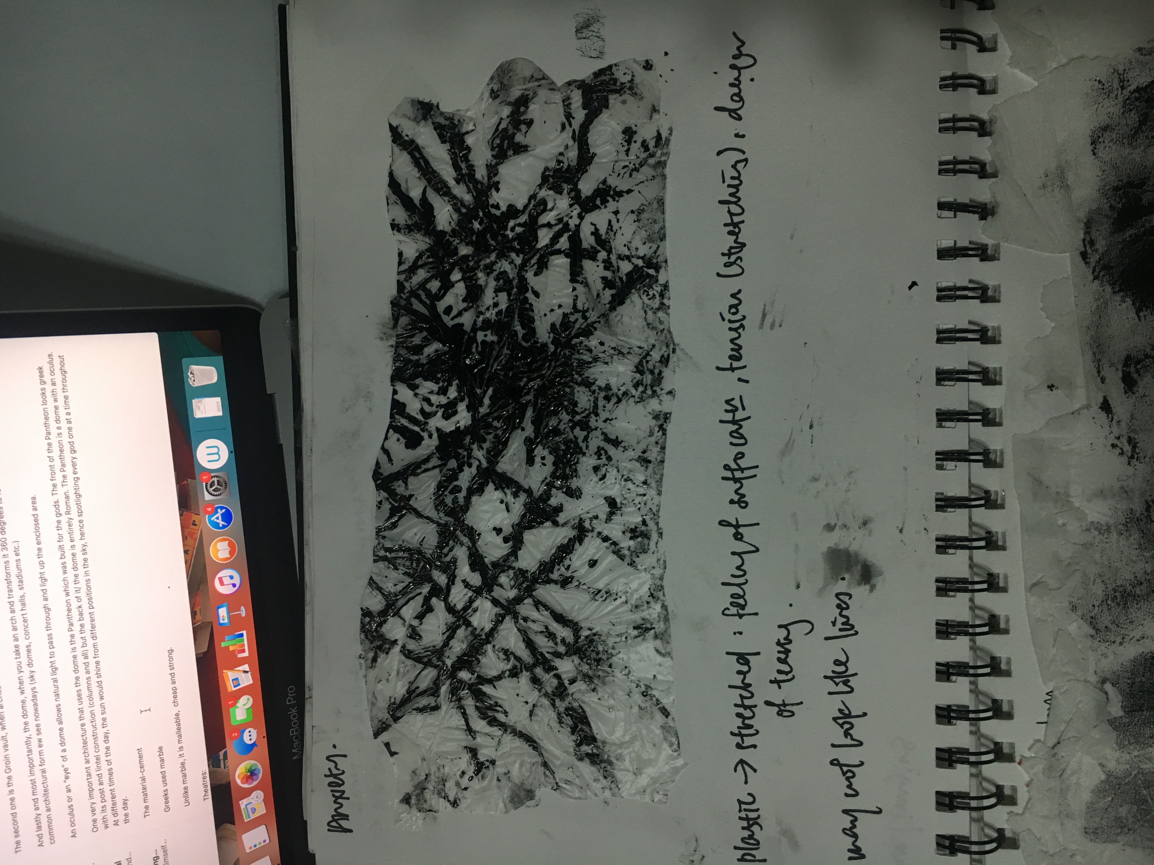
For the texture wise, I wanted to first go with stretched plastic as it also implies the idea of suffocation, of a lack of air, however, the effect wasn’t good as the ink can be easily removed and the lines are not completely formed due to the ridges of the plastic. Also, there isn’t a bleeding out effect that makes it look heavier and gloomier.
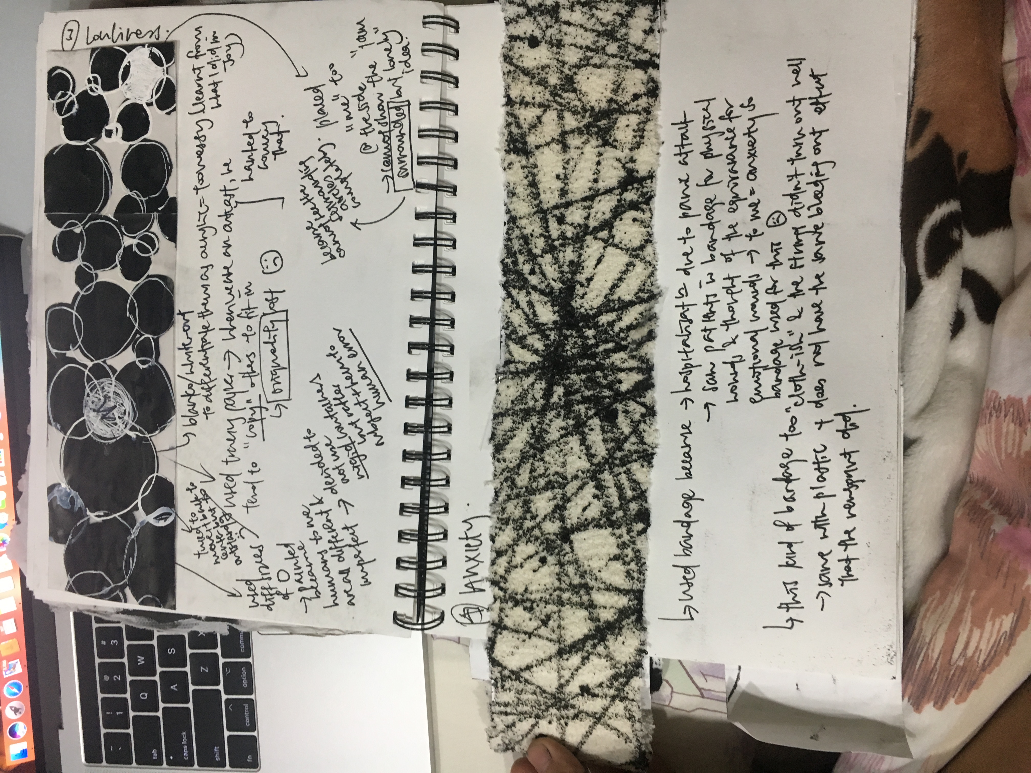
I decided to use a bandage as the texture because anxiety to me, is a kind of emotional wound/pain that is equivalent to a physical wound that requires bandages. I used this thick bandage at first however, the effect, just like the plastic one, is not as I would like it to me. There is not a bleeding out effect and the lines all ended up the same thickness no matter how lightly I press on the string or how many times I go over the same line with the string.
As seen in the pic above this one, the one of the final one, I used another kind of bandage that had the bleeding out effect that I wanted (and it makes the piece look greyish-like the grey consuming the white: pushes the idea of anxiety consuming one) and it is easy to create both thick and thin lines.
For longing,
To convey the idea of that someone having been there and having left, I wanted to imply human intimacy and the traces of a human presence hence I decided to use handprints/palms.
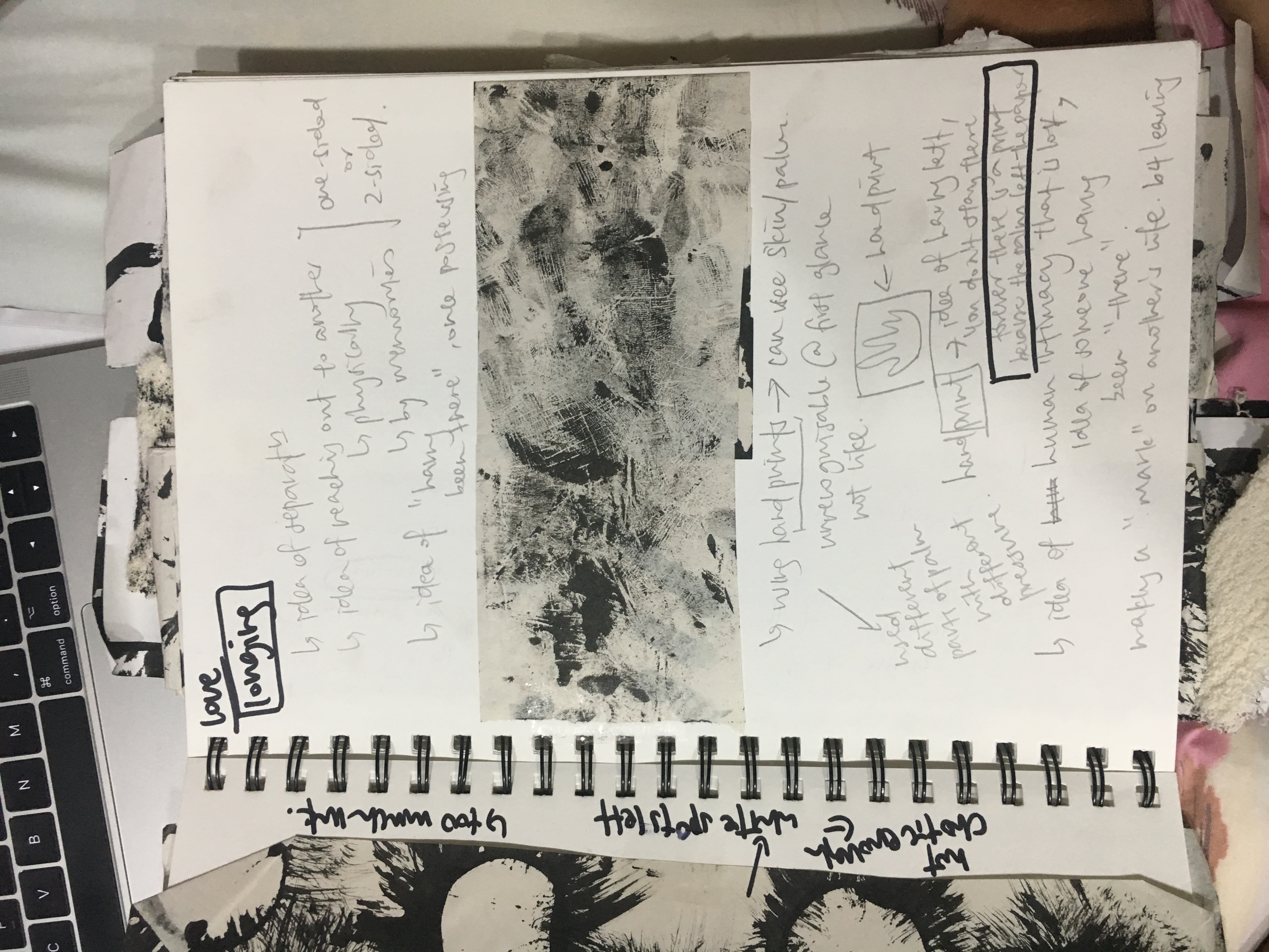
I didn’t want it to be too representative hence I applied different amounts of pressure to different parts of the palm to make it look abstract and yet we can still see the prints of a hand.
However, it looks very random and messy and at one glance, I don’ think anyone can see it as longing.
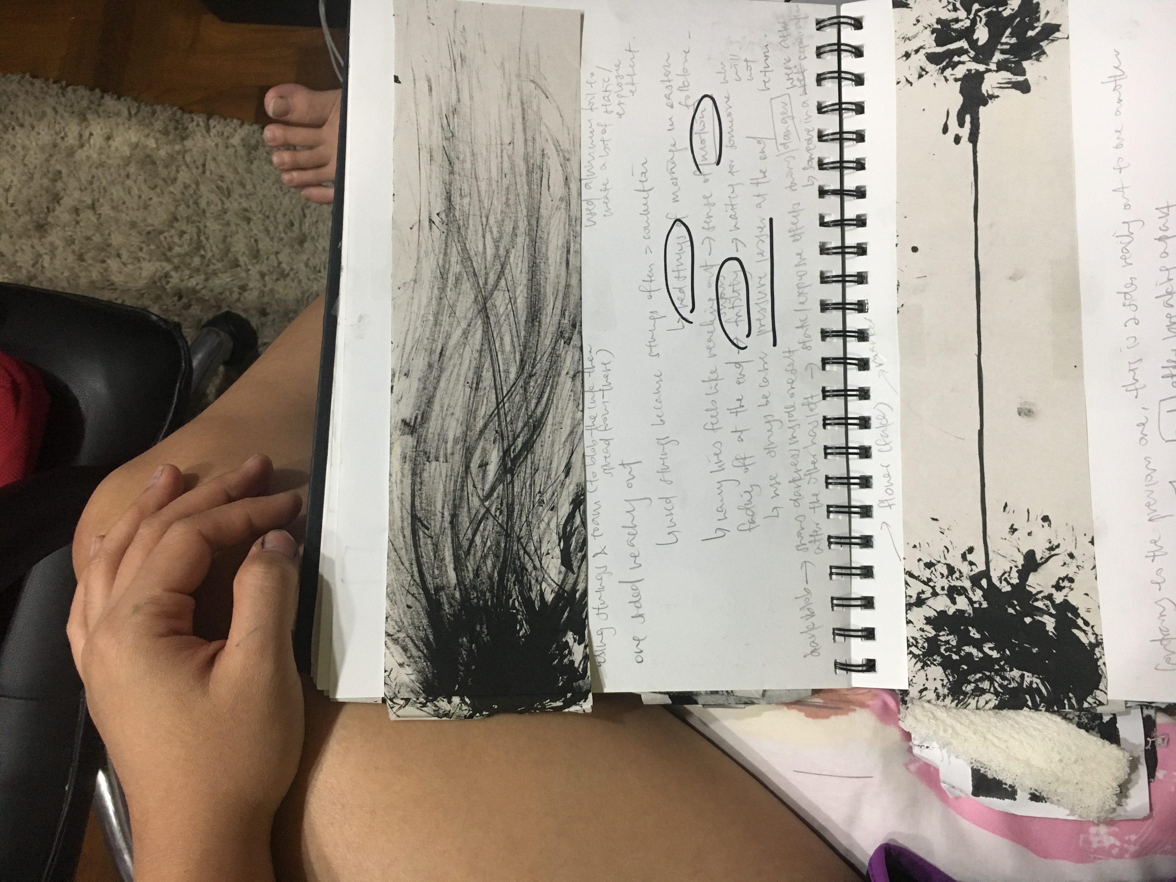
The second idea I had was a blob and lines leading from it that signifies a person reaching out. However, it doesn’t show the person reaching out for ANOTHER PERSON although it does show the attempt to reach out.
Hence, I decided to add another blob and made it symmetrical (sort of) which is visually more appealing and I changed the narrative to 2 persons reaching out for each other and trying to sustain a connection
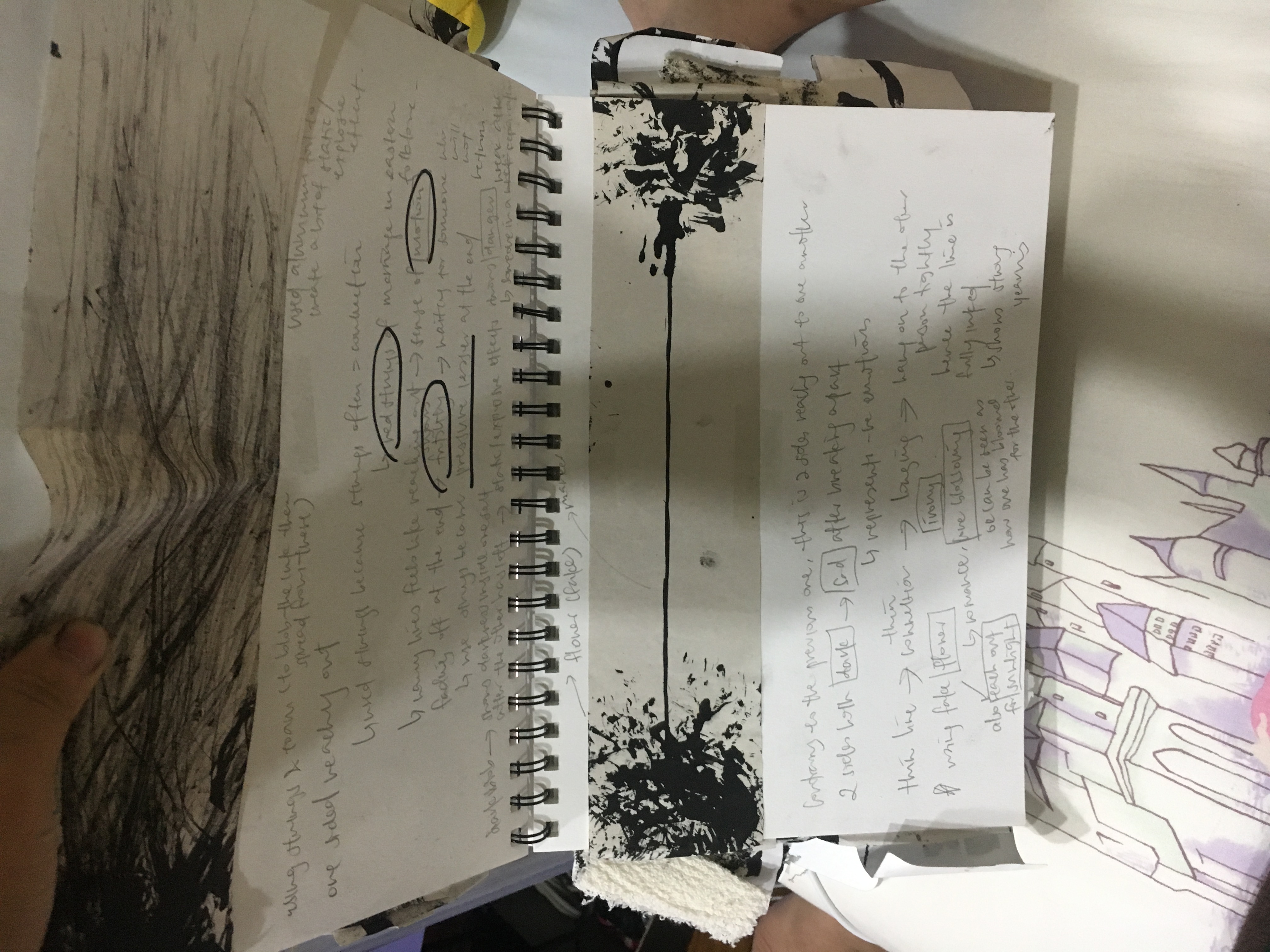
I used ink blobs to represent a person as I wanted to let the darkness of the ink and the messiness of the blob represent how disordered a person can become with another gone.
I used paper towel/tissue as the texture and wet it first because wetting makes it stronger and less flimsy and also because I feel that the water can stimulate/represent tears and hence the sadness that one experiences after the other leaves.
I used a disposable panty for the final one instead as I still wanted to convey the idea of human intimacy (not just emotional but also physical) and the disposability of the panty also carries the idea of something that is to be lost/thrown away, something that cannot be with one forever, hence implying an inevitable separation that will lead to longing.
Also I decided to add more small splatters near the line to further push the idea of the entities reaching out for each other.
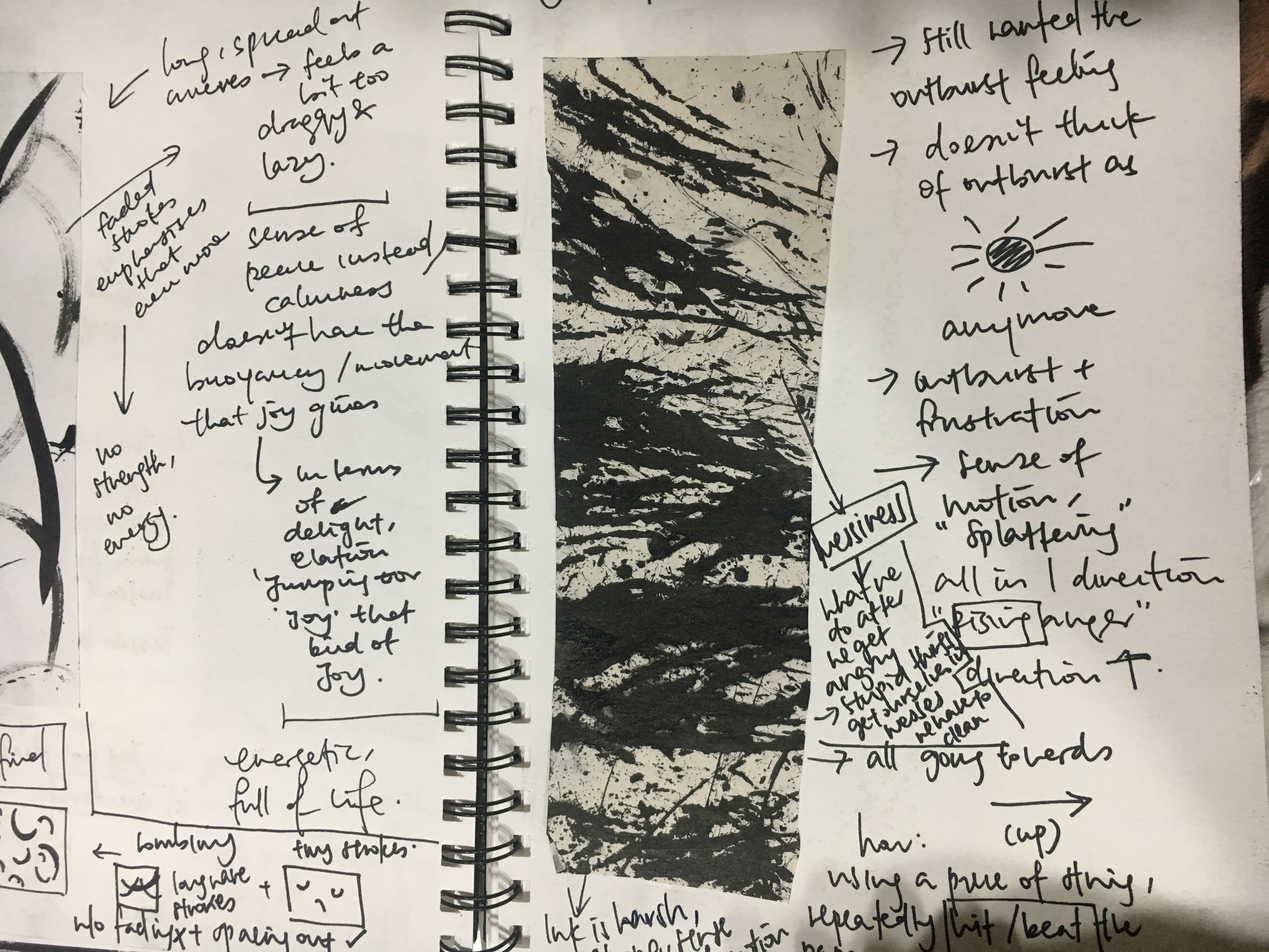
For anger,
I thought of the ways to mark out the “holding it in” part which I had in mind a ball of darkness waiting to burst and hence has lines leading out of it.
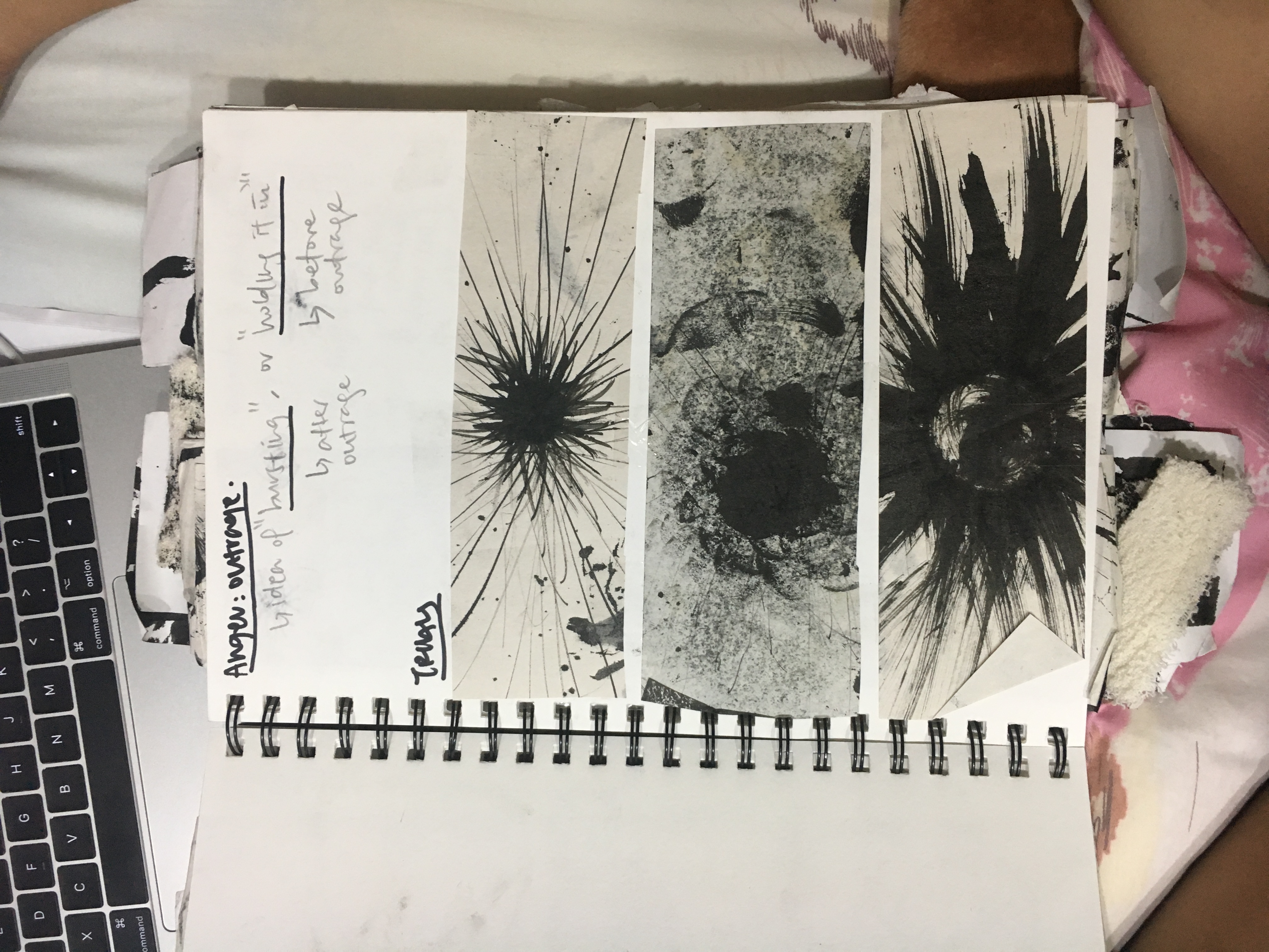
The first one is more tamed but it looked very purposeful and not organic. The second one seems more natural and conveys that idea of something expanding and rising. The third one is closer to an outburst and I left the middle a bit empty deliberately as I wanted to push the idea of release, of cleansing one’s inner state by having released the negative energy inside.
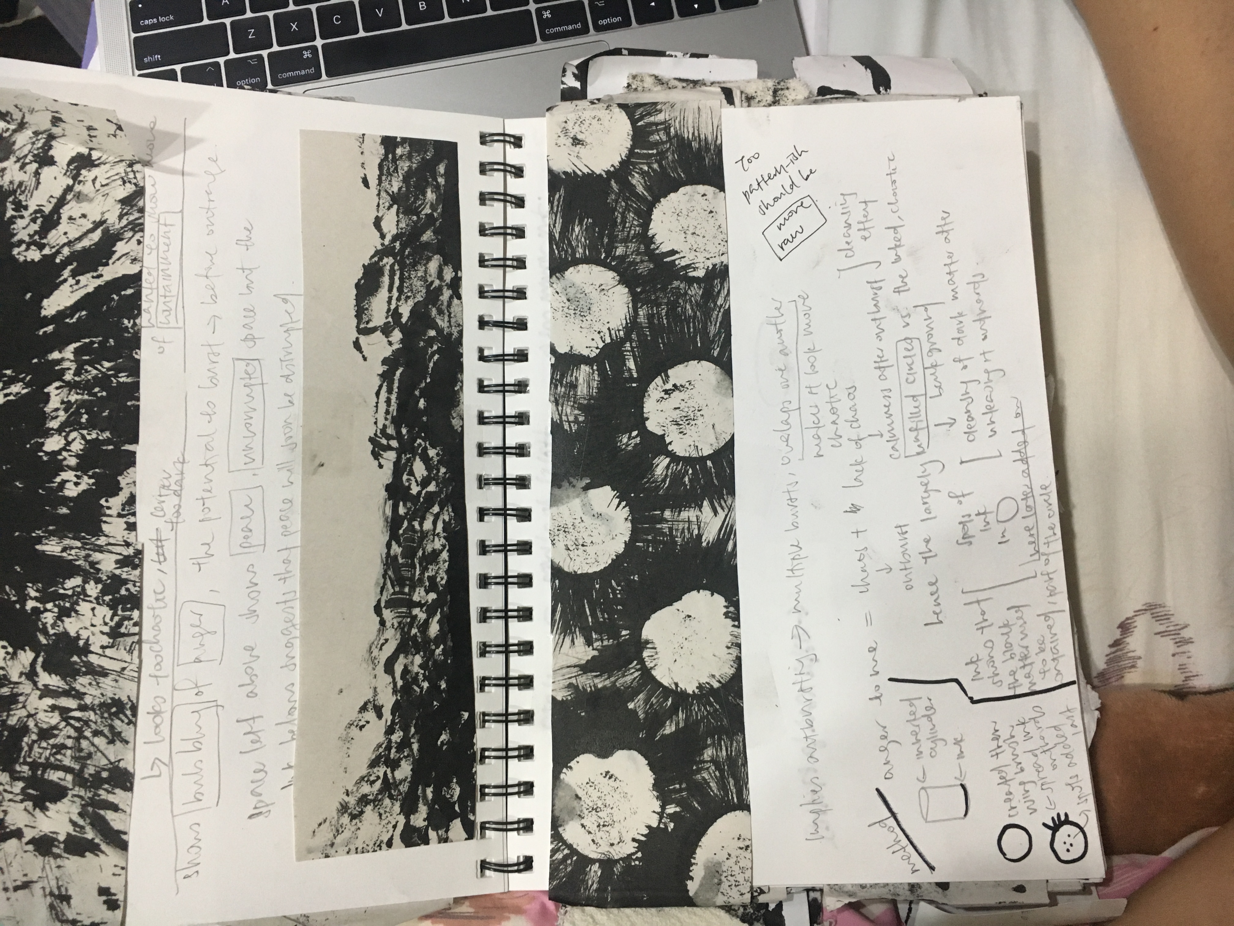
I decided on doing this instead, representing both the outburst and the release. During the critique, I was told that the circles, being of the same shape, made the piece looked very pattern-ish and I agreed. I think that anger is a very uncontrolled thing and that I shouldn’t have portrayed it in such a restricted and boring way.
Hence, to go to the other extreme, I decided to portray anger as messy and violent, disorderly and a bit anarchic. I wanted to capture motion and violence with ink and paper hence I whipped the paper with ink (and really channeled my anger oops).
I like the way this captures the ink flying and everything is messy as it pushes the idea that anger makes things a messy affair (we often do wrong and impulsive stuff when we are angry).
For loneliness,
I wanted to express first, the idea of a me vs the world thing so I did this. 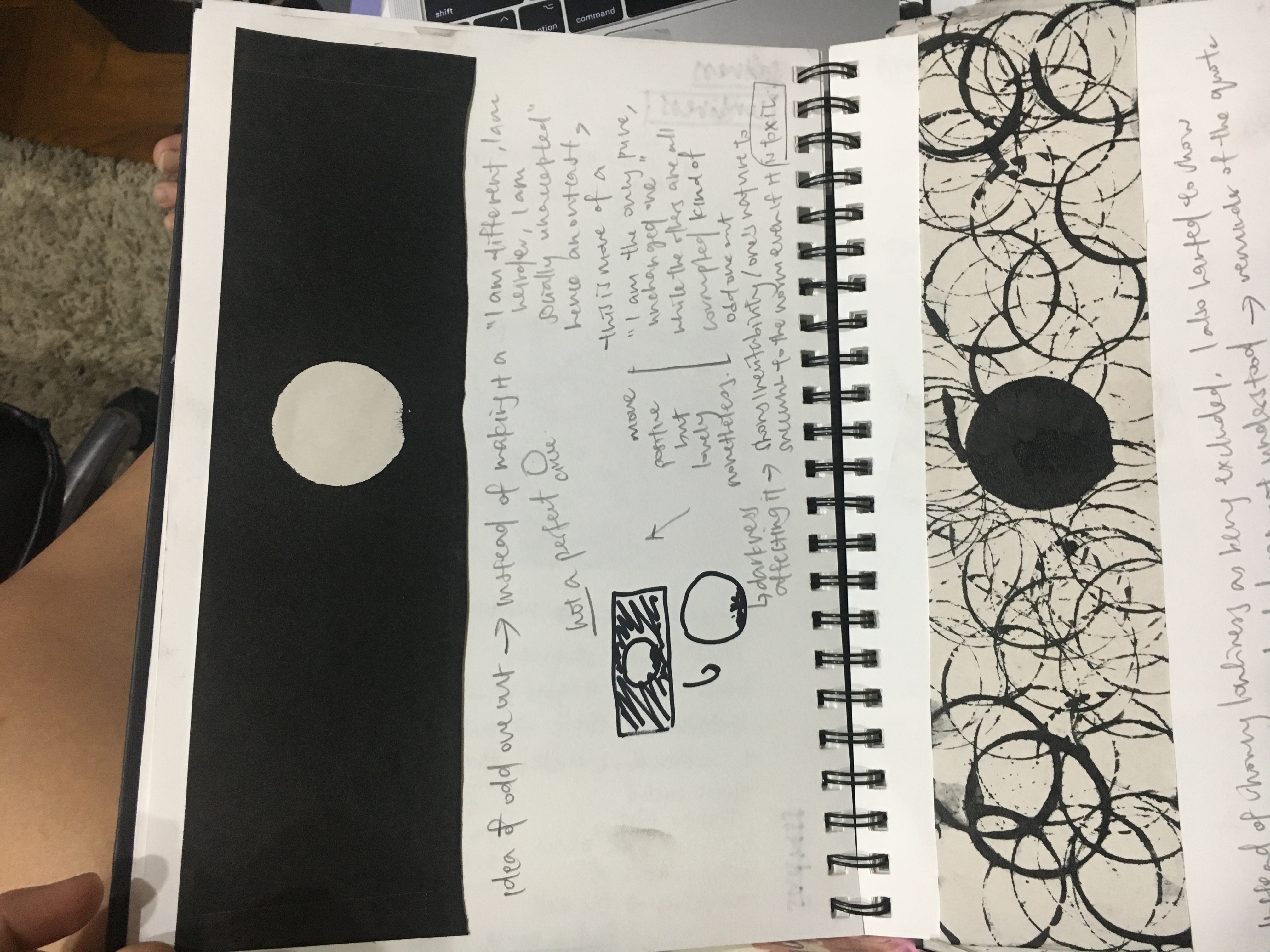
however, it came off a little too simple and boring.
So I decided to go with the “I’m in a room full of people but I still feel lonely idea.” I received comments that the circles, being of the same size came off as not dynamic and I agree that if they represent people, they should be of different sizes. Also, when one feels lonely, one feels empty or so that was what I had felt, and hence, the centre/I shouldn’t be blackened but instead should be emptied of ink. The ‘I’ of this piece shouldn’t be in the centre too because that makes ‘I’ look very outstanding which is not the case in loneliness and is actually the opposite because one feels insignificant and easily overlooked hence I wanted to place it at a corner.
Therefore, I came up with this.

I put the ‘I’ in a corner but not too corner as I wanted to show him being surrounded by others too and I represented the others with circles of different sizes. I didn’t use molds for the circles and painted them by hand instead and outlined them too by hand because I feel like humans are dynamic and folds are too rigid to represent humans.
For surprise,
I wanted to use a rubriks cube to set the standard pattern for which I would then interrupt. I chose the cube as it is very standard and familiar to us all (9 cubes of the same size with six faces of that same 9 cubes).
I used white on black at first as I found it easier to remove the white using black rather than using white to remove black and I remove not just one square but a half square as I believe that would come across as more of a surprise.
However, it looked very purposeful which is the critique I received for this piece.
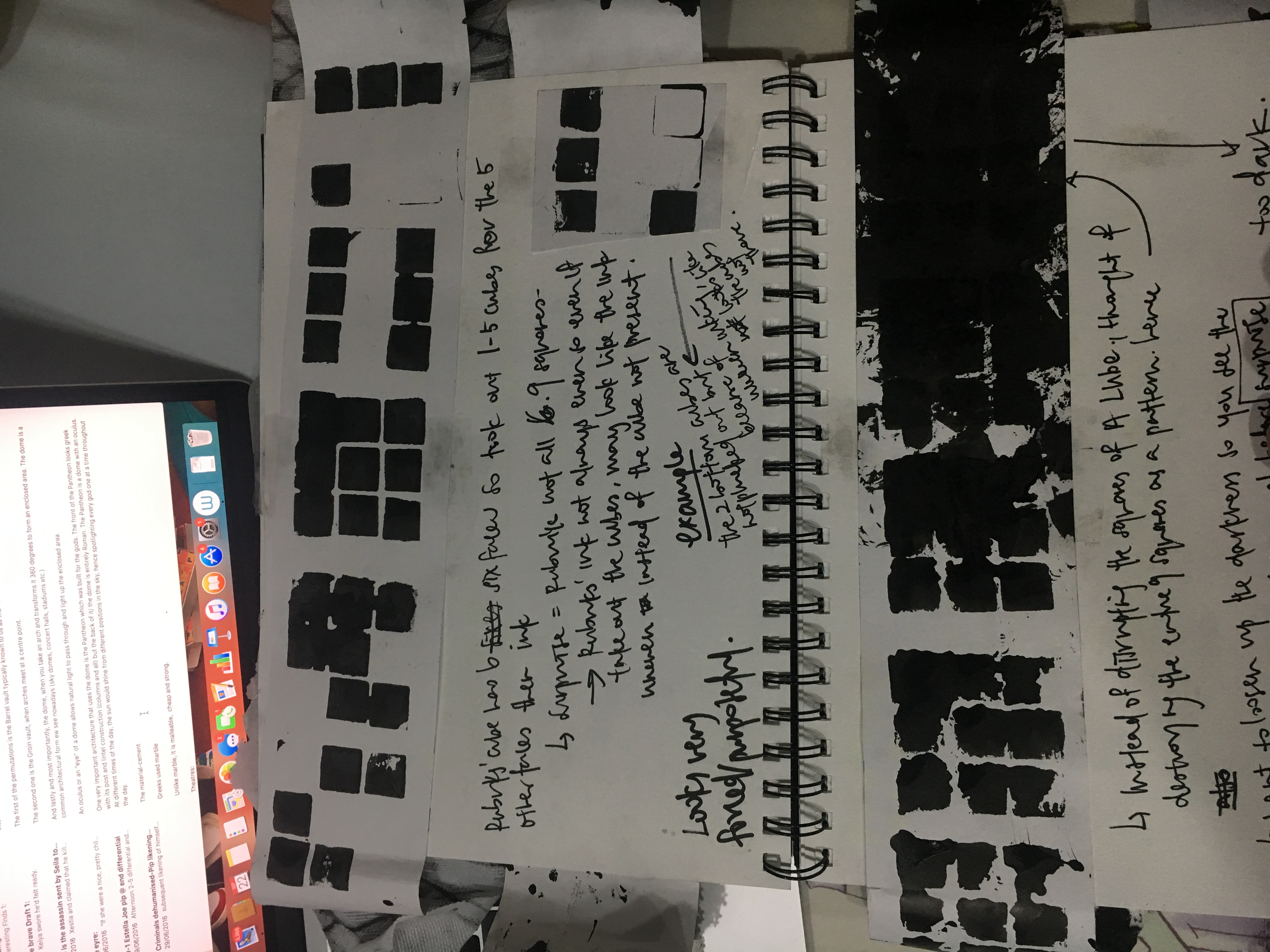
I then removed the top of some cubes manually (so they are open and won’t make the mark) and inked it so that the cubes won’t all be 9 and only one would be.
However, it still feels very purposeful in fact more so than before.
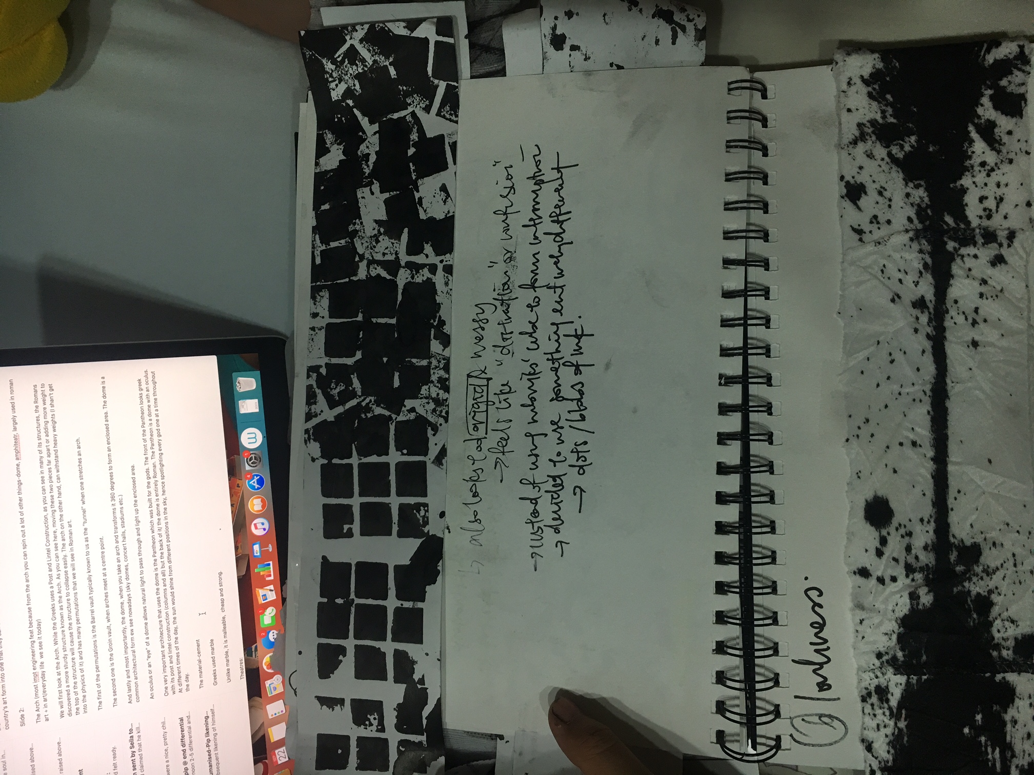
so I decided to jumbled up the cube patterns to make it look less purposeful but it still feels like there is not enough surprise as these are all cubes still.
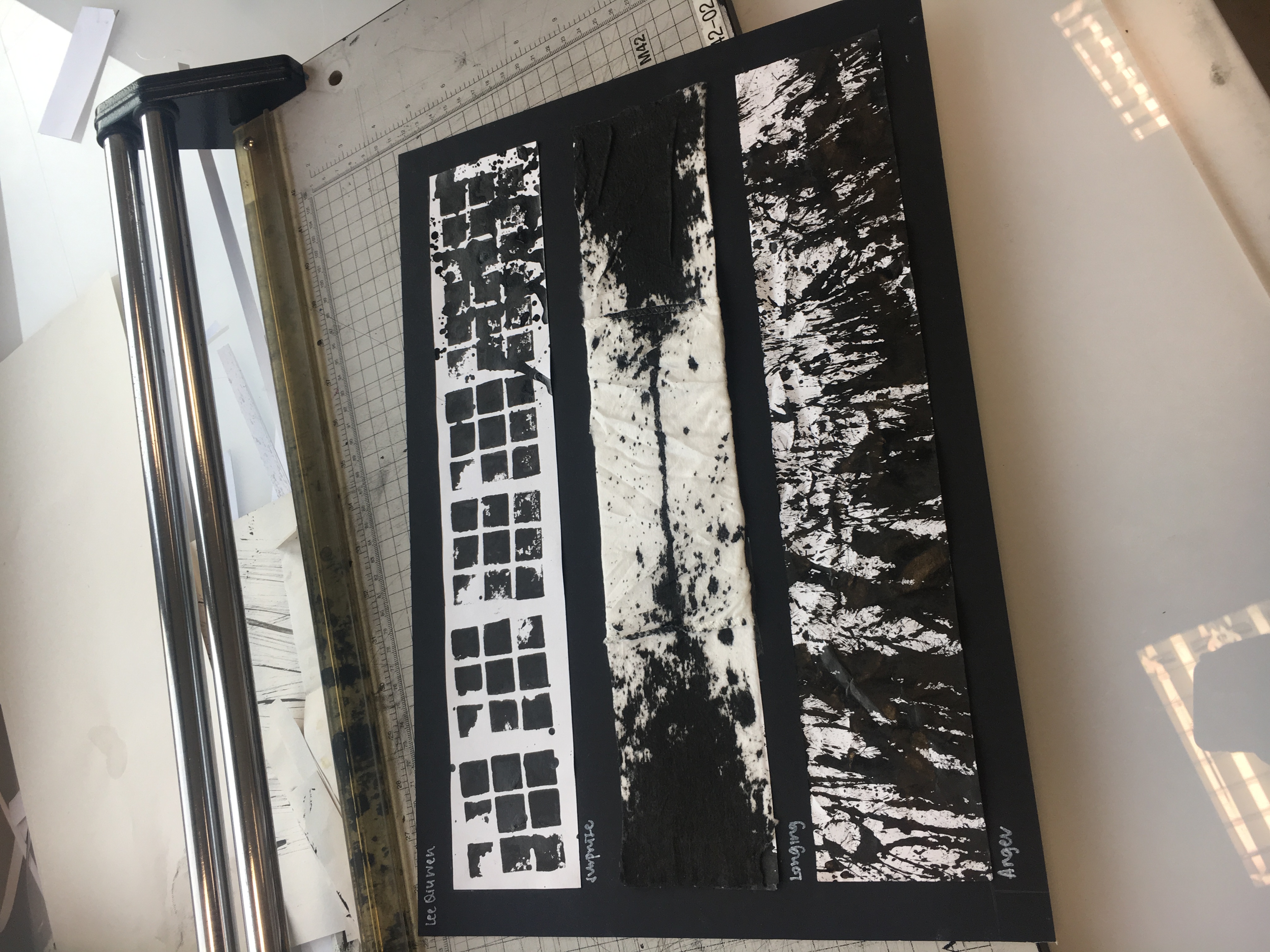
hence, I decided to use a different ink shape to interrupt the shape and this was a recreated accident (another piece was stained by some brush strokes and I was genuinely surprised by it so I decided to recreate it as surprise was what I felt, and visually, I think this out of the others represented surprise more.)