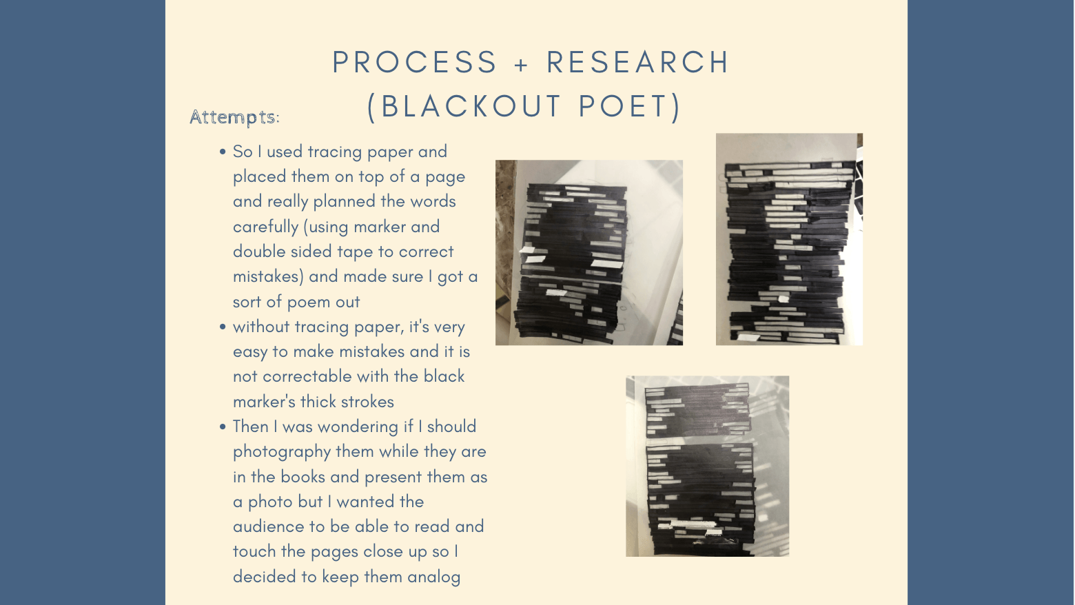
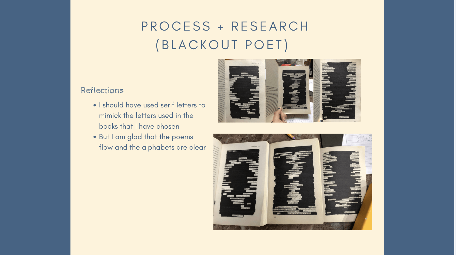
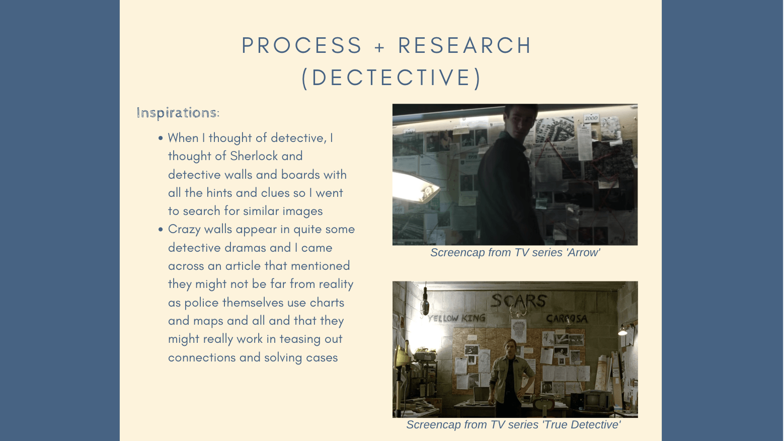
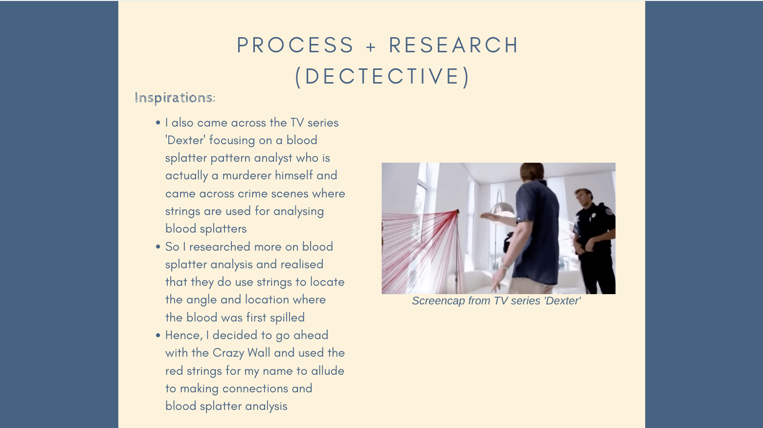
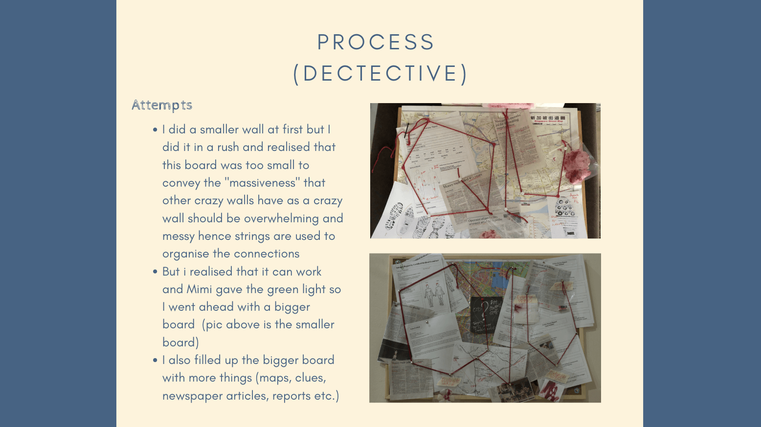
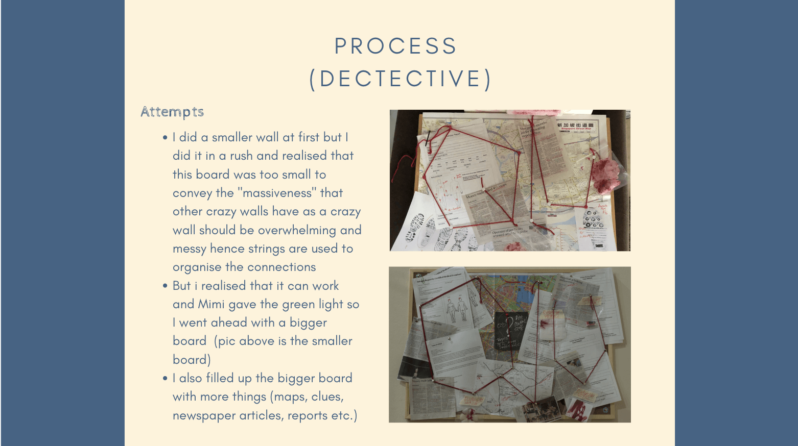
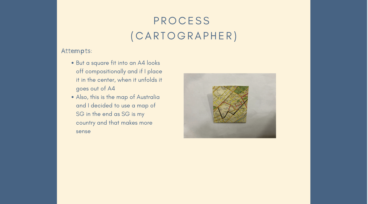
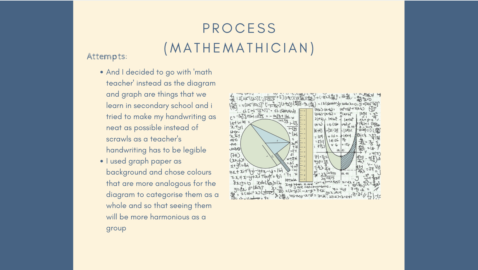
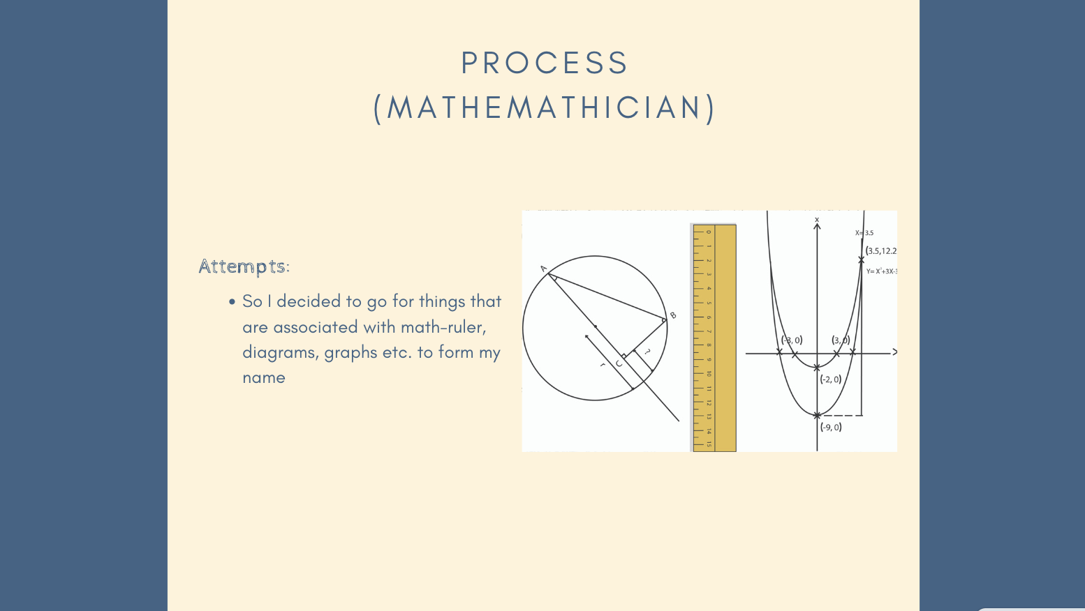
The location I got was Bedok and these were some ideas at first:
Comparing old and new Bedok using traditional sketches vs. digital illustrations (as not many knows about Bedok’s rich history as a sea side Kampong area)
A narrative on suicide and the Elderly (as Bedok has the highest Elderly population and there were the many cases of suicide during 2011-2012)
After asking Mimi, she advised that I play on my strengths instead of trying to do traditional just to fit into the theme and that comparisons of past and future need not be done in a traditional vs digital way. I decided to go towards the narrative as I’ve always liked to tell stories and this is one that I feel rather attached to.
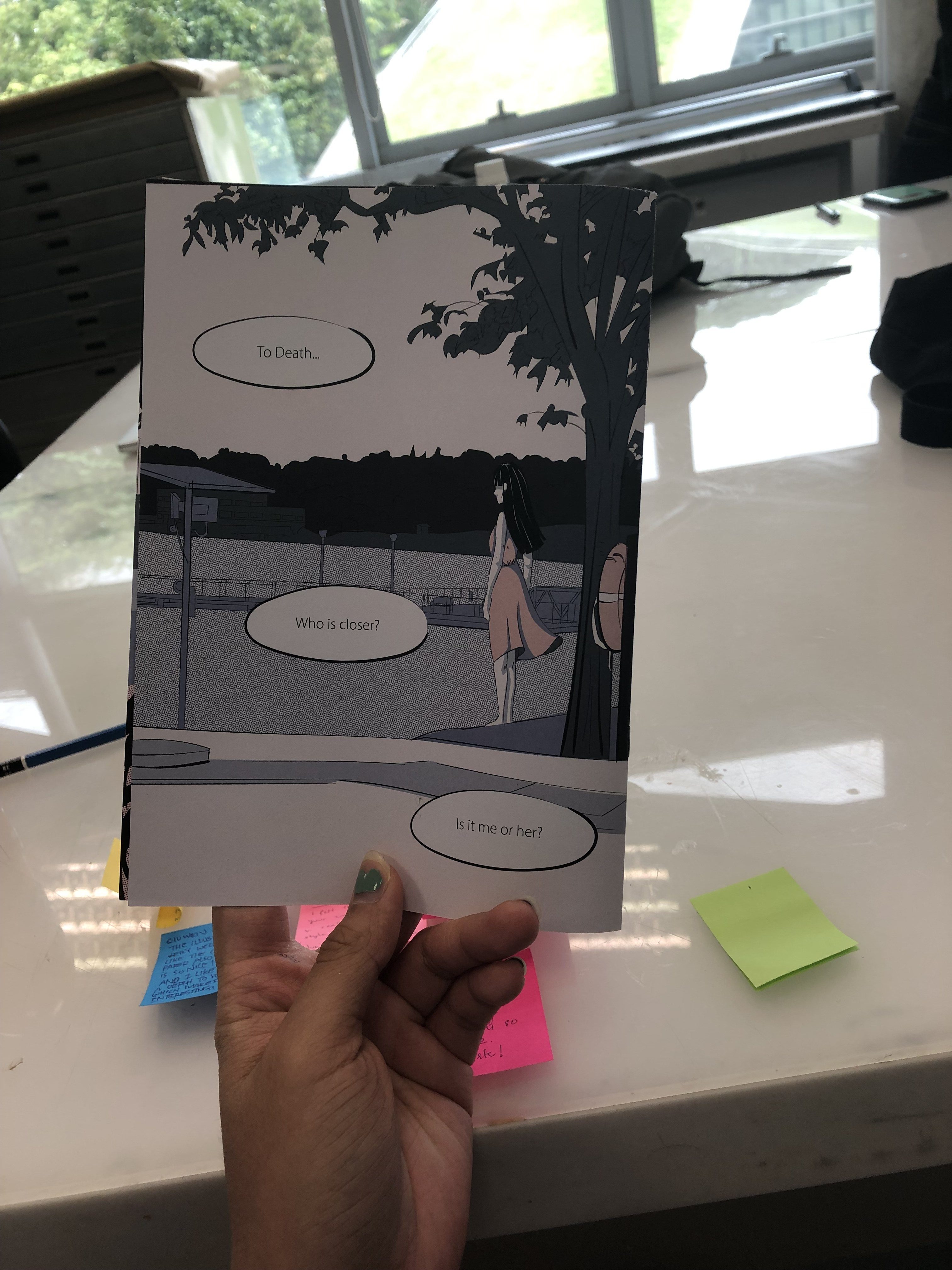
The narrative is simple but I wish it to be thought provoking: An old man comes out of his checkup worrying about death only to meet a suicidal woman at the resevoir and wonder, ‘who is closer to death?’
I was having troubles with the colours mostly as I wanted to differentiate mine from the previous Bedok’s zine.
And I did some research on some potential colour schemes:
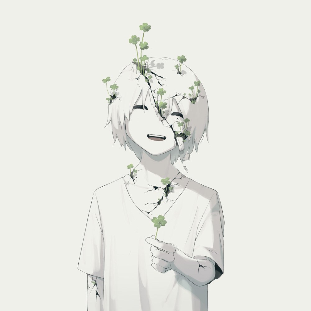
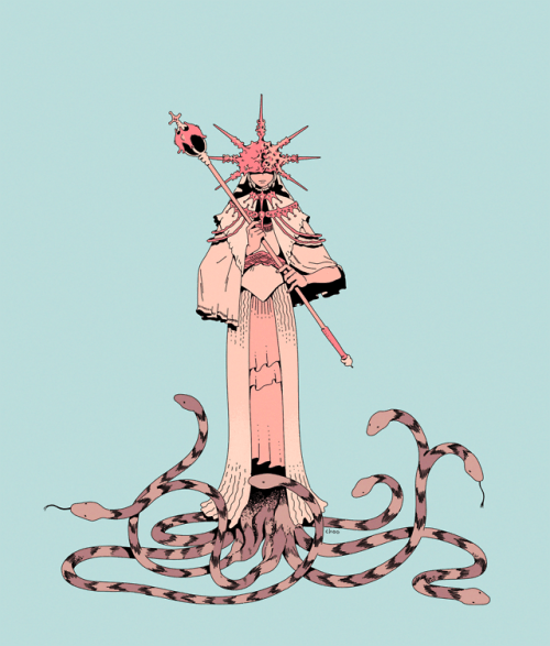
One artist that I really like and would wish to imitate his style is Avogado6
Illustration by Avogado6Illustration by Avogado6Illustration by Avogado6
I found his works to be very thought provoking using rather simple metaphors and motifs to put across a strong message and I was inspired by the first picture to use flowers/plants as a metaphor (will touch more on this). For the first picture especially too, I realised that I need not have super dark aesthetics to put across a deep message, sometimes a cleaner and calmer image that contrasts with the weight of the message can work too which inspired me to go towards ‘quieter’ visuals instead of loud ones.
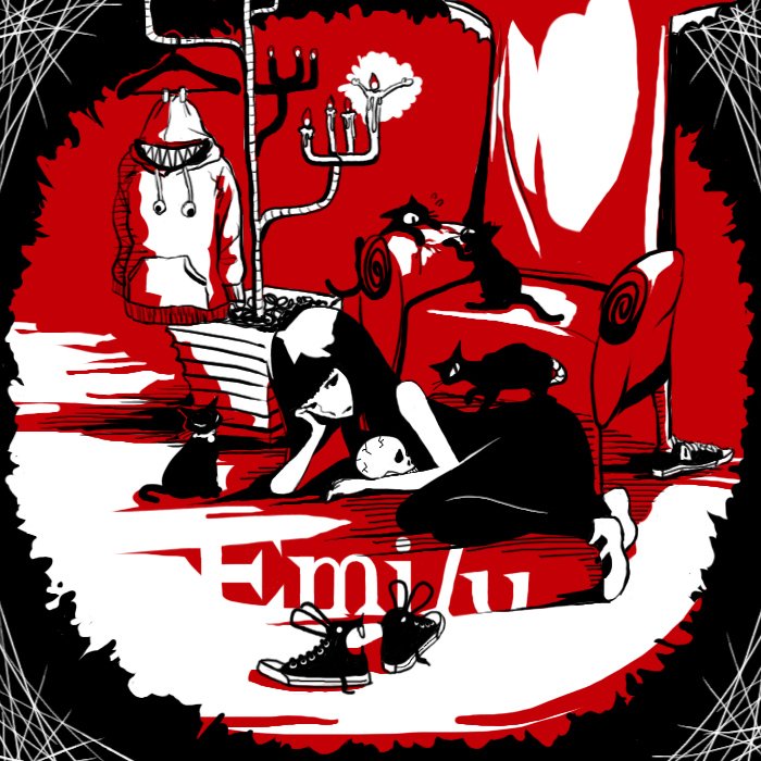
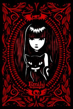
With his use of spot colours, I also found ‘Emily the Strange’ which is a collection of stories and the illustrations have an iconic black and white with red colour scheme.
‘Emily the Strange’ cover page‘Emily the Strange’ Cover page
The mood conveyed by these colours differ so much from those by Avogado6. They are darker and more mysterious and for fear of not being able to play with colours, I wanted to use this at first.
I also looked at some analogous colour schemes and with references. I looked more at analogous colours as I wanted to head towards a calmer overall visual and tone and analogous colours can make this happen + give a more sombre and quiet mood overall.
A. Green-blue and yellowish tones (analogous)
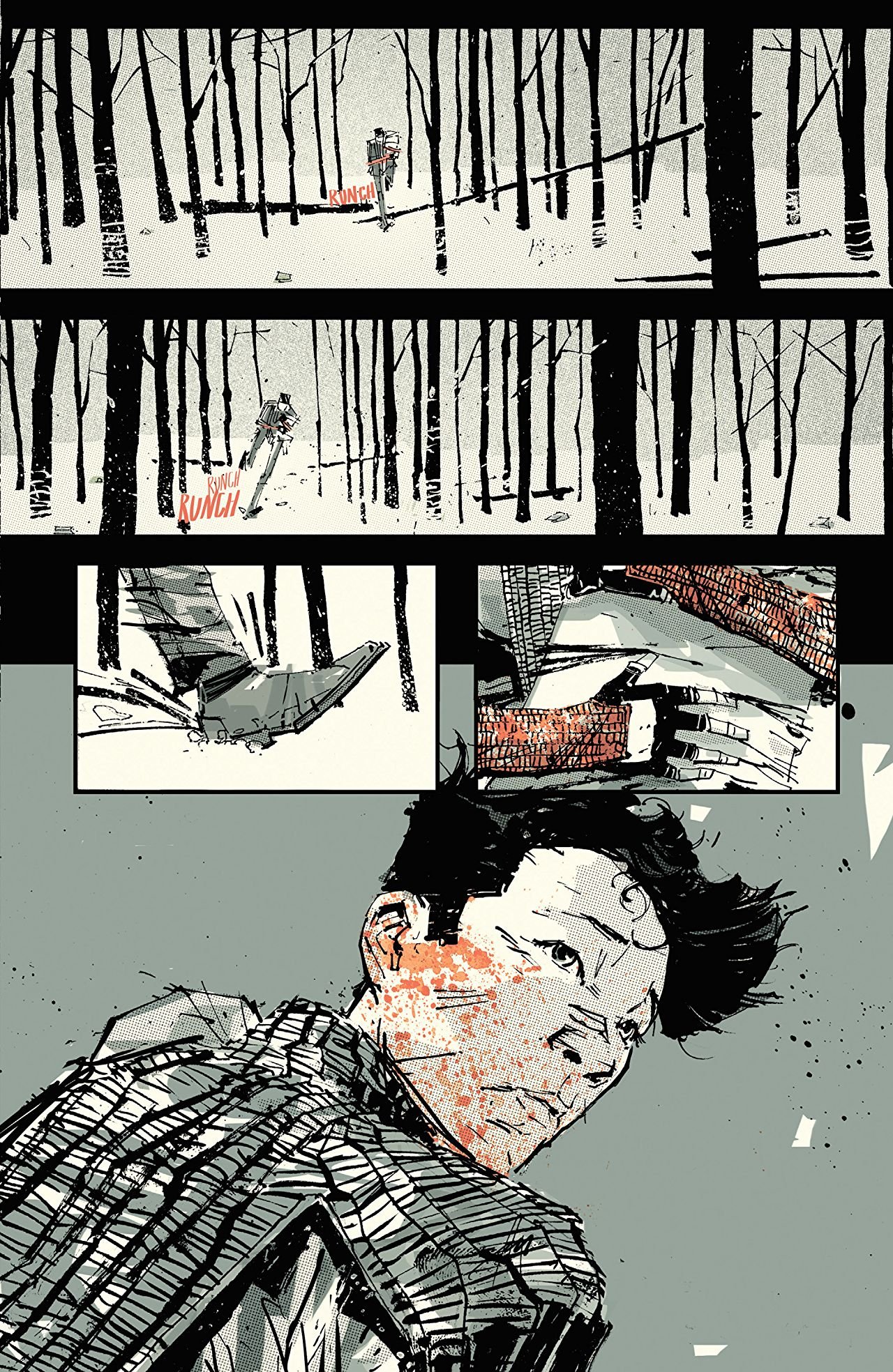
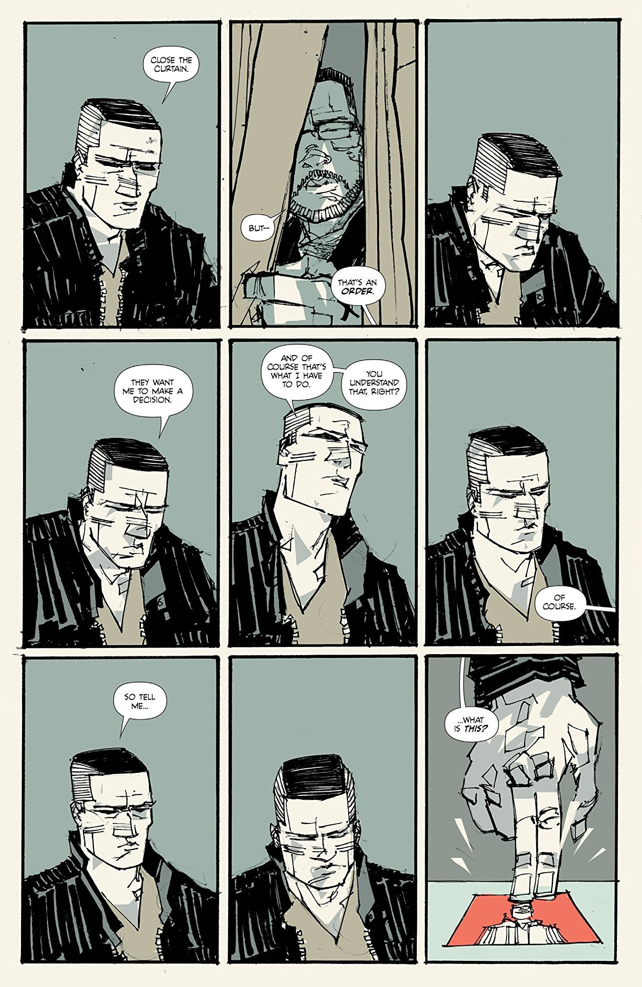
Page from ‘The Few’ by Hayden ShermanPage from ‘The Few’ by Hayden Sherman
These are illustrations from a comic ‘The Few’ by writer Sean Lewis and artist Hayden Sherman. I looked up on Sherman’s works and he uses his signature blue-green and cream yellow tones very well. He also uses spot color red/pink and the complementary colours work well to bring certain things out (focus of the visuals).
B. Blue and Pinkish Tones (analogous)
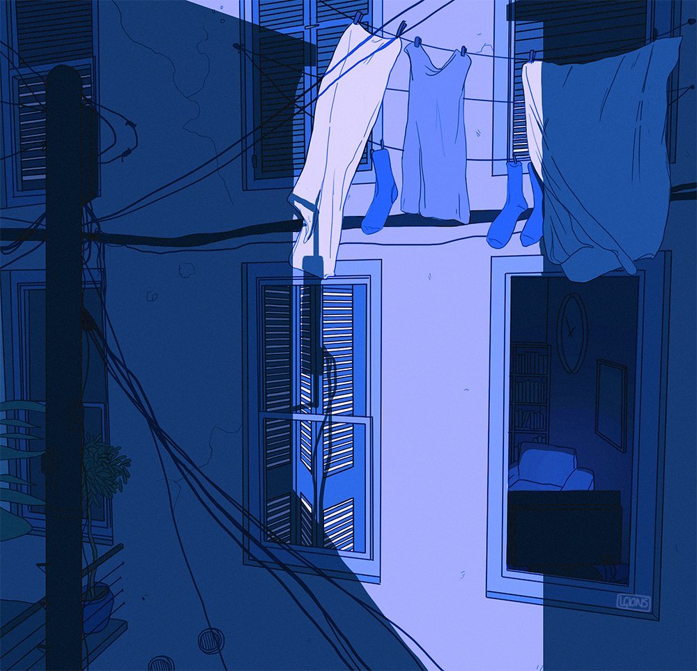
Art by Bev Gelndining http://lgions.com/
Art by Bev Gelndining http://lgions.com/
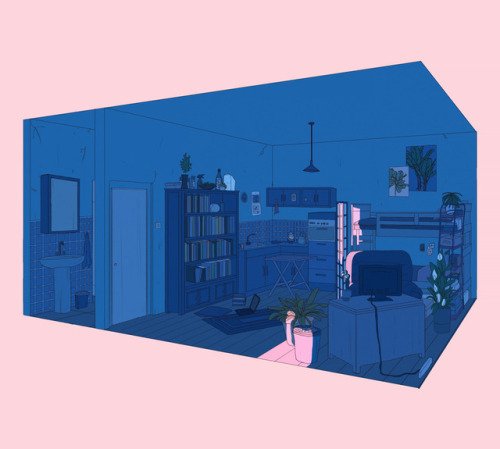
The next scheme I saw was this pink and blue + purplish tones and I think that they convey a sense of loneliness well as blue is a colour related to ‘sadness’ and ‘calmness’ and pink has a softness to it that is welcoming. I’m not sure if this is a thing but the images above using this colour scheme conveys a sense of sadness and isolation too.
I was particularly inspired by artist Bev Glendining’s colours as she uses a lot of this scheme and her works have a sense of loneliness to them.
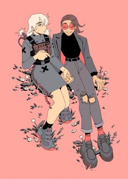
Another inspiration is freelance artist Choodraws (tumblr/instagram account)
Art by @Choodraws https://choodraws.tumblr.com/post/181911538358Art by @Choodraws https://choodraws.tumblr.com/page/2
Who uses this scheme too but with simpler backgrounds and I feel that i incorporate the colours both into my characters as well as the Bedok landscape behidn them
So some experimentation with colours goes as below:
I used the colours mainly inspired by/taken from ‘The Few’ and I liked how it works though it gives an almost oppressing sense of sadness as the colours are dull and dull. I also felt that I wasn’t innovating much because I simply took the colours from him so I didn’t like it that much.
I do like the spot colours idea to highlight certain things though and I tried doing so with black and white too. This below has a very ‘Emily the Strange’ look.
It does give a cleaner feel but it feels very empty and a little lacking. I also thought that it might be too similar to the previous zine on Bedok that Mimi showed us.
SO, I decided to try the last pinkish bluish tones and i got these:
And I really like the colors that gives off a sense of serenity but sadness at the same time. I emailed Mimi and she said they work as well but i can select more pinkish instead of peachy tones.
And I tried to contrast lighter and stronger pinks and I like the overall feel they have.
Narrative wise,
I initially wanted to use motifs of construction (bedok has plenty of it) to represent the old man as i felt that construction=destruction and demolition which he can reflect upon on old age and the destruction of the body. But mimi pointed out that construction can mean life too and rebirth and renewal and we wanted to steer the story in the direction of him realising that old age does not =death but a new life (?) instead but I felt that that was trying to tell too much in 8 pages.
INitial drafts:
This was the initial cover page and I used Gestalt to rep the construction for the old man and waves for the lady. I like the juxtaposition too.
For the other pages: I initially showed Mimi this
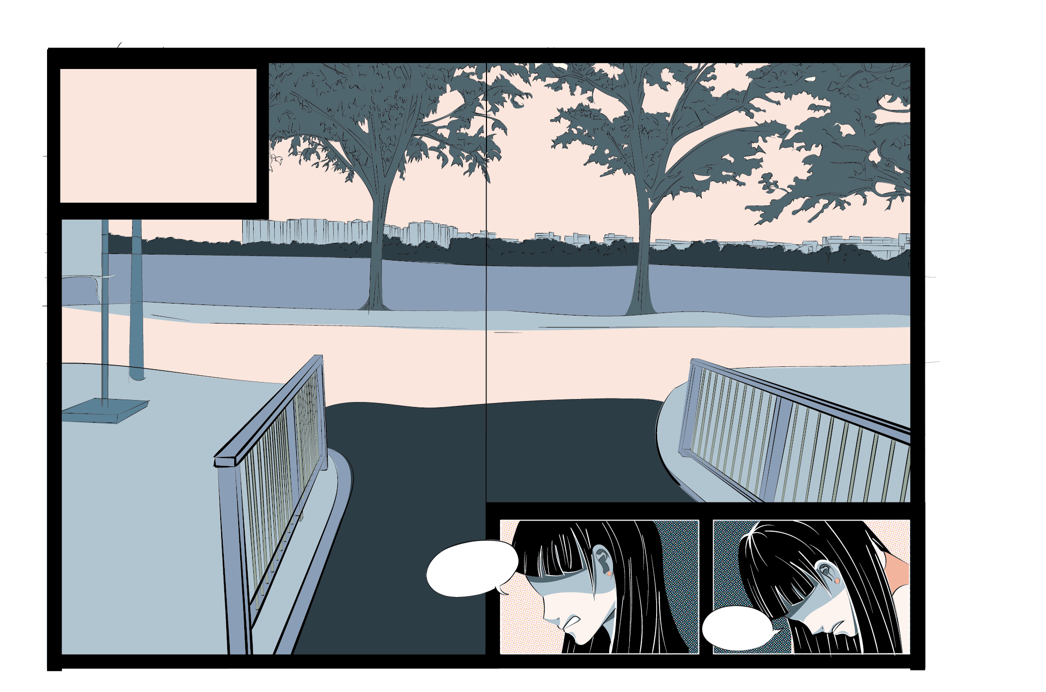
And she said that the structure was too rigid and too traditional comics so she asked me to play more with the spreads and layouts (to occupy landscape with two pages).
After this, I went back and thought more of the narrative structure first and came up with a backbone:
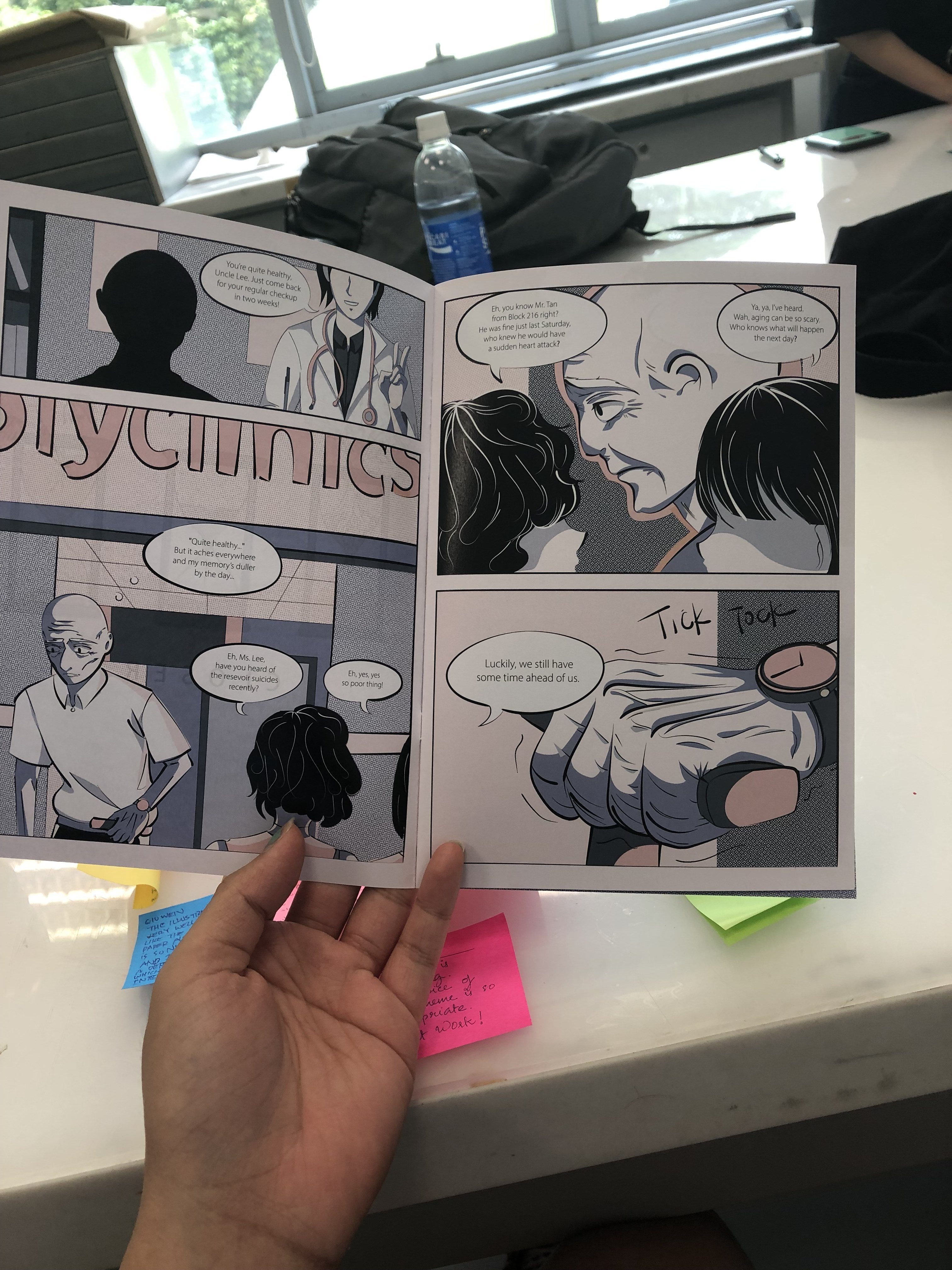
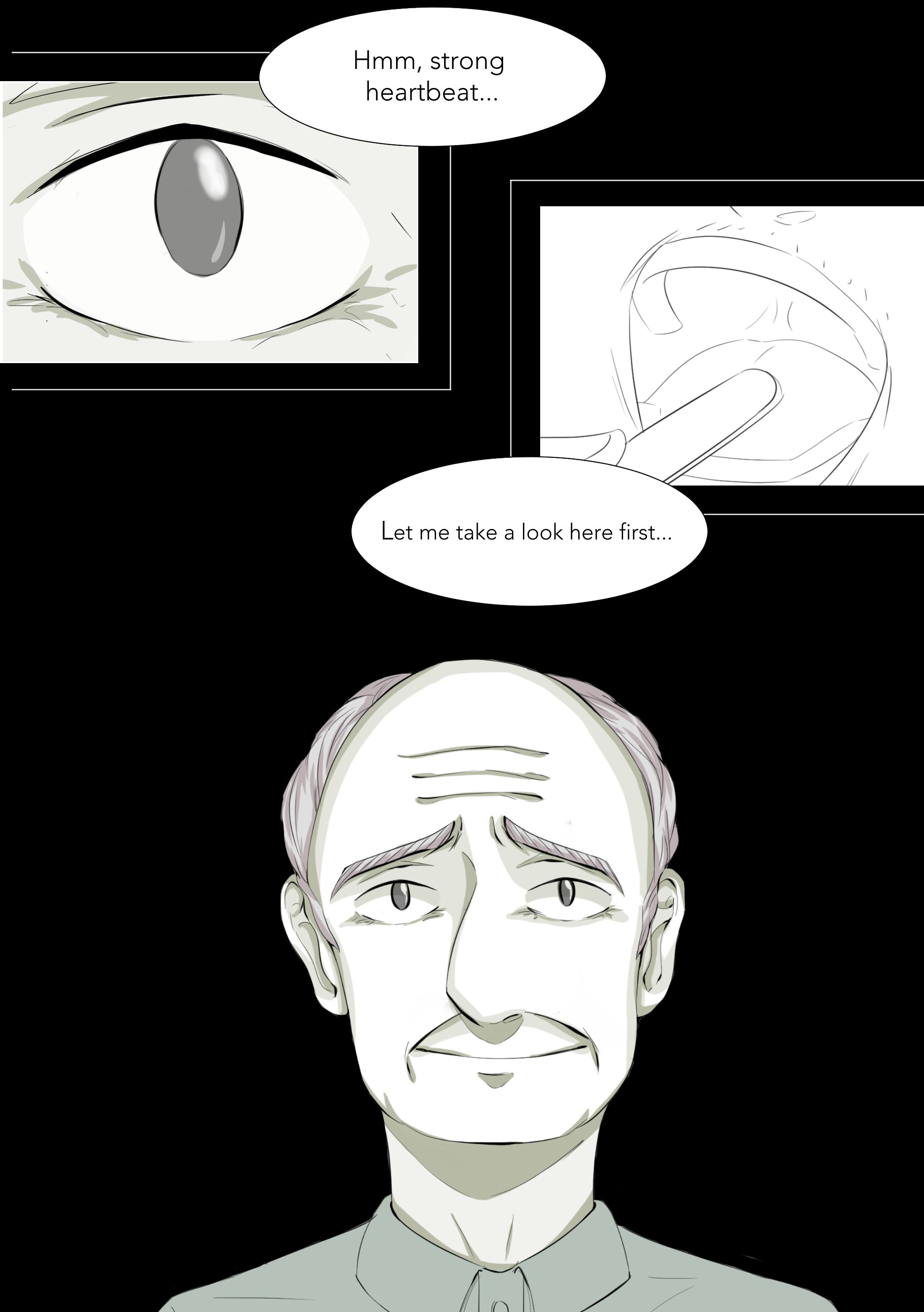
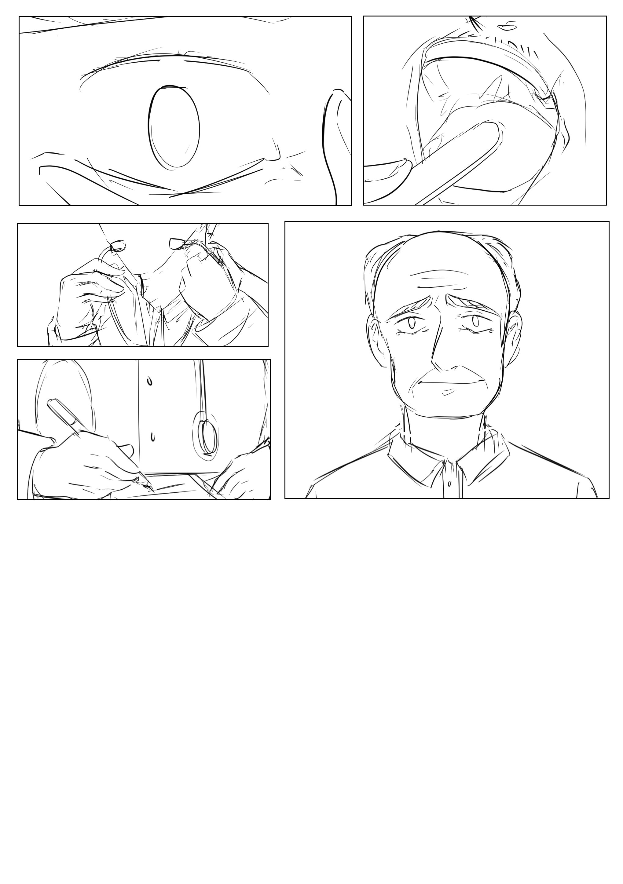
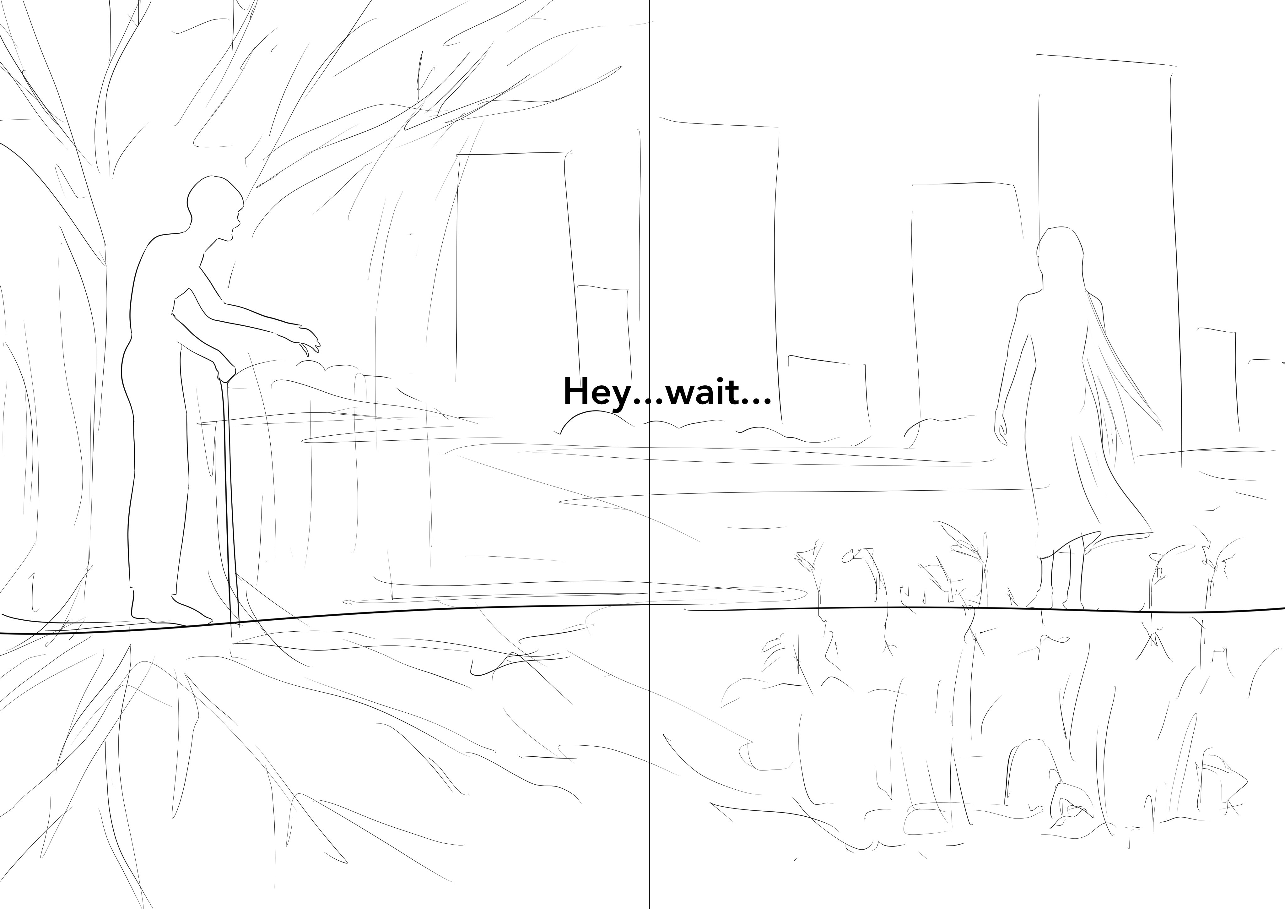
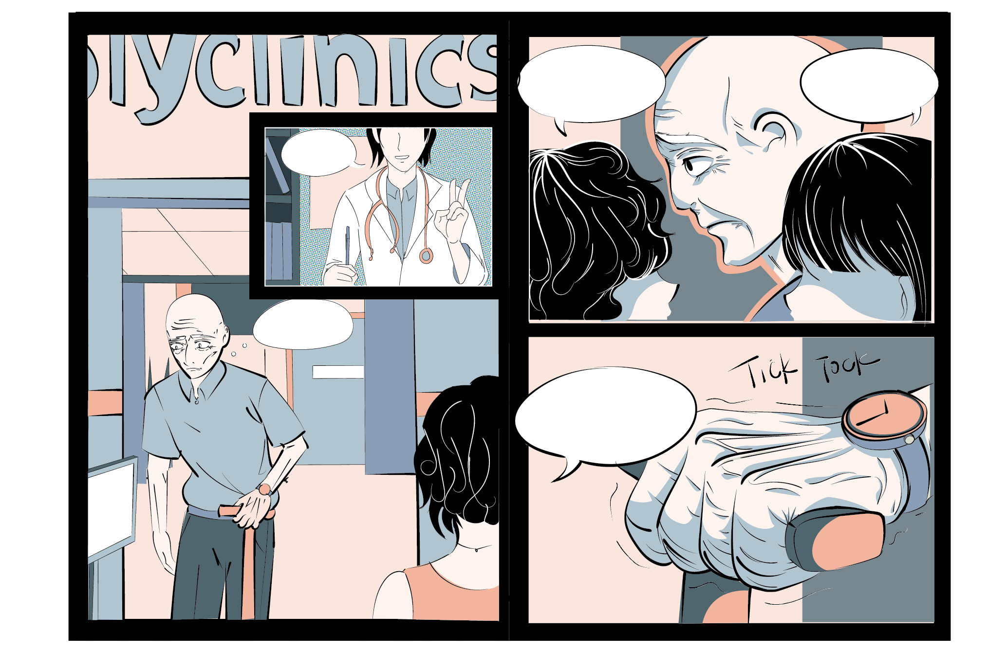
1-cover, 2-3: him visiting Doc and contemplating on death after meeting some aunties talking about this old man who suddenly died although he was healthy and fine, 4-5: old man sees construction site and ponders about being ‘replaced’ and being a relic of the past, 6-7: old man sees lady and is shocked and 8: he wonders who is closer to death.
These were sketches for pg 3-4 and 6-7
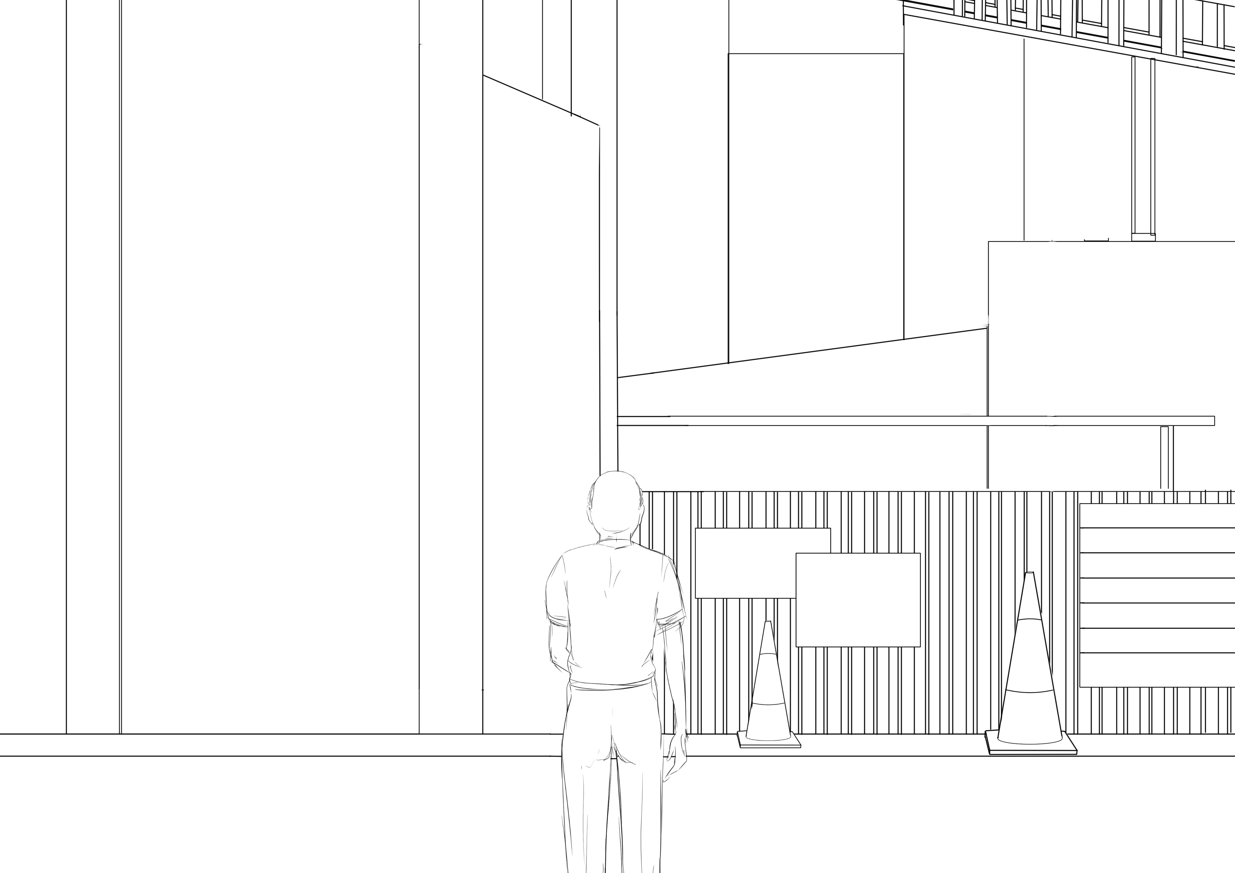
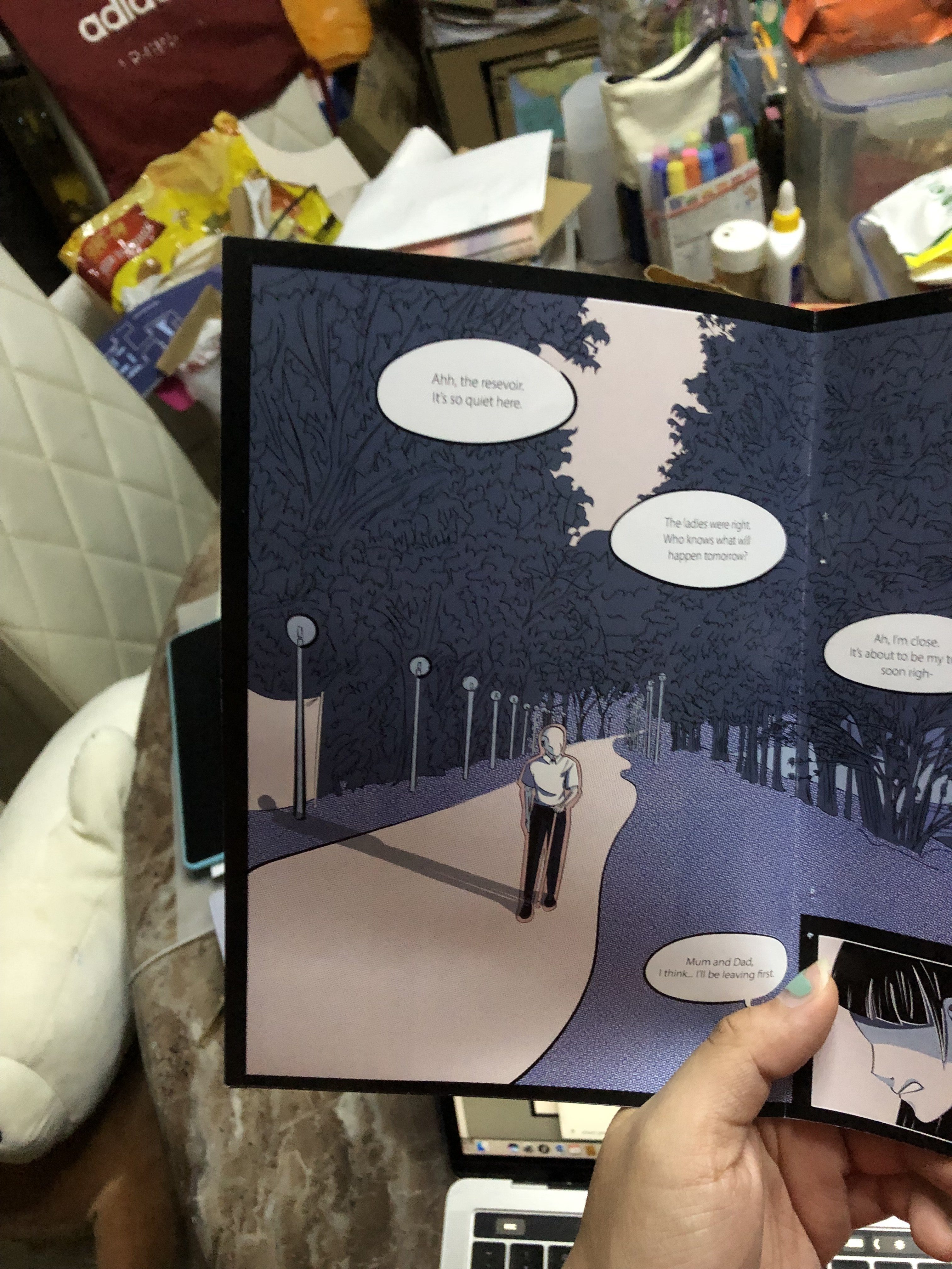
I tried to work with the spreads more and I think they were quite effective! Mimi also said that she didn’t see much of Bedok and I had to feature it so I did this
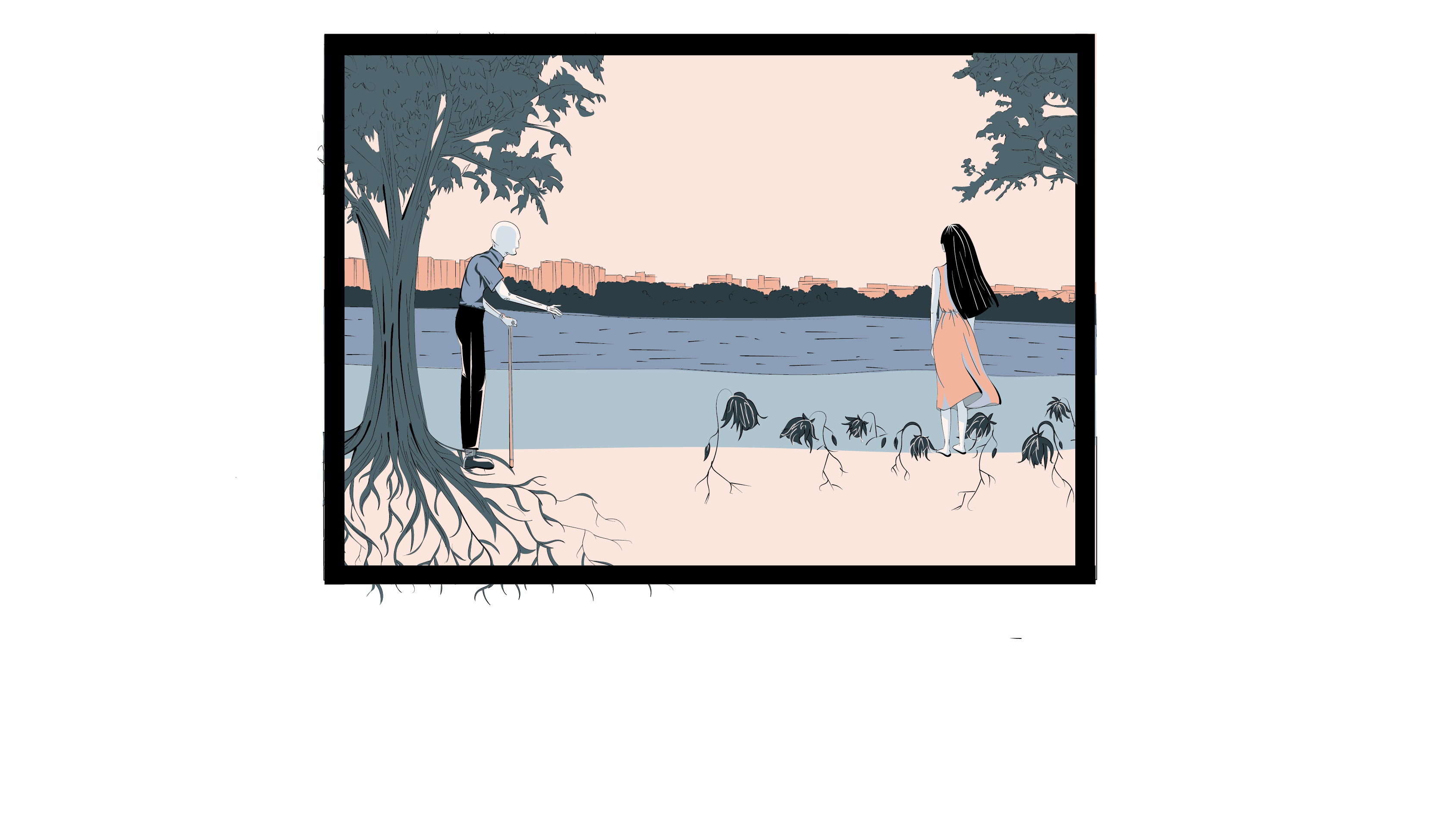
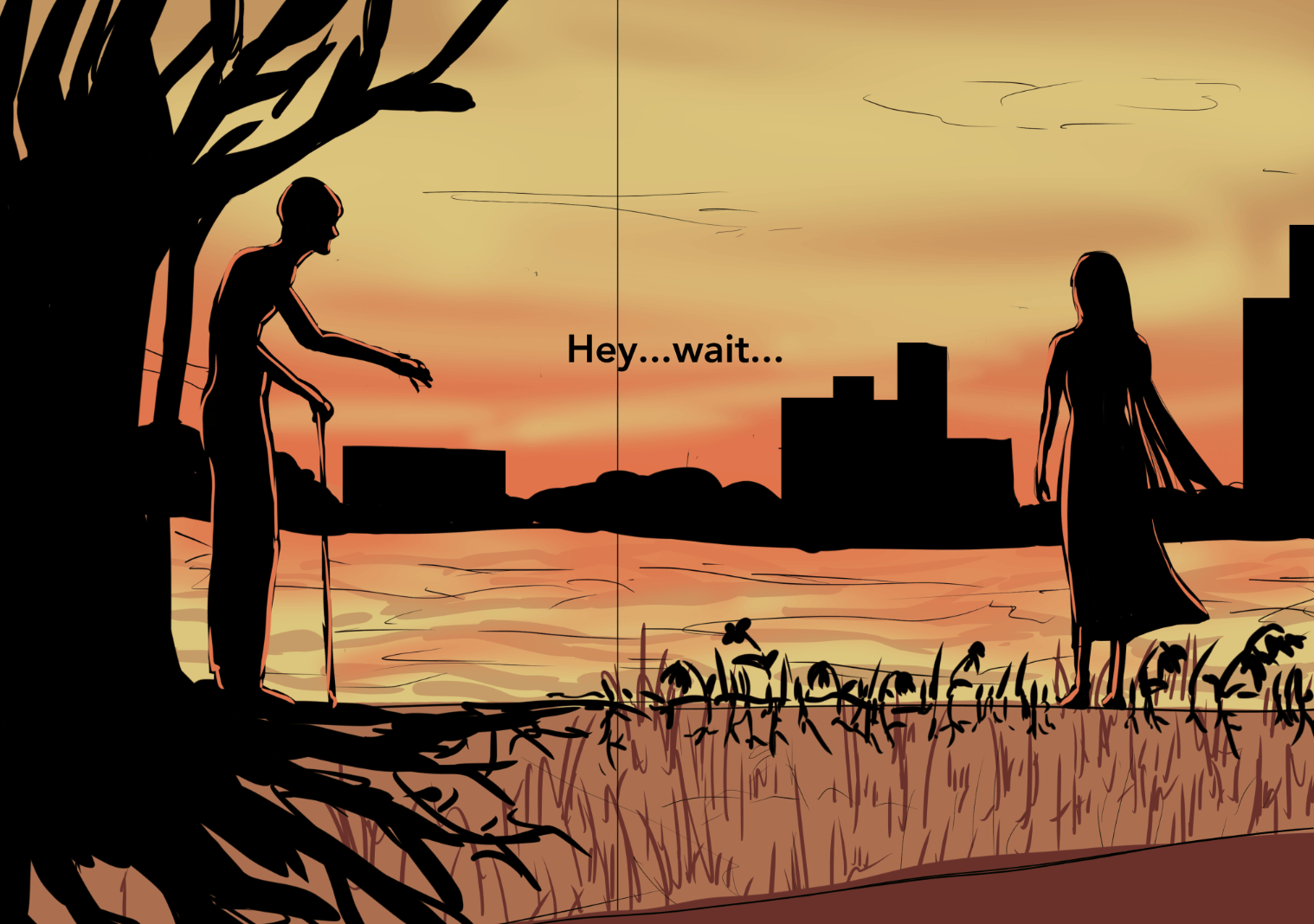
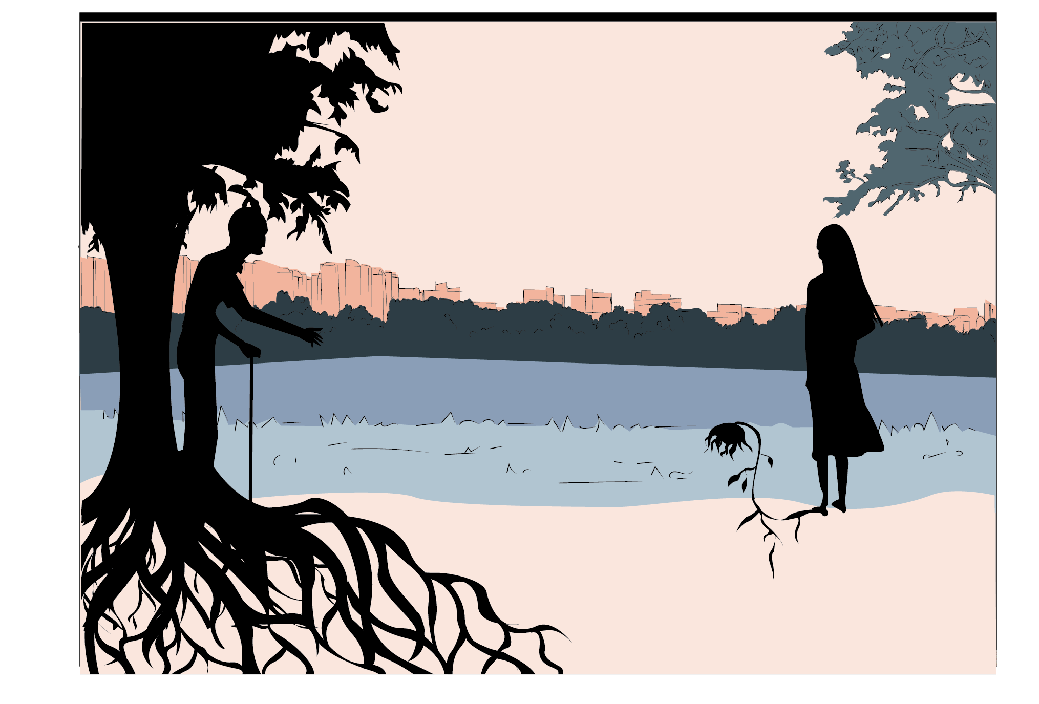
And I felt that I could play on symbols of plants instead of construction as that’s quite risky. So I thought of representing the old man as a huge old tree that is old but well rooted and the lady as a young flower but withering due to her spirit being broken.
This was the initial sketch I had in mind. And before the color schemes were decided I tried some orangey analogous just to convey the sombre mood and I liked how it turns out.
After decided the scheme and cleaning up the illustrations: i had some difficulty trying to bring across the symbolism:
These are some variations:
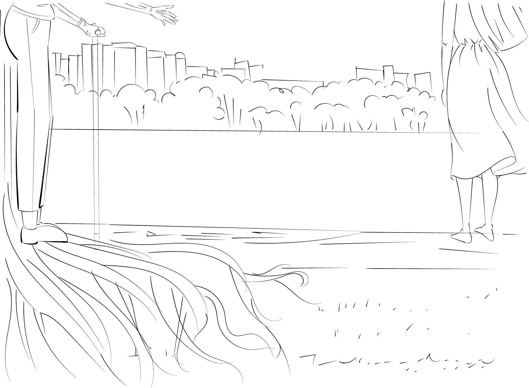
I tried to zoom in on the feet and roots and plants but they look too claustrophobic and I think I should capitalise on the resevoir landscape haha
so I tried using colors too and they look okay but i think they were too distracting and you will not immediately link the man and the tree and the girl and the flowers.
I initially wanted more flowers to represent those who suicided too (around 6-8) but they would be too confusing so:
I changed them into silhouttes and connectig the flower to the girl’s feet.
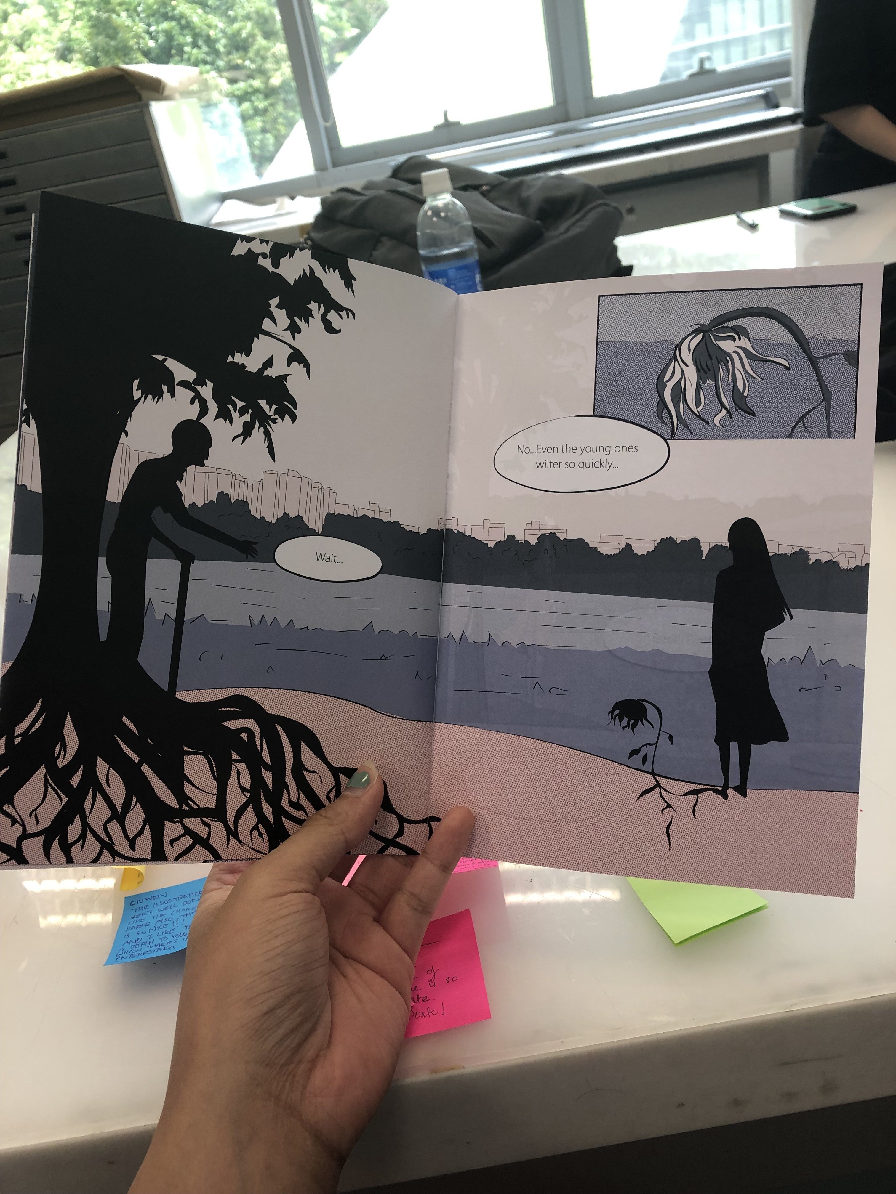
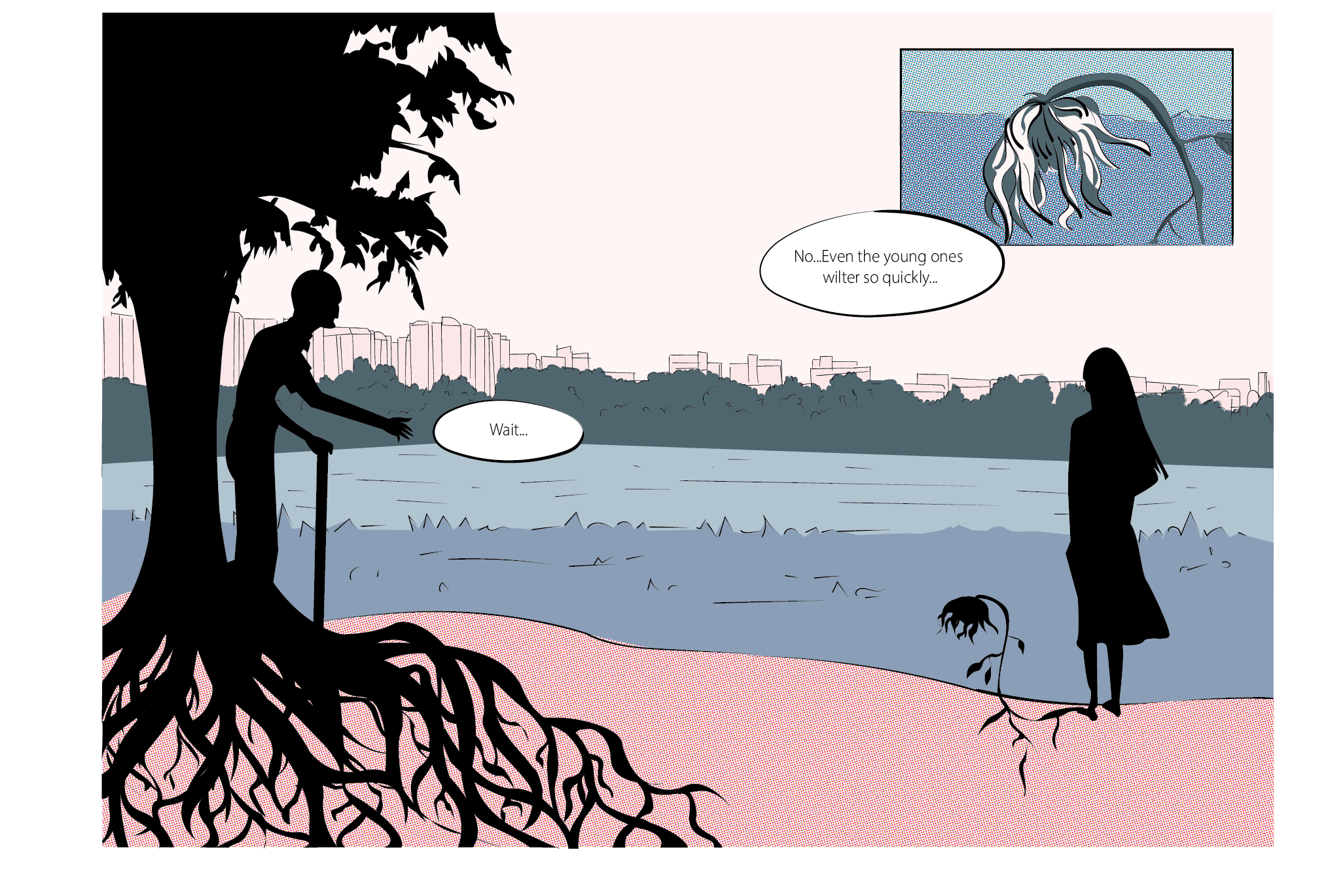
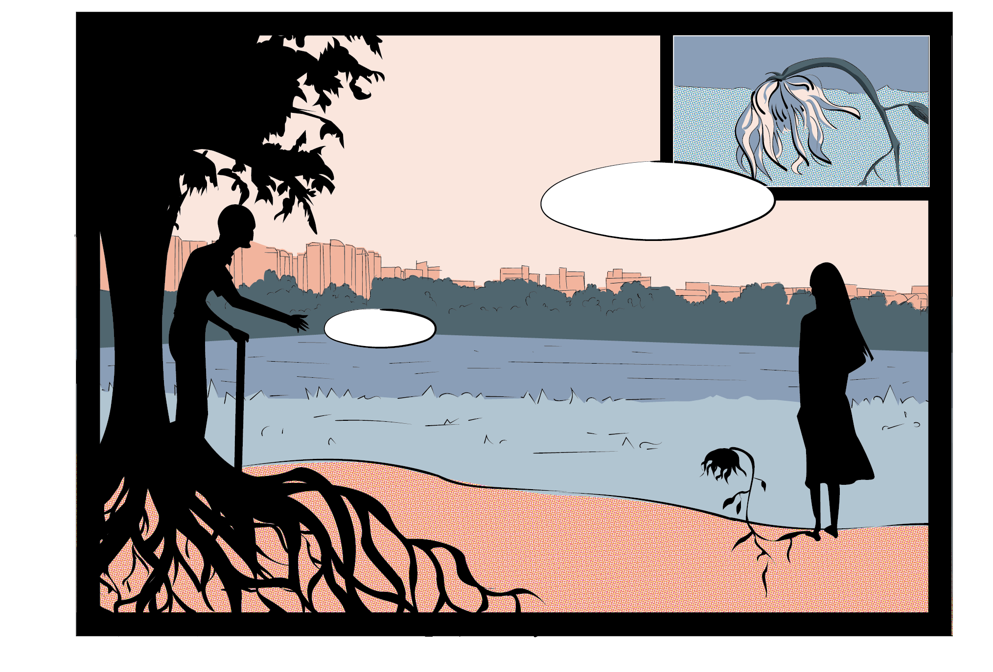
I was afraid that it’s not strong enough so I decided to zoom in on the withering flower and use words to direct attention to it: Even the young ones wither so quickly so you immediately link the plants to the people metaphorically.
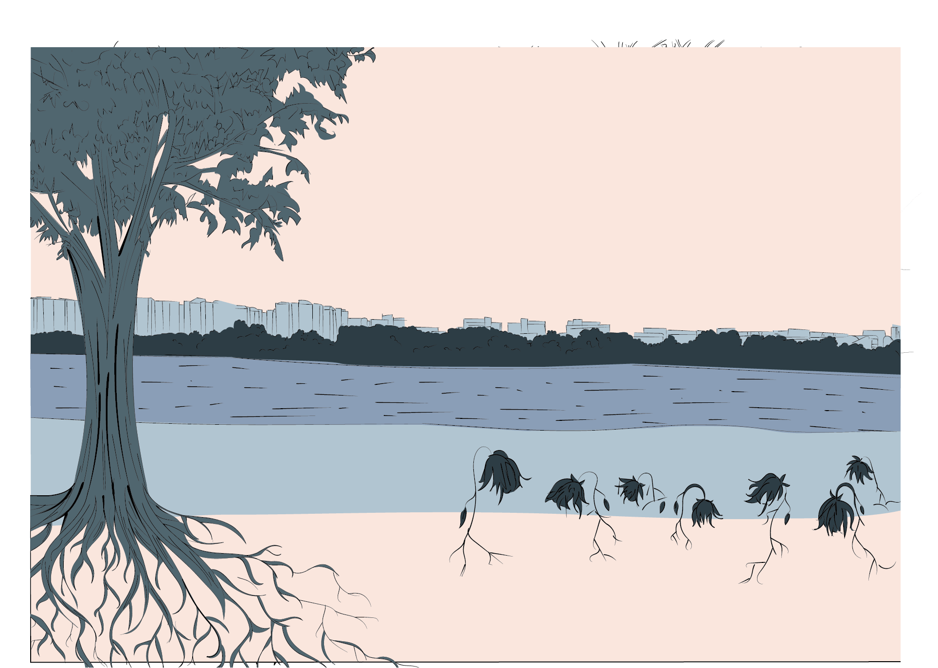
So getting rid of the construction motif, I got to focus more on the greenery:
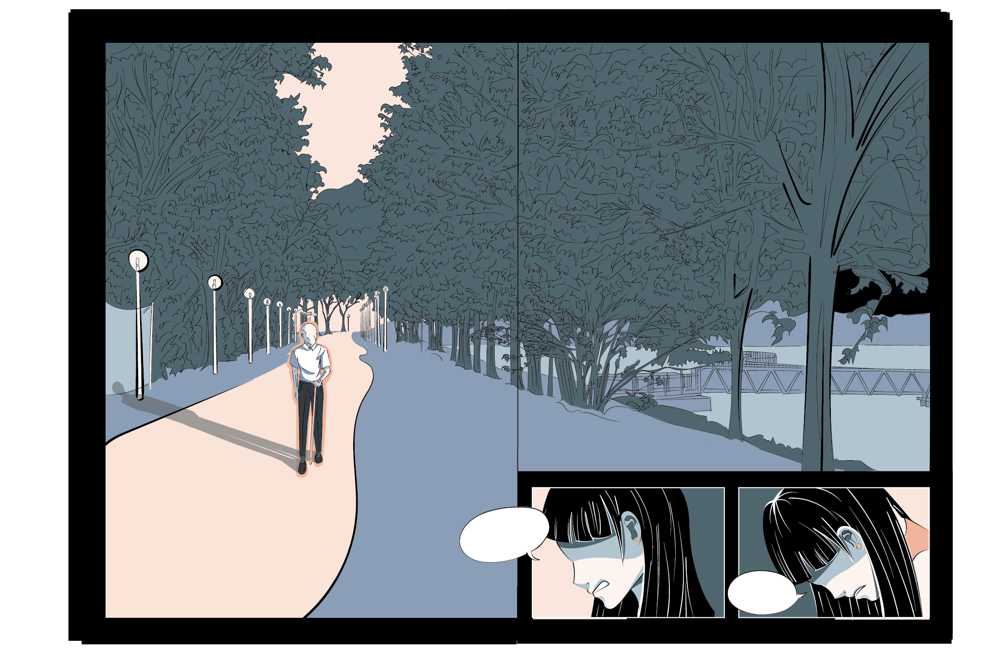
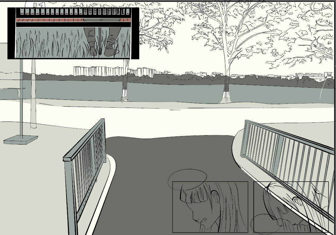
Initially wanted to use the below scenery but felt that the angle was more appropriate for pg 67 so I zoomed in and cleared some trees for 67 and changed the scenery of 45 to a lane so i can put the old man walking there hahha
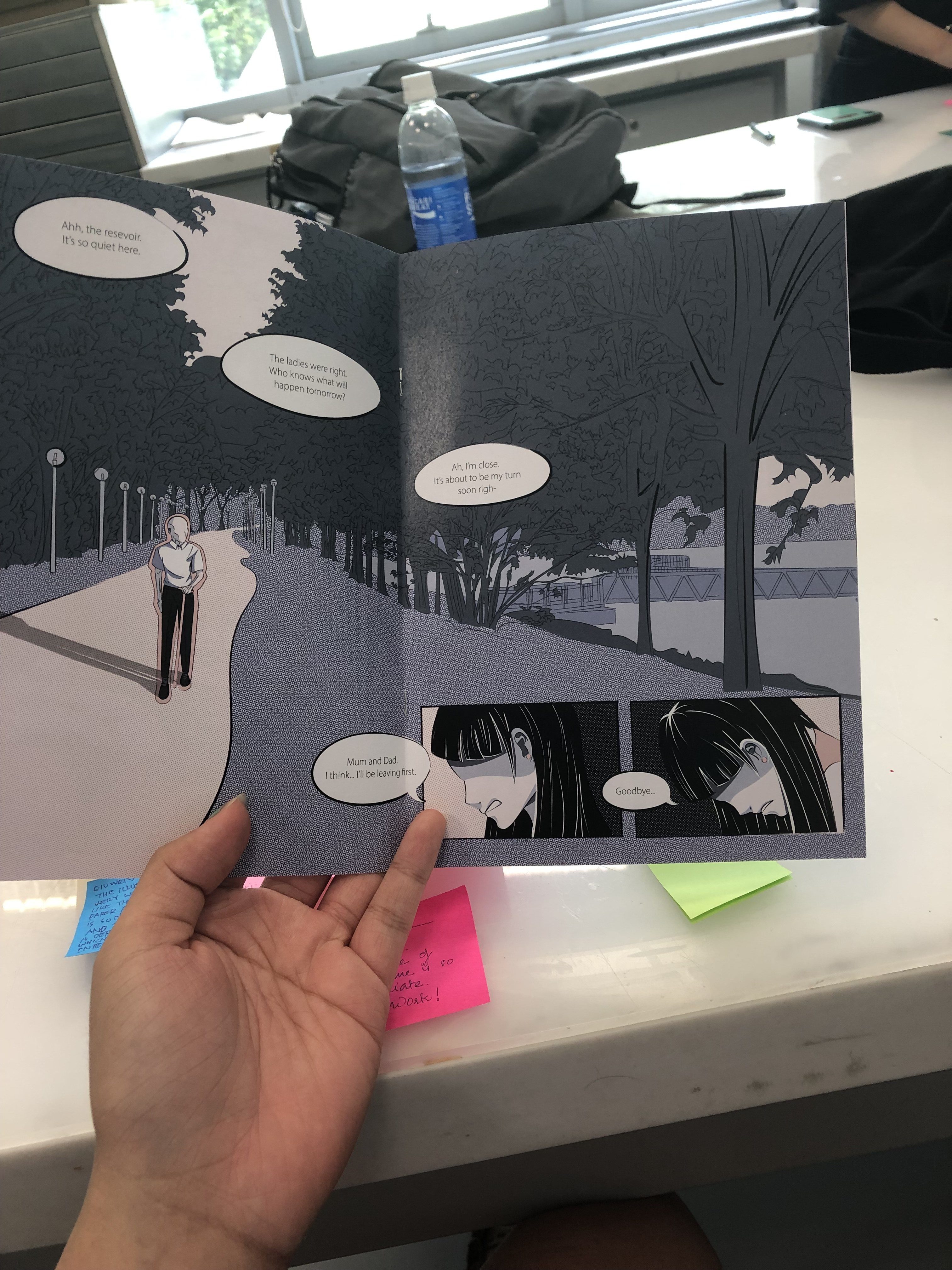
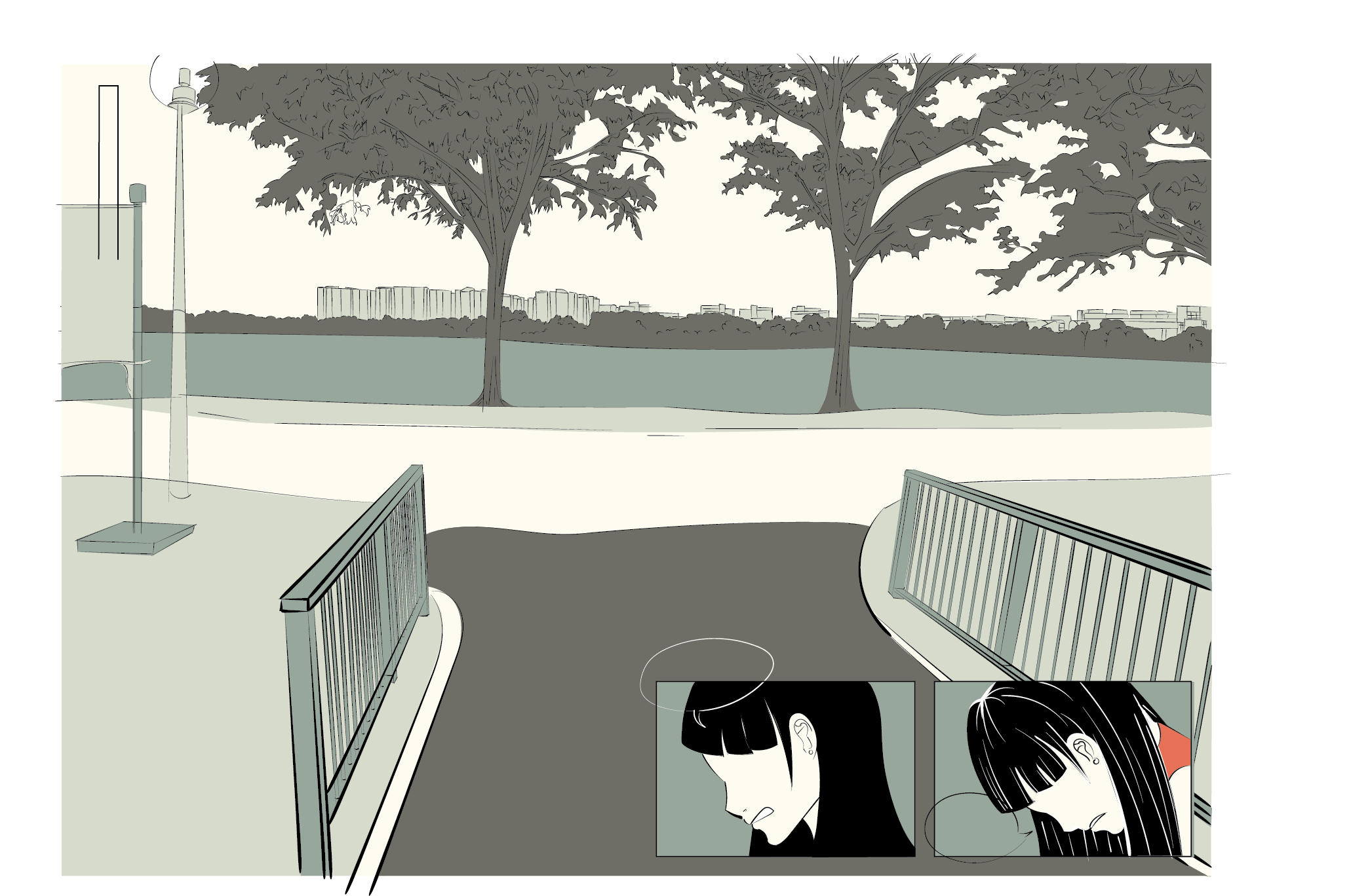
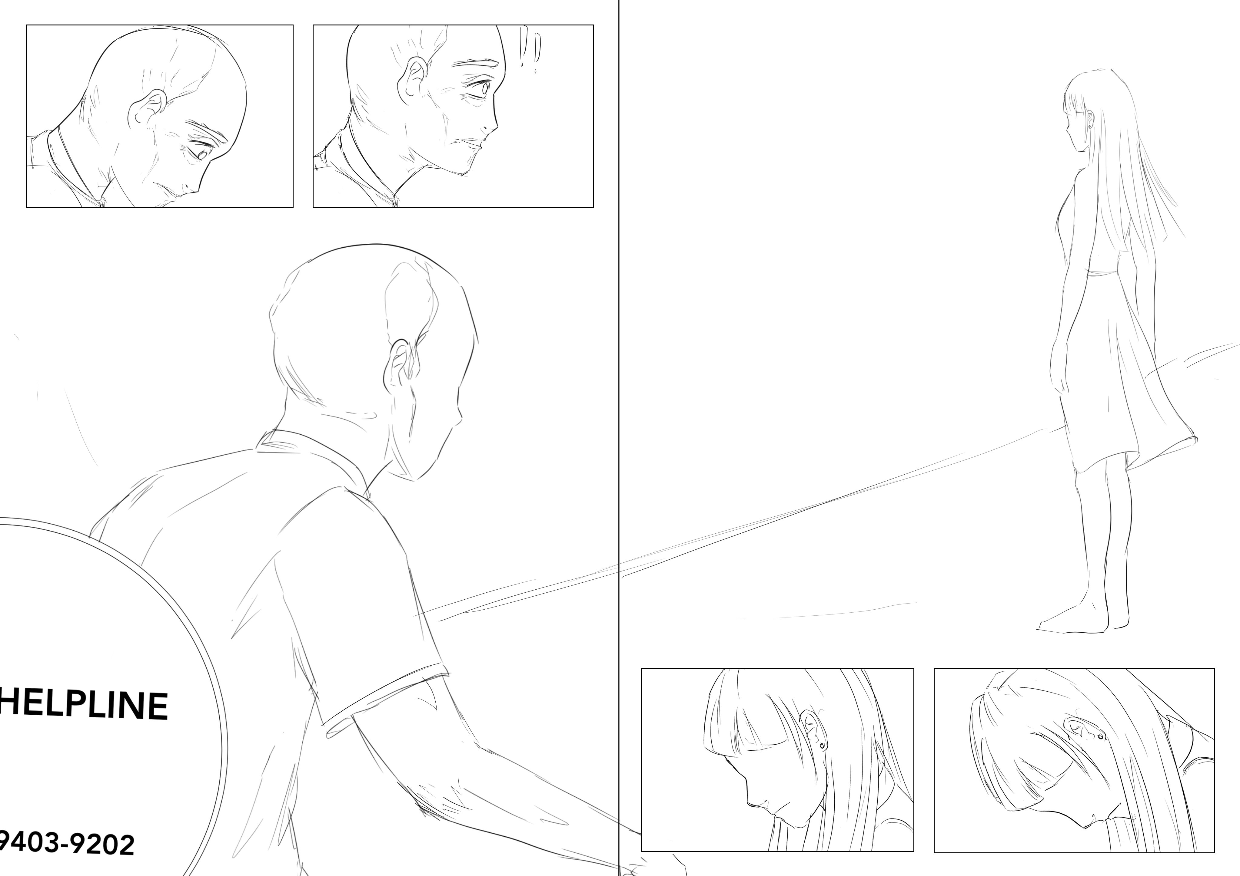
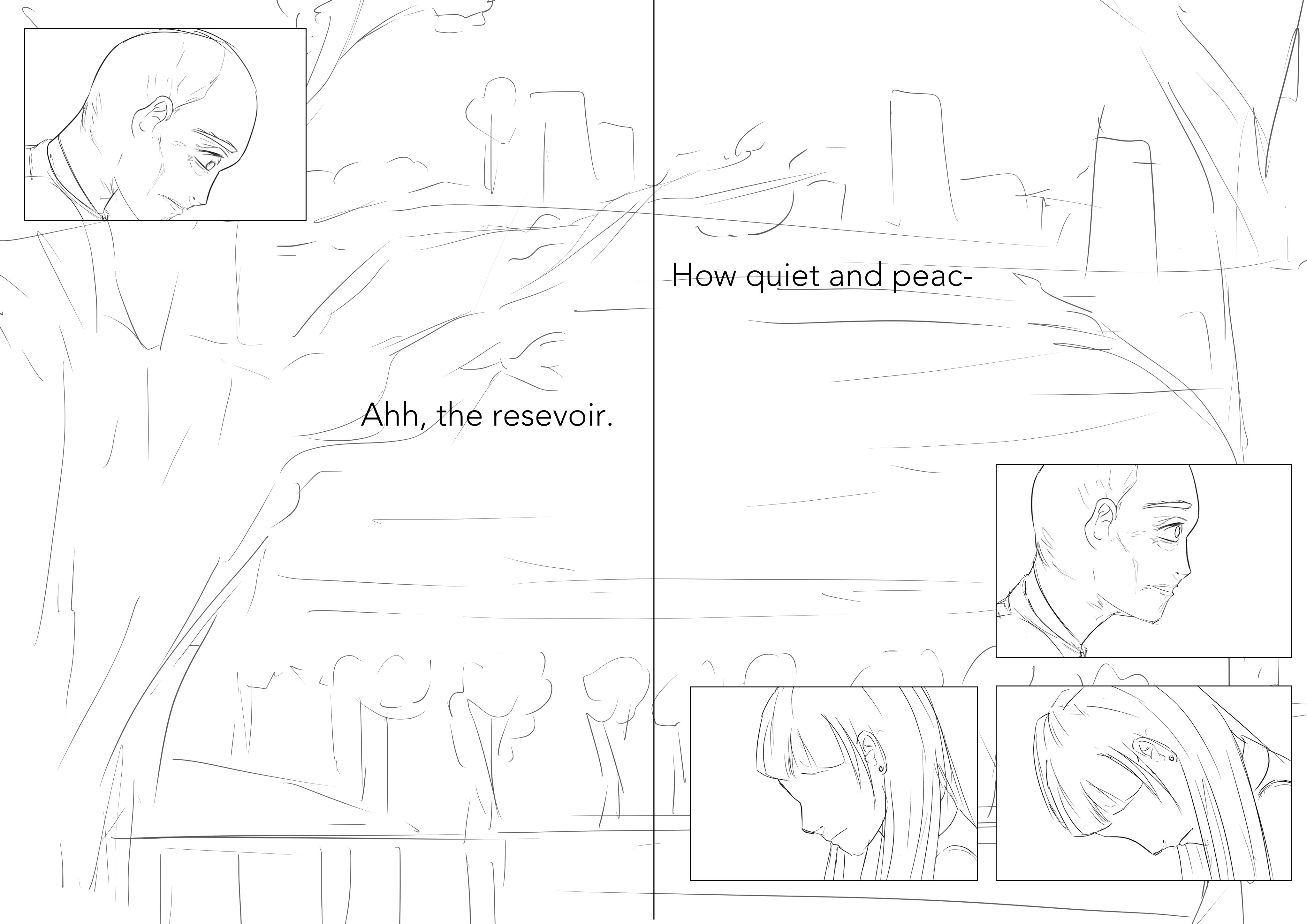
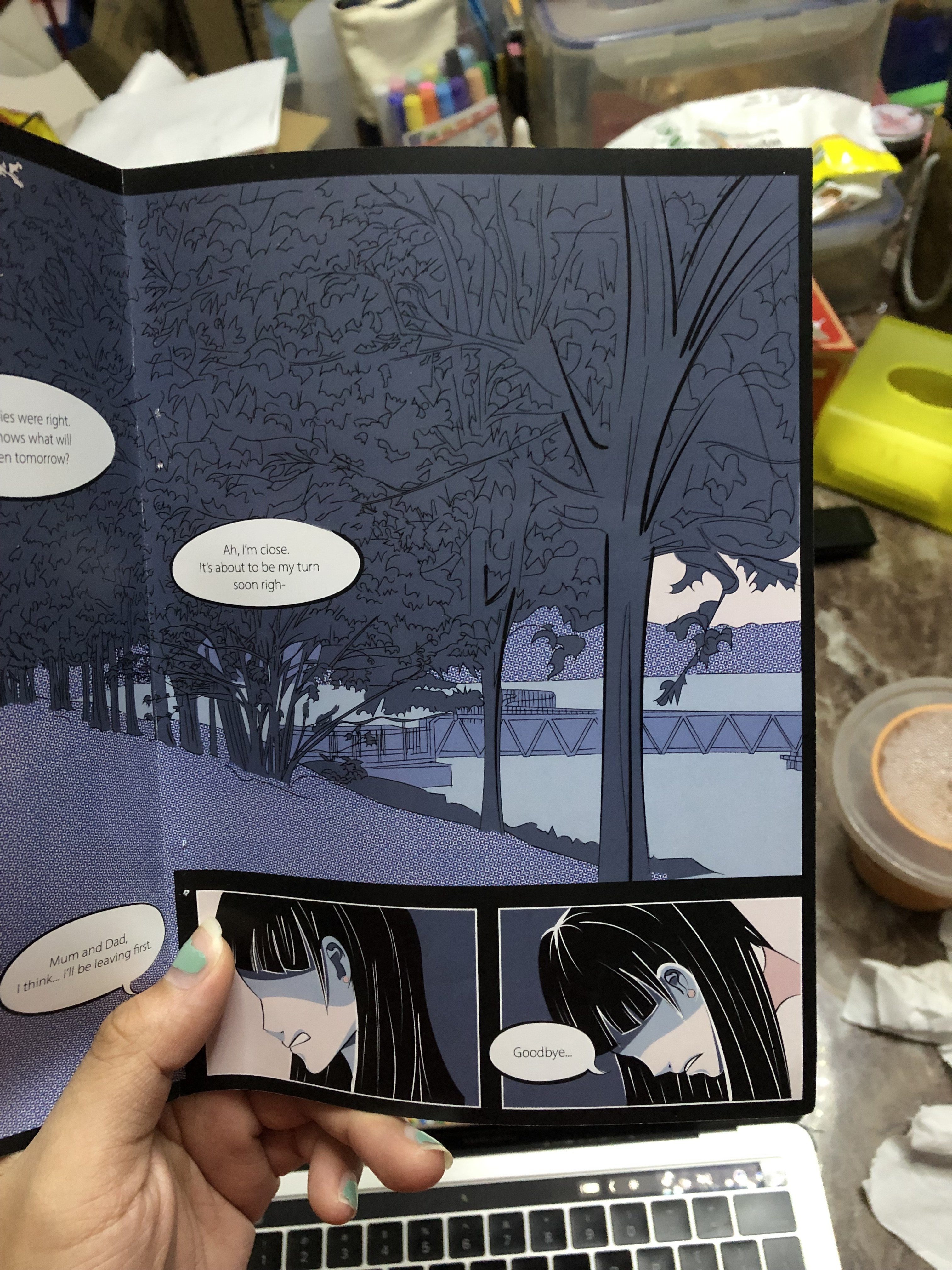
I also had trouble trying to feature him in the resevoir so initially i had the idea of using a bench with him alone (and not showing his face and focusing on the empty spot between him to emphasise on his loneliness and his friends who have all left). But the bench didn’t work as well and after changing the scenery, i felt that the old man walkign alone with a long shadow behind suggests quite the same and has a sense of isolation too.
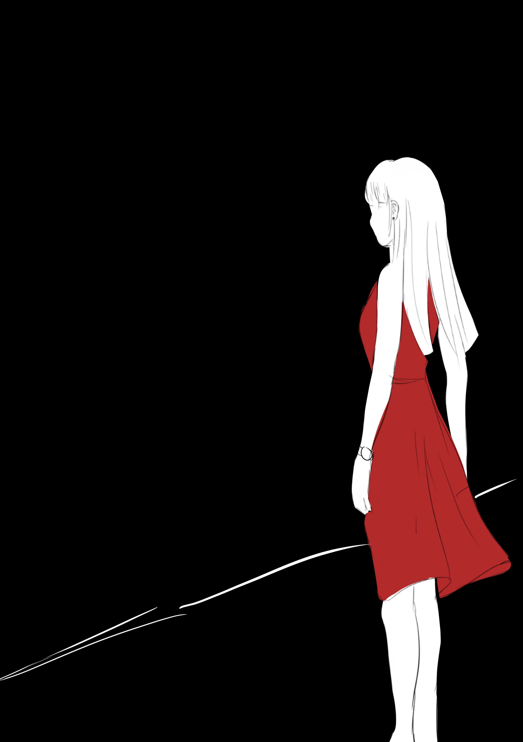
I also wanted to justapose him and the girl by giving her a close-up to emphasise on how when she’s suicidal, she gives looking inside to herself and not outside but the old man looks outside and feels sad because of that. So there’s the difference between them.
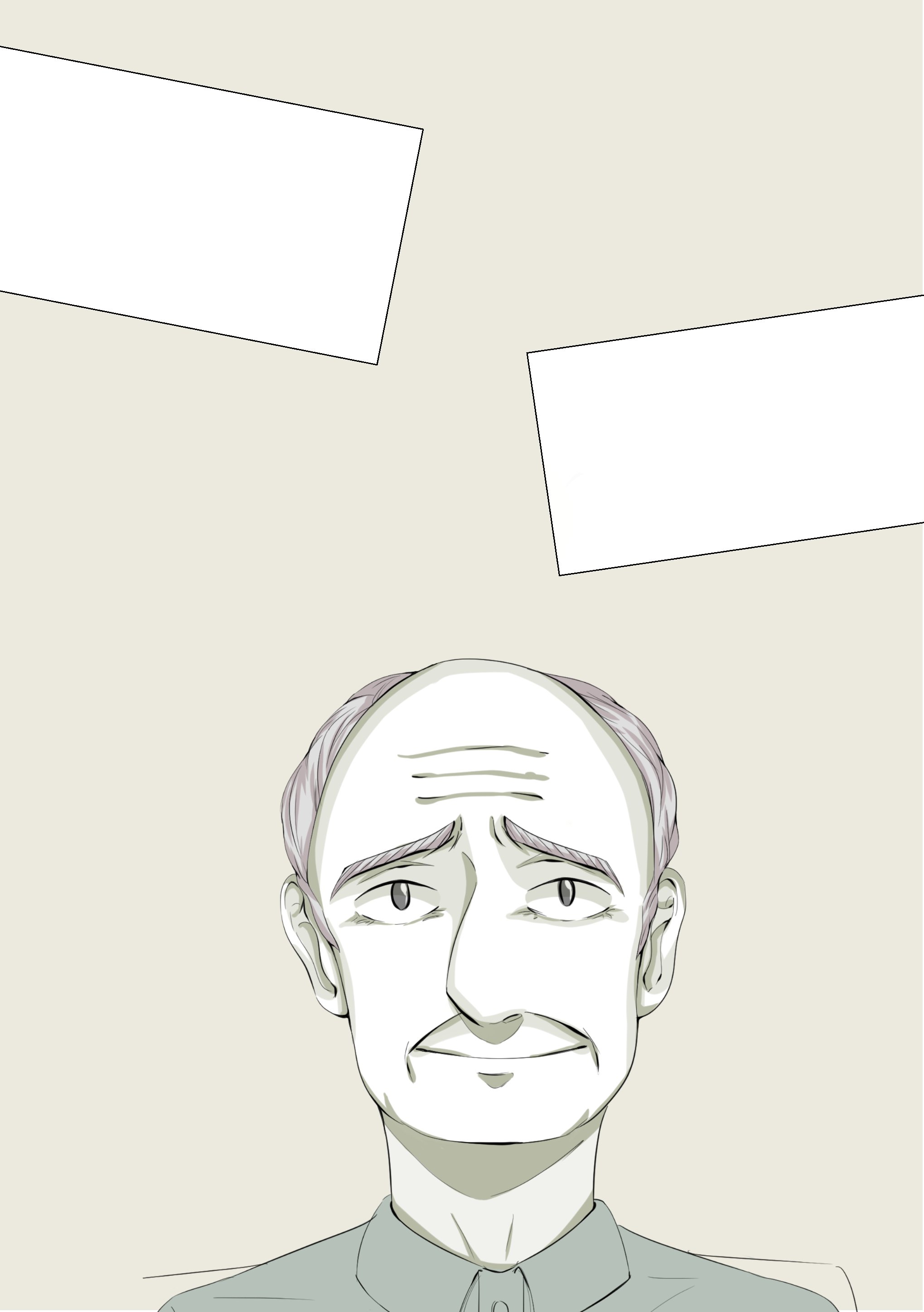
INitially for pg 2 and 3 I felt that i crowded it too much
I wanted to do not a basic layout so I put the doctor in a small box but that’s too confusing. After some thought, i realised that this page contrasts with the other pages in terms of space usage and i think it brings across a rather claustrophobic feels like the old man is too drowned out by all these information and i think that that reflects his state well as compared to when he goes to the resevoir later where he has more space to relax and think and the sparing use of panels on pages 4567 conveys so.
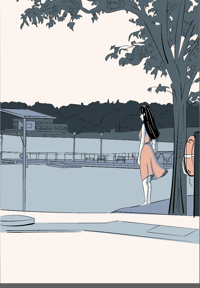
For the last page (and I’m so not organised I’m so sorry), this was my initial draft and Mimi said that I could put her smaller to justapose her to the outside world and feature the resevoir more so I found a picture with a perfect angle (thank the lords)
This is with the spot colours scheme but I opted for the below scheme instead.
I placed her smaller and highlighted the life buoy same color as her to put a connection between the as life buoy=symbolism of help and perhaps she’s crying for help silently too.
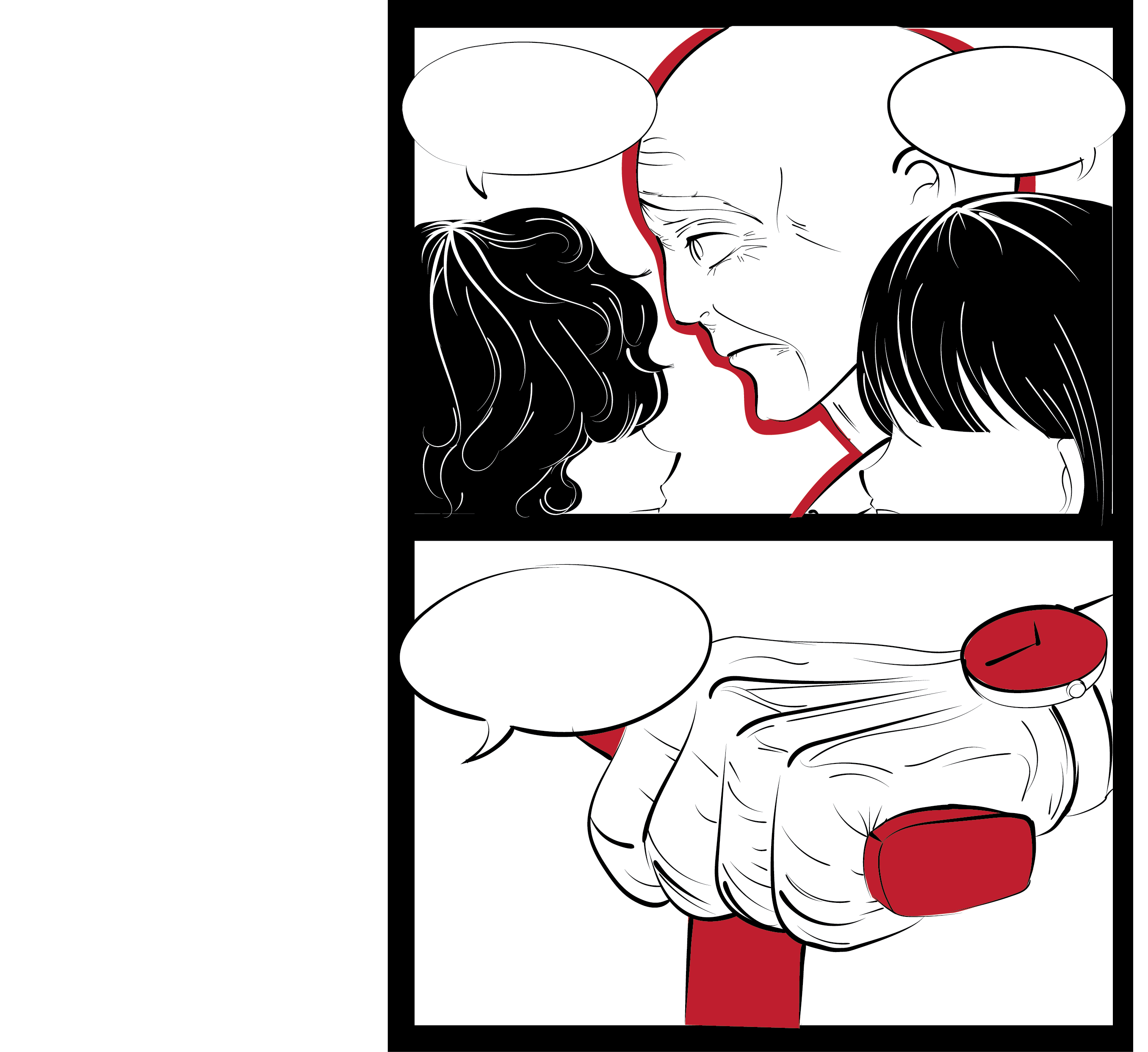
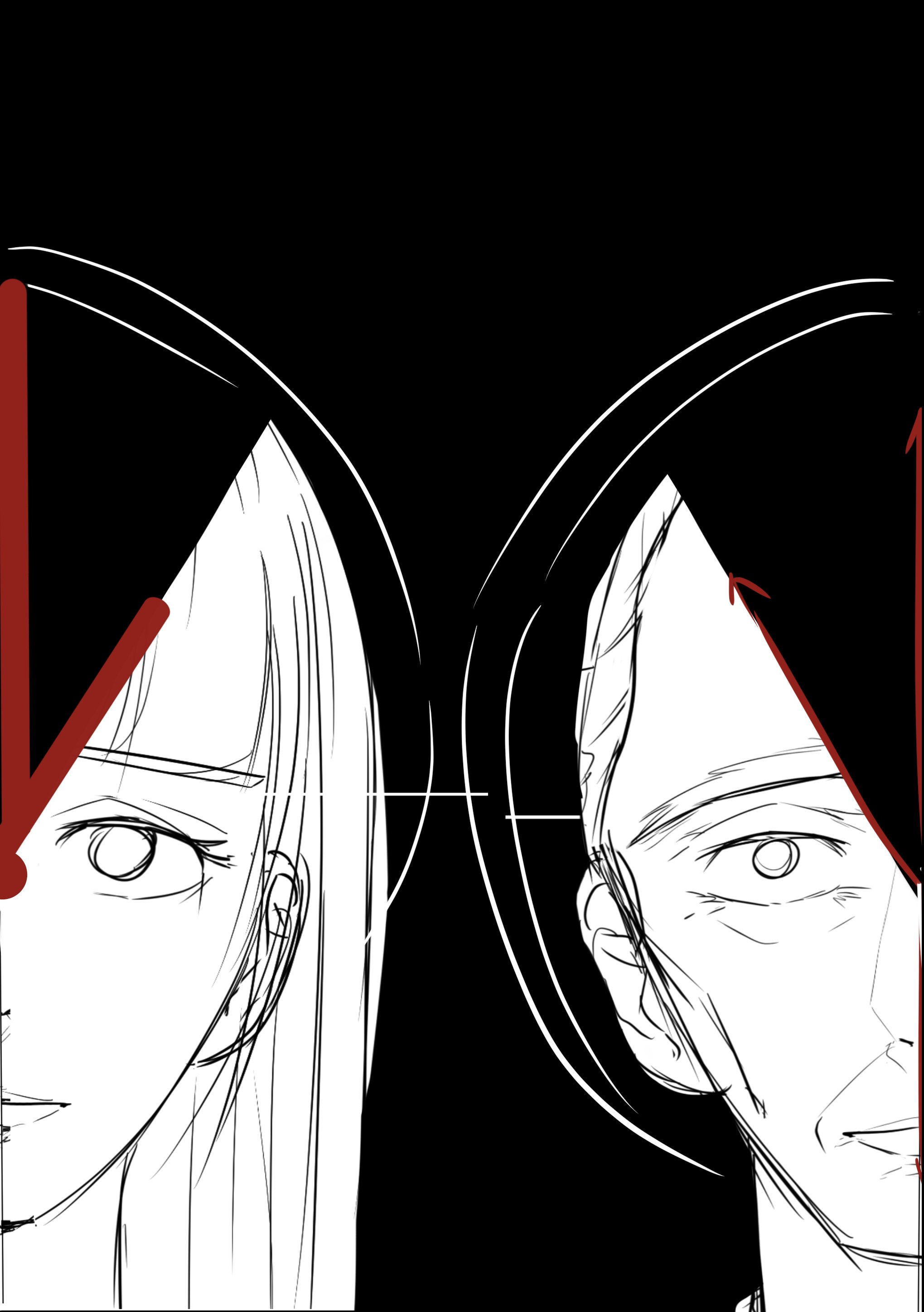
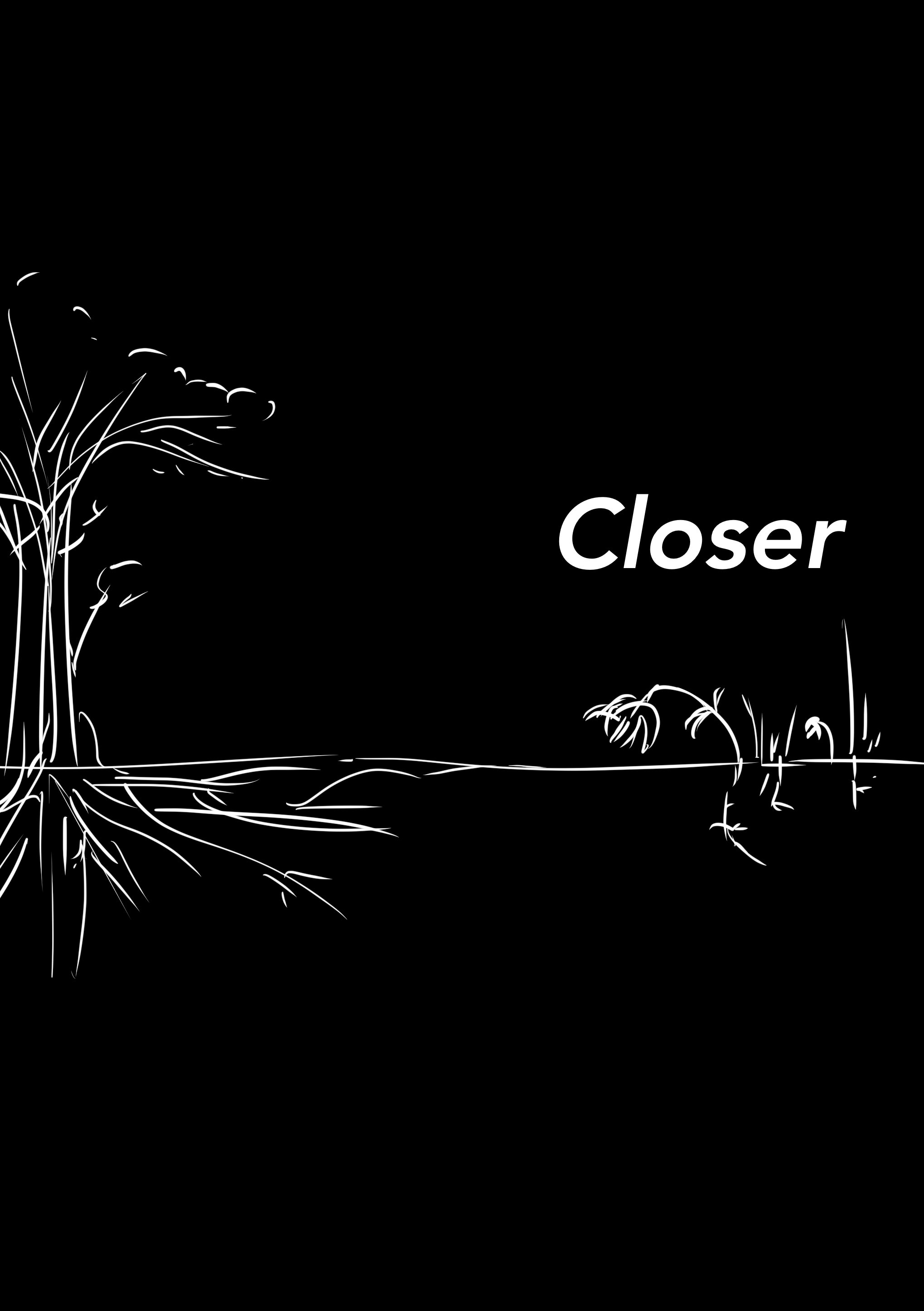
For the cover page, i didn’t know what to do now without the gestalt so I wanted to use their heads too but I put them with clocks instead but it looked super creepy so
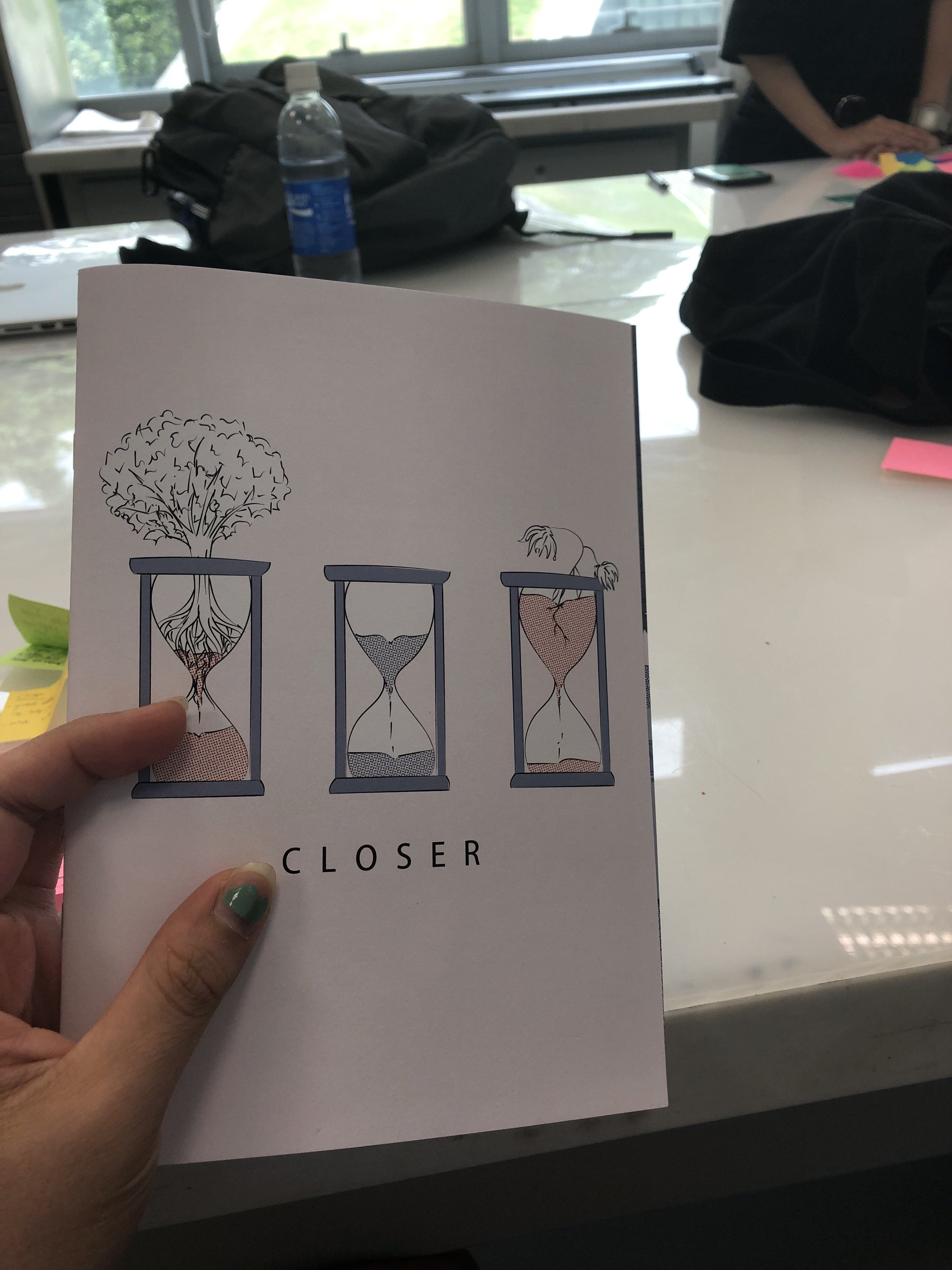
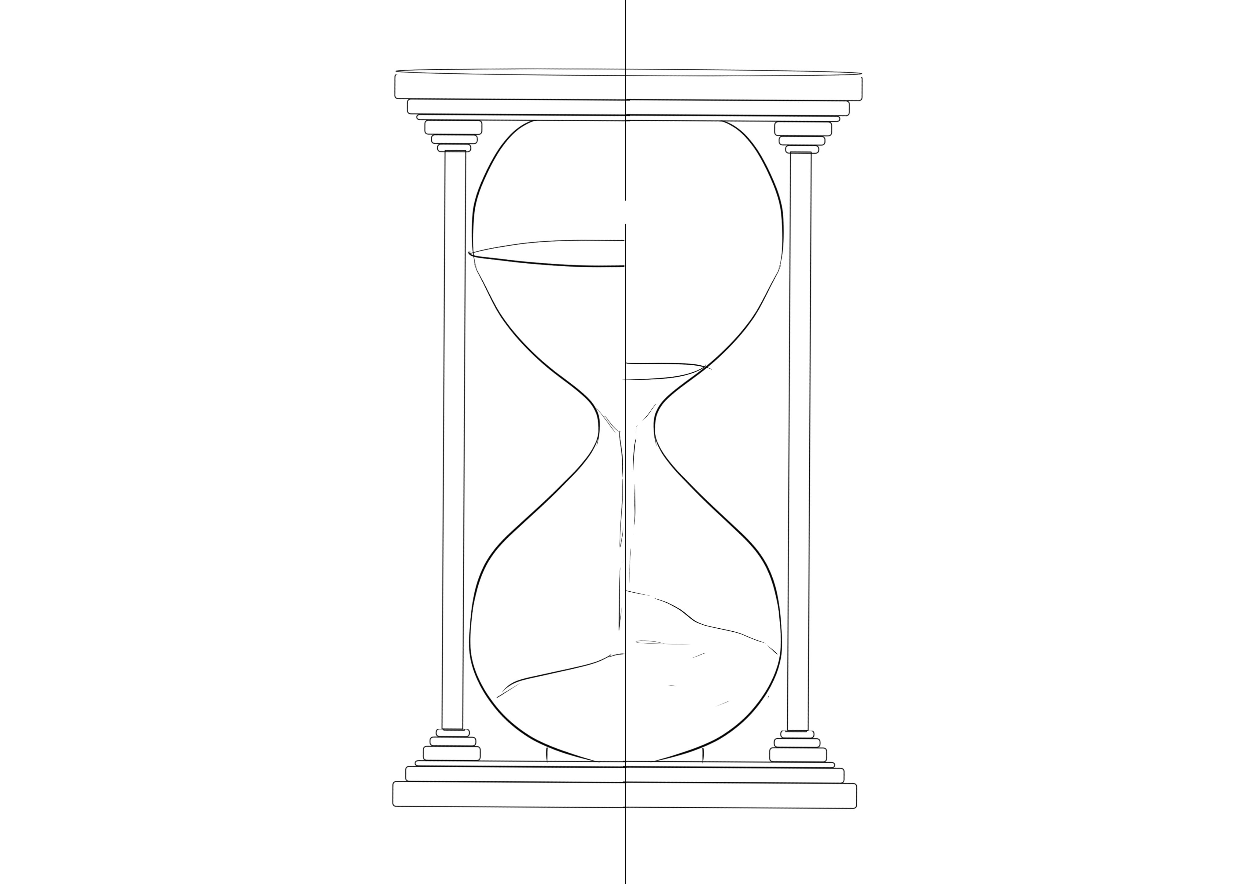
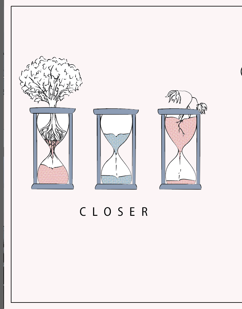
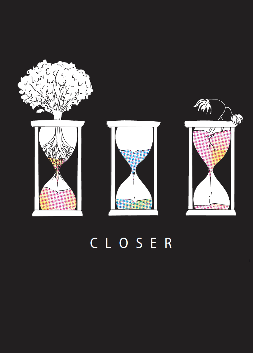
SO I did a simpler flower one but mimi said that there were no associations to death so I decided to experiment with hourglasses and this was the main idea to juxtapose the amount of time they have left
Then irealised that sand in hourglass can serve as soil so i planted’ their respective motives into the sand and justaposed that!
I also added a middle hourglass to show like a ‘constant’ like the norm and highlight the sand of the other two as the spot color i used for the other panels to highlight the characters.
as be seen from the above, at first my drafts had a black border and a black cover:
but the printing resulted in misalignment that is hard to ignore with the black borders:
This border is clearly thinner than
The border on the previous page and it is a spread so it’s hard to ignore 🙁 i tried two printing shops and both gave the same and the aunties say that it’s almost impossible to try and get the borders right so…
I decided to get rid of it and change my cover to pinkish background so that it fits more with the rest!
Overall, it’s been really fulfilling and fun and i do think that i could have looked at other styles more but i felt that i’ve done that for the previous project alot and for this i wanted my illustration style to show through more so i referenced color schemes and motifs instead! I had a lot of fun too:) thank you!