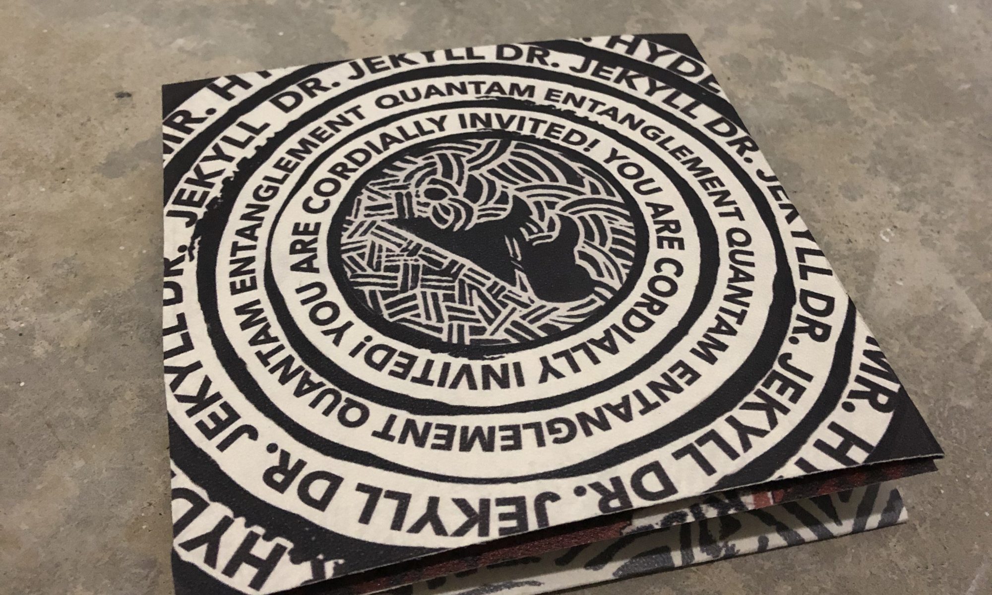
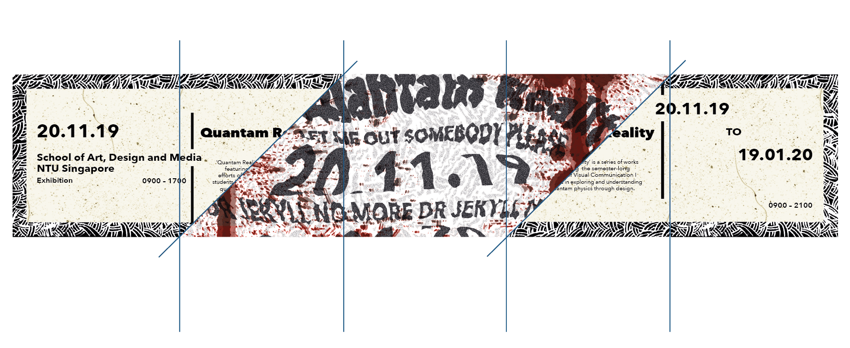
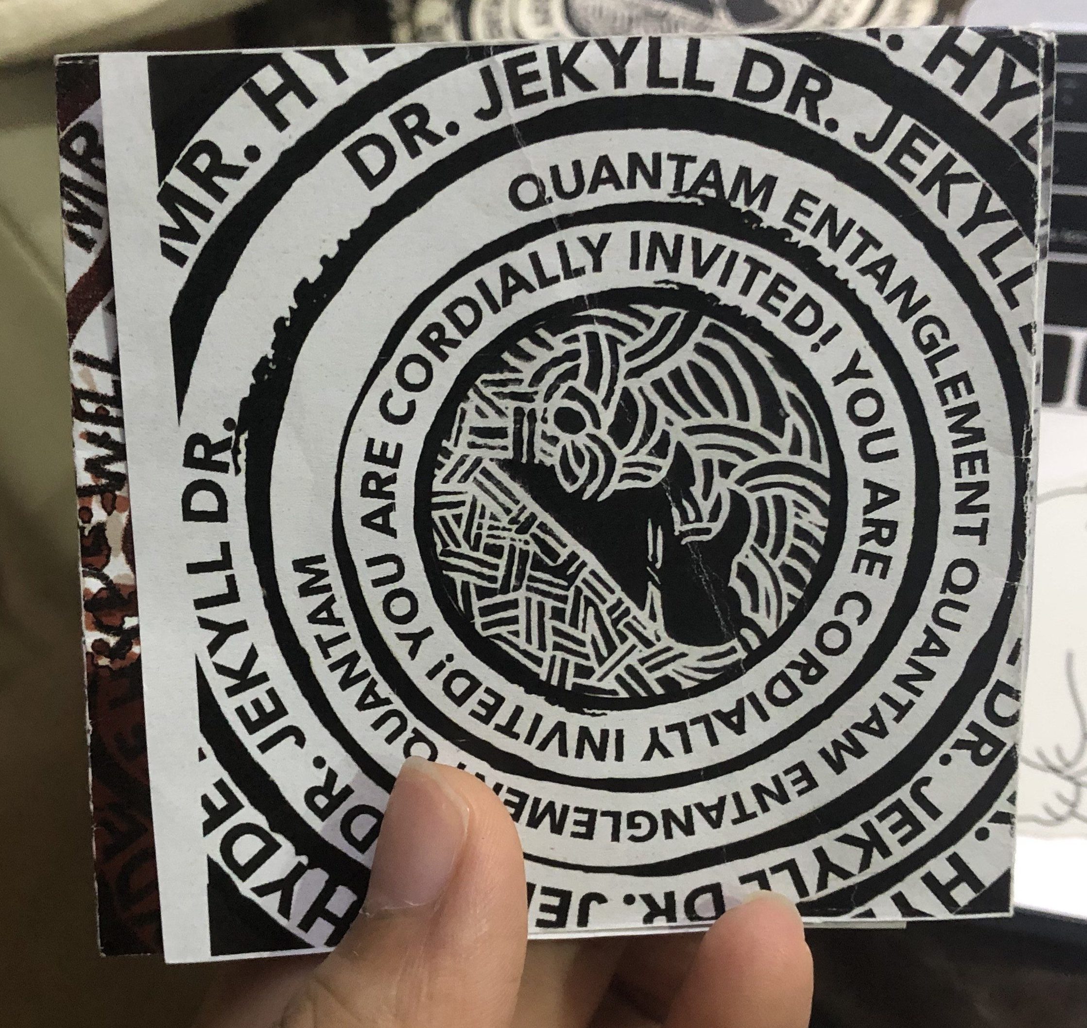
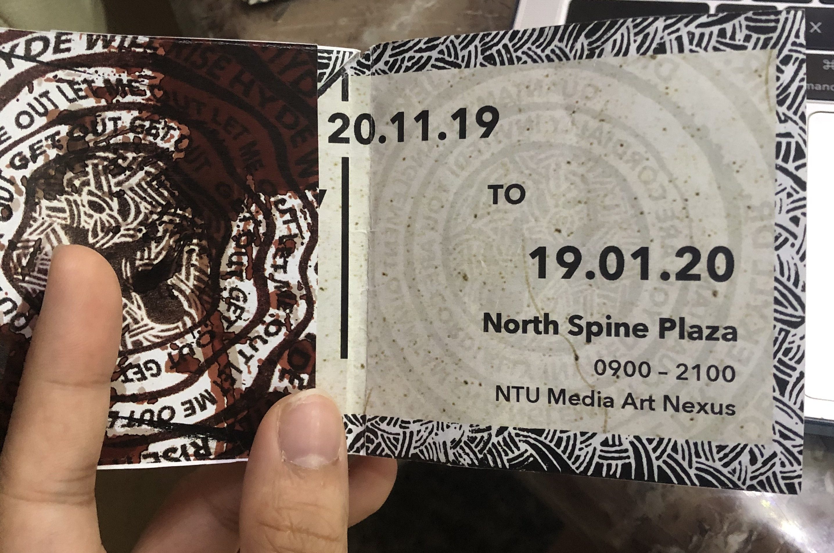
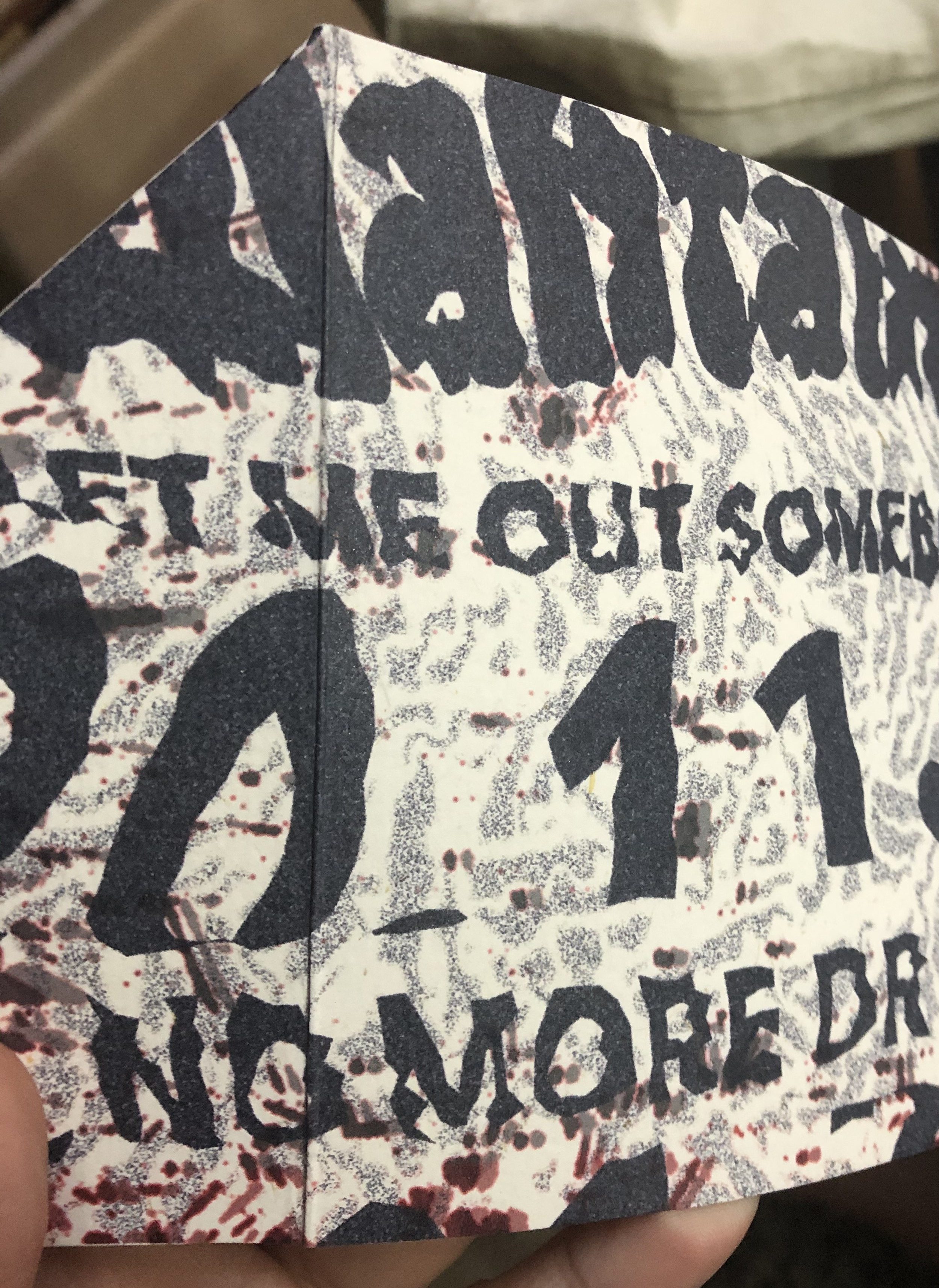
Short Description: Extrapolating the theory of quantam entanglement to the literary story of Dr. Jekyll and Mr. Hyde, I explore in this invite the struggles of two entangled beings grasping for monarch over a single body. In quantam entanglement, the state of one particle cannot be described independently of the state of another particle across distances and I would like to express that with the duality of Jekyll and Hyde; that their good and evilness comes hand in hand. Hence, with every formal and clean invitation layout (font page, the inner information), there is a hidden warped version of that layout and it has to be discovered (either through flipping the invite or opening up the invite further especially the second warped layout, there is a twist and turn action to access that layout and that is to imply that accessing Hyde and Jekyll’s inner psyche is not an easy feat; it requires some deliberation). Hidden in these warped layouts are some of Hyde’s thoughts like: “Jekyll no more” and “Let me out” in contrast with Jekyll’s cordial invitation. Hence, this invite aims to not only demonstrate the duality that comes with entanglement but the inexplicable trouble that comes with it.
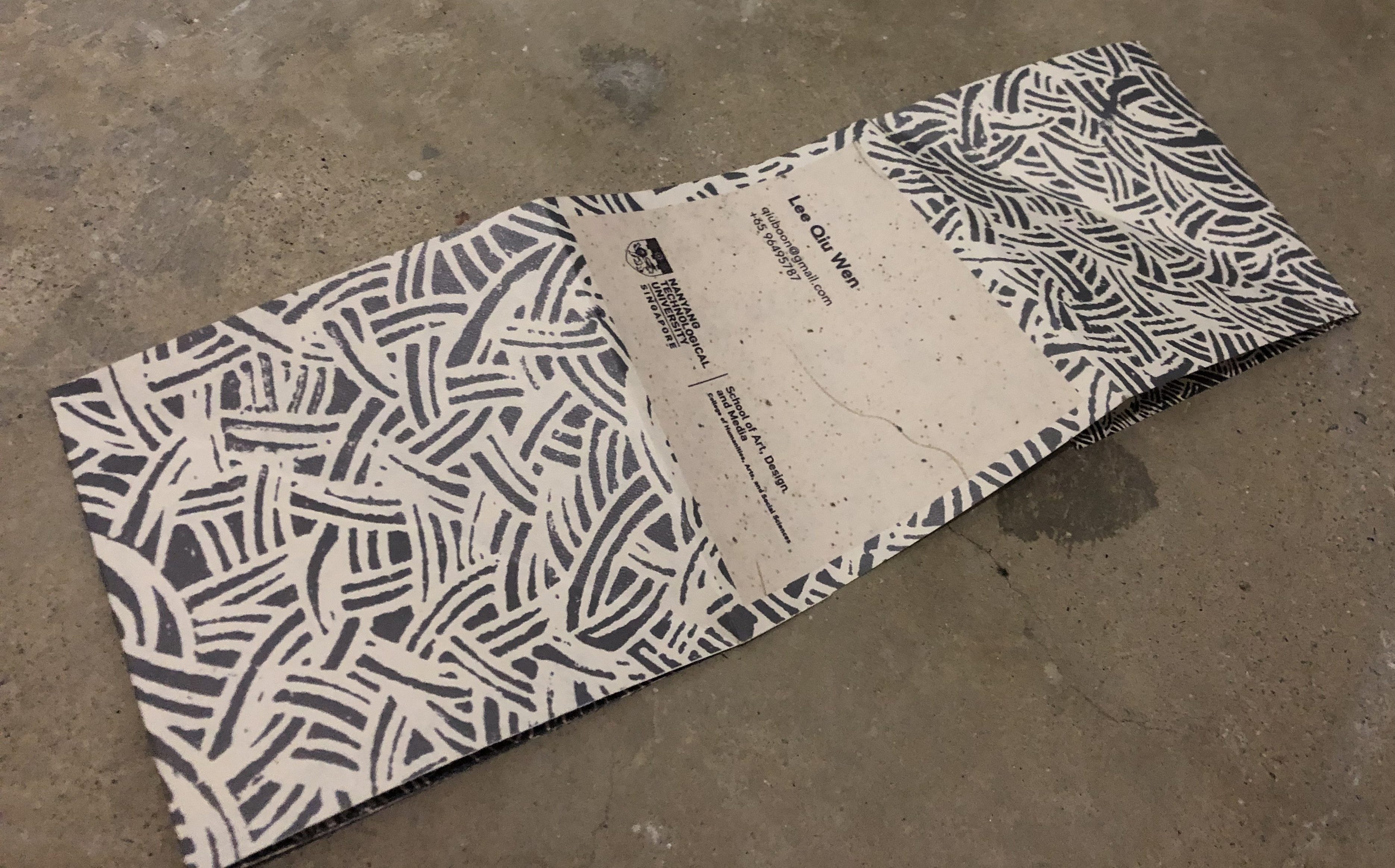
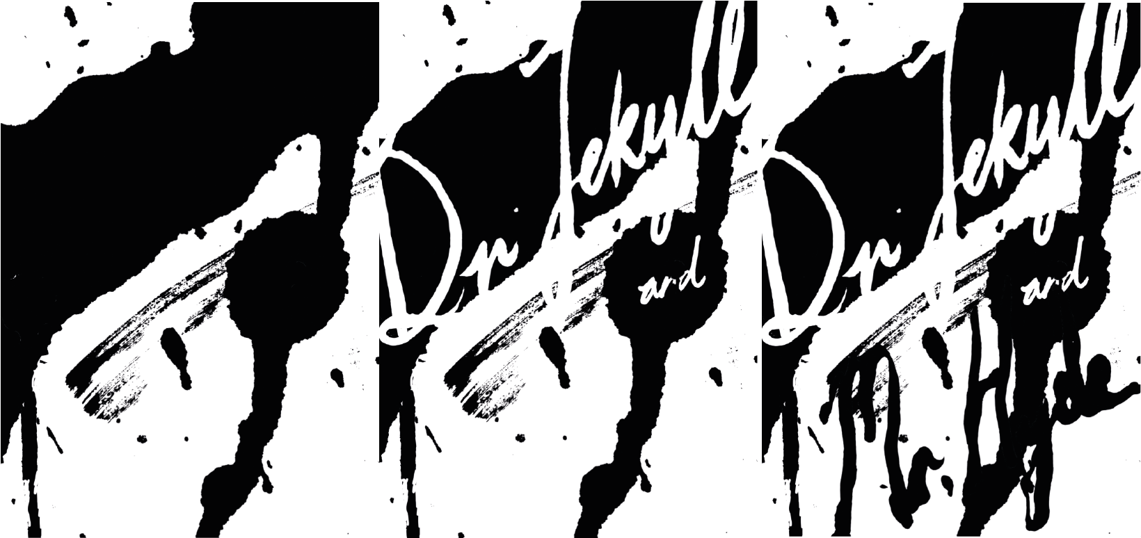
Front: (Blue lines are where the invite is folded)
Back: (Blue lines are where the invite is folded)
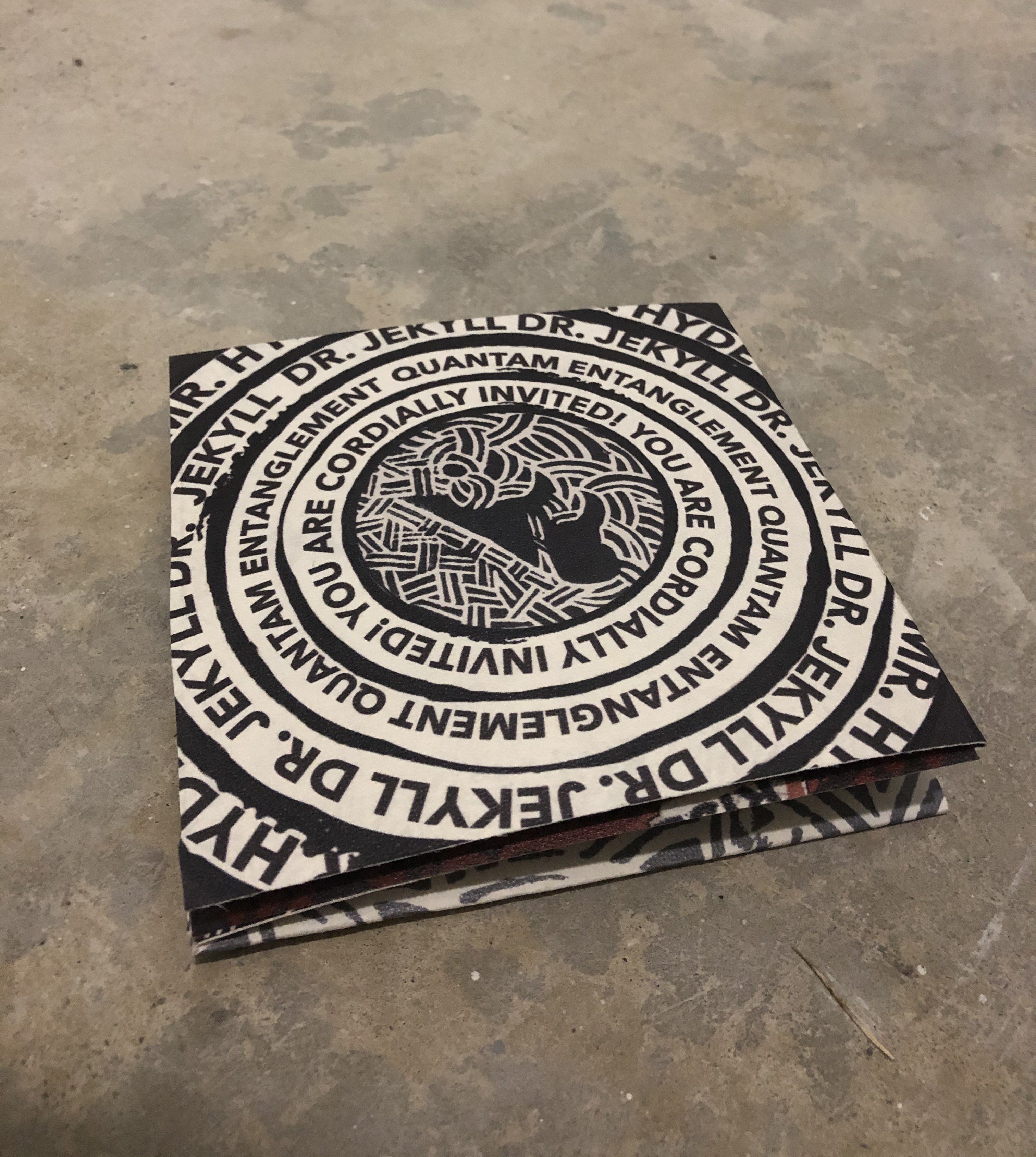
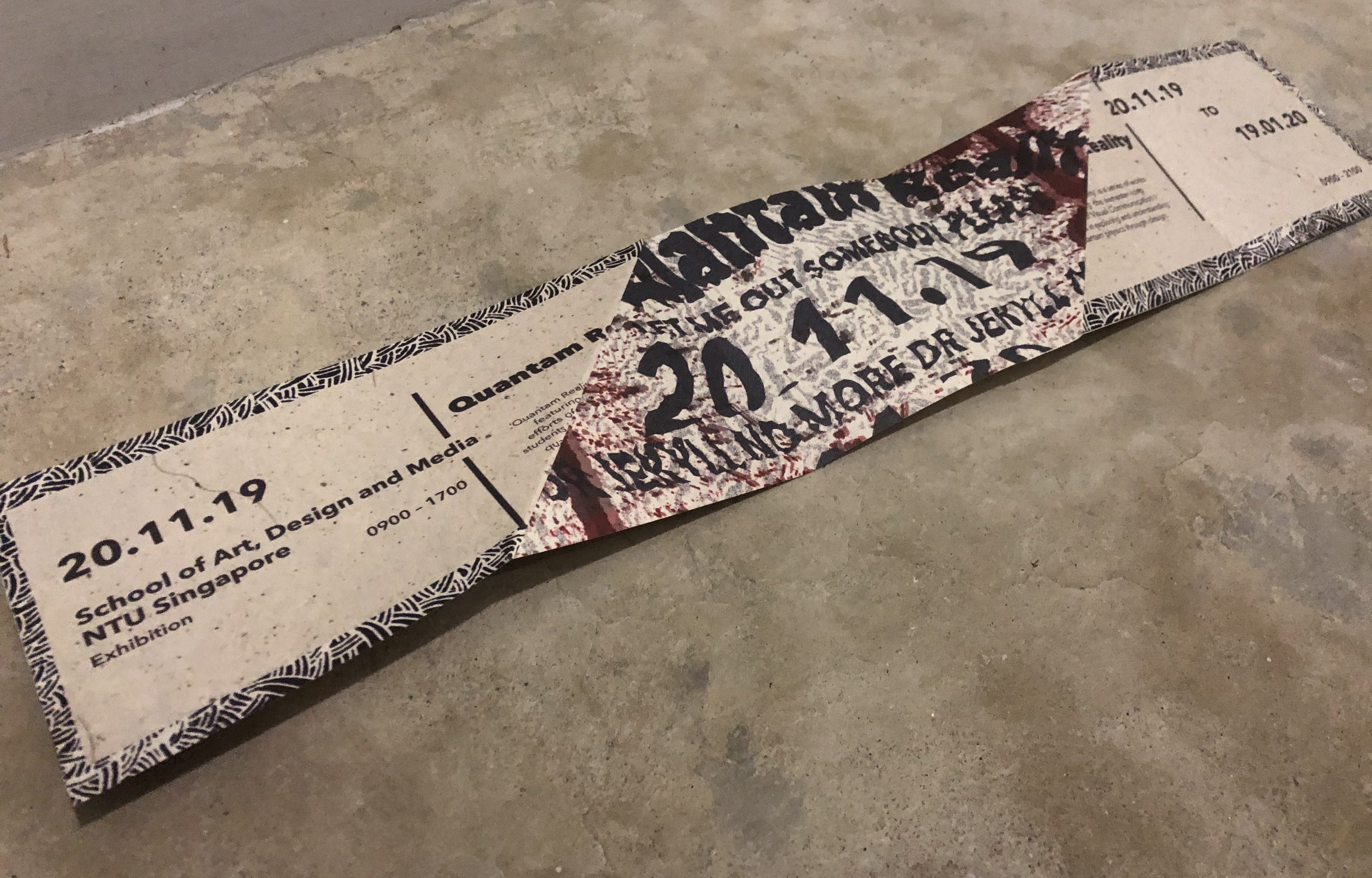
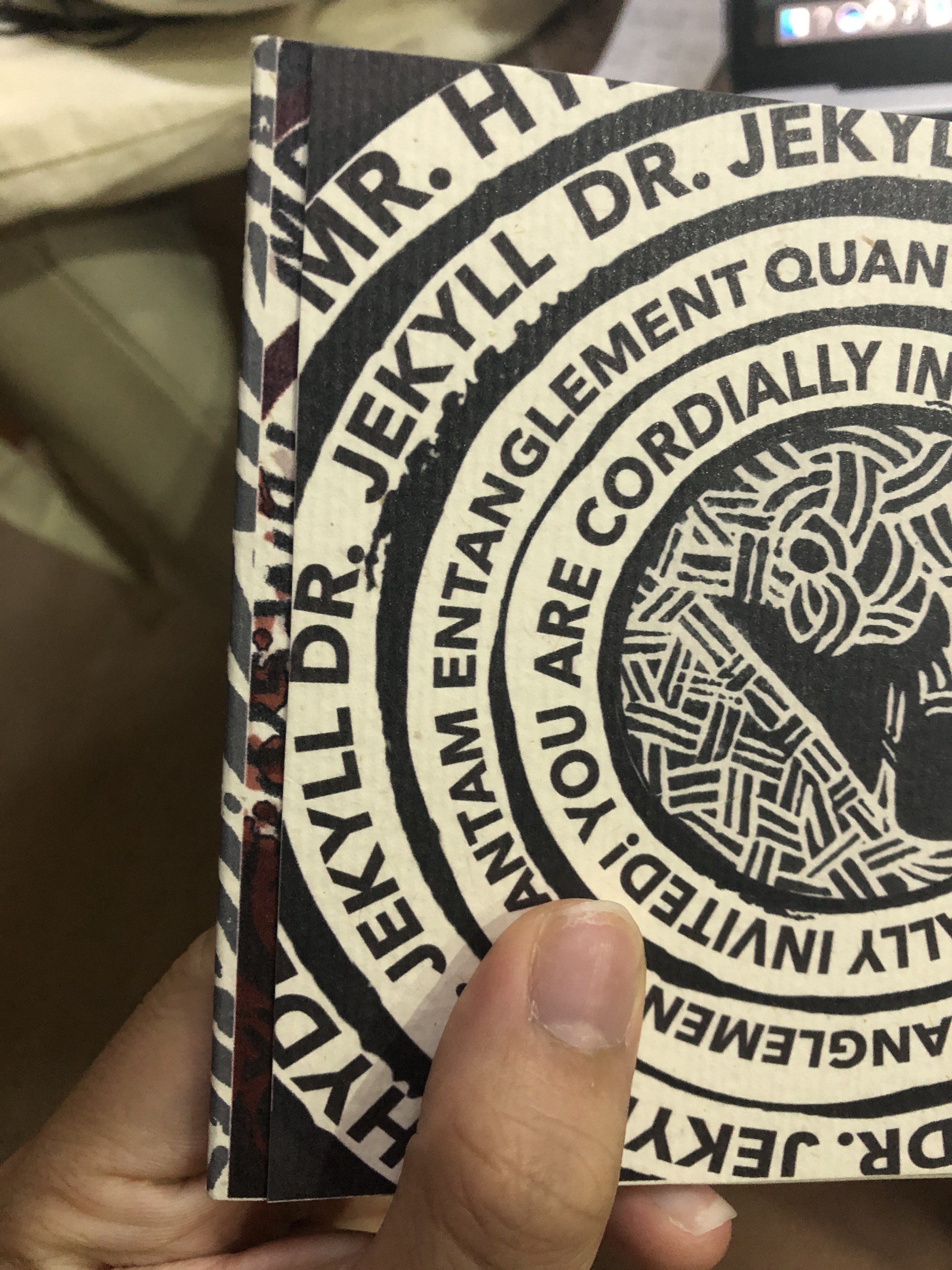
Picture of invite:
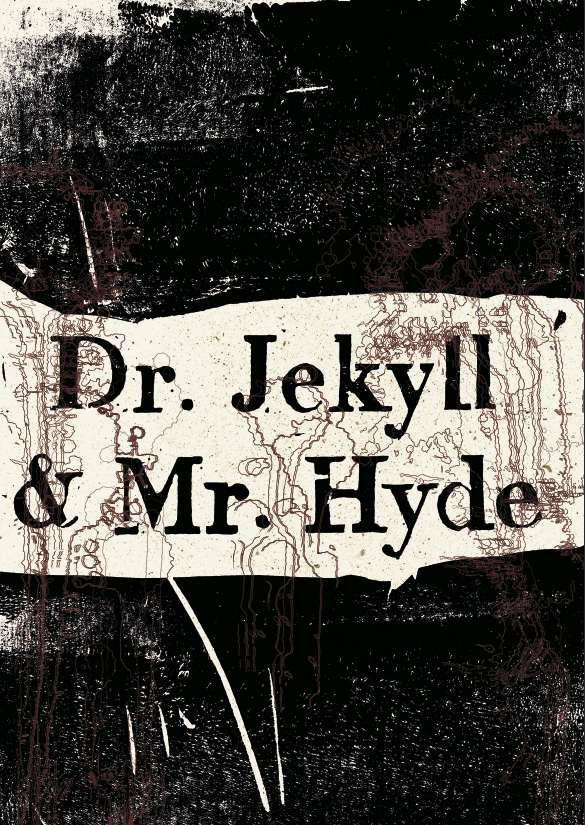
Front:
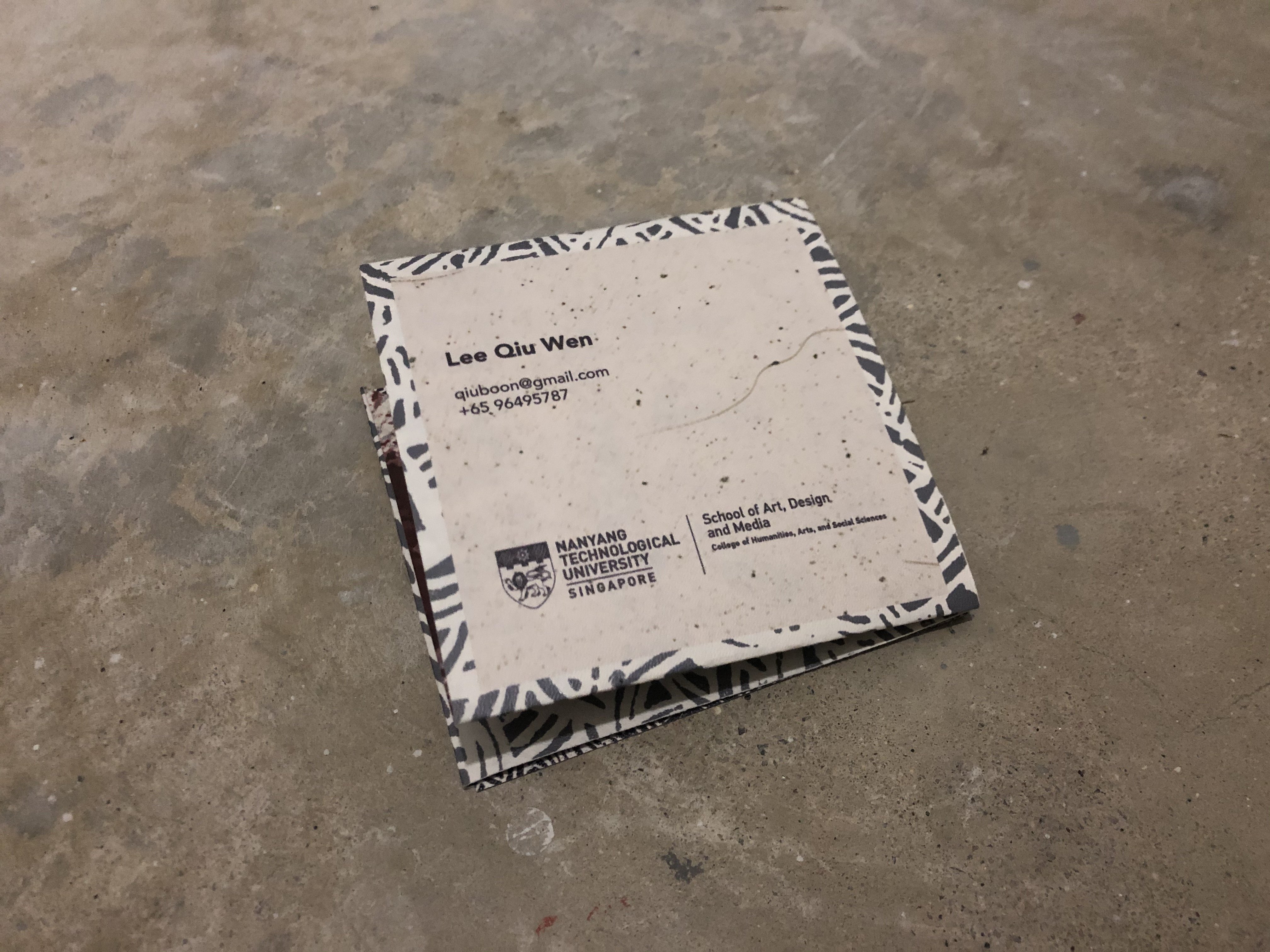
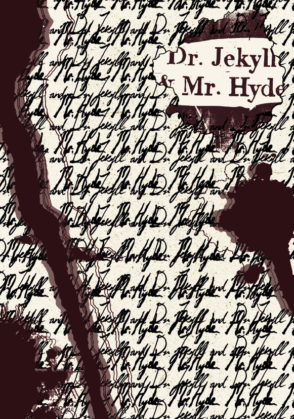
Back:
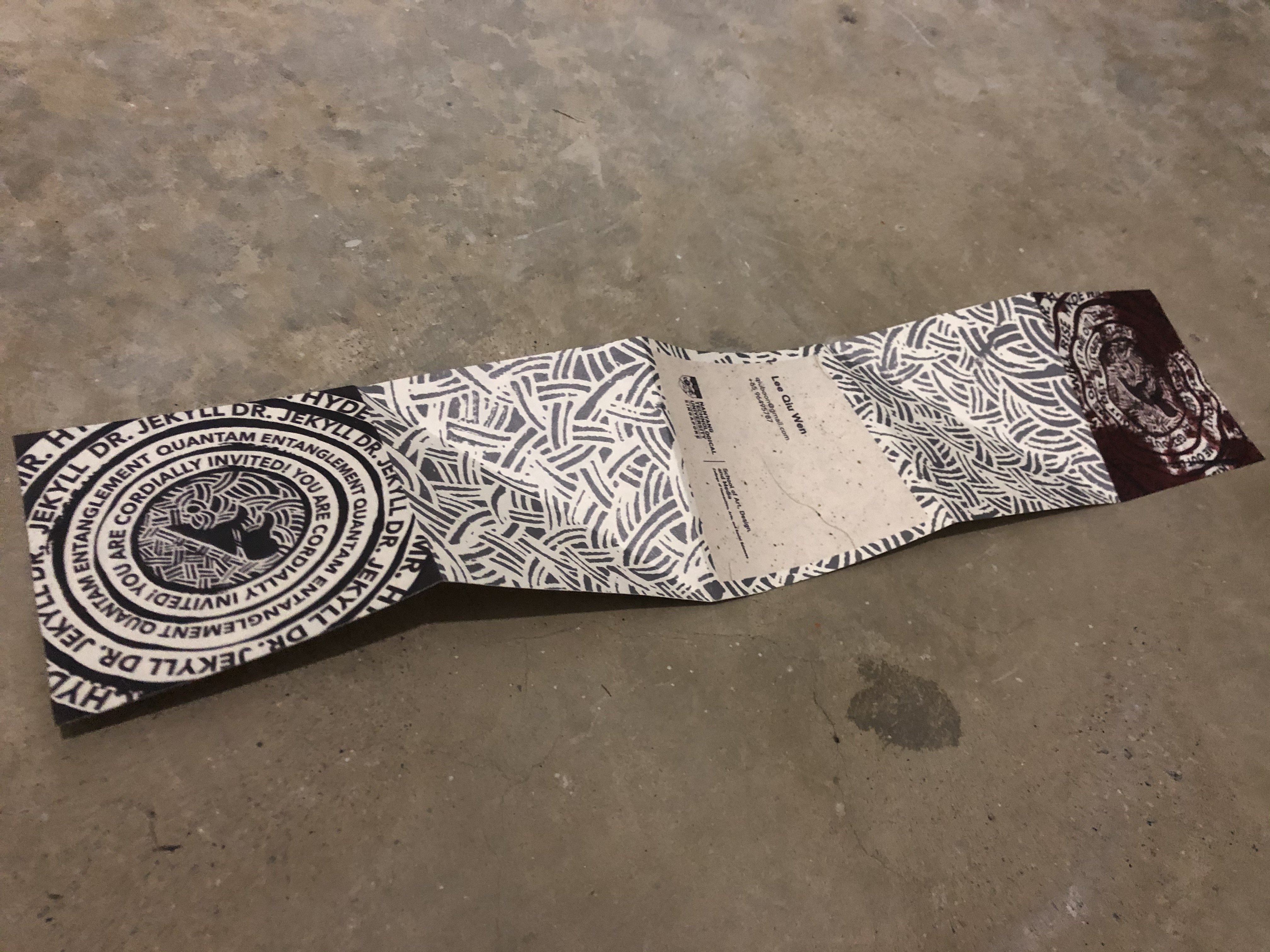
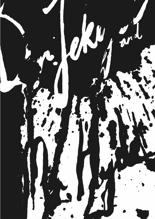
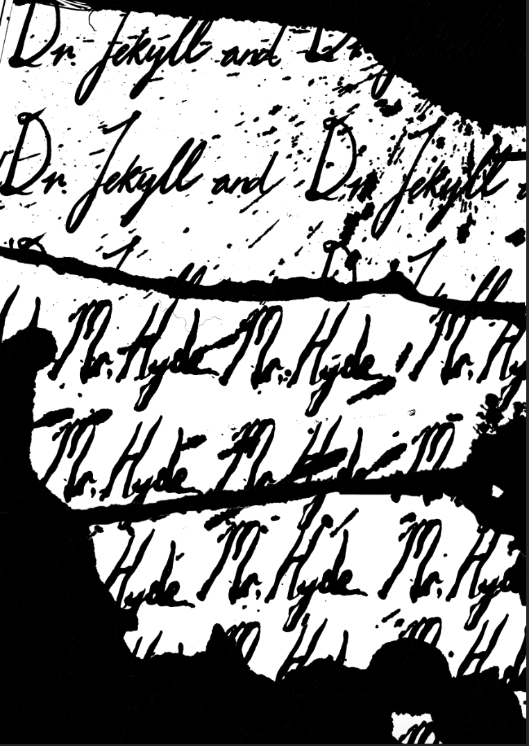
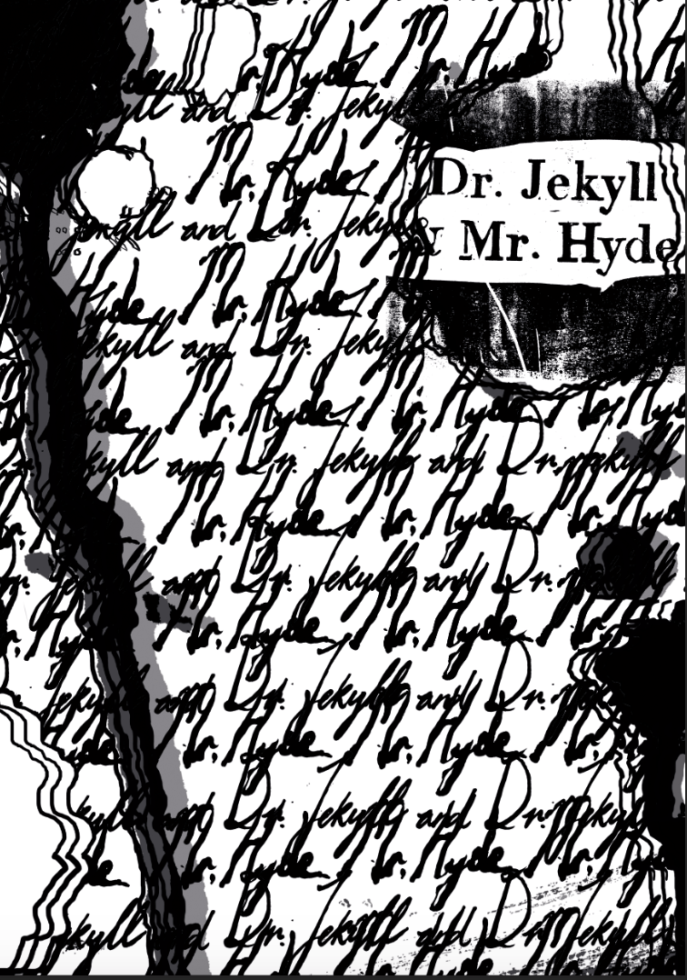
Front unfolded (Inside):
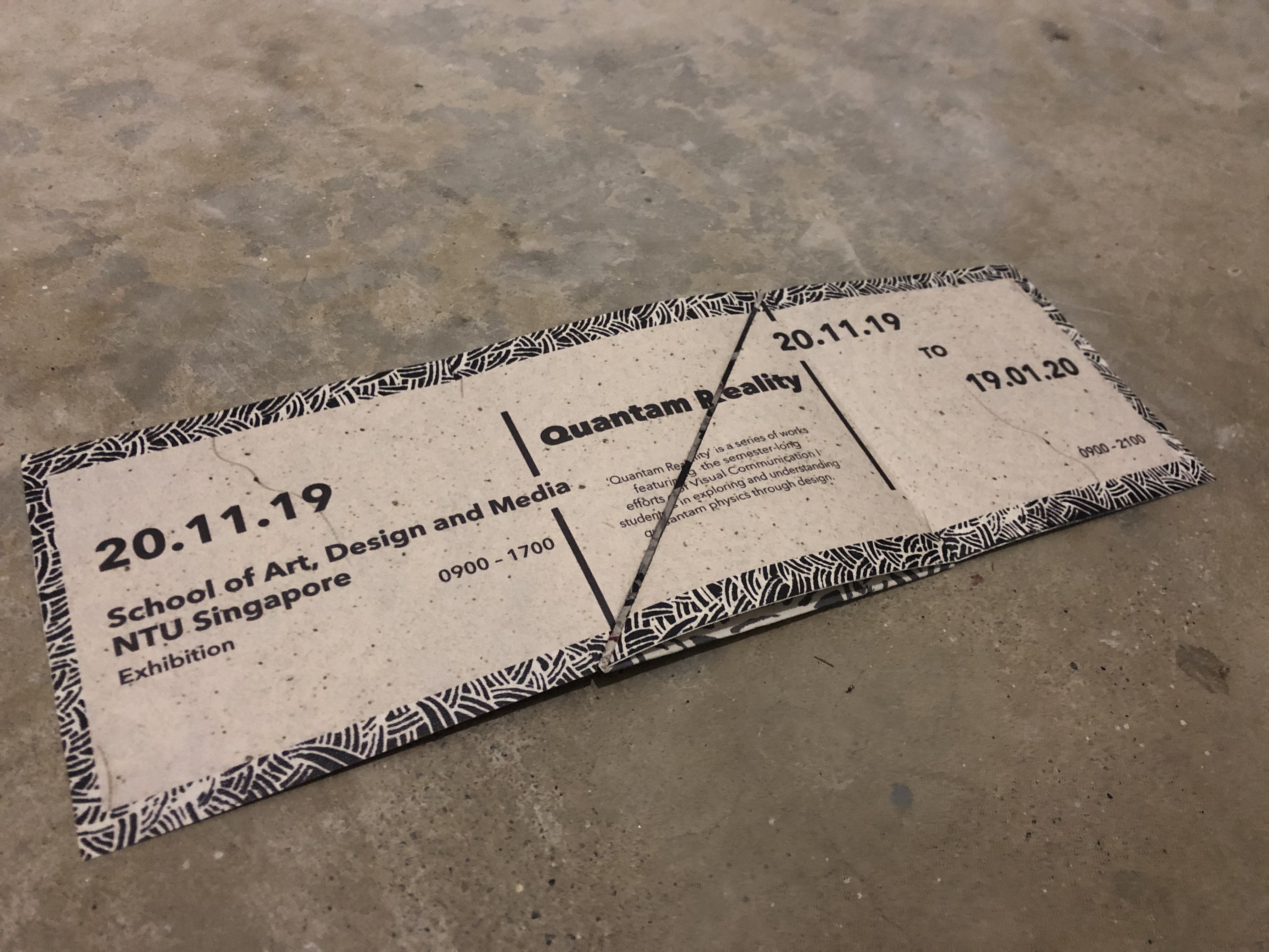
Back Unfolded:
Paper Details:
Name: Sagitta White
GSM: 110 GSM
Recurring Problems:
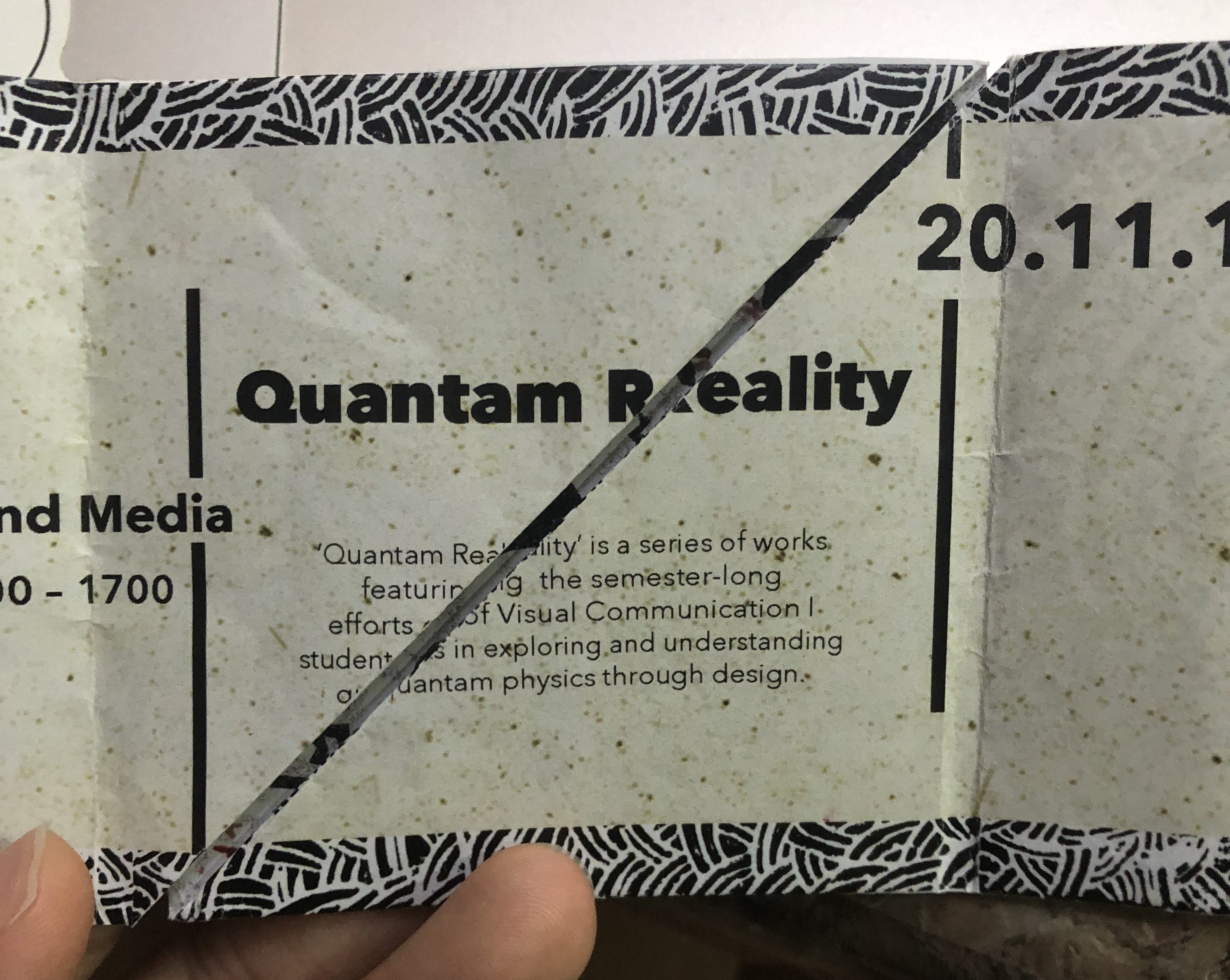
The problem I had was mainly aligning the two sides as my folds have to be accurate so that the information in the middle section matches up and is readable. It was hard to align the folds especially since the middle of my invite is split into two folds and they have to come together perfectly. My test prints all had these problems that comes with alignment:
The centre has a gap that splits the information even if the information is aligned and matches up like the picture below:
The front of the invite does not line up to form a perfect square:
The first test print was horribly misaligned:
The printing done at sunshine was better but still misaligned:
The paper used here was 250 gsm which was too thick and left very obvious folding marks:
Hence, for the final one I chose a paper that has way lesser gsm: 110 and I told the printer to align it for me as best as he can. He used two pieces of paper (which is all that I bought) and failed to align it so I went to get more paper for him and he managed to somewhat align it in the end. The alignment is still not that perfect but it’s probably the best that I can get and I guess I’m satisfied with it :’)
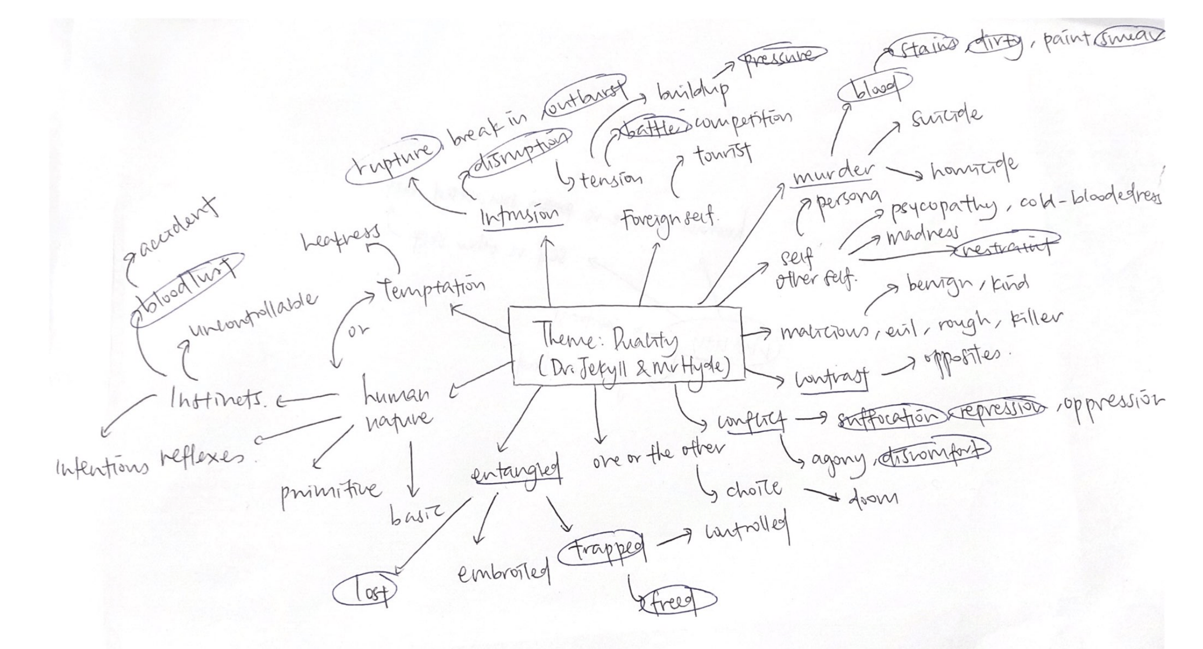
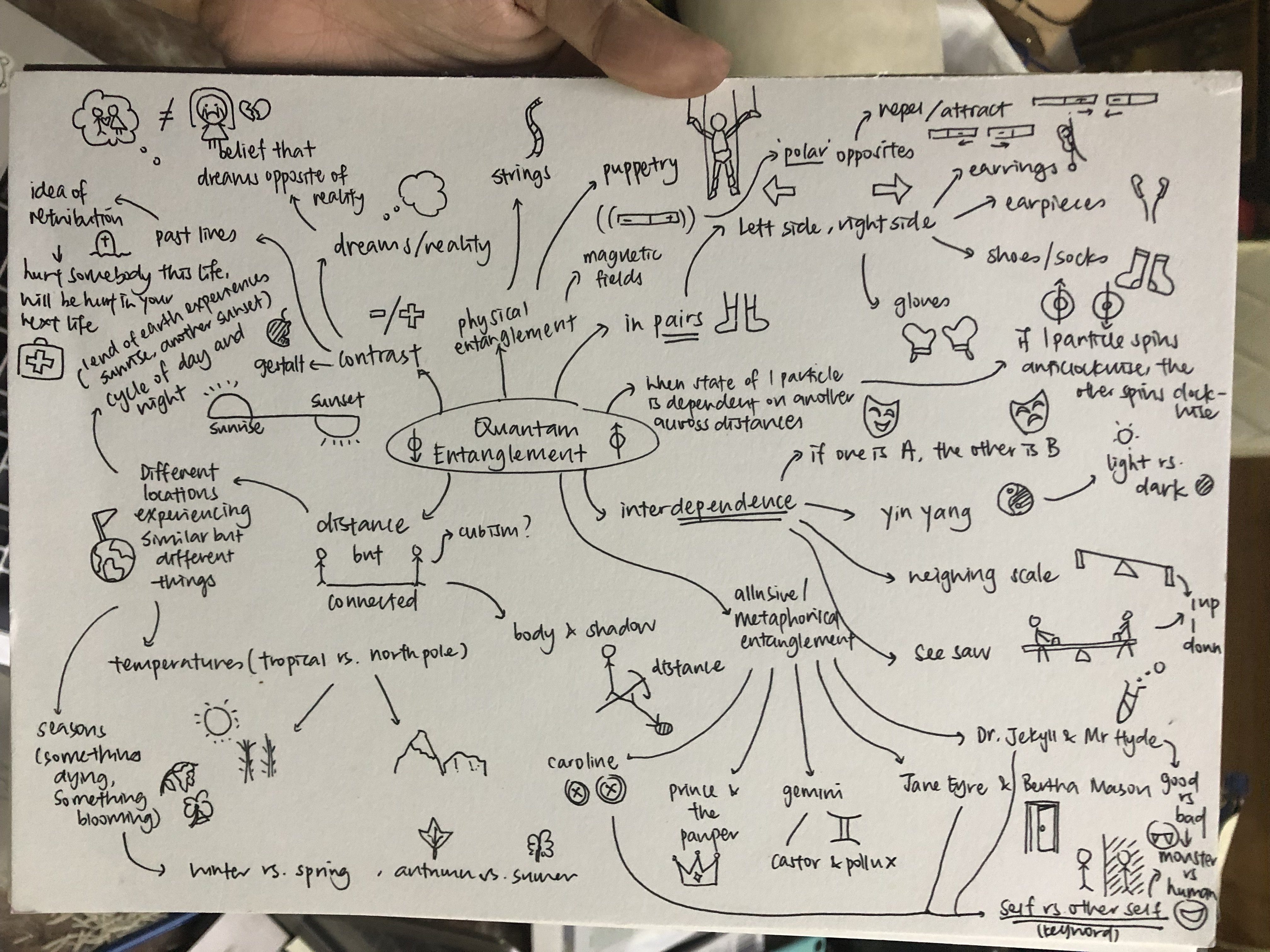
At first, I wanted to explore the theme of duality which I feel exemplifies both Quamtam physics and Dr. Jekyll and Mr. Hyde. In quantam physics, if one electron spins in clockwise direction, another spins in the anti-clockwise direction hence there is a sort of opposition and duality in play here. For Dr. Jekyll and Mr. Hyde, that duality is even more obvious as Mr. Hyde is a reflection of and the evil parallel of the noble Dr. Jekyll.
Some words that I branched out to that I feel tells the story of Jekyll and Hyde were: Conflict, Intrusion, Trapped & Freed, Instincts, Human Nature, Murder and Agony, Entangled
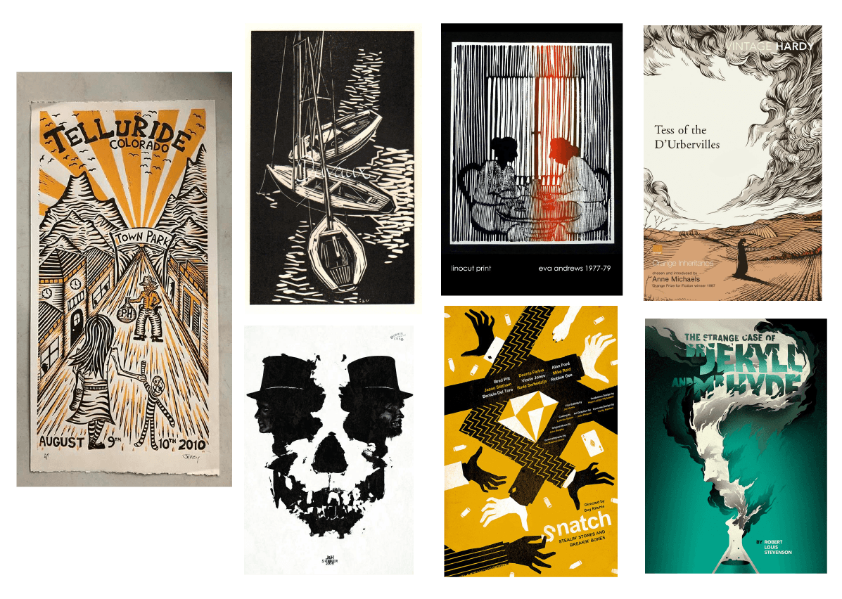
Hence I wanted to portray them in the posters below:
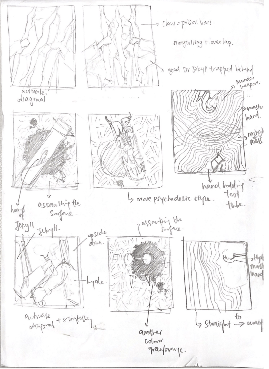
First sketches:
Initially, when I first thought of Dr. Jekyll and Mr. Hyde, because it is a literary story on its own, it was very easy to conceptualise posters that are more like movie posters and are more representative.
Poster 1 & 2: Dr. Jekyll trapped behind claws that are like prison bars (Keywords: Trapped and Freed: Jekyll is trapped while Hyde is freed)
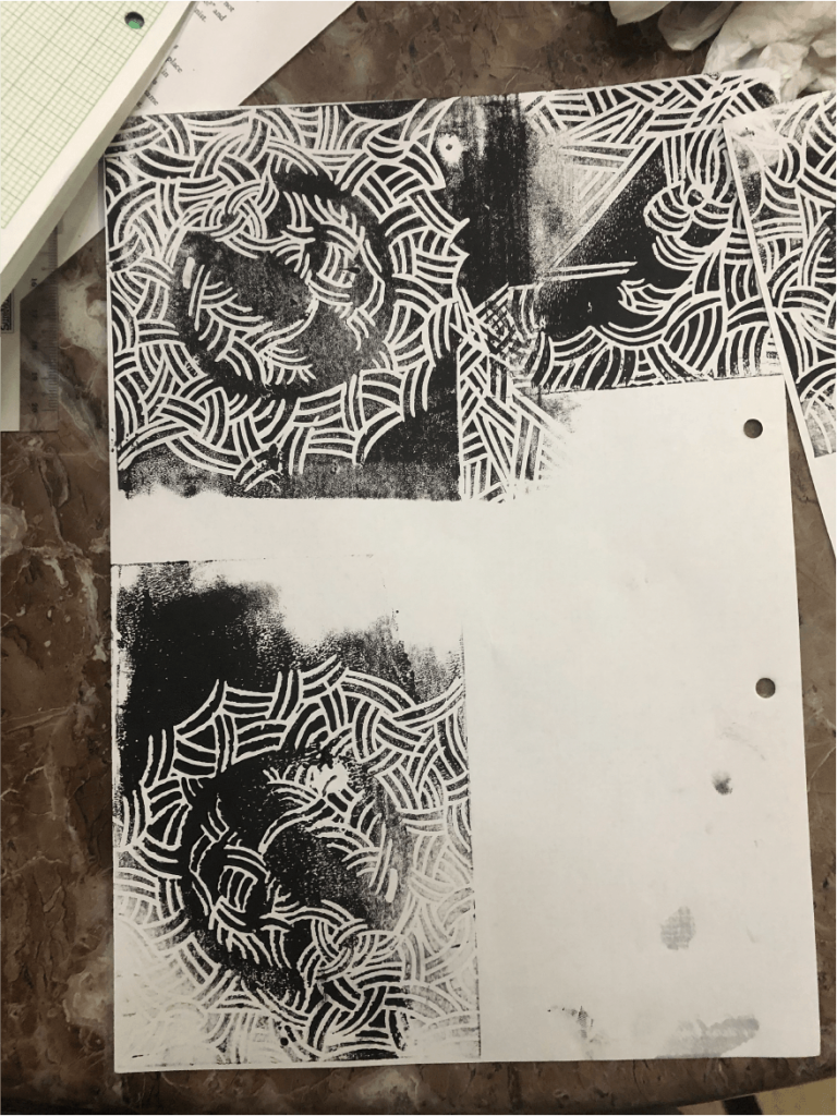
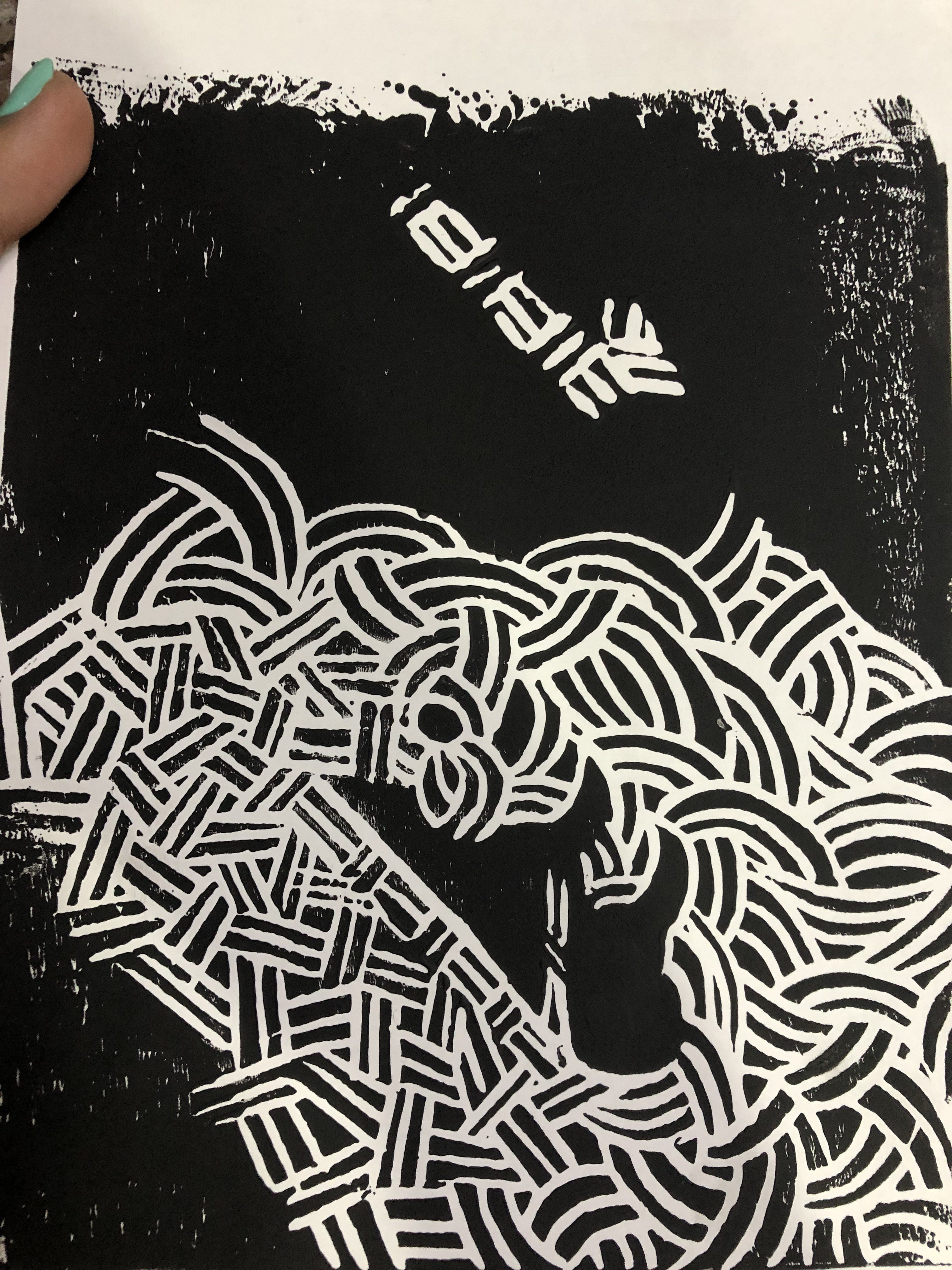
Posters 3,4, and 7 all feature an icon of either Jekyll and Hyde or both and an assaulting of surface by splashing black ink onto a linocut of rigid patterns. (Keywords: Murder, Blood, Disruption, Conflict)
Posters 5 and 8 deal with wavy lines and the idea of ‘wavelengths’ to communicate the coming together and separation of Jekyll and Hyde. (Keywords: Conflict, Human Nature, Entangled, Intrusion, Trapped & Freed)
Poster 6 is like a move poster featuring diagonals and contrasting both men with the things they hold: Jekyll holding a test tube and Hyde holding a murder weapon. (Keywords: Contrast, Conflict, Murder)
After consultation however, Ina suggests that I use more of patterns and linocut to bring out the idea of Jekyll and Hyde and that I do not have to be super in-your-face about the story or the plot. I decided to focus on assaulting the surface and to use that to represent the sudden presence of Hyde and the disruption he brings to Jekyll’s otherwise peaceful life.
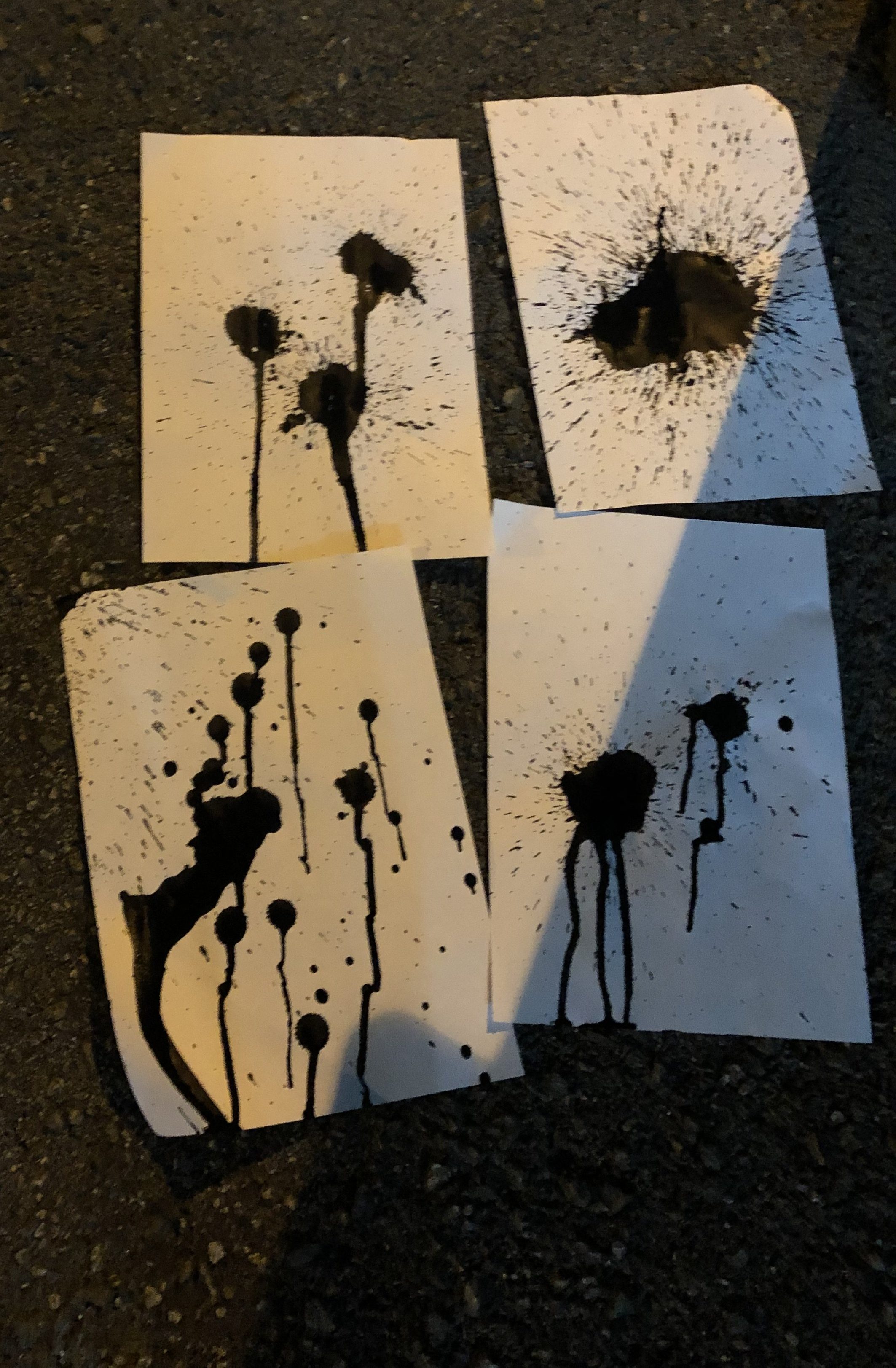
Some forms of assualting the surface that we came up with were:
-Ink Splashes
-Paper tears
-Lino cutter slashes
-Multiple inking
etc.
I went back to the keywords and realised that I have some action words that may aid in my assaulting of the poster surface and categorised them according to how I might utilise them:
For ink: stain, smear, dirty, blood->to represent murder
For ink staining/ruining a pattern/sudden lino cut slashes: outburst, disruption, rupture, pressure
Pattern: Trapped/freed (with ruining of it)->to show restraint, suffocation, repression, oppression, conflict
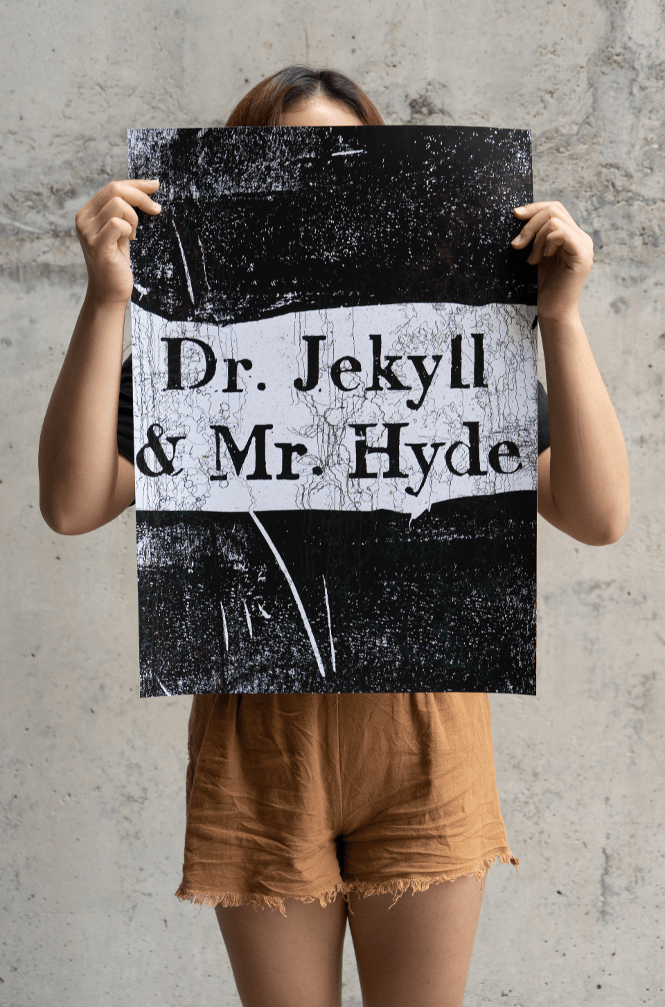
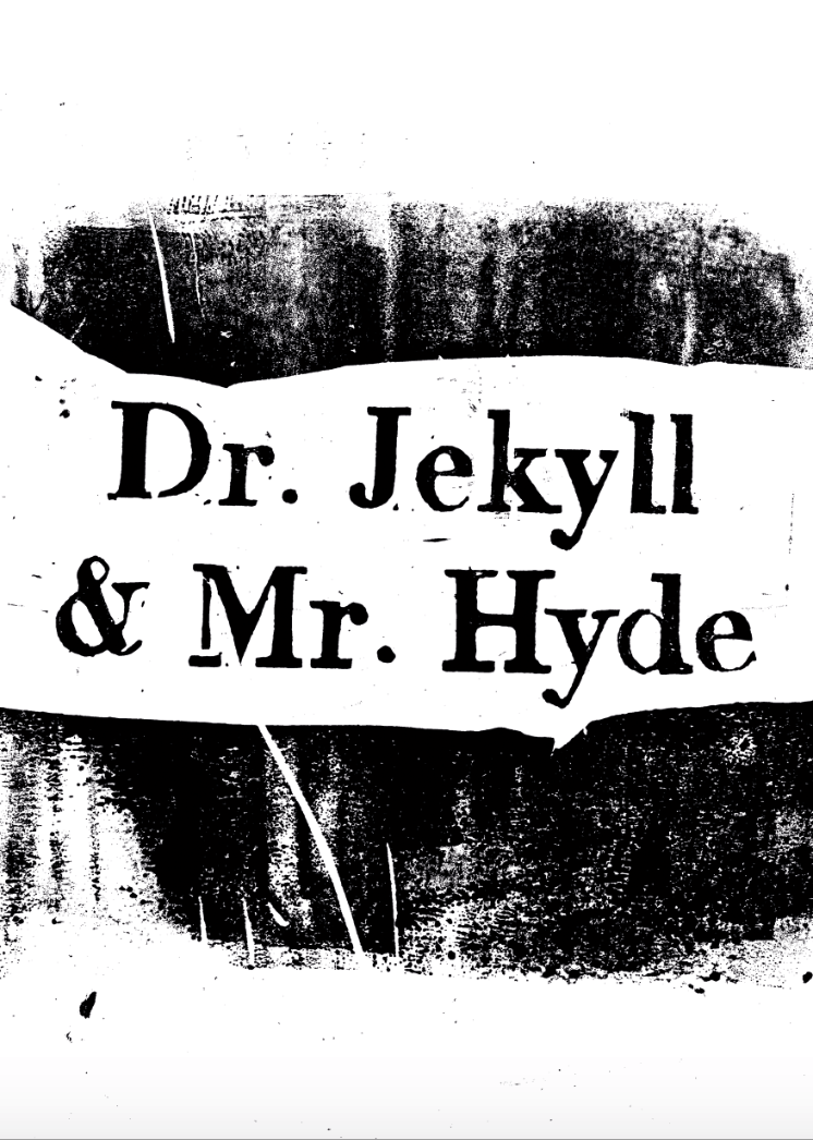
I was afraid of going too abstract and Ina suggested that my words simply be the title “Dr. Jekyll and Mr. Hyde” and the patterns be suggestive of their natures and the story.
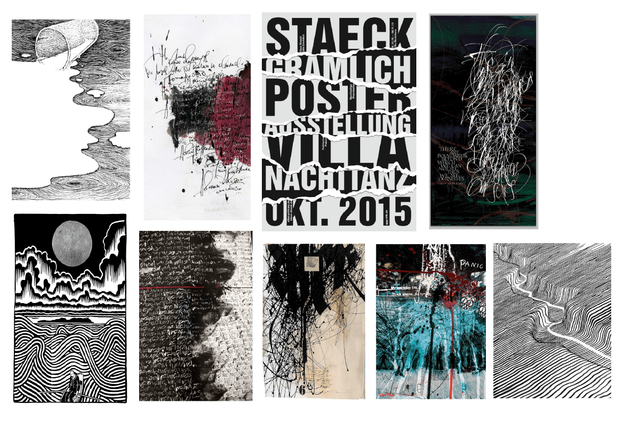
Moodboard references:
Initially, my moodboard leaned towards linocuts and more graphic representations.
After consultation however, I decided to focus more on mark makings and focused on posters that are more geared towards assaulting the surface/disrupting a pattern particularly with marks or inks etc.
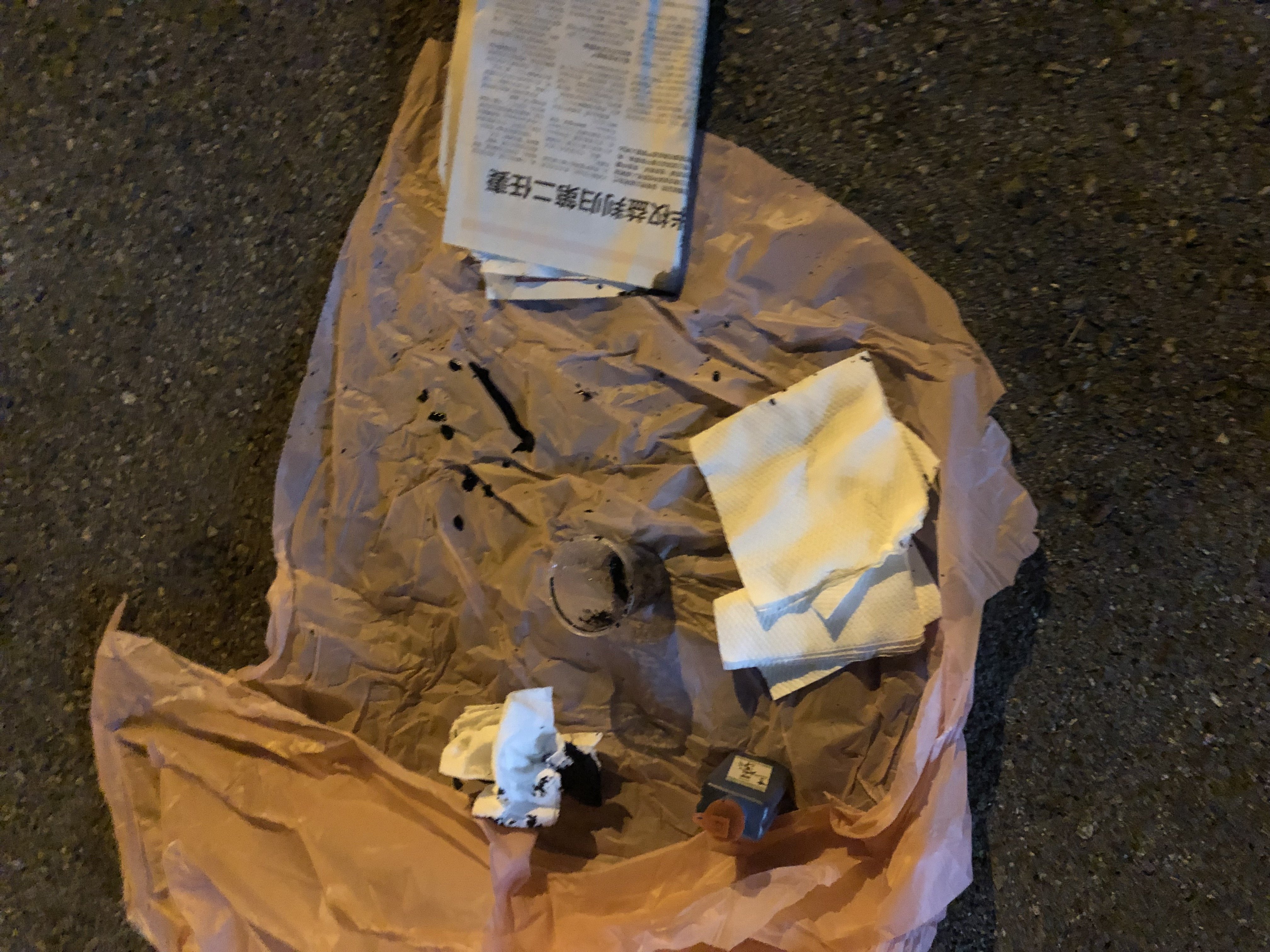
Process of first drafts:
Stencil and linocut the title
2. Printing
3. Ink splashing
4. Writing ‘Dr. Jekyll’ with my right hand and ‘Mr. Hyde’ with my left
5. Scanning and digitising of marks and writing
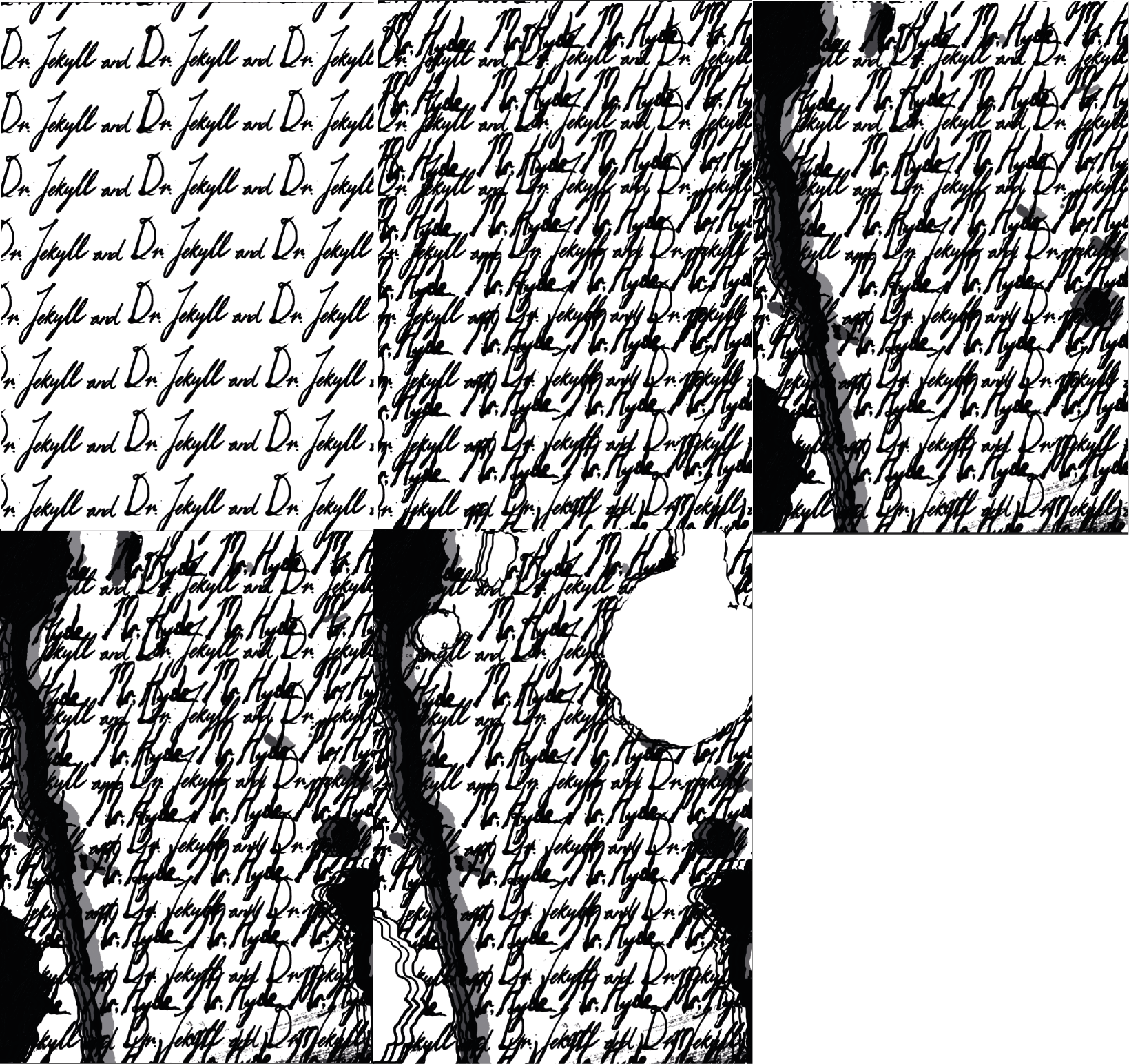
First Digitised Drafts:
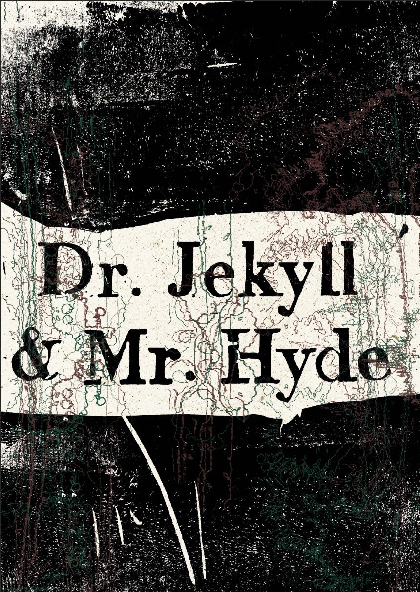
Layout #1a
For this layout, I tried using the techniques Overlapping, assaulting the surface then overwhelming the eye.
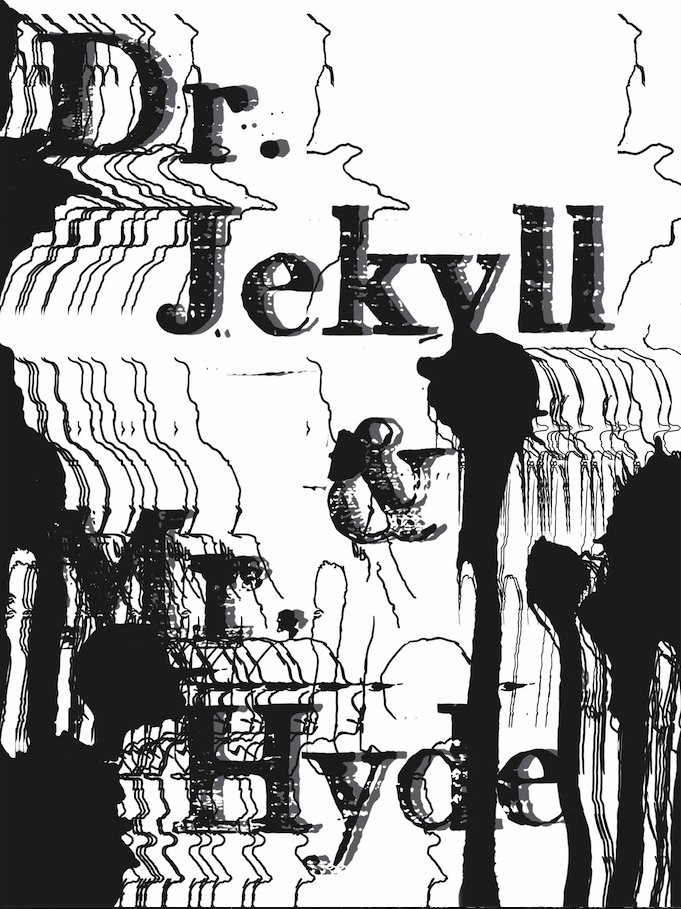
I overlapped the ink splashes with the words then traced out the outlines of the ink splashes, duplicated them and scattered them to get a glitchy effect.
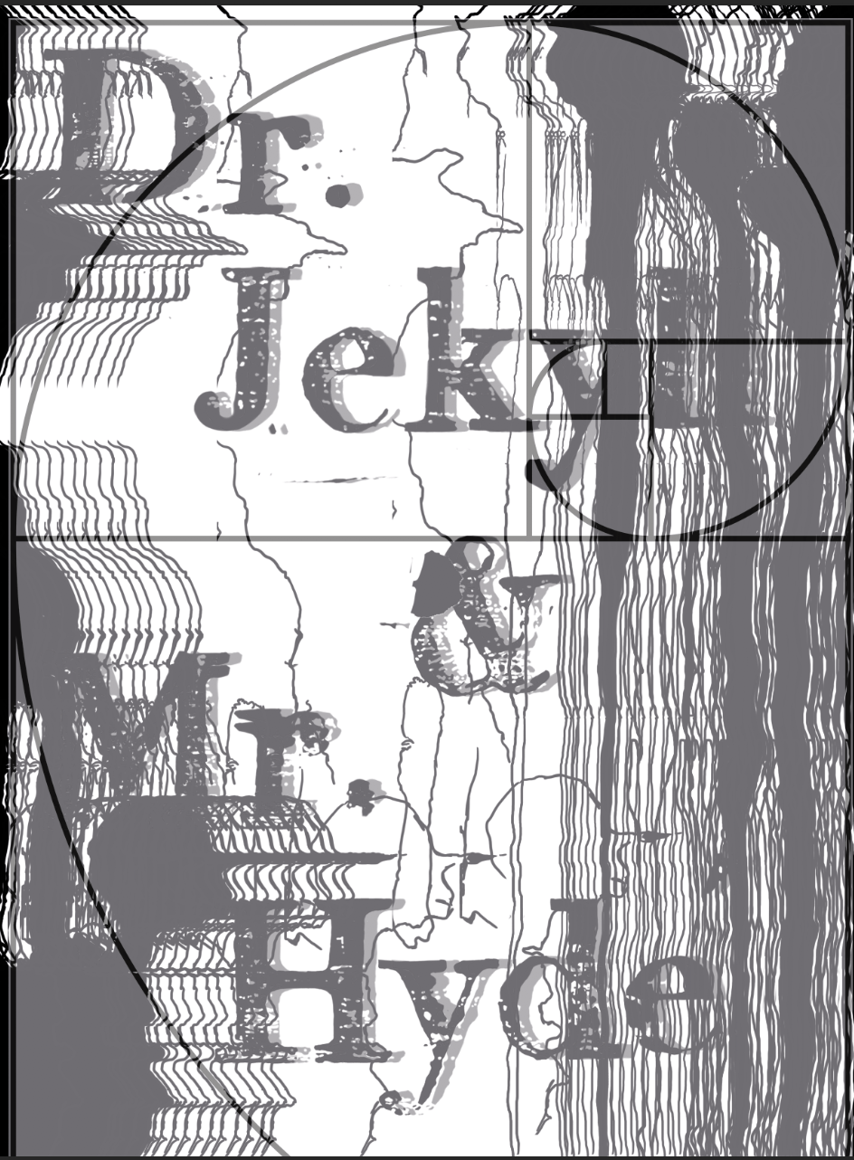
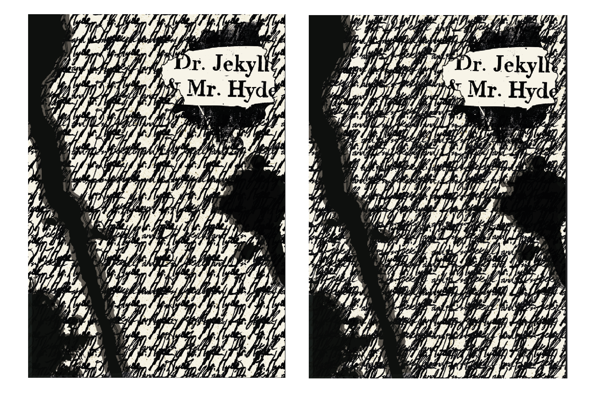
I duplicated the words then shifted them and lowered the opacity to get a shadowy effect that also represents the split personas of Jekyll and Hyde and one being more domineering than the other. I added the splashes to assault the clean surface alike to how Hyde’s murder and violence causes disruption in Jekyll’s otherwise calm and peaceful life. The splashes were meant to look like blood stains and I covered the words ‘Mr. Hyde’ more with the splashes to show that it is Hyde’s sin but the glitching lines overlapping the words ‘Dr. Jekyll’ shows that Jekyll is inexplicably implicated and affected by Hyde’s sin.
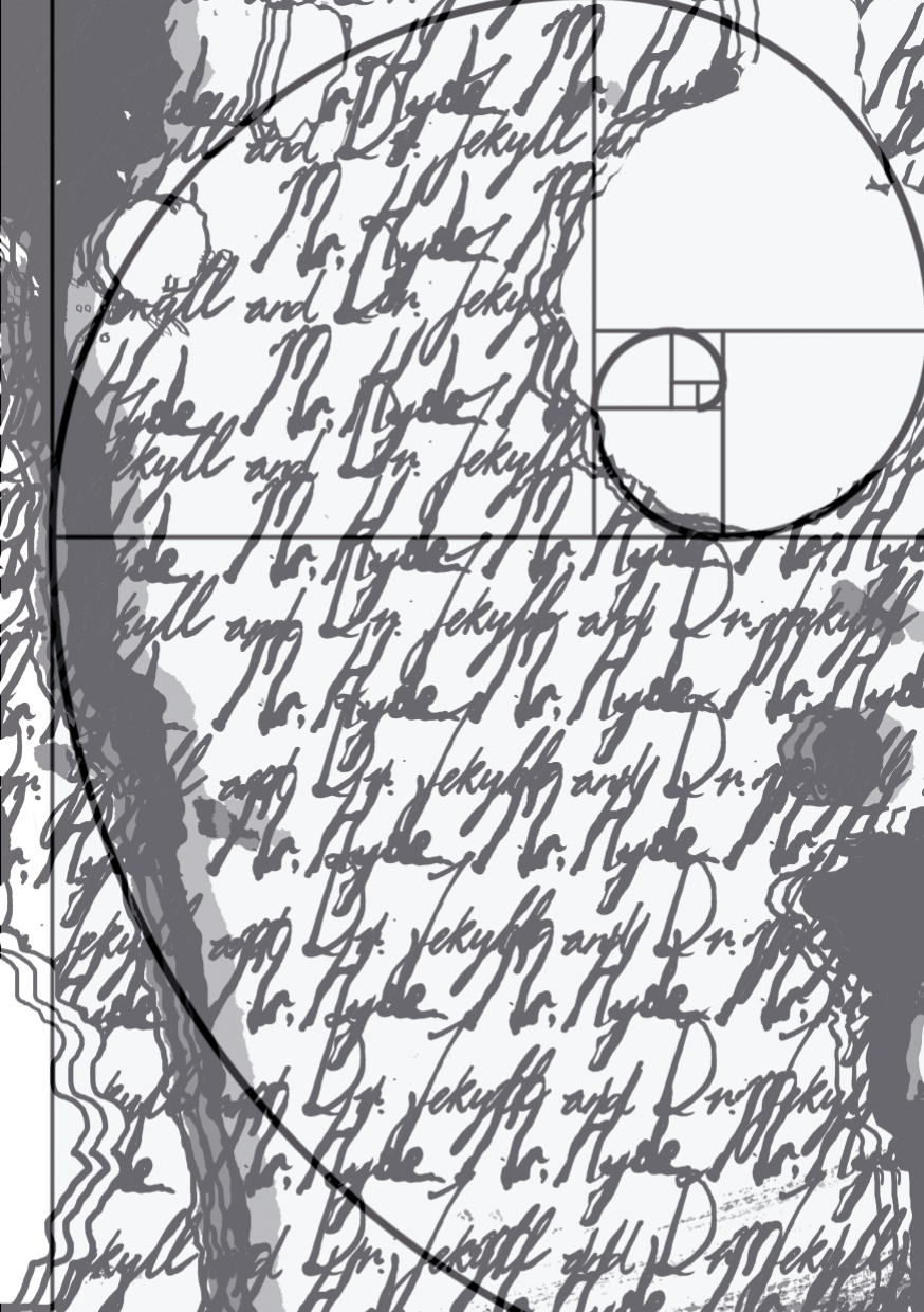
Layout #1b
I then realised that i should have framed it with the golden ratio and so here’s 1b!
Layout 2
For this layout, I tried using the techniques Overlapping, Activating the diagonal, and assaulting the surface.
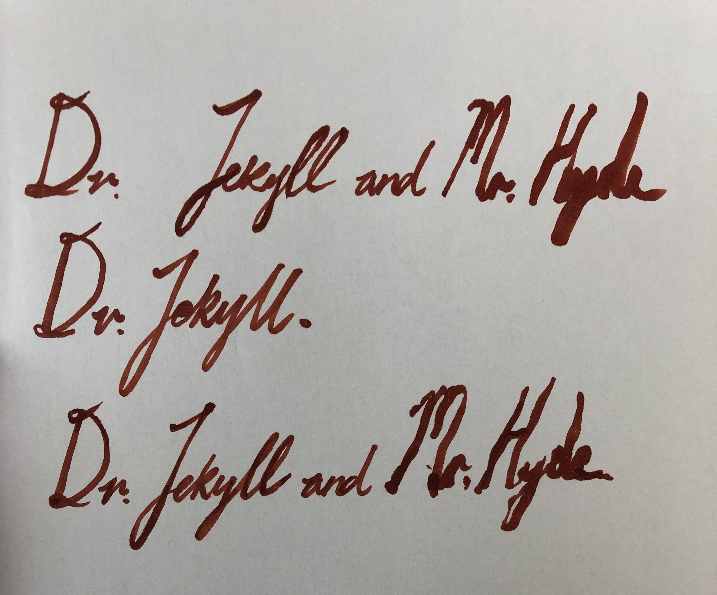
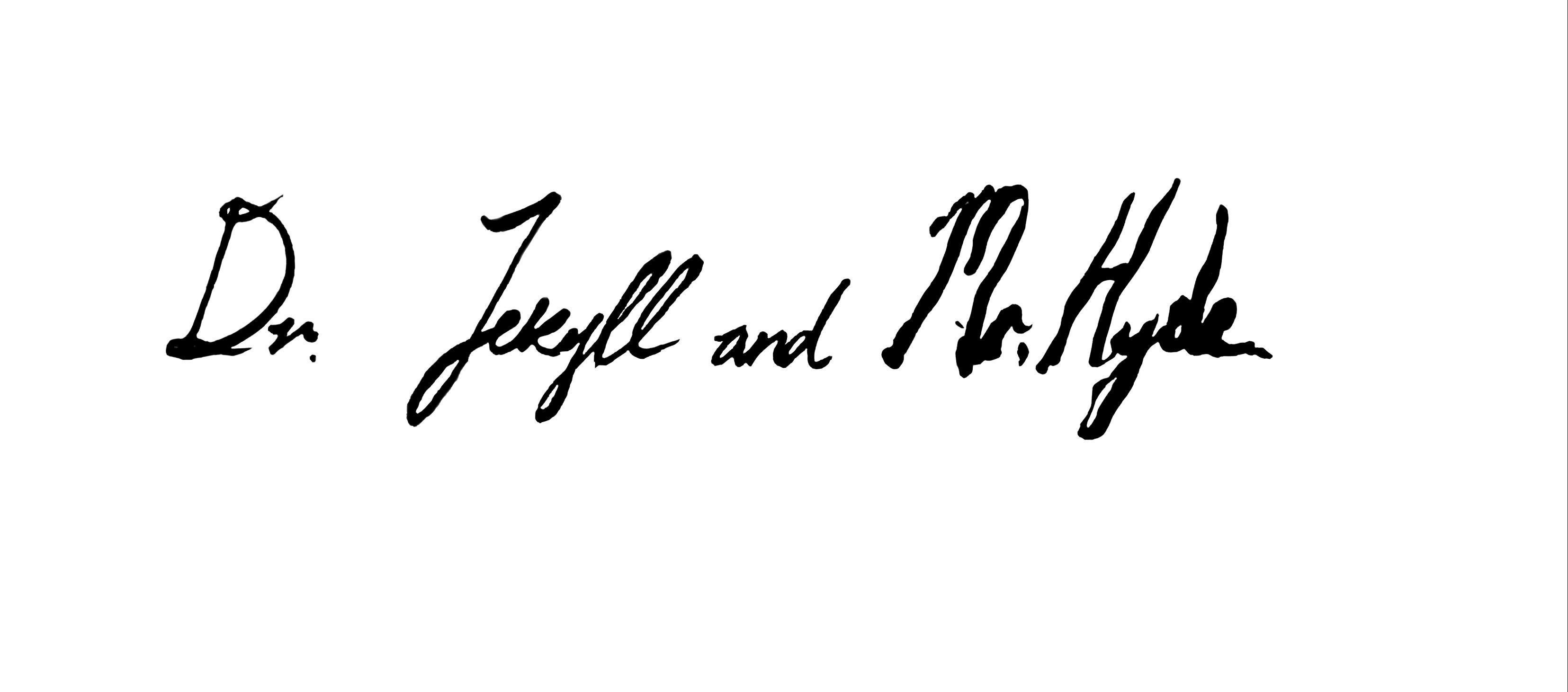
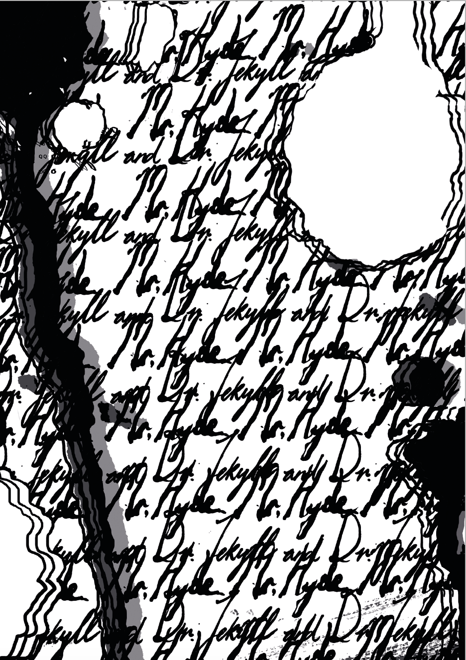
Because in some stage play versions of Dr. Jekyll and Mr. Hyde, the actor differentiates both personas by Dr. Jekyll using his right hand and Mr. Hyde using his left, I decided to write the words Dr. Jekyll with my right hand and mimicked victorian handwriting (cursive) while I used my left hand to write Mr. Hyde.
I duplicated the Dr. Jekyll words and the Mr. Hyde words and overlapped them to visually represent the entanglement between the both of them and the chaos that ensued because of it (as it looks very messy). Then, I added the ink splashes (rotated them so that they are diagonal) and duplicated them, lowered the opacity to get a more inky effect. The ink splashes were meant to mimic blood splashes, pointing to traces of Hyde’s violence and murder.
I also blanked out some ink splashes to get more variation and to represent the lack of intentions on Jekyll’s part to be a murderer. I also framed the composition using the golden ratio.
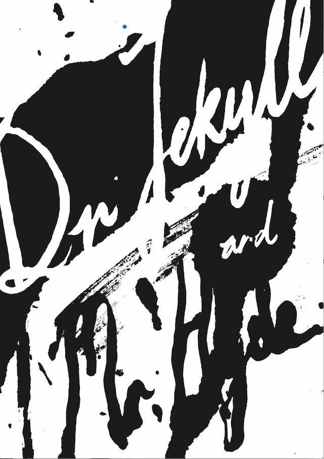
Layout 3
For this layout, I tried using the techniques Activating the diagonal and overlapping.
I cropped an enlarged splash mark from the scans that I had:
and adding the words Dr. Jekyll in white on the black part as Dr. Jekyll is the noble character surrounded by darkness (the black part). I added Mr. Hyde in black to show the contrast between him and Jekyll and let the splash marks intersect with it to show the disruption and chaos the character Hyde brings.
Some other drafts and layouts:
After consultation, Ina suggested that I put the title “Dr. Jekyll and Mr. Hyde” into the top right hole of Layout #2
and that I utilise the full rawness of the linocut print itself:
as the first layouts feel too digitised and have lost the rawness of the linocut print. For the first linocut, I thought I should just use the words but Ina made me realise that I should fully utilise the whole lino pad, even the places where I cut uglily or wrongly to produce a print that is raw and more natural.
Second Drafts:
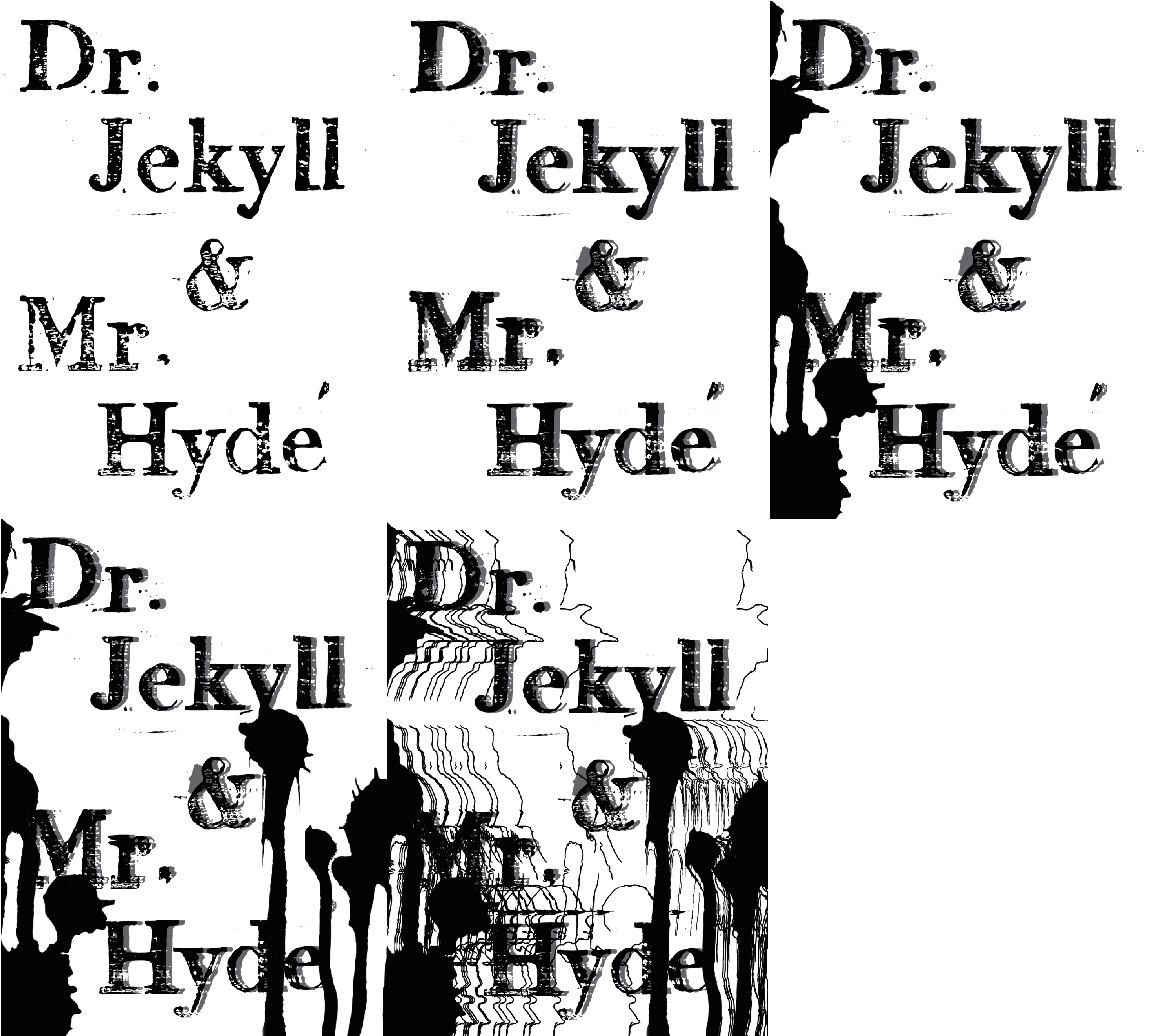
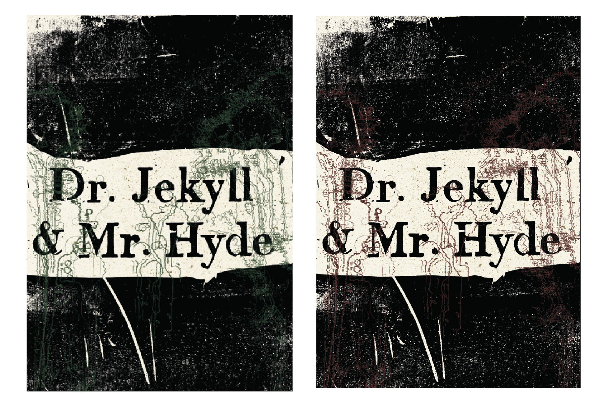
Refining Layout 1: Digitisation
These are iterations from the plain lino cuts:
Plain lino cut
Full black bloodstains/ink splashes and outlines of splashes with plain lino cut
Green outlines of bloodstains/ink splashes with plain lino cut
Red outlines of bloodstains/ink splashes with plain lino cut
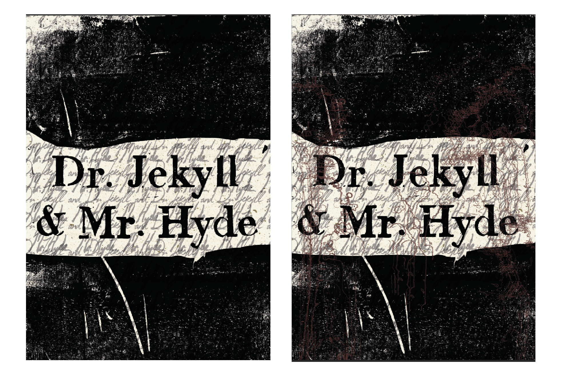
Plain lino cut with Jekyll/Hyde handwriting
Plain lino cut with Jekyll/Hyde handwriting & red outlines of bloodstains/ink splashes
All Black, Handwriting with 2 layer of Dr. Jekyll and 2 layers of Mr. Hyde
All Black, Handwriting with 2 layers of Dr. Jekyll and 3 layers of Mr. Hyde,
All Black, Handwriting with 2 layers of Dr. Jekyll and 3 layers of Mr. Hyde, differing opacity
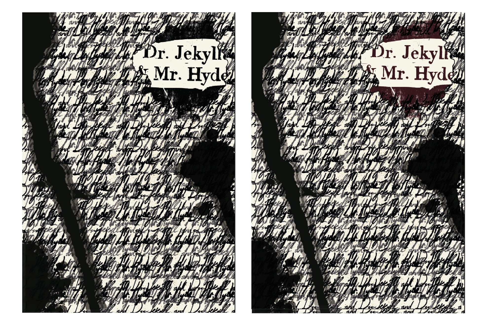
Title red, splashes black, Handwriting with 3 layers of Dr. Jekyll and 2 layers of Mr. Hyde, differing opacity
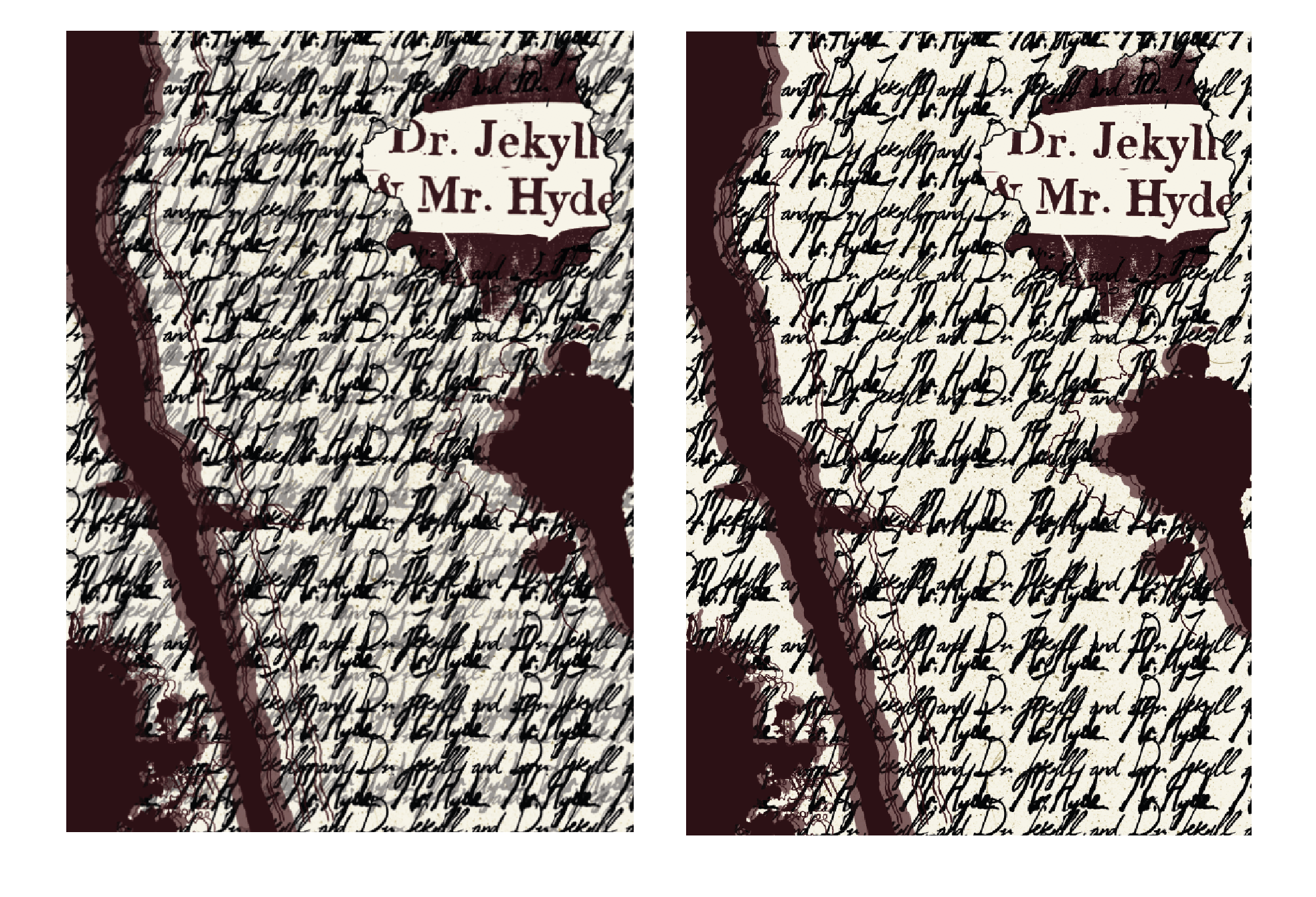
All red, Handwriting with 2 layers of Dr. Jekyll and 3 layers of Mr. Hyde, differing opacity
All red, Handwriting with 1 layers of Dr. Jekyll and 2 layers of Mr. Hyde,
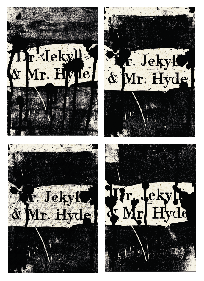
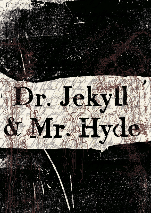
After final consultation, it was between these three:
and the class chose the one with the red lines only (option 2)
but i felt that its too simple and doesn’t convey the idea strongly enough.
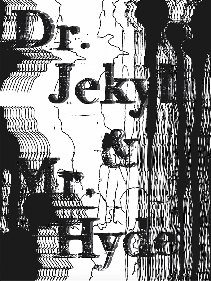
Hence, I duplicated the red lines and coloured them green, inverted them and toggled with the scattering to get this:
Ina mentioned that the green parts at the bottom right looks too stamped and deliberate so I stretched them further apart vertically and horizontally.
and I feel like this conveyed the chaos that I was looking for with the inversion and intersection of green and red lines showing the difference between Hyde and Jekyll (that they are opposites of each other) but entangled with each other and cannot be separated.
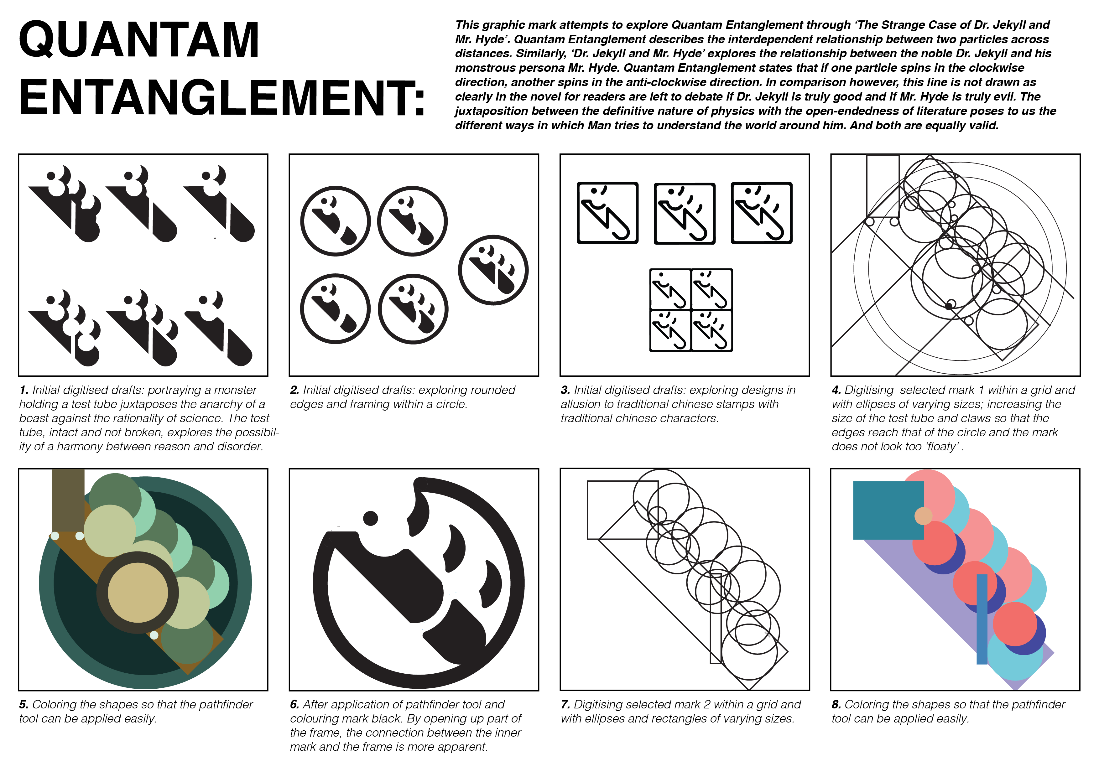
When I first received the brief and did some research, the first thing that popped out to me was Quantam Entanglement as I found it interesting how two matters can affect each other across distance even if they are not in contact with each other.
I then branched out to the more physical ideas like Pairs of things or the Night and Day cycle, things that have opposing ends etc. before going into metaphors and literature like Jane Eyre vs. Bertha Mason, Prince and the Pauper and The Strange Case of Dr. Jekyll and Mr. Hyde.
The last one struck me because I think that it’s very representative of Quantam Entanglement where when you have a good side of that person, you’re bound to have a bad side of that person and if Jekyll is good then naturally Hyde is bad and if Hyde is good then Jekyll is bad.
Hence, I decided to explore Quantam Entanglement via Jekyll and Hyde.
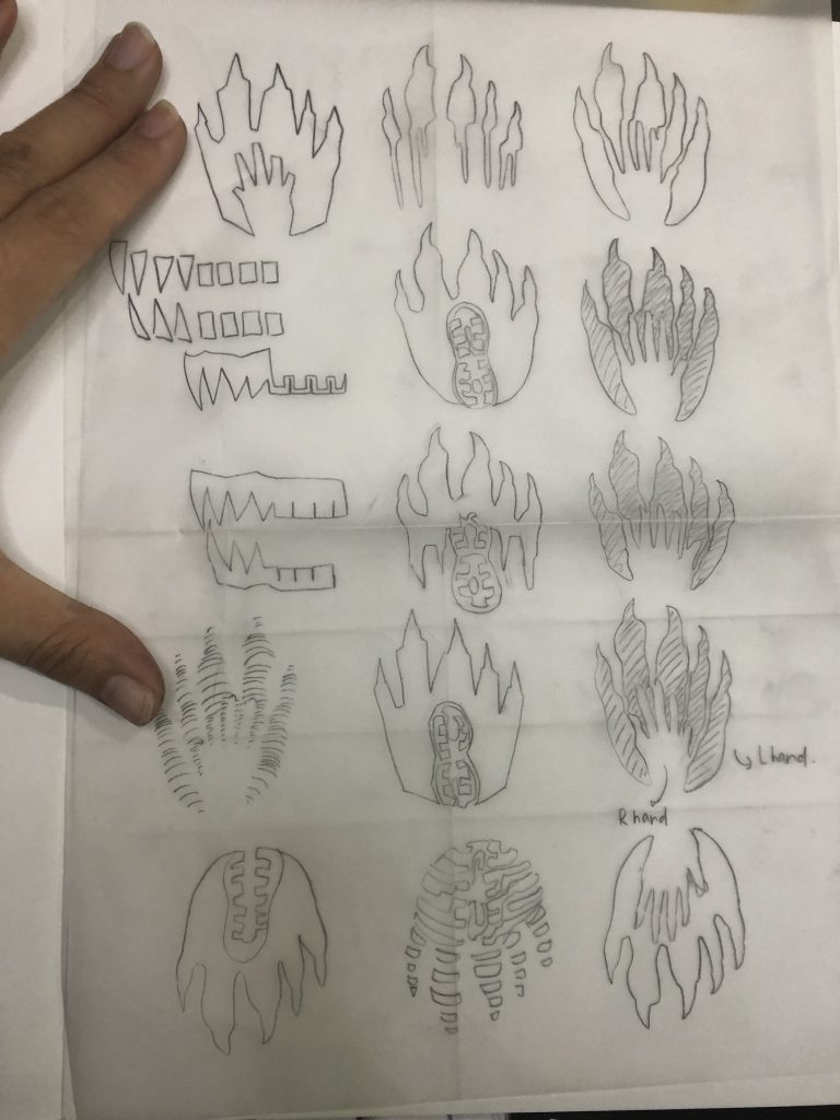
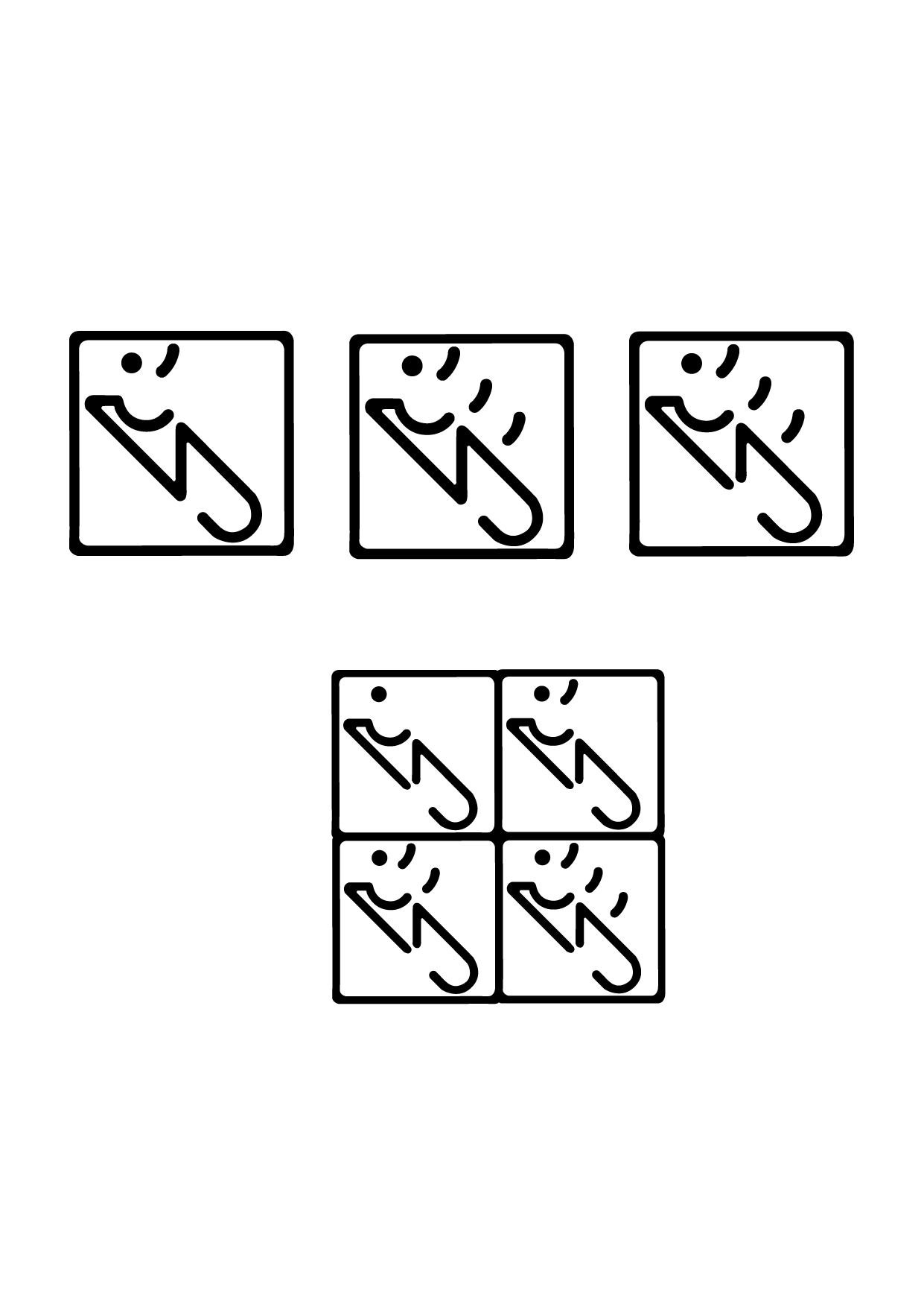
At first, I decided on the keywords: Self vs. The Other Self and Chaos vs. Order and decided on the images of claws, human teeth and footprints.
I wanted to show the contrast between the monster self and the human self hence the differing sizes and shapes of the monster paw vs. the human hand or the human teeth vs. the monster fangs.
After consulting with Ina, she recommend that I used a grid and when I was trying to do so, I realised that these shapes are very hard to fit into a grid and that this was too obvious and not abstract enough.
I also wanted to try linocutting to make the mark as I think that there is something raw about linocutting that is representative of the rawness of human nature that the story of Jekyll & Hyde was trying to explore.
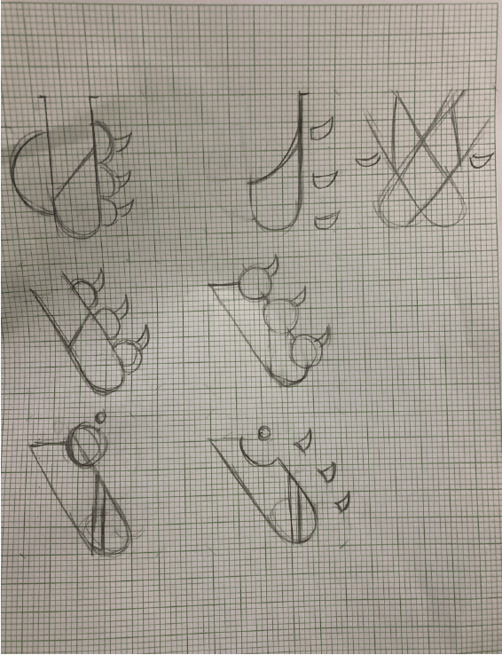
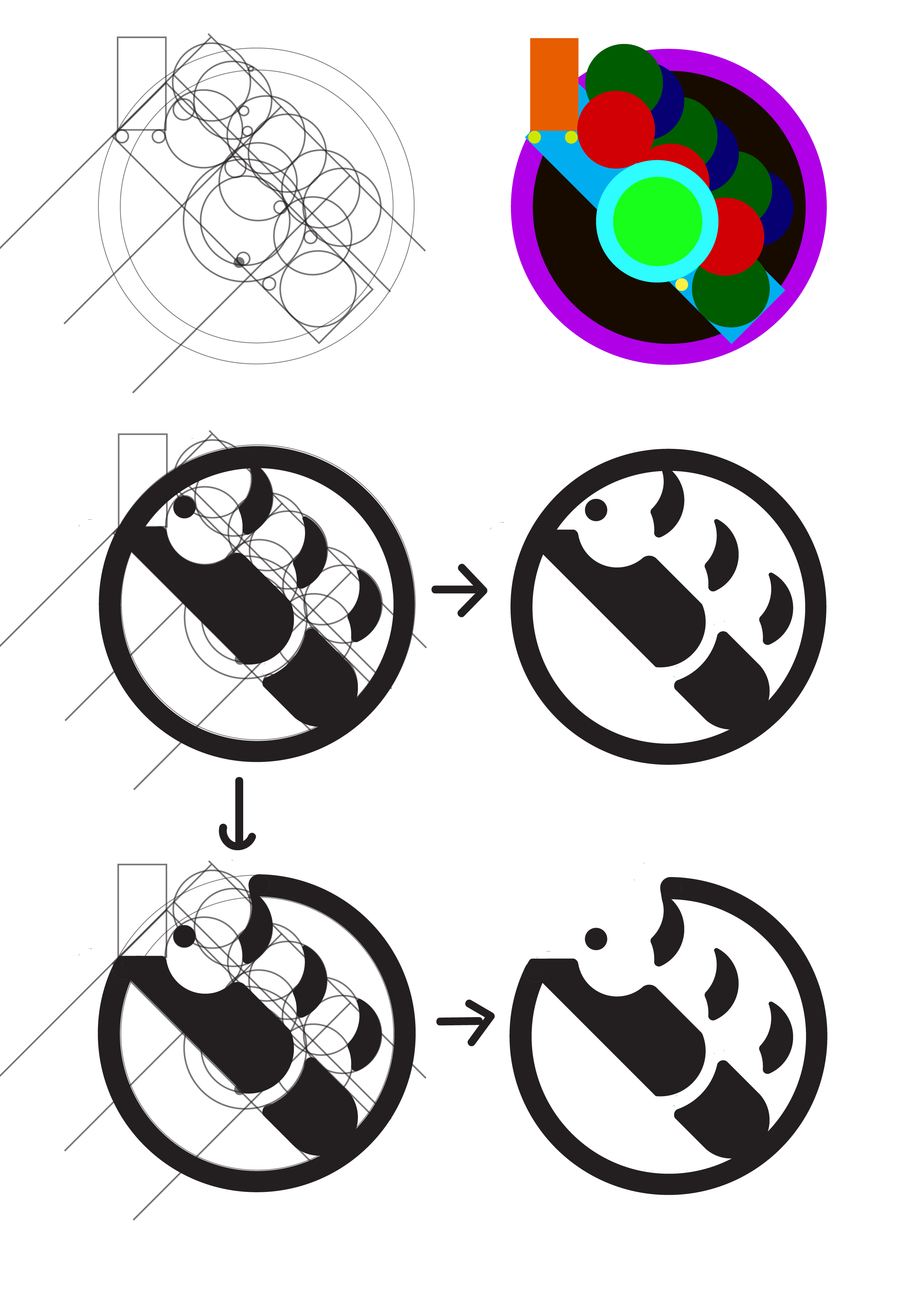
So instead of the sketches that I have I decided to come up with new ones and explored the idea of a ‘monster holding a test tube’ to show both the harmony and the contrast between the rationality of science and the lack of rationality of a monster that is balanced out perfectly in this figure of Hyde/Jekyll.
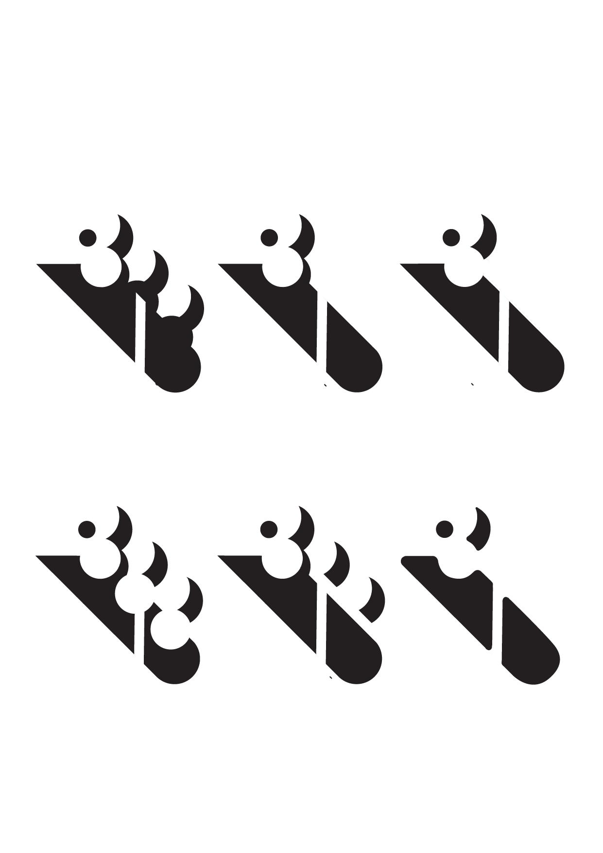
I then digitised them and came up with more variations.
But the grids are still kind of rough as I wasn’t really sure of how to deal with overlapping shapes until the class where our classmates kindly taught us how to (thank you so so much!!!)
Ina mentioned that from the previous drafts, the mark looked too separated from the circle so I tried to merge them more in the first pic and I found that they look a little too boring so I omitted a part of it also to show the emptiness or lack of rationality that Jeykll embodies.
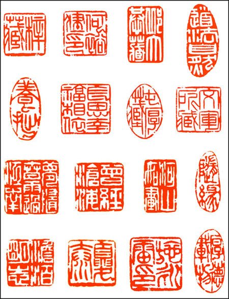
The last mark with the four square is supposed to imitate traditional chinese stamps with traditional words like these:
and Ina also mentioned that the first draft looks too ‘floaty’ so I merged them more into the borders and they show the sequential turning of Jekyll into Hyde with the number of claws increasing.
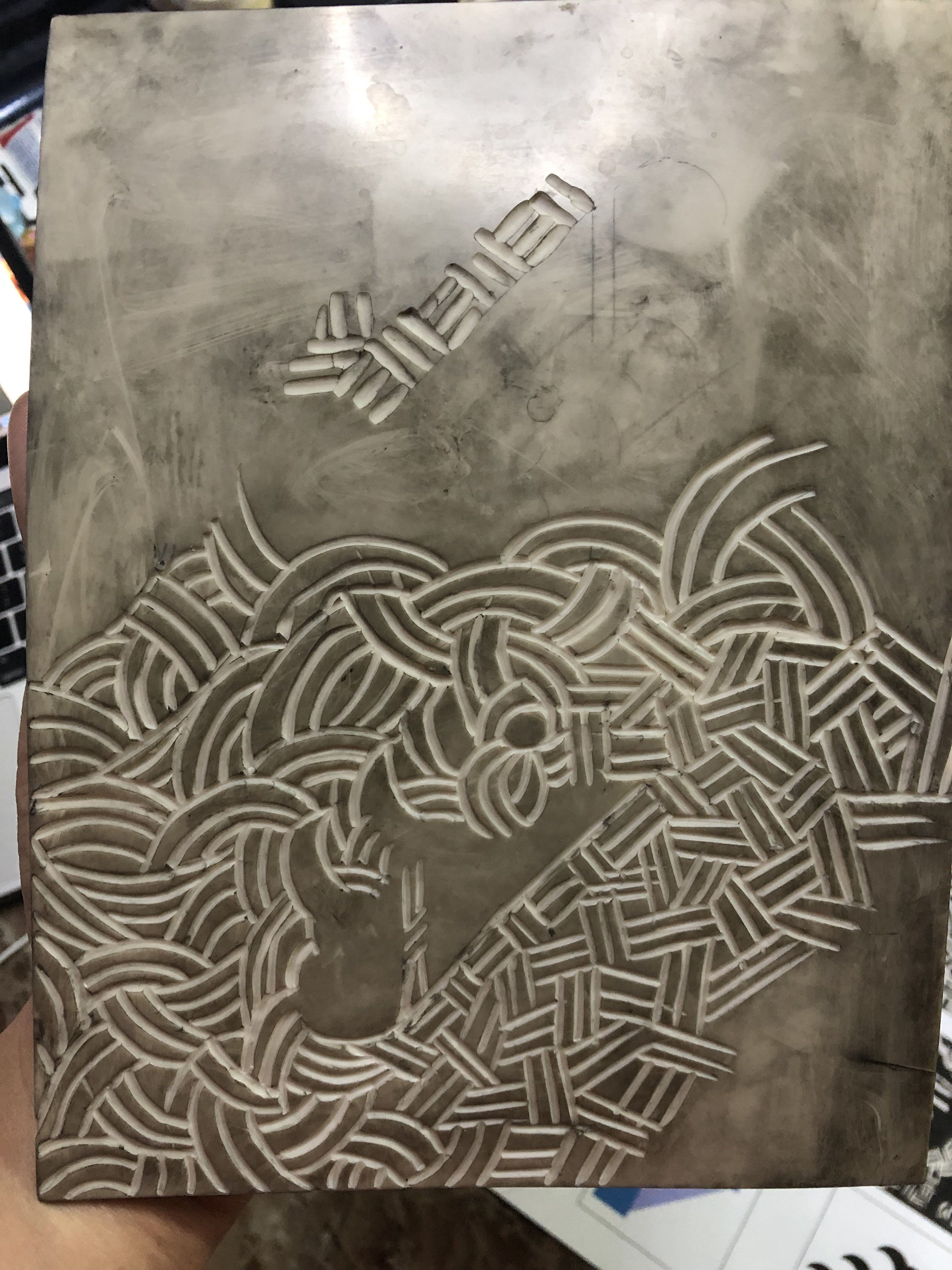
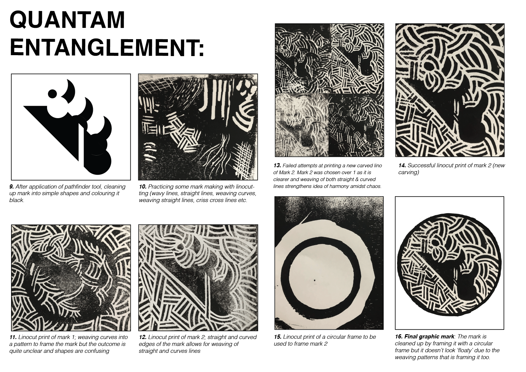
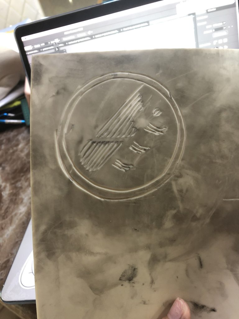
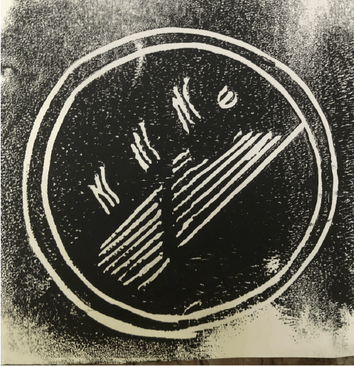
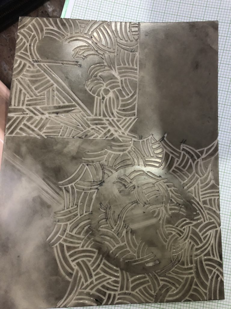
With linocutting, the first attempt was not too successful as I tried to use the marks to bring out the shapes and forgot that since I am printing it by flipping it and pressing it onto a piece of paper, I should cut it on the reverse side but I did not so I got this
.
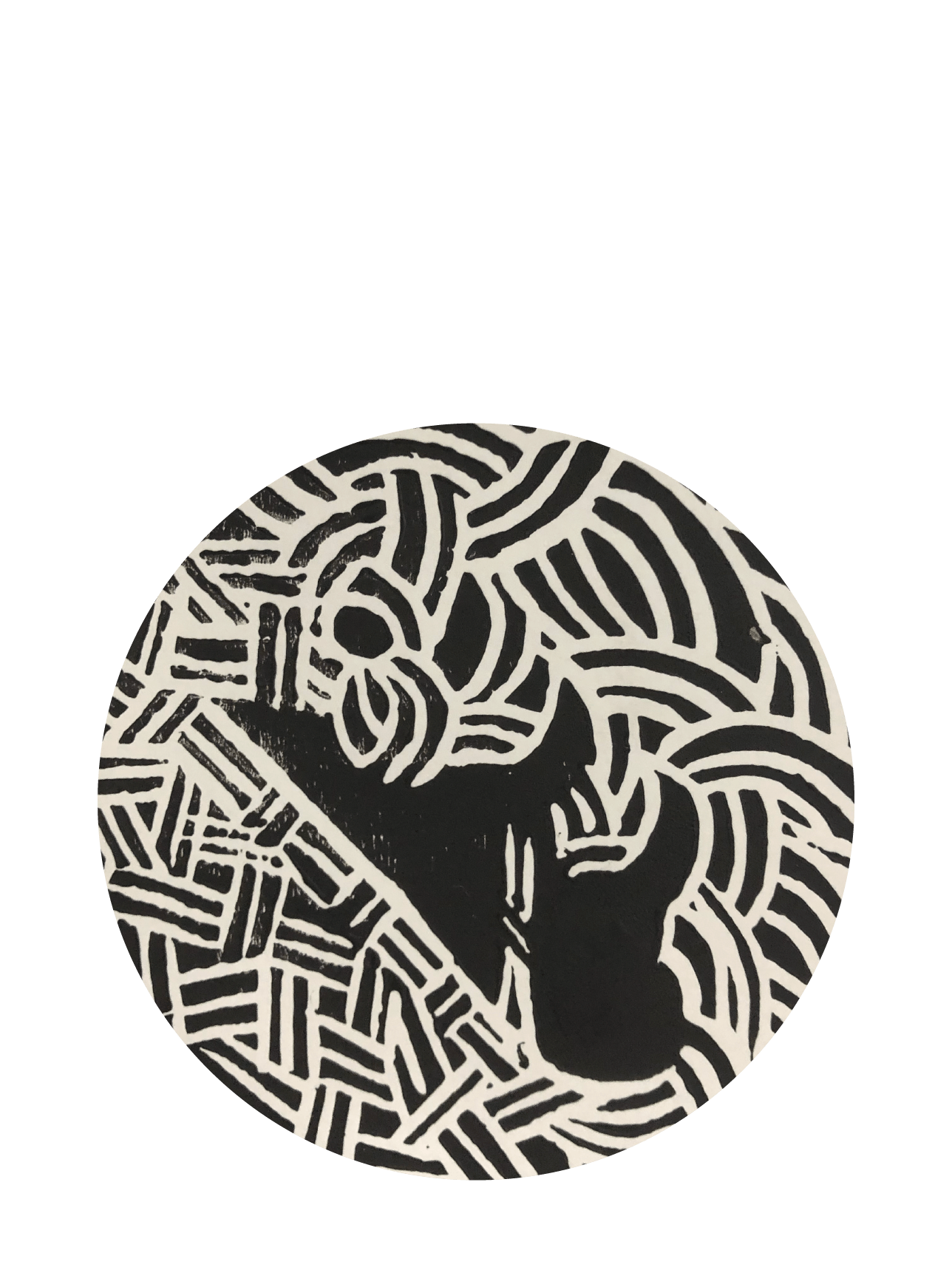
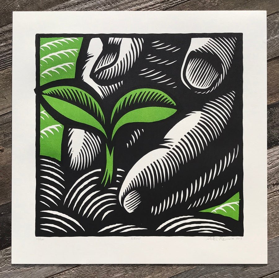
And I realised that instead of marking the shapes I should mark the outside to bring out the shapes so I tried it again (and this time reversing it). I also referenced a linocut artist Peter Nevins whose use of curves to frame and shape figures is very masterful and I feel like would help me frame my shapes well too
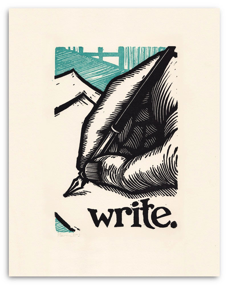
One artist I referenced was Peter Nevins: https://www.peternevins.com/products
‘Grow’ by Peter Nevins
‘Write’ by Peter Nevins
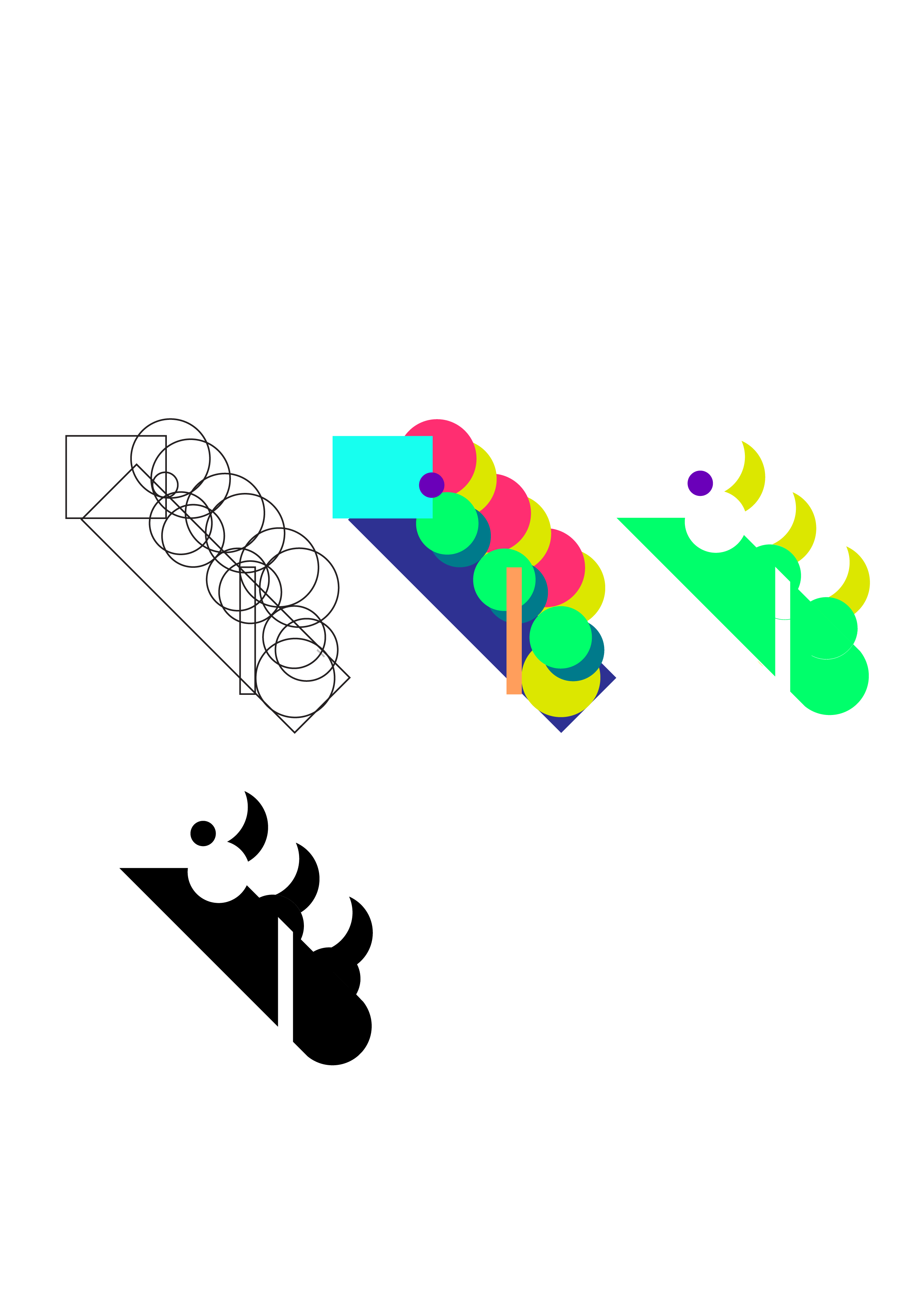
For the more squarish and geometric one, I use curved lines to frame the curvatures and straight lines to frame the straight areas and formed a sort of weaving pattern to bring out the shapes.
For the circular mark, I used curves to frame the the shapes and I find the weaving pattern very interesting as it kind of exemplifies the chaos yet order (which was one of the keywords I wanted to play with) of the science that Jekyll was experimenting with and that was aligned with Quantam Entanglement.
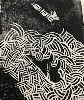
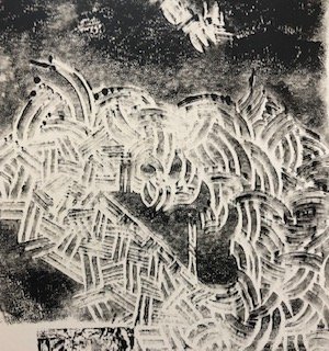
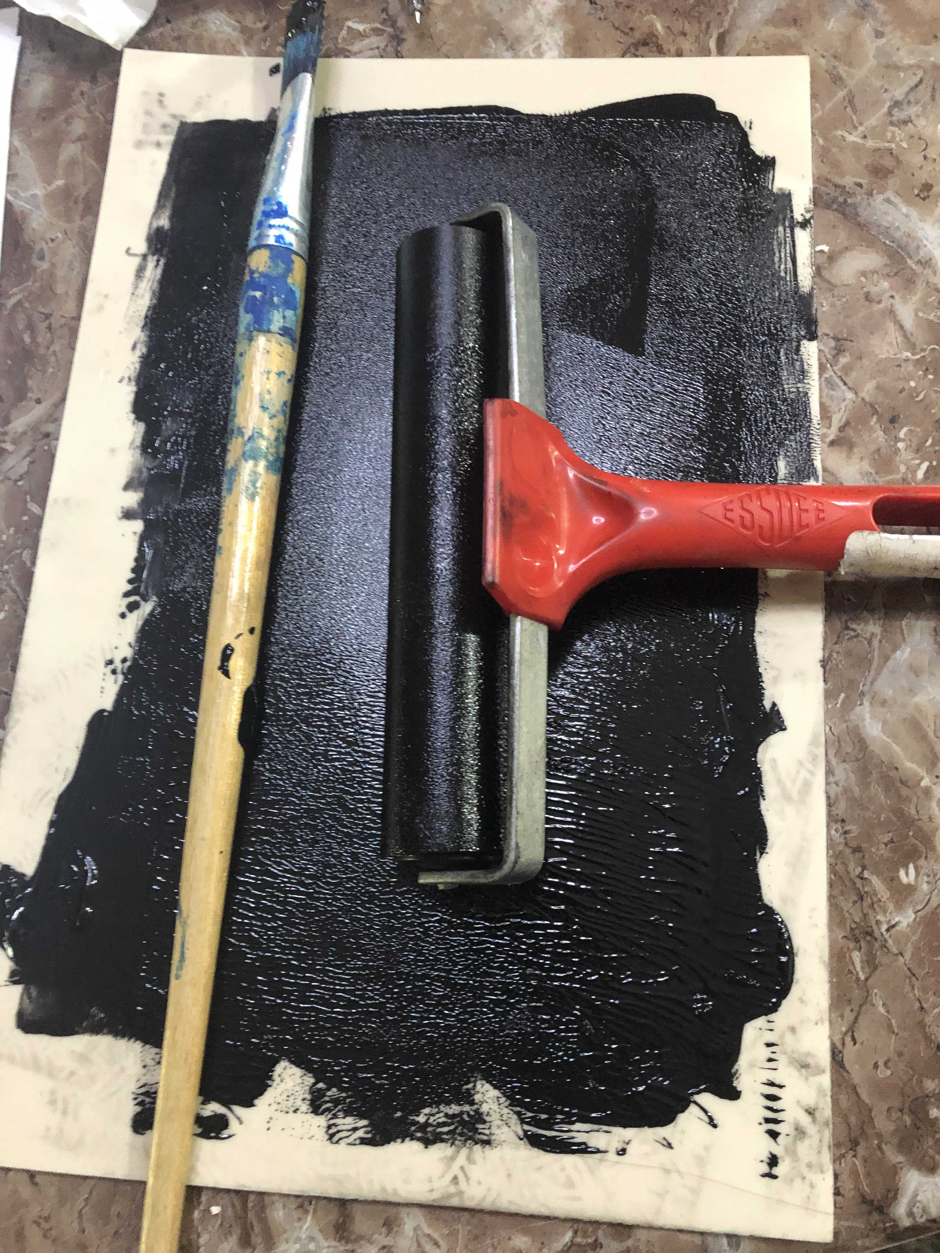
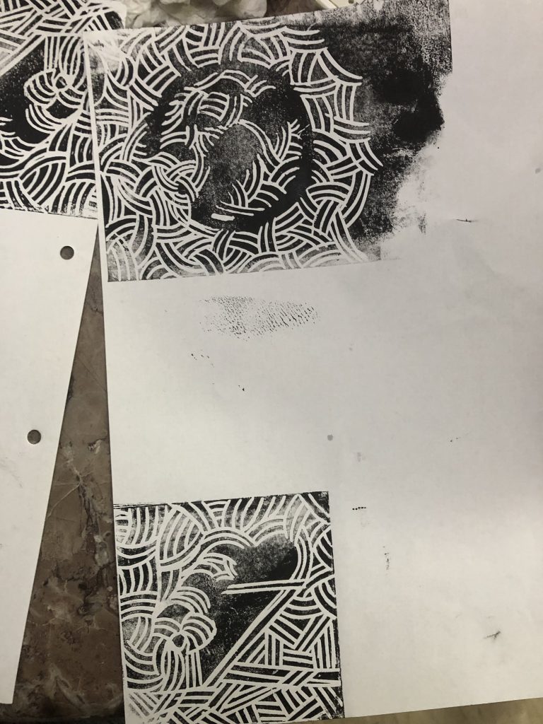
These are the printing process:
.
I’ll experiment more with linocutting in the week to come!
After consultation, Ina mentioned that I should use reference color scheme for the colors that I used to differentiate the various shapes to use the pathfinder tool on.
These are the pictures that I referenced:
And I applied the referenced colors to the shapes here.
And for this too.
After using the pathfinder tool, I got these:
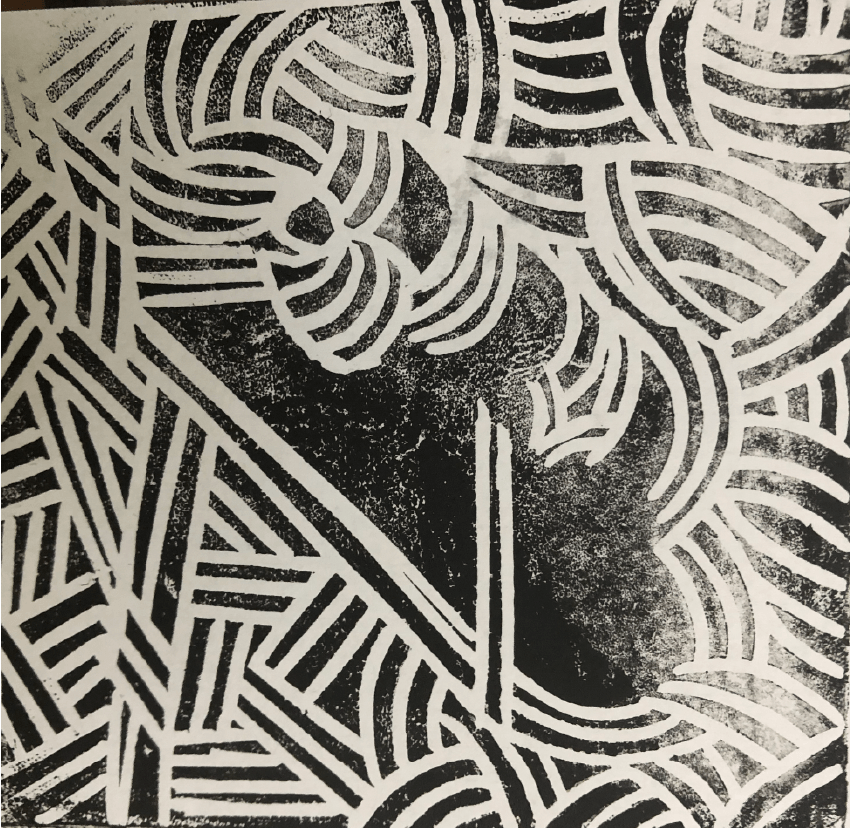
And started to do more linocutting. I decided to practice some basics first so to do some mark making first:
then I carved out the mark that I wanted which from the previous consultations, Ina mentioned that I should work on mark 2. I also felt that mark 2’s curves + straight edges gave me more to play with and I can explore the co-existence and harmony of both weaved curves and weaved straight lines that plays to the idea of two opposing things coming together (reinforces Quantam Entanglement/ Jekyll and Hyde).
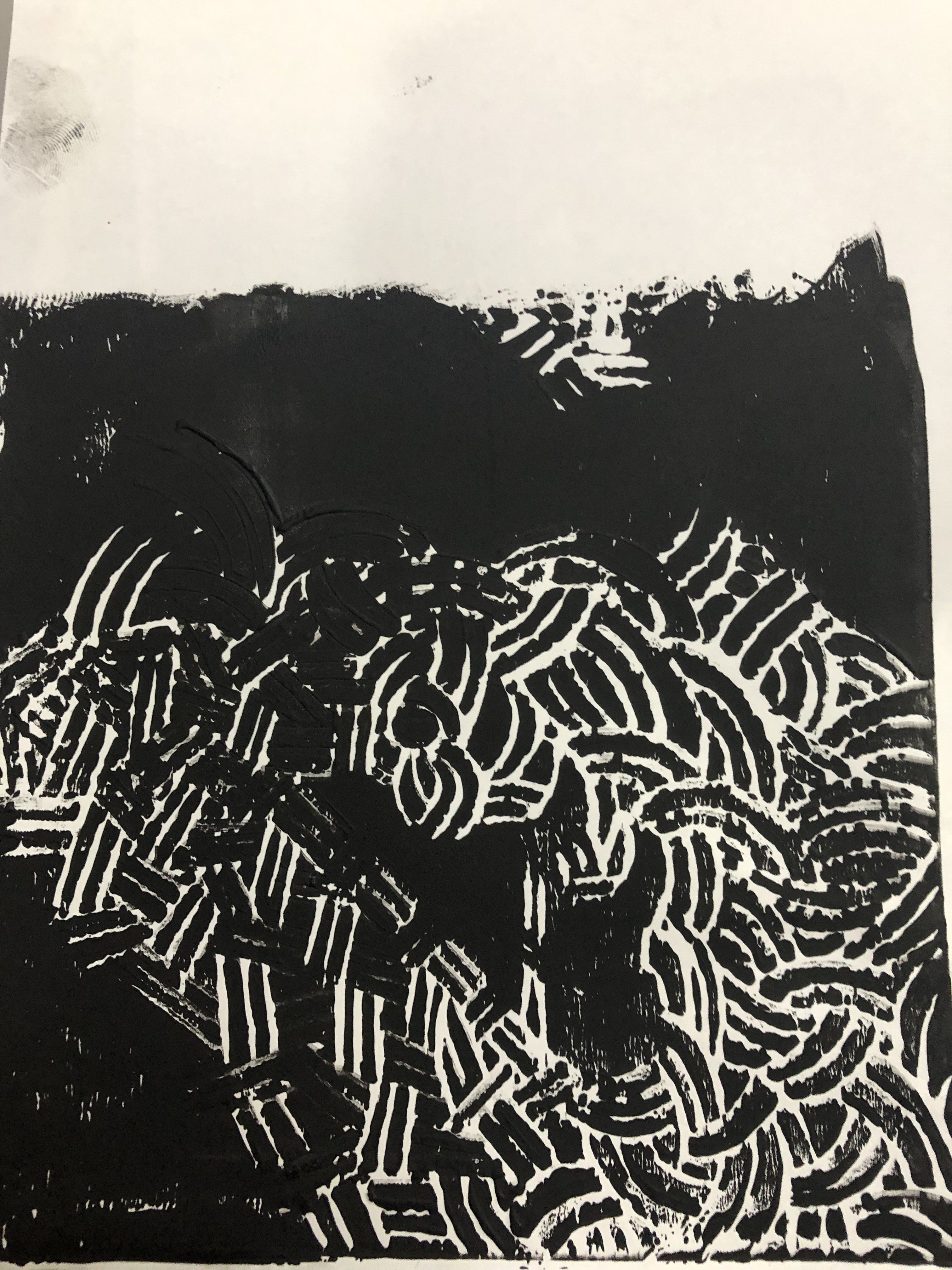
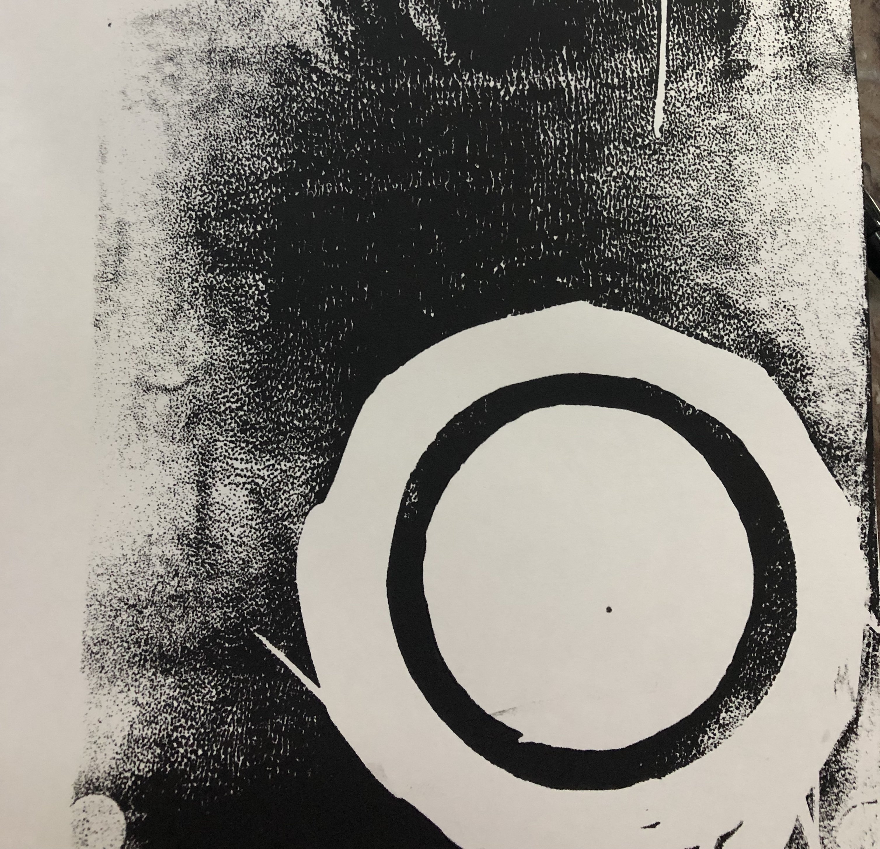
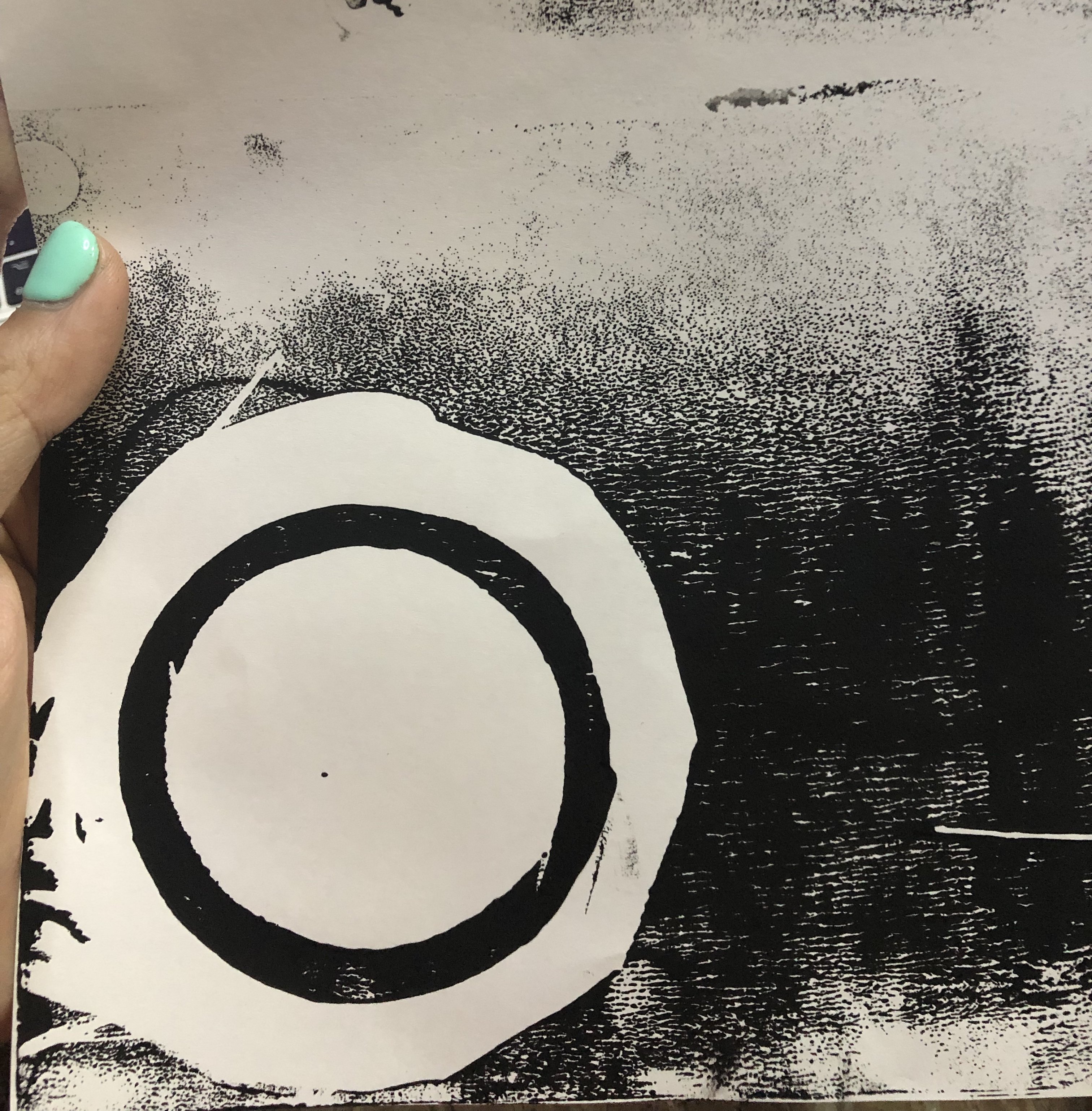
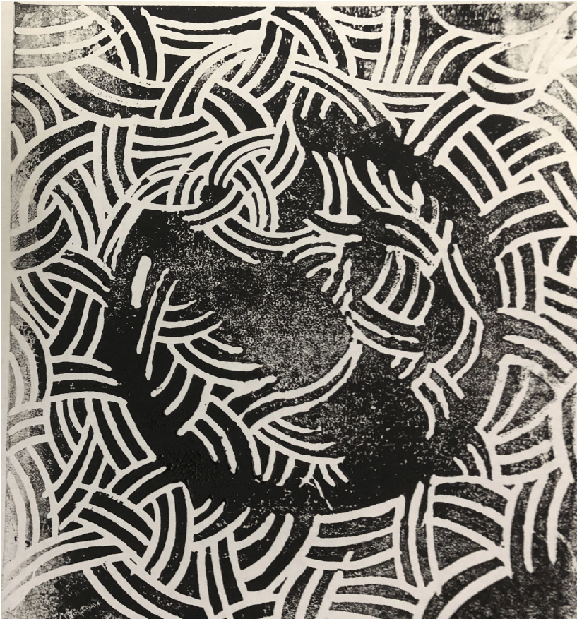
And after some printing errors (where the ink is either too clumpy or too faded):
This was the final one that worked well :))
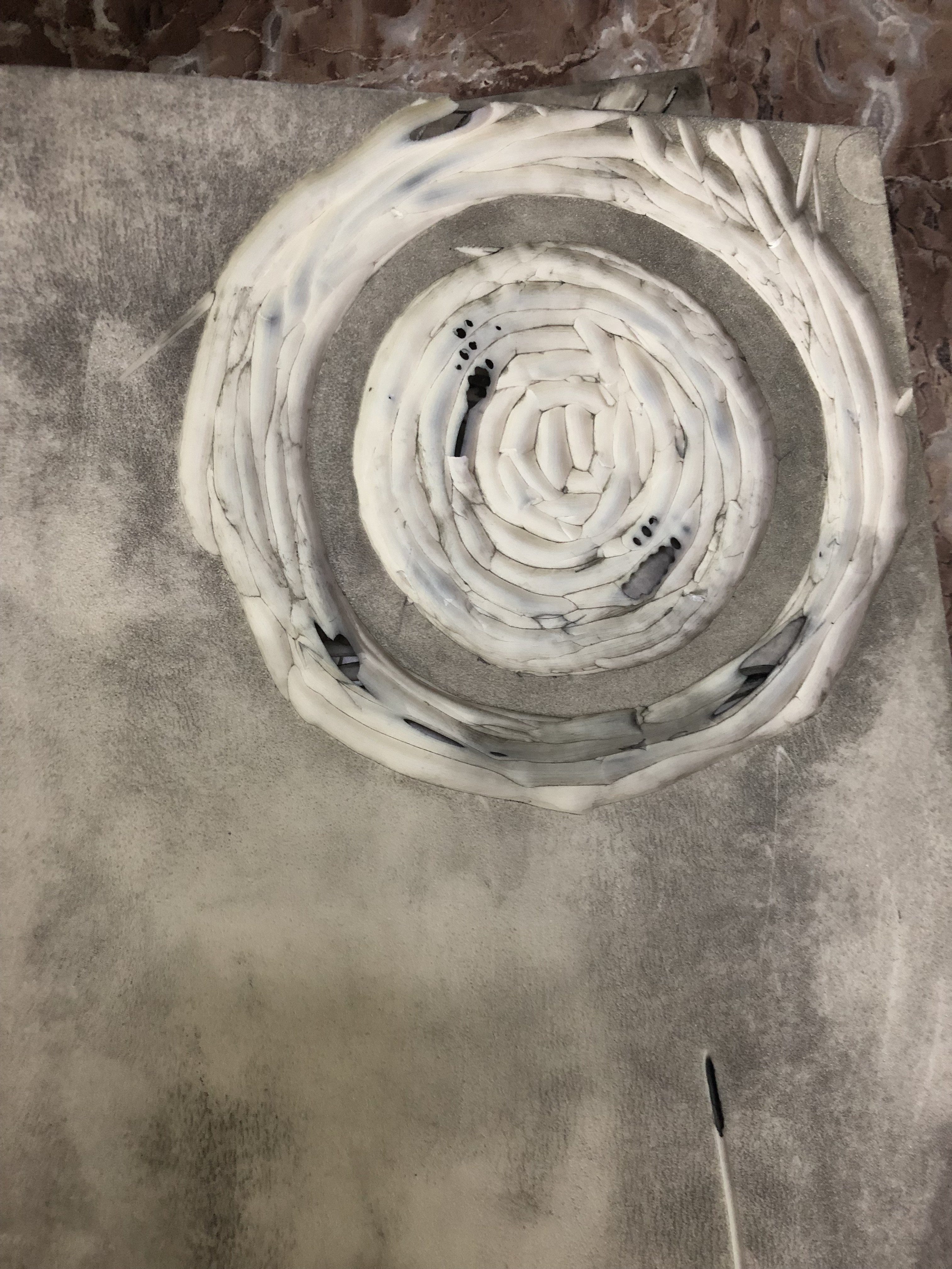
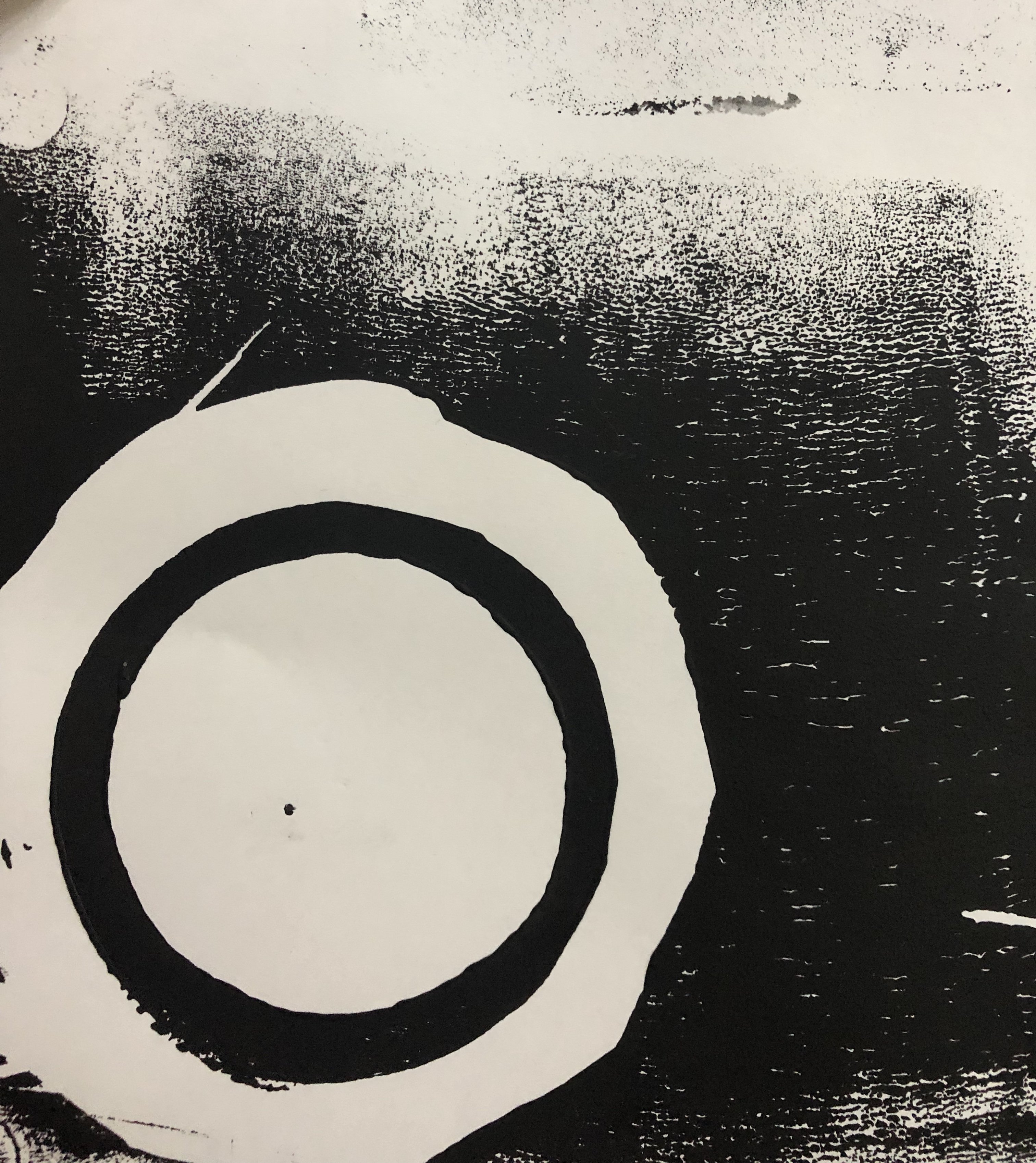
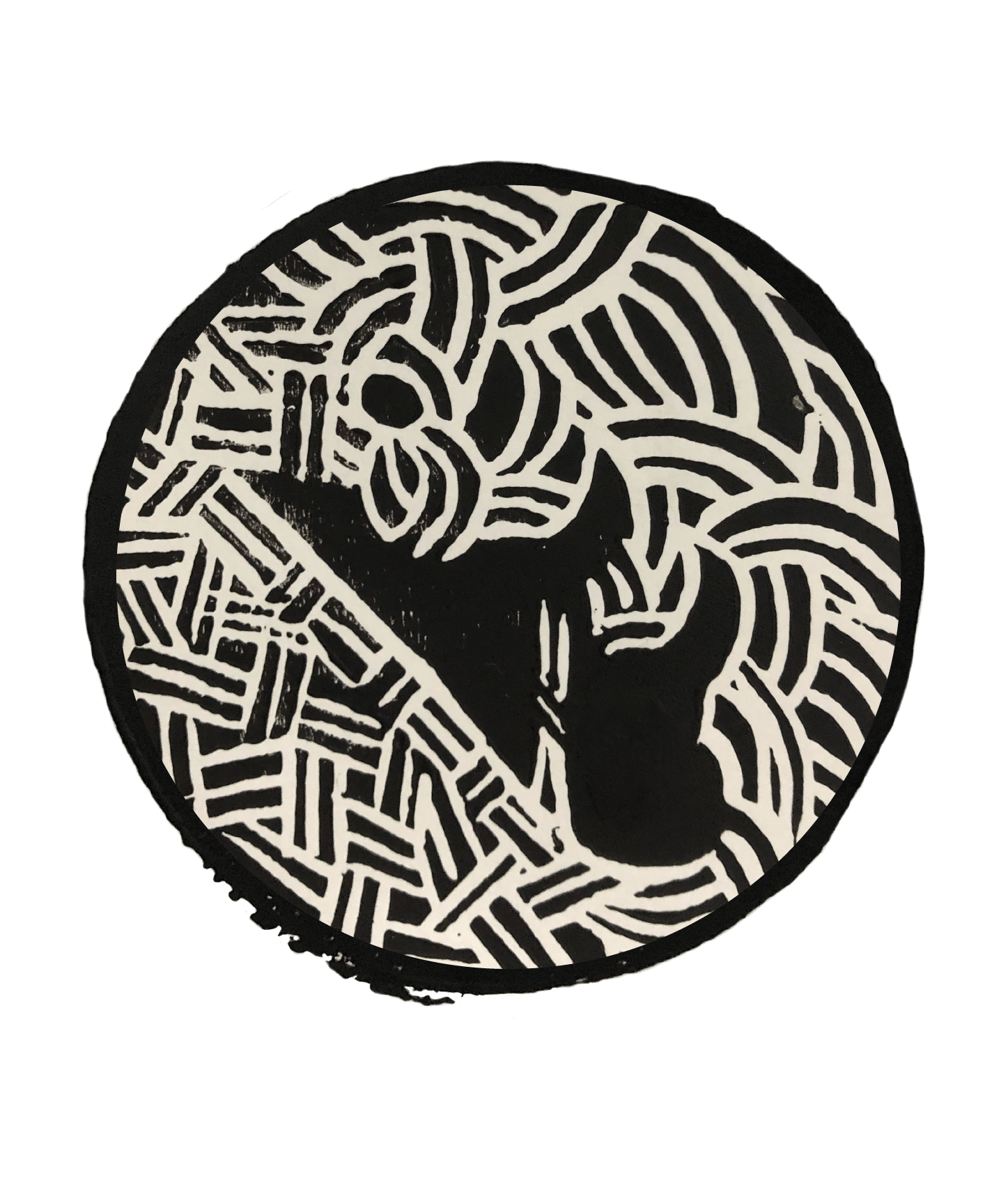
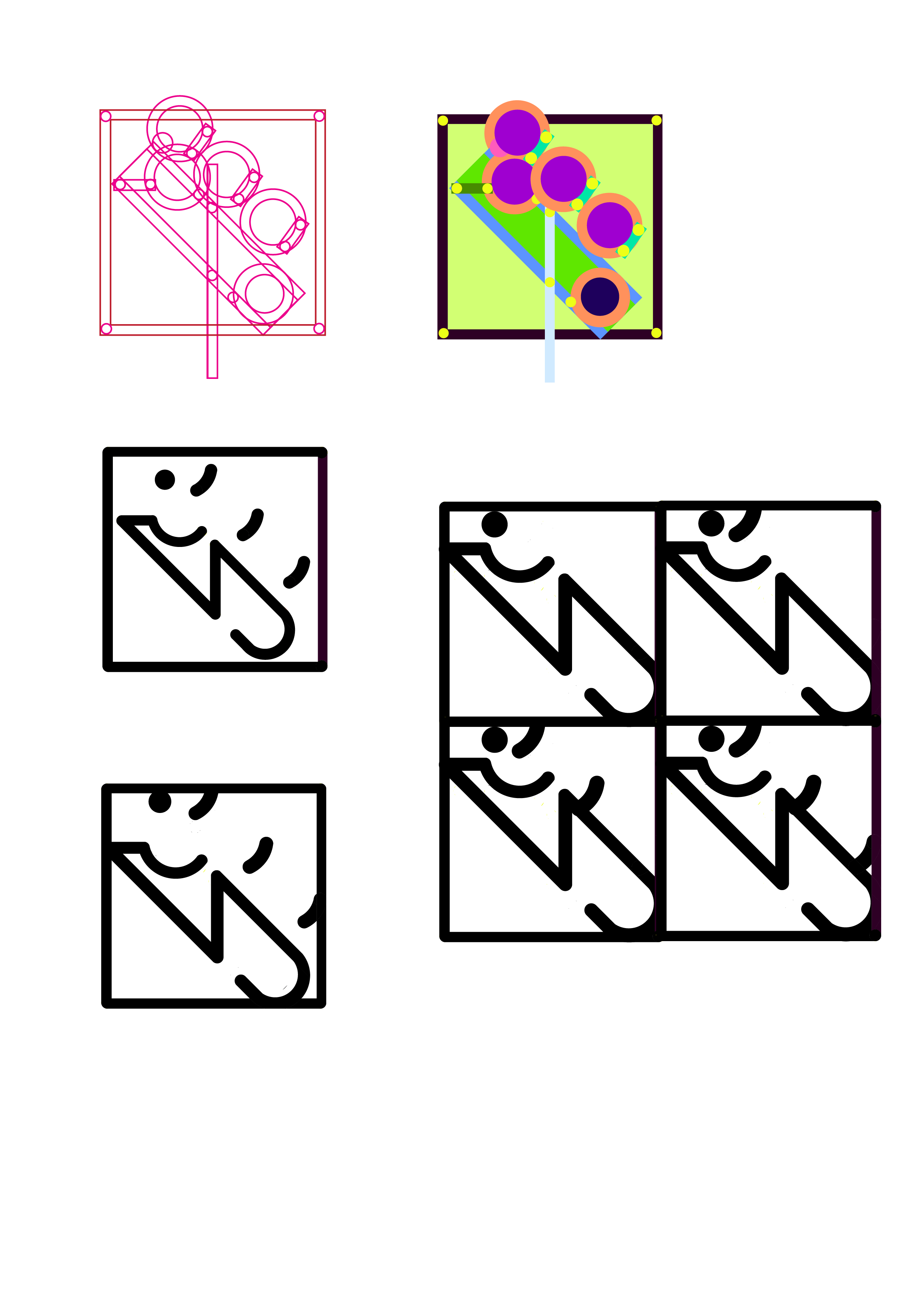
After consultation, Ina also mentioned for me to frame the design within a circle. Initially, she suggested doing so through digitisation but I decided that I wanted to keep it raw so I decided to linocut a circular frame first then digitise the two marks together.
Here’s the circular frame carving!
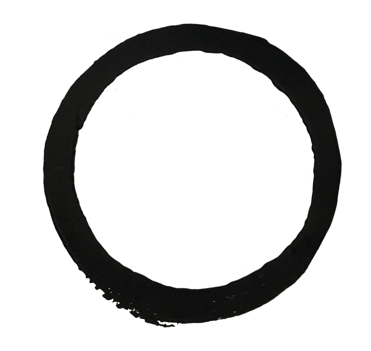
Here are the marks it produced and I chose the last one as it is the darkest and most complete circle!
I first put a clipping mask on the mark with the test tube to frame it with a circle.
Then mask out the circular mark from the image of it.
Then combine the both and used clone tool to clean it up so that the edges don’t look too abrupt or clean (to keep the rawness of the linocut)
And I also cleaned up the blotches as the bottom left to get the final mark!
From this project, I realised that by drawing parallels between science with literature, I also found the differences between the both. While in quantam entanglement, when one particle spins in a clockwise direction, the other is sure to spin in an anti-clockwise direction, it is not so clear in the example of Jekyll and Hyde. Yes, Hyde is evil and Jekyll is good and hence the parallel but the novel also raises questions as to whether Hyde is completely bad and if Jekyll is completely good and so this poses a difference between science and literature. While the quantam entanglement theory has been widely debated, it is mostly proven true and the theory itself, though doubted, has very little room for differing perceptions and versions of it. Meanwhile in literature, it is up to the reader’s perception of the story to come to a conclusion if Hyde or Jekyll is completely good or bad (in other words, the direction in which these two particles spin and the conclusion can be entirely ambiguous in which Jekyll and Hyde both spin in both directions).
Hence, this exploration makes me conclude that as much as science is definitive and literature is open-ended (the opposite), they are both ways in which Man explores the world and neither is above the other. Also, perhaps the juxtaposition of science vs. literature also runs in parallel with quantam entanglement in which these two very differing subjects are interdependent on one another. The world cannot be entirely explored in definitive lenses, all would be too rigid and much beauty would be lost. It can also not be explored in entirely flexible viewpoints as we need some facts to ground us. The rigidity of science is enhanced by the open endedness of literature and vice versa hence this exploration, when thought further is really an extrapolation of Quantam Entanglement to the broader subjects of science and literature.

 Back: (Blue lines are where the invite is folded)
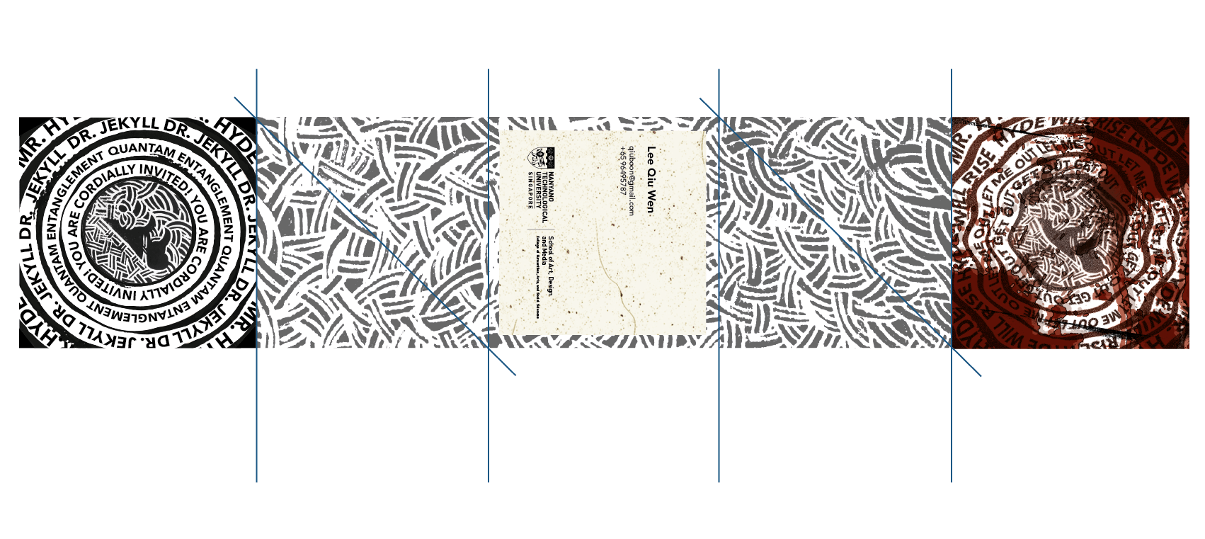


 Process of first drafts:
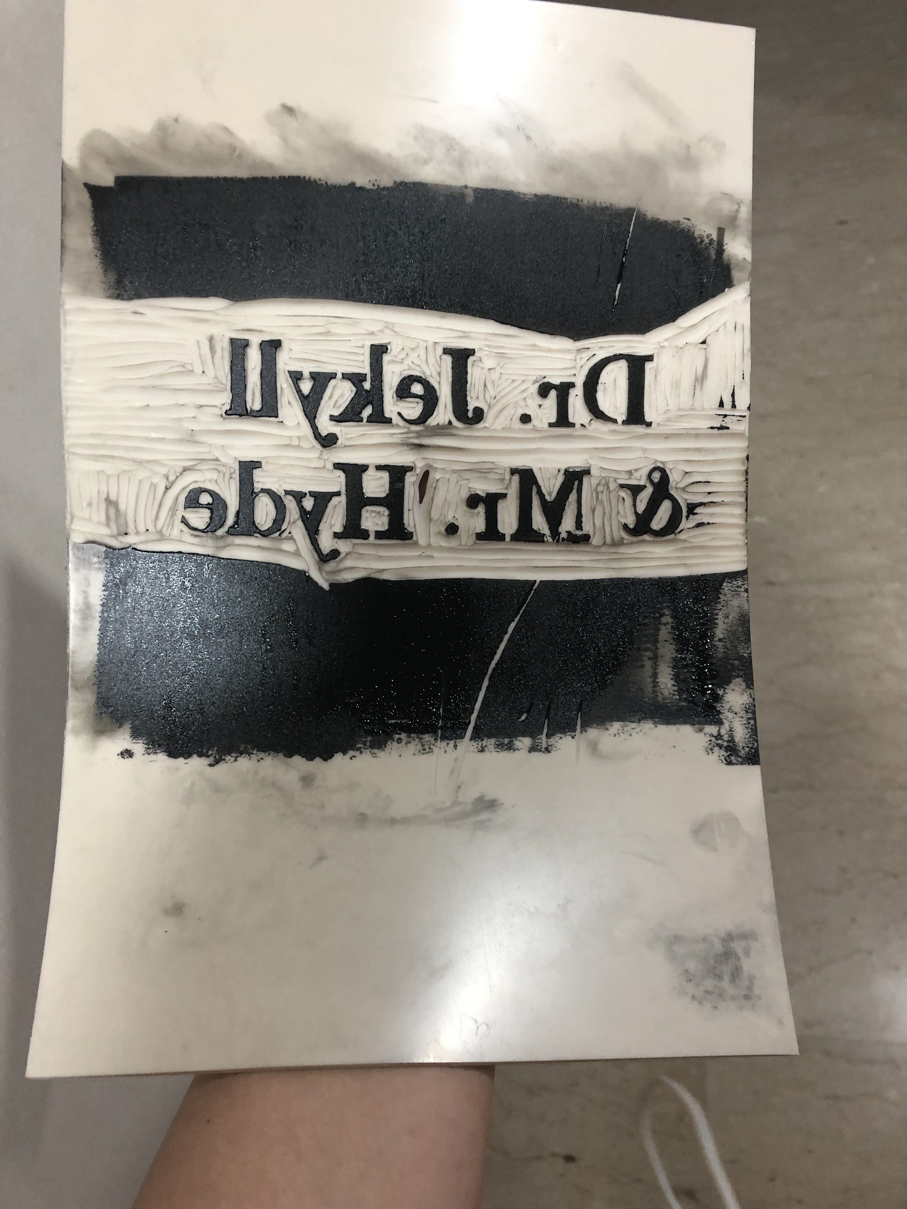


 .
. 
 .
.