Point of view stage 2: Artist research and my first step

I apologize in advance for this long post because I tend to collate everything together first and review them over and over again before uploading them. So...here it goes? 
Idea 1.

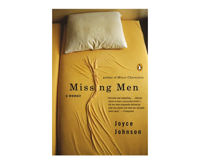
If I am to work on the book cover idea, there are 5 things I would have to think about:

  • The title
  • The font of the title
  • The slogan
  • The settings in the photo
  • The composition

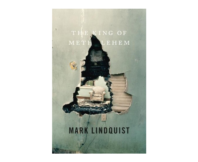
The following are some reference book cover ideas which might help me for this project.

Book cover design ideas:

book-cover-design-ideas3 book-cover-design-ideas6

book-cover-designs2 underthedome

tallgrass paris

talesofchekhov skingame blackseconds theoppositehouse

Photography manipulation artist research

Giuseppe Colarusso:

Switzerland-born Italian artist Giuseppe Colarusso has a strange fetish for making everyday objects totally unusable. The reason why I like his photos is because they are all very mind-blowing and out of the box.

photomanipulations-giuseppe-colarusso-mister-solo-19 photomanipulations-giuseppe-colarusso-mister-solo-15 photomanipulations-giuseppe-colarusso-mister-solo-14

Somehow in each photo, there is a puzzle to solve…

photomanipulations-giuseppe-colarusso-mister-solo-7

photomanipulations-giuseppe-colarusso-mister-solo-2

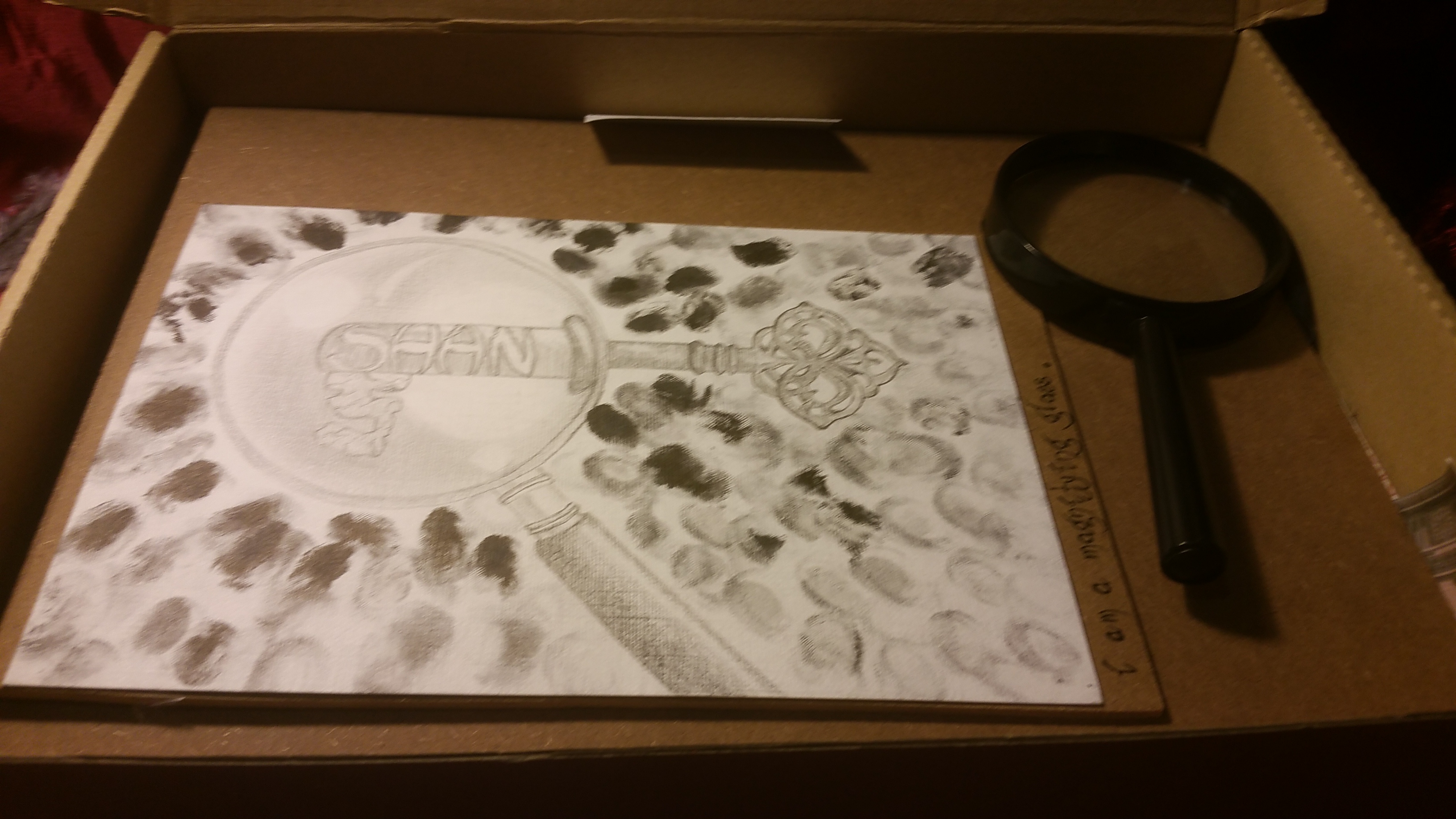
I feel that it would be quite interesting if I try to the combine the idea of transformation with the idea of books…so for example in a composition I could try to add or change some element to a book (for eg. wings).

Idea 2.

Photography illustration artist research

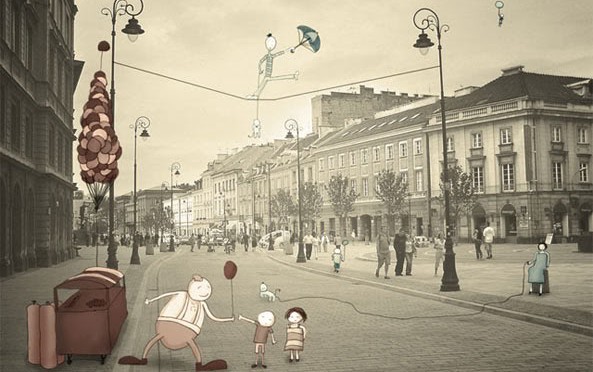
Besides photography manipulation, I also thought of exploring photography illustration.

Johan Thörnqvist:

In my opinion, Johan Thörnqvist work is just….wow fantastic!!!! I’m really in love with his art work. Okay…just take a few minutes to scroll through and be thrown away by his impressive art pieces guys~


101129_j3c

101129_j5e

101129_j8h

101129_j11k

101129_j12l

101129_j16p

101129_j19s

101129_j23w

brandpost

The illustration artist, Johan Thörnqvist enhances ordinary photographs by doodling little characters and buildings on them. By doing so, he turns each and every single pieces of photo into a completely different world using his imagination.

I think that photography illustration is actually an interesting technique and I would like to try it because by doing so I can create a balance between the real world and the imaginary world. Also, by doing so, I can actually solve my dilemma on whether I want to do something new which is digital photography or stick to illustration. 🙂

My progress so far:

For the previous project, I immediately had an idea about what is the overall concept I wanted to work on, which is Pandora box. However right now the biggest problem for me is actually the overall theme. So far I have decided on the idea I wanted to explore – which is the book but I have decided on a medium which I am not very familiar with this time.

Actually, I have started exploring a bit on it. I started by taking some photos and right now I’m still thinking about how I want to include the illustration inside (stay tuned for ‘Point of View stage 3)

These are some photos I took:

 3

4

5

2

1

6

Working on the ideas:

  • Books from the POV of a bookshelf are residents
  • Book from the POV of a bookworm is an escape.

I kind of have a rough overall concept in mind – I want to create a story out of the 6 compositions. However, I don’t feel that the concept is solid enough yet. Any ideas?

Typography chapter 5: Work in progress

My paper cut attempt: to portray the depth of the box.

I had this idea while researching on this project. At first I wanted to make a Pandora’s box for myself. Using just black and white papers and tiny little foams, I created a sense of depth in the composition.  However, I feel that the workmanship is not there and the structure itself is quite fragile…so in the end I decided to forgo the idea.

My attempts to arrange the compositions and create the types:

My questions during the group consultations – Is it okay without a background or is it too plain? What should I include in background?  Should I manipulate the drawings digitally? Any idea how I should portray the last panel – hope?

curiosity
curiosity
desire
desires
fear
fear
My (failed) attempts to manipulate my drawings digitally:

I tried to find a lot of different boxes as the background:

It was a disaster…

curiosity box

curiosity 2

curious 1

My ‘dabao’ (Takeaways) from the group consultations: 
  • Can try using negative spaces to portray the word. In that way, the background is not too blank.
  • Try using another symbol to represent hope in the last panel because the whole series are related to symbolism.
  • It is not necessary for digital manipulation if it is not fitting.
The process of making the real box and the layers in between.
20160216_161641 (1)
last layer
20160216_161548
cutting out A5 board for every compositions

Typography chapter 6: Final

P.S. I'll upload 'chapter 5: work in progress' at a later timing >< Here's the final.

Final

Layer by layer:

Layer 1: The story.

20160218_184814

All of us keeps a Pandora box deep within our mind. It is a box that contains our fears, phobias and desires all the evils in the world. By being aware of the things inside our Pandora’s box, we can in turn learn how to heal ourselves. Do you have fears? If so, what do you fears?

Now, let me bring you through a journey of my Pandora’s box.

Layer 2: I am a magnifying glass.

20160218_184833

Magnifying glass symbolizes curiosity, the urge to search for more information. he key in the composition represents answers, it could also be seen as the key to the lock of the Pandora’s box. To me, Curiosity is a very important trait that exist in almost everyone. Curiosity is what makes our life more interesting. It is also what drives us to learn. However, Curiosity can be dangerous at times. (in the case of Pandora’s box)

Layer 3: I am an octopus

20160218_184855

Octopus have many tentacles, and tentacles represents greed and desires. As a normal human being, I desire for more and better stuff. More money, more food, more clothes, better cars, better pens, better laptops and also better grades.  (In other words, I fear failures) However, I don’t really recognize that as an extremely bad side of me. I see desires/expectations as something that drives me to work harder.

Layer 4: I am a raven

20160218_184916

Raven are very closely connected to loss and death. I do have deep dark fears – I fear losing loved ones, I fear endings and I fear death.

Layer 5: I am an oak tree

20160218_185008

Oak tree represents courage and hope. I chose to draw an Oak tree in both summer and winter form to show that Oak trees are mighty and strong. I am an Oak tree – I stand strong through all things and I never lose hope because I believe that hope is the only thing that is stronger than fear.

Note to self: Stay strong! Stay hopeful!


Presentation

Last minute solutions:

The following setup is an attempt to make my cardboard box look more mysterious and more like a legit pandora’s box. (Because sadly I couldn’t find any nicer box at home)

Firstly I made a scroll by printing out the pandora’s story and dabbing tea onto the back of the paper to make it look like an old paper. Then I went out to pluck some leaves and branches and borrowed some red cloth and a lamp from the foundation drawing room (It is like a props room~)

Here’s how the setup looks like:

Typography chapter 4: Pandora’s box

Inspired by the Greek Mythology:

The story.

In Greek mythology, Pandora was the first woman on earth. Zeus ordered Hephaestus, the god of craftsmanship, to create her and he did, using water and earth. The gods endowed her with many talents; Aphrodite gave her beauty, Apollo music, Hermes persuasion, and so forth. Hence her name: Pandora, “all-gifted”.

When Prometheus stole fire from heaven, Zeus took vengeance by presenting Pandora to Epimetheus, Prometheus’ brother. With her, Pandora had a jar which she was not to open under anycircumstance. Impelled by her natural curiosity, Pandora opened the jar, and all evil contained escaped and spread over the earth. She hastened to close the lid, but it was too late. The only blessing to the entire incident was that at the bottom of the jar, layed the gift of hope.


The Idea.

Pandora’s box, to me represents one’s subconscious mind. Pandora was given a jar filled with many sickness, desires and the many evils of the world. All of these are present in our subconscious mind. I believe that our subconscious mind not only has the power to manifest our most precious dreams and wishes but also our fears and hidden desires.

We all carry a Pandora’s box in our minds. By becoming aware of the things we have buried inside the box, we may be able to find hope and in turn heal ourselves. So…what do you have inside your Pandora’s box?

1. I am curious

  • Due to Pandora’a curiousity, she opened the Pandora’s box.

Research:

  • Magnifying glass – represent curiosity, the urge to search for more information.
  • At the spiritual level the magnifying glass in the dream means that the dreamer must take a closer look at his behavior, if he wants to move forward on the path of spiritual development.
typography_by_ygt_design
Searching for more information


209c8159d6810f6d27544879968333d7
Taking a closer look


My pandora’s box – Fears and desires.

2. I fear losing/endings

Research:

  • Dark crows – closely connected with death and loss.
  • Cutting of ropes – endings
Inspired by Jee young Lee.

3. I desire for more

Research:

  • Octopus tentacles – represents greediness, the desire to grab more things in your hands.
505c8cc3c833f695e79f3f7e9962ea5a
Meaning: Neediness or greediness


76190578d55156c8f814bc727c6e6e0f
Meaning: Grabbing or grasping, trying to take control over something

4. I am Couragous

Research:

  • Oak Tree – The mighty Oak is a symbol of courage and strength, legend has it that it is the most powerful of all trees, the Mighty Oak stands strong through all things.
oak-01
Mighty and strong. Symbol of hope and power.


Typography chapter 3: More artist research.

Jee Young Lee.

Transforms Her Small Studio Into Dreamlike Worlds Without Photoshop

Artist JeeYoung Lee‘s work Stage of Mind is a series of images constructed in her tiny, room-sized studio in Seoul, South Korea. Since 2007, she has been transforming the space into wildly colorful and ephemeral dreamscapes, each scene painstakingly created by hand and without digital manipulation.

Some examples of her work:

Nightmare.

Lee used paper clips for this image. They bear no threat in real life, but she wanted to highlight how small worries can compile into a burden we carry through life. The clips stick to the woman as she walks away just like troubles do.

Black Birds.

“For me large birds are threatening, and the image of their feathers, beak, and curved talons is frightful,” says Lee. The scene is fraught with turmoil, and the doors represent future changes and challenges that the artist will have to go through.


Reaching for the stars.

lifebuzz-e6fe51741efc0ac3152ca1af873cb2d1-limit_2000
It is made of over 2,000 paper cups that were stacked together as bricks of a fragile castle, which represents the human need for betterment. Lee explains: “I wanted to express the process of heading toward your desire, along with the effort it takes to achieve your dream, which is represented by the star.”


I feel that Jee young’s work is very inspiring. Handicraft and skill aside, Lee’s work is permeated with complex layers imbued with personal meaning and symbolism. A mixture of childhood hopes and adult fears, Lee navigates her constructed landscapes as a wondering and apprehensive protagonist.

Typography chapter 2: Hello…it’s me~

Hello, my name is…

Through this exercise I depicted my personalities using 3 name cards of 3 different styles.

IMG_20160124_0001

Typography:

  • Characteristic: carefree, simple
  • Humour brings laughter. Laughter are contagious. Laughter brings Joy. 😀
  • Turning my initial into a pun: “still my favourite S”
  • Improvised by drawing the word like body parts. Shanelle is indeed a sexy name. Just like the person. Wew~

20160124_215514


Abstract:

  • Characteristic: enthusiastic, determined
  • My favourite technique: fumage.
  • Fire represents passion. Fire represents enthusiasm.
  • Fingerprint represents identity.

IMG_20160124_0001

Conceptual:

  • Characteristic: Lazy, Boring
  • Panda is in a world of colours. But panda is black and white. Panda is dull and down. No wonder the colours around Panda are not bright. Panda needs help. I am Panda.
  • Panda wants to find brighter colours, but Panda doesn’t want to move.
  • Hopefully, Panda will walk down the path to brighter colours ahead in the future.


Typography chapter 1: Artist Research

Artist reference

Atelier Pariri.
Using lines to form a word.

research 1

 Paper cutting and layering technique.

research 2

Yulia Brodskaya

The artist uses two simple materials-paper and glue, and a simple technique that involves the placement of carefully cut and bent strips of paper -to make lush, vibrant, three-dimensional paper artworks.

“Paper always held a special fascination for me. I’ve tried many deferent methods and techniques of working with it, until I found the way that has turned out to be ‘the one’ for me: now I draw with paper instead of on it”. – YULIA BRODSKAYA

research 3

Besides researching the artist on the internet, I went to adm library to search for typography books as well. Here are some photos and idea from a book that inspired and left a strong impression in me.

FROM ONE OF THE BOOK.

scan 2 scan 6scan 3 scan 4 scan 5

3D TYPOGRAPHY BOOK.

Image (7)

Image

Image (5)Image (2)

OTHER THOUGHTS.

Henna inspired typography.

Henna considered a way of expressing happiness and style at the same time. To me, henna is feminine and alluring as most women use henna to decorate their hands with beautiful ornament.

research 4
Scanography

Is it a photo or painting? The scanner effect is made up of 2 main factors:

  • Scanner’s camera has very high resolution, creating detailed and sharp images.
  • All the objects are placed on a flat plane, with nothing in the background.

The lack of perspective and depth results in a unique image capture, giving three dimensional objects a partially flat appearance. This special effect gives a touch of the surreal to the image, somewhere between fantasy and reality.

research 5

I was inspired by scanography and tried out my own version as well.

Shan 2 Shan