FINALE

Yet again, this proposal was rejected! HAHAHA…kidding. It is probably the most interesting proposal that I have ever created out of the (non-existent) 143 proposals. Most interesting and enjoyable 2d project, I meant. 😀
The idea behind making this zine was inspired by my previous artist research. In this project, I decided to illustrate the design by drawing it traditionally again and then take a step further by editing it digitally and also include typography.
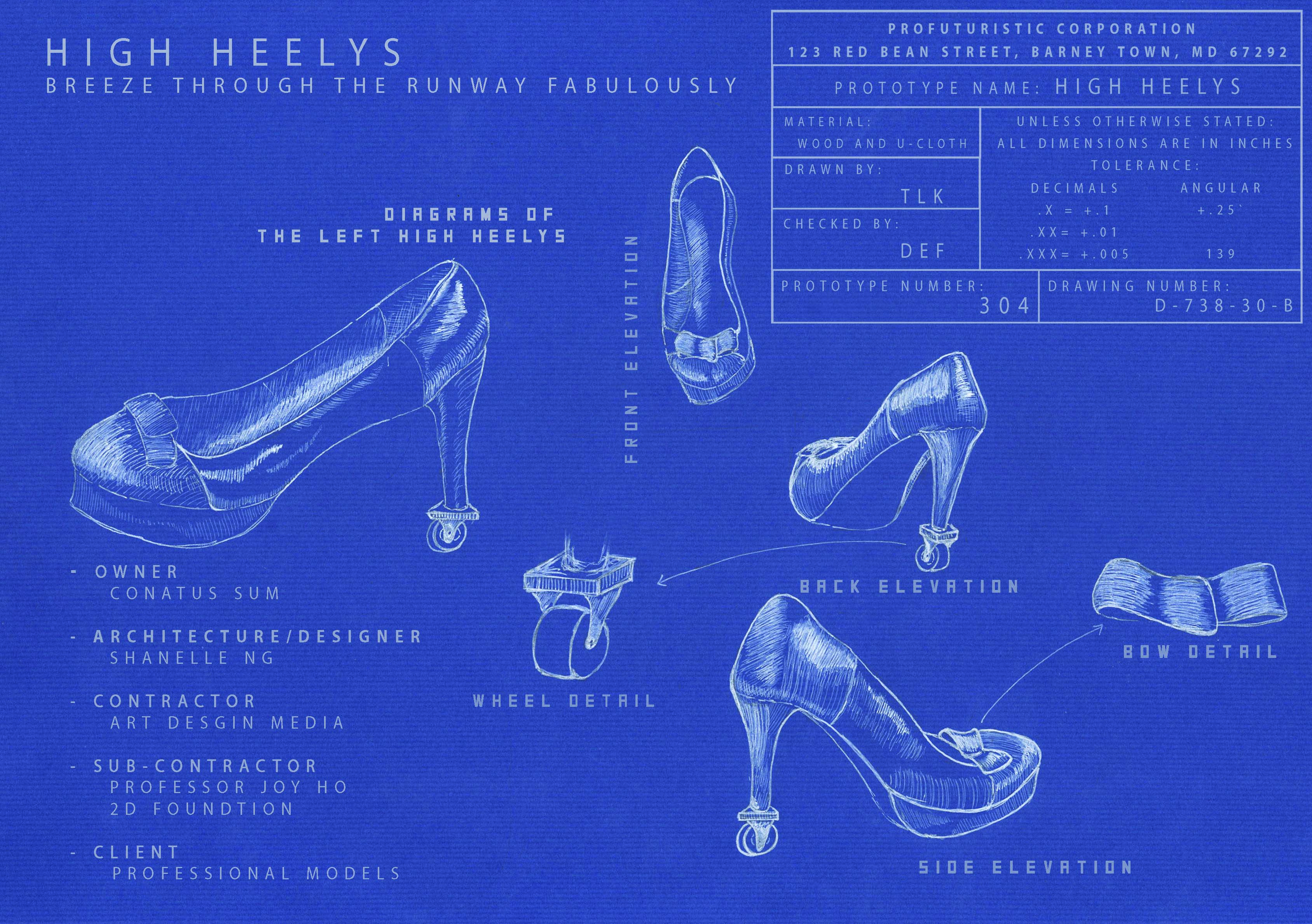
As I am going to be majoring in product design, I think that it would be interesting for me to create a zine about products, specifically products that are ridiculous and funny. Thinking about it, many existing products were actually at some point of time considered to be an absurd and dangerous design. For example, high heels or roller skates?
By altering different components of different products to make it look absurd, it gives me a chance to think out of the box. Imagination is limitless! Here’s a just for laugh: http://www.buzzfeed.com/tenballlabs/40-most-ridiculous-products-youve-never-seen-640g
I actually had many initial ideas to work on, however, due to the limited amount of time we have, I decided to focus on drawing products that:
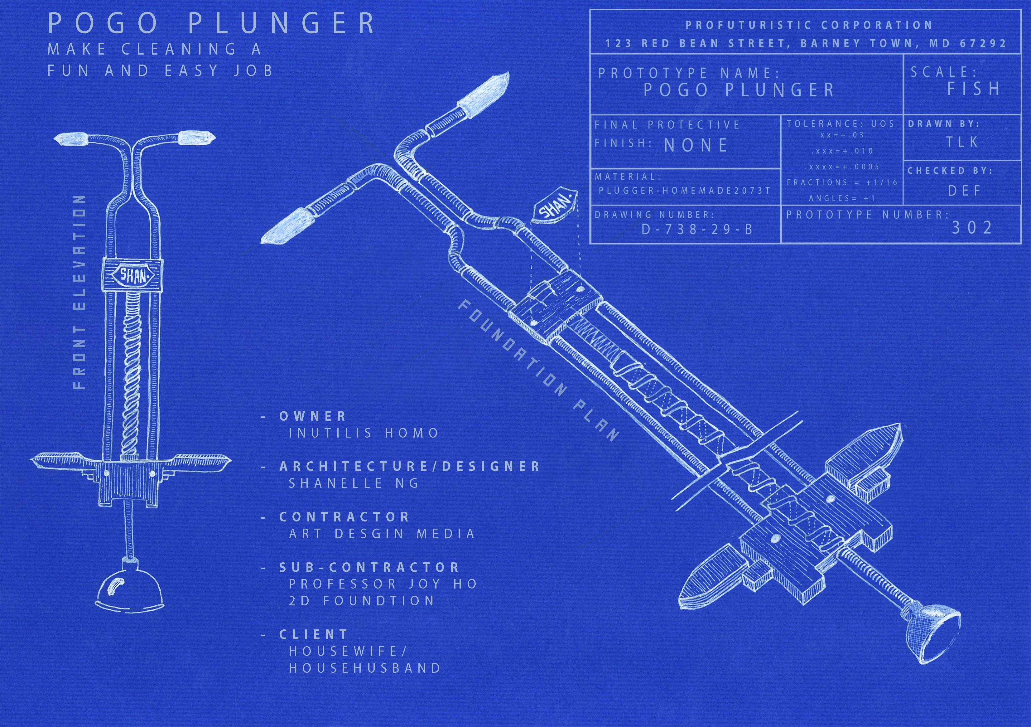
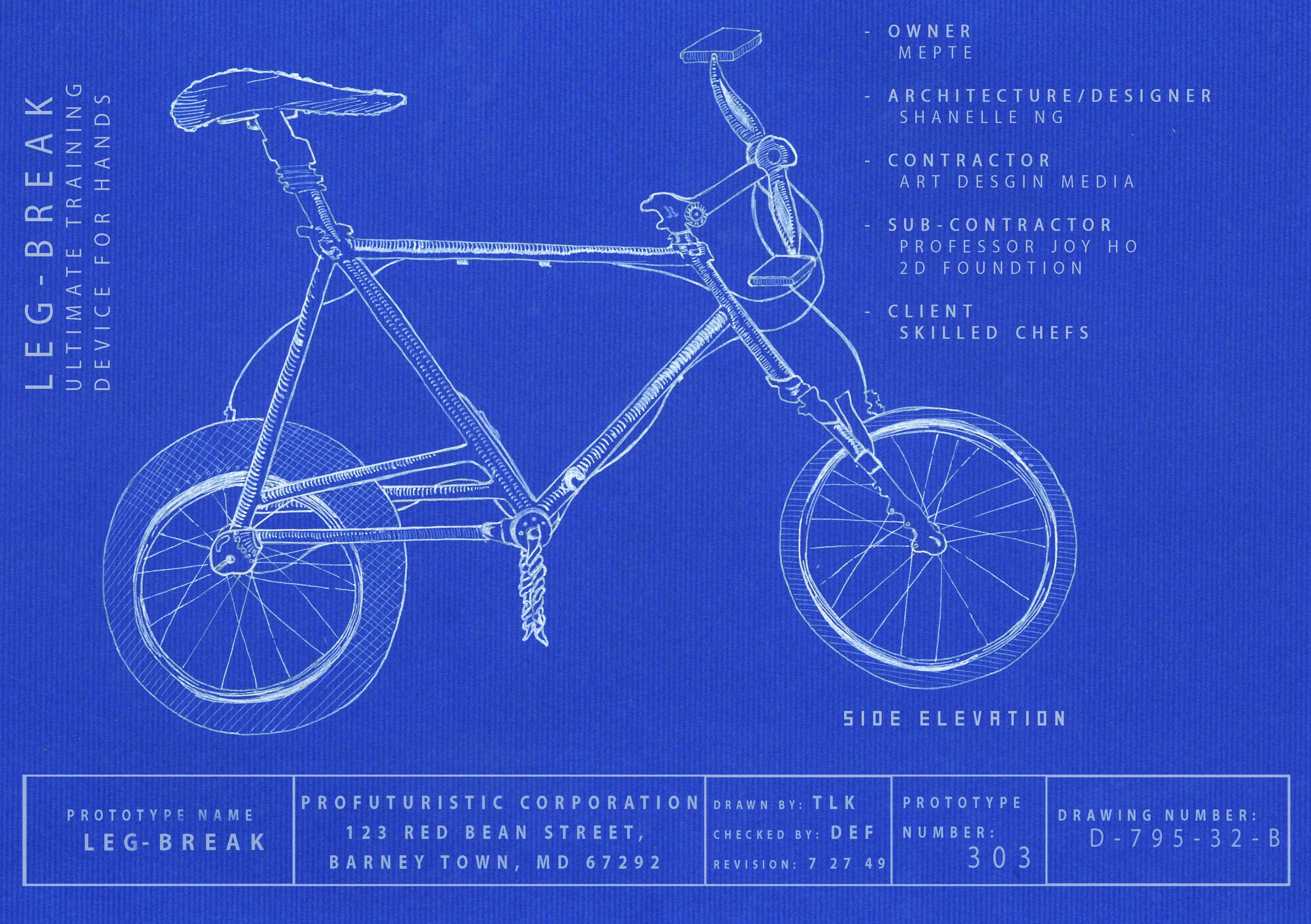
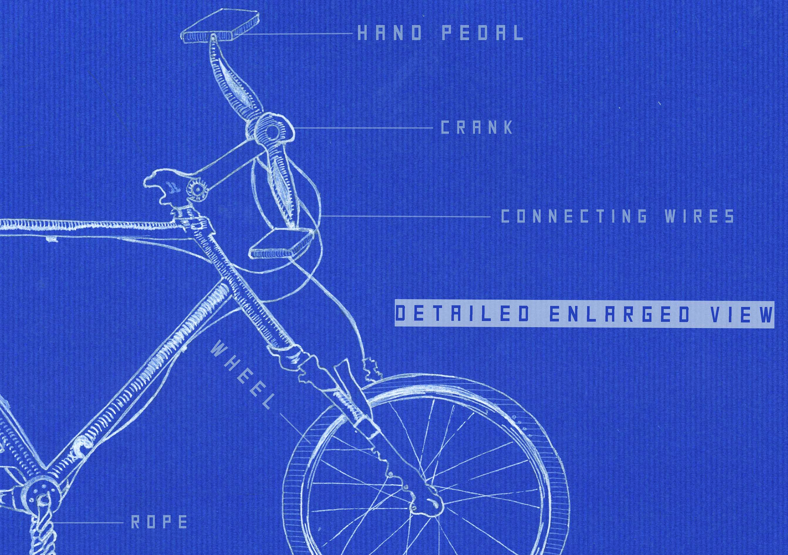
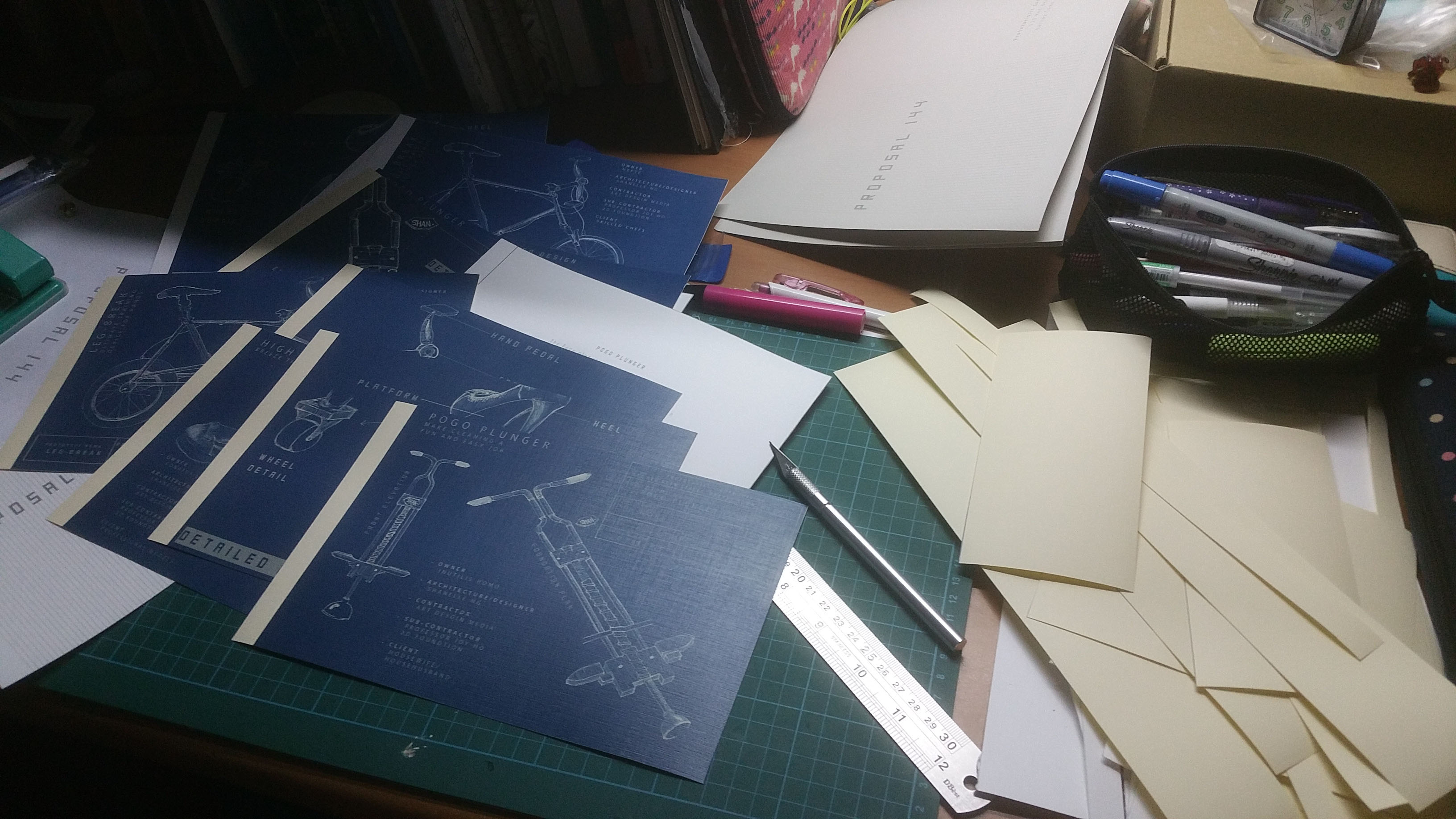
- Have a mechanism in them – so that I can draw the details
- Is related to excitement and travel – so that I have a theme to tie all the products together.
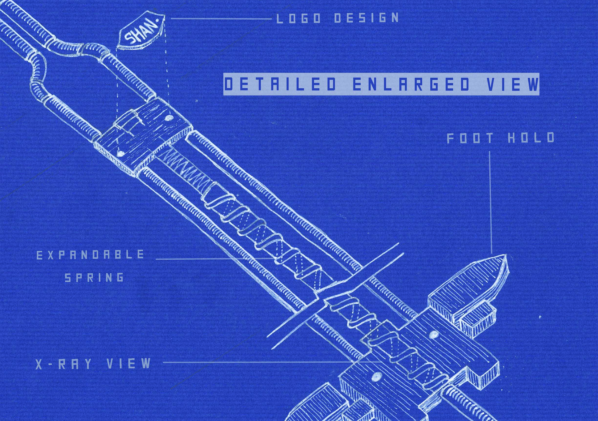
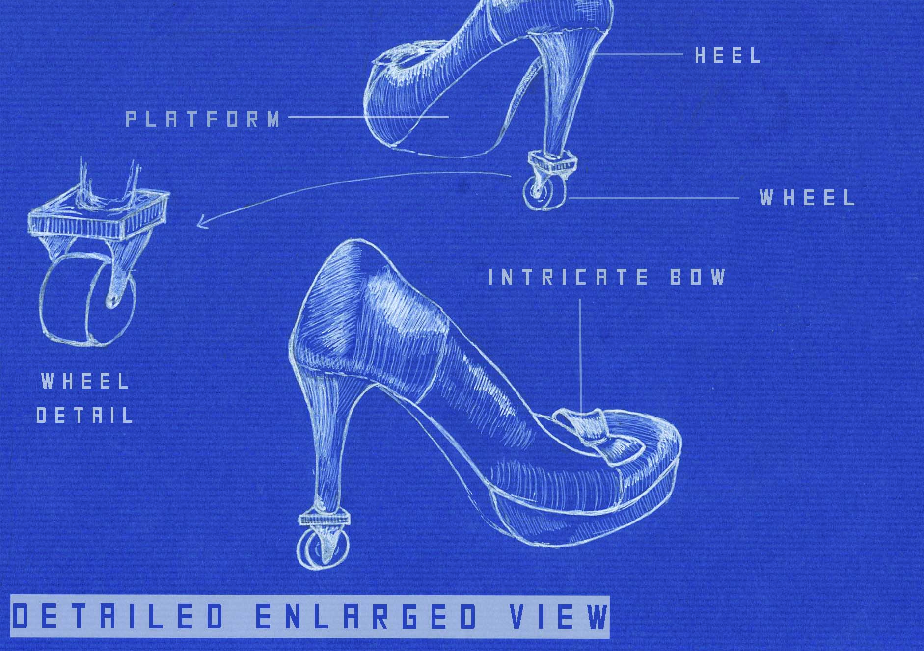
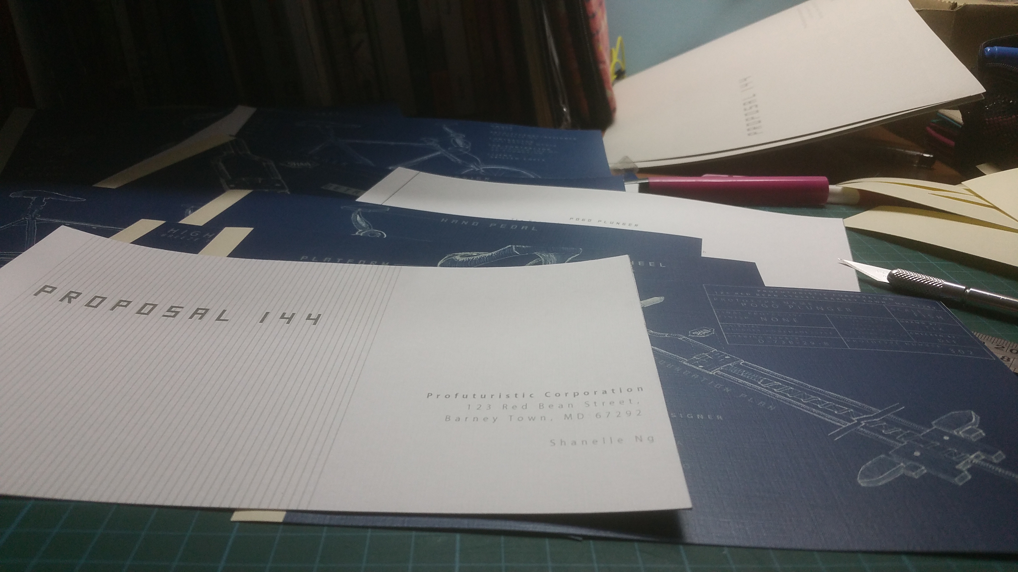
Besides having an overall blueprint layout of the 3 designs, I also decided to include the detailed enlarged version to give more information about the products. After all, the printed piece is limited to A5 size.
Initially, I wanted to print the blueprint designs on blue paper, thinking that a printer will print the white illustration. However, I realised that a printer cannot print white ink. Hmm, new discovery~ The printing turned out to be a disaster though. 🙁
After that, I printed the blueprints on 2 different types of paper. A yellowish textured paper and a white textured one. Then I proceed to cut the papers and left a margin for the binding.
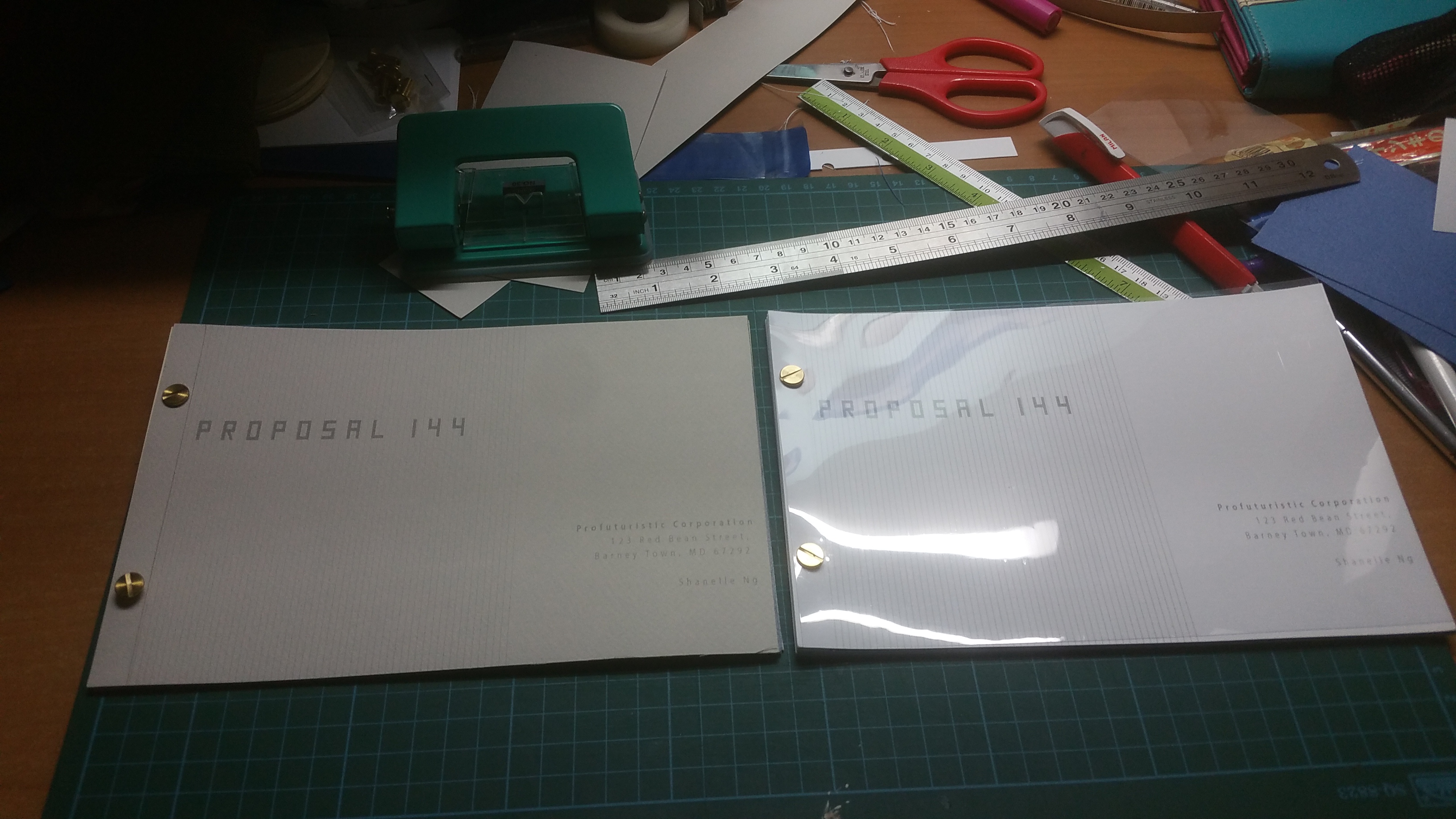
To make it look like a clean and legit proposal:
- I chose to print one-sided – so that the zine appears to be thicker
- I chose the white and thicker version in the end
- I included transparency at the front and back – reflective texture gives it a professional look
- I bound the zine using the binding screws instead of stitching it.
Here’s the printed version of my final zine: