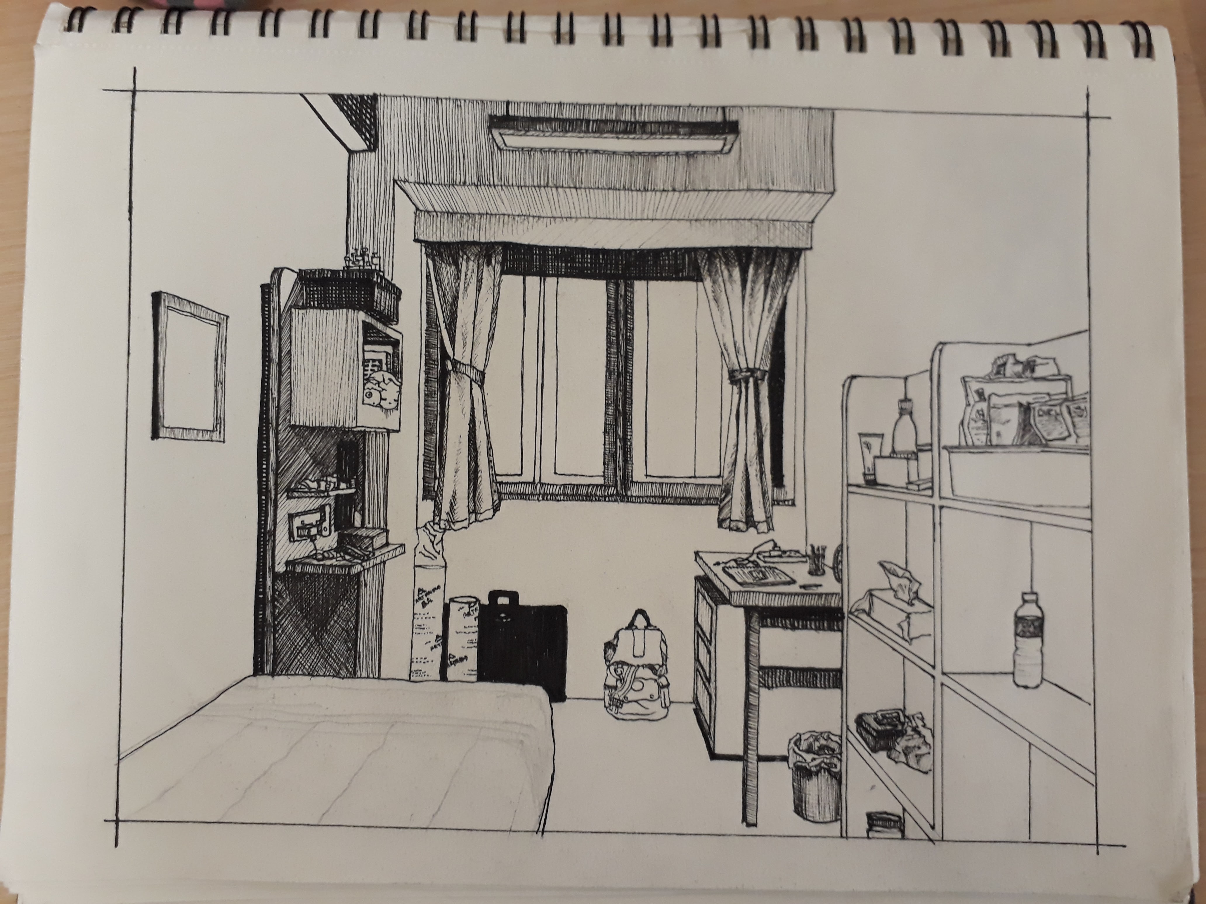
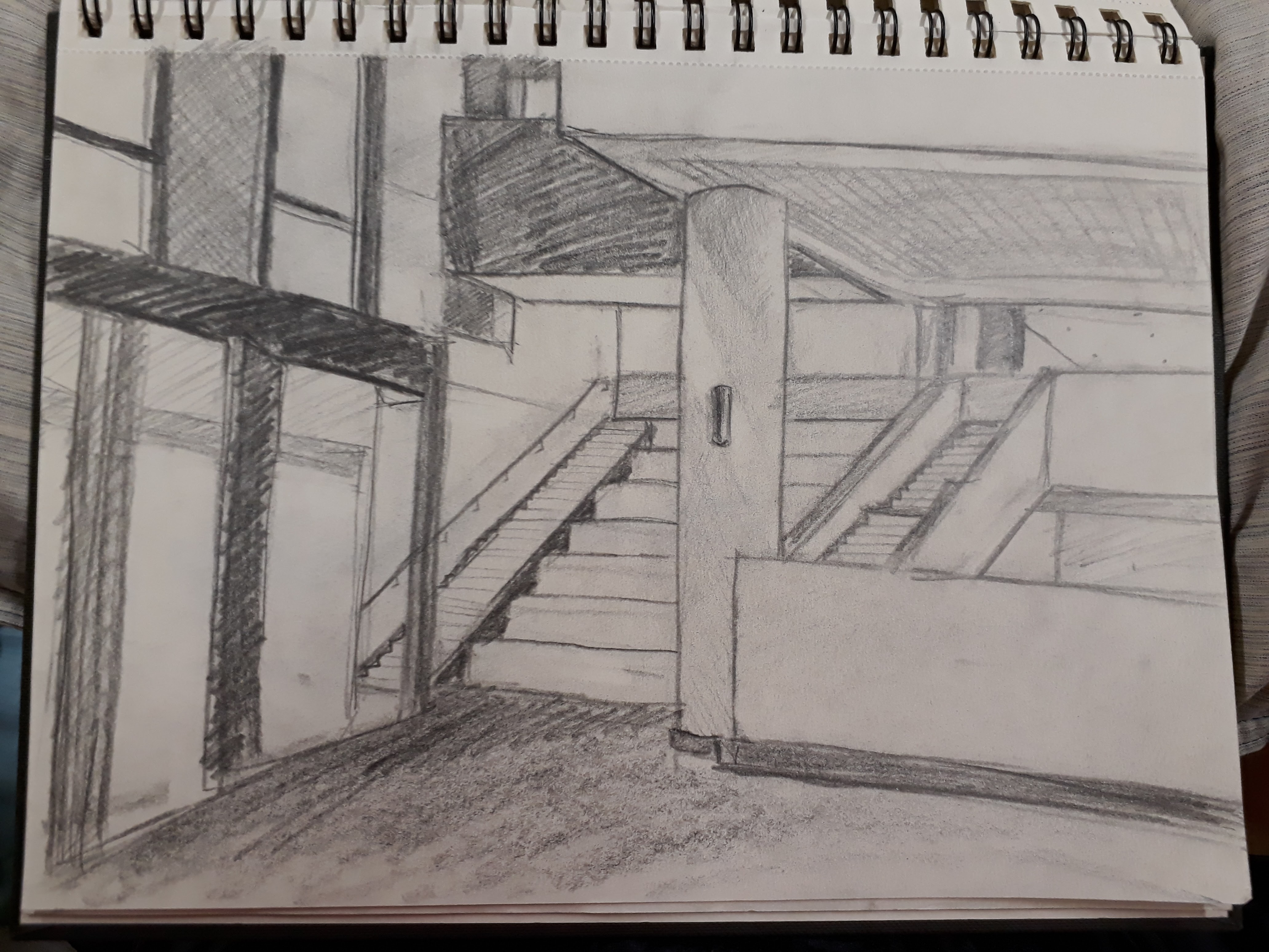
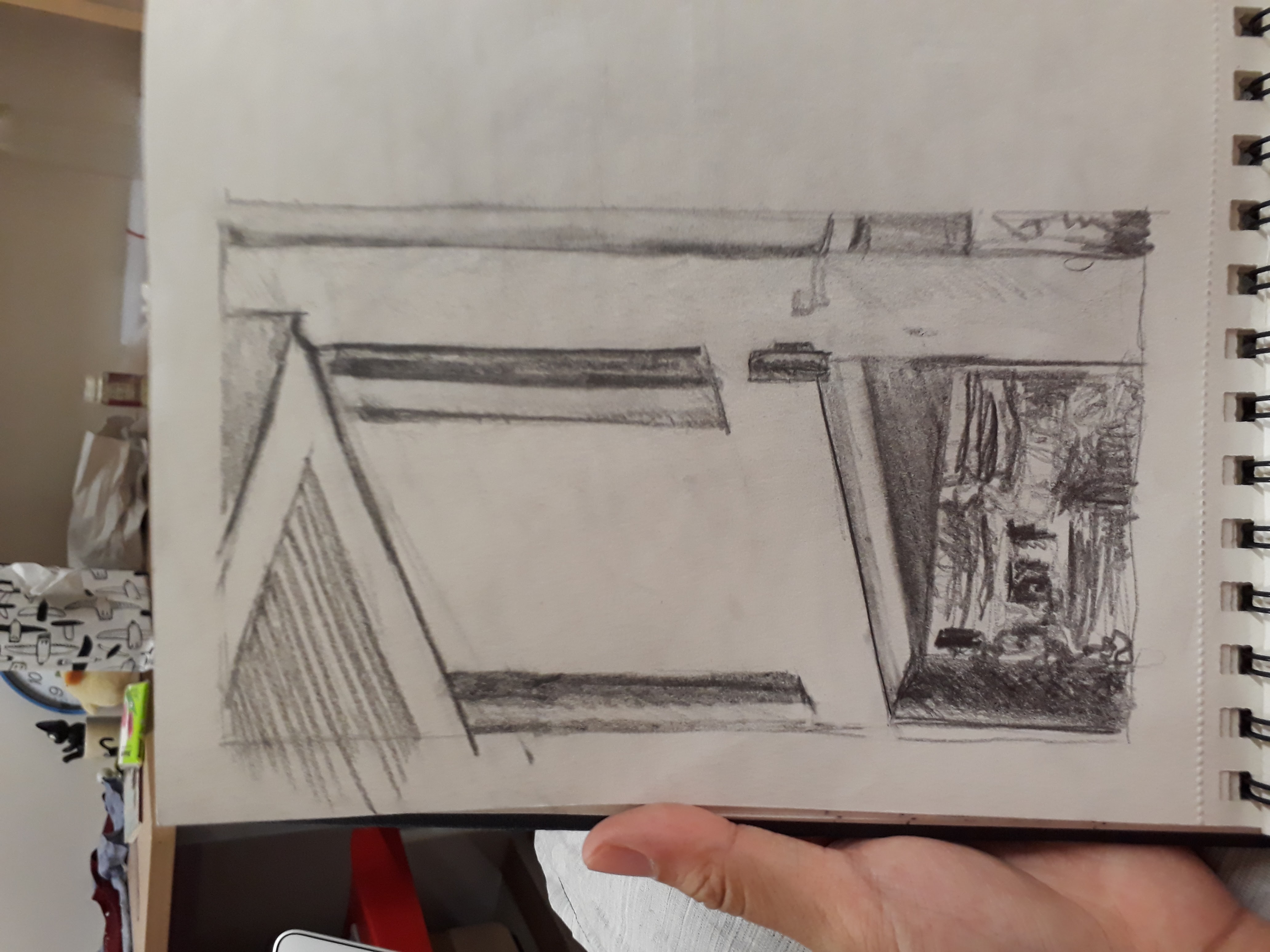
Here is the drawing of my room using the one-point perspective:
The drawing was more tedious than I thought and I spent quite long trying to get the angles of the lines right.
I first did it in pencil:

And then I inked it over:
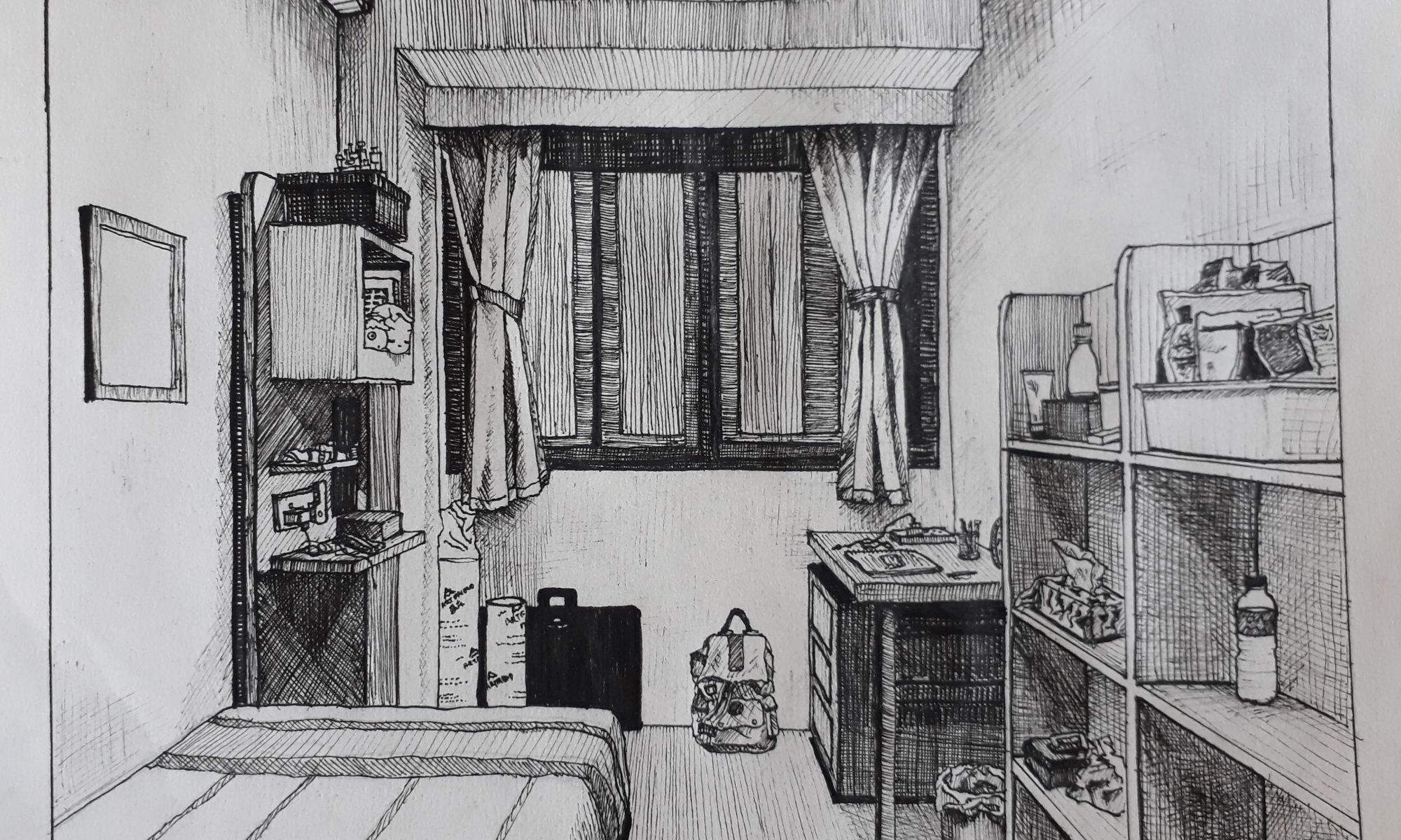
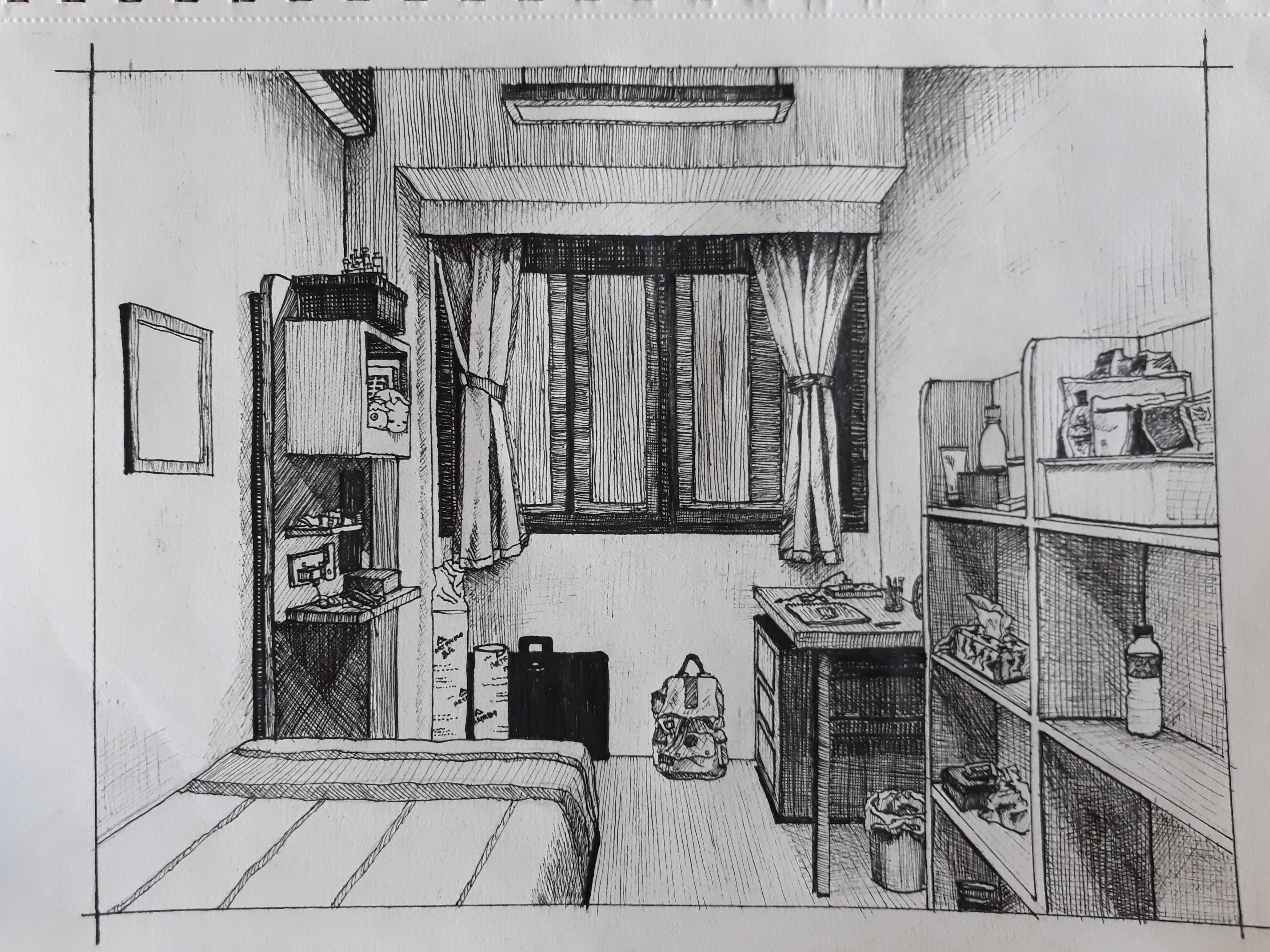
Here is the drawing of my room using the one-point perspective:
The drawing was more tedious than I thought and I spent quite long trying to get the angles of the lines right.
I first did it in pencil:
And then I inked it over:
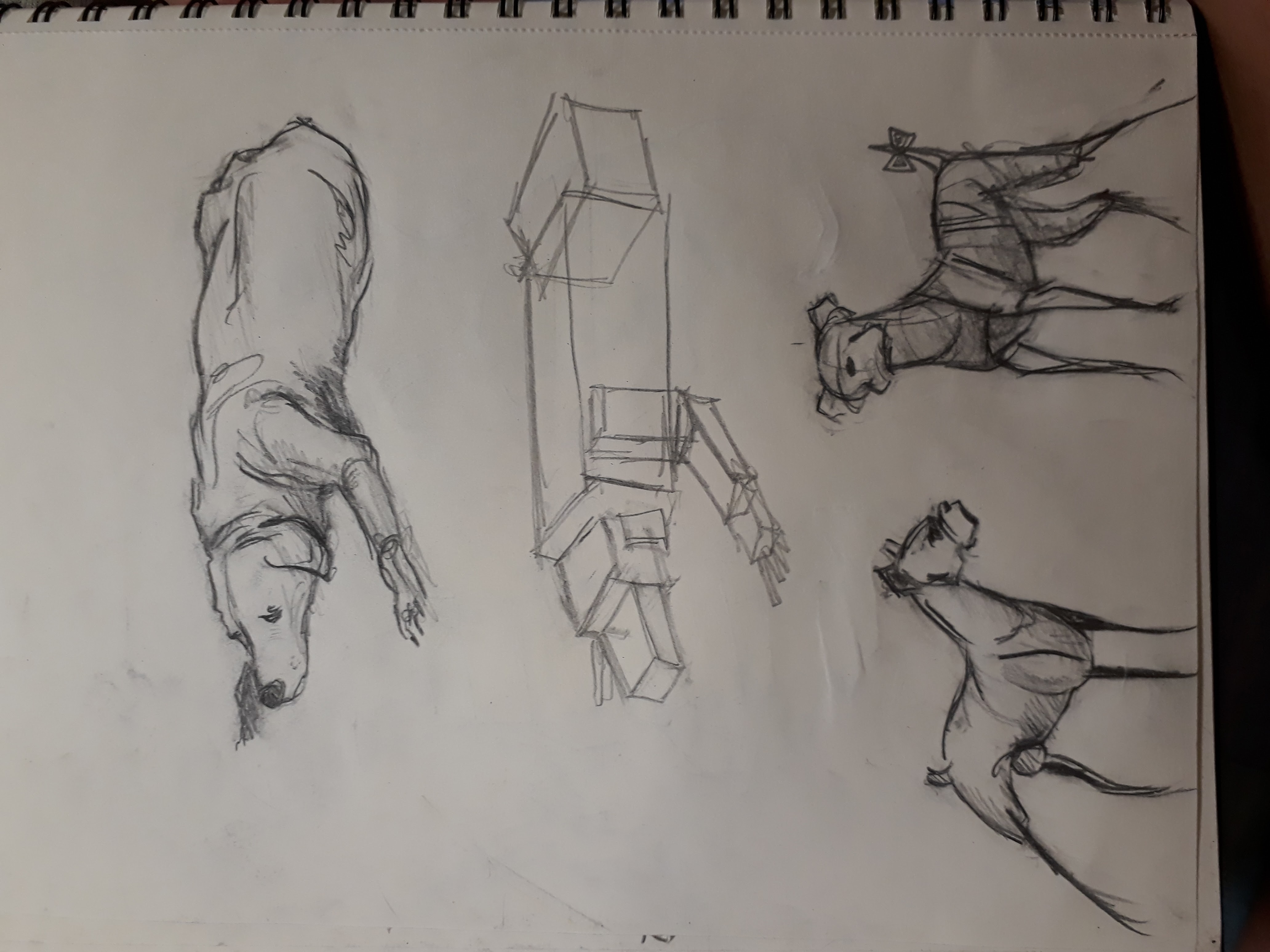
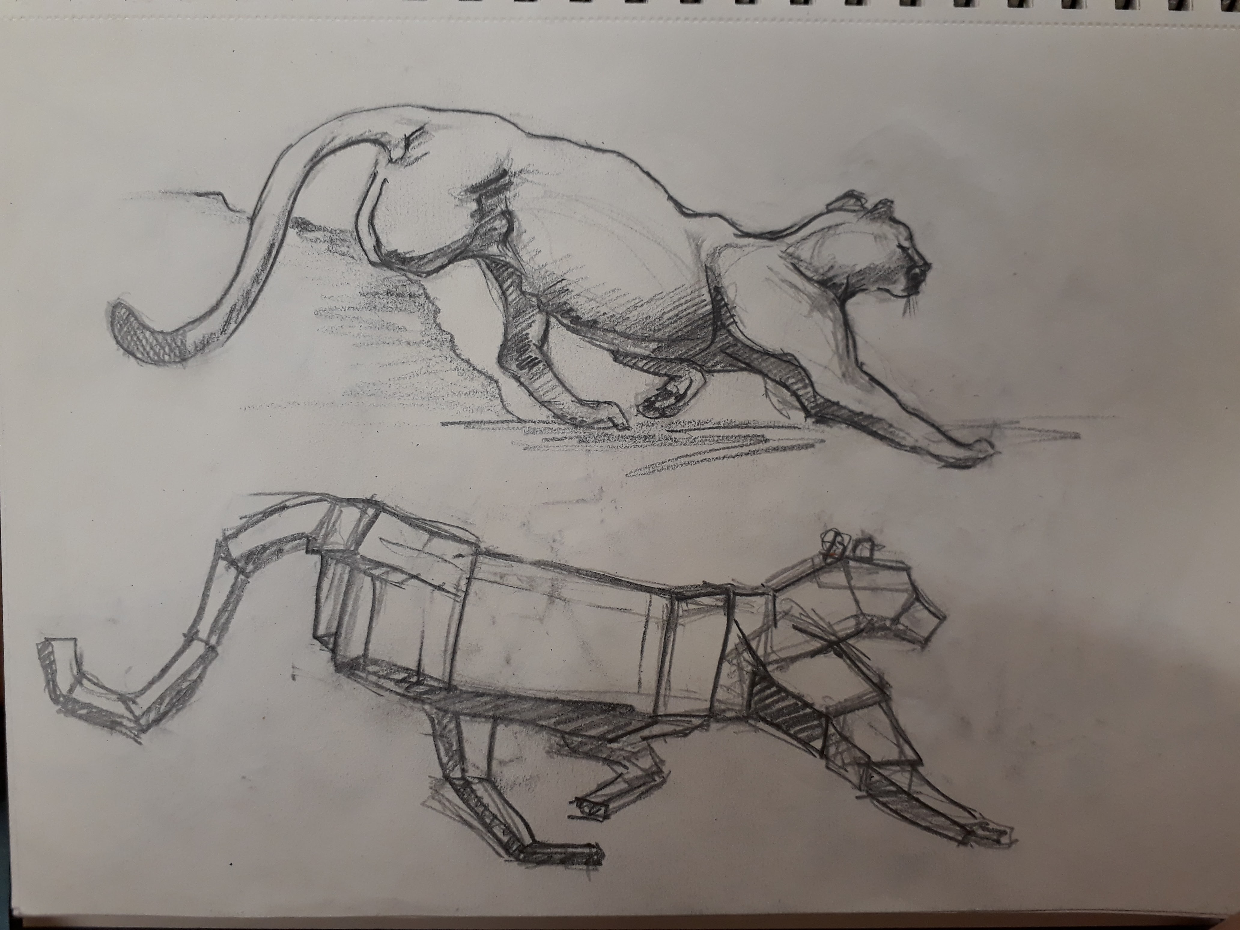
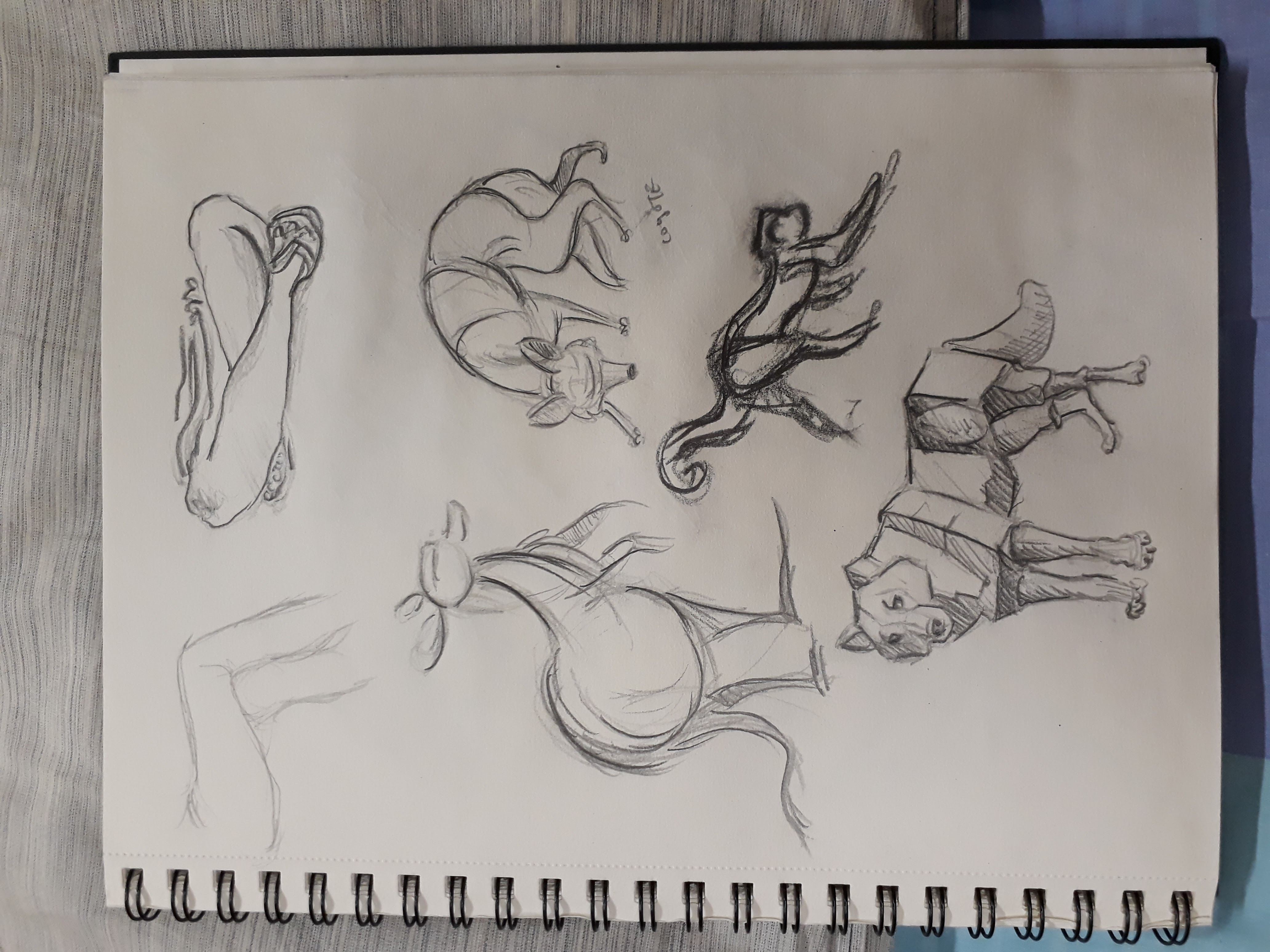
We did some sketching of animals (copied from a book). Through studying the sketches and trying to make out of the main blocks that make up the body, I gained a better understanding of how to construct an animal figure (even though it still depends on which animal). This simple exercise was more helpful than I thought.
Here are some of my sketches:
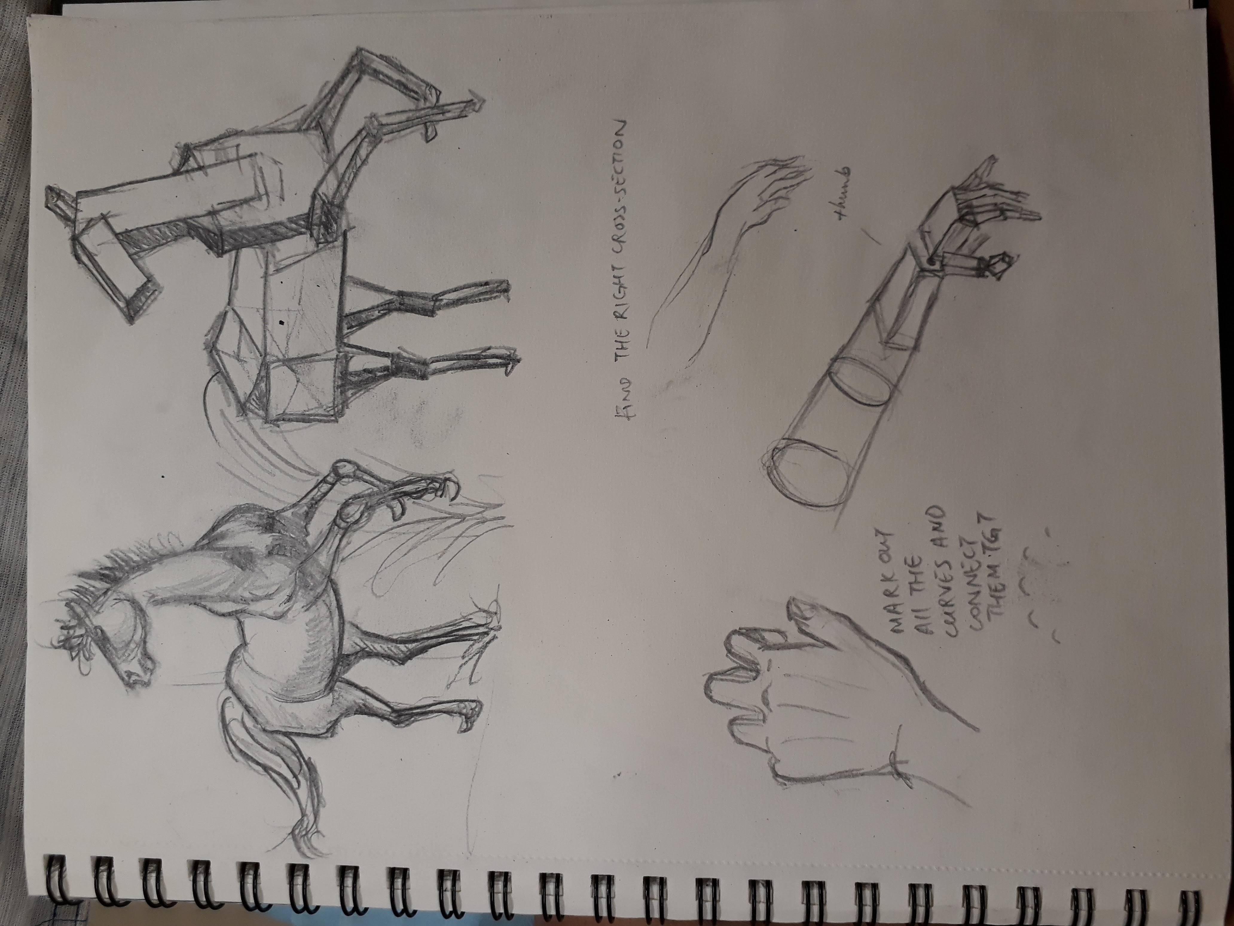

Prof also taught us a method of constructing hands and arms which I thought was a really great method
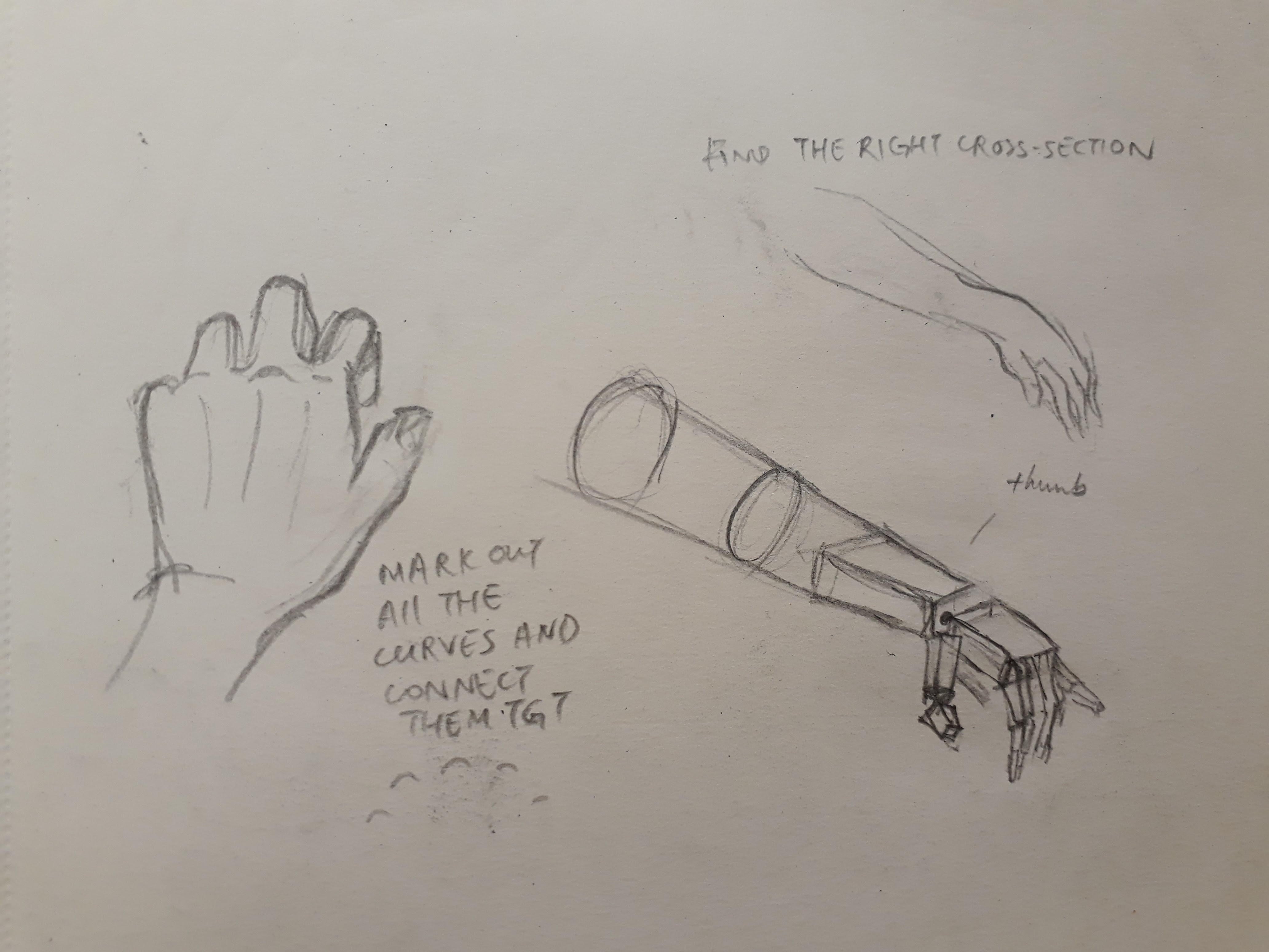
To draw the hand, mark out all the curves in their respective locations first (e.g. the curve of the knuckle, the curve of the wrist). Then, join the curve with lines and the hand is formed!
As for the arm, further away of the arm, it adopts a more cylindrical shape, which gradually becomes more like a rectangular block as it approaches the wrist. Always take note of where the thumb starts — it starts where the wrist ends. Hence the thumb block will start from the same edge as the palm block.
This is just for personal record ya :)

Here are the slides Charmaine and I used for our 2D presentation on Dot, line and shape :)
If you’re lazy to download the file, here are some important points from our research:


Use of Shape:


Hello! I realise I have no updates for 4D at all (since Joel didn’t require us to upload anything to OSS so far) so here’s just some stuff for personal record :)
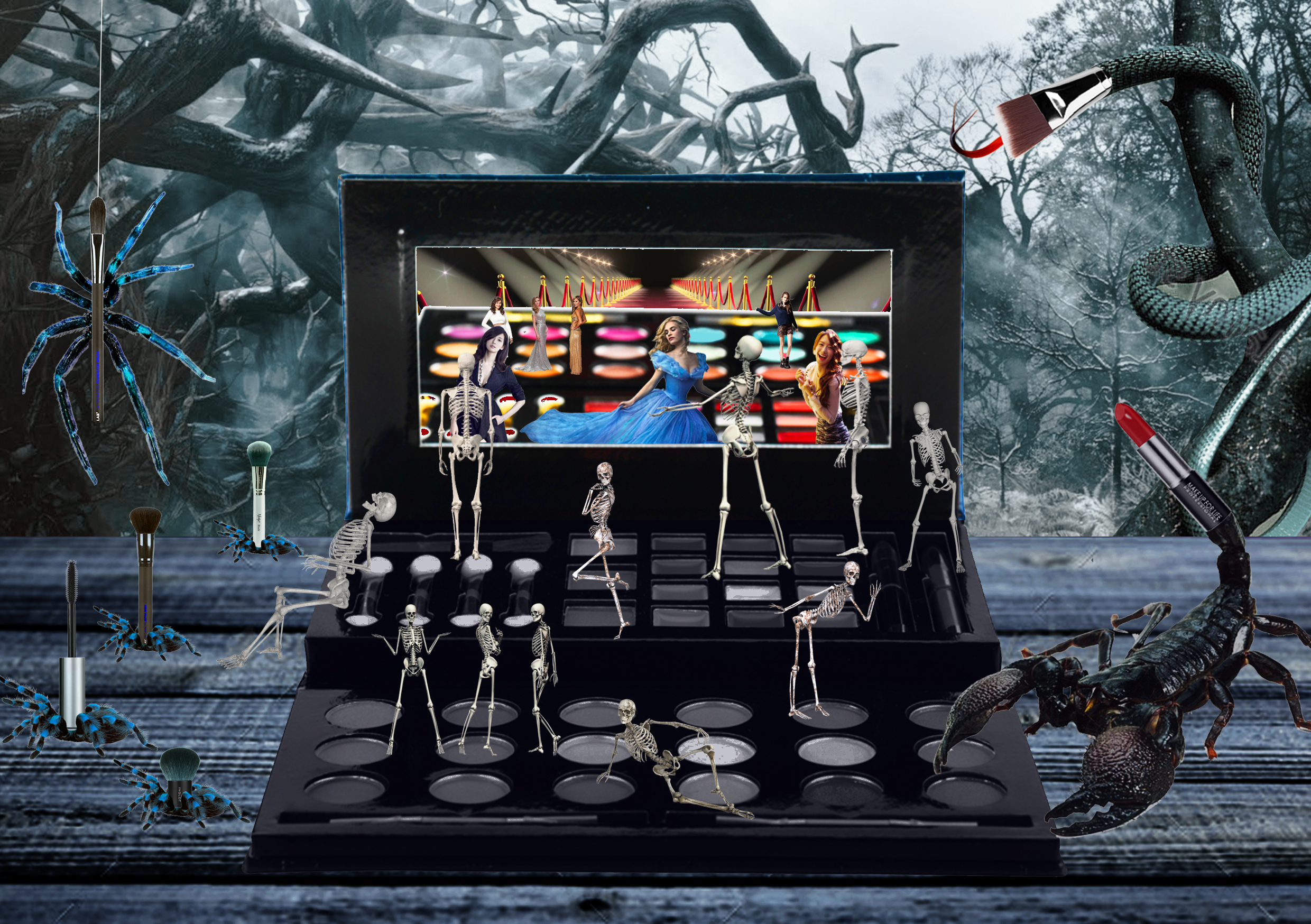
For project 1, we had to create 3 original digital artworks based on the theme Strange New World. By manipulating visual images, three artworks containing landscape, figure and object (one each) have to be created, be it by addition, subtraction, and/or substitution.
For this project, I started out having two very vivid images of people standing on lamp posts as well as people squatting on lily pads intently gazing at something. These images were just random, but when I started to properly brainstorm for an overarching theme for my works, these images somehow fitted seamlessly with what I had in mind, which was an exploration of human traits that corrupt and dictate our actions.
Our Puppeteers
This work endeavours to explore the human condition. Man, by nature, is inherently self-interested. We have never been spared the company of our puppeteers – our greed, ignorance, and vanity – who subconsciously dictate our actions, permeate our thoughts, and blind our visions. All around us, we see a parasitical manifestation of egotism. In midst of our furious pursuit to feed our already inflated sense of self, we ironically become more and more detached with ourselves. At the end of the day, behind all that grandiose façade, do we know who we truly are? Do we dare to bare our soul to ourselves? Greed, ignorance, and vanity – to which do we own our conscience?
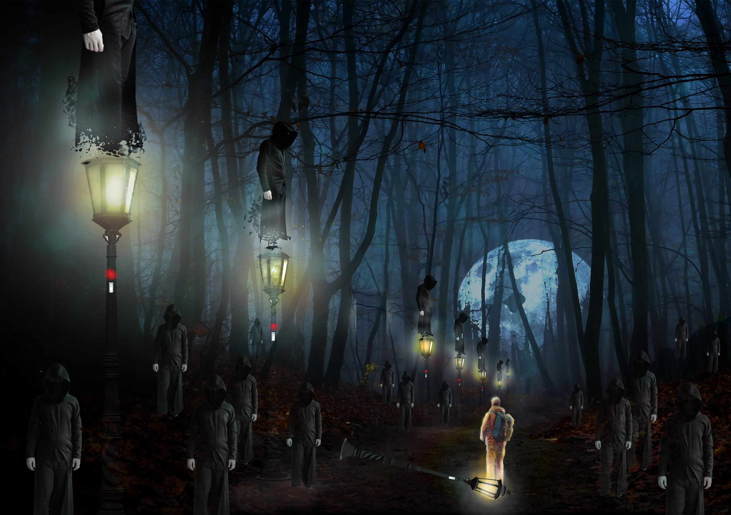
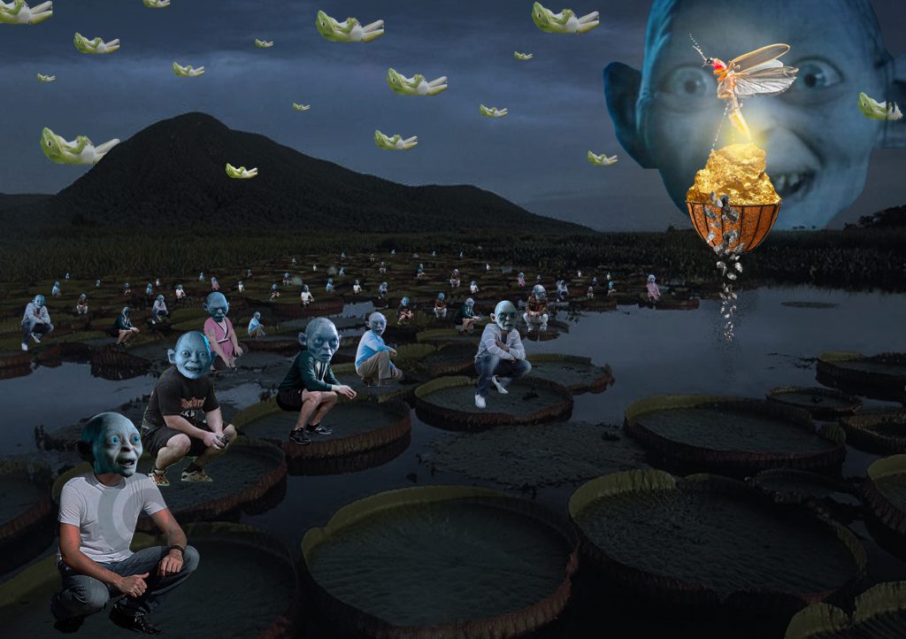
These 3 artworks are arranged in sequence of its creation, which explains why the first looks so much more amateurish than the last.
Overall, I really enjoyed the process of creation in this project: you start with a vague idea and walk the journey with it, curiously observing how your idea develops and how inspirations jump at you at the most unexpected moments. In aspects of semiotics, it was interesting to actually seriously consider why you use a certain element; what does it represent in this context; how can I use a certain symbol to my advantage; and how does the symbols changes the interpretation of my work. As a non-frequent user of digital media, working with digital images was a fresh experience – there are a lot of things that can be manipulated in digital media but not in traditional. For example, I can be a lot more adventurous in digital media because the actions are reversible, and thus I am empowered to be vastly more experimental :)
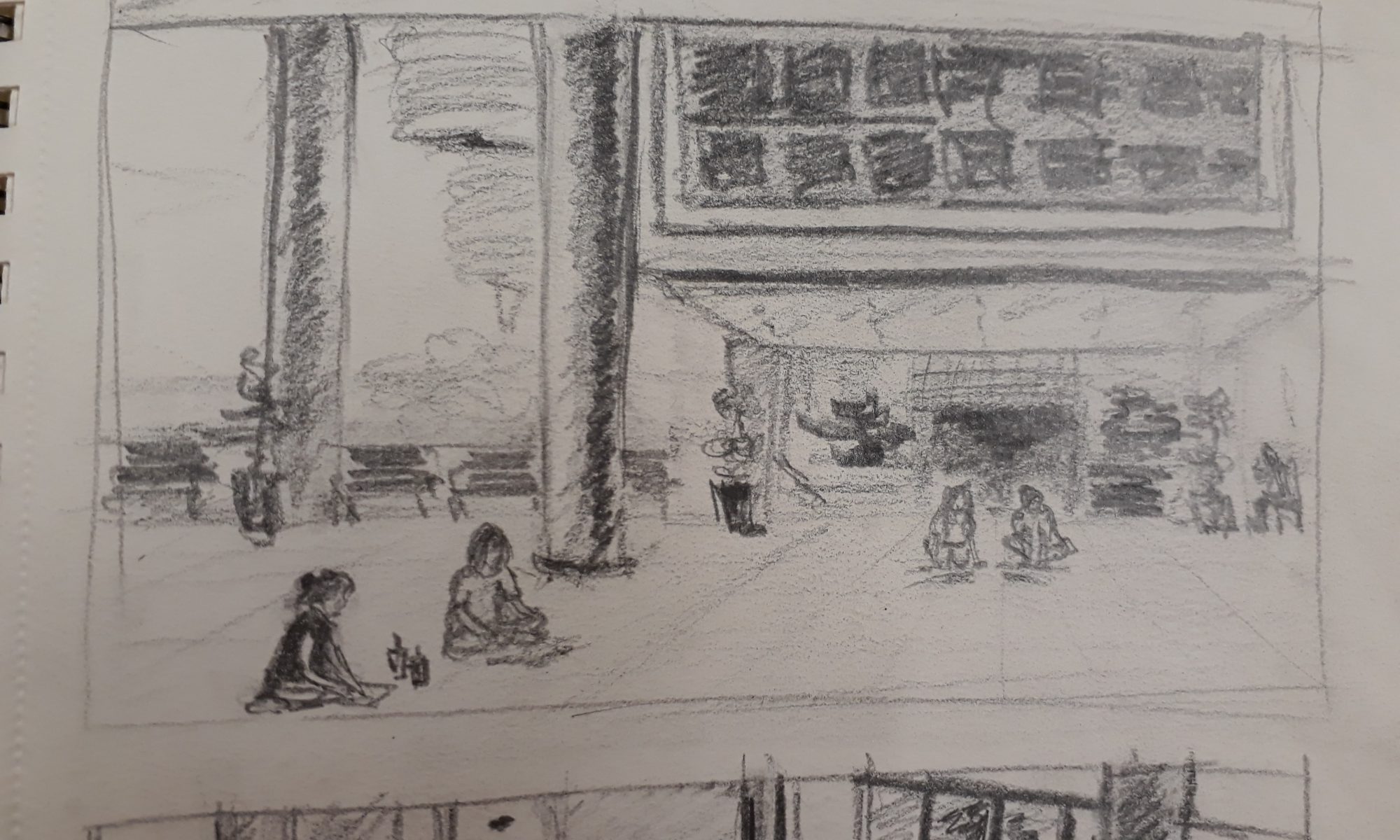
In the afternoon following the figure drawing lesson, we headed to HASS to do some outdoor sketching and to understand the theories of perspective better. Prof demonstrated how he construct a sketch using one-point and two-point perspectives.
For one-point perspectives, there are two pairs of parallel lines, each pair established by joining the lines extended from the vanishing point; for two-point, there is one pair.

By determining the lines of building structures that are parallel, we can leverage on that foundation to draw the basic structures of the building.
Prof told us to always focus on the big picture first: draw out the general structure before filling in the details. Should we rush into the details and the details aren’t drawn accurately, this will subsequently affect all other structures.
Prof also mentioned that in the scenario where the perspective is particularly hard to construct (or if we are simply lazy or bad at perspective drawing), we can make use of space to cover up our weakness by placing smaller structures in front of bigger ones so that the edges of the buildings are obscured.
These are some sketches that I made that day:
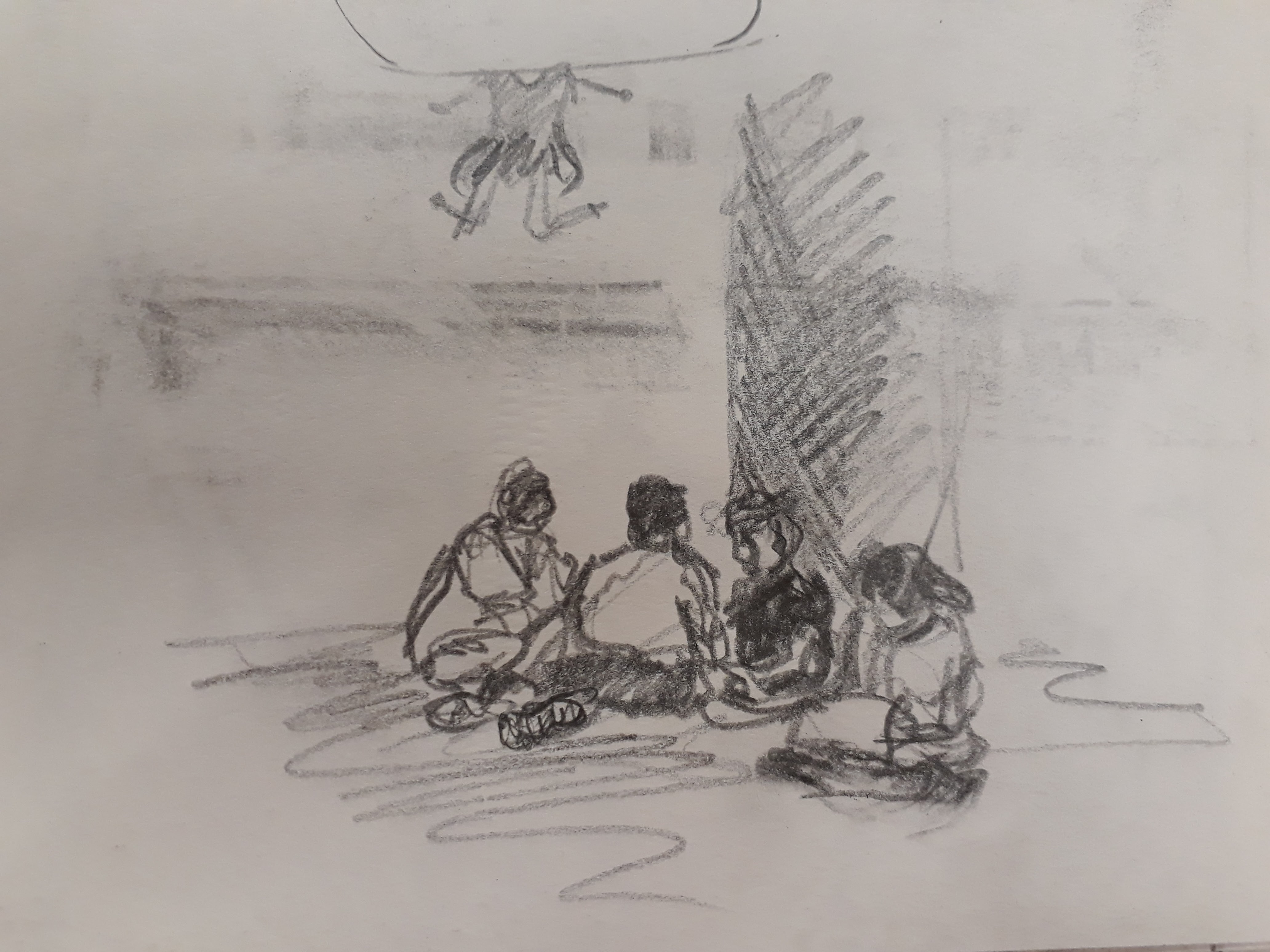
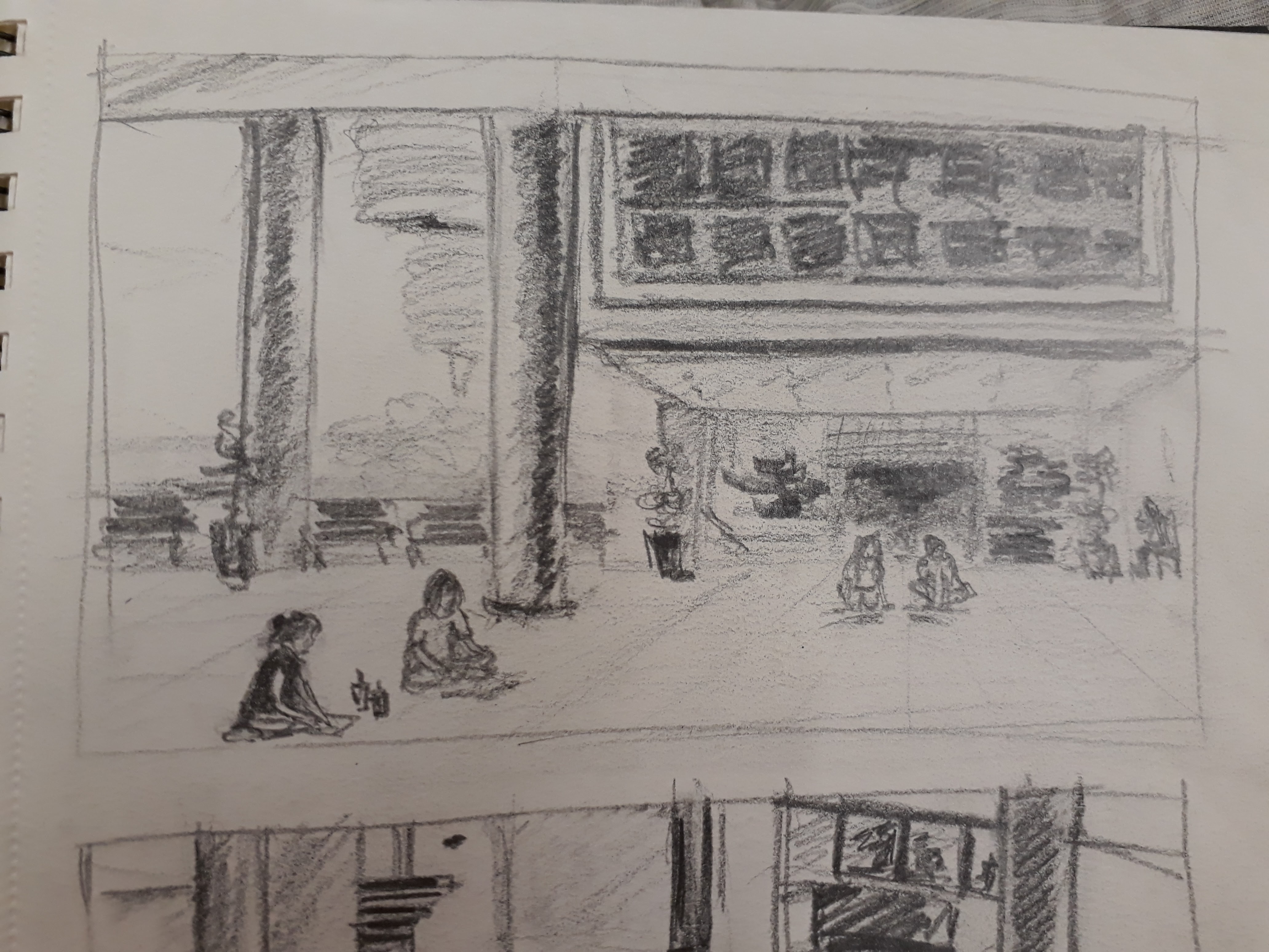
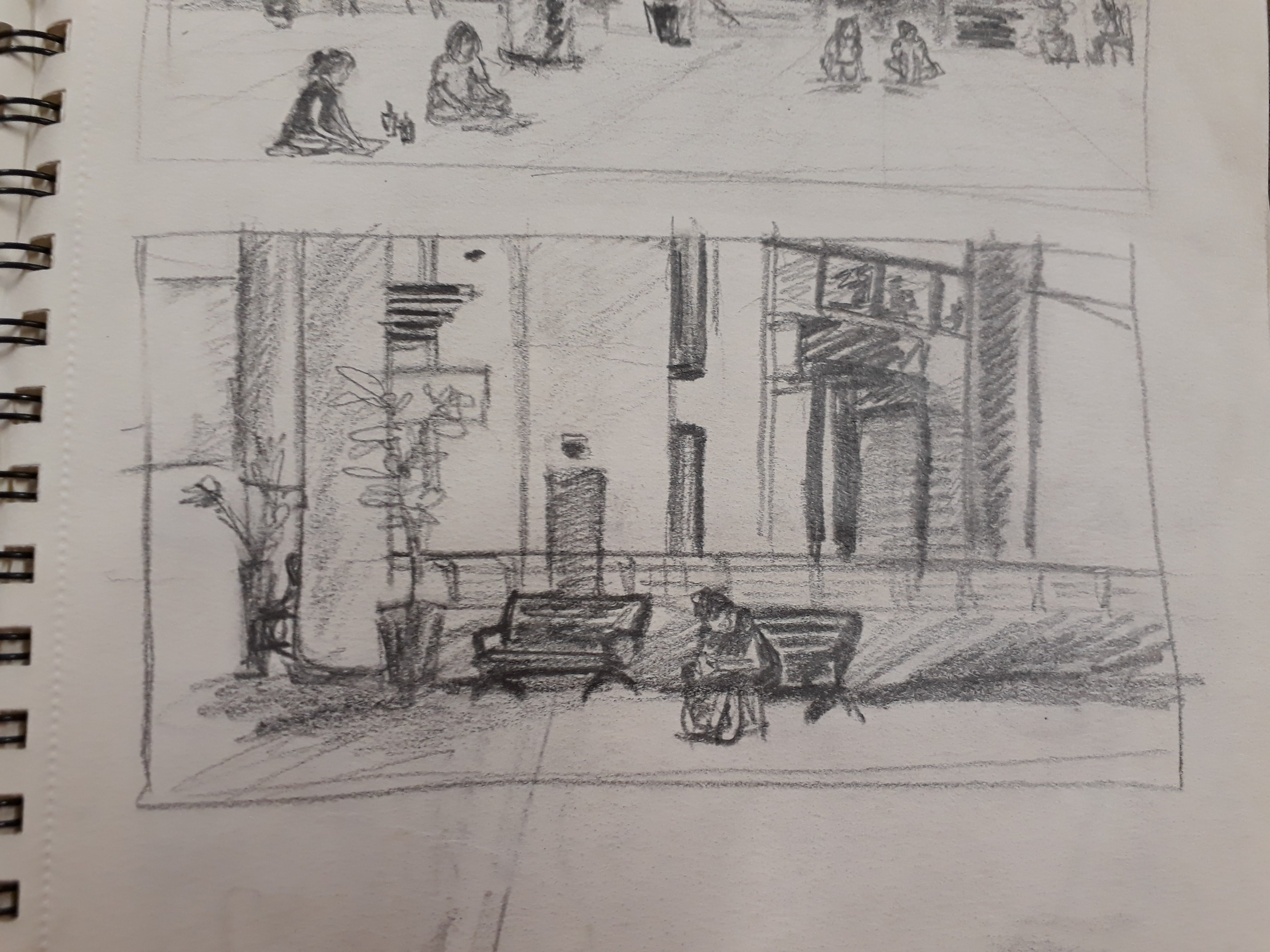
I wasn’t overly rigid in my drawing in the sense that I was quite loose with plotting the construction lines. I merely got a general sense of the direction of the line and went ahead to draw it out. I guess judging by the conceptual (focus more on form) vs perceptual (focus more on what you see) distinction that Prof mentioned, I belong to the latter.
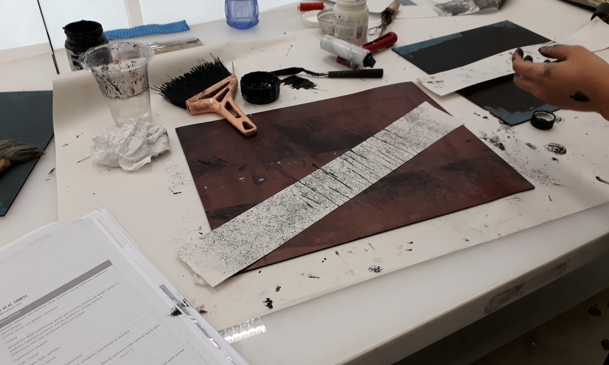
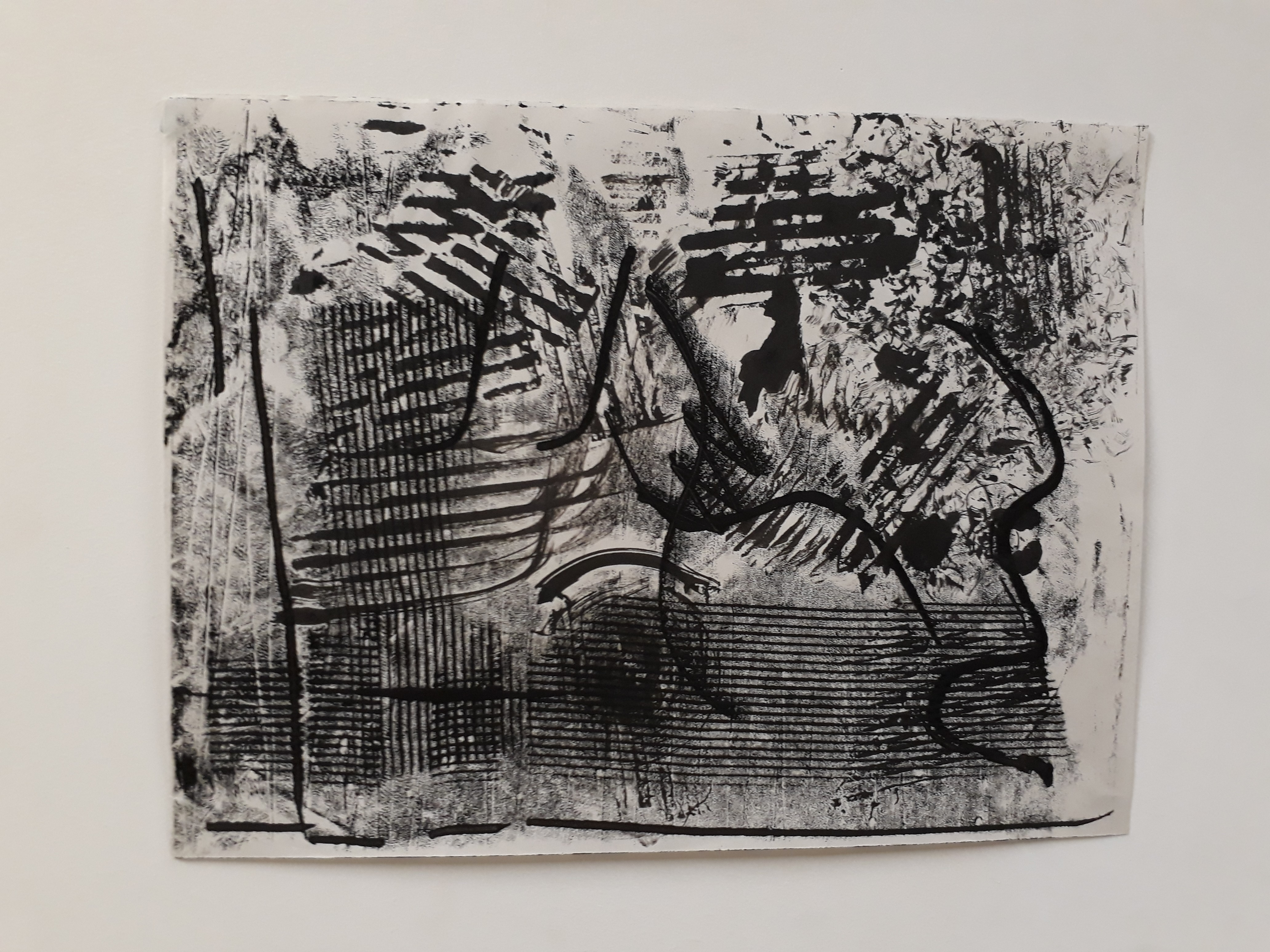
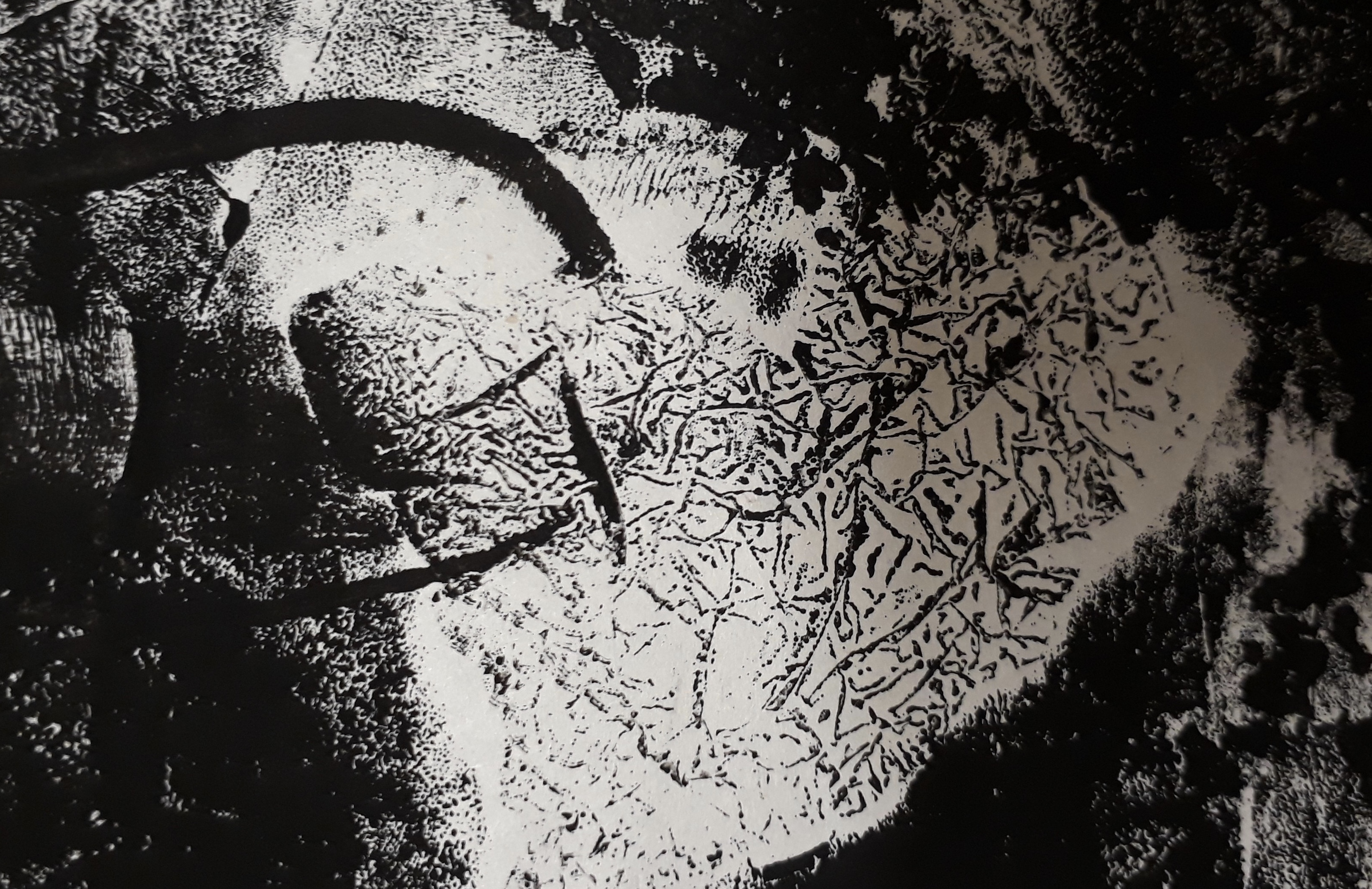
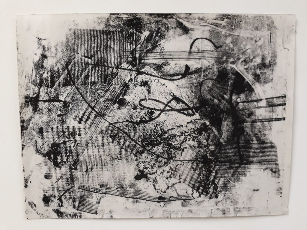
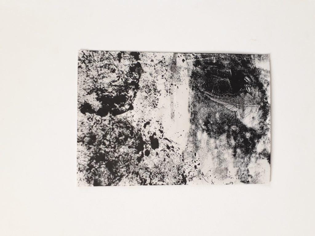
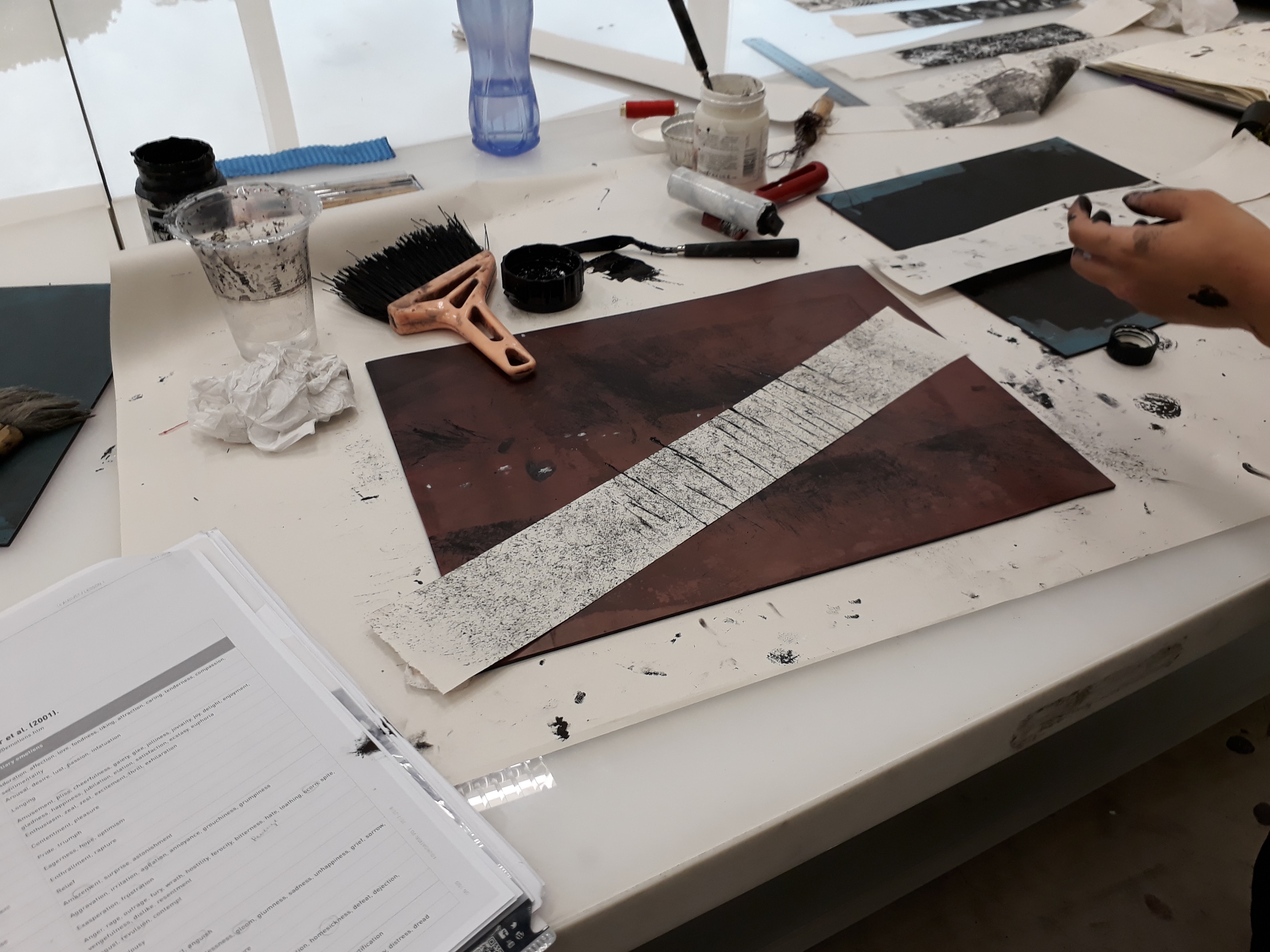
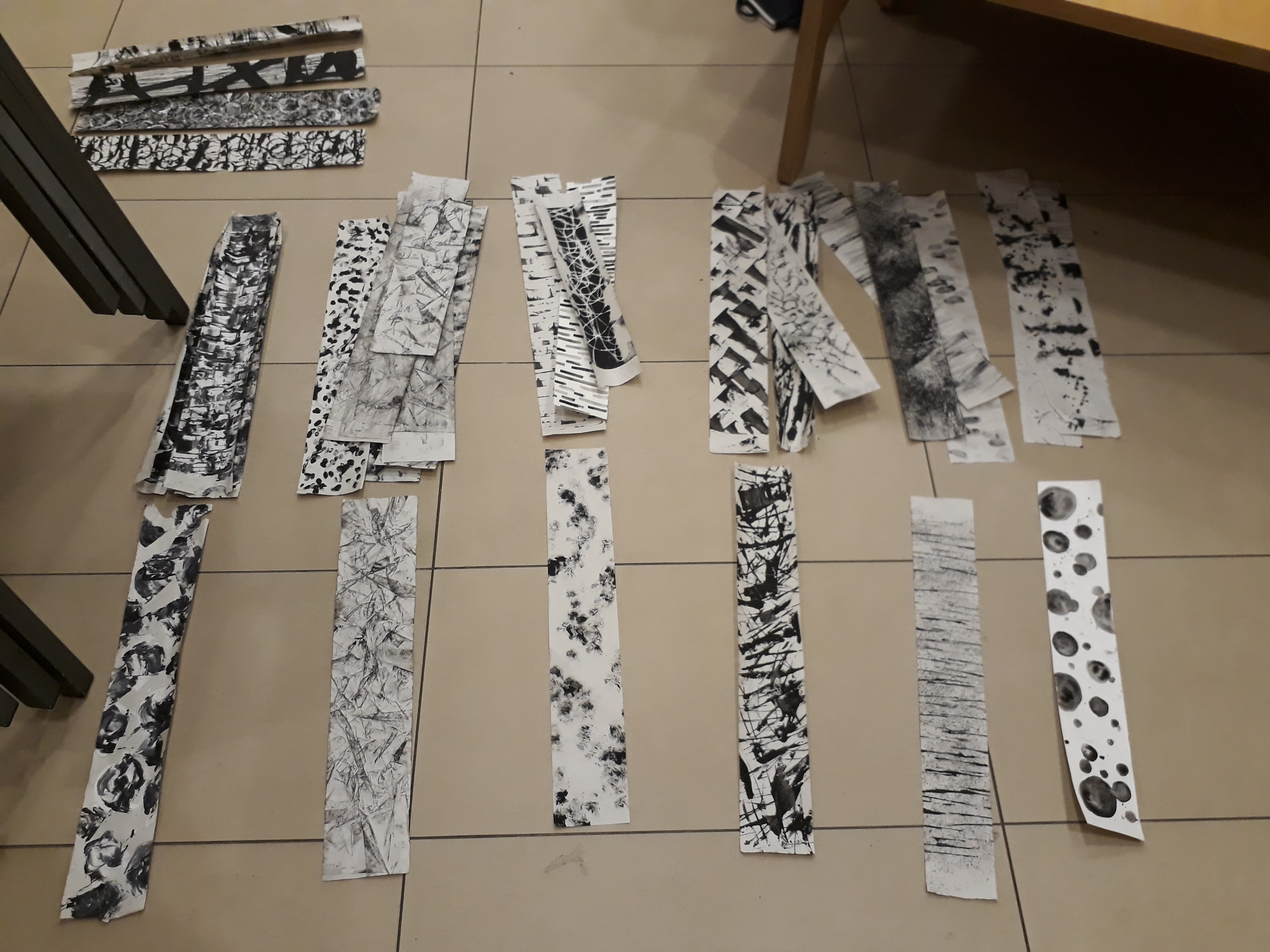
Here are some documentation of the process I’ve been through for mark-making. I realise I’m not a person who can multitask very well, and so I kept on forgetting to whip out my phone to record down my experimentation process.
Initial emotions research:
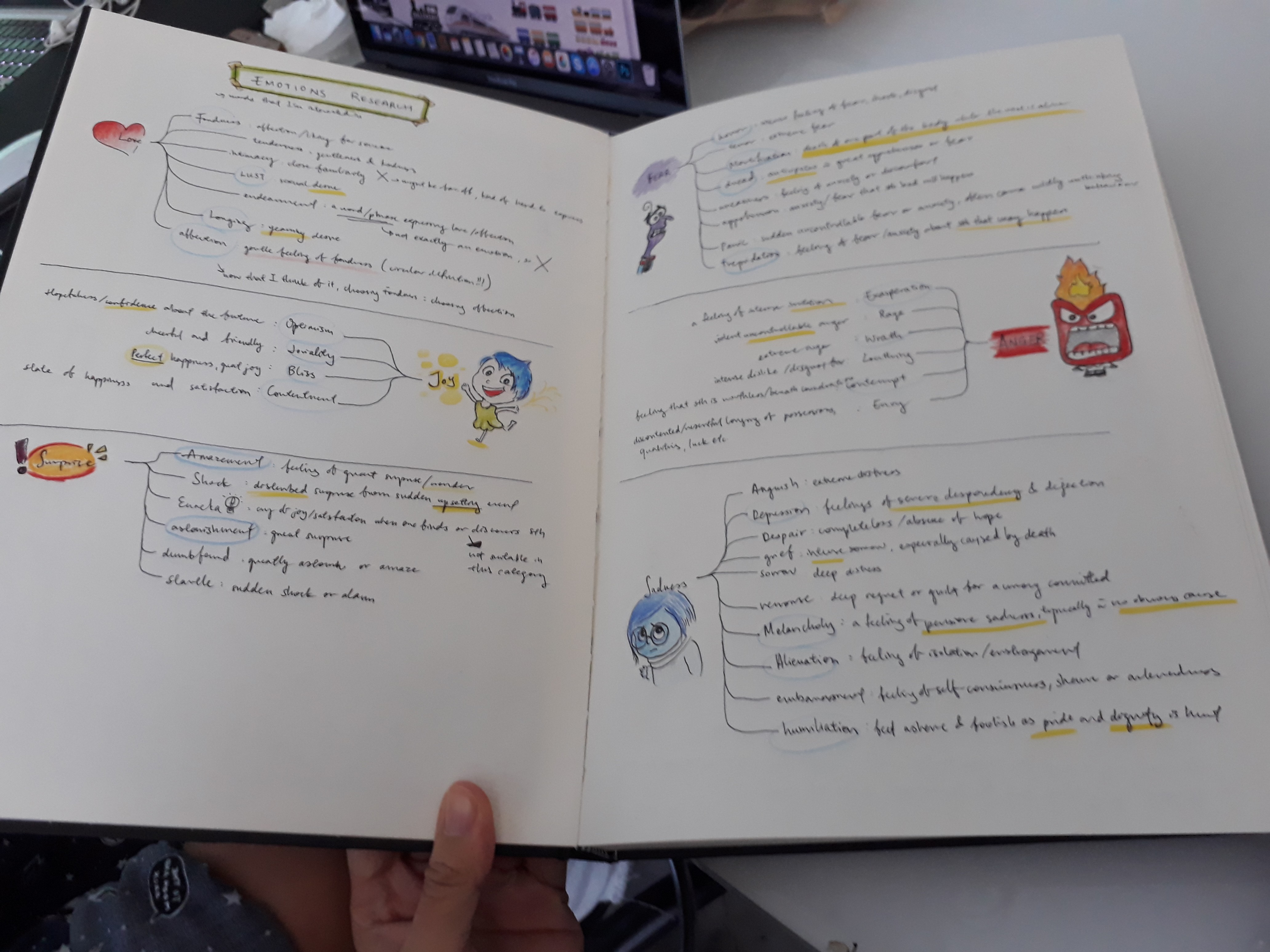
I wanted to get a clear idea of what each emotions represented. Hence I did several small mind-maps for each emotion category and researched on each specific emotion to ensure that my understanding of that emotion is correct.
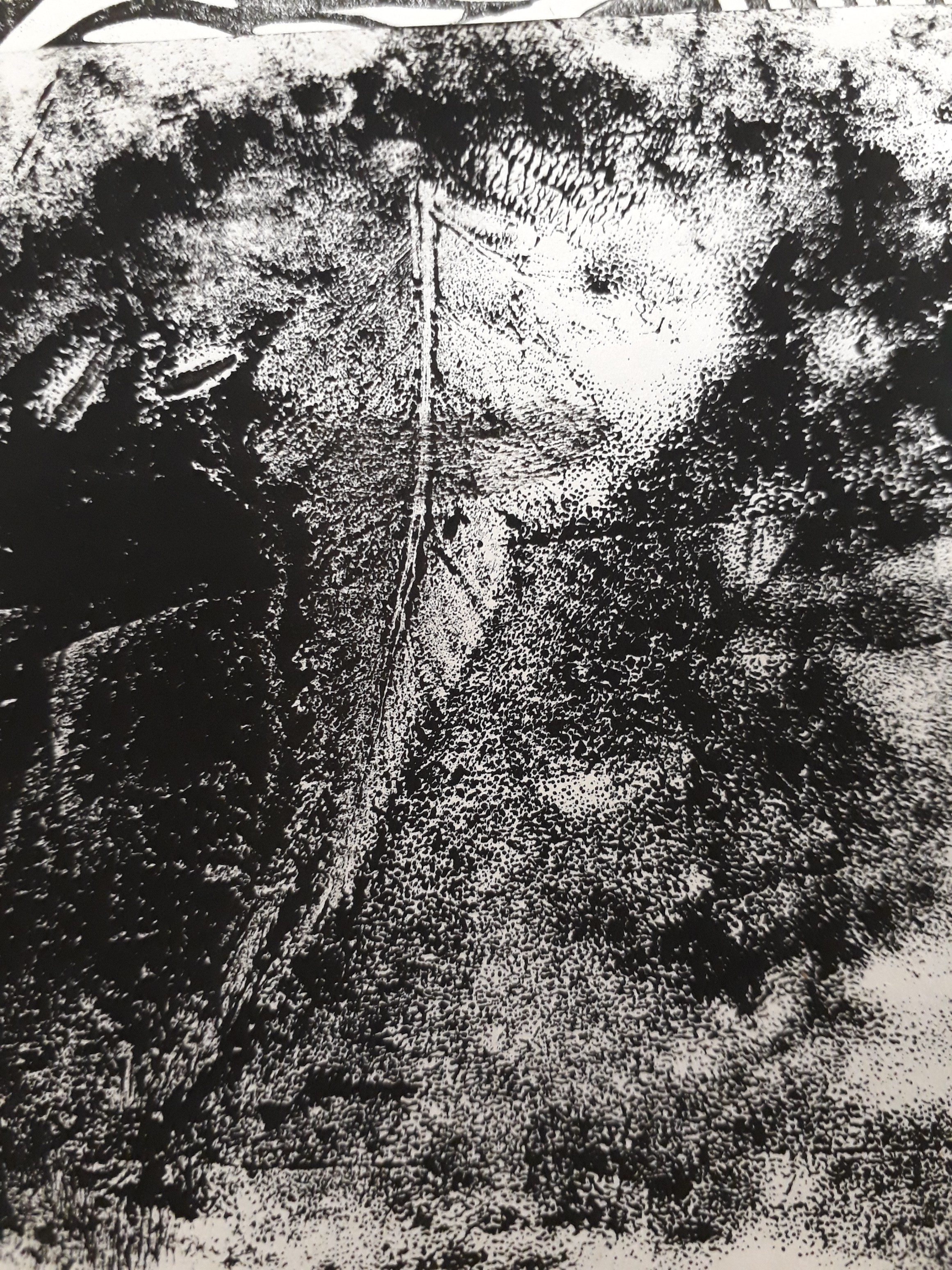
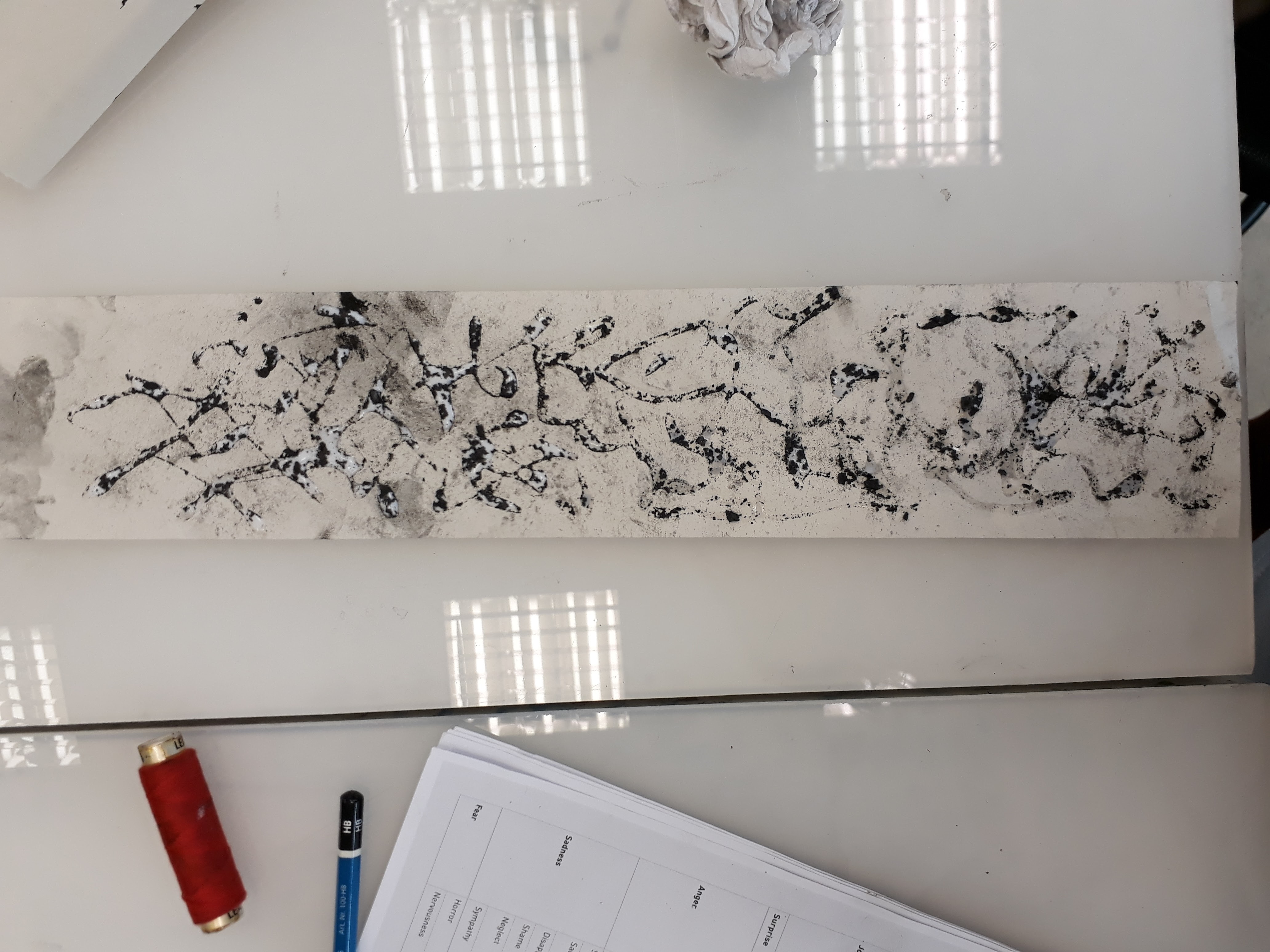
Experimentation for melancholy:
The feeling of melancholy is something that I believe everyone can instinctively understand as the wrenching throb in the heart but troubles to eloquently put the emotion into words. And so when I tried to express melancholy in my marks, I tried to keep the the marks to a minimum so that the empty space (the paper) gives a more pervasive feeling of hollowness and emptiness.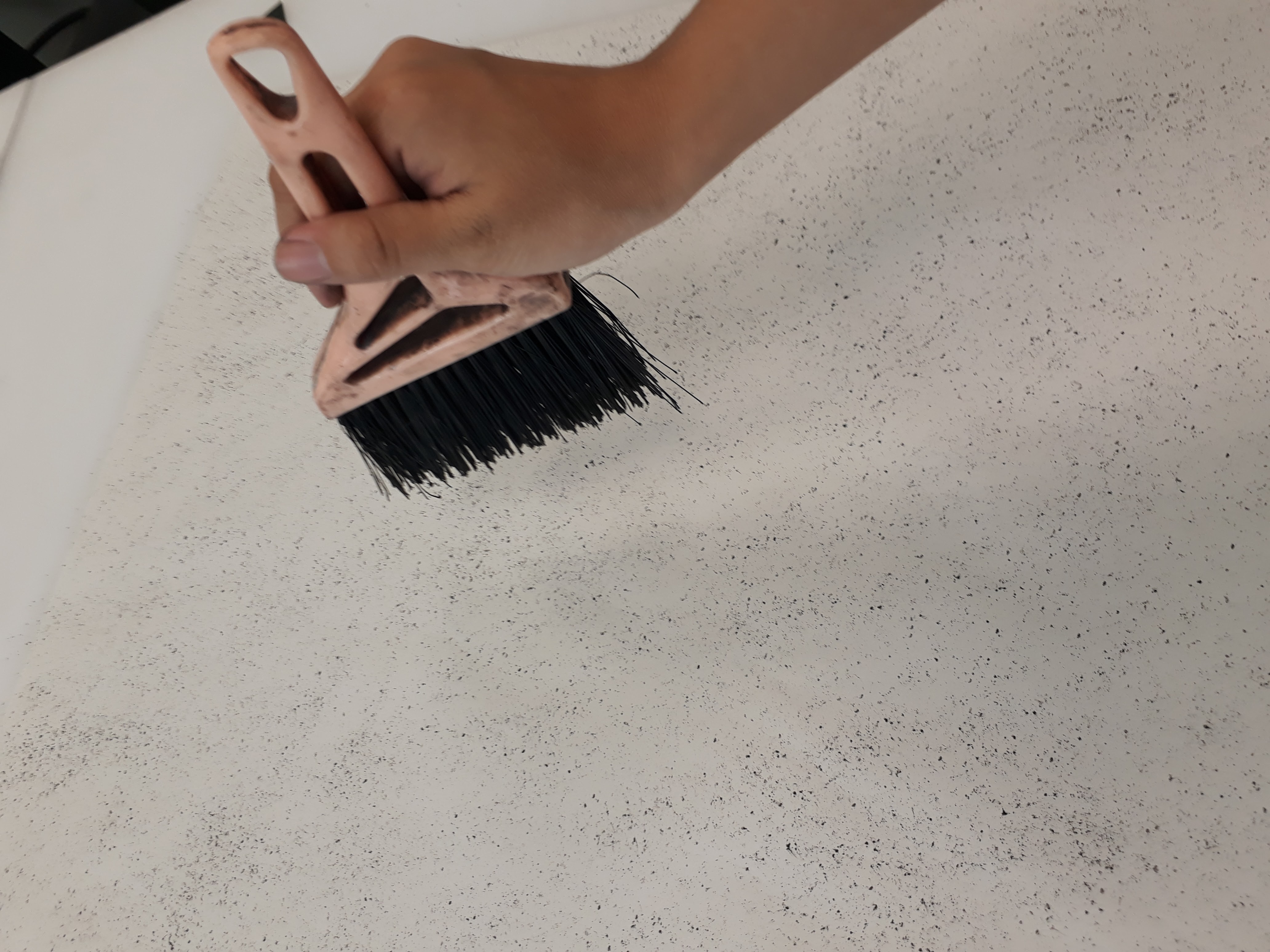
I made this by spreading glue around the paper first, and then sprinkling charcoal crumbs previously crushed. When the glue dries, only the charcoal is left behind, obediently following the trail of glue. I thought the idea was interesting, but I didn’t have any use for it in my final 6 emotions
To see more of my process, please refer to my visual journal :DD
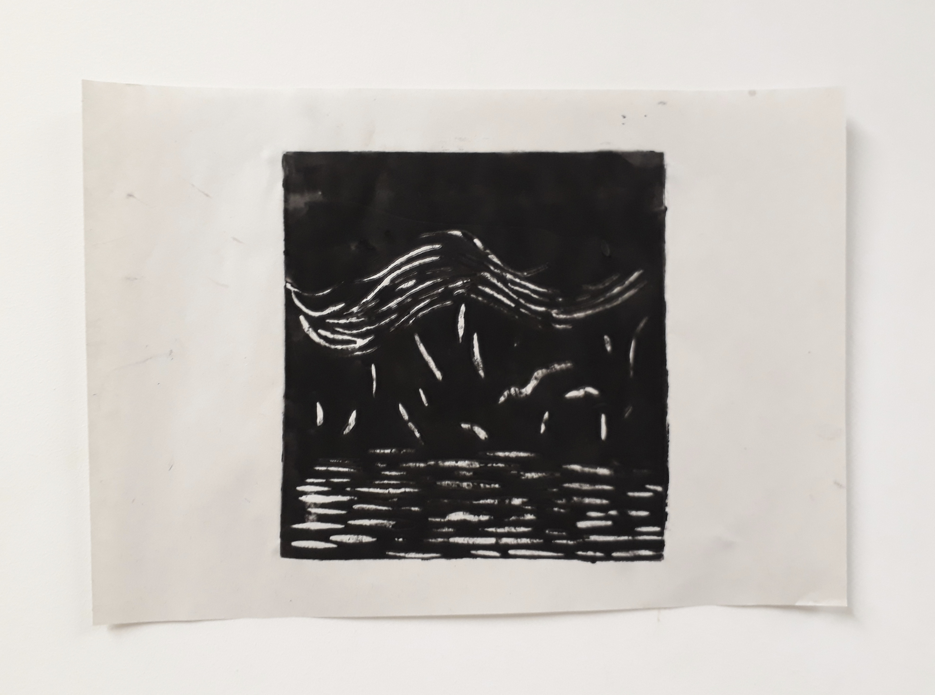
This was what I had after a week of experimentation:

Working on my learning points from the consult, I continued experimenting with more emotions, specifically working on points raised during the consultation.
Working with asymmetry

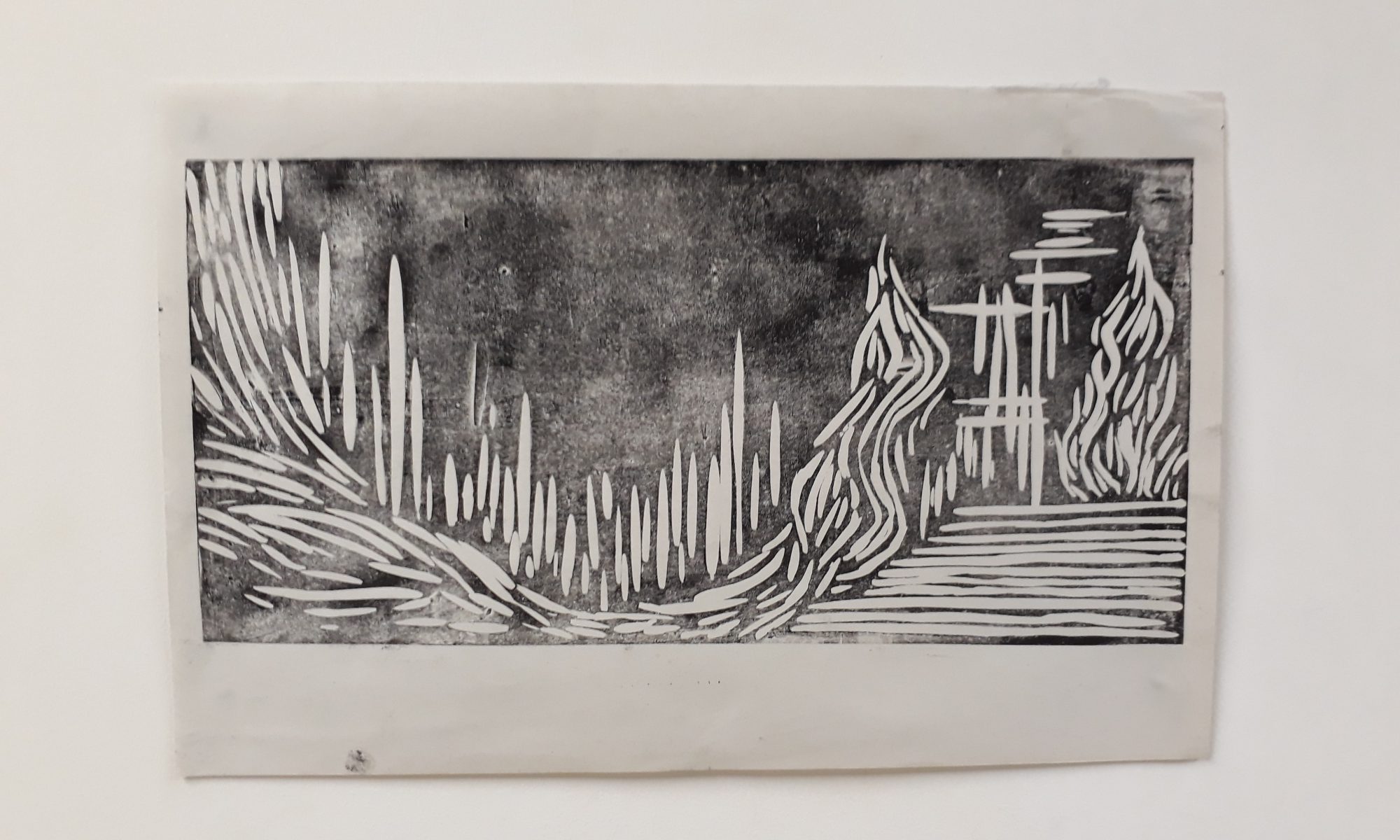
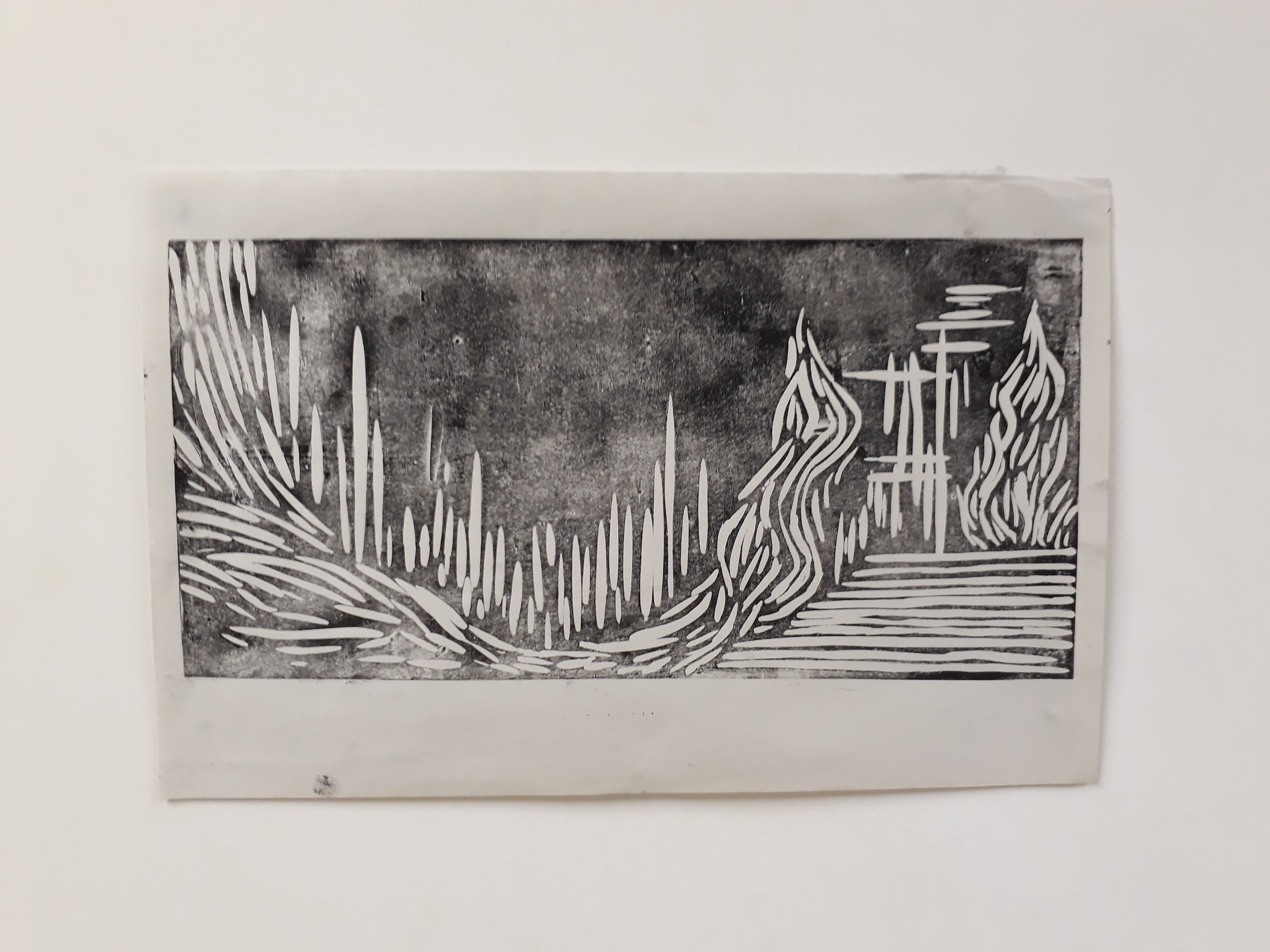
Working with different medium:

Initial idea was to simply roll a roller over crumpled paper

I decided to work on this idea by introducing newspaper as a medium to create a paper mache effect.
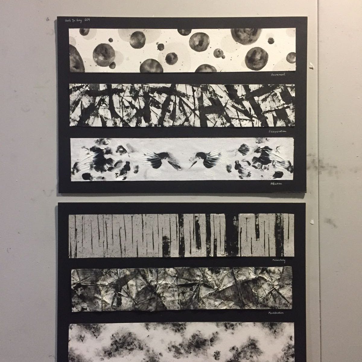
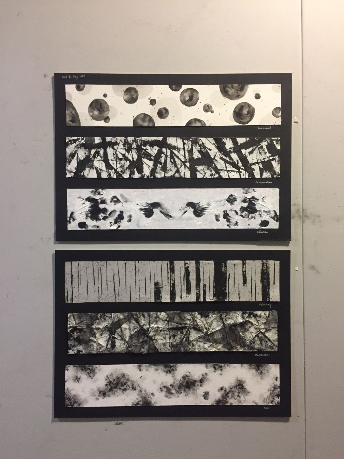
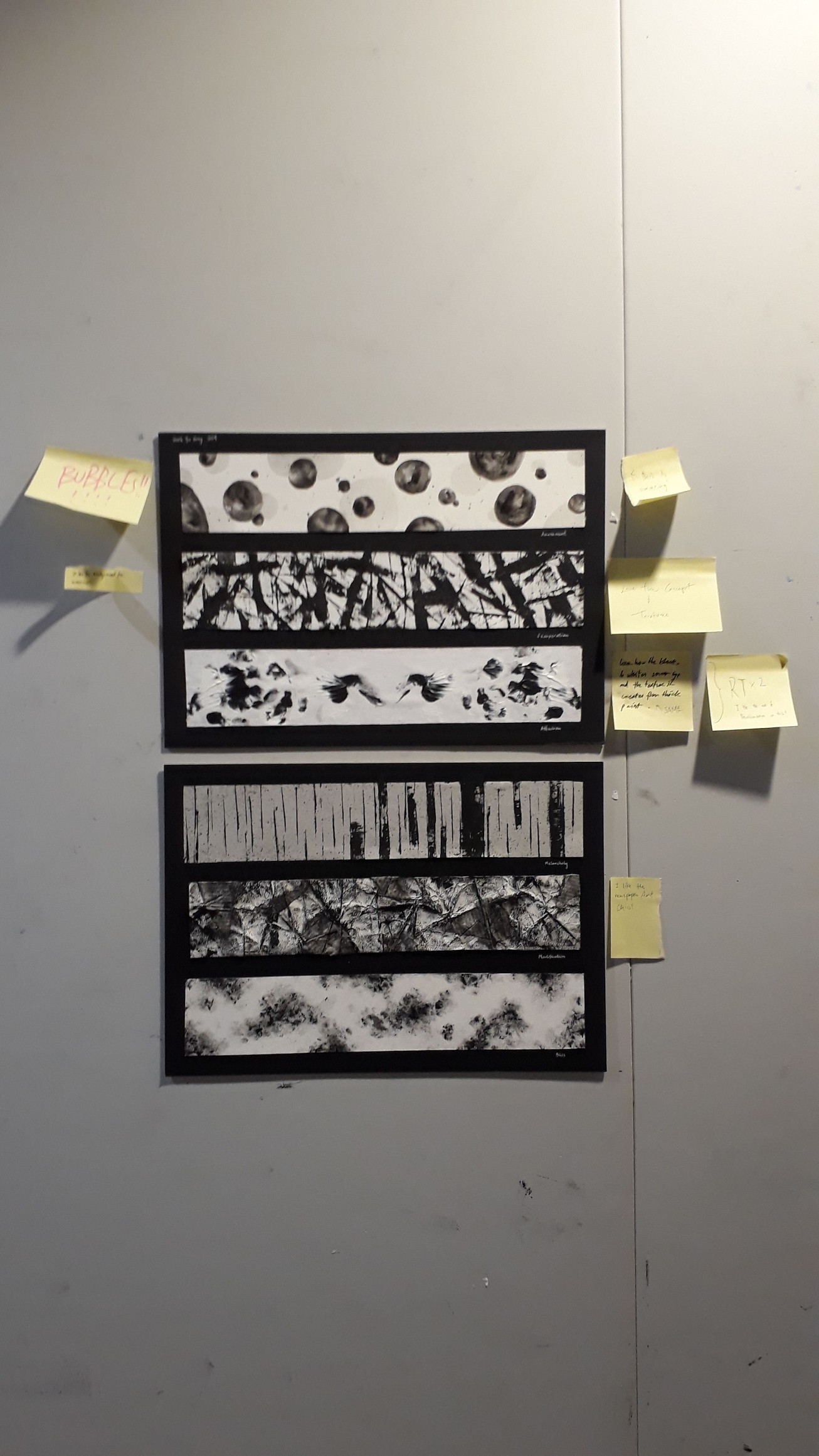
I brainstormed for a suitable theme to make my emotions cohesive and coherent when seen in a certain sequence. I had a few ideas off the top of my mind but they were somewhat random. At the end, since we are dealing with emotions in this project, I started to think about what emotions themselves signify. I felt that emotions are something very ‘raw’ and very ‘unique’ to humans. Yes, some animals can feel emotions as well, but they’re not as varied nor can they reach the same depth as human emotions can. Along this line of thought, I decided that I wanted to do something that ties in very closely to what makes a human human, which is how I arrived at my theme “life”.
Brainstorming:
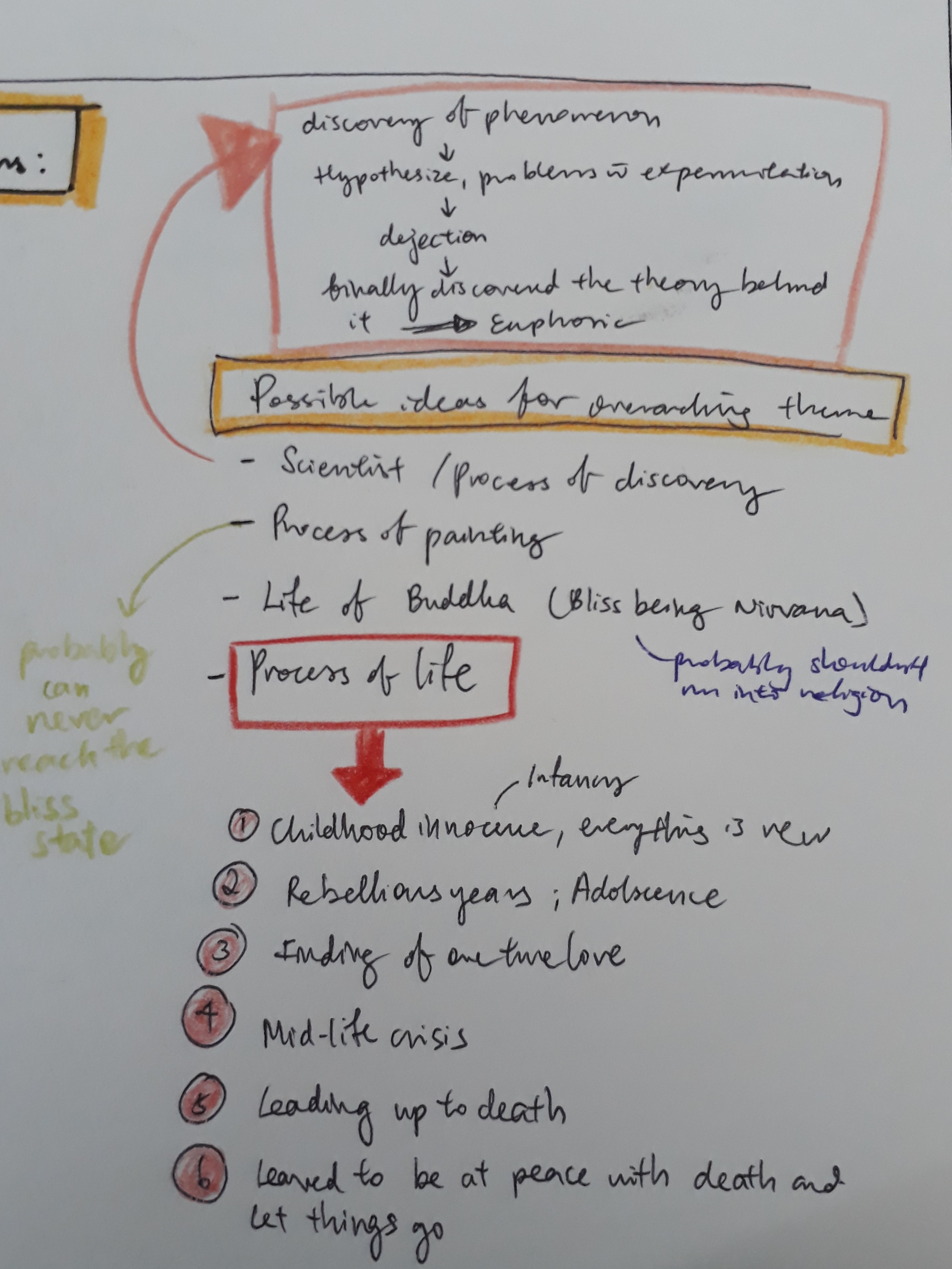
With this as my starting point, I started to narrow down emotions that I want to deal with. I identified the different stages of life and the emotions one most probably would have felt at that point in time:
(Check out the journal for the full description for each stage :> )
From my huge pile of emotions, I picked out 6 emotions most representative of what one would have felt at the six identified stages of life:
I went on making the final emotions used for submission. However, I realised that the same marks can never be replicated. Even subtle differences can make a big difference to the general mood the marks elicit.
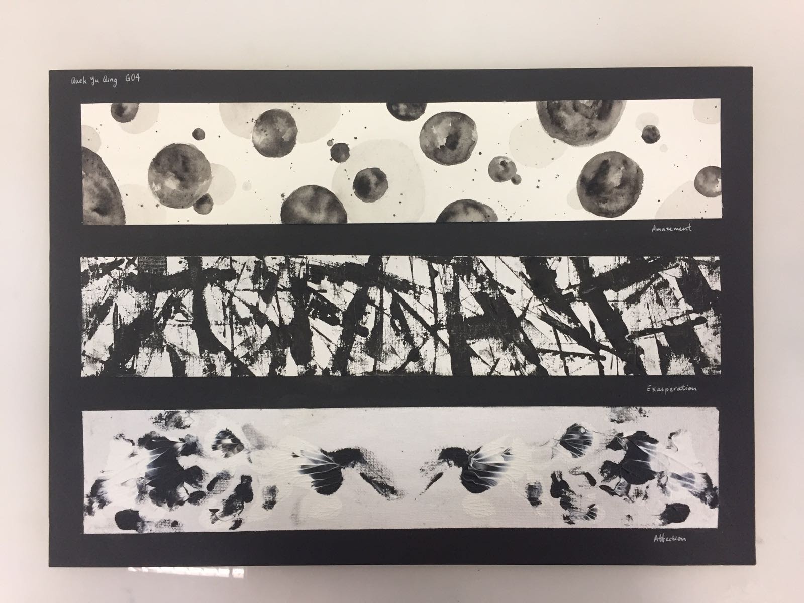
In particular, I couldn’t get ‘Lust’ the way I wanted at all even after multiple, numerous, countless number of tries and kilos of paint wasted (just kidding). In a spurt of frustration, I folded a strip that I was doing halfway, intending to discard it. However, when I opened the strip, it dawned on me how perfect Warhol’s Rorscharch technique can be applied. I started experimenting more with this technique, constantly being pleasantly surprised whenever I open the folded paper.
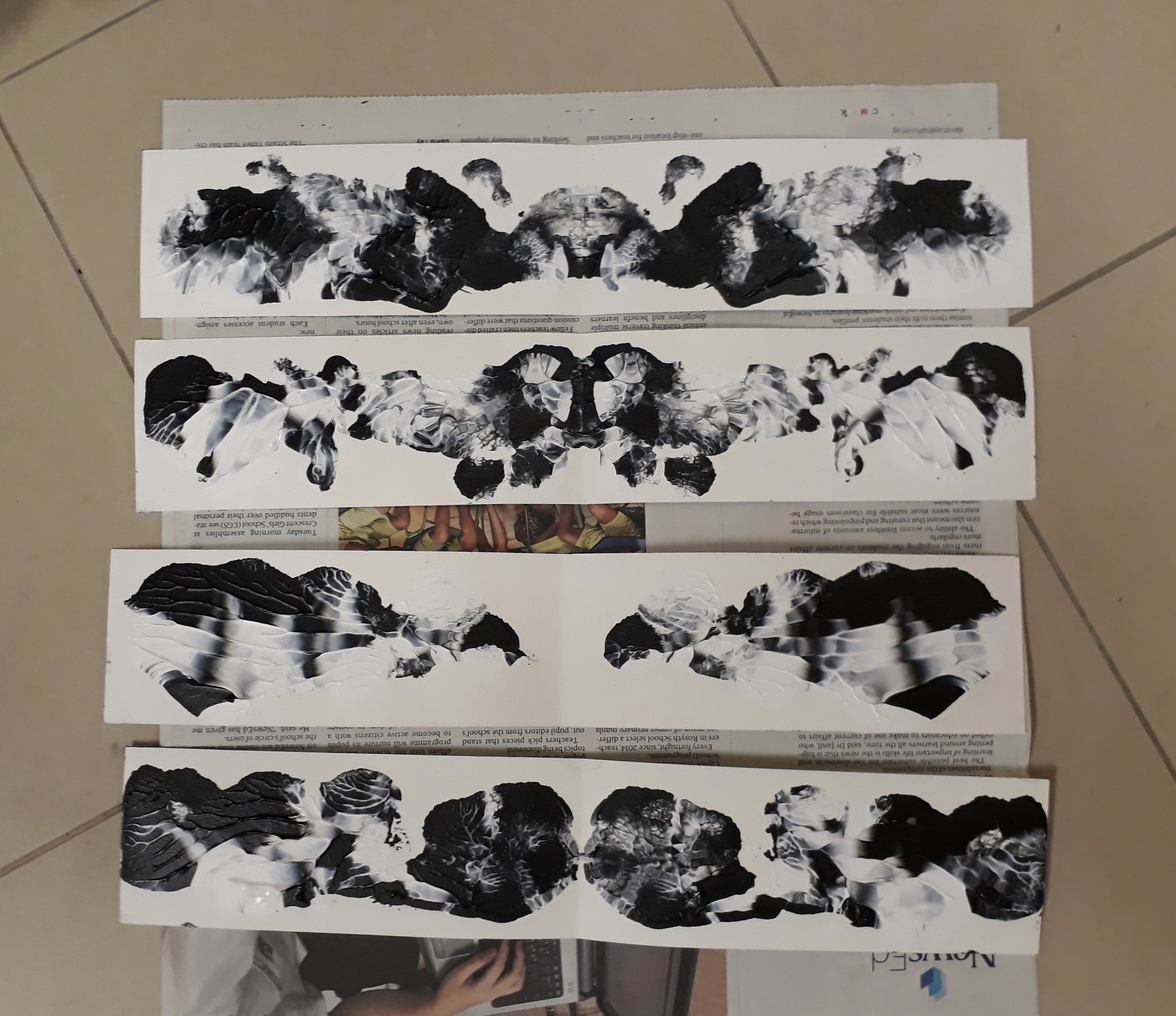
And so, one day before submission, I changed “Lust” to “Affection”, an emotion I thought best described the ink blot I made.
In the end, my final six emotions were:
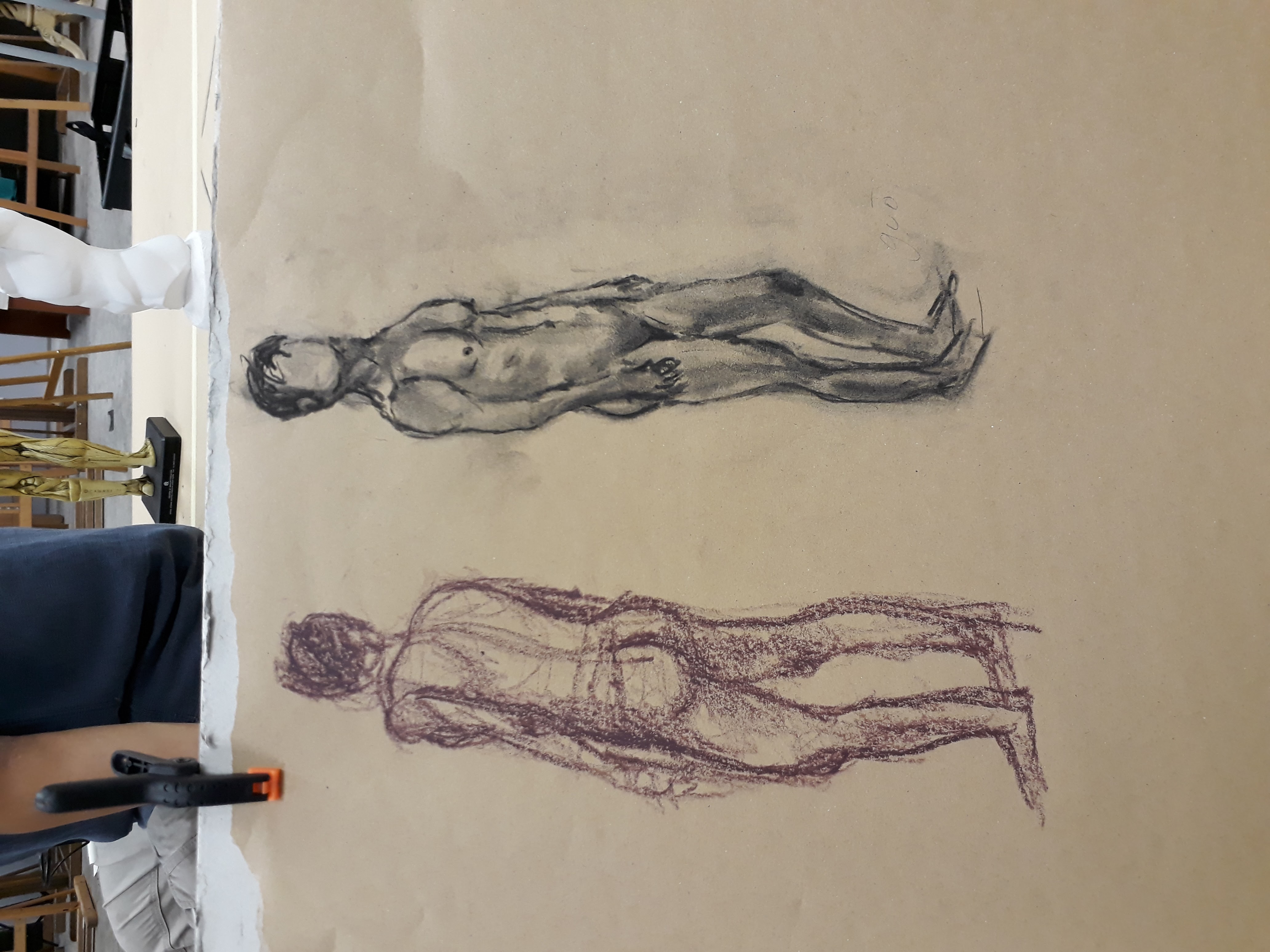
Second figure drawing session!
Today we dealt with Chiaroscuro, learning to deal with light and shadows and knowing how to demarcate edges of a form just by playing around with tone.
Some quick sketches we did as warm up to try portraying the figure using different tones:
There isn’t quite enough tonal ranges in these sketches, but I did get a rough idea of what we are supposed to learn here.
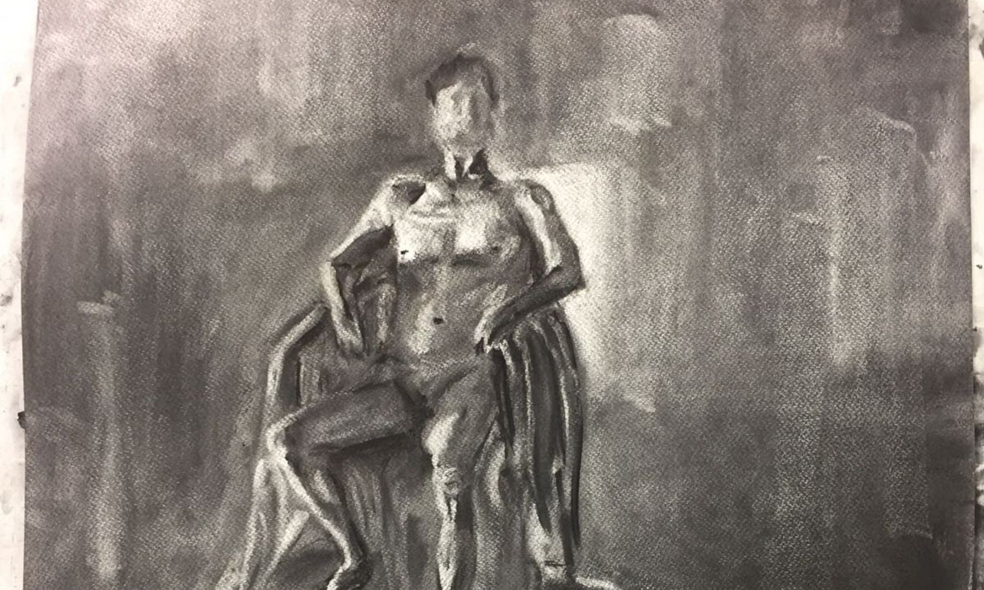
1.5h sketch: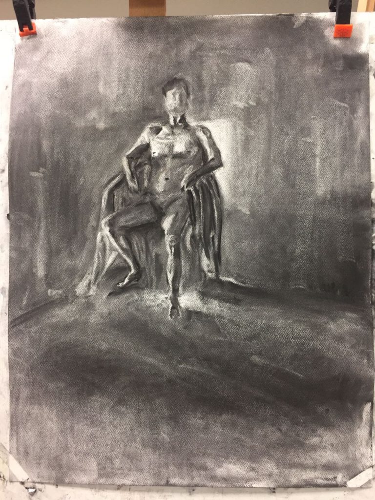 Here, we first smeared the background with charcoal so that it is mid-tone black and then brought out the human form by using an eraser. This exercise helps us to identify the brightest and darkest parts of the human figure, and this aids us in elucidating the form accurately.
My figure is too small again….. Somehow I cannot visualise how the figure will translate on the paper, and so I couldn’t estimate the size of the drawing. Here I think I managed to mark out the form of the body quite clearly (other than the hands which I casually skipped). Some shadows are too sharp (like the one at the model’s right shadow) and some edges are rather weird (e.g. the left arm). I am very happy with the model’s left leg though!! I thought it turned out quite well :>
However, I wasn’t very successful with capturing the mood. Even though the background shades vary in tone, they don’t really give you the idea that there is some sort of air flow or movement at the back. They literally just look like different blocks of different shades in the background. I should work on this more in the future.
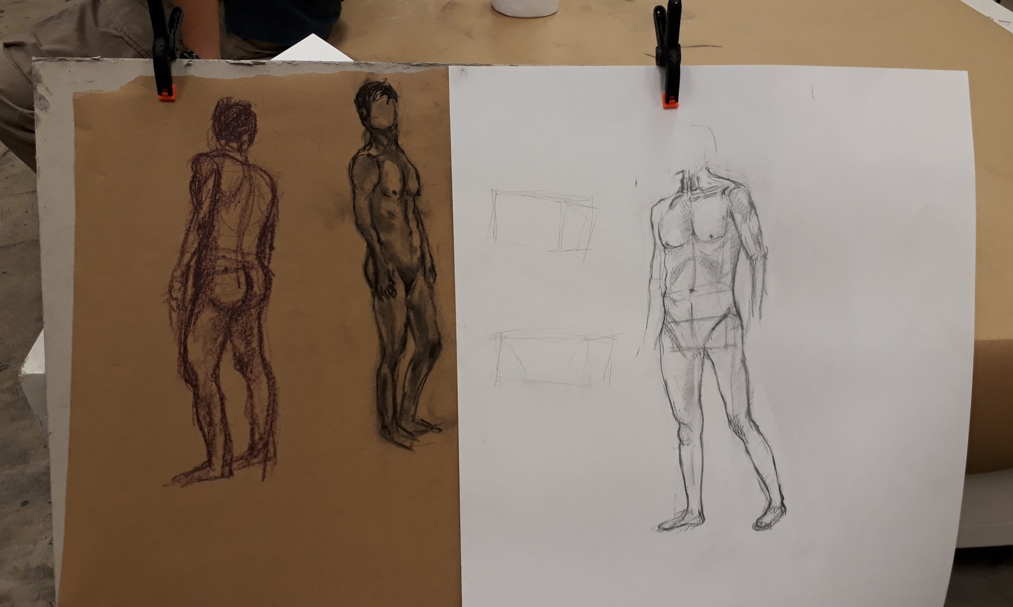
In the third week of school, we are already working on nude figure drawing! I was quite surprised as I thought we would be working more on still-life setups as well as learn the human anatomy before actual moving on to real life models.
I thought that Prof’s method of teaching was quite effective. For basics, he instructed us to focus on the torso and taught us to construct its shape by using two boxes — one representing the upper body while the other representing the pelvis.
For the upper body box, the upper edge is to be extended from the hollow located along the clavicles (collarbone) at the top of the shoulder while the bottom edge is to be aligned with the ends of the ribcage.
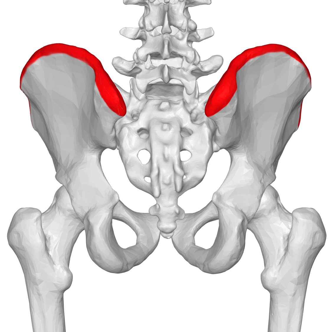
For the pelvis box, three points are to be first identified: two points at the ends of the iliac crest and one at the pubic bone.
Iliac crest:
Interestingly, when a human is standing, the upper box will be tilting backwards instead of being upright or inclining forward. This is often overlooked, even when I tried to sketch later on.
Easier said than done! Even though the theory sounds extremely simple, when I tried applying it I found that just getting the proportions of the boxes right is a big enough headache. It is difficult to pinpoint from the nude model where the boxes starts and ends and what their orientation in space is.
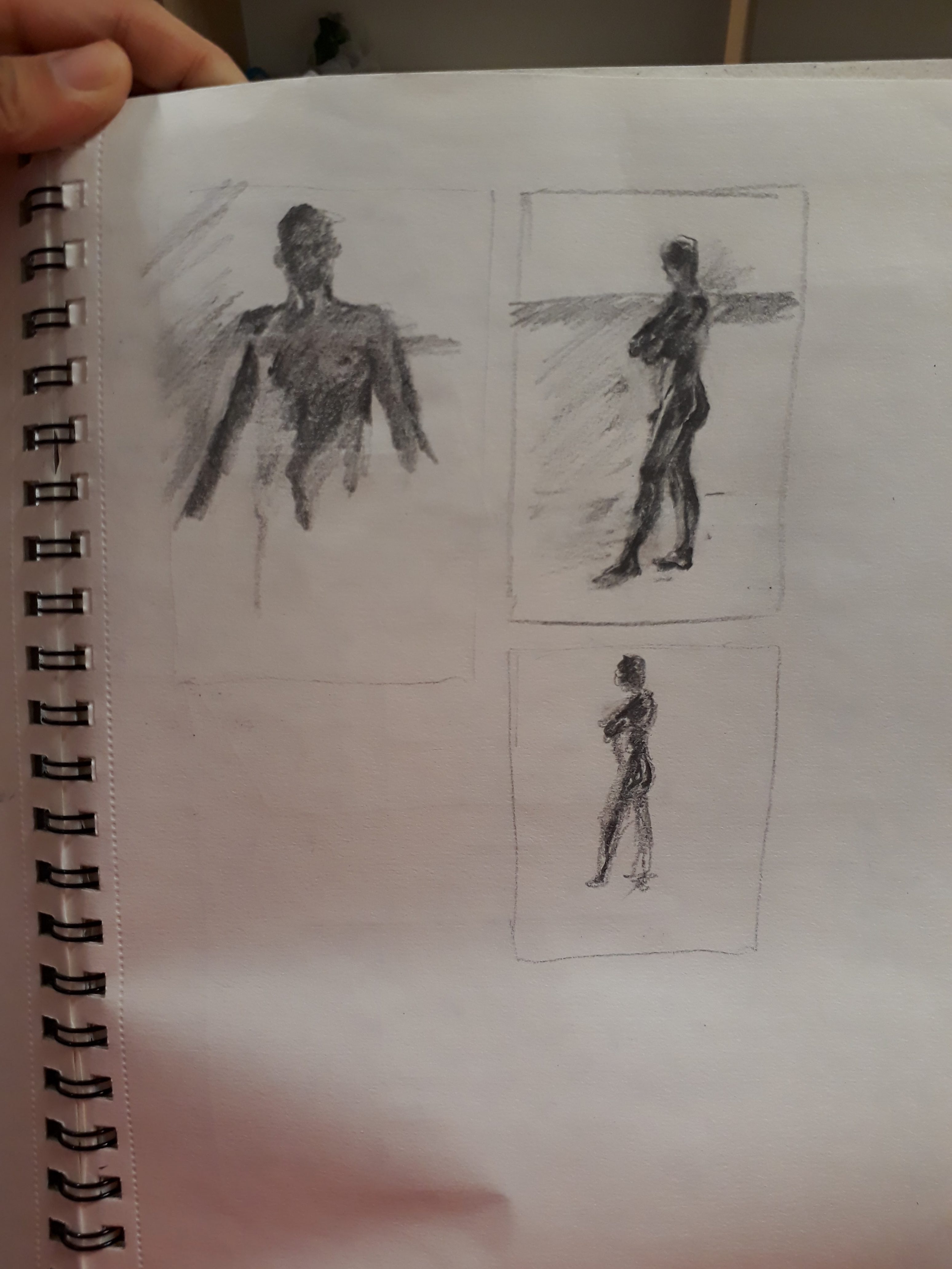
Quick sketches I did:
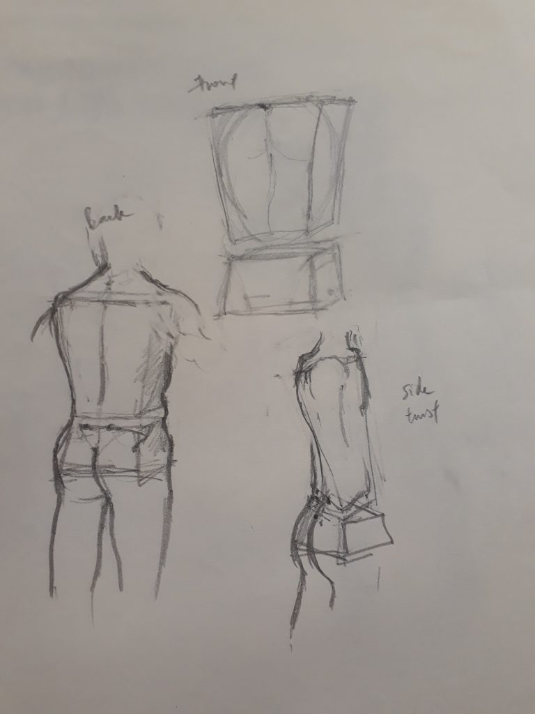 Proportions feel rather off here. Also, I did not know that the boxes should be rectangular instead of taking a trapezium shape. In the bottom right sketch, I was confused by the twisted torso of the model and thought that my boxes should be distorted as well. However, Prof told us later that we should be thinking of the boxes themselves as representing immovable blocks (we can’t twist our ribcage or pelvis after all). What gives rise to the idea of the ‘twist’ is by displacing the alignment of the top and bottom box.
We sketched for longer periods after:
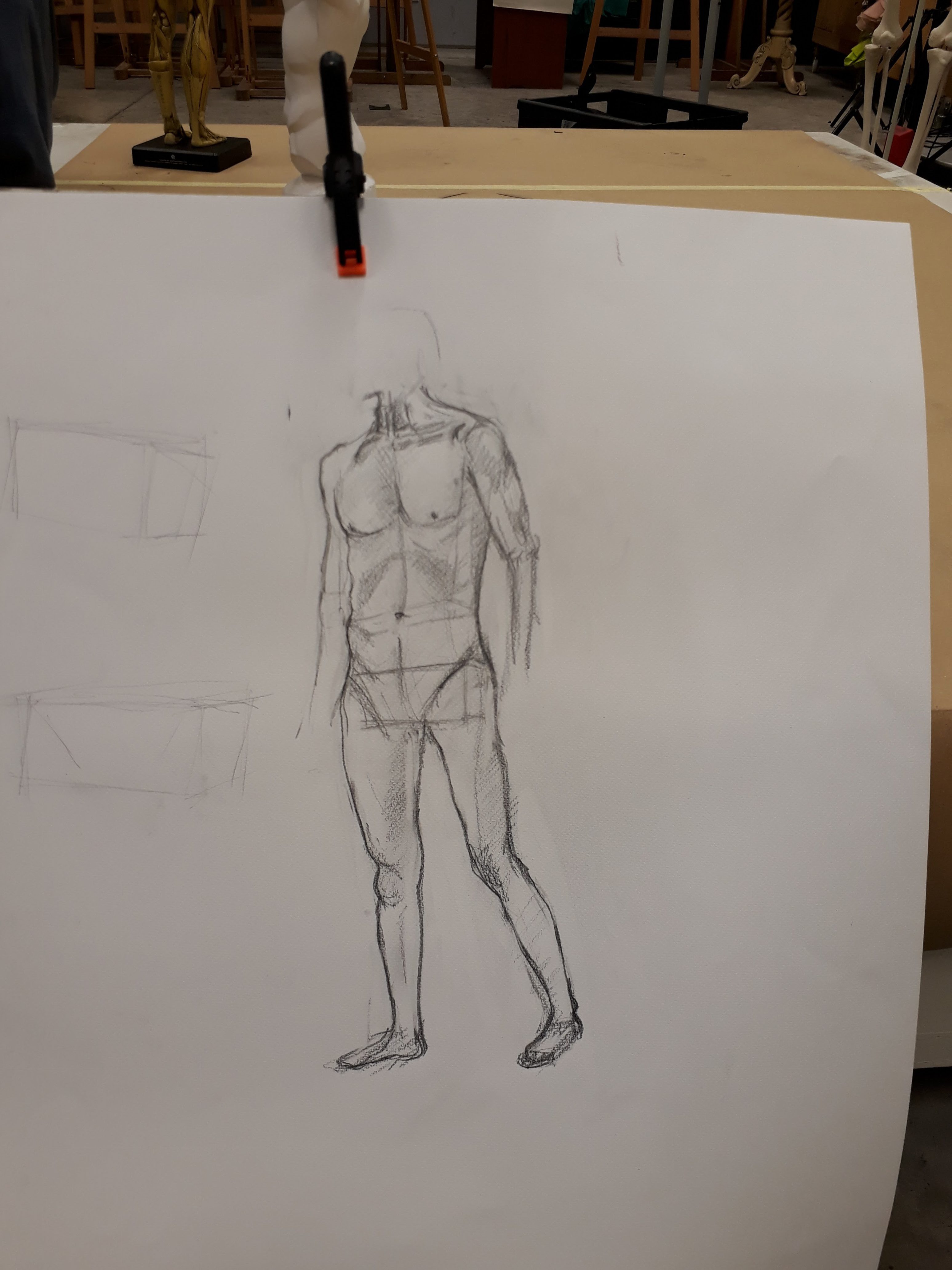
I realise I have this very bad habit of sketching the model too small…
I hope there’s a lot more figure drawing sessions to come because it feels like it is very hard to master and will require loads of practice. Hopefully, through better understanding of the human anatomy and techniques to figure drawing, I will get better and faster and more confident at it :)