This week, we worked with charcoal to learn about textures and tones in a drawing.
Texture:
Since drawings are 2d, we can only create the illusion of texture by manipulating light. For smooth surfaces, there will be a smooth graduation from light to dark; for rough surfaces, there will be sharp contrasts of light.
Tone:
Varying tones is crucial feature to have in order to bring life to a drawing. Objects have no outline in reality – hence for realistic drawing, it does not make sense to have clearly delineated outlines. Hence, without outlines, the only way to portray an object will be to describe it based on its tones and how it behaves under light.
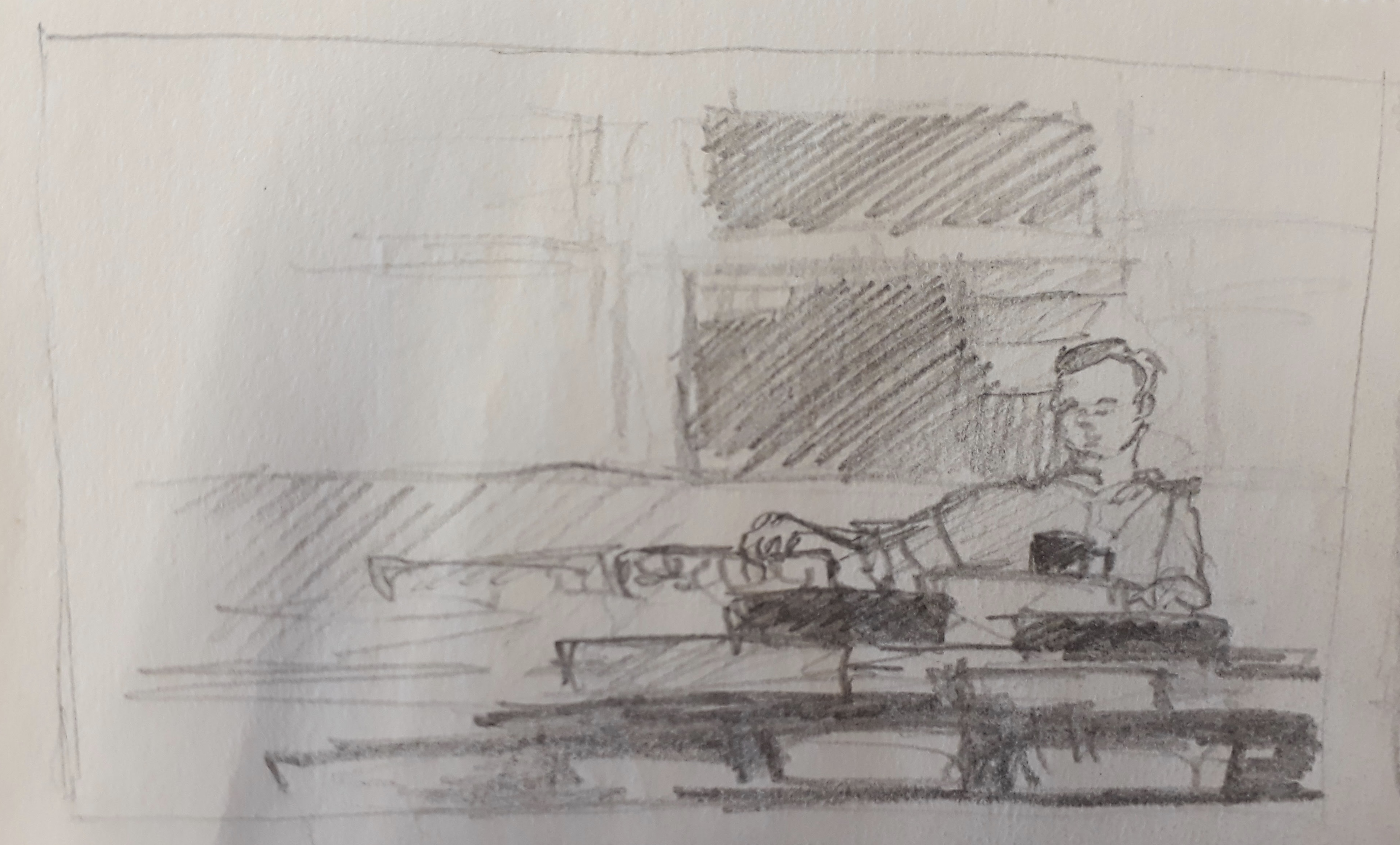
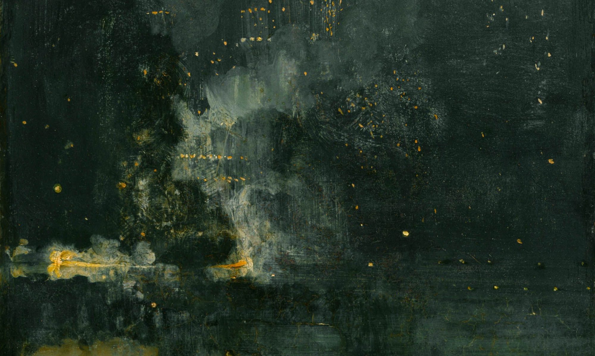
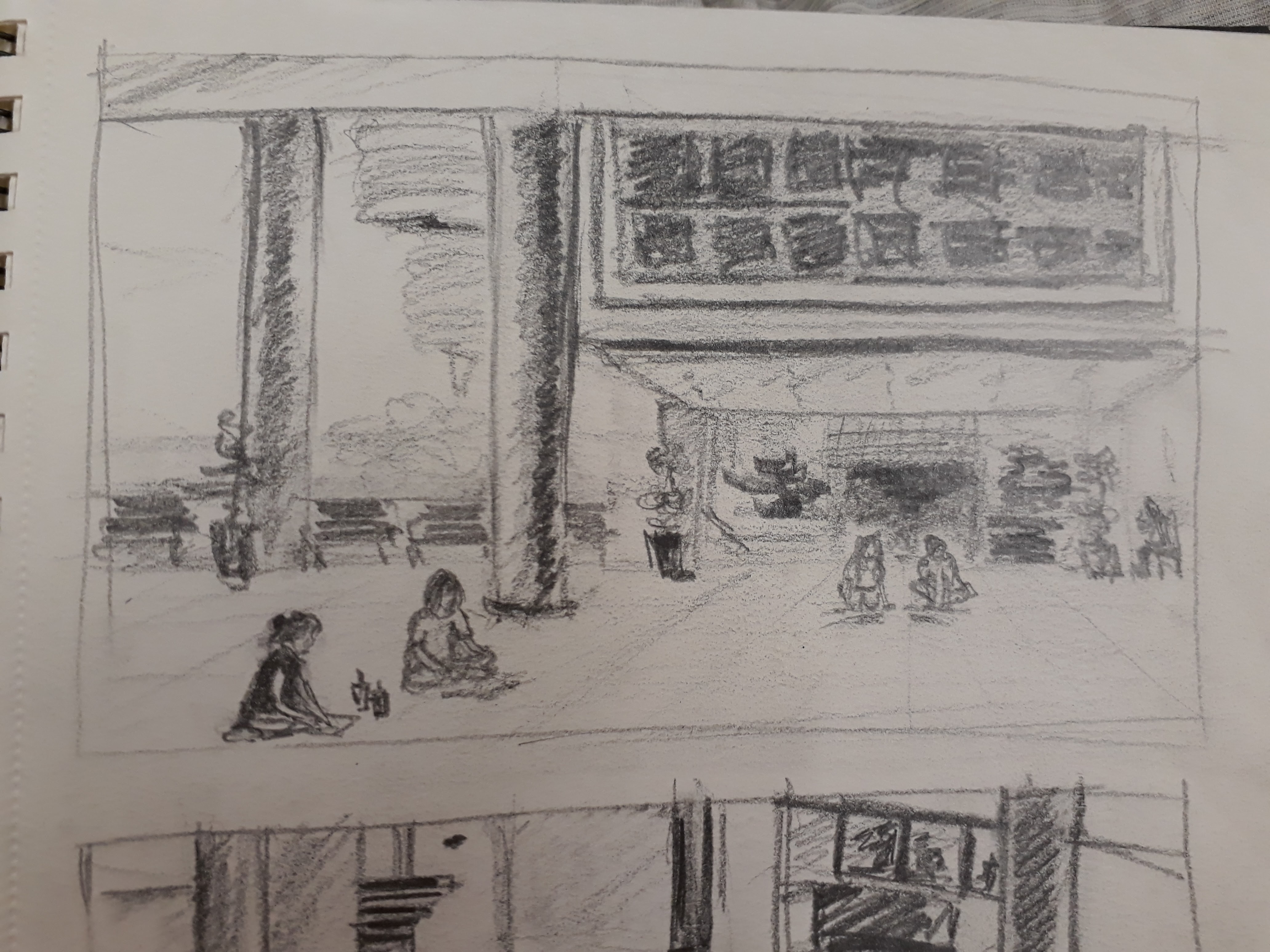
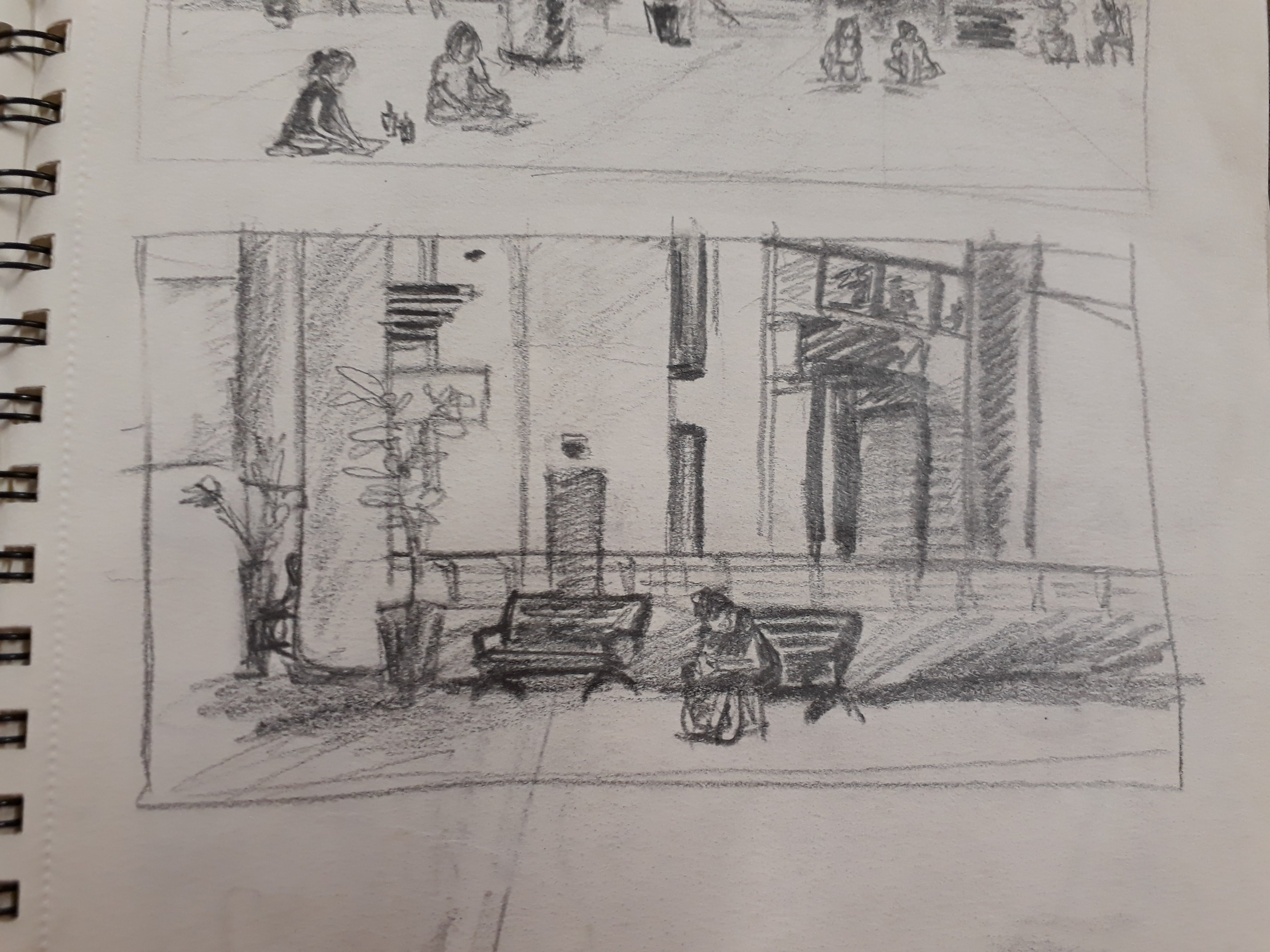
Takeaways from Prof’s demonstration of a rainy day:
- The importance of creating a delusion, and acquiring the know-how. In a rainy day, there are no sharp shadows due the diffusion of light from the rain droplets, the ground, the walls, etc. As sunlight is still the main source of light (other sources including street lights/ lights in buildings), the ground (horizontal surfaces) will reflect the most light among all surfaces. Additionally, due to the reflection of light among rain droplets, the further the distance, the brighter it will appear. Hence, in a rainy scene, furthest objects will appear the brightest.
- Prof barely drew any details, yet we could tell that it is a rainy day. We could make out the forms of the cars, the people, the umbrellas….. with minimal strokes. This goes to show the importance of light and dark in a drawing – they make all the differences
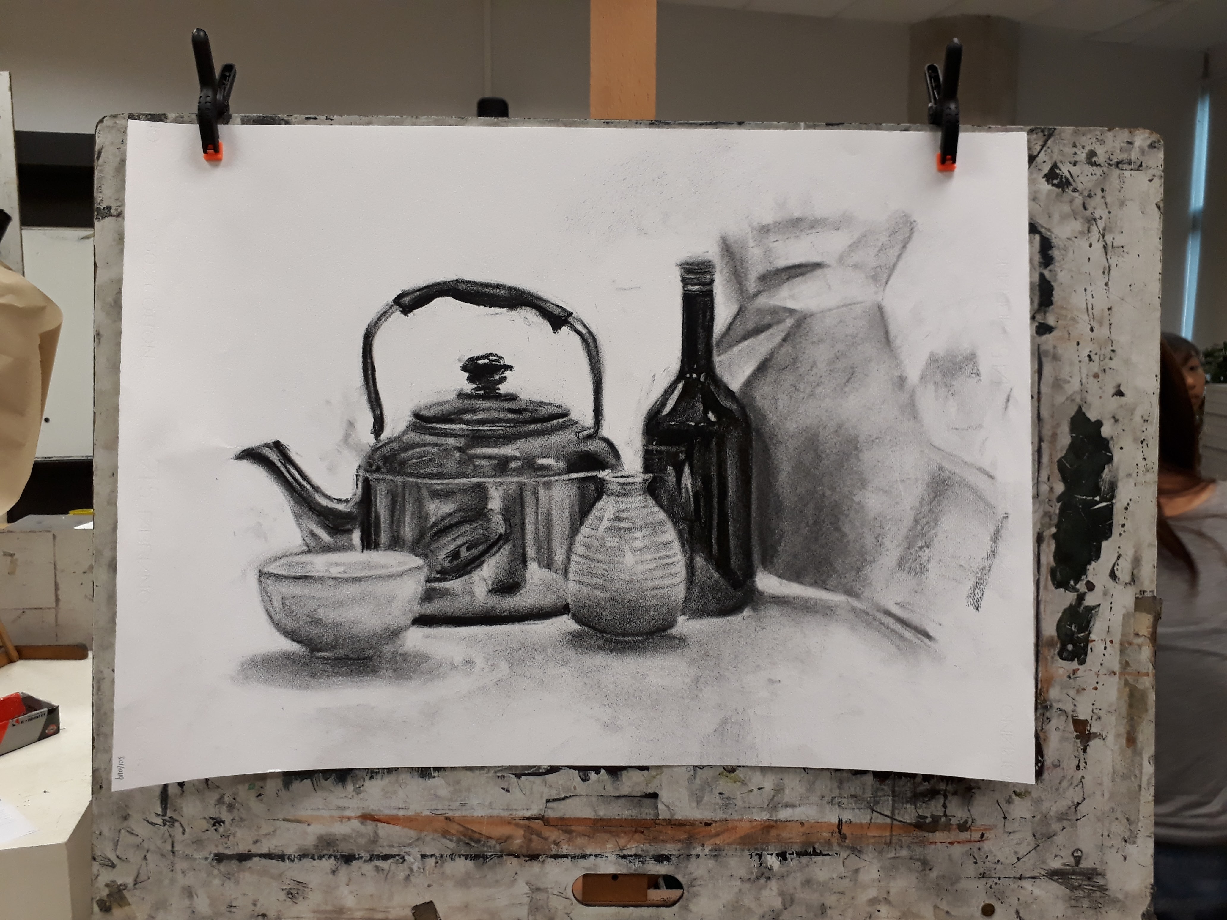
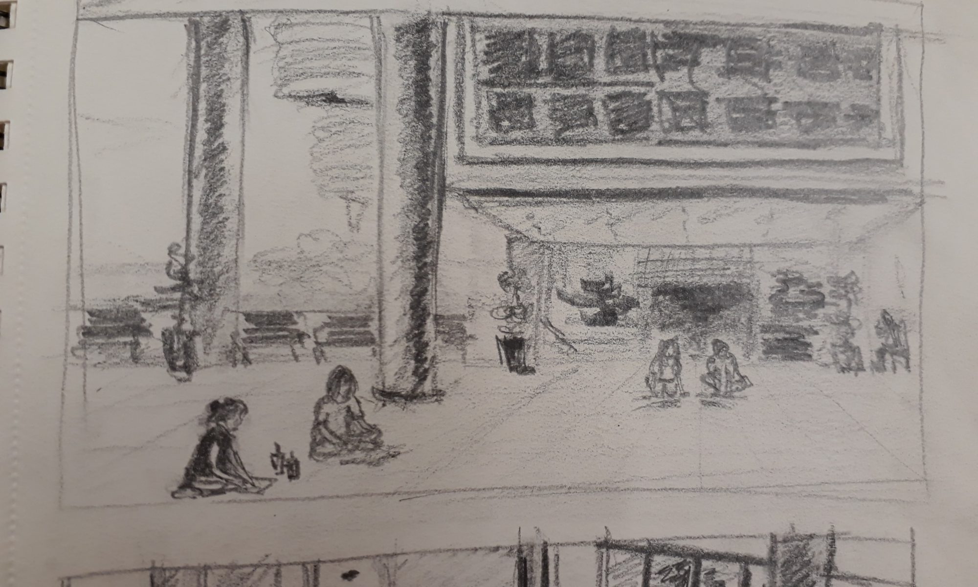
We had a chance to draw a still life set up. Here is my from the session:
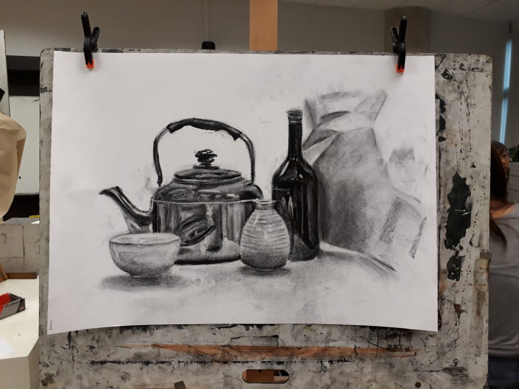
I am not foreign to the use of charcoal, however I had some troubles adapting to the paper I was using which was somehow quite different from what I’ve used in the past. For examples, I found that it was more difficult to erase and get a sharp edge. Also, the charcoal does not seem to adhere to the paper – when I rub on the charcoal with my fingers, the tone lightens immensely more than I intend.
I think it can be quite distinctly observed that the quality of drawing drops from the right towards the left (excluding the crumpled paper texture). This is because I am a rather slow worker. Thus I was drawing at a more comfortable pace at the start and spent a lot of time on the glass bottle. However as more and more time passed, I was pressurised to work quicker, and the rushed drawings do not fare so well.
Tones
For the ceramics, it was very difficult to capture their tones because the change in tone is very subtle under the diffused studio lighting. Prof mentioned that it was very important to ensure that the darkest parts of the ceramics are lighter than the darkest parts of the darker objects.
For the kettle, I think that my tones are changing too abruptly and the contrast is too large. Also, each band of tone (which I drew as a flat solid colour) should have a gradual change in tone within itself.
For the crumpled paper (in the background), while I did not have enough time to work on them, the portion that I did draw is too dark and the tones too flat.
Texture
Again, I found it more difficult to work with the ceramics – their textures are so hard to capture! Reflections on the kettle and glass bottle are a lot more straightforward because each change of tone is very clean and distinct. Since their surfaces are smooth, all I had to focus on was the reflection.
Drawing
Even though this lesson did not focus on the drawing itself, I find that my proportions and perspectives are rather poorly done – especially the eclipses.
Personally, I love drawing. I would love to attend more drawing sessions and improve as much as possible.

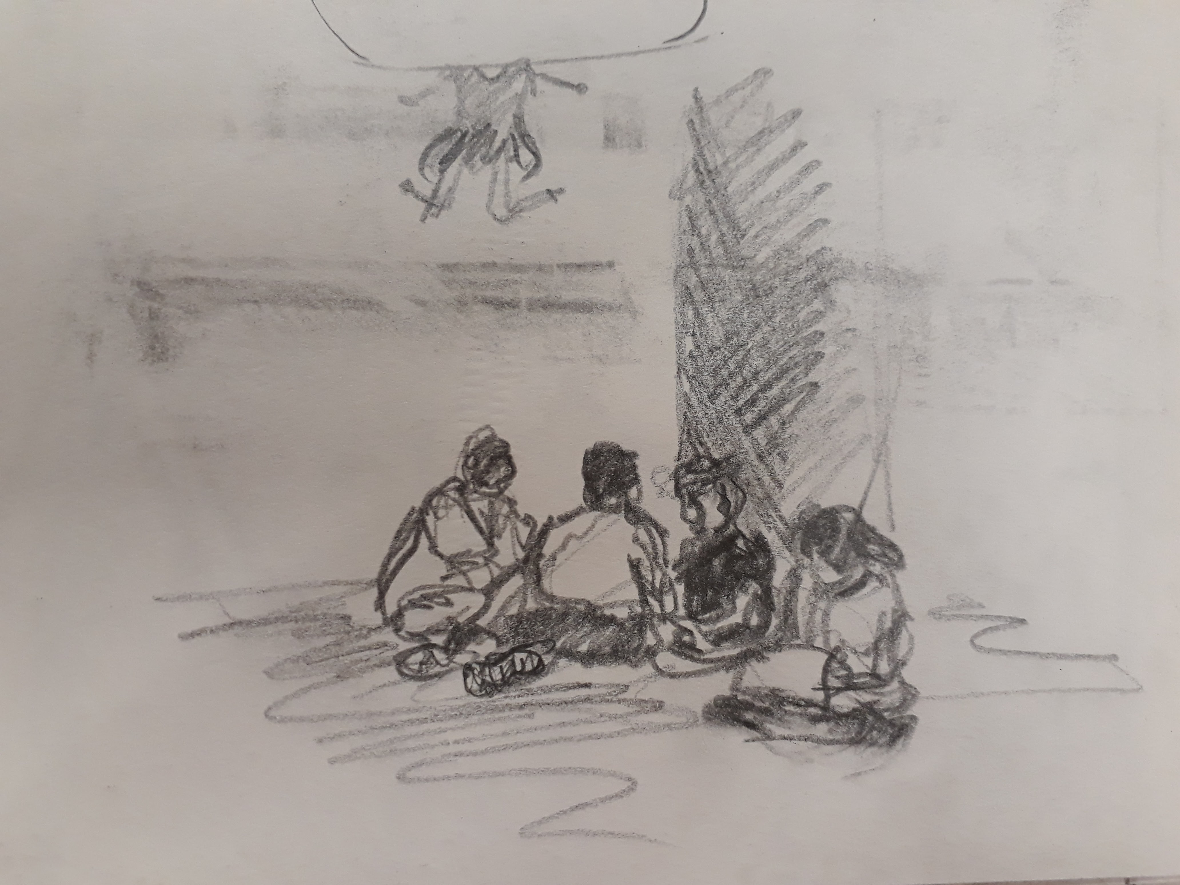
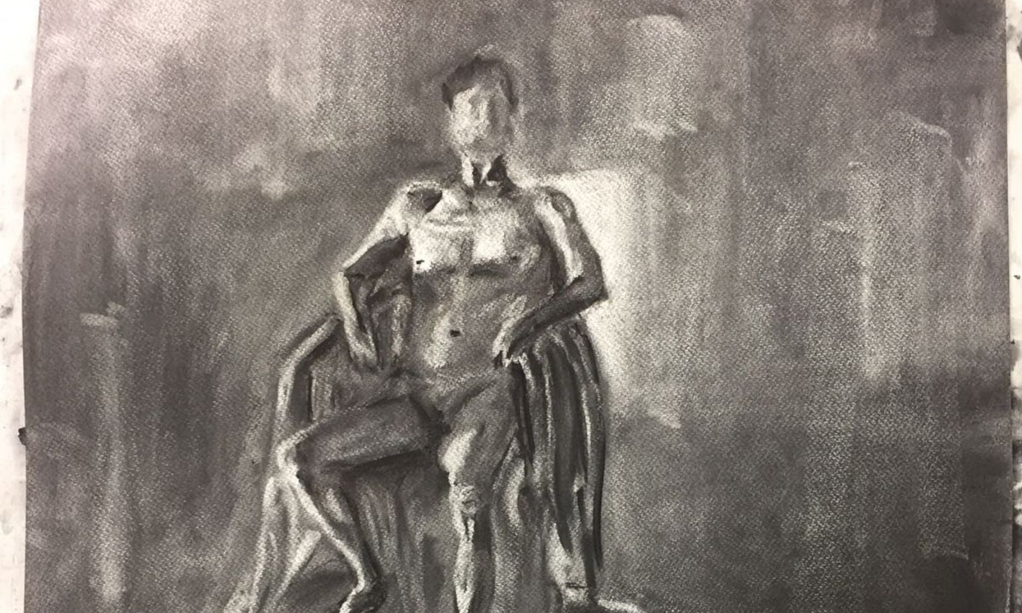
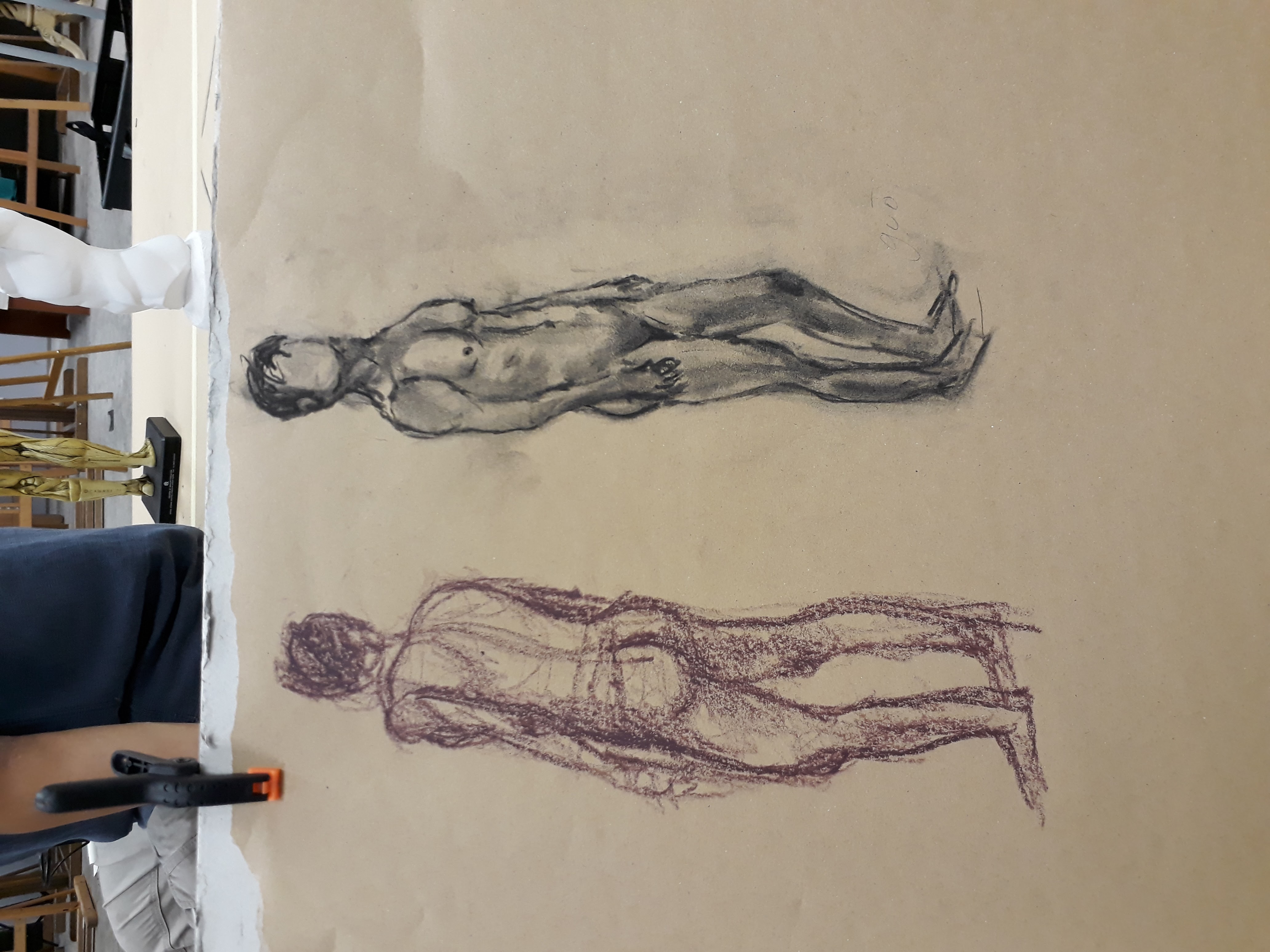
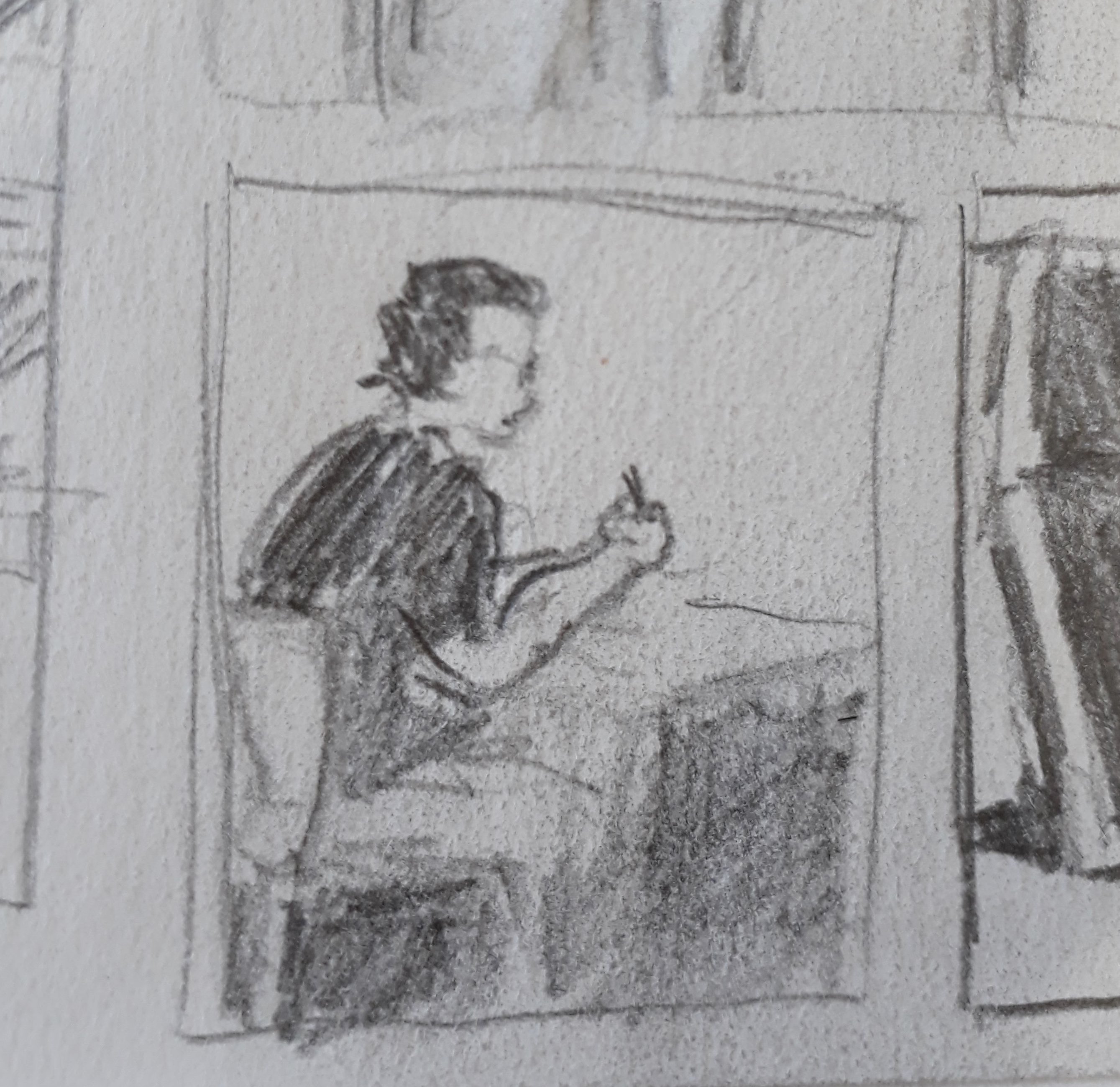
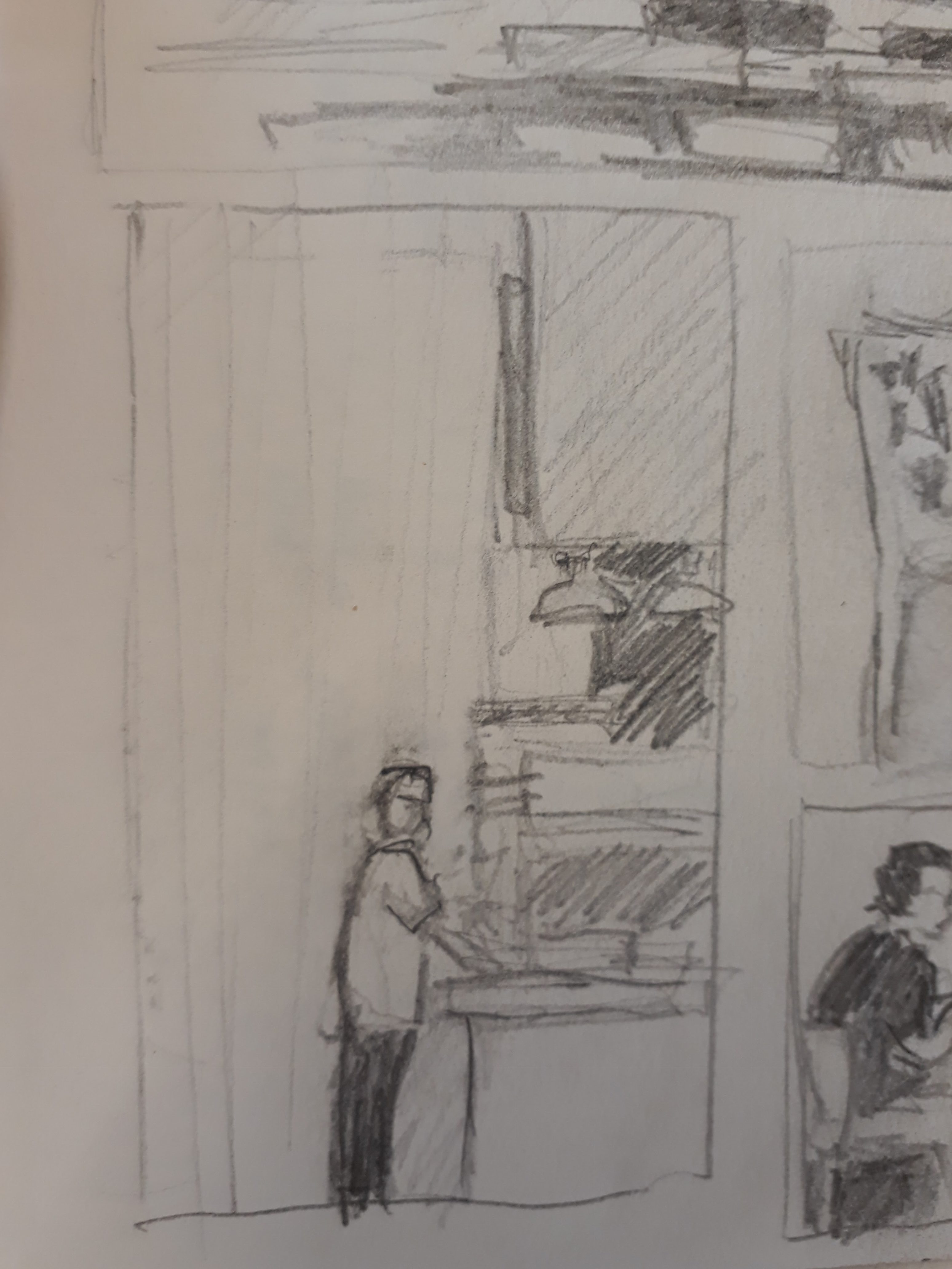
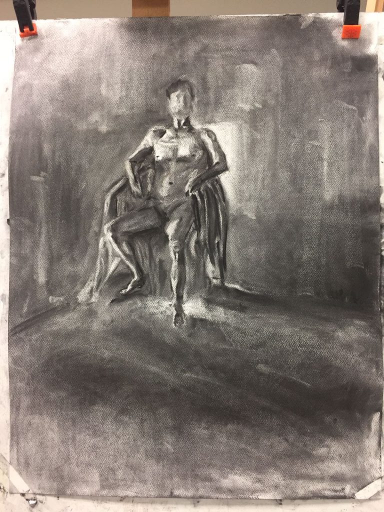 Here, we first smeared the background with charcoal so that it is mid-tone black and then brought out the human form by using an eraser. This exercise helps us to identify the brightest and darkest parts of the human figure, and this aids us in elucidating the form accurately.
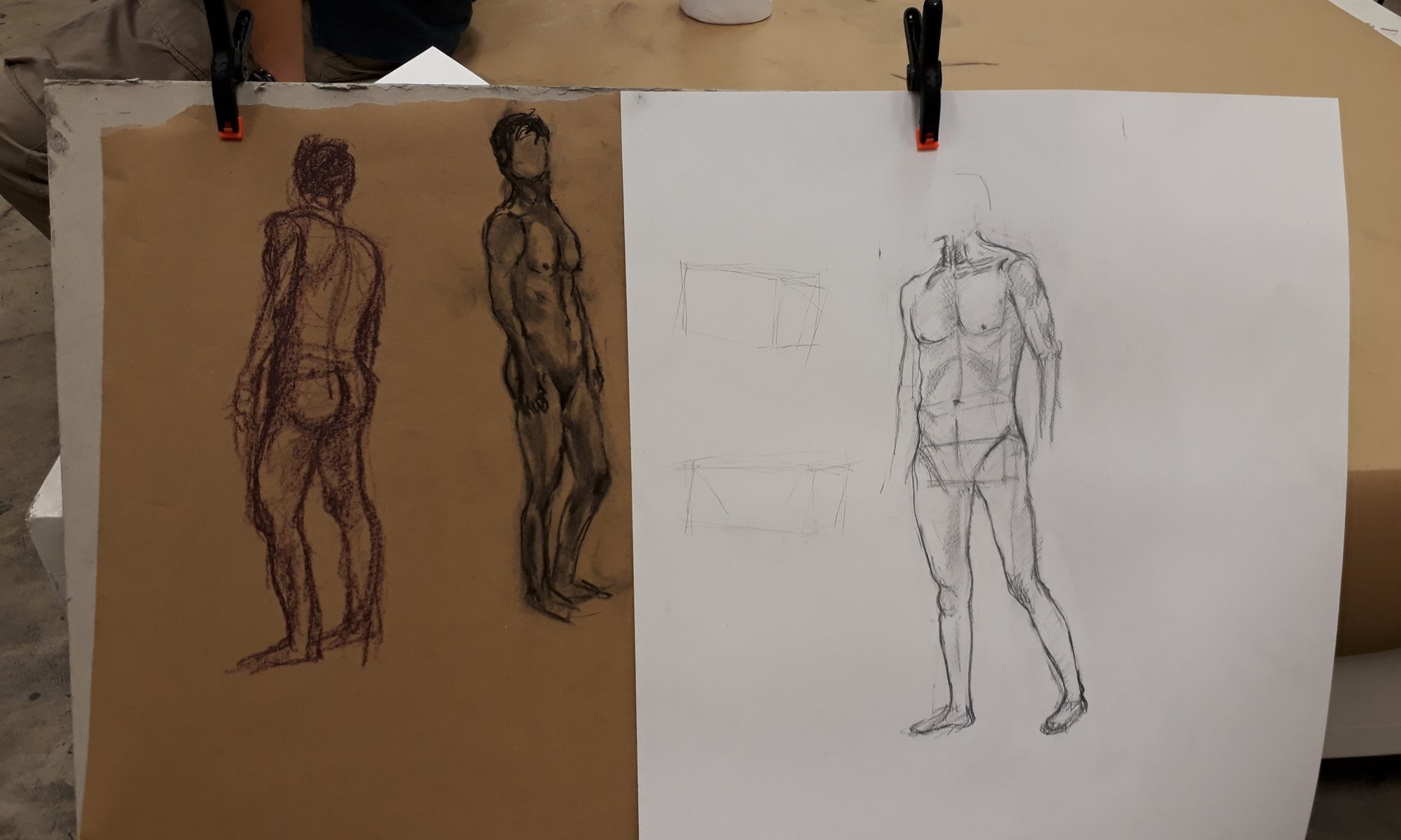
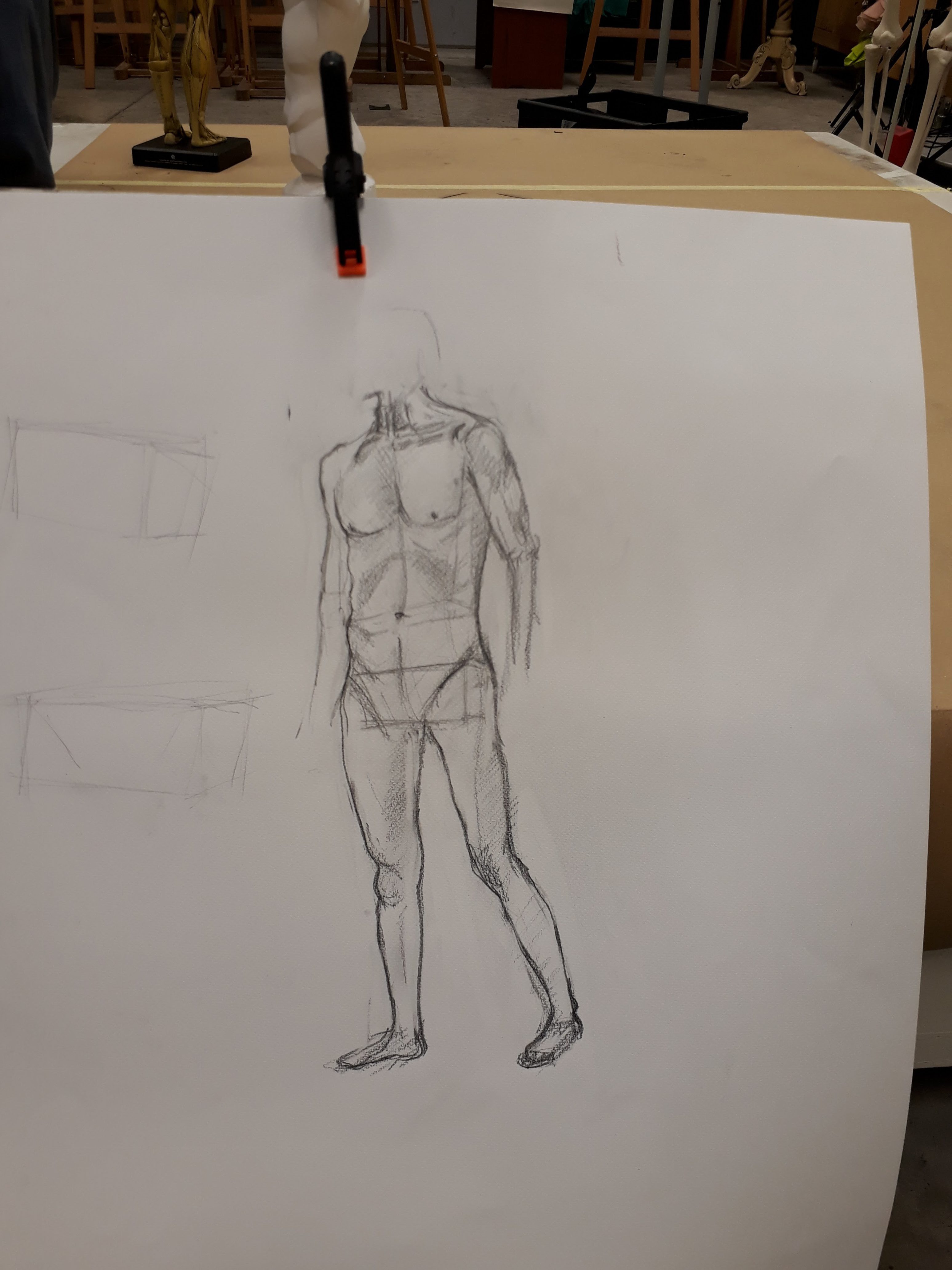
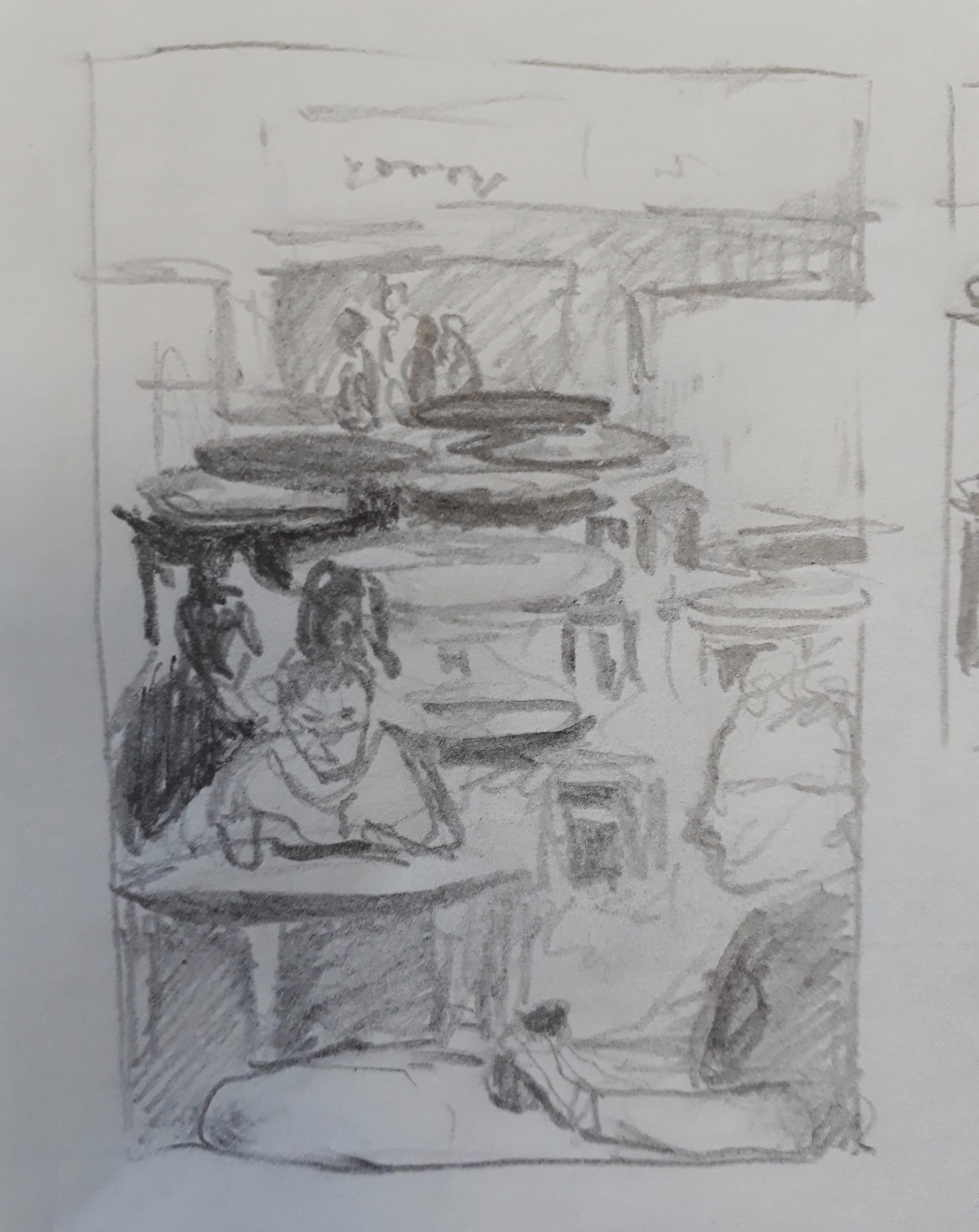
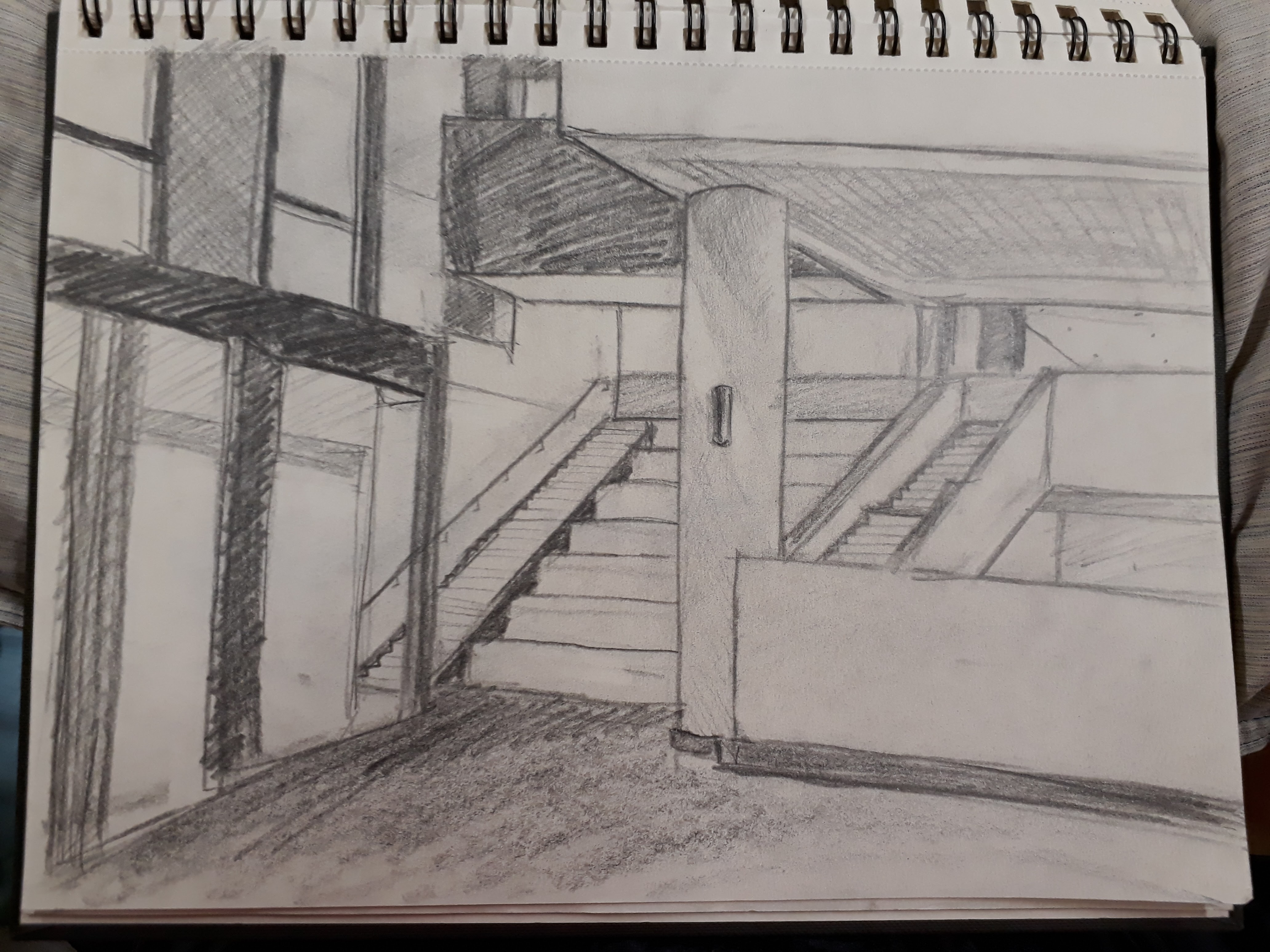
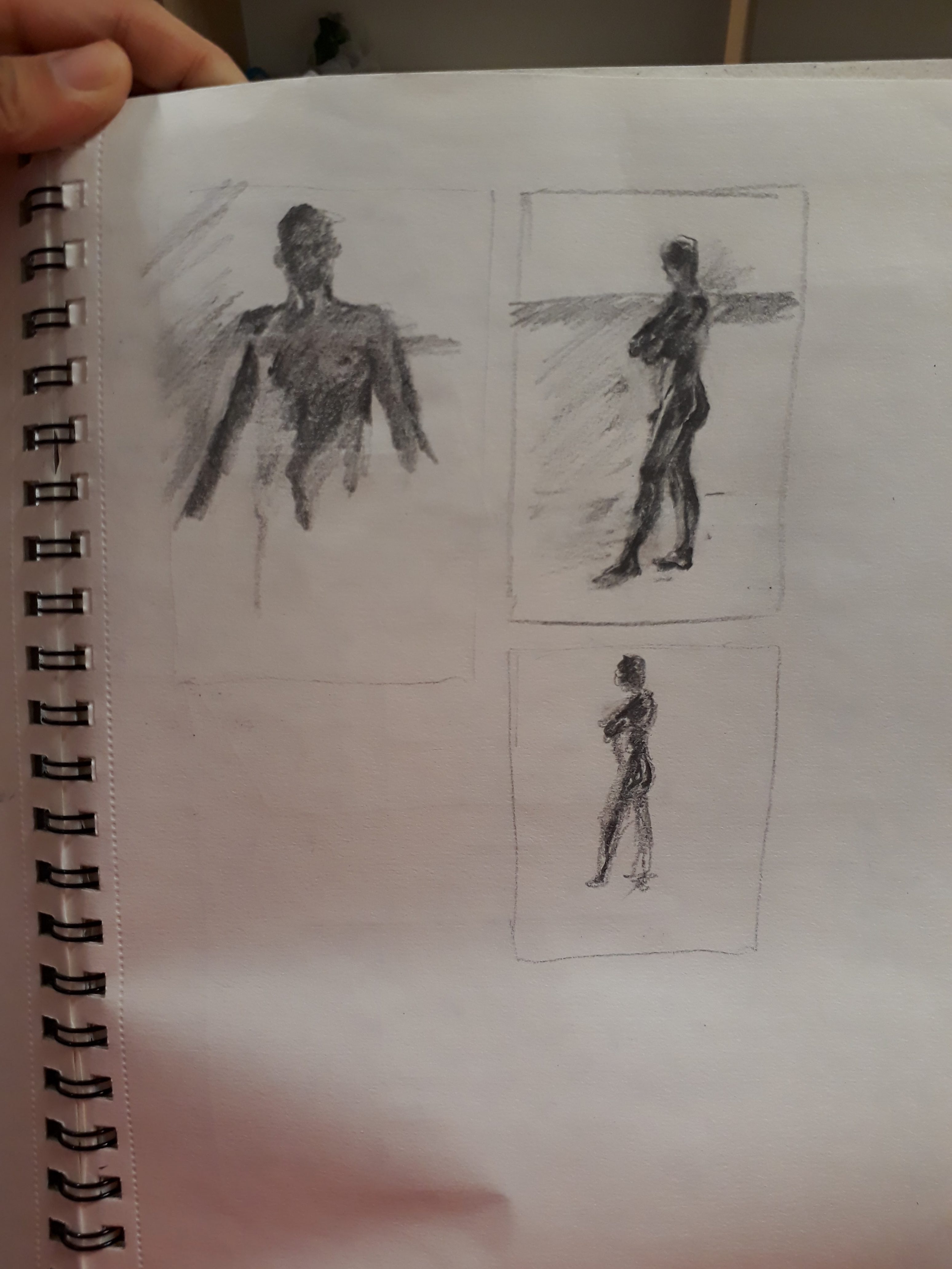
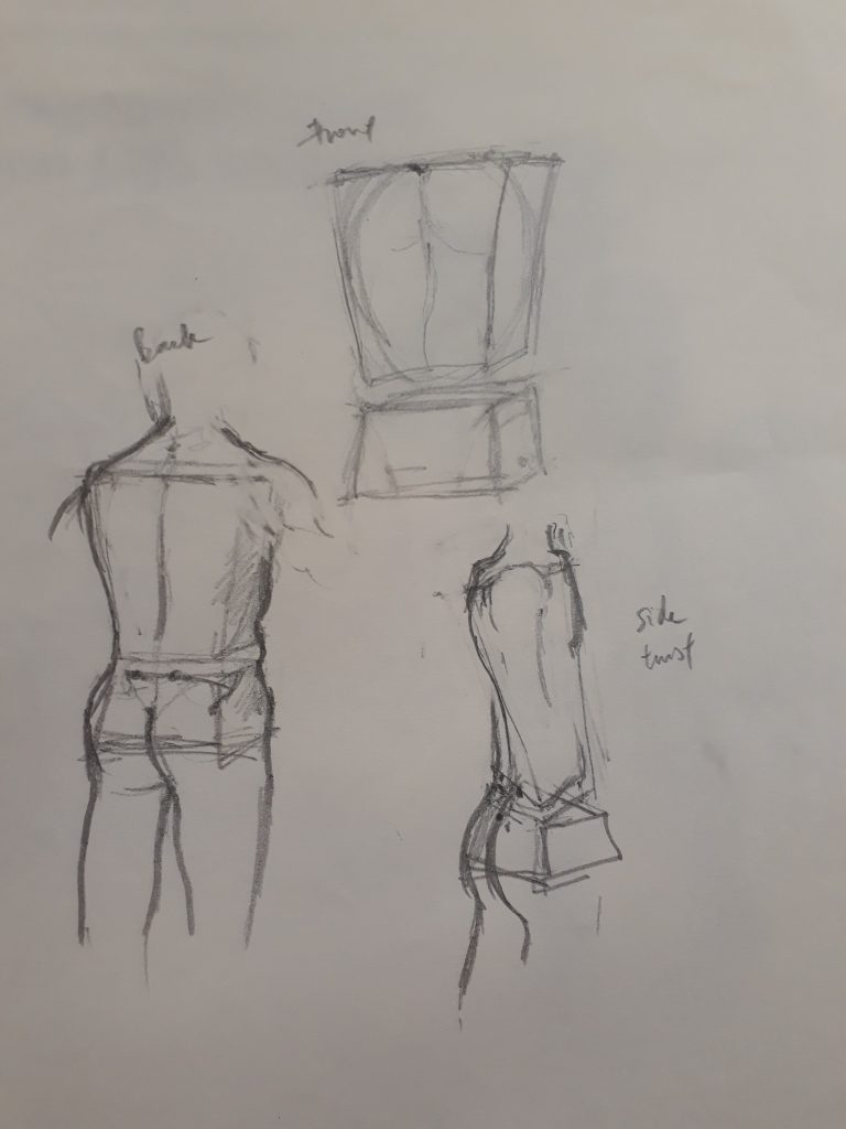 Proportions feel rather off here. Also, I did not know that the boxes should be rectangular instead of taking a trapezium shape. In the bottom right sketch, I was confused by the twisted torso of the model and thought that my boxes should be distorted as well. However, Prof told us later that we should be thinking of the boxes themselves as representing immovable blocks (we can’t twist our ribcage or pelvis after all). What gives rise to the idea of the ‘twist’ is by displacing the alignment of the top and bottom box.