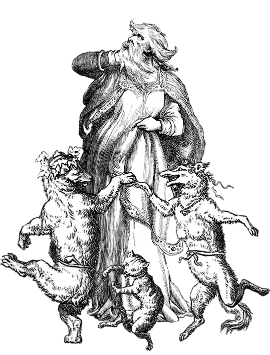
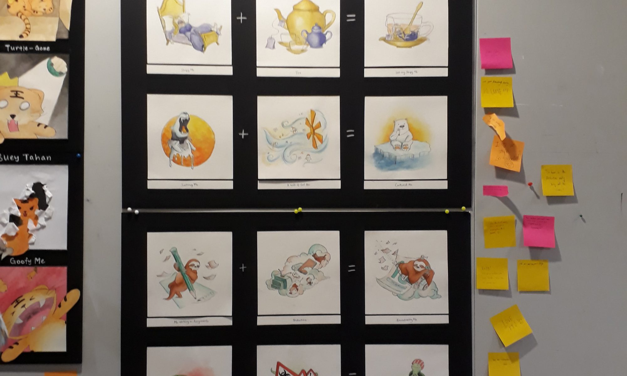
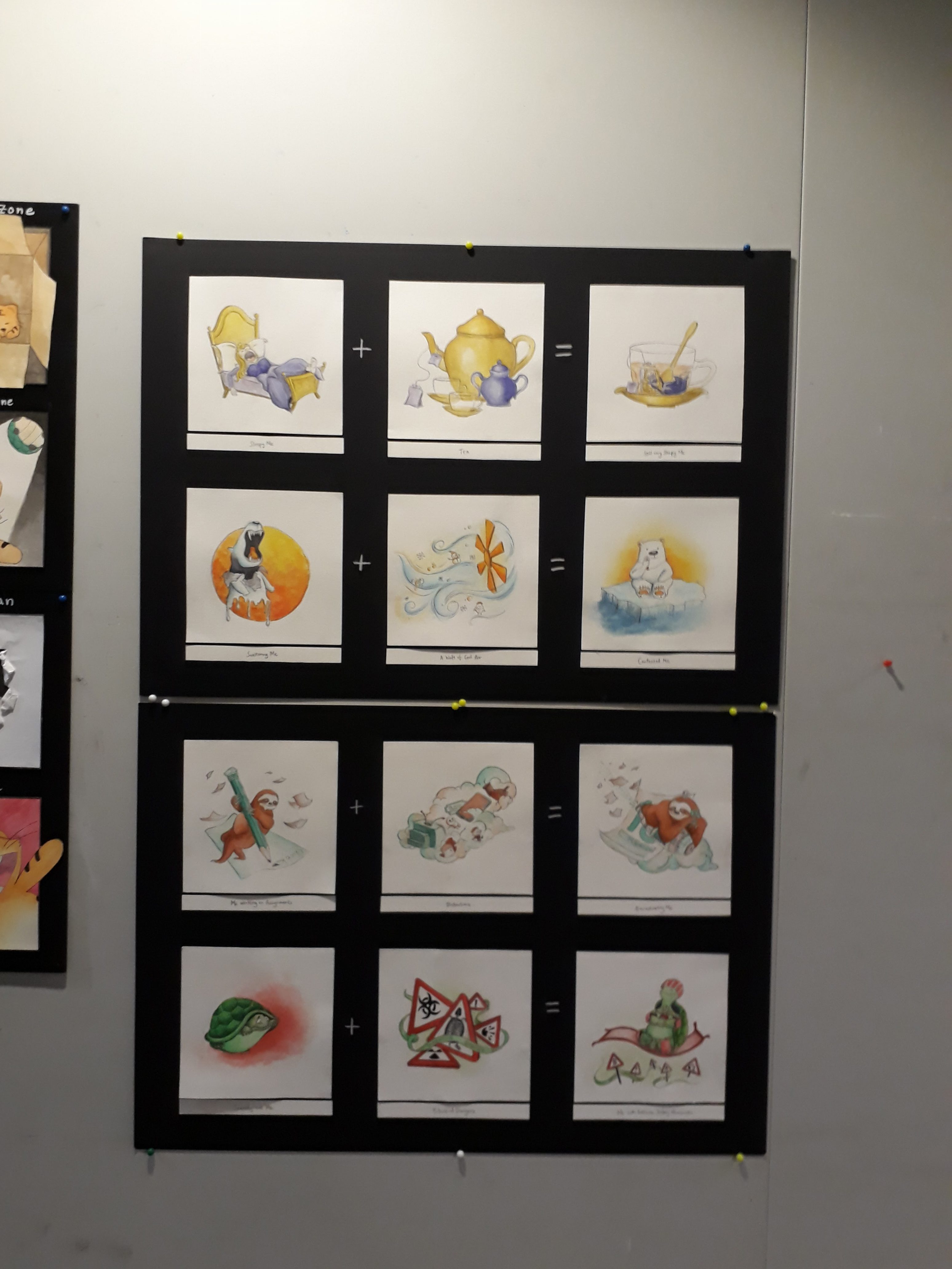
Me working on assignments + Distractions = Procrastinating me
Scaredy-cat me + Dangers = Me with Extreme Safety Measures
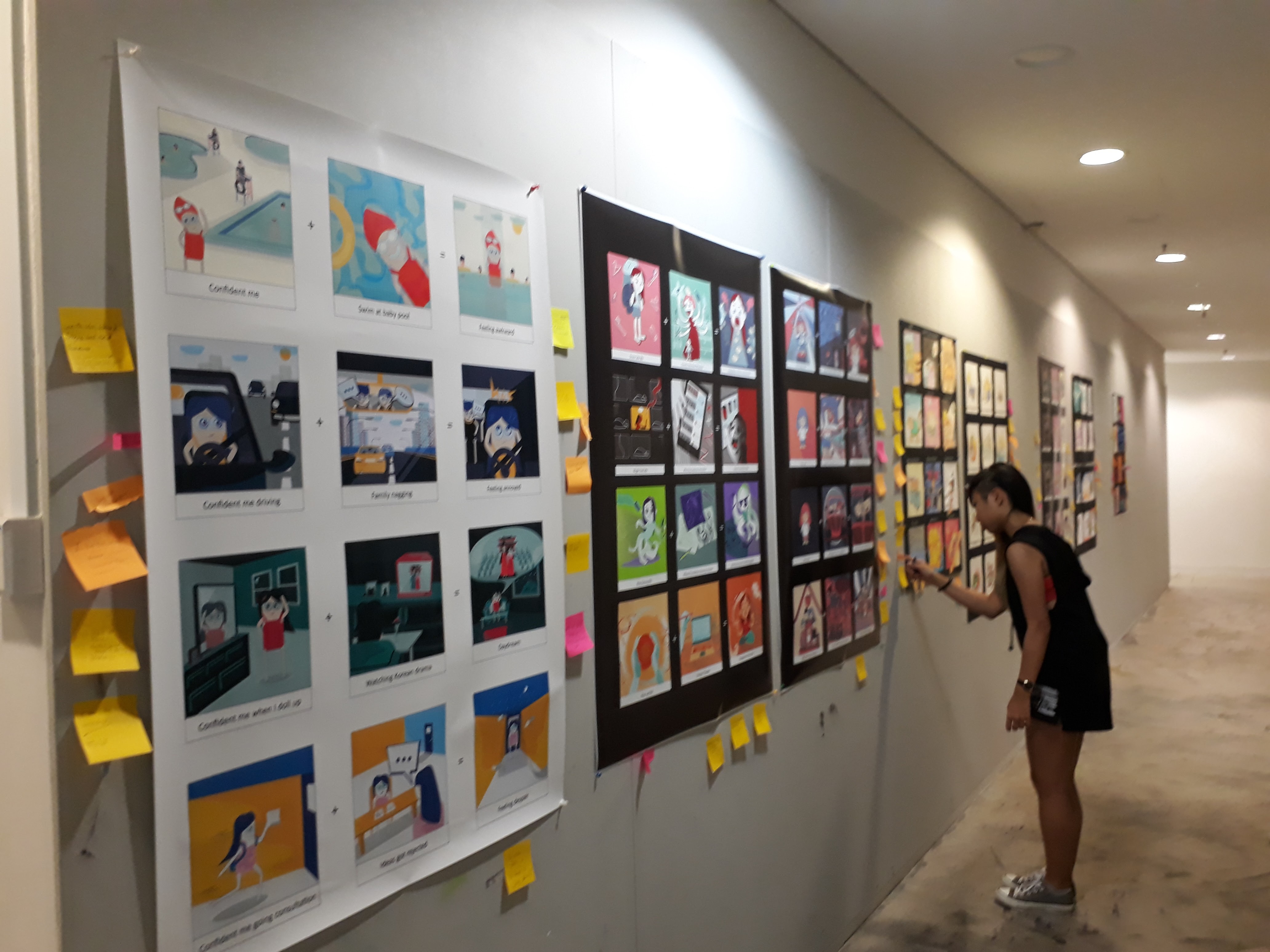
Gallery viewing + Presentation :)
There were so so many amazing works!! It was really nice to see how everyone chose to represent themselves as well as the equations that they express.
Eheheh what a great end to Foundation 2D!
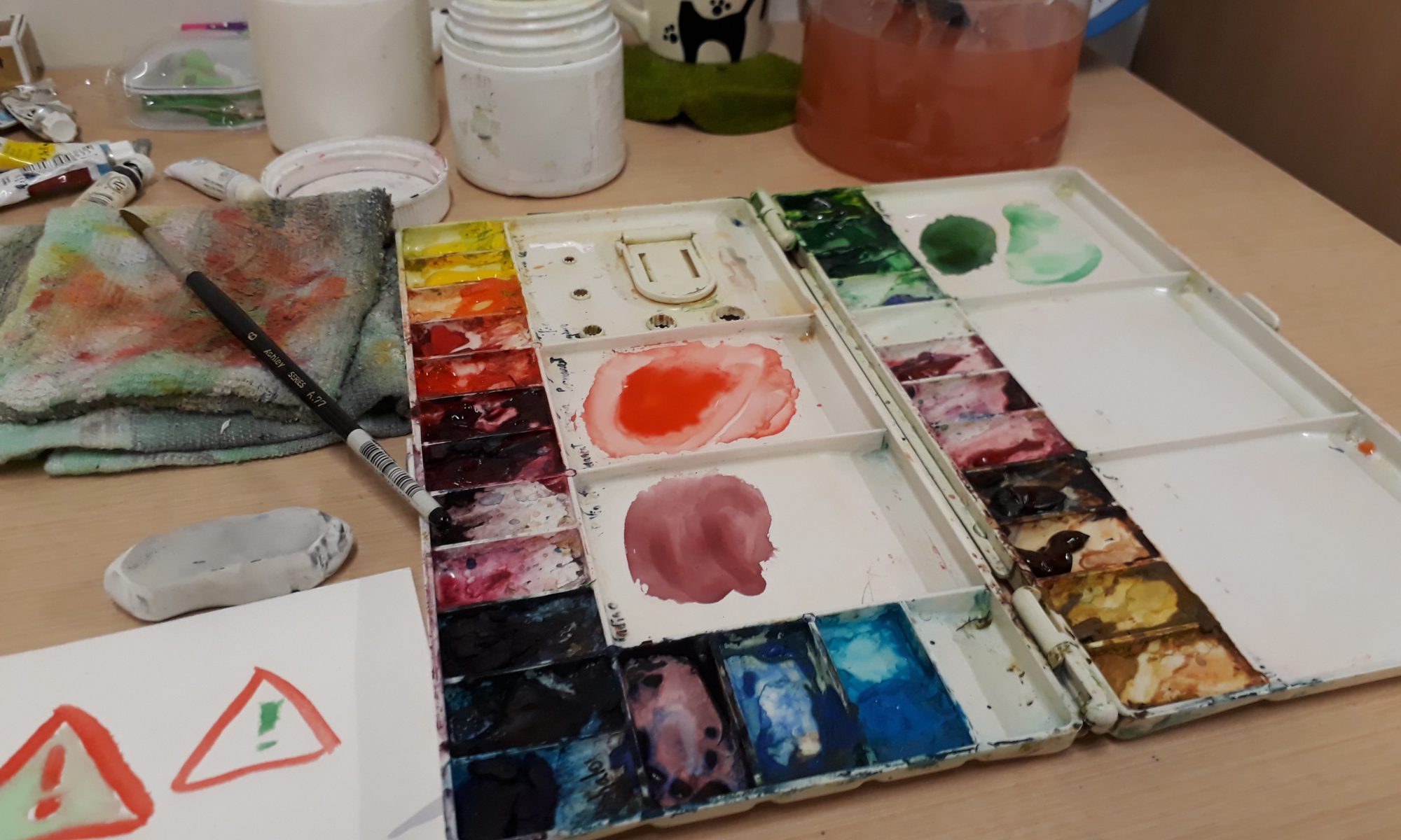
Overall, this project has been a challenging one. Just ideation alone took me a really long time as I kept revising what I had. The drawing process wasn’t easy either, as I had to work around with different compositions and decide which works the best — especially troublesome when it comes to traditional media as I had to erase everything and start over. Learning about colour theories has also pushed me to really think carefully before I apply colours instead of the usual dabbing of colours based on instincts. This is the first time I actually obediently followed through a colour scheme. It was worth it though, as I really liked the end result. Nevertheless, I still feel that the painting can be improved, especially in terms of tones. Watercolour is really a difficult medium!!
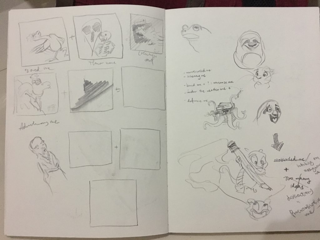
When I first started, I sketched out a few random ideas that were in my mind. In my first brainstorming session, this was what I came up with:
From up to down,
Me being very reluctant to leave the bed + Sunrise in a mountainous area = Sleepy me trekking up the mountain at 3AM while being in a sleeping bag (This is inspired by my trekking trip in Sikkim several years ago, where I had to wake up early to catch the sunrise but I was really sleepy)
Greedy Me + Food Buffet = Me gulping down everything
Me poor like a church mouse + shopping mall on sale = Me buying everything I want but starving for the rest of the week
Me feeling cold + hot spring = Roasted but satisfied me
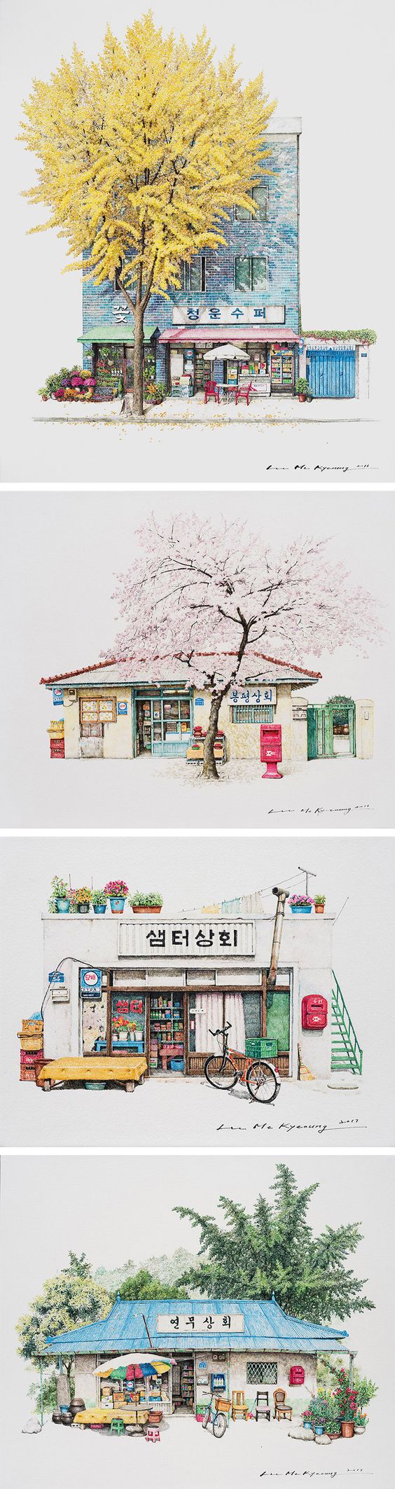
The reason I wanted to use architectural settings (the shopping mall and bath house) is because I was initially inspired by a illustration artist Me Kyeoung Lee who illustrated South Korean Corner Stores:
Accessed from http://www.thisiscolossal.com/2017/03/corner-store-illustrations-by-me-kyeoung-lee/
However, I couldn’t generate sufficient ideas that make use of architecture illustrations and had to abandon this concept as it was causing my ideation to be very restricted.
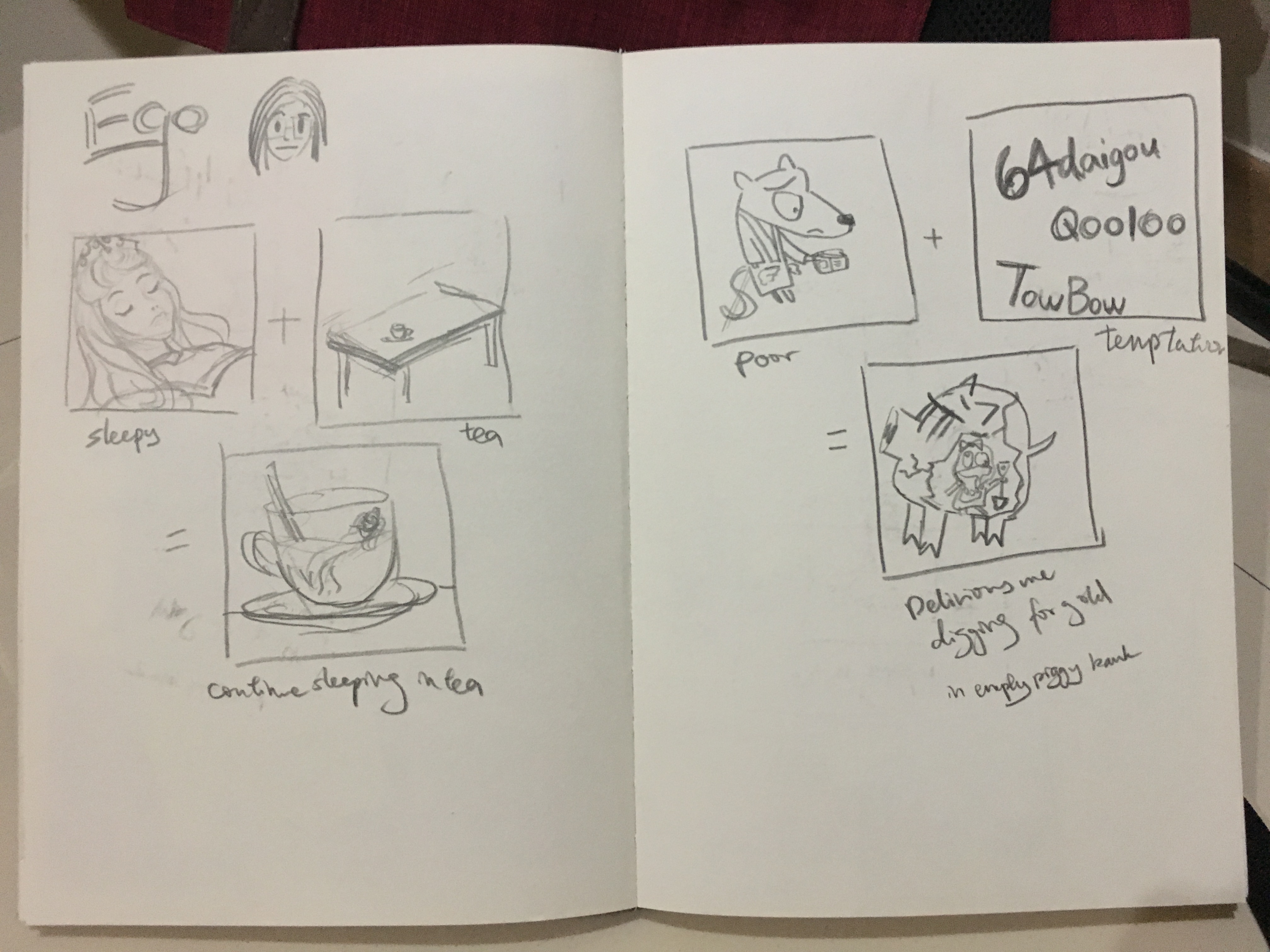
Following that, I continued brainstorming for more possible equations
Left: sleepy me + tea = me continue sleeping in tea
Right: Poor like a church mouse me + bombarded by cheap deals on online shopping sites like Taobao and Ezbuy = Delirious me digging for gold in an empty piggy bank while holding up shopping loots.
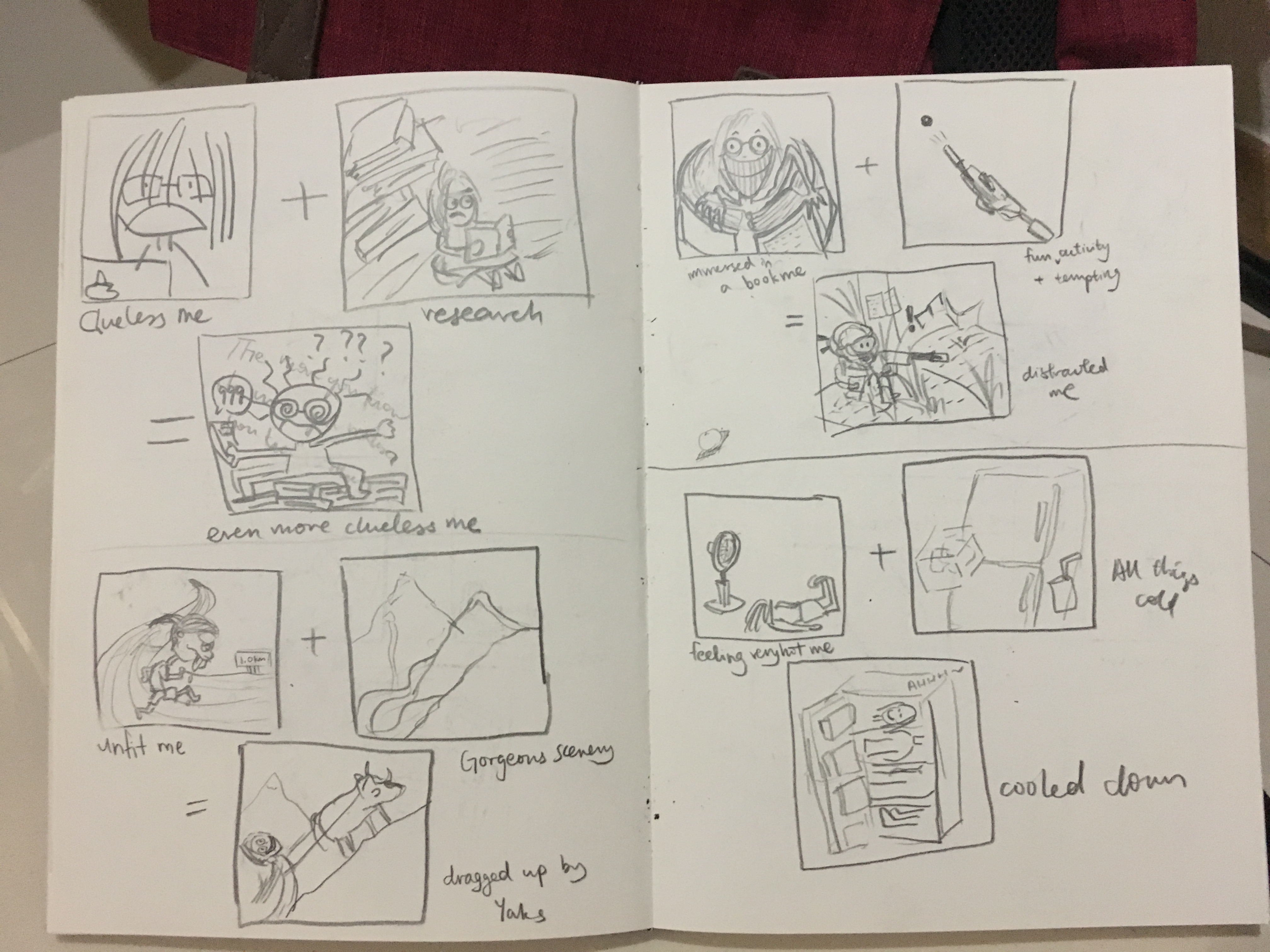
Left up: Clueless me working on assignments + Research = Even more clueless me
Left down: Unfit me + Gorgeous scenery in mountains = ‘trekking’ up to admire the scenery by being dragged by the yaks
Right up: Me being immersed in a book + a fun and highly tempting activity = me being distracted while still trying very hard to reading the book
Right down: Me feeling very hot + all things cool = me getting cooled down as if I am dissected and fitted into different sections of the fridge
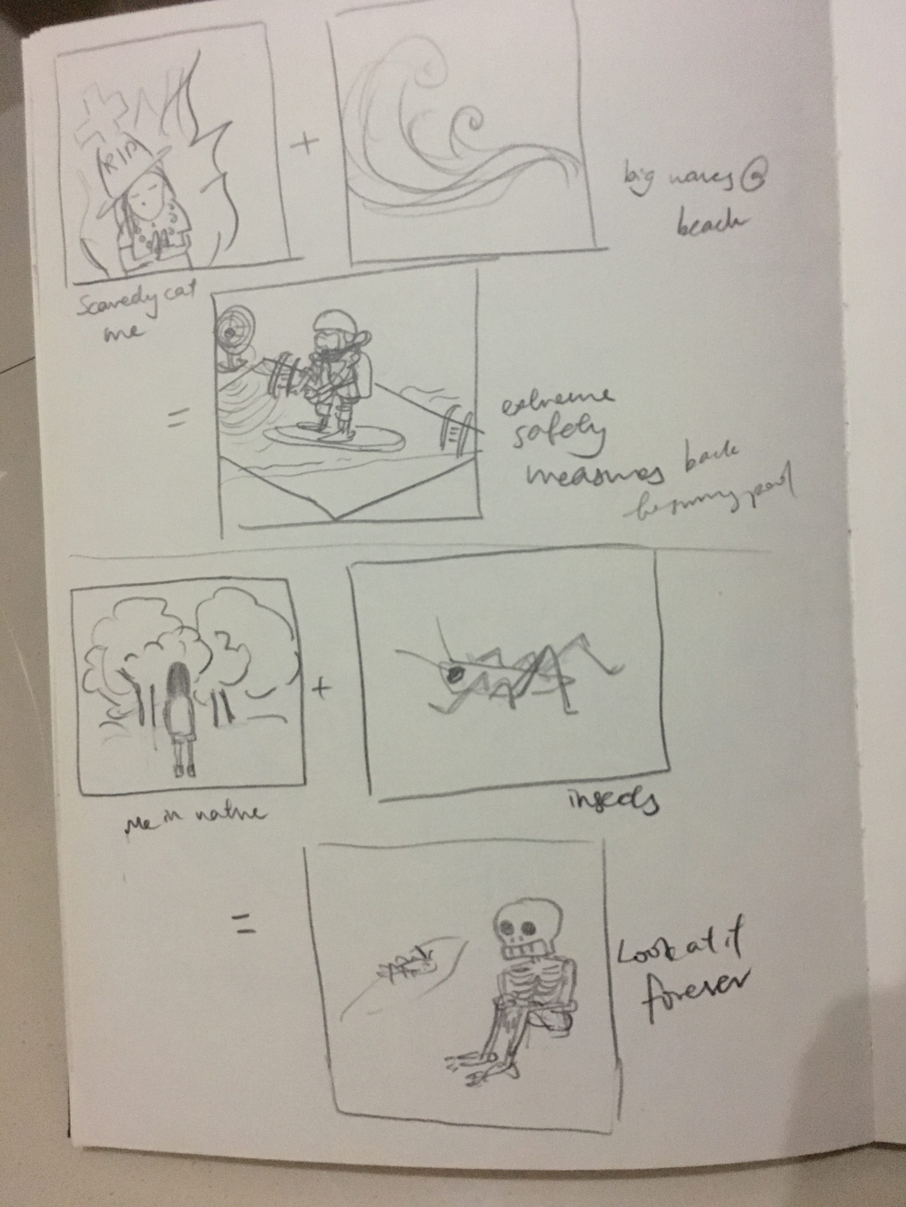
Up: Scaredy cat me + big waves on a beach = me taking extreme safety measures and only daring to go to a swimming pool
Down: Me in Nature + I see cool insects = Me staring and admiring at the insect forever
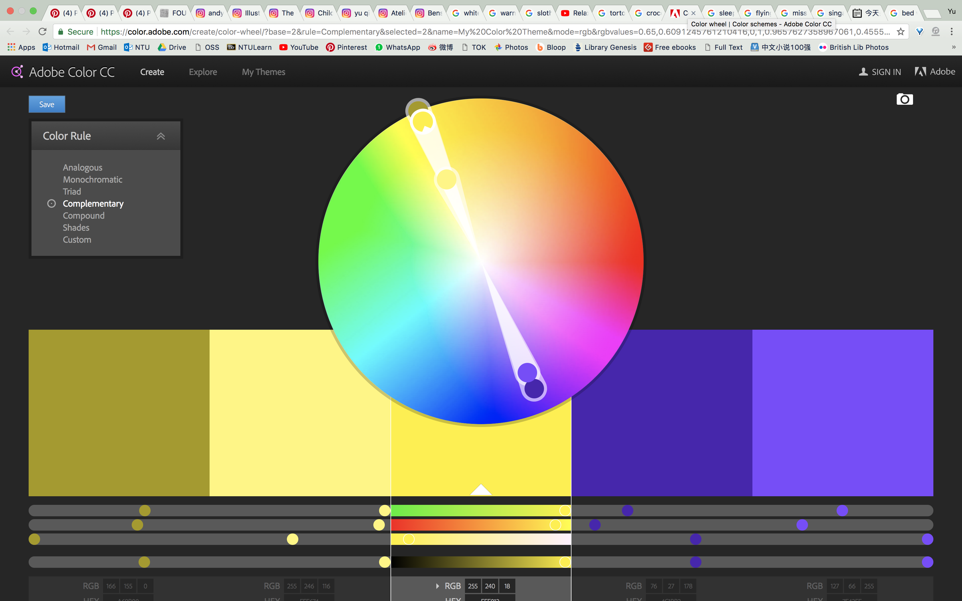
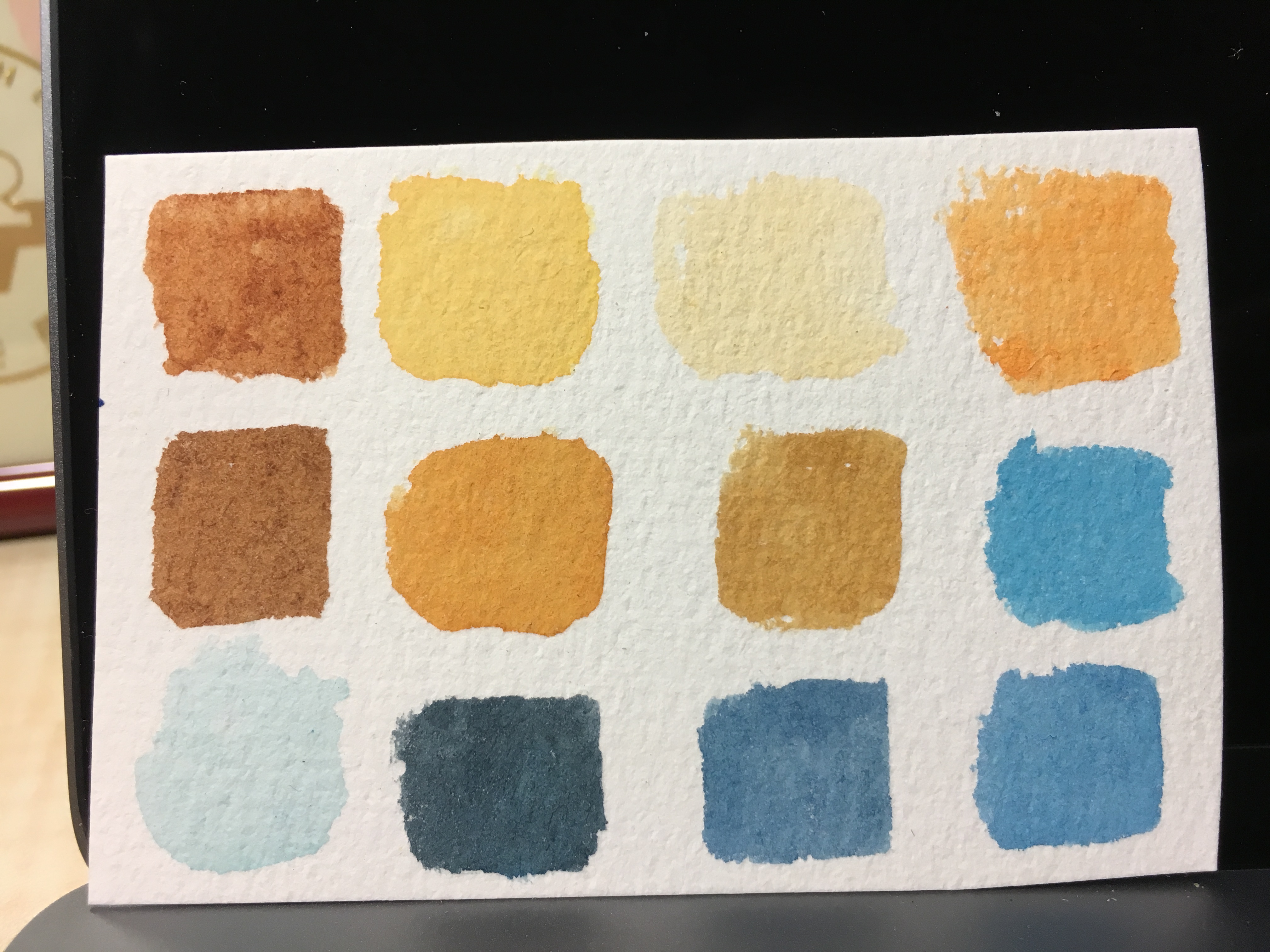
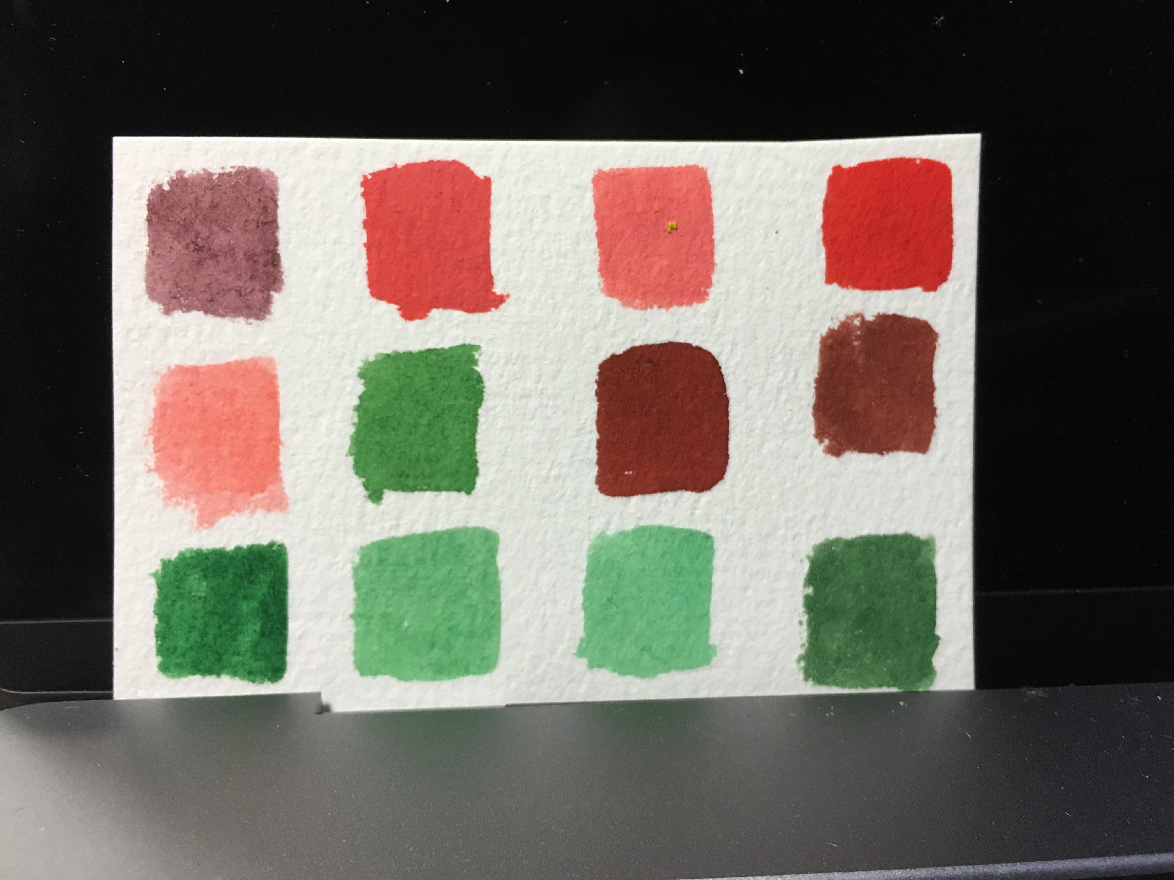
Narrowing down to several ideas that I am more fond of, I decided to work on thumbnail sketches to get a sensing of the colours and composition of the equations. I have decided on complementary colours because I was not confident of handling the very versatile watercolours (especially when the paint mix to form another colour) and restricting to two colours will help a lot.
After the thumbnail sketches, I was more or less settled on the following:
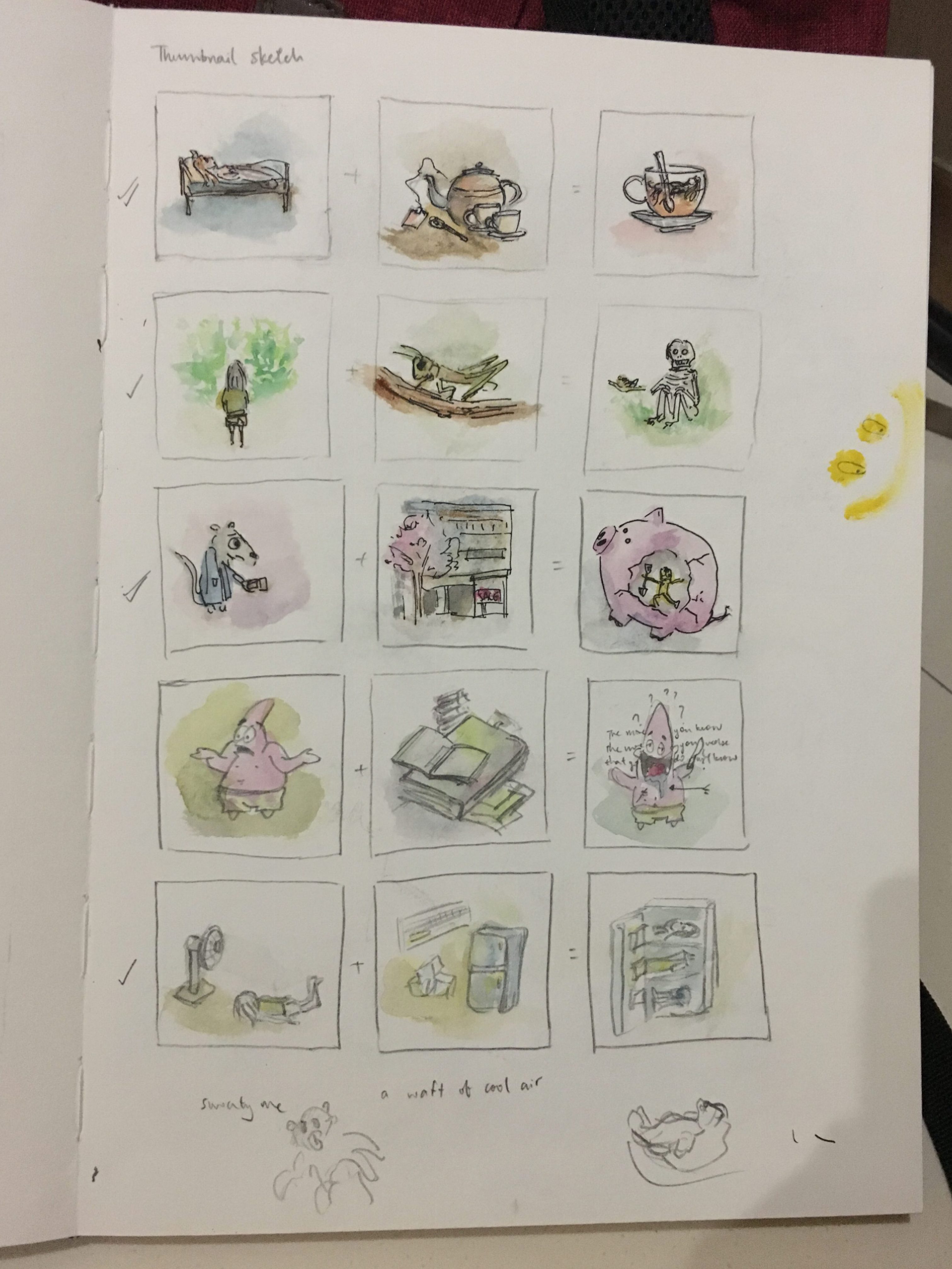
sleepy me + tea = still very sleepy me
poor like a church mouse = shopping deals = me spending everything
Me feeling very hot + all things cool = me getting cooled down
I was unsatisfied with the rest of the ideas and decided to explore further.
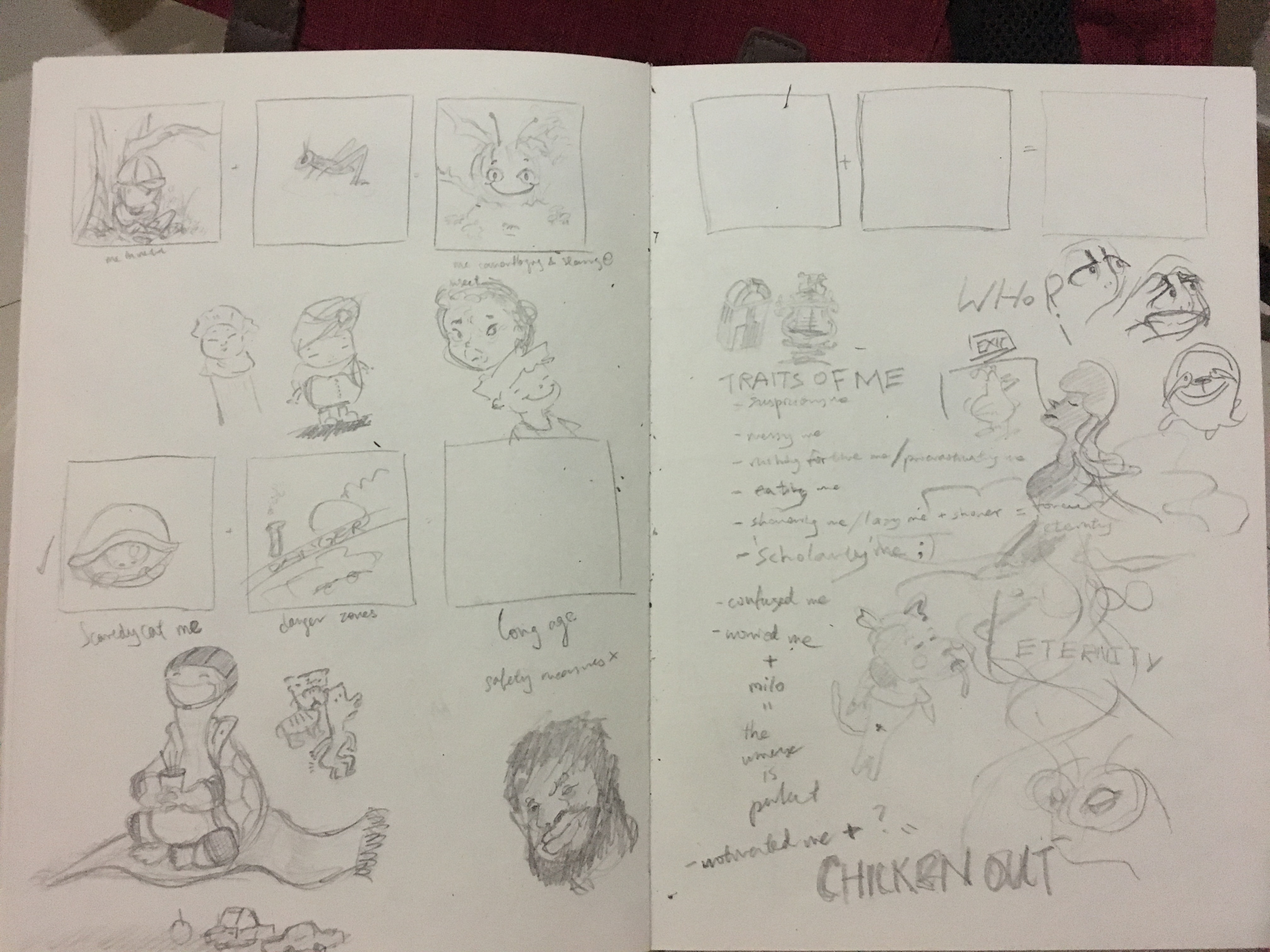
Left top: me in nature = cool insects = me camouflaged as the same insect while quietly staring at it, being careful not to scare it away
Left bottom: Scaredy-cat me + danger = me with extreme safety measures and living to long age
Right: I listed down traits of myself to help identify potential ideas to work on.
More sketches…
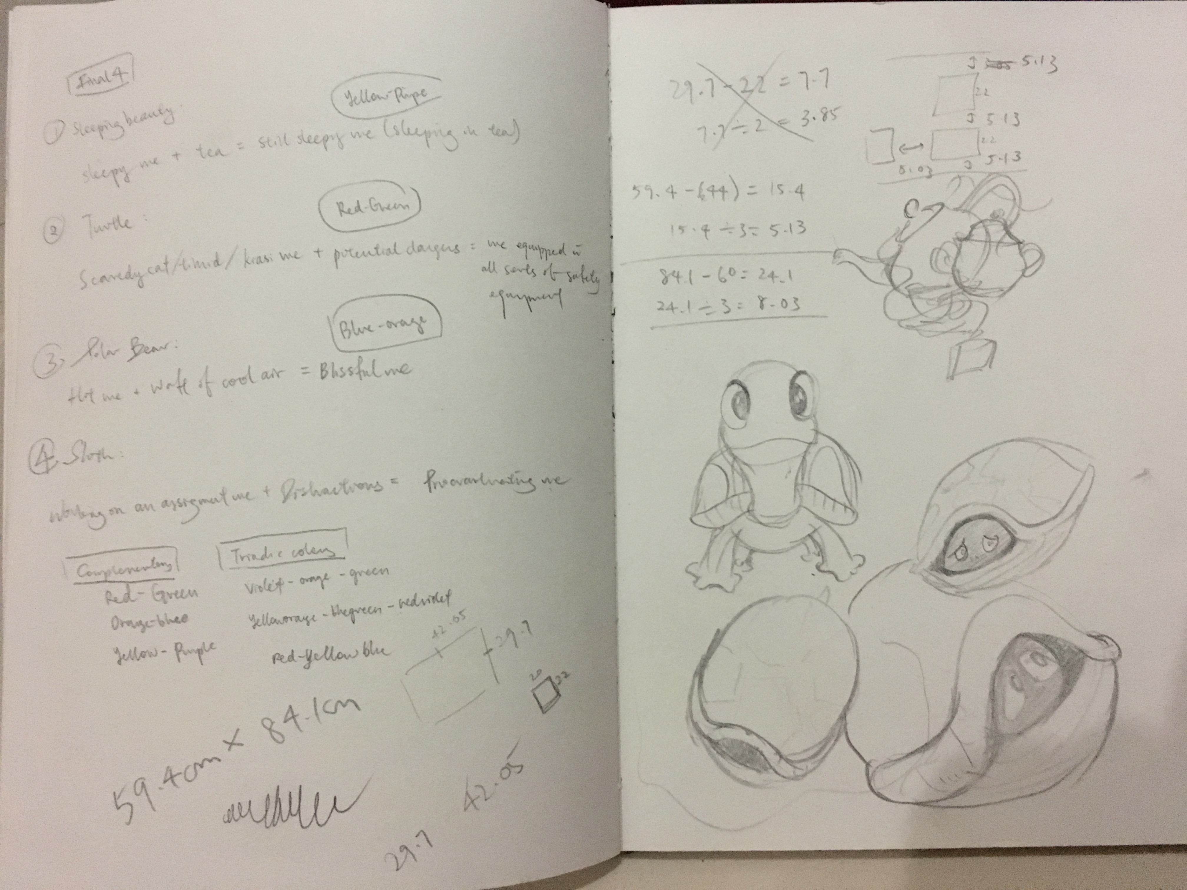
Here, I’ve finally decided on the final four ideas:
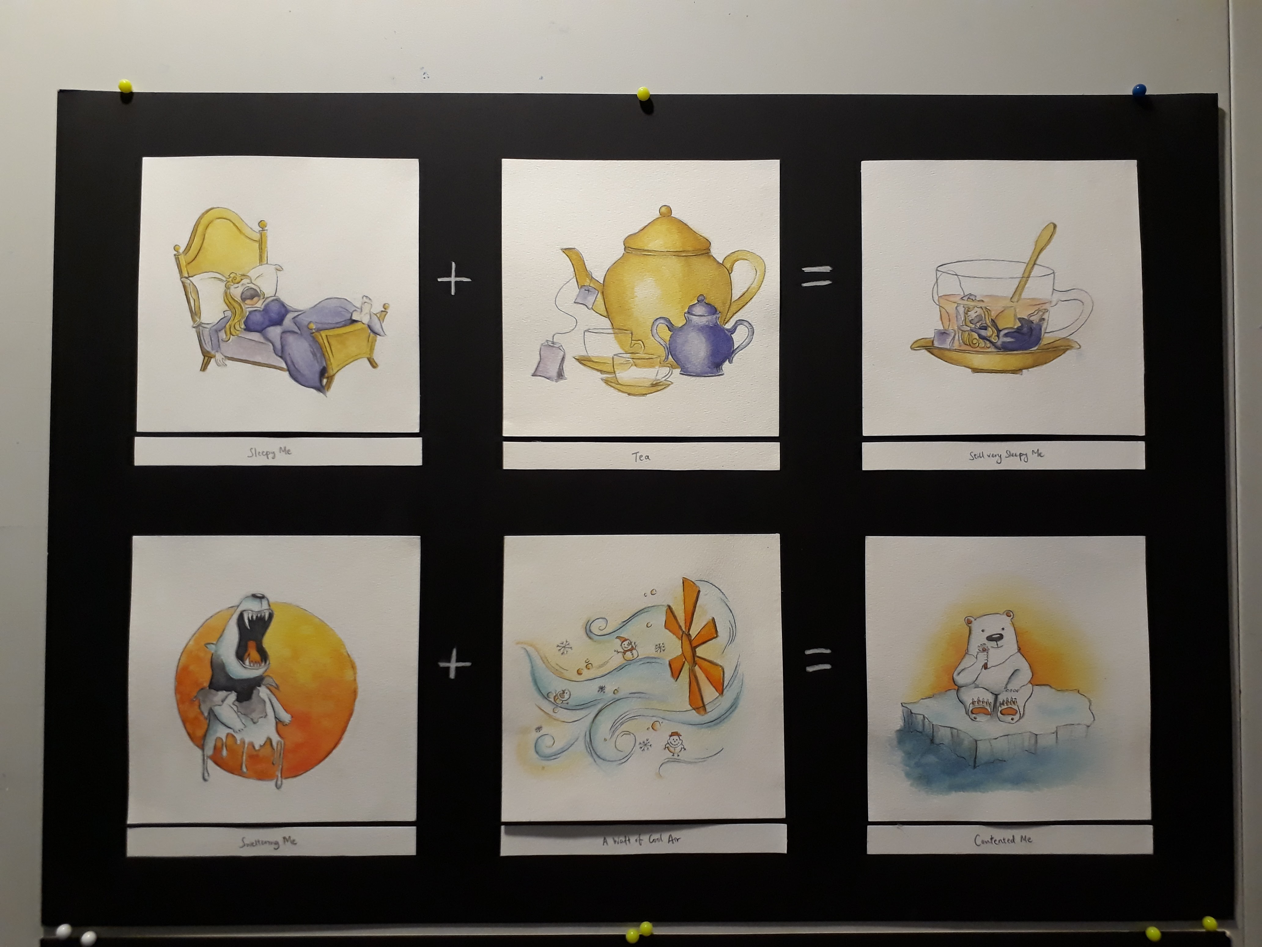
Sleepy me + tea = still very sleepy me
Scaredy-cat me + Dangers = me with extreme safety measures
Me feeling very hot + a waft of cool air = blissful and contented me
Me working on assignments + distractions = Procrastinating me
Moving on, I did a first draft of the illustrations to get an even better idea of what I am expecting. However, it went wrong when I used a marker to outline the drawings before painting over. As a result the marker smudged when the paint is applied, causing the colour to be a few shades darker and dirty as well. Although this made the end-colour less representative of the actual one, it was nevertheless useful in allowing me to decide which parts to be coloured what colour.
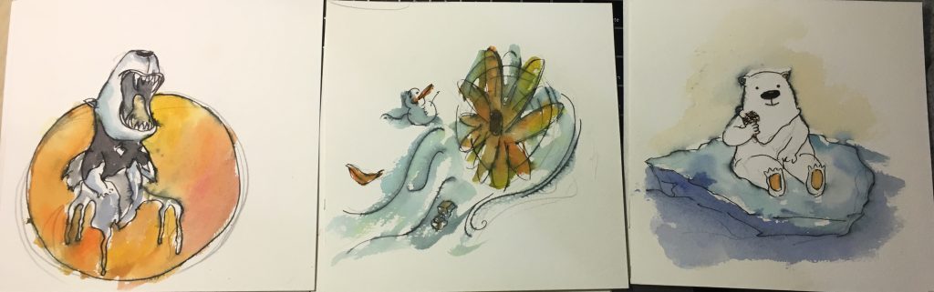
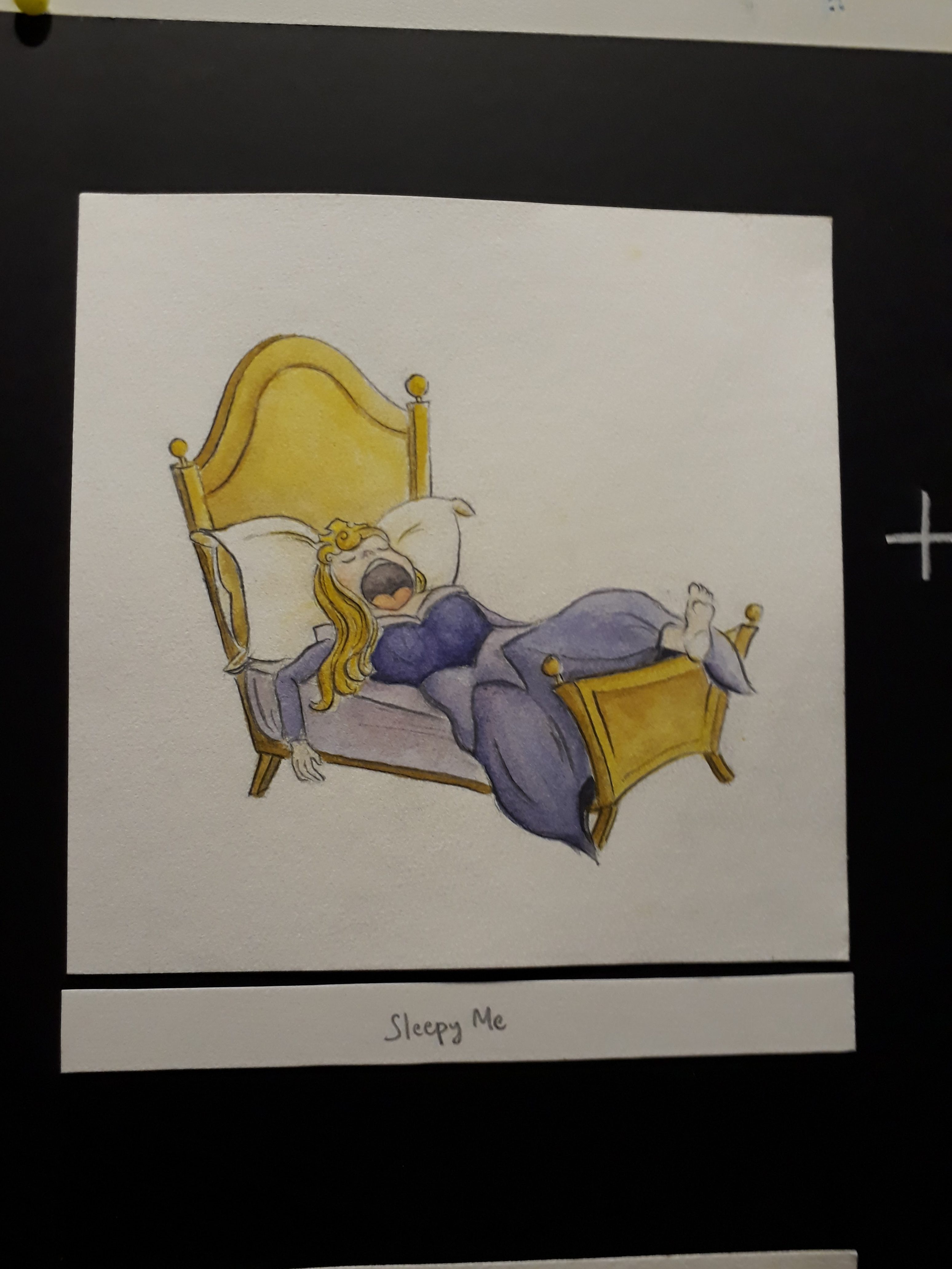
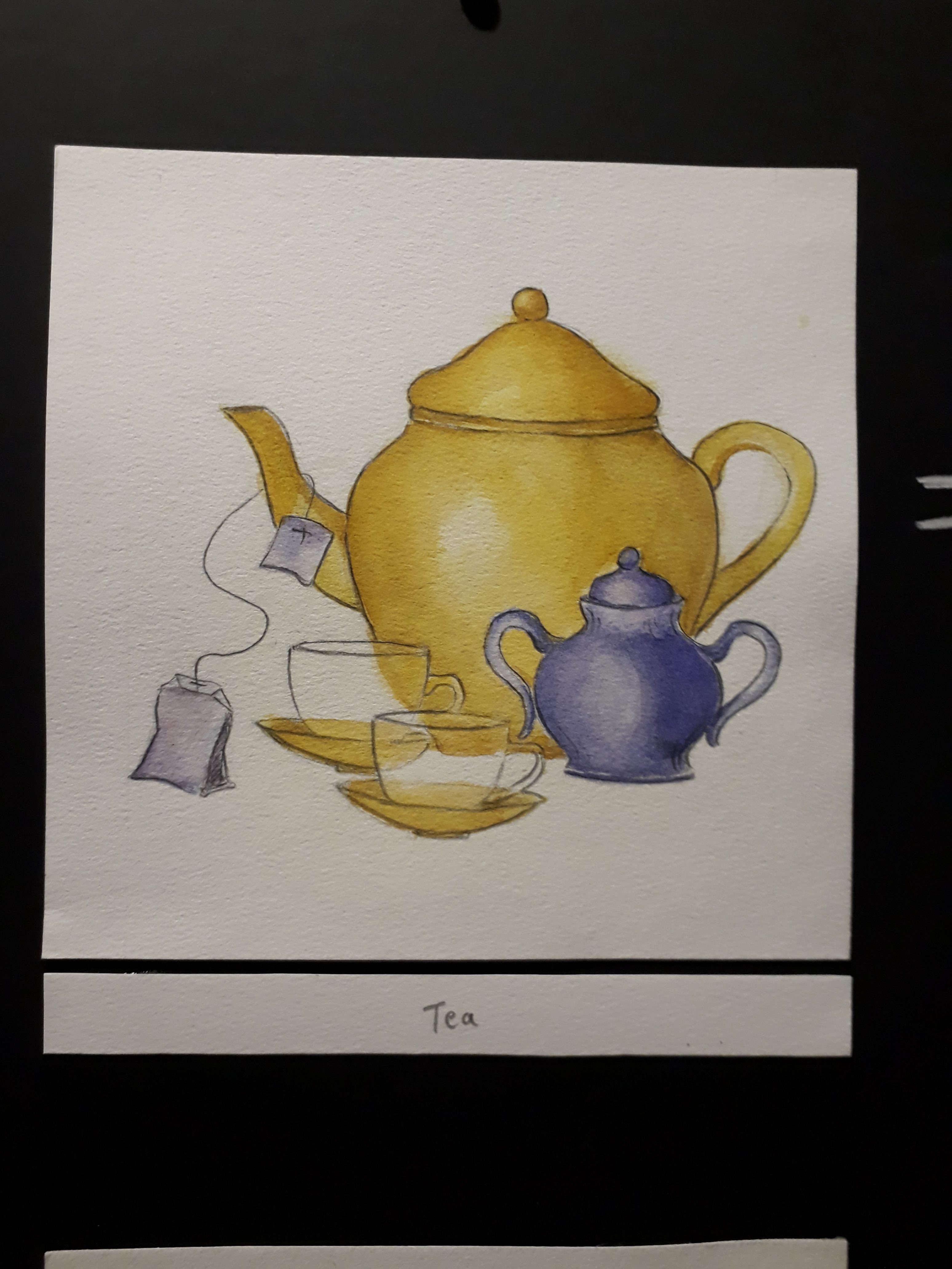
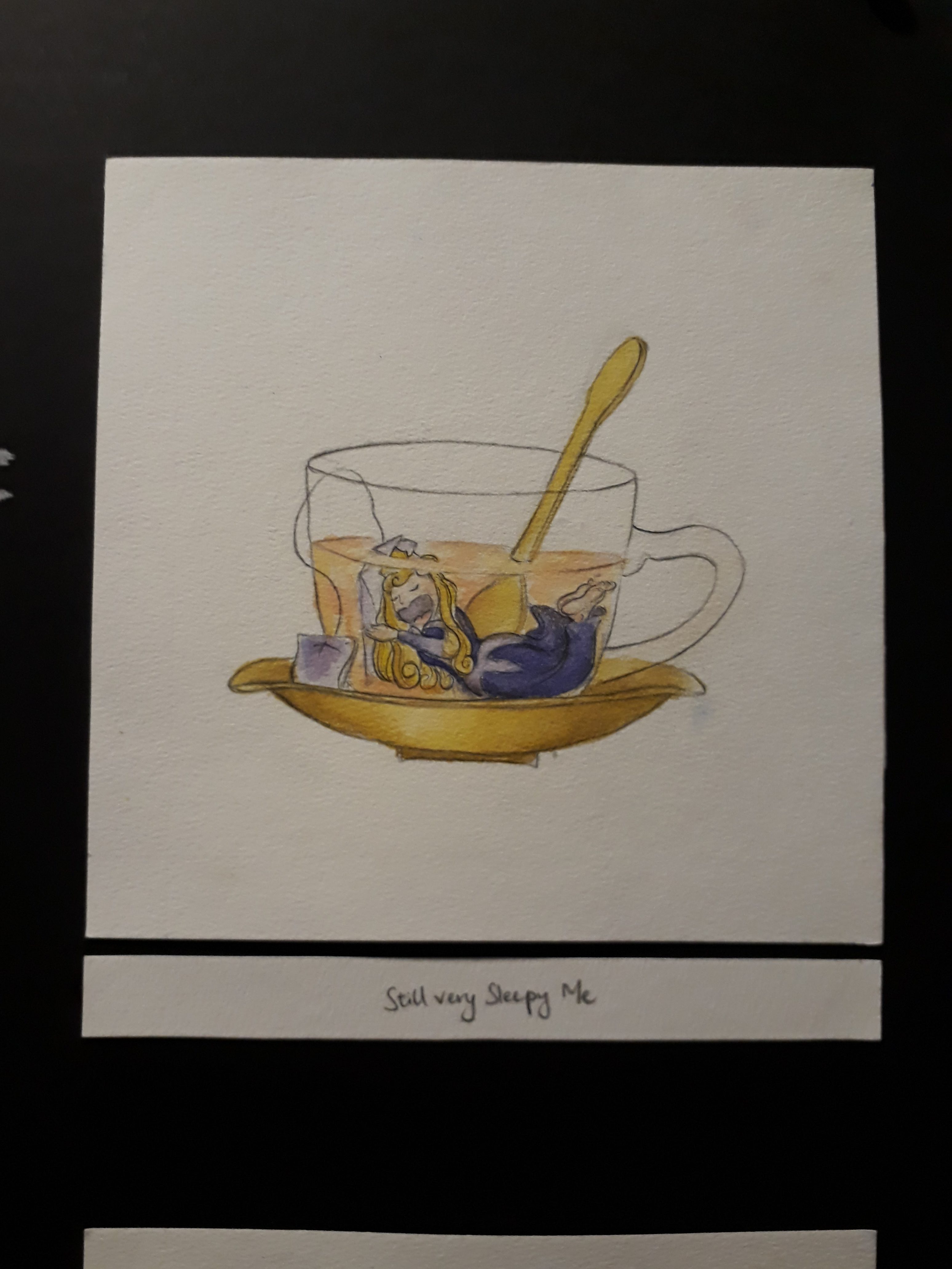
1. Sleepy me + tea = still very sleepy me
I used sleeping beauty because one of the most prominent feature of her is, well, sleeping; and so I thought it would be very apt to use sleeping beauty to represent the very sleepy me.
In the not-too-long-ago past, tea used to be an effective way to wake myself up. However, perhaps due to the overdose of tea as a result of many many late nights, somehow it’s effectiveness has reduced. Maybe my body has gotten used to it.
Anyway, this equation is a very apt description of myself these days, where I’m perpetually sleepy all day around, and even after gulping down tea, I still feel sleepy.
Colour: Yellow-purple. To represent sleeping-beauty (a princess), I chose to use purple since the colour represents ‘royalty’ as learned from the colour theory presentation by my peers. Yellow was a suitable colour as it suits the colour of tea.
References while drawing:
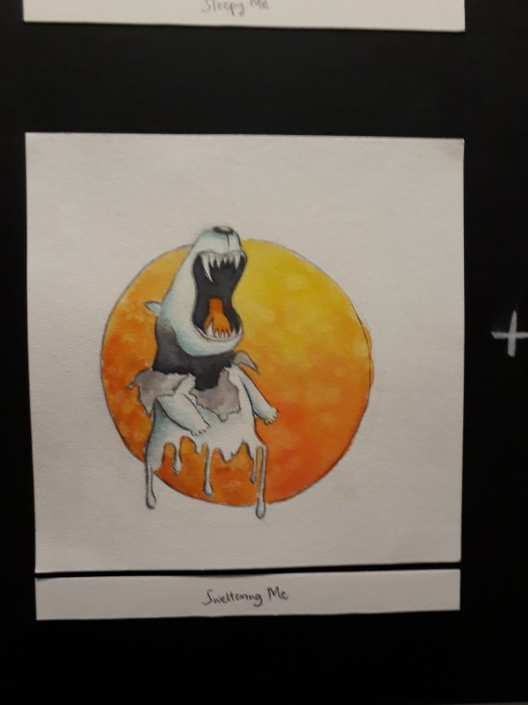
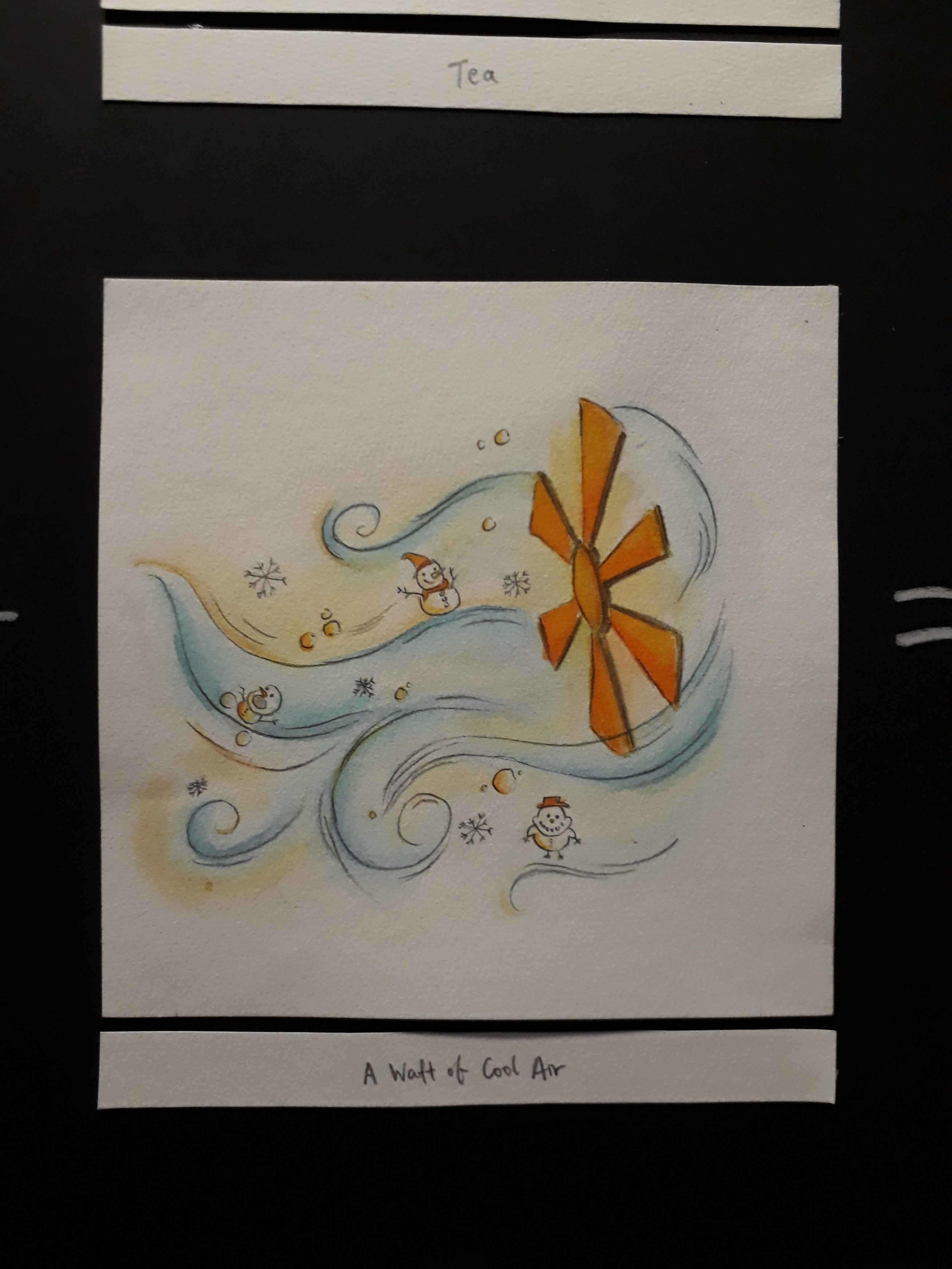
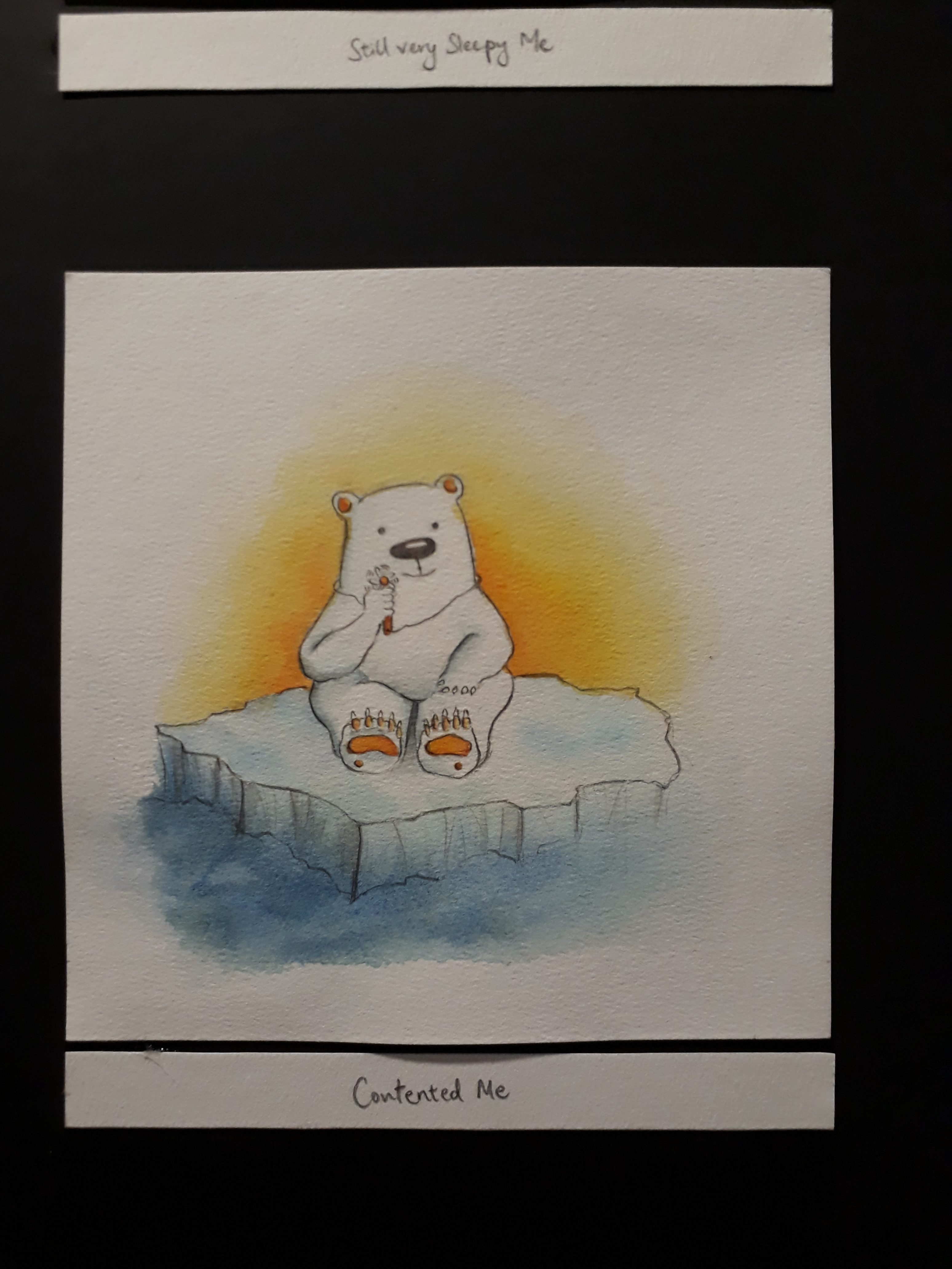
Me feeling very hot + a waft of cool air = blissful and contented me
I used a polar bear because they are very adversed to heat and warmth and they are the ones that need a cold climate the most.
In the first frame, the polar bear is so hot that it has to tear of its fur coat to reveal the black skin below. Also the lower body of the polar bear has melted. In the second frame, there is a waft of cool air, as shown by the little snowman. Lastly, it is revealed that the wind is just from the very tiny hand-held fan, but even so the small amount of cool wind is enough to satisfy the polar bear.
Colour: Orange-blue. Orange to represent the sun/warmth/heat in the first frame, and blue to represent coolness/ice bergs in the Arctic.
References while drawing:
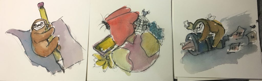
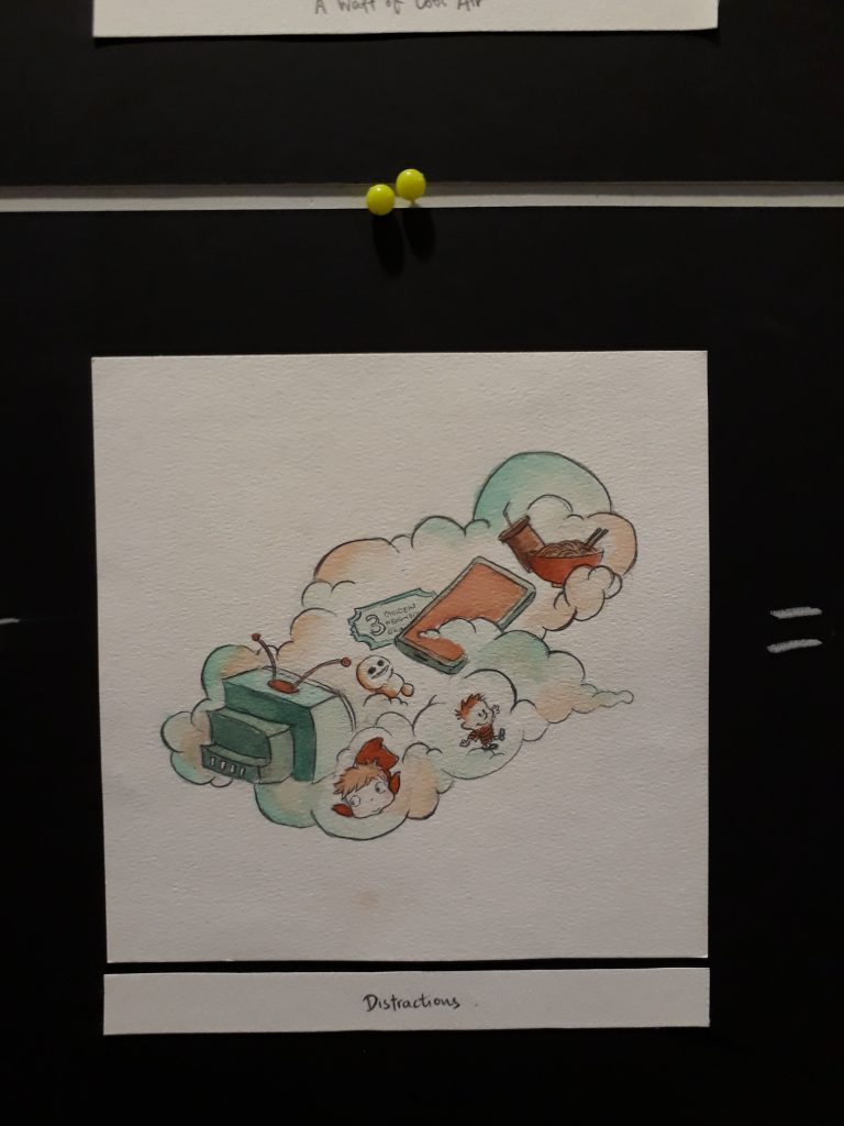
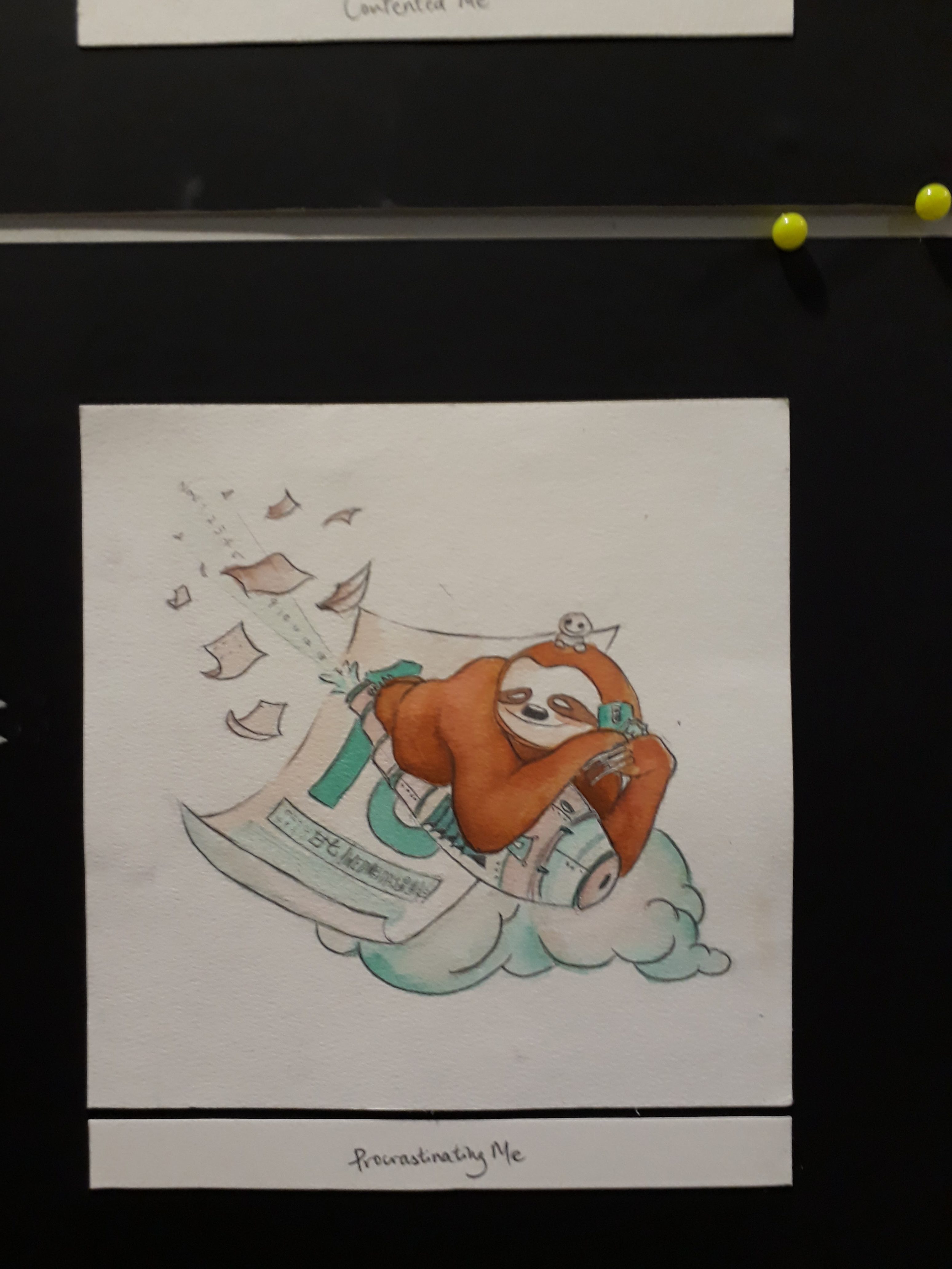
Me working on assignments + distractions = Procrastinating me
I am usually a very slow worker, and hence I represented myself as a sloth. At the same time, I have such a wide span of interests that I often digress from my work. This include very random searches on google as well as sudden urges to read a book/watch a vid/ engage in some kind of activity. As a result, I often end up procrastinating and slow worker+procrastination= time will always fly past way too quickly than I’ll like. As seen in the third panel, I am riding on a rocket that is expelling calendar dates, signifying that time is passing very quickly while I indulge in other activities.
If you compare to the final work, you can see that the composition for this particular equation has changed a lot as I wasn’t satisfied with it.
Colour: Orangeishbrown-Turquoise. The colour is chosen so that the sloth can be more easily recognised compared to, say, a blue sloth or a green sloth.
References while drawing:
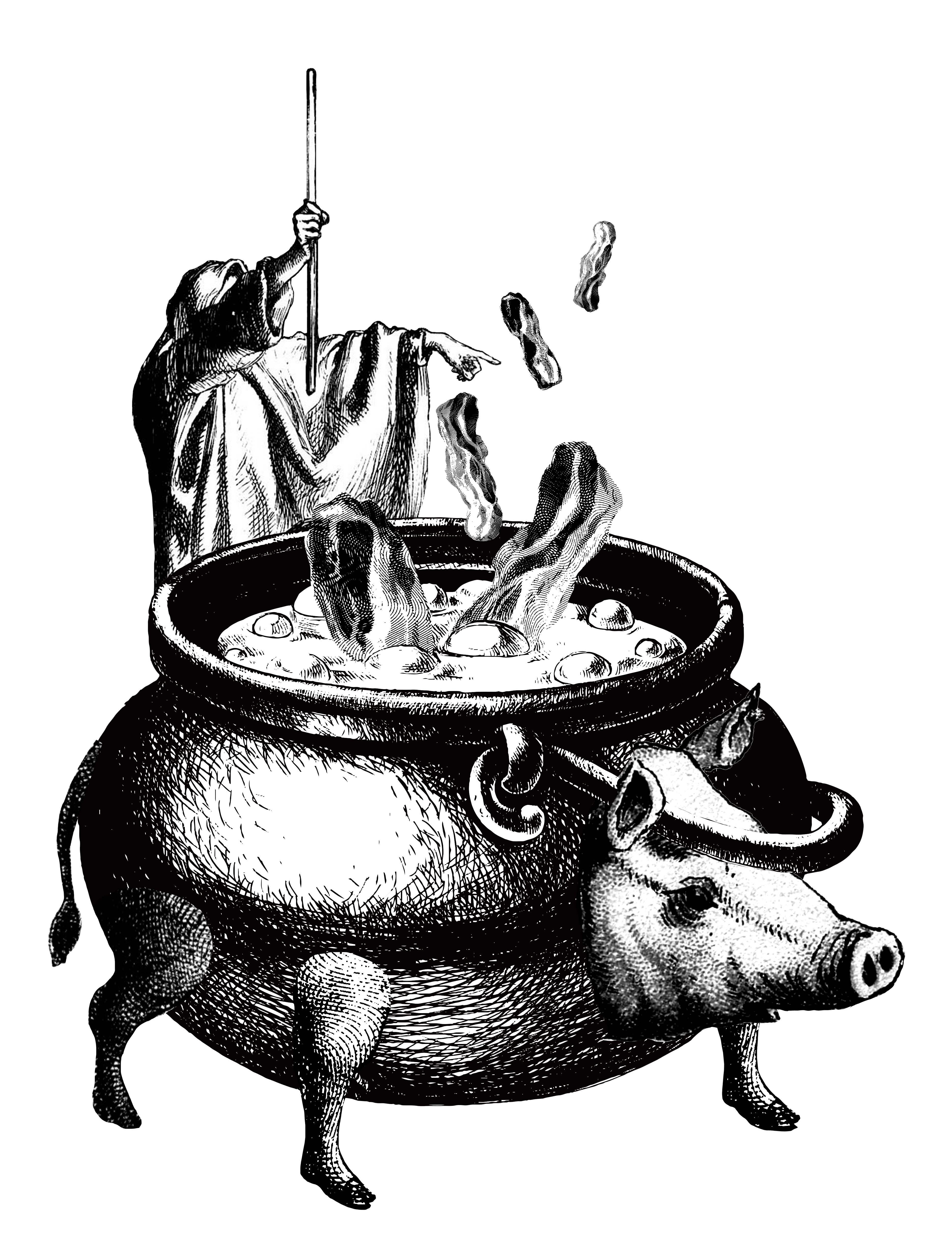
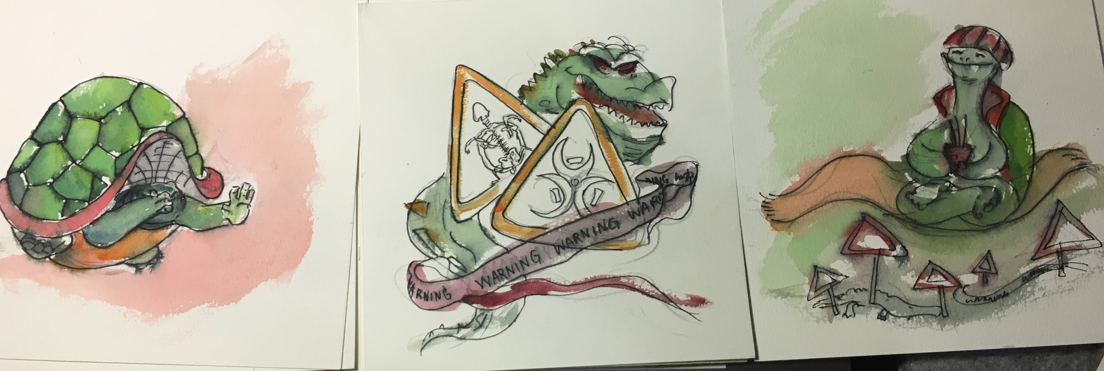
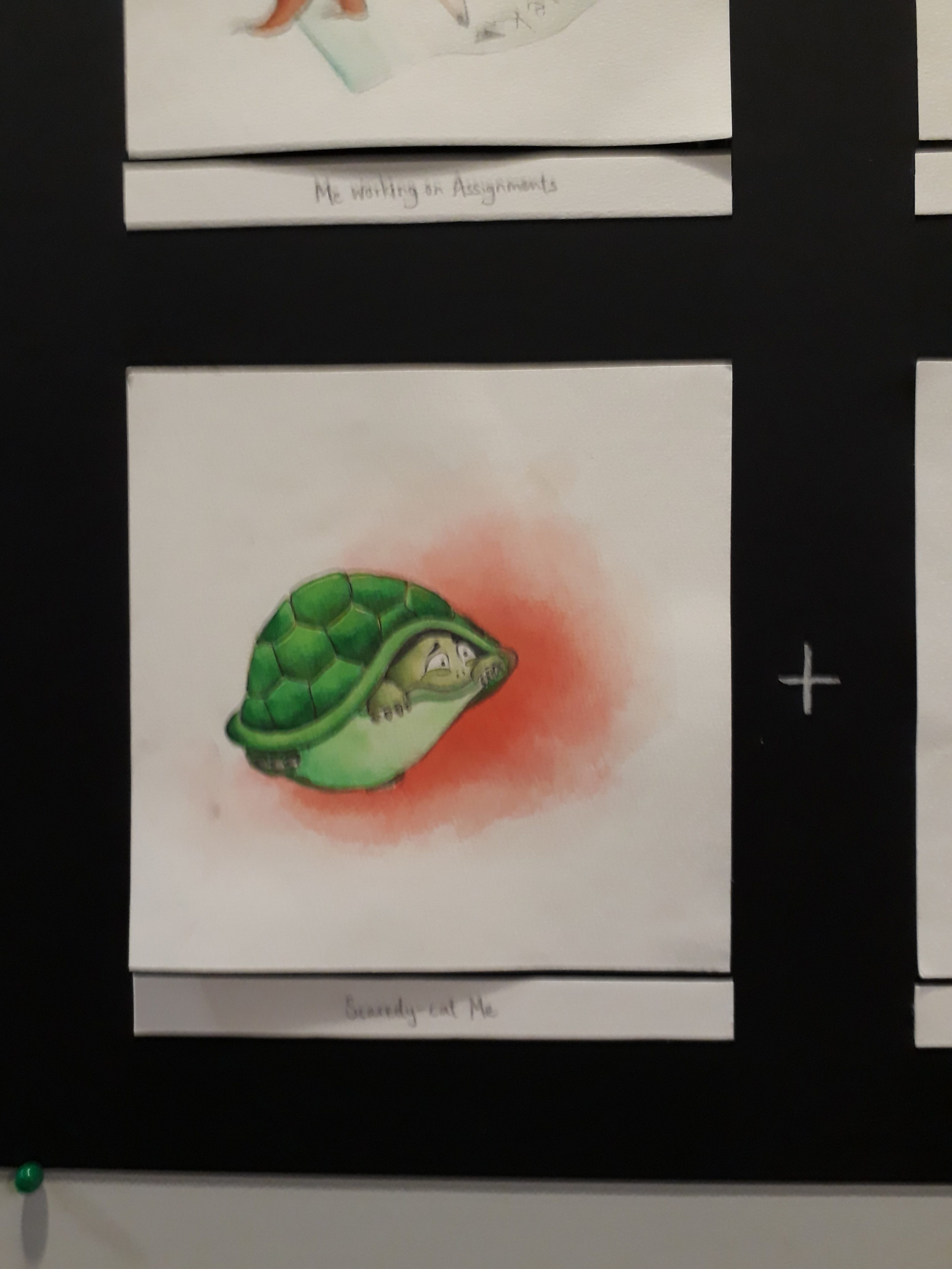
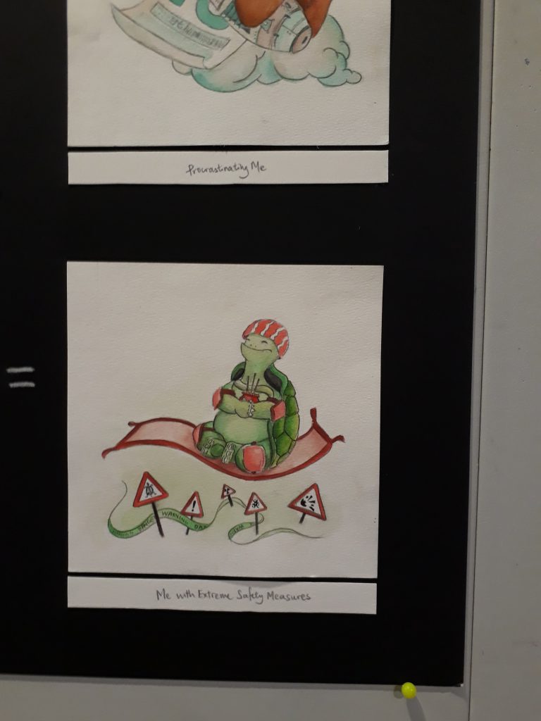
Scaredy-cat me + Dangers = me with extreme safety measures
I am somehow very imaginative when it comes to potential dangers/injuries that can occur in all sorts of scenarios, and hence even though I really like adventurous activities, I also try my best to prevent myself from landing into any kinds of danger.
In the first panel, I drew a tortoise that is hiding in its shell to show that it is scared. The second panel illustrates all the danger zones and warning signs. In the third panel, the tortoise, armed with all sorts of safety equipments like helmets, elbow guards, knee guards, as well as joss sticks for praying, floats across the danger zones safely. This is rather ironic as a tortoise already has a very protective and hard shell, yet it still needs external equipment to protect itself from dangers.
Colour: Green-red. The choice of colour is very straightforward here: green because it best represents a tortoise, and red because red colour is a very intense colour associated with energy, war, and danger.
References while drawing:
Yay!
If you notice, in all the equations, the setting (2nd panel) will have some of its elements repeated in the final panel. This is initially found in a few equations in my very early thumbnail sketches
(This one!)
Mimi noticed it, and suggested that I repeat that in every equation, thus now you can see that the tea cup, the little fan, the distractions as well as the danger signs are repeated in the last panel.
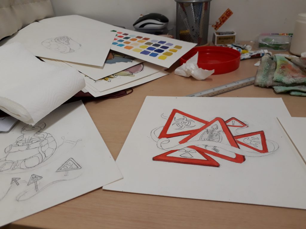
Working on the final product
Pencil sketch first…
Colour by colour..
The table in hall is so smal!
I didn’t take much photos while working on the final work ~(。☉︵ ಠ@)>
The final illustrations!!
I faced some problems deciding the colour for the bed frame and the mattress because I didn’t want entire bed+frame to be yellow as it’ll be difficult to tell them apart, but at the same time having a purple bed and a purple dress also result in the same problem. I end up opting for a lighter shade of purple for the mattress.
I couldn’t figure out how to show the transparency of the tea cups here :<
Here sleeping beauty hugs the tea bag as a pillow and continues sleeping while being submerged in tea.
The orange circle at the back represents the sun, and the polar bear is frustrated by the heat. That’s why the fur coat is peeling off to reveal the black skin underneath, and the lower body is also melting.
I added snowman and snow flakes and snowballs to show that the air is cool.
The fan element is repeated here. If you look closely, the polar bear is holding a tiny fan!! This shows that when you are feeling extremely hot, even a tiny waft of cool air from a tiny fan is enough to satisfy you.
The pencil lead is broken, after only writing my surname… this goes to show my slow-ness. There are so many empty assignments at the back waiting to be worked on, yet I’m still writing my name on the first paper…
This are some of the things that distracts me: drama series, animation movies, CALVIN AND HOBBES, my phone, and fooood. I used the cloud to represent how these things are always lingering in the back of my mind, waiting for the opportunity to pounce out and steer me away from work.
The distractions are repeated here if you look closely! Also, the date of the calendar is actually the submission date, which is 15th November. The trail of numbers that are ejected from the rocket is actually dates: Nov 1, 2, 3, 4, all the way to 14.
A scared me is depicted as a tortoise in a shell.
I wanted to illustrate danger here, but simply using the typical danger signs and human skull didn’t feel quite enough, hence I changed the human skull danger sign to a tortoise skeleton so that it ties in with the tortoise theme better.
Here, a blissful and safe tortoise floats past all dangers, while praying fervently for its safety and adopting all measures to protect itself on top of its hard turtle shell.
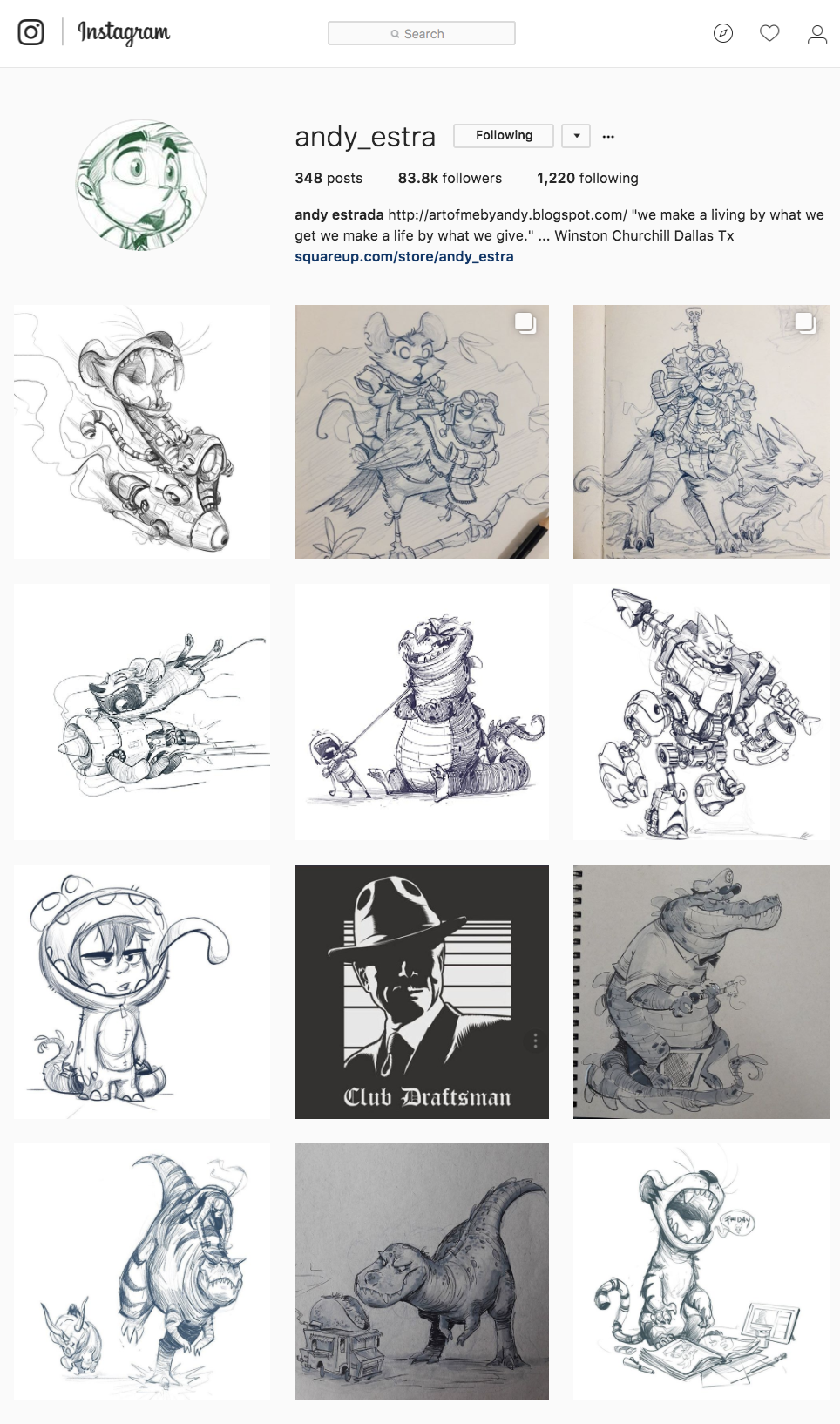
For this project, I was aspiring towards a children book kind of illustration style. I was inspired by the following artists who I follow on instagram:
1. @andy_estra // Andy Estrada
Screenshot taken from https://www.instagram.com/andy_estra/?hl=en
I really like his illustration style! It is very quirky, expressive and dramatic. If you observe my final work, I have actually referenced him quite a bit in terms of drawing the facial expressions and learning how I should work with movement in each panel
2. @bshum79
I really like his use of vibrant watercolours as well as his use of space.
Screenshot from https://www.instagram.com/bshum79/
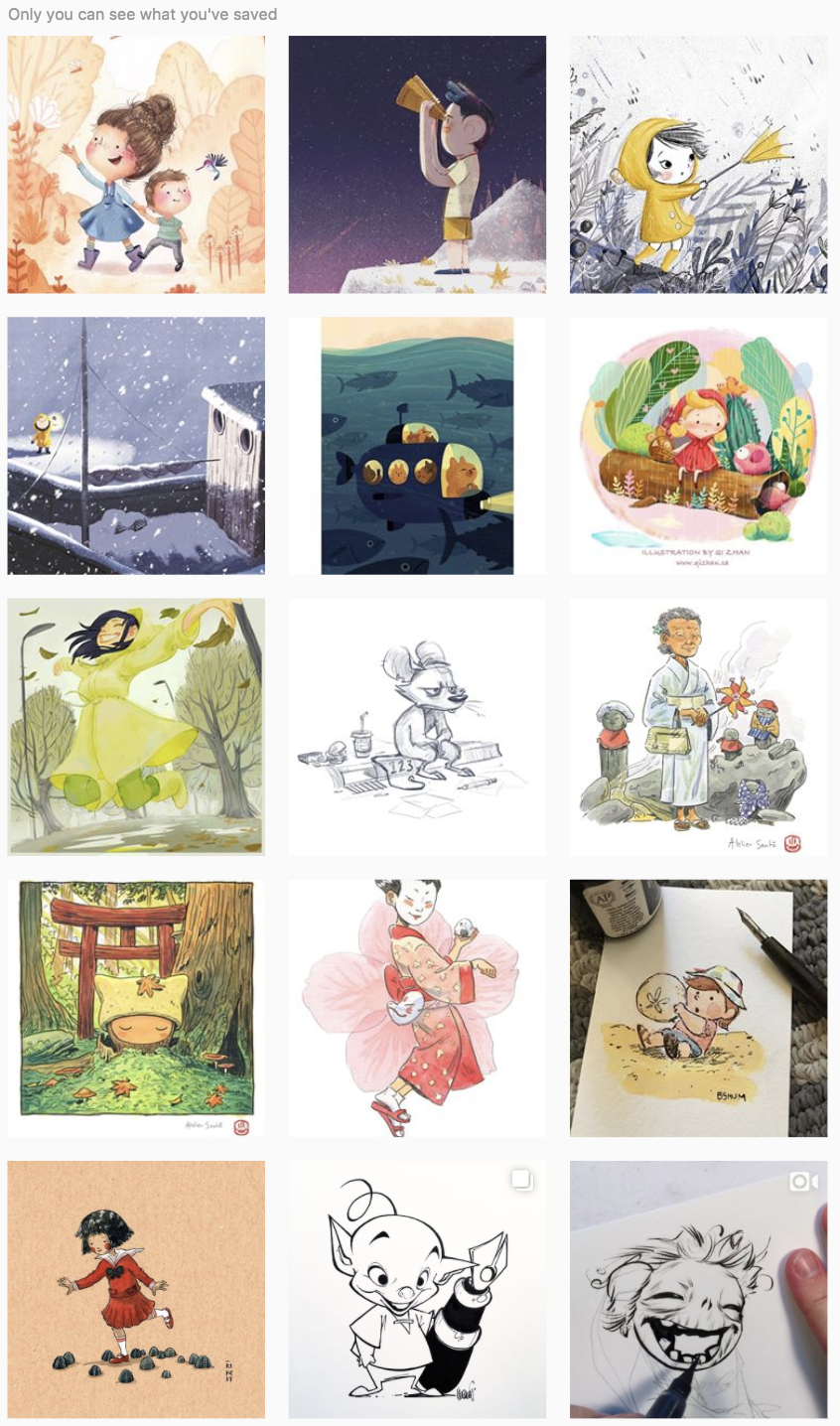
3. Various illustrations from children books!
For this, there is no fixed artist that I was referencing. I was mainly looking around at children book illustration style as that was the kind of look I was going for in my work. I have been looking through various Instagram accounts that posts such works such as @childrenswritersguild and @childrenillustration.
Screenshot from https://www.instagram.com/childrenswritersguild/?hl=en
Some of the works I’ve saved from various accounts!
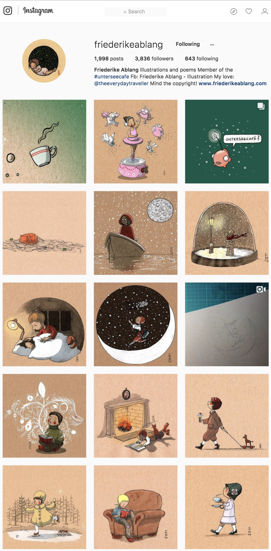
4. @friederikeablang
Initially, I was extremely keen to follow this style!! It is so clean and simple and nice. The way the artist made use of the brown paper as skin tone of people was also very intriguing. I even went as far as to private message the artist on instagram to ask what type of paper and paint were used. ミ●﹏☉ミ
Screenshot taken from https://www.instagram.com/friederikeablang/
Eventually, I decided to stay with watercolour because by the time he replied, it was kinda late to buy new materials already ?. Nevertheless, if you can tell, I was trying to emulate the way empty space is used. In my own work, I’ve tried to keep it uncluttered and plain.
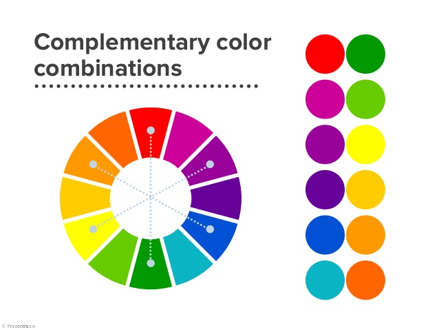
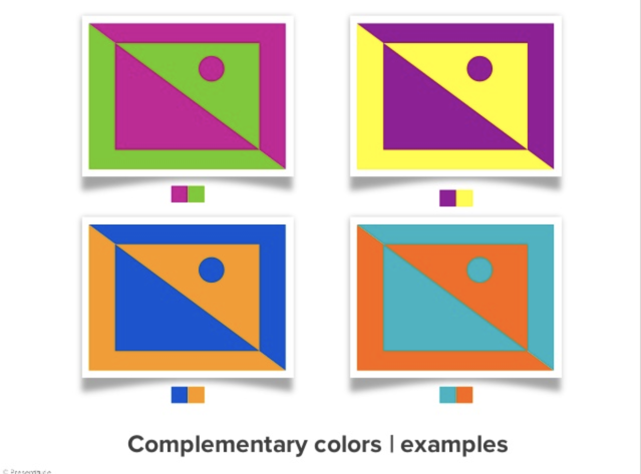
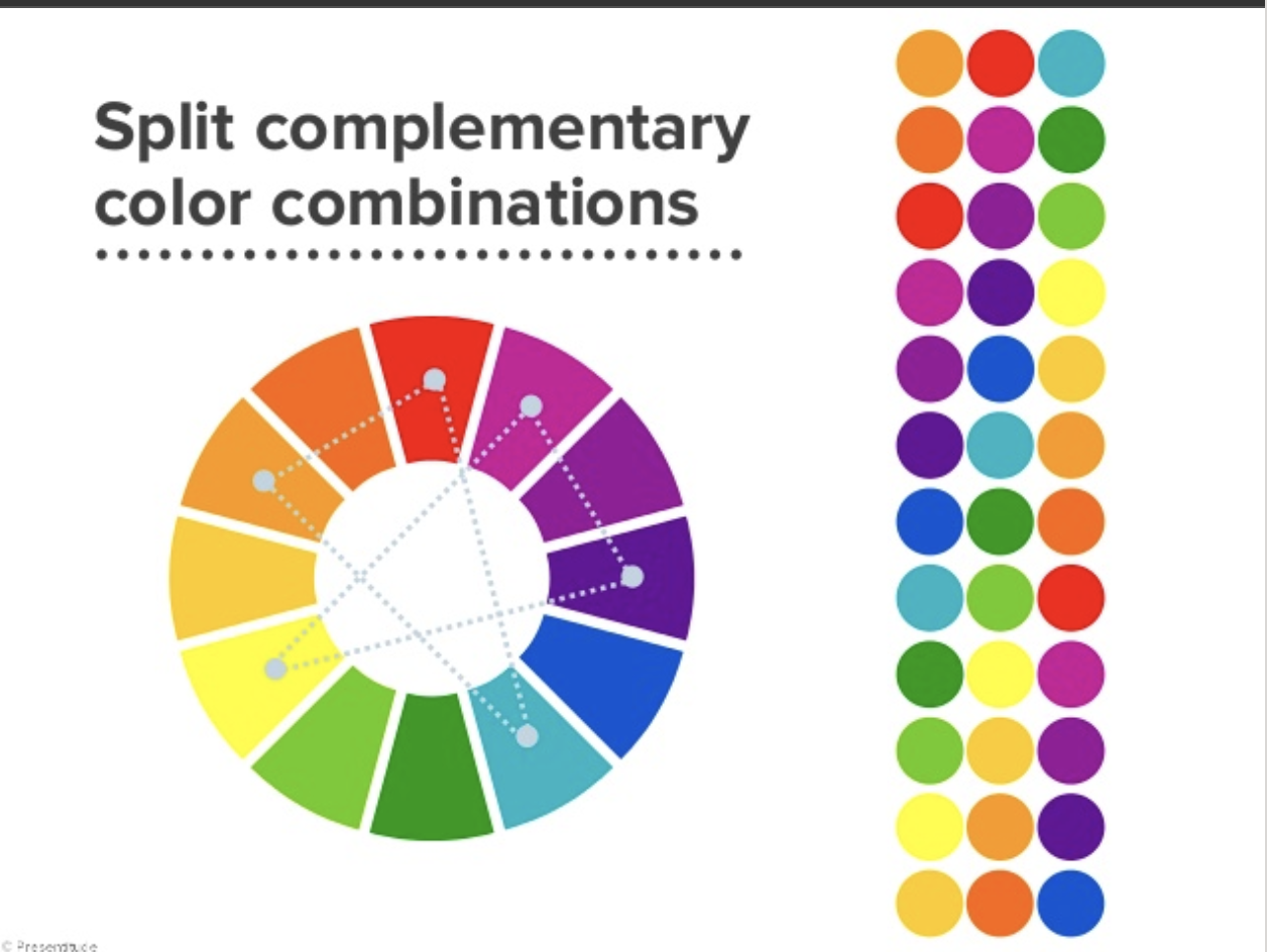
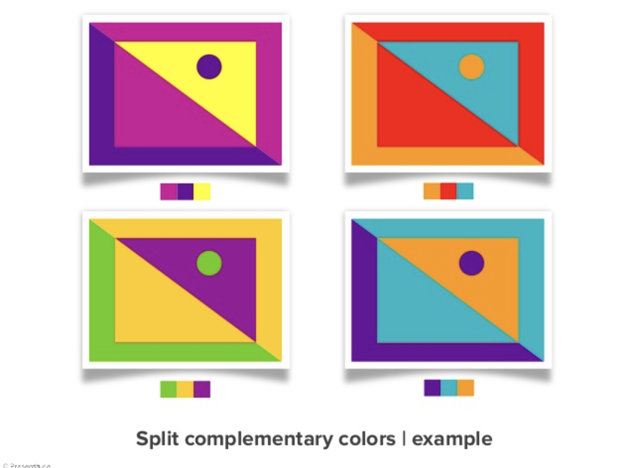
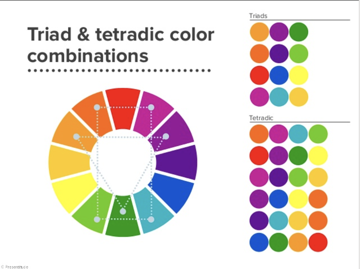
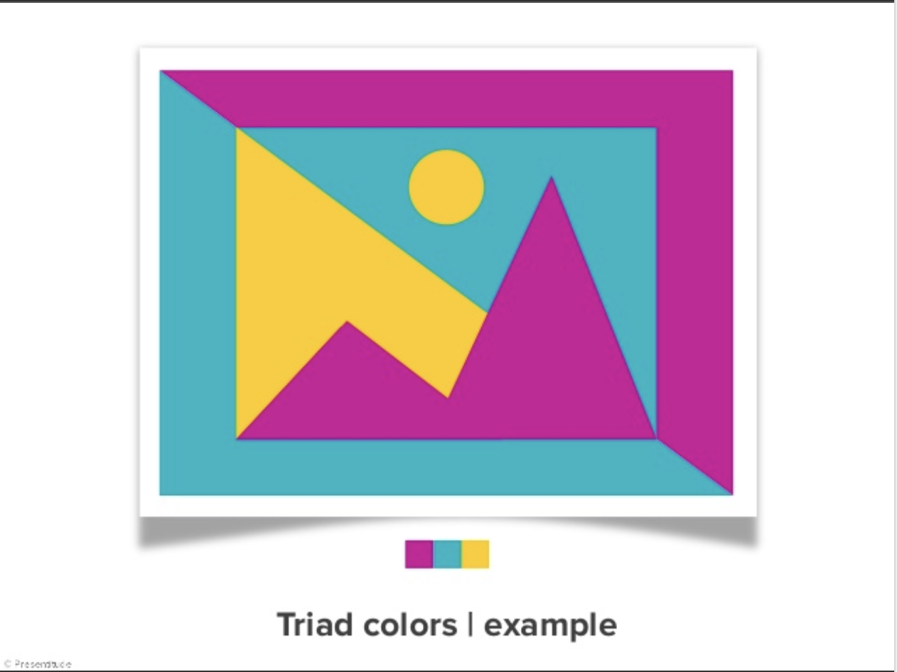
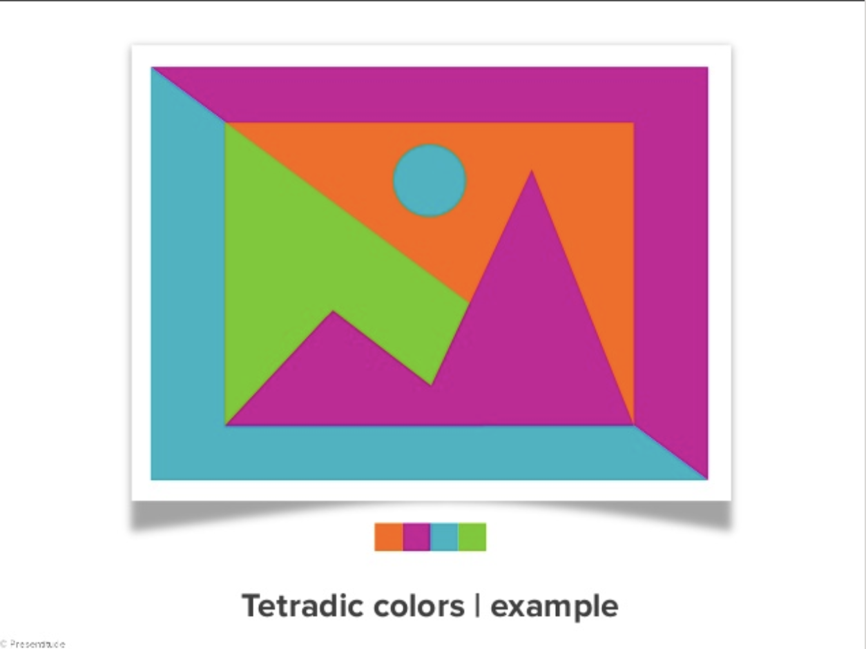
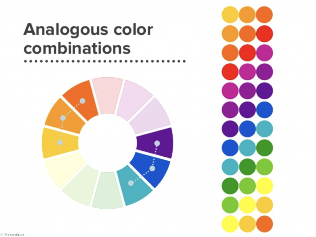
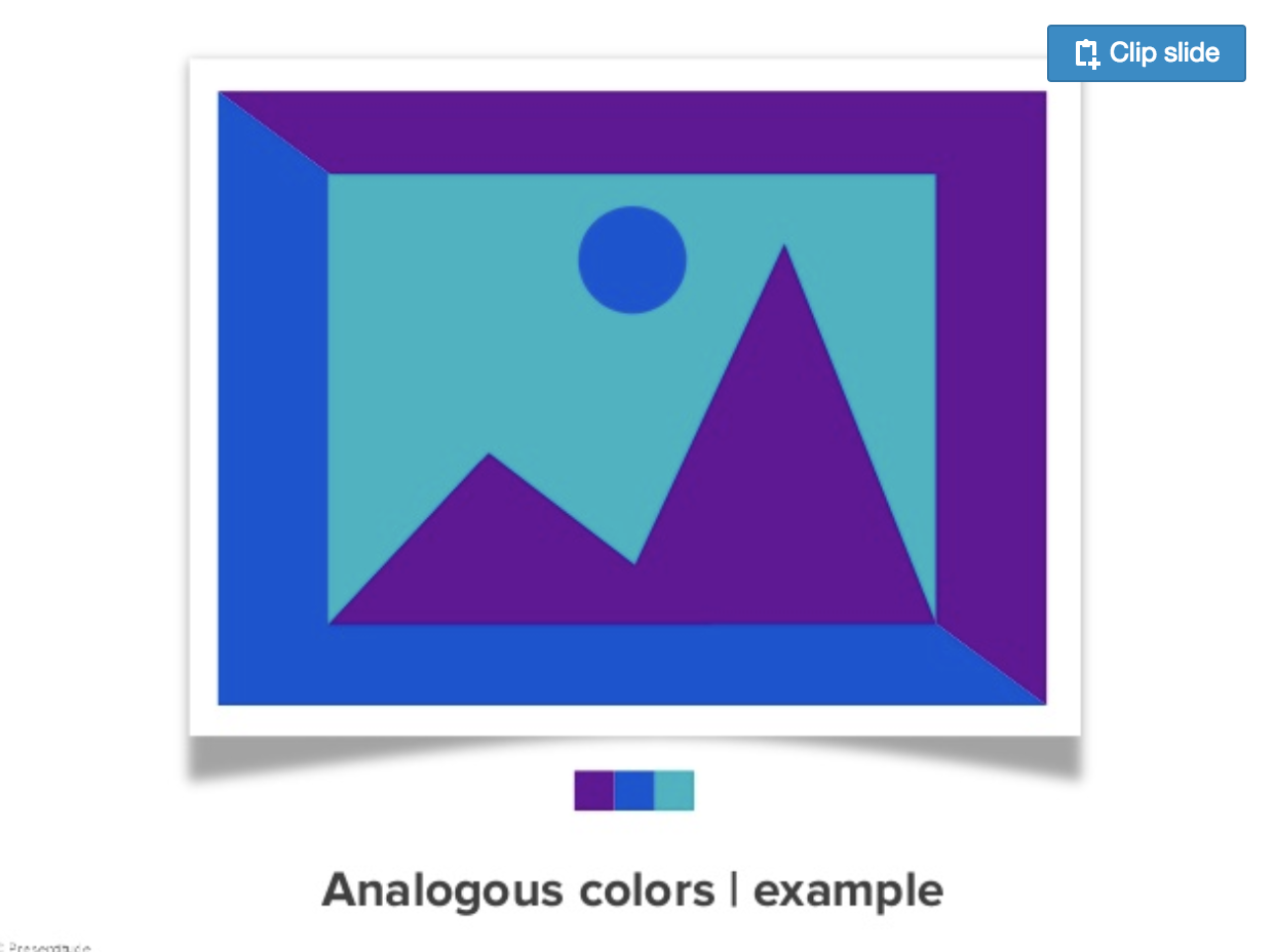
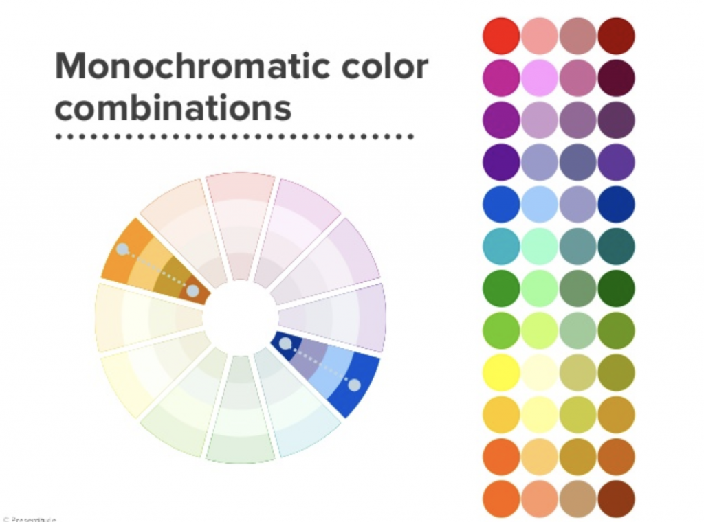
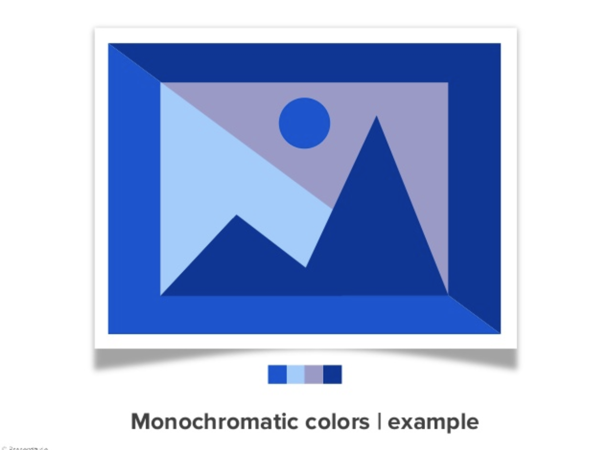
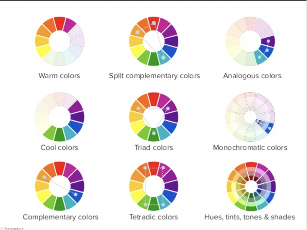
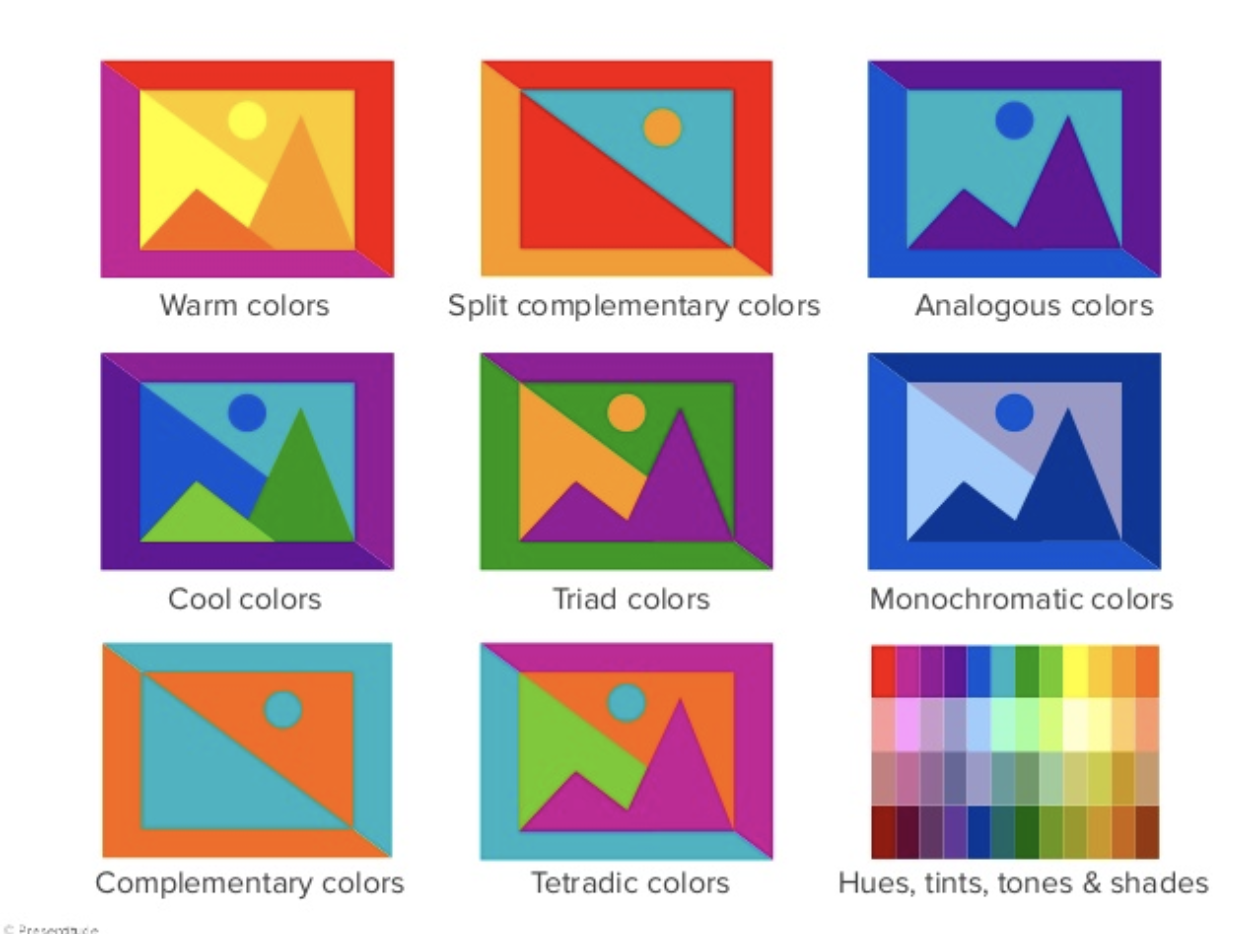
colour theory
I’ve learned a lot about colour theory from my peers presentation. The part about colour schemes were particularly helpful for this project.
There are 6 basic ways to combine colours: Complementary, Analogous, Triadic, Split-commentary, Tetradic
From the stash of movie quotes, I have narrowed down to work on these few:
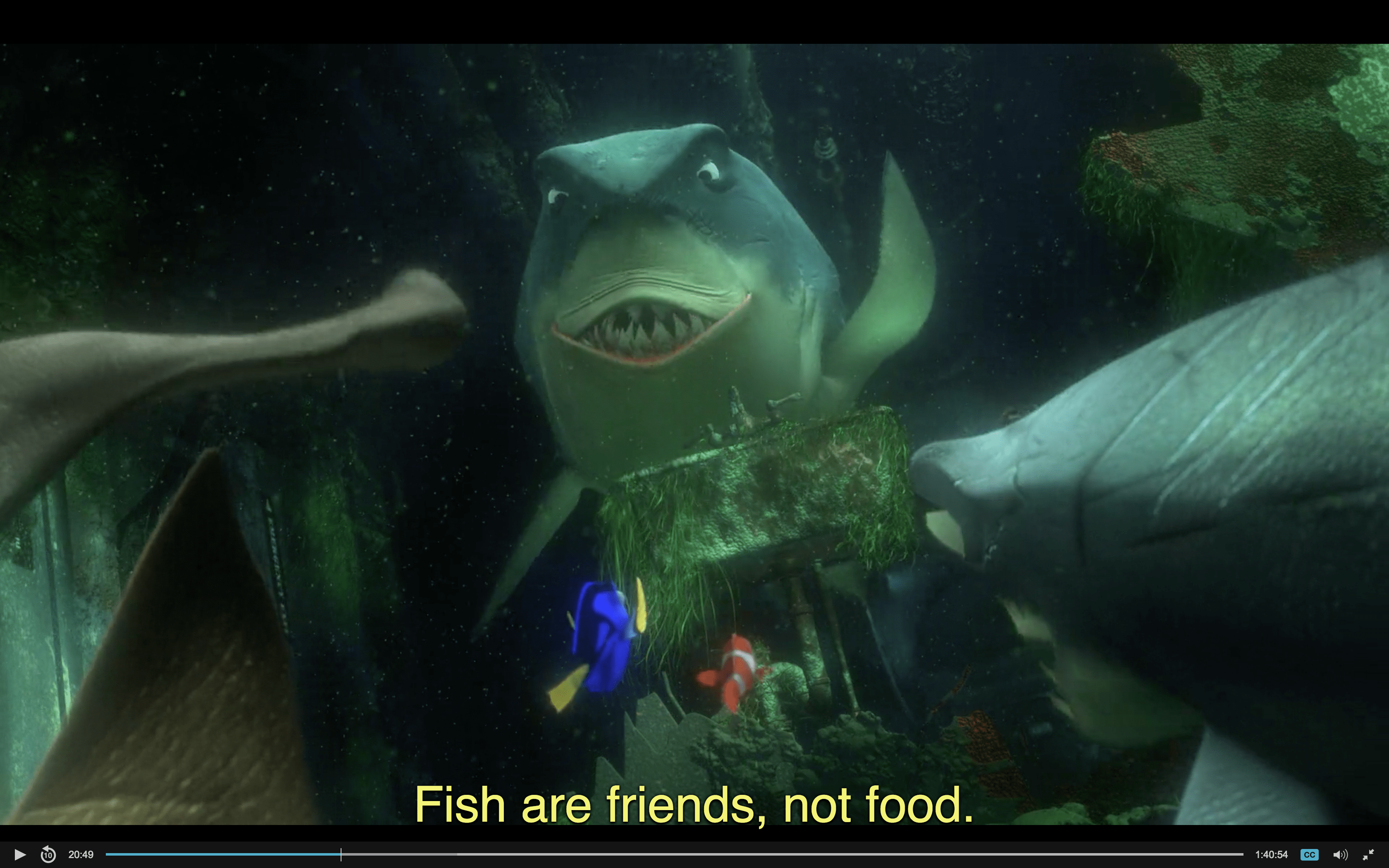
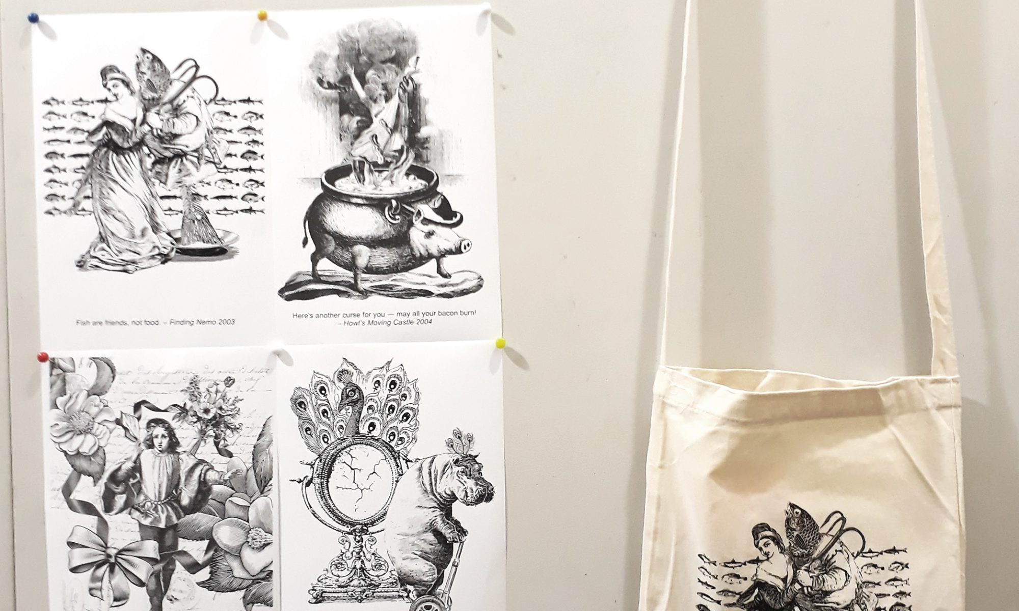
Finding Nemo: “Fish are friends, not food”
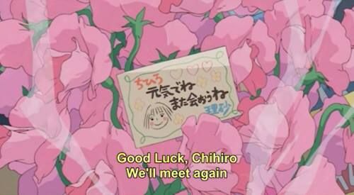
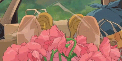
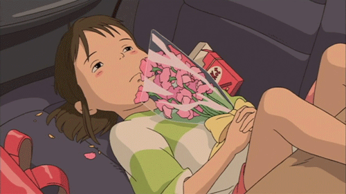
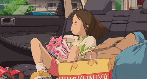
Spirited Away: “I finally get a bouquet of flowers and it’s a goodbye present”
Howl’s Moving Castle: “Here’s another curse for you – may all your bacon burn.”
Howl’s Moving Castle: “I see no point in living if I can’t be beautiful”
Ponyo: “I’ll let a fish lick me if it’d get me out of this wheelchair”
Moana: “If you wear a dress and have an animal sidekick, you’re a princess”
This is still more than the four movie quotes required, but I decide to just work on them first to get a better idea about which quotes have more potential to be developed.
Learning from my research on Dan Hillier, I wanted to emulate his working style in this project. Instead of sketching out clearly what I am looking for in my composition and then searching for suitable images online, I have decided to follow Hillier’s way of starting with a very vague idea and browsing through images to find associations. Only then are the images composed together — pretty much trial and error.
As I really like Hiller’s illustrations, I decide that I wanted to go with a consistent Victorian/ Old books illustration style for my compositions. However, as all my quotes are taken from animated movies, I thought that using elements from the movie itself will appear too jarring as they evoke a very modern and child-like kind of feel, which seems incompatible with the Victorian art style. Thus, for most images, I’ve decided to take the quotes out of context and interpret them simply for what they are.
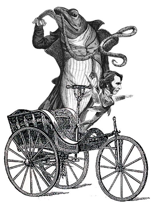
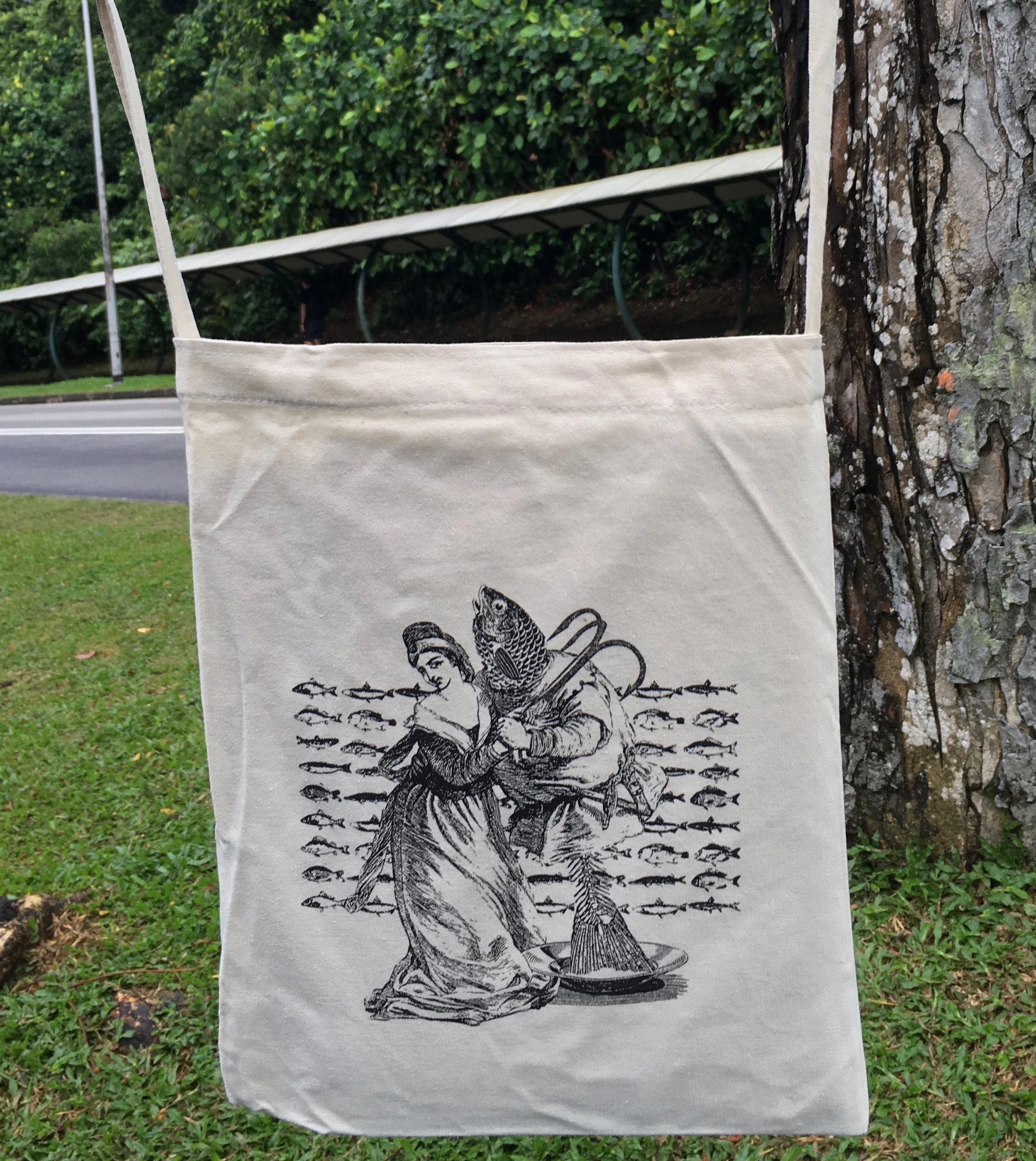
Finding Nemo: “Fish are friends, not food”
When I look at this quote, the first thing I thought was that I need to convey the idea of friendship/closeness well. It is easy to bring across the idea of fishes and food, but I was worried that if I were to focus on that, I will neglect the main idea of fish are friends.
However, searching for images on ‘friendship’ did not yield much satisfactory results as the image merely look like two or more people talking to each other.
For example:
Accessed from http://www.istockphoto.com/sg/vector/victorian-male-friendship-gm170178869-23189160Accessed from http://www.istockphoto.com/sg/vector/group-of-victorian-men-gossiping-about-a-scandal-gm538354728-95714931
The idea of rapport/ companionship/bond is not conveyed strongly. Thus I tweaked my search and sourced, instead, for couples. While bringing in ‘love’ might not be that suitable, what I was driving at is really an intimate and friendly relationship.
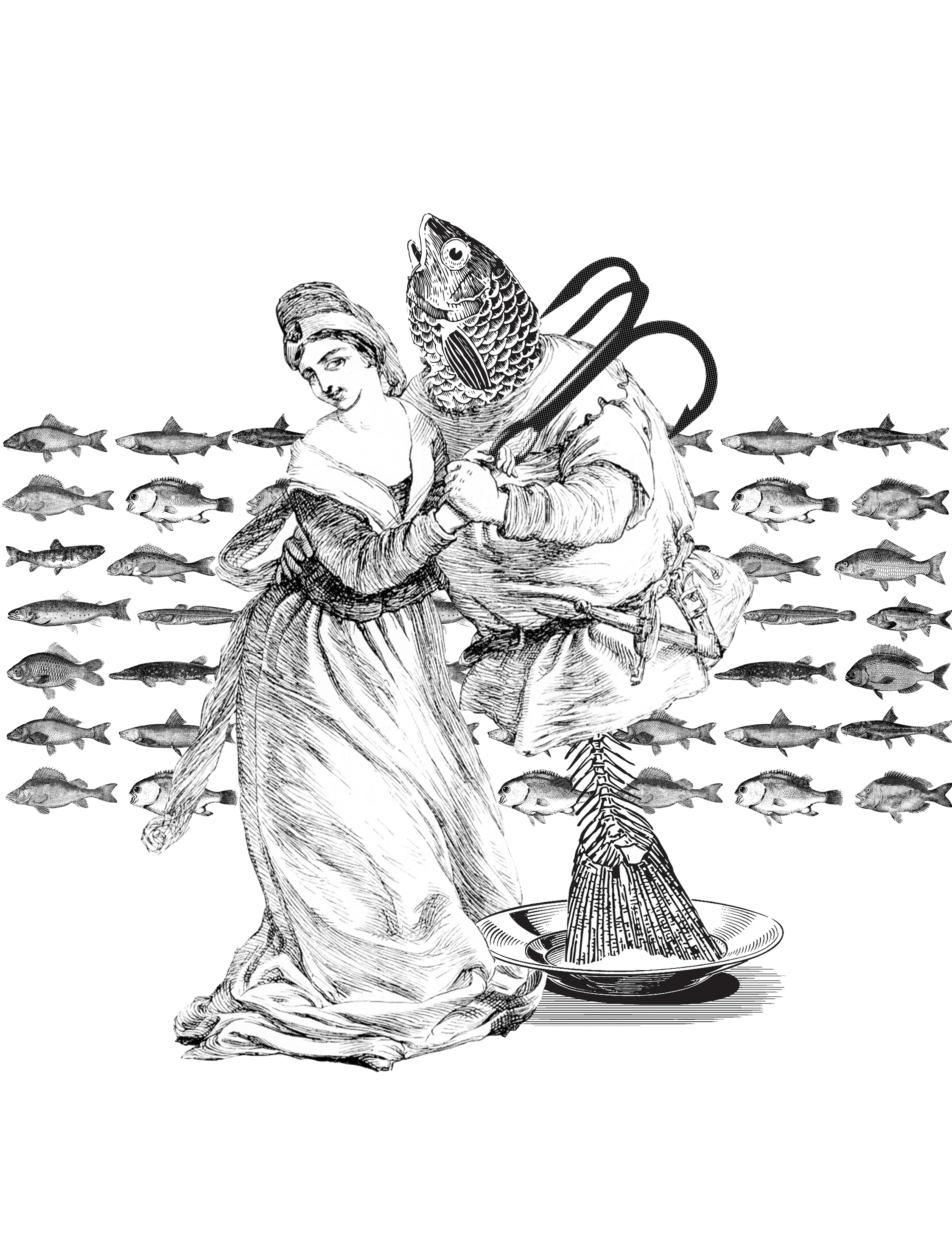
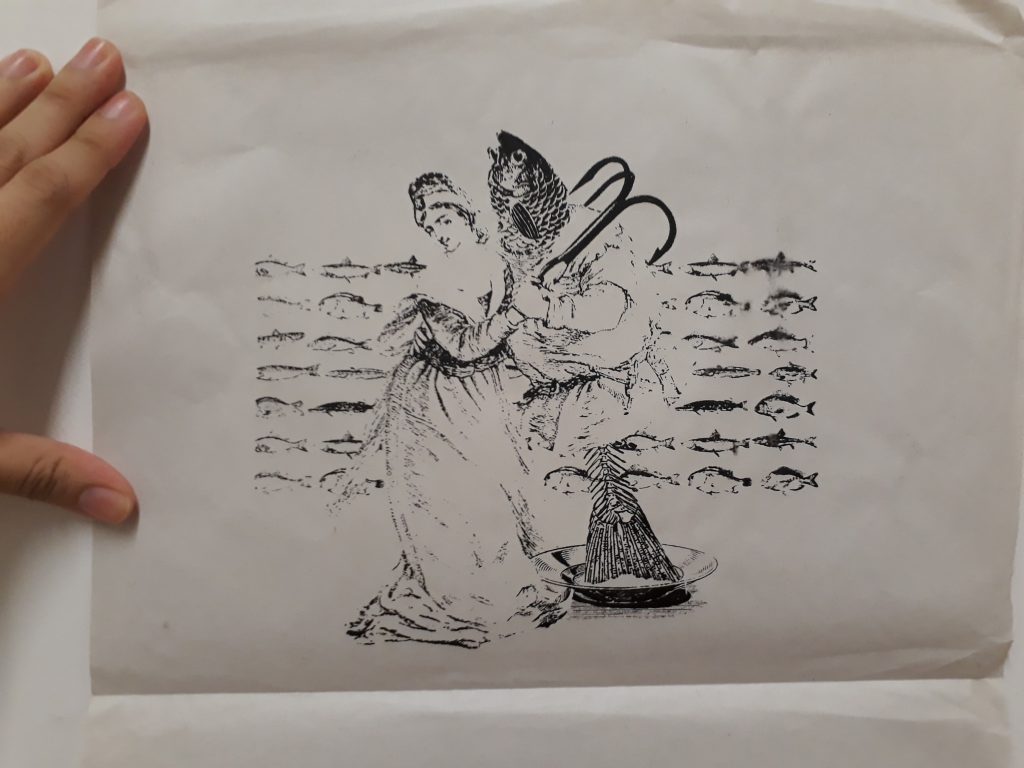
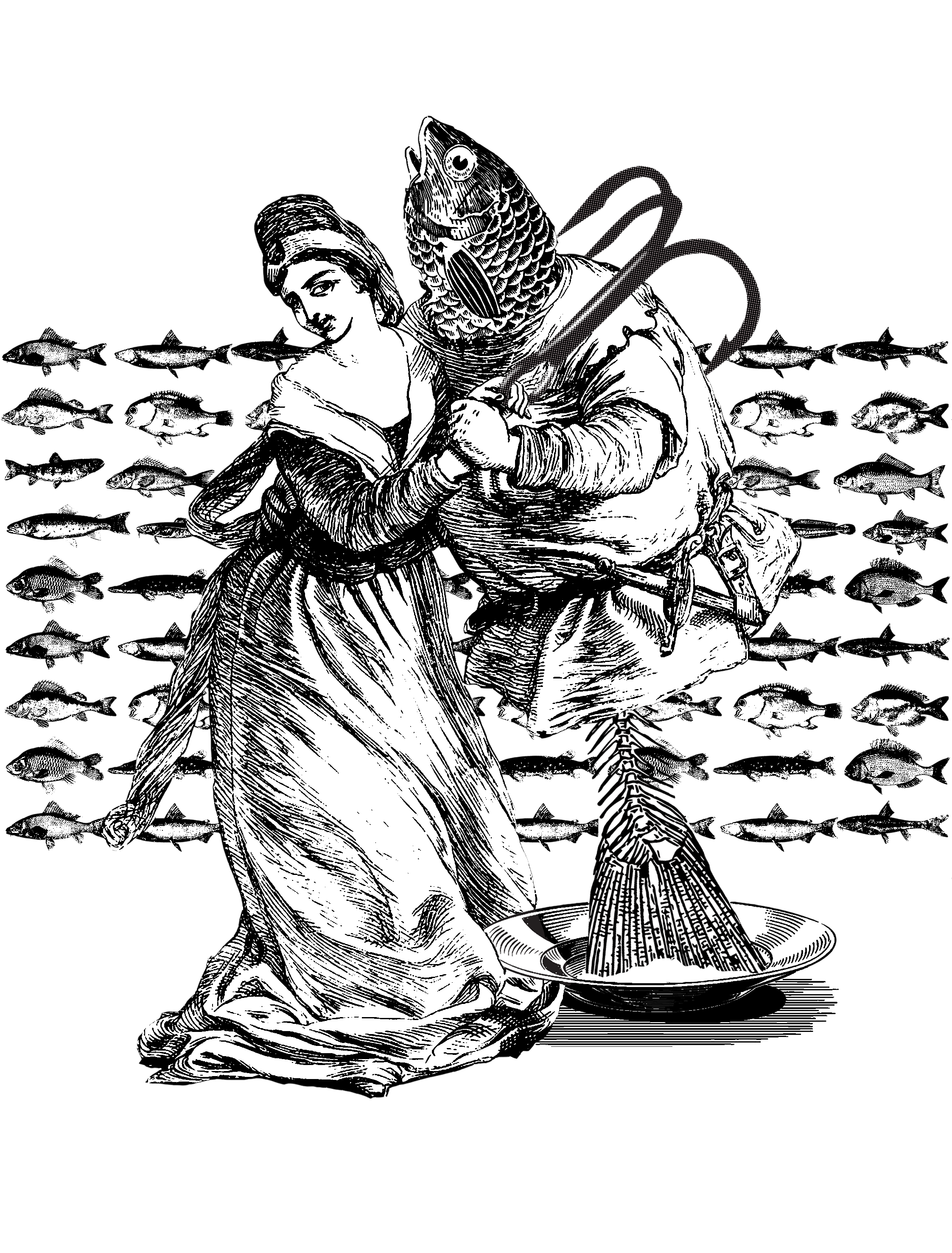
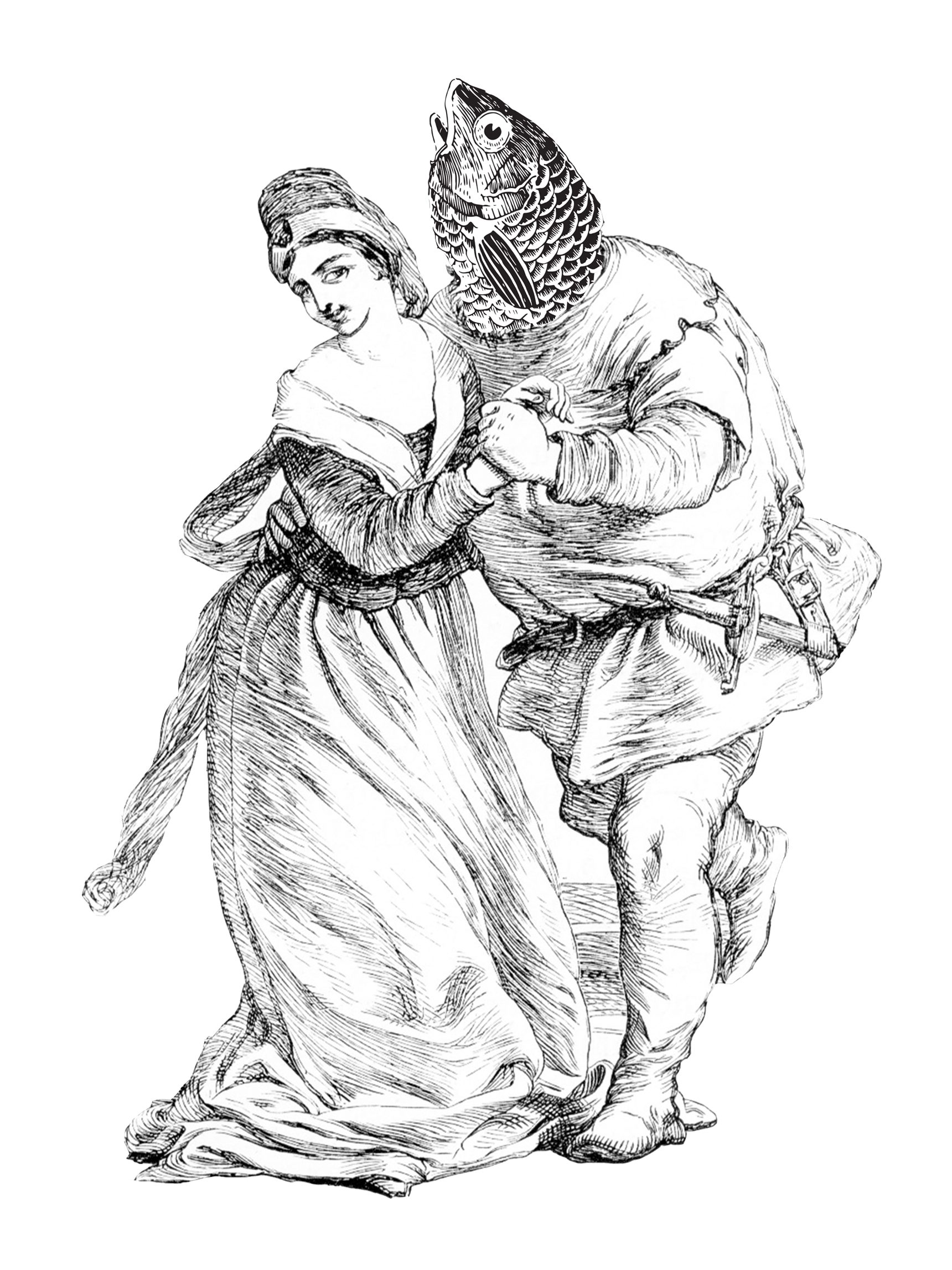
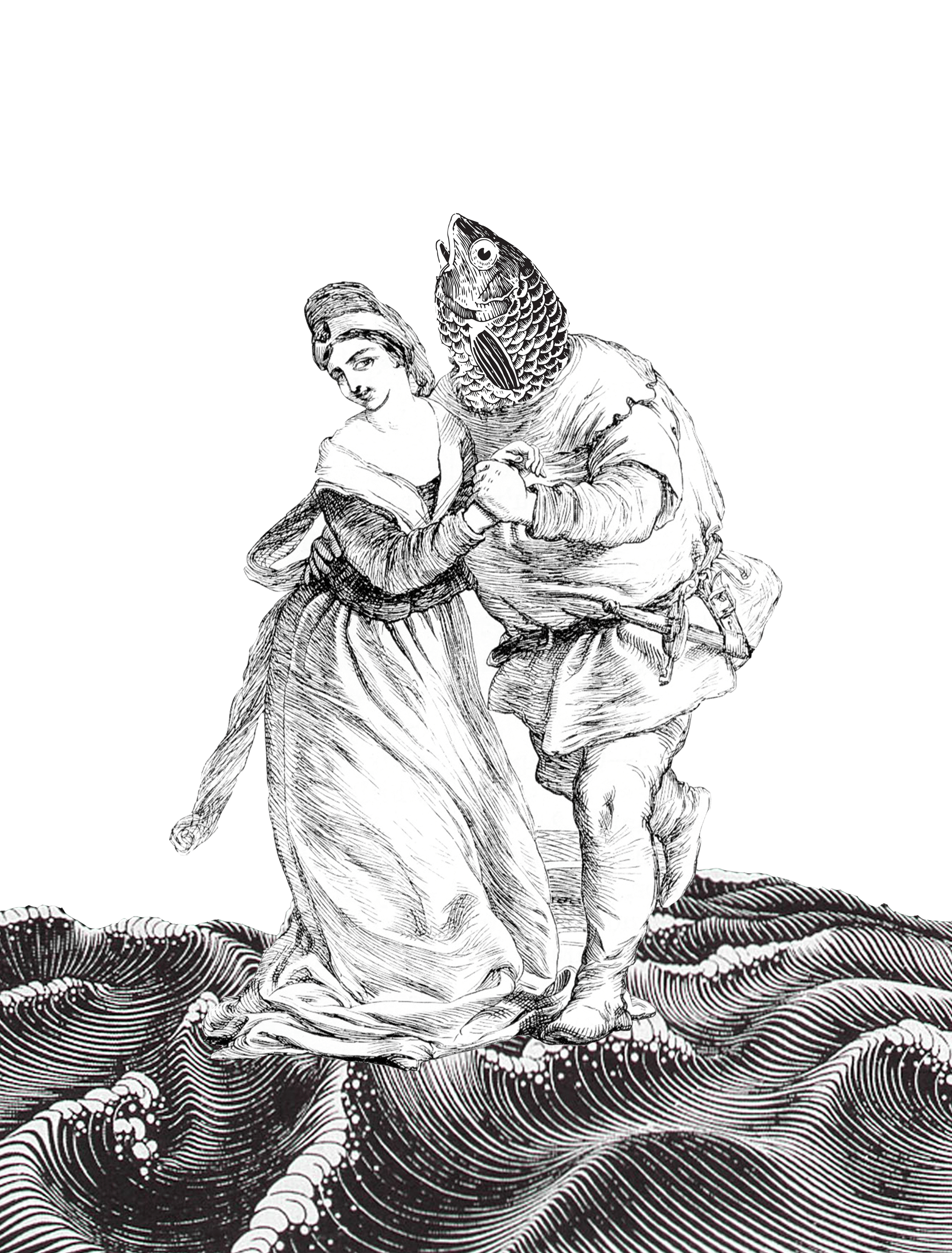
This was what I found. The man looks like he’s courting the woman. I thought this image was suitable because of the physical contact that expresses the idea of ‘closeness’, while not being overtly intimate or romantic. The expressions of the woman is apt as well, as she looks like she’s challenging the notion that fishes are food/friend.
This is the first design I made:
By swapping the man’s head for a fish head, I wanted to bring out the idea that the man is the fish, and the close contact between the two shows that the woman sees him as a friend and not food.
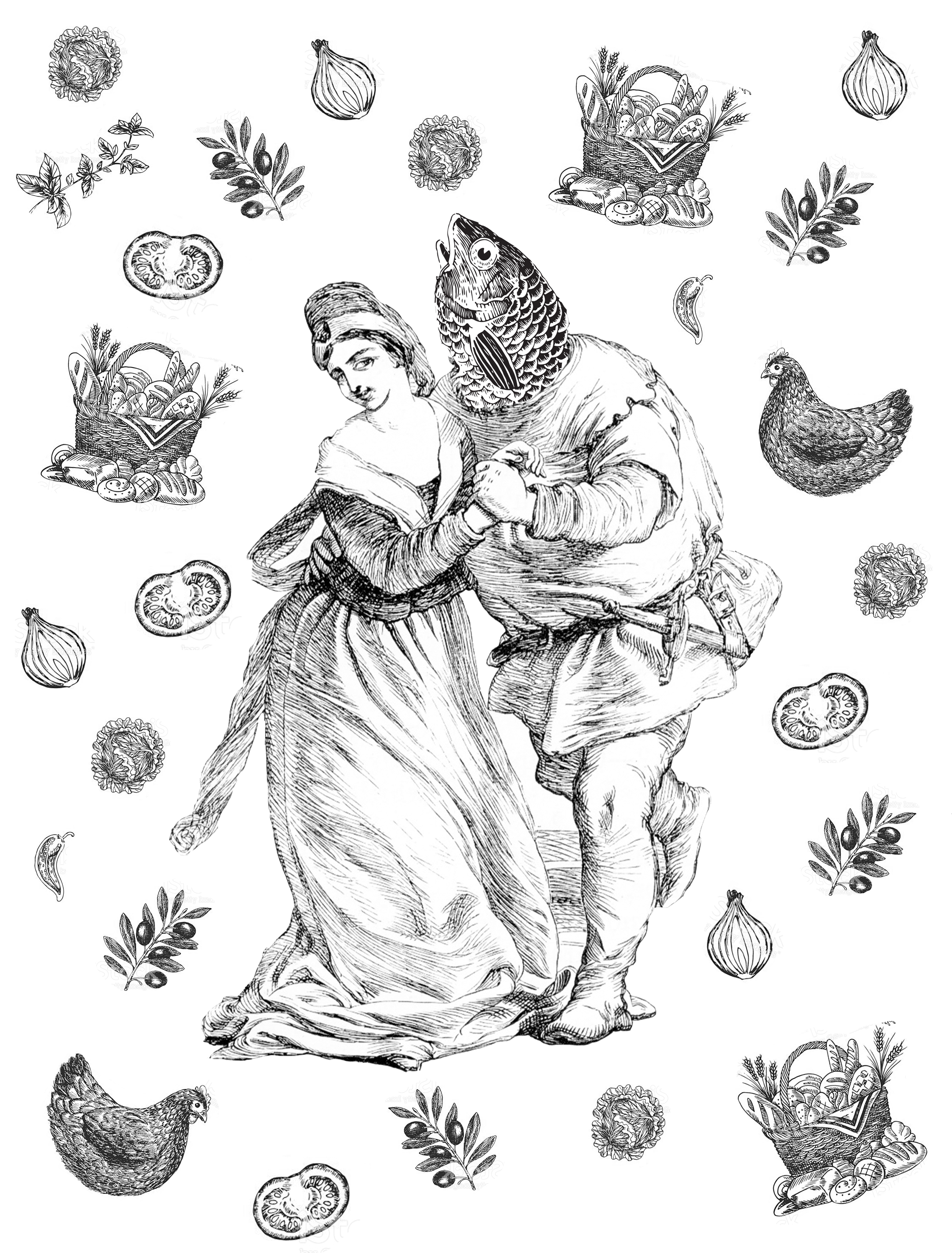
Thinking that the idea of food is not strong enough, I scattered bits and pieces of ‘food’ around them.
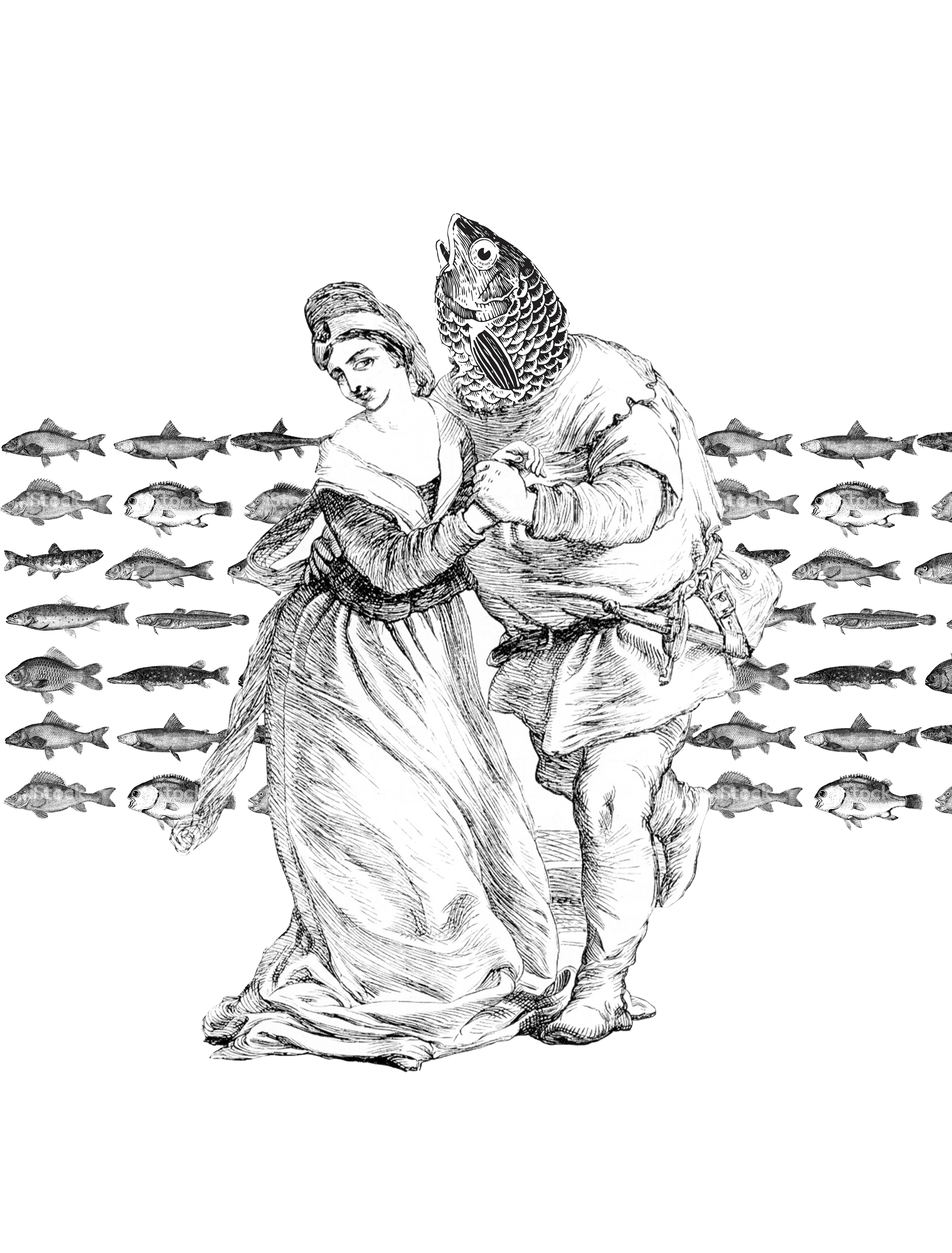
However, I found that the entire composition does not tie in well because the food is scattered too randomly, and no idea of fish being friends and not food is being expressed. Yet, to use the original design feels too plain. Thus, I started working with the background.
I added waves here since fishes live in the sea/water. Again, the waves doesn’t deliver much meaning and are quite redundant.
Using the idea of repetition to bring out harmony, I decide to collage different species of fishes for the background to bring across the idea that “fish are friends, not food” applies not just exclusively to the ‘fish-man’, but all types of fishes. Nevertheless, the quote is still not conveyed strongly enough.
Being stuck, I decide to revisit the movie scene.
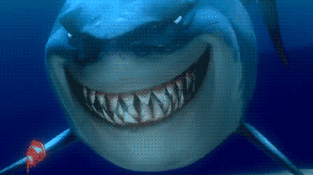
The sharks were determined not to eat fishes at the start.
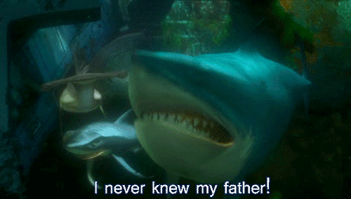
However, when Dory started bleeding…..
The sharks forget all the talk about not eating fish and went berserk.
As we can see, there is actually a lot of ambiguity in the quote, when taken in context. Although the sharks proclaim that ‘fish are friends, not food’, their resolve is not strong, which cause them to waver between eating fishes and treating them as friends. I decide to incorporate this sense of ambiguity into my design.
By placing the man on the plate, their motion becomes uncertain: is the woman leading the fish away from the plate, or is she putting the fish onto the plate? The same idea is reinforced several times:
The half-eaten body of the fish: did the woman eat it, or did she safe the fish from being fully consumed?
The fish hook that isn’t firmly entrenched in the fish body: again, is the woman helping to remove the hook, or is she attaching it?
As I found this to be a satisfactory design, I decided to go ahead with it.
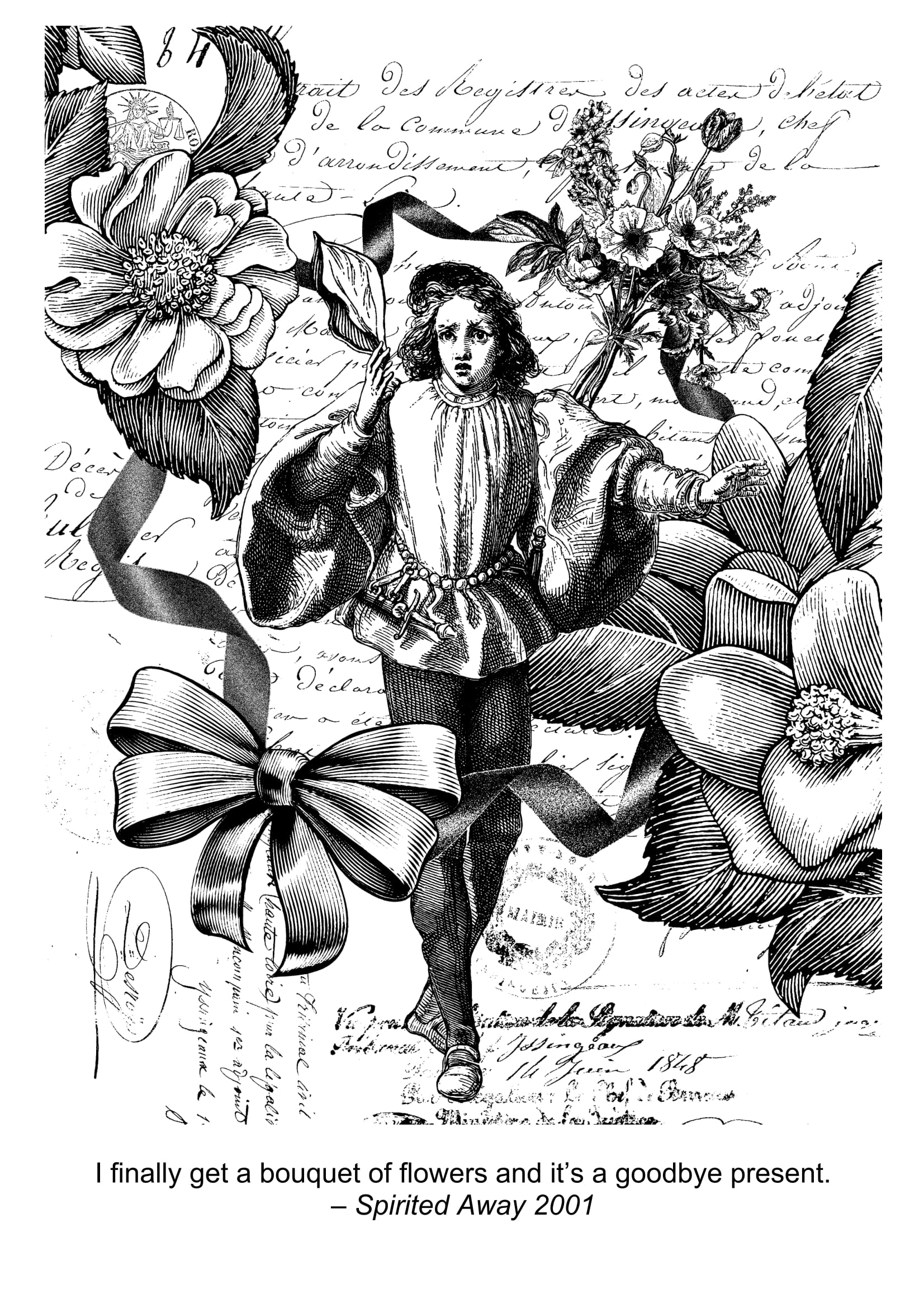
Spirited Away: “I finally get a bouquet of flowers and it’s a goodbye present”
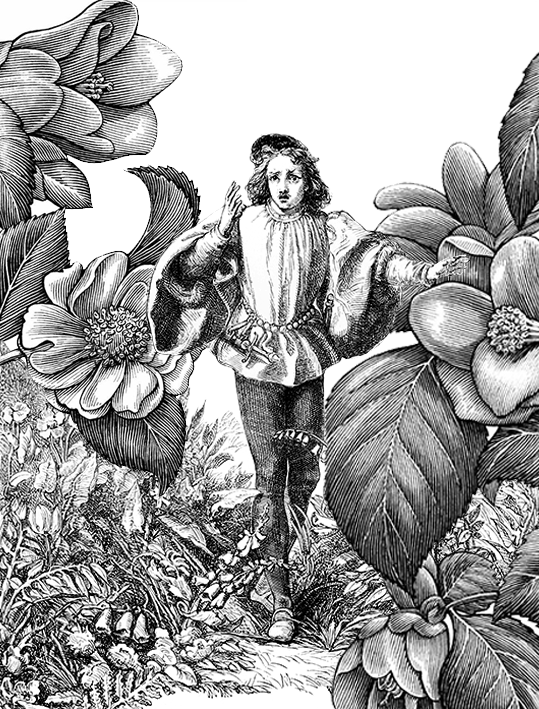
When I was brainstorming for this quote, as it involves abstract concepts like “goodbye”, I decided to pin down first the more literal components like flowers and present.
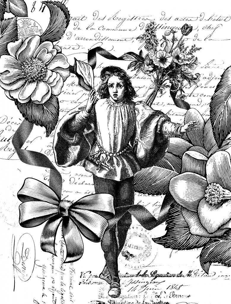
By chance, I found this forlorn looking guy who looks like someone is leaving him and he is raising his hand as if about to say goodbye, yet the person has turned and left already. I went on to surround him with a sea of flowers to portray him as drowning in his present that is full of ‘goodbye’ and ‘farewell’ connotations. I used very large flowers to frame the sides to represent the sheer monumental impact of the goodbye left in the person’s mind.
Thinking that the idea of ‘present’ isn’t strong enough, I went on to add ribbons and ribbon bow, since presents are often adorned with them.
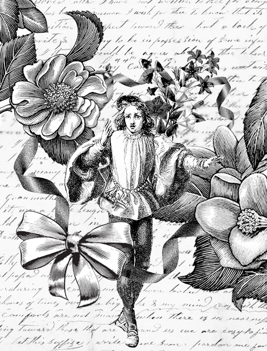
I thought that the ribbons were a good addition, but the idea of goodbye is still not there. Besides, I realise that flowers =/= bouquet of flowers. And so, I added a hand-written letter at the background to symbolise farewell letters that people usually write for one another at moments of departure. I also included in a bouquet of flowers to make the message stronger.
As I worked on the final design, I resized the different elements to bring more focus to the man in the middle rather than the flowers on the side. I also changed the bouquet of flowers to one that is more obvious since the previous one simply looked like a bunch of flowers held together. During the consultation, Mimi mentioned that she feels that ‘goodbye’ isn’t conveyed strong enough. I experimented with many different compositions (which I failed to save), such as having the person he is waving goodbye to at the foreground walking away/waving goodbye with one raised hand, but they destroy the original composition (which I thought was aesthetically pleasing enough, and hence did not want to alter it). After a long process of research, I decided to add a handkerchief to the centre guy’s raised right hand.
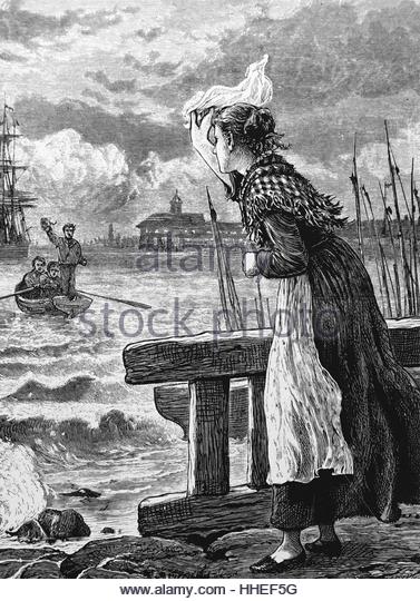
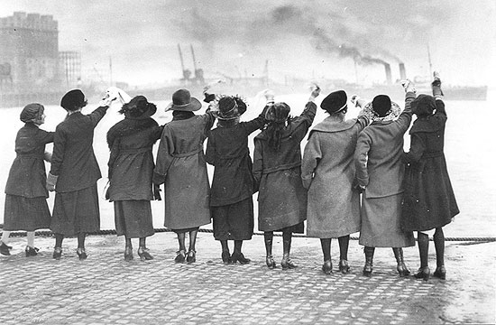
This is because historically, whenever sailors set sail to sea, their loved ones will wave handkerchiefs towards the leaving boat as a sign of goodbye, as seen in the two photos below:
Accessed from http://www.alamy.com/stock-photo/sailors-waving.htmlAccessed from http://the-history-girls.blogspot.sg/2012/02/
Final design for this quote:
Howl’s Moving Castle: “Here’s another curse for you – may all your bacon burn.”
This quote is among the most literal quotes. I thought it doesn’t make sense if I were to research for what symbolises, say, curses or bacon or burning, because the resultant composition will deviate too much from the original quote that it becomes unrecognisable.
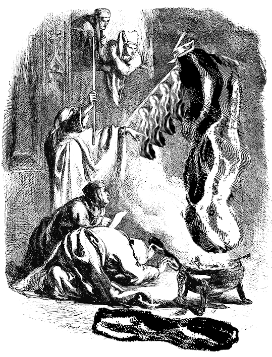
For my first design, I found this illustration of Shakespeare’s play, Henry VI, where a hooded conjurer is conjuring spirits. I thought it was quite apt, because it conveys the idea of “curses” and “burning”. I added a few pieces of bacon to see how it’ll turn out.
I felt like it didn’t look too bad, but the people at the sides are way too extra. Also the part about burning should be more strongly expressed, because it looked more like smoked bacon than burned bacon. Also, I felt that just using bacon is boring. Thus, to add more flavour to composition, I added a pig (do you know bacon is made from pigs?).
I thought that having the bacon fall in to the boiling pot makes the design more dynamic because there is this idea of action. Also, it gives off the impression that the bacon is conjured up, and not brought in by someone, like in the first design.
I experimented with some backgrounds as well. I usually searched for ‘war’ images since there is often some kind of burning in the landscapes. However, as they are often too complicated, they steal the limelight of the central scene, causing the composition to lose focus. Mimi agreed that the above design with the plain background is a lot more ideal.
I was intending to go ahead with it. However, on the night before the big critique day, I chanced upon this image of a woman shrouded by smoke, with her hands thrown up as if she’s casting a curse. It was perfect. I superimposed the photo and simply love the outcome!
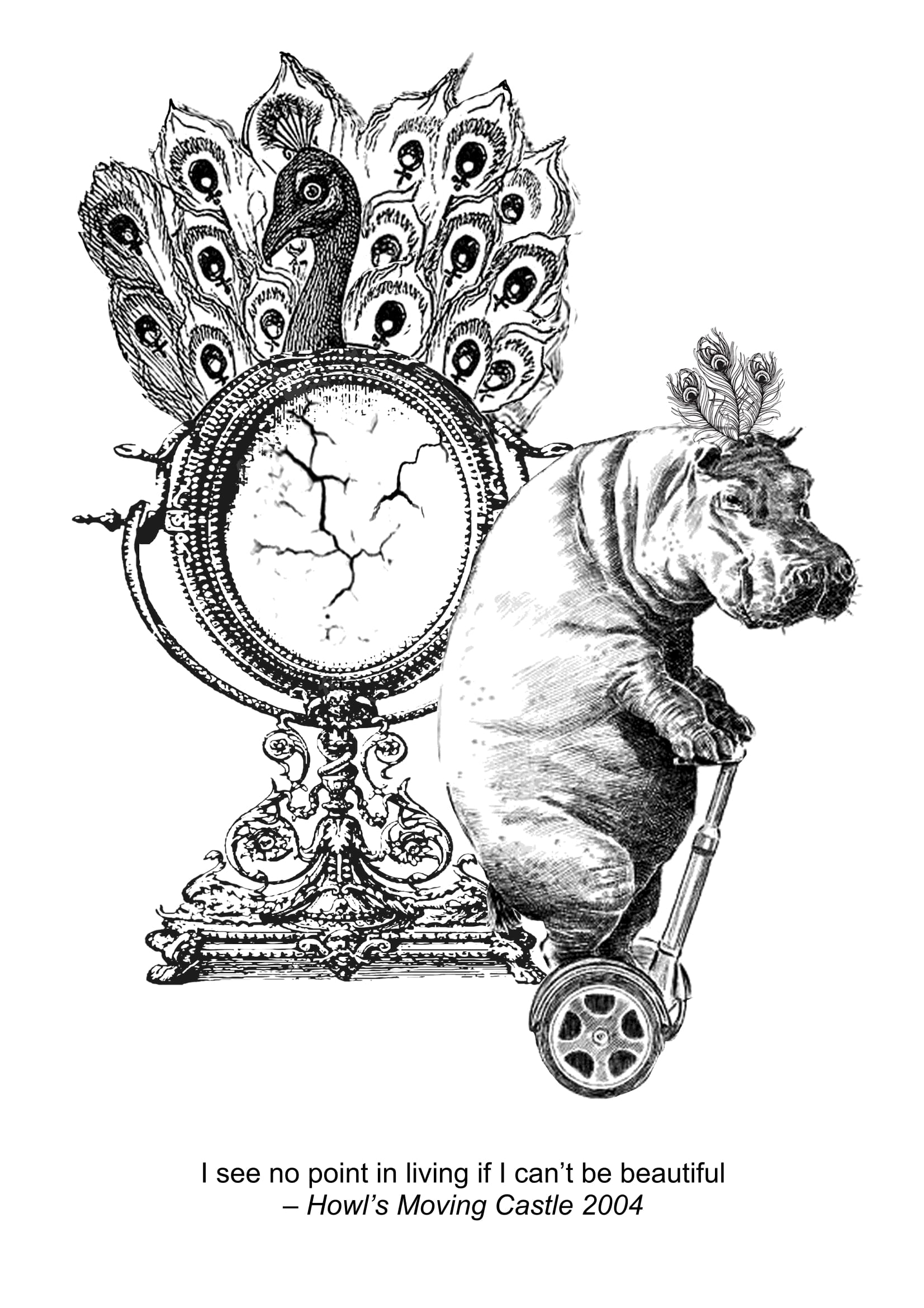
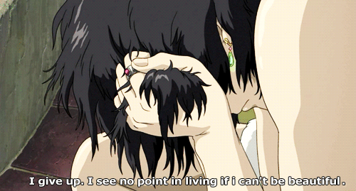
Howl’s Moving Castle: “I see no point in living if I can’t be beautiful”
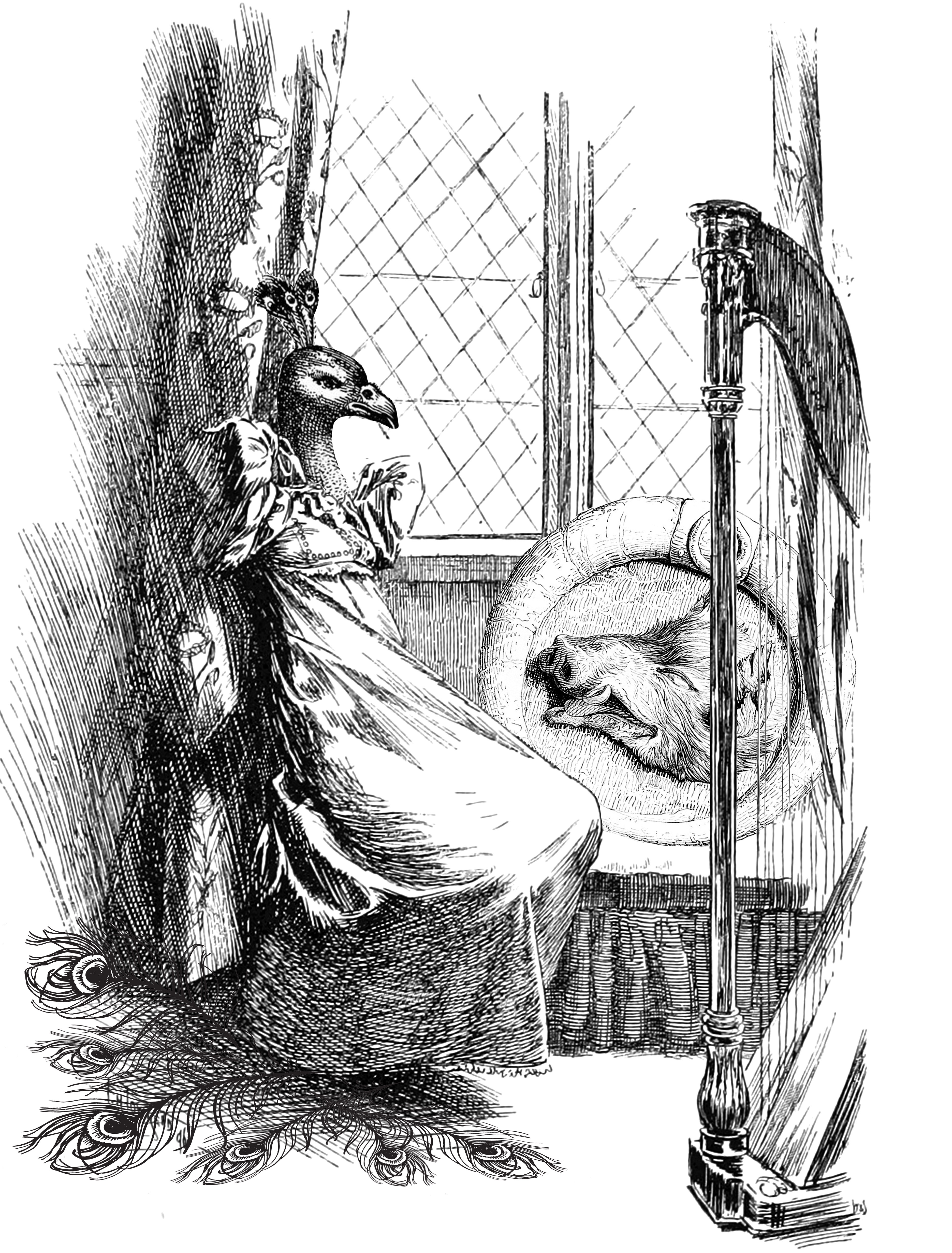
While browsing through images online, I came across this illustration which showed a melancholic person staring out of the window. I found that it conveyed the idea of “no point of living” very aptly, and so I saved the image to work with it. I swapped his head for a peacock head, yet add a emblem/shield like thing at the side with a boar’s head, to show that this person is trying as much as possible to beautify his outward appearance, yet the truth is that he simply resembles a boar constantly haunts him. The peacock feathers further accentuate the idea that beauty is something that he can never achieve.
I found this design to be too obscure, and the idea of ‘no point of living’ is not well-expressed.
I worked on a second design, which is a lot more literal. Clearly, you can see that the skeleton is surrounded by the flowers, which means that he is consumed by the concept of beauty. The skeleton — a sulking one for that matter — conveys the idea that there is no point in living, even if he has everything on the world (since he is sitting on the globe)
While the aesthetics look fine here, I felt that it lacked the wow factor and didn’t really resonated with what I wanted.
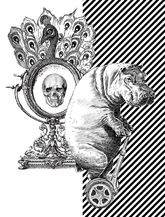
Here, a girl in a dress has a ugly animal head and stares vainly into the mirror, adorned with a single peacock feather. She wears a troubled expression as if upset with her looks.
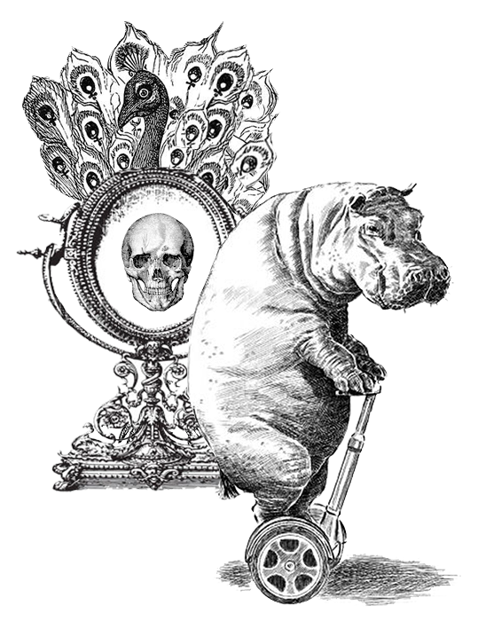
This design is okay to me, but a tad bit too simple. Thus I worked on a new design and borrowed elements from the previous design. I used the peacock mirror to symbolise beauty and vanity. The gloomy hippo, being upset by his appearance in the mirror, rides away on his segway. The skull, which surfaced after the hippo looked into the mirror, represents the face of death, telling the hippo that his appearance means that he doesn’t deserve to live.
Mimi mentioned that the skull is too distracting and redundant. I didn’t feel that at first, but after seriously considering her comment, I realise it’s very true. There are too many elements in the composition fighting for attention, and the skull simply dilute the focus further without contributing much.
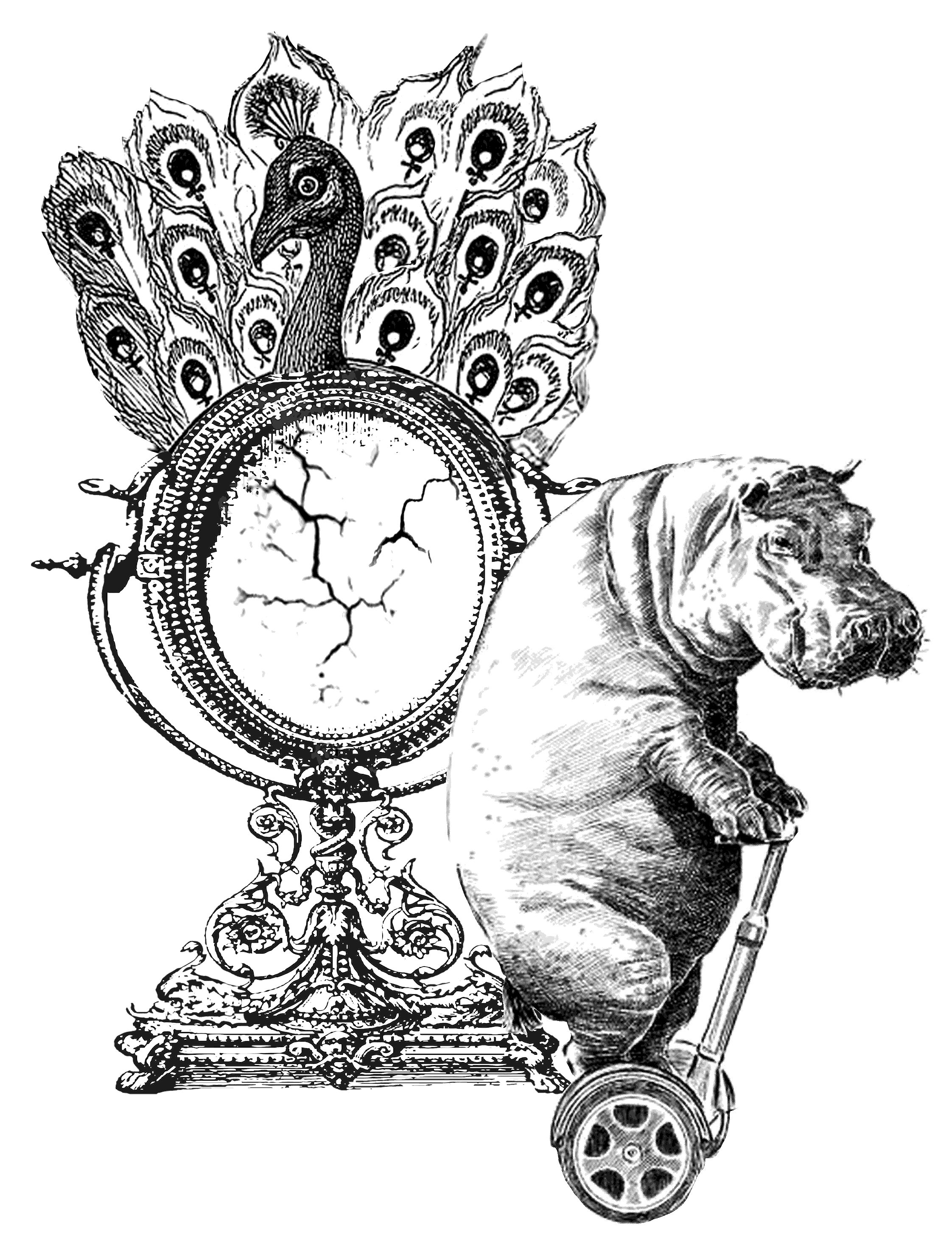
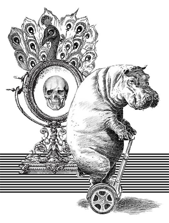
Working on her feedback, I substituted the skull for a more toned-down mirror-cracks to show that the hippo’s looks are so bad that even the mirror cracks after being exposed to his face. I resized the peacock mirror larger so that there is a main focus for the composition (instead of having both the peacock and hippo the same size and have them fighting for attention)
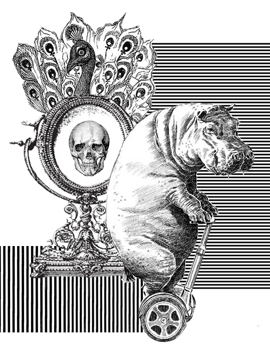
I’ve also experimented with different backgrounds because I found it plain:
Conclusion: nah, I should keep it plain. Thus I stuck to the previous design as the final one, but added three more peacock feathers on the hippo’s head to symbolise his efforts to beautify himself, but which still failed in the end.
Ponyo: “I’ll let a fish lick me if it’d get me out of this wheelchair”
I interpreted the quote very literally. Thus I used 4 main elements: fish, tongue, wheelchair, person getting out of chair. This was the first design I did:
I tweaked the composition so that it follows a triangular shape and feels more stable and comfortable on the eye.
I found the design interesting, but too disparate and seemingly random (even though it did follow the quote). Mimi felt that the flying guy doesn’t express the idea of ‘getting out of wheelchair’ strong enough. Also, instead of the licking fish, the flying guy should be the main focus.
I worked on her comment and experimented with different compositions using the same images. However, nothing satisfactory came out, and I thought that there isn’t potential for further development. Hence, I dropped this design for the final 4.
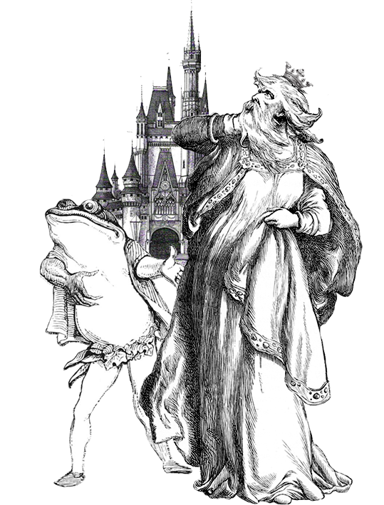
Moana: “If you wear a dress and have an animal sidekick, you’re a princess”
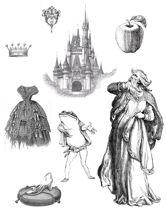
Although directed to Moana, this quote suggests that anyone can be a princess, as long as he/she 1) wears a dress, and 2) have an animal sidekick. I decided to play on this by superimposing an old man’s face onto a woman who is wearing a dress. I used the dancing animals as I thought they were really cute and similar to the animals in Disney movies.
To further express the idea of princess, I added a little crown on the head.
Feeling that the message wasn’t strong enough, I added waves at the background as an allusion to Moana. However, I realise that it’s a little out of place.
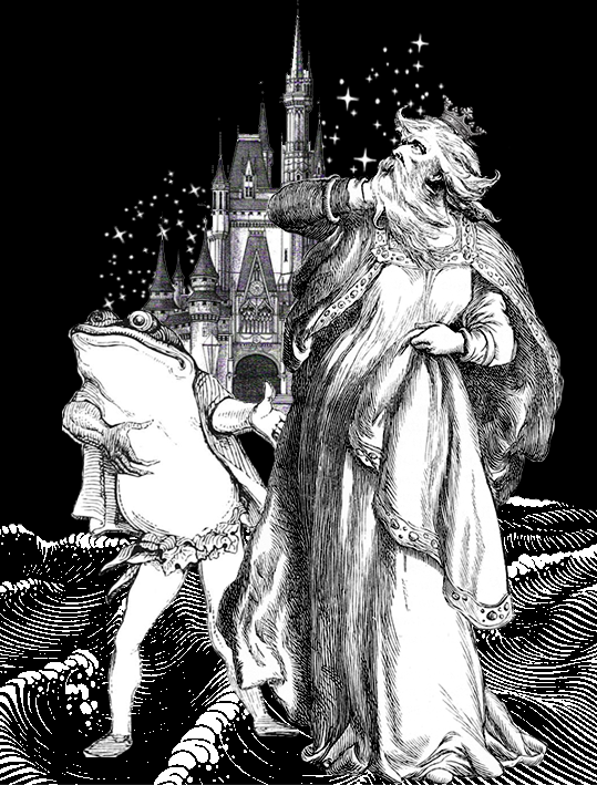
I decide to redo the composition and used a frog this time, as this frog gives the impression that it is eager to promote his owner, just like any other Disney princess’ sidekick. I added the Disney castle to emphasise the idea of Princess and royalty.
I experimented further and added in the waves (to allude to Moana) and twinkling stars for magical effect.
As I scrolled through old photos, I also saw several images of old encyclopedia:
Accessed from http://www.silverspiralarts.com/keyword/pincones;antique%20royalty%20free%20stock%20image;illustration/Accessed from: http://onewomanshands.blogspot.sg/2011/11/freebie-images-encyclopedia-pages-1.html
Inspired by their layout, I decided to try it out:
The apple symbolise the poison apple that Snow White ate; magic mirror used by the queen in Snow White; glass slippers worn by Cinderella. All elements point to the idea of ‘princess’. I’m actually quite fond of this design, but thought that this layout might not be too suitable for this project. And it also looks like I have no idea how to use photoshop and can only lay the elements out separately.
After the very long process of experimenting with and developing different designs, I have came up with my final 4 designs:
Check out my blogspot on my final 4 designs :D
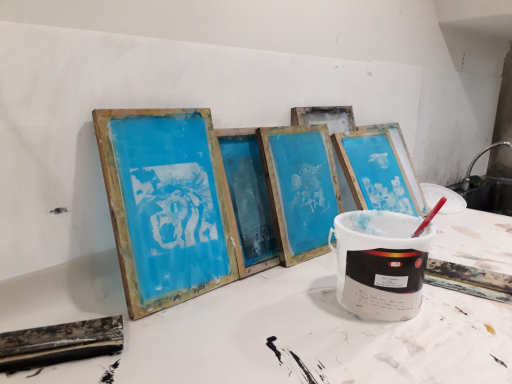
Silkscreen printing
This is my first time working with silkscreen printing, and it involves a lot more process than I thought. I didn’t document much of the process because I didn’t bring my phone into the dark room :(
Silkscreen process:
Coat the silkscreen frame with the photosensitive blue emulsion paint (try to make the coating as smooth as possible)
Leave to dry
Paste the transparency (the surface with the carbon downwards) on top of the frame and exposed the silkscreen in the UV machine for 18seconds
Use a water gun/ running water with pressure for the transferred design to appear
Use a squeegee and swipe with one confident stroke to evenly apply the black paint
give yourself a pat on your back if your design turns out well, or cry (gimme a chocolate if u actually read this ?)
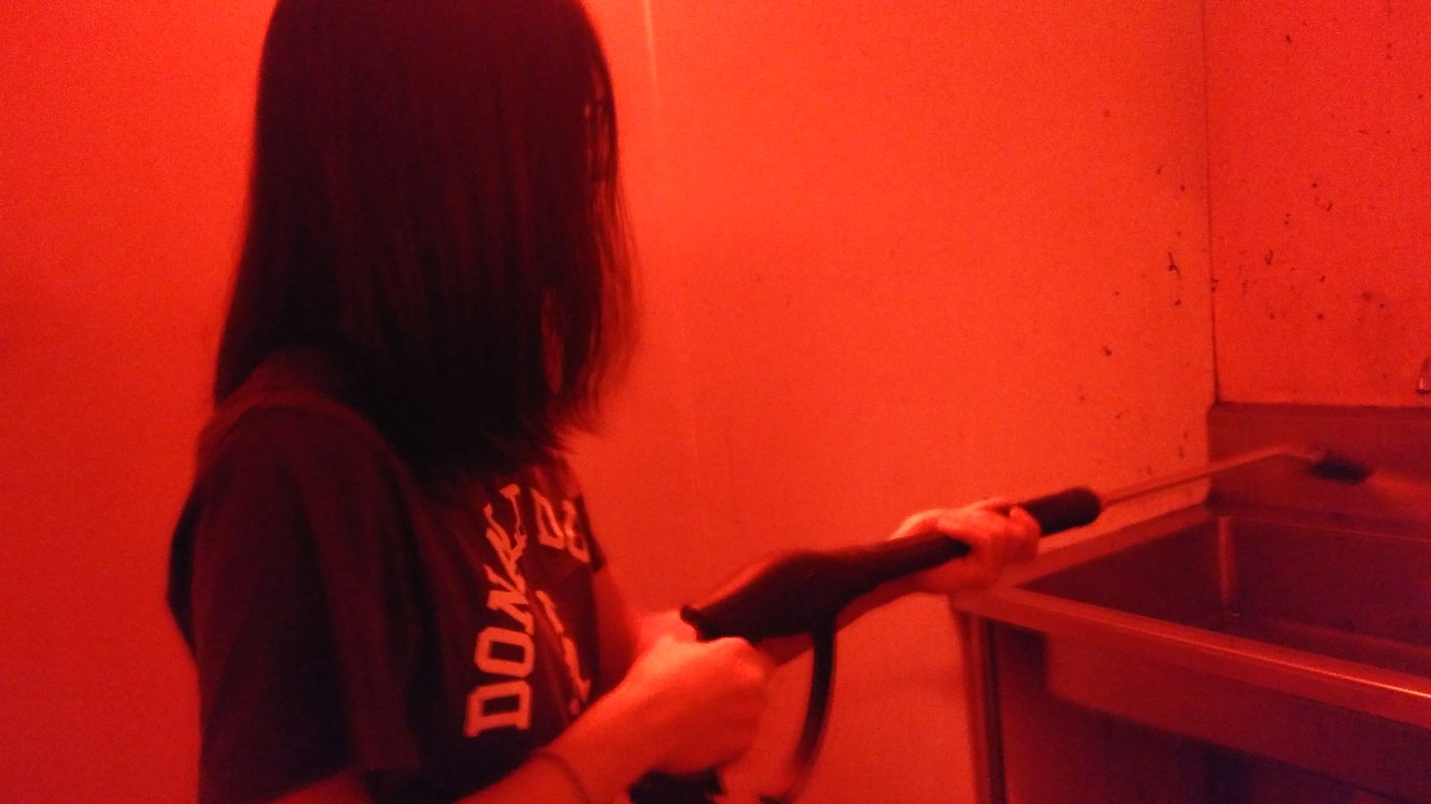
A rare photo of myself caught in action (thanks Loh Kee)
The design didn’t turn out very well when transferred onto the paper as the details are simply too small to be captured well. I desperately hoped at the start that it was just the first print that went wrong and the rest will be fine if I apply more paint — but sadly, no, they’re just as bad.
I definitely needed a second round of printing. For my second round of printing, I increased the size and threshold of the entire composition. This helped immensely as the lines are now well-defined.
Removing the emulsion paintMy refined design: notice that the central figures are now larger. Lines are also more clearly defined after I increased the threshold.
Test print!
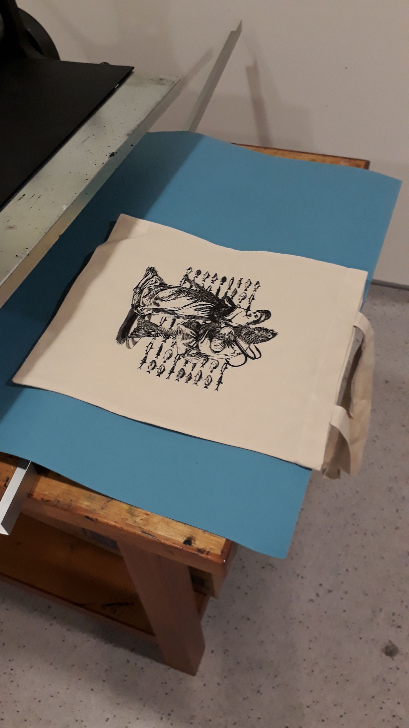
Before printing on my tote bag, I did several trial runs on newsprint to get a feel on how much paint to use/how much pressure to apply, how fast to swipe the squeegee. I was so glad that most of my print this round turned out well! I just had to take note not to use too much paint, as that is fatal for a design that used many many thin lines.
I was really lucky though, my final print on the tote bag was perfect in the first round. I printed on a couple more bags for fun. I would think they would be even better since I had several rounds of experience already, but somehow the very first print on the tote is the best.
My first print on tote bag!
This is a really long post. Congrats on making it through ⌒°(❛ᴗ❛)°⌒
Generally, people liked the consistent art style in the overall composition. Surprisingly, the “May all your bacon burn” composition yielded good response among my classmates. Many also loved the ugly hippo on his segway. Mimi mentioned that it was nice that I manage to source for all images that cohere with the Victorian illustration style, and that there was quite a good use of imagery to represent my quotes. However, she felt that “goodbye” is still not very well-represented in the Spirited Away quote and there’s still room for further improvement.
Overall, this project has been extremely fun. Working on the movie quotes showed me how a single line can convey multiple meanings and conjure different imageries in the mind simply depending on how you choose to interpret it. Working around with different compositions, changing their relative scales, and arranging and rearranging them in space has heightened my sensitivity towards space and the importance of getting the composition right. Sometimes, the choice of images are perfectly fine but they still look odd. All they need, in fact, is just reworking with how they are arranged.
Being forced (heheh) to work with online images, I’ve learned a tons lot of photoshop techniques as a newbie, and am also now extremely conscious of the importance of choosing the right resolution for my designs (I used 72ppi for all but one composition, and had to redo everything ?). Reflecting on my final 4 designs, I am quite satisfied with them, but also feel that they can be further explored and developed. I think I could have researched on more symbolisms to use, so that my designs can be more allegorical instead of being too literal. This is especially relevant for the ”goodbye’ design, since I found it hard to express goodbye adequately using literal images without having the entire composition becoming way too literal).
Silkscreen printing was also an entirely new experience. The process was fascinating: applying the photosensitive emulsion in the dark room lit by spooky red lights, exposing the silkscreen in the UV machine (and have to believe that something has happened even though the screen looks the exactly the same), playing around with the water gun, and go through nightmares while printing with ink. Even though I faced several hiccups along the way, nevertheless, I am really glad that my tote bag turned out well ( I have a few extra, anyone wants to buy? $20友情价??? heheh jk) It would be nice if I could print other designs as well! (human greed has no end)
Here are some movie quotes that I’ve decided to work on for the project! Surprisingly, all my quotes came from animated movies. I really didn’t expect that, but I guess I’m just a really big fan of them ヾ(´∀`○)ノ Right now there’s a lot of quotes included (it’s just too difficult to cut down!), I’ll experiment with different designs before deciding on what to go with :)
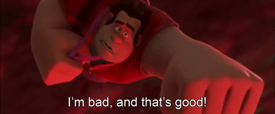
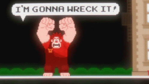
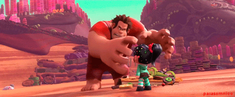
1. Wreck it Ralph: “I am bad and that is good, I will never be good and that’s not bad”
This quote really stuck after I watched the movie, most probably because of how hilariously contradicting it is and how it fits Ralph so well. A heartwarming movie, it is :’)
Spirited Away: “I finally get a bouquet of flowers and it’s a goodbye present”
My (or everyone’s) all-time favourite movie: Spirited Away. There are way too many feelings attached to this movie and the movie has been a great source of inspiration and motivation personally.
This quote is really depressing. I chose it, instead of other more famous quotes from spirited away, because of how heavy a feeling it evoked in one’e heart. Everyone experienced departures one way or another in their lives, be it moving house, changing schools, or even migrating elsewhere. We are not unfamiliar with farewells, yet we still feel as affected as the very first experience.
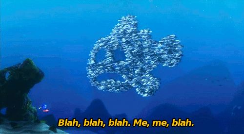
Finding Nemo: “Fish are friends, not food”
Finding Nemo! True-blue childhood movie that I’d watched a million times.
This quote was extremely memorable. I remember being terrified when the sharks appear, yet laughed my head off when I saw how eager the sharks were to make friends with the fishes.
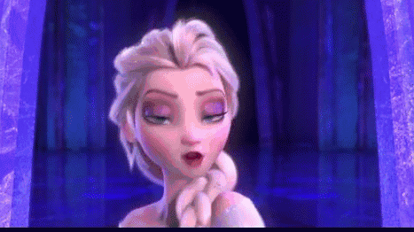
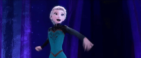
Frozen: “The cold never bothered me anyway”
I love Frozen, not even kidding. And this quote is too sassy to not include it. I really enjoyed the entire movie sequence for “let it go” because I found it highly relatable, and also happy for Elsa for finally being able to release the mental distress that has been troubling her since she was a child.
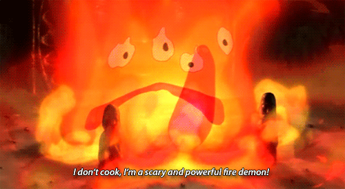
Howl’s Moving Castle: “May all your bacon burn”
This quote was said by Calcifer, a fire demon is a magical contract with a wizard, Howl. He is a very powerful creature himself, with a great deal of magical ability, though cannot move beyond the confines of the hearth in which Howl keeps him without the wizard’s help. He provides power to Howl’s castle, such as heating the bath, strengthening the threshold and moving the castle from place to place.
For a demon with such a great amount of magic, Calcifer could well have said highly destructive curses. Yet he chose one that was so trivial and insignificant — to burn your bacon. This really portrayed Calcifer as a kind-hearted, innocent ‘demon’, seemingly unfitting yet ironically adorable.
So cute!!
Howl’s Moving Castle: “I see no point in living if I can’t be beautiful”
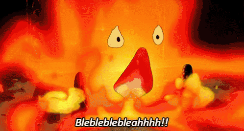
Context: Howl was taking a bath but his magic potions (which changes the colour of his hair) were mixed up by the female protagonist, Sophie, (a self-employed cleaner in his house). The unaware Howl used the wrong concoction and end up having a terrible hair colour (terrible in his opinion). Distraught by his tragic appearance, he had a literal melt down.
I literally LOLed at this quote because of how vain it is, and how the character (Howl) was saying it so earnestly while breaking down.
Look, he’s literally melting down!
Ponyo: “I’ll let a fish lick me if it’d get me out of this wheelchair”
This is a very trivial quote from the movie, said by an old lady from the elderly home. I chose it merely because of how quirky it sounds and the imagery it conjures up in one’s image.
But here’s one cute lil Ponyo:
and one ugly one:
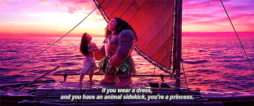
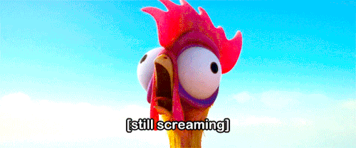
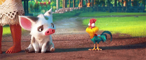
Moana: “If you wear a dress and have an animal sidekick, you’re a princess”
I watched Moana thrice in the cinema!!! That’s how much I enjoyed the movie. This quote was said my Maui (the big guy) to Moana. It was a very astute observation, made even funnier by the fact that Disney is mocking themselves through him, since practically every Disney princess wears a dress, and has a animal sidekick.
Wow this has been a great spam of images and gifs — can’t help it when one loves the movies that much! This research has been a trip down the memory lane, and a perfectly enjoyable one for that matter. Looking forward to working on these quotes!!
To source for inspiration and ideas for the next project Forrest Gump, here is some research that I’ve done up.
Dan Hillier
Firstly, I researched on an artist, Dan Hillier, whom Mimi suggested we look up. Dan Hillier has many interesting designs that are very befitting to this project as he works with collages of found images, masterminded by his imaginings. His designs have this vintage look and victorian style that I hope to be able to emulate. It seems like he is especially fond of having humans/portraits as the subject. His designs are dark and impacting, yet visually appealing. There’s also this mystical feel that I really like.
Here are some of his works:
Accessed from https://www.danhillier.com/artwork/undreamt—screen-printAccessed from https://www.danhillier.com/artwork/akasha—screen-printAccessed from https://www.danhillier.com/artwork/temple-of-the-way-of-light—screen-printAccessed from https://www.danhillier.com/artwork/midpoint-giclee
From what I have read online, Dan Hillier typically begins with a vague idea of what he wants to make, and from that idea he would scan through old books and illustrations, finding materials that can be suitably associated with his initial idea. Without a fixed image of his outcome, his exploration is quite intuitive and flexible because he allows himself to be led by what he found.
For my own project, I think I would like to follow his style of working. Instead of sketching my ideas for each quotes before hand, I would list out the main elements or moods from the quote and try to source for materials using those key words, and then play around with what I find. Hopefully this will make for an interesting and ingenious design!
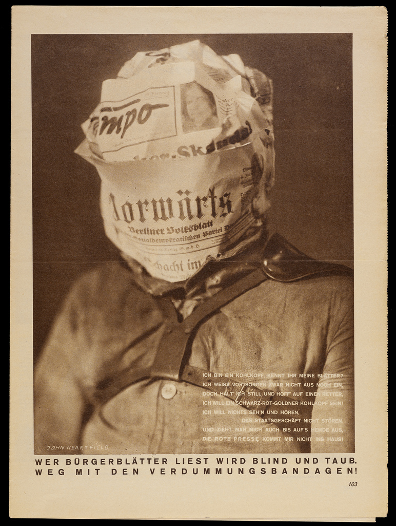
John Heartfield
John Heartfield is a German pioneer of the Dada movement and an anti-fascist collage artist who used his art as a weapon to defy The Third Reich and Adolf Hitler. His works made use of the photomontage technique (defined as: a combination of several photographs joined together for artistic effect or to show more of the subject than can be shown in a single photograph), with a touch of surrealism.
Interesting fact: more than using art as a tool to express political dissent, John Heartfield actually changed his German name Helmut Herzfeld to one that is more English-sounding as a provocative move. That’s really bold of him and makes him all the more admirable.
Some of his works:
Accessed from https://ipnagogicosentire.wordpress.com/2012/09/08/john-heartfield-and-the-anti-nazi-political-artivism/Accessed from https://litterboxconfidential.wordpress.com/category/shots/page/2/
The caption here reads: “Whoever Reads Bourgeois Newspapers Becomes Blind and Deaf: Away with These Stultifying Bandages!”
This is so impactful…… but also extraordinarily simple.
Accessed from http://retroavangarda.com/john-heartfield-and-the-dawn-of-photomontage/
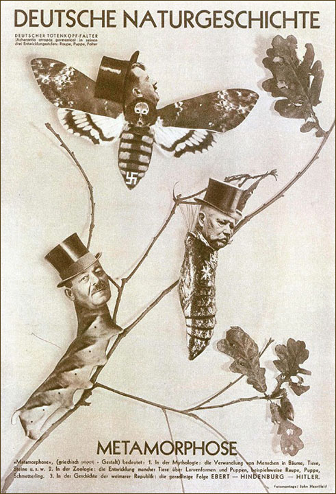
Deutsche Naturgeschichte translates to Natural History of Germany, and the subtitle Metamorphose means metamorphosis.
This work is alluding to Franz Kafkas’s story where the main characters evolve into insects. The heads of these insects are replaced by German politicians: Friedrich Ebert (caterpillar), Paul von Hindenburg (chrysalis) and Adolf Hitler (moth). These images are very powerful as it depicts the power dynamics that led to Hitler’s rise to power, e.g. Hindenburg, who was discreetly manipulated by Hitler, is depicted as powerless by being bounded in his cocoon.
Accessed from https://i.pinimg.com/originals/b6/07/29/b60729887cc1af29bd4e4026746be05f.jpg
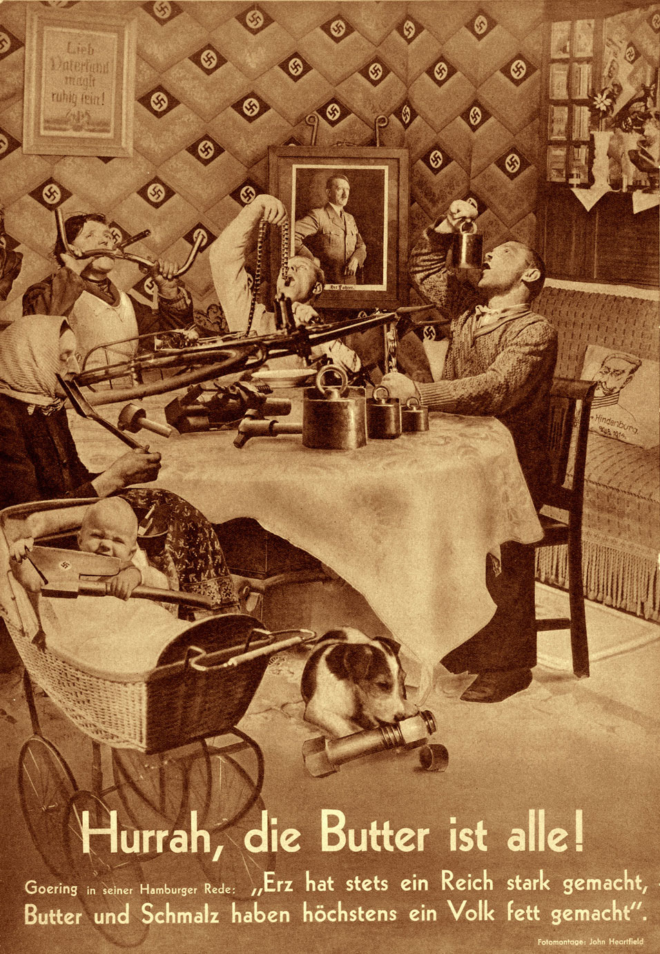
Caption reads: “Hurrah, the butter is gone!”
This photomontage makes parody a speech by Nazi Party leader Hermann Göring, who demanded an increase in iron production, even at the expense of food. A quote from the speech is included below, which says: “Ore has always made an empire strong, butter and lard have made a country fat at most.”
Heartfield’s work is wrought with irony. In stark mockery, he shows a typical German family brainwashed by the Nazi ideals, celebrating the fact that they have finally finished their food and all they have now is iron.
Accessed from http://retroavangarda.com/john-heartfield-and-the-dawn-of-photomontage/
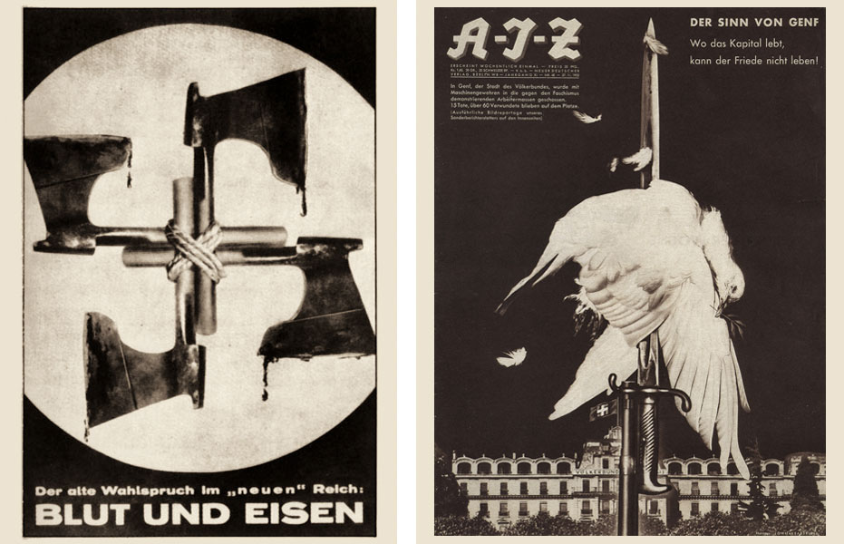
Caption reads: “Blood and Iron” (left); “Peace and Fascism”
His works are really powerful, even if the imagery is simple. Theres only 3 elements in the image on the right: a dove, a fascist bayonet, and the League of Nations building. But just simply having the dove being impaled by the fascist bayonet right in front of the building sends a strong message about the implications of Nazi Germany and the incompetency of the League of Nations.
(I really love history by the way ヽ(´ω`○)ノ.+゚*。:゚+ )
This research has been so enlightening and fruitful… I now realise how much significance embedded meanings can add to one work. Heartfield’s works were never straightforward and they force the viewer to really contemplate and ponder about what he is trying to convey. Now that I’ve learned about his works, maybe it’s time to go and revise some of my own designs (I’ve started on a few already), in hopes that I can deliver the quotes more powerfully.
If you’re lazy to download the file, here are some important points from our research:
General Introduction:
Accessed from https://jessbens.wordpress.com/2012/02/19/dot-line-and-shape/
Dot, line, and shape are the basic elements of design
Elements are components or parts which can be isolated and defined in any visual design or work of art. They are the structure of the work, and can carry a wide variety of messages.
Dot
A point is that of which there is no part — No part = no width, length, or breadth
In pure geometric terms, a point is a pair of x, y coordinates.
Use of points:
Vanishing point
The spot on the horizon line to which the receding parallel lines diminish
Creates depth
In art: Yayoi Kusama, Benday dots (in comic illustration), Neo-impressionism movement (A Sunday on la grande jatte)
Accessed from https://hirshhorn.si.edu/kusama/Accessed from https://georgetowner.com/articles/2013/08/15/lichtenstein-blockbuster-proclaims-power-print/
Line
A line is a length without breadth.
Graphically, lines exist in many weights; the thickness and texture as well as the path of the mark determine its visual presence.
Use of Line
In composition or image
Lines are important to guide your eyes.
Horizontal lines suggest a feeling of rest
Vertical lines often communicate a sense of height
Diagonal lines convey a feeling of movement
Curve lines can convey energy
Use of line to create optical illusions
Accessed from https://s-media-cache-ak0.pinimg.com/originals/1f/8d/f3/1f8df341ebeff6b434decffc666559f5.jpg
Use of line in Fine Art: Chua Ek Kay
Accessed from http://www.theprivatemuseum.org/index.php/exhibition/old-campus-revisited/
Use of line in fine art: Gene Davis
Accessed from https://www.artsy.net/artist/gene-davis
Shape
A surface is that which has length and breadth
Shapes are planes with edges.
When a form or shape has regular contours, when internal and external measurements are mathematically similar in multiple directions, we think of the form or shape as geometric.
Organic shapes and forms are typically irregular or asymmetrical.
Use of Shape:
We see shapes every day in logos, flags, books, clothes etc.
TV test screen
Accessed from https://www.youtube.com/watch?v=8gKL_3LIK2k
Local Artist Yeo Chee Kiong: “Series #02, ‘A Yoga and Pedicure DIY Session on the Beach’“
Accessed from http://cheekiongyeo.com/?language=en_gb
Use of shape in Architecture: Louvre
Accessed from https://plus.google.com/communities/115746467979626722538/stream/62b9e0b2-17eb-434b-a8ea-f24a54624569
Point, Line and shape
All 3 elements combine Patterns, Compositions (Art)
Pattern: A regular repetition of lines, shapes, colours, or values in a composition.
Henry Moore’s Wallpaper Design
Accessed from http://midcenturymoderndesign.tumblr.com/post/62745744987
Kandinsky Composition viii
Accessed from http://www.wassilykandinsky.net/work-50.php
And it comes! The day of final submission! Three weeks of mark-making and it’s now over!
My work:
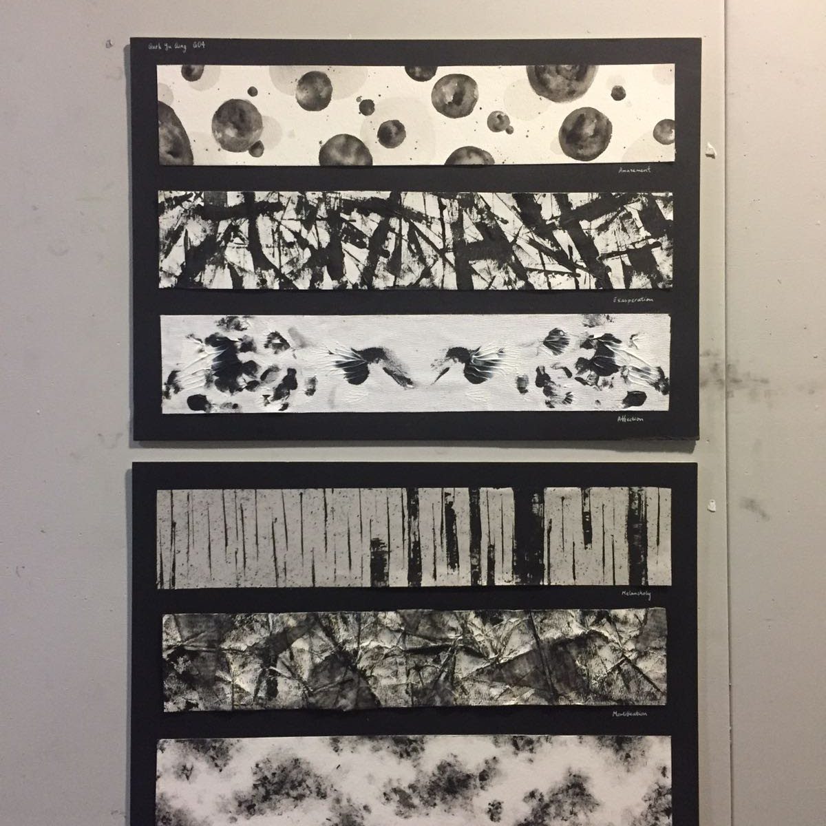
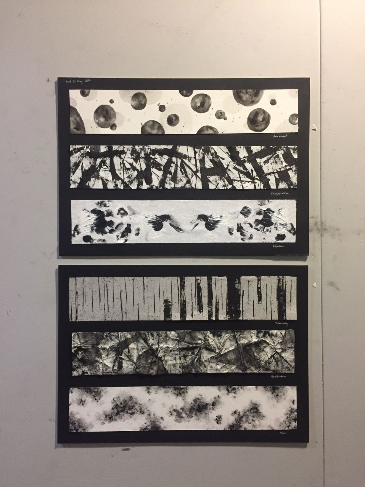
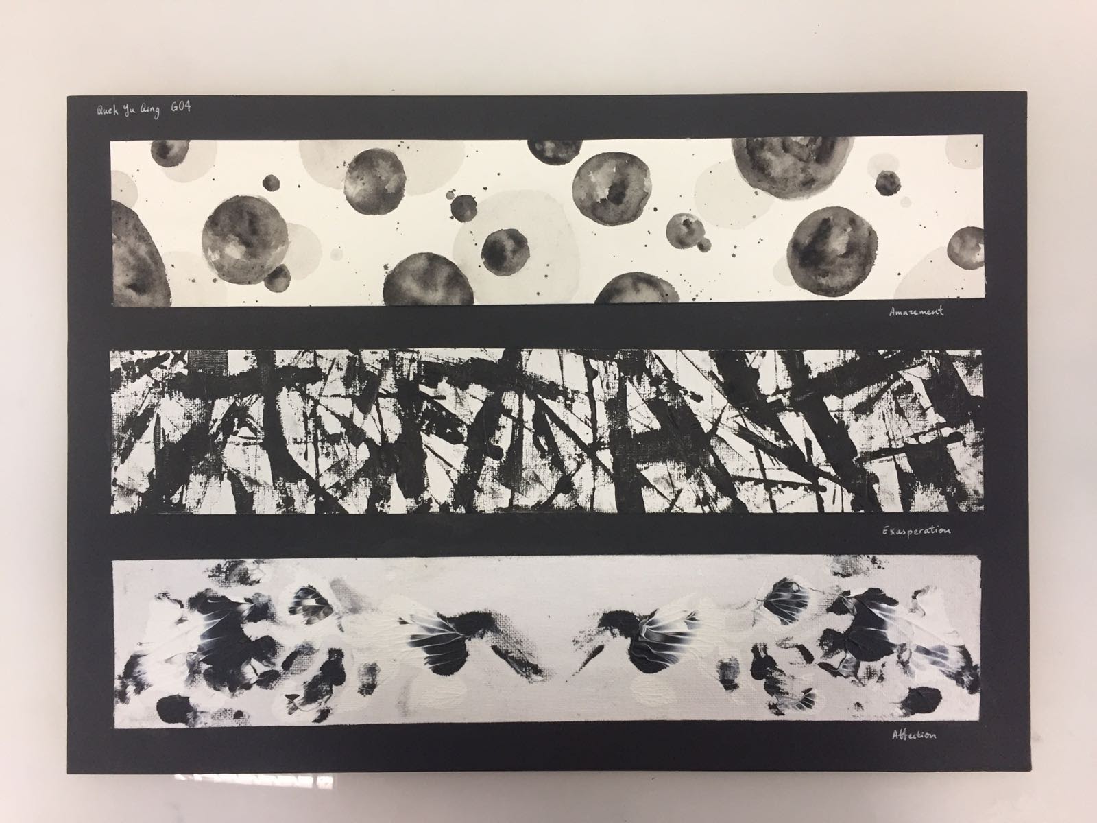
Top down: Amazement, exasperation, affection, melancholy, mortification, bliss
Infancy — Amazement
the marks, while representing amazement, have a touch of inquisitiveness in them
the bubble-like marks encapsulates the curiosity and wonder a child feels as he/she interacts with the world for the first time
questions and wonders pop up like bubbles in their minds spontaneously
every ink blot/circle is unique -> every child interprets our world differently, but their interpretations are all equally mesmerising and filled with precious innocence
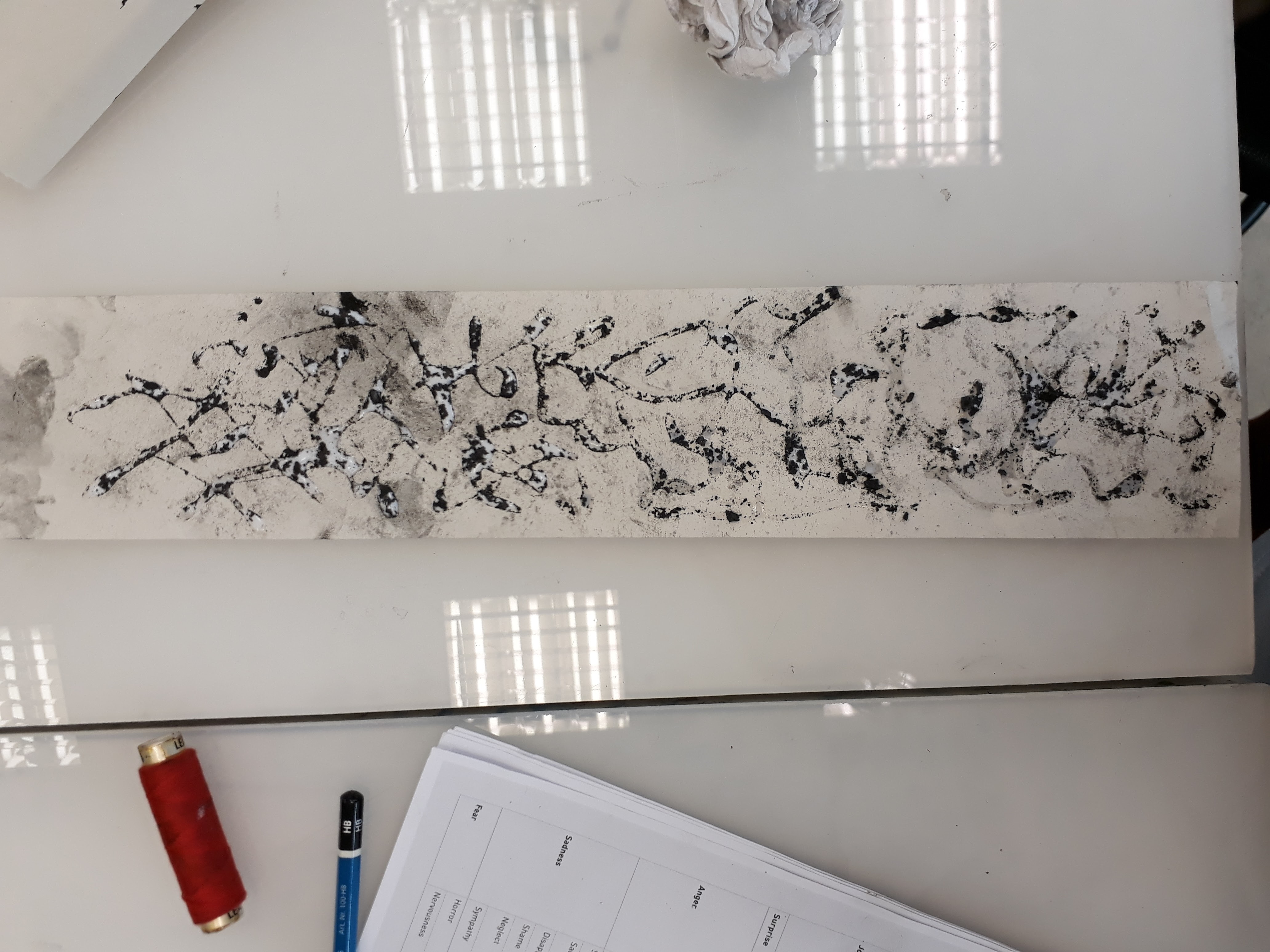
Adolescence — Exasperation
The marks record our rebellious years where our fluctuating moods and identity confusion causes us to be dissatisfied with and exasperated at many things, be it towards our peers, our family or our parents
use of palette knife to slash paint onto the paper is just like how one feels like ‘killing’/’strangling’ a person when that person simply does not understand what you’re driving at
the thicker smears of paint is just like the huge SIGHs we make after each gradual build-up of exasperation
expresses the uninhibited aggression and frustration a teenager feels at that stage
It also portrays teenagers’ urgency to make an impression and assert their identity and importance in this world
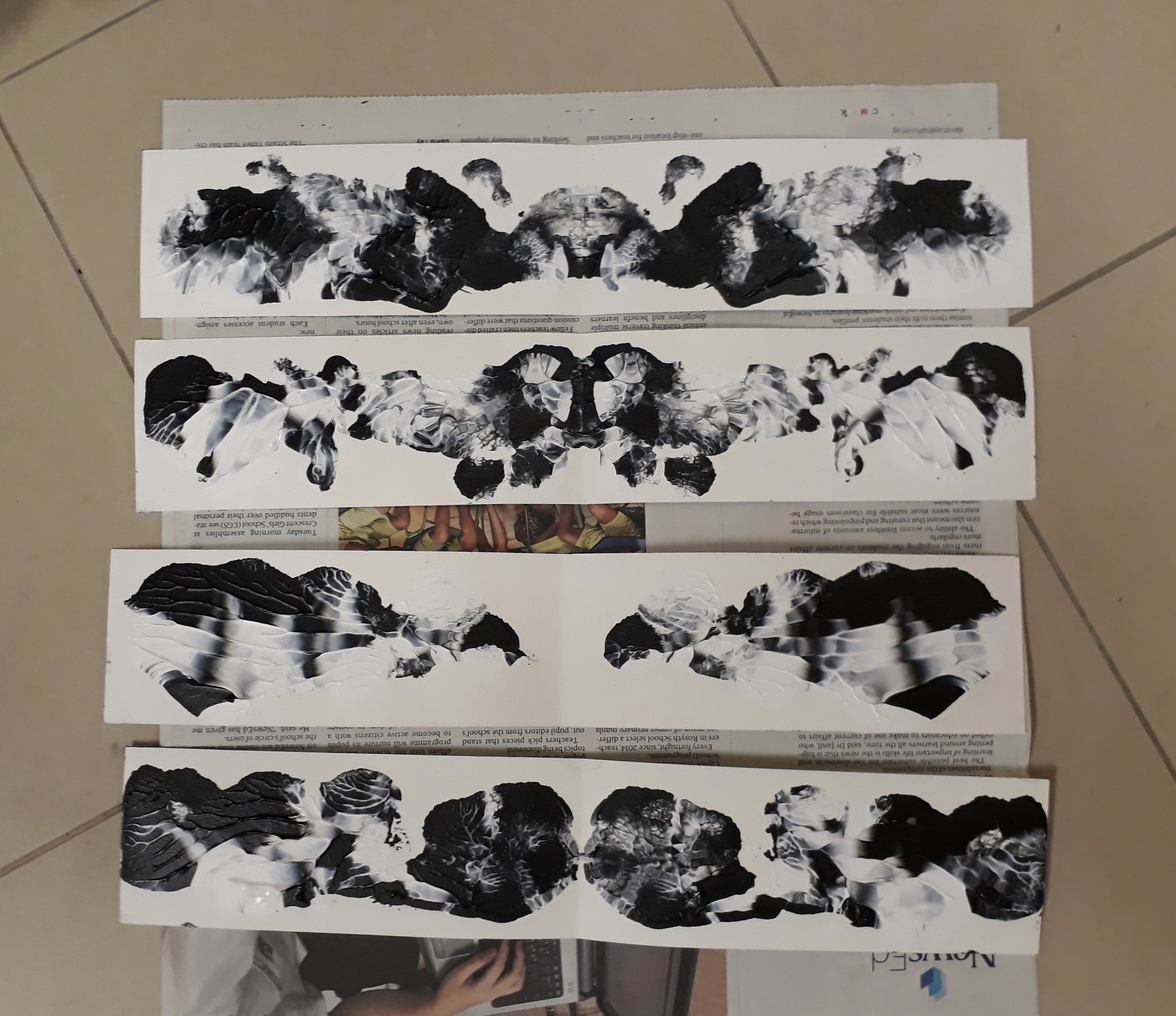
Love — affection
As we move through our teenage years into adulthood, we start looking for our other ‘half’ (the symmetry in this mark alludes to this)
the dreamy and fantasy-like feeling suggests intimacy and sweetness —illustrates our hopes and ideals for our partner
the emergence of love-birds-like figures from hazy fumes shows how the search for our true love often begins without us knowing what we are looking for, but it eventually reveals itself to us
Notice how the images are similar but not identical -> what I am trying to convey here is that we will find flaws in even our perfect fit, but we must learn to embrace them and accept them for who they are
Mid-Life crisis — Melancholy
Looming spectres and the use of lines of different weights and intensity creates the illusion of depth — some of our troubles are further away while others are right in our face
Hazy background -> melancholy feelings do not usually have an identifiable source of sadness, yet the feeling is pervasive and omnipresent
Sparse marks help to convey the idea of hollowness and emptiness
Using the palette knife to slash the paper with ink exemplifies how pangs of grief strike a melancholic person
Illness/the approach to old age — Mortification
Paper marche effect created by using newspaper with glue and water
The marks were made by crumpling the paper, and then rolling the roller across the creases
memory fades, vision darkens, creases appear
the use of newspaper: words giving themselves up to the void, along with all the meaning they used to contain
fragmentation: highlights the dissonance/ confused state of mind one is in as you grow frail
Death looms, close enough to be weighing on your chest
Before the final end — bliss
This mark presents a strong juxtaposition to the ‘mortification’ strip
One learns to find peace with oneself and finally achieve a sense of serenity and solidarity
The cloudy/ dreamy mark prompts one to reminisce about one’s childhood and life experience
Death becomes a relief from suffering
the soft outlines represents how death is like a restful/gentle sleep
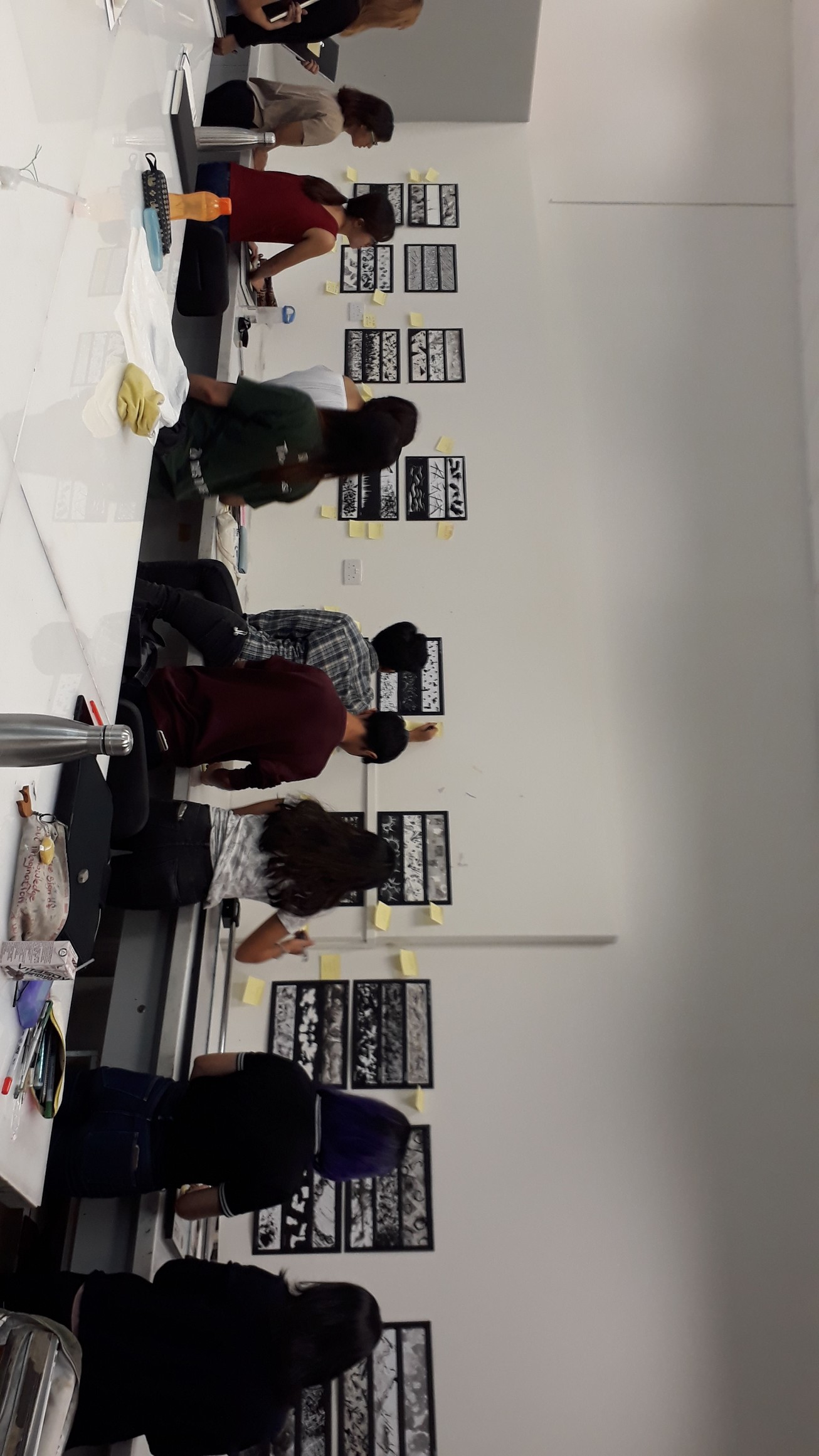
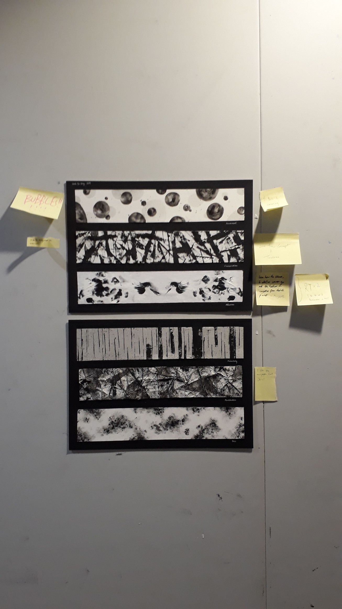
Presentation!
I really love the museum-style presentation — we lay out our works just like how they’ll look in a gallery and we are walked through the works one by one. It was really intriguing to learn about what my peers did and how they interpreted different emotions differently from me.
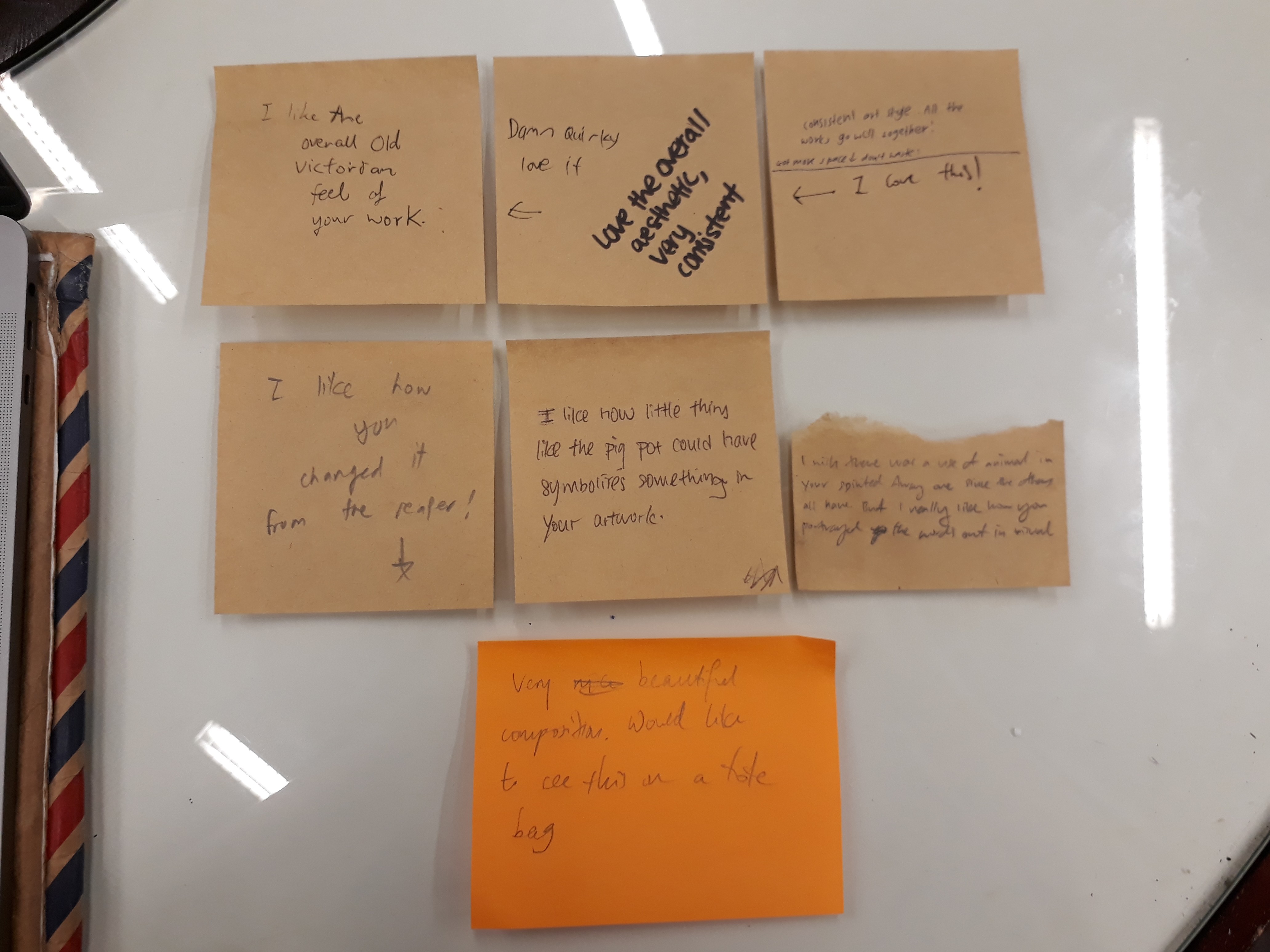
Thanks friends for the encouraging comments :D
Some Reflections
Overall I’m rather proud of my work but I feel that I could have explored even more with different mediums and materials. I initially thought that this project would be easy, but that was not true at all — it was only through tireless experimentation that I am able to generate my final pieces. But it was only through this process that I came to realise the importance of experimentation as an indispensable part of the creative process because there were so many inspirations that only revealed themselves to me along the way. All in all, mark-making is a highly therapeutic activity. I really had a lot of fun working on this project :)
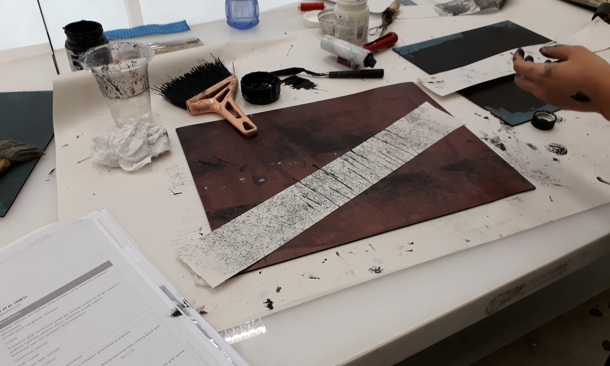
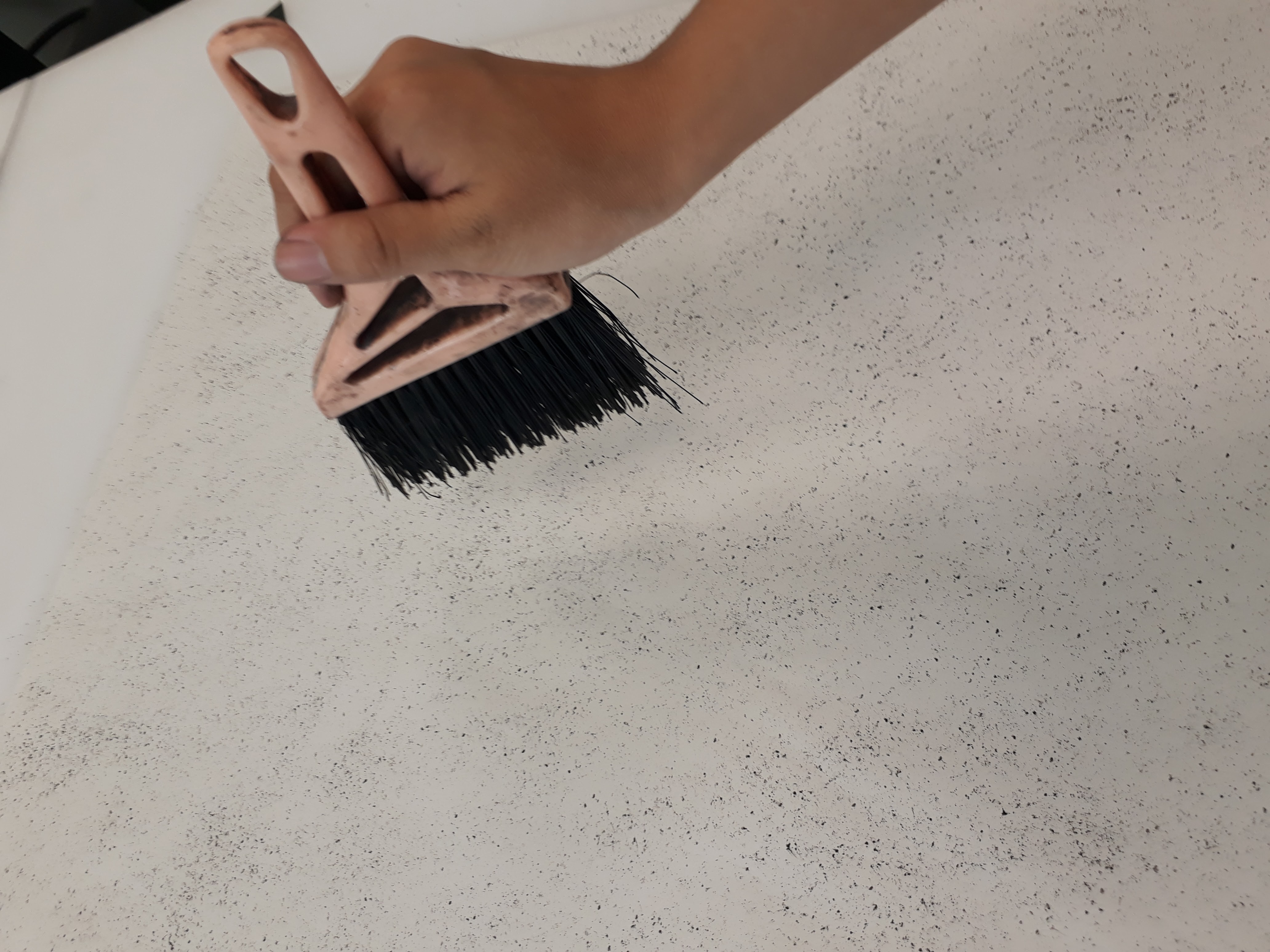
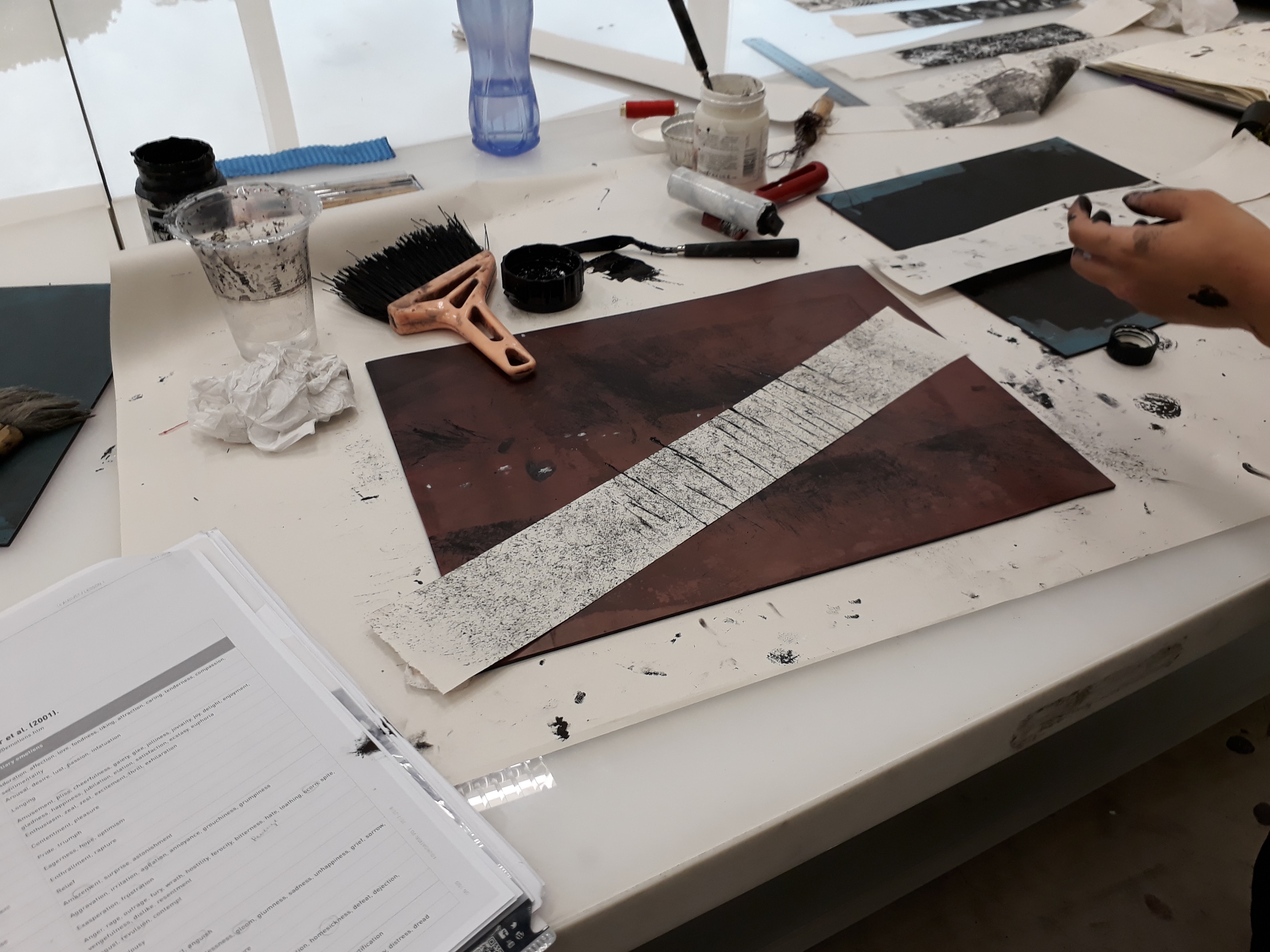
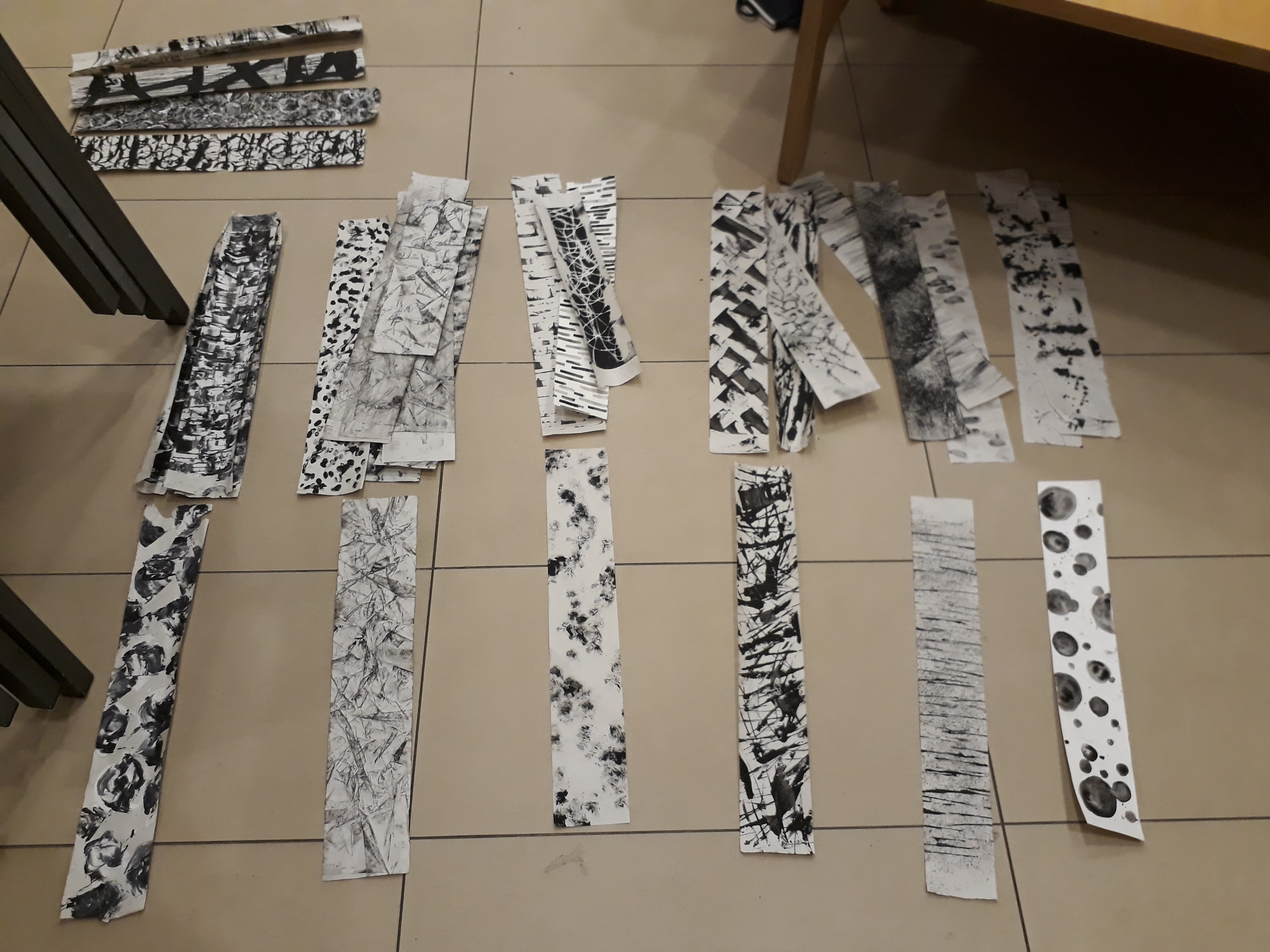
Here are some documentation of the process I’ve been through for mark-making. I realise I’m not a person who can multitask very well, and so I kept on forgetting to whip out my phone to record down my experimentation process.
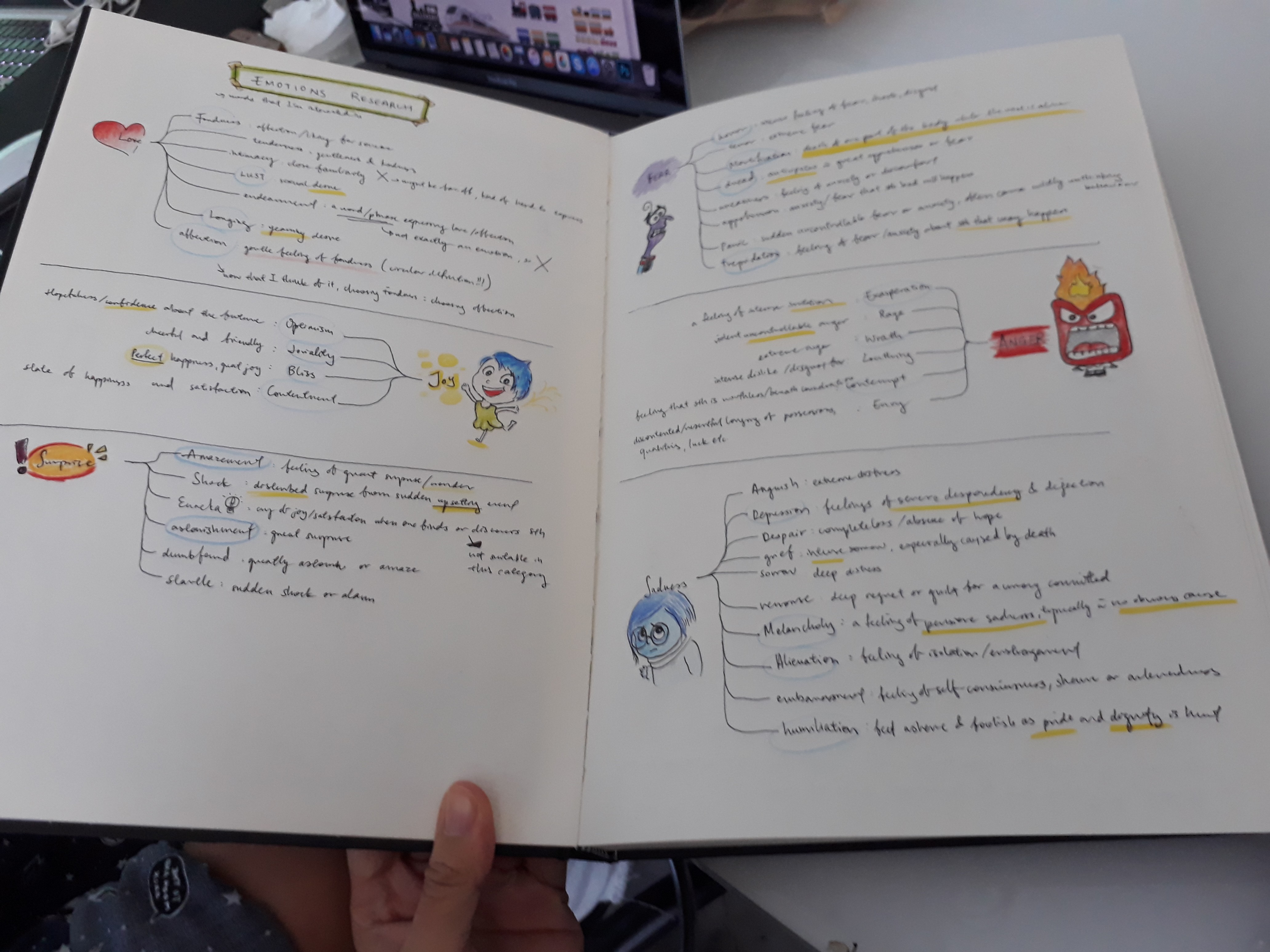
Initial emotions research:
I wanted to get a clear idea of what each emotions represented. Hence I did several small mind-maps for each emotion category and researched on each specific emotion to ensure that my understanding of that emotion is correct.
Experimentation for melancholy:
The feeling of melancholy is something that I believe everyone can instinctively understand as the wrenching throb in the heart but troubles to eloquently put the emotion into words. And so when I tried to express melancholy in my marks, I tried to keep the the marks to a minimum so that the empty space (the paper) gives a more pervasive feeling of hollowness and emptiness.
I made this by spreading glue around the paper first, and then sprinkling charcoal crumbs previously crushed. When the glue dries, only the charcoal is left behind, obediently following the trail of glue. I thought the idea was interesting, but I didn’t have any use for it in my final 6 emotions
To see more of my process, please refer to my visual journal :DD
This was what I had after a week of experimentation:
Consultation with Mimi
Mimi said that my works were too symmetrical (I agree!!!). I actually did try making some strips that were asymmetrical but I discarded them because they looked too bad. But I should really experiment more with having asymmetrical designs or having the idea of gradual up of emotions in order to make my works more exciting
Mimi also mentioned that I shouldn’t be working on newsprint alone. I took her advice and experimented with canvas, watercolour paper and newspaper later on :) I also tried to vary my medium by using acrylic and watercolour (wanted to use oil but it wouldn’t dry in time)
Can try collaging the works! See if anything interesting comes out of it!
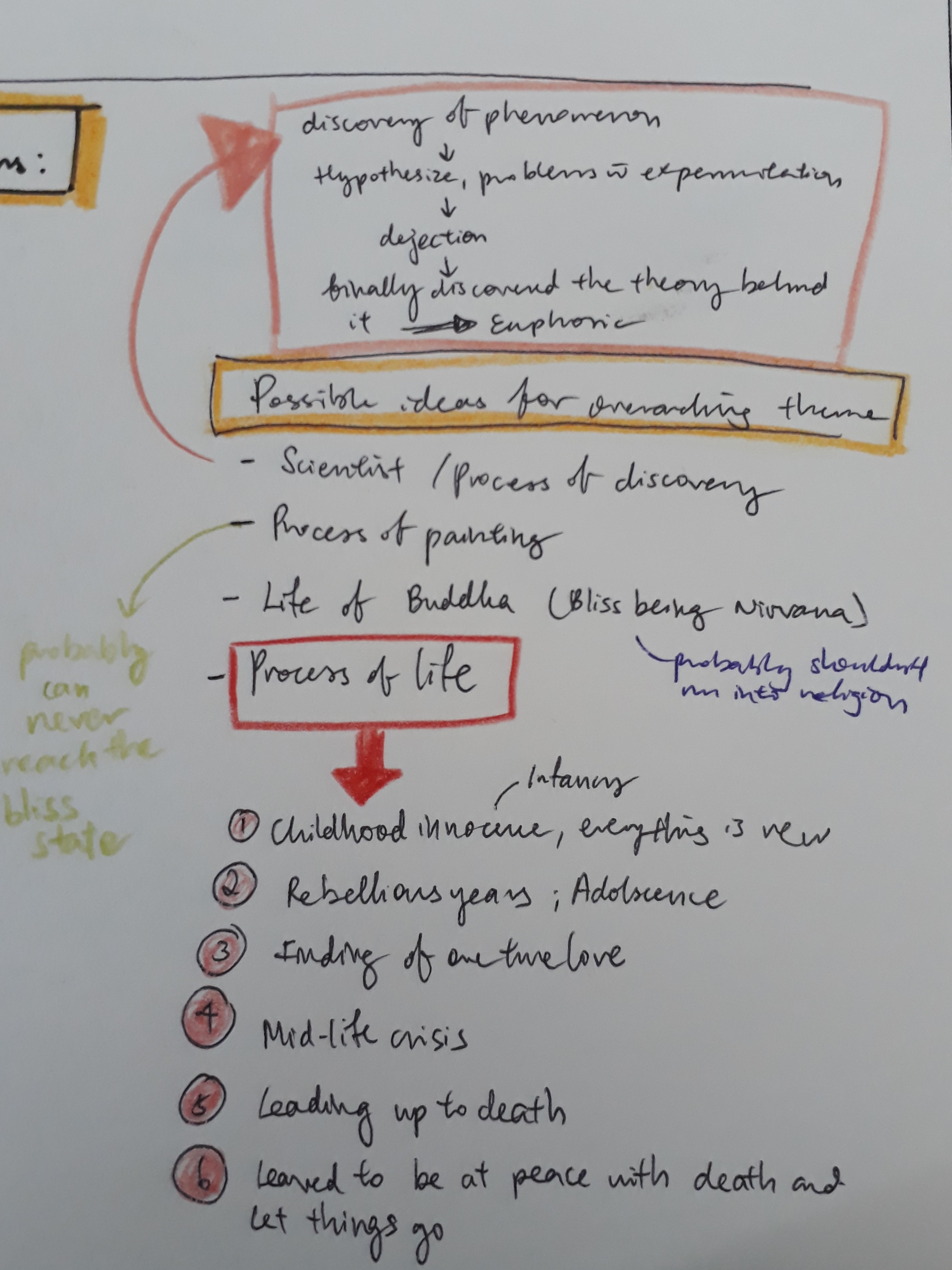
There has to be an overarching theme that can hold the separate emotions together (can be in the form of songs, stories, phenomenon, or just anything)
Even though Mimi said that I have a wide variations of line work, she said to be careful when choosing my final 6 strips to prevent having the works looking too similar (especially since I seem to have the tendency to product mark-making that fills up the entire page)
Working on my learning points from the consult, I continued experimenting with more emotions, specifically working on points raised during the consultation.
Working with asymmetry
Working with different medium:
Initial idea was to simply roll a roller over crumpled paper
I decided to work on this idea by introducing newspaper as a medium to create a paper mache effect.
I brainstormed for a suitable theme to make my emotions cohesive and coherent when seen in a certain sequence. I had a few ideas off the top of my mind but they were somewhat random. At the end, since we are dealing with emotions in this project, I started to think about what emotions themselves signify. I felt that emotions are something very ‘raw’ and very ‘unique’ to humans. Yes, some animals can feel emotions as well, but they’re not as varied nor can they reach the same depth as human emotions can. Along this line of thought, I decided that I wanted to do something that ties in very closely to what makes a human human, which is how I arrived at my theme “life”.
Brainstorming:
With this as my starting point, I started to narrow down emotions that I want to deal with. I identified the different stages of life and the emotions one most probably would have felt at that point in time:
Infancy
Adolescence
Teenager – Adulthood
Mid-life Crisis
Illness/ approaching old age
Before the final end
(Check out the journal for the full description for each stage :> )
From my huge pile of emotions, I picked out 6 emotions most representative of what one would have felt at the six identified stages of life:
Infancy — Amazement
Adolescence — Exasperation
Teenager – Adulthood — Lust
Mid-life Crisis — Melancholy
Illness/ approaching old age — Mortification
Before the final end — Bliss
I went on making the final emotions used for submission. However, I realised that the same marks can never be replicated. Even subtle differences can make a big difference to the general mood the marks elicit.
In particular, I couldn’t get ‘Lust’ the way I wanted at all even after multiple, numerous, countless number of tries and kilos of paint wasted (just kidding). In a spurt of frustration, I folded a strip that I was doing halfway, intending to discard it. However, when I opened the strip, it dawned on me how perfect Warhol’s Rorscharch technique can be applied. I started experimenting more with this technique, constantly being pleasantly surprised whenever I open the folded paper.
And so, one day before submission, I changed “Lust” to “Affection”, an emotion I thought best described the ink blot I made.


 The table in hall is so smal!
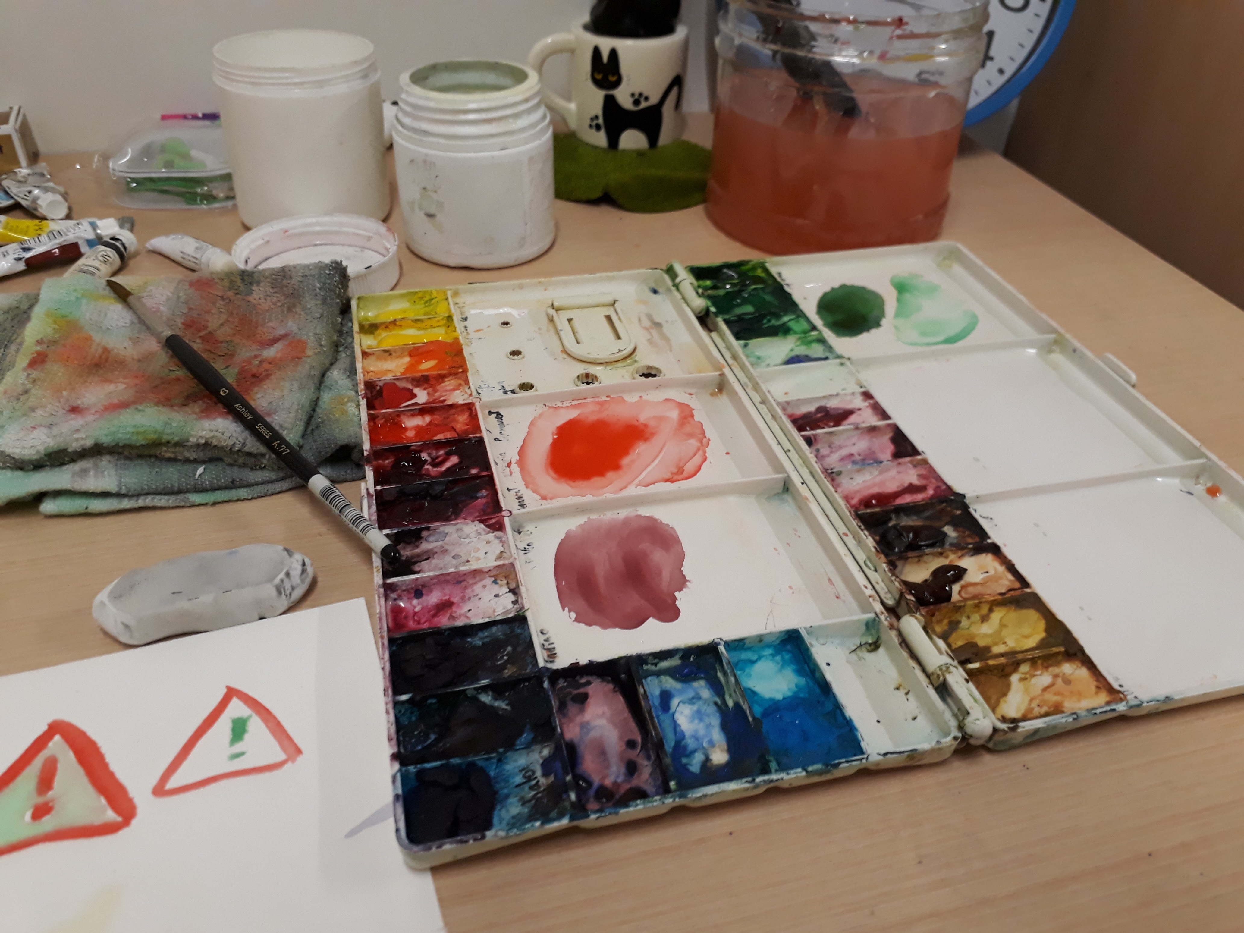


 The sharks were determined not to eat fishes at the start.