Final Project: Animatic

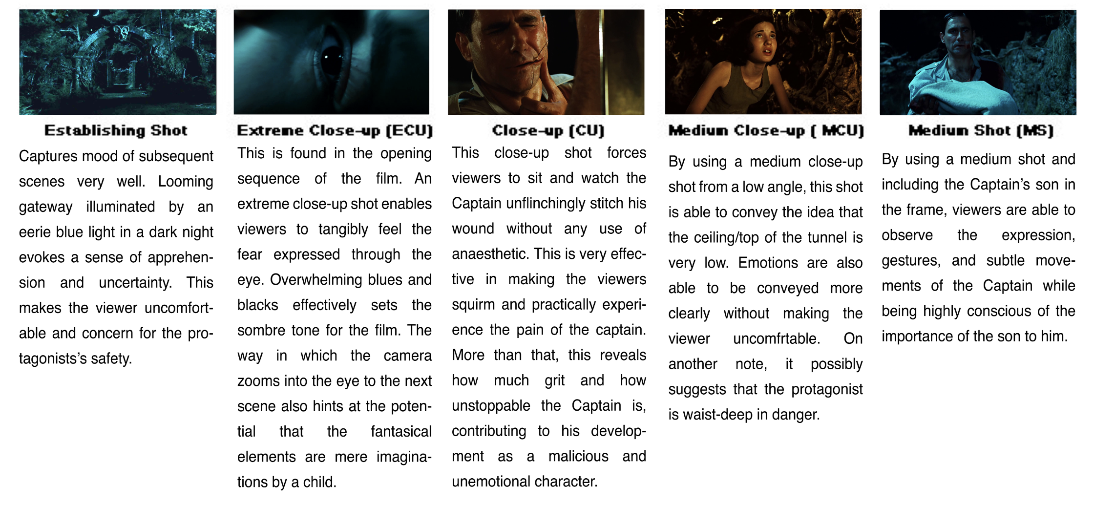
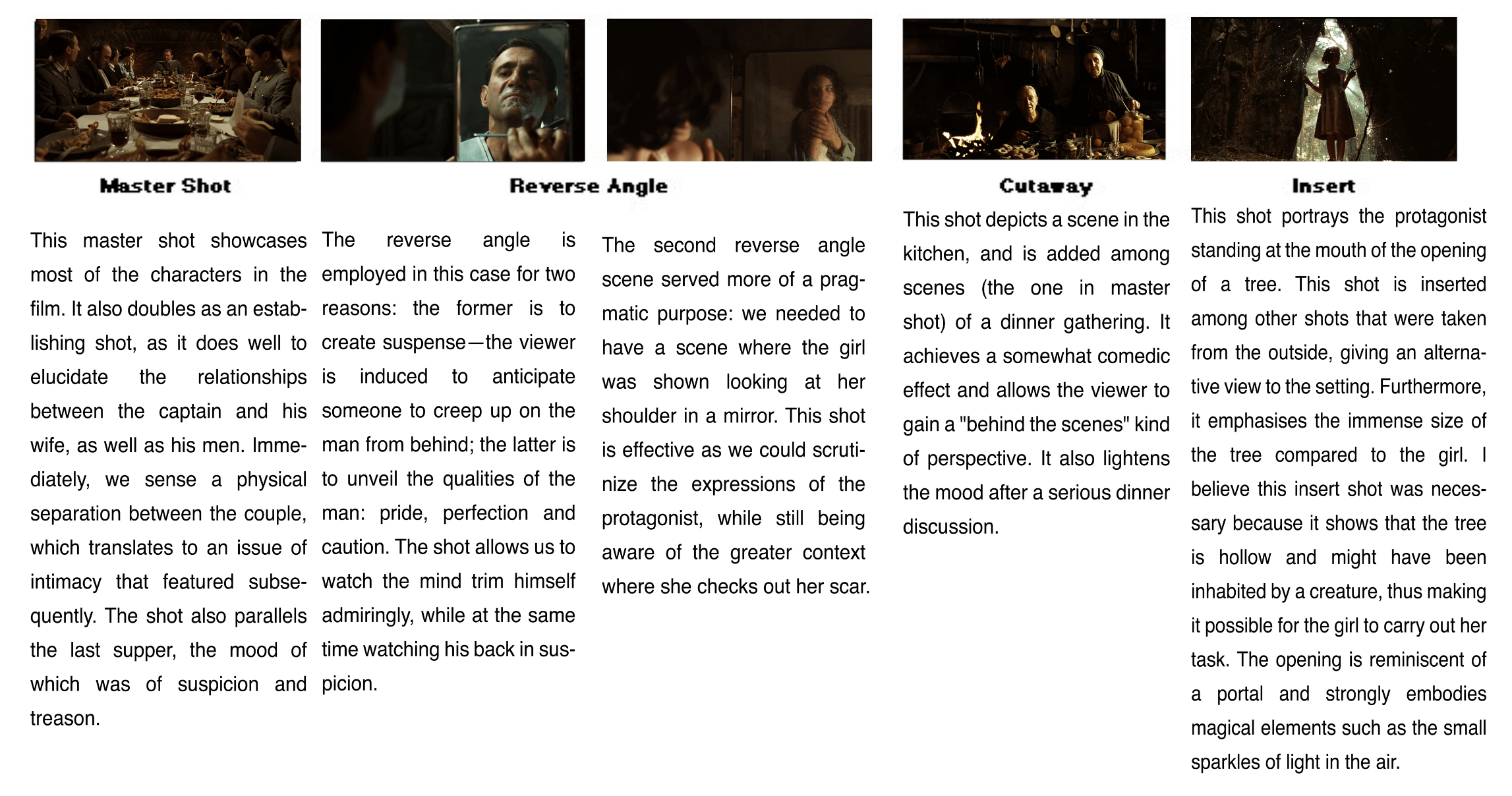
The Man and the Tree

Story Synopsis

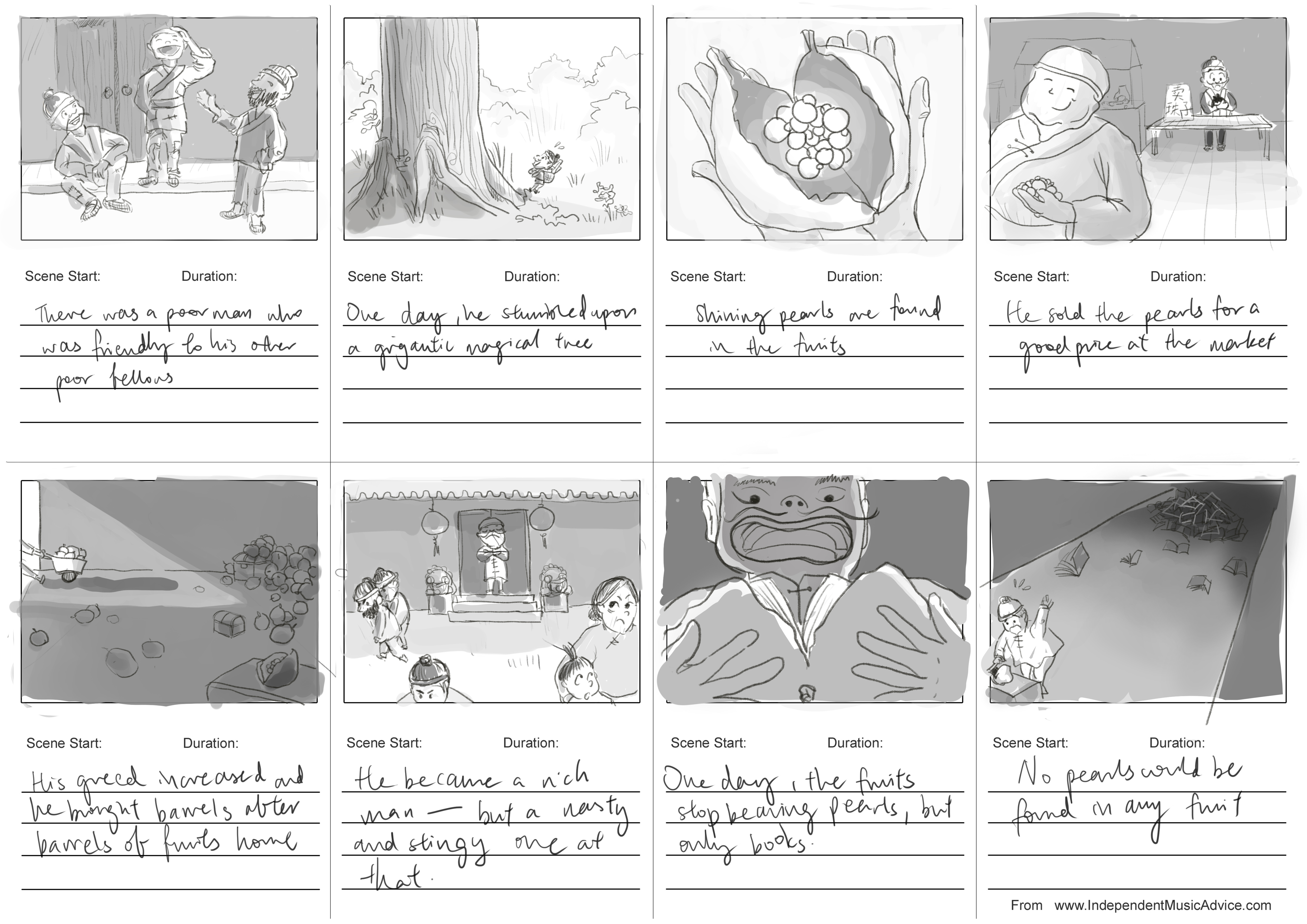
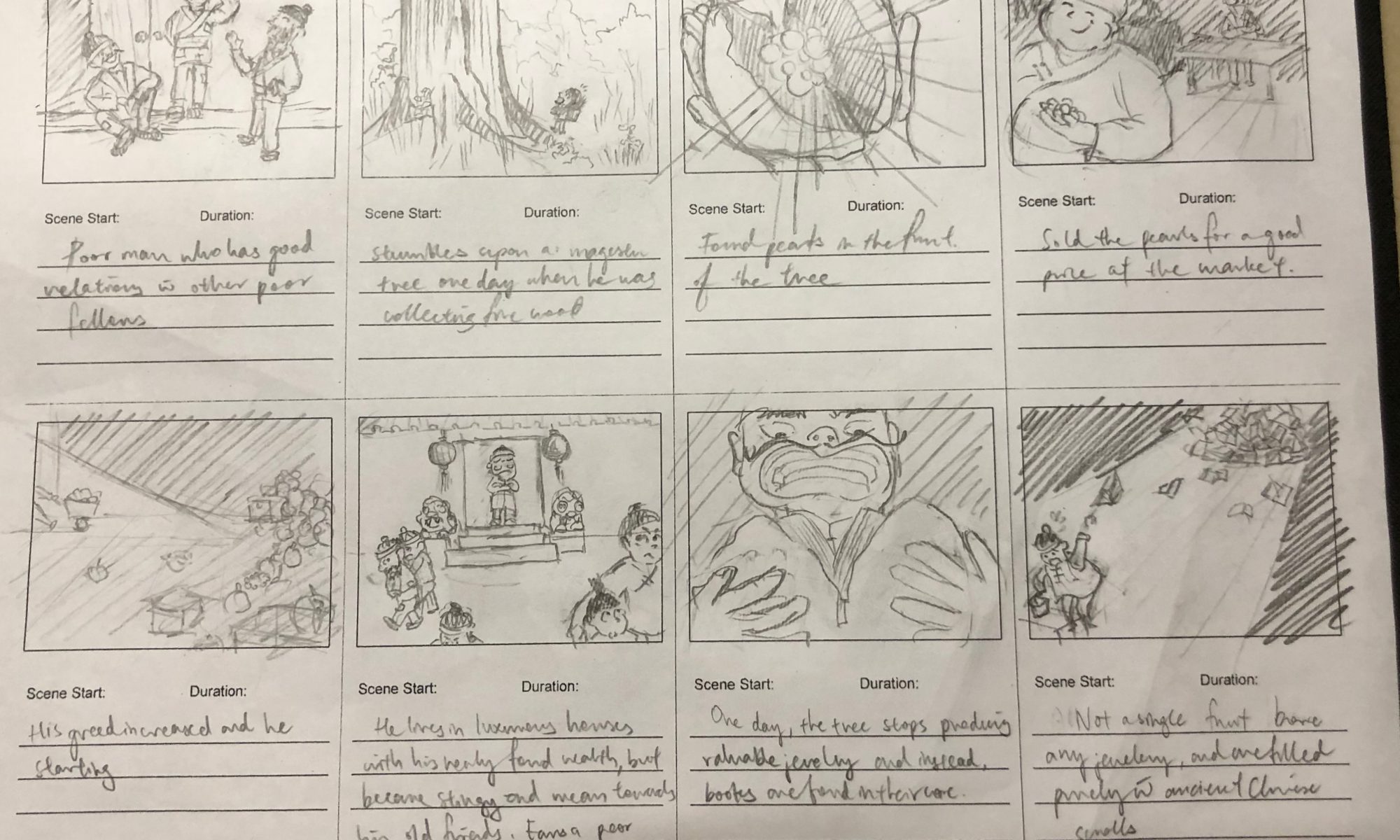
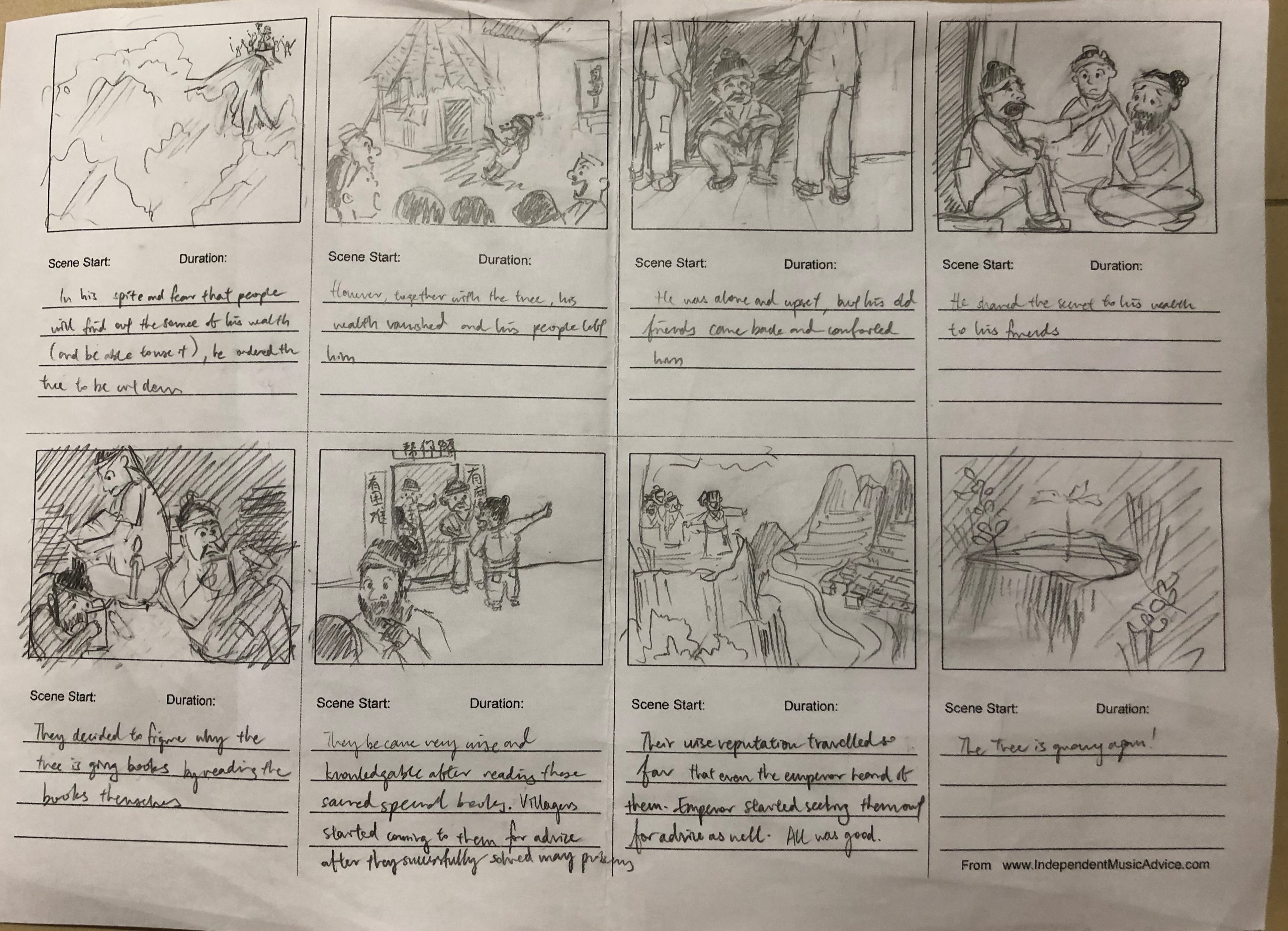
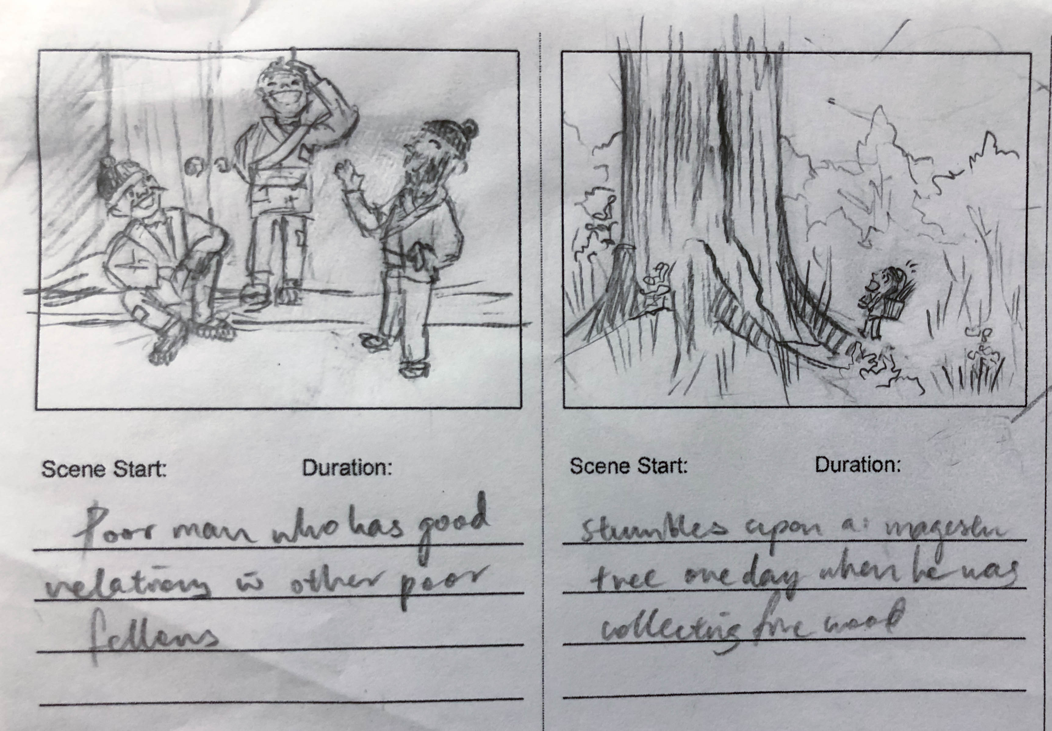
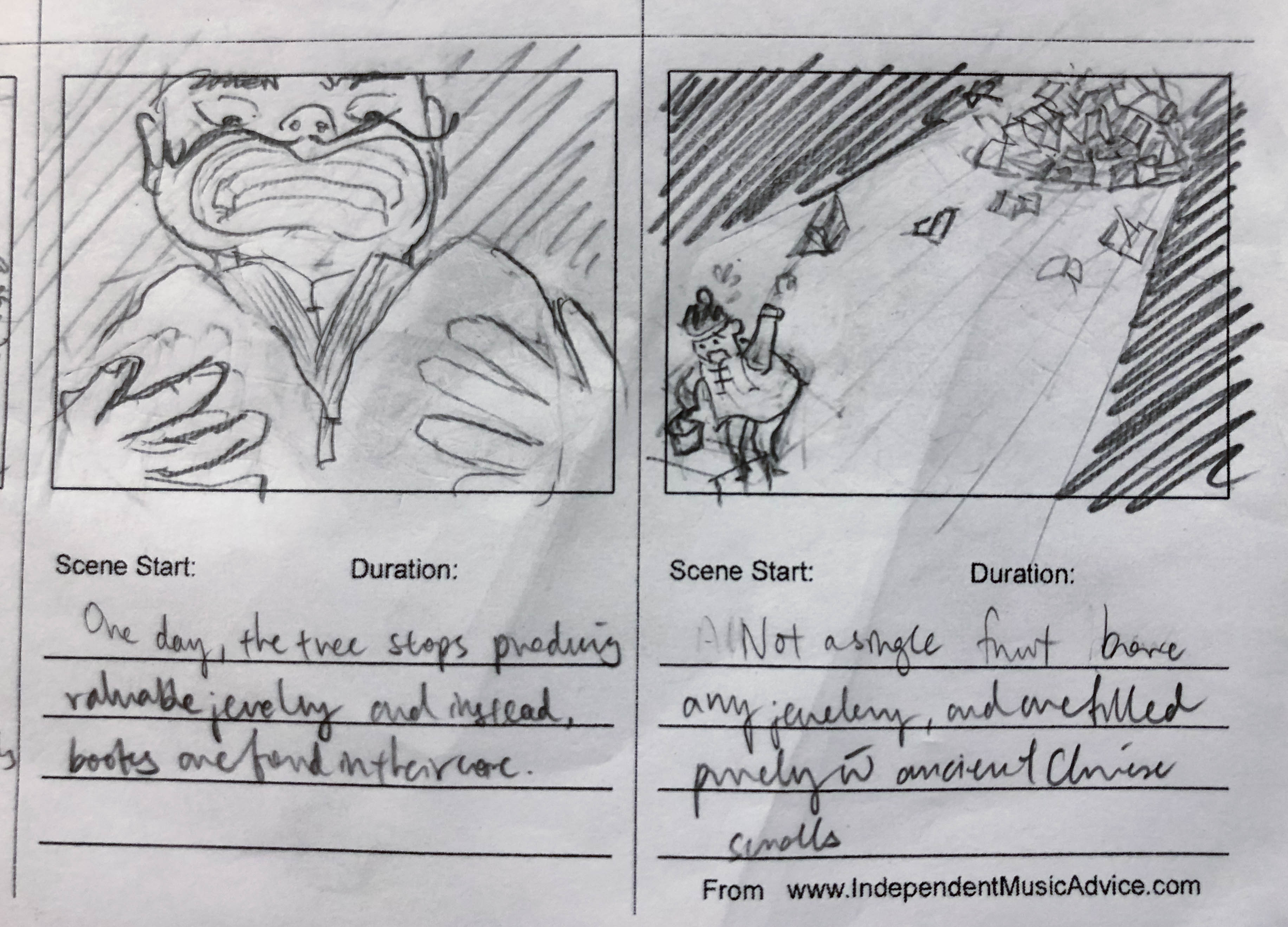
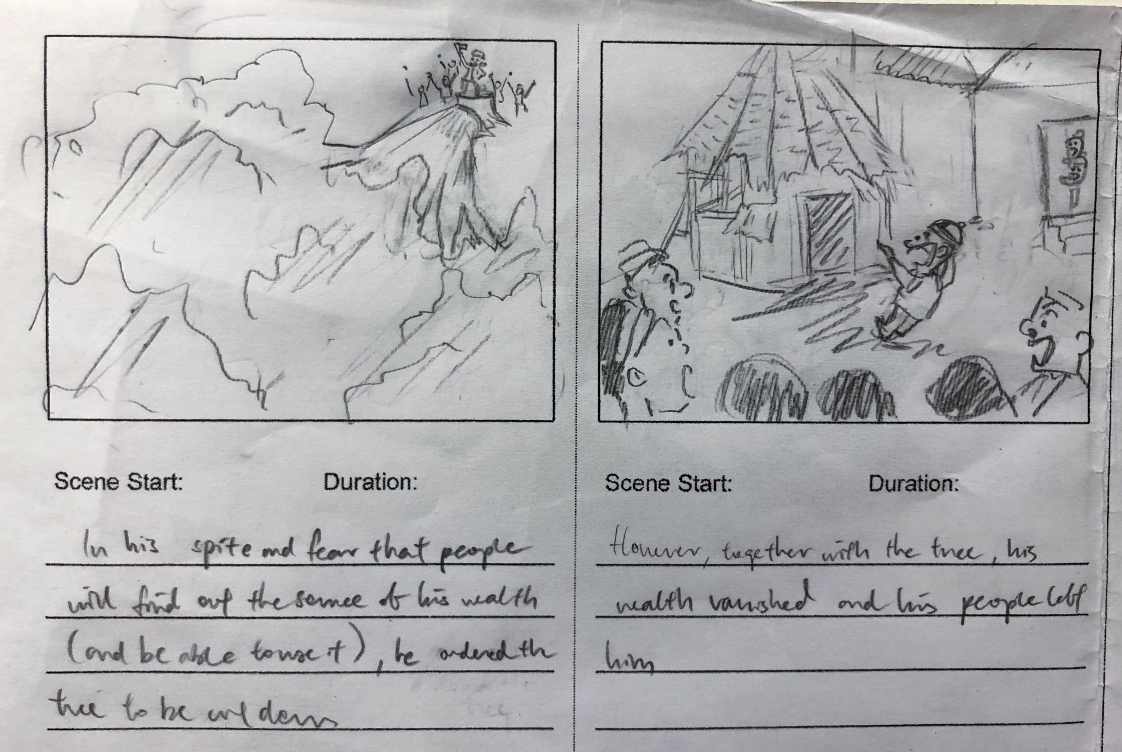
A poor man chances upon a magical tree that bears jewellery. He sells it for some good money, and realises the profitability of his enterprise. His wealth amasses and he soon forgets his humble roots. Where would his greed take him?

Process

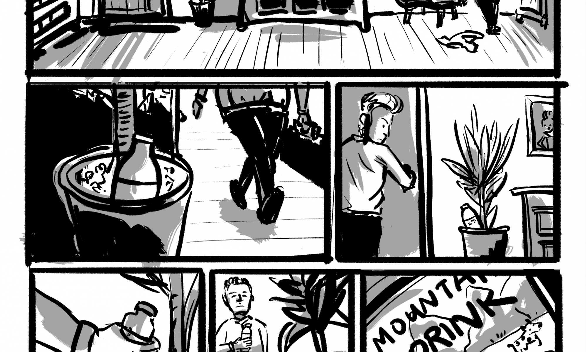
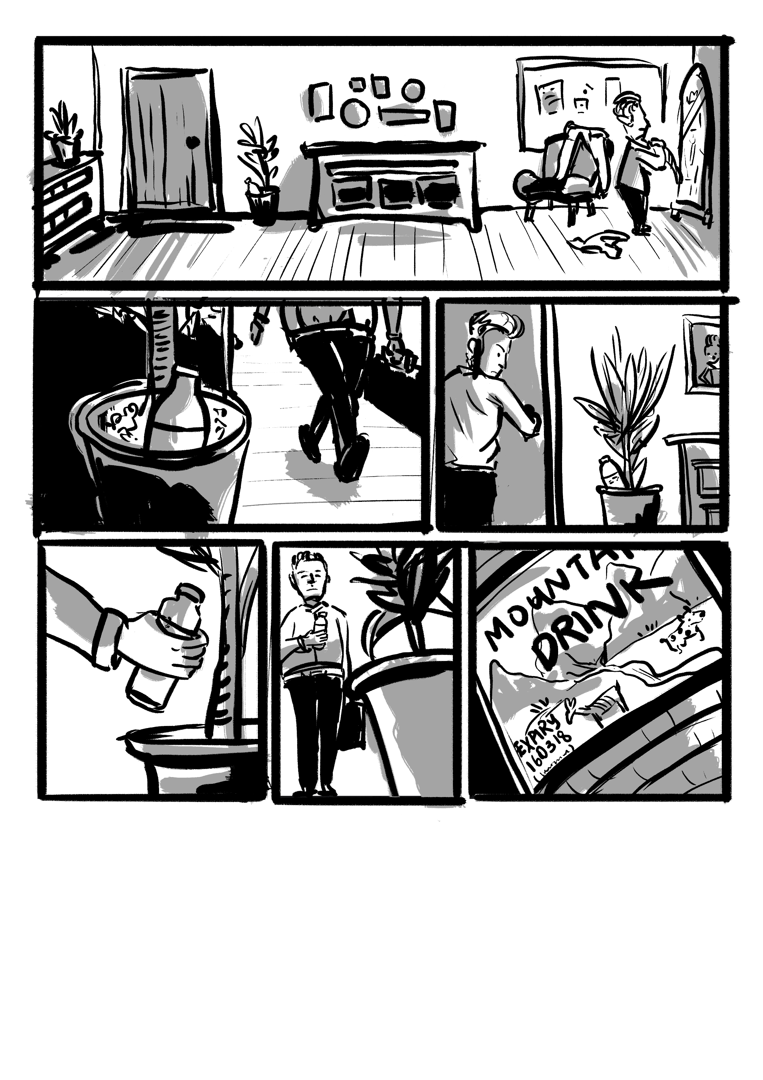
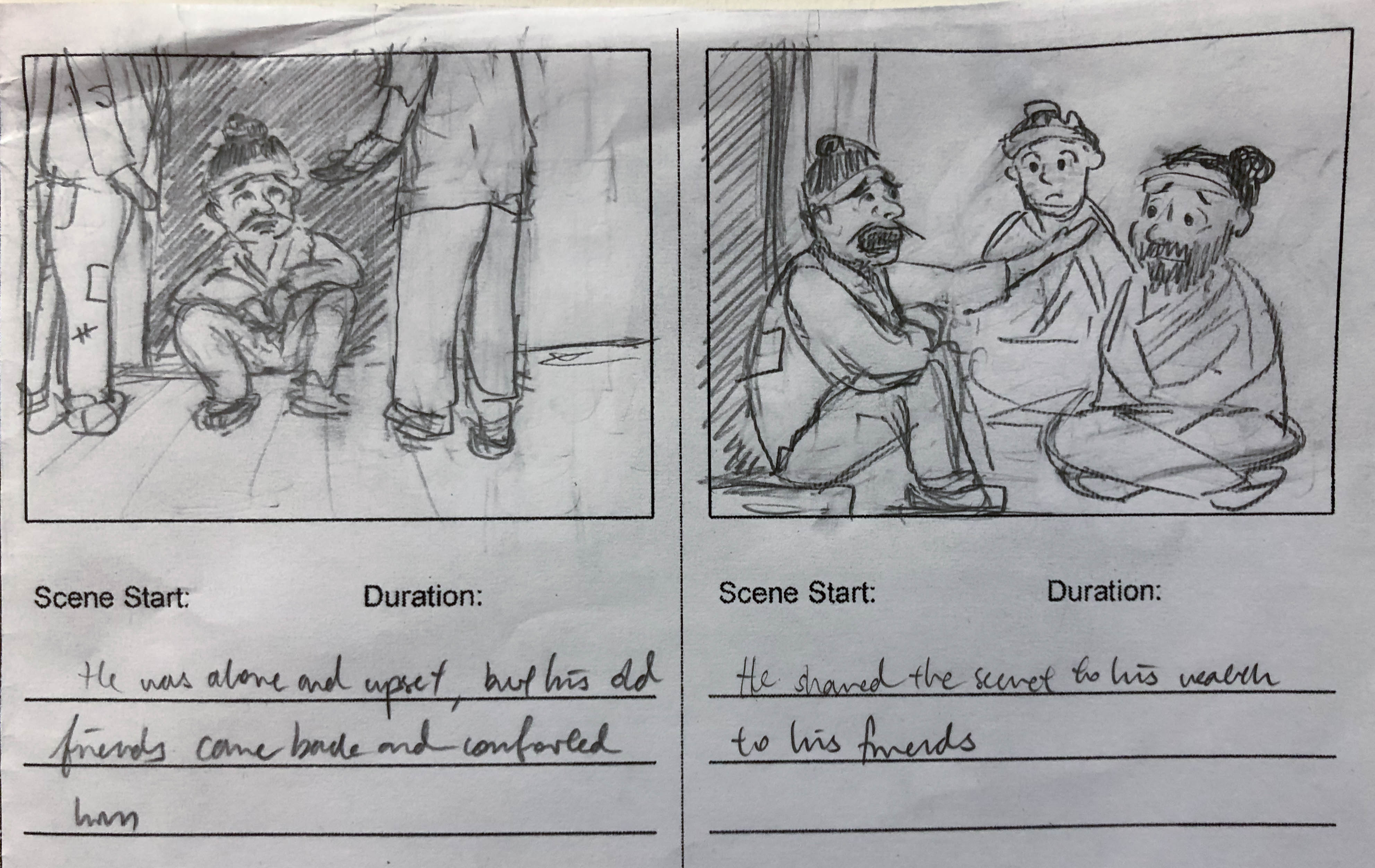
As I worked on a graphic novel layout for the previous project, I did not have any storyboards to work with. While this means that I essentially need to start from scratch, it also means that I could play around with a different mood and style from the one I did for the graphic novel — which I did. But first, I had to trim the story. The original story was way too complicated and the story beats were extremely concise. There was no way I could pull that story off in a limited amount of time. As such, I shortened the story by removing the parts about his relationship with his friends and his transformation after his wealth vaporised.

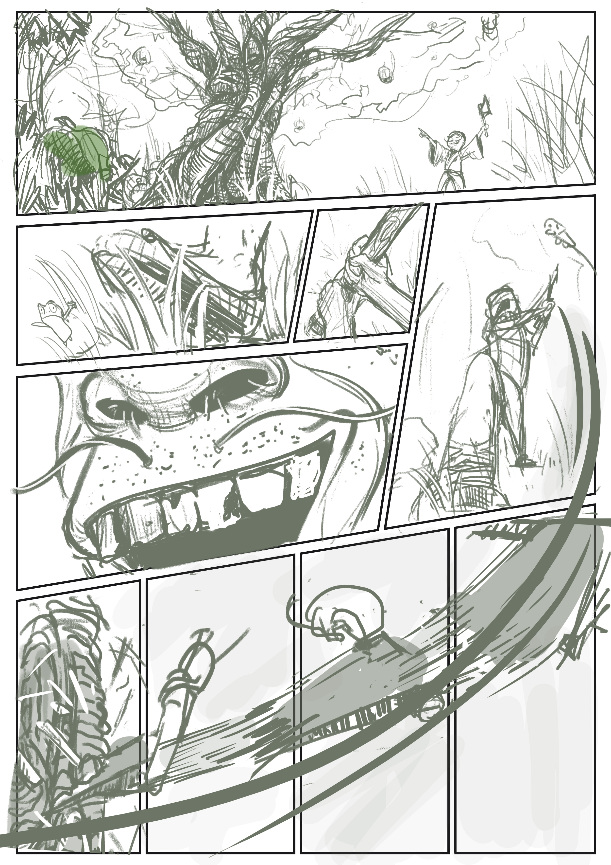
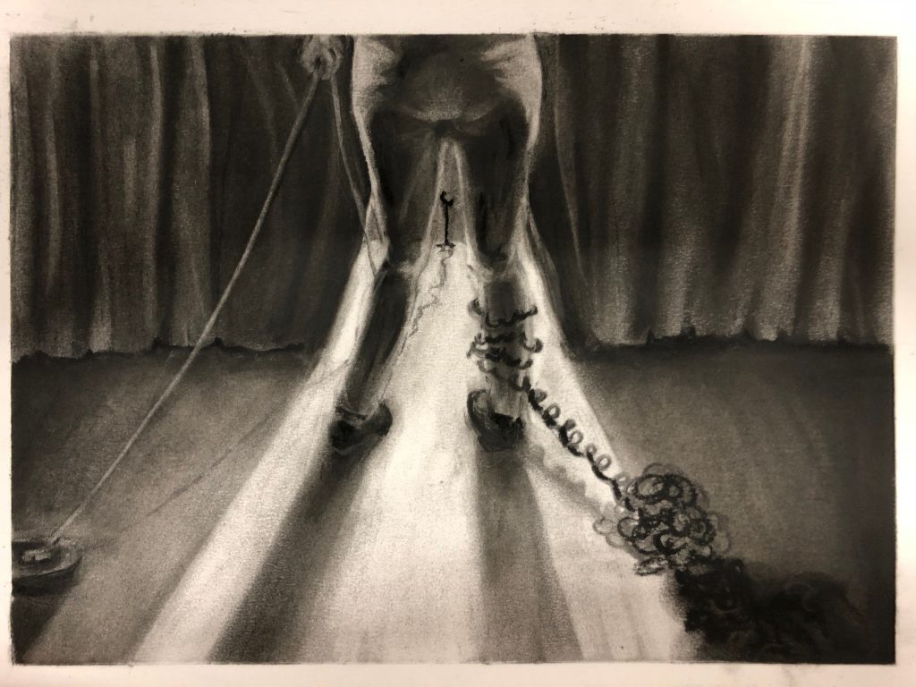
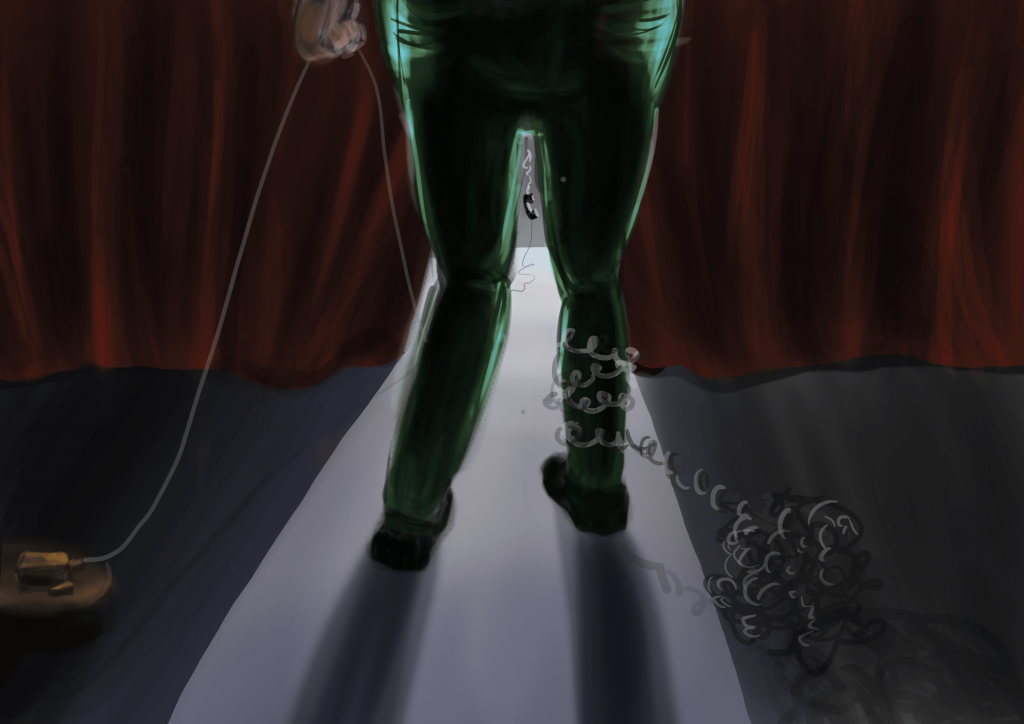
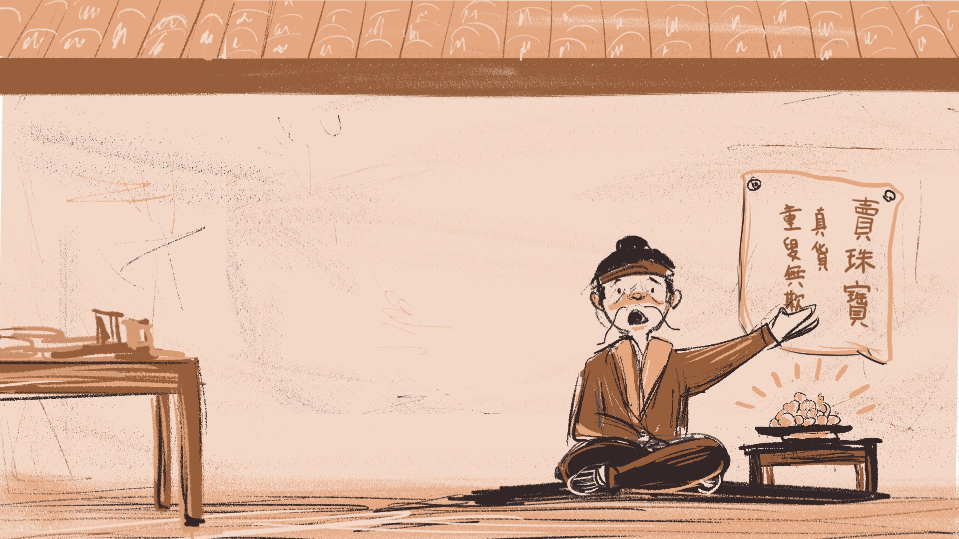
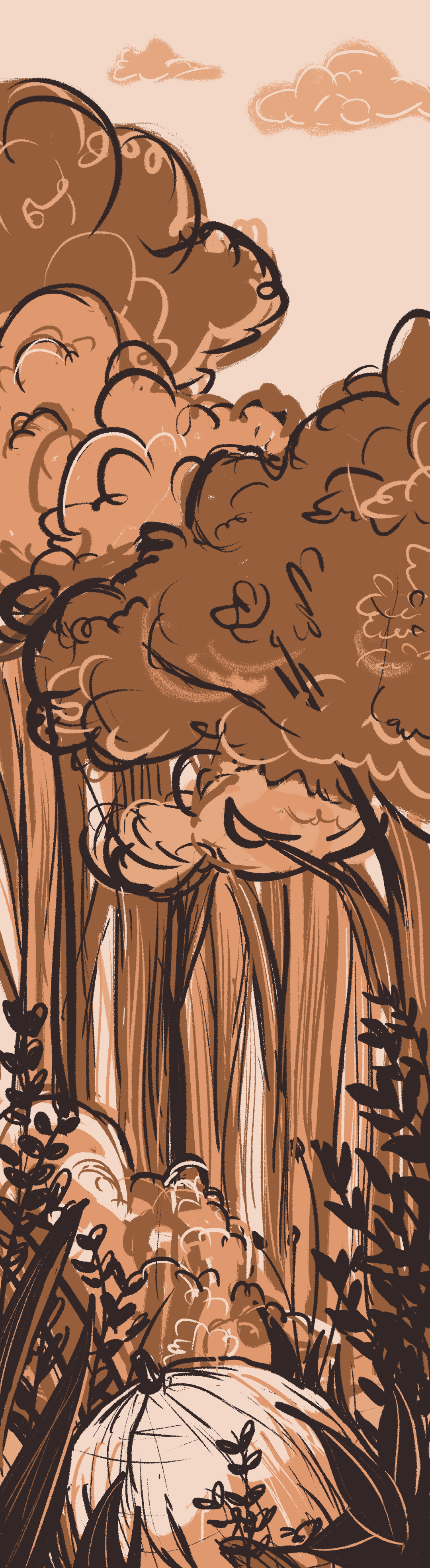
I drew my storyboards digitally on photoshop. I chose an earthly, warm monochrome colour scheme to reflect the passions of the main character, as well as to establish a subtle relationship to the earth/forest/tree. I also felt that the clay-like, subdued colours also fit well with the idea of an ancient China setting with the 尘土飞扬 feels. On a similar note, I used a sort of chalky brush throughout the storyboards to evoke the same feeling.

Storyboards

The drawing process is straightforward. I usually start with a pinkish canvas, and then work forwards — from the background to the foreground in separate layers. I tried to keep the style consistent throughout by using the same colour palette and brush.

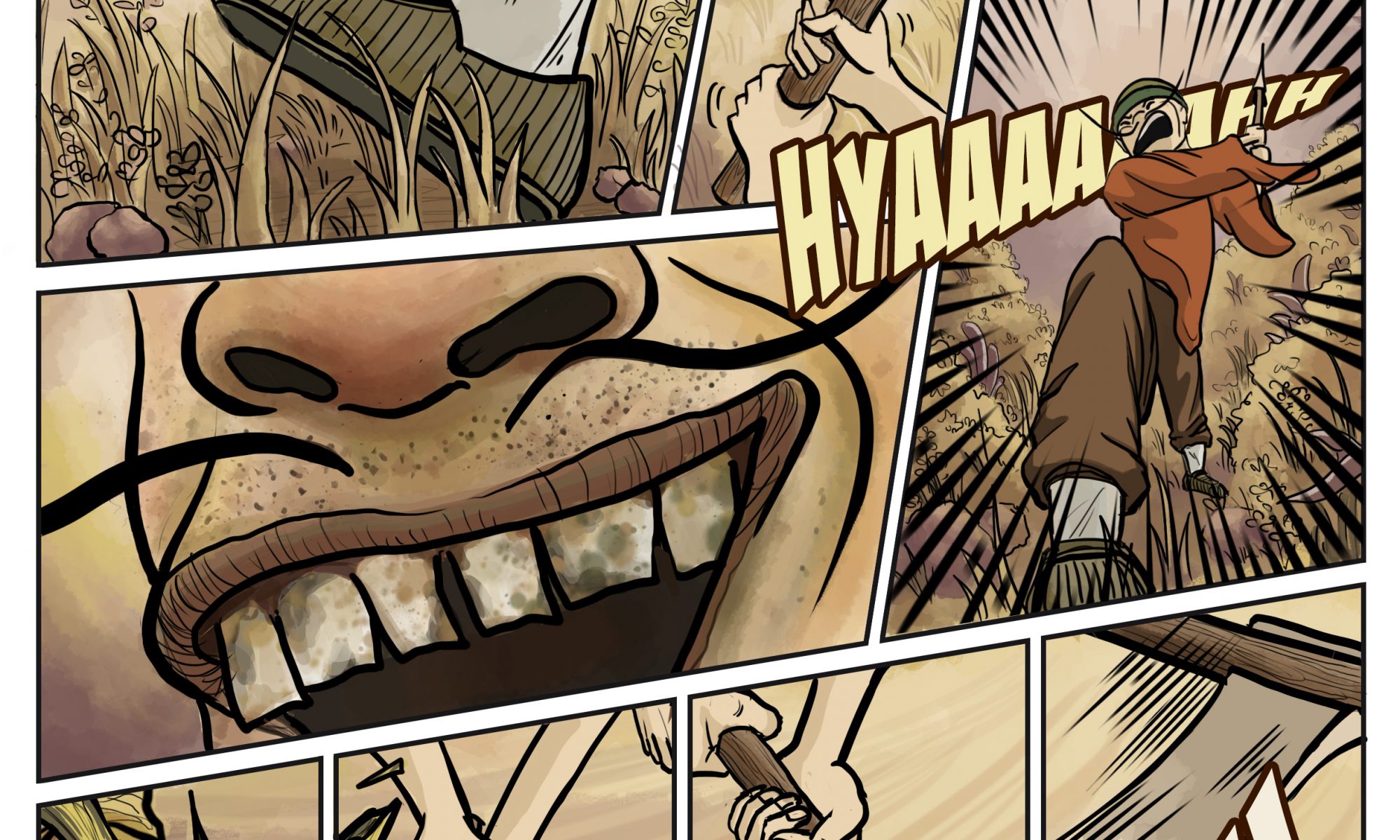
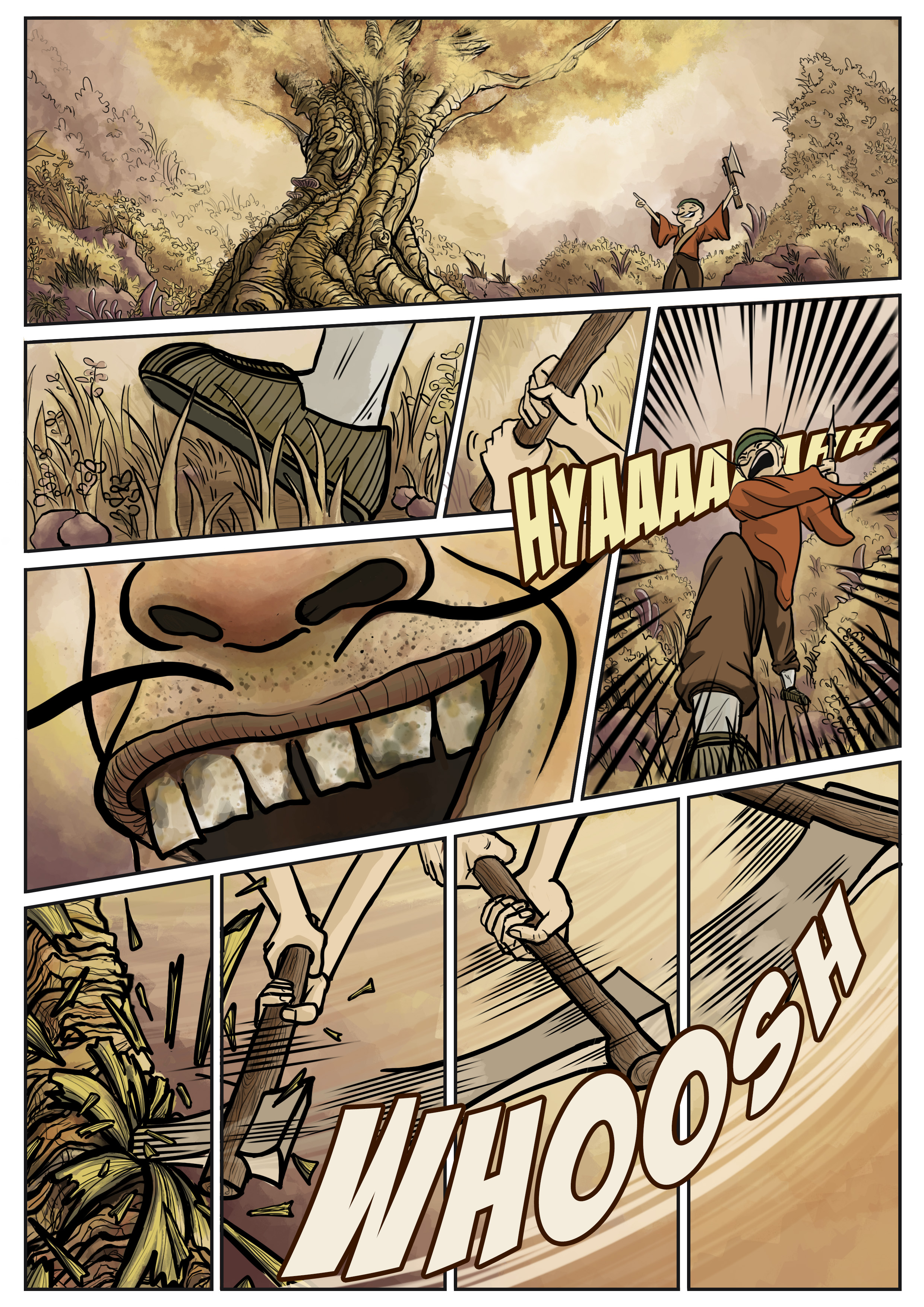
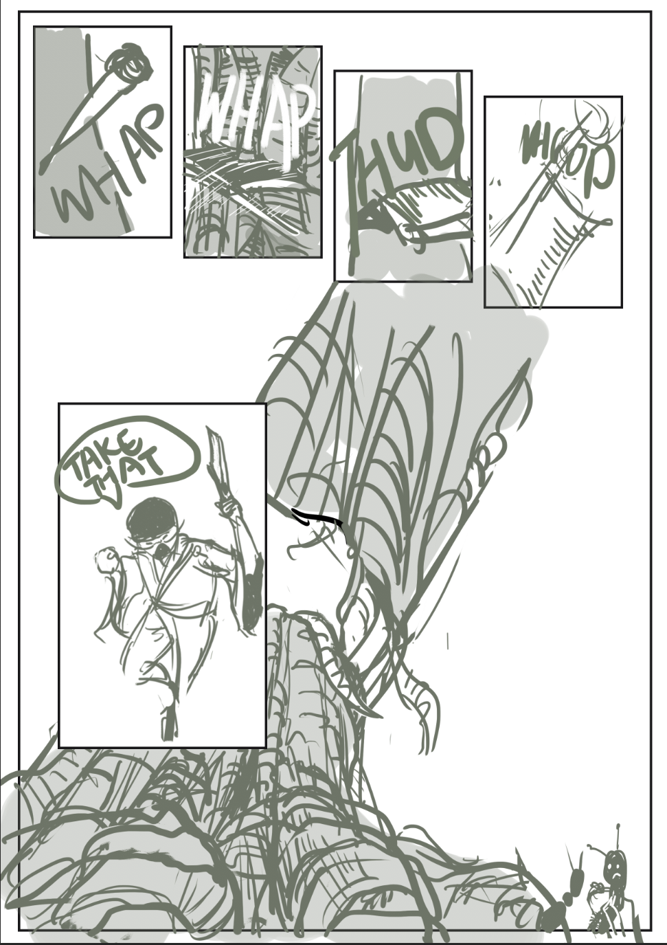
I chose to imply some scenes instead of explicitly drawing them out. This is the case for the part where the protagonist was about the cut the tree down.

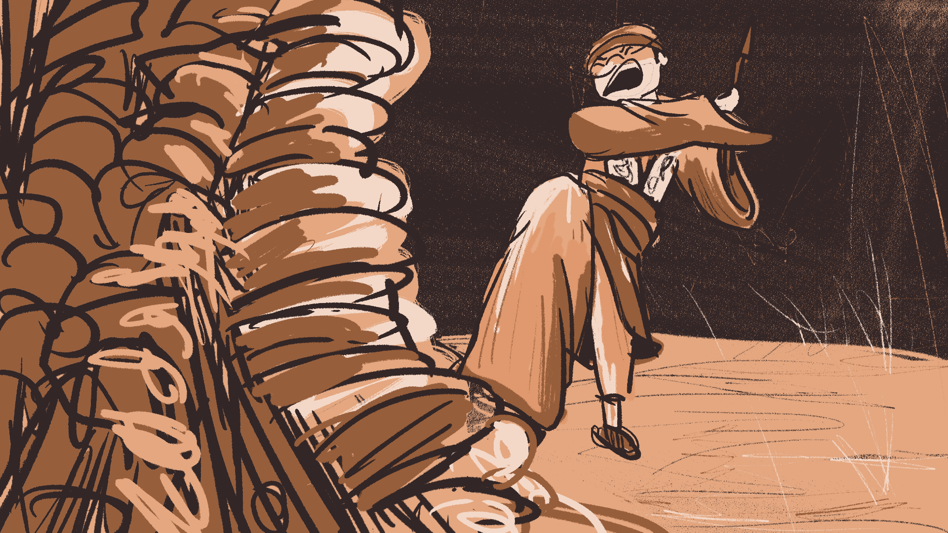
I felt that to flesh out the entire scene of repeated chopping of the axe till the felling of the tree would be too drawn out and unnecessary. Thus I wanted to experiment with implied movements here.

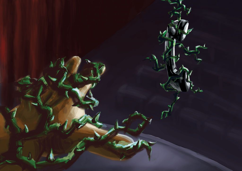
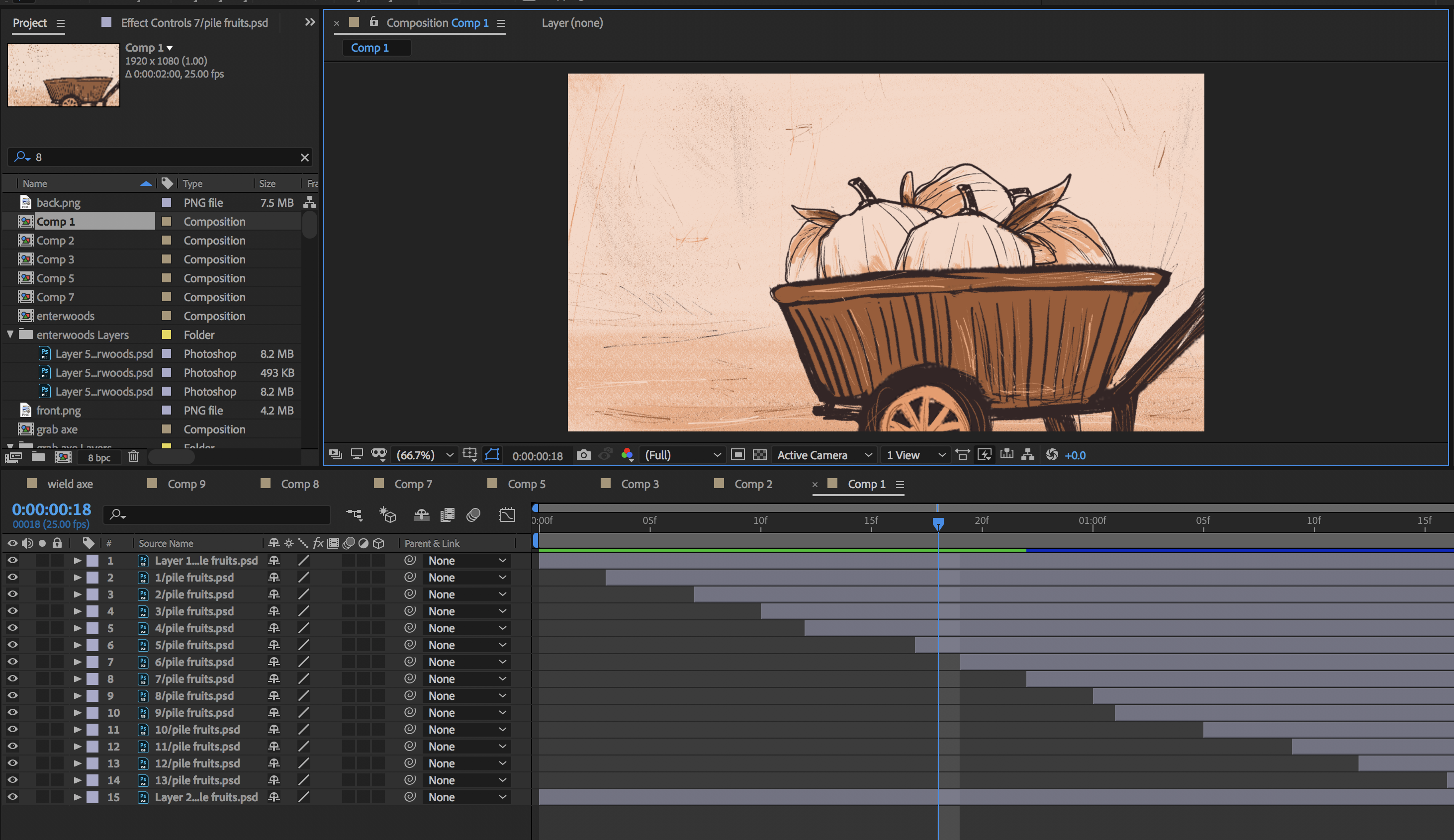
To animate the scenes, I used either premiere pro or after effects. Simple keyframes were added for the motion. In the example below, I manipulated the positions of the hands and the fruit to animate the hand reaching out to pick the fruit up.

While premiere pro worked fine for most animations, the excessive layering of assets was cluttering the work space so much that I moved over to after effects sometimes so that I can add the animations into premiere pro as individual video clips that were already pre-animated. This usually applies to scenes that have a foreground, midground and background, which I find to be neater and easier to do on after effects rather than stack three layers on premiere pro.

For example, in the scene where fruits were piling up in the wheelbarrow, it would have been a big headache if I have 10+ layers on premiere pro and have to plough through one by one. It was a lot clearer for me to animate on after effects and then transfer the exported video over to premiere pro.

Panning shots were done by drawing the scenes on a longer/wider canvas.

Example of a panning shot

Audio wise, I first added the sound effects so that the character has a basic expression and movements such as the rustling of clothes can be understood by the viewer. The sound effects also help the viewer integrate into the scene. For instance, an airy forest ambience is added at the start to set up a mysterious forest atmosphere.

After which I sourced for sound tracks to accompany the scenes. This was very difficult for me because the story has many varied moods and it was hard to get the different sound tracks to be compatible with each other and come together as a cohere music accompaniment for the entire video.

Lesson learned

I think the animatic could be more elaborate towards the end; the storyboards are more sparse then. Scenes were switched when they could be fleshed out even further. I am also quite unsatisfied with the music choices as I feel that some sound effects don’t match that well and that some music tracks do not match the scene as well as I would have wanted. Also, perhaps there can be better music transitions other than the basic fade in and fade out.

As I completed bulk of the storyboards in one (very long) sitting, I realise that this can easily cause one to forget to vary the camera angles/ choose interesting compositions. Perhaps this is why there was a storyboard assignment preceding this project — so that we can plan out most of our shots and decide whether those compositions can make it. Working on panel after panel without seeing the whole picture can end you up with less-than-interesting shots. I do feel that I can improve my animatic with more dynamic camera angles, movements and compositions.

It was rather difficult to pace the video and match the audio together. When I did the first cut, it was awkward in every possible way. Some scenes were too fast, some were too slow, some had uncomfortably loud audio,  and some don’t even match the audio at all. I abandoned the first cut, and worked the images/videos in tandem with the audio in the next attempt. This turned out to be better — it seems to be easier to plan and pace the story.

And of course, one other takeaway will be time management. I couldn’t estimate how long it will take to execute what I had in mind and thus I was overly ambitious even when it was clear to anyone else that it will be impossible to finish. While the storyboards were drawn a lot quicker than I thought, it was the audio that I did not anticipate. It was a lot tougher than expected to find suitable sound effects and sound tracks, especially since in many cases I only have an inkling of the mood I want to portray. Having to rush the entire project from scratch in 2 to 3 days also explains why the storyboard become less elaborate towards the end — quite a regret but it was out of my means. Perhaps a simpler story should be chosen next time ?

Conclusion

In all honestly, I am happy with what I made, even though I’m still rather disappointed that I didn’t complete in time. This is my first animatic and its really amazing to see my drawings string together to tell a story. Truly grateful for the very fruitful semester!

Graphic Novel

Scene: The man, furious at the fact that the tree is no longer producing fruits with precious pearls, came to cut the tree down.

SKETCH

FINAL

Review & Critique:

Did the storyboard / story turn out as you hoped?

Yes, I am quite satisfied with the final page layout, especially because it has went through a lot of revisions. I am happy with the colours as well as I think it brings out the slightly gloomy/ foreshadowing feeling without being overly dark. However, this layout has differed from my initial expectations in the sense that I initially wanted to include the depiction of the felling of the tree as well. However, as I worked on the each panel, I realised that the story will be too condensed if I were to to include both the cutting and falling of the tree. Hence, I left this page as purely illustrating the scene where the man arrives at the tree and starts chopping it with his axe. I believe this gives the reader more room to breathe and assimilate the content.

What would you do to improve it?

I think the top few panels are not dynamic enough. The part where the shoe steps into the grass should have way more power and strength to it, as if the man is stomping down. I initially included a frog jumping away in shock, which I think would have helped to bring out the stomping effect but I couldn’t draw the frog well so.. ? Also, I think that panel transitions could be better in the cluster of panels on top as well. Perhaps this could be helped if I chose to draw from other perspectives, e.g. I feel that the snarling/smirking mouth doesn’t fit that into the big picture right now.

What skills do you need to improve?

I need to be able to draw objects from various perspectives better. In the bottom panels, drawing the axe actually took me way way longer than expected because I just couldn’t get the shape of the axe to be right.

Also, I want to improve on my background design because I am always at a lost of how to fill in the background. I have resolved the problem here by opting a simpler way of filling in colour gradients and simple foliage here and there. I do hope I can learn to draw trees and grass and bushes better.

On top of that, I hope to improve panel transitions. I didn’t include the above page layout in the final work because I feel that the transitions are not done well and seem too repetitive. I only realised this after colouring the comic and seeing it from the big picture. The repetitive chopping of the tree coupled with the tree swaying back and forth (which itself isn’t illustrated clearly) made the layout look very boring. I wonder what can be done to make the falling of the tree more dramatic and clearer to the viewer.

What are the most significant things you have learned so far?

This project was really quite challenging for me, and so it was very enriching. Firstly, I’ve learned about panel design. Deciding panel arrangement, their sizes, how close they are to the next, how they serve the story etc., these were more complicated than I thought and a lot of experimentation was done. I think it probably comes with experience to know how arrange and sequence the drawings and panels so that it tells a seamless story that readers can follow easily. I have also learned to play around with perspectives so that the panels are more interesting.

In addition, I have learned to incorporate comic elements which I was rather unfamiliar with since I don’t read much comics. Stuff like sound effects or motion lines or panel-to-panel transition were really unintuitive. For example, just figuring out how to draw motion lines in Photoshop took me hours long already…


Story Beats 2

I have cleaned up my storyboards from last week’s submission and moved them over to digital media. The story is slightly shortened as well. I have used tone to differentiate the different stages of the story as well: brighter tones when he is kinder and poorer and darker tones when he became rich but nasty.

Assignment 3: Story Beats

Premise

A poor man chances upon a magical tree that bears jewellery-containing fruits. His greed for the treasures estranged him from his friends, and only after which did he learn that true wealth is in wisdom and friendship, not in material goods.

Story Beats
  • There was a poor man who was friendly with his other poor fellows
  • One day, he stumbled upon a magical gigantic tree
  • He found shining pearls in the fruits of the tree
  • He gleefully sold the pearls for a good price at the market
  • His greed increased and this compelled him to bring barrels and barrels of fruits home
  • With his sudden increase in wealth, he now lives in luxurious houses and dresses in luxurious clothes. He was a stingy and nasty man and despised his old friends. He earned a bad reputation.
  • One day, the tree stops producing jewellery. Instead, books are found in the fruits.
  • He frantically checked all the fruits but none of them bore any jewellery. Only books could be found.
  • In his spite and fear that others will find out his secret source of his wealth, he ordered the tree to be cut down
  • However, together with the tree, his new-found wealth vaporised.
  • He became alone and upset, but his old friends came over to comfort him
  • He shared the secret to his wealth to his friends
  • Together, the three friends decided to read the books to see what it contains
  • They became very wise and knowledgable, and villagers started coming to them for advices
  • Their reputation travelled so far that even the emperor has heard of them. The emperor sought them out for advice. All was good.
  • A new sprout appears. The tree is growing again!
Beat Boards (WIP)


Fear; Telephonophobia

The phobia I chose for this assignment is Telephonophobia, which is the reluctance or fear of making or taking phone calls, literally meaning ‘fear of telephones’. While I personally do not have this phobia, I can somewhat relate to the anxieties and trepidation one might feel when having to handle phone calls; because I do experience that fear sometimes (in a milder form) when an unknown caller reaches me.

Following my research, I narrowed down three causes of telephonophobia that I wanted to focus on:

  1. Anxieties associated with having to speak and converse with someone on the other end
  2. Absence of body language, thus fear of misinterpretations and misunderstandings
  3. Fear of embarrassing silences and the failure to respond appropriately

From the 3 main causes, I did a simple word map to brainstorm some ideas. Here are some keywords that I have identified through this process:

privacy (or lack thereof), disruptive, communication, voice, unwelcome, physical distance, two-way, speech

I realised that a parallel can be drawn between this phobia and stage fright, since the symptoms expressed are similar, eg nausea, sweaty palms, shortness of breath. Expanding on the idea of stage fright, I decided to portray the scene as having to give a speech, since, just like handling phone calls, making a speech requires one to ‘perform’ and use the voice as the primary medium of communication.

Image 1 (Charcoal Drawing)

Who: Performer // speaker

Where: On stage // in front of a telephone

What:

Glaring stage lights makes audience non visible to speaker -> inability to see body language

Stage ————– audience -> tangible physical distance

Speaker’s hand holds on to the cable of the telephone, giving her the autonomy to cut the phone/back out from performance or take it

Telephone cords wrap around leg and drags on ground -> resemble chain and ball, represents weight of anxiety that rests on the speaker regardless whether phone call is taken

When: Just before performer steps out on to stage // when the first ring of phone is heard

Image 1 (Coloured)

When I coloured the image, I decided to go for a more muted and dark colour scheme to more adequately express the phobia since we usually associate scary/evil stuff with darkness and bleakness. All things are cast in shadow, except the source of fear – which the speaker will inevitably have to face.

For the second image, I decided to develop the story up to the point where the speaker is about the answer the call/make the speech. As the speaker approaches the phone, the scene becomes increasingly threatening to her. The telephone cords that previous wrapped around the speaker’s legs have now turned into menacing thorny vines that crept up the entire body of the speaker, engulfing her in fear and pain. The corresponding vines around the phone receiver shows that the telephone is the source of the speaker’s misery.

Image 2

I have used the same colour scheme for both images to keep them coherent. I chose the complementary red-green colour scheme, because firstly they help viewers recognise objects in the scene (eg stage curtains and vines), and secondly the contrast lends a vibrancy to the scene, making it look even more alarming. Red-green complementary is particularly known for being able to express dark and heavy scenes and are commonly associated with villains and monsters — which is very apt in this case and further accentuates the danger the the vines pose to the speaker.

Comments from Class:

  • use an more muted/desaturated red to create a better contrast between red and green
  • Perhaps use a different perspective for the second image, and not immediately have the hand reaching out to the phone. Alternative: see the speaker from bottom up and see her gripping with fear at the vines