The Man and the Tree
Story Synopsis
A poor man chances upon a magical tree that bears jewellery. He sells it for some good money, and realises the profitability of his enterprise. His wealth amasses and he soon forgets his humble roots. Where would his greed take him?
Process
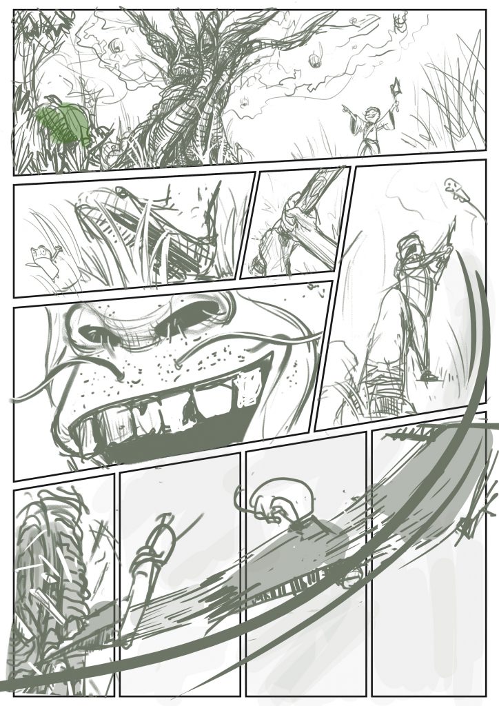
As I worked on a graphic novel layout for the previous project, I did not have any storyboards to work with. While this means that I essentially need to start from scratch, it also means that I could play around with a different mood and style from the one I did for the graphic novel — which I did. But first, I had to trim the story. The original story was way too complicated and the story beats were extremely concise. There was no way I could pull that story off in a limited amount of time. As such, I shortened the story by removing the parts about his relationship with his friends and his transformation after his wealth vaporised.
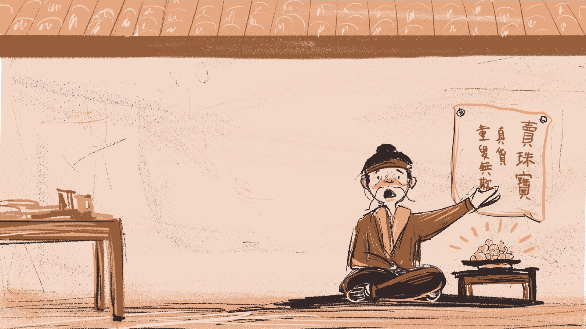
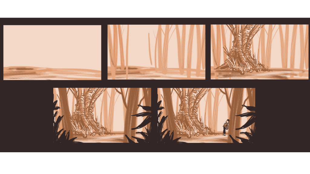
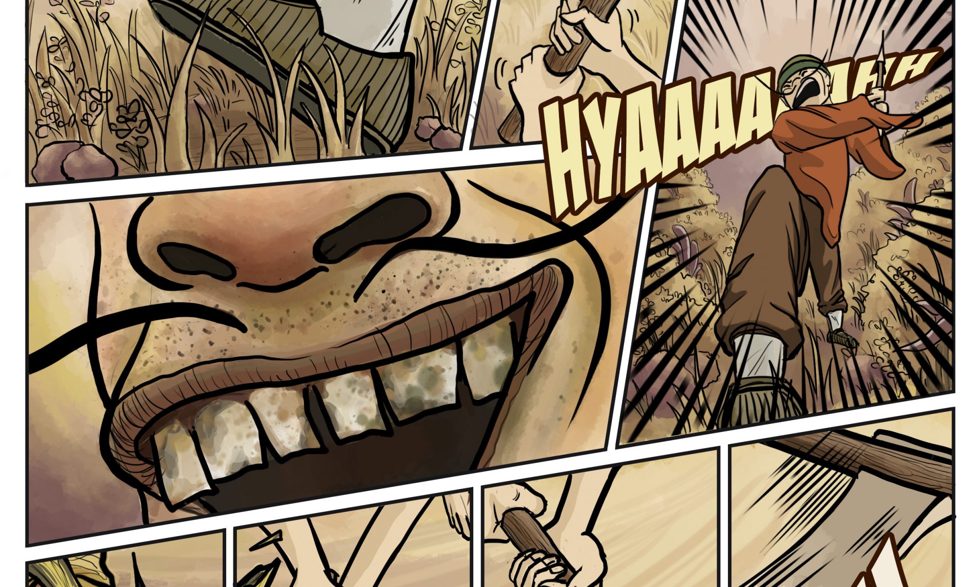
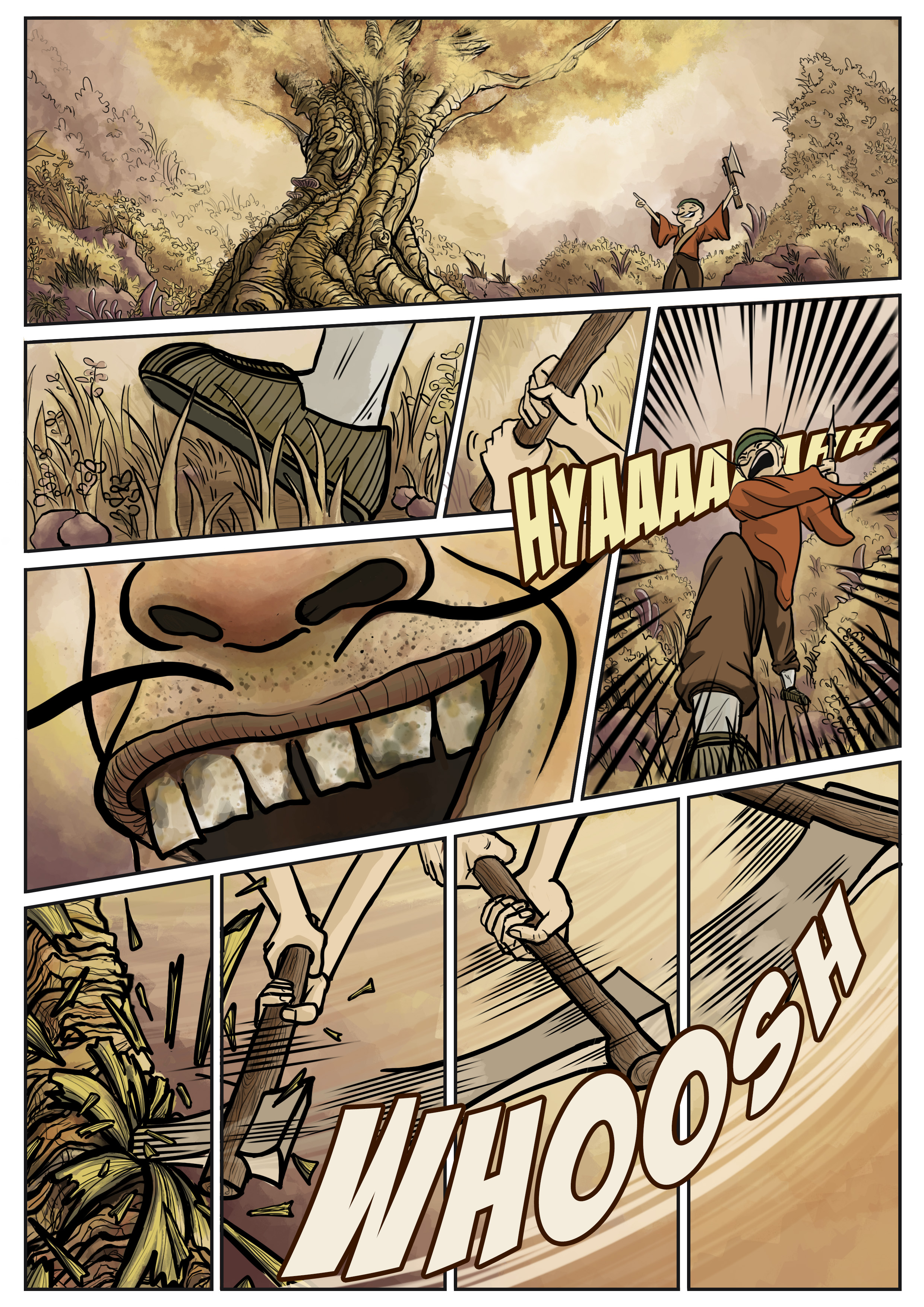
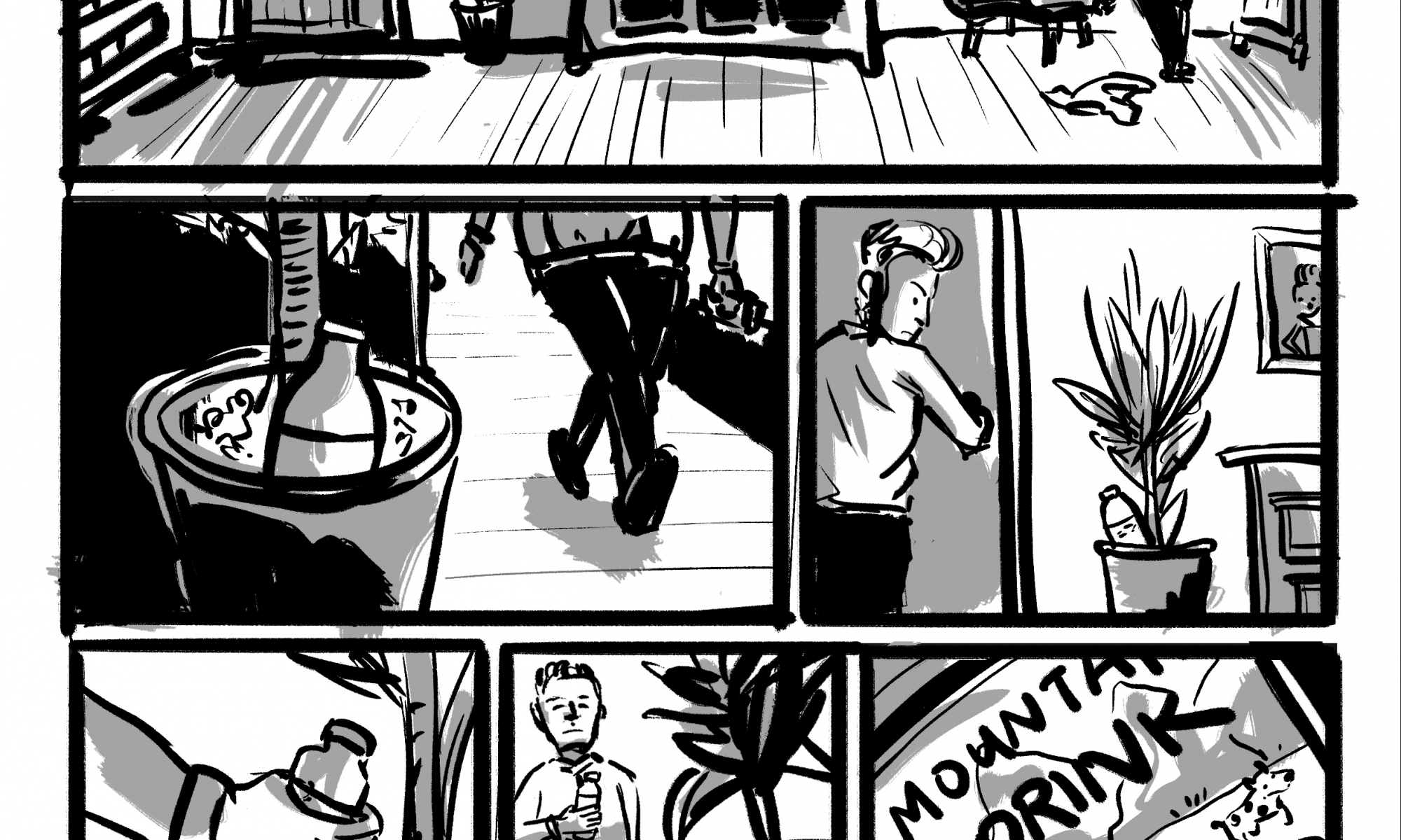
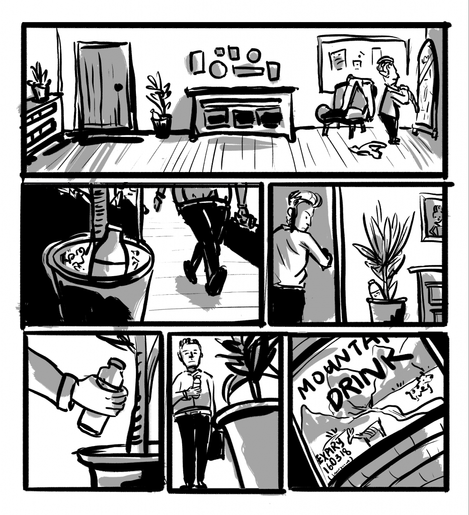
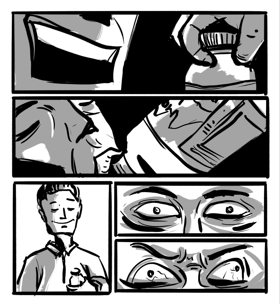
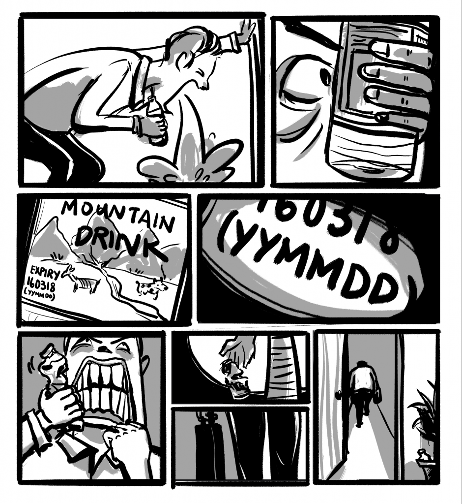
I drew my storyboards digitally on photoshop. I chose an earthly, warm monochrome colour scheme to reflect the passions of the main character, as well as to establish a subtle relationship to the earth/forest/tree. I also felt that the clay-like, subdued colours also fit well with the idea of an ancient China setting with the 尘土飞扬 feels. On a similar note, I used a sort of chalky brush throughout the storyboards to evoke the same feeling.

The drawing process is straightforward. I usually start with a pinkish canvas, and then work forwards — from the background to the foreground in separate layers. I tried to keep the style consistent throughout by using the same colour palette and brush.
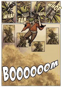
I chose to imply some scenes instead of explicitly drawing them out. This is the case for the part where the protagonist was about the cut the tree down.
I felt that to flesh out the entire scene of repeated chopping of the axe till the felling of the tree would be too drawn out and unnecessary. Thus I wanted to experiment with implied movements here.
To animate the scenes, I used either premiere pro or after effects. Simple keyframes were added for the motion. In the example below, I manipulated the positions of the hands and the fruit to animate the hand reaching out to pick the fruit up.
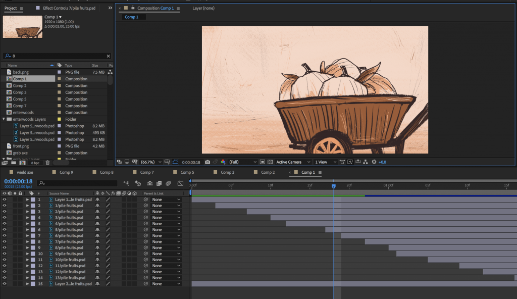
While premiere pro worked fine for most animations, the excessive layering of assets was cluttering the work space so much that I moved over to after effects sometimes so that I can add the animations into premiere pro as individual video clips that were already pre-animated. This usually applies to scenes that have a foreground, midground and background, which I find to be neater and easier to do on after effects rather than stack three layers on premiere pro.
For example, in the scene where fruits were piling up in the wheelbarrow, it would have been a big headache if I have 10+ layers on premiere pro and have to plough through one by one. It was a lot clearer for me to animate on after effects and then transfer the exported video over to premiere pro.
Panning shots were done by drawing the scenes on a longer/wider canvas.

Audio wise, I first added the sound effects so that the character has a basic expression and movements such as the rustling of clothes can be understood by the viewer. The sound effects also help the viewer integrate into the scene. For instance, an airy forest ambience is added at the start to set up a mysterious forest atmosphere.
After which I sourced for sound tracks to accompany the scenes. This was very difficult for me because the story has many varied moods and it was hard to get the different sound tracks to be compatible with each other and come together as a cohere music accompaniment for the entire video.
Lesson learned
I think the animatic could be more elaborate towards the end; the storyboards are more sparse then. Scenes were switched when they could be fleshed out even further. I am also quite unsatisfied with the music choices as I feel that some sound effects don’t match that well and that some music tracks do not match the scene as well as I would have wanted. Also, perhaps there can be better music transitions other than the basic fade in and fade out.
As I completed bulk of the storyboards in one (very long) sitting, I realise that this can easily cause one to forget to vary the camera angles/ choose interesting compositions. Perhaps this is why there was a storyboard assignment preceding this project — so that we can plan out most of our shots and decide whether those compositions can make it. Working on panel after panel without seeing the whole picture can end you up with less-than-interesting shots. I do feel that I can improve my animatic with more dynamic camera angles, movements and compositions.
It was rather difficult to pace the video and match the audio together. When I did the first cut, it was awkward in every possible way. Some scenes were too fast, some were too slow, some had uncomfortably loud audio, and some don’t even match the audio at all. I abandoned the first cut, and worked the images/videos in tandem with the audio in the next attempt. This turned out to be better — it seems to be easier to plan and pace the story.
And of course, one other takeaway will be time management. I couldn’t estimate how long it will take to execute what I had in mind and thus I was overly ambitious even when it was clear to anyone else that it will be impossible to finish. While the storyboards were drawn a lot quicker than I thought, it was the audio that I did not anticipate. It was a lot tougher than expected to find suitable sound effects and sound tracks, especially since in many cases I only have an inkling of the mood I want to portray. Having to rush the entire project from scratch in 2 to 3 days also explains why the storyboard become less elaborate towards the end — quite a regret but it was out of my means. Perhaps a simpler story should be chosen next time ?
Conclusion
In all honestly, I am happy with what I made, even though I’m still rather disappointed that I didn’t complete in time. This is my first animatic and its really amazing to see my drawings string together to tell a story. Truly grateful for the very fruitful semester!
