Animal sketching

We did some sketching of animals (copied from a book). Through studying the sketches and trying to make out of the main blocks that make up the body, I gained a better understanding of how to construct an animal figure (even though it still depends on which animal). This simple exercise was more helpful than I thought.

Here are some of my sketches:


Prof also taught us a method of constructing hands and arms which I thought was a really great method

To draw the hand, mark out all the curves in their respective locations first (e.g. the curve of the knuckle, the curve of the wrist). Then, join the curve with lines and the hand is formed!

As for the arm, further away of the arm, it adopts a more cylindrical shape, which gradually becomes more like a rectangular block as it approaches the wrist. Always take note of where the thumb starts — it starts where the wrist ends. Hence the thumb block will start from the same edge as the palm block.

This is just for personal record ya :)

2D Presentation: Dot Line Shape

Here are the slides Charmaine and I used for our 2D presentation on Dot, line and shape :)

dot line shape.compressed

If you’re lazy to download the file, here are some important points from our research:

General Introduction:

Accessed from https://jessbens.wordpress.com/2012/02/19/dot-line-and-shape/
  • Dot, line, and shape are the basic elements of design
  • Elements are components or parts which can be isolated and defined in any visual design or work of art. They are the structure of the work, and can carry a wide variety of messages.

Dot

  • A point is that of which there is no part — No part = no width, length, or breadth
  • In pure geometric terms, a point is a pair of x, y coordinates.

Use of points:

  • Vanishing point
    • The spot on the horizon line to which the receding parallel lines diminish
    • Creates depth
  • In art: Yayoi Kusama, Benday dots (in comic illustration), Neo-impressionism movement (A Sunday on la grande jatte)
Accessed from https://hirshhorn.si.edu/kusama/
Accessed from https://georgetowner.com/articles/2013/08/15/lichtenstein-blockbuster-proclaims-power-print/

Line

  • A line is a length without breadth.
  • Graphically, lines exist in many weights; the thickness and texture as well as the path of the mark determine its visual presence.

Use of Line

  • In composition or image
    • Lines are important to guide your eyes.
    • Horizontal lines suggest a feeling of rest
    • Vertical lines often communicate a sense of height
    • Diagonal lines convey a feeling of movement
    • Curve lines can convey energy
    • Use of line to create optical illusions
Accessed from https://s-media-cache-ak0.pinimg.com/originals/1f/8d/f3/1f8df341ebeff6b434decffc666559f5.jpg
  • Use of line in Fine Art: Chua Ek Kay
Accessed from http://www.theprivatemuseum.org/index.php/exhibition/old-campus-revisited/
  • Use of line in fine art: Gene Davis
Accessed from https://www.artsy.net/artist/gene-davis

Shape

  • A surface is that which has length and breadth
  • Shapes are planes with edges.
  • When a form or shape has regular contours, when internal and external measurements are mathematically similar in multiple directions, we think of the form or shape as geometric.
  • Organic shapes and forms are typically irregular or asymmetrical.

Use of Shape:

  • We see shapes every day in logos, flags, books, clothes etc.
  • TV test screen
Accessed from https://www.youtube.com/watch?v=8gKL_3LIK2k
  • Local Artist Yeo Chee Kiong: “Series #02, ‘A Yoga and Pedicure DIY Session on the Beach’“
Accessed from http://cheekiongyeo.com/?language=en_gb
  • Use of shape in Architecture: Louvre
Accessed from https://plus.google.com/communities/115746467979626722538/stream/62b9e0b2-17eb-434b-a8ea-f24a54624569

Point, Line and shape

  • All 3 elements combine Patterns, Compositions (Art)
  • Pattern: A regular repetition of lines, shapes, colours, or values in a composition.
  • Henry Moore’s Wallpaper Design
Accessed from http://midcenturymoderndesign.tumblr.com/post/62745744987
  • Kandinsky Composition viii
Accessed from http://www.wassilykandinsky.net/work-50.php


4D project 1: Image and Meaning

Hello! I realise I have no updates for 4D at all (since Joel didn’t require us to upload anything to OSS so far) so here’s just some stuff for personal record :)

For project 1, we had to create 3 original digital artworks based on the theme Strange New World. By manipulating visual images, three artworks containing landscape, figure and object (one each) have to be created, be it by addition, subtraction, and/or substitution.

For this project, I started out having two very vivid images of people standing on lamp posts as well as people squatting on lily pads intently gazing at something. These images were just random, but when I started to properly brainstorm for an overarching theme for my works, these images somehow fitted seamlessly with what I had in mind, which was an exploration of human traits that corrupt and dictate our actions.

Our Puppeteers

This work endeavours to explore the human condition. Man, by nature, is inherently self-interested. We have never been spared the company of our puppeteers – our greed, ignorance, and vanity – who subconsciously dictate our actions, permeate our thoughts, and blind our visions. All around us, we see a parasitical manifestation of egotism. In midst of our furious pursuit to feed our already inflated sense of self, we ironically become more and more detached with ourselves. At the end of the day, behind all that grandiose façade, do we know who we truly are? Do we dare to bare our soul to ourselves? Greed, ignorance, and vanity – to which do we own our conscience?

Ignorance:

  • Lampposts: a phantom of knowledge, a feeble imitation of knowledge
  • Men on lampposts: people blinded by ignorance. Pompously put themselves on a pedestal, in a bid to lead others, and people actually follow
  • People on the road: Wandering, lost, lured and misled by those on lampposts. They are trying to assert their importance, but have yet find a foothold, i.e. they are finding their own lamp posts, meanwhile they look up to those who are standing on the lamp posts, believing them to be wise and knowledgeable
  • Switch on lampposts: symbolise that the pretence of raising yourself up to a status higher than you deserve is fundamentally voluntary and intentional
  • Fallen lamp and Orange man: switch of lamp is turned off. One can only realise one’s shortcoming by introspection – it is not something that external forces can achieve. Hence, the switch is turned off by the ones who finally acknowledge their flaws
  • Illuminated glow of orange man, he leaves the lamp and heads towards the moon: the light from the lamp posts blinded those who stood on it. Only when one admits to oneself his/her deficiency and is eager to change, can he regain his vision. Then, he would have realise that the moon was there all along. This is an allusion to Plato’s cave. Instead of the Sun, the moonlight – juxtapose against the artificial lamp light – represents knowledge and wisdom.
  • Thus begin the journey towards the moon
Greed:
  • Use of Gollum in substitute of all people’s faces:
    • Blanket use of Gollum in substitute of everyone’s faces symbolises the loss of individuality as everyone is trapped in the blind chase for wealth
    • Gollum’s significance in LOTR: Gollum was obsessed over the One Ring and was corrupted under its influence – greed has no end
    • The ring became his sole purpose of living, analogous to how people are obsessed with earning money in their lives.
    • The destiny of Gollum foreshadows the consequence of being too greedy
    • Also symbolises how pointless the pursuit is – you accumulate wealth, but it means nothing once you depart from this world
  • Gold that drop out of the basket became rocks, in actual fact the rocks are illuminated by the firefly, thus giving rise to the appearance of gold – reiterates the previous point, that money by itself has no intrinsic value
  • Frogs:
    • Nonchalant to the gold and the firefly
    • What I hoped to convey here is that money is pretty much a social construct, reiterates the point that it has no intrinsic value. We go head over heels for money, yet it holds no significance for the frogs
    • Ignores the firefly: because fireflies are toxic to frogs – symbolises that the firefly and the gold that is carrying is corrupting and essentially a poison to the human soul
    • Floating in the air: humans are weighed down by their greed, whereas the frogs are unbounded
    • Traditionally, frogs are associated with the water element and its cleansing attributes. Its symbolisms include: spiritual cleansing and ancient wisdom, essentially what the people on the lily pads lack. Use of frogs provide a contrast against the humans.
Vanity:
  • Quite straightforward
  • Skeletons, but their reflections in the mirror are beautiful: beauty and physical appearance is a very superficial concept. Being preoccupied with physical appearance means nothing if you don’t enrich yourself spiritually and intellectually
  • Mirror: symbolises self-perception and fantasy
    • Difference in colour: the actual palette is desaturated, while the mirror image is flushed with vivid colours– expectations vs reality
    • Objects appear superior and more ideal in the reflections, do not reflect reality, but an impression of our desires
  • Make up brushes at the side are demonized and appear threatening.
  • Use of poisonous insects and animals: alludes to the malignant nature of the beauty industry, the menace of the insects and animals also suggests that giving up the brush (in other words, stop being obsessed over physical appearance) is forbidden once you picked it up = there is no way out

Challenges

  • Definitely technical problems. Being unfamiliar with photoshop (because I use AI more), I can’t get the effect I wanted in my mind
  • Also, I was limited by the images I can find online (e.g. when I want to find a particular posture/particular angle of a scene but there just isn’t any)
  • Perspective gave me many problems
  • Gollum faces could have been better imposed on the people,
  • Harmonizing the colours (especially for greed!) and having a unifying theme throughout all three images

These 3 artworks are arranged in sequence of its creation, which explains why the first looks so much more amateurish than the last.

Reflections

Overall, I really enjoyed the process of creation in this project: you start with a vague idea and walk the journey with it, curiously observing how your idea develops and how inspirations jump at you at the most unexpected moments. In aspects of semiotics, it was interesting to actually seriously consider why you use a certain element; what does it represent in this context; how can I use a certain symbol to my advantage; and how does the symbols changes the interpretation of my work. As a non-frequent user of digital media, working with digital images was a fresh experience – there are a lot of things that can be manipulated in digital media but not in traditional. For example, I can be a lot more adventurous in digital media because the actions are reversible, and thus I am empowered to be vastly more experimental :)

Outdoor Sketching

In the afternoon following the figure drawing lesson, we headed to HASS to do some outdoor sketching and to understand the theories of perspective better. Prof demonstrated how he construct a sketch using one-point and two-point perspectives.

For one-point perspectives, there are two pairs of parallel lines, each pair established by joining the lines extended from the vanishing point; for two-point, there is one pair.

Accessed from http://kingslan.com/blog/?p=280

By determining the lines of building structures that are parallel, we can leverage on that foundation to draw the basic structures of the building.

Prof told us to always focus on the big picture first: draw out the general structure before filling in the details. Should we rush into the details and the details aren’t drawn accurately, this will subsequently affect all other structures.

Prof also mentioned that in the scenario where the perspective is particularly hard to construct (or if we are simply lazy or bad at perspective drawing), we can make use of space to cover up our weakness by placing smaller structures in front of bigger ones so that the edges of the buildings are obscured.

These are some sketches that I made that day:

I wasn’t overly rigid in my drawing in the sense that I was quite loose with plotting the construction lines. I merely got a general sense of the direction of the line and went ahead to draw it out. I guess judging by the conceptual (focus more on form) vs perceptual (focus more on what you see) distinction that Prof mentioned, I belong to the latter.

2D Project 1 My Line is Emo — process

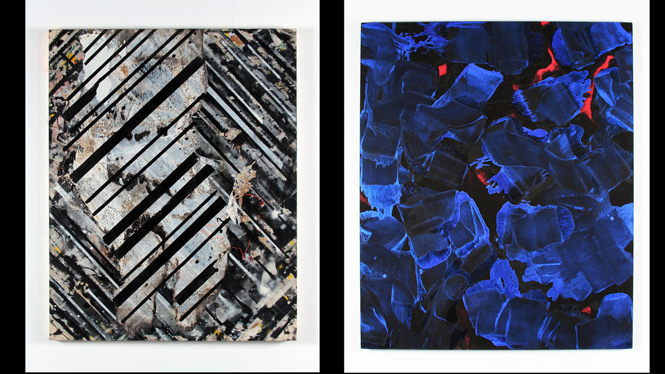
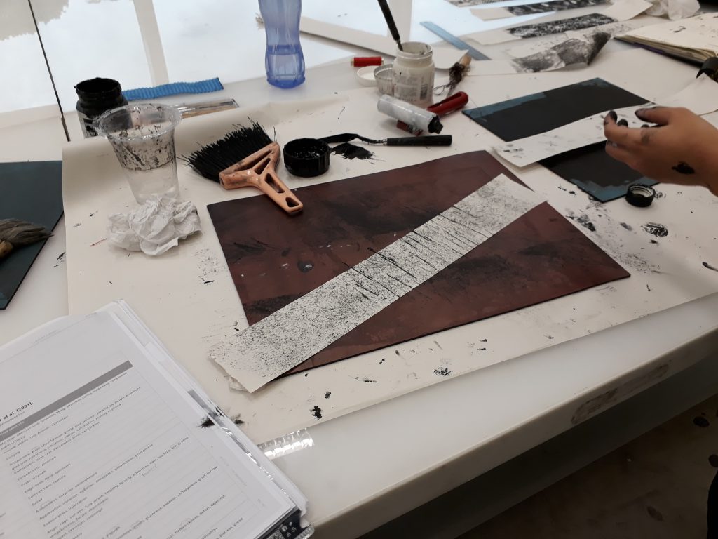
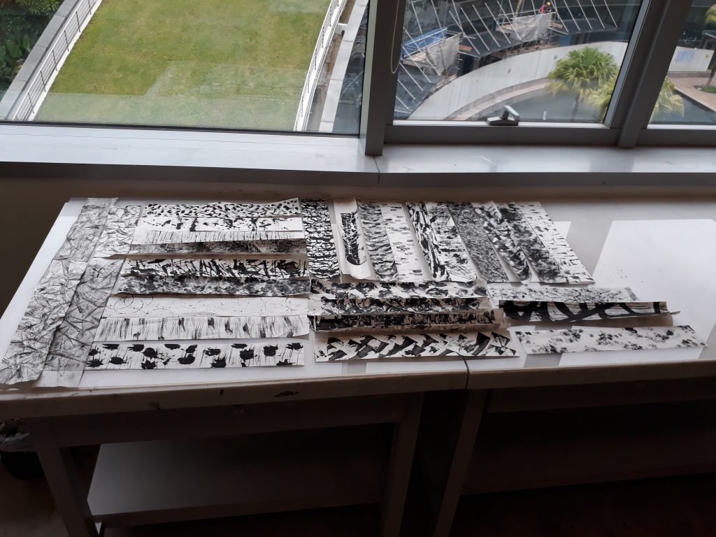
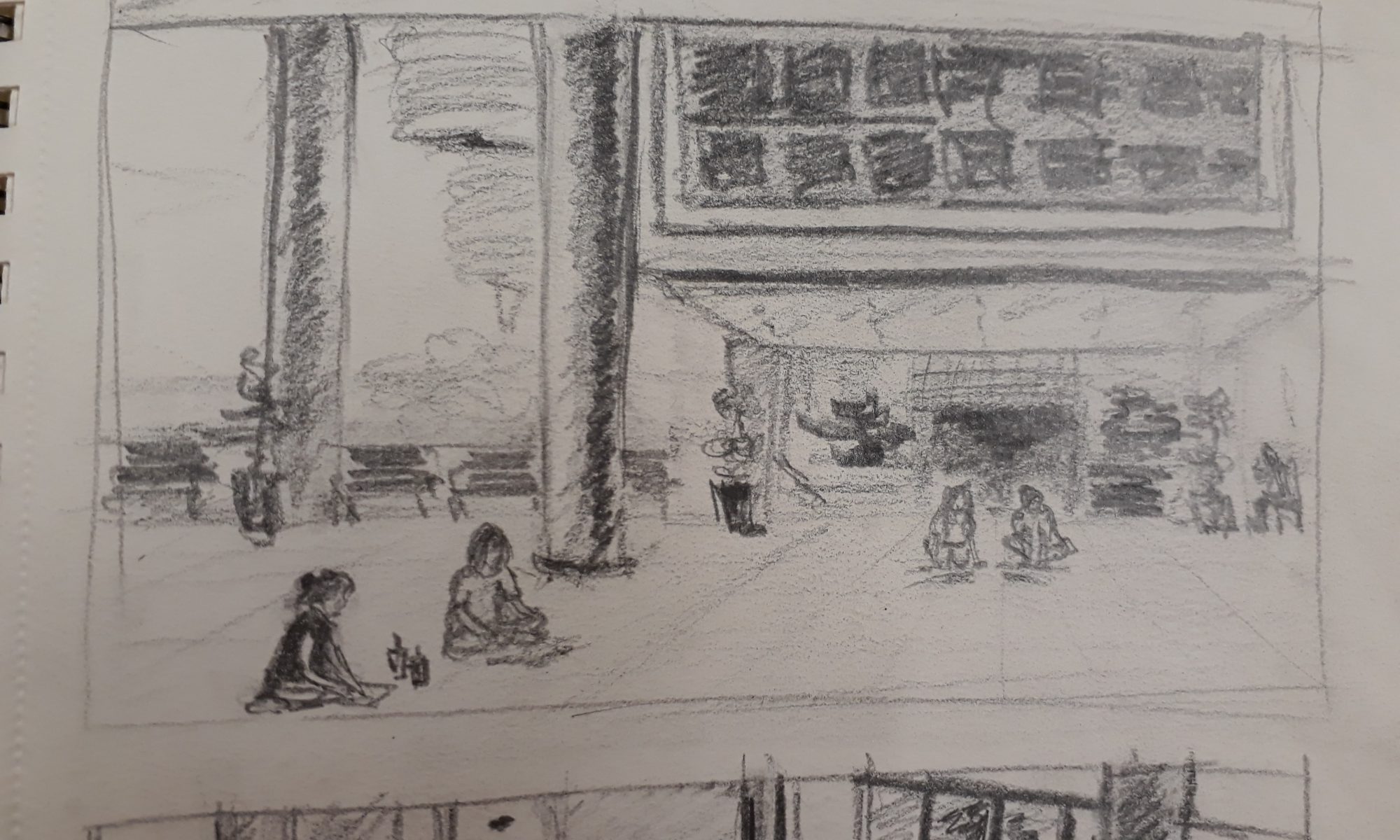
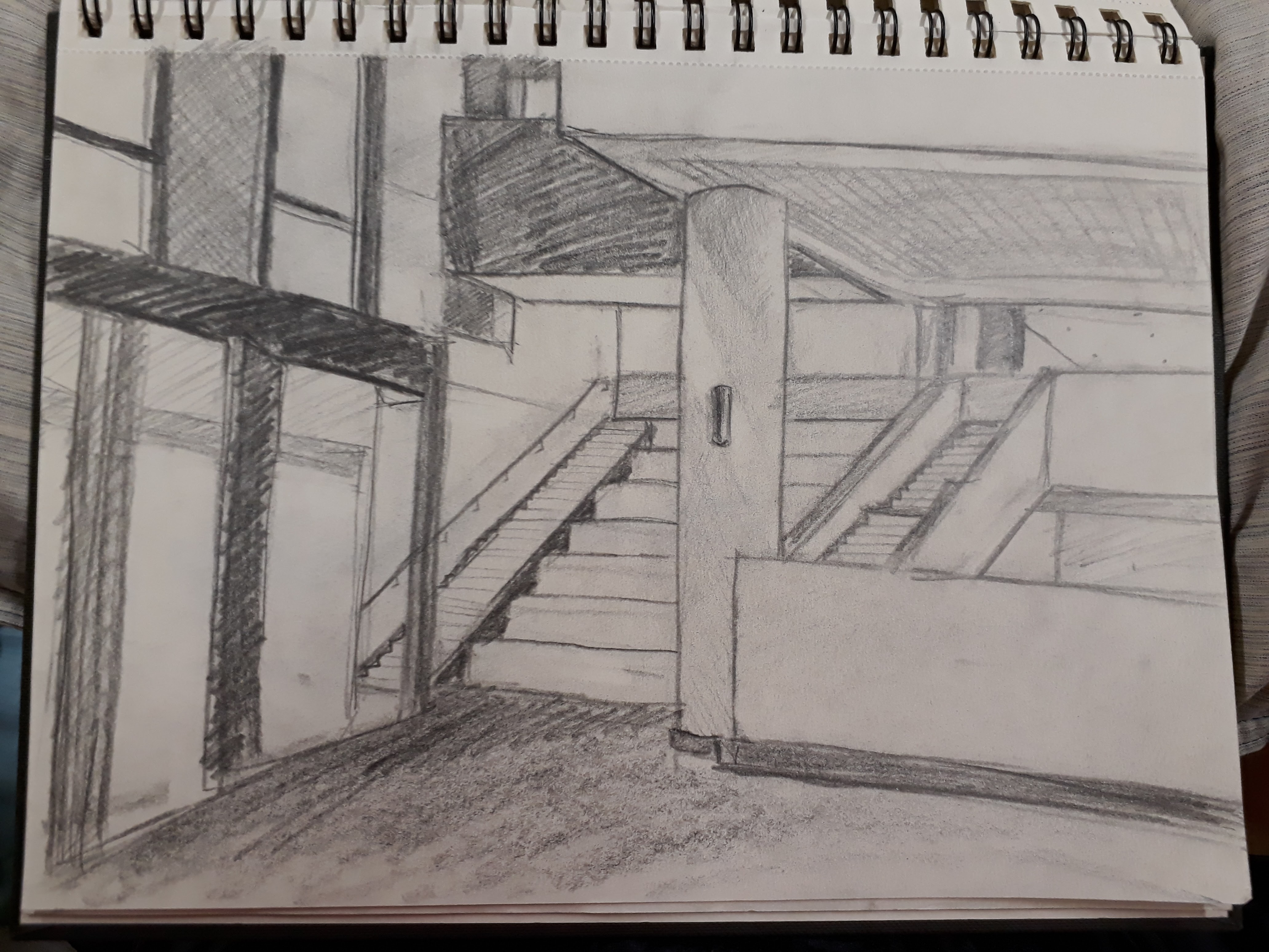
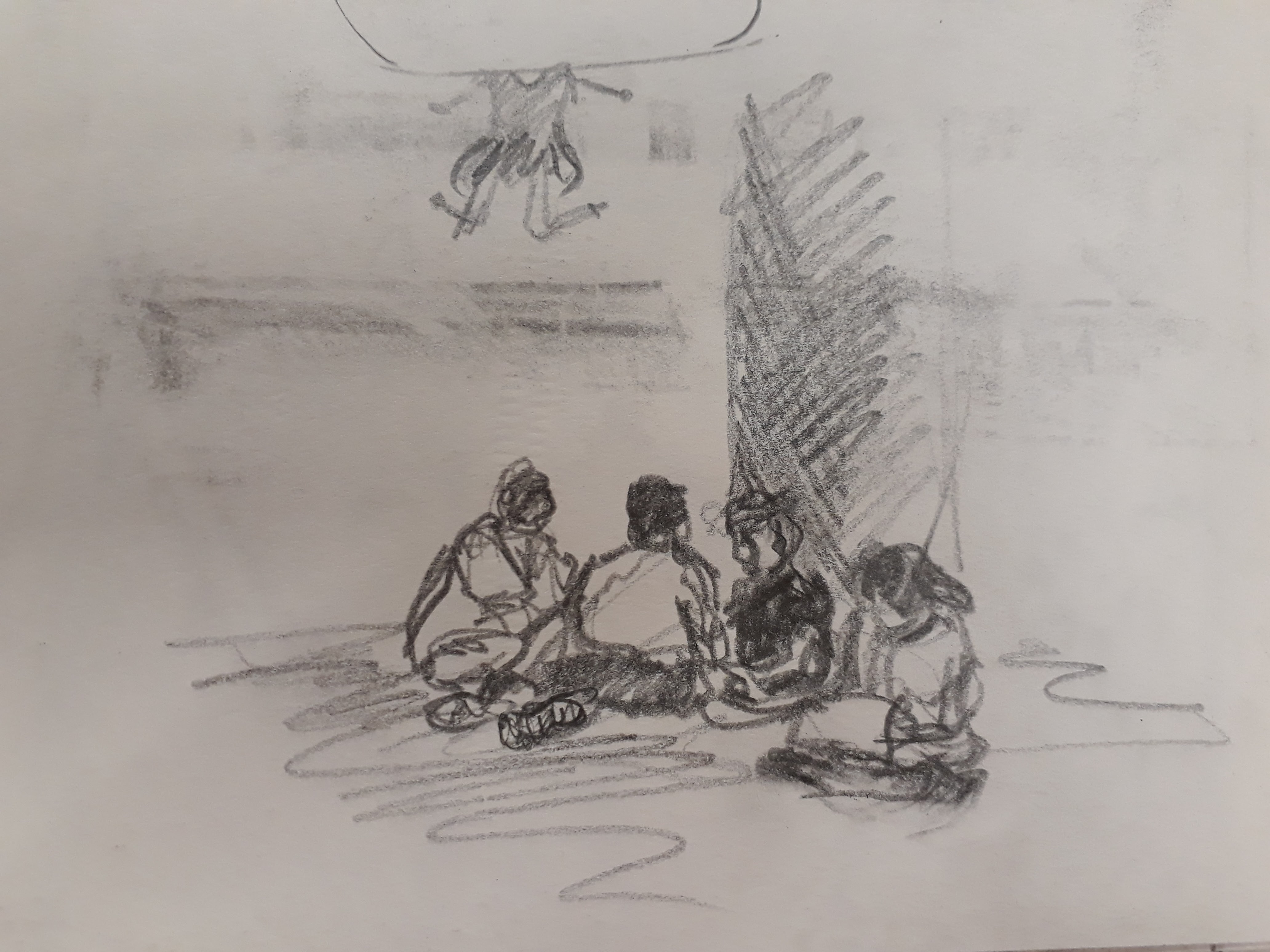
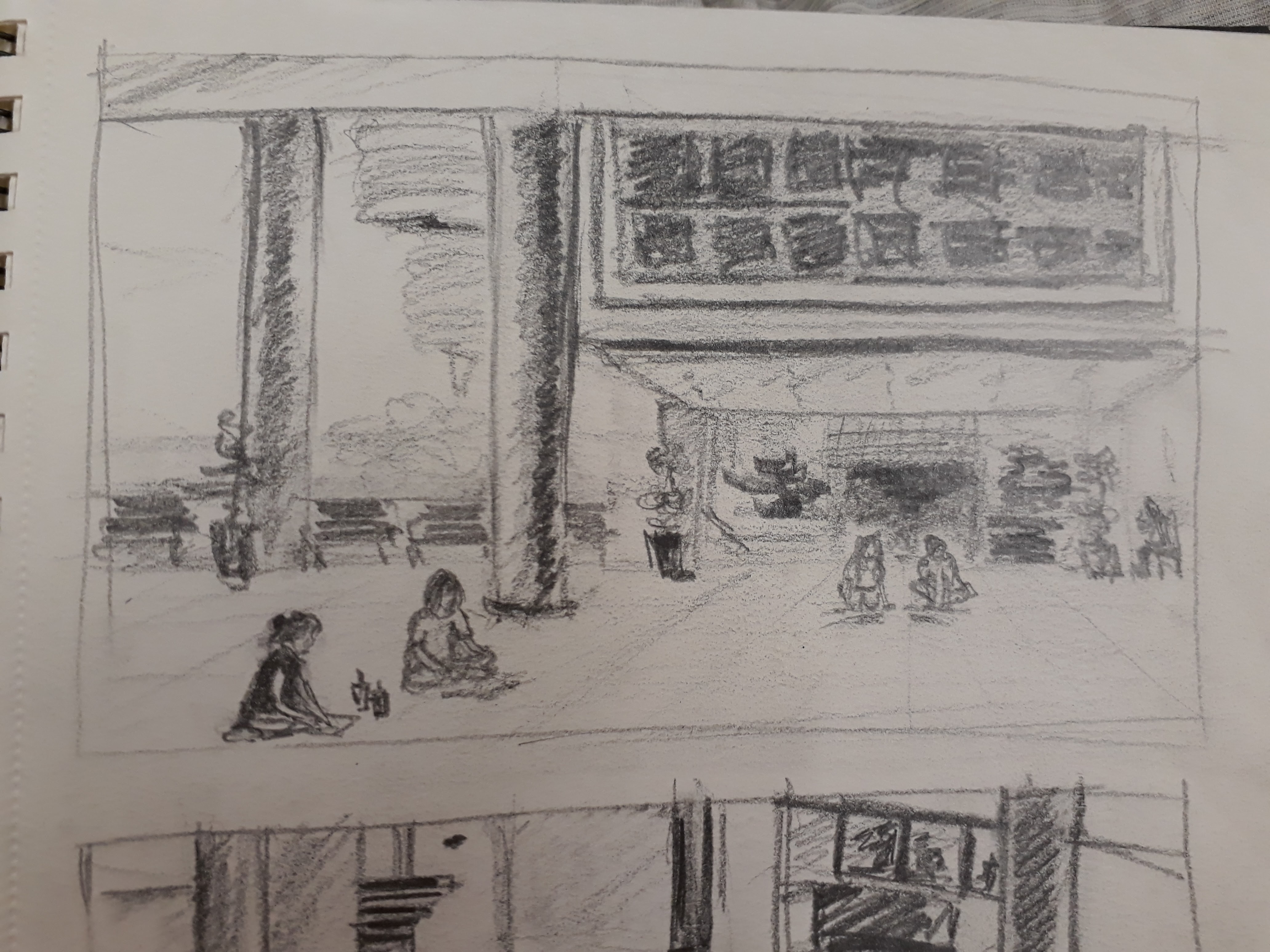
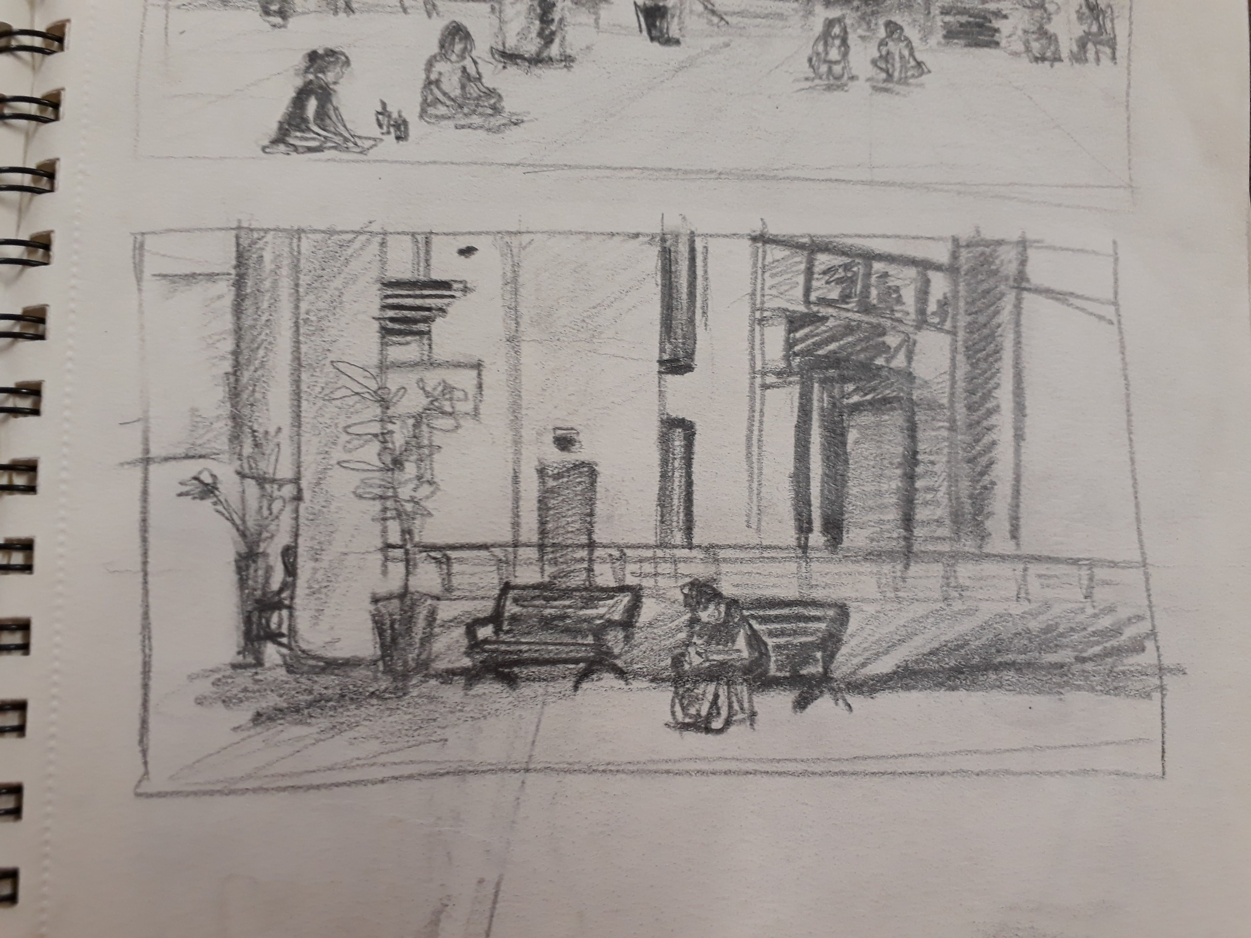
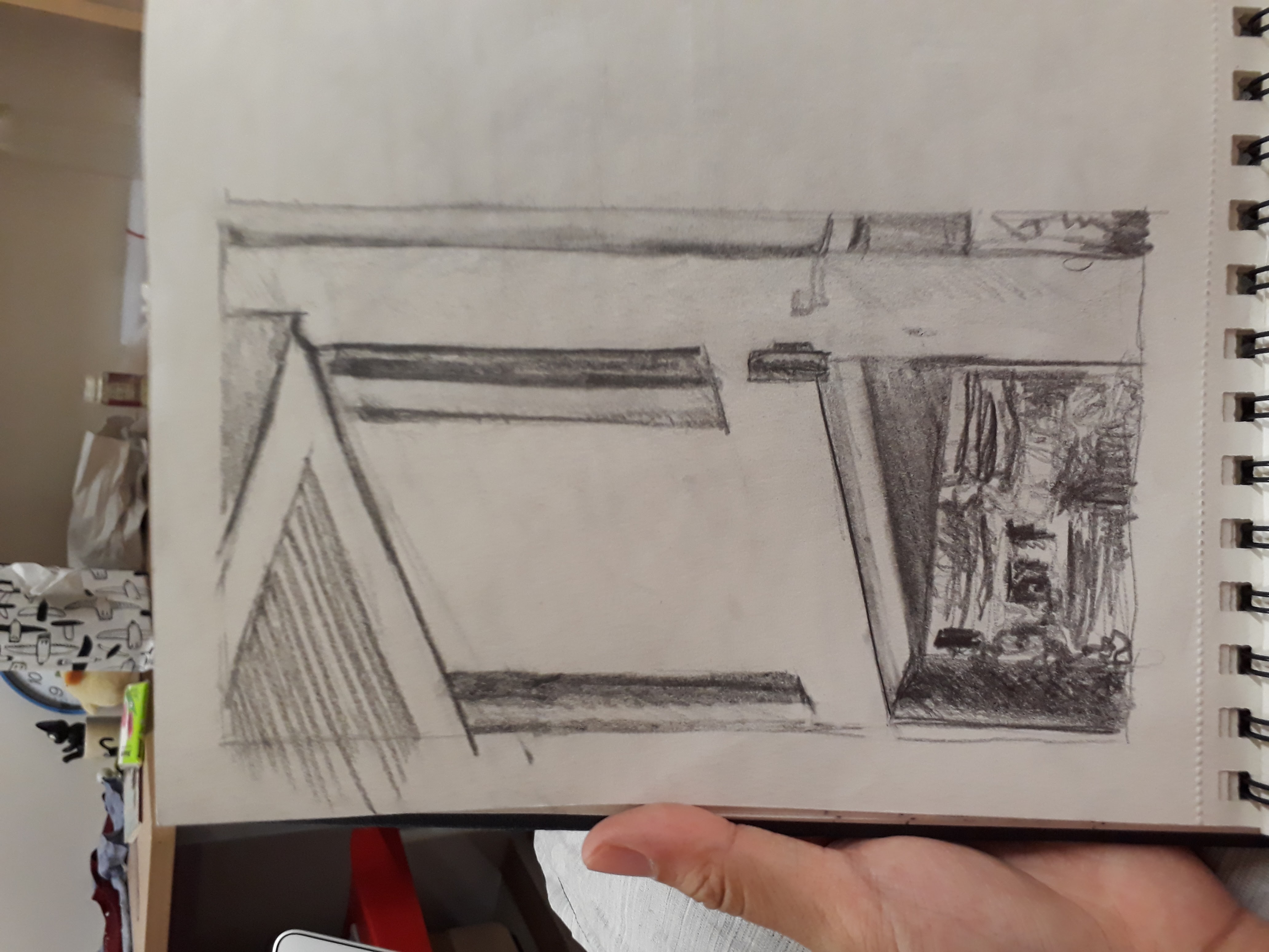
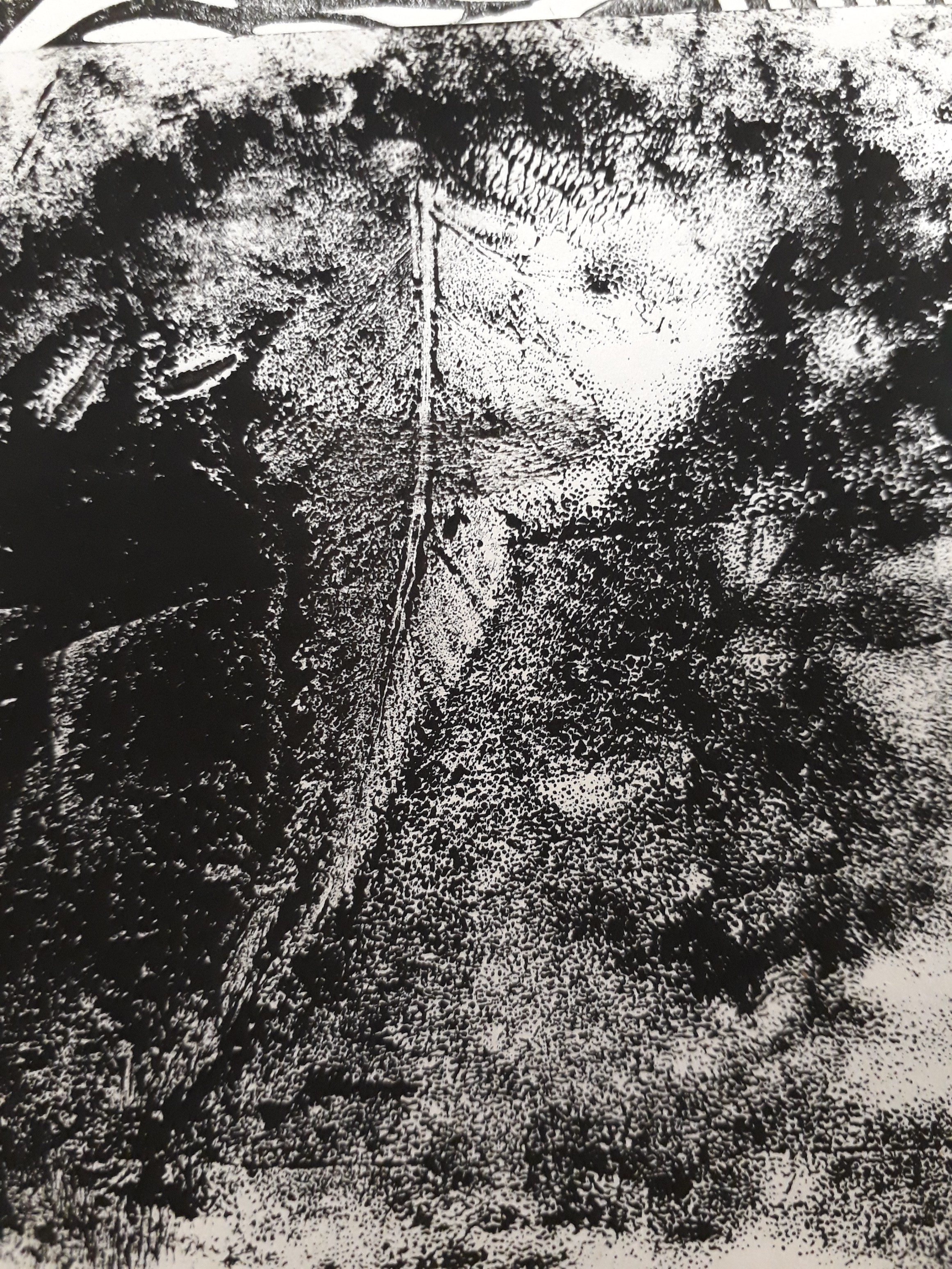
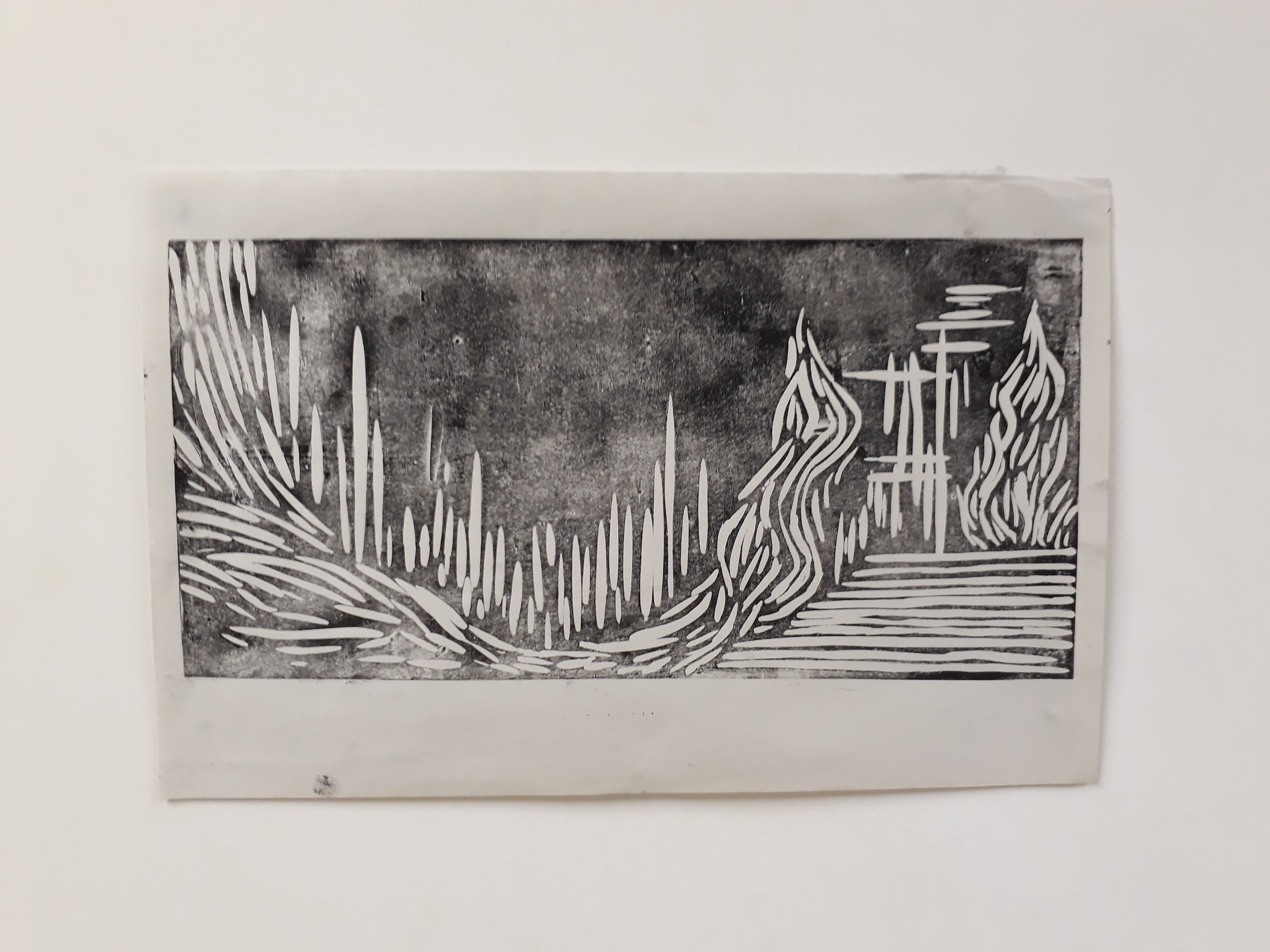
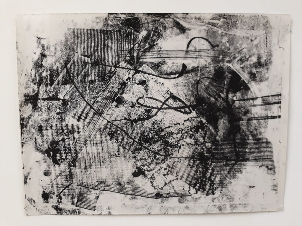
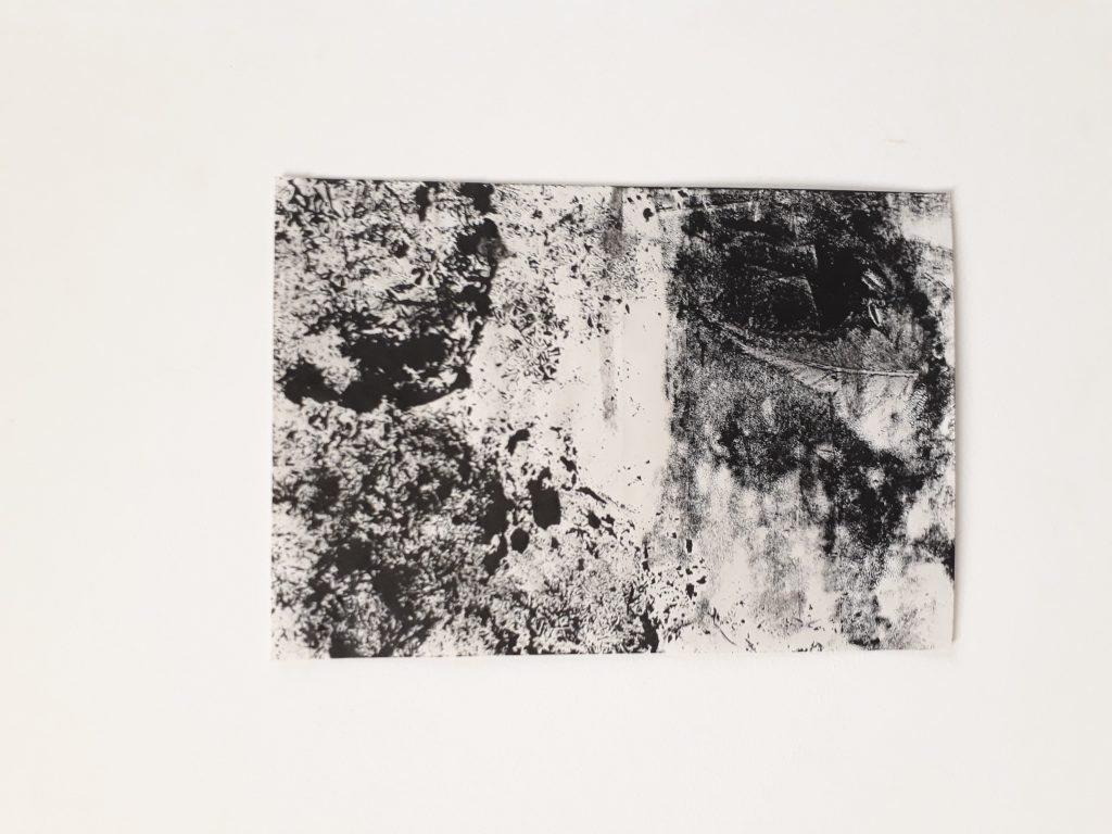
Here are some documentation of the process I’ve been through for mark-making. I realise I’m not a person who can multitask very well, and so I kept on forgetting to whip out my phone to record down my experimentation process.

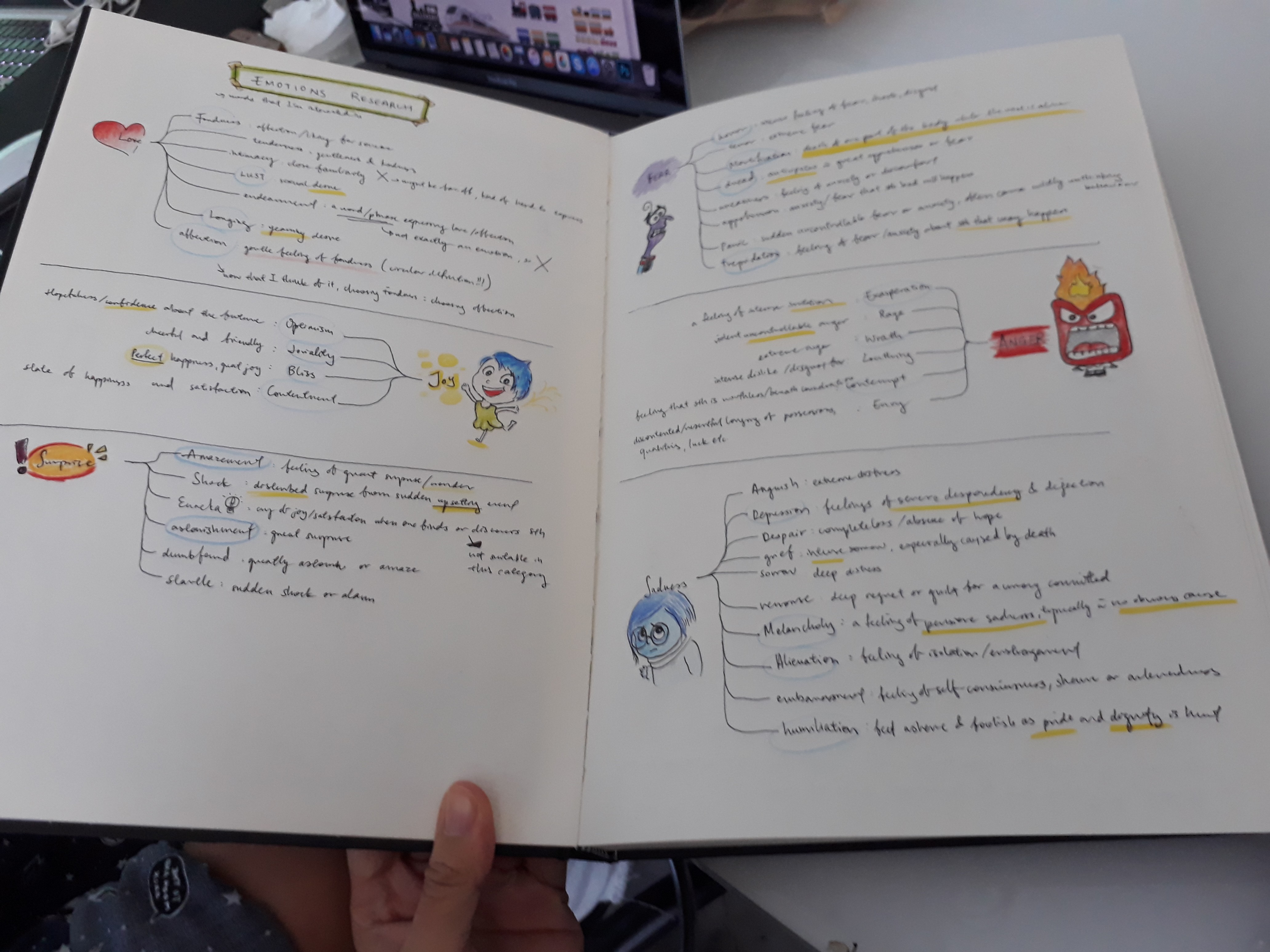
Initial emotions research:

I wanted to get a clear idea of what each emotions represented. Hence I did several small mind-maps for each emotion category and researched on each specific emotion to ensure that my understanding of that emotion is correct.

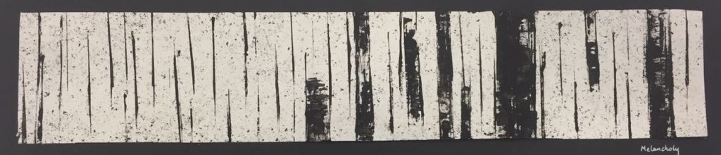
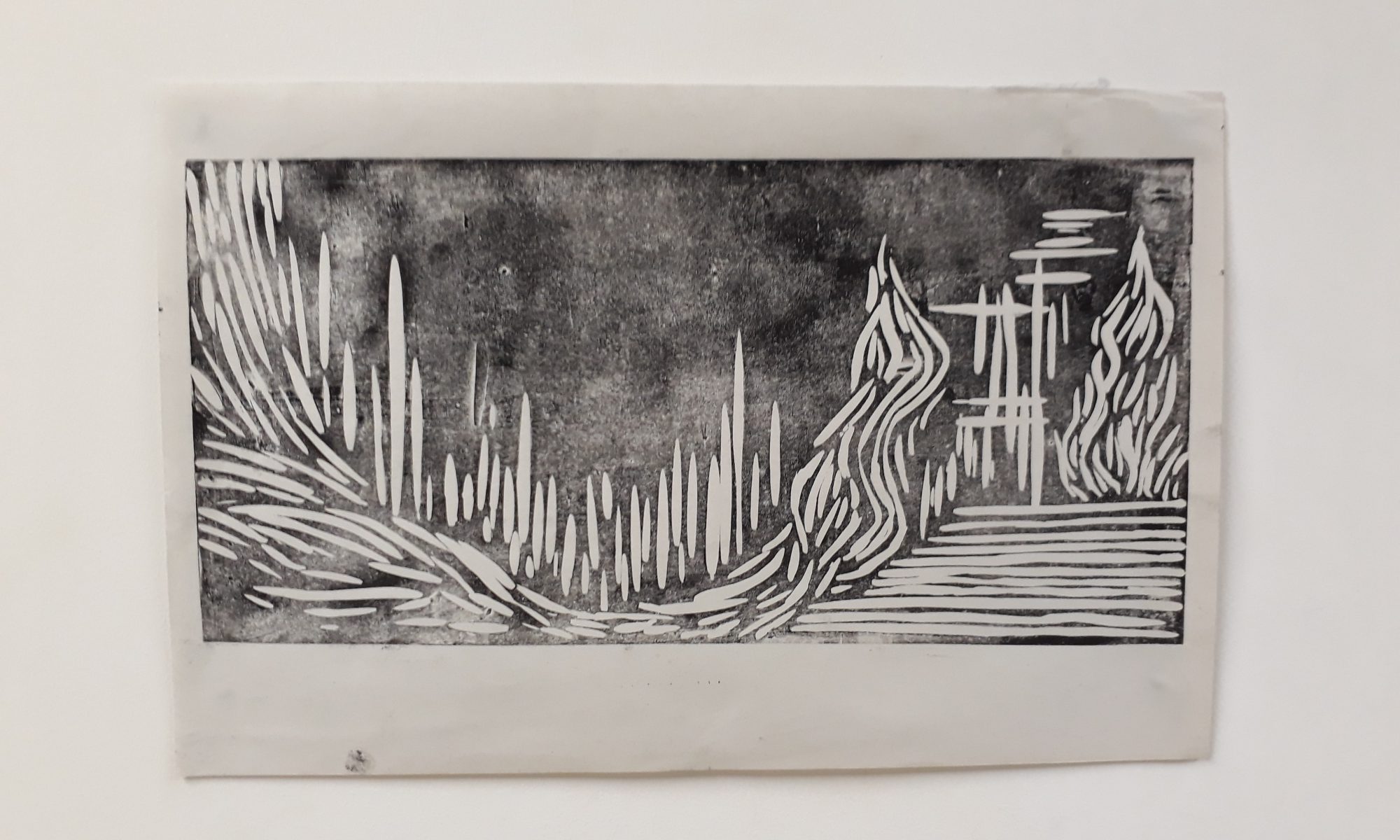
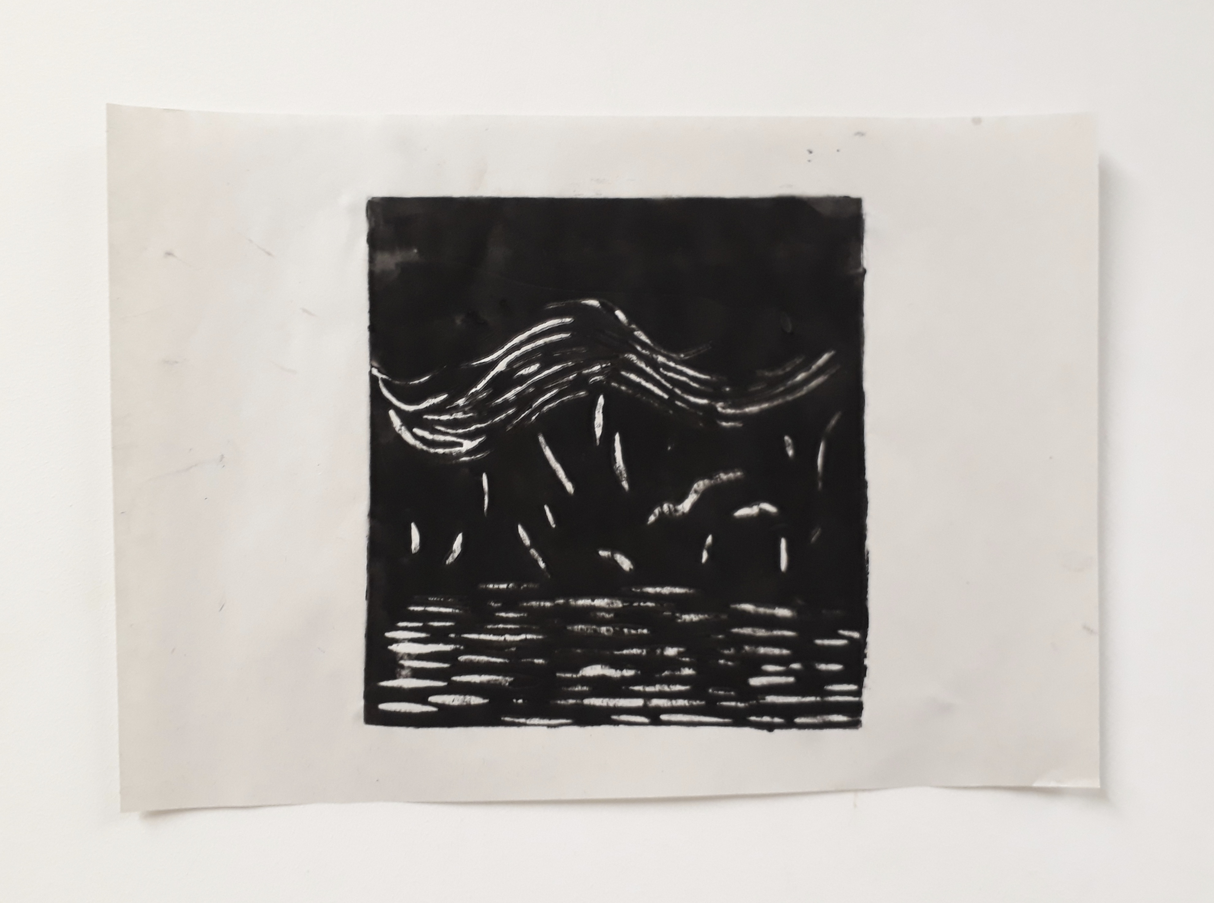
Experimentation for melancholy:

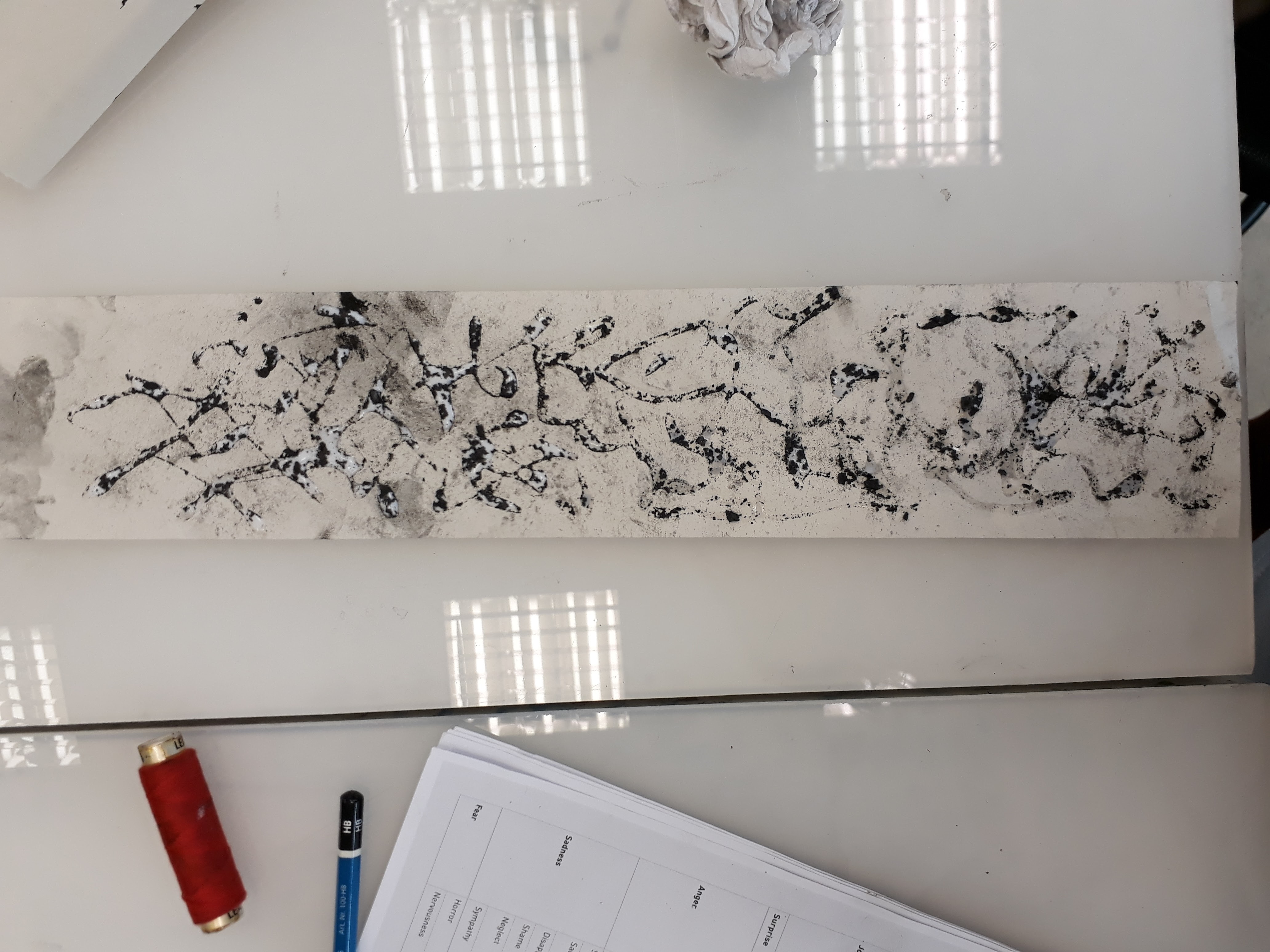
The feeling of melancholy is something that I believe everyone can instinctively understand as the wrenching throb in the heart but troubles to eloquently put the emotion into words.  And so when I tried to express melancholy in my marks, I tried to keep the the marks to a minimum so that the empty space (the paper) gives a more pervasive feeling of hollowness and emptiness.

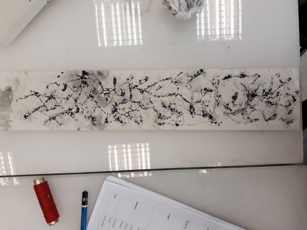
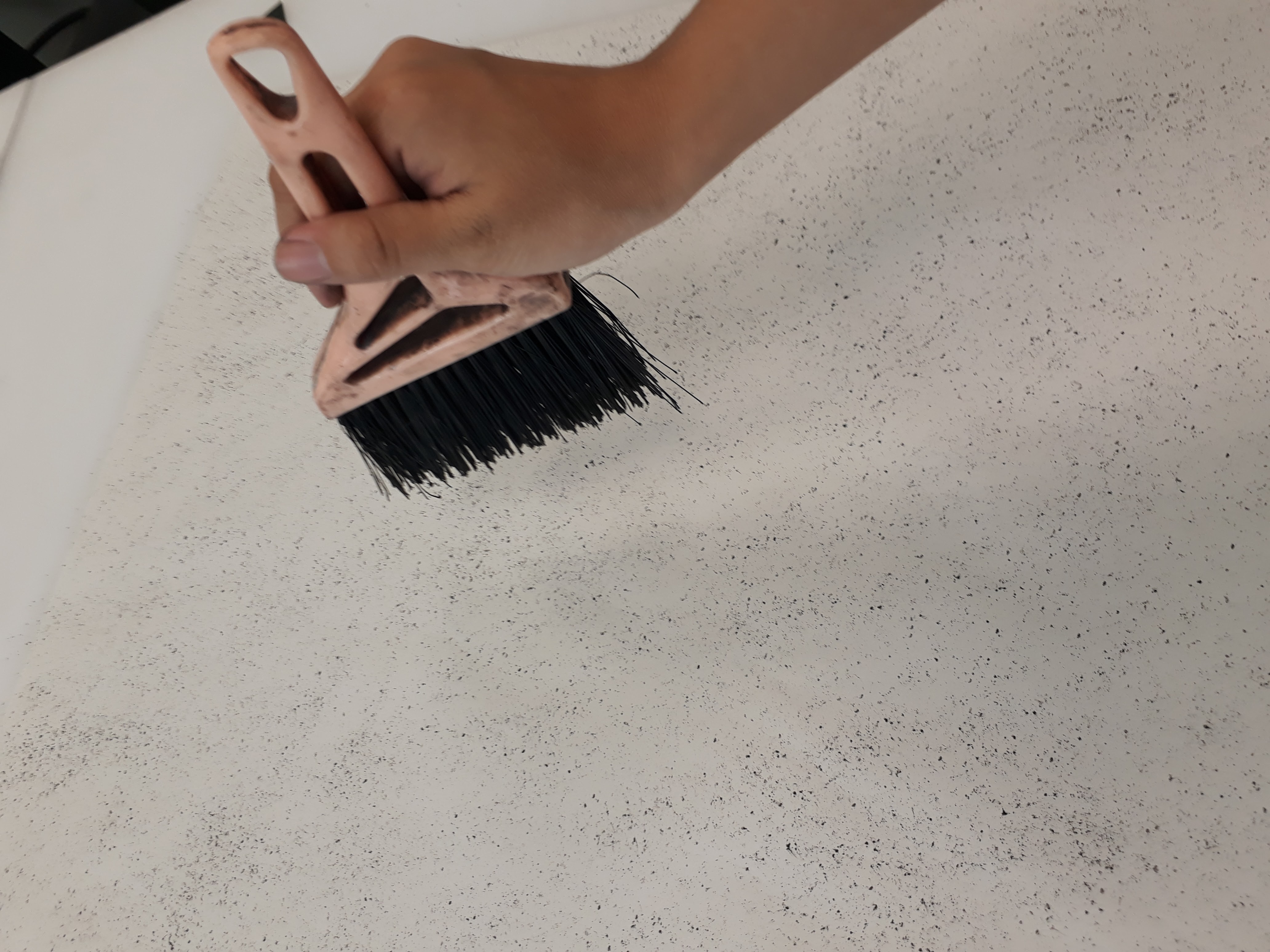
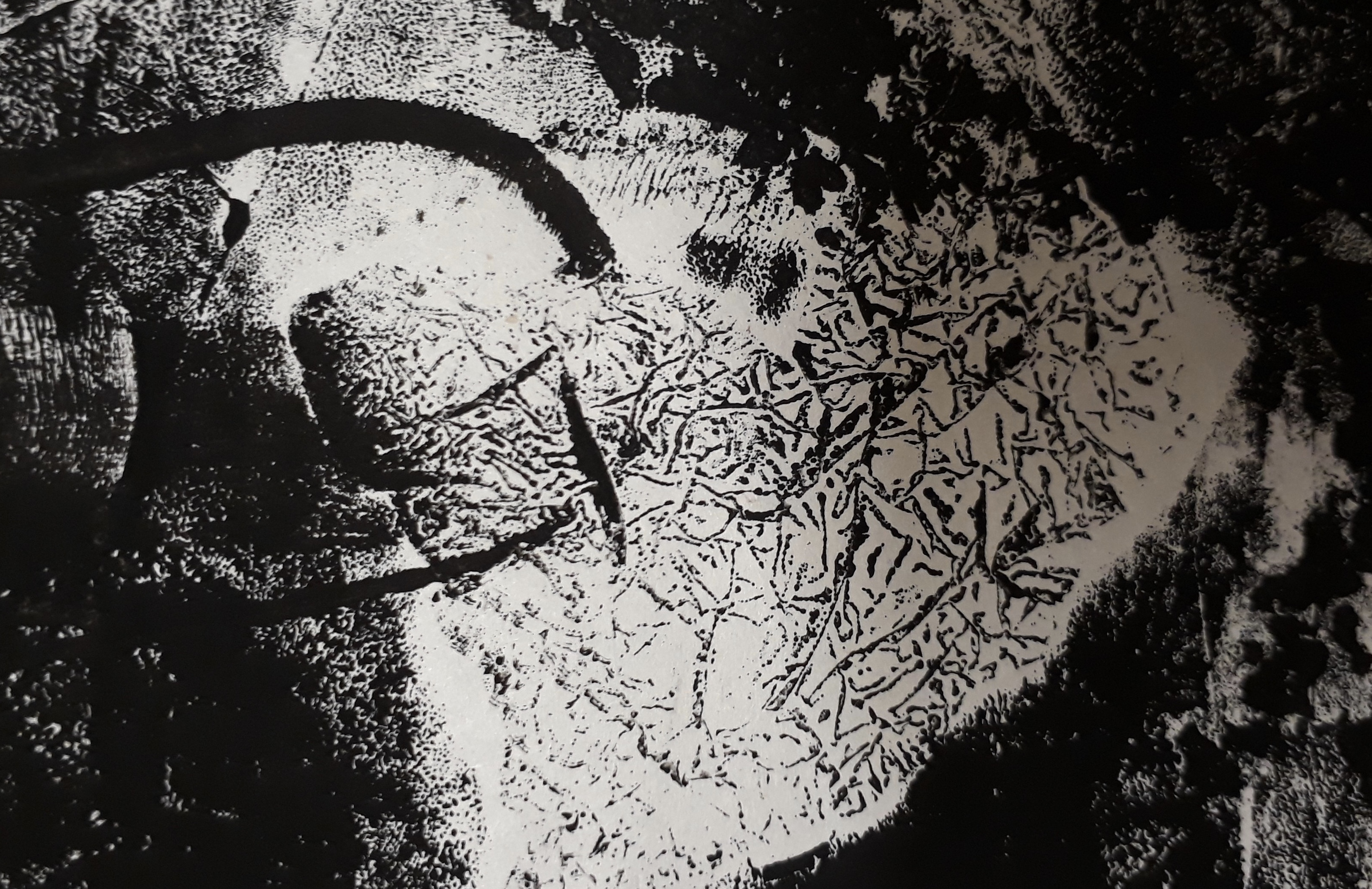
I made this by spreading glue around the paper first, and then sprinkling charcoal crumbs previously crushed. When the glue dries, only the charcoal is left behind, obediently following the trail of glue. I thought the idea was interesting, but I didn’t have any use for it in my final 6 emotions

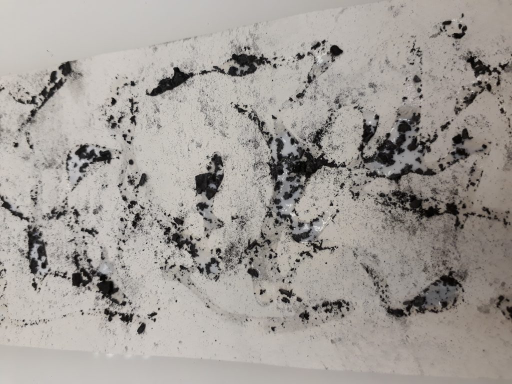
To see more of my process, please refer to my visual journal :DD

This was what I had after a week of experimentation:

Consultation with Mimi

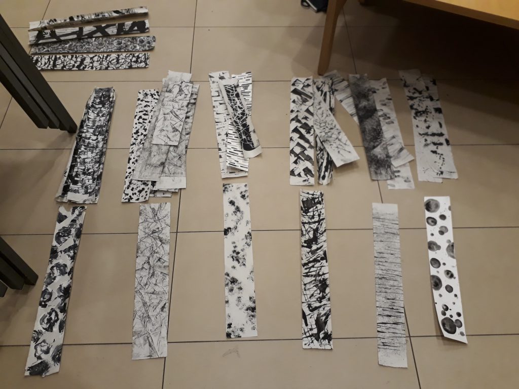
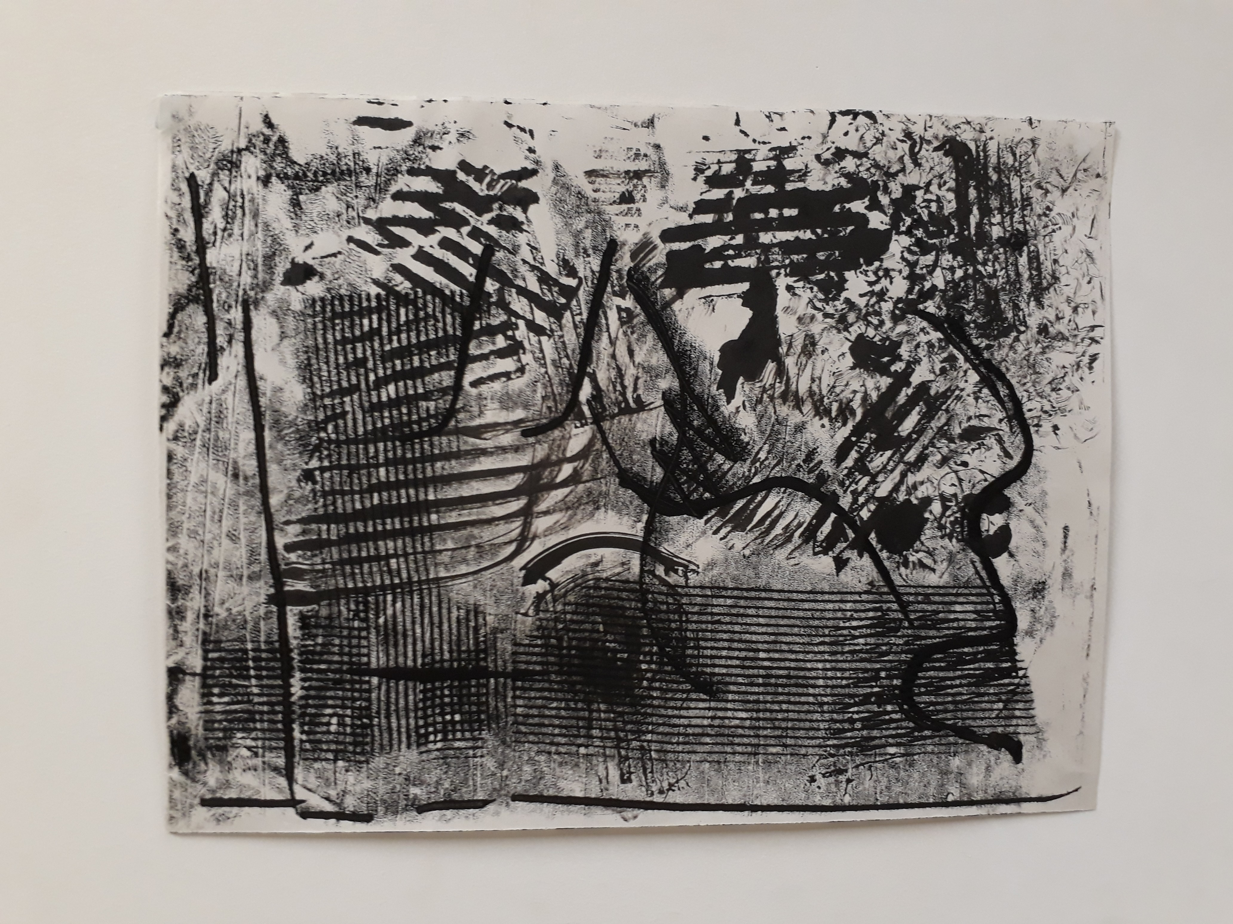
  • Mimi said that my works were too symmetrical (I agree!!!). I actually did try making some strips that were asymmetrical but I discarded them because they looked too bad. But I should really experiment more with having asymmetrical designs or having the idea of gradual up of emotions in order to make my works more exciting
  • Mimi also mentioned that I shouldn’t be working on newsprint alone. I took her advice and experimented with canvas, watercolour paper and newspaper later on :) I also tried to vary my medium by using acrylic and watercolour (wanted to use oil but it wouldn’t dry in time)
  • Can try collaging the works! See if anything interesting comes out of it!
  • There has to be an overarching theme that can hold the separate emotions together (can be in the form of songs, stories, phenomenon, or just anything)
  • Even though Mimi said that I have a wide variations of line work, she said to be careful when choosing my final 6 strips to prevent having the works looking too similar (especially since I seem to have the tendency to product mark-making that fills up the entire page)

Working on my learning points from the consult, I continued experimenting with more emotions, specifically working on points raised during the consultation.

Working with asymmetry

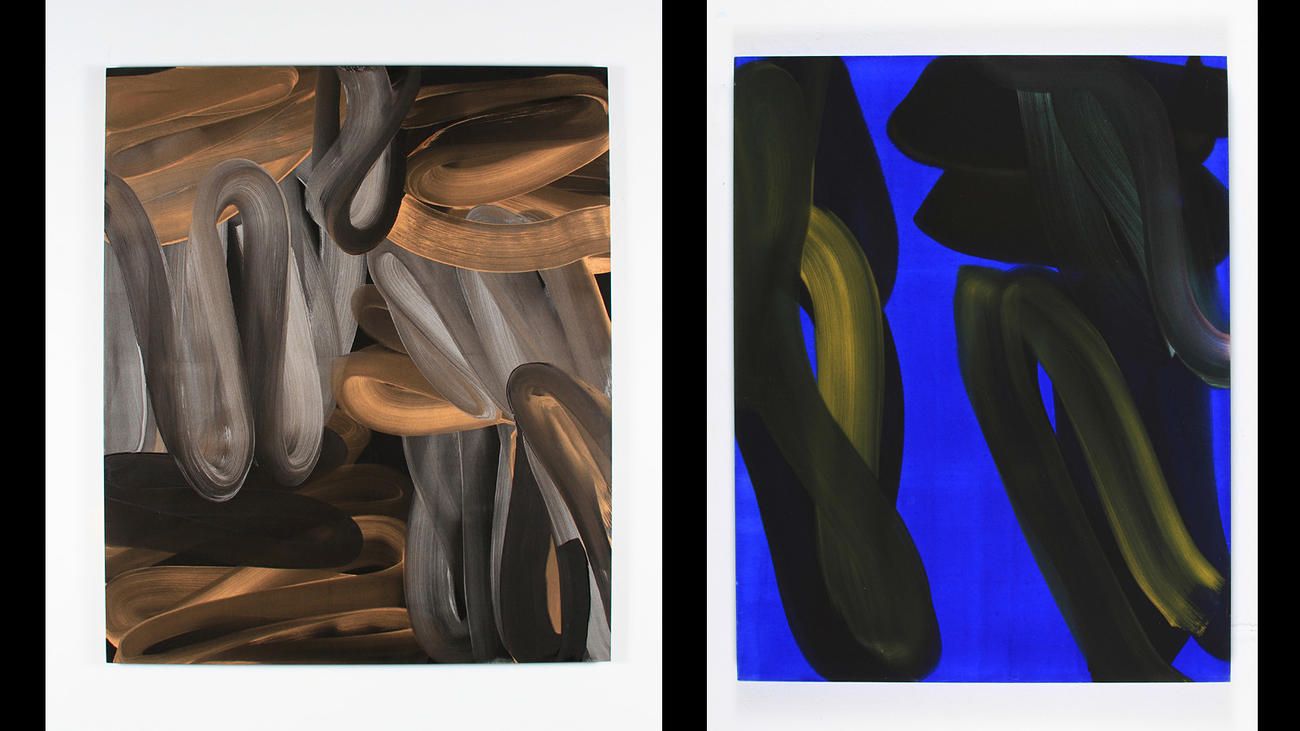
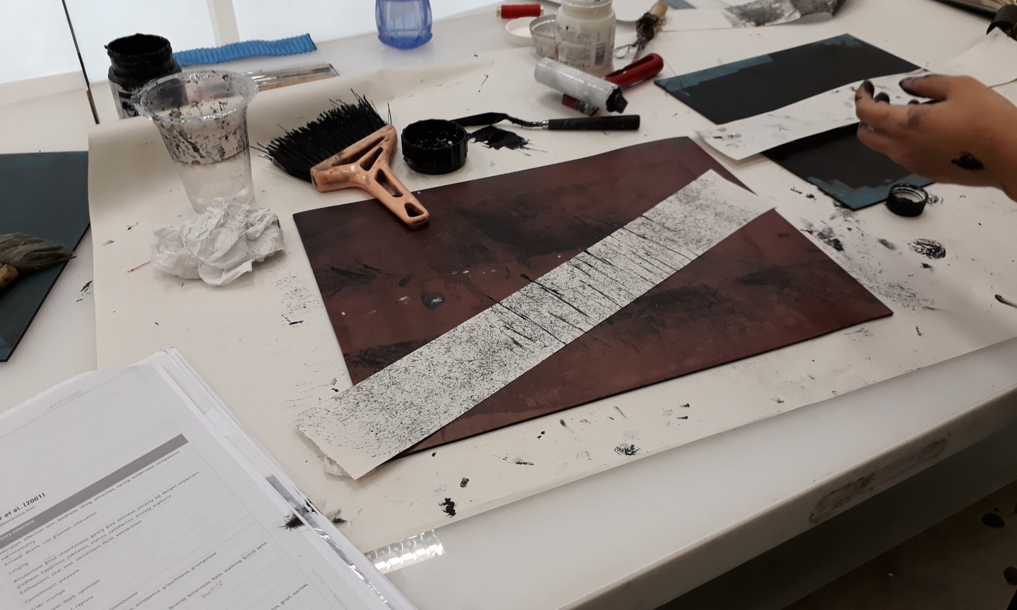
Working with different medium:

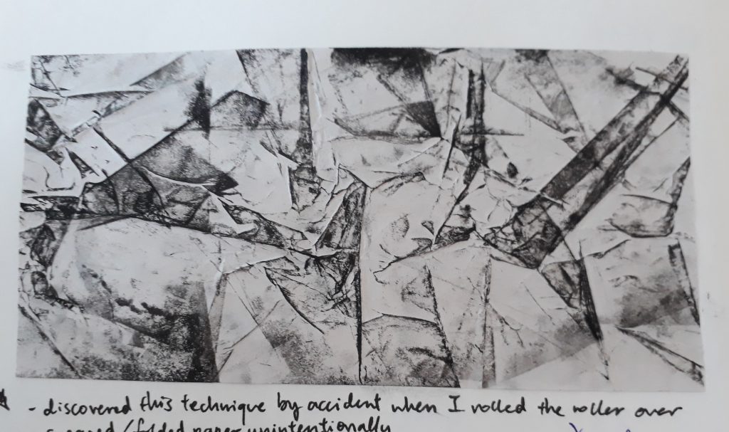
Initial idea was to simply roll a roller over crumpled paper

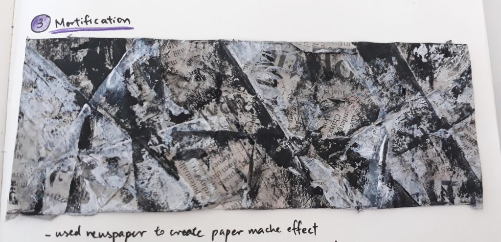
I decided to work on this idea by introducing newspaper as a medium to create a paper mache effect.

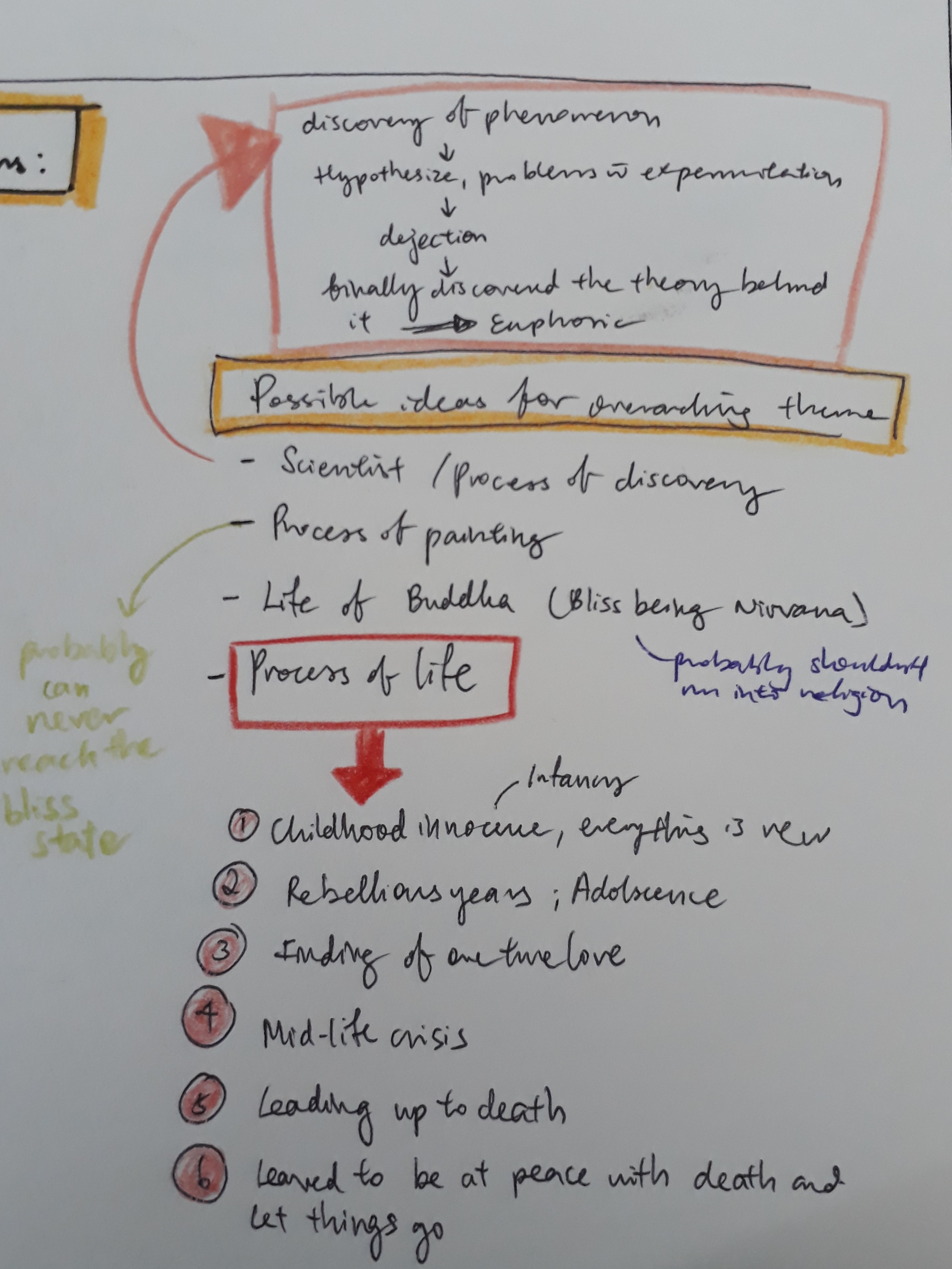
I brainstormed for a suitable theme to make my emotions cohesive and coherent when seen in a certain sequence. I had a few ideas off the top of my mind but they were somewhat random. At the end, since we are dealing with emotions in this project, I started to think about what emotions themselves signify. I felt that emotions are something very ‘raw’ and very ‘unique’ to humans. Yes, some animals can feel emotions as well, but they’re not as varied nor can they reach the same depth as human emotions can. Along this line of thought, I decided that I wanted to do something that ties in very closely to what makes a human human, which is how I arrived at my theme “life”.

Brainstorming:

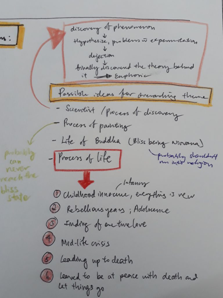
With this as my starting point, I started to narrow down emotions that I want to deal with. I identified the different stages of life and the emotions one most probably would have felt at that point in time:

  • Infancy
  • Adolescence
  • Teenager – Adulthood
  • Mid-life Crisis
  • Illness/ approaching old age
  • Before the final end

(Check out the journal for the full description for each stage :> )

From my huge pile of emotions, I picked out 6 emotions most representative of what one would have felt at the six identified stages of life:

  • Infancy — Amazement
  • Adolescence — Exasperation
  • Teenager – Adulthood — Lust
  • Mid-life Crisis — Melancholy
  • Illness/ approaching old age — Mortification
  • Before the final end — Bliss

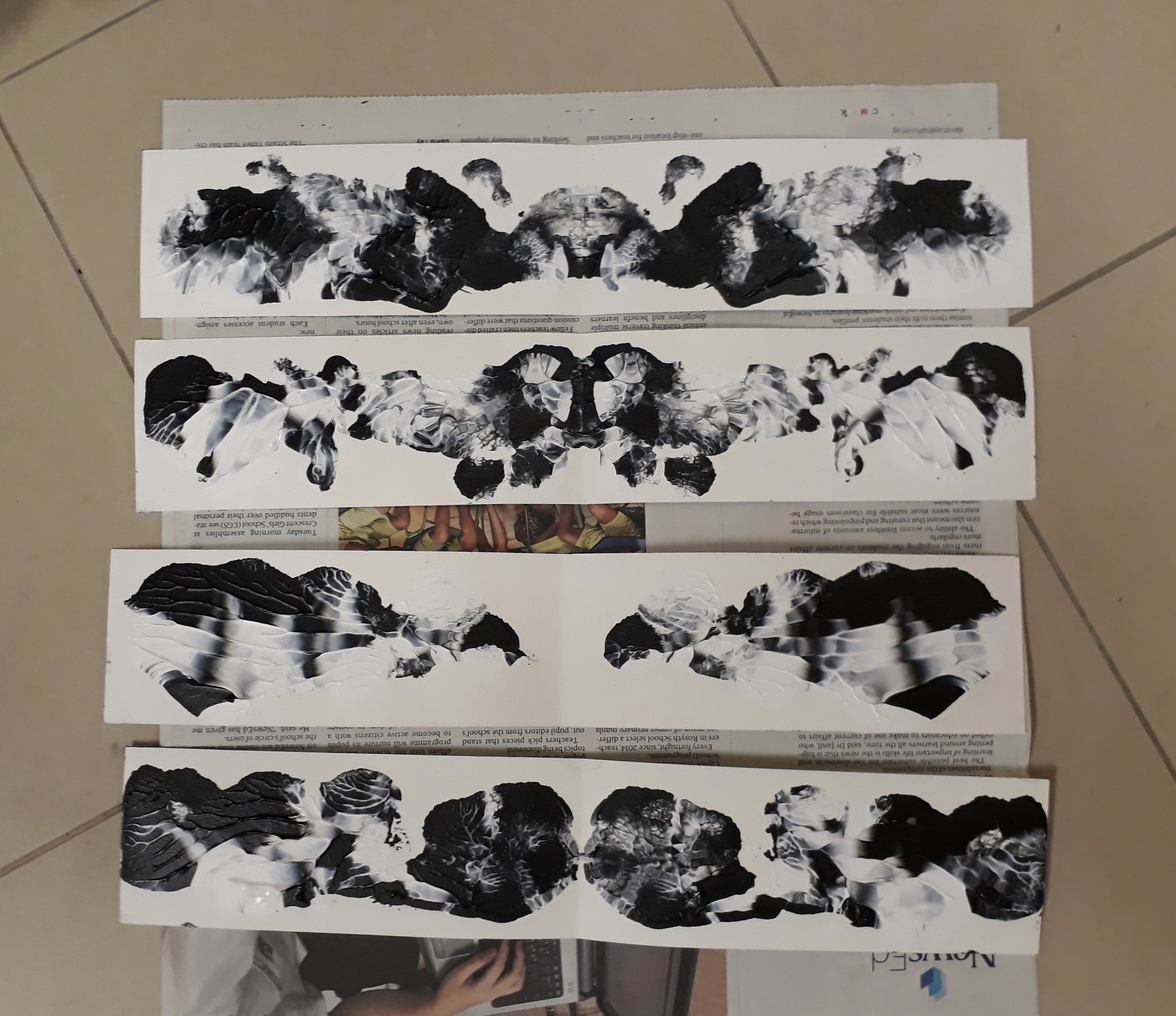
I went on making the final emotions used for submission. However, I realised that the same marks can never be replicated. Even subtle differences can make a big difference to the general mood the marks elicit.

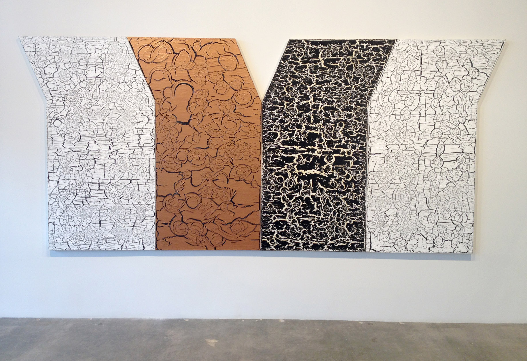
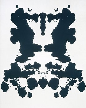
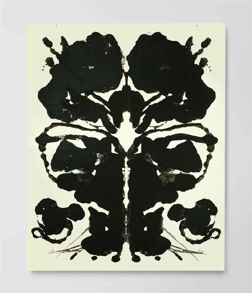
In particular, I couldn’t get ‘Lust’ the way I wanted at all even after multiple, numerous, countless number of tries and kilos of paint wasted (just kidding). In a spurt of frustration, I folded a strip that I was doing halfway, intending to discard it. However, when I opened the strip, it dawned on me how perfect Warhol’s Rorscharch technique can be applied. I started experimenting more with this technique, constantly being pleasantly surprised whenever I open the folded paper.

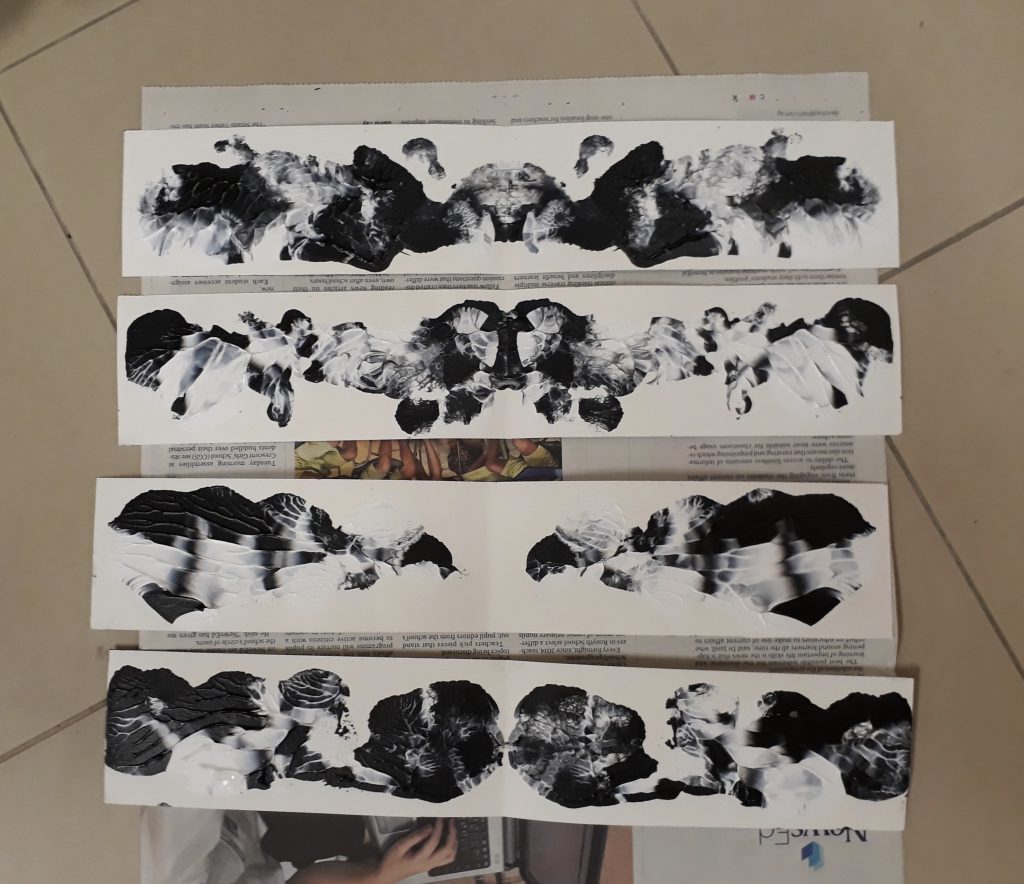
And so, one day before submission, I changed “Lust” to “Affection”, an emotion I thought best described the ink blot I made.

In the end, my final six emotions were:

  • Infancy — Amazement
  • Adolescence — Exasperation
  • Teenager – Adulthood — Affection
  • Mid-life Crisis — Melancholy
  • Illness/ approaching old age — Mortification
  • Before the final end — Bliss


2D Project 1 My Line is Emo – first experimentaion

This week’s lesson was thoroughly enjoyable as I tried my hand at mark making. This was my first attempt at mono-printing and the printing machine, which were immensely interesting and fun!

Some mark making tools I brought to experiment:

  • leaves, tree bark, rocks, sea shells
  • aluminium foil, corrugated cardboard, cling wrap, non-slip mat
  • bottle cap, tissue, syringe
  • velcro, thick rubber band, buttons
  • my fingers

Mimi told us not to bother about the aesthetics of our prints and to explore freely — which was what I did. Here are some prints I made:

I managed to get the bold lines by using the handle of the roller. These lines feel very raw and strong — potential marks for the more intense emotions. Also, the mono-printing method is almost unpredictable because I’m just making the marks blindly without being able to see what I’m doing.

Printed a leaf! Can only vaguely see the shape and veins. And it’s too obvious that it’s a leaf — probably not very suitable here since we want to stay away from very literal/ representative marks.

Experimented with the use of combs here. The neat rows of lines produces a very nice effect. The thick rows of lines were created with corrugated cardboard.

Prints of crushed aluminium foil! The effect is really cool if enlarged, but since it’s very condensed and crammed, it doesn’t look very nice from far.

Marks made by dipping a rock into ink and rolling it around the paper. It’s quite beautiful, especially how the ink is concentrated and sparse in different areas.

Linocut! First time working around with the tools. It wasn’t hard to cut the linoleum, but getting the shape/line I wanted was hard. The lines I cut also looked rather similar — the edges are all rounded.

A linocut I made at the end of the class! I didn’t have anything in mind and was just cutting based on instincts. I’m very satisfied with this print :)  (though mildly annoyed that the print I rushed through with minimal thought turned out the nicest)

Some other prints:

With this round of exploration, I’m more familiar with the tools and materials and how we can create different kinds of marks. I have a better idea of what this project is about and I’m ready to experiment and explore a lot more. Excited for the weeks to come! :D


Figure drawing 2

Second figure drawing session!

Today we dealt with Chiaroscuro, learning to deal with light and shadows and knowing how to demarcate edges of a form just by playing around with tone.

Some quick sketches we did as warm up to try portraying the figure using different tones:

There isn’t quite enough tonal ranges in these sketches, but I did get a rough idea of what we are supposed to learn here.

1.5h sketch:
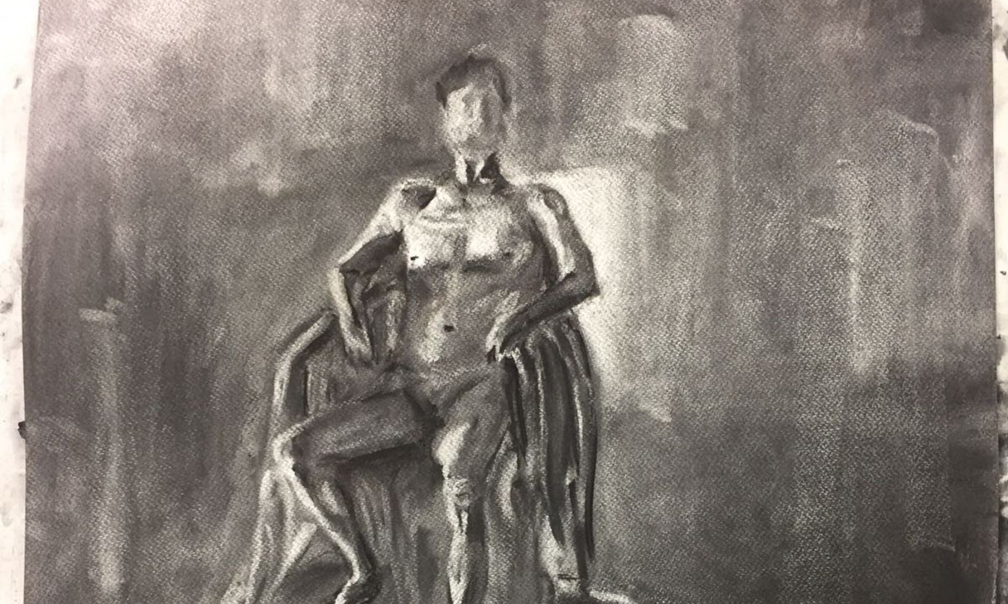
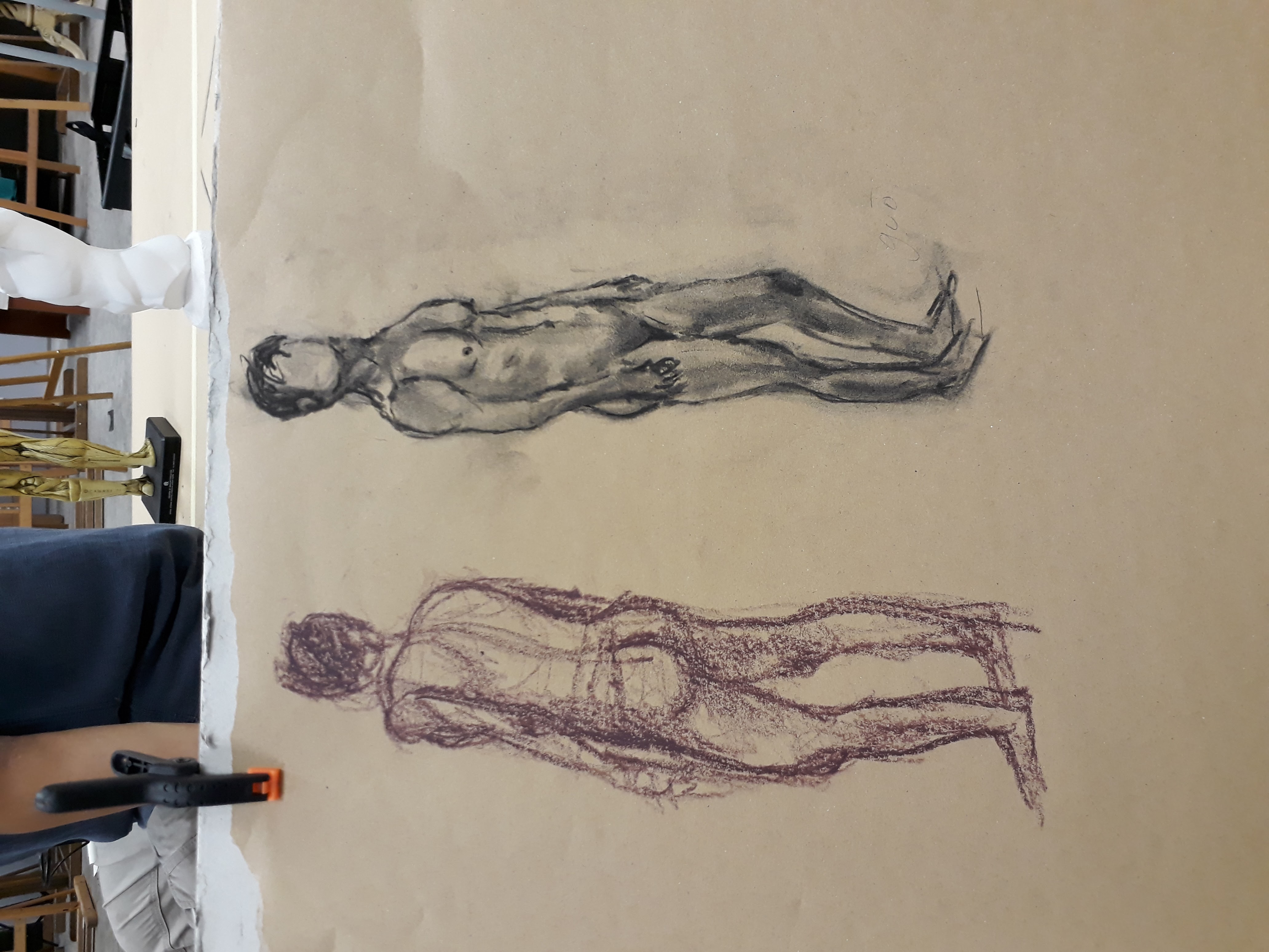
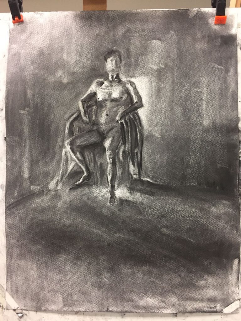
Here, we first smeared the background with charcoal so that it is mid-tone black and then brought out the human form by using an eraser. This exercise helps us to identify the brightest and darkest parts of the human figure, and this aids us in elucidating the form accurately.

My figure is too small again….. Somehow I cannot visualise how the figure will translate on the paper, and so I couldn’t estimate the size of the drawing. Here I think I managed to mark out the form of the body quite clearly (other than the hands which I casually skipped). Some shadows are too sharp (like the one at the model’s right shadow) and some edges are rather weird (e.g. the left arm). I am very happy with the model’s left leg though!! I thought it turned out quite well :>

However, I wasn’t very successful with capturing the mood. Even though the background shades vary in tone, they don’t really give you the idea that there is some sort of air flow or movement at the back. They literally just look like different blocks of different shades in the background. I should work on this more in the future.


Figure Drawing 1

In the third week of school, we are already working on nude figure drawing! I was quite surprised as I thought we would be working more on still-life setups as well as learn the human anatomy before actual moving on to real life models.

I thought that Prof’s method of teaching was quite effective. For basics, he instructed us to focus on the torso and taught us to construct its shape by using two boxes — one representing the upper body while the other representing the pelvis.

For the upper body box, the upper edge is to be extended from the hollow located along the clavicles (collarbone) at the top of the shoulder while the bottom edge is to be aligned with the ends of the ribcage.

For the pelvis box, three points are to be first identified: two points at the ends of the iliac crest and one at the pubic bone.

Iliac crest:

Accessed from https://commons.wikimedia.org/wiki/File:Iliac_crest_03_-_posterior_view.png

Interestingly, when a human is standing, the upper box will be tilting backwards instead of being upright or inclining forward. This is often overlooked, even when I tried to sketch later on.

Easier said than done! Even though the theory sounds extremely simple, when I tried applying it I found that just getting the proportions of the boxes right is a big enough headache. It is difficult to pinpoint from the nude model where the boxes starts and ends and what their orientation in space is.

Quick sketches I did:

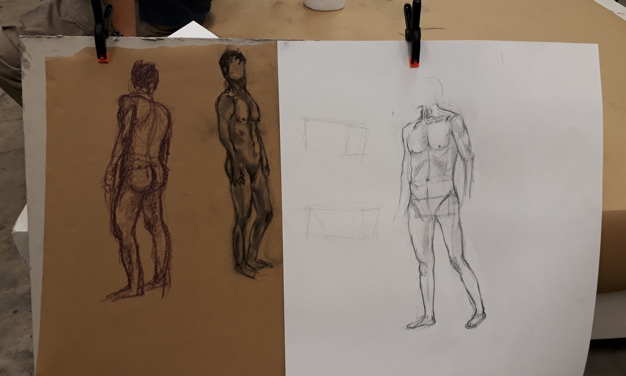
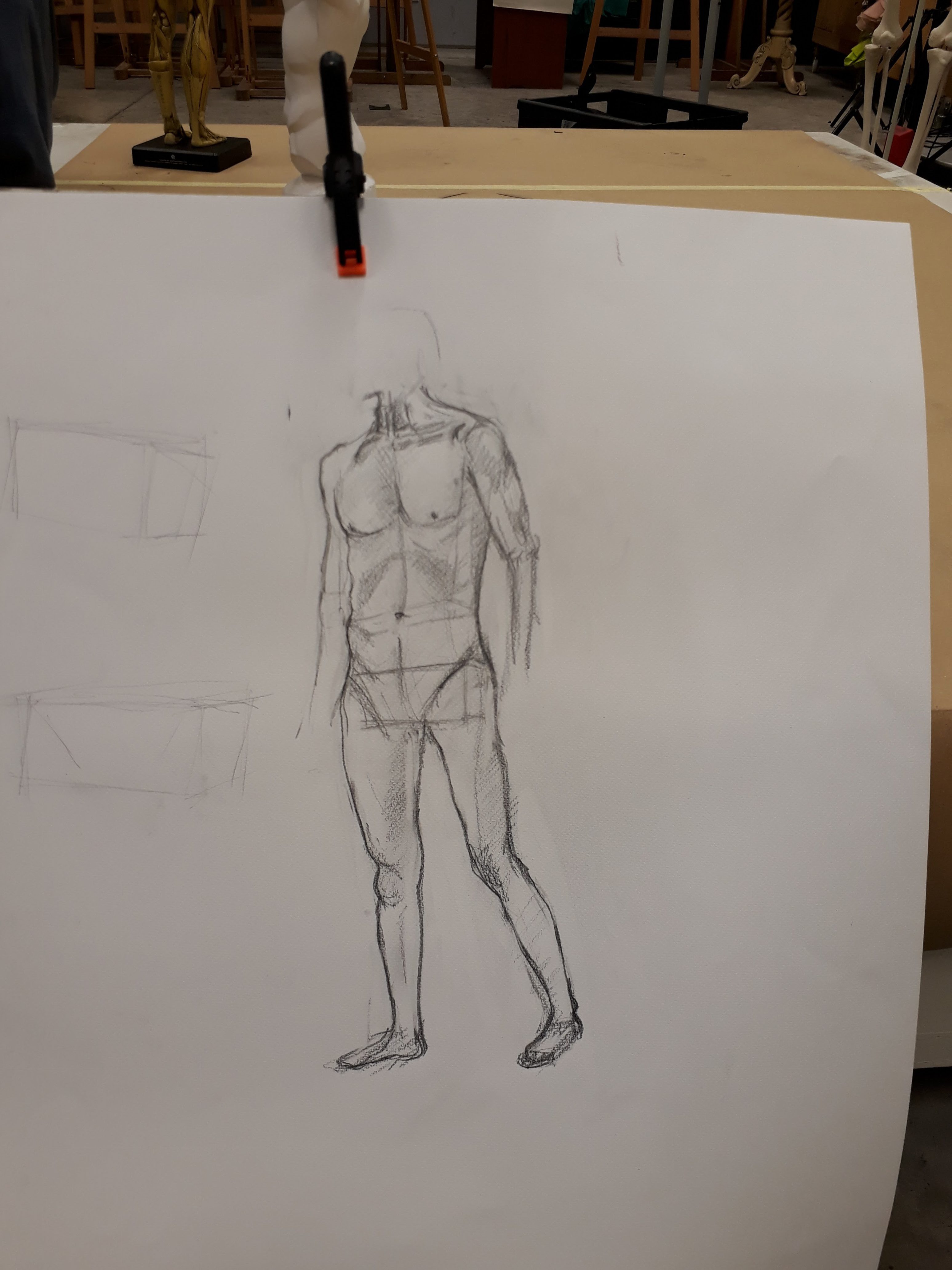
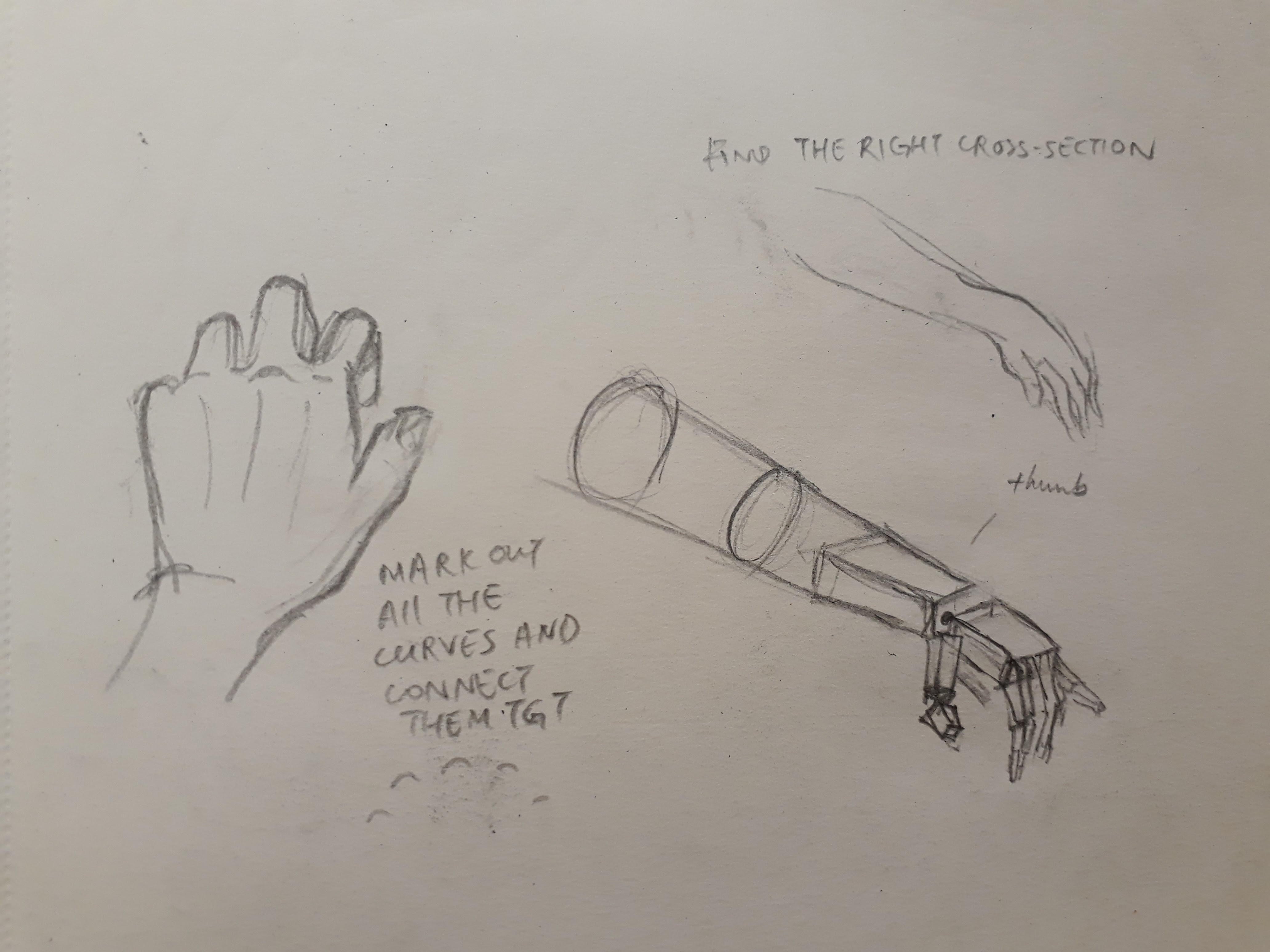
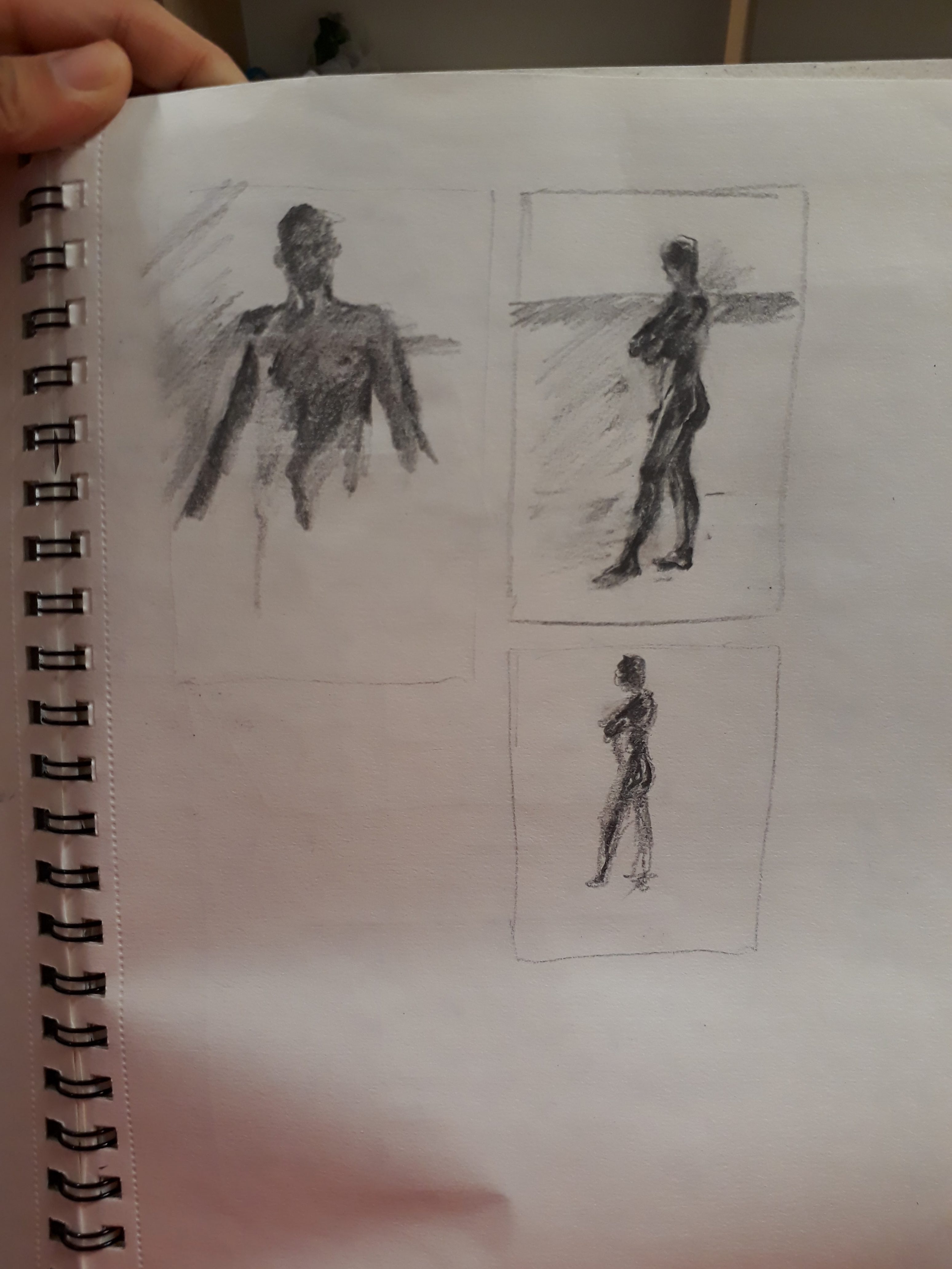
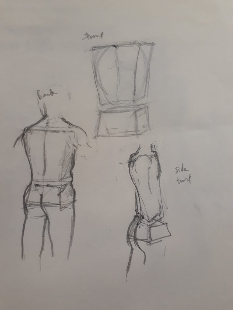
Proportions feel rather off here. Also, I did not know that the boxes should be rectangular instead of taking a trapezium shape. In the bottom right sketch, I was confused by the twisted torso of the model and thought that my boxes should be distorted as well. However, Prof told us later that we should be thinking of the boxes themselves as representing immovable blocks (we can’t twist our ribcage or pelvis after all). What gives rise to the idea of the ‘twist’ is by displacing the alignment of the top and bottom box.

We sketched for longer periods after:


I realise I have this very bad habit of sketching the model too small…

I hope there’s a lot more figure drawing sessions to come because it feels like it is very hard to master and will require loads of practice. Hopefully, through better understanding of the human anatomy and techniques to figure drawing, I will get better and faster and more confident at it :)

Foundation drawing: tones and textures

This week, we worked with charcoal to learn about textures and tones in a drawing.

Texture:

Since drawings are 2d, we can only create the illusion of texture by manipulating light. For smooth surfaces, there will be a smooth graduation from light to dark; for rough surfaces, there will be sharp contrasts of light.

Tone:

Varying tones is crucial feature to have in order to bring life to a drawing. Objects have no outline in reality – hence for realistic drawing, it does not make sense to have clearly delineated outlines. Hence, without outlines, the only way to portray an object will be to describe it based on its tones and how it behaves under light.

Takeaways from Prof’s demonstration of a rainy day:

  • The importance of creating a delusion, and acquiring the know-how. In a rainy day, there are no sharp shadows due the diffusion of light from the rain droplets, the ground, the walls, etc. As sunlight is still the main source of light (other sources including street lights/ lights in buildings), the ground (horizontal surfaces) will reflect the most light among all surfaces. Additionally, due to the reflection of light among rain droplets, the further the distance, the brighter it will appear. Hence, in a rainy scene, furthest objects will appear the brightest. 
  • Prof barely drew any details, yet we could tell that it is a rainy day. We could make out the forms of the cars, the people, the umbrellas….. with minimal strokes. This goes to show the importance of light and dark in a drawing – they make all the differences

We had a chance to draw a still life set up. Here is my from the session:

I am not foreign to the use of charcoal, however I had some troubles adapting to the paper I was using which was somehow quite different from what I’ve used in the past. For examples, I found that it was more difficult to erase and get a sharp edge. Also, the charcoal does not seem to adhere to the paper – when I rub on the charcoal with my fingers, the tone lightens immensely more than I intend.

I think it can be quite distinctly observed that the quality of drawing drops from the right towards the left (excluding the crumpled paper texture). This is because I am a rather slow worker. Thus I was drawing at a more comfortable pace at the start and spent a lot of time on the glass bottle. However as more and more time passed, I was pressurised to work quicker, and the rushed drawings do not fare so well.

Tones

For the ceramics, it was very difficult to capture their tones because the change in tone is very subtle under the diffused studio lighting. Prof mentioned that it was very important to ensure that the darkest parts of the ceramics are lighter than the darkest parts of the darker objects.

For the kettle, I think that my tones are changing too abruptly and the contrast is too large. Also, each band of tone (which I drew as a flat solid colour) should have a gradual change in tone within itself.

For the crumpled paper (in the background), while I did not have enough time to work on them, the portion that I did draw is too dark and the tones too flat.

Texture

Again, I found it more difficult to work with the ceramics – their textures are so hard to capture! Reflections on the kettle and glass bottle are a lot more straightforward because each change of tone is very clean and distinct. Since their surfaces are smooth, all I had to focus on was the reflection.

Drawing

Even though this lesson did not focus on the drawing itself, I find that my proportions and perspectives are rather poorly done – especially the eclipses.

Personally, I love drawing. I would love to attend more drawing sessions and improve as much as possible.

My Line is Emo — Research on Artists

I am rather fascinated by how non-representational mark making is able to express so many varied emotions. This means that the marks must contain some form of inner significance – one that is able to trigger our thoughts, transport us back to a memory, and resonate with us.

On second thought, however, it makes sense that non-representational marks are able to express our feelings. Emotions are not thoughts after all. They are not literal, not tangible, and not exactly rational. It follows that expressive mark making is indeed an apt medium to portray them.

To learn more about mark making as well as to source for inspirations, here are some artists whom I have researched on:

Ed Moses

Accessed from http://www.laweekly.com/arts/ed-moses-on-new-work-the-poet-and-the-jabberwocky-painting-in-four-dimensions-alice-in-wonderland-and-marilyn-monroes-butt-2372658

Ed Moses is an American abstract artist. To him, art is about “exploring the phenomenal world”. Since the phenomenal world is so diverse and impermanent, it comes as no surprise that Ed Moses’ approach to art is highly experimental. It is quite obvious from his works that he refrains from being limited to a certain style.

Ed Moses does not consciously dictate what to do in front of a canvas and is happy to accept whatever ‘accidents’ and mistakes as part of his artistic process.

Some of his works:

Accessed from http://www.latimes.com/entertainment/arts/la-et-cm-ed-moses-at-90-20160501-story.html

Love the subtle use of red!

Accessed from http://www.latimes.com/entertainment/arts/la-et-cm-ed-moses-at-90-20160501-story.html

The bright red stripe is so bold and striking!

Accessed from https://newamericanpaintings.com/blog/ed-moses-greenbronze

Personally, Ed Moses’ paintings are really enchanting. He varies the transparency of paint, fracture lines abruptly, and smears paints across the canvas liberally, allowing the elements to emerge from and sink in the canvas –  just like the ebb and flow of waves

Andy Warhol

http://www.askthemonsters.com/facts-about-andy-warhol-every-girl-should-know/

Andy Warhol was an American artist and a leading figure of the Pop Art movement who played an influential role in contemporary art and culture.

Accessed from https://www.gagosian.com/exhibitions/september-21-1996–andy-warhol

Rorschach is a series of paintings that Warhol made in 1984. These paintings are essentially ‘ink blots’, with inspiration drawn from “The Ink Blot test” created by Swiss psychologist Hermann Rorschach. Patients had to interpret ink blots presented to them, while psychologist would help to decipher their mental and emotional states based on what they perceive.

Interestingly, Warhol misunderstood the clinical process and thought that the patients were supposed to create their own ink blots for the psychologist to decipher – which led to the creation of the Rorschach paintings.

Warhol used the pour-and-fold technique, which helped him to achieve symmetry.

Accessed from http://www.christies.com/lotfinder/Lot/andy-warhol-1928-1987-rorschach-5621967-details.aspx
Accessed from http://newsinteractive.post-gazette.com/pghinsidersguide/ae/hidden-gems/
Accessed from http://www.contemporaryartdaily.com/2009/10/andy-warhol-the-last-decade-at-milwaukee-art-museum/warhol_10/

The paintings are huge!!

Sol LeWitt

Accessed from http://www.gettyimages.com/detail/news-photo/portrait-of-artist-sol-lewitt-in-his-studio-late-1960s-or-news-photo/532614795#portrait-of-artist-sol-lewitt-in-his-studio-late-1960s-or-early-1970s-picture-id532614795

Sol LeWitt was an American artist who played a leading role in the Conceptual Movement. He placed great emphasis on the concept or idea of his work, rendering inherent narrative and descriptive imagery to be unimportant. As seen from his works, they are all non-representational.

His artistic explorations were systematic: they generally dealt with geometric elements and patterns – visually appealing nevertheless. Interestingly, as he stresses on the importance of ‘concept’, for large part of his wall drawings, LeWitt only conceive and plan them –  the actual works are usually executed by draftsman.


Accessed from http://www.centrepompidou-metz.fr/en/sol-lewitt-wall-drawings-1968-2007
Accessed from https://jewishcurrents.org/september-9-sol-lewitt/

LeWitt believes “each person draws a line differently and each person understands words differently”. This is one of the reason he chose to let draftsmen carry out his plan:

Draftsman inject their own interpretation of the plan into the actual work, allowing the final work to morph into something elusively different from the original plan, yet it is still the same artwork. Any misinterpretation or error made by the draftsman are accepted as part of the work.

Accessed from http://ex-chamber-memo5.up.n.seesaa.net/ex-chamber-memo5/image/1sol-lewitt.jpeg?d=a0
Accessed from http://urania-josegalisifilho.blogspot.sg/2012/01/sol-lewitt-paragraphs-on-conceptual-art.html


I have a curious observation, that is – although these three artists differ greatly in style, all three embrace mistakes and ‘accidents’ as part of the artistic process. They do not eliminate them, but rather generously and happily incorporate them into the final work. This is something I should learn from them and not be fearful of committing errors. I should always keep an open mind and be willing to continuously experiment with new ideas.