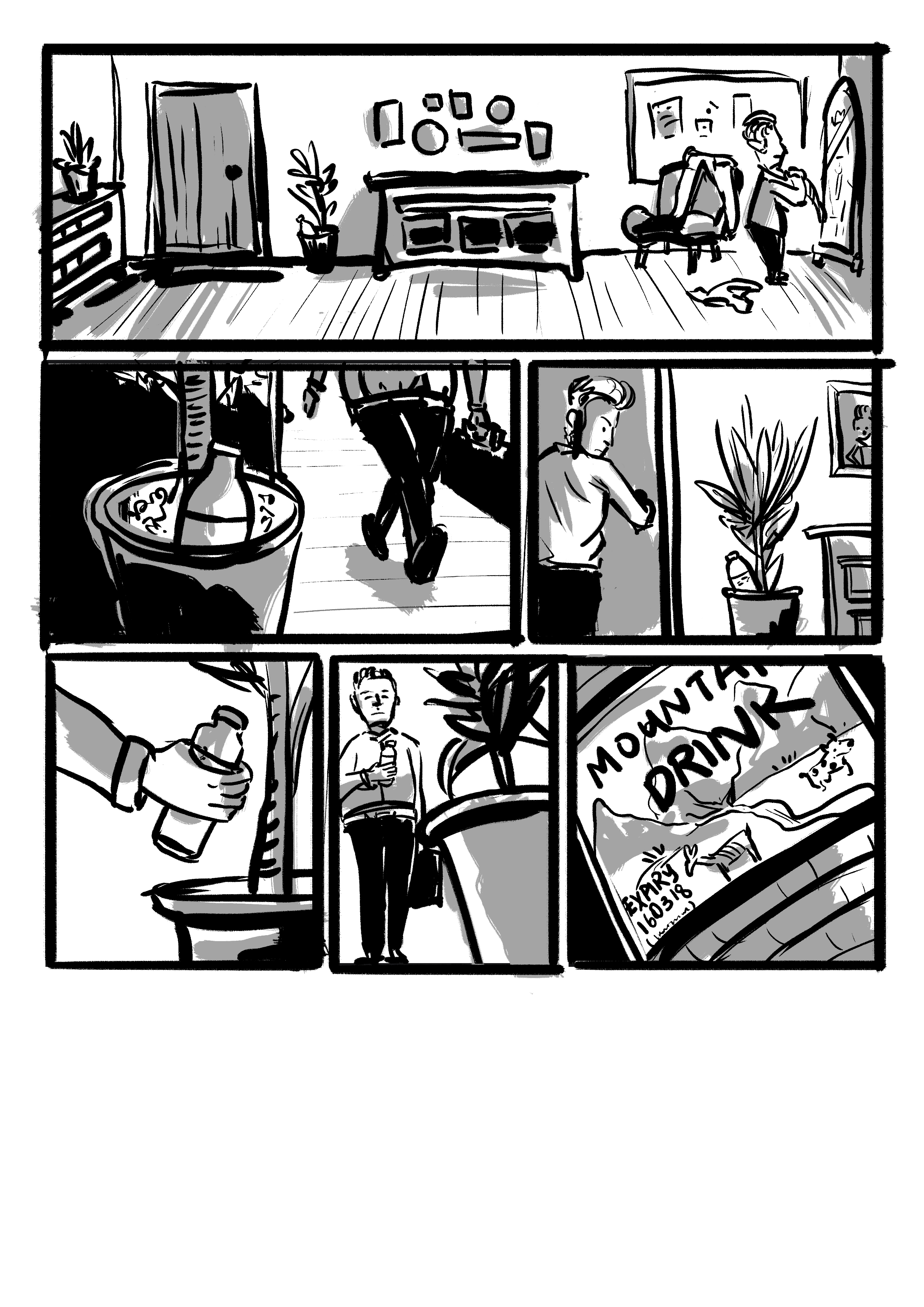
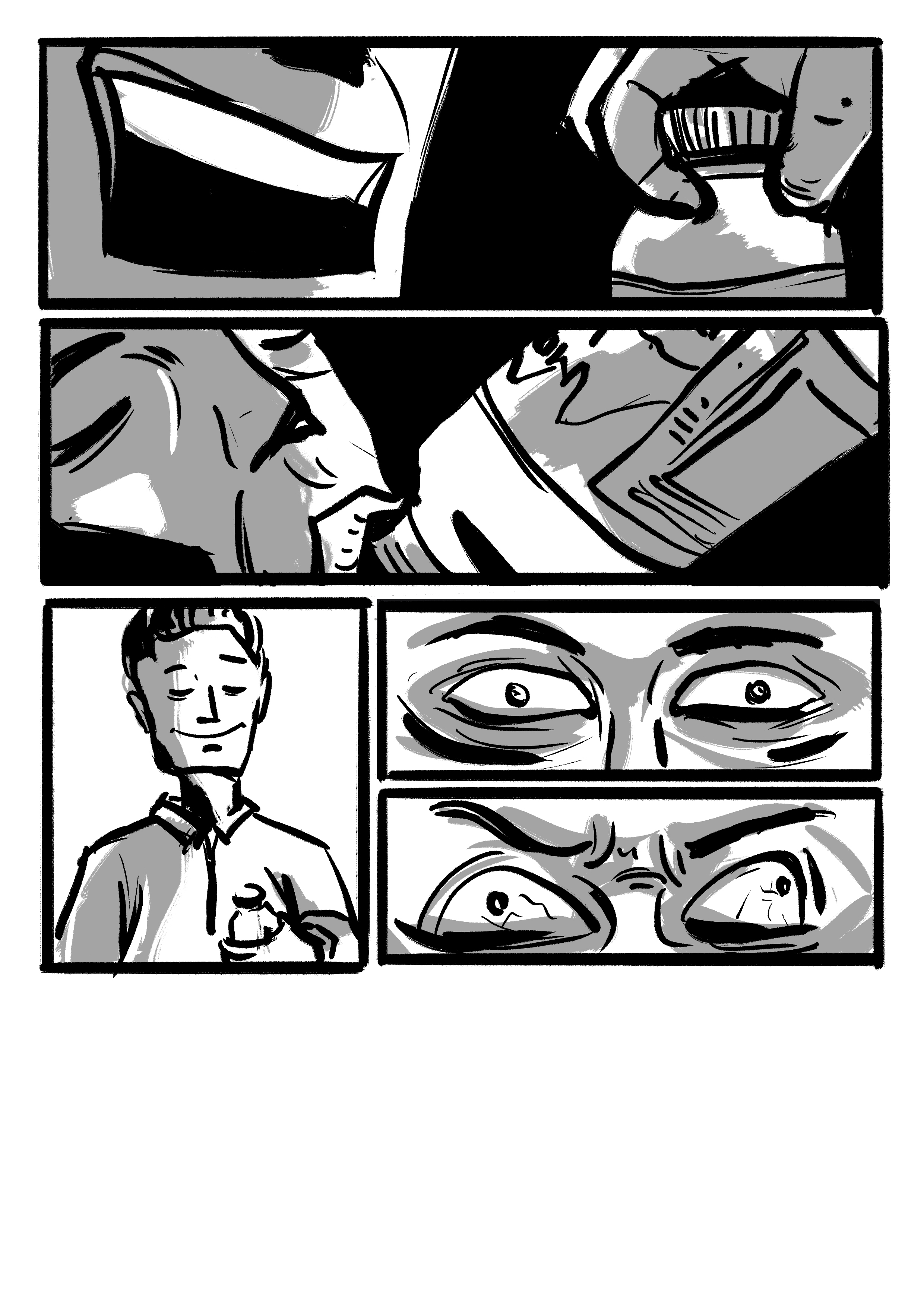

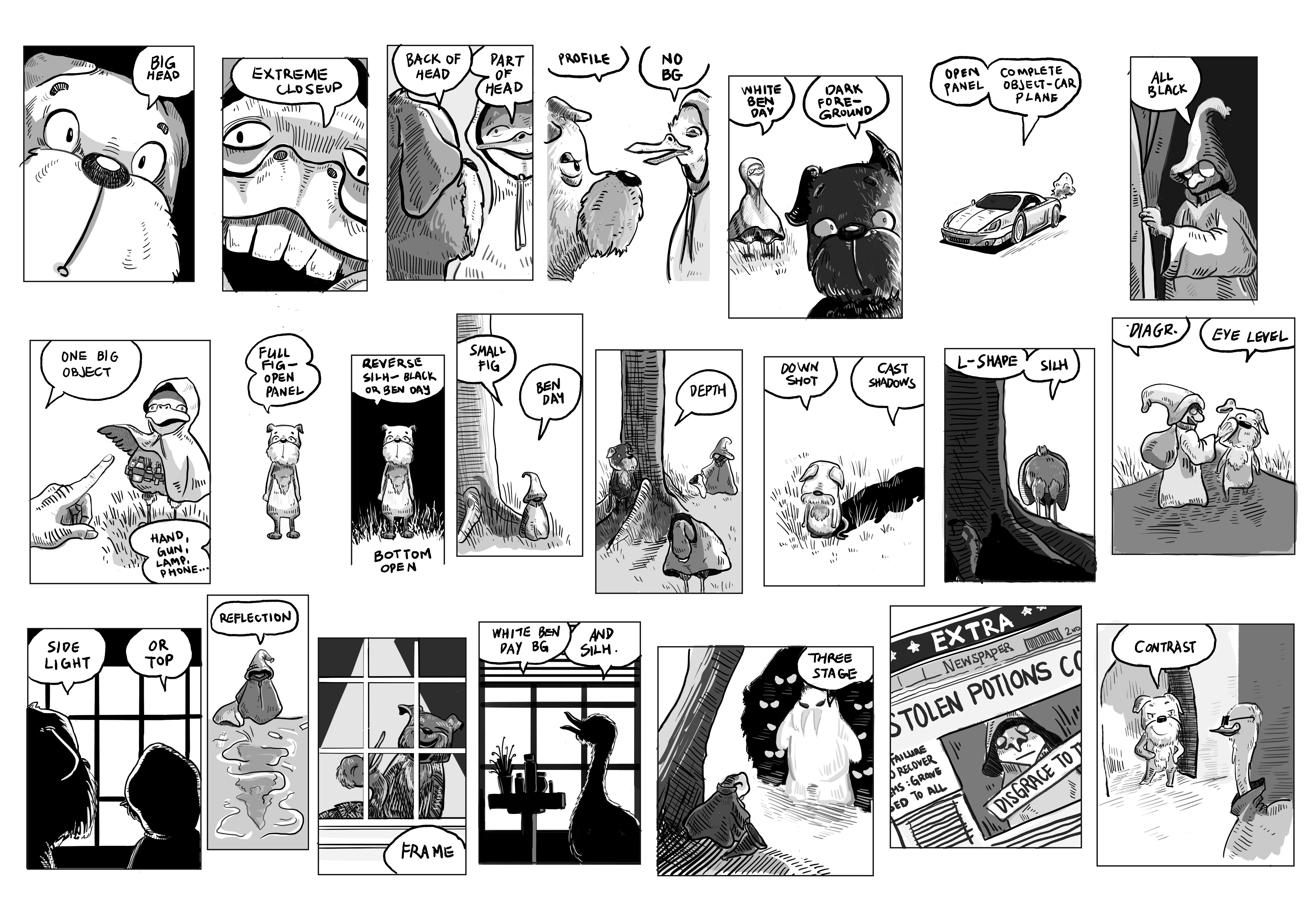
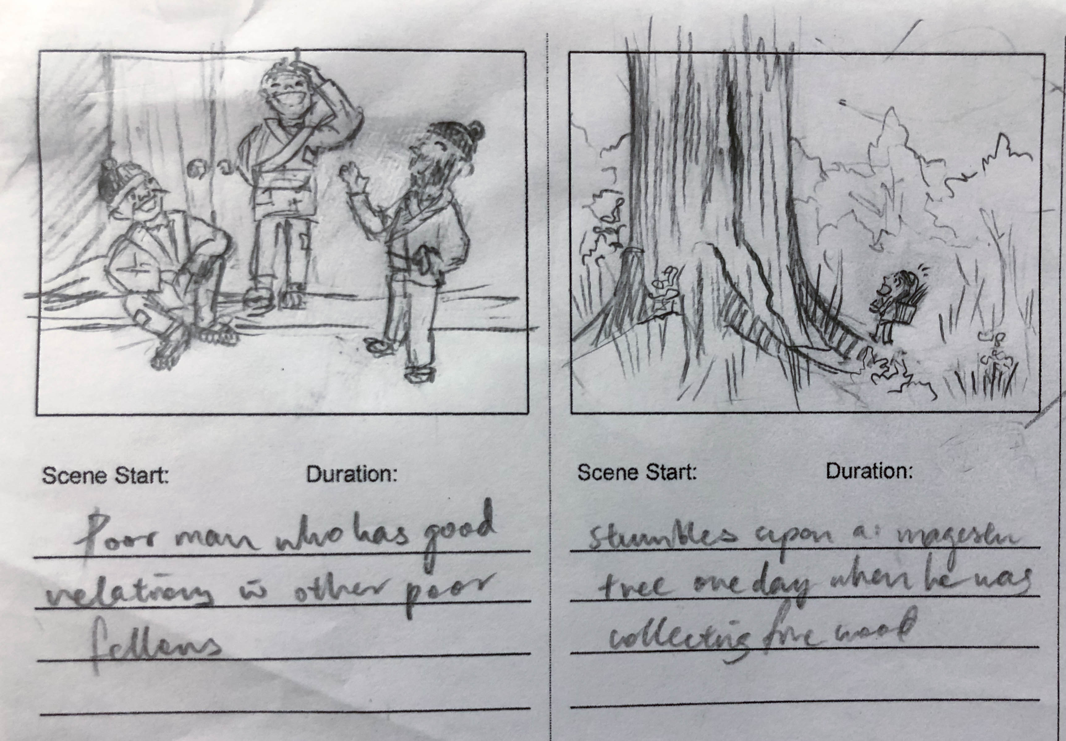
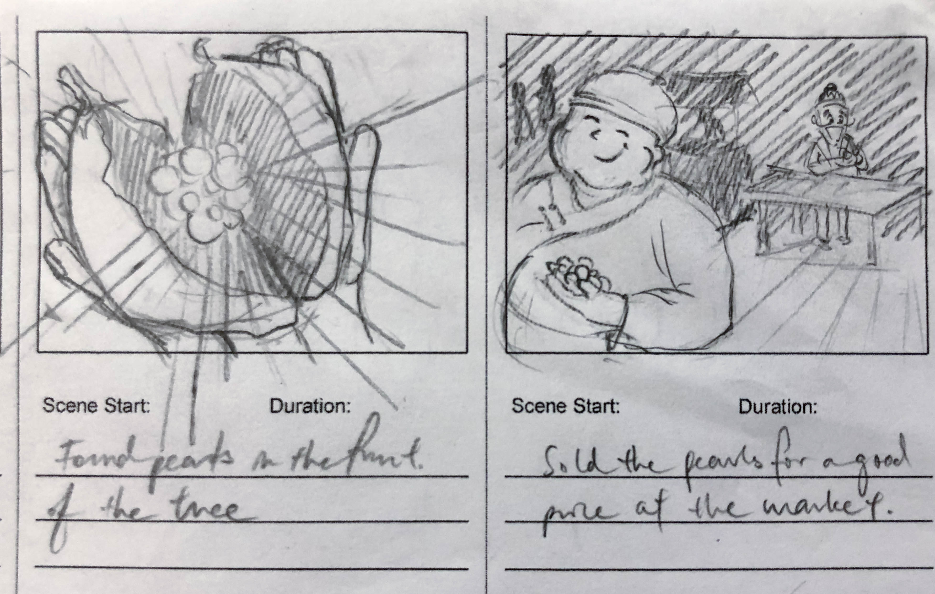
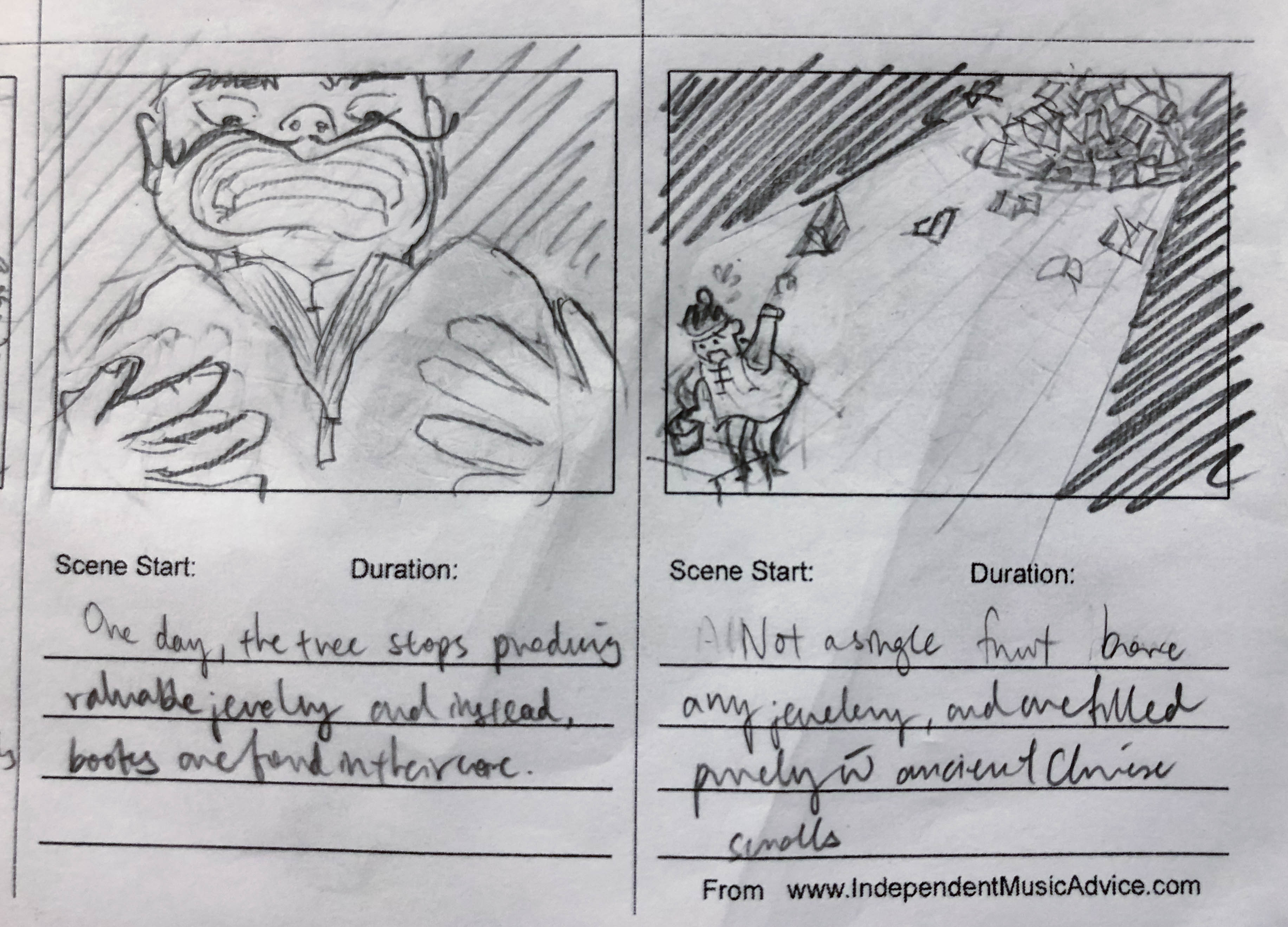
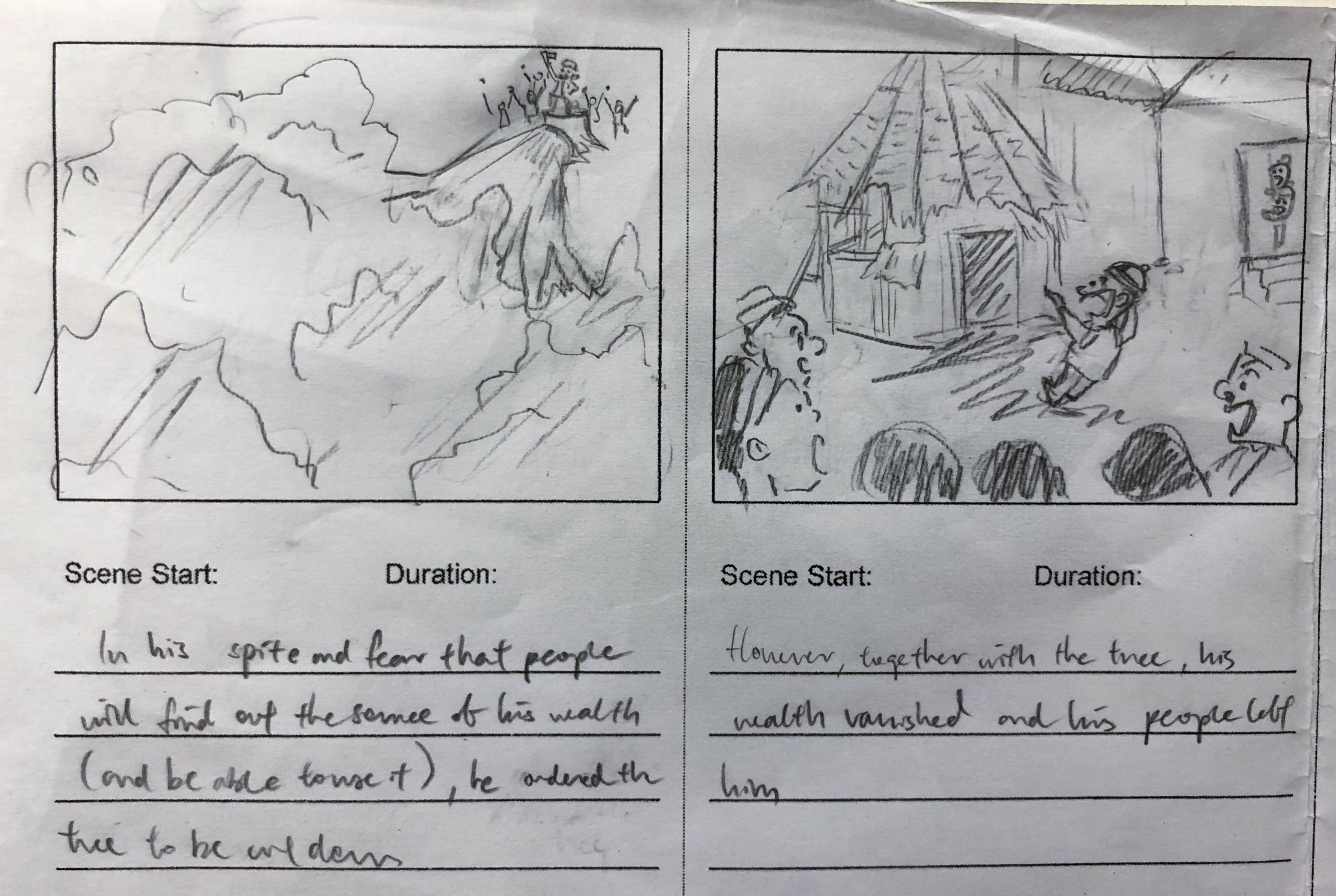
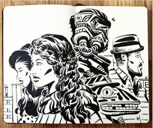
Assignment 2B: John Takes a Drink
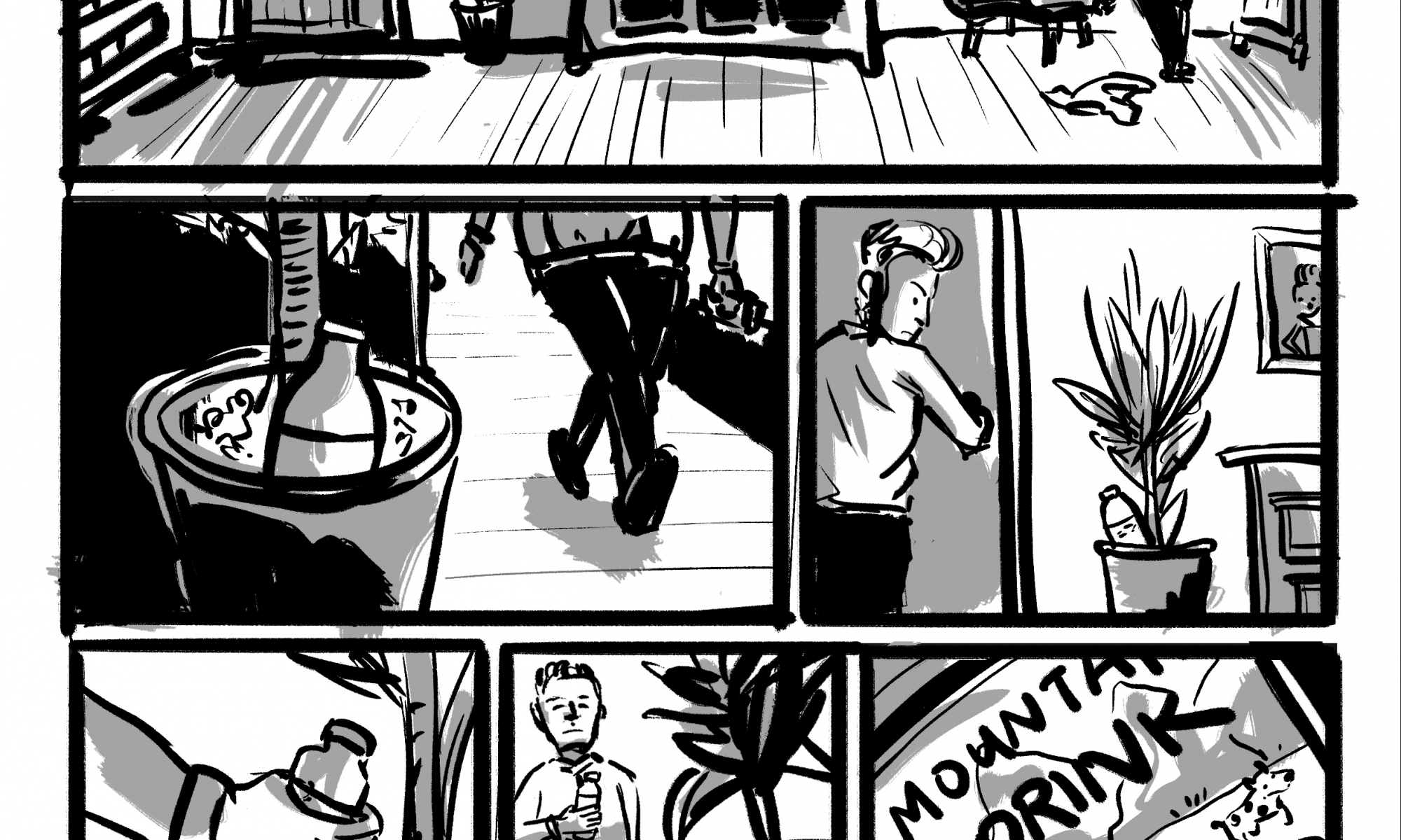
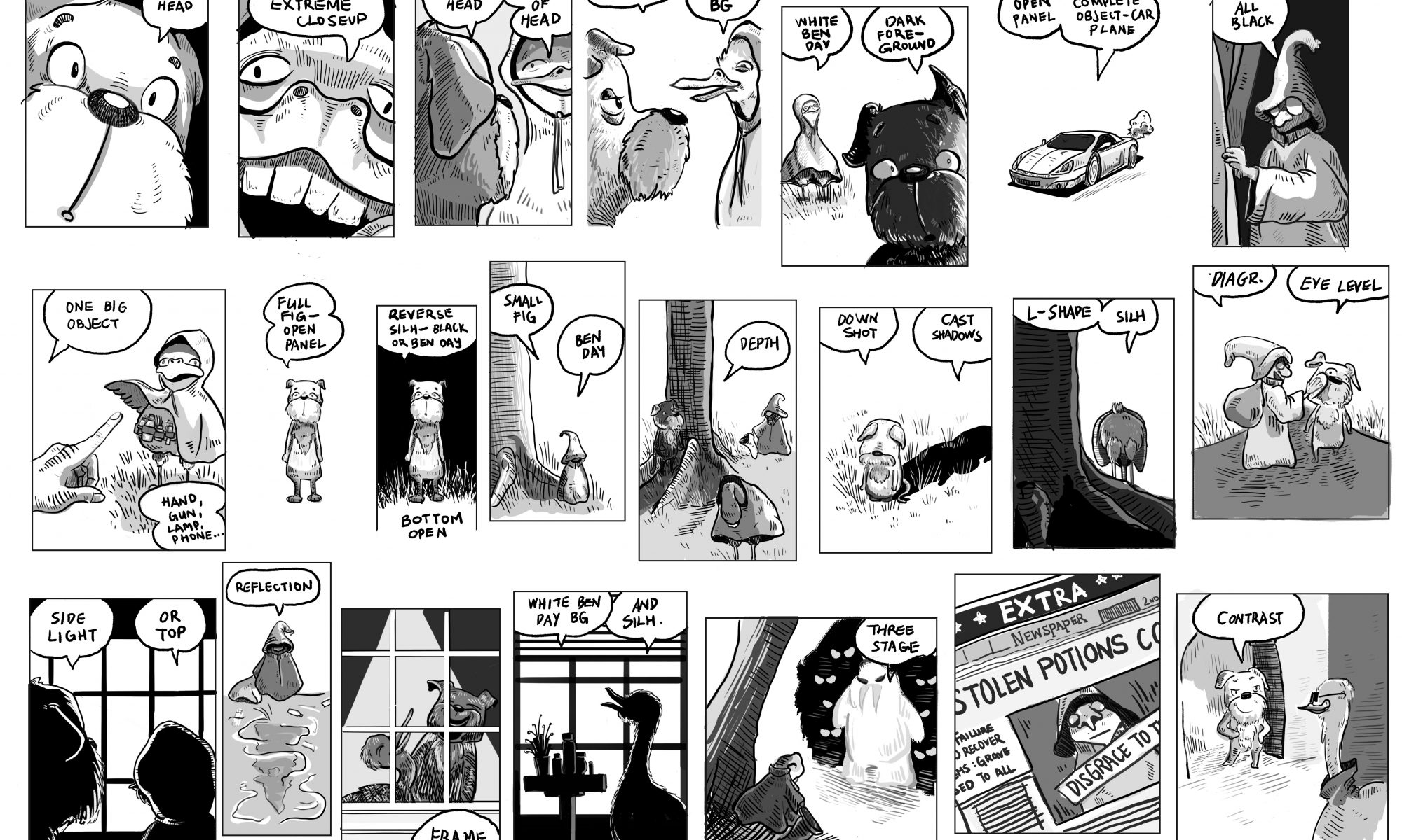
The following panels are recreated based on Wally Wood’s 22 panels that always work.

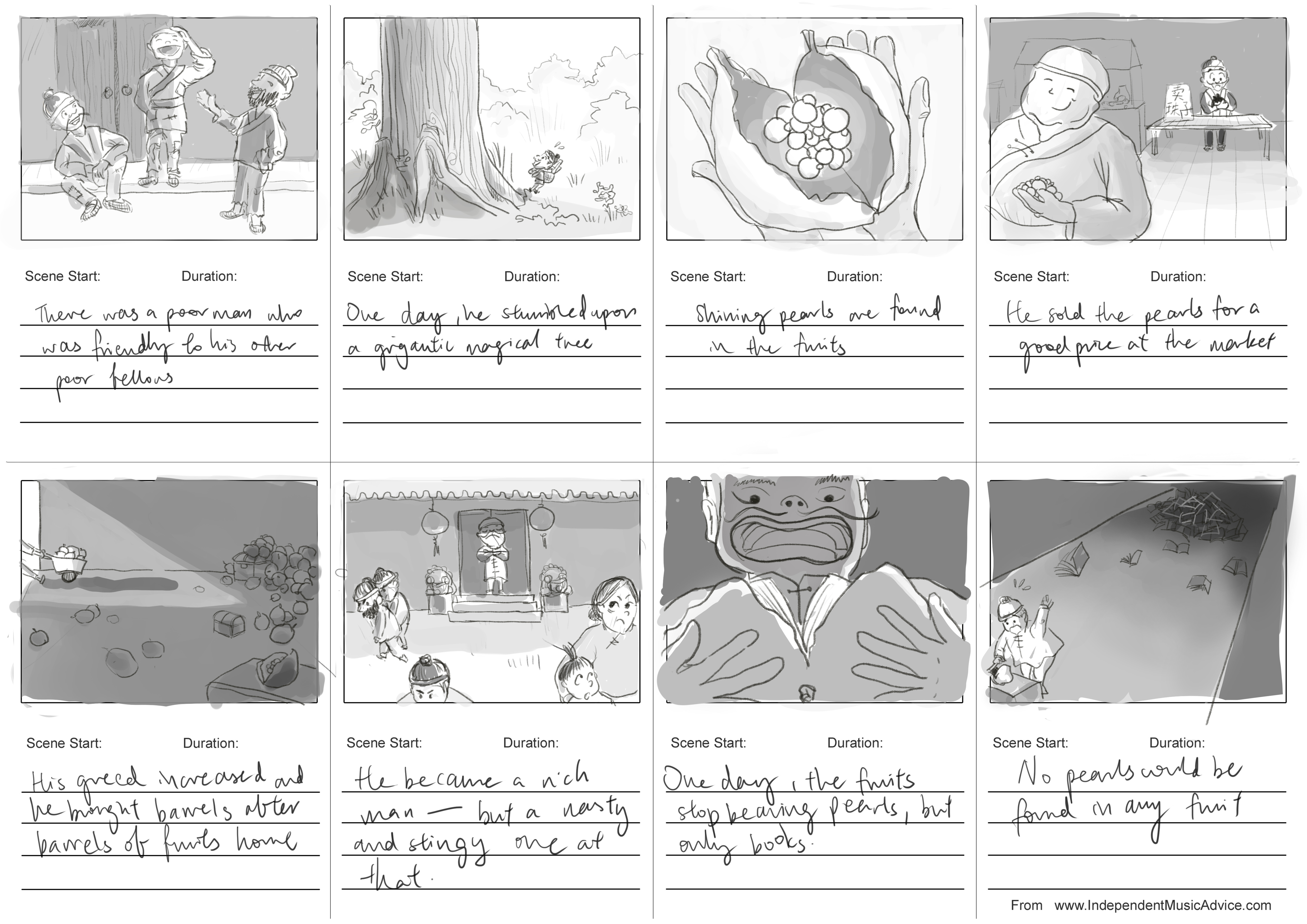
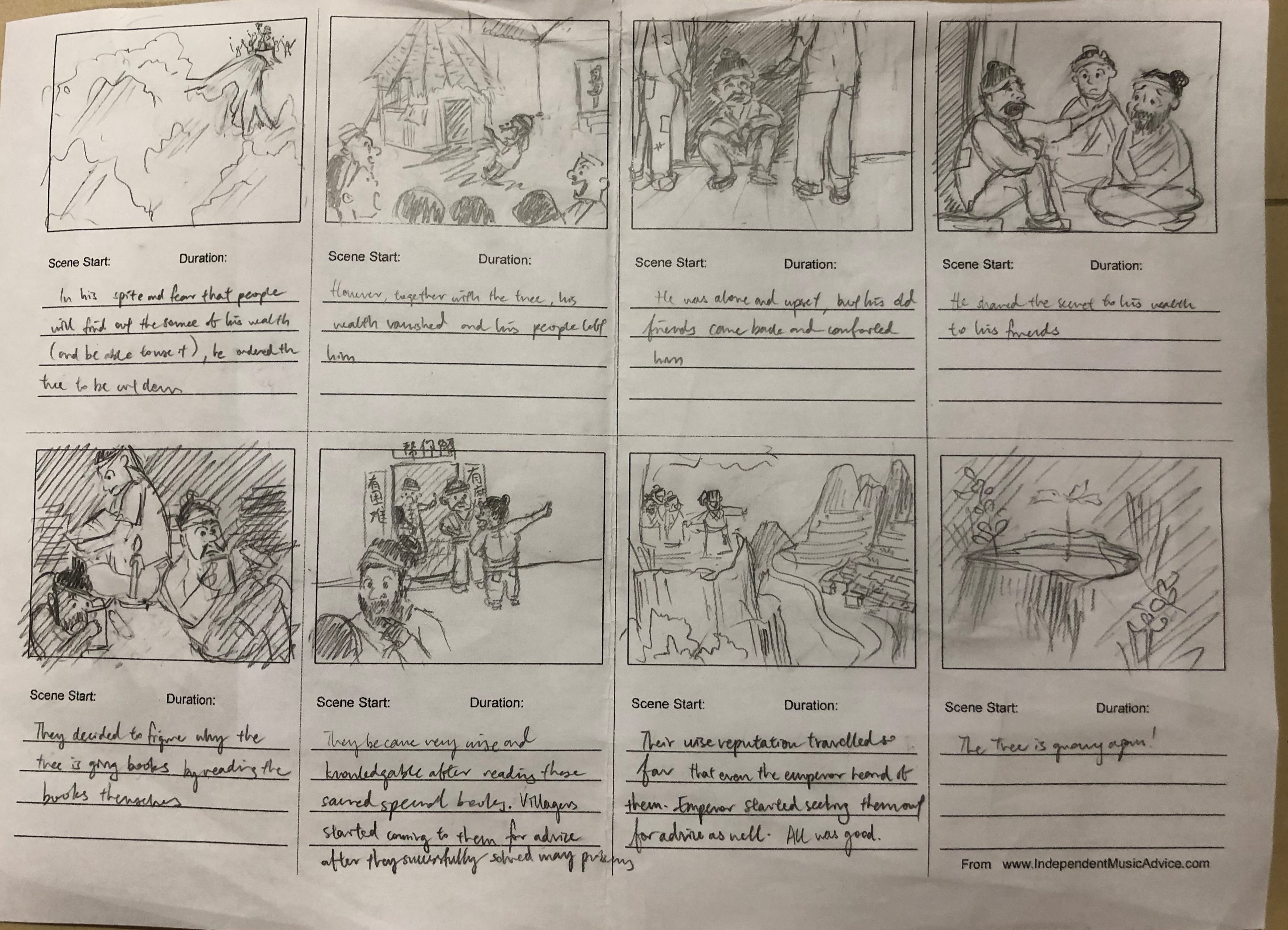
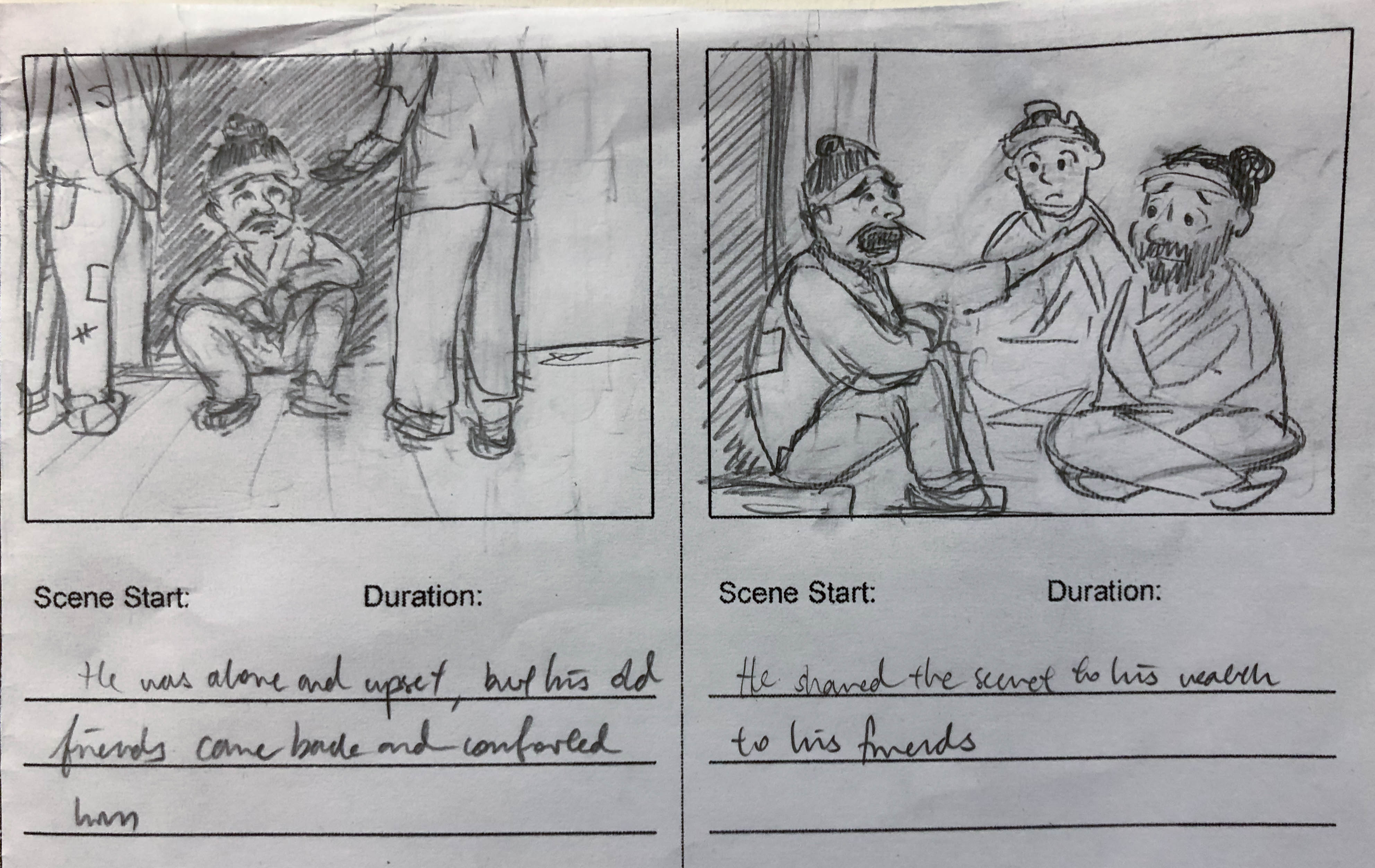
I have cleaned up my storyboards from last week’s submission and moved them over to digital media. The story is slightly shortened as well. I have used tone to differentiate the different stages of the story as well: brighter tones when he is kinder and poorer and darker tones when he became rich but nasty.

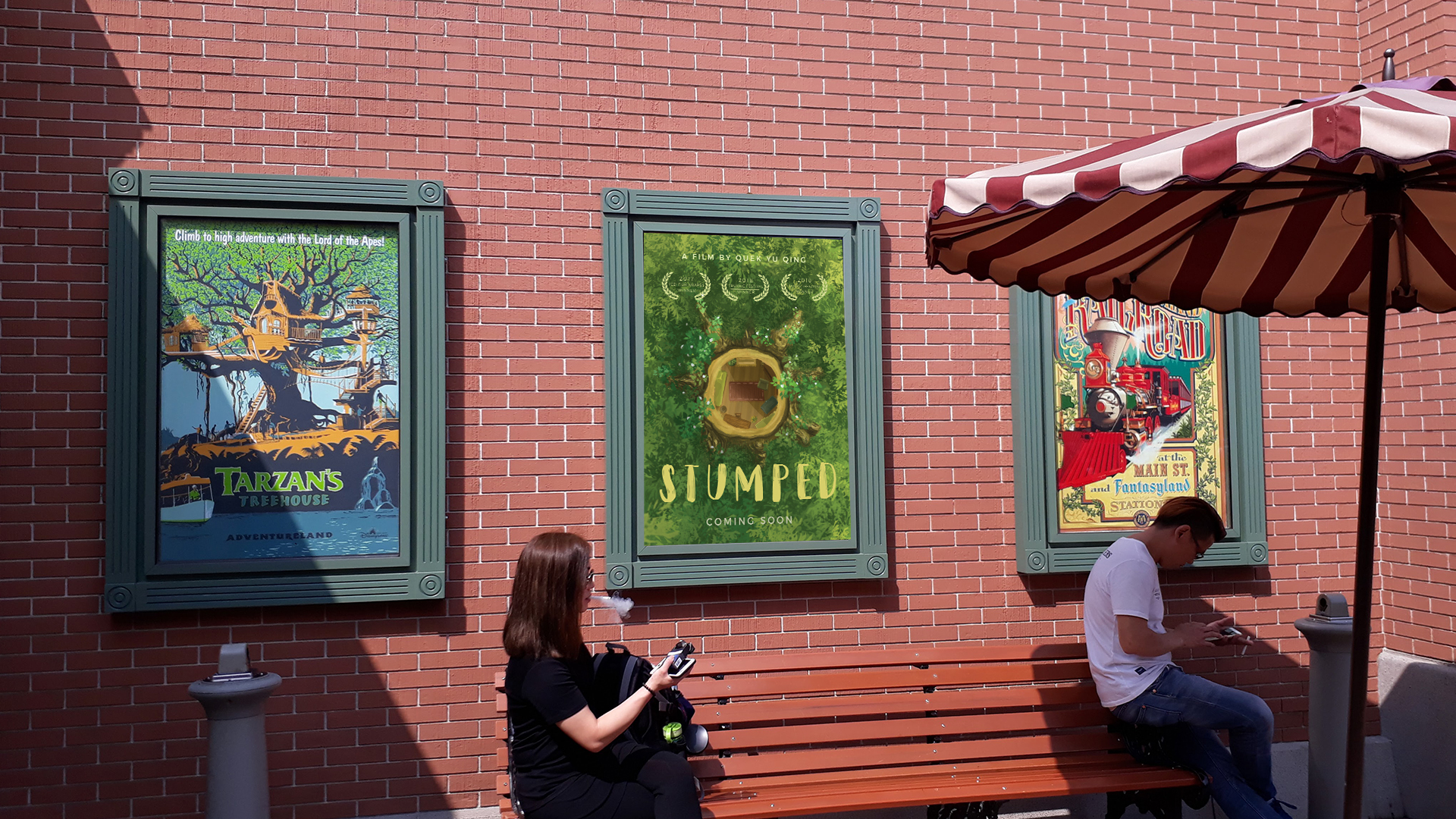
For this project, we were tasked to create our own movie campaign.
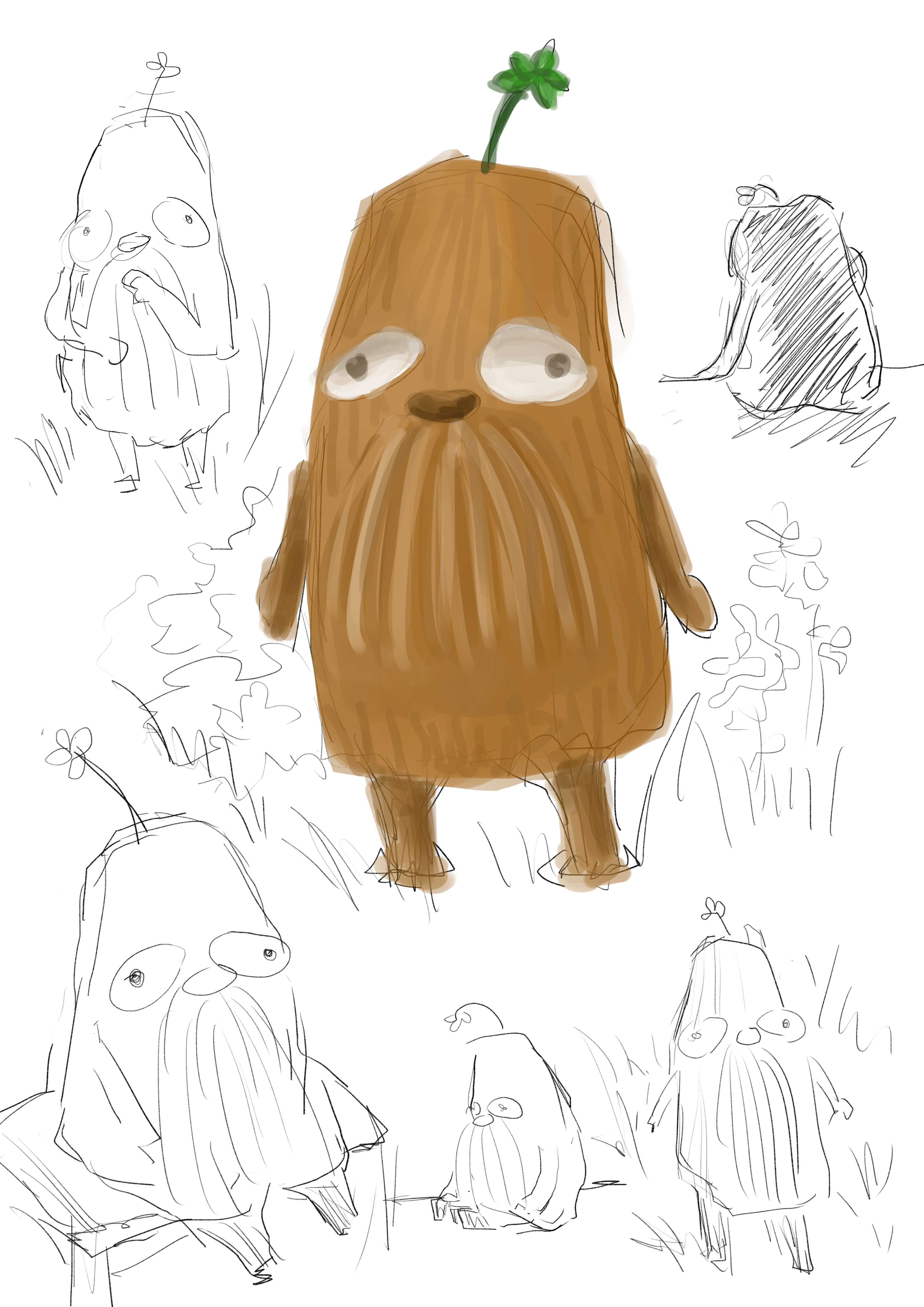
A tree spirit is displaced when his home — an mighty oak tree — was felled by humans. A moving adventure awaits him as he leaves his beloved home in search for a new shelter.
This story is inspired by a Thai belief that spirits inhibit trees, and that a ‘spirit house’ has to be built for the spirits when their trees are cut down. When I came across this fact, it prompted me to wonder what will happen if the spirit house isn’t built and the spirits have to search for their new homes.
Keeping in mind the fact “spirits” can be easily associated with ghost stories or haunted movies, I deliberately steered away from inducing such an effect by adopting bright and vibrant colours. As I intended the film to be of a fantasy and adventure genre that is suitable for kids to watch, I wanted the poster to convey a light-hearted mood while provokes curiosity. At the same time, with themes like deforestation in the movie, I was heading towards the exploration of environmentalism in the movie.
My main source of inspiration and colour study was Studio Ghibli films, in particular The Secret World of Arrietty. Studio Ghibli is renown for their visually-stunning images of nature and greenery. Their choice of colours and style are very much aligned with what I had in mind.

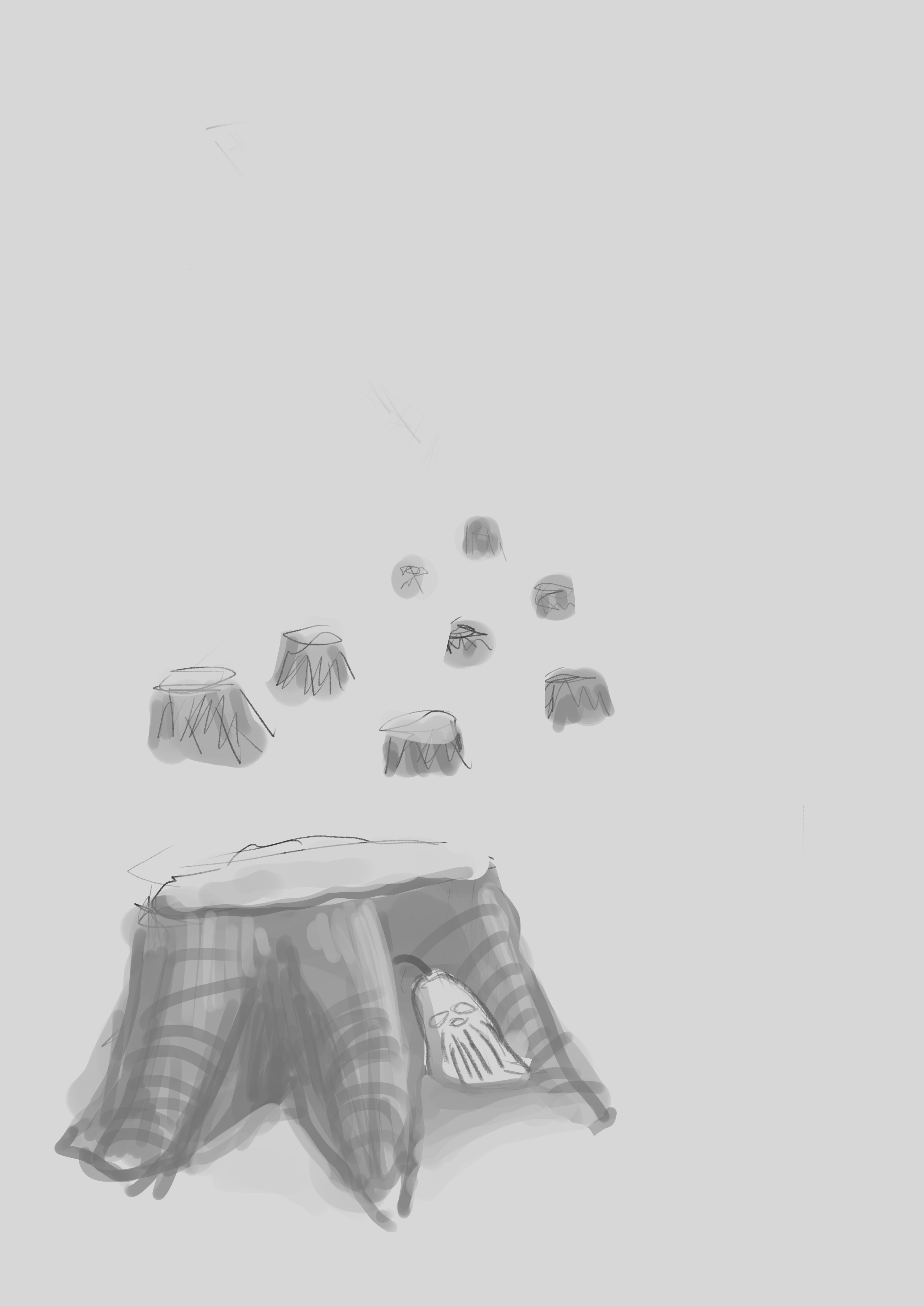
I did several sketches to brainstorm the design of the poster. Initially, I wanted to use the main character, i.e. the tree spirit, as the central focus and display it prominently on the movie poster. I tried several compositions that show that the spirit is miserable that is tree is cut down/ resolutely leaving its home to find a new place.

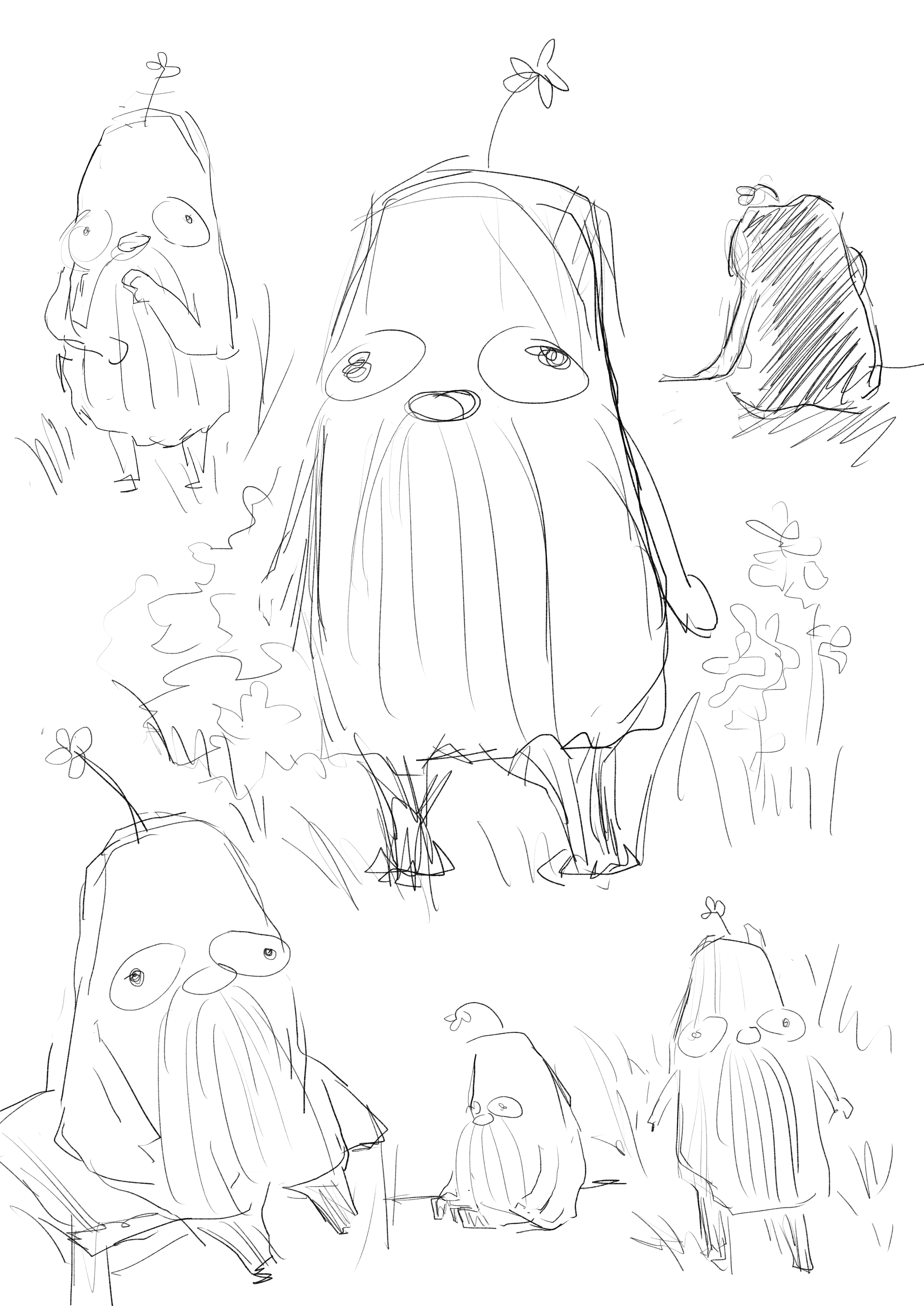
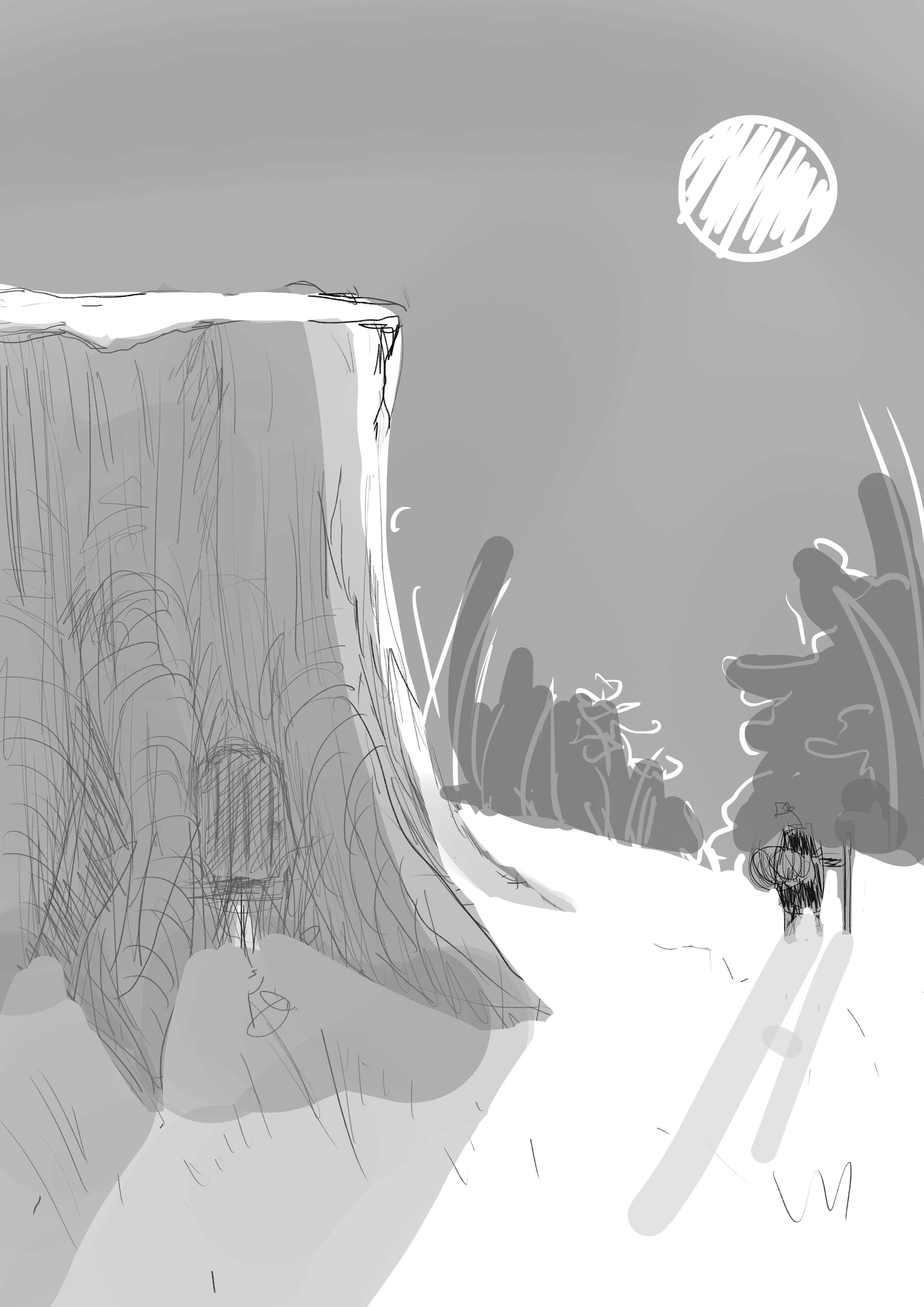

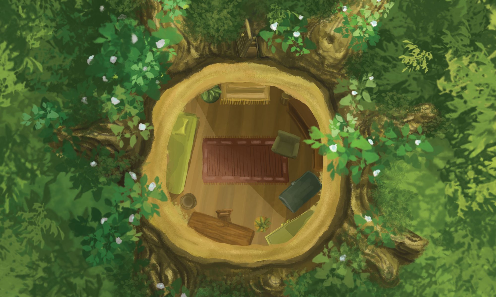
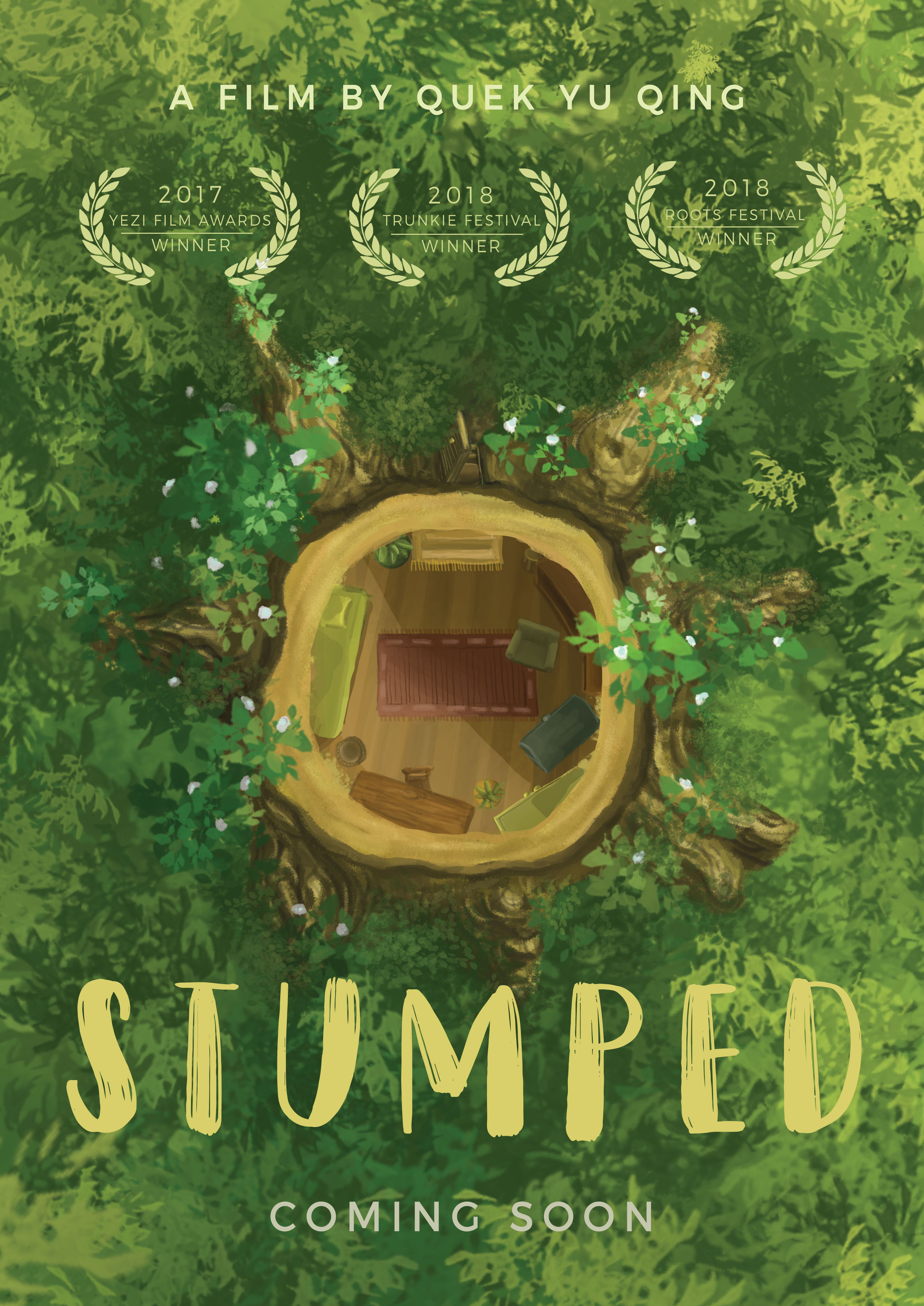
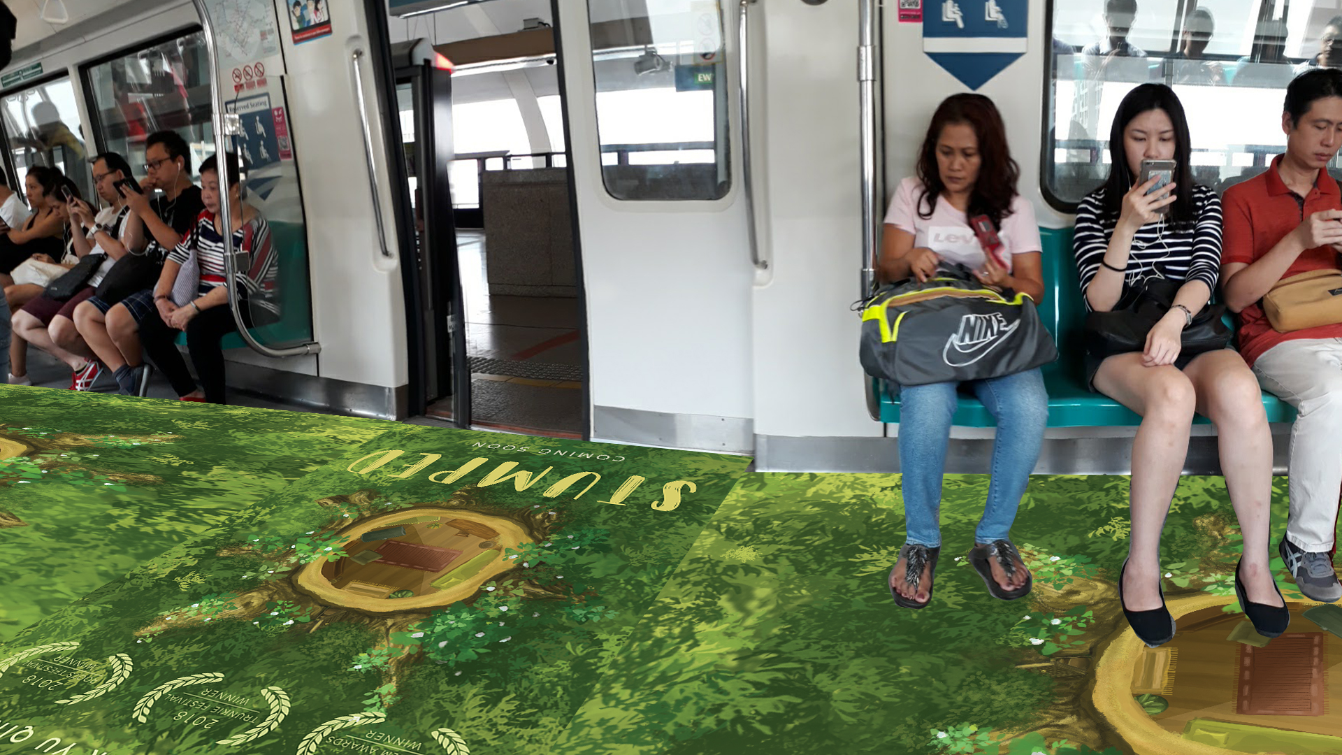
Upon further development, I decided to use the sketch below — a top view of the tree stump after the tree was cut off. No character can be seen here; the spirit has left already. I thought that this composition works the best because: firstly it sparks curiosity about why there is a house in the tree stump, secondly who lives in it, and thirdly where is the being that lived in it.
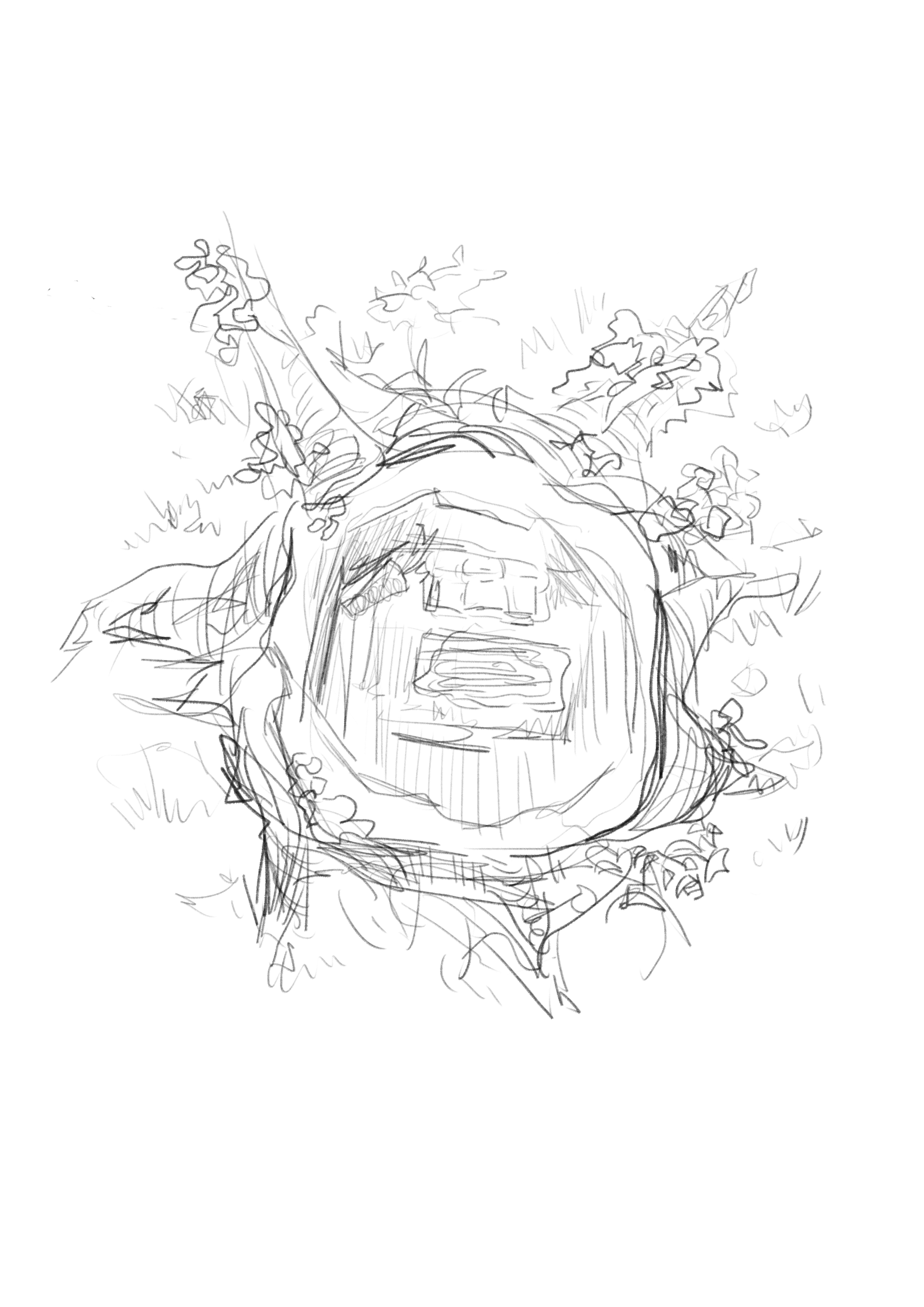
I used a central composition of the stump to draw attention to it immediately so that viewers will notice the layout of a house inside the stump. I flooded the sides with foliage and greenery instead of more complicated designs to emphasise the stump further. The greenery also heavily hints at themes of environmentalism in the movie.
The choice of typography is more quirky and cartoony to further express the light-hearted mood and to appeal to younger audience.
A small open door is added to the tree stump to suggest that someone has left the place. The layout of the house and furnitures are still to evoke a sense of stifledness and calmness — that the departure is quietly and seriously pondered over.
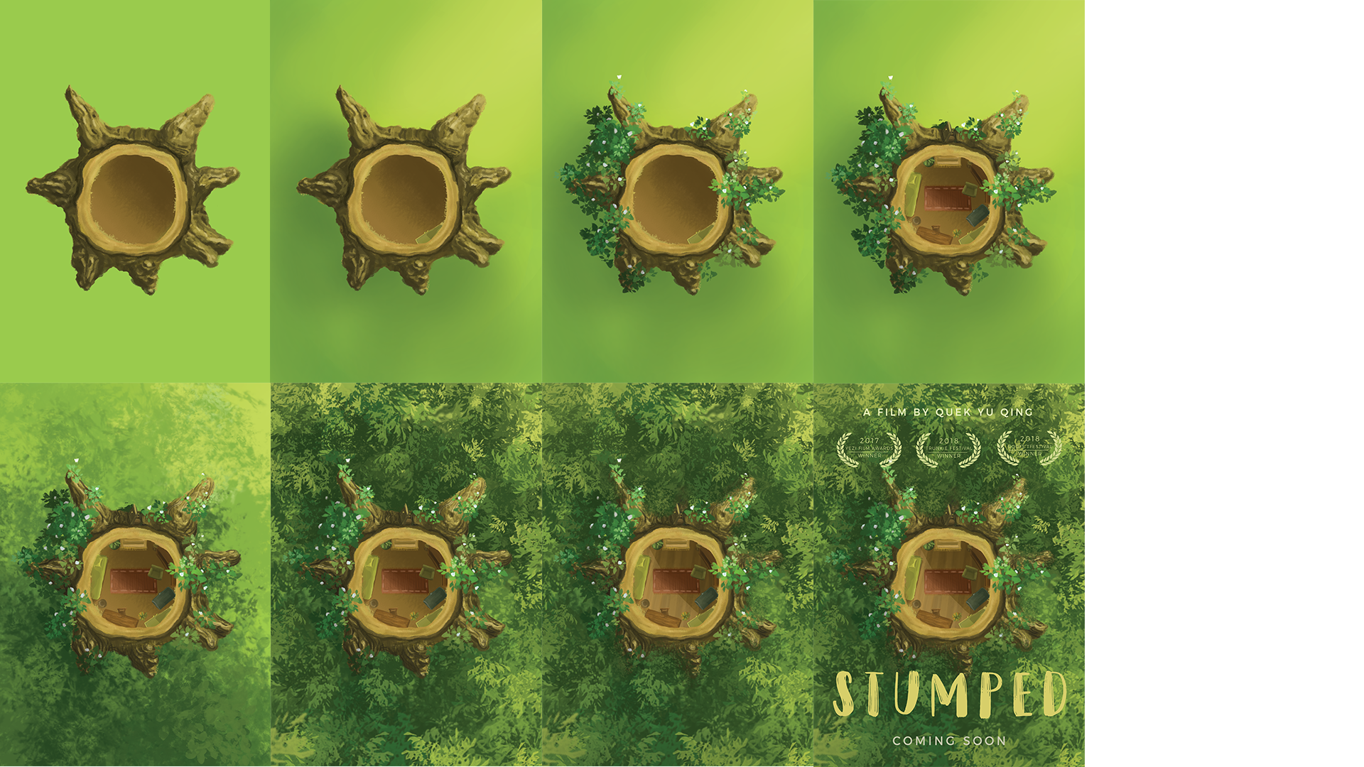
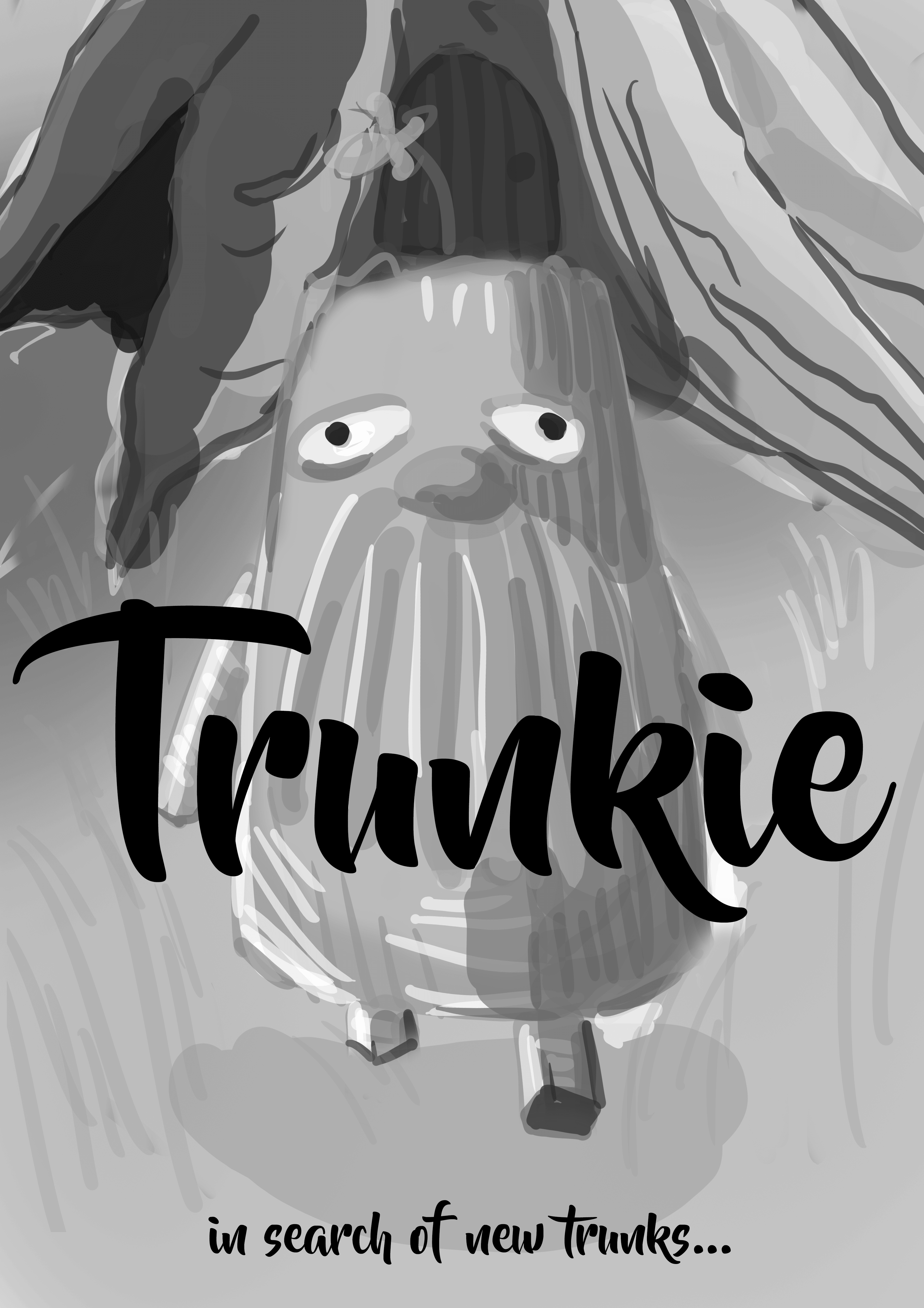
I titled my film “Stumped”, both as a wordplay on the tree stump and as a symbolisation of the spirit’s bafflement and confusion after his house was destroyed.


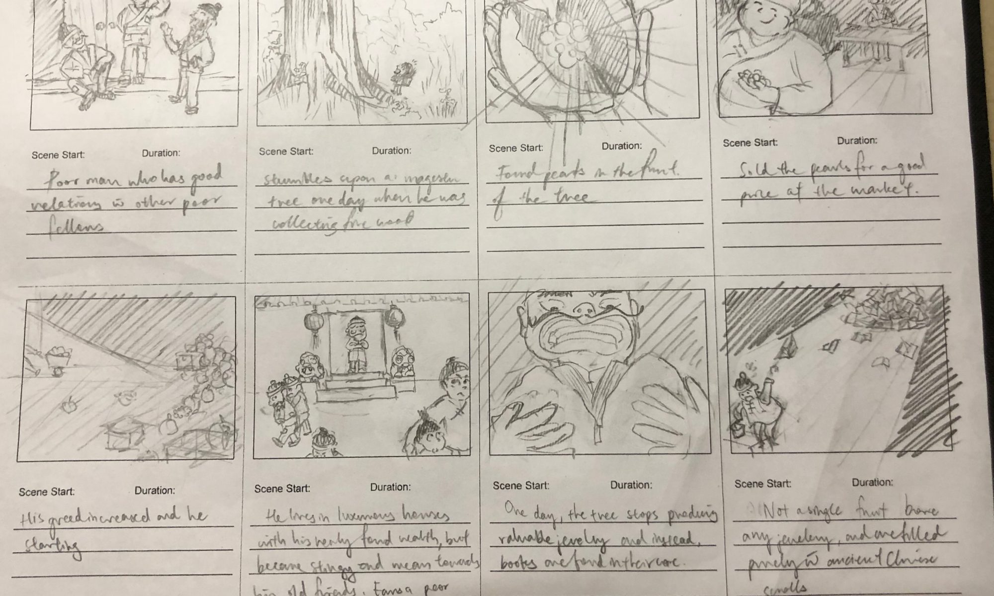
A poor man chances upon a magical tree that bears jewellery-containing fruits. His greed for the treasures estranged him from his friends, and only after which did he learn that true wealth is in wisdom and friendship, not in material goods.


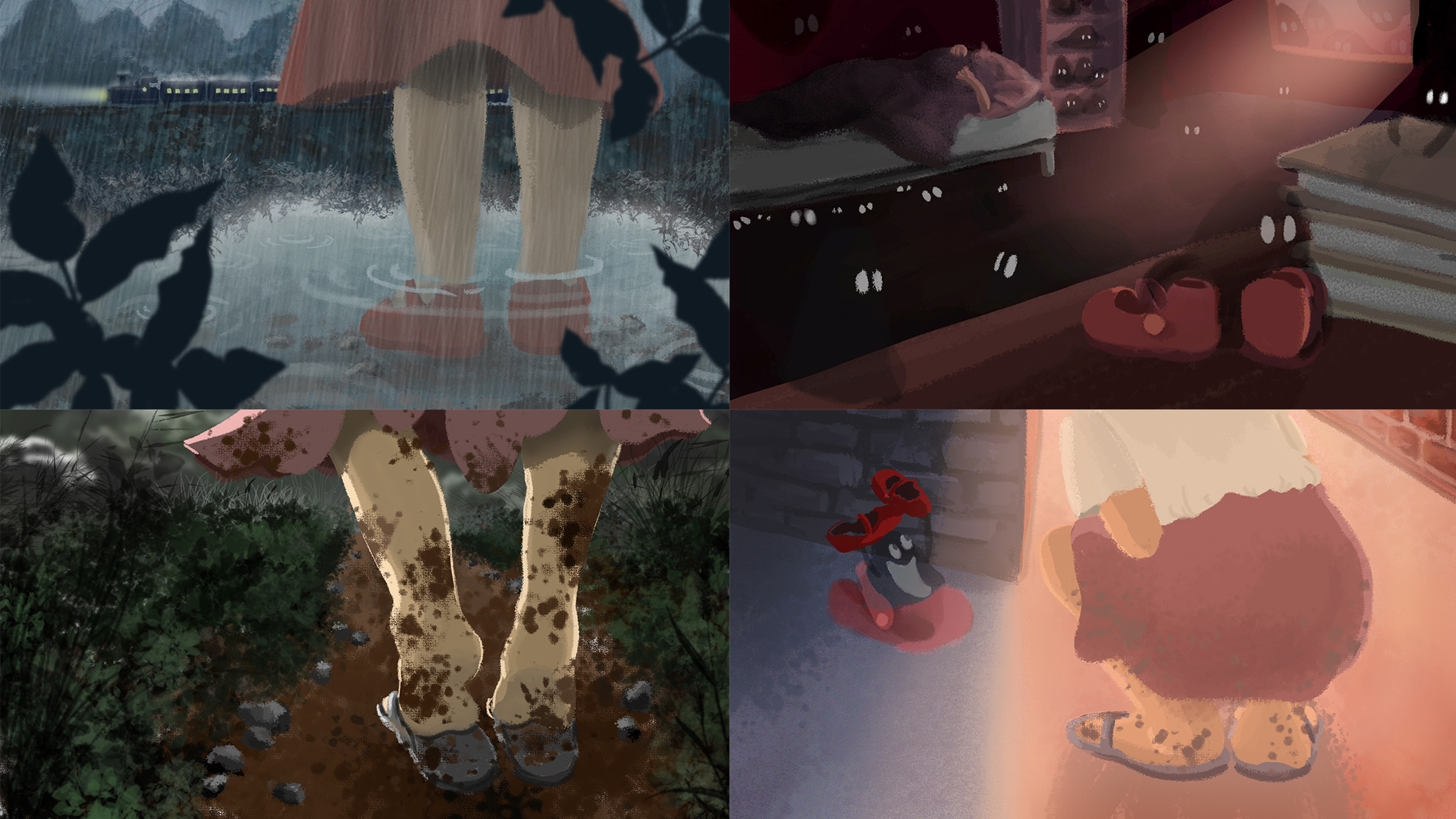
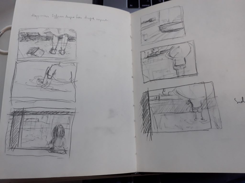
For this assignment, we were tasked to present 4-6 images that express basic human emotions. I chose to work on the following 4 emotions: Sadness, Fear, Disgust, and Happiness in the format of a visual narrative. I chose the Digital painting medium to develop my digital painting skills, which I am not very acquainted with.
Initially, I wanted to express the emotions through the different portrayals and actions of water. I aimed to explore how a still and tranquil water body can evoke acute feelings that are raging and turbulent. However, I realized that I was unable to confidently illustrate water due to its abstract character that was difficult to personify. Having reached a dead end, I then turned to a more feasible representation — the figure of a little girl. I deliberately did not illustrate her facial features (or even specific details) so as to keep the enigmatic character that leaves room for the faculties of the imagination.
Initially, I wanted to express the emotions through the different portrayals and actions of water. I aimed to explore how a still and tranquil water body can evoke raging and acute emotions. However, I realized that I was unable to confidently illustrate water: it was intensely difficult to personify due to its abstract and turbulent character.
Having reached a dead end, I then turned to a more feasible representation— to use a protagonist in space to relate to emotion. I chose the figure of a little girl: a symbol of naivete, purity, capriciousness and endless wonder. I deliberately did not illustrate her facial features (or even specific details) to leave room for the faculties of the imagination.
With this new representation, I had to update the story type— from distinct and atomic frames to a narrative that flowed from the first frame.
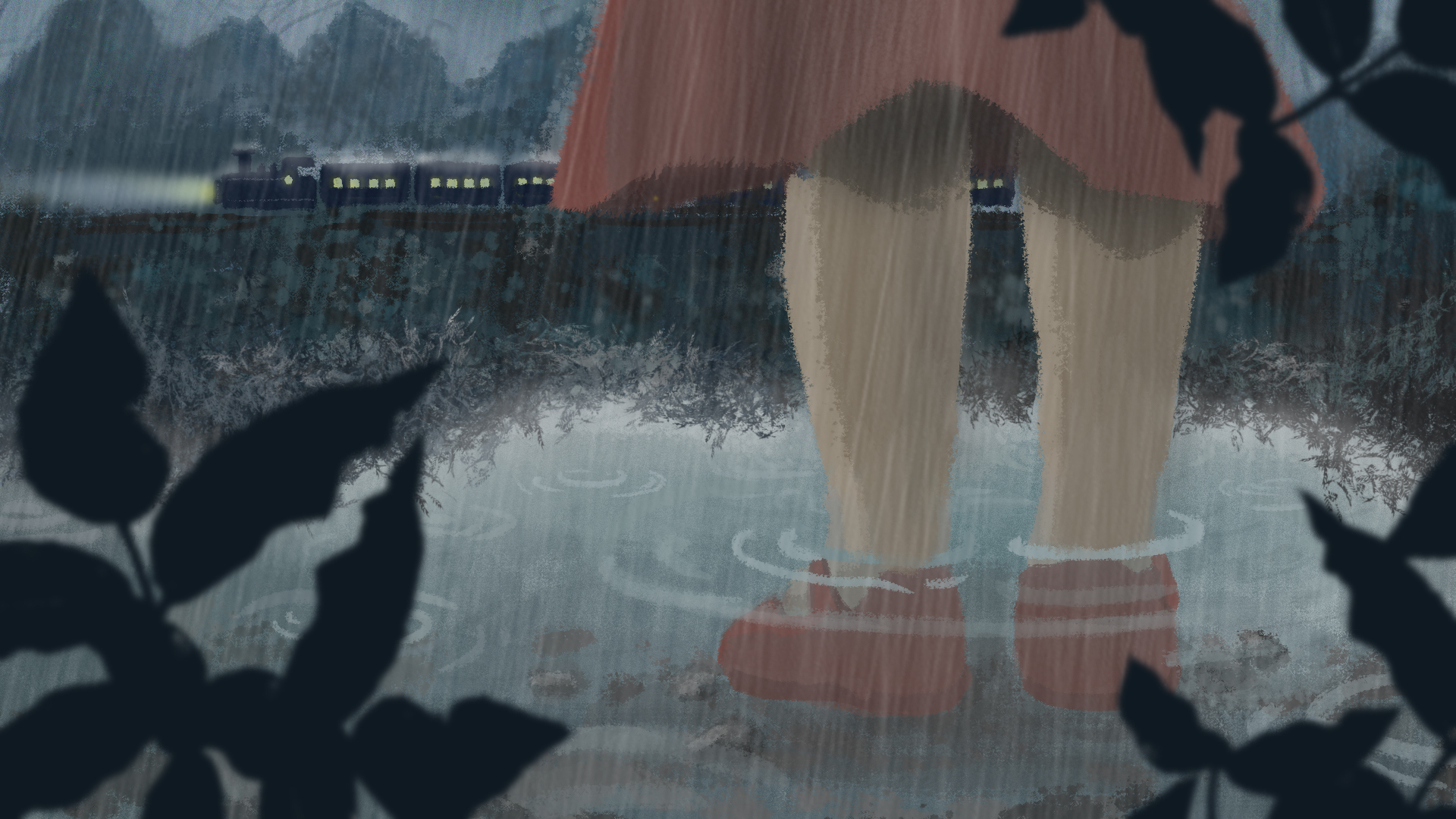
I drew upon my initial ideas of emotive water as the background to complement the protagonist’s emotions. To elicit the same emotion in the audience, I also employed colour theories of emotion for each scene.
The first draft of the story is:
Upon further development to add more content and excitement to the story, I came up with the final story:
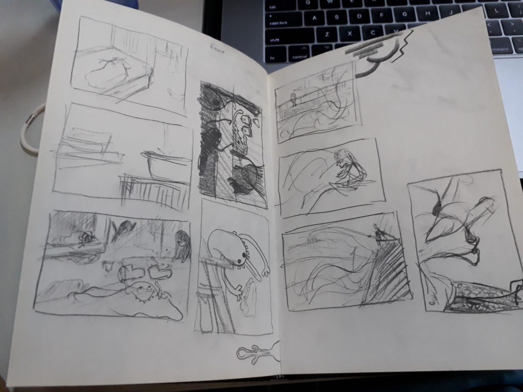
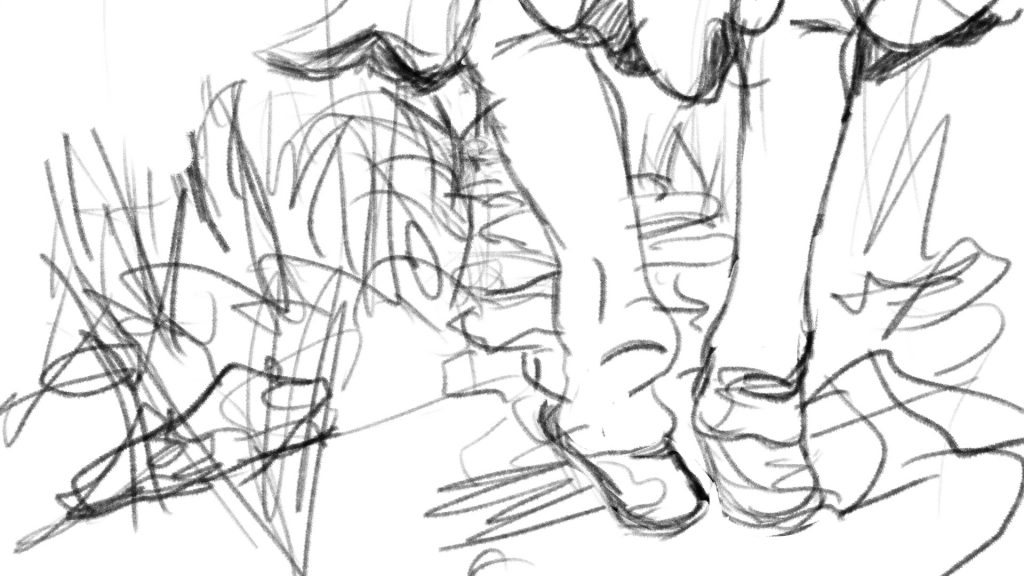
Some sketches that I drew before starting work. I feel that I work better when I sketch my thoughts on pen and paper.
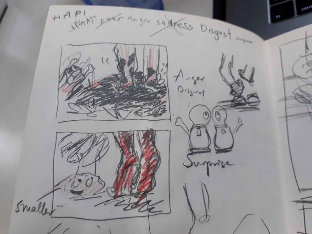
One key point that I experimented with was whether it was possible to illustrate all four panels with the placement of the shoe being fixed, while presenting the images different perspectives. I managed to do it, but the sadness and disgust images are rather similar. Perhaps more could be done to experiment with alternative povs :>
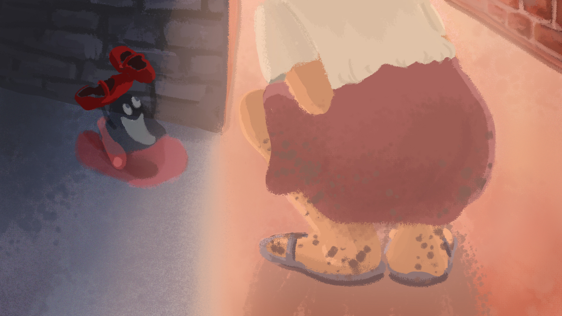
Father leaves daughter; rainy scene
Daughter is left alone in her room to fend her fear of the dark. Her imagination ran wild as she faintly hear something being dragged across the room. In actual fact, a ‘ghost’ has took her shoes away.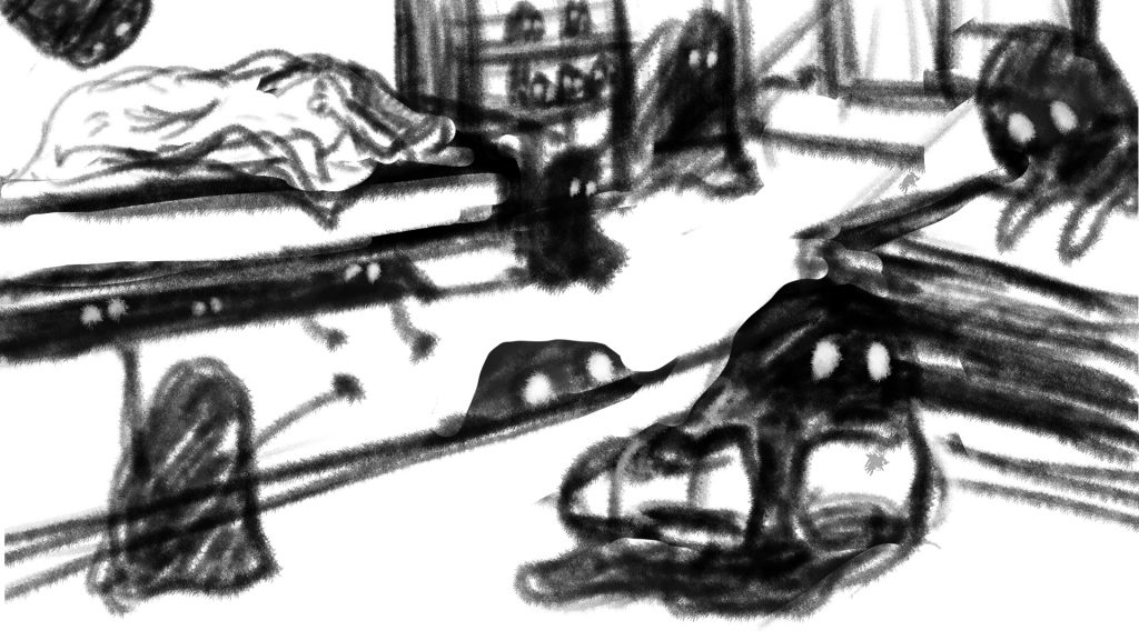
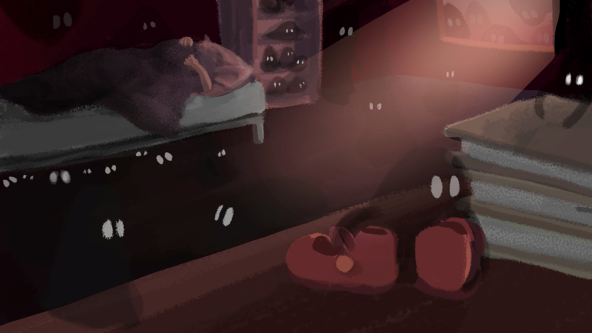
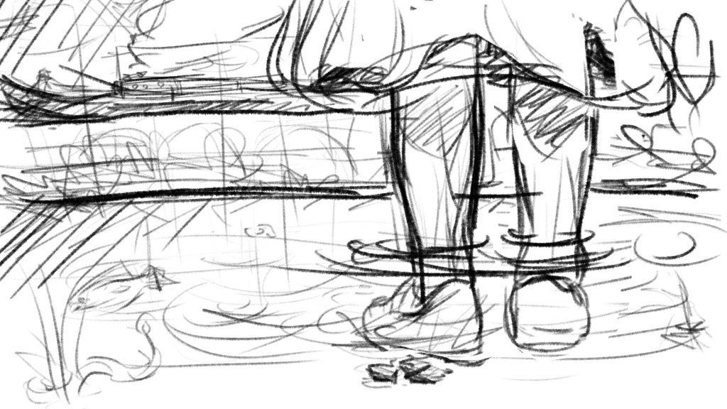
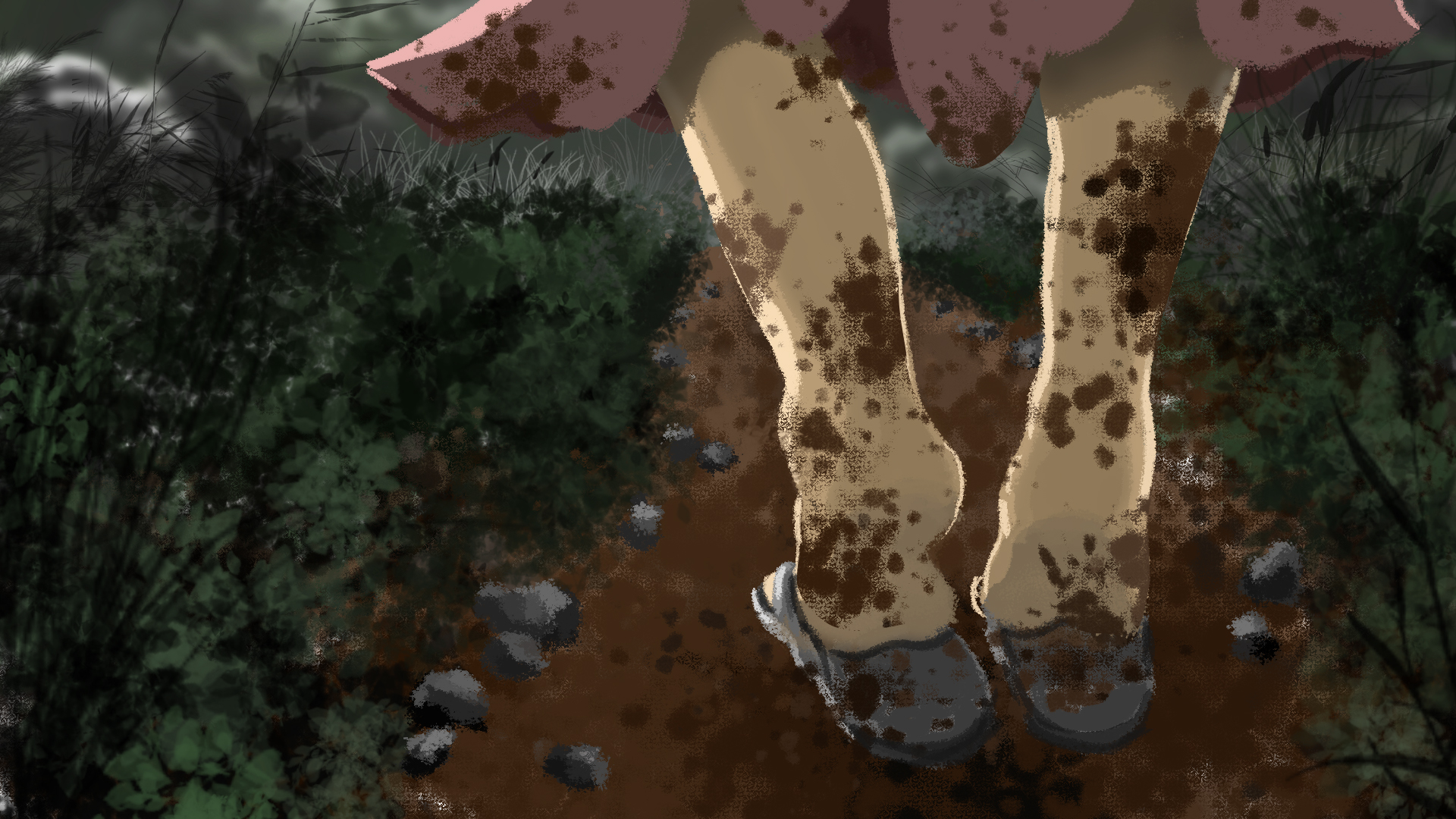
Daughter realises the next morning that her favourite shoes are gone. Wearing her old slippers, she went out in search for it. Wet mud splattered all over her skirt and legs, evoking a strong sense of disgust from her.
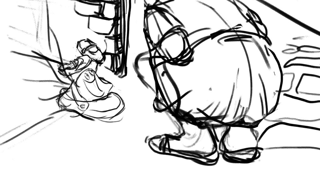
She found her shoes at last! In fact, the ghost was on its way to return the shoes as well, after modelling and making its own ghost shoe.
I am very happy with the final work even though the quality and style isn’t that consistent throughout (something to take note of next time). Having worked mainly with traditional medium and less with digital, this assignment helped me pick up many useful techniques from photoshop. Now I am really starting to appreciate digital painting!
The phobia I chose for this assignment is Telephonophobia, which is the reluctance or fear of making or taking phone calls, literally meaning ‘fear of telephones’. While I personally do not have this phobia, I can somewhat relate to the anxieties and trepidation one might feel when having to handle phone calls; because I do experience that fear sometimes (in a milder form) when an unknown caller reaches me.
Following my research, I narrowed down three causes of telephonophobia that I wanted to focus on:
From the 3 main causes, I did a simple word map to brainstorm some ideas. Here are some keywords that I have identified through this process:
privacy (or lack thereof), disruptive, communication, voice, unwelcome, physical distance, two-way, speech
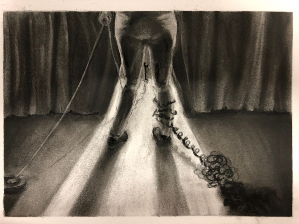
I realised that a parallel can be drawn between this phobia and stage fright, since the symptoms expressed are similar, eg nausea, sweaty palms, shortness of breath. Expanding on the idea of stage fright, I decided to portray the scene as having to give a speech, since, just like handling phone calls, making a speech requires one to ‘perform’ and use the voice as the primary medium of communication.
Who: Performer // speaker
Where: On stage // in front of a telephone
What:
Glaring stage lights makes audience non visible to speaker -> inability to see body language
Stage ————– audience -> tangible physical distance
Speaker’s hand holds on to the cable of the telephone, giving her the autonomy to cut the phone/back out from performance or take it
Telephone cords wrap around leg and drags on ground -> resemble chain and ball, represents weight of anxiety that rests on the speaker regardless whether phone call is taken
When: Just before performer steps out on to stage // when the first ring of phone is heard
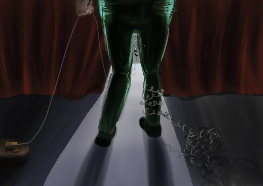
When I coloured the image, I decided to go for a more muted and dark colour scheme to more adequately express the phobia since we usually associate scary/evil stuff with darkness and bleakness. All things are cast in shadow, except the source of fear – which the speaker will inevitably have to face.
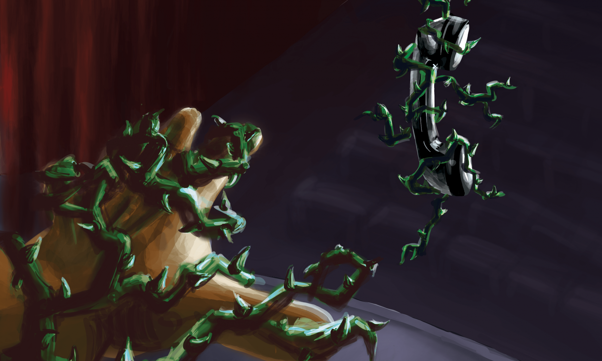
For the second image, I decided to develop the story up to the point where the speaker is about the answer the call/make the speech. As the speaker approaches the phone, the scene becomes increasingly threatening to her. The telephone cords that previous wrapped around the speaker’s legs have now turned into menacing thorny vines that crept up the entire body of the speaker, engulfing her in fear and pain. The corresponding vines around the phone receiver shows that the telephone is the source of the speaker’s misery.
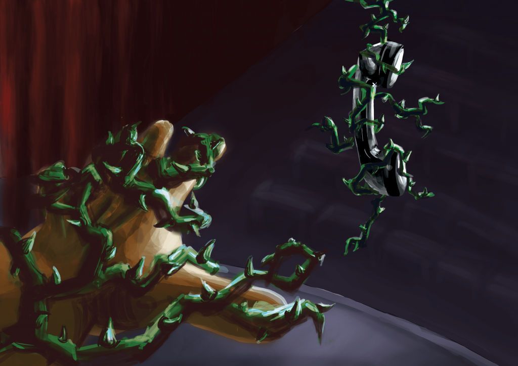
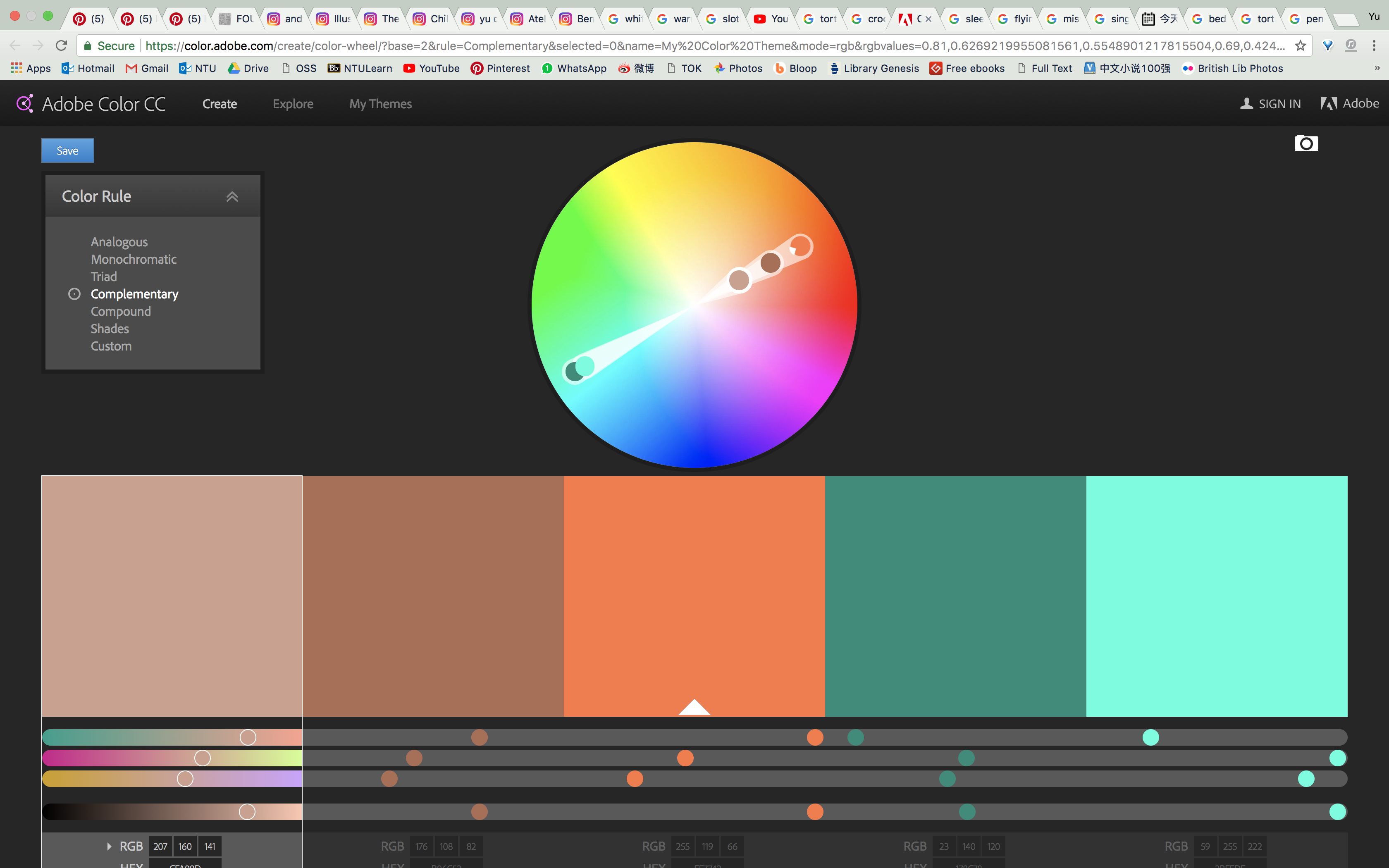
I have used the same colour scheme for both images to keep them coherent. I chose the complementary red-green colour scheme, because firstly they help viewers recognise objects in the scene (eg stage curtains and vines), and secondly the contrast lends a vibrancy to the scene, making it look even more alarming. Red-green complementary is particularly known for being able to express dark and heavy scenes and are commonly associated with villains and monsters — which is very apt in this case and further accentuates the danger the the vines pose to the speaker.
Comments from Class:
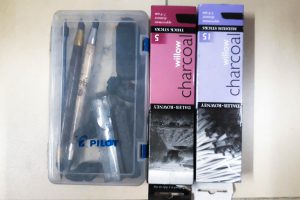
Drawing tool sets
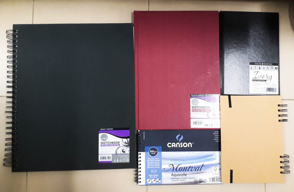
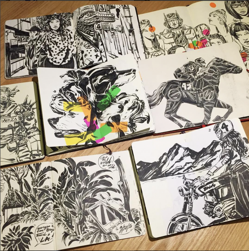
Sketchbooks:
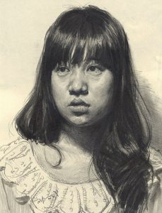
Currently, I intend improve my pencil and charcoal sketches. Thus, I am limiting myself with dry media materials and get myself to establish a stronger foundation before moving onto other mediums. At the same time, I hope to becoming faster and more confident in drawing — I work very slowly at the moment.
Tool sets:
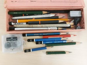
Pencils of different softness — aiming to work on my shading techniques and to incorporate more tones in my drawings. Hoping to improve my line quality as well as be more precise with each stroke instead of roughly estimating several times.
Charcoal sticks from previous semester — hoping to achieve more confidence in handling charcoals as well as obtain a wide range of tones.
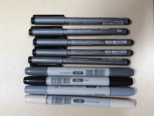
Brush pens (old and new) — have little experience working with them. I would like to use them to explore light and shading, as well as variations in line weights and how this affects the drawing
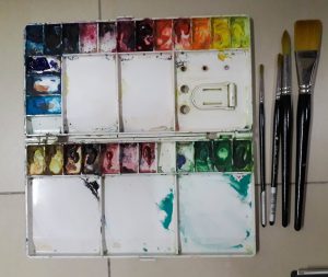
Watercolour set — not intending to use watercolour in the near future, but would love to explore and master this medium. Using watercolour for outdoor sketching/ figure drawing is really appealing to me.
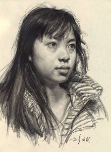
Asian faces tend to have gentler curves and shadows that rests more subtly on the faces. Liu Bin manages to capture this and portray Asian portraits in a realistic manner. I am interested in studying the way he handles light and shadow to achieve this effect.
2. Kim Jung Gi
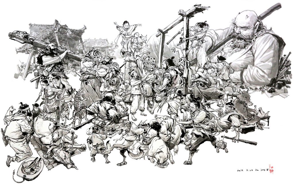
Kim Jung Gi’s mastery of form is insane. Watching his sketching videos are pretty unbelievable because he seems to have the entire picture in his mind and draws straightaway without any need for construction lines/sketch. I would like to study his drawing of human forms from different angles as well as his brushwork.
3. Paul Heaston (@paulheaston on Instagram)

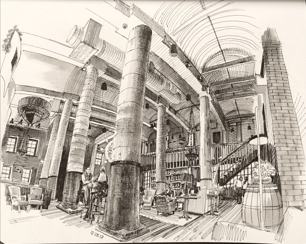
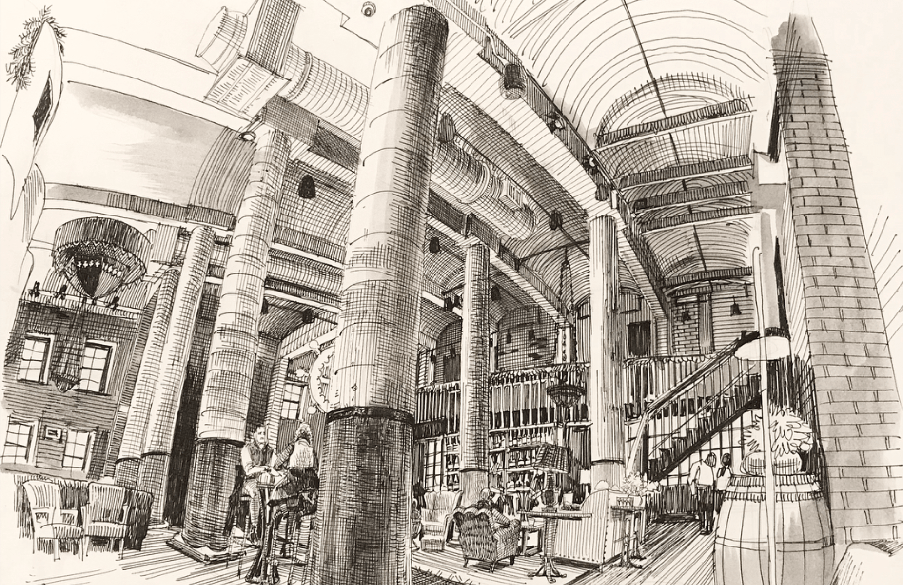
I want to study his inking and crosshatching techniques. Even though he often sketch the interior of rooms, the drawings are neat and not boring in any way. His perspective of rooms are very interesting, especially with the warp effect.
4. Dennis Brown (@bags43)
I like his brushwork and bold use of line. He can bring out a form with a few simple strokes — something that I would want to emulate.
5. General artworks
(Sabin Howard)
(@miles.yoshida)
(@phildean1963) 
Andrew Loomis
As you can tell, I am focusing on studying the different ways of using line and light/shadows. My drawings tend to be very flat and 2D – so I’m hoping that through learning from these works, I will better understand form and tones.
May this semester be a fruitful learning journey!
Final Submission!!
From top down:

Gallery viewing + Presentation :)
There were so so many amazing works!! It was really nice to see how everyone chose to represent themselves as well as the equations that they express.

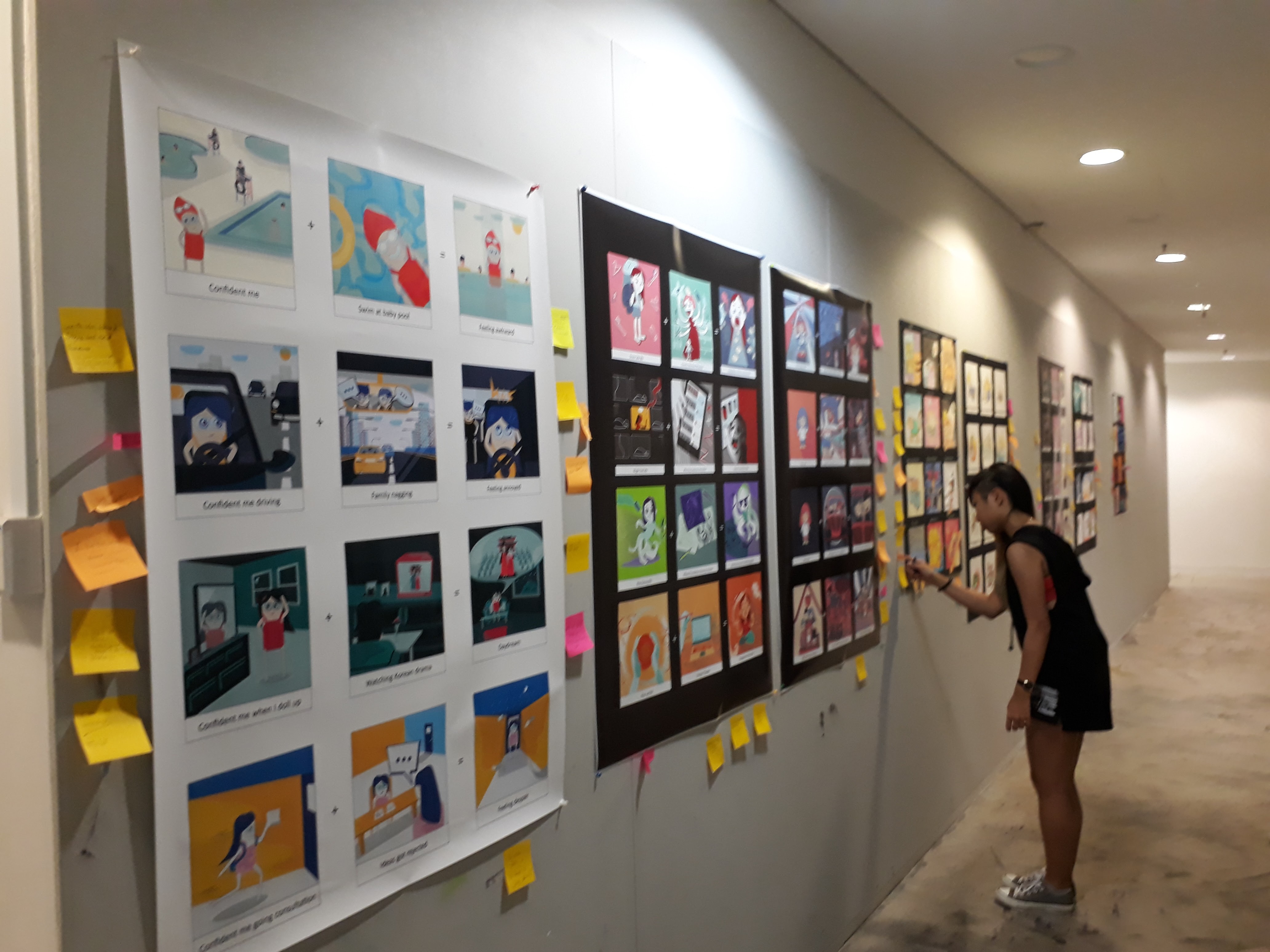
Eheheh what a great end to Foundation 2D!


Overall, this project has been a challenging one. Just ideation alone took me a really long time as I kept revising what I had. The drawing process wasn’t easy either, as I had to work around with different compositions and decide which works the best — especially troublesome when it comes to traditional media as I had to erase everything and start over. Learning about colour theories has also pushed me to really think carefully before I apply colours instead of the usual dabbing of colours based on instincts. This is the first time I actually obediently followed through a colour scheme. It was worth it though, as I really liked the end result. Nevertheless, I still feel that the painting can be improved, especially in terms of tones. Watercolour is really a difficult medium!!
When I first started, I sketched out a few random ideas that were in my mind. In my first brainstorming session, this was what I came up with:
From up to down,

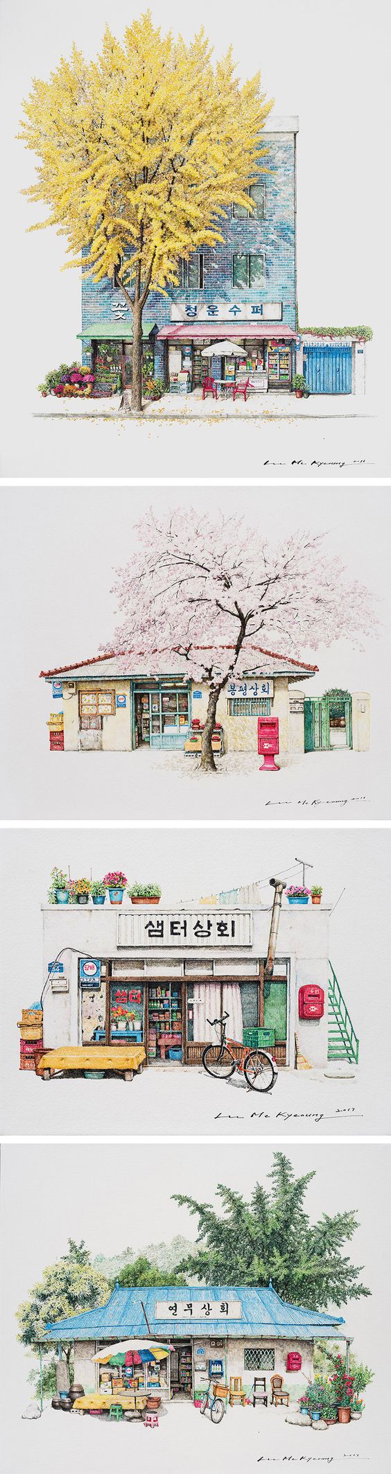
The reason I wanted to use architectural settings (the shopping mall and bath house) is because I was initially inspired by a illustration artist Me Kyeoung Lee who illustrated South Korean Corner Stores:
However, I couldn’t generate sufficient ideas that make use of architecture illustrations and had to abandon this concept as it was causing my ideation to be very restricted.
Following that, I continued brainstorming for more possible equations
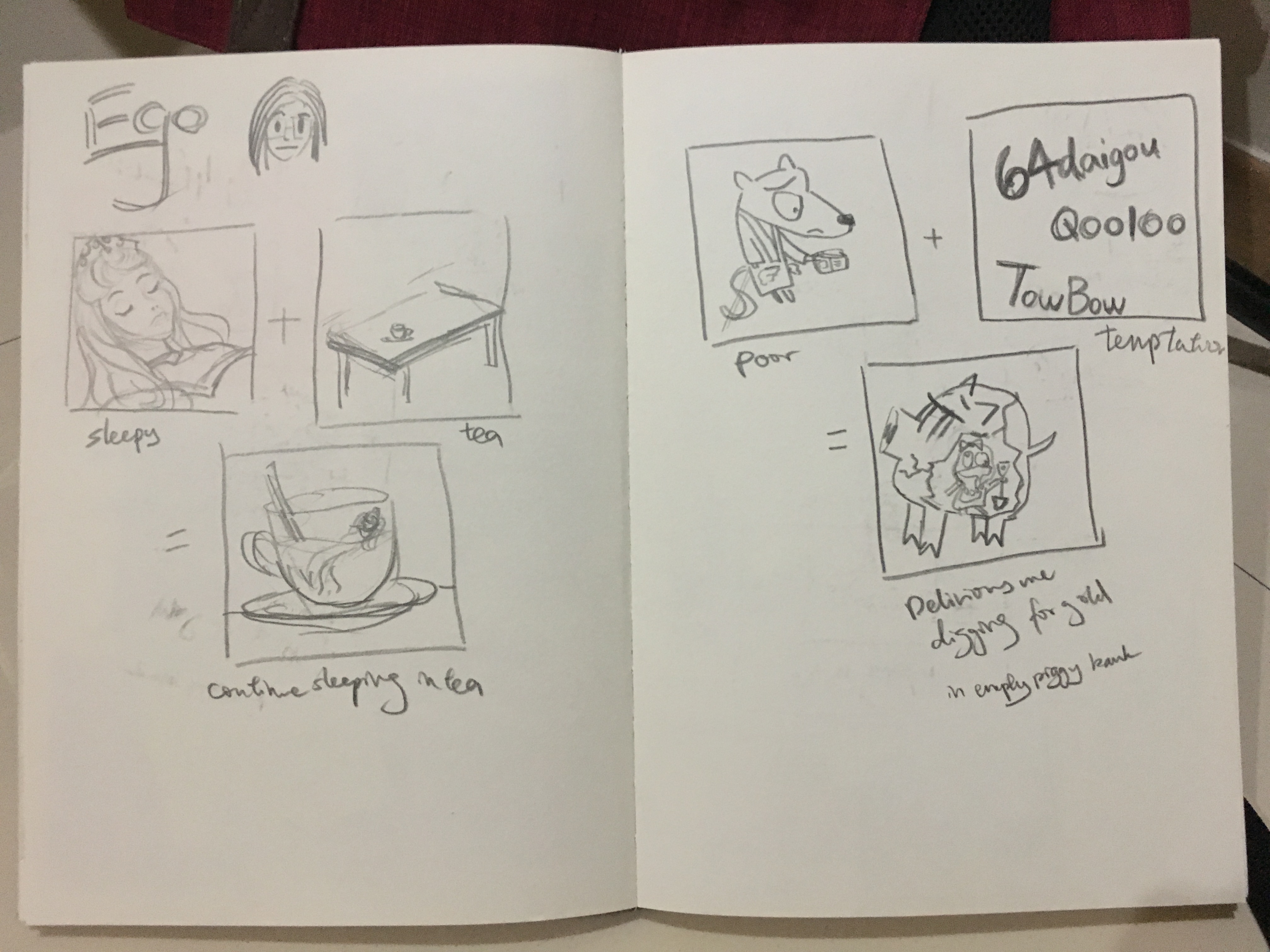
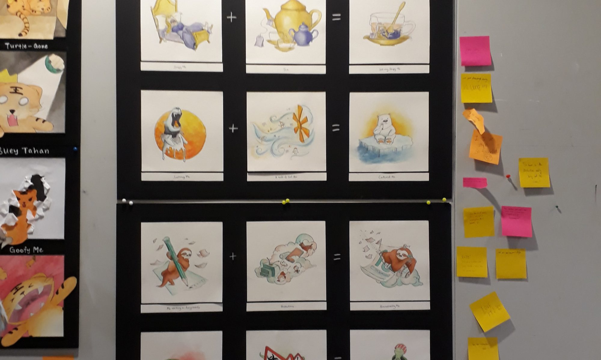
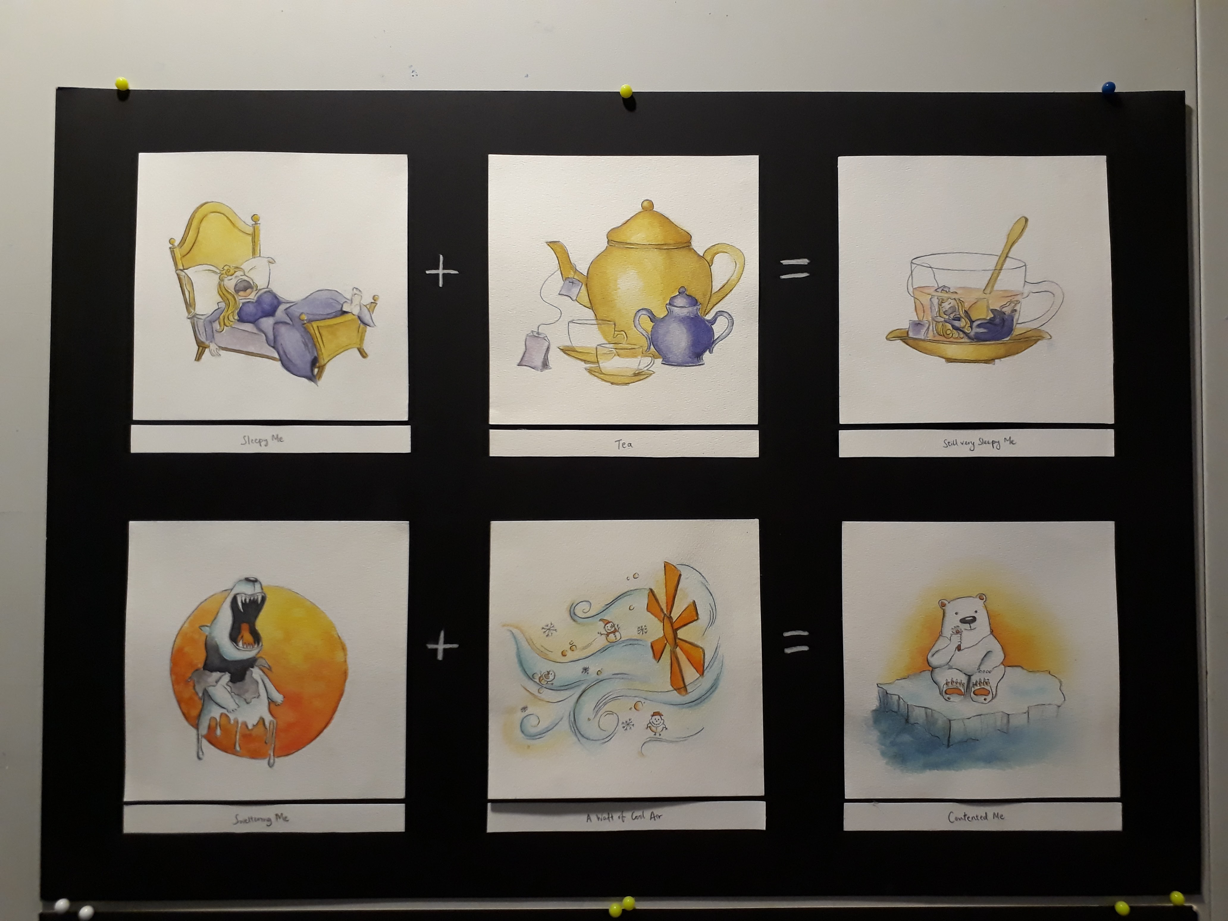
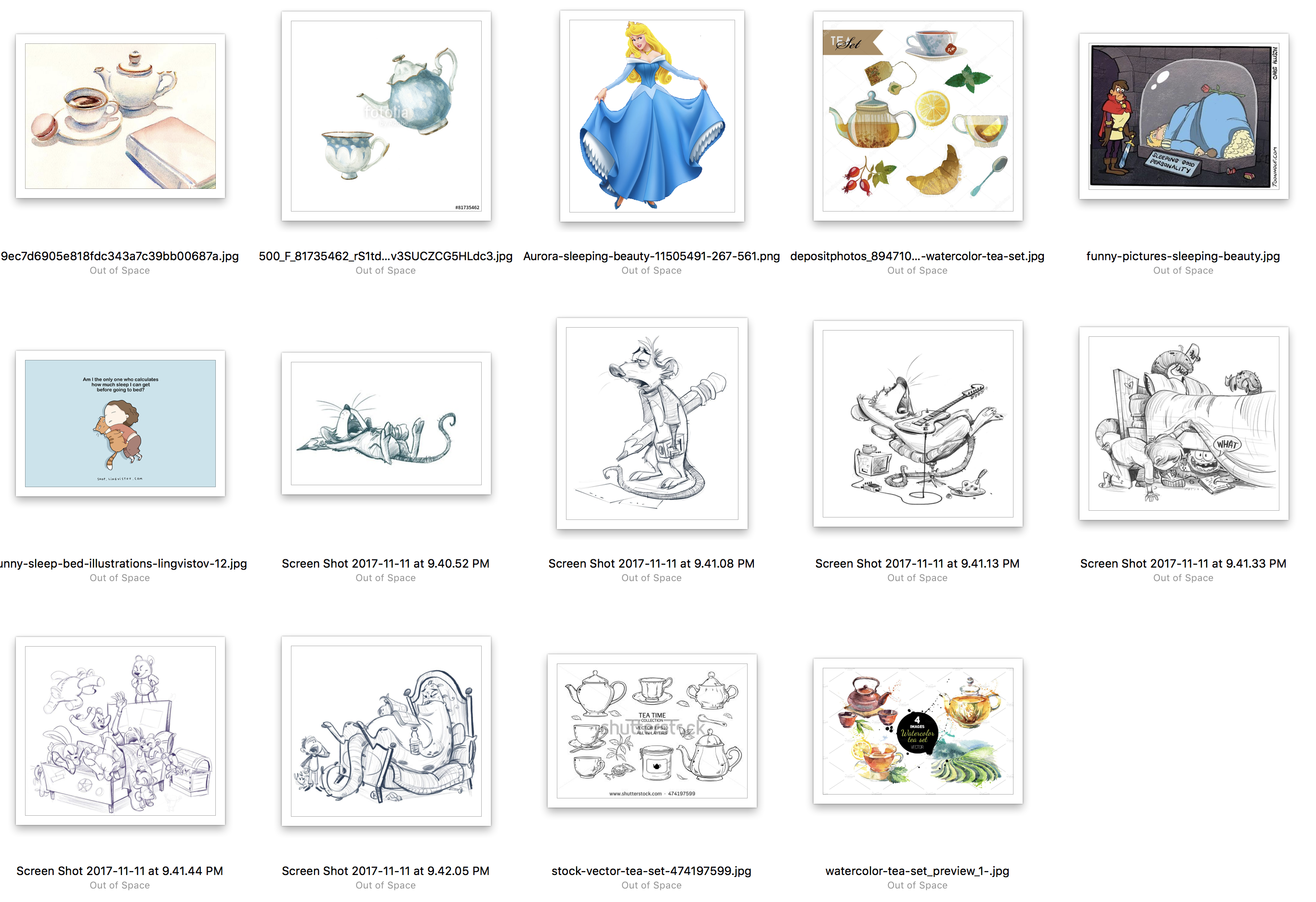
Left: sleepy me + tea = me continue sleeping in tea
Right: Poor like a church mouse me + bombarded by cheap deals on online shopping sites like Taobao and Ezbuy = Delirious me digging for gold in an empty piggy bank while holding up shopping loots.
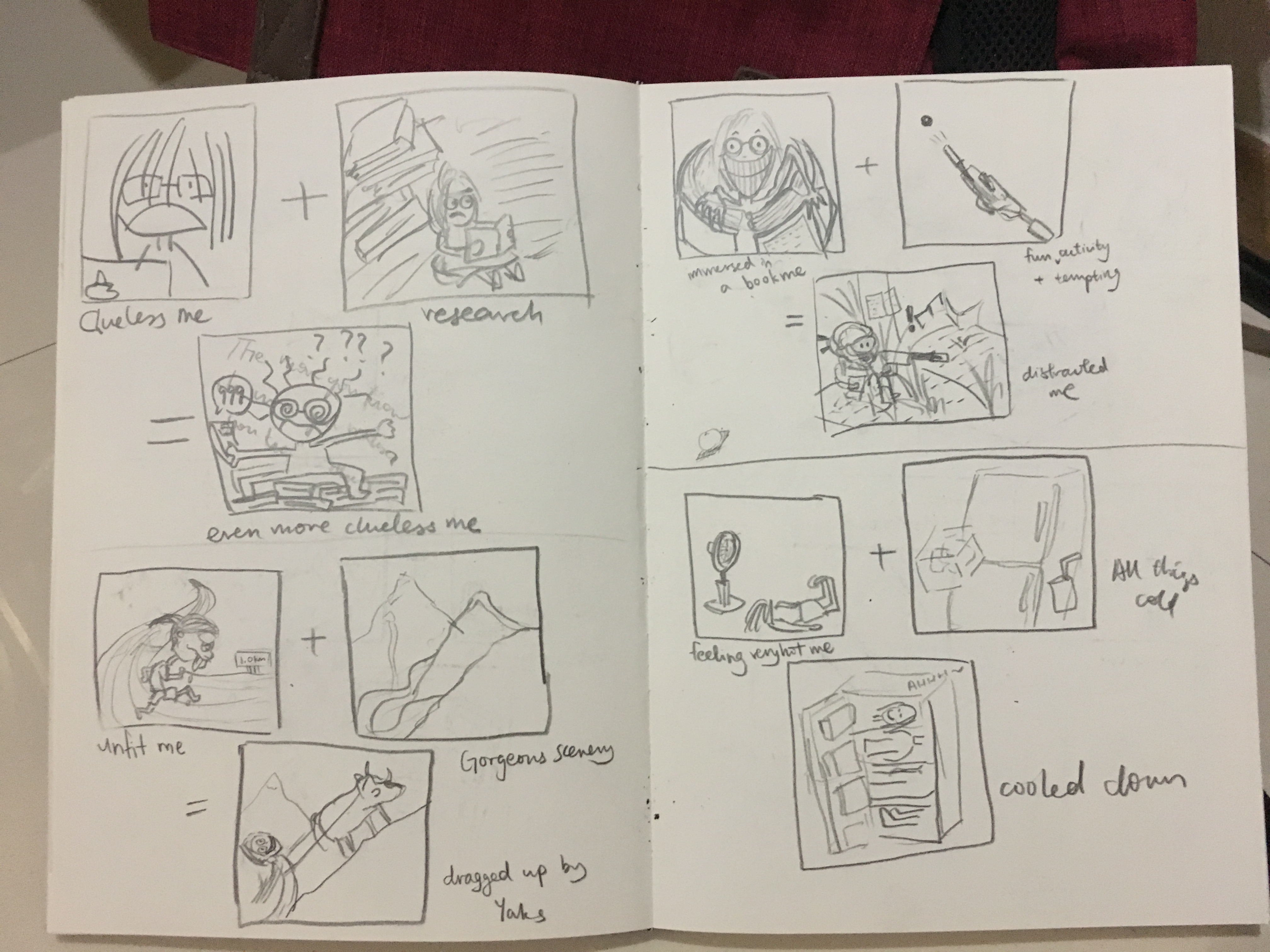
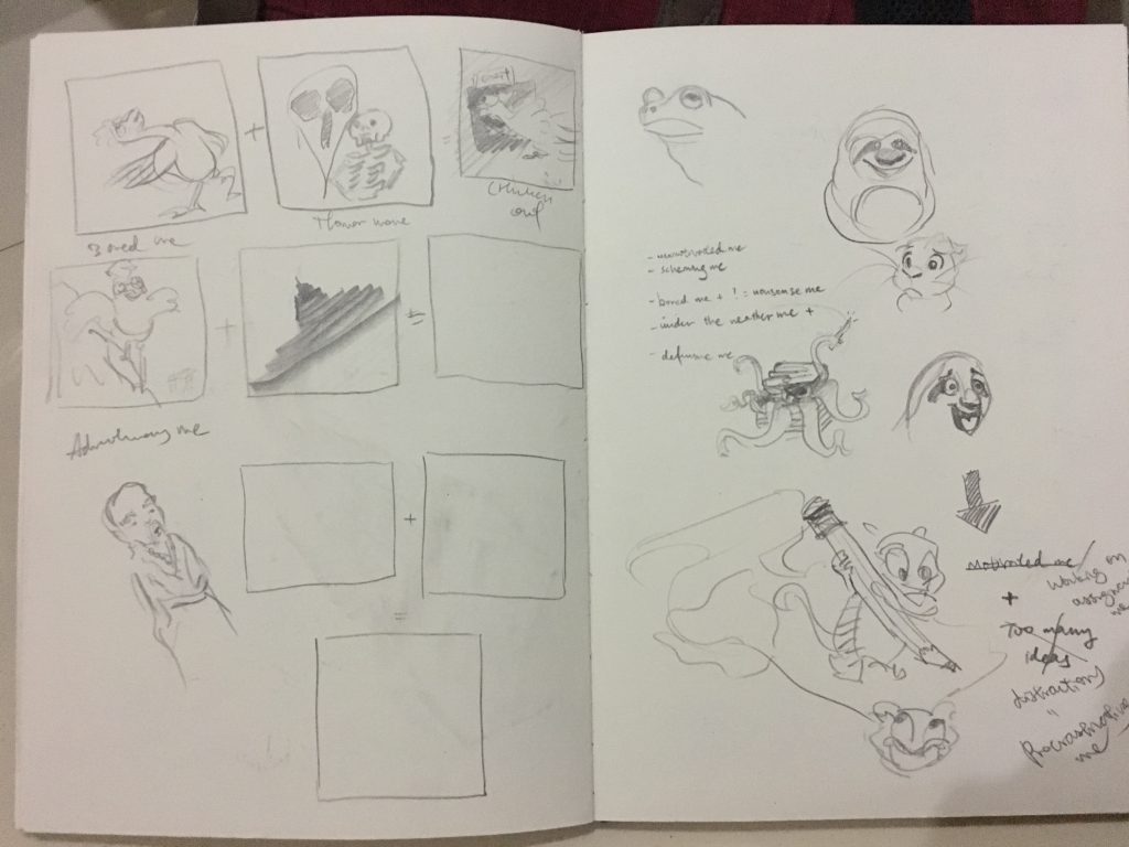
Left up: Clueless me working on assignments + Research = Even more clueless me
Left down: Unfit me + Gorgeous scenery in mountains = ‘trekking’ up to admire the scenery by being dragged by the yaks
Right up: Me being immersed in a book + a fun and highly tempting activity = me being distracted while still trying very hard to reading the book
Right down: Me feeling very hot + all things cool = me getting cooled down as if I am dissected and fitted into different sections of the fridge
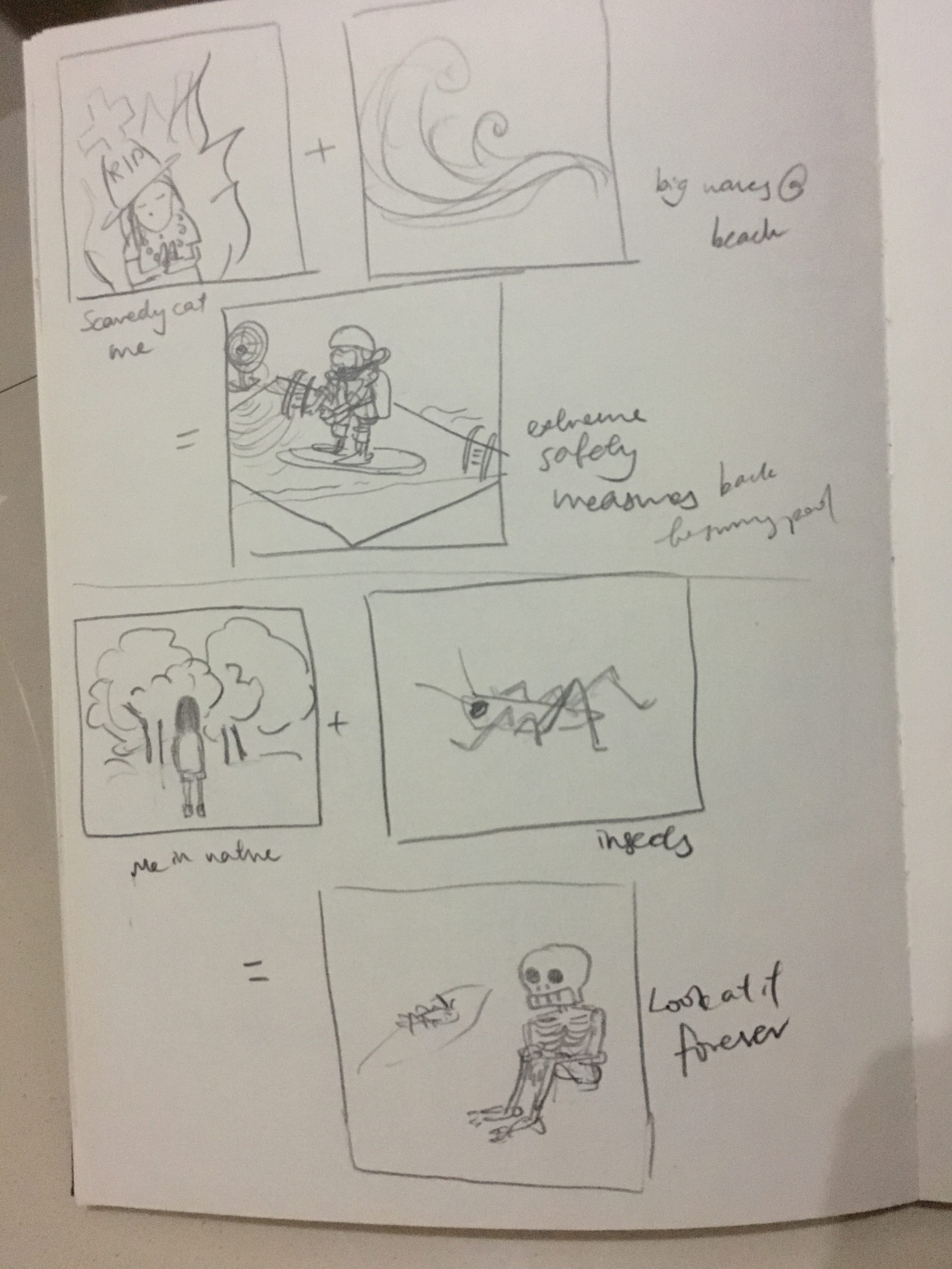
Up: Scaredy cat me + big waves on a beach = me taking extreme safety measures and only daring to go to a swimming pool
Down: Me in Nature + I see cool insects = Me staring and admiring at the insect forever
Narrowing down to several ideas that I am more fond of, I decided to work on thumbnail sketches to get a sensing of the colours and composition of the equations. I have decided on complementary colours because I was not confident of handling the very versatile watercolours (especially when the paint mix to form another colour) and restricting to two colours will help a lot.
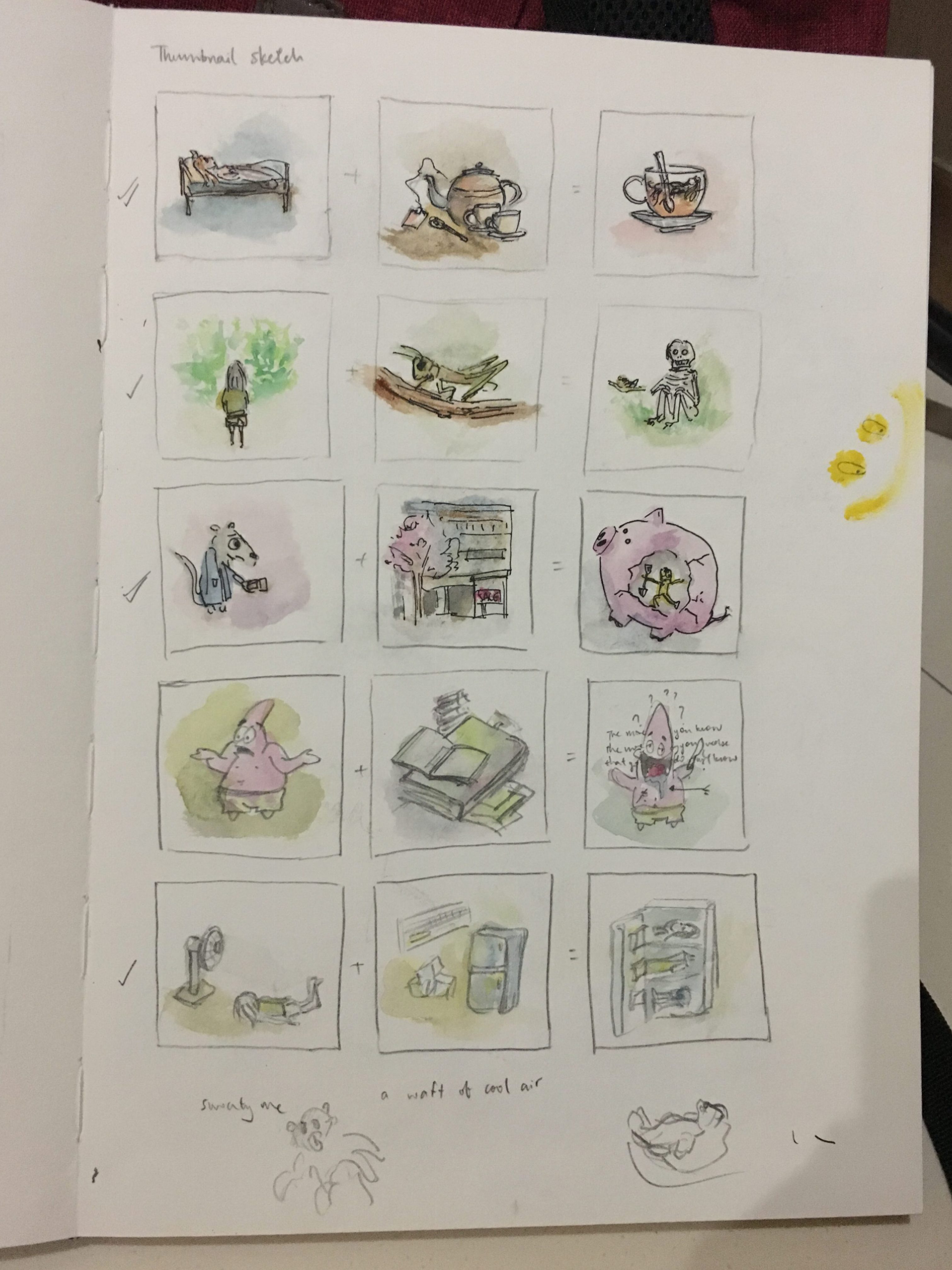
After the thumbnail sketches, I was more or less settled on the following:
I was unsatisfied with the rest of the ideas and decided to explore further.
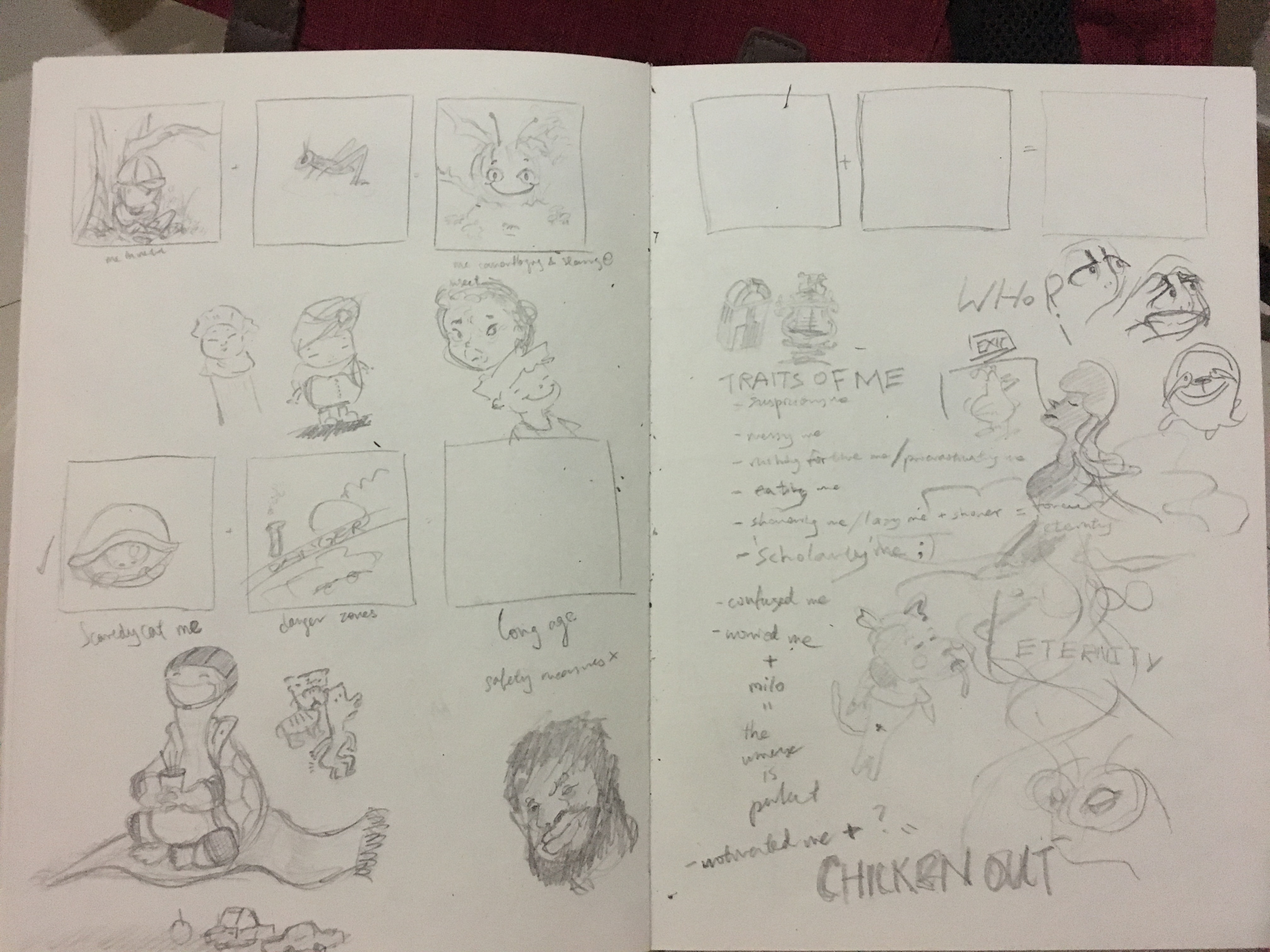
Left top: me in nature = cool insects = me camouflaged as the same insect while quietly staring at it, being careful not to scare it away
Left bottom: Scaredy-cat me + danger = me with extreme safety measures and living to long age
Right: I listed down traits of myself to help identify potential ideas to work on.
More sketches…
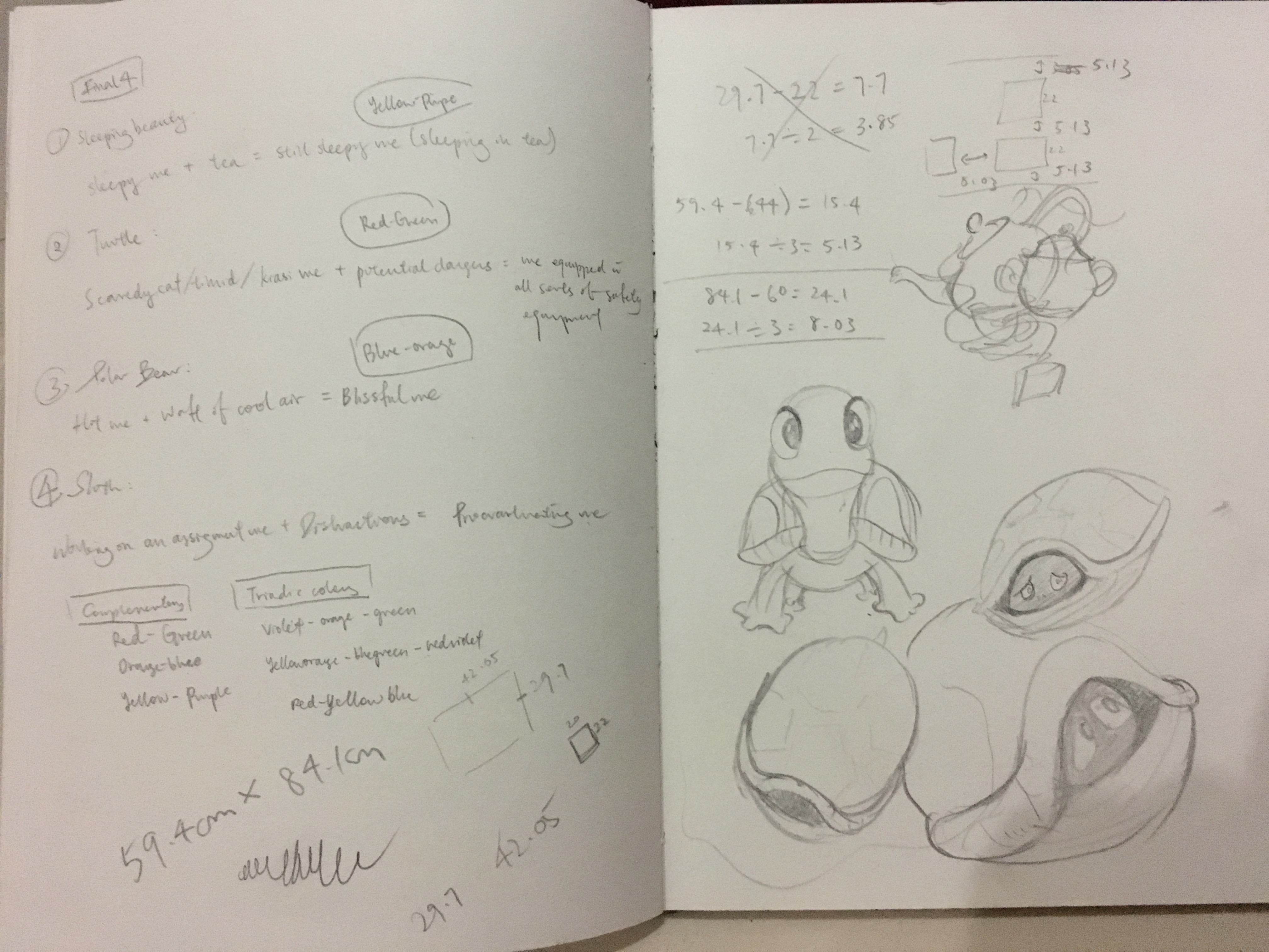
Here, I’ve finally decided on the final four ideas:
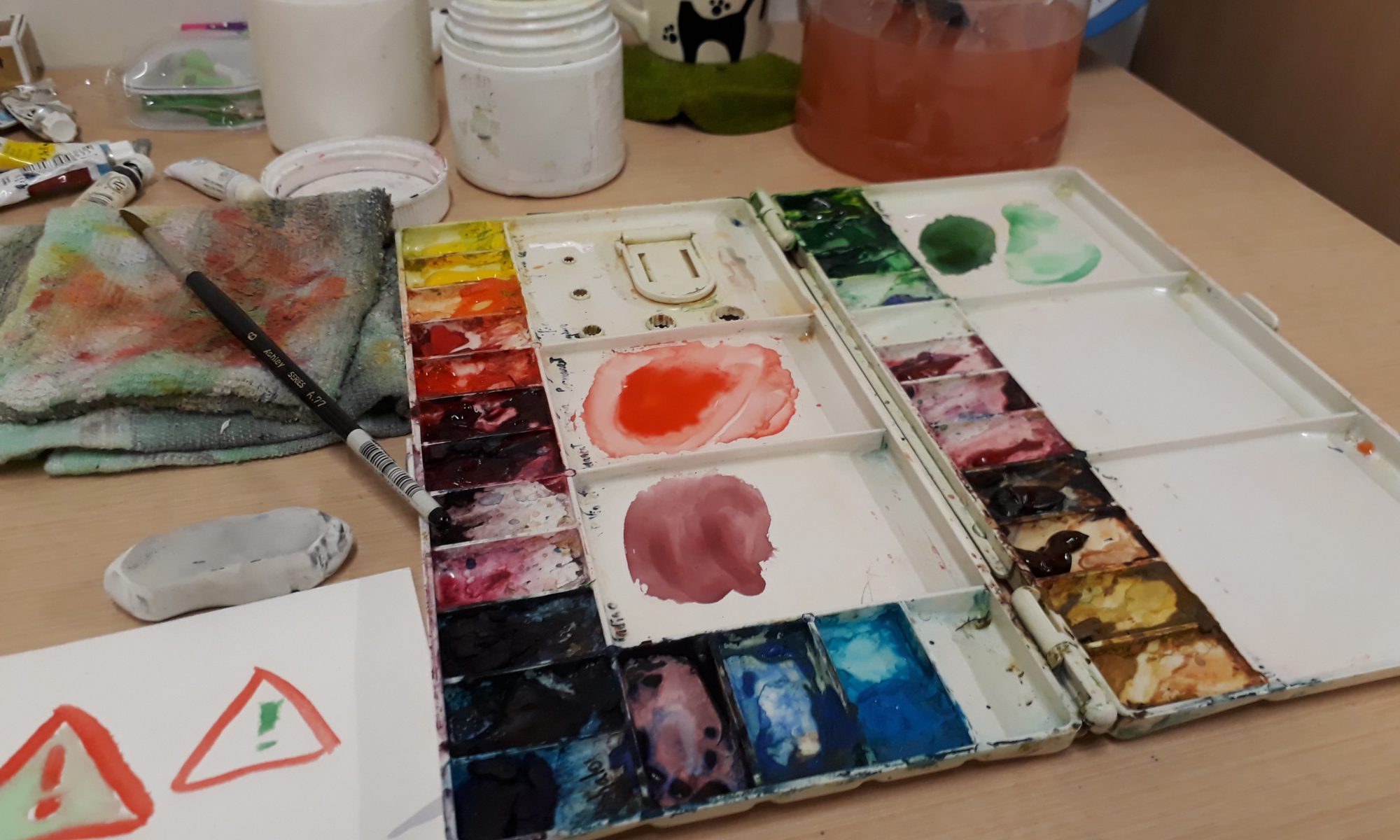
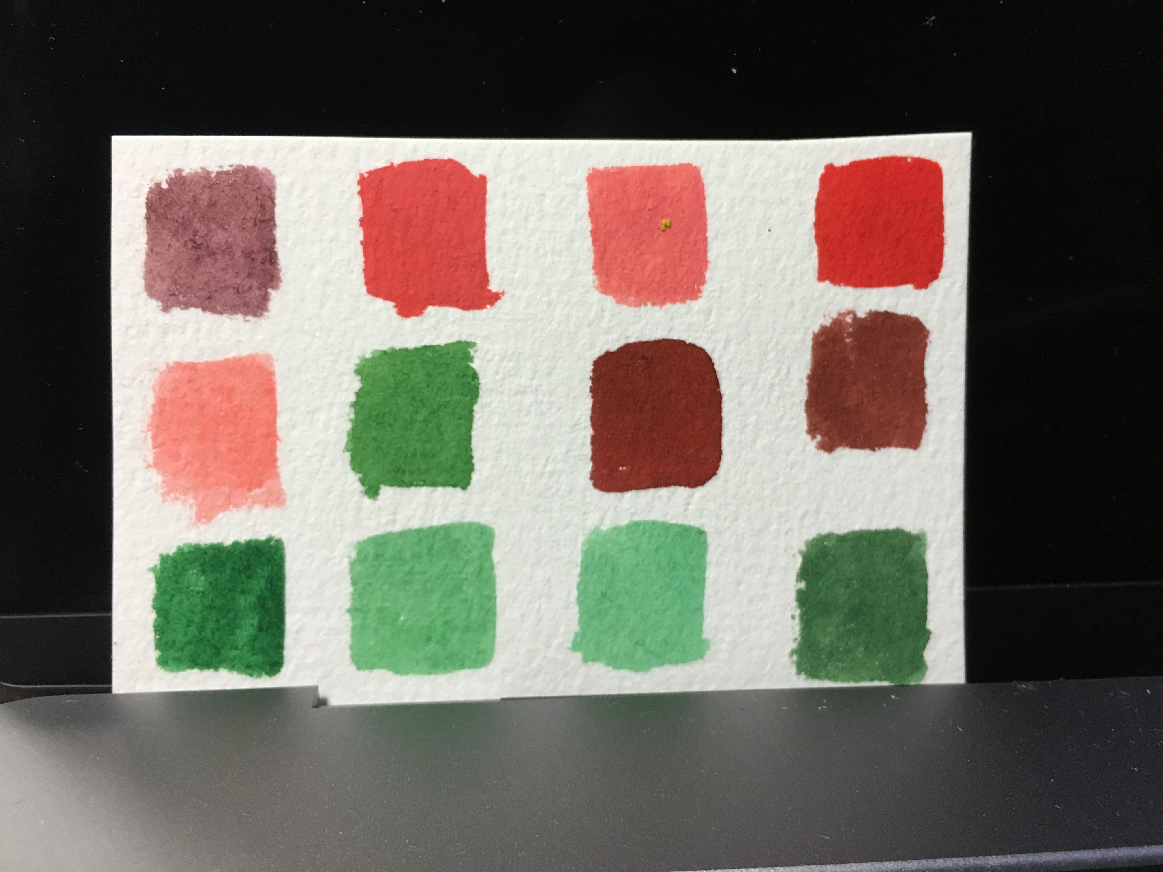
Moving on, I did a first draft of the illustrations to get an even better idea of what I am expecting. However, it went wrong when I used a marker to outline the drawings before painting over. As a result the marker smudged when the paint is applied, causing the colour to be a few shades darker and dirty as well. Although this made the end-colour less representative of the actual one, it was nevertheless useful in allowing me to decide which parts to be coloured what colour.
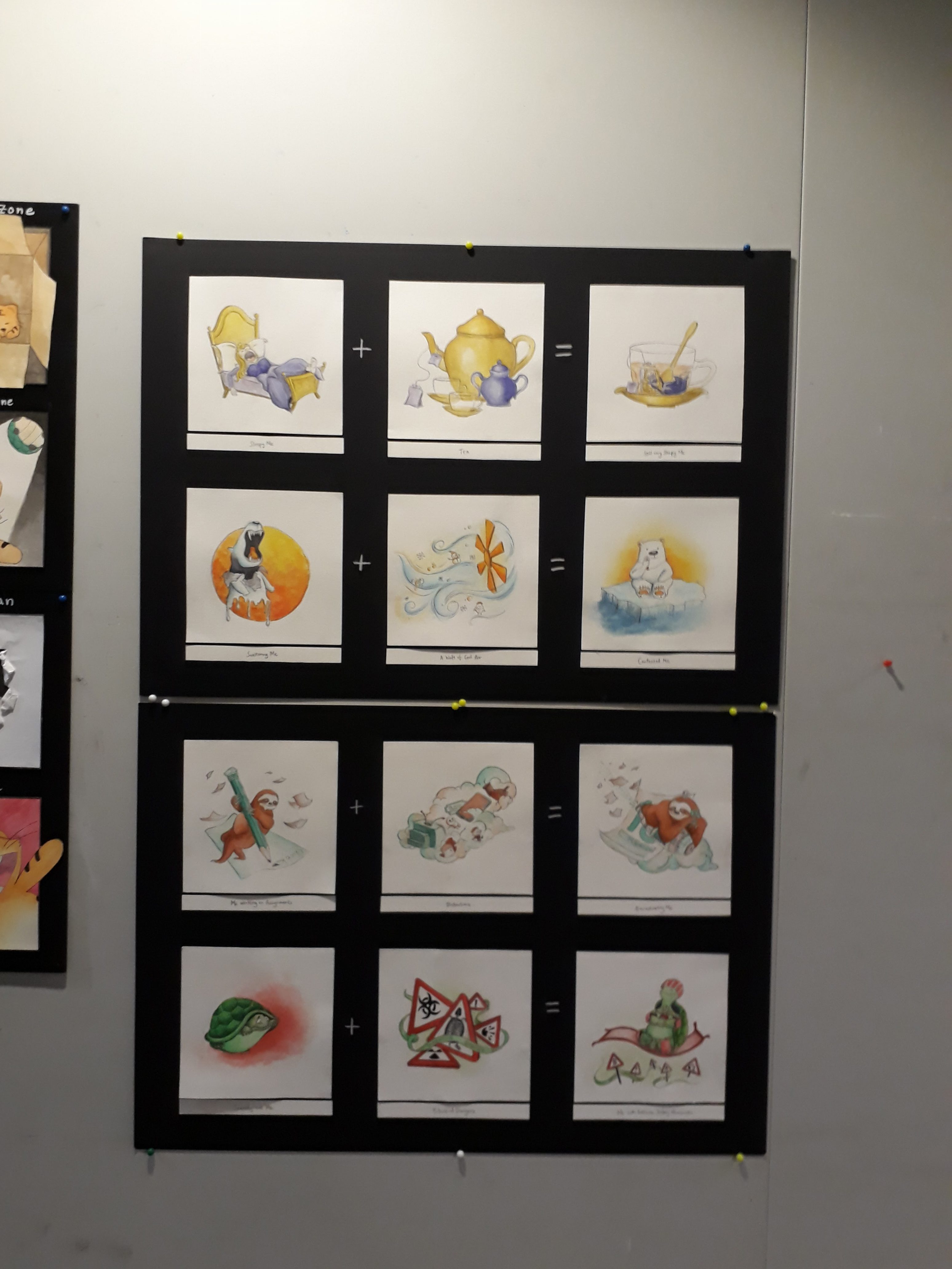
1. Sleepy me + tea = still very sleepy me
 I used sleeping beauty because one of the most prominent feature of her is, well, sleeping; and so I thought it would be very apt to use sleeping beauty to represent the very sleepy me.
In the not-too-long-ago past, tea used to be an effective way to wake myself up. However, perhaps due to the overdose of tea as a result of many many late nights, somehow it’s effectiveness has reduced. Maybe my body has gotten used to it.
Anyway, this equation is a very apt description of myself these days, where I’m perpetually sleepy all day around, and even after gulping down tea, I still feel sleepy.
Colour: Yellow-purple. To represent sleeping-beauty (a princess), I chose to use purple since the colour represents ‘royalty’ as learned from the colour theory presentation by my peers. Yellow was a suitable colour as it suits the colour of tea.

References while drawing:
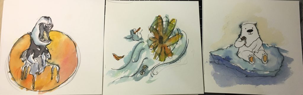
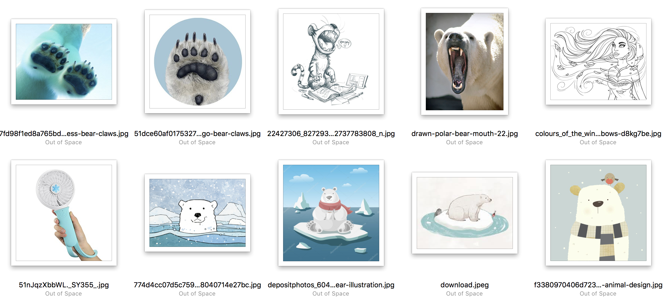
I used a polar bear because they are very adversed to heat and warmth and they are the ones that need a cold climate the most.
In the first frame, the polar bear is so hot that it has to tear of its fur coat to reveal the black skin below. Also the lower body of the polar bear has melted. In the second frame, there is a waft of cool air, as shown by the little snowman. Lastly, it is revealed that the wind is just from the very tiny hand-held fan, but even so the small amount of cool wind is enough to satisfy the polar bear.
Colour: Orange-blue. Orange to represent the sun/warmth/heat in the first frame, and blue to represent coolness/ice bergs in the Arctic.
References while drawing:
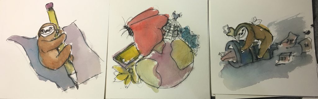
I am usually a very slow worker, and hence I represented myself as a sloth. At the same time, I have such a wide span of interests that I often digress from my work. This include very random searches on google as well as sudden urges to read a book/watch a vid/ engage in some kind of activity. As a result, I often end up procrastinating and slow worker+procrastination= time will always fly past way too quickly than I’ll like. As seen in the third panel, I am riding on a rocket that is expelling calendar dates, signifying that time is passing very quickly while I indulge in other activities.
If you compare to the final work, you can see that the composition for this particular equation has changed a lot as I wasn’t satisfied with it.
Colour: Orangeishbrown-Turquoise. The colour is chosen so that the sloth can be more easily recognised compared to, say, a blue sloth or a green sloth.

References while drawing:

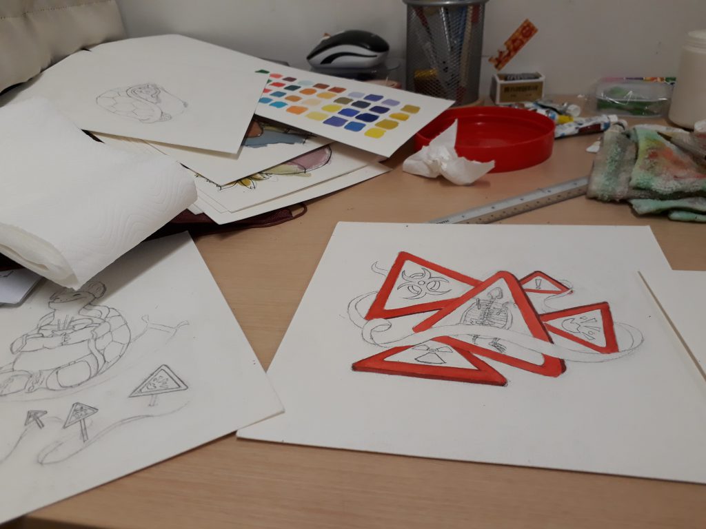
I am somehow very imaginative when it comes to potential dangers/injuries that can occur in all sorts of scenarios, and hence even though I really like adventurous activities, I also try my best to prevent myself from landing into any kinds of danger.
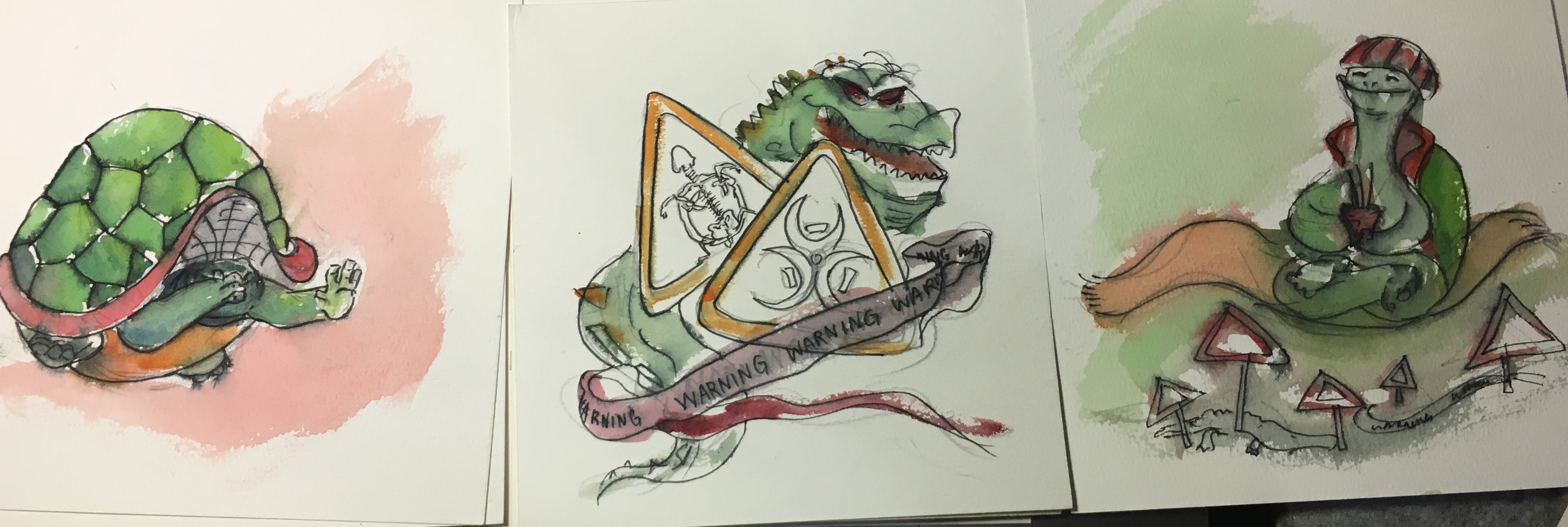
In the first panel, I drew a tortoise that is hiding in its shell to show that it is scared. The second panel illustrates all the danger zones and warning signs. In the third panel, the tortoise, armed with all sorts of safety equipments like helmets, elbow guards, knee guards, as well as joss sticks for praying, floats across the danger zones safely. This is rather ironic as a tortoise already has a very protective and hard shell, yet it still needs external equipment to protect itself from dangers.
Colour: Green-red. The choice of colour is very straightforward here: green because it best represents a tortoise, and red because red colour is a very intense colour associated with energy, war, and danger.
References while drawing:
Yay!

If you notice, in all the equations, the setting (2nd panel) will have some of its elements repeated in the final panel. This is initially found in a few equations in my very early thumbnail sketches
(This one!)
Mimi noticed it, and suggested that I repeat that in every equation, thus now you can see that the tea cup, the little fan, the distractions as well as the danger signs are repeated in the last panel.
Pencil sketch first…

Colour by colour..
 The table in hall is so smal!
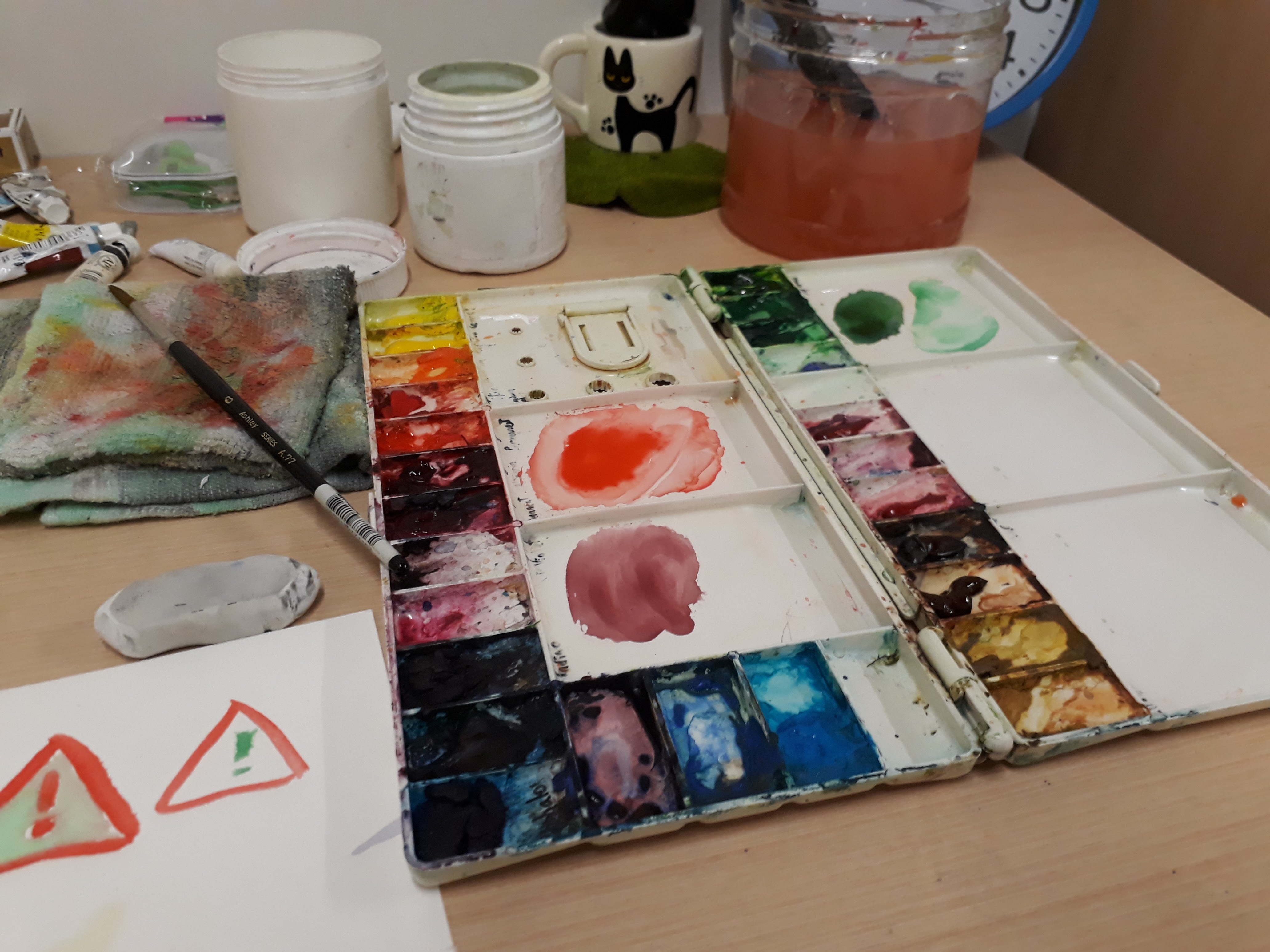
I didn’t take much photos while working on the final work ~(。☉︵ ಠ@)>
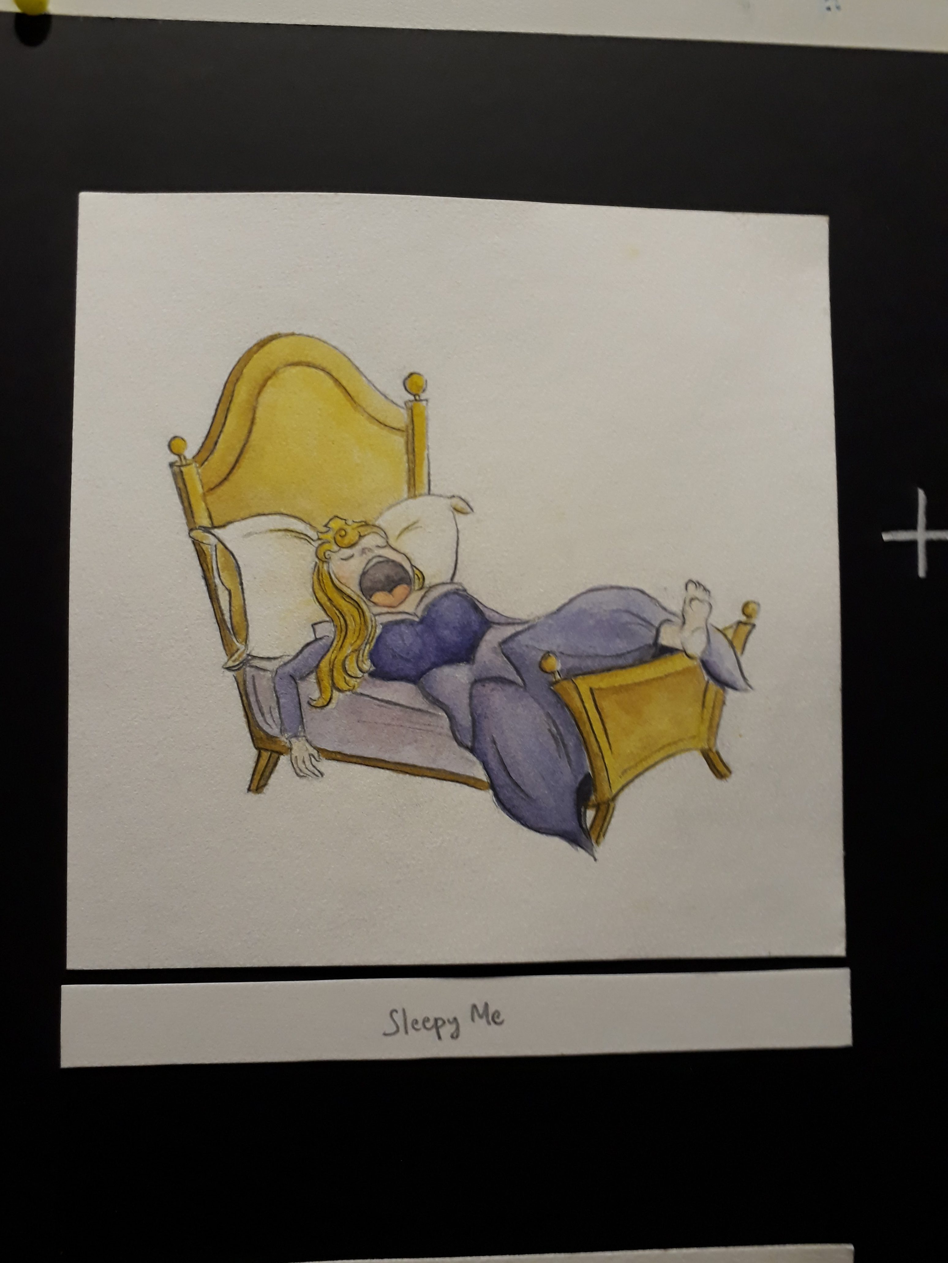
I faced some problems deciding the colour for the bed frame and the mattress because I didn’t want entire bed+frame to be yellow as it’ll be difficult to tell them apart, but at the same time having a purple bed and a purple dress also result in the same problem. I end up opting for a lighter shade of purple for the mattress.
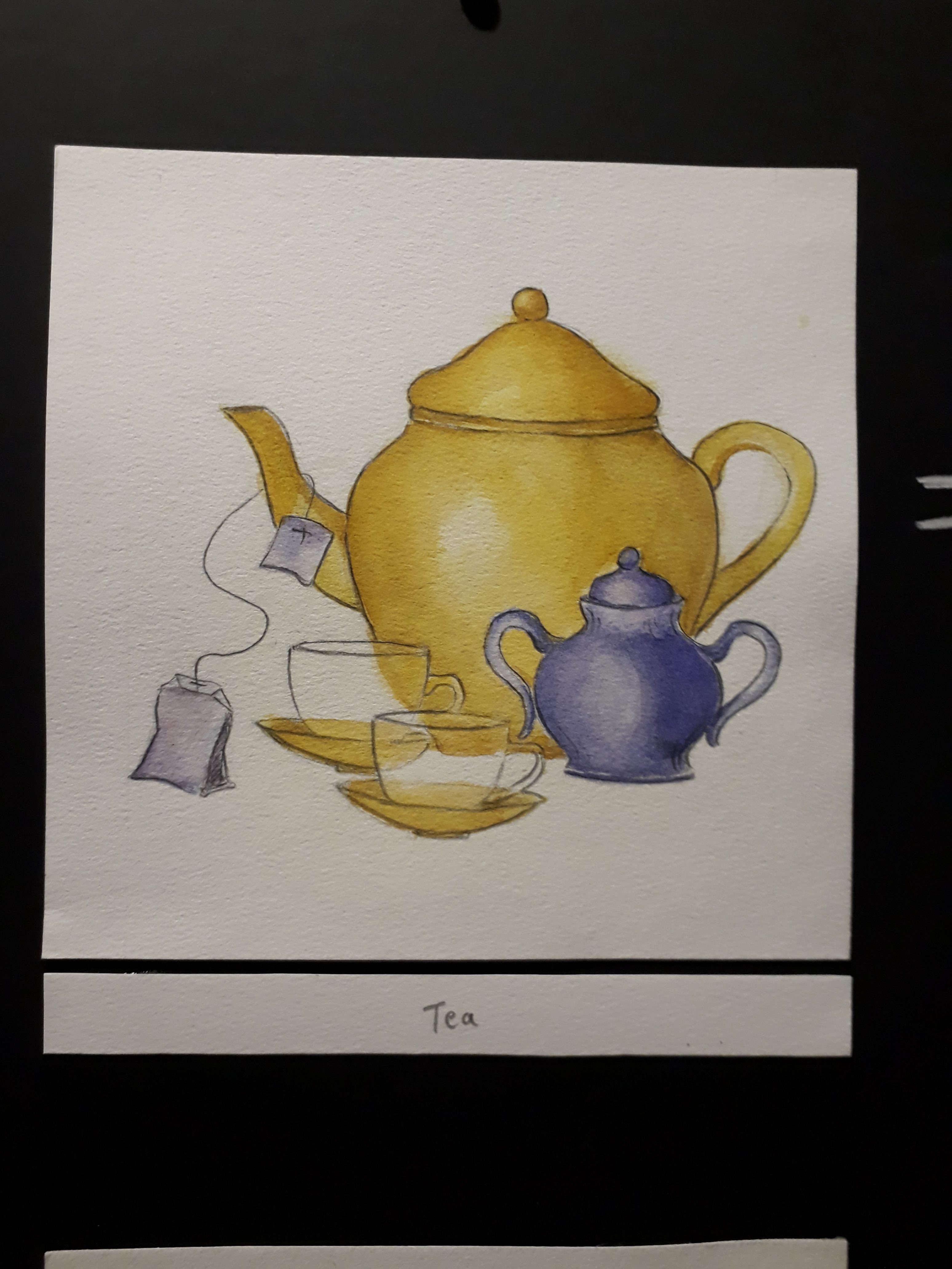
I couldn’t figure out how to show the transparency of the tea cups here :<
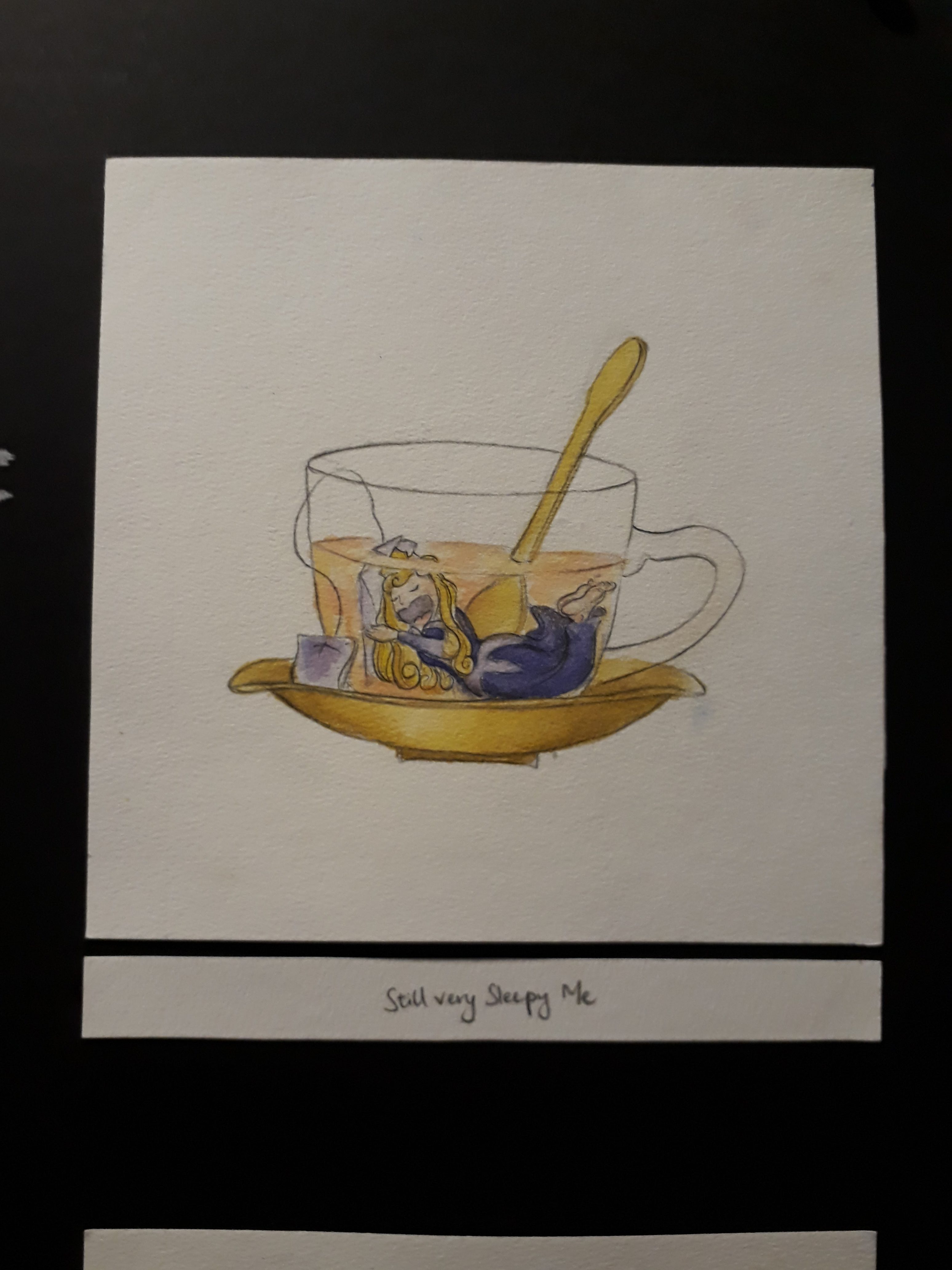
Here sleeping beauty hugs the tea bag as a pillow and continues sleeping while being submerged in tea. 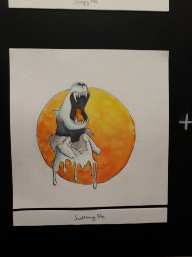
The orange circle at the back represents the sun, and the polar bear is frustrated by the heat. That’s why the fur coat is peeling off to reveal the black skin underneath, and the lower body is also melting.
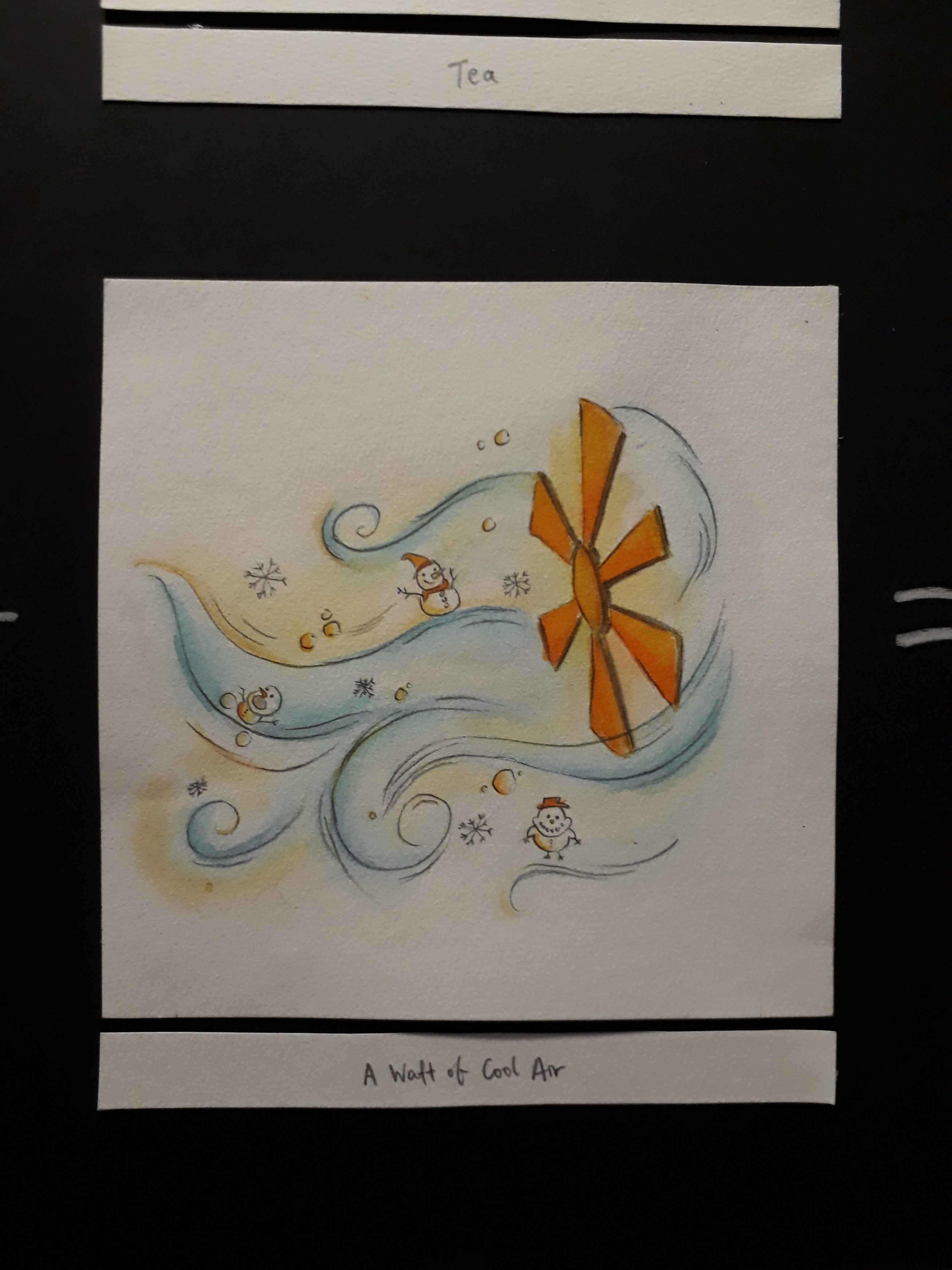
I added snowman and snow flakes and snowballs to show that the air is cool.
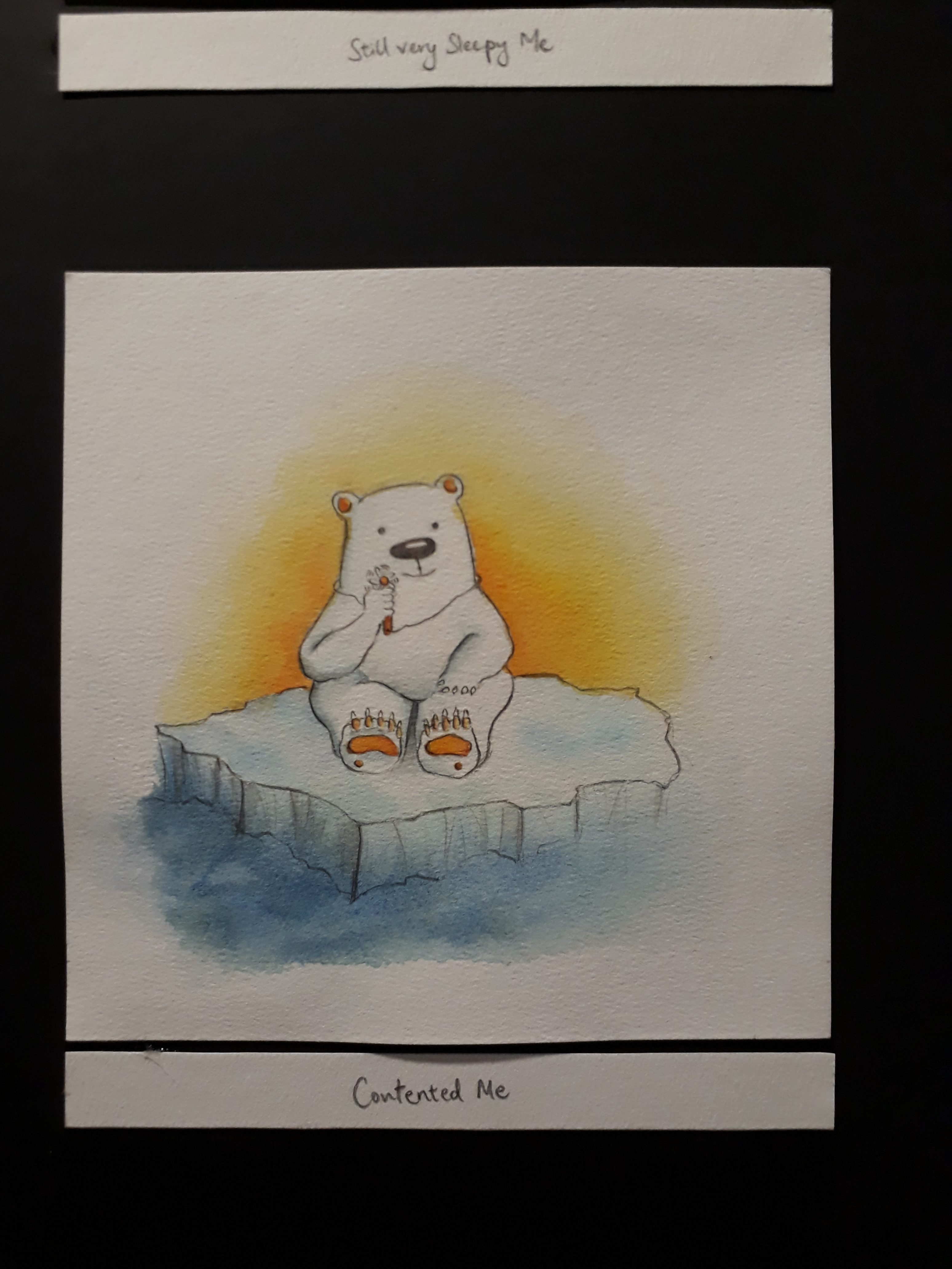
The fan element is repeated here. If you look closely, the polar bear is holding a tiny fan!! This shows that when you are feeling extremely hot, even a tiny waft of cool air from a tiny fan is enough to satisfy you.
The pencil lead is broken, after only writing my surname… this goes to show my slow-ness. There are so many empty assignments at the back waiting to be worked on, yet I’m still writing my name on the first paper…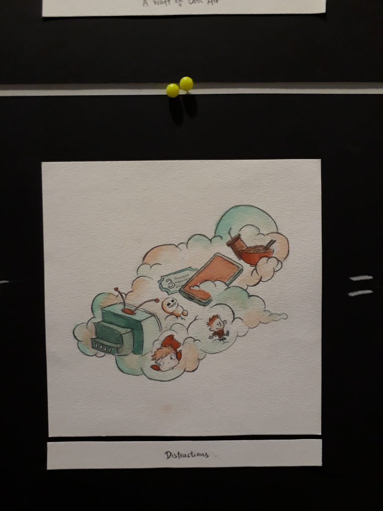
This are some of the things that distracts me: drama series, animation movies, CALVIN AND HOBBES, my phone, and fooood. I used the cloud to represent how these things are always lingering in the back of my mind, waiting for the opportunity to pounce out and steer me away from work.
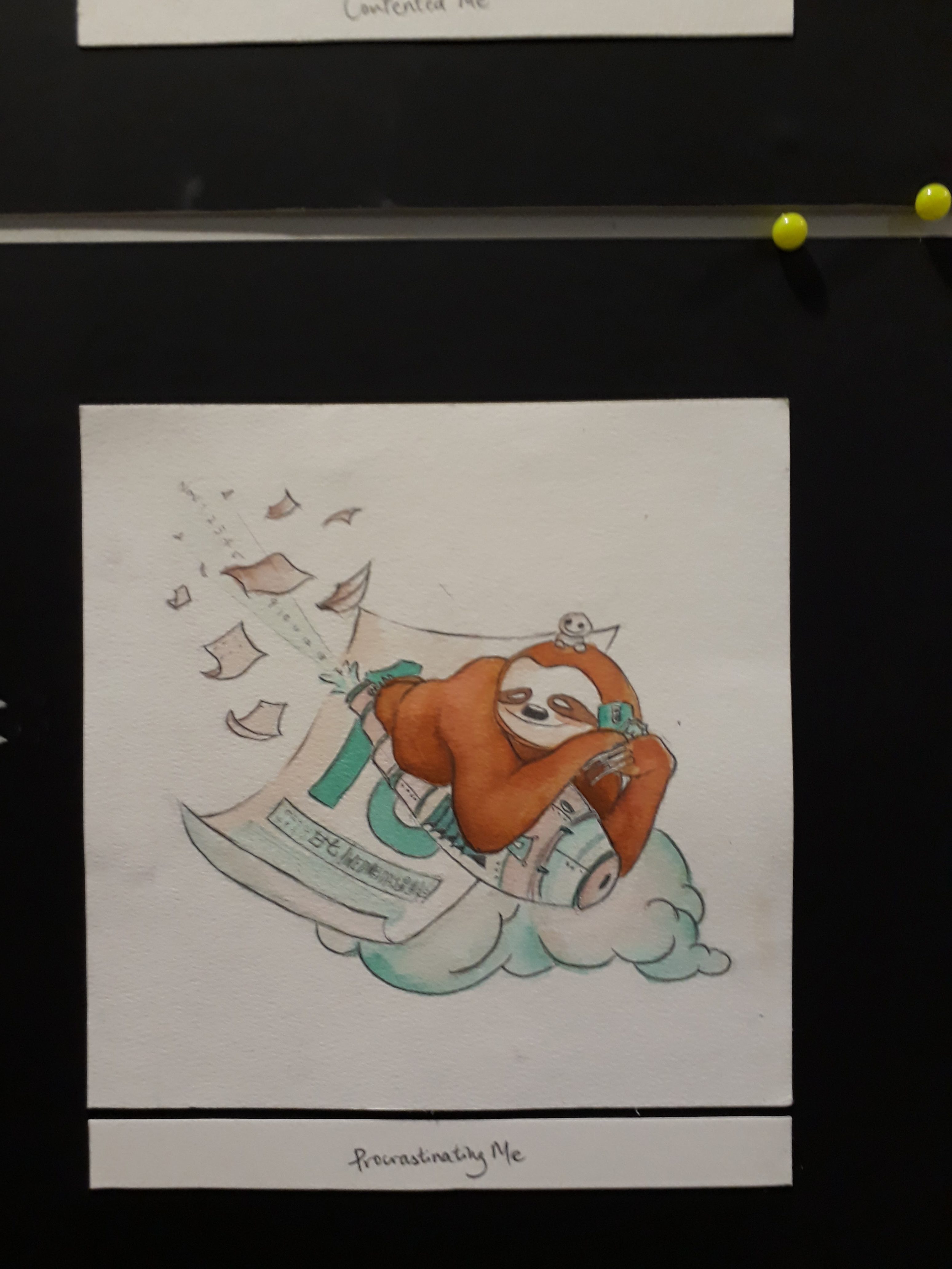
The distractions are repeated here if you look closely! Also, the date of the calendar is actually the submission date, which is 15th November. The trail of numbers that are ejected from the rocket is actually dates: Nov 1, 2, 3, 4, all the way to 14.
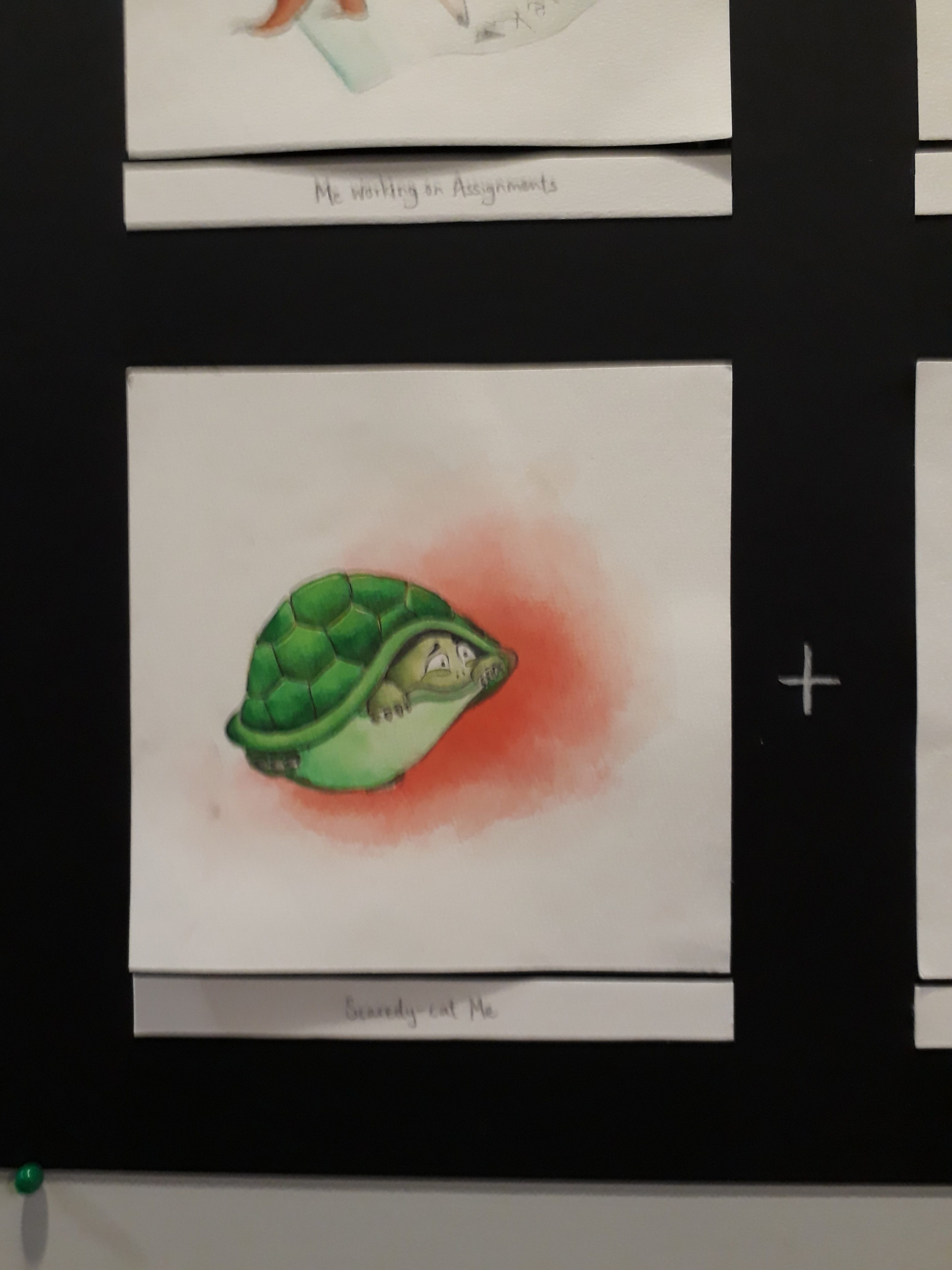
A scared me is depicted as a tortoise in a shell.
I wanted to illustrate danger here, but simply using the typical danger signs and human skull didn’t feel quite enough, hence I changed the human skull danger sign to a tortoise skeleton so that it ties in with the tortoise theme better.
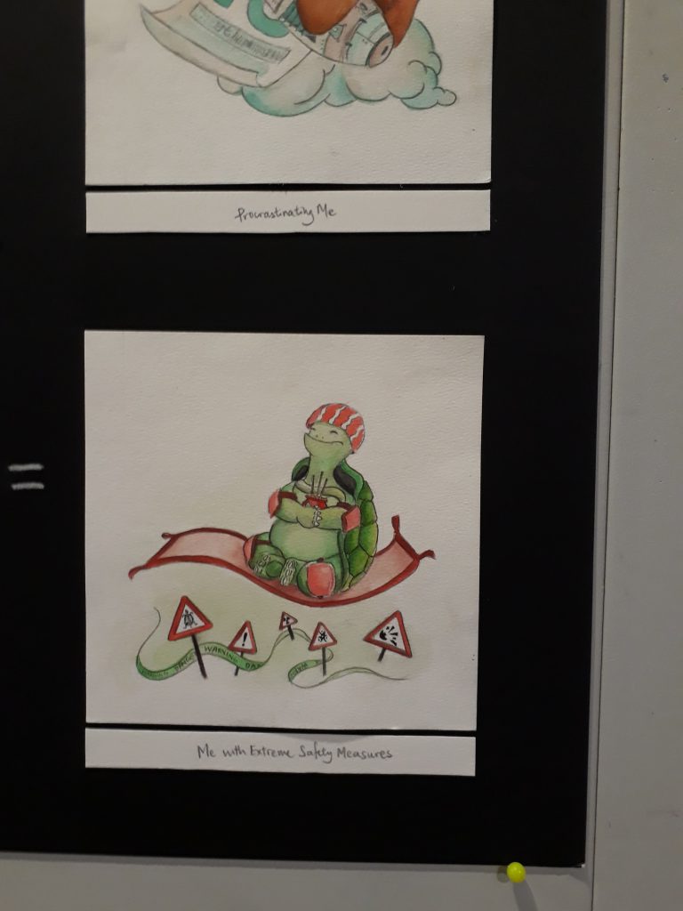
Here, a blissful and safe tortoise floats past all dangers, while praying fervently for its safety and adopting all measures to protect itself on top of its hard turtle shell.