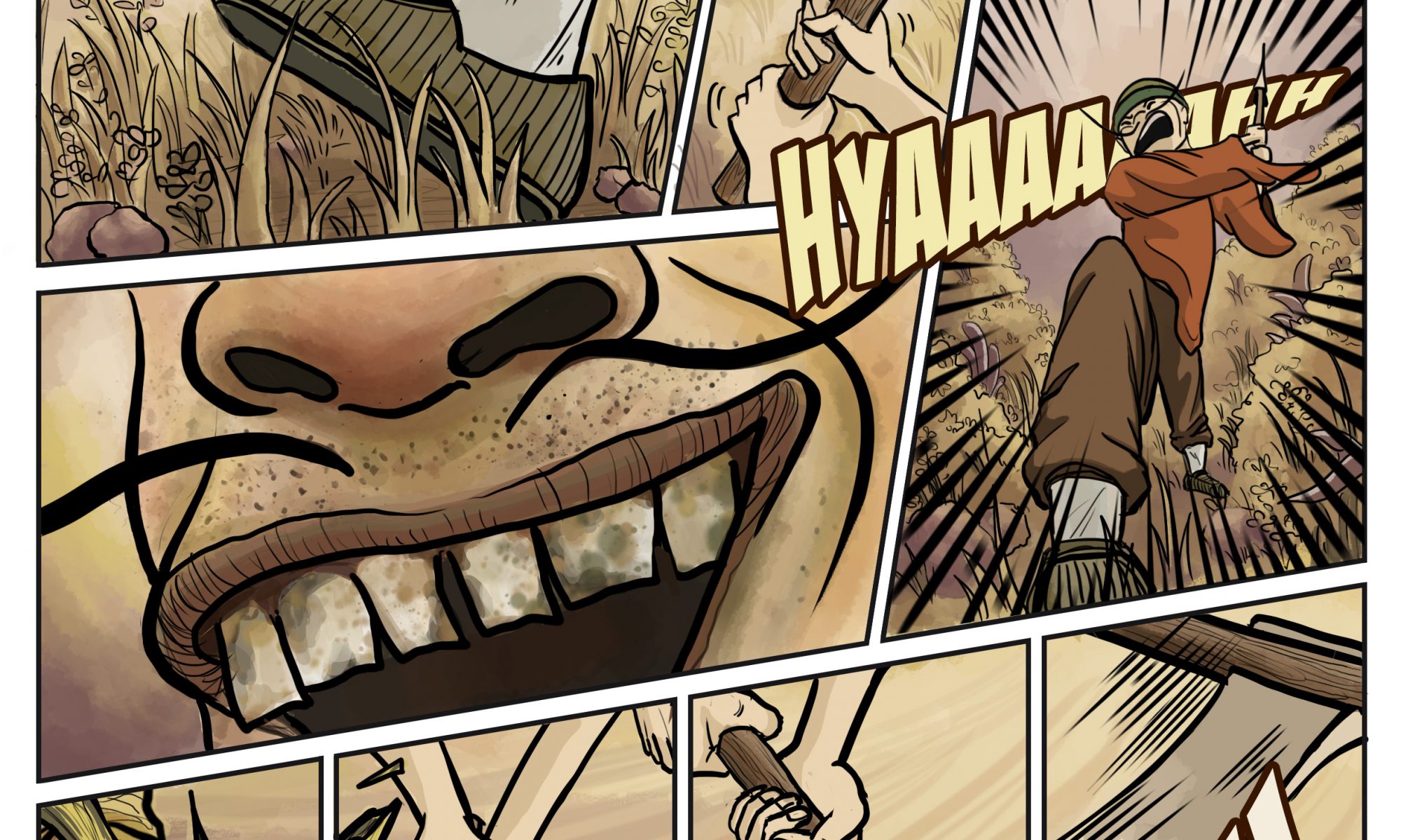
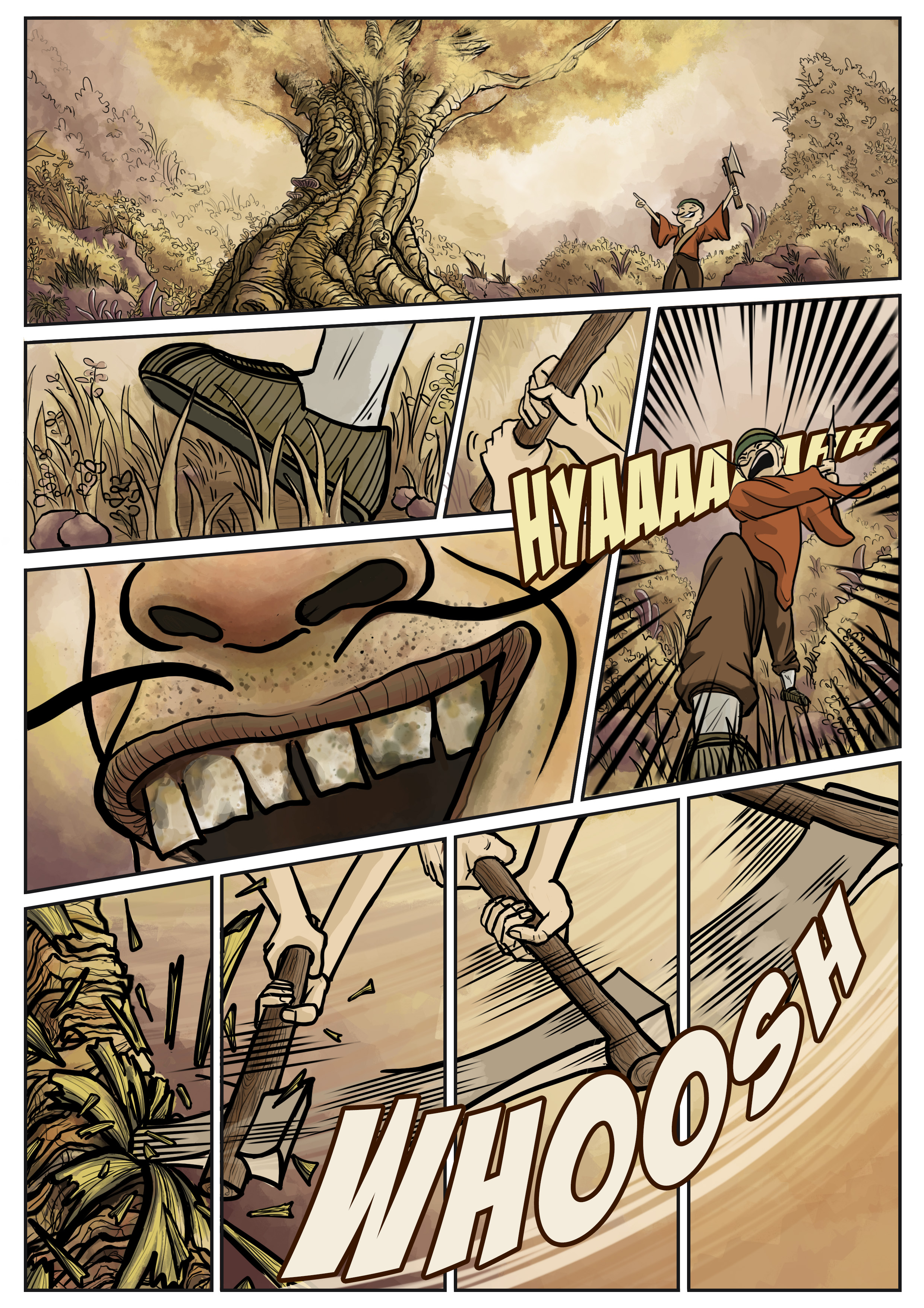
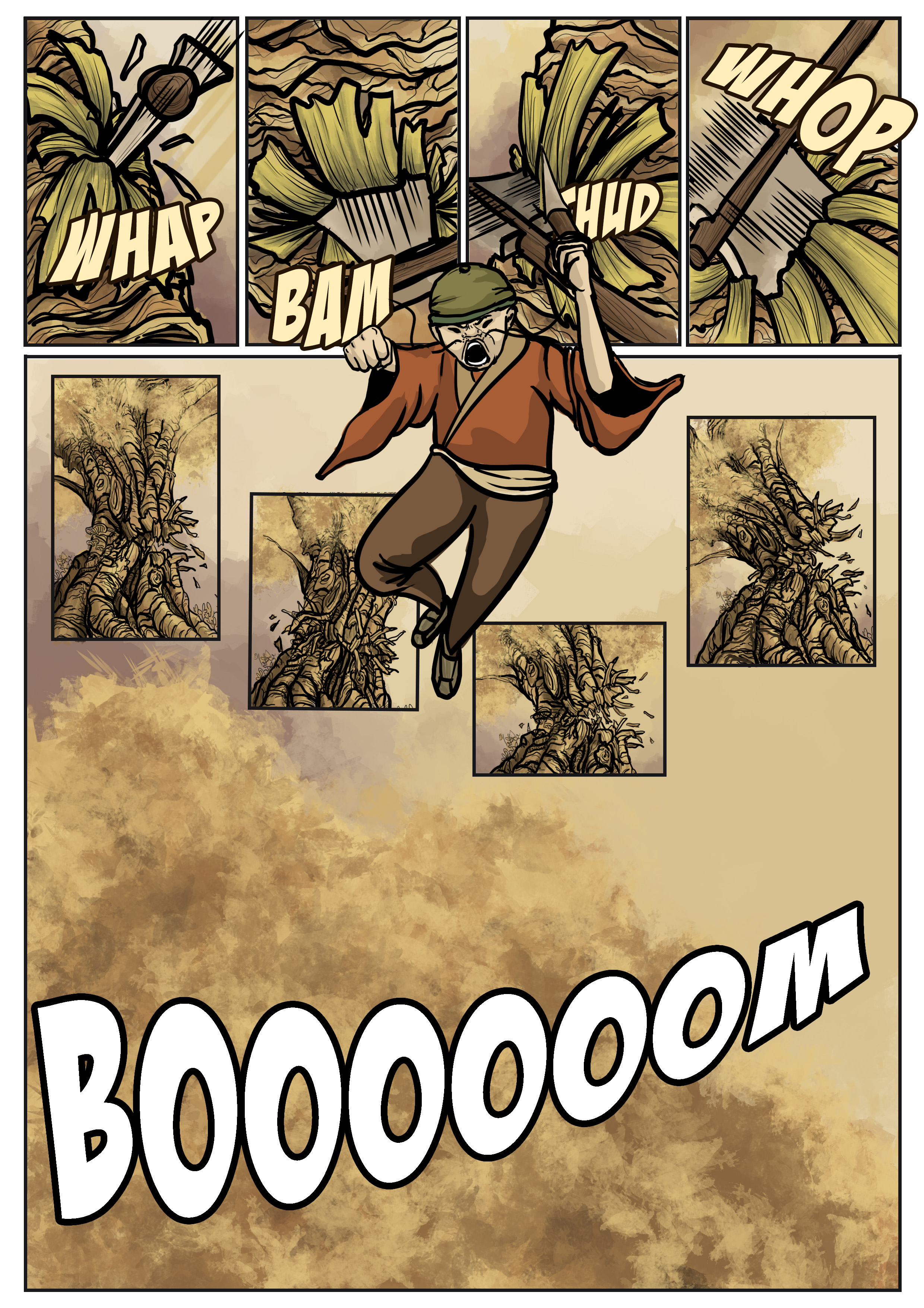
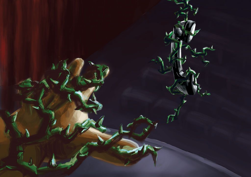
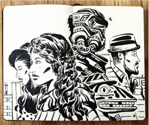
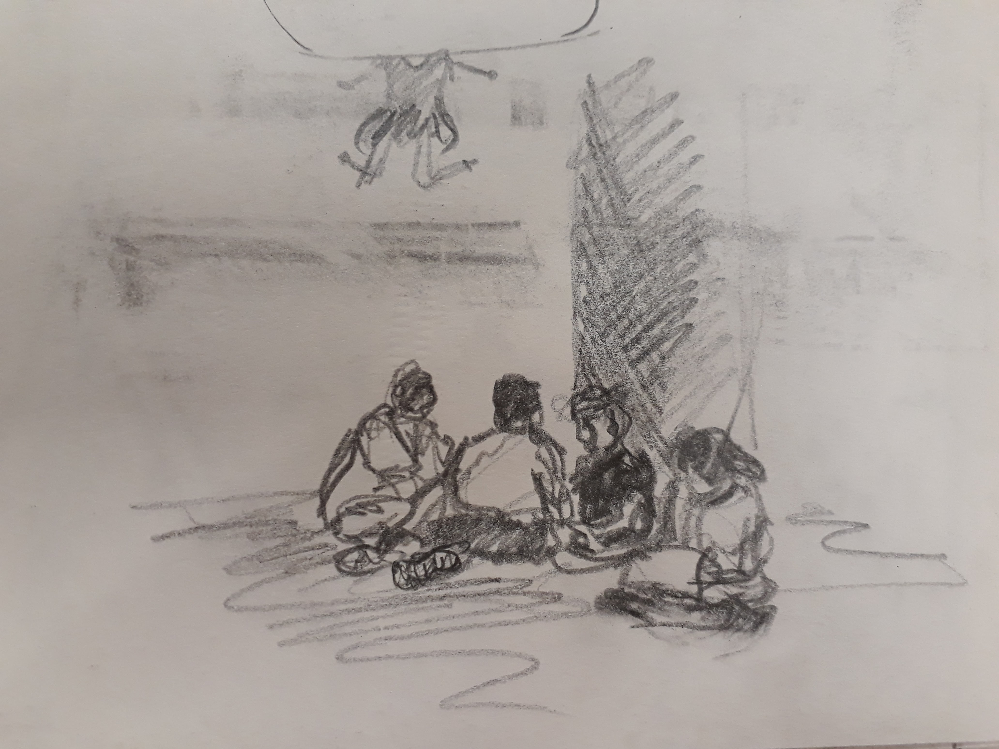
Scene: The man, furious at the fact that the tree is no longer producing fruits with precious pearls, came to cut the tree down.
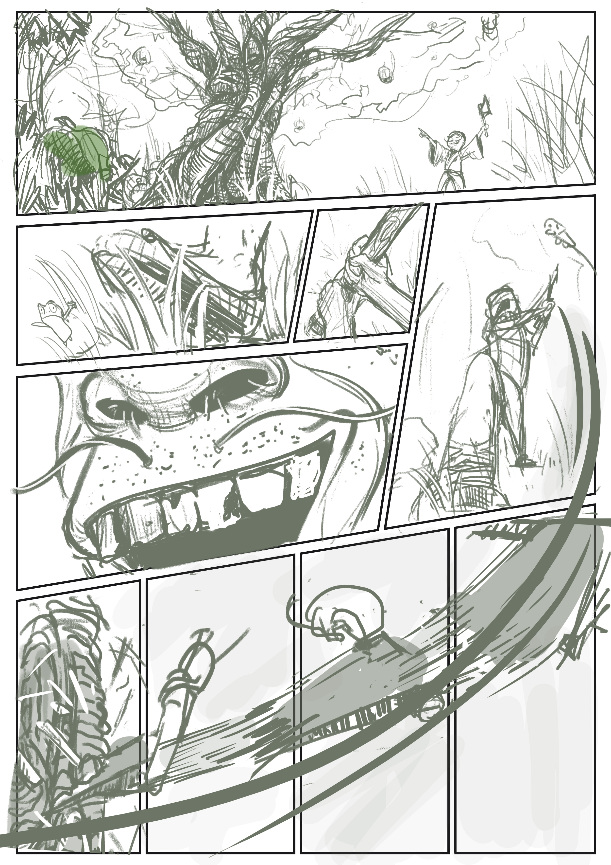
SKETCH
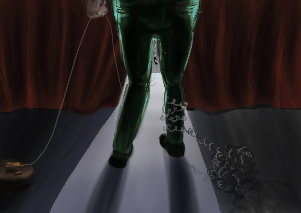
FINAL
Review & Critique:
Did the storyboard / story turn out as you hoped?
Yes, I am quite satisfied with the final page layout, especially because it has went through a lot of revisions. I am happy with the colours as well as I think it brings out the slightly gloomy/ foreshadowing feeling without being overly dark. However, this layout has differed from my initial expectations in the sense that I initially wanted to include the depiction of the felling of the tree as well. However, as I worked on the each panel, I realised that the story will be too condensed if I were to to include both the cutting and falling of the tree. Hence, I left this page as purely illustrating the scene where the man arrives at the tree and starts chopping it with his axe. I believe this gives the reader more room to breathe and assimilate the content.
What would you do to improve it?
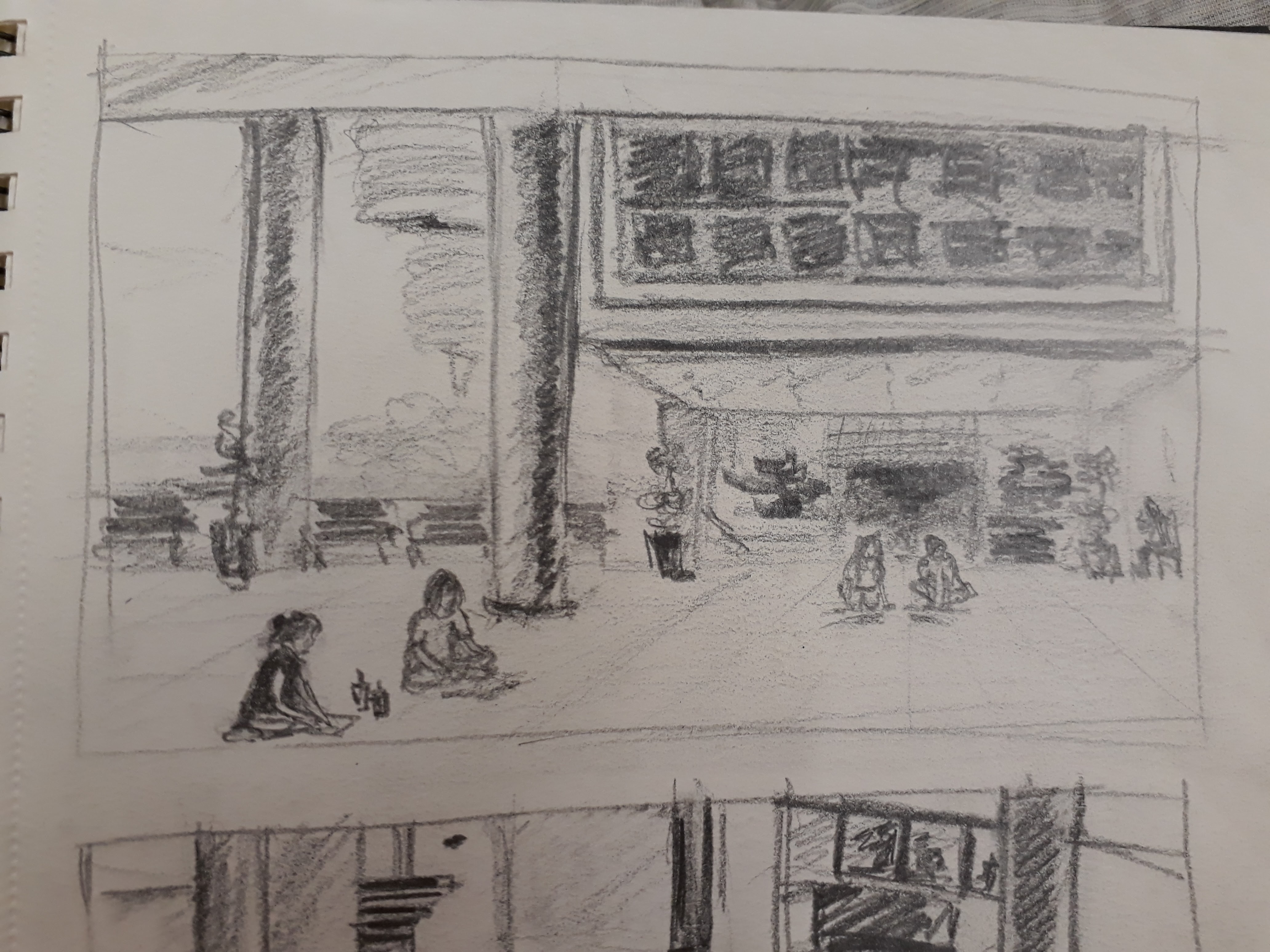
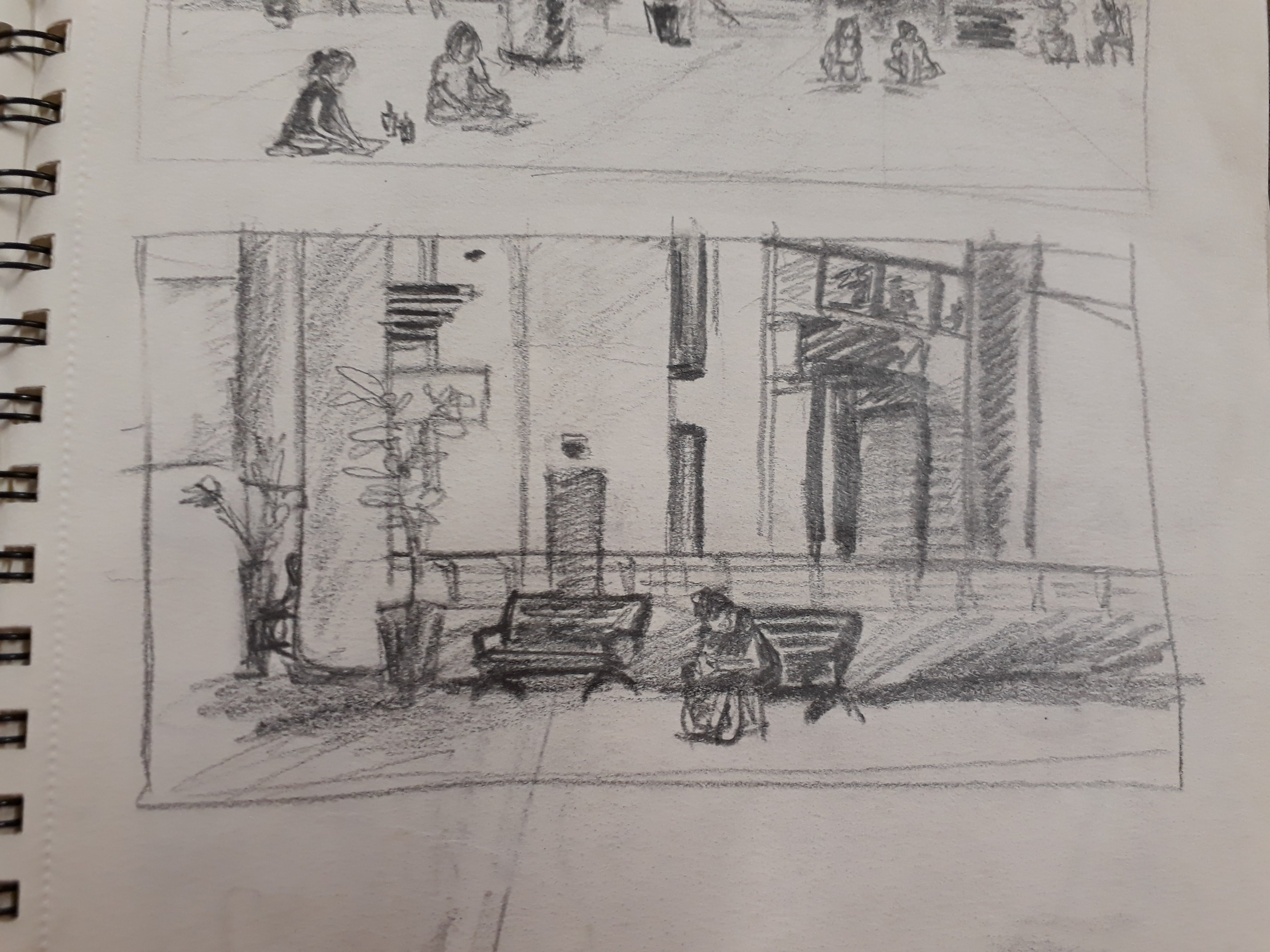
I think the top few panels are not dynamic enough. The part where the shoe steps into the grass should have way more power and strength to it, as if the man is stomping down. I initially included a frog jumping away in shock, which I think would have helped to bring out the stomping effect but I couldn’t draw the frog well so.. ? Also, I think that panel transitions could be better in the cluster of panels on top as well. Perhaps this could be helped if I chose to draw from other perspectives, e.g. I feel that the snarling/smirking mouth doesn’t fit that into the big picture right now.
What skills do you need to improve?
I need to be able to draw objects from various perspectives better. In the bottom panels, drawing the axe actually took me way way longer than expected because I just couldn’t get the shape of the axe to be right.
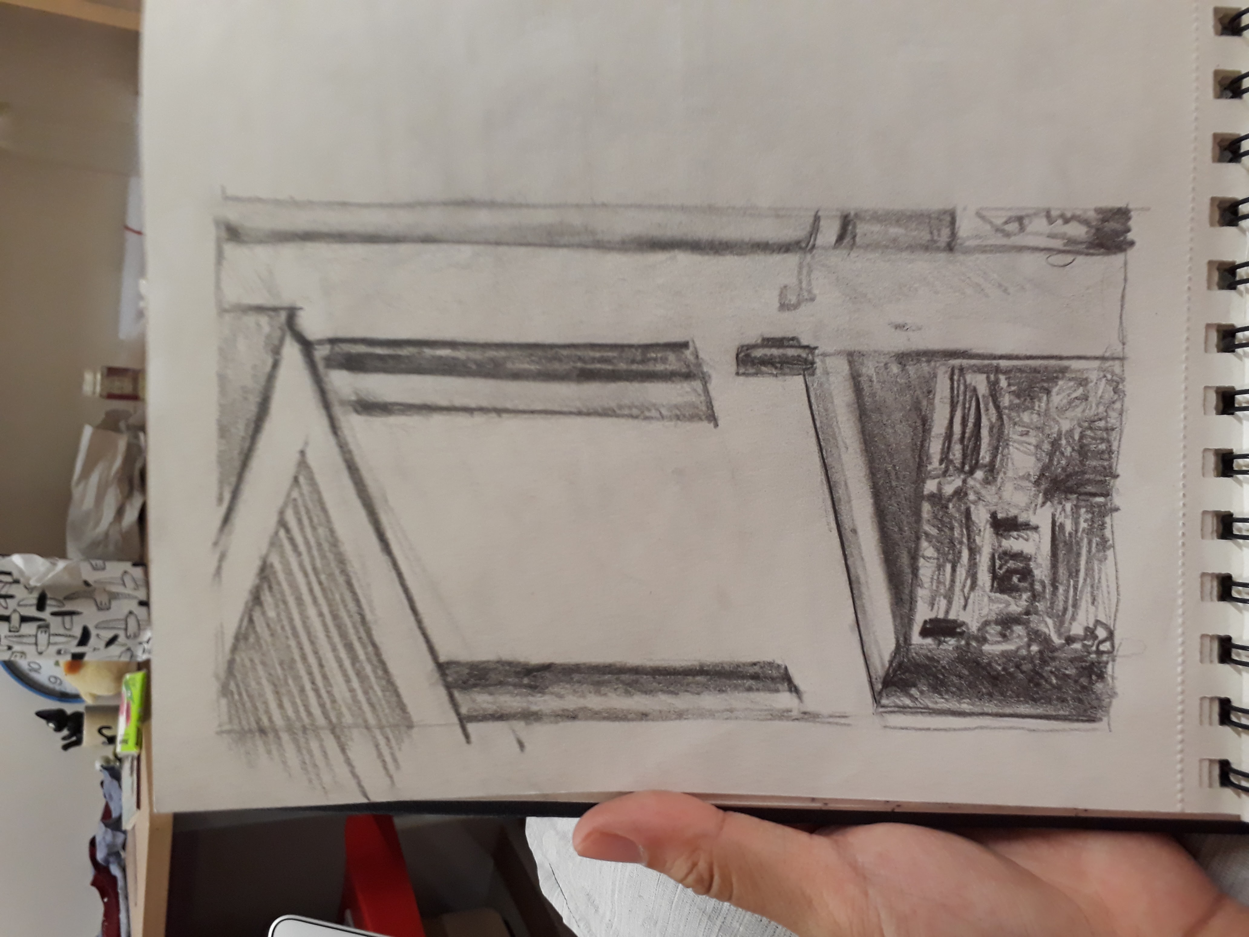
Also, I want to improve on my background design because I am always at a lost of how to fill in the background. I have resolved the problem here by opting a simpler way of filling in colour gradients and simple foliage here and there. I do hope I can learn to draw trees and grass and bushes better.
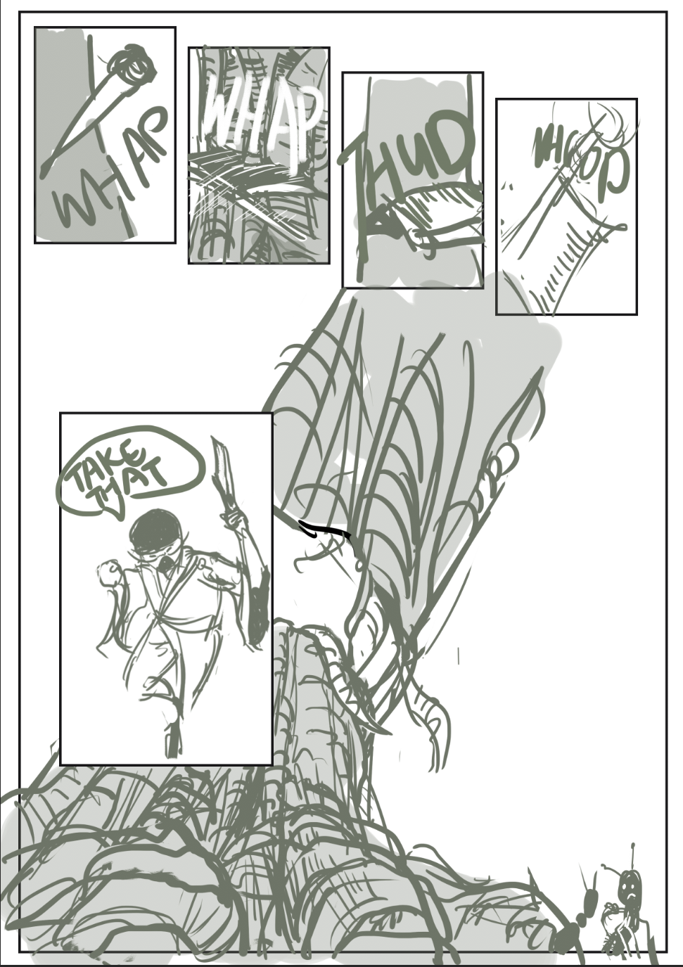
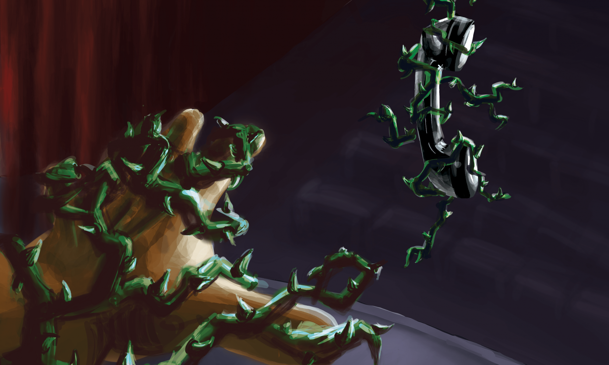
On top of that, I hope to improve panel transitions. I didn’t include the above page layout in the final work because I feel that the transitions are not done well and seem too repetitive. I only realised this after colouring the comic and seeing it from the big picture. The repetitive chopping of the tree coupled with the tree swaying back and forth (which itself isn’t illustrated clearly) made the layout look very boring. I wonder what can be done to make the falling of the tree more dramatic and clearer to the viewer.
What are the most significant things you have learned so far?
This project was really quite challenging for me, and so it was very enriching. Firstly, I’ve learned about panel design. Deciding panel arrangement, their sizes, how close they are to the next, how they serve the story etc., these were more complicated than I thought and a lot of experimentation was done. I think it probably comes with experience to know how arrange and sequence the drawings and panels so that it tells a seamless story that readers can follow easily. I have also learned to play around with perspectives so that the panels are more interesting.
In addition, I have learned to incorporate comic elements which I was rather unfamiliar with since I don’t read much comics. Stuff like sound effects or motion lines or panel-to-panel transition were really unintuitive. For example, just figuring out how to draw motion lines in Photoshop took me hours long already…
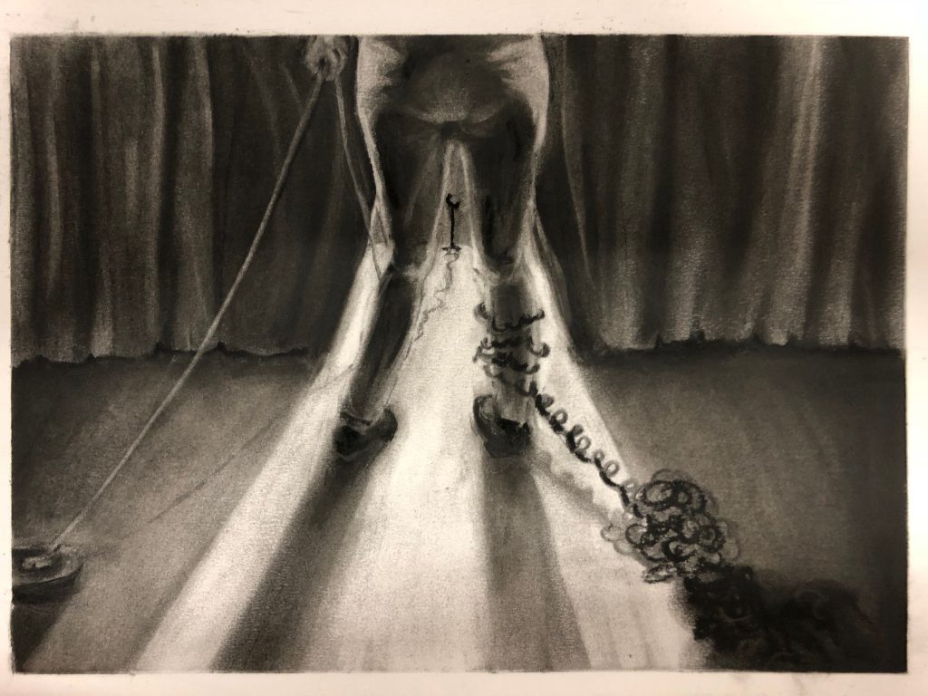
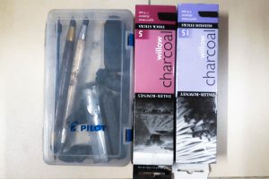
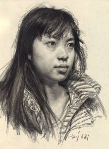


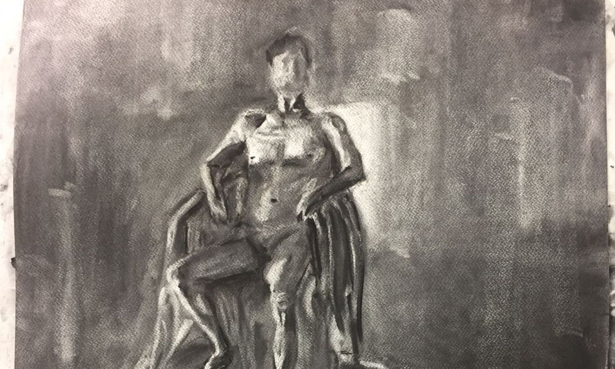
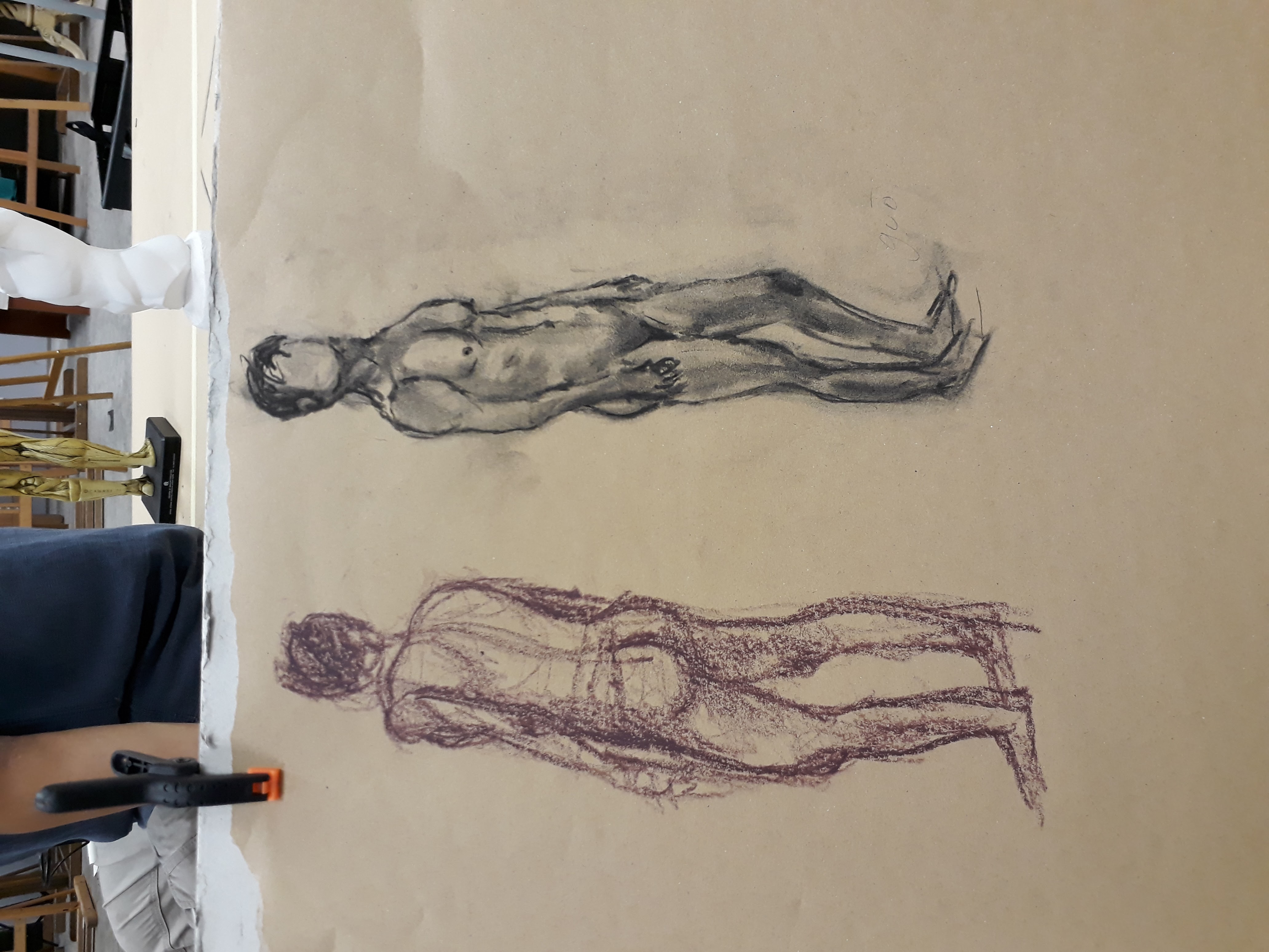
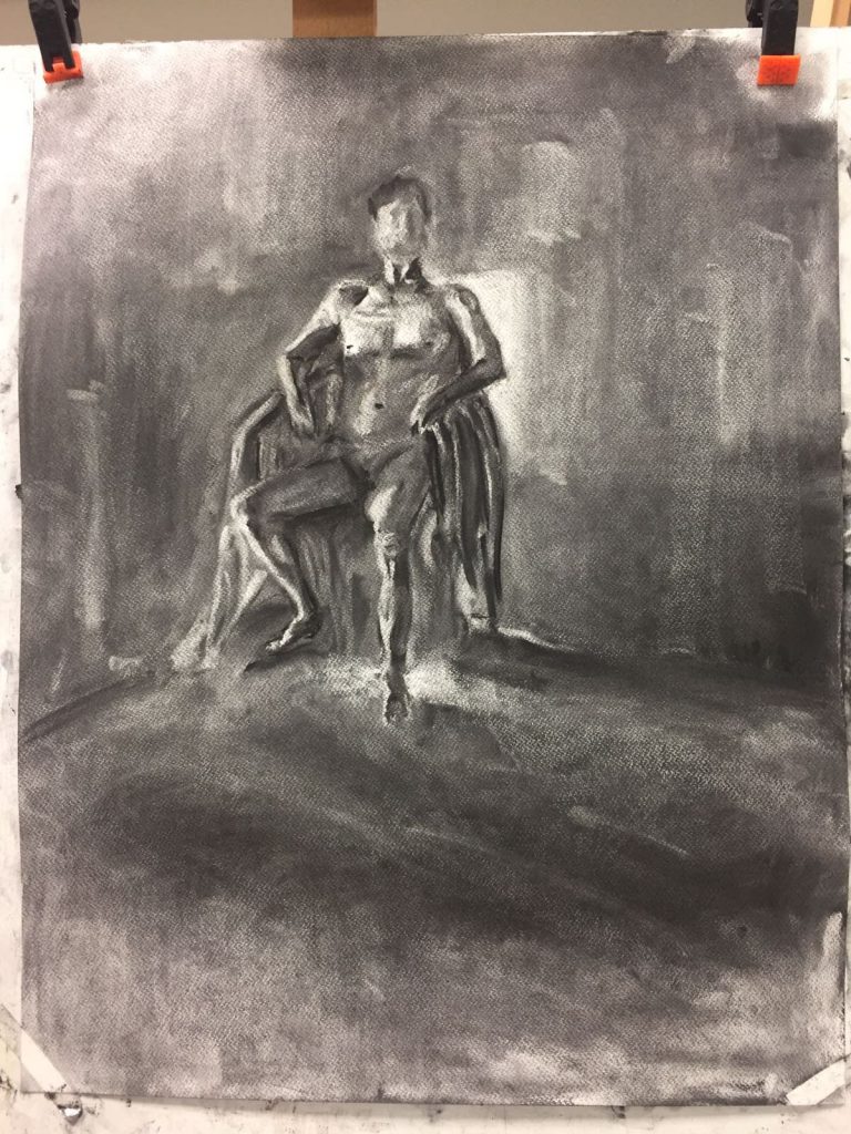 Here, we first smeared the background with charcoal so that it is mid-tone black and then brought out the human form by using an eraser. This exercise helps us to identify the brightest and darkest parts of the human figure, and this aids us in elucidating the form accurately.
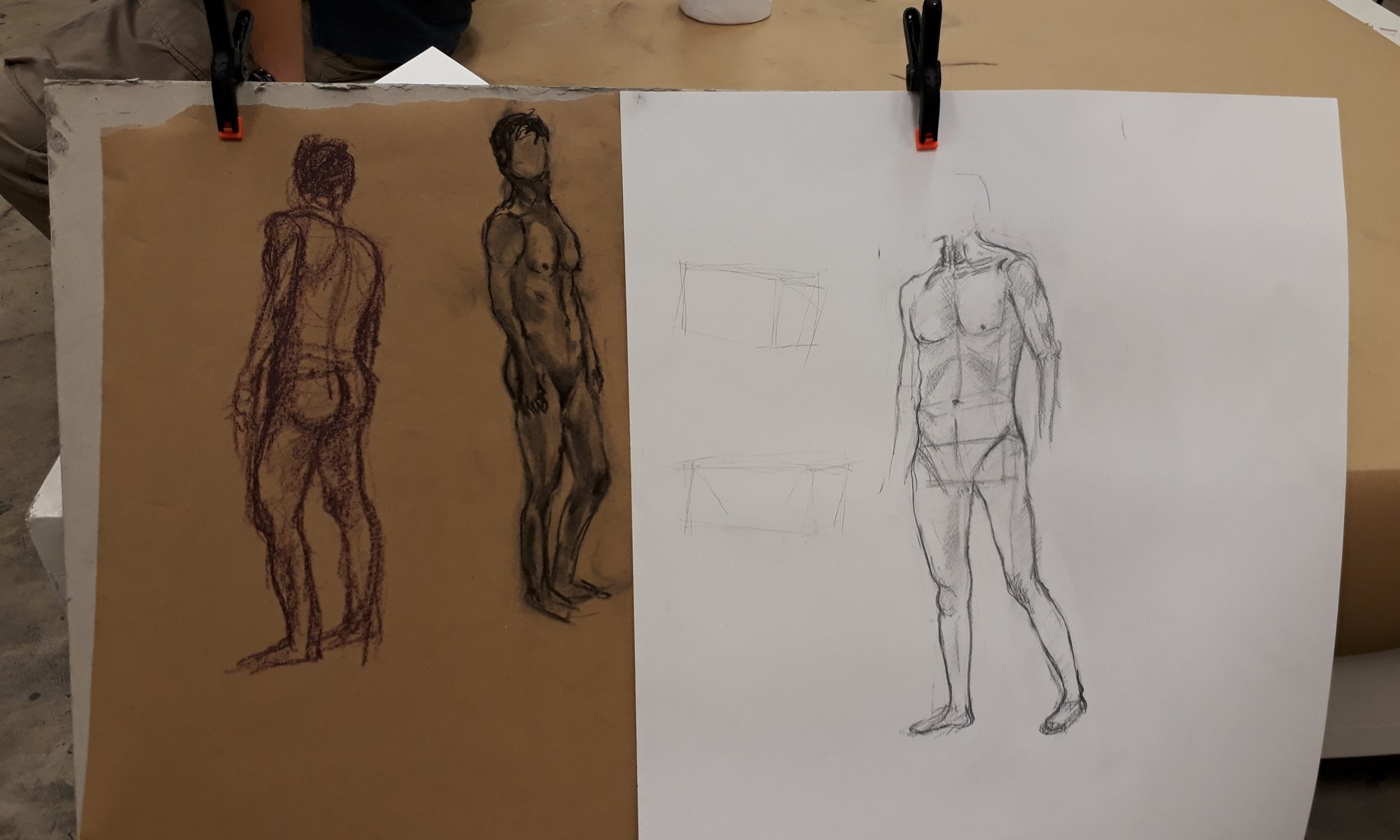
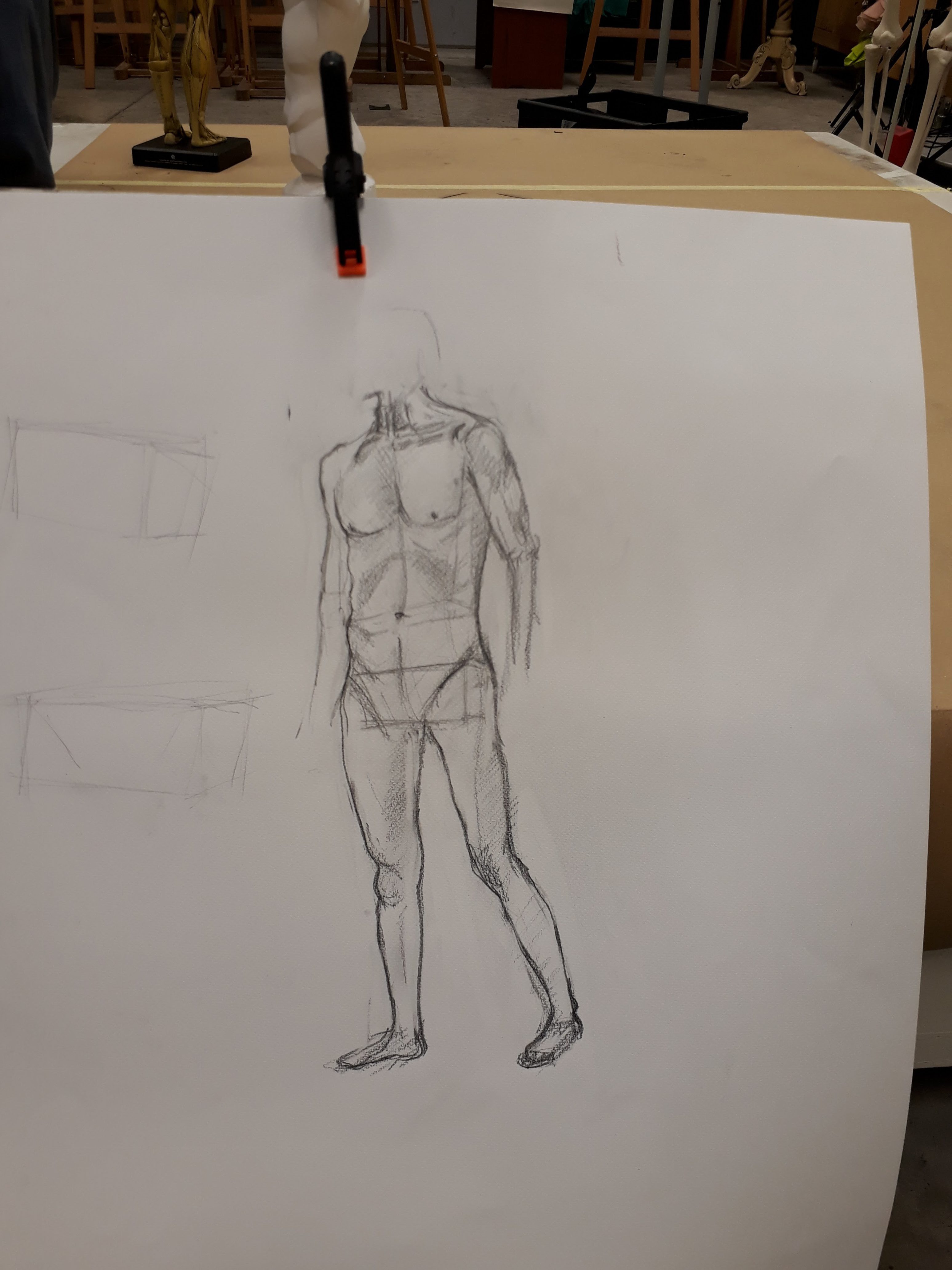
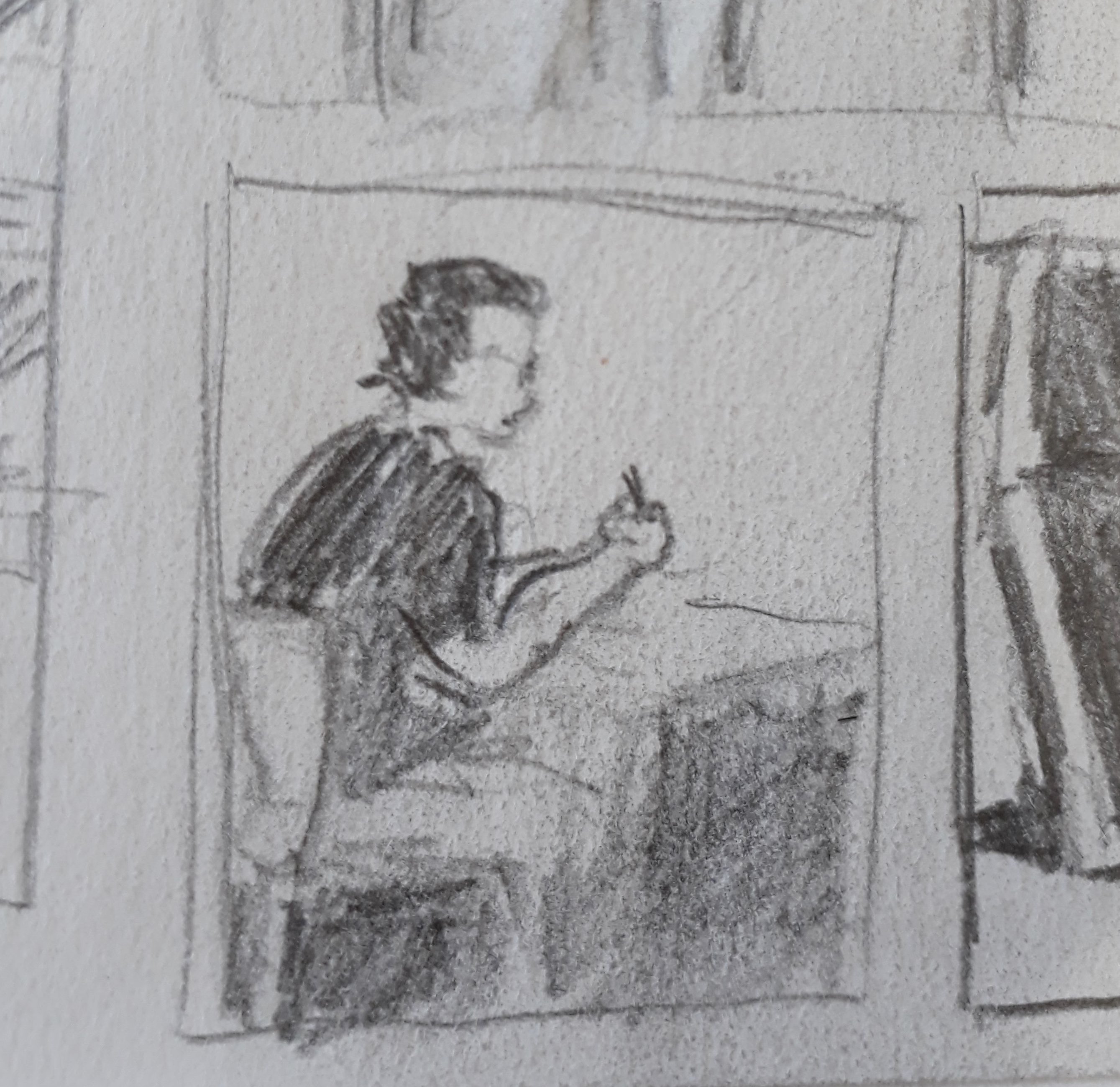
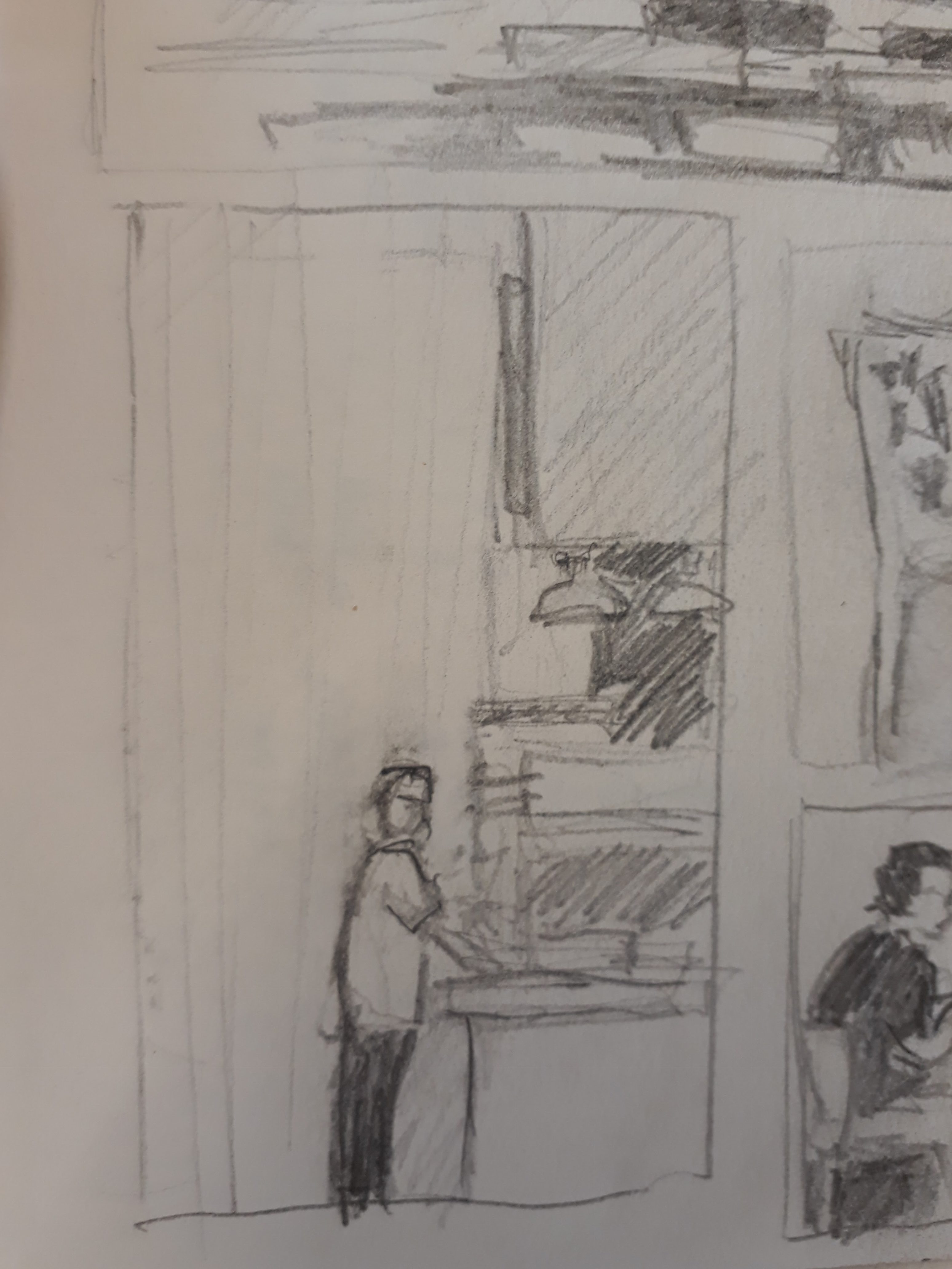
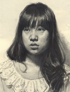
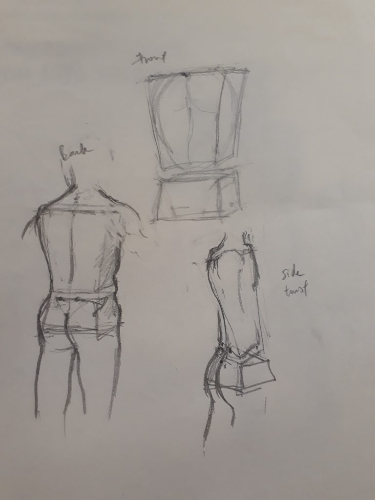 Proportions feel rather off here. Also, I did not know that the boxes should be rectangular instead of taking a trapezium shape. In the bottom right sketch, I was confused by the twisted torso of the model and thought that my boxes should be distorted as well. However, Prof told us later that we should be thinking of the boxes themselves as representing immovable blocks (we can’t twist our ribcage or pelvis after all). What gives rise to the idea of the ‘twist’ is by displacing the alignment of the top and bottom box.