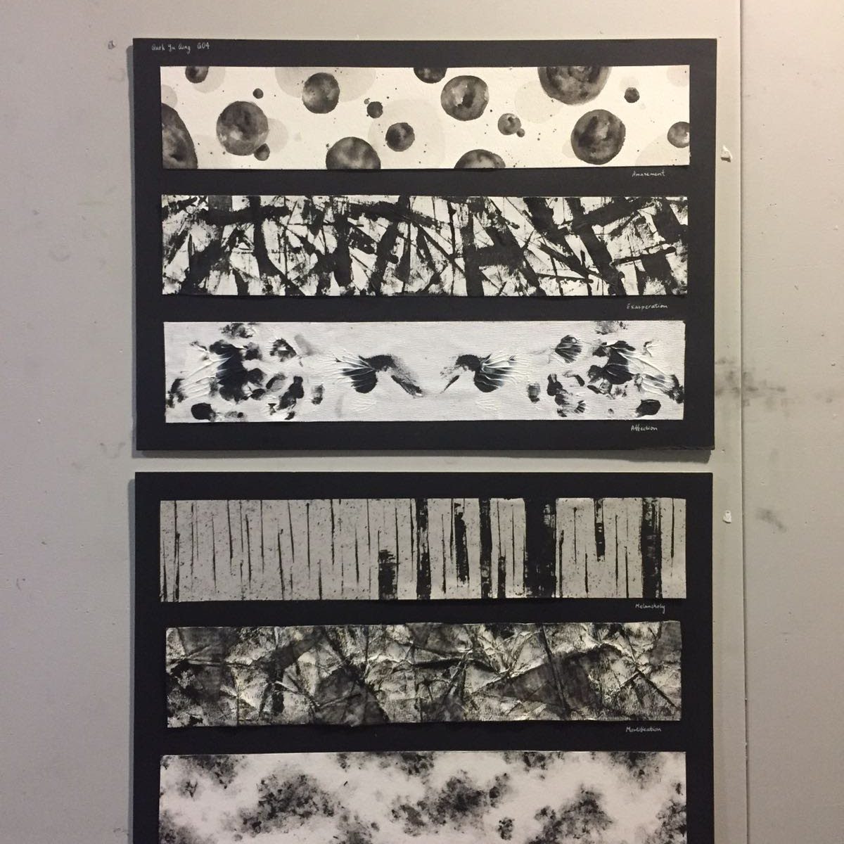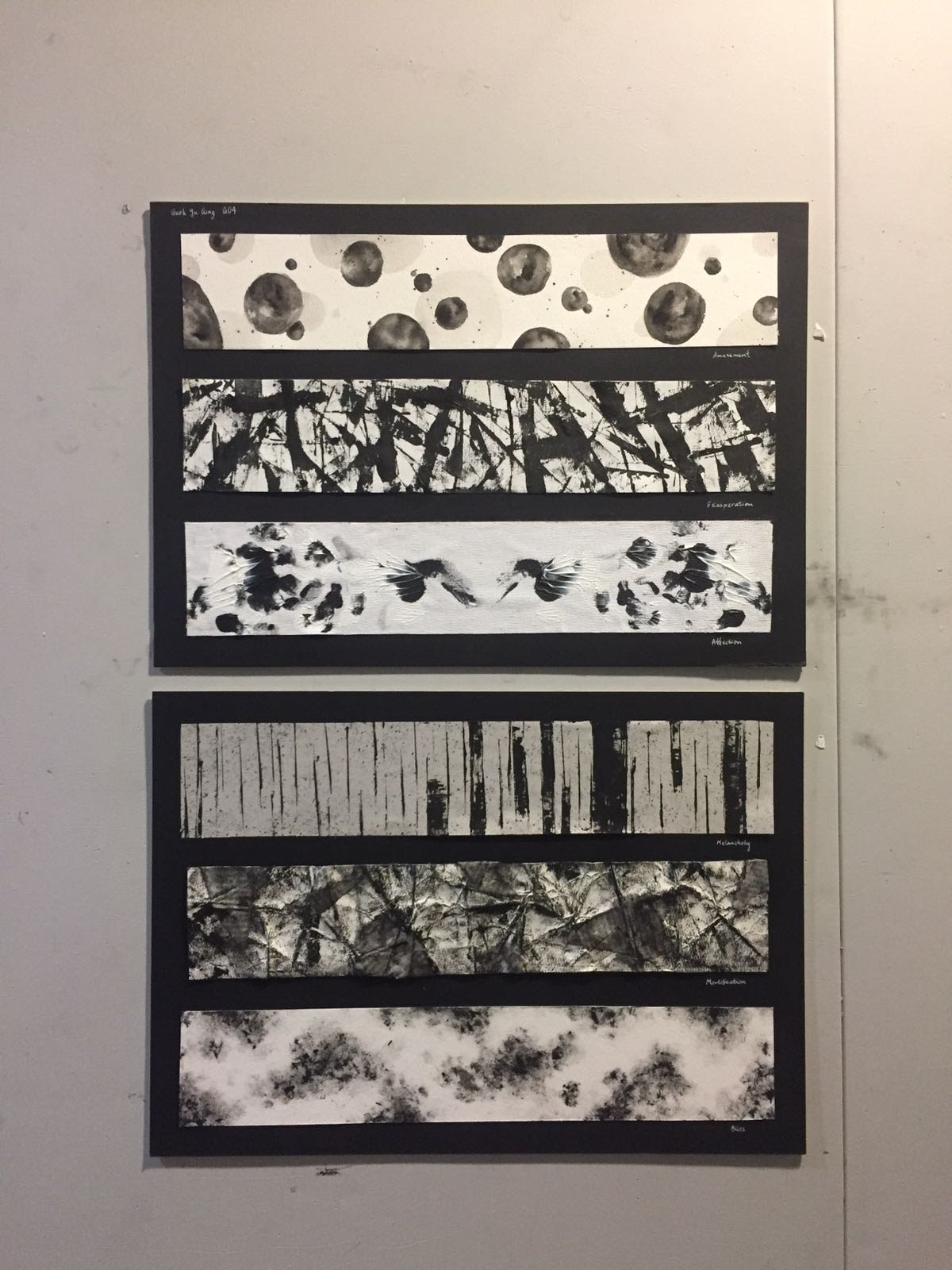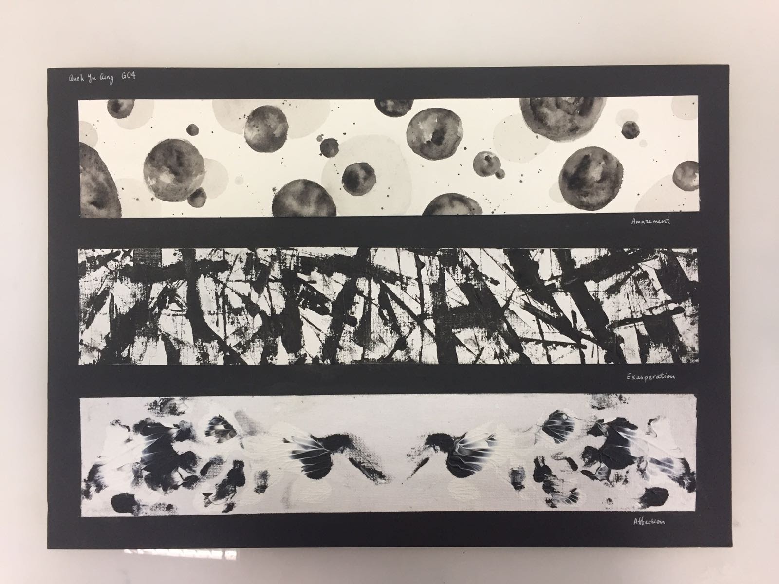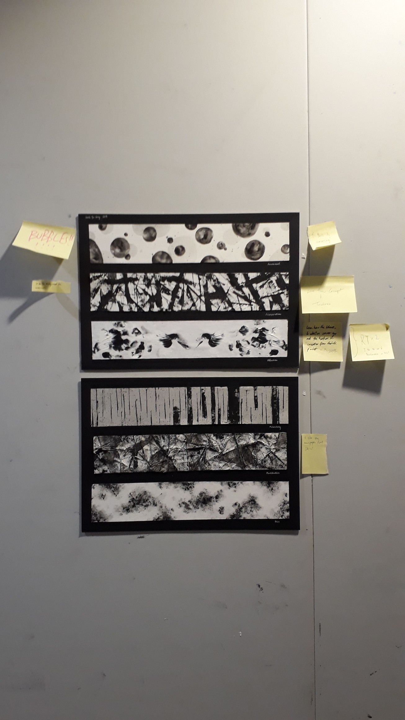
For this assignment, we were tasked to present 4-6 images that express basic human emotions. I chose to work on the following 4 emotions: Sadness, Fear, Disgust, and Happiness in the format of a visual narrative. I chose the Digital painting medium to develop my digital painting skills, which I am not very acquainted with.
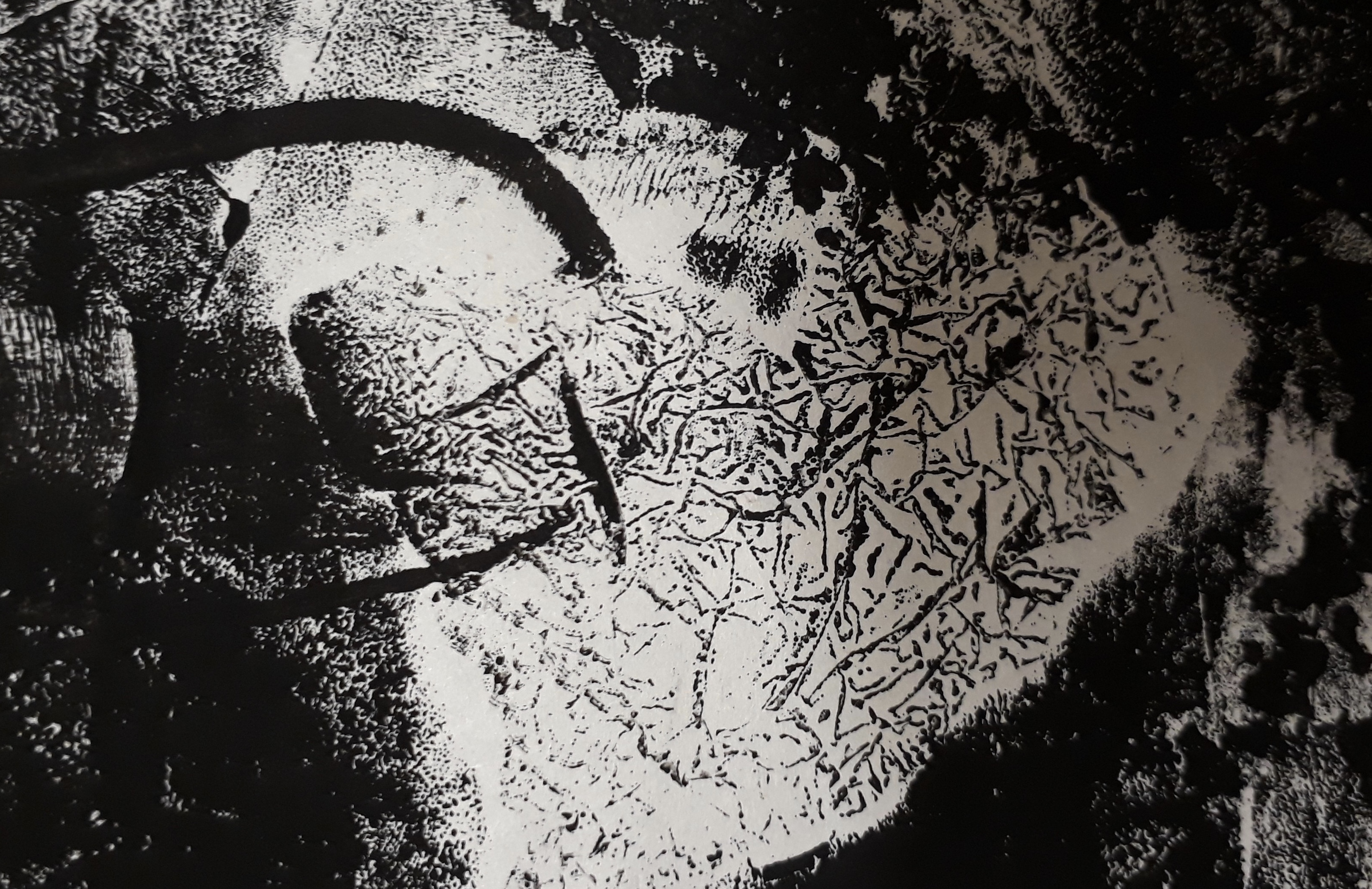
Initially, I wanted to express the emotions through the different portrayals and actions of water. I aimed to explore how a still and tranquil water body can evoke acute feelings that are raging and turbulent. However, I realized that I was unable to confidently illustrate water due to its abstract character that was difficult to personify. Having reached a dead end, I then turned to a more feasible representation — the figure of a little girl. I deliberately did not illustrate her facial features (or even specific details) so as to keep the enigmatic character that leaves room for the faculties of the imagination.
Initially, I wanted to express the emotions through the different portrayals and actions of water. I aimed to explore how a still and tranquil water body can evoke raging and acute emotions. However, I realized that I was unable to confidently illustrate water: it was intensely difficult to personify due to its abstract and turbulent character.
Having reached a dead end, I then turned to a more feasible representation— to use a protagonist in space to relate to emotion. I chose the figure of a little girl: a symbol of naivete, purity, capriciousness and endless wonder. I deliberately did not illustrate her facial features (or even specific details) to leave room for the faculties of the imagination.
With this new representation, I had to update the story type— from distinct and atomic frames to a narrative that flowed from the first frame.
I drew upon my initial ideas of emotive water as the background to complement the protagonist’s emotions. To elicit the same emotion in the audience, I also employed colour theories of emotion for each scene.
The first draft of the story is:
- Sadness: Father leaves daughter; rainy scene
- Fear: Daughter alone in room, buckets collecting dripping water, imagination ran wild in fear of the dark and of ghosts
- Anger: Daughter shouting to the stormy sea in frustration, in the direction of the foreign town
- Happiness: Father returns; dew hanging off greenery shining in the sun
Upon further development to add more content and excitement to the story, I came up with the final story:
- Sadness: Father leaves daughter; rainy scene
- Fear: Daughter is left alone in her room to fend her fear of the dark. Her imagination ran wild as she faintly hear something being dragged across the room. In actual fact, a ‘ghost’ has took her shoes away.
- Disgust: Daughter realises the next morning that her favourite shoes are gone. Wearing her old slippers, she went out in search for it. Wet mud splattered all over her skirt and legs, evoking a strong sense of disgust from her. (note: not disgust at the fact that someone took her shoes because this will be too strong for a young girl)
- Happiness: She found her shoes! In fact, the ghost was on its way to return the shoes as well, after modelling and making its own ghost shoe.
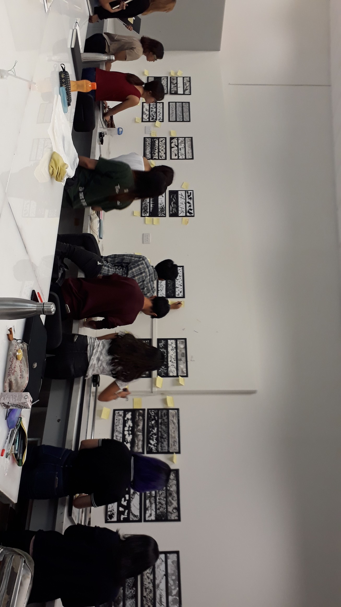
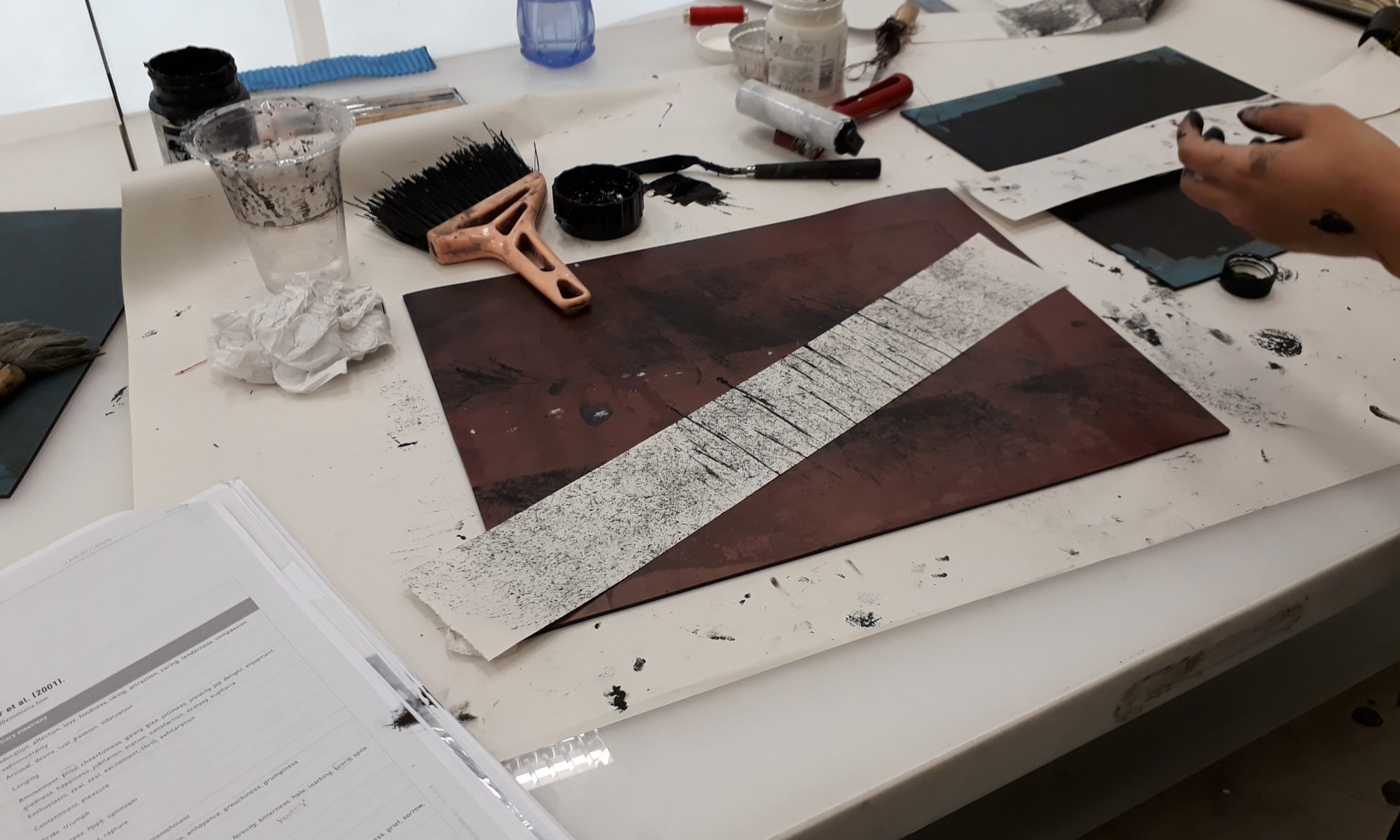
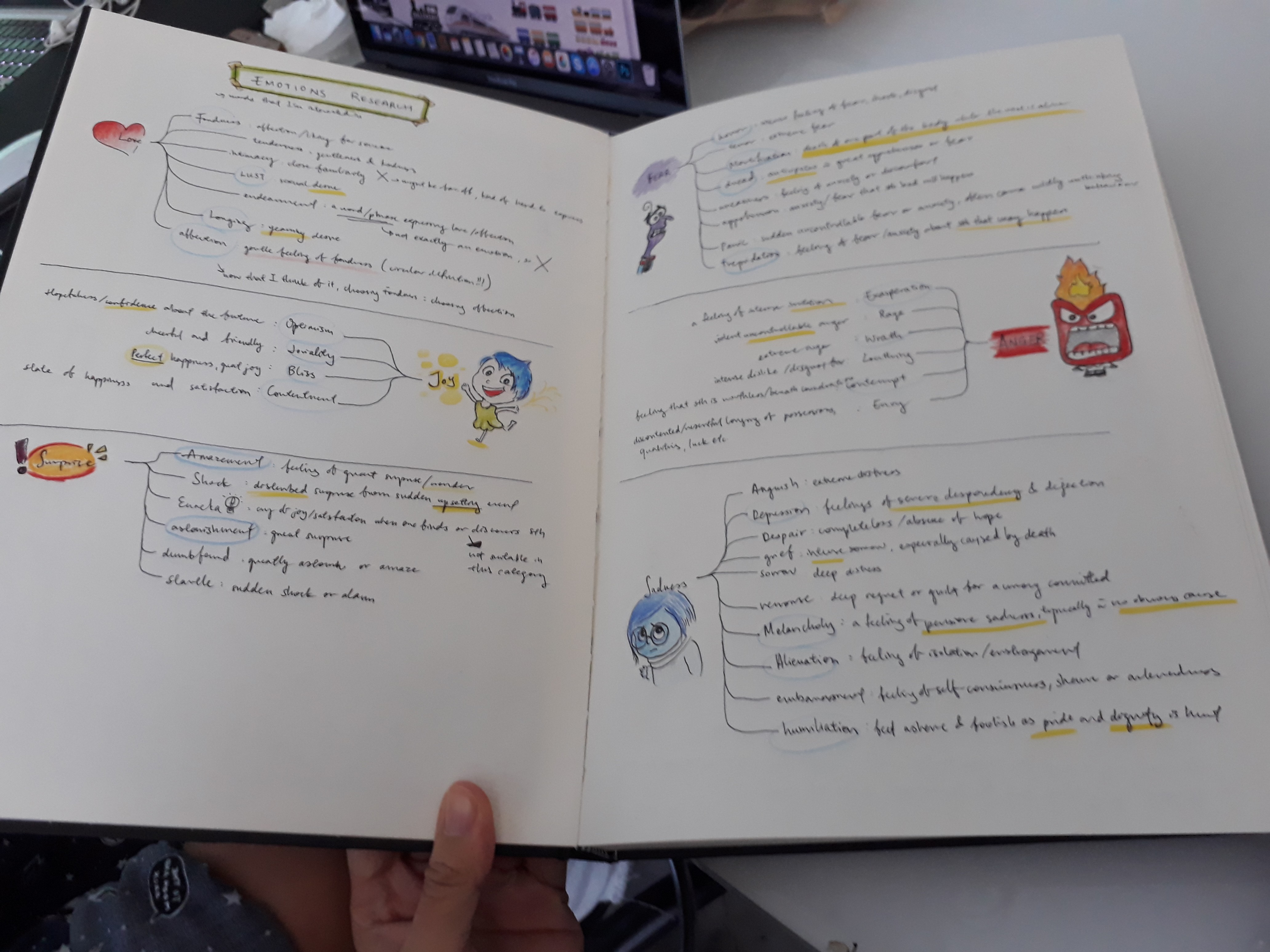
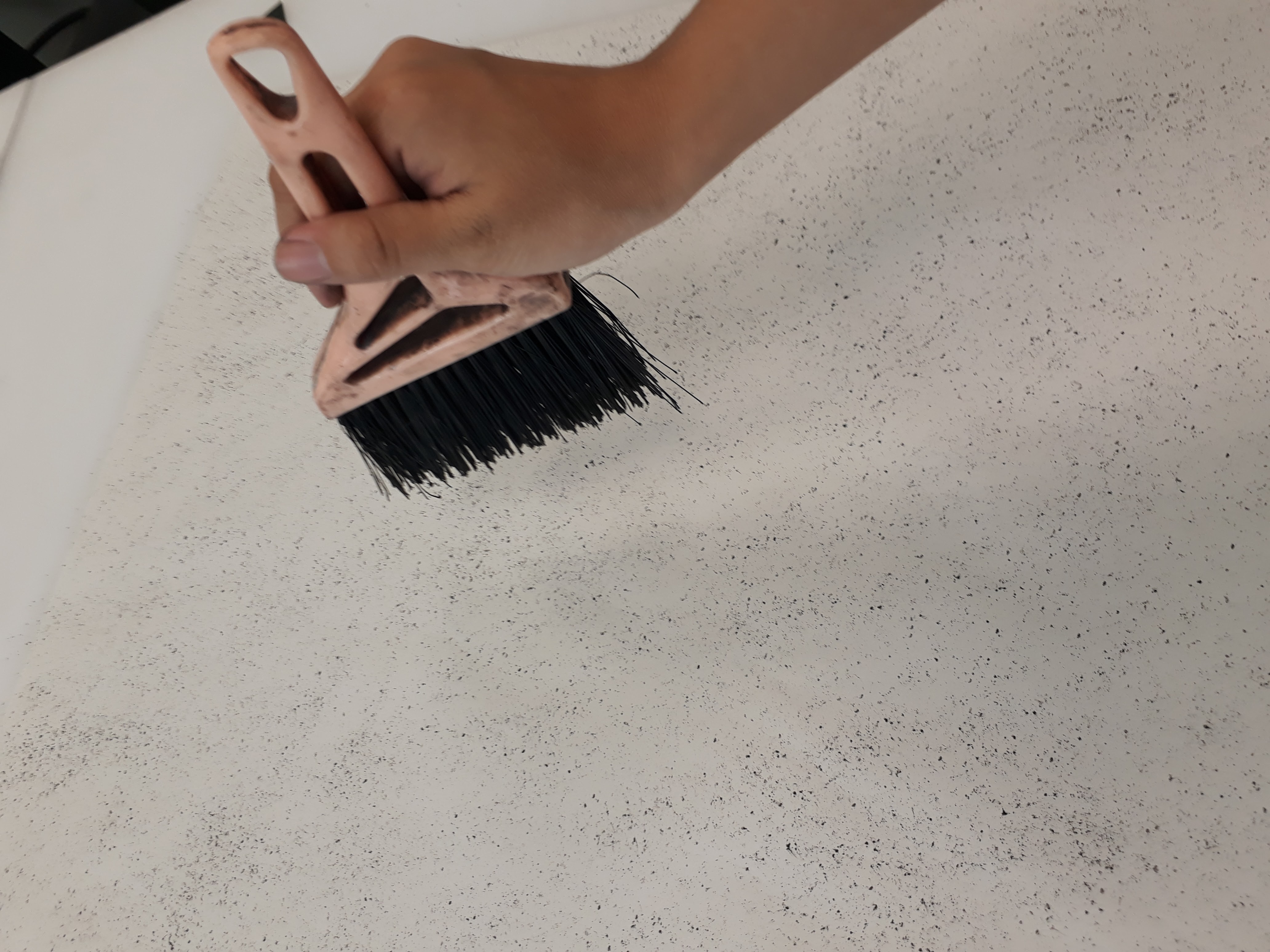
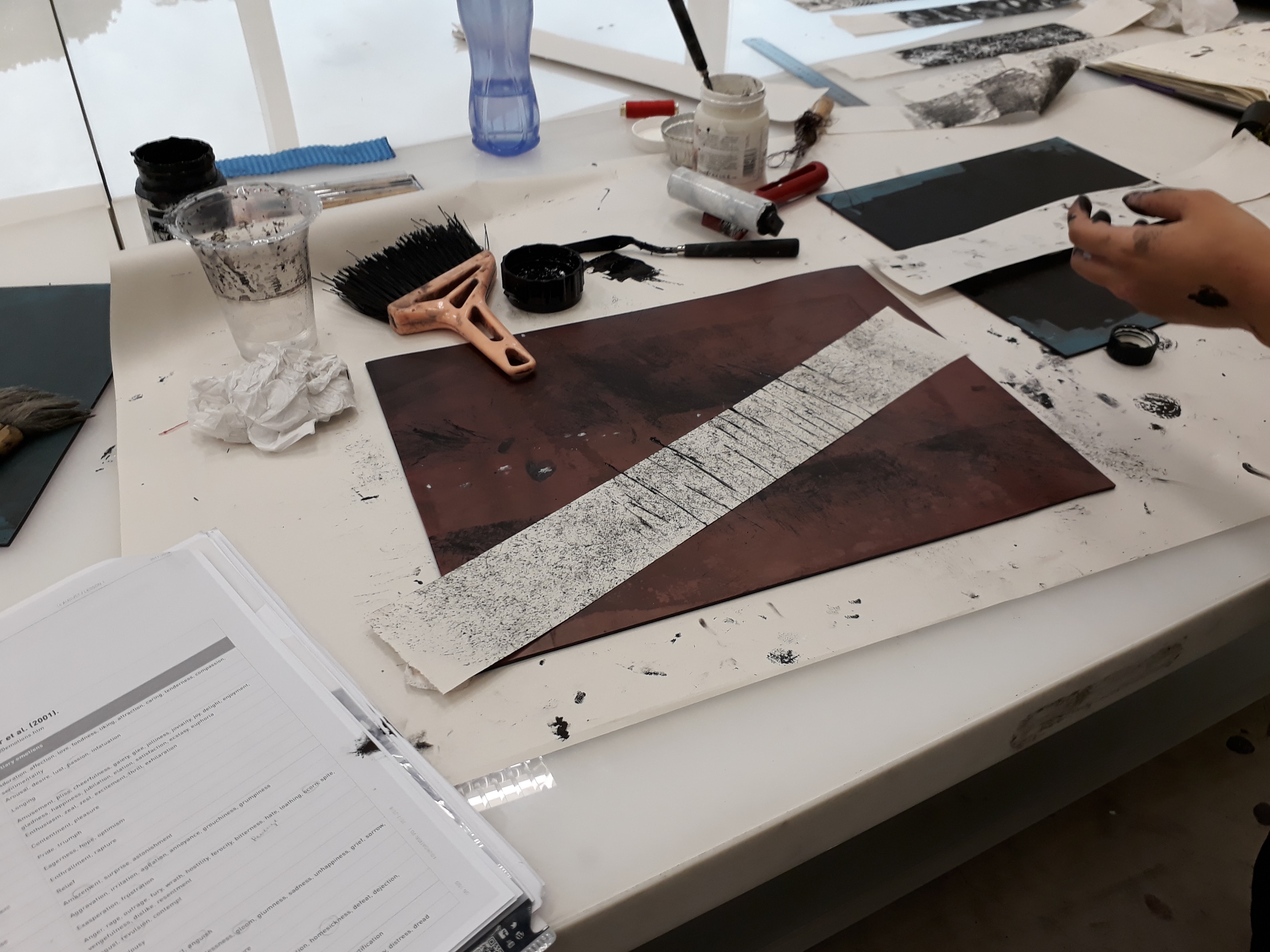
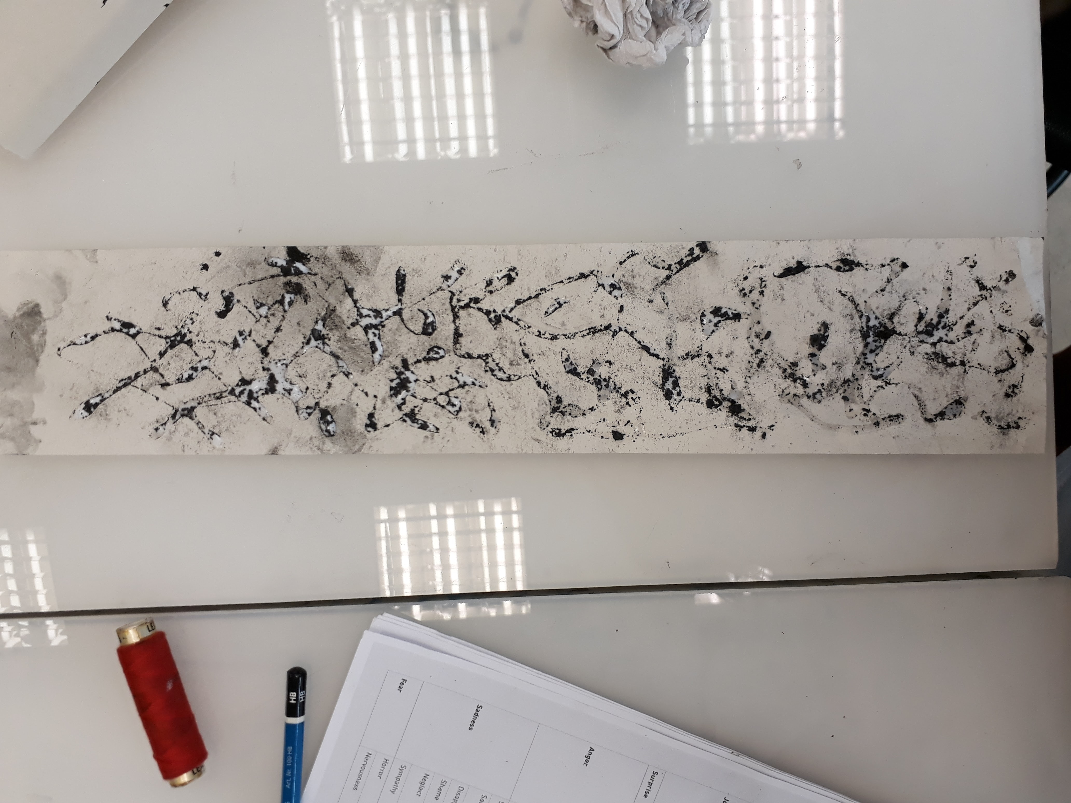
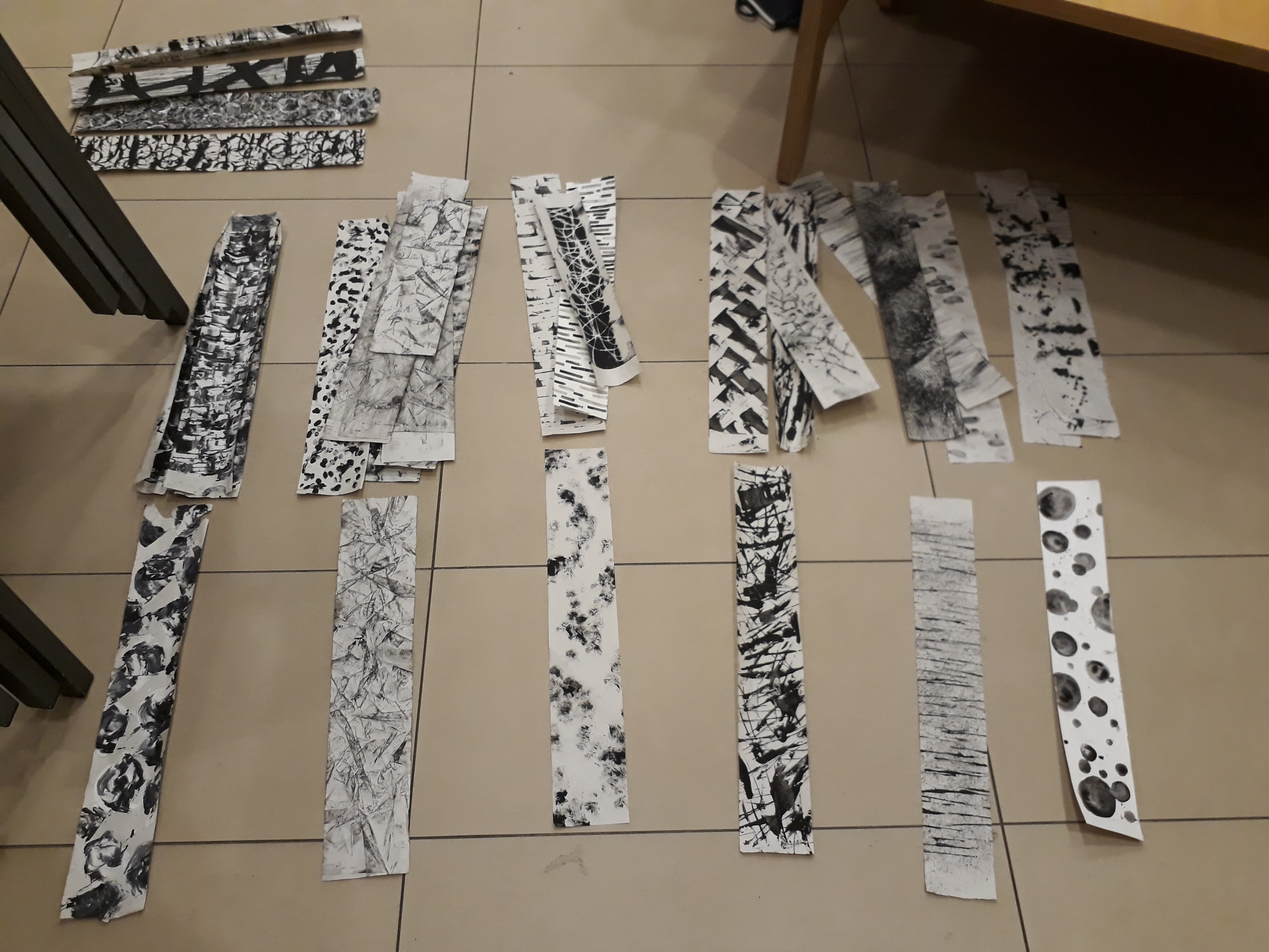
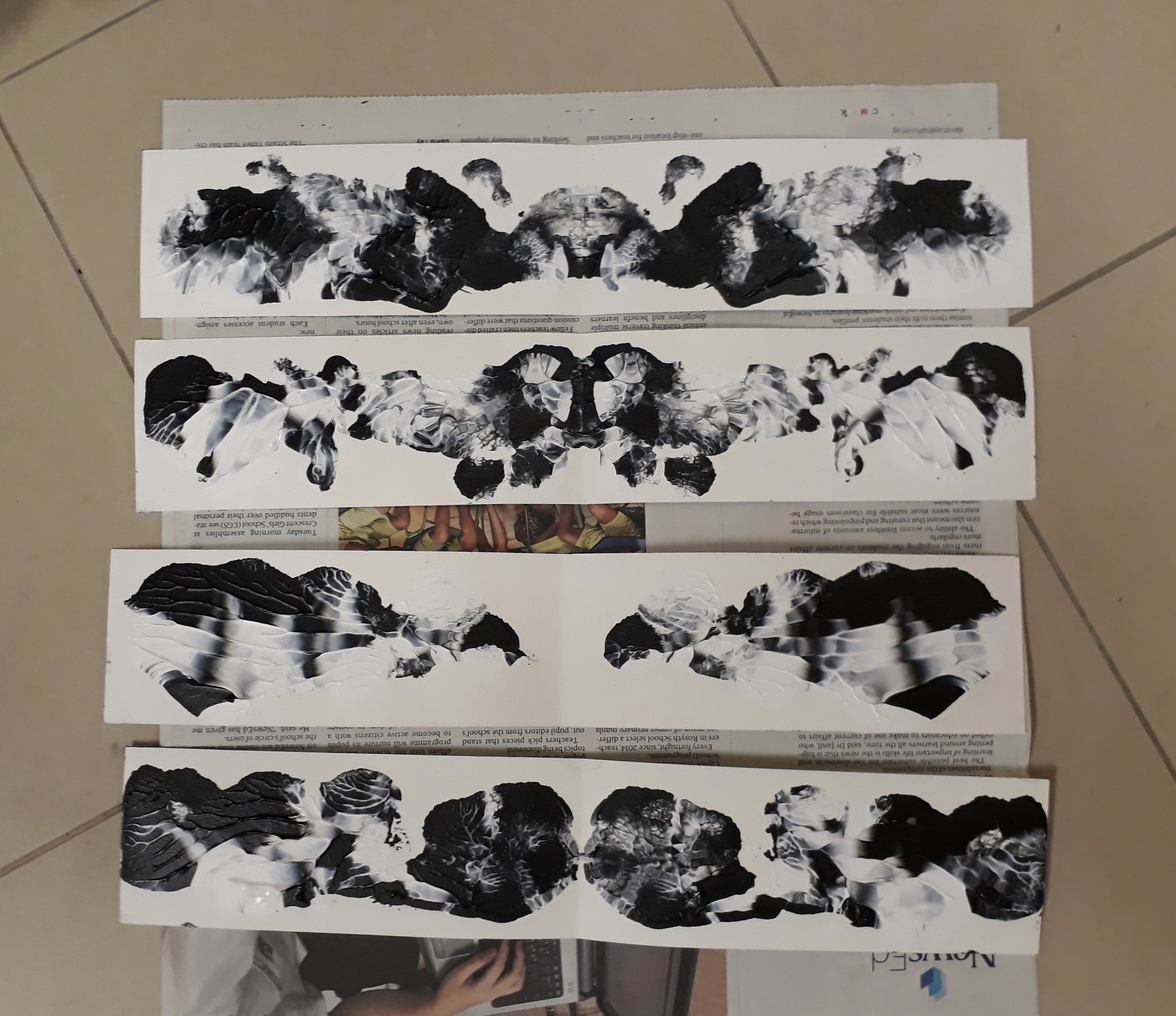
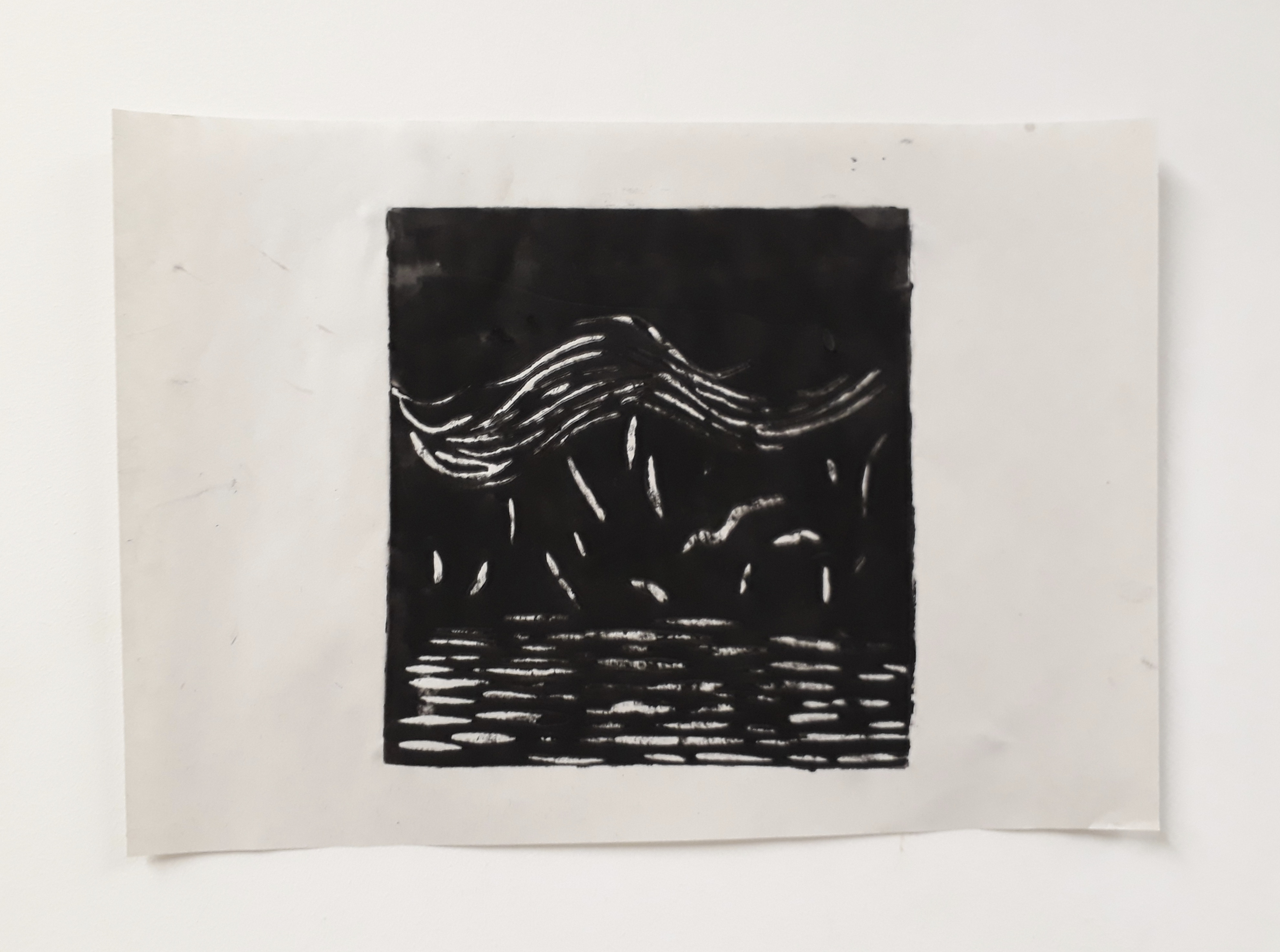
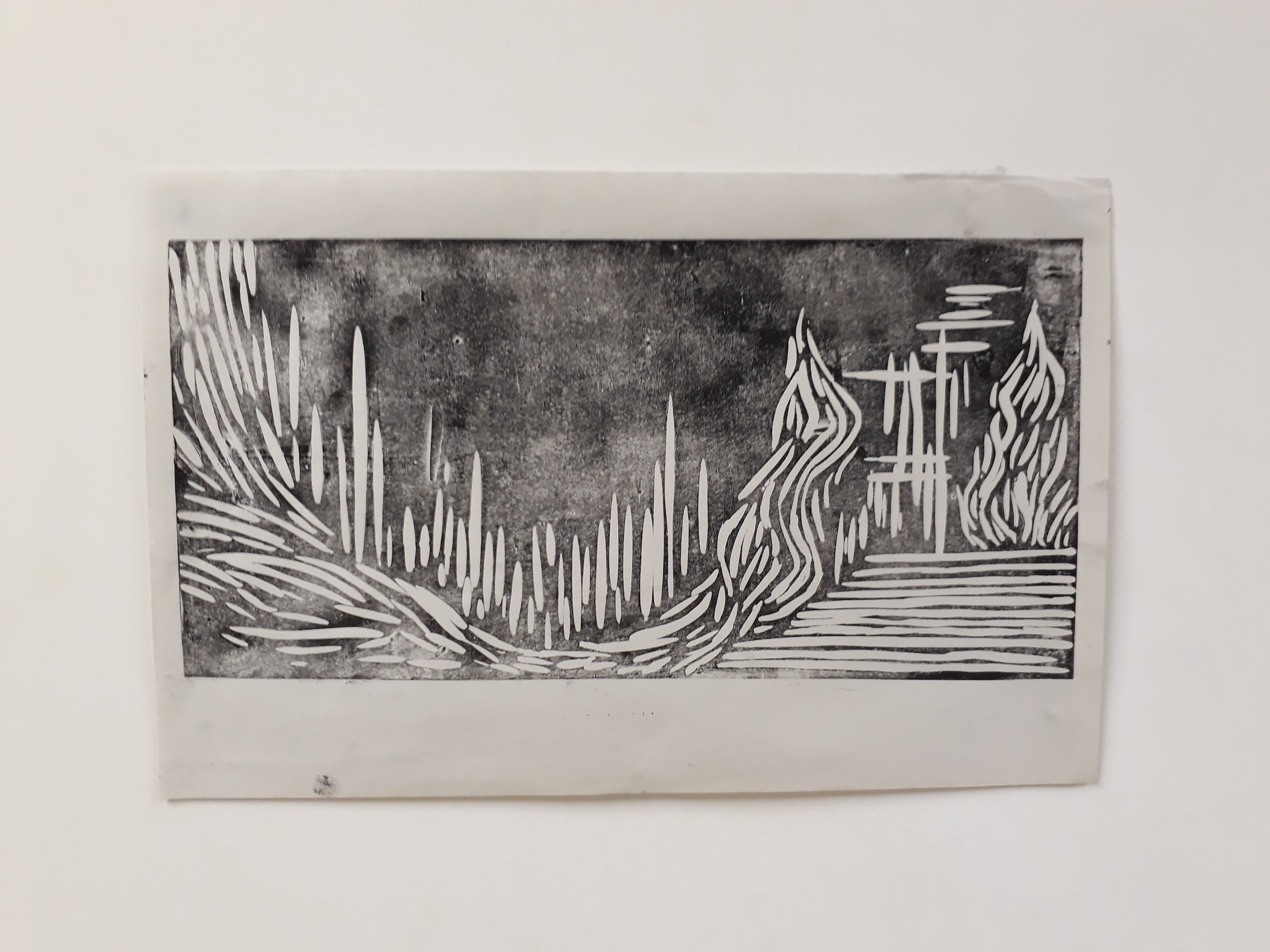
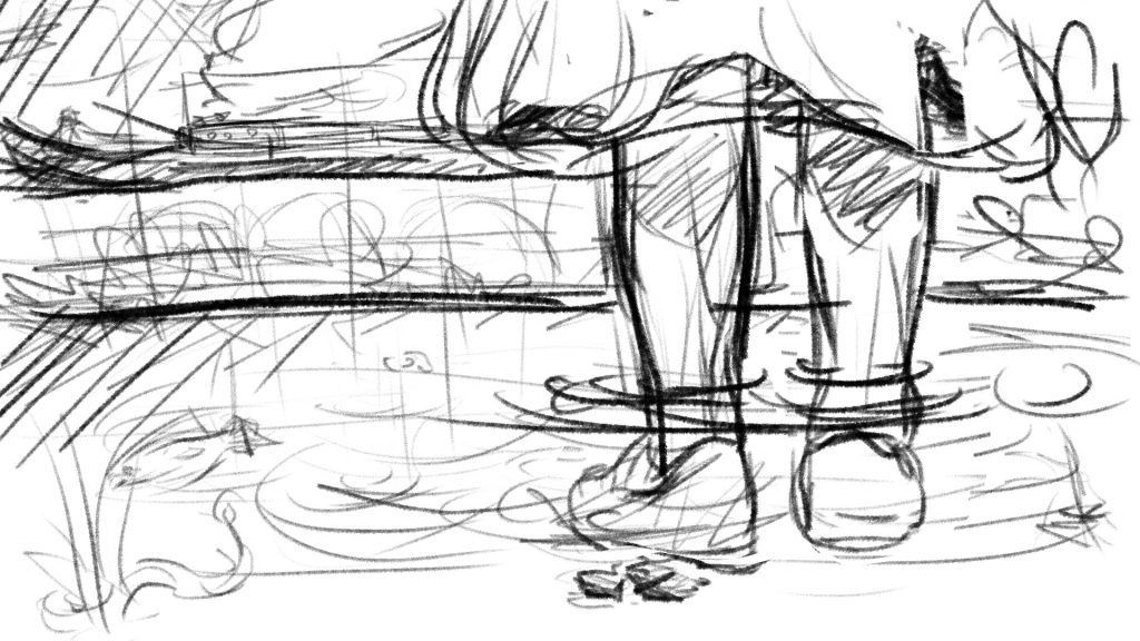
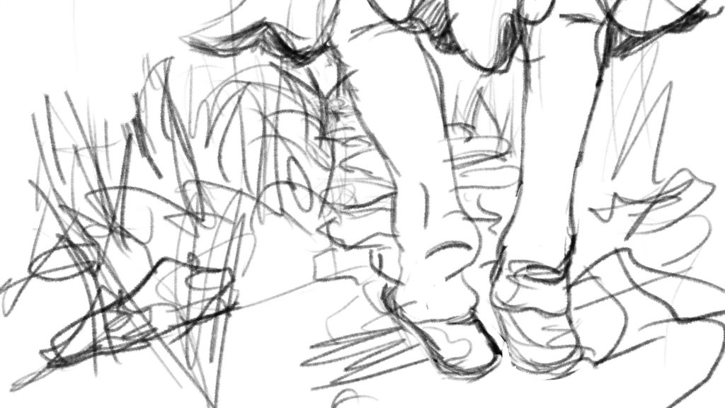
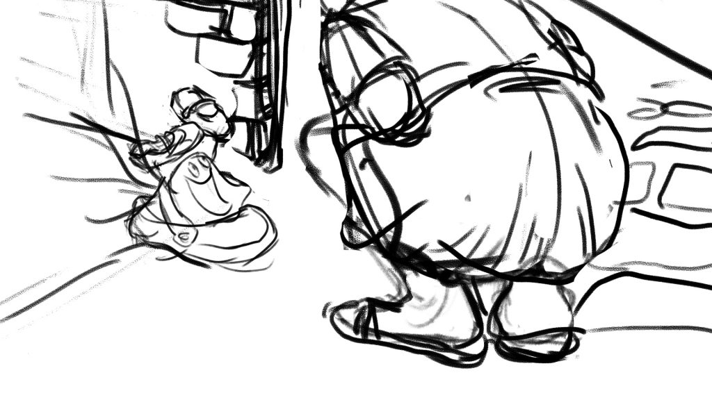
Some sketches that I drew before starting work. I feel that I work better when I sketch my thoughts on pen and paper.
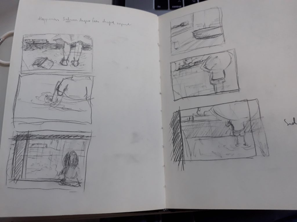
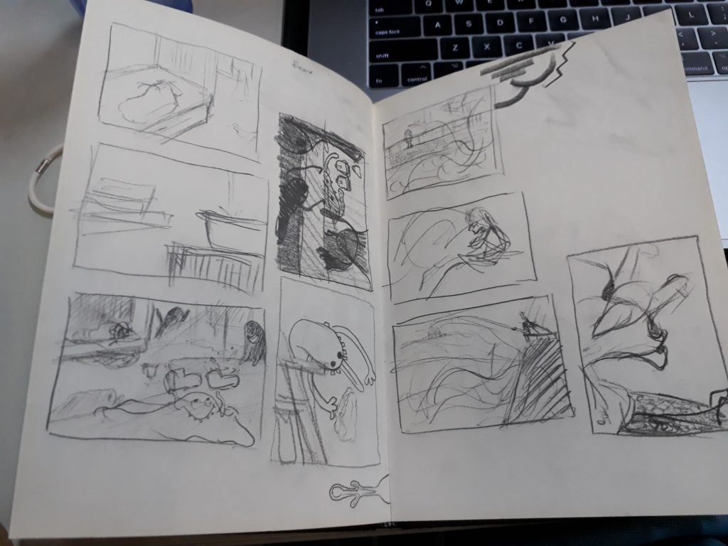
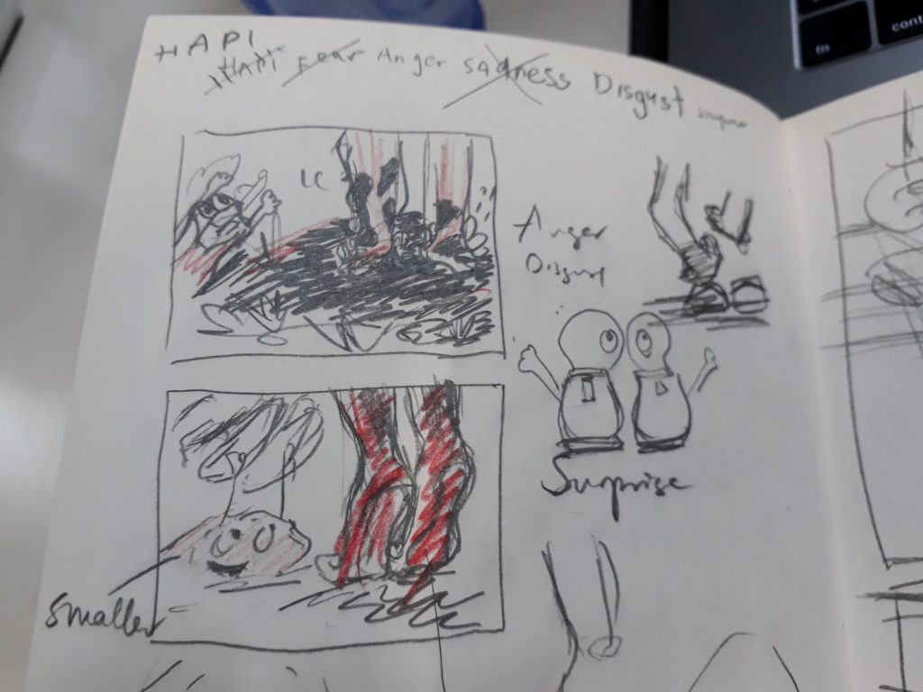
One key point that I experimented with was whether it was possible to illustrate all four panels with the placement of the shoe being fixed, while presenting the images different perspectives. I managed to do it, but the sadness and disgust images are rather similar. Perhaps more could be done to experiment with alternative povs :>
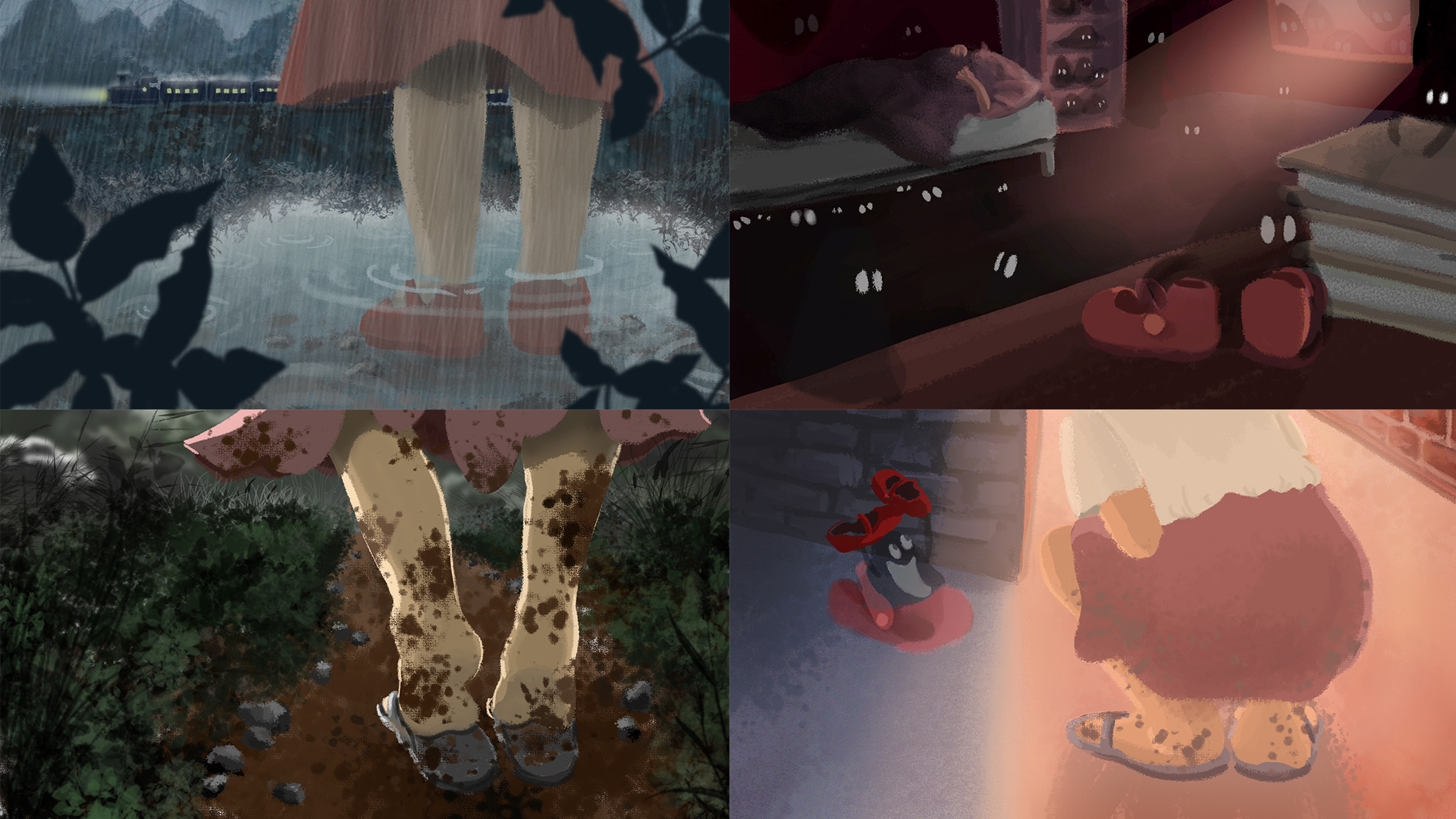
Final Images
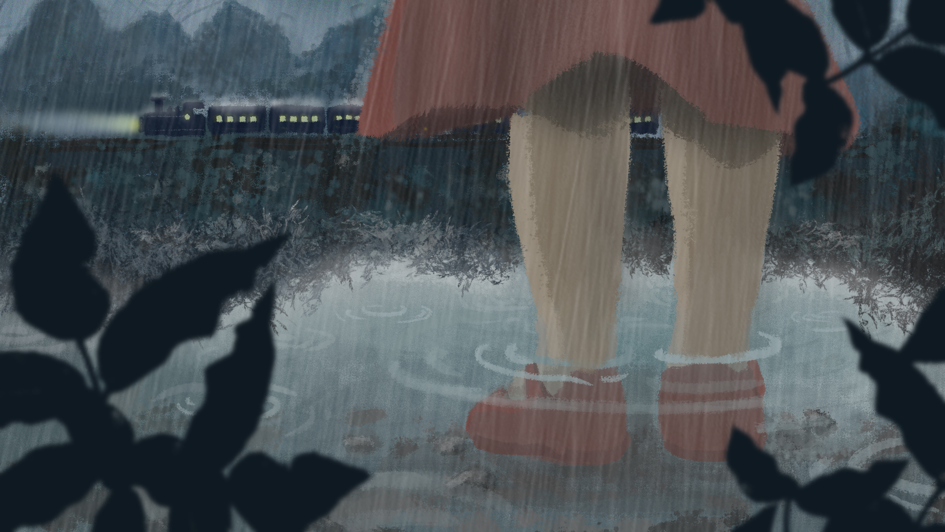
Sadness
Father leaves daughter; rainy scene
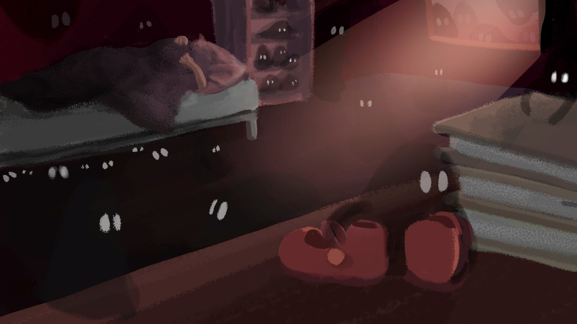
Fear
Daughter is left alone in her room to fend her fear of the dark. Her imagination ran wild as she faintly hear something being dragged across the room. In actual fact, a ‘ghost’ has took her shoes away.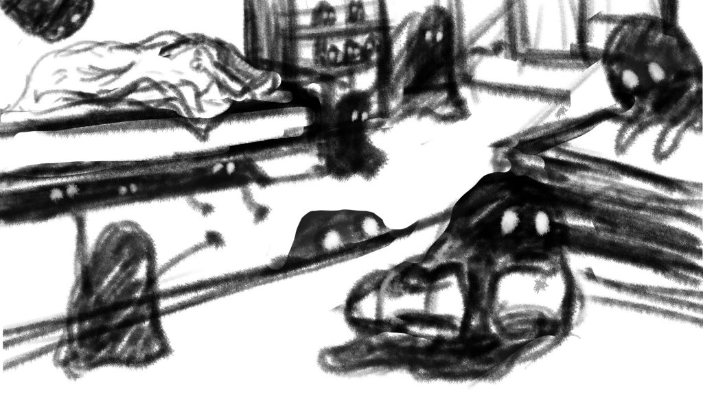
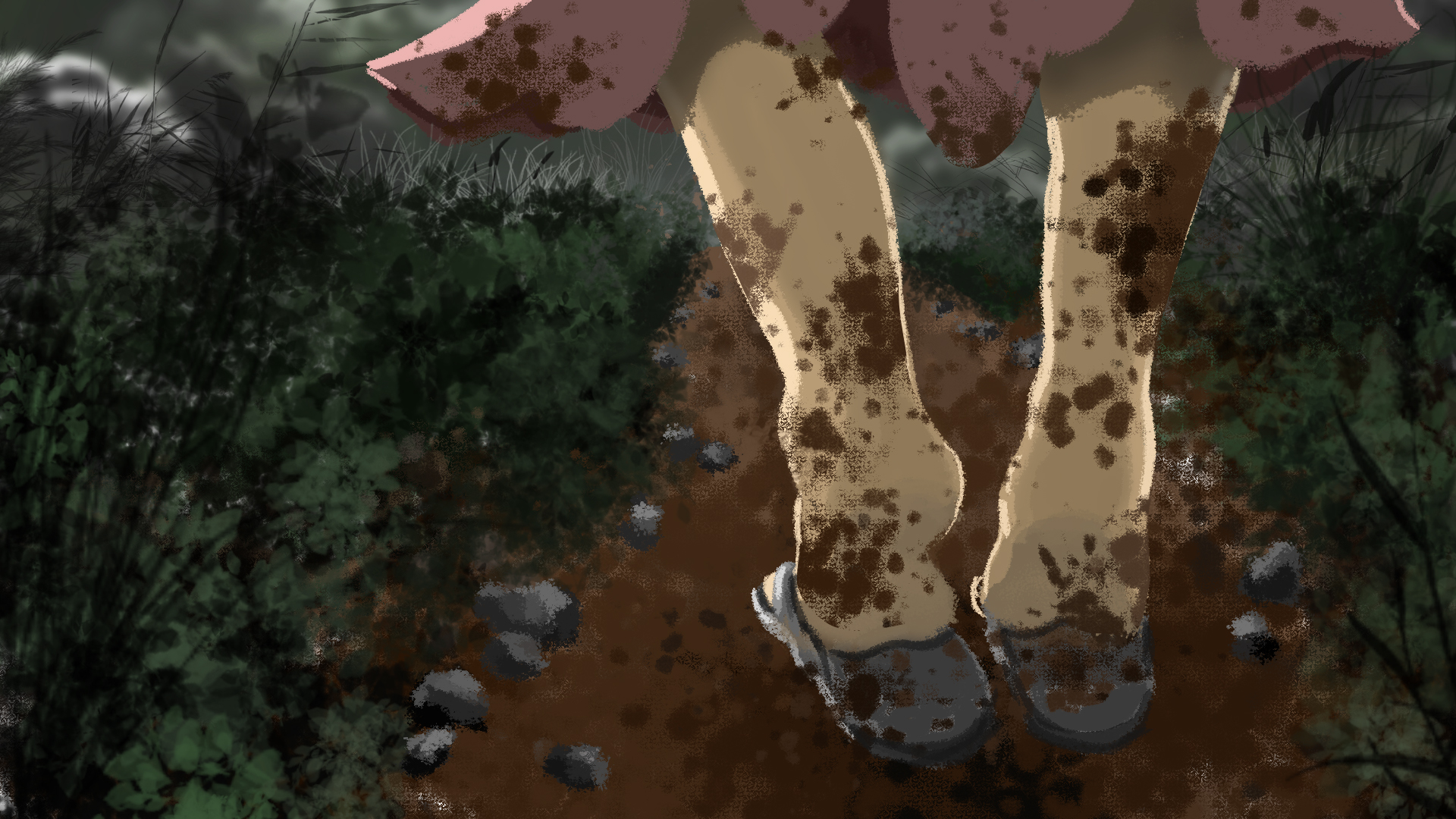
disgust
Daughter realises the next morning that her favourite shoes are gone. Wearing her old slippers, she went out in search for it. Wet mud splattered all over her skirt and legs, evoking a strong sense of disgust from her.
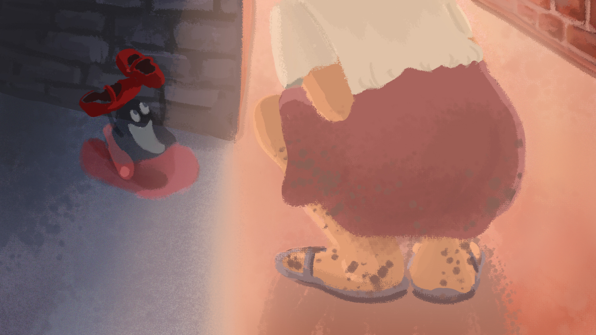
Happiness
She found her shoes at last! In fact, the ghost was on its way to return the shoes as well, after modelling and making its own ghost shoe.
I am very happy with the final work even though the quality and style isn’t that consistent throughout (something to take note of next time). Having worked mainly with traditional medium and less with digital, this assignment helped me pick up many useful techniques from photoshop. Now I am really starting to appreciate digital painting!