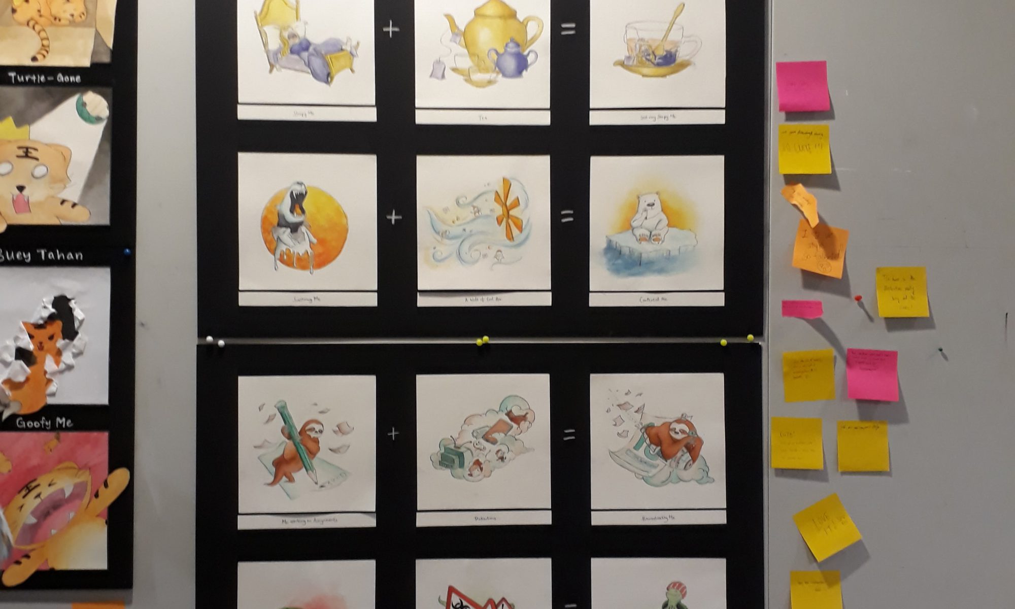
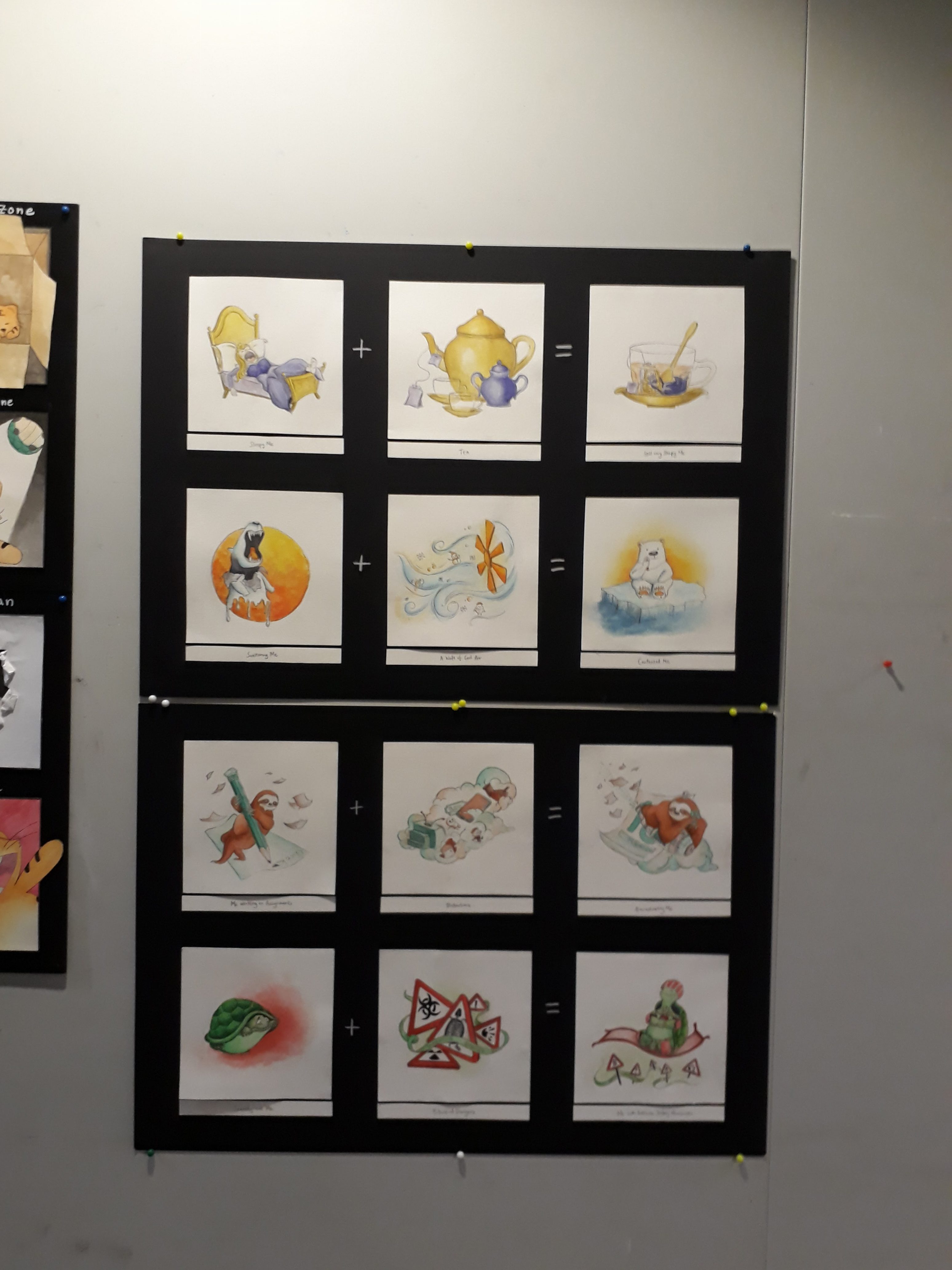
Me working on assignments + Distractions = Procrastinating me
Scaredy-cat me + Dangers = Me with Extreme Safety Measures
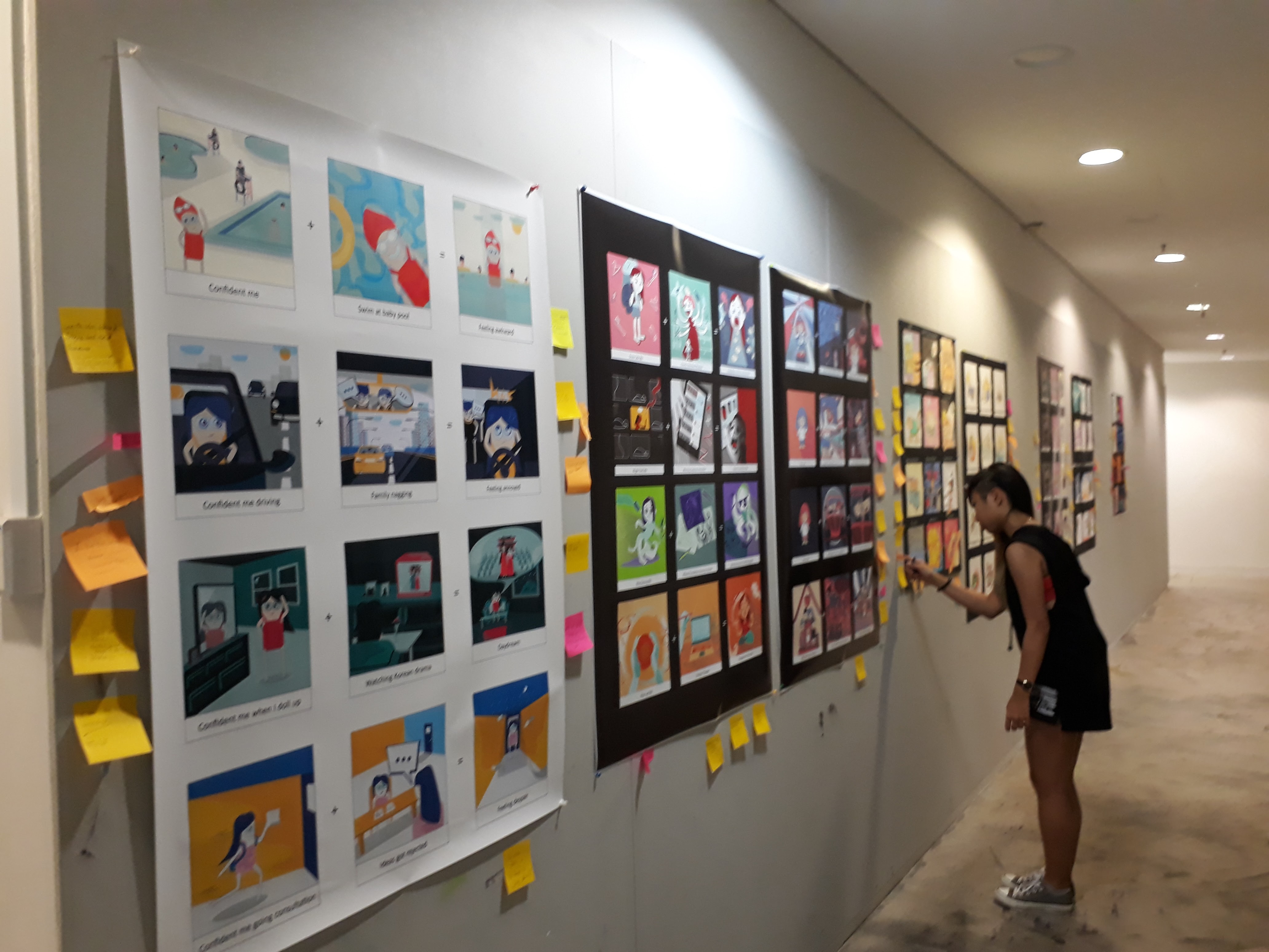
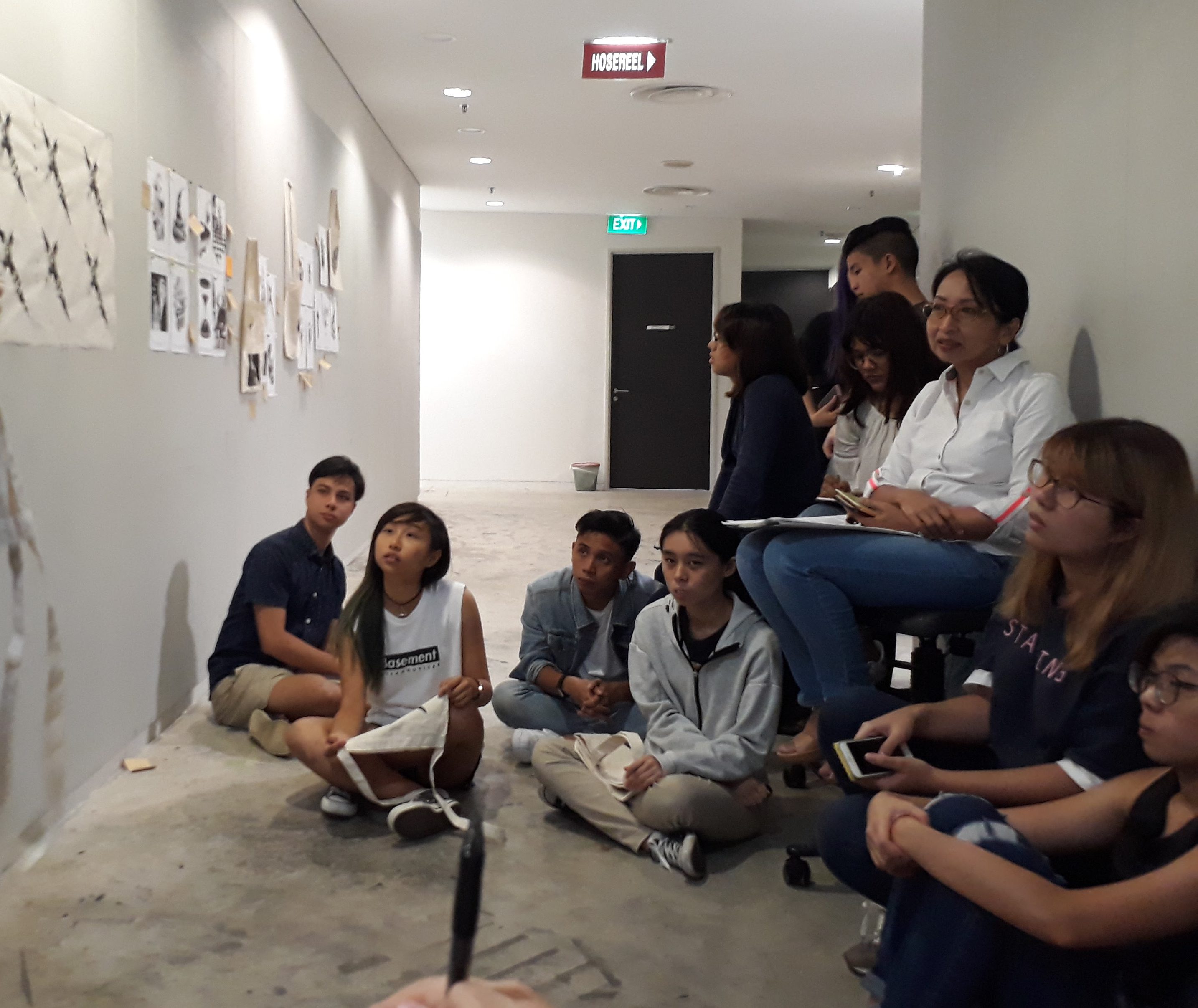
Gallery viewing + Presentation :)
There were so so many amazing works!! It was really nice to see how everyone chose to represent themselves as well as the equations that they express.
Eheheh what a great end to Foundation 2D!
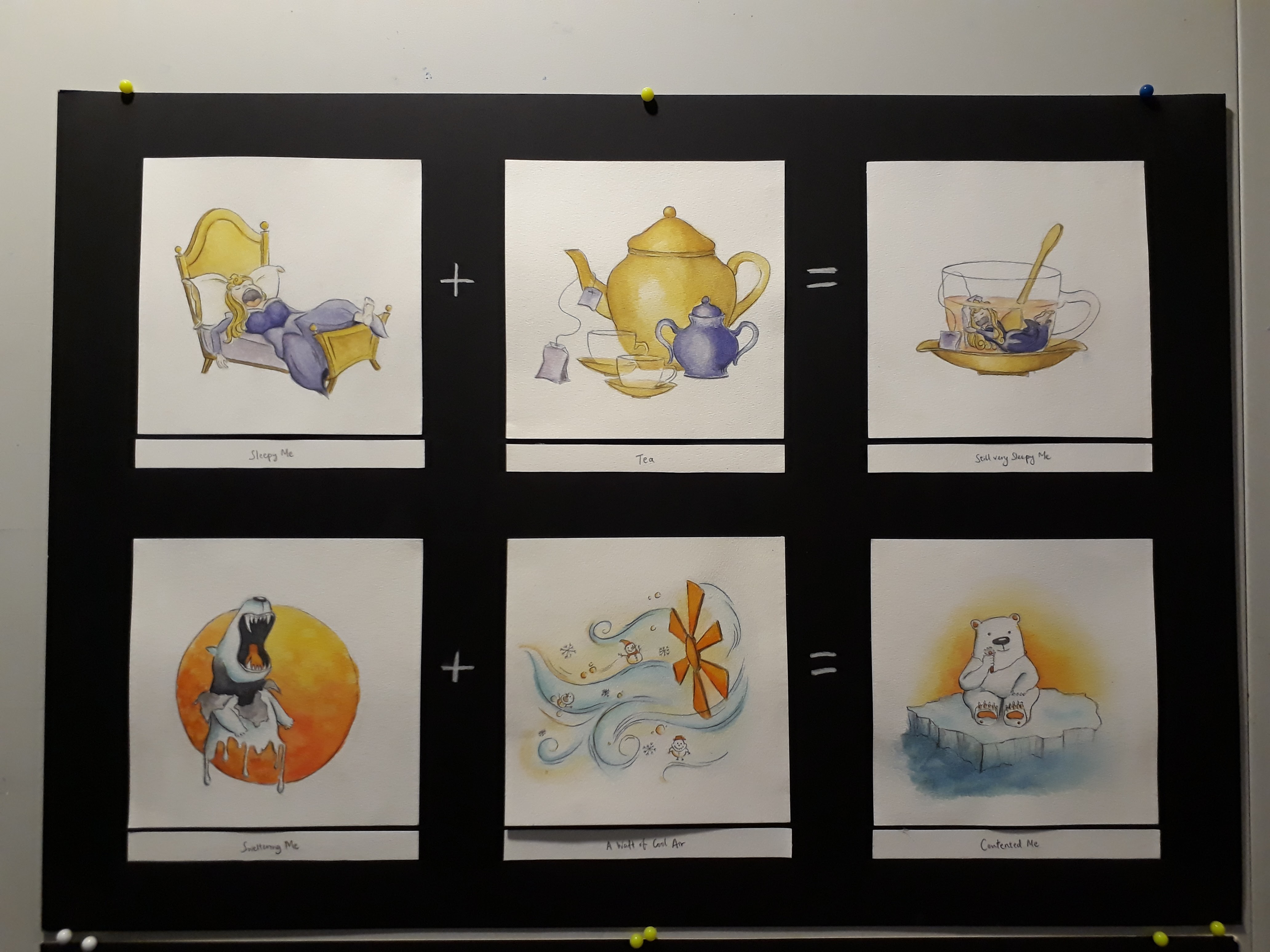
Overall, this project has been a challenging one. Just ideation alone took me a really long time as I kept revising what I had. The drawing process wasn’t easy either, as I had to work around with different compositions and decide which works the best — especially troublesome when it comes to traditional media as I had to erase everything and start over. Learning about colour theories has also pushed me to really think carefully before I apply colours instead of the usual dabbing of colours based on instincts. This is the first time I actually obediently followed through a colour scheme. It was worth it though, as I really liked the end result. Nevertheless, I still feel that the painting can be improved, especially in terms of tones. Watercolour is really a difficult medium!!
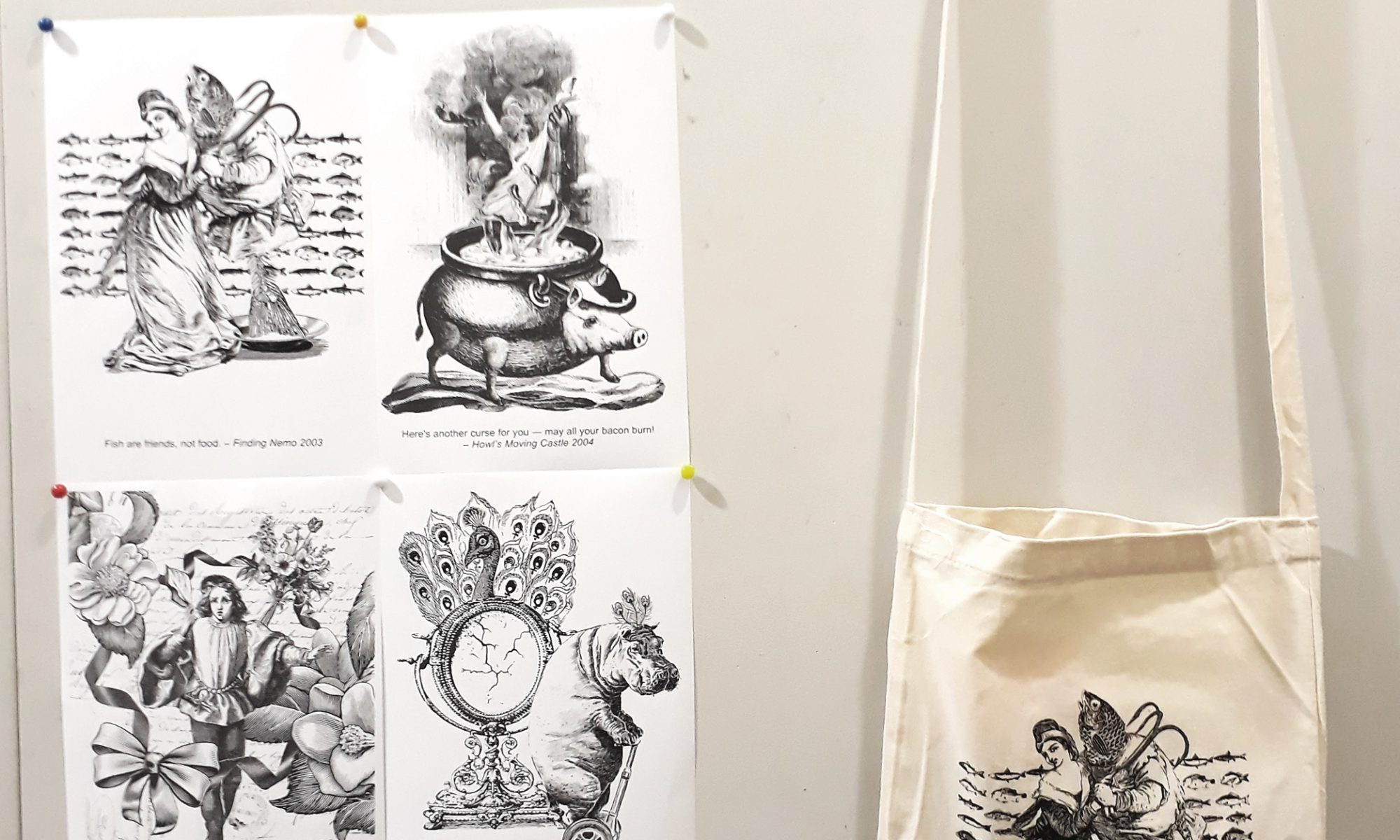
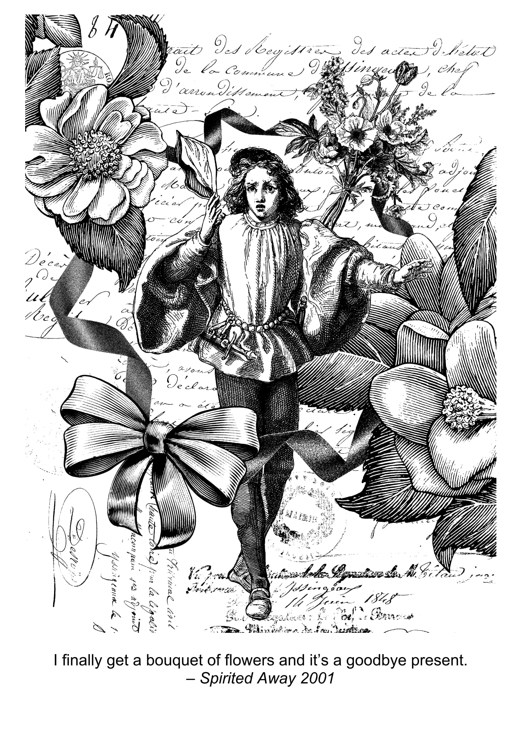
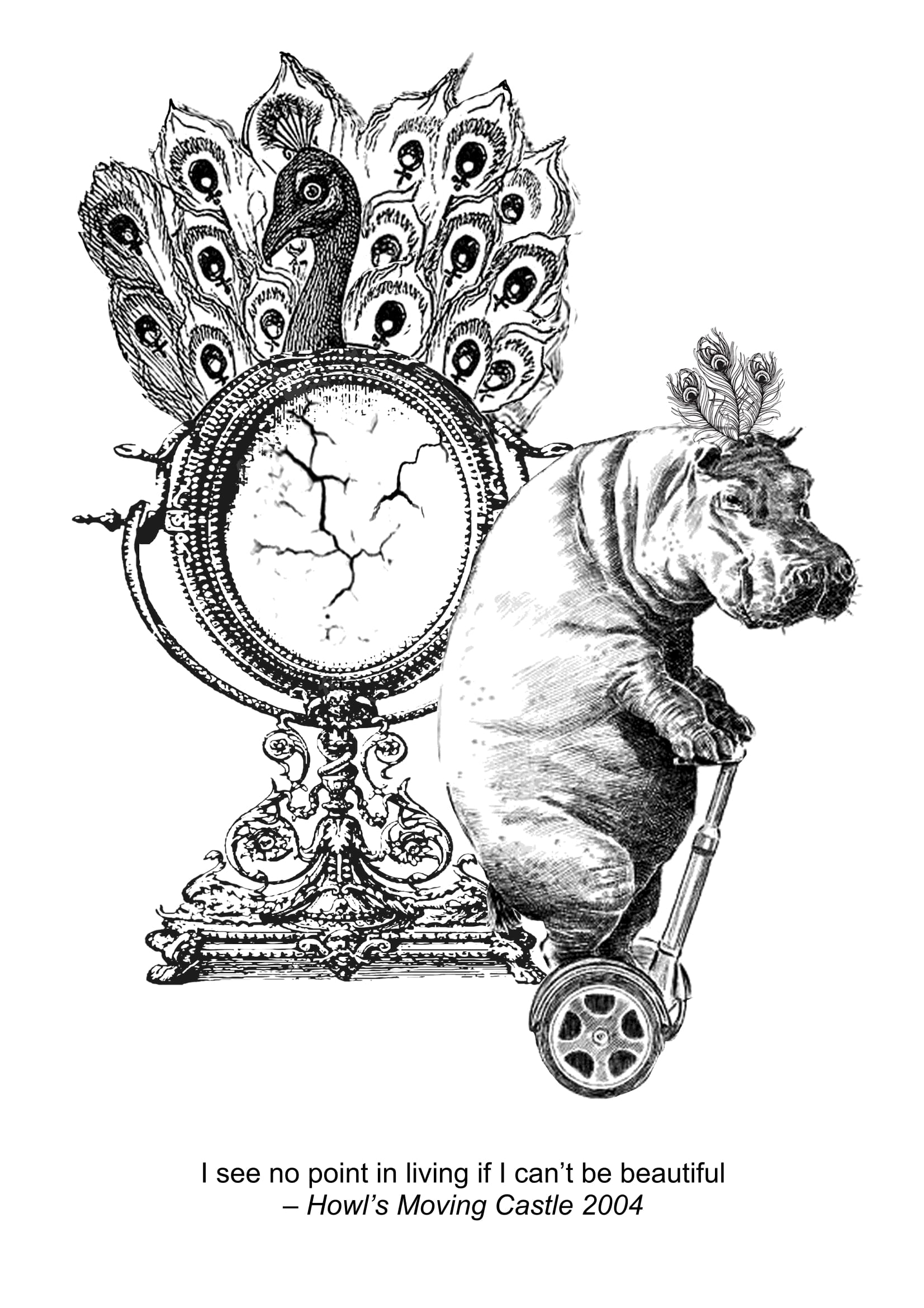
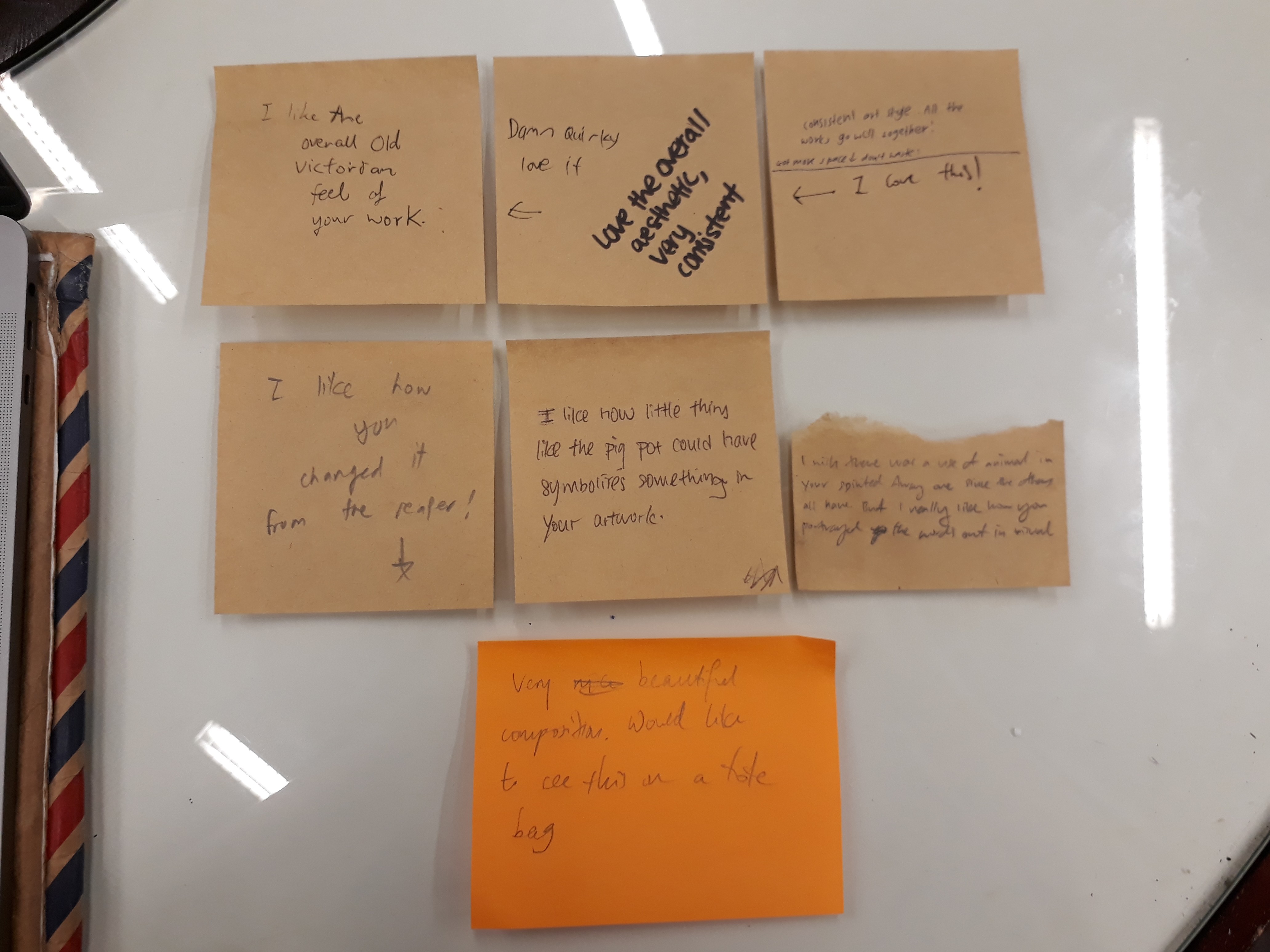
Generally, people liked the consistent art style in the overall composition. Surprisingly, the “May all your bacon burn” composition yielded good response among my classmates. Many also loved the ugly hippo on his segway. Mimi mentioned that it was nice that I manage to source for all images that cohere with the Victorian illustration style, and that there was quite a good use of imagery to represent my quotes. However, she felt that “goodbye” is still not very well-represented in the Spirited Away quote and there’s still room for further improvement.
Overall, this project has been extremely fun. Working on the movie quotes showed me how a single line can convey multiple meanings and conjure different imageries in the mind simply depending on how you choose to interpret it. Working around with different compositions, changing their relative scales, and arranging and rearranging them in space has heightened my sensitivity towards space and the importance of getting the composition right. Sometimes, the choice of images are perfectly fine but they still look odd. All they need, in fact, is just reworking with how they are arranged.
Being forced (heheh) to work with online images, I’ve learned a tons lot of photoshop techniques as a newbie, and am also now extremely conscious of the importance of choosing the right resolution for my designs (I used 72ppi for all but one composition, and had to redo everything ?). Reflecting on my final 4 designs, I am quite satisfied with them, but also feel that they can be further explored and developed. I think I could have researched on more symbolisms to use, so that my designs can be more allegorical instead of being too literal. This is especially relevant for the ”goodbye’ design, since I found it hard to express goodbye adequately using literal images without having the entire composition becoming way too literal).
Silkscreen printing was also an entirely new experience. The process was fascinating: applying the photosensitive emulsion in the dark room lit by spooky red lights, exposing the silkscreen in the UV machine (and have to believe that something has happened even though the screen looks the exactly the same), playing around with the water gun, and go through nightmares while printing with ink. Even though I faced several hiccups along the way, nevertheless, I am really glad that my tote bag turned out well ( I have a few extra, anyone wants to buy? $20友情价??? heheh jk) It would be nice if I could print other designs as well! (human greed has no end)