And it comes! The day of final submission! Three weeks of mark-making and it’s now over!
My work:
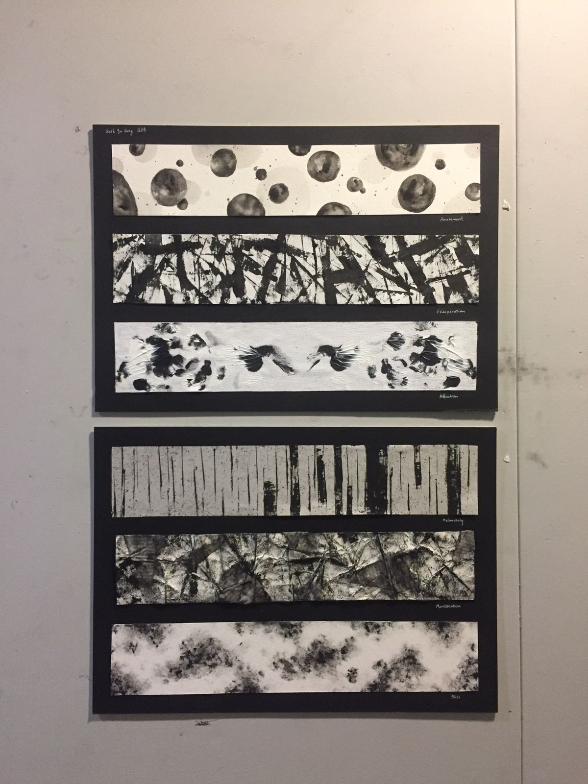
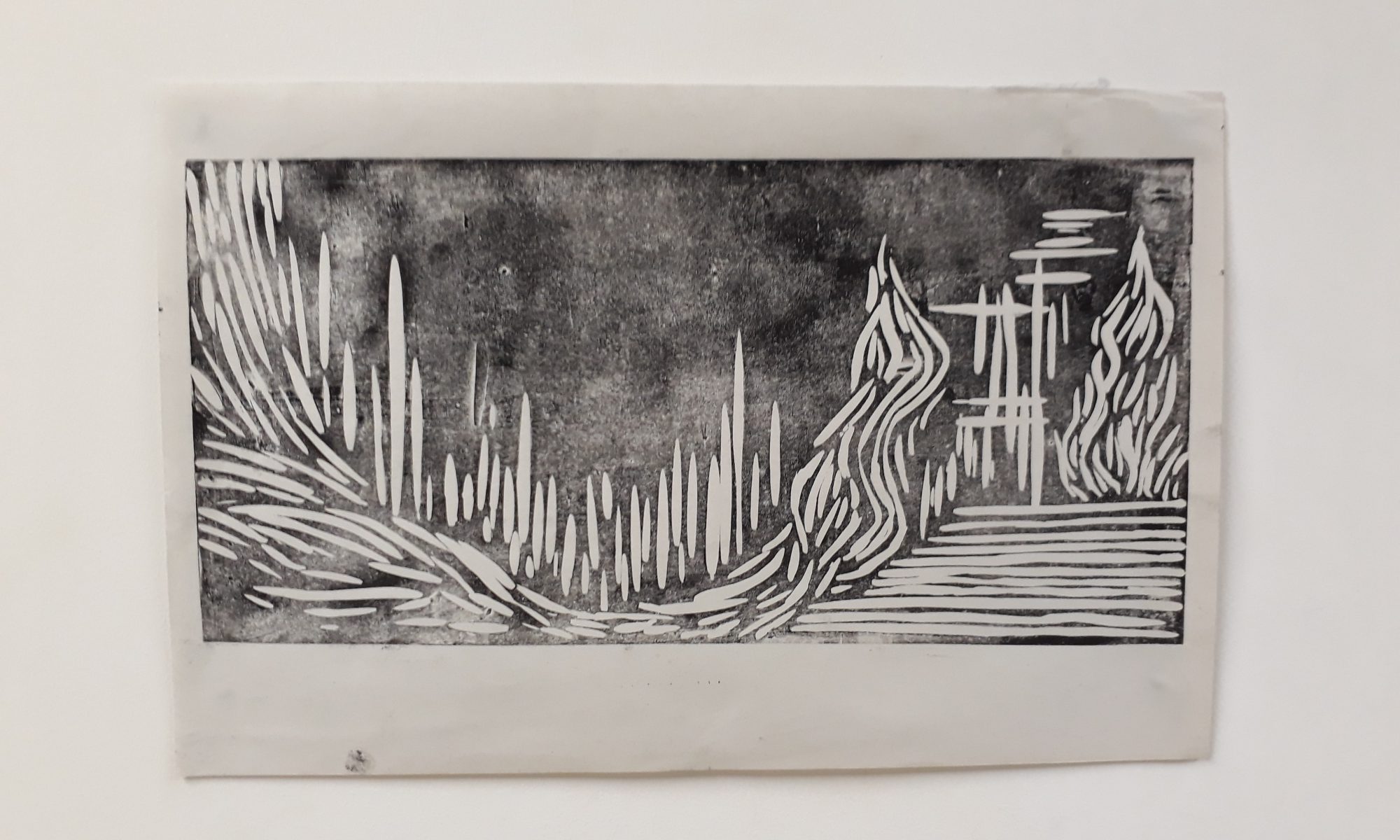
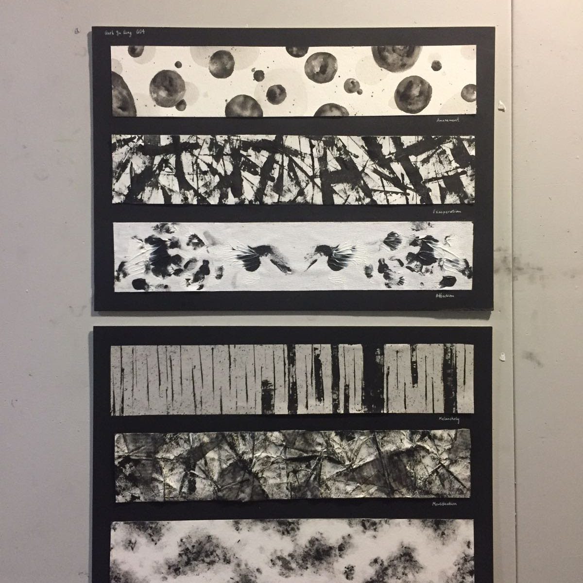
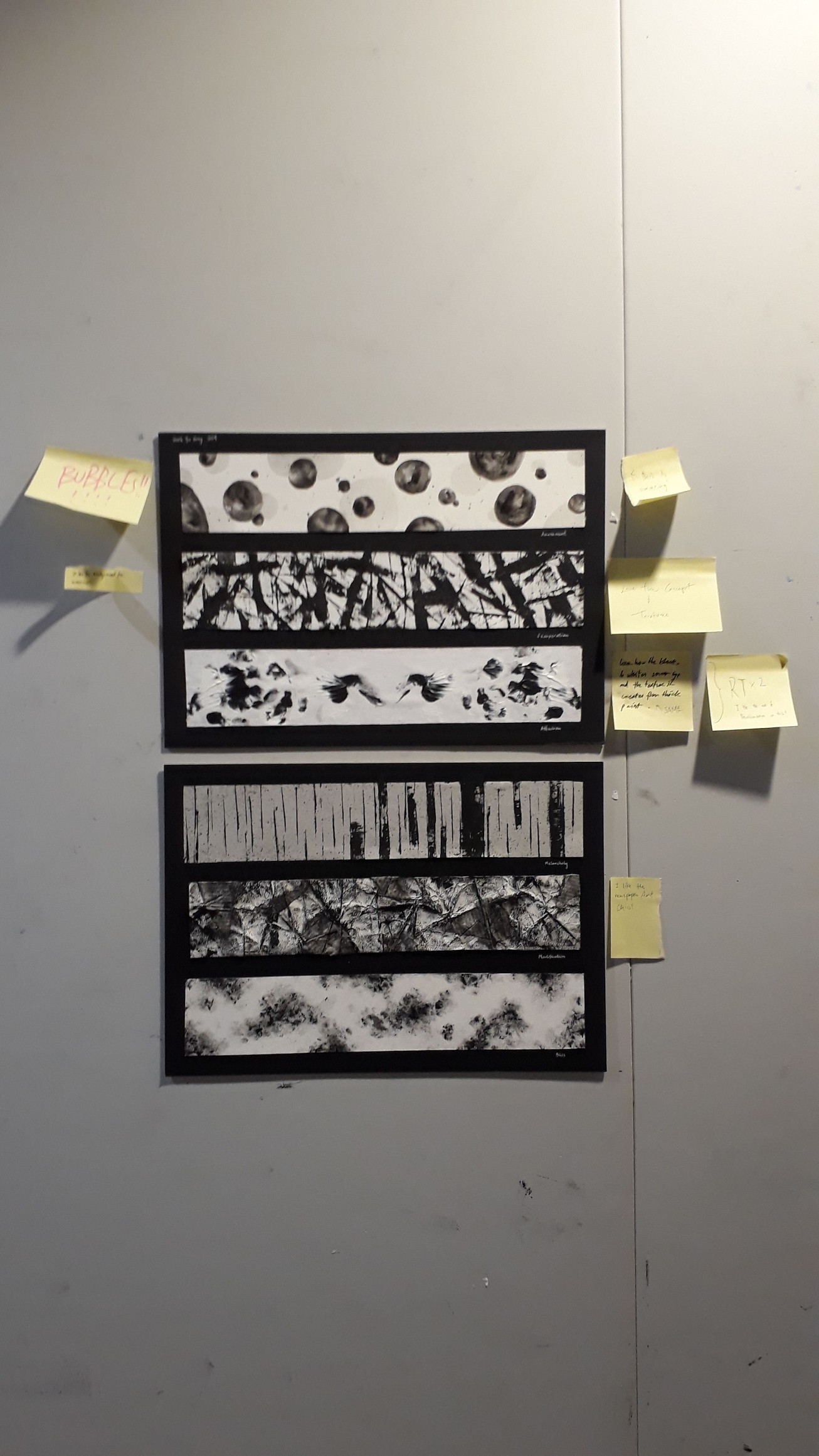
Top down: Amazement, exasperation, affection, melancholy, mortification, bliss
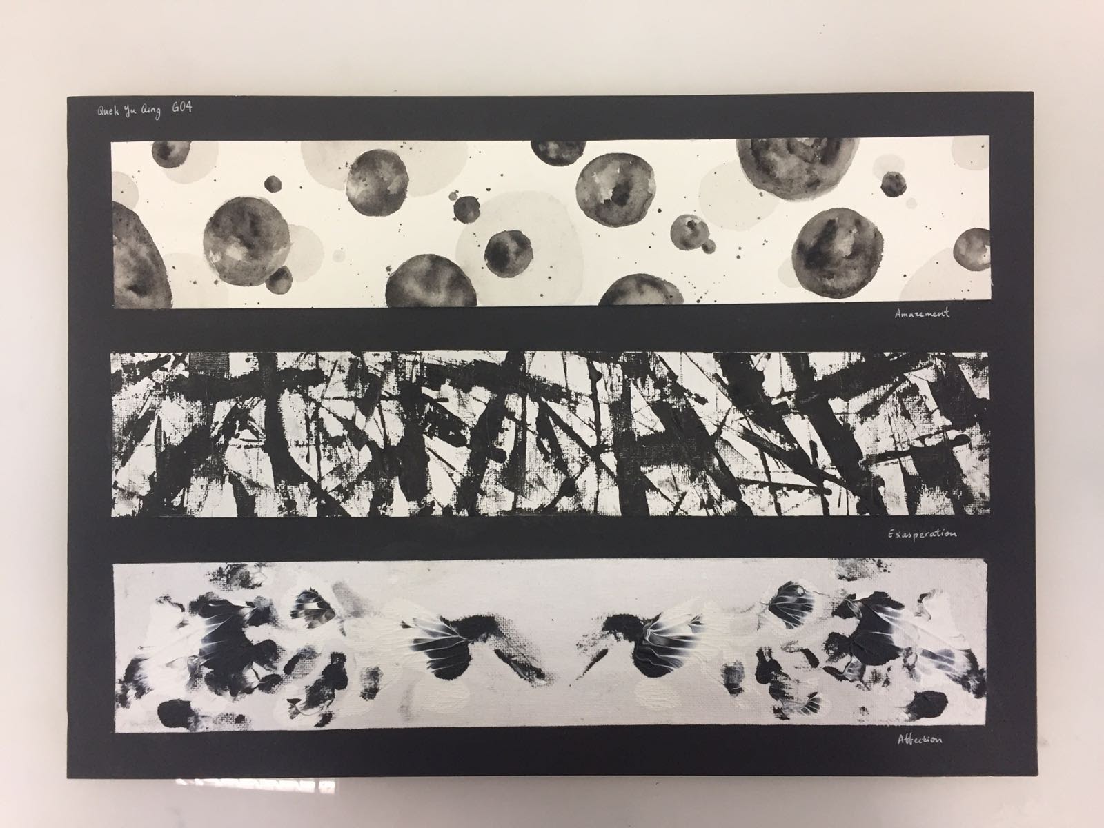
Infancy — Amazement
- the marks, while representing amazement, have a touch of inquisitiveness in them
- the bubble-like marks encapsulates the curiosity and wonder a child feels as he/she interacts with the world for the first time
- questions and wonders pop up like bubbles in their minds spontaneously
- every ink blot/circle is unique -> every child interprets our world differently, but their interpretations are all equally mesmerising and filled with precious innocence
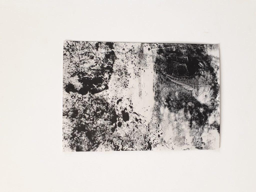
Adolescence — Exasperation
- The marks record our rebellious years where our fluctuating moods and identity confusion causes us to be dissatisfied with and exasperated at many things, be it towards our peers, our family or our parents
- use of palette knife to slash paint onto the paper is just like how one feels like ‘killing’/’strangling’ a person when that person simply does not understand what you’re driving at
- the thicker smears of paint is just like the huge SIGHs we make after each gradual build-up of exasperation
- expresses the uninhibited aggression and frustration a teenager feels at that stage
- It also portrays teenagers’ urgency to make an impression and assert their identity and importance in this world
Love — affection
- As we move through our teenage years into adulthood, we start looking for our other ‘half’ (the symmetry in this mark alludes to this)
- the dreamy and fantasy-like feeling suggests intimacy and sweetness —illustrates our hopes and ideals for our partner
- the emergence of love-birds-like figures from hazy fumes shows how the search for our true love often begins without us knowing what we are looking for, but it eventually reveals itself to us
- Notice how the images are similar but not identical -> what I am trying to convey here is that we will find flaws in even our perfect fit, but we must learn to embrace them and accept them for who they are

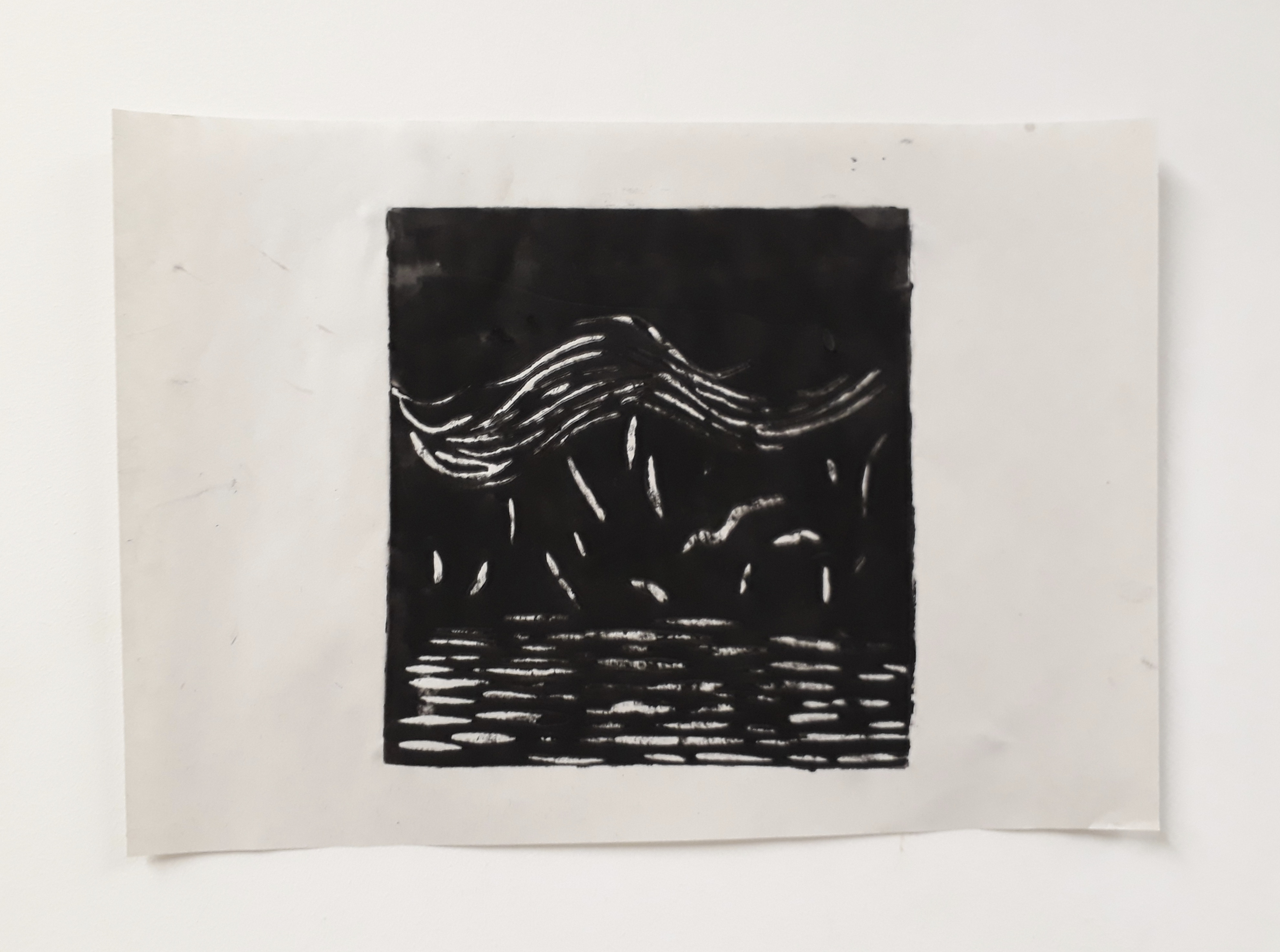
Mid-Life crisis — Melancholy
- Looming spectres and the use of lines of different weights and intensity creates the illusion of depth — some of our troubles are further away while others are right in our face
- Hazy background -> melancholy feelings do not usually have an identifiable source of sadness, yet the feeling is pervasive and omnipresent
- Sparse marks help to convey the idea of hollowness and emptiness
- Using the palette knife to slash the paper with ink exemplifies how pangs of grief strike a melancholic person
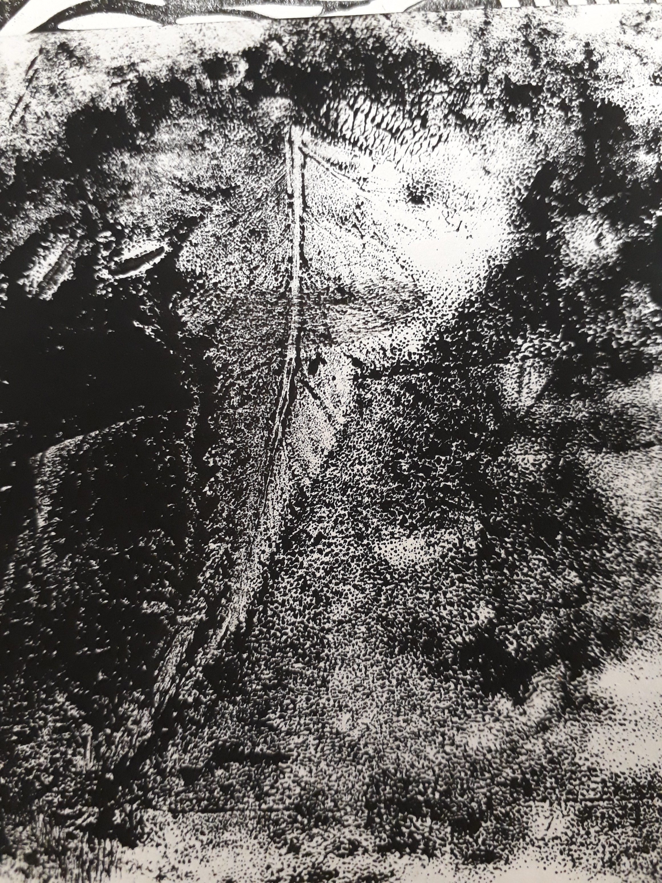
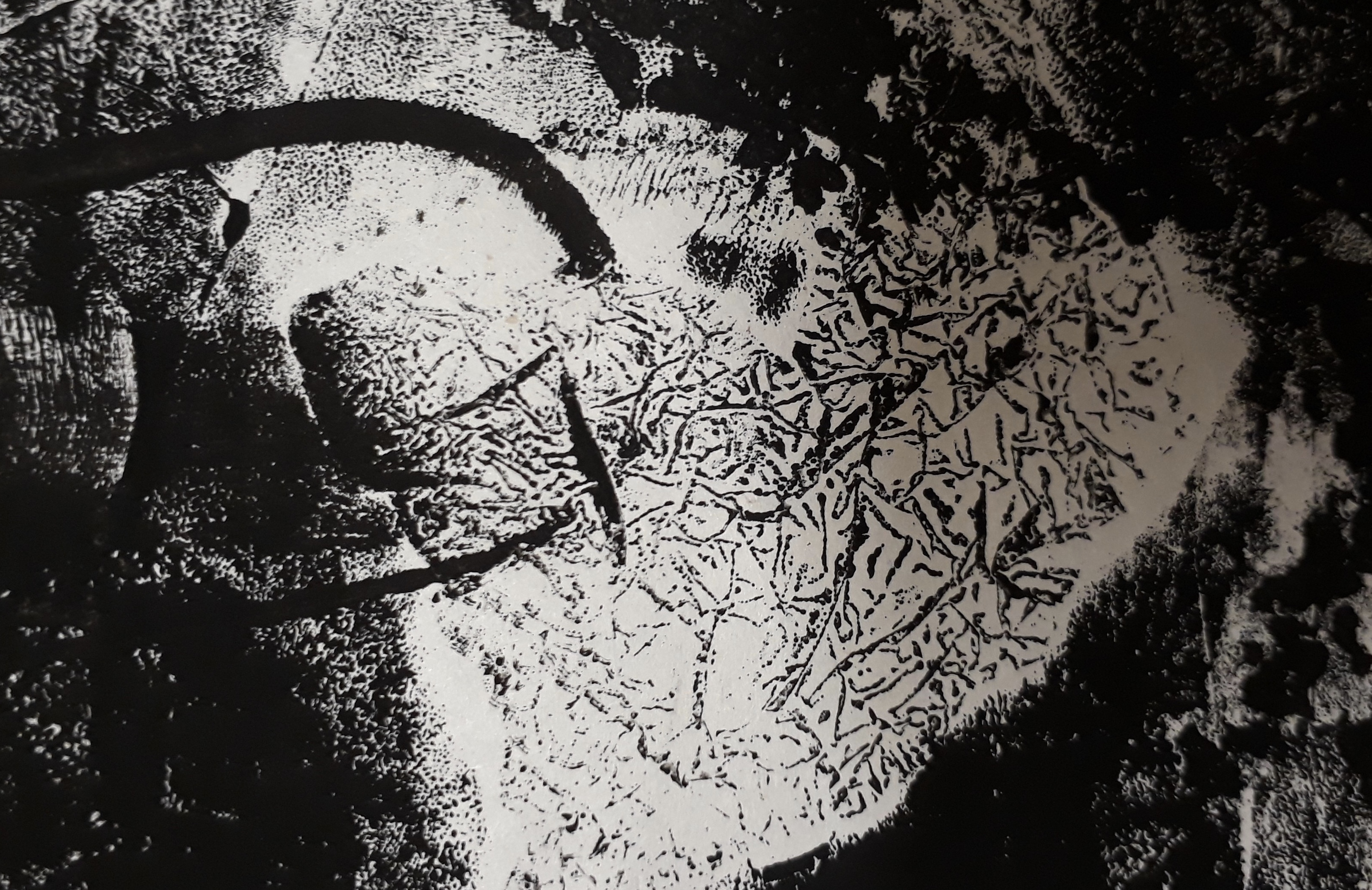
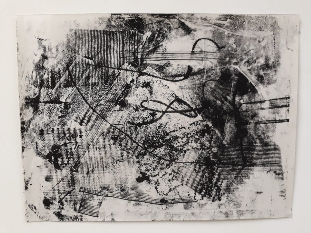
Illness/the approach to old age — Mortification
- Paper marche effect created by using newspaper with glue and water
- The marks were made by crumpling the paper, and then rolling the roller across the creases
- memory fades, vision darkens, creases appear
- the use of newspaper: words giving themselves up to the void, along with all the meaning they used to contain
- fragmentation: highlights the dissonance/ confused state of mind one is in as you grow frail
- Death looms, close enough to be weighing on your chest
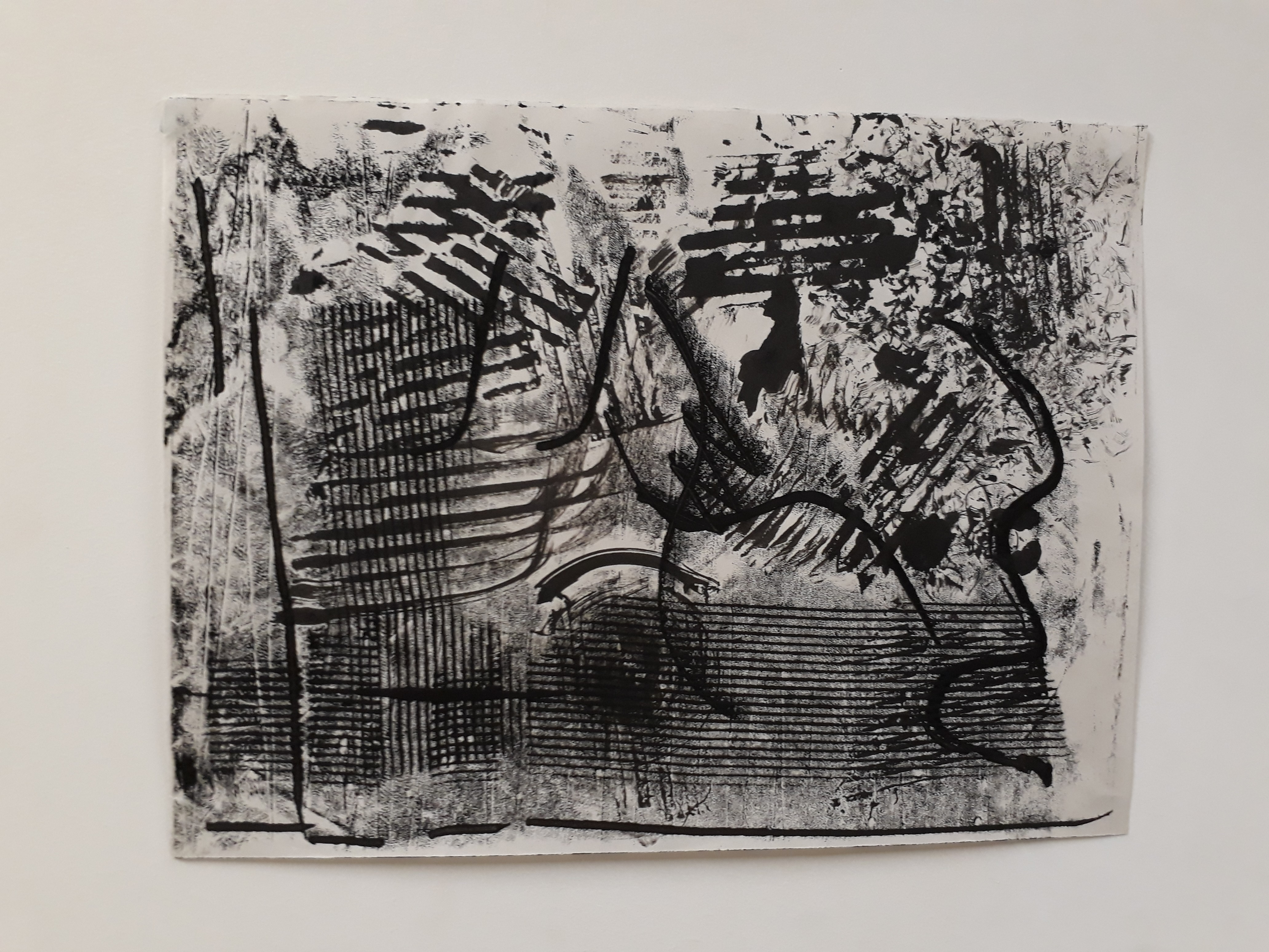
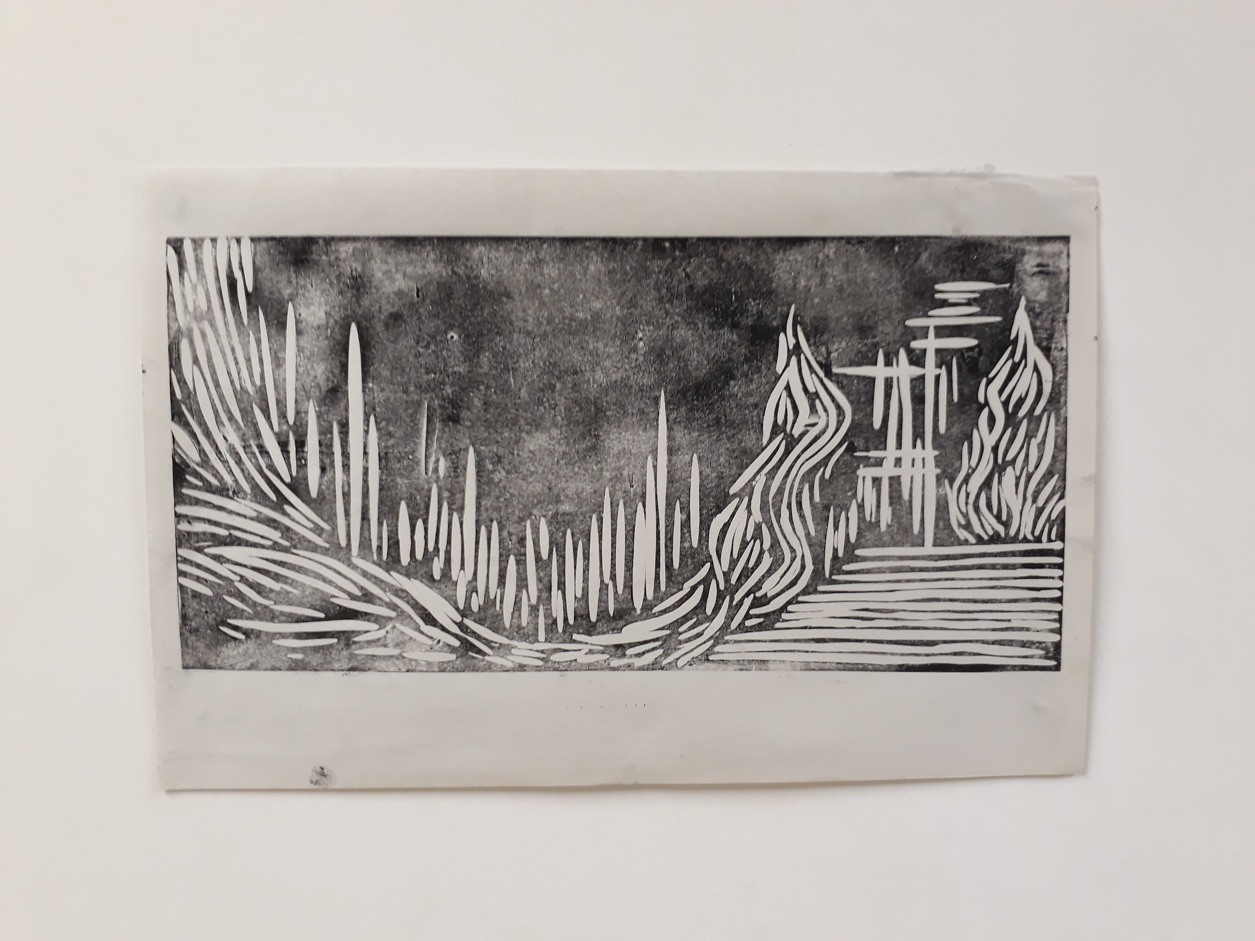
Before the final end — bliss
- This mark presents a strong juxtaposition to the ‘mortification’ strip
- One learns to find peace with oneself and finally achieve a sense of serenity and solidarity
- The cloudy/ dreamy mark prompts one to reminisce about one’s childhood and life experience
- Death becomes a relief from suffering
- the soft outlines represents how death is like a restful/gentle sleep
Presentation!
I really love the museum-style presentation — we lay out our works just like how they’ll look in a gallery and we are walked through the works one by one. It was really intriguing to learn about what my peers did and how they interpreted different emotions differently from me.
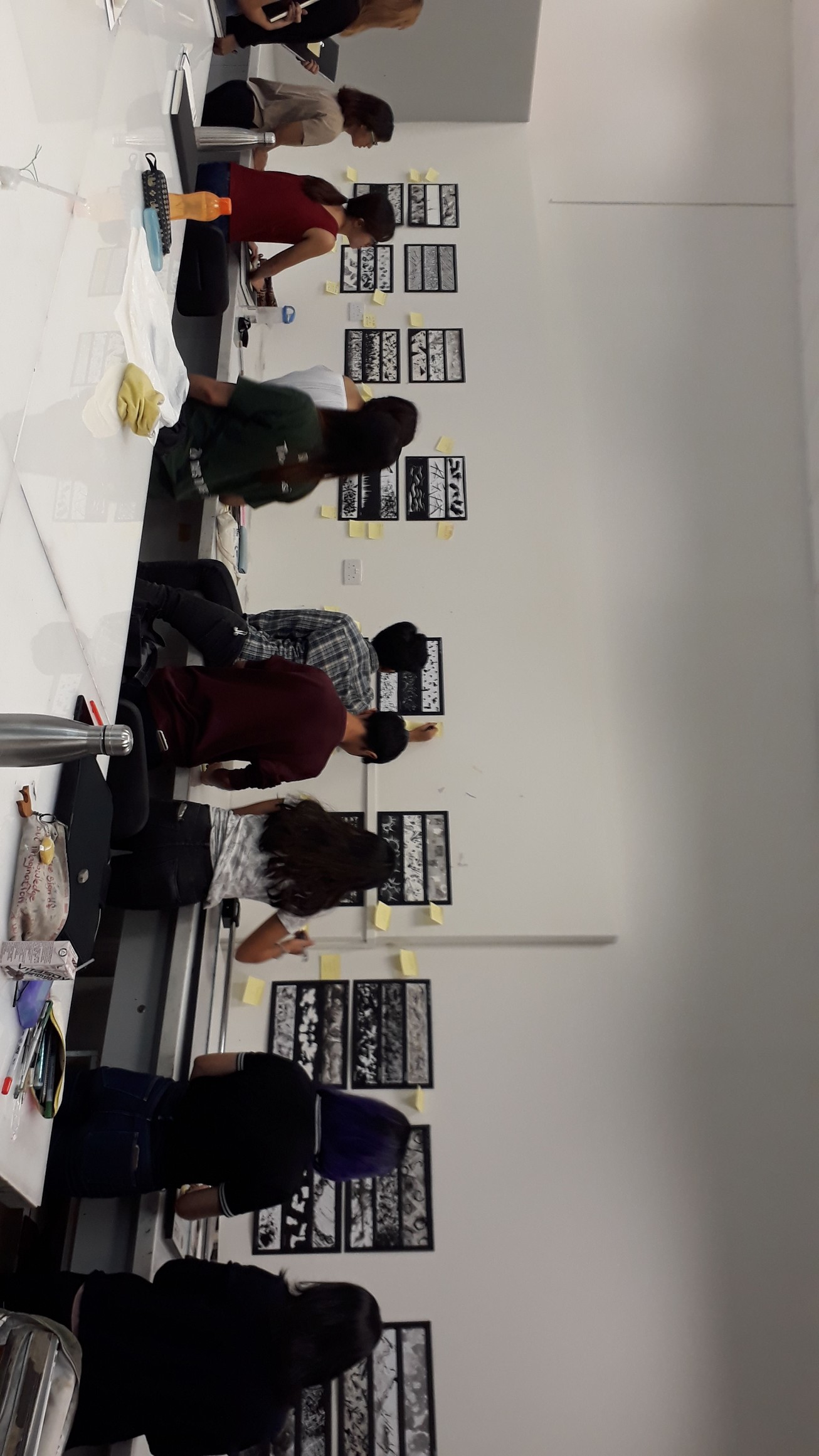

Thanks friends for the encouraging comments :D
Some Reflections
Overall I’m rather proud of my work but I feel that I could have explored even more with different mediums and materials. I initially thought that this project would be easy, but that was not true at all — it was only through tireless experimentation that I am able to generate my final pieces. But it was only through this process that I came to realise the importance of experimentation as an indispensable part of the creative process because there were so many inspirations that only revealed themselves to me along the way. All in all, mark-making is a highly therapeutic activity. I really had a lot of fun working on this project :)