For this assignment, we were tasked to present 4-6 images that express basic human emotions. I chose to work on the following 4 emotions: Sadness, Fear, Disgust, and Happiness in the format of a visual narrative. I chose the Digital painting medium to develop my digital painting skills, which I am not very acquainted with.
Initially, I wanted to express the emotions through the different portrayals and actions of water. I aimed to explore how a still and tranquil water body can evoke acute feelings that are raging and turbulent. However, I realized that I was unable to confidently illustrate water due to its abstract character that was difficult to personify. Having reached a dead end, I then turned to a more feasible representation — the figure of a little girl. I deliberately did not illustrate her facial features (or even specific details) so as to keep the enigmatic character that leaves room for the faculties of the imagination.
Initially, I wanted to express the emotions through the different portrayals and actions of water. I aimed to explore how a still and tranquil water body can evoke raging and acute emotions. However, I realized that I was unable to confidently illustrate water: it was intensely difficult to personify due to its abstract and turbulent character.
Having reached a dead end, I then turned to a more feasible representation— to use a protagonist in space to relate to emotion. I chose the figure of a little girl: a symbol of naivete, purity, capriciousness and endless wonder. I deliberately did not illustrate her facial features (or even specific details) to leave room for the faculties of the imagination.
With this new representation, I had to update the story type— from distinct and atomic frames to a narrative that flowed from the first frame.
I drew upon my initial ideas of emotive water as the background to complement the protagonist’s emotions. To elicit the same emotion in the audience, I also employed colour theories of emotion for each scene.
The first draft of the story is:
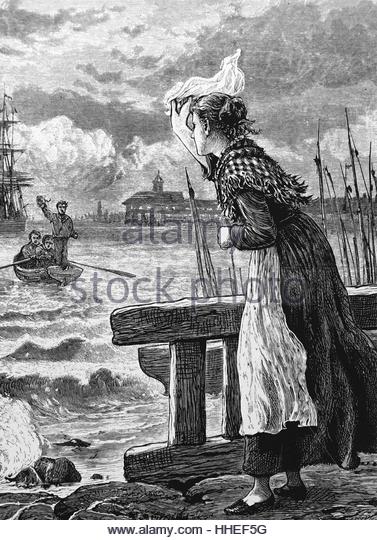
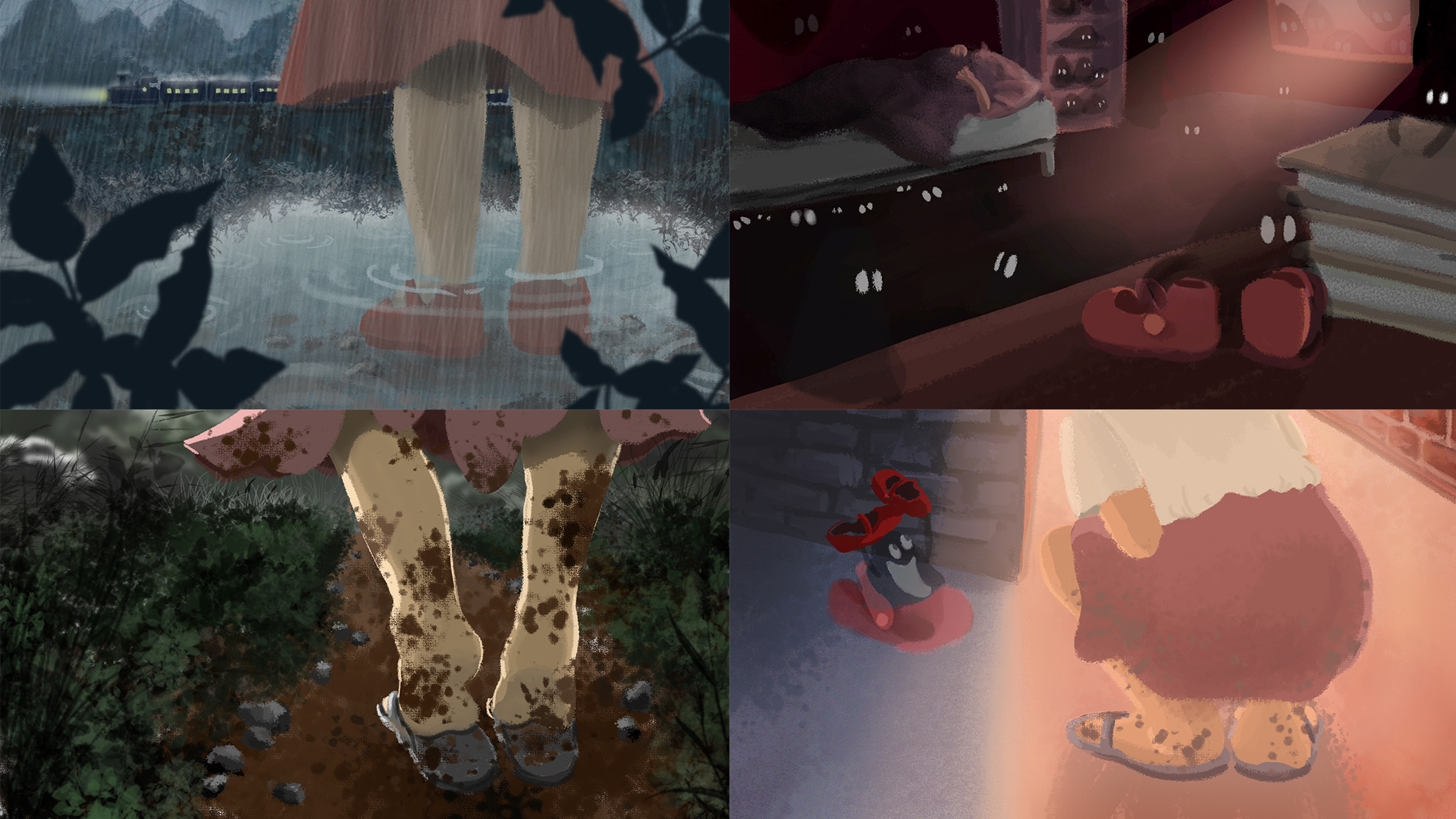
Sadness: Father leaves daughter; rainy scene
Fear: Daughter alone in room, buckets collecting dripping water, imagination ran wild in fear of the dark and of ghosts
Anger: Daughter shouting to the stormy sea in frustration, in the direction of the foreign town
Happiness: Father returns; dew hanging off greenery shining in the sun
Upon further development to add more content and excitement to the story, I came up with the final story:
Sadness: Father leaves daughter; rainy scene
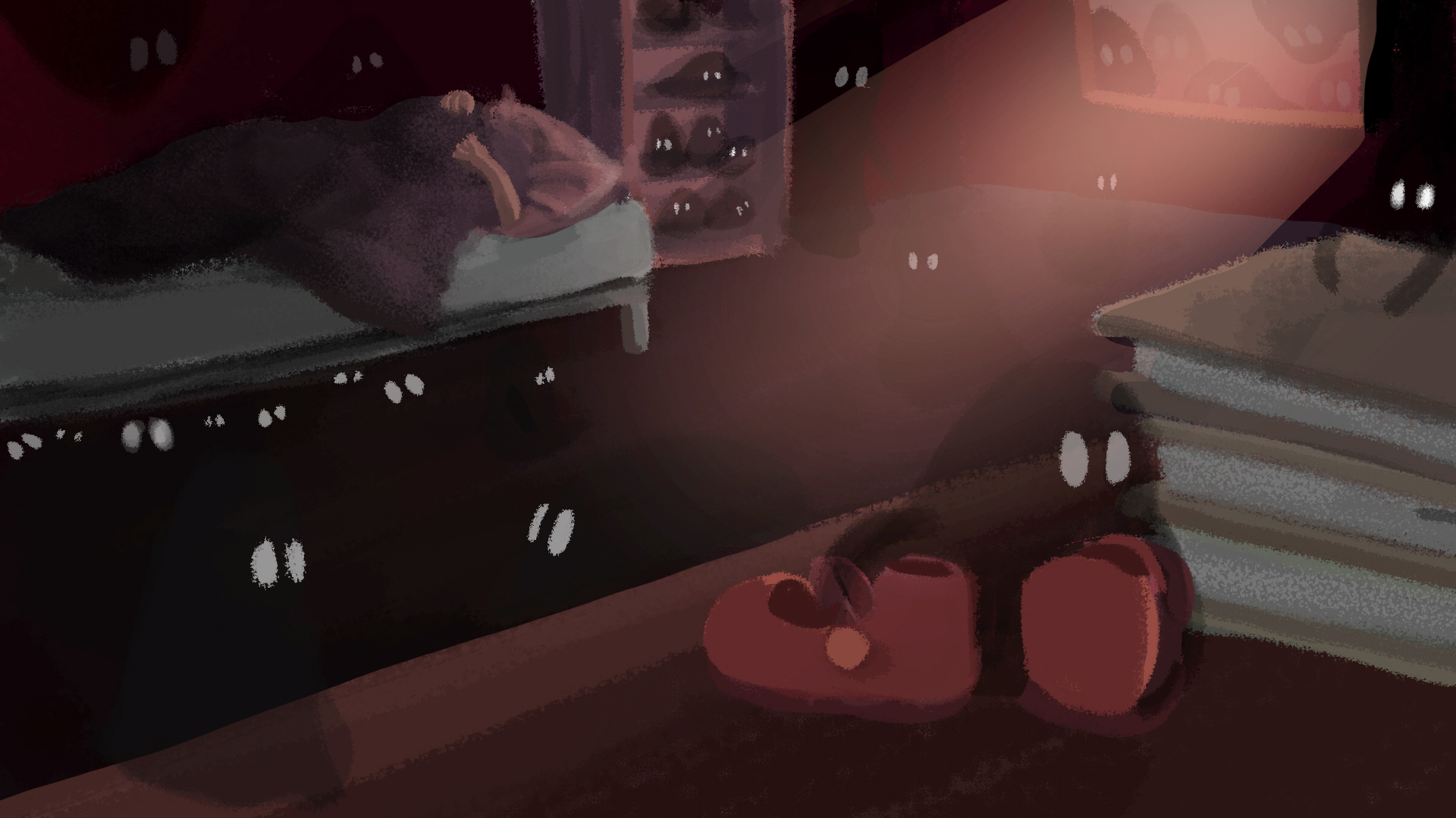
Fear: Daughter is left alone in her room to fend her fear of the dark. Her imagination ran wild as she faintly hear something being dragged across the room. In actual fact, a ‘ghost’ has took her shoes away.
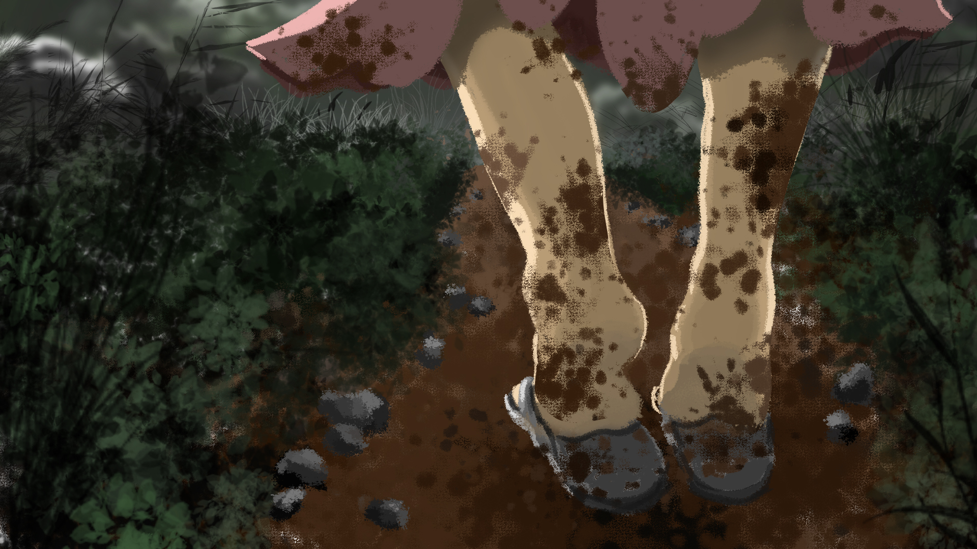
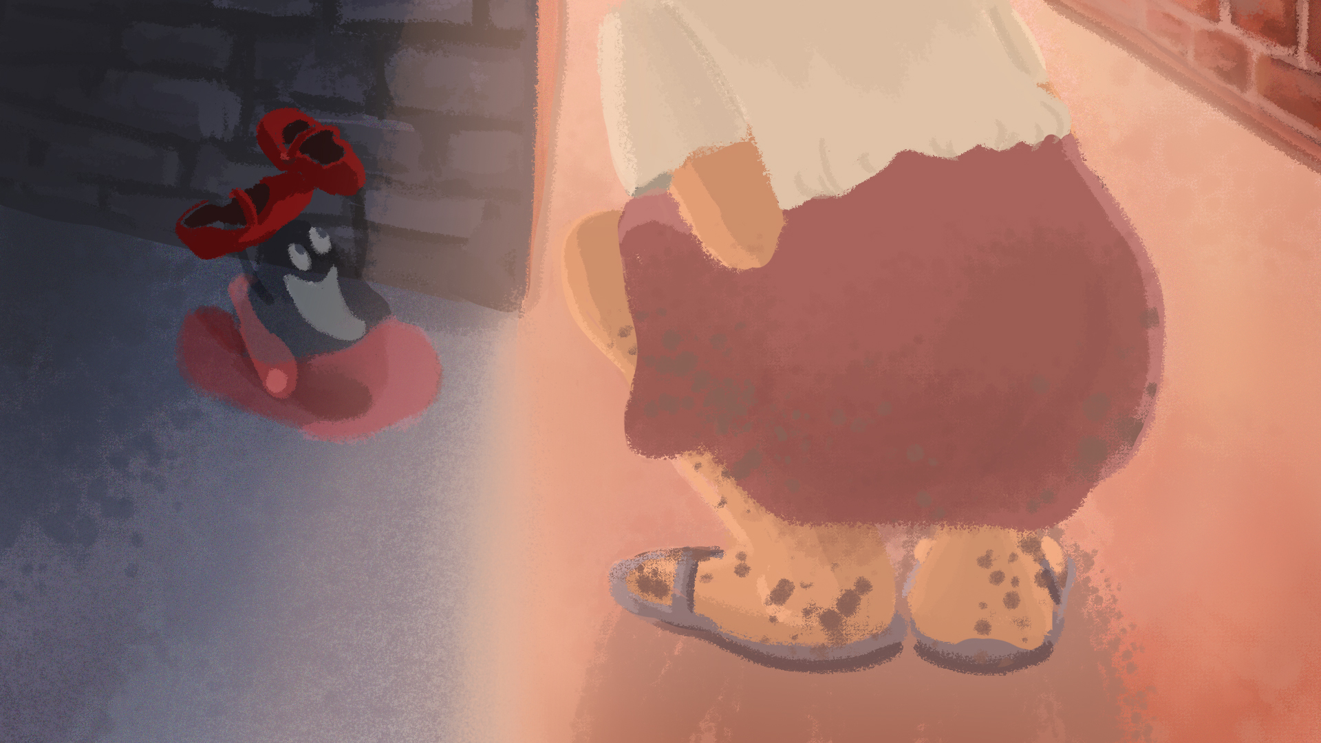
Disgust: Daughter realises the next morning that her favourite shoes are gone. Wearing her old slippers, she went out in search for it. Wet mud splattered all over her skirt and legs, evoking a strong sense of disgust from her. (note: not disgust at the fact that someone took her shoes because this will be too strong for a young girl)
Happiness: She found her shoes! In fact, the ghost was on its way to return the shoes as well, after modelling and making its own ghost shoe.
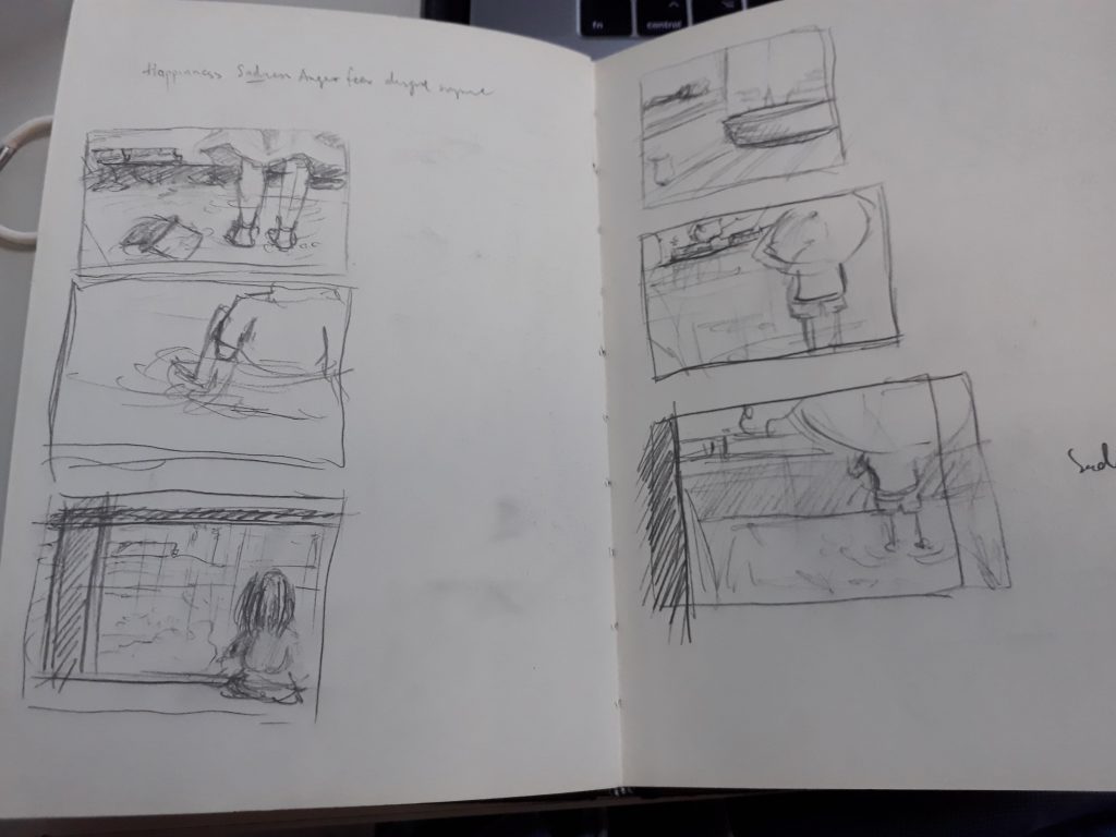
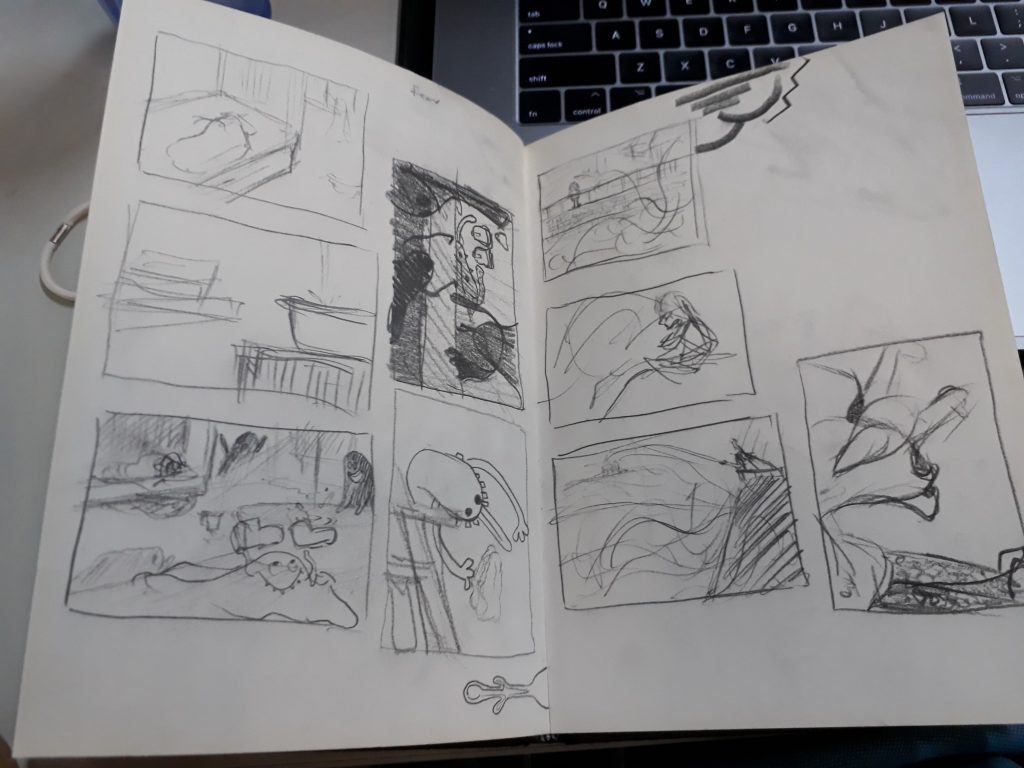
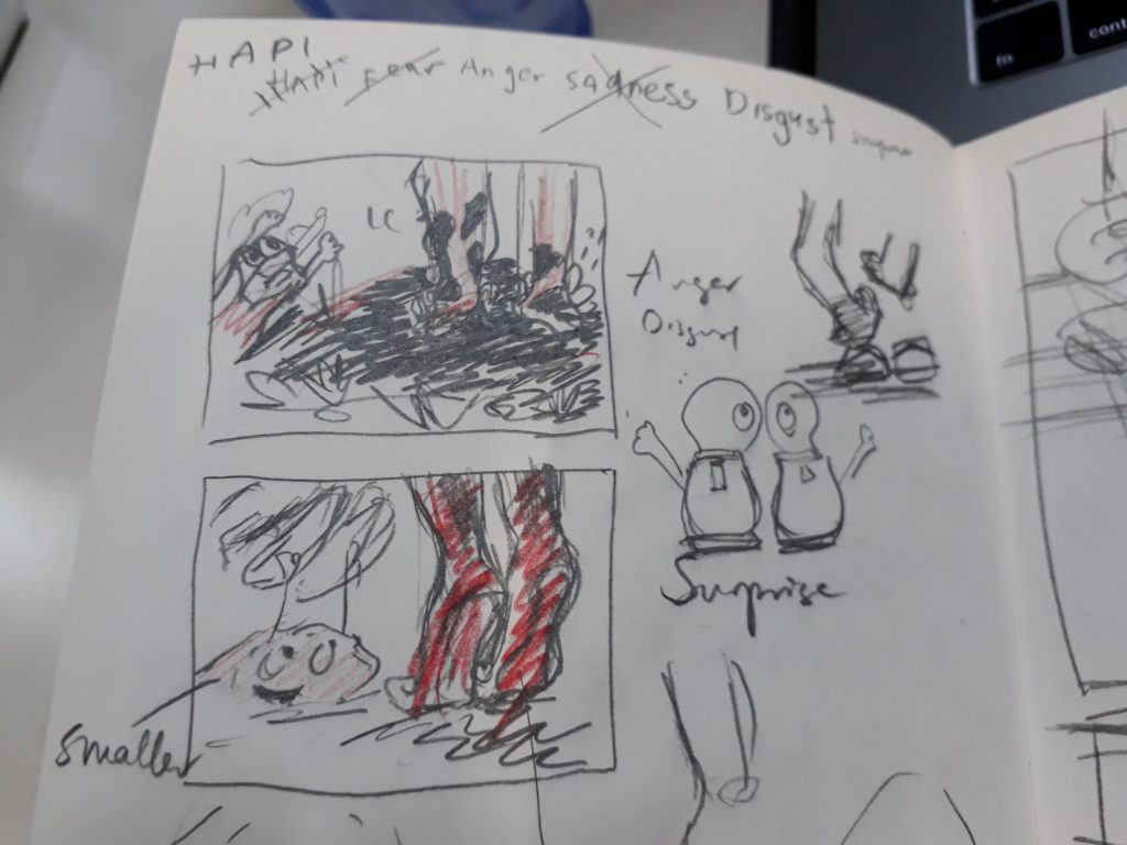
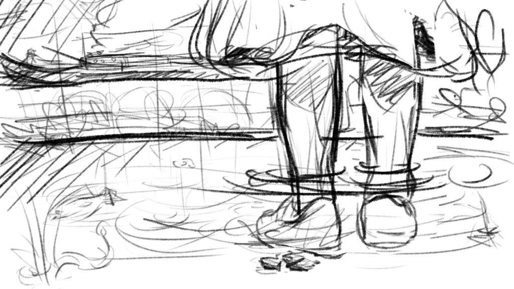
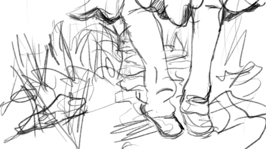
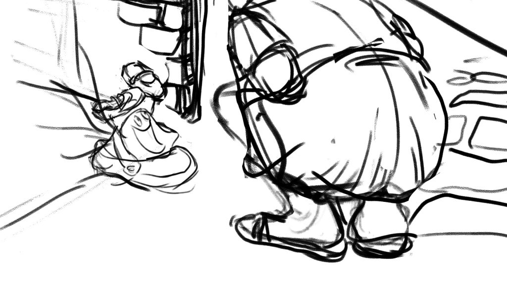
Some sketches that I drew before starting work. I feel that I work better when I sketch my thoughts on pen and paper.
One key point that I experimented with was whether it was possible to illustrate all four panels with the placement of the shoe being fixed, while presenting the images different perspectives. I managed to do it, but the sadness and disgust images are rather similar. Perhaps more could be done to experiment with alternative povs :>
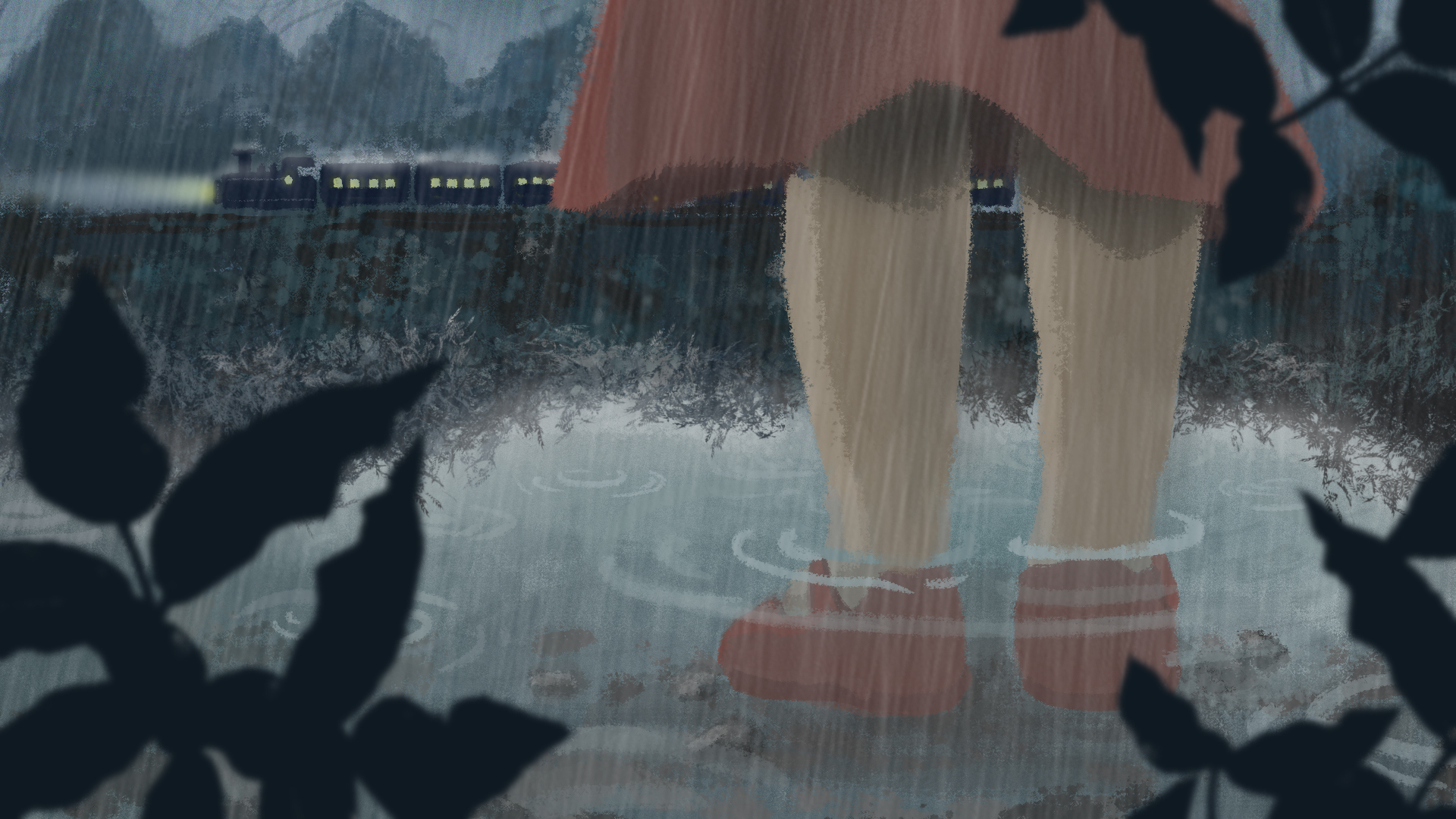
Final Images
Sadness
Father leaves daughter; rainy scene
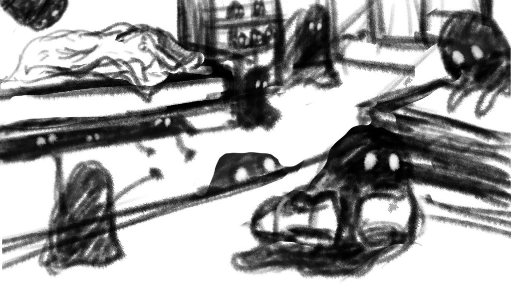
Fear
Daughter is left alone in her room to fend her fear of the dark. Her imagination ran wild as she faintly hear something being dragged across the room. In actual fact, a ‘ghost’ has took her shoes away.
disgust
Daughter realises the next morning that her favourite shoes are gone. Wearing her old slippers, she went out in search for it. Wet mud splattered all over her skirt and legs, evoking a strong sense of disgust from her.
Happiness
She found her shoes at last! In fact, the ghost was on its way to return the shoes as well, after modelling and making its own ghost shoe.
I am very happy with the final work even though the quality and style isn’t that consistent throughout (something to take note of next time). Having worked mainly with traditional medium and less with digital, this assignment helped me pick up many useful techniques from photoshop. Now I am really starting to appreciate digital painting!
From the stash of movie quotes, I have narrowed down to work on these few:
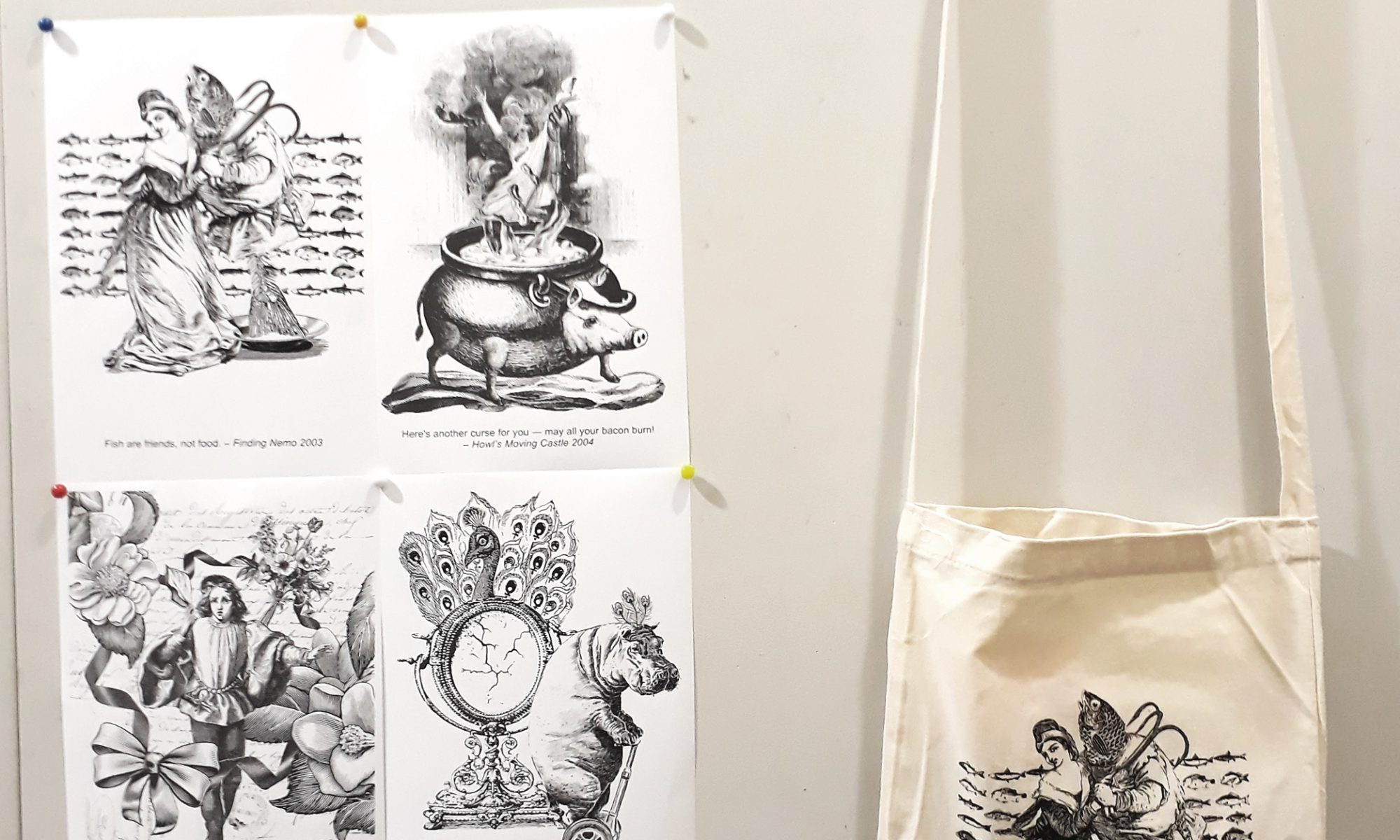
Finding Nemo: “Fish are friends, not food”
Spirited Away: “I finally get a bouquet of flowers and it’s a goodbye present”
Howl’s Moving Castle: “Here’s another curse for you – may all your bacon burn.”
Howl’s Moving Castle: “I see no point in living if I can’t be beautiful”
Ponyo: “I’ll let a fish lick me if it’d get me out of this wheelchair”
Moana: “If you wear a dress and have an animal sidekick, you’re a princess”
This is still more than the four movie quotes required, but I decide to just work on them first to get a better idea about which quotes have more potential to be developed.
Learning from my research on Dan Hillier, I wanted to emulate his working style in this project. Instead of sketching out clearly what I am looking for in my composition and then searching for suitable images online, I have decided to follow Hillier’s way of starting with a very vague idea and browsing through images to find associations. Only then are the images composed together — pretty much trial and error.
As I really like Hiller’s illustrations, I decide that I wanted to go with a consistent Victorian/ Old books illustration style for my compositions. However, as all my quotes are taken from animated movies, I thought that using elements from the movie itself will appear too jarring as they evoke a very modern and child-like kind of feel, which seems incompatible with the Victorian art style. Thus, for most images, I’ve decided to take the quotes out of context and interpret them simply for what they are.
Finding Nemo: “Fish are friends, not food”
When I look at this quote, the first thing I thought was that I need to convey the idea of friendship/closeness well. It is easy to bring across the idea of fishes and food, but I was worried that if I were to focus on that, I will neglect the main idea of fish are friends.
However, searching for images on ‘friendship’ did not yield much satisfactory results as the image merely look like two or more people talking to each other.
For example:
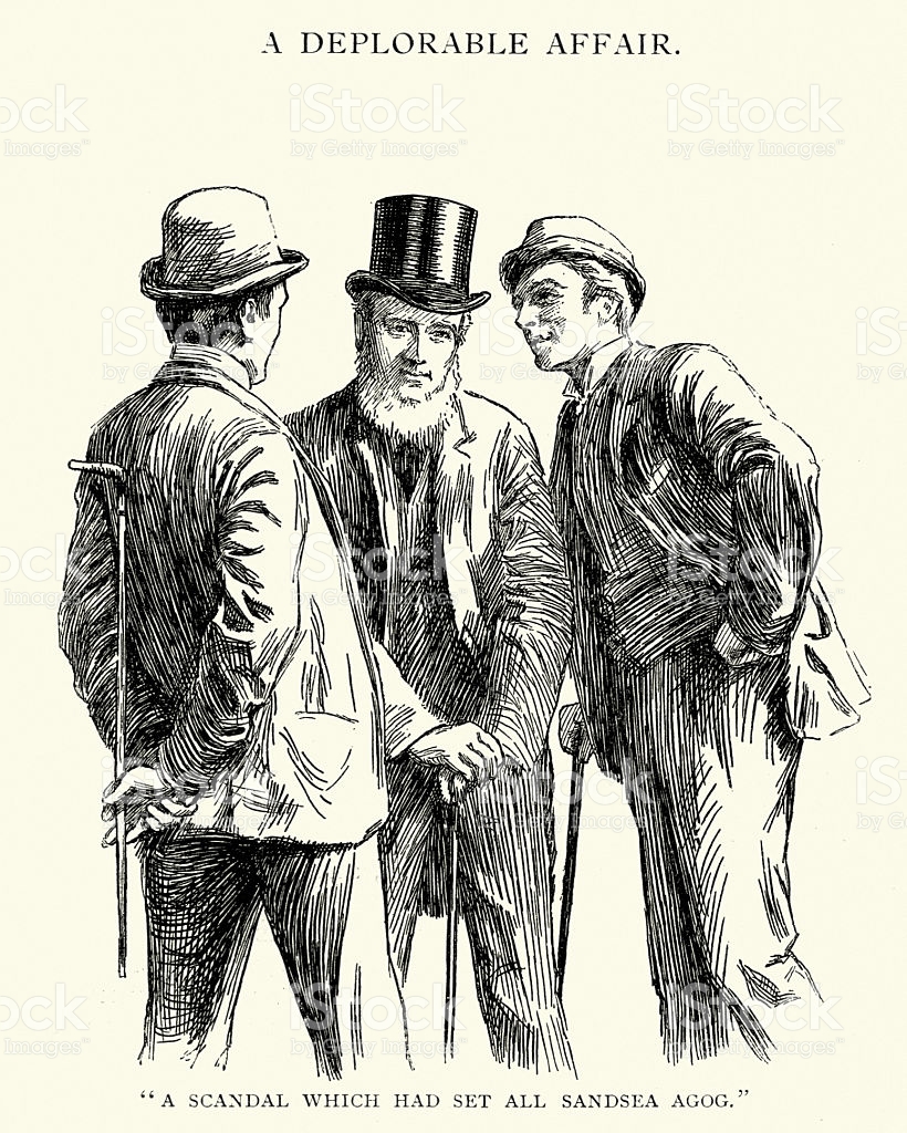
Accessed from http://www.istockphoto.com/sg/vector/victorian-male-friendship-gm170178869-23189160Accessed from http://www.istockphoto.com/sg/vector/group-of-victorian-men-gossiping-about-a-scandal-gm538354728-95714931
The idea of rapport/ companionship/bond is not conveyed strongly. Thus I tweaked my search and sourced, instead, for couples. While bringing in ‘love’ might not be that suitable, what I was driving at is really an intimate and friendly relationship.
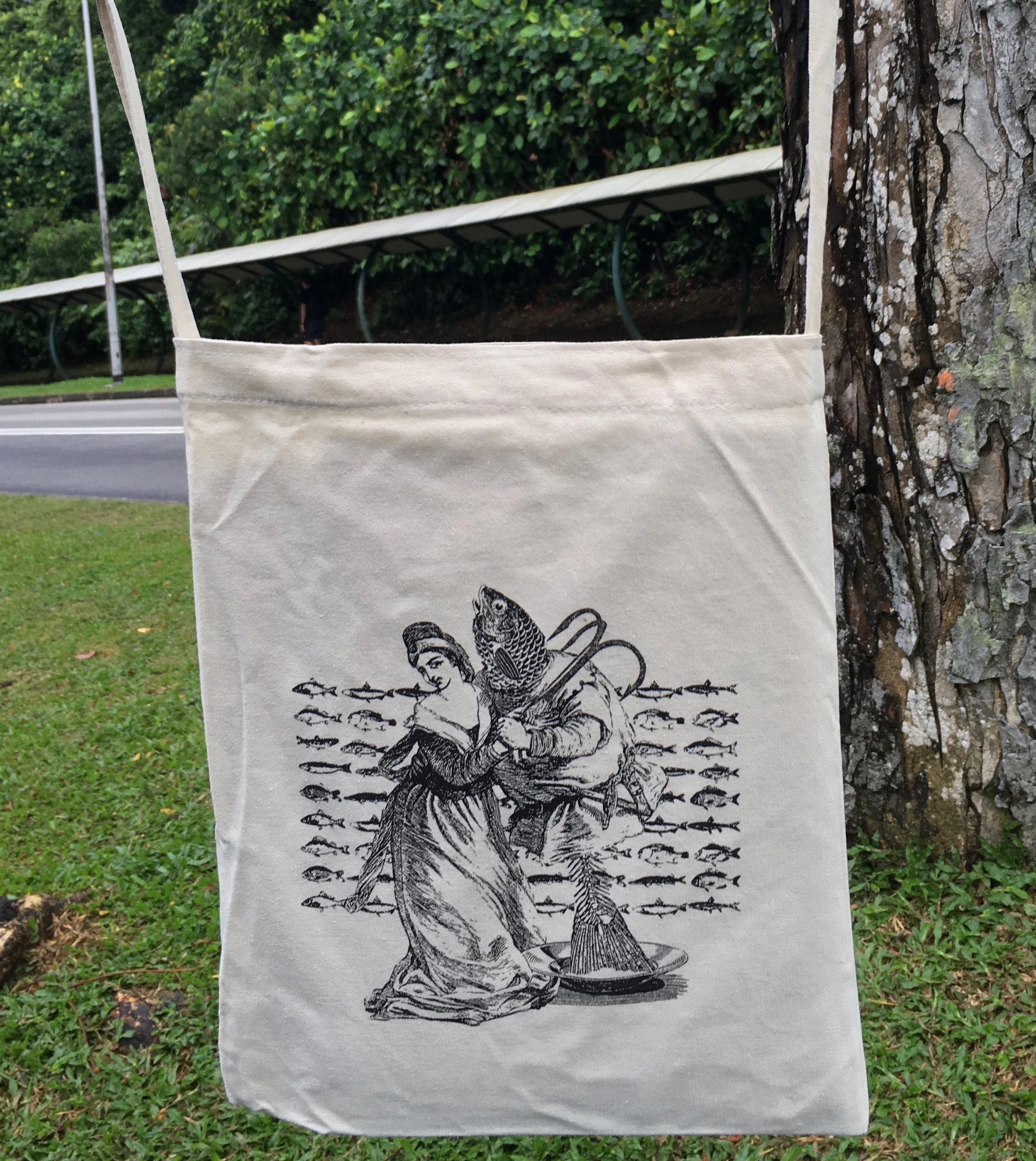
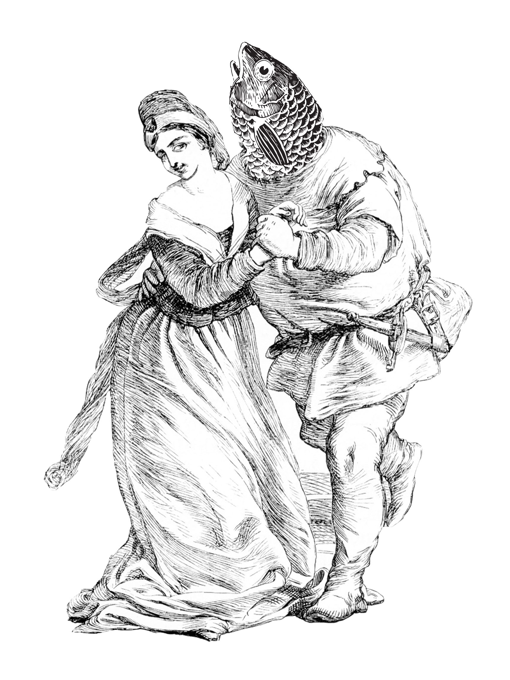
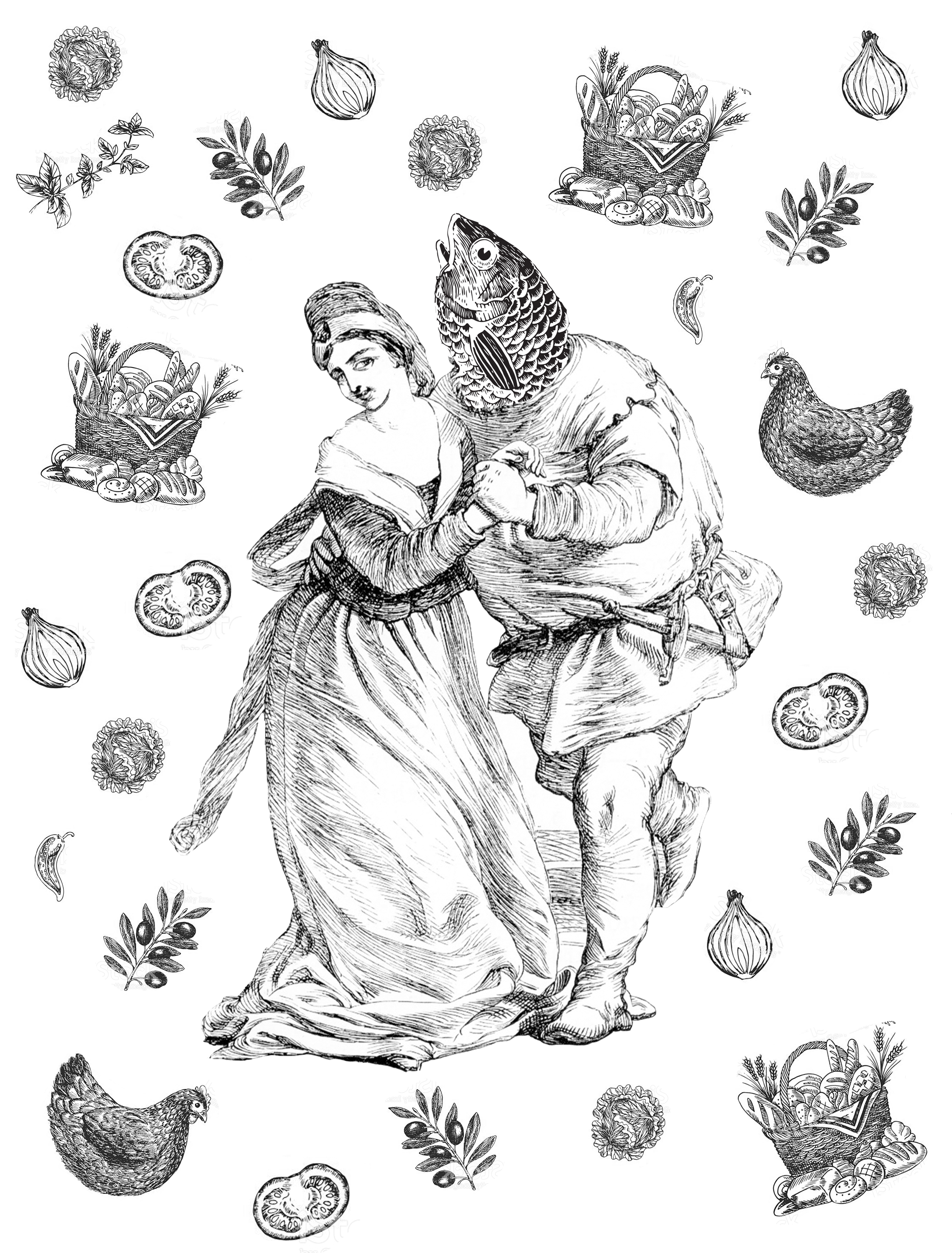
This was what I found. The man looks like he’s courting the woman. I thought this image was suitable because of the physical contact that expresses the idea of ‘closeness’, while not being overtly intimate or romantic. The expressions of the woman is apt as well, as she looks like she’s challenging the notion that fishes are food/friend.
This is the first design I made:
By swapping the man’s head for a fish head, I wanted to bring out the idea that the man is the fish, and the close contact between the two shows that the woman sees him as a friend and not food.
Thinking that the idea of food is not strong enough, I scattered bits and pieces of ‘food’ around them.
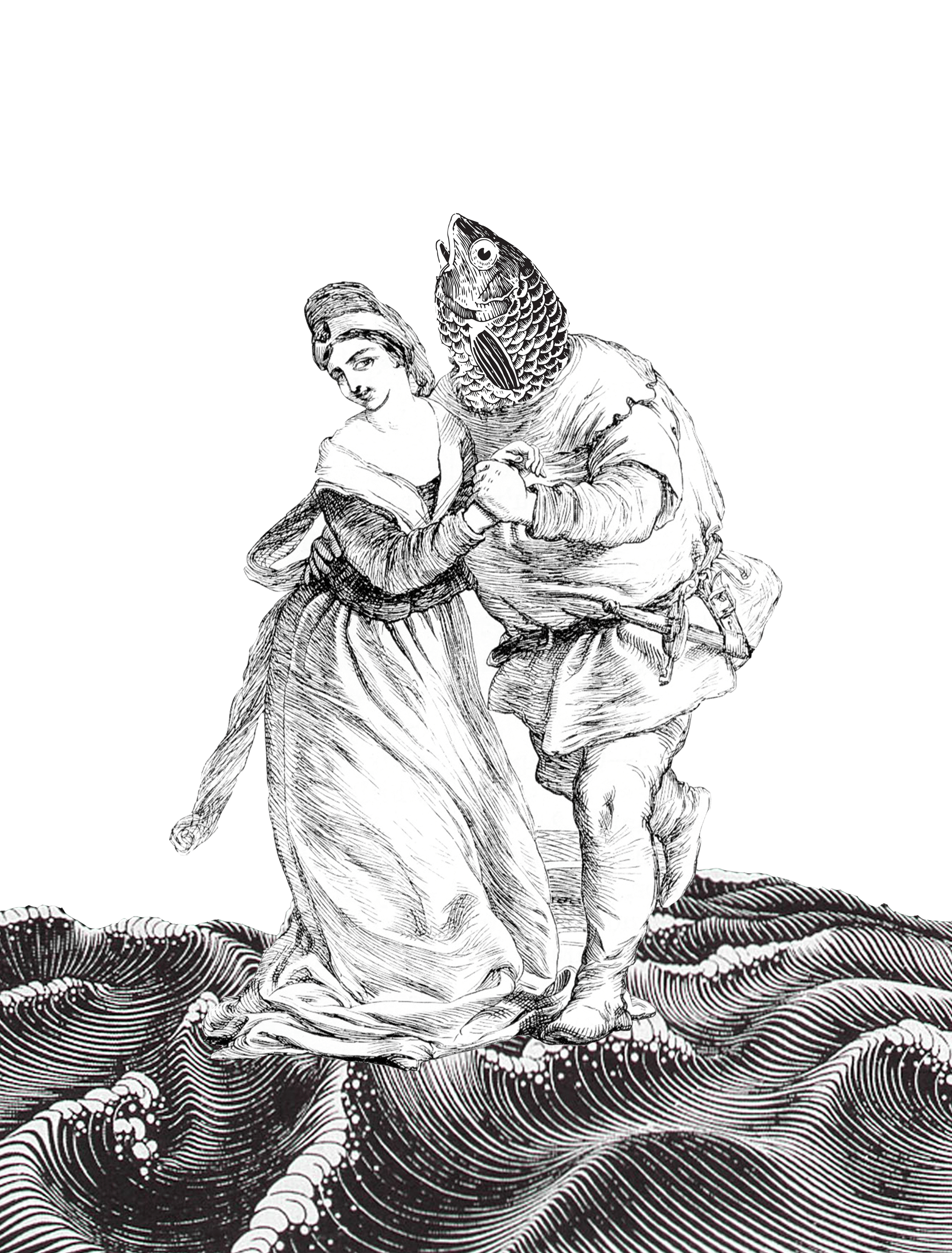
However, I found that the entire composition does not tie in well because the food is scattered too randomly, and no idea of fish being friends and not food is being expressed. Yet, to use the original design feels too plain. Thus, I started working with the background.
I added waves here since fishes live in the sea/water. Again, the waves doesn’t deliver much meaning and are quite redundant.
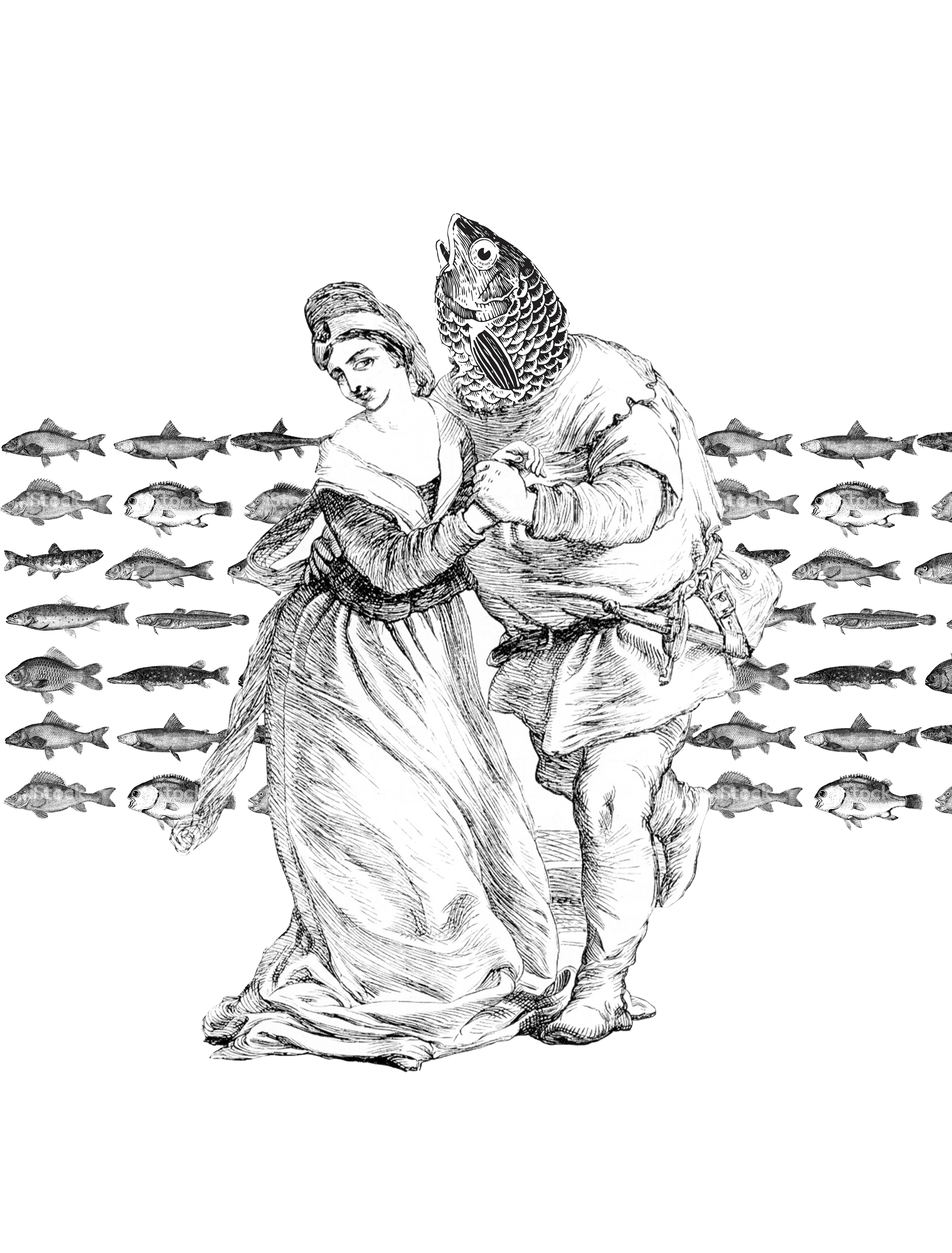
Using the idea of repetition to bring out harmony, I decide to collage different species of fishes for the background to bring across the idea that “fish are friends, not food” applies not just exclusively to the ‘fish-man’, but all types of fishes. Nevertheless, the quote is still not conveyed strongly enough.
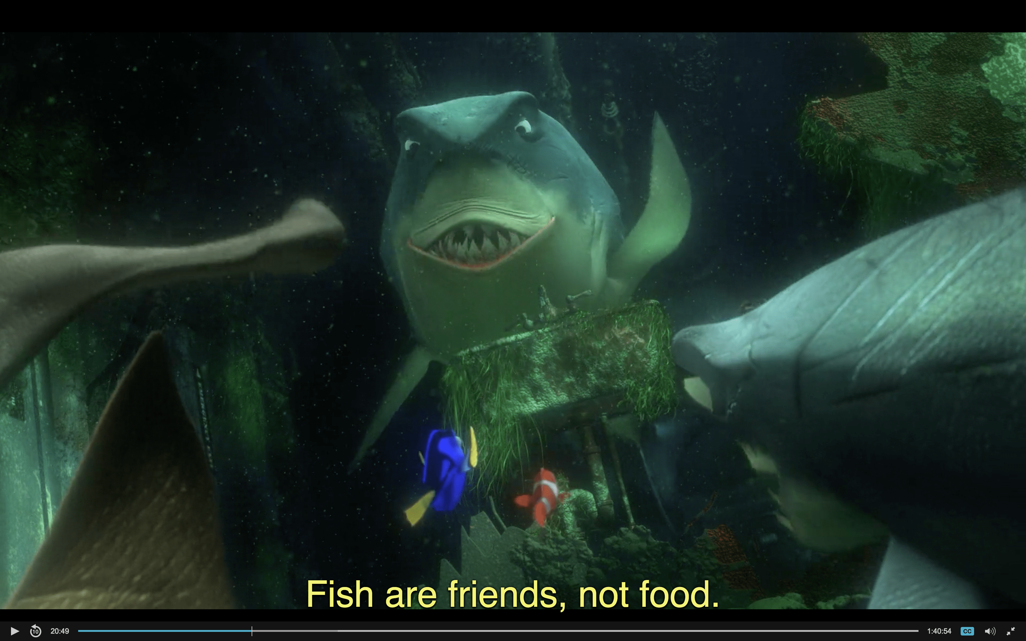
Being stuck, I decide to revisit the movie scene.
The sharks were determined not to eat fishes at the start.
However, when Dory started bleeding…..
The sharks forget all the talk about not eating fish and went berserk.
As we can see, there is actually a lot of ambiguity in the quote, when taken in context. Although the sharks proclaim that ‘fish are friends, not food’, their resolve is not strong, which cause them to waver between eating fishes and treating them as friends. I decide to incorporate this sense of ambiguity into my design.
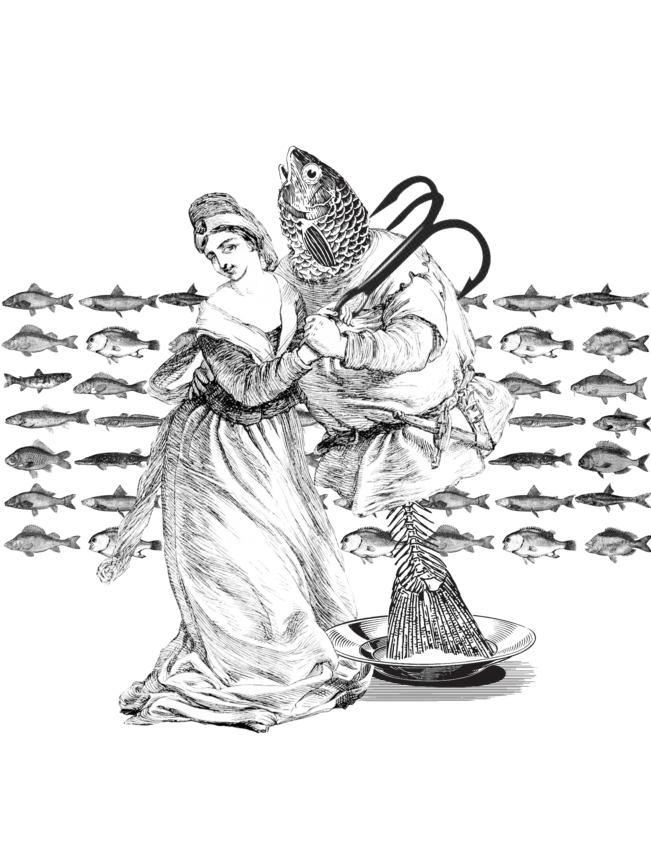
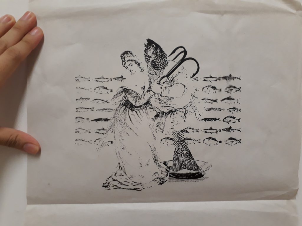
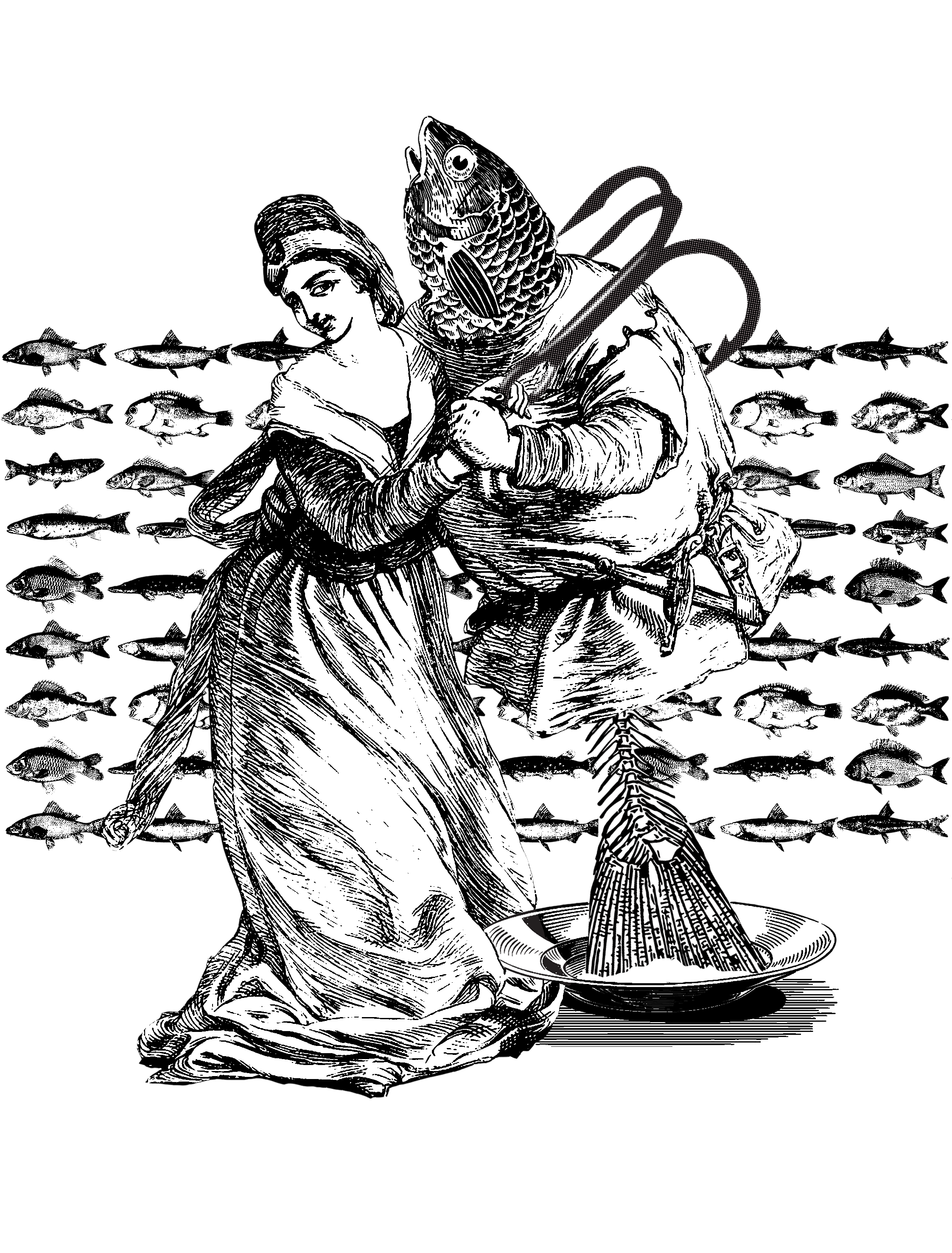
By placing the man on the plate, their motion becomes uncertain: is the woman leading the fish away from the plate, or is she putting the fish onto the plate? The same idea is reinforced several times:
The half-eaten body of the fish: did the woman eat it, or did she safe the fish from being fully consumed?
The fish hook that isn’t firmly entrenched in the fish body: again, is the woman helping to remove the hook, or is she attaching it?
As I found this to be a satisfactory design, I decided to go ahead with it.
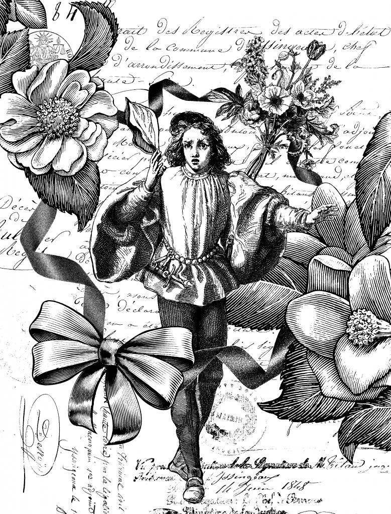
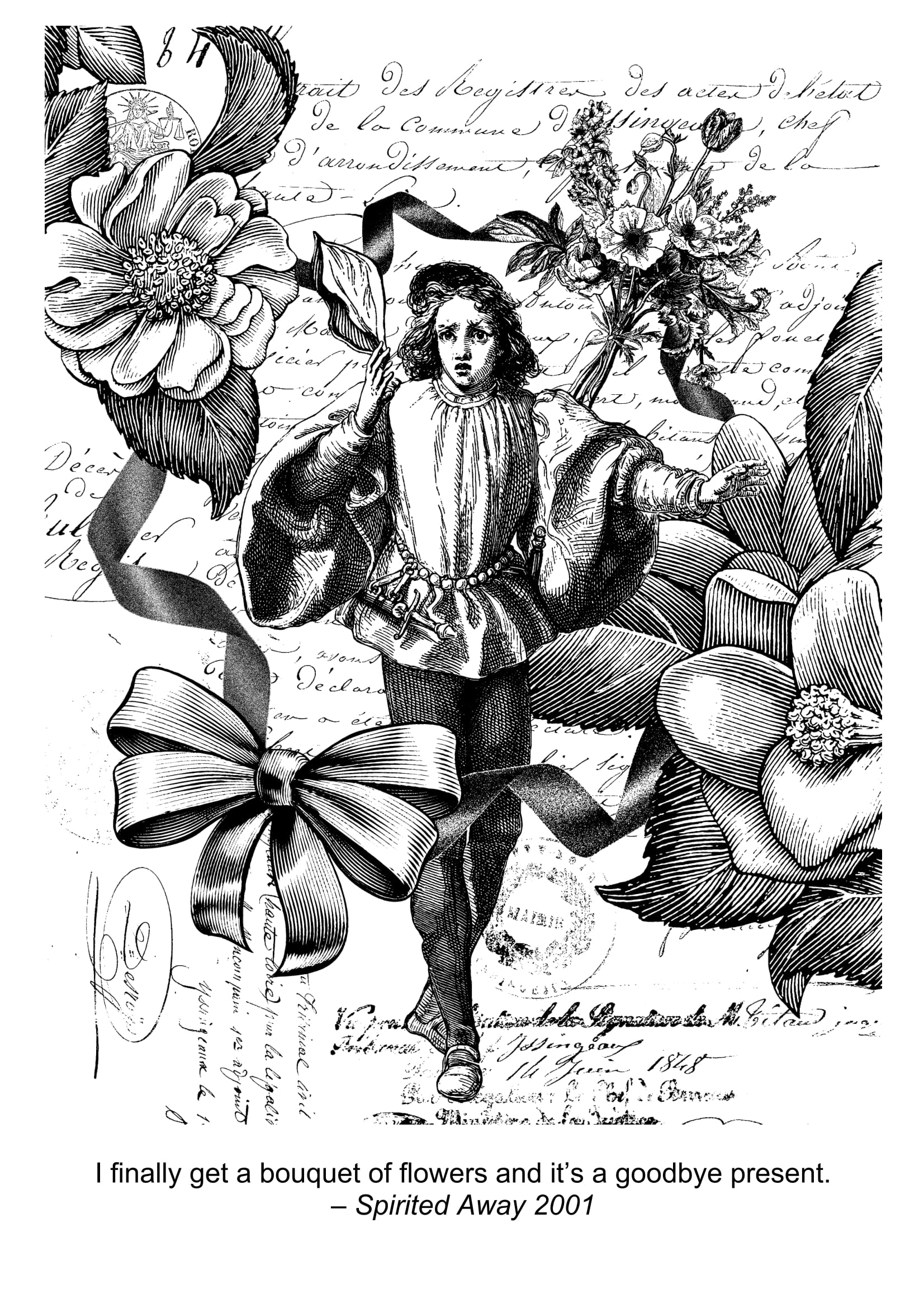
Spirited Away: “I finally get a bouquet of flowers and it’s a goodbye present”
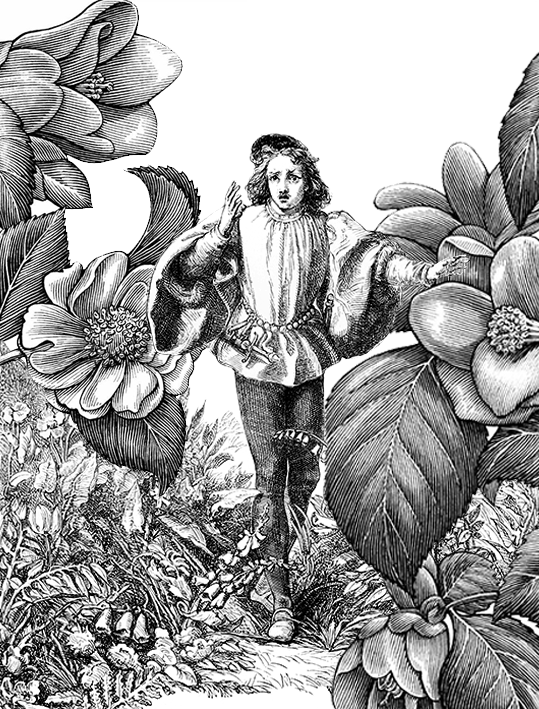
When I was brainstorming for this quote, as it involves abstract concepts like “goodbye”, I decided to pin down first the more literal components like flowers and present.
By chance, I found this forlorn looking guy who looks like someone is leaving him and he is raising his hand as if about to say goodbye, yet the person has turned and left already. I went on to surround him with a sea of flowers to portray him as drowning in his present that is full of ‘goodbye’ and ‘farewell’ connotations. I used very large flowers to frame the sides to represent the sheer monumental impact of the goodbye left in the person’s mind.
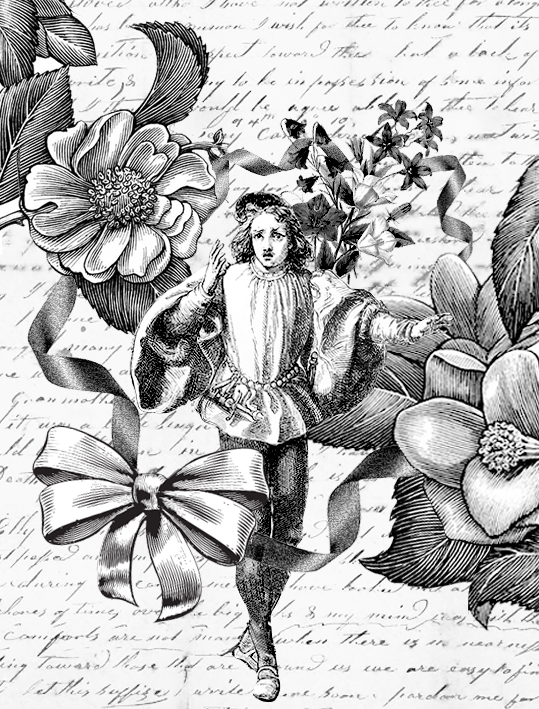
Thinking that the idea of ‘present’ isn’t strong enough, I went on to add ribbons and ribbon bow, since presents are often adorned with them.
I thought that the ribbons were a good addition, but the idea of goodbye is still not there. Besides, I realise that flowers =/= bouquet of flowers. And so, I added a hand-written letter at the background to symbolise farewell letters that people usually write for one another at moments of departure. I also included in a bouquet of flowers to make the message stronger.
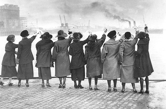
As I worked on the final design, I resized the different elements to bring more focus to the man in the middle rather than the flowers on the side. I also changed the bouquet of flowers to one that is more obvious since the previous one simply looked like a bunch of flowers held together. During the consultation, Mimi mentioned that she feels that ‘goodbye’ isn’t conveyed strong enough. I experimented with many different compositions (which I failed to save), such as having the person he is waving goodbye to at the foreground walking away/waving goodbye with one raised hand, but they destroy the original composition (which I thought was aesthetically pleasing enough, and hence did not want to alter it). After a long process of research, I decided to add a handkerchief to the centre guy’s raised right hand.
This is because historically, whenever sailors set sail to sea, their loved ones will wave handkerchiefs towards the leaving boat as a sign of goodbye, as seen in the two photos below:
Accessed from http://www.alamy.com/stock-photo/sailors-waving.htmlAccessed from http://the-history-girls.blogspot.sg/2012/02/
Final design for this quote:
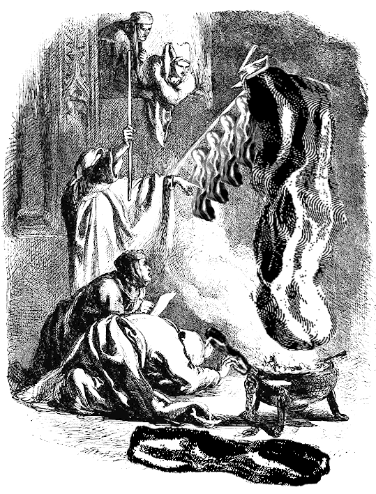
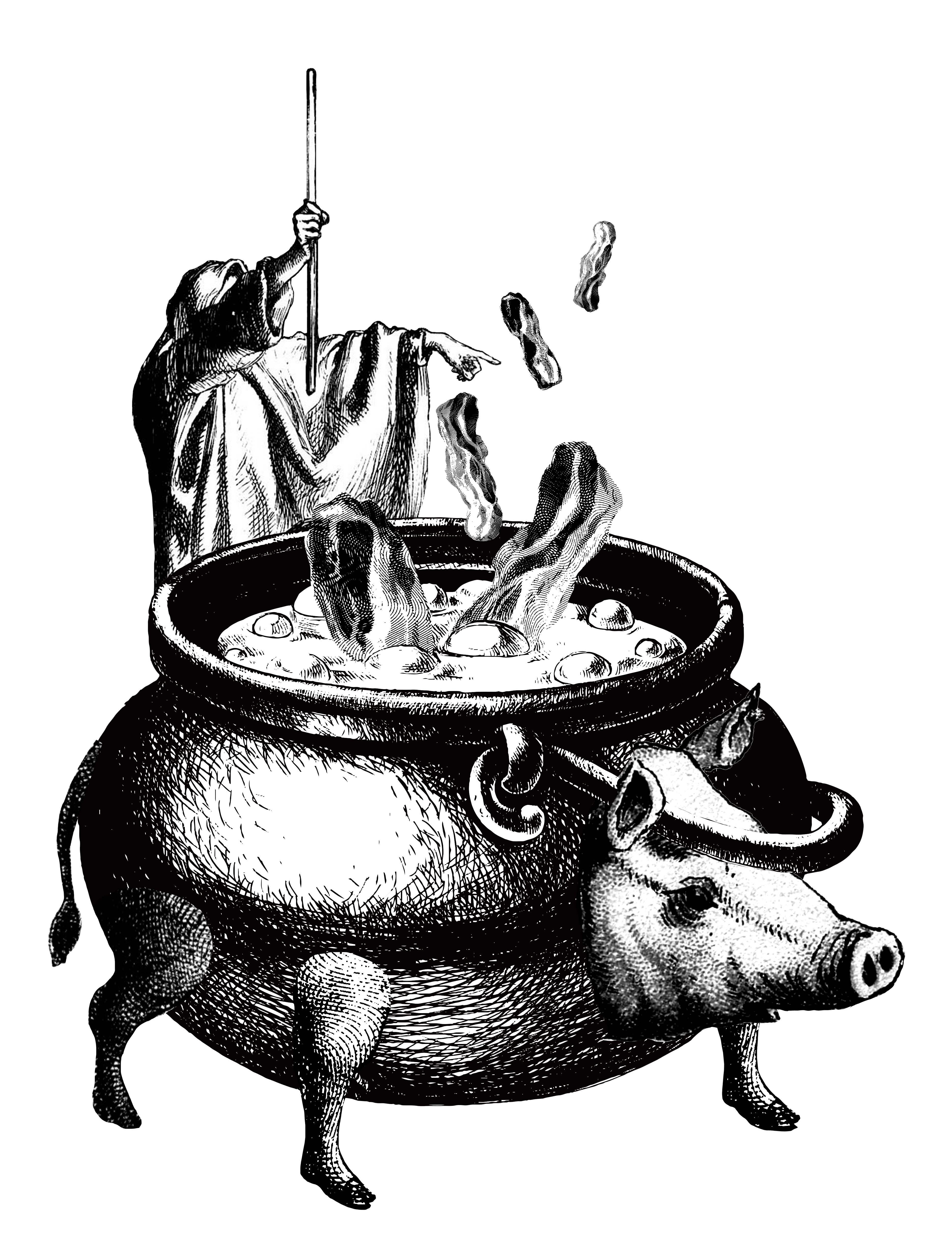
Howl’s Moving Castle: “Here’s another curse for you – may all your bacon burn.”
This quote is among the most literal quotes. I thought it doesn’t make sense if I were to research for what symbolises, say, curses or bacon or burning, because the resultant composition will deviate too much from the original quote that it becomes unrecognisable.
For my first design, I found this illustration of Shakespeare’s play, Henry VI, where a hooded conjurer is conjuring spirits. I thought it was quite apt, because it conveys the idea of “curses” and “burning”. I added a few pieces of bacon to see how it’ll turn out.
I felt like it didn’t look too bad, but the people at the sides are way too extra. Also the part about burning should be more strongly expressed, because it looked more like smoked bacon than burned bacon. Also, I felt that just using bacon is boring. Thus, to add more flavour to composition, I added a pig (do you know bacon is made from pigs?).
I thought that having the bacon fall in to the boiling pot makes the design more dynamic because there is this idea of action. Also, it gives off the impression that the bacon is conjured up, and not brought in by someone, like in the first design.
I experimented with some backgrounds as well. I usually searched for ‘war’ images since there is often some kind of burning in the landscapes. However, as they are often too complicated, they steal the limelight of the central scene, causing the composition to lose focus. Mimi agreed that the above design with the plain background is a lot more ideal.
I was intending to go ahead with it. However, on the night before the big critique day, I chanced upon this image of a woman shrouded by smoke, with her hands thrown up as if she’s casting a curse. It was perfect. I superimposed the photo and simply love the outcome!
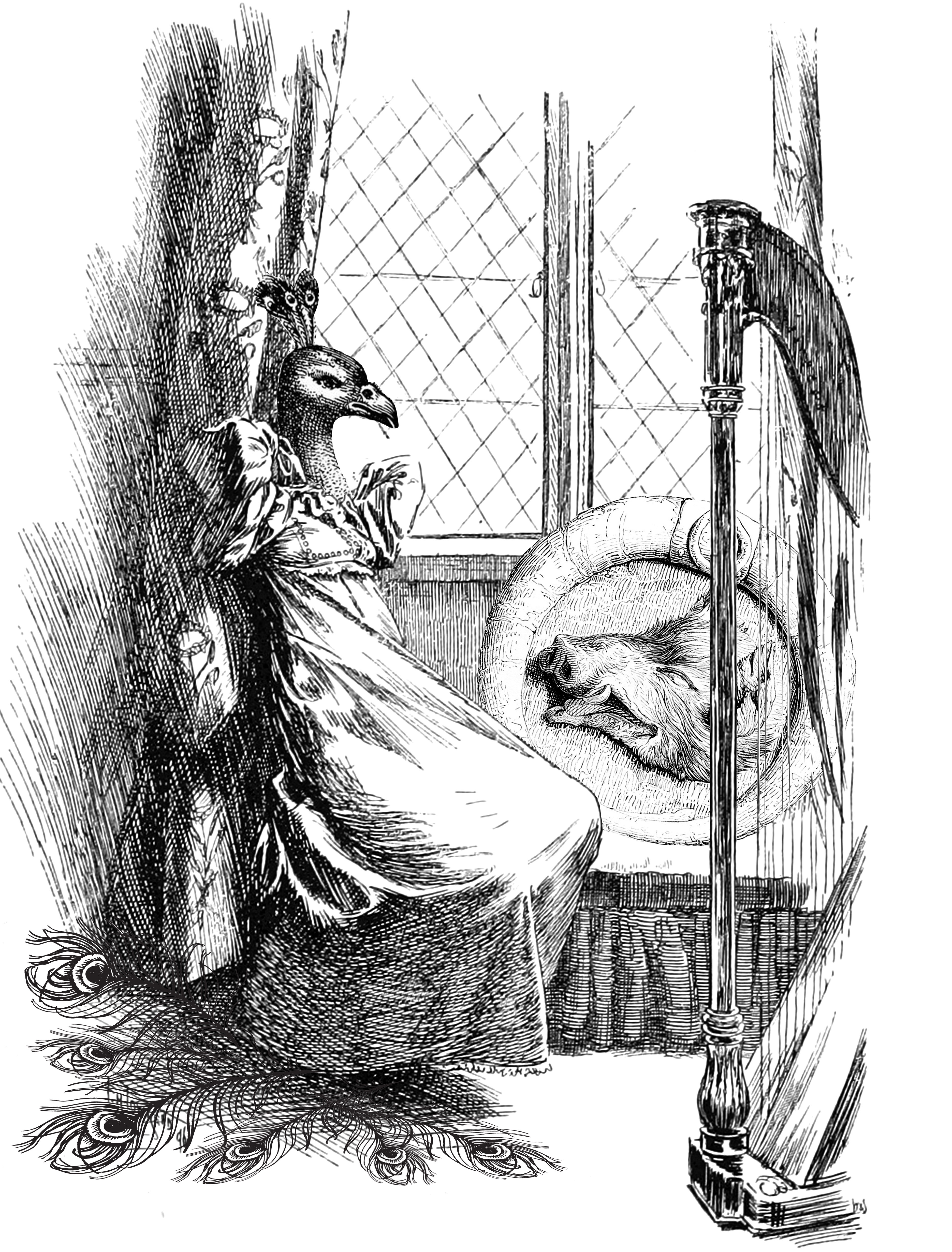
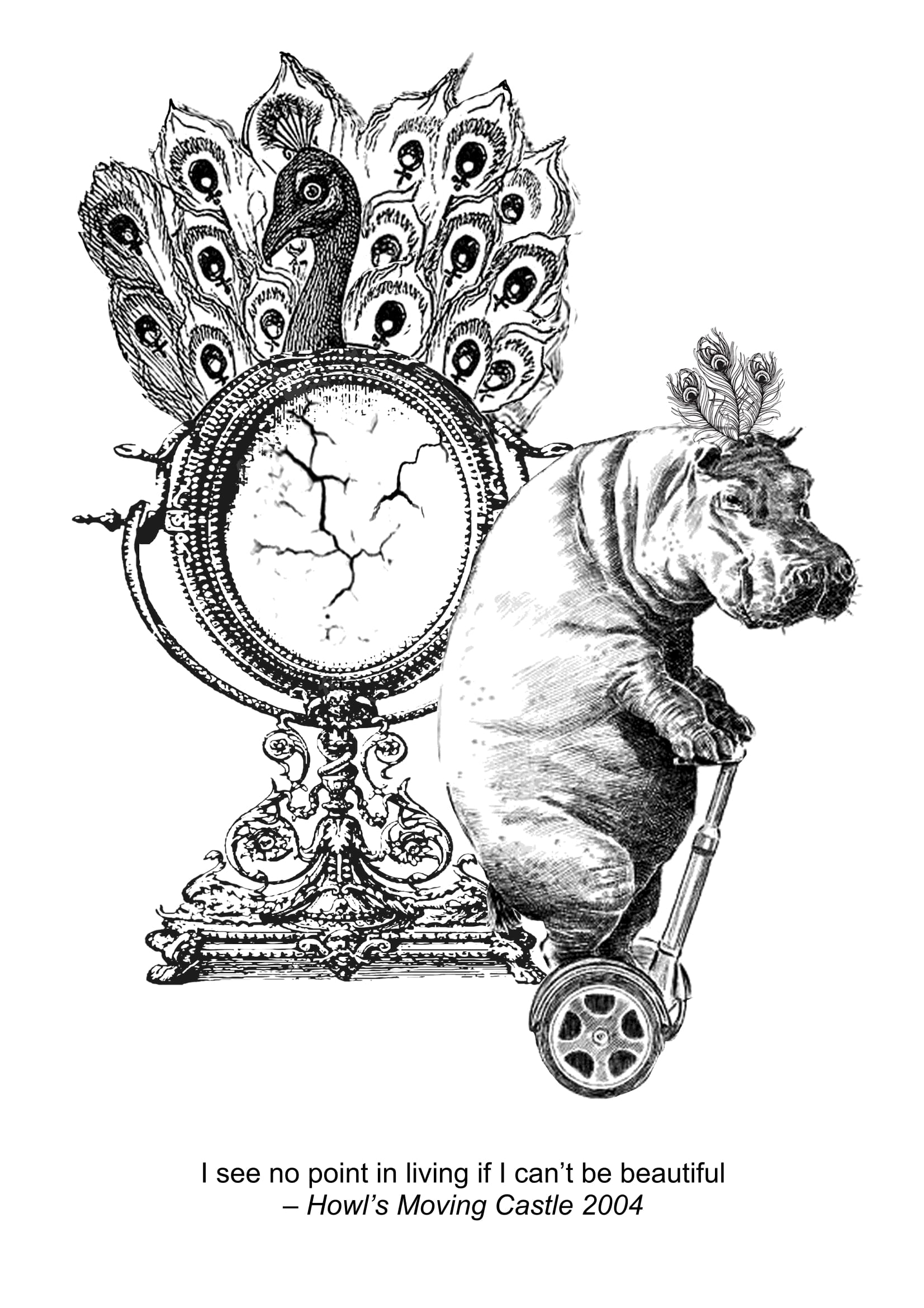
Howl’s Moving Castle: “I see no point in living if I can’t be beautiful”
While browsing through images online, I came across this illustration which showed a melancholic person staring out of the window. I found that it conveyed the idea of “no point of living” very aptly, and so I saved the image to work with it. I swapped his head for a peacock head, yet add a emblem/shield like thing at the side with a boar’s head, to show that this person is trying as much as possible to beautify his outward appearance, yet the truth is that he simply resembles a boar constantly haunts him. The peacock feathers further accentuate the idea that beauty is something that he can never achieve.
I found this design to be too obscure, and the idea of ‘no point of living’ is not well-expressed.
I worked on a second design, which is a lot more literal. Clearly, you can see that the skeleton is surrounded by the flowers, which means that he is consumed by the concept of beauty. The skeleton — a sulking one for that matter — conveys the idea that there is no point in living, even if he has everything on the world (since he is sitting on the globe)
While the aesthetics look fine here, I felt that it lacked the wow factor and didn’t really resonated with what I wanted.
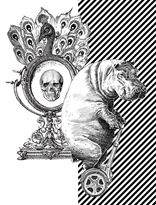
Here, a girl in a dress has a ugly animal head and stares vainly into the mirror, adorned with a single peacock feather. She wears a troubled expression as if upset with her looks.
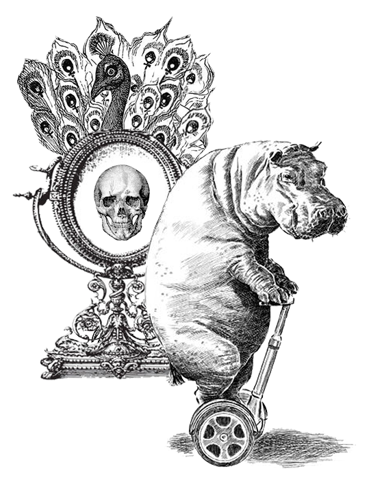
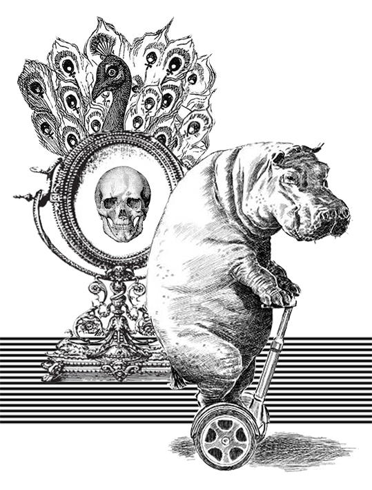
This design is okay to me, but a tad bit too simple. Thus I worked on a new design and borrowed elements from the previous design. I used the peacock mirror to symbolise beauty and vanity. The gloomy hippo, being upset by his appearance in the mirror, rides away on his segway. The skull, which surfaced after the hippo looked into the mirror, represents the face of death, telling the hippo that his appearance means that he doesn’t deserve to live.
Mimi mentioned that the skull is too distracting and redundant. I didn’t feel that at first, but after seriously considering her comment, I realise it’s very true. There are too many elements in the composition fighting for attention, and the skull simply dilute the focus further without contributing much.
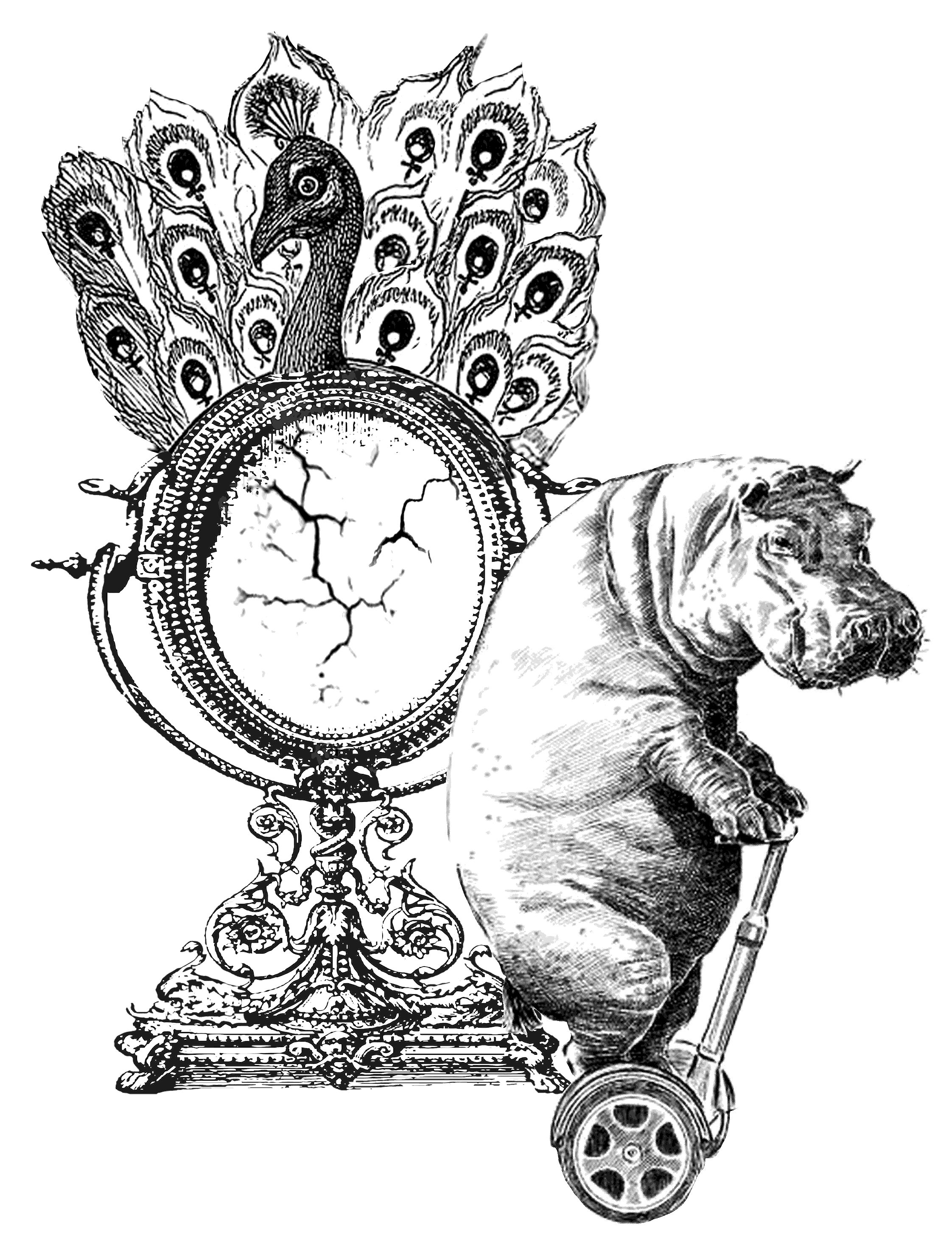
Working on her feedback, I substituted the skull for a more toned-down mirror-cracks to show that the hippo’s looks are so bad that even the mirror cracks after being exposed to his face. I resized the peacock mirror larger so that there is a main focus for the composition (instead of having both the peacock and hippo the same size and have them fighting for attention)
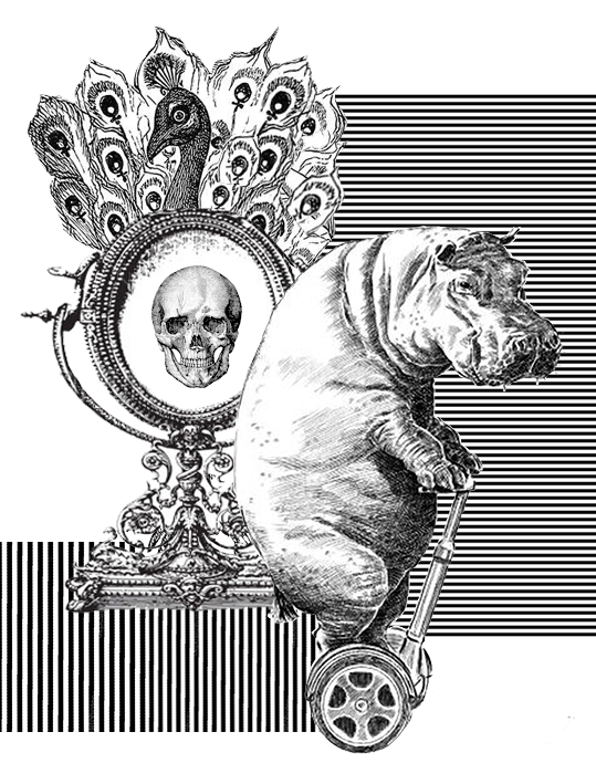
I’ve also experimented with different backgrounds because I found it plain:
Conclusion: nah, I should keep it plain. Thus I stuck to the previous design as the final one, but added three more peacock feathers on the hippo’s head to symbolise his efforts to beautify himself, but which still failed in the end.
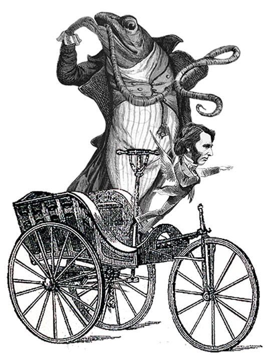
Ponyo: “I’ll let a fish lick me if it’d get me out of this wheelchair”
I interpreted the quote very literally. Thus I used 4 main elements: fish, tongue, wheelchair, person getting out of chair. This was the first design I did:
I tweaked the composition so that it follows a triangular shape and feels more stable and comfortable on the eye.
I found the design interesting, but too disparate and seemingly random (even though it did follow the quote). Mimi felt that the flying guy doesn’t express the idea of ‘getting out of wheelchair’ strong enough. Also, instead of the licking fish, the flying guy should be the main focus.
I worked on her comment and experimented with different compositions using the same images. However, nothing satisfactory came out, and I thought that there isn’t potential for further development. Hence, I dropped this design for the final 4.
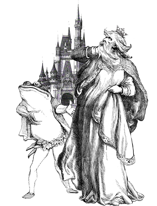
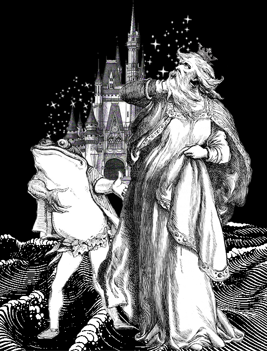
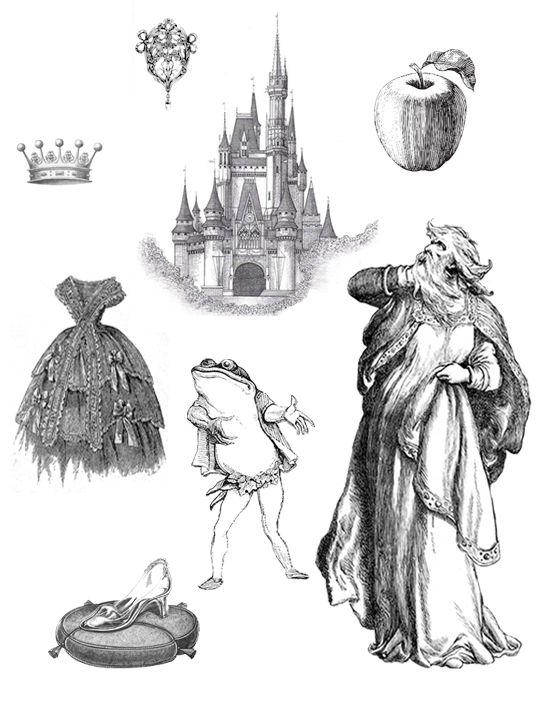
Moana: “If you wear a dress and have an animal sidekick, you’re a princess”
Although directed to Moana, this quote suggests that anyone can be a princess, as long as he/she 1) wears a dress, and 2) have an animal sidekick. I decided to play on this by superimposing an old man’s face onto a woman who is wearing a dress. I used the dancing animals as I thought they were really cute and similar to the animals in Disney movies.
To further express the idea of princess, I added a little crown on the head.
Feeling that the message wasn’t strong enough, I added waves at the background as an allusion to Moana. However, I realise that it’s a little out of place.
I decide to redo the composition and used a frog this time, as this frog gives the impression that it is eager to promote his owner, just like any other Disney princess’ sidekick. I added the Disney castle to emphasise the idea of Princess and royalty.
I experimented further and added in the waves (to allude to Moana) and twinkling stars for magical effect.
As I scrolled through old photos, I also saw several images of old encyclopedia:
Accessed from http://www.silverspiralarts.com/keyword/pincones;antique%20royalty%20free%20stock%20image;illustration/Accessed from: http://onewomanshands.blogspot.sg/2011/11/freebie-images-encyclopedia-pages-1.html
Inspired by their layout, I decided to try it out:
The apple symbolise the poison apple that Snow White ate; magic mirror used by the queen in Snow White; glass slippers worn by Cinderella. All elements point to the idea of ‘princess’. I’m actually quite fond of this design, but thought that this layout might not be too suitable for this project. And it also looks like I have no idea how to use photoshop and can only lay the elements out separately.
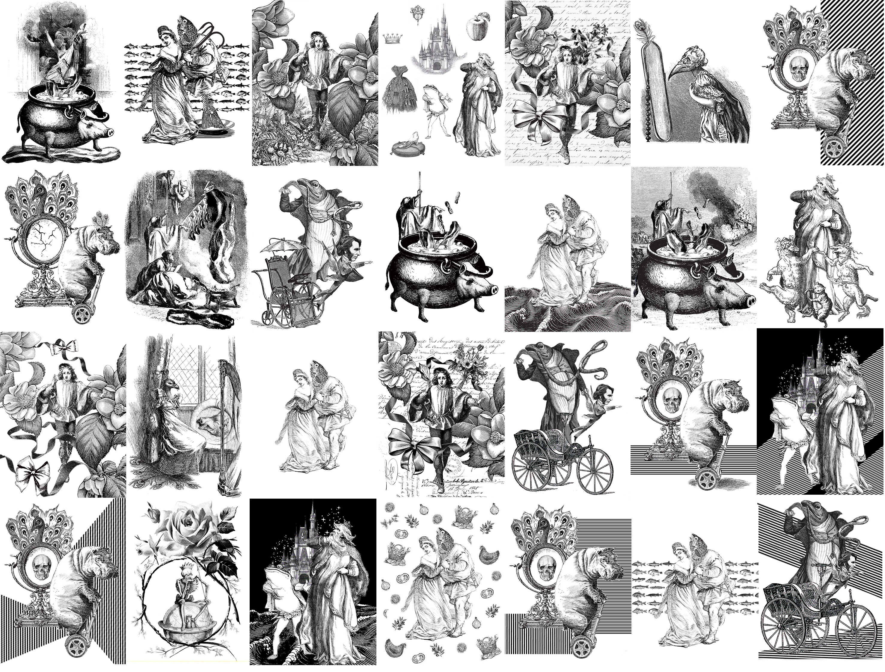
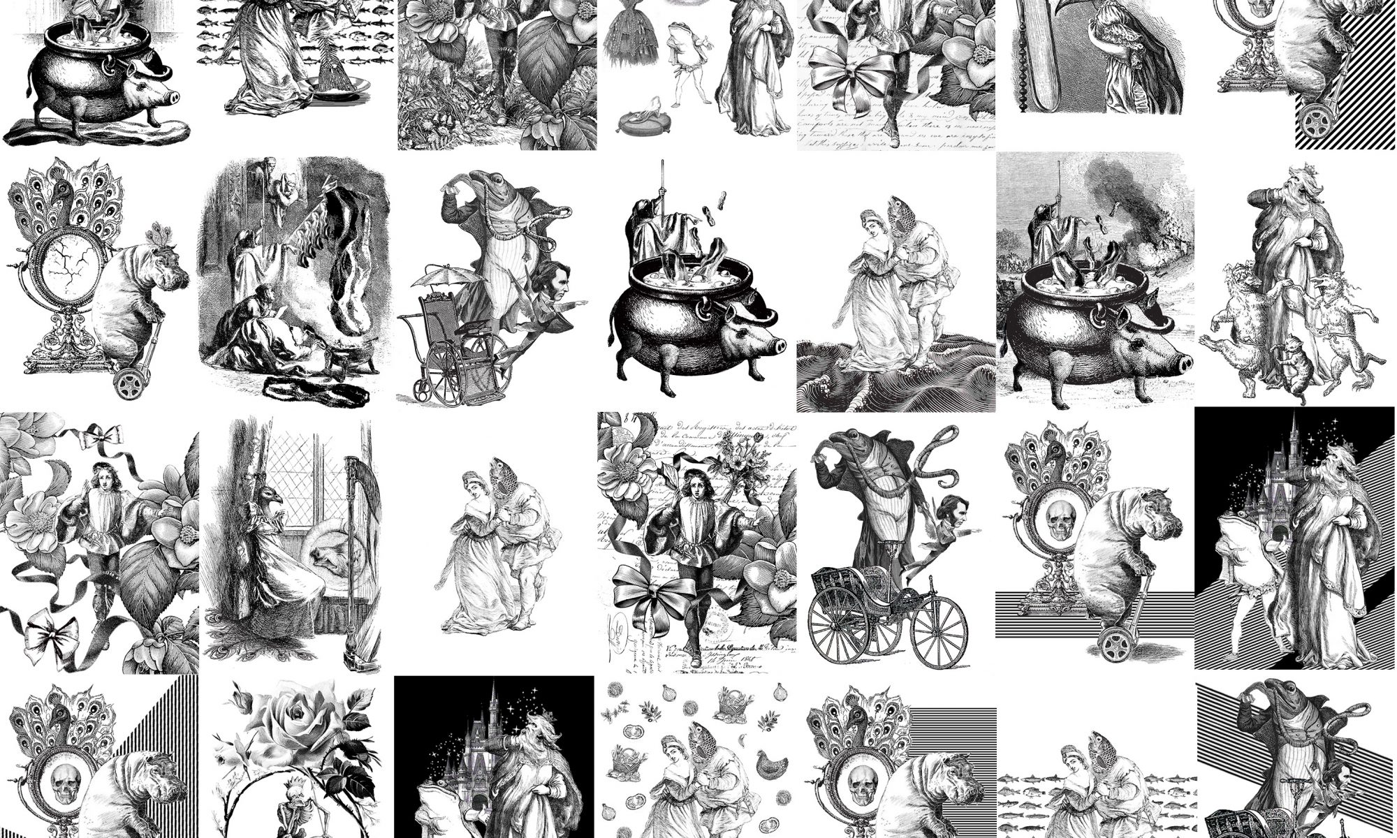
After the very long process of experimenting with and developing different designs, I have came up with my final 4 designs:
Check out my blogspot on my final 4 designs :D
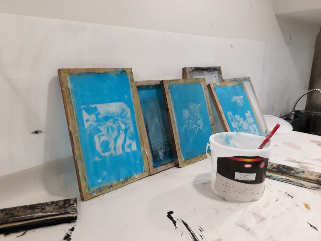
Silkscreen printing
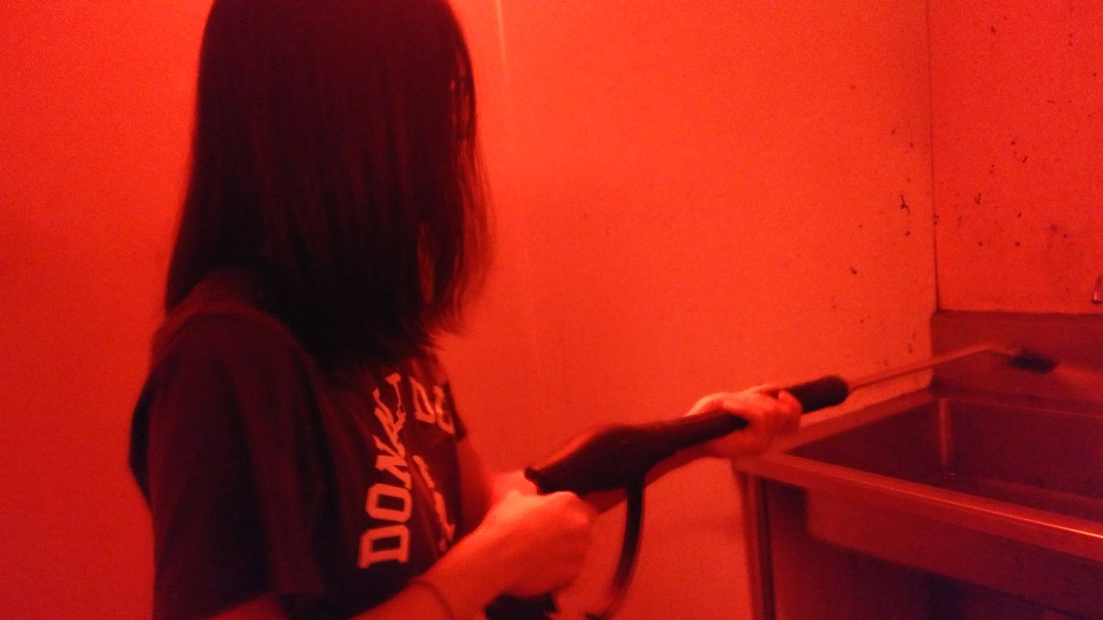
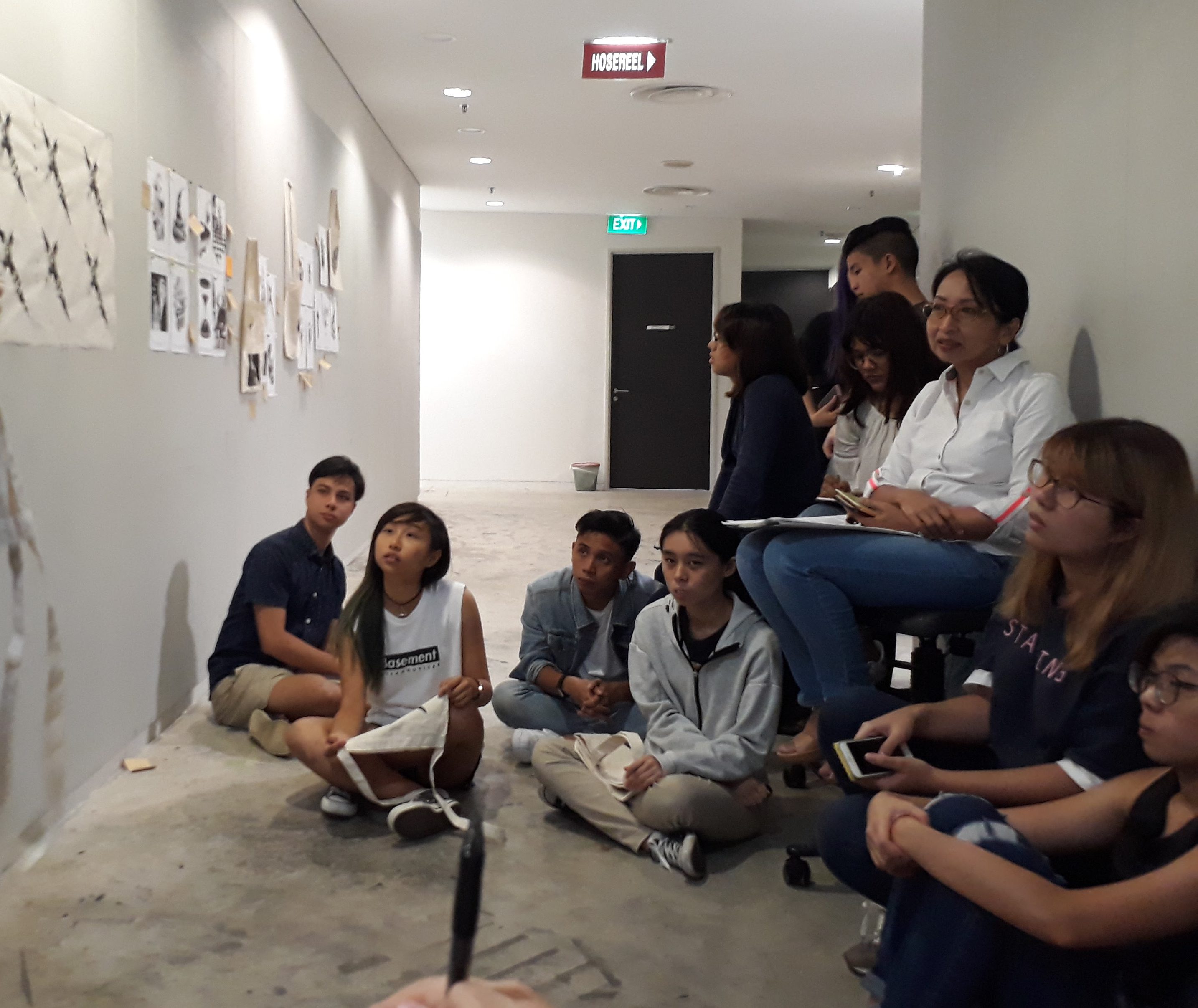
This is my first time working with silkscreen printing, and it involves a lot more process than I thought. I didn’t document much of the process because I didn’t bring my phone into the dark room :(
Silkscreen process:
Coat the silkscreen frame with the photosensitive blue emulsion paint (try to make the coating as smooth as possible)
Leave to dry
Paste the transparency (the surface with the carbon downwards) on top of the frame and exposed the silkscreen in the UV machine for 18seconds
Use a water gun/ running water with pressure for the transferred design to appear
Use a squeegee and swipe with one confident stroke to evenly apply the black paint
give yourself a pat on your back if your design turns out well, or cry (gimme a chocolate if u actually read this ?)
A rare photo of myself caught in action (thanks Loh Kee)
The design didn’t turn out very well when transferred onto the paper as the details are simply too small to be captured well. I desperately hoped at the start that it was just the first print that went wrong and the rest will be fine if I apply more paint — but sadly, no, they’re just as bad.
I definitely needed a second round of printing. For my second round of printing, I increased the size and threshold of the entire composition. This helped immensely as the lines are now well-defined.
Removing the emulsion paintMy refined design: notice that the central figures are now larger. Lines are also more clearly defined after I increased the threshold.
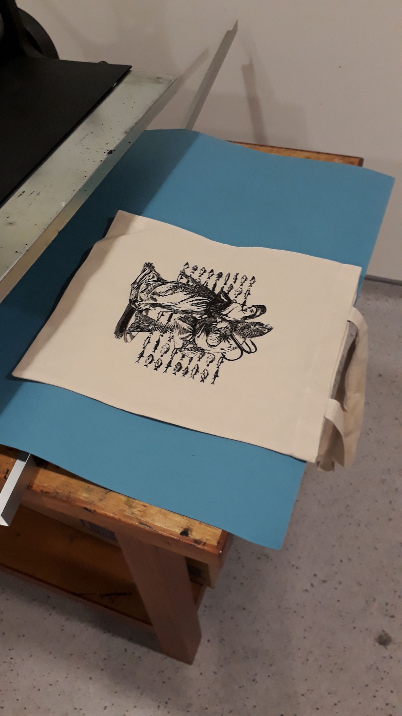
Test print!
Before printing on my tote bag, I did several trial runs on newsprint to get a feel on how much paint to use/how much pressure to apply, how fast to swipe the squeegee. I was so glad that most of my print this round turned out well! I just had to take note not to use too much paint, as that is fatal for a design that used many many thin lines.
I was really lucky though, my final print on the tote bag was perfect in the first round. I printed on a couple more bags for fun. I would think they would be even better since I had several rounds of experience already, but somehow the very first print on the tote is the best.
My first print on tote bag!
This is a really long post. Congrats on making it through ⌒°(❛ᴗ❛)°⌒
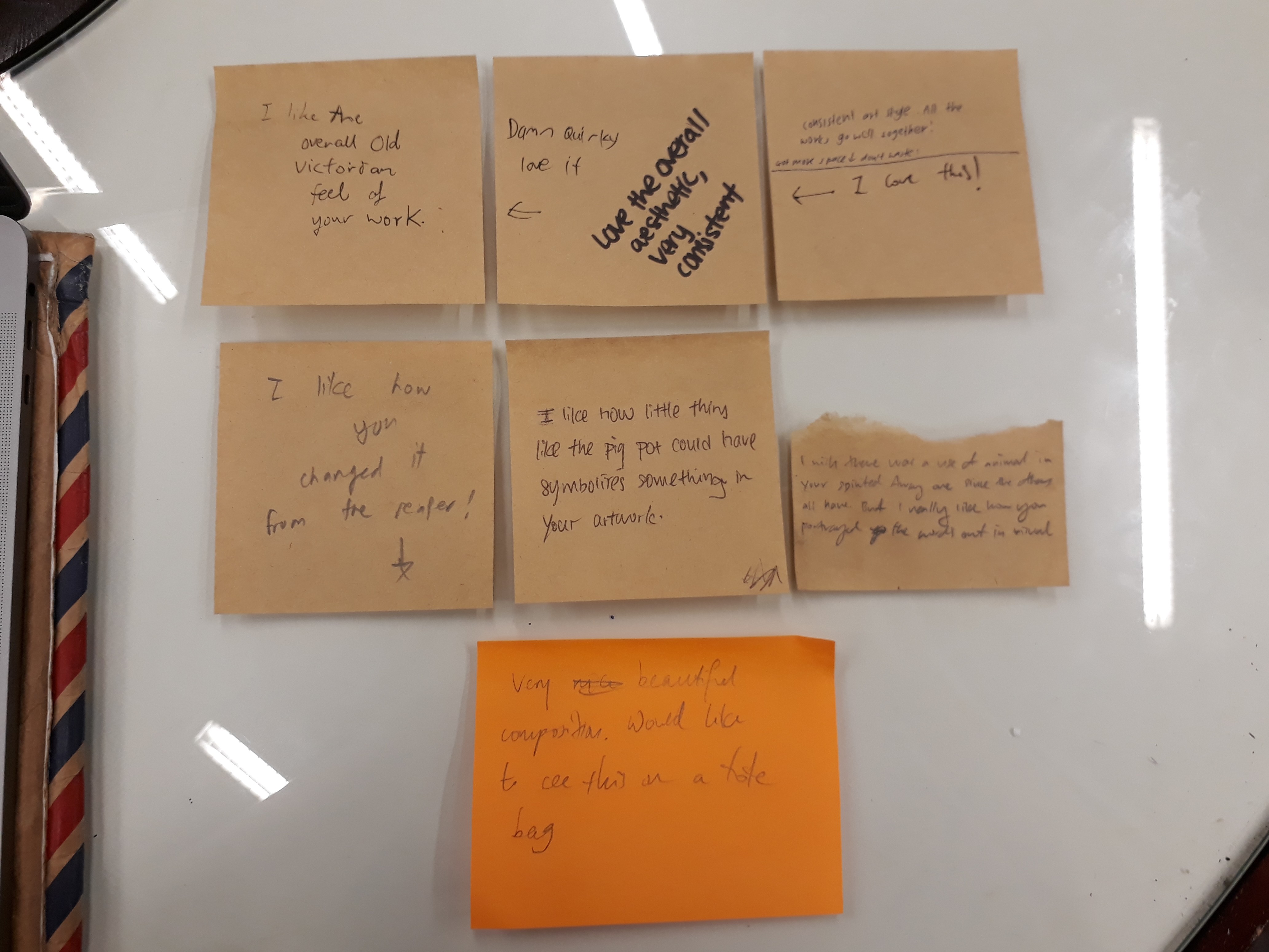
Generally, people liked the consistent art style in the overall composition. Surprisingly, the “May all your bacon burn” composition yielded good response among my classmates. Many also loved the ugly hippo on his segway. Mimi mentioned that it was nice that I manage to source for all images that cohere with the Victorian illustration style, and that there was quite a good use of imagery to represent my quotes. However, she felt that “goodbye” is still not very well-represented in the Spirited Away quote and there’s still room for further improvement.
Overall, this project has been extremely fun. Working on the movie quotes showed me how a single line can convey multiple meanings and conjure different imageries in the mind simply depending on how you choose to interpret it. Working around with different compositions, changing their relative scales, and arranging and rearranging them in space has heightened my sensitivity towards space and the importance of getting the composition right. Sometimes, the choice of images are perfectly fine but they still look odd. All they need, in fact, is just reworking with how they are arranged.
Being forced (heheh) to work with online images, I’ve learned a tons lot of photoshop techniques as a newbie, and am also now extremely conscious of the importance of choosing the right resolution for my designs (I used 72ppi for all but one composition, and had to redo everything ?). Reflecting on my final 4 designs, I am quite satisfied with them, but also feel that they can be further explored and developed. I think I could have researched on more symbolisms to use, so that my designs can be more allegorical instead of being too literal. This is especially relevant for the ”goodbye’ design, since I found it hard to express goodbye adequately using literal images without having the entire composition becoming way too literal).
Silkscreen printing was also an entirely new experience. The process was fascinating: applying the photosensitive emulsion in the dark room lit by spooky red lights, exposing the silkscreen in the UV machine (and have to believe that something has happened even though the screen looks the exactly the same), playing around with the water gun, and go through nightmares while printing with ink. Even though I faced several hiccups along the way, nevertheless, I am really glad that my tote bag turned out well ( I have a few extra, anyone wants to buy? $20友情价??? heheh jk) It would be nice if I could print other designs as well! (human greed has no end)
Hello! I realise I have no updates for 4D at all (since Joel didn’t require us to upload anything to OSS so far) so here’s just some stuff for personal record :)
For project 1, we had to create 3 original digital artworks based on the theme Strange New World. By manipulating visual images, three artworks containing landscape, figure and object (one each) have to be created, be it by addition, subtraction, and/or substitution.
For this project, I started out having two very vivid images of people standing on lamp posts as well as people squatting on lily pads intently gazing at something. These images were just random, but when I started to properly brainstorm for an overarching theme for my works, these images somehow fitted seamlessly with what I had in mind, which was an exploration of human traits that corrupt and dictate our actions.
Our Puppeteers
This work endeavours to explore the human condition. Man, by nature, is inherently self-interested. We have never been spared the company of our puppeteers – our greed, ignorance, and vanity – who subconsciously dictate our actions, permeate our thoughts, and blind our visions. All around us, we see a parasitical manifestation of egotism. In midst of our furious pursuit to feed our already inflated sense of self, we ironically become more and more detached with ourselves. At the end of the day, behind all that grandiose façade, do we know who we truly are? Do we dare to bare our soul to ourselves? Greed, ignorance, and vanity – to which do we own our conscience?
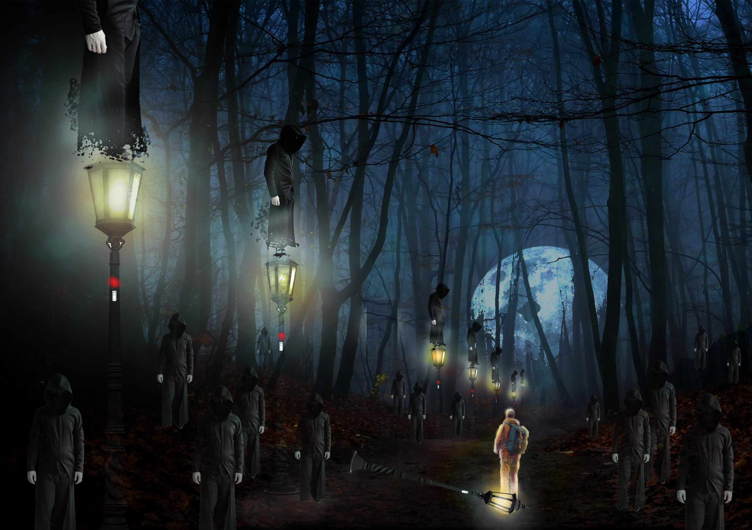
Ignorance:
Lampposts: a phantom of knowledge, a feeble imitation of knowledge
Men on lampposts: people blinded by ignorance. Pompously put themselves on a pedestal, in a bid to lead others, and people actually follow
People on the road: Wandering, lost, lured and misled by those on lampposts. They are trying to assert their importance, but have yet find a foothold, i.e. they are finding their own lamp posts, meanwhile they look up to those who are standing on the lamp posts, believing them to be wise and knowledgeable
Switch on lampposts: symbolise that the pretence of raising yourself up to a status higher than you deserve is fundamentally voluntary and intentional
Fallen lamp and Orange man: switch of lamp is turned off. One can only realise one’s shortcoming by introspection – it is not something that external forces can achieve. Hence, the switch is turned off by the ones who finally acknowledge their flaws
Illuminated glow of orange man, he leaves the lamp and heads towards the moon: the light from the lamp posts blinded those who stood on it. Only when one admits to oneself his/her deficiency and is eager to change, can he regain his vision. Then, he would have realise that the moon was there all along. This is an allusion to Plato’s cave. Instead of the Sun, the moonlight – juxtapose against the artificial lamp light – represents knowledge and wisdom.
Thus begin the journey towards the moon
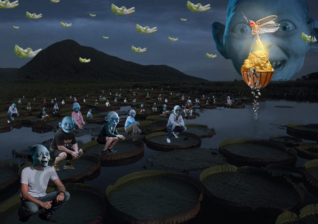
Greed:
Use of Gollum in substitute of all people’s faces:
Blanket use of Gollum in substitute of everyone’s faces symbolises the loss of individuality as everyone is trapped in the blind chase for wealth
Gollum’s significance in LOTR: Gollum was obsessed over the One Ring and was corrupted under its influence – greed has no end
The ring became his sole purpose of living, analogous to how people are obsessed with earning money in their lives.
The destiny of Gollum foreshadows the consequence of being too greedy
Also symbolises how pointless the pursuit is – you accumulate wealth, but it means nothing once you depart from this world
Gold that drop out of the basket became rocks, in actual fact the rocks are illuminated by the firefly, thus giving rise to the appearance of gold – reiterates the previous point, that money by itself has no intrinsic value
Frogs:
Nonchalant to the gold and the firefly
What I hoped to convey here is that money is pretty much a social construct, reiterates the point that it has no intrinsic value. We go head over heels for money, yet it holds no significance for the frogs
Ignores the firefly: because fireflies are toxic to frogs – symbolises that the firefly and the gold that is carrying is corrupting and essentially a poison to the human soul
Floating in the air: humans are weighed down by their greed, whereas the frogs are unbounded
Traditionally, frogs are associated with the water element and its cleansing attributes. Its symbolisms include: spiritual cleansing and ancient wisdom, essentially what the people on the lily pads lack. Use of frogs provide a contrast against the humans.
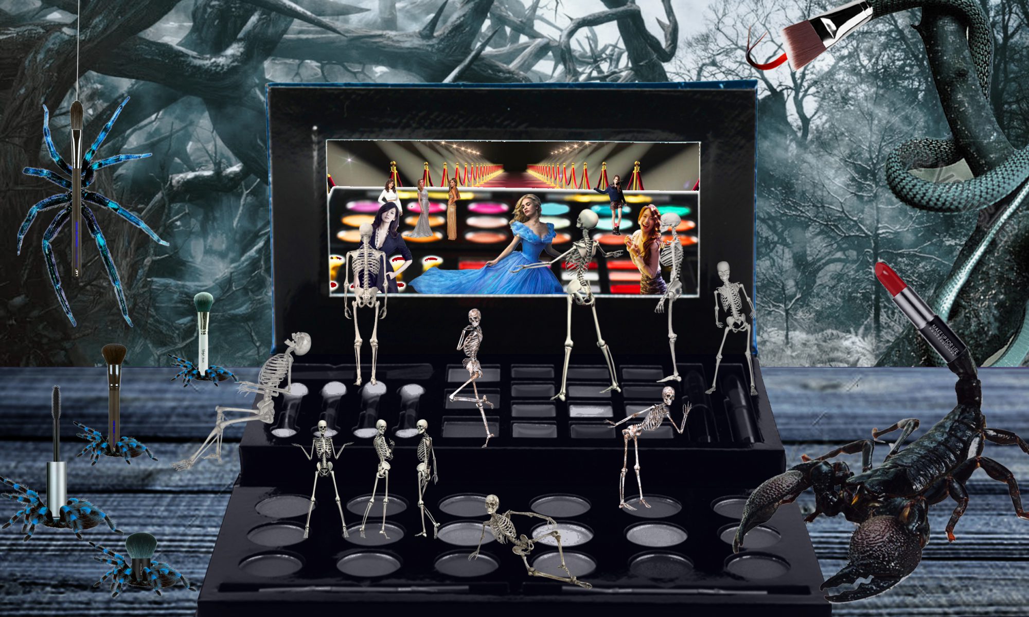
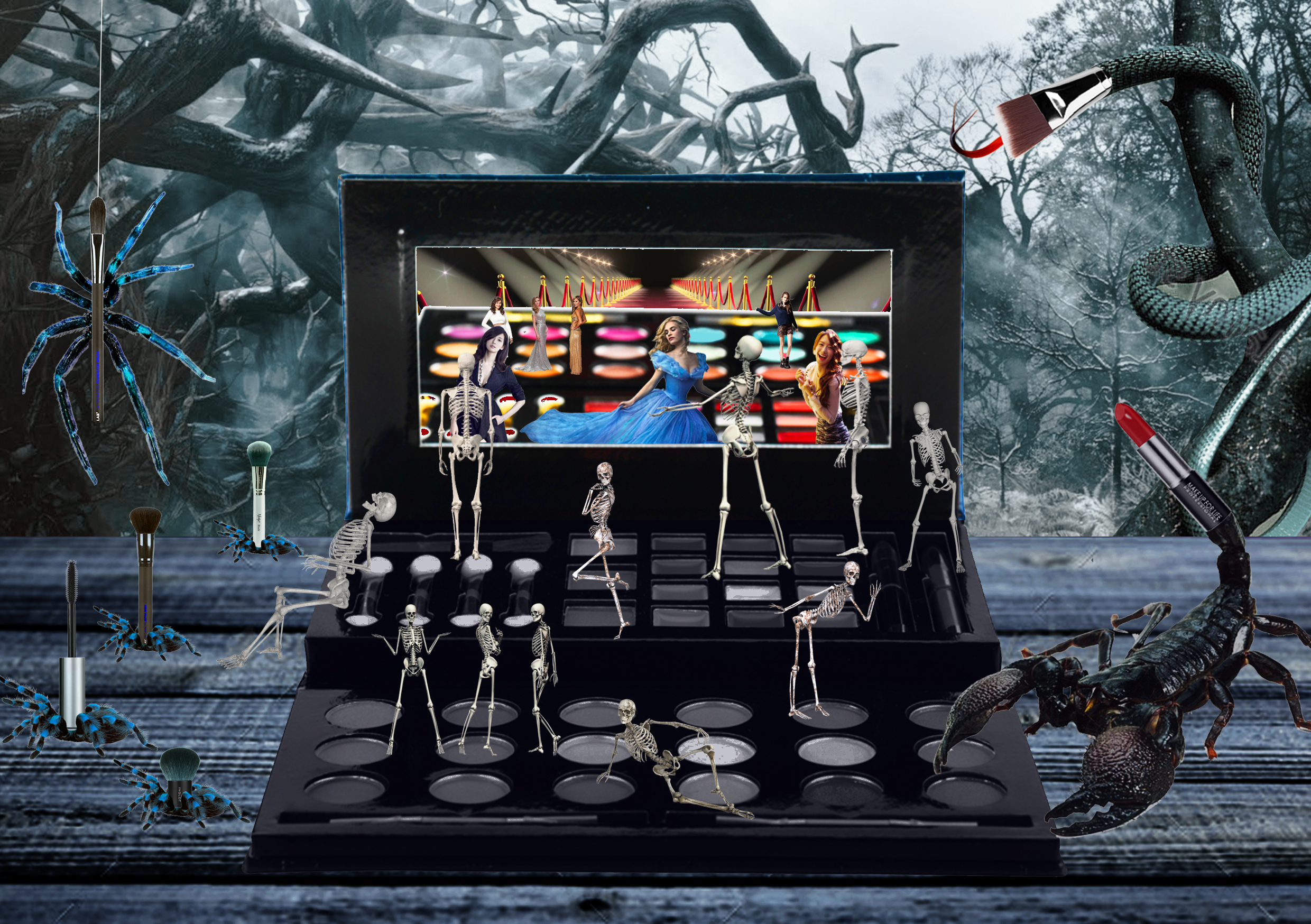
Vanity:
Quite straightforward
Skeletons, but their reflections in the mirror are beautiful: beauty and physical appearance is a very superficial concept. Being preoccupied with physical appearance means nothing if you don’t enrich yourself spiritually and intellectually
Mirror: symbolises self-perception and fantasy
Difference in colour: the actual palette is desaturated, while the mirror image is flushed with vivid colours– expectations vs reality
Objects appear superior and more ideal in the reflections, do not reflect reality, but an impression of our desires
Make up brushes at the side are demonized and appear threatening.
Use of poisonous insects and animals: alludes to the malignant nature of the beauty industry, the menace of the insects and animals also suggests that giving up the brush (in other words, stop being obsessed over physical appearance) is forbidden once you picked it up = there is no way out
Challenges
Definitely technical problems. Being unfamiliar with photoshop (because I use AI more), I can’t get the effect I wanted in my mind
Also, I was limited by the images I can find online (e.g. when I want to find a particular posture/particular angle of a scene but there just isn’t any)
Perspective gave me many problems
Gollum faces could have been better imposed on the people,
Harmonizing the colours (especially for greed!) and having a unifying theme throughout all three images
These 3 artworks are arranged in sequence of its creation, which explains why the first looks so much more amateurish than the last.
Reflections
Overall, I really enjoyed the process of creation in this project: you start with a vague idea and walk the journey with it, curiously observing how your idea develops and how inspirations jump at you at the most unexpected moments. In aspects of semiotics, it was interesting to actually seriously consider why you use a certain element; what does it represent in this context; how can I use a certain symbol to my advantage; and how does the symbols changes the interpretation of my work. As a non-frequent user of digital media, working with digital images was a fresh experience – there are a lot of things that can be manipulated in digital media but not in traditional. For example, I can be a lot more adventurous in digital media because the actions are reversible, and thus I am empowered to be vastly more experimental :)


 The sharks were determined not to eat fishes at the start.