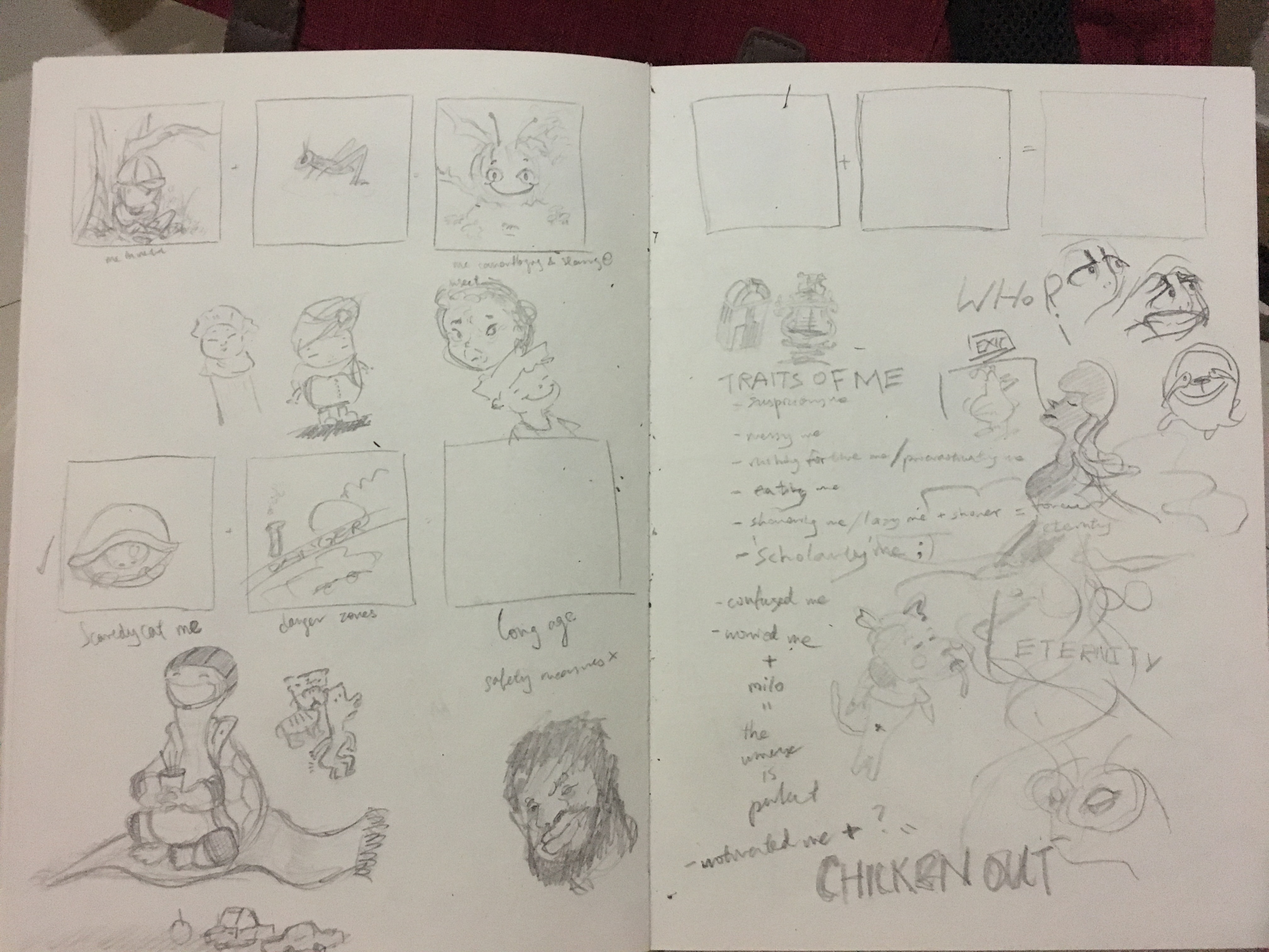
When I first started, I sketched out a few random ideas that were in my mind. In my first brainstorming session, this was what I came up with:
From up to down,
- Me being very reluctant to leave the bed + Sunrise in a mountainous area = Sleepy me trekking up the mountain at 3AM while being in a sleeping bag (This is inspired by my trekking trip in Sikkim several years ago, where I had to wake up early to catch the sunrise but I was really sleepy)
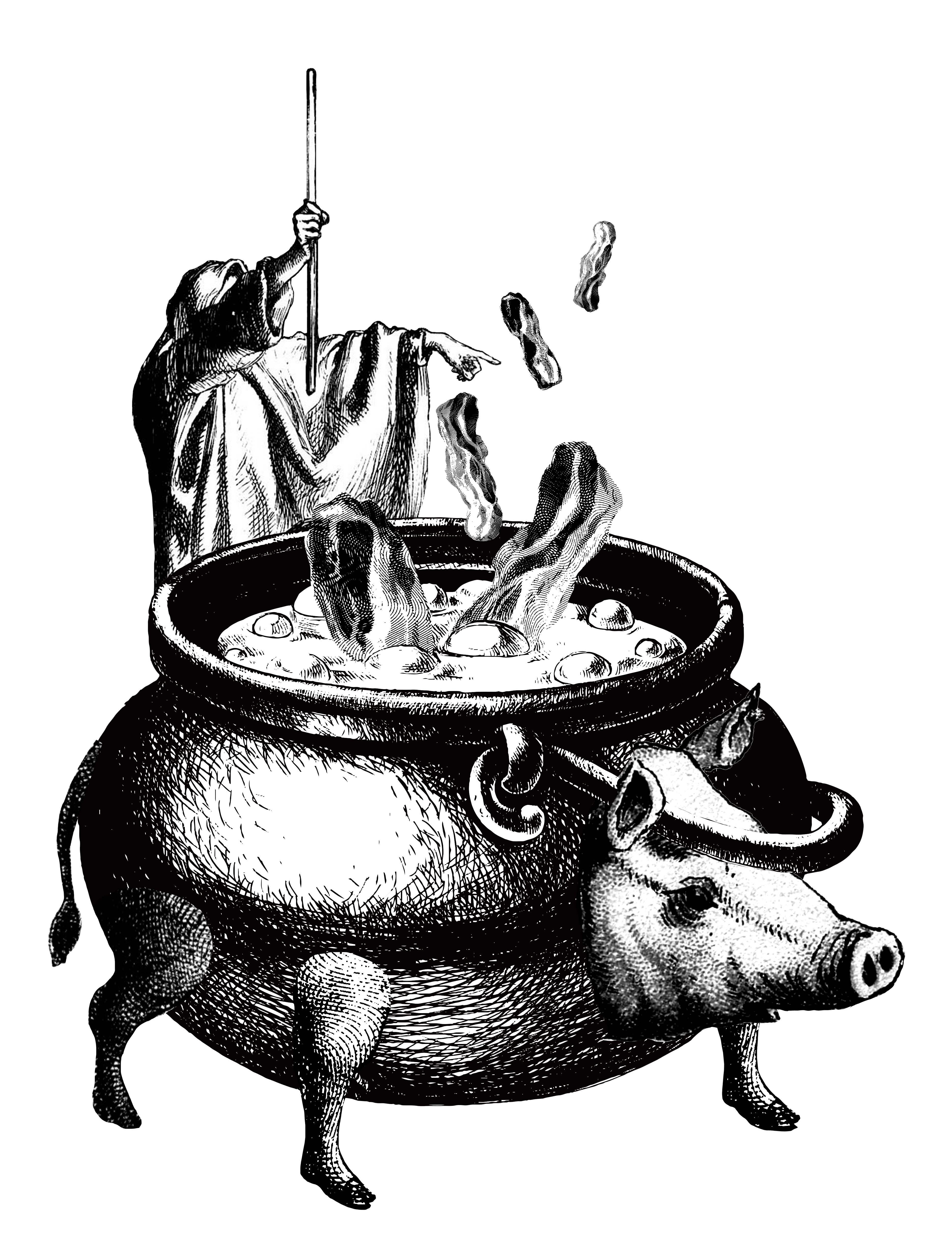
- Greedy Me + Food Buffet = Me gulping down everything
- Me poor like a church mouse + shopping mall on sale = Me buying everything I want but starving for the rest of the week
- Me feeling cold + hot spring = Roasted but satisfied me

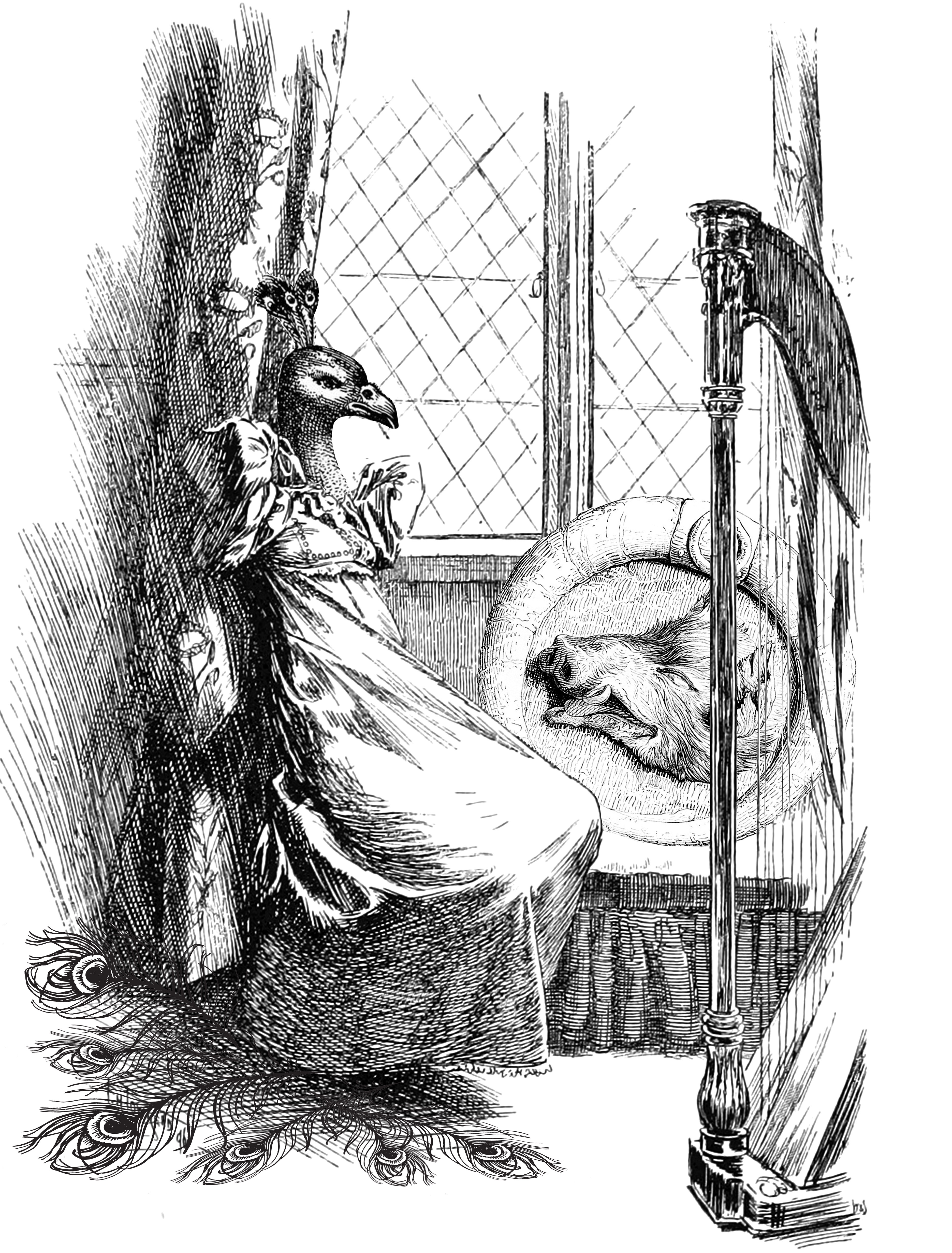
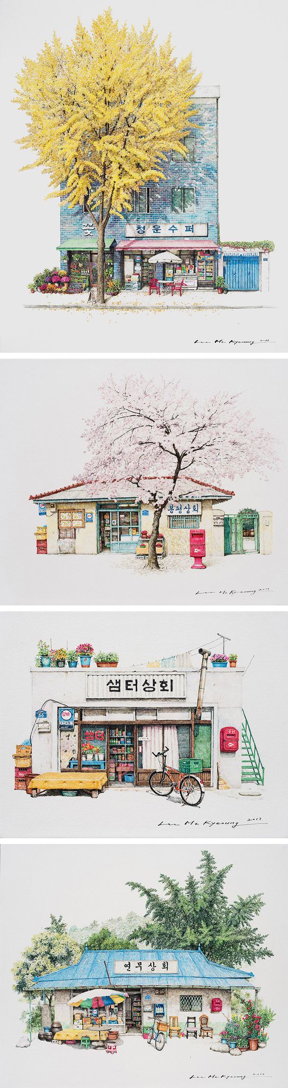
The reason I wanted to use architectural settings (the shopping mall and bath house) is because I was initially inspired by a illustration artist Me Kyeoung Lee who illustrated South Korean Corner Stores:
However, I couldn’t generate sufficient ideas that make use of architecture illustrations and had to abandon this concept as it was causing my ideation to be very restricted.
Following that, I continued brainstorming for more possible equations
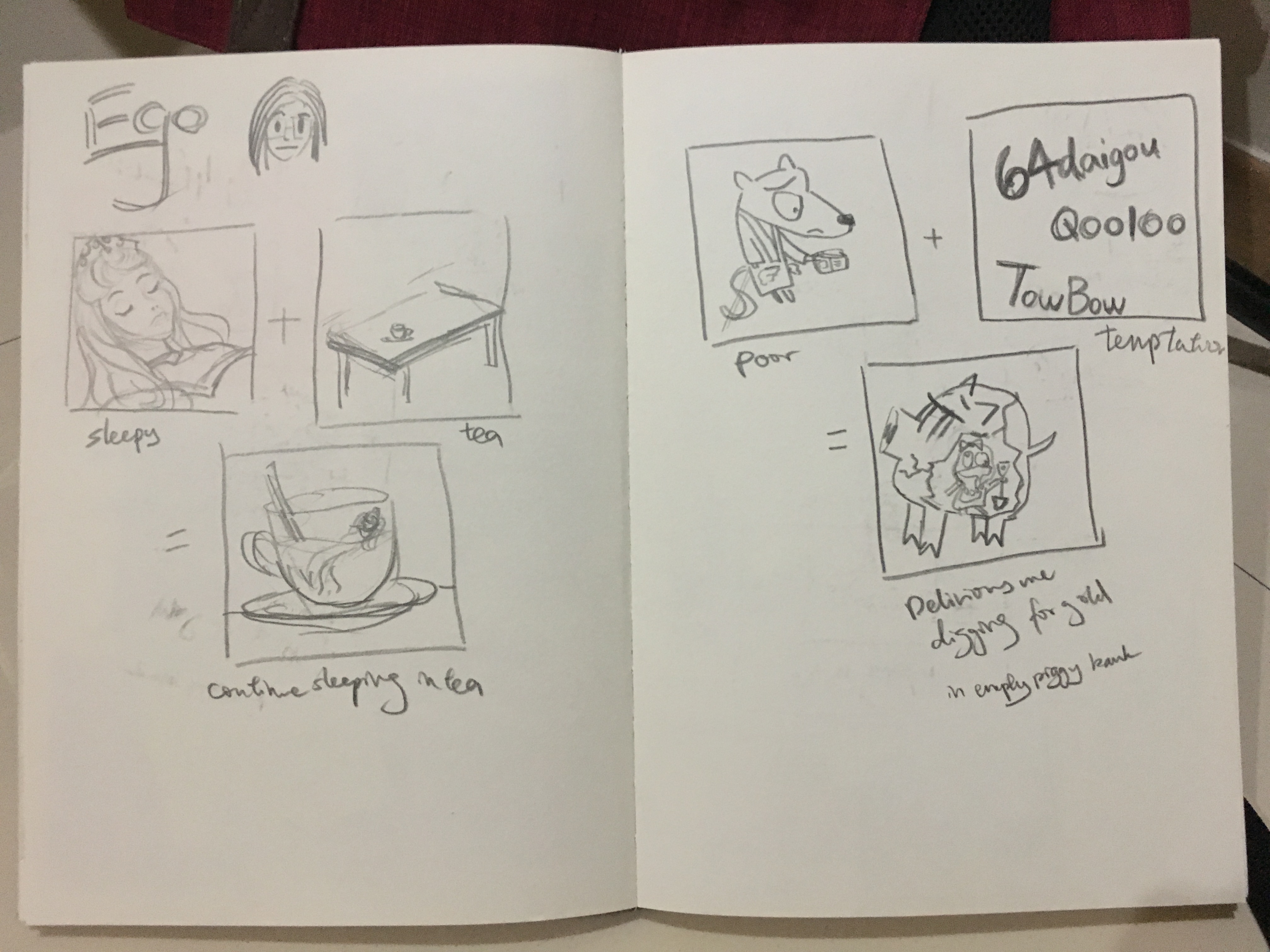
Left: sleepy me + tea = me continue sleeping in tea
Right: Poor like a church mouse me + bombarded by cheap deals on online shopping sites like Taobao and Ezbuy = Delirious me digging for gold in an empty piggy bank while holding up shopping loots.
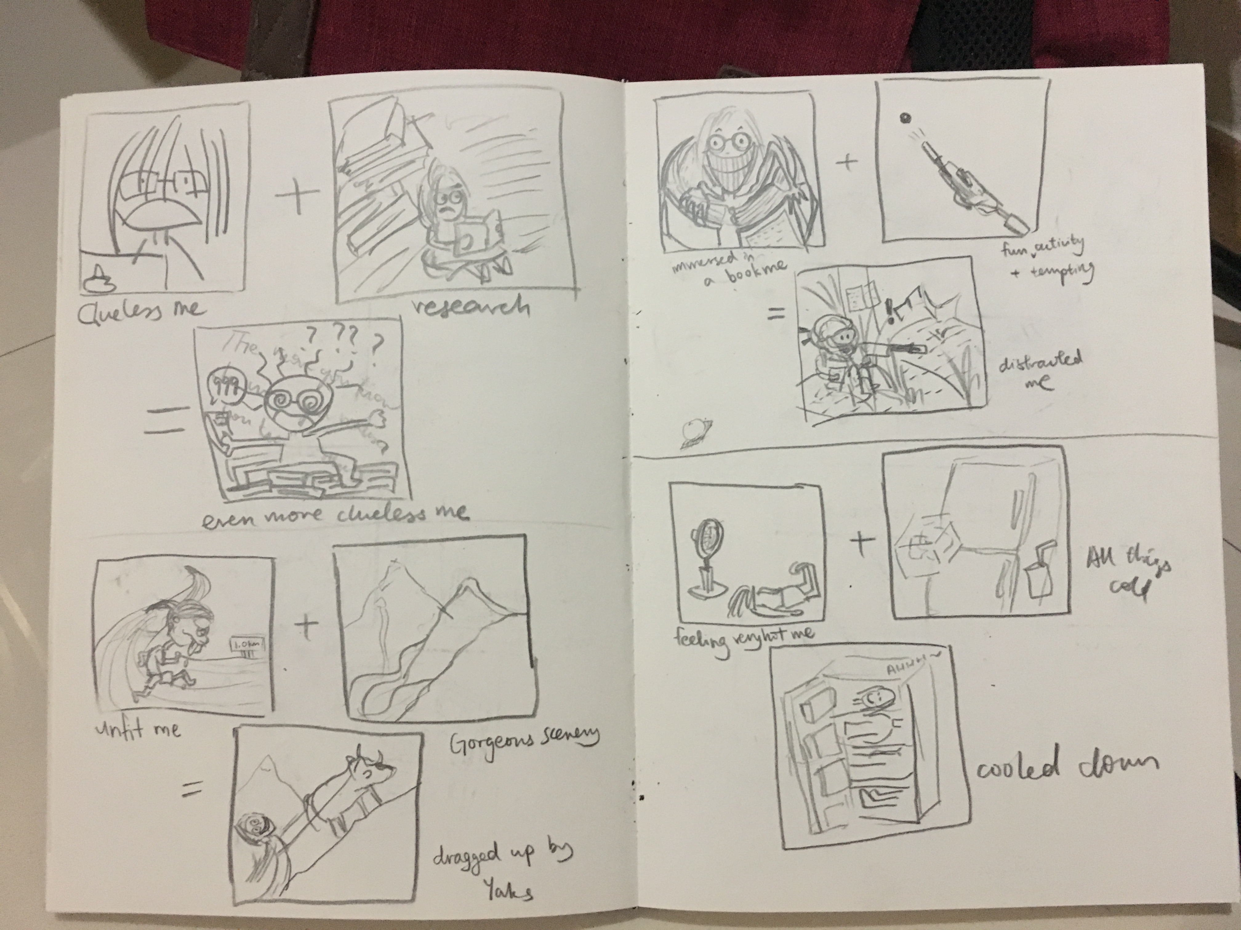
Left up: Clueless me working on assignments + Research = Even more clueless me
Left down: Unfit me + Gorgeous scenery in mountains = ‘trekking’ up to admire the scenery by being dragged by the yaks
Right up: Me being immersed in a book + a fun and highly tempting activity = me being distracted while still trying very hard to reading the book
Right down: Me feeling very hot + all things cool = me getting cooled down as if I am dissected and fitted into different sections of the fridge
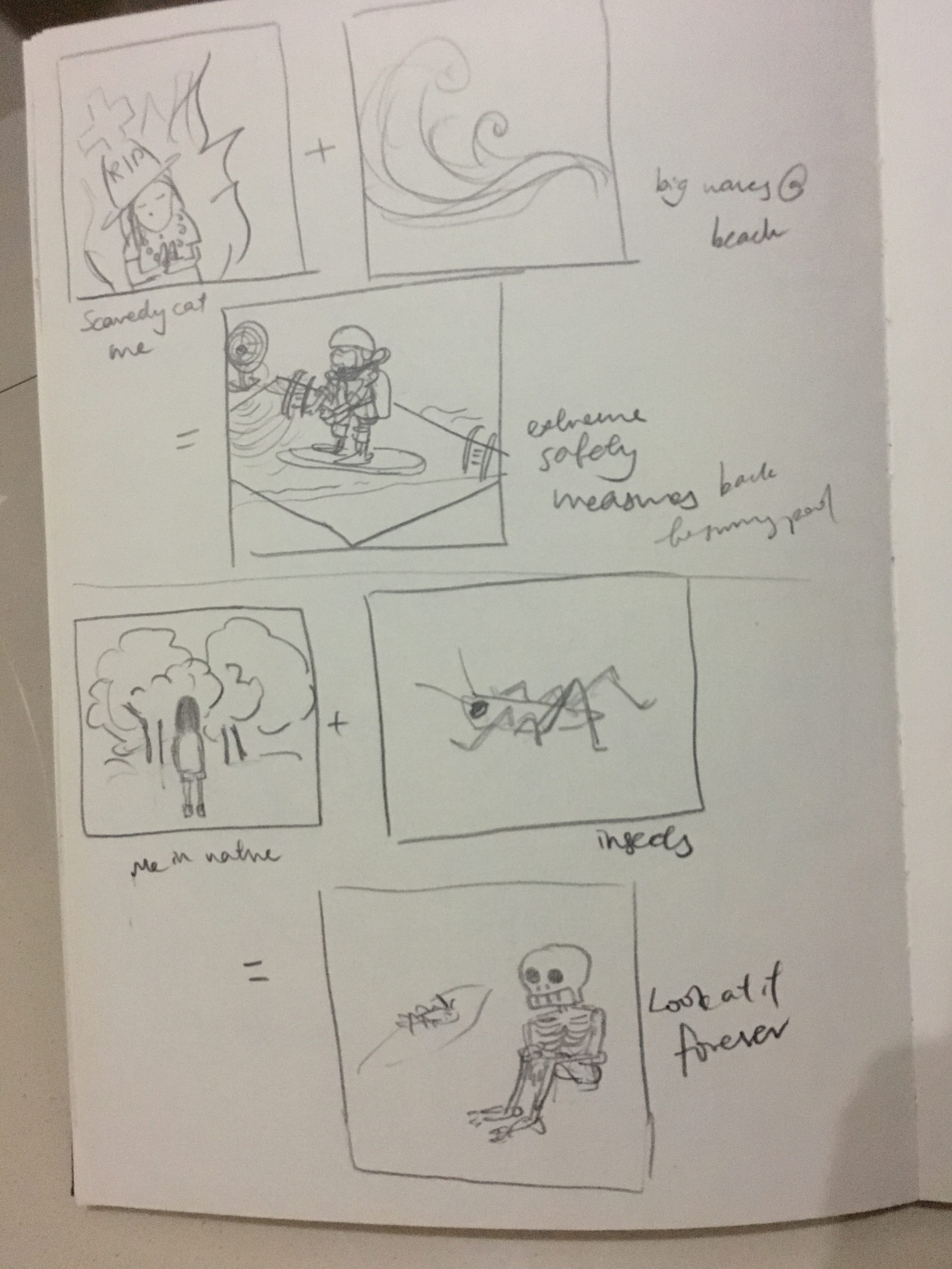
Up: Scaredy cat me + big waves on a beach = me taking extreme safety measures and only daring to go to a swimming pool
Down: Me in Nature + I see cool insects = Me staring and admiring at the insect forever
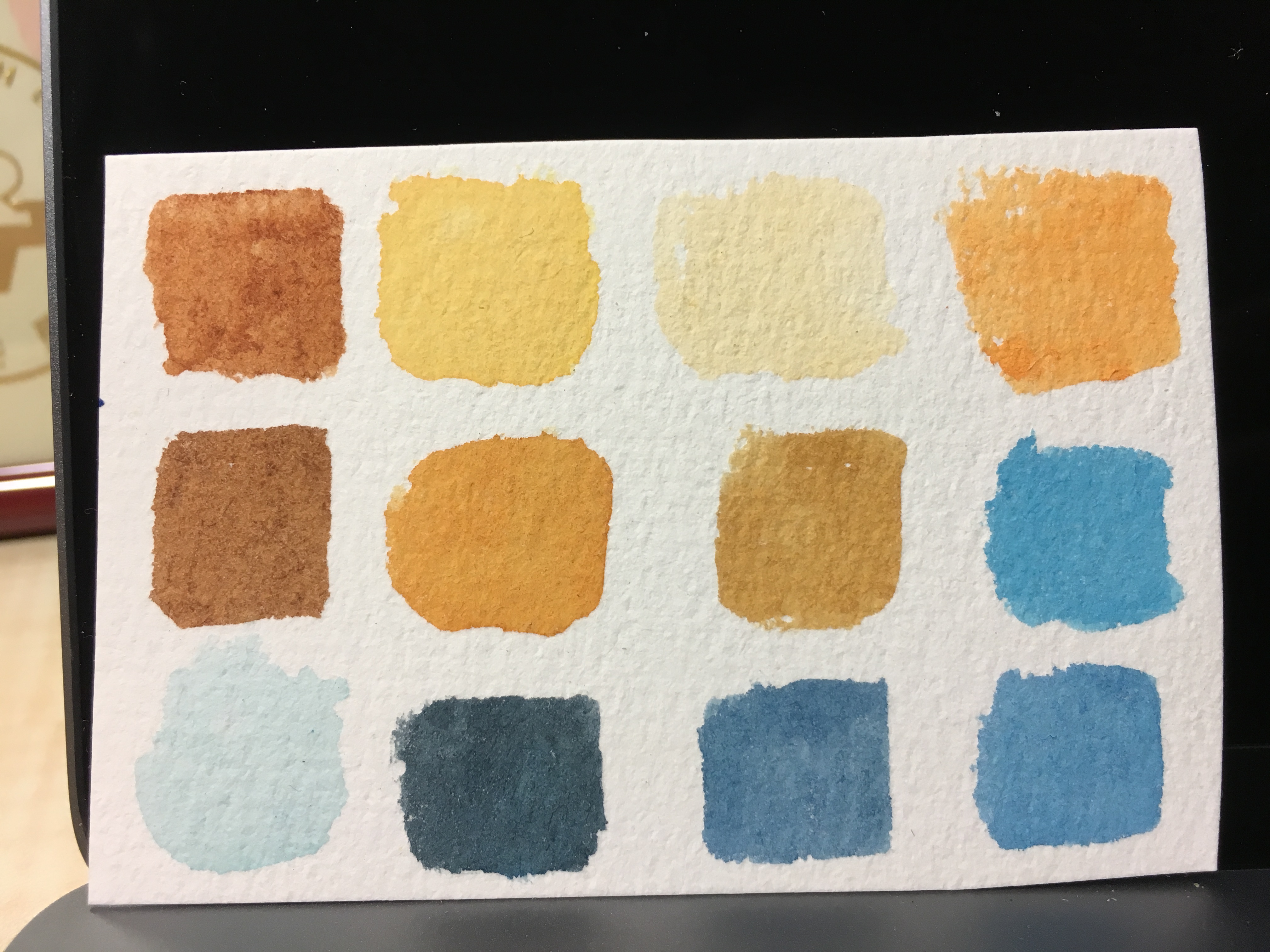
Narrowing down to several ideas that I am more fond of, I decided to work on thumbnail sketches to get a sensing of the colours and composition of the equations. I have decided on complementary colours because I was not confident of handling the very versatile watercolours (especially when the paint mix to form another colour) and restricting to two colours will help a lot.
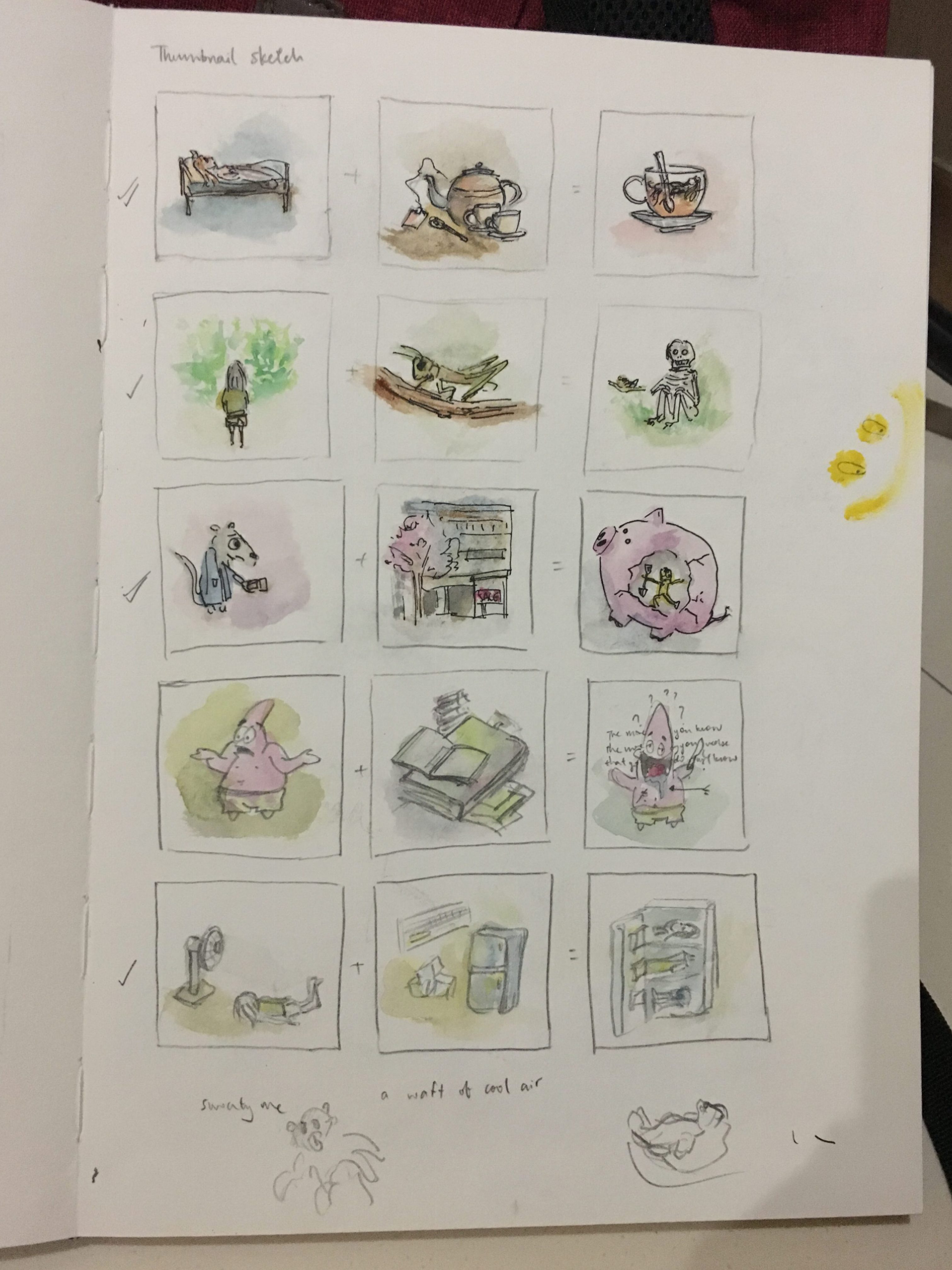
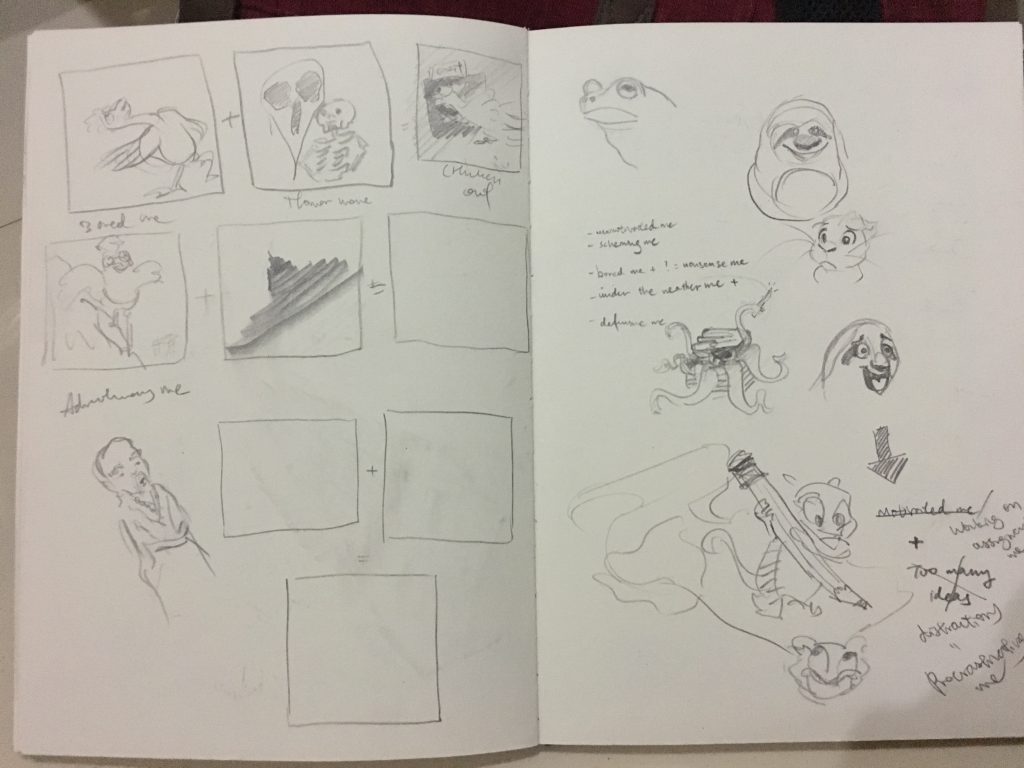
After the thumbnail sketches, I was more or less settled on the following:
- sleepy me + tea = still very sleepy me
- poor like a church mouse = shopping deals = me spending everything
- Me feeling very hot + all things cool = me getting cooled down
I was unsatisfied with the rest of the ideas and decided to explore further.
Left top: me in nature = cool insects = me camouflaged as the same insect while quietly staring at it, being careful not to scare it away
Left bottom: Scaredy-cat me + danger = me with extreme safety measures and living to long age
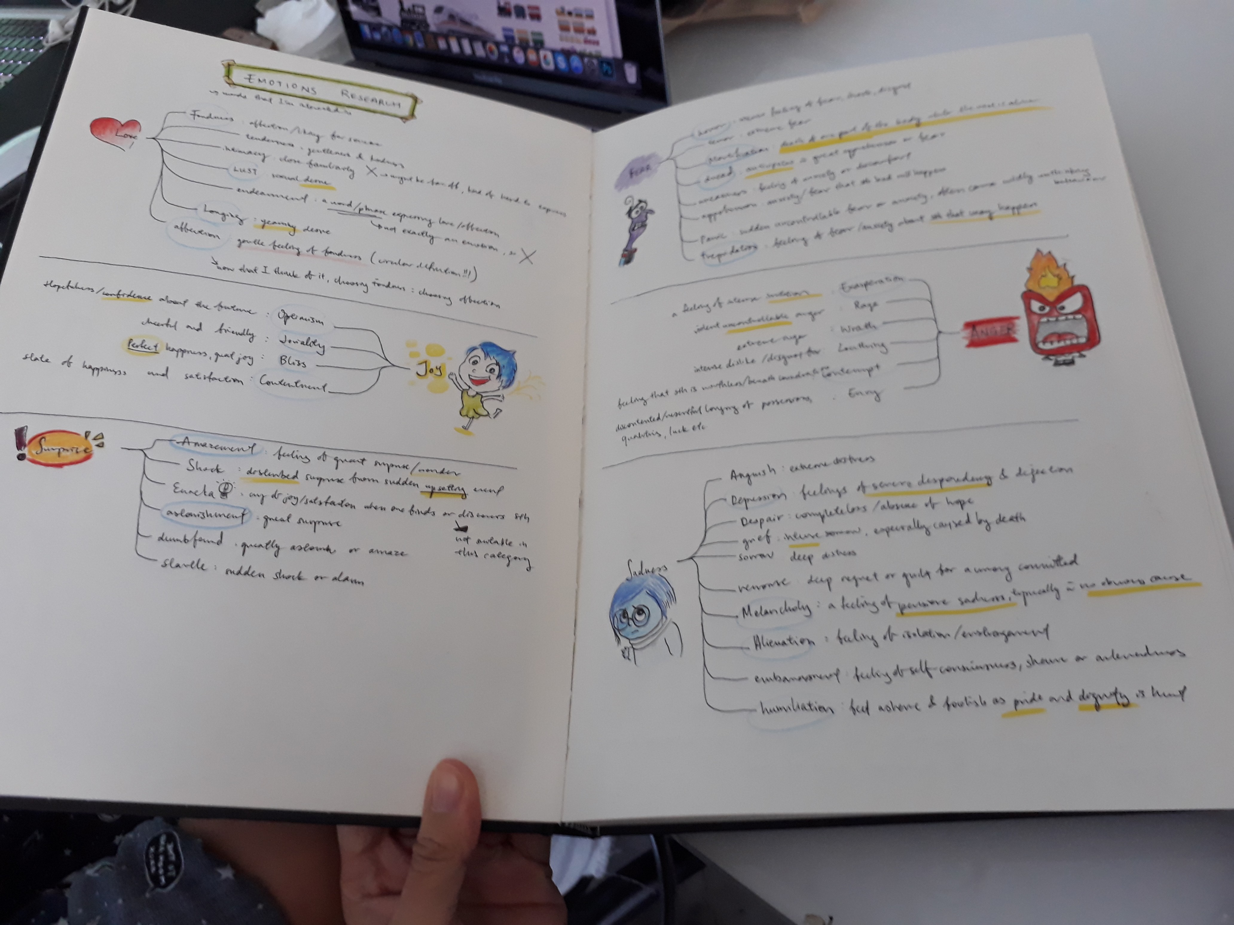
Right: I listed down traits of myself to help identify potential ideas to work on.
More sketches…
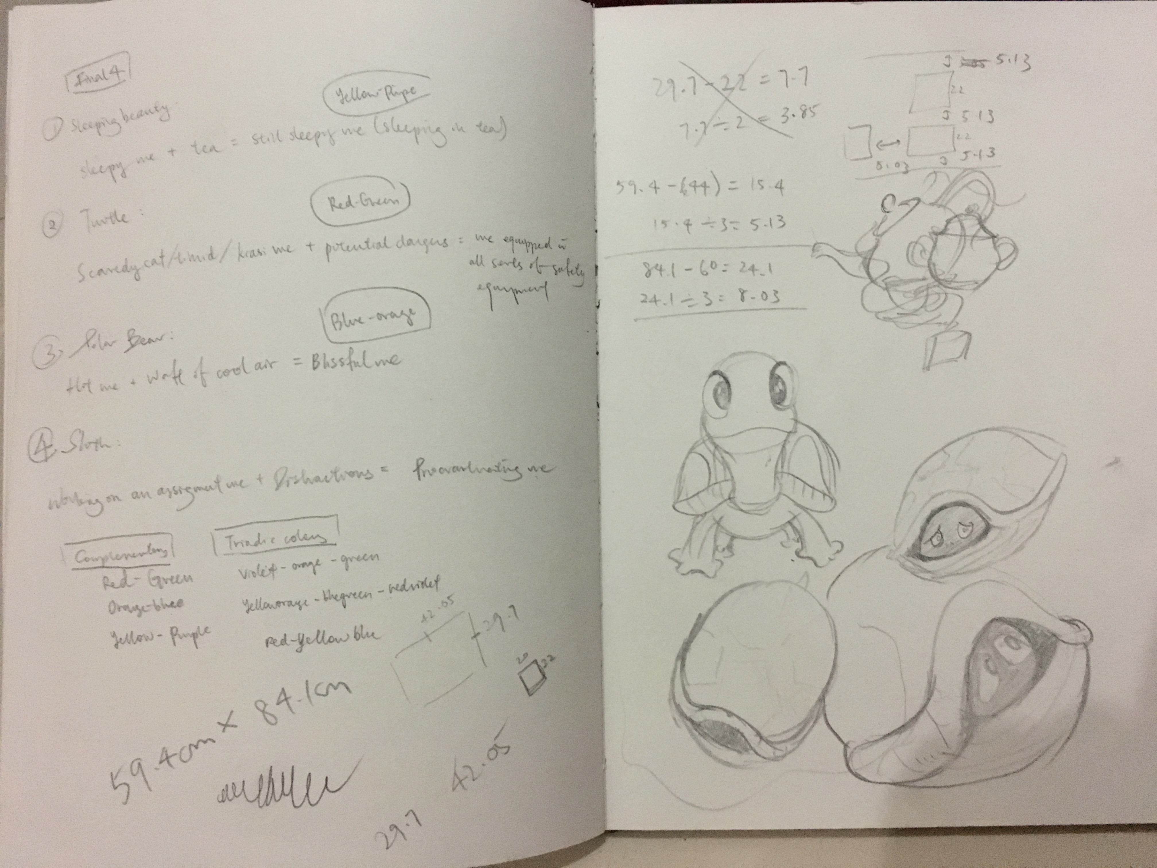
Here, I’ve finally decided on the final four ideas:
- Sleepy me + tea = still very sleepy me
- Scaredy-cat me + Dangers = me with extreme safety measures
- Me feeling very hot + a waft of cool air = blissful and contented me
- Me working on assignments + distractions = Procrastinating me
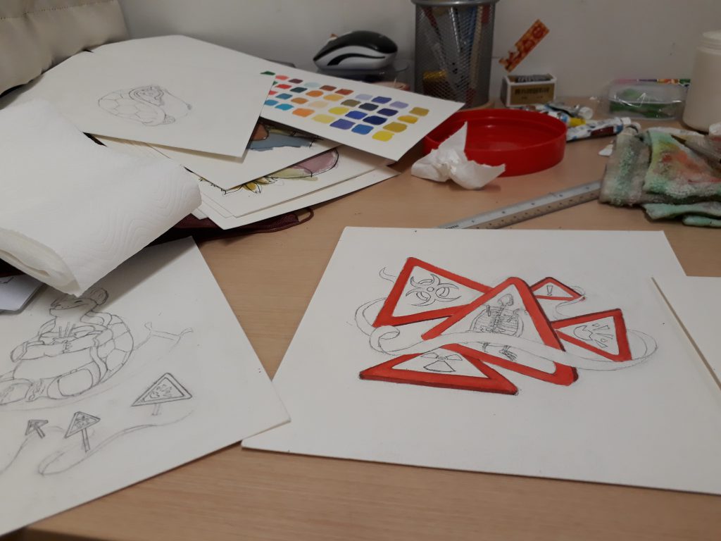
Moving on, I did a first draft of the illustrations to get an even better idea of what I am expecting. However, it went wrong when I used a marker to outline the drawings before painting over. As a result the marker smudged when the paint is applied, causing the colour to be a few shades darker and dirty as well. Although this made the end-colour less representative of the actual one, it was nevertheless useful in allowing me to decide which parts to be coloured what colour.
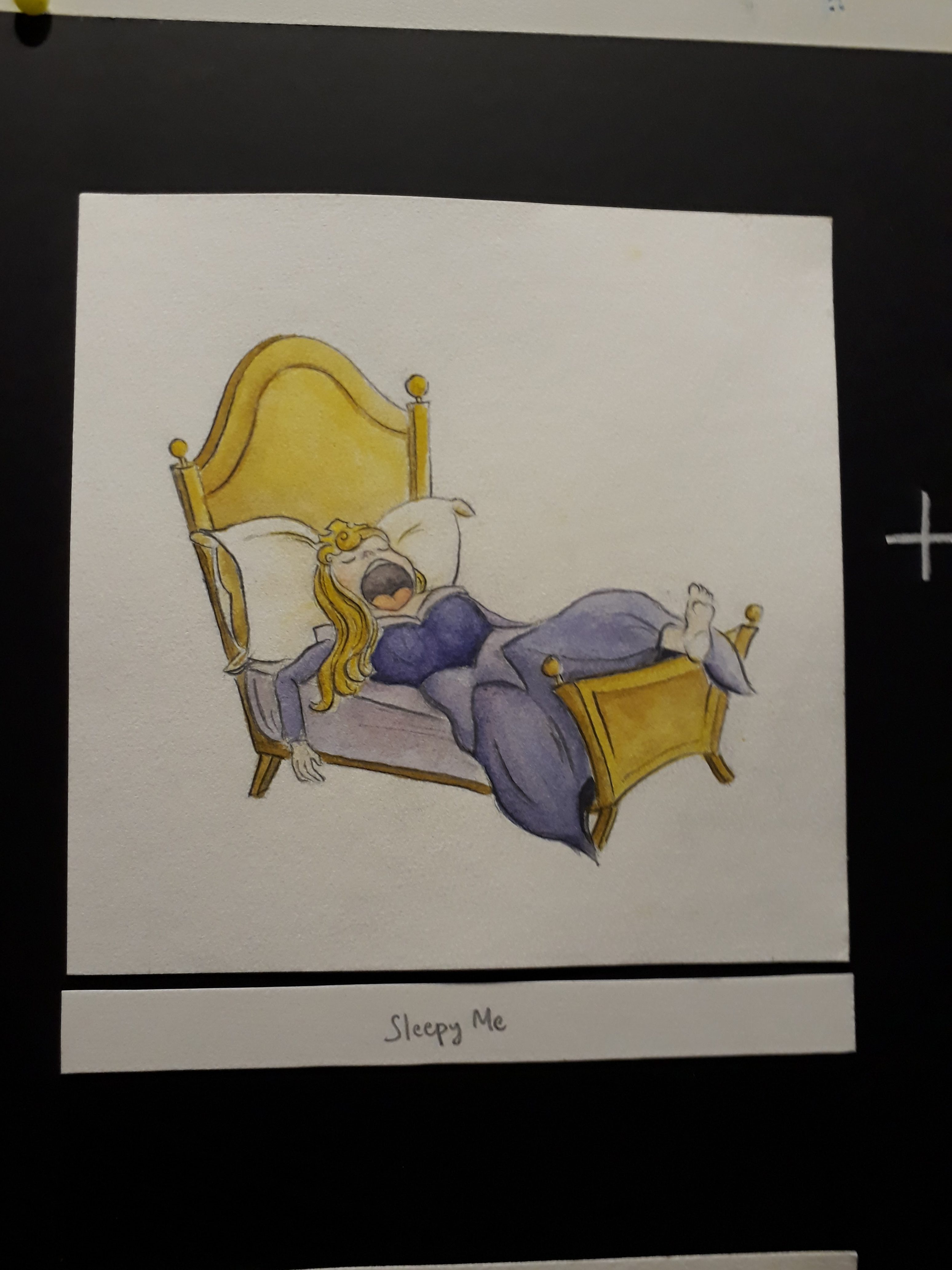
1. Sleepy me + tea = still very sleepy me
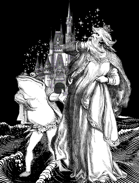
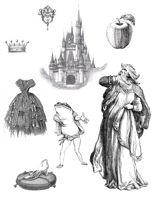
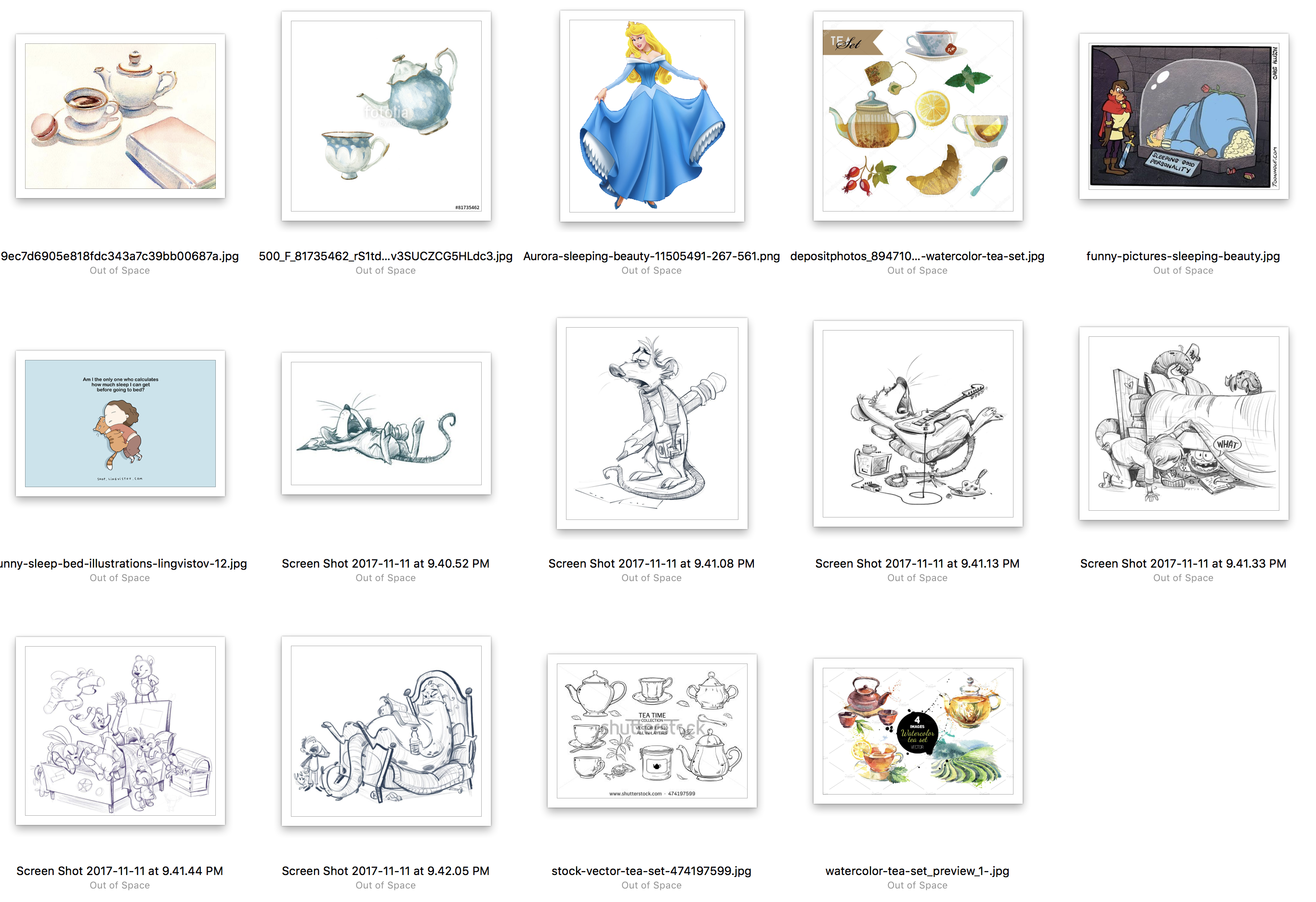
 I used sleeping beauty because one of the most prominent feature of her is, well, sleeping; and so I thought it would be very apt to use sleeping beauty to represent the very sleepy me.
In the not-too-long-ago past, tea used to be an effective way to wake myself up. However, perhaps due to the overdose of tea as a result of many many late nights, somehow it’s effectiveness has reduced. Maybe my body has gotten used to it.
Anyway, this equation is a very apt description of myself these days, where I’m perpetually sleepy all day around, and even after gulping down tea, I still feel sleepy.
Colour: Yellow-purple. To represent sleeping-beauty (a princess), I chose to use purple since the colour represents ‘royalty’ as learned from the colour theory presentation by my peers. Yellow was a suitable colour as it suits the colour of tea.

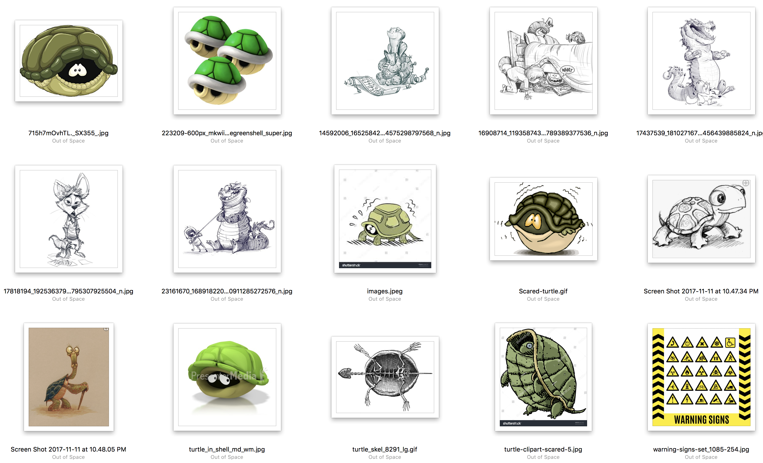
References while drawing:
Me feeling very hot + a waft of cool air = blissful and contented me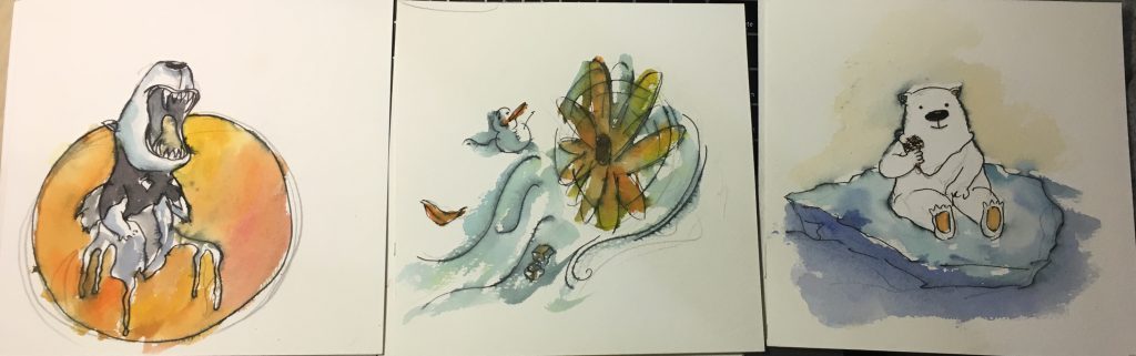
I used a polar bear because they are very adversed to heat and warmth and they are the ones that need a cold climate the most.
In the first frame, the polar bear is so hot that it has to tear of its fur coat to reveal the black skin below. Also the lower body of the polar bear has melted. In the second frame, there is a waft of cool air, as shown by the little snowman. Lastly, it is revealed that the wind is just from the very tiny hand-held fan, but even so the small amount of cool wind is enough to satisfy the polar bear.
Colour: Orange-blue. Orange to represent the sun/warmth/heat in the first frame, and blue to represent coolness/ice bergs in the Arctic.
References while drawing:
Me working on assignments + distractions = Procrastinating me
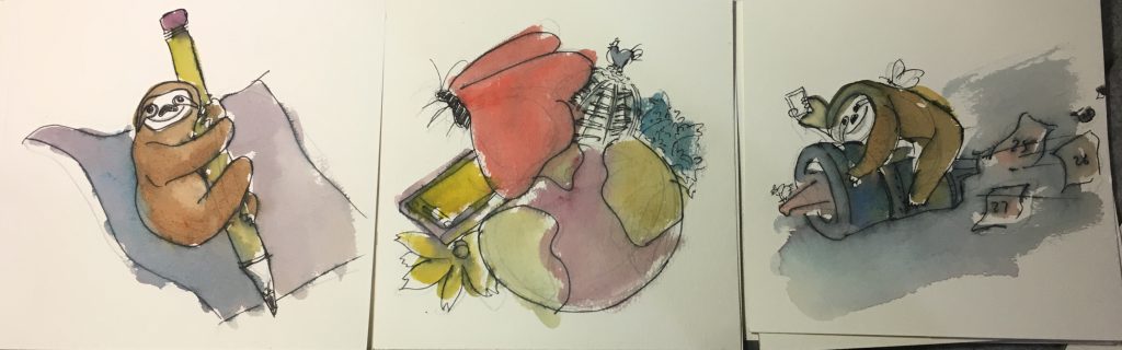
I am usually a very slow worker, and hence I represented myself as a sloth. At the same time, I have such a wide span of interests that I often digress from my work. This include very random searches on google as well as sudden urges to read a book/watch a vid/ engage in some kind of activity. As a result, I often end up procrastinating and slow worker+procrastination= time will always fly past way too quickly than I’ll like. As seen in the third panel, I am riding on a rocket that is expelling calendar dates, signifying that time is passing very quickly while I indulge in other activities.
If you compare to the final work, you can see that the composition for this particular equation has changed a lot as I wasn’t satisfied with it.
Colour: Orangeishbrown-Turquoise. The colour is chosen so that the sloth can be more easily recognised compared to, say, a blue sloth or a green sloth.

References while drawing:

Scaredy-cat me + Dangers = me with extreme safety measures
I am somehow very imaginative when it comes to potential dangers/injuries that can occur in all sorts of scenarios, and hence even though I really like adventurous activities, I also try my best to prevent myself from landing into any kinds of danger.
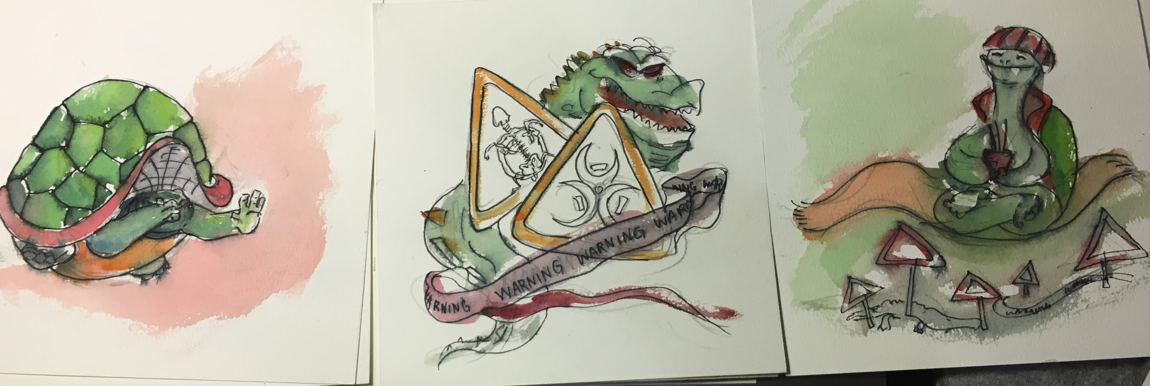
In the first panel, I drew a tortoise that is hiding in its shell to show that it is scared. The second panel illustrates all the danger zones and warning signs. In the third panel, the tortoise, armed with all sorts of safety equipments like helmets, elbow guards, knee guards, as well as joss sticks for praying, floats across the danger zones safely. This is rather ironic as a tortoise already has a very protective and hard shell, yet it still needs external equipment to protect itself from dangers.
Colour: Green-red. The choice of colour is very straightforward here: green because it best represents a tortoise, and red because red colour is a very intense colour associated with energy, war, and danger.
References while drawing:
Yay!

If you notice, in all the equations, the setting (2nd panel) will have some of its elements repeated in the final panel. This is initially found in a few equations in my very early thumbnail sketches
(This one!)
Mimi noticed it, and suggested that I repeat that in every equation, thus now you can see that the tea cup, the little fan, the distractions as well as the danger signs are repeated in the last panel.
Working on the final product
Pencil sketch first…

Colour by colour..
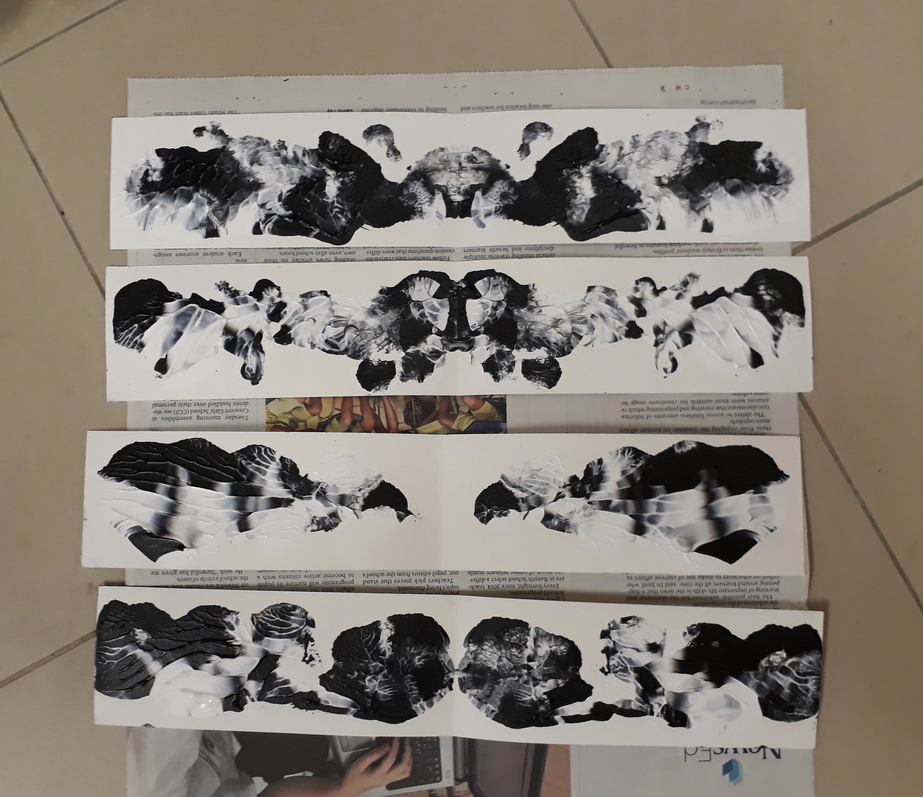
 The table in hall is so smal!
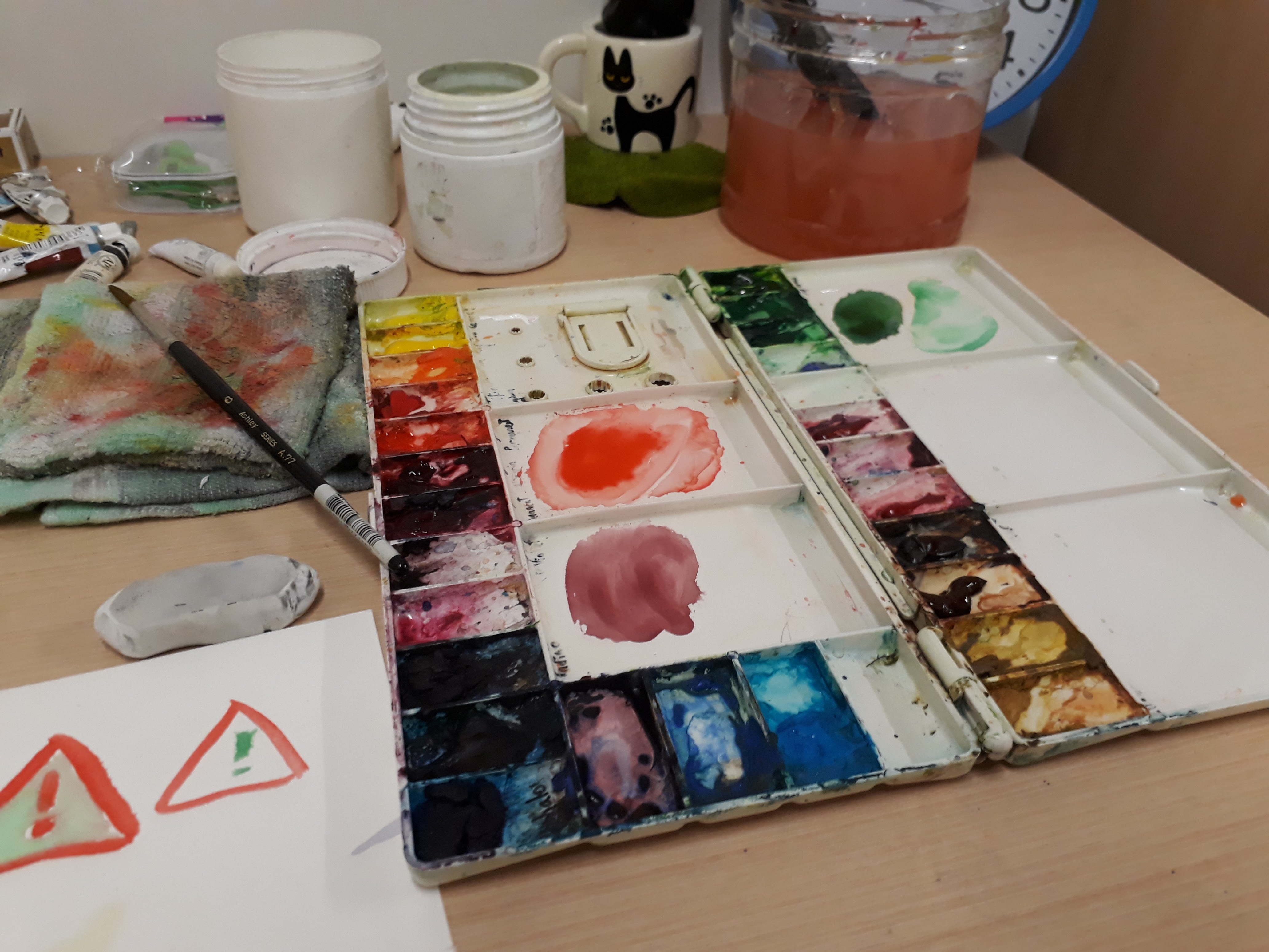
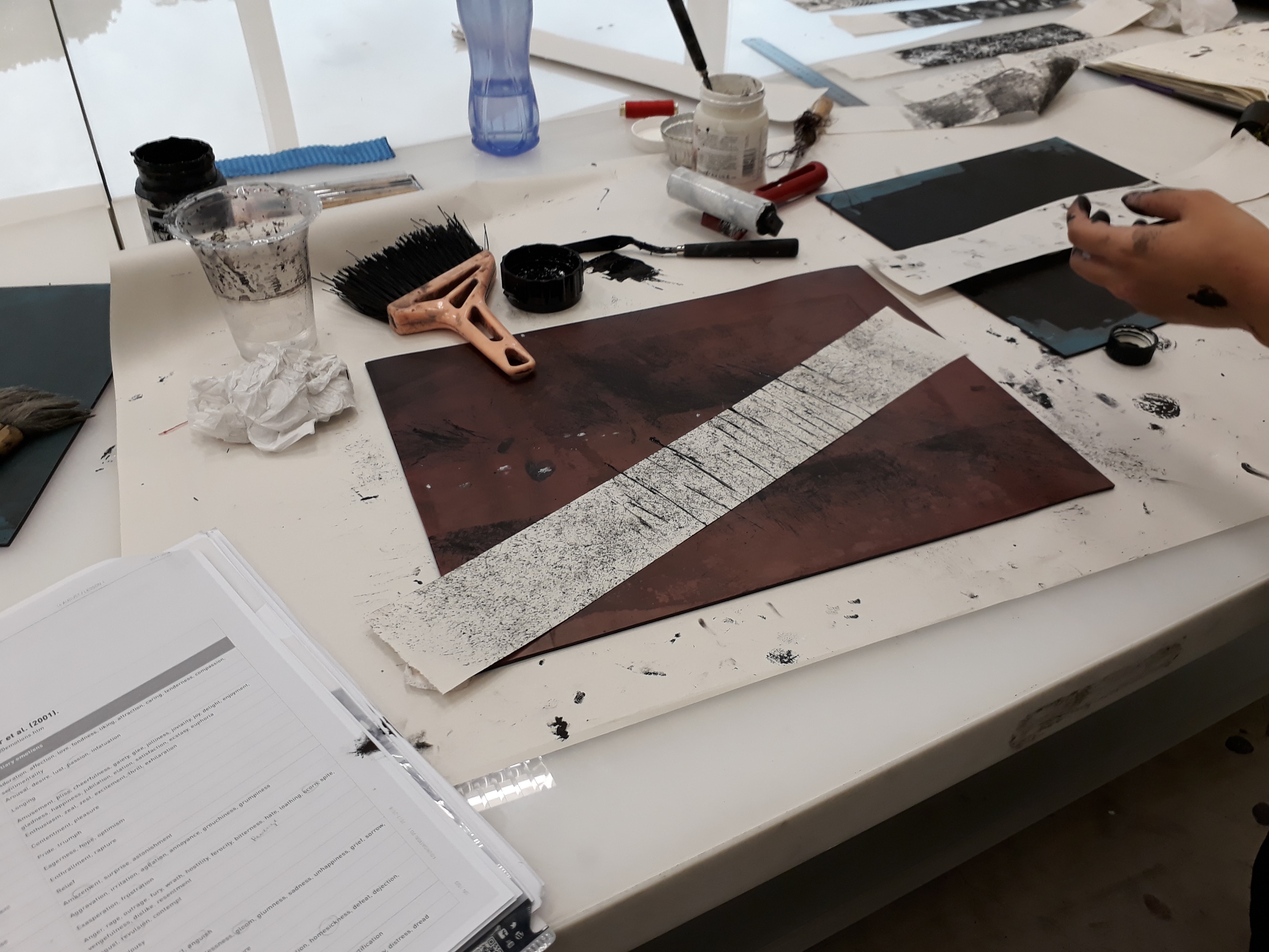
I didn’t take much photos while working on the final work ~(。☉︵ ಠ@)>
The final illustrations!!
I faced some problems deciding the colour for the bed frame and the mattress because I didn’t want entire bed+frame to be yellow as it’ll be difficult to tell them apart, but at the same time having a purple bed and a purple dress also result in the same problem. I end up opting for a lighter shade of purple for the mattress.
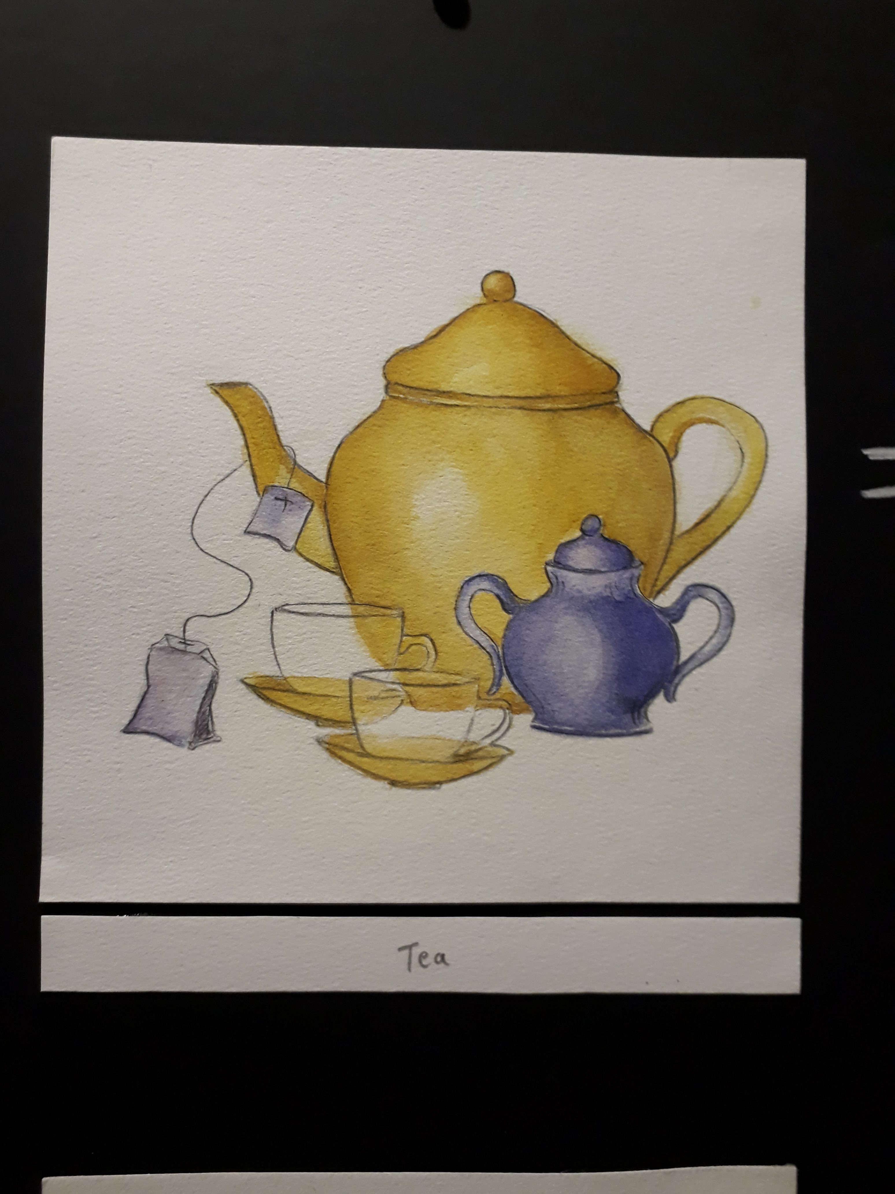
I couldn’t figure out how to show the transparency of the tea cups here :<
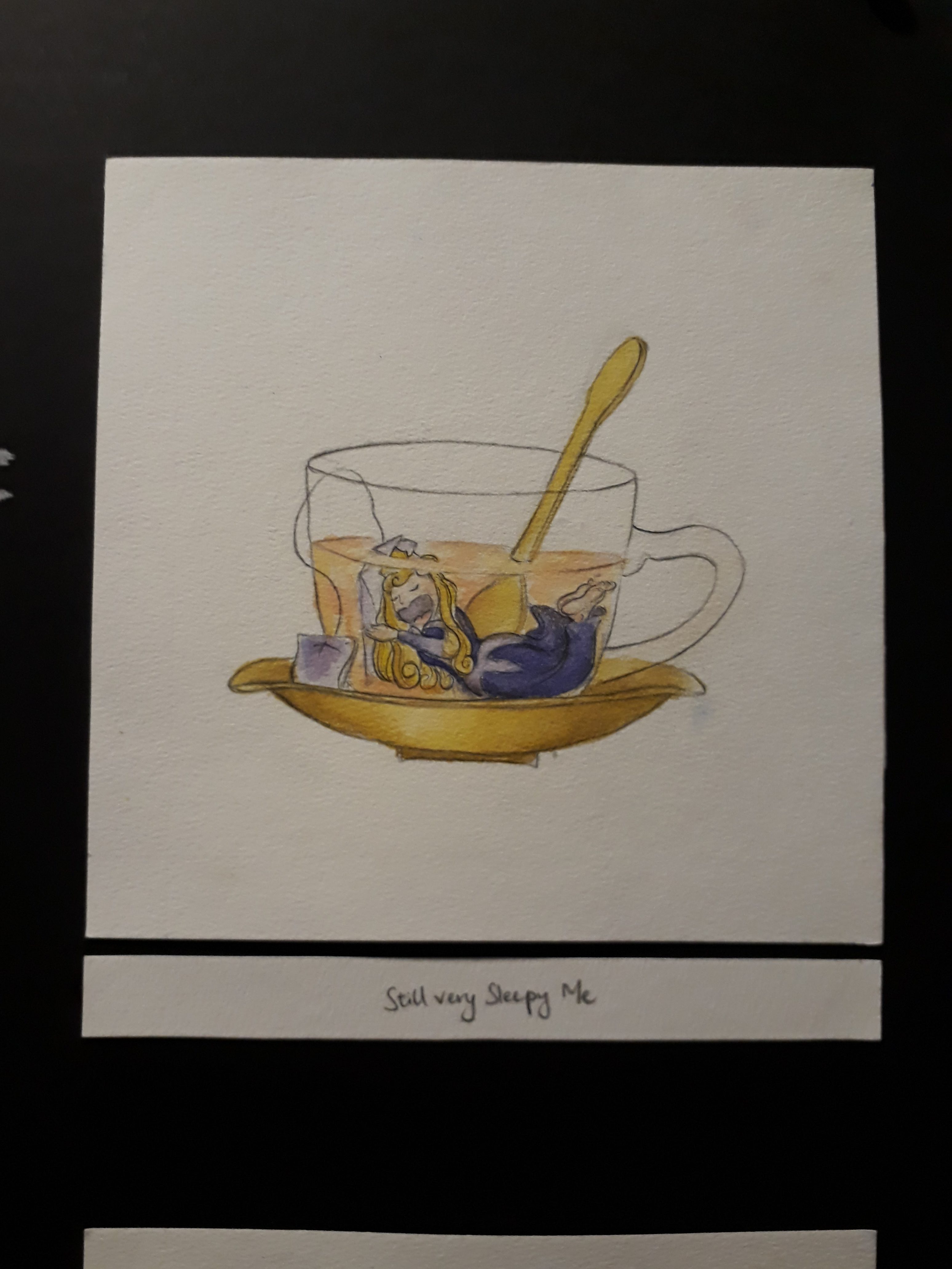
Here sleeping beauty hugs the tea bag as a pillow and continues sleeping while being submerged in tea. 
The orange circle at the back represents the sun, and the polar bear is frustrated by the heat. That’s why the fur coat is peeling off to reveal the black skin underneath, and the lower body is also melting.
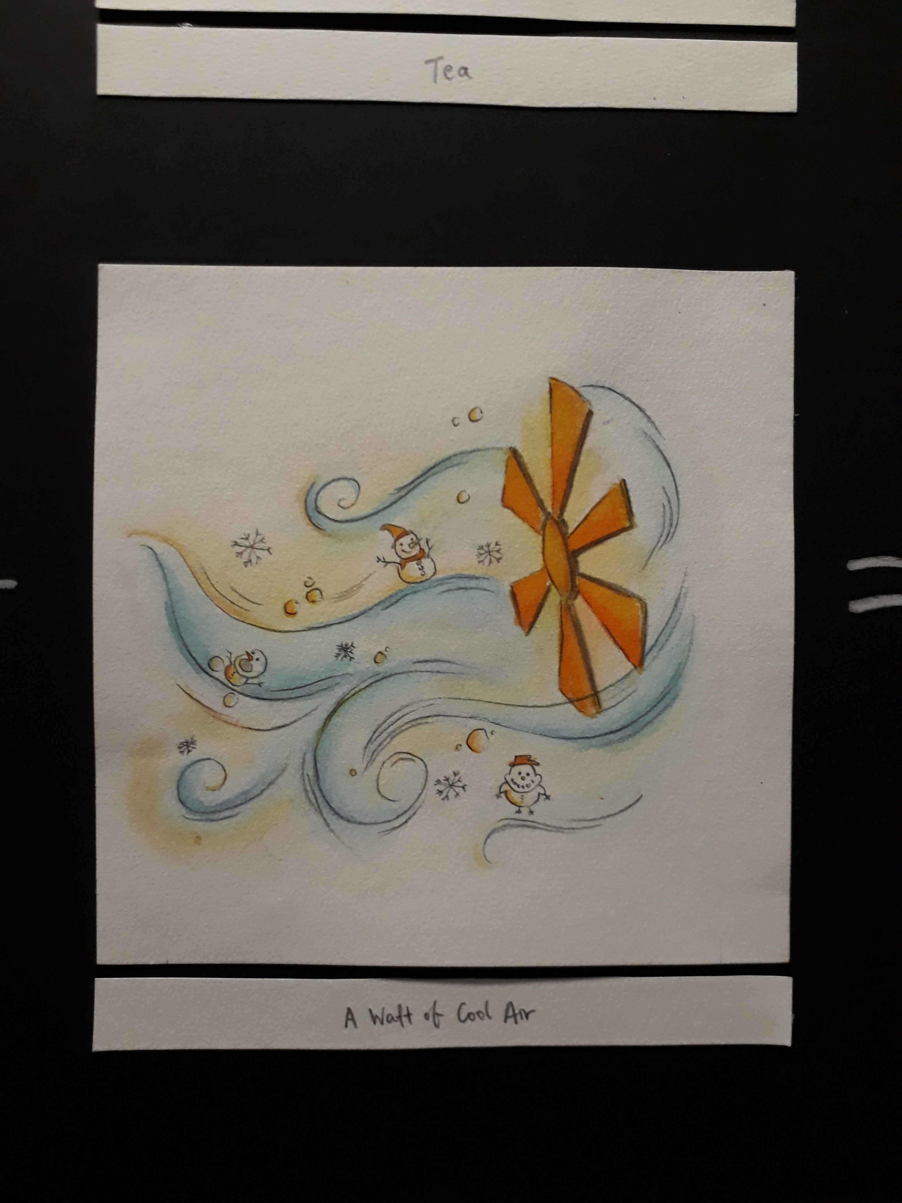
I added snowman and snow flakes and snowballs to show that the air is cool.
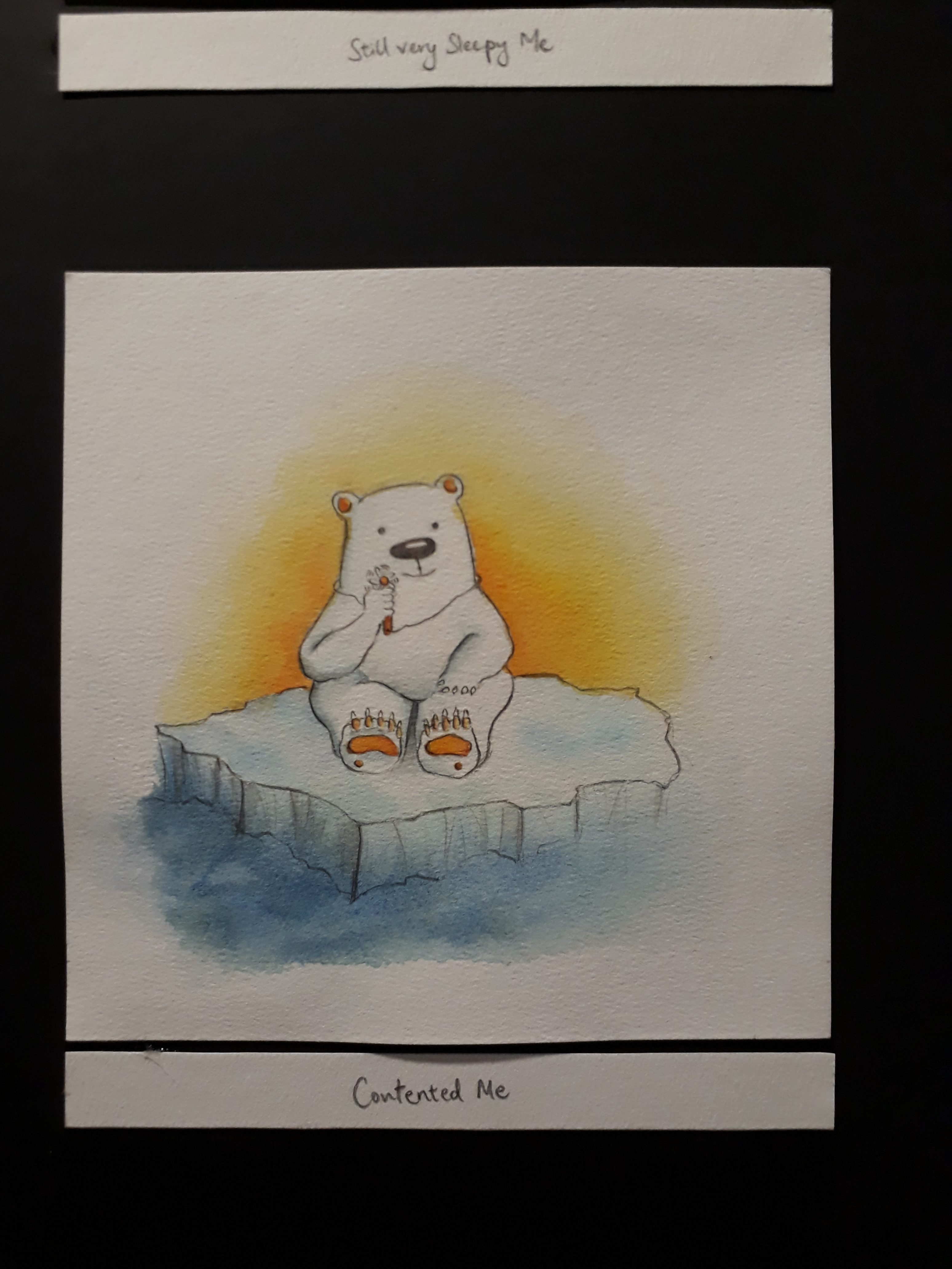
The fan element is repeated here. If you look closely, the polar bear is holding a tiny fan!! This shows that when you are feeling extremely hot, even a tiny waft of cool air from a tiny fan is enough to satisfy you.
The pencil lead is broken, after only writing my surname… this goes to show my slow-ness. There are so many empty assignments at the back waiting to be worked on, yet I’m still writing my name on the first paper…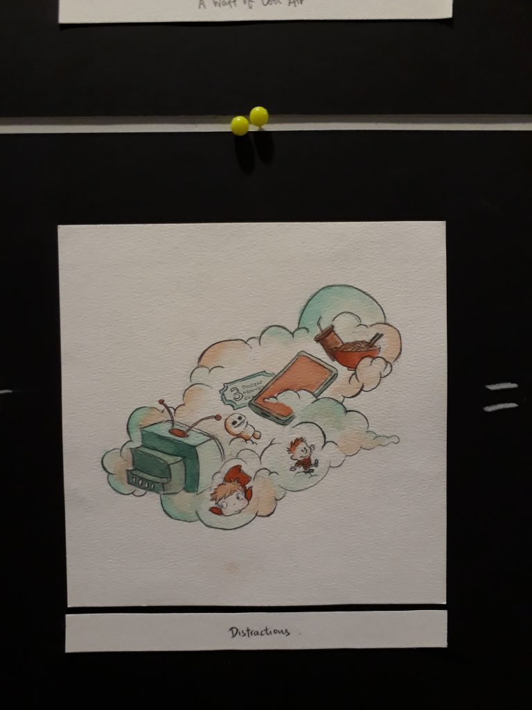
This are some of the things that distracts me: drama series, animation movies, CALVIN AND HOBBES, my phone, and fooood. I used the cloud to represent how these things are always lingering in the back of my mind, waiting for the opportunity to pounce out and steer me away from work.
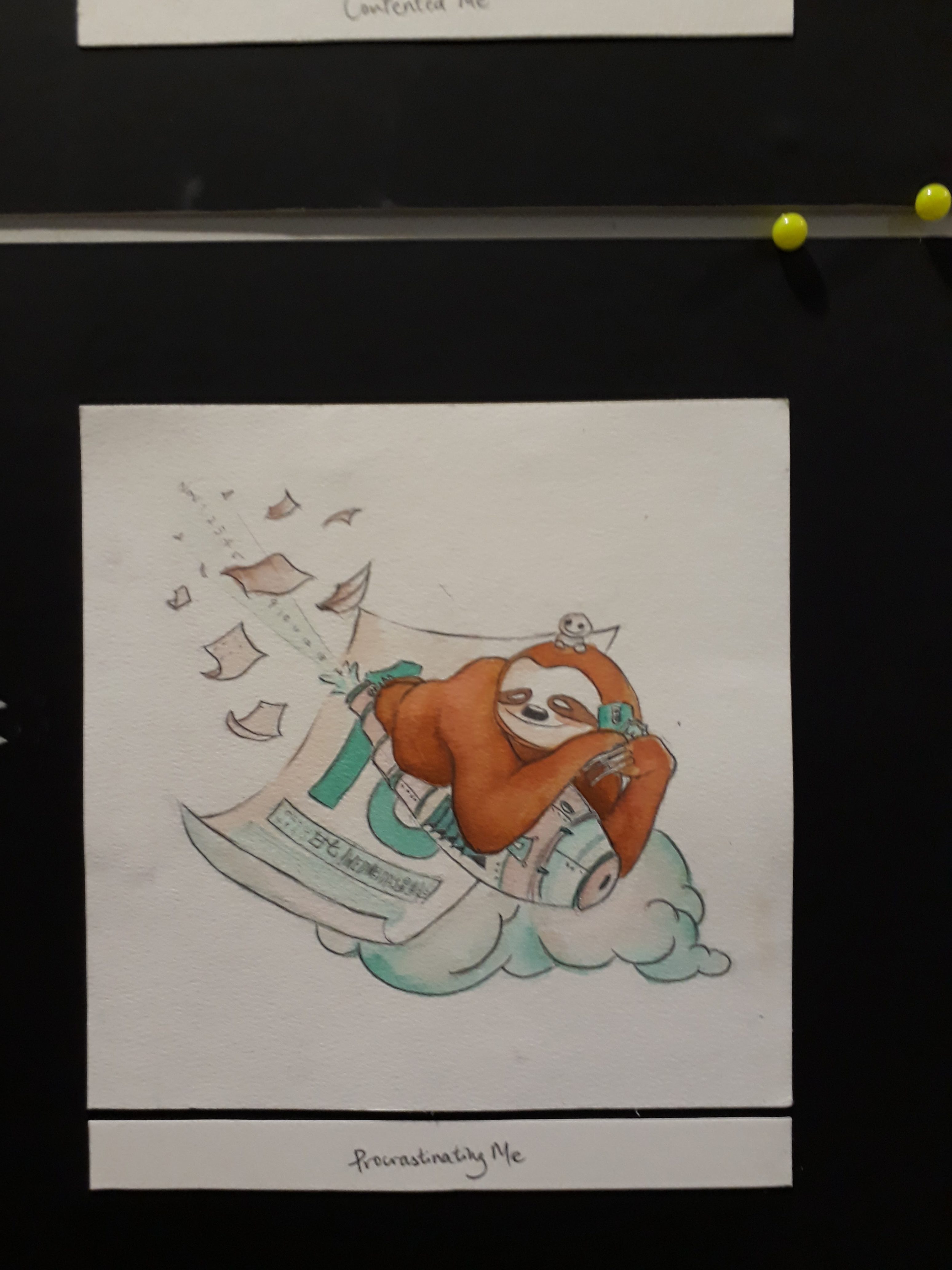
The distractions are repeated here if you look closely! Also, the date of the calendar is actually the submission date, which is 15th November. The trail of numbers that are ejected from the rocket is actually dates: Nov 1, 2, 3, 4, all the way to 14.
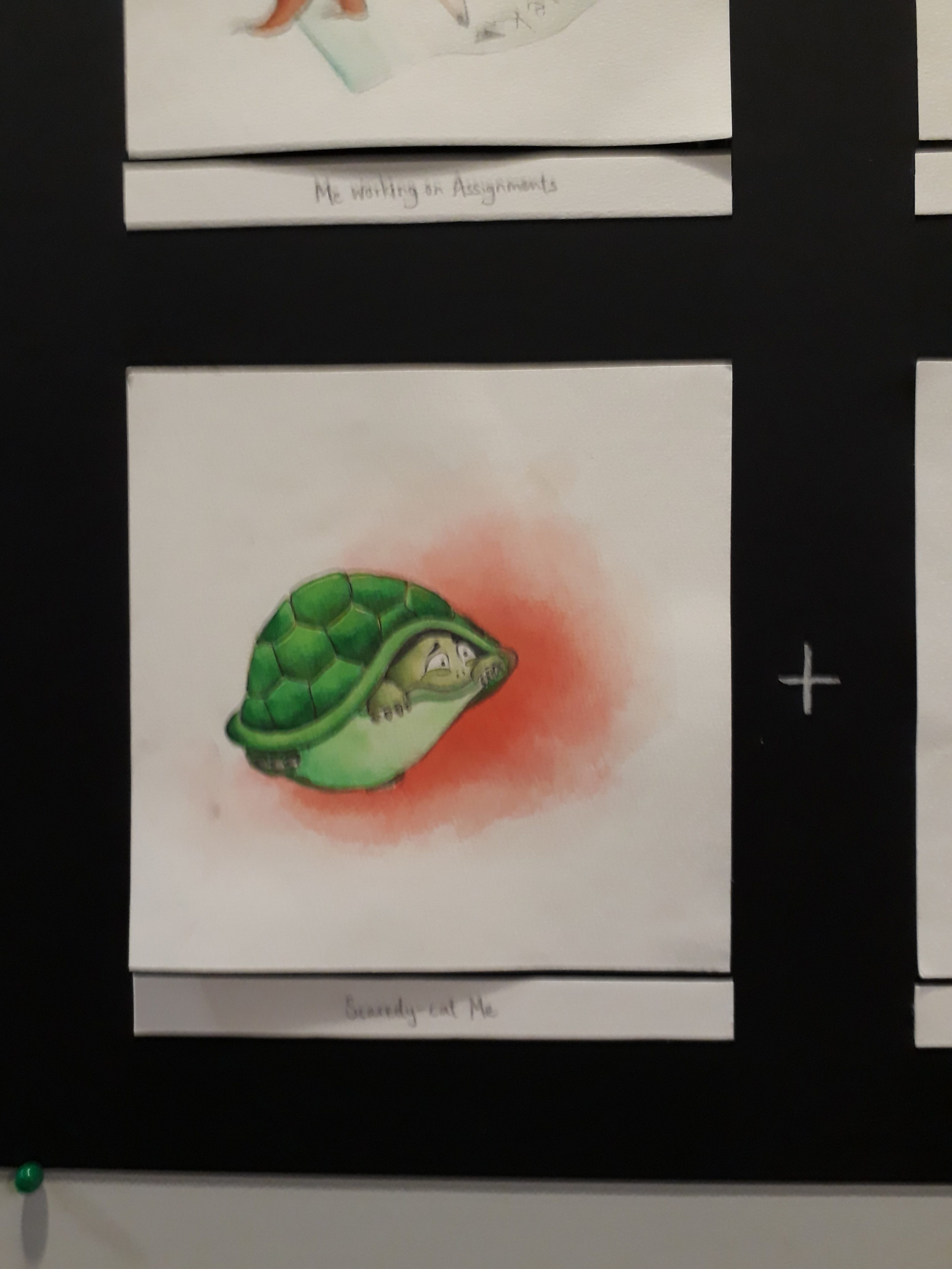
A scared me is depicted as a tortoise in a shell.
I wanted to illustrate danger here, but simply using the typical danger signs and human skull didn’t feel quite enough, hence I changed the human skull danger sign to a tortoise skeleton so that it ties in with the tortoise theme better.
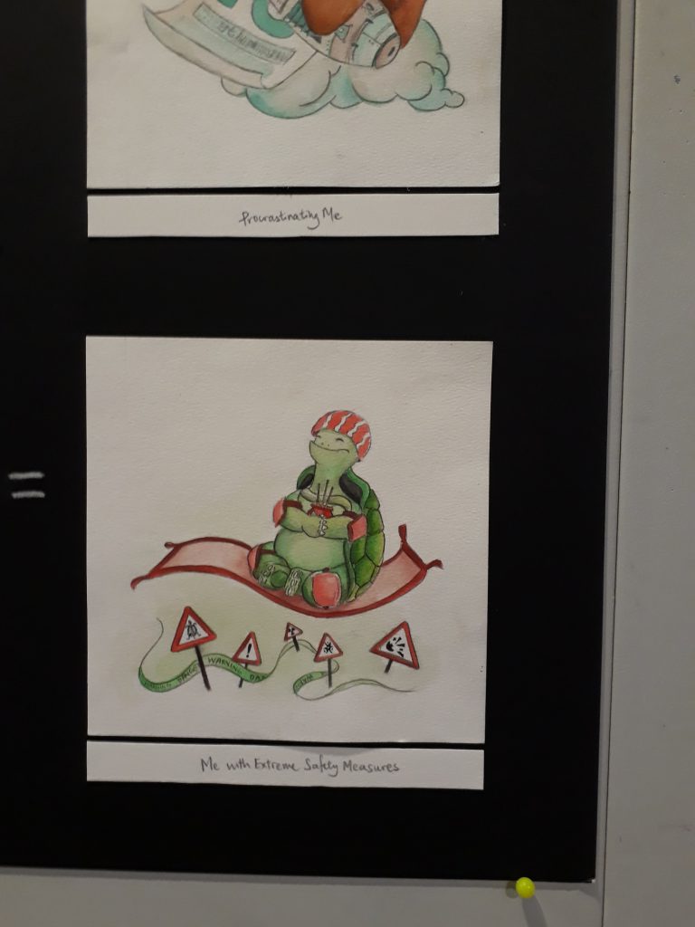
Here, a blissful and safe tortoise floats past all dangers, while praying fervently for its safety and adopting all measures to protect itself on top of its hard turtle shell.


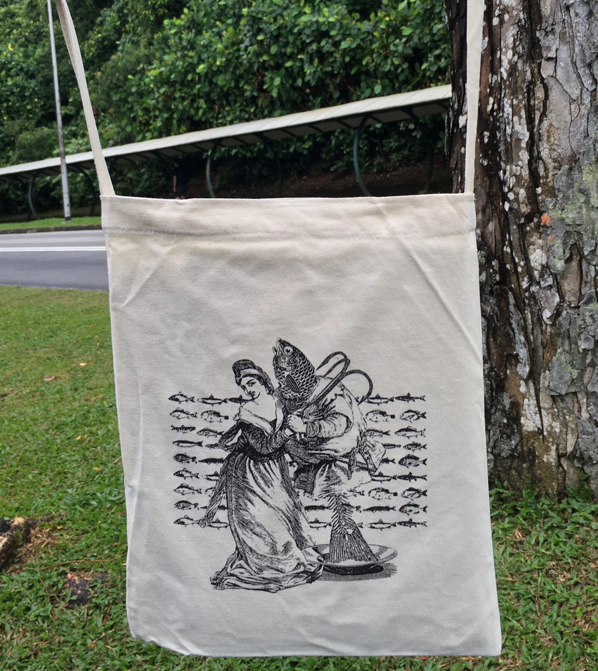
 The sharks were determined not to eat fishes at the start.