ADM-DIP WHITE – Site Options

During the site visit to Marina Bay on 11 October, our team considered several factors before deciding our installation site:
– Environment: Wind, heat, rain, water drainage, etc.
– Existing structure to utilise
– Nearby light sources
– Crowd and traffic

We narrowed down our options into 4 possible locations (ordered by priority):
1. A2 – Mist Walk
2. A6 – Breeze Shelter
3. A5 – Waterfront Promenade along Marina Boulevard
4. A3 – Lower Boardwalk

1. A2 – Mist Walk

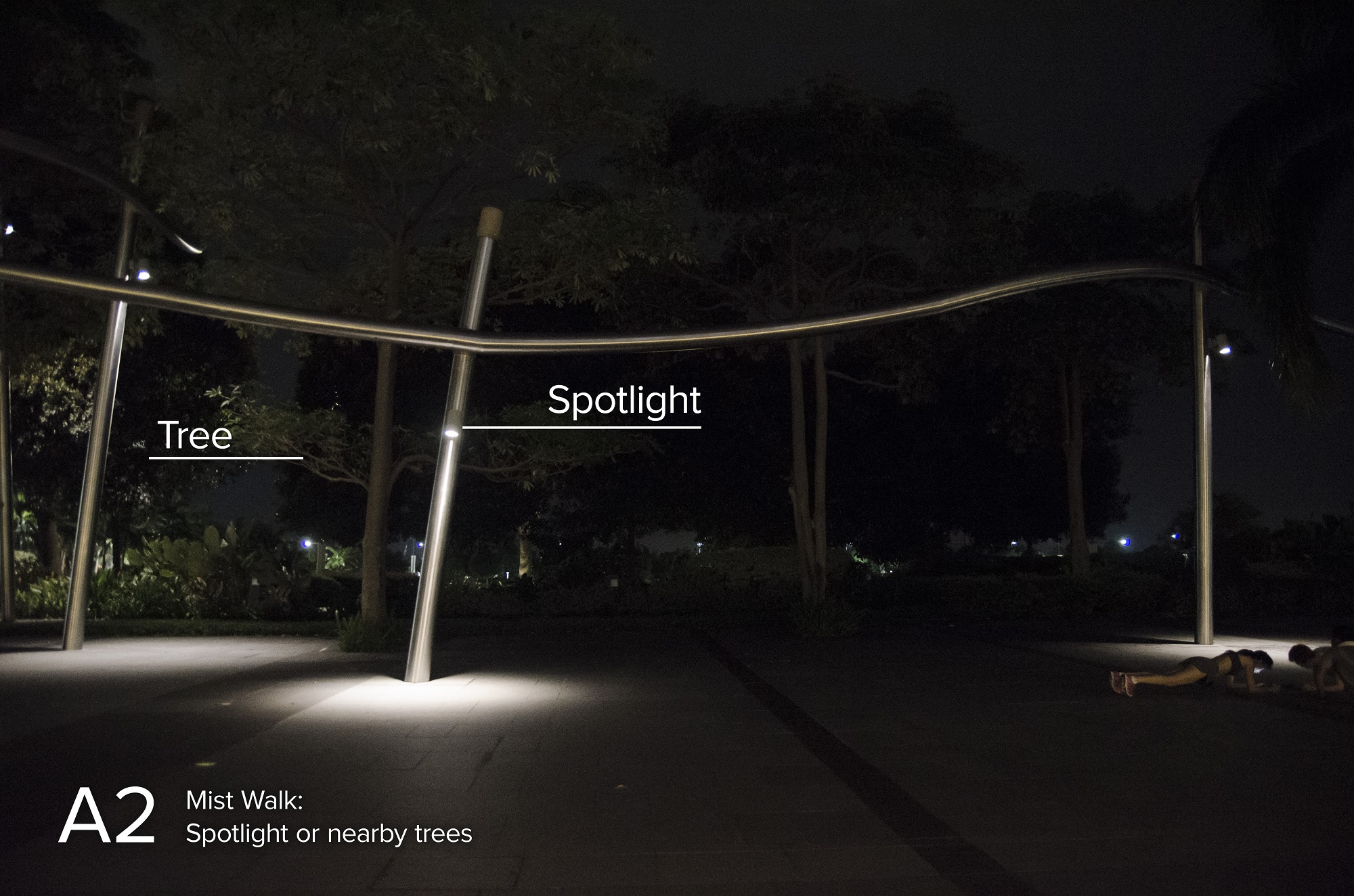
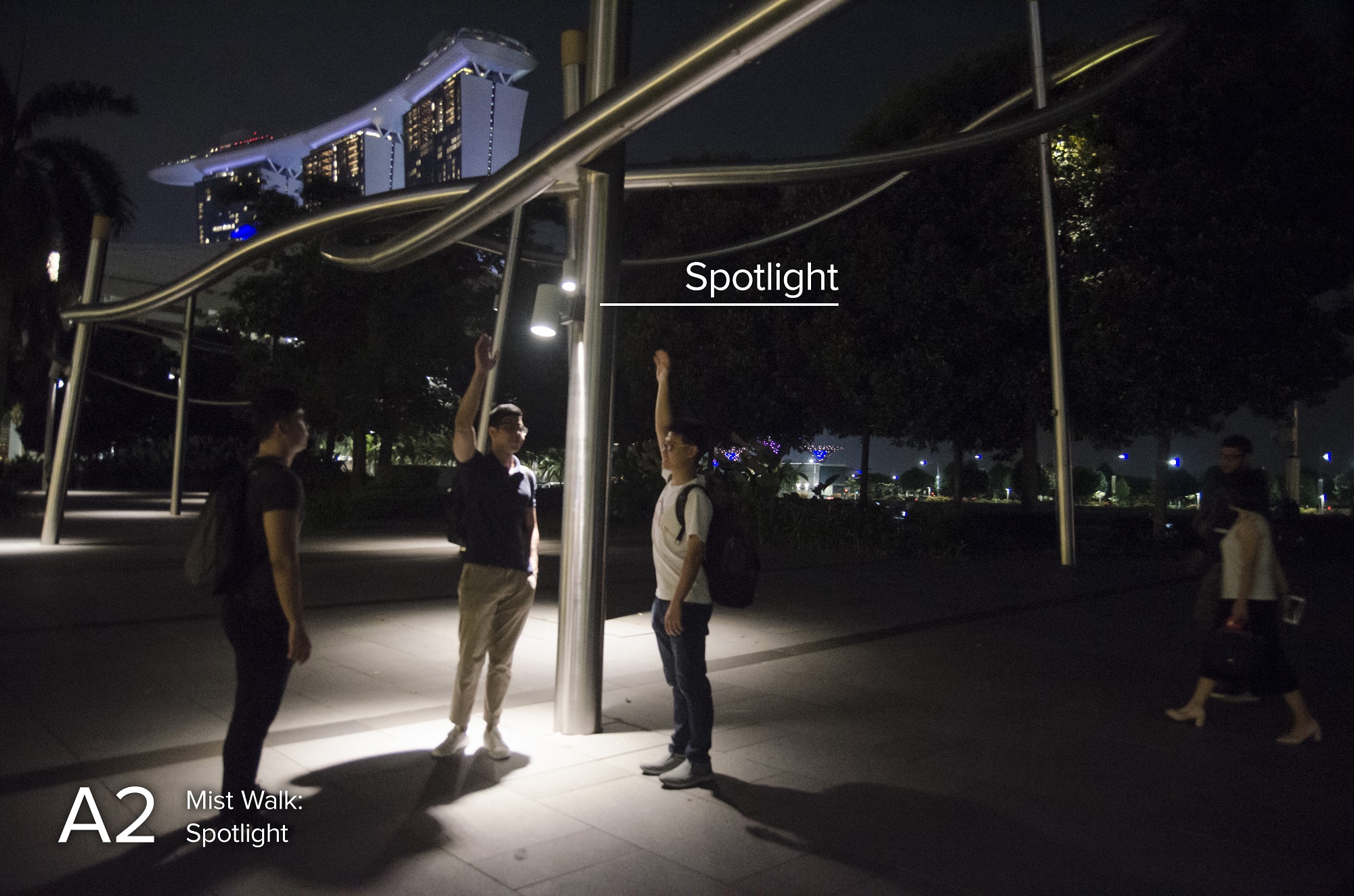
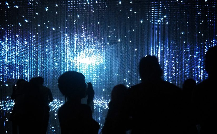
This area has existing structures which could reinforce our own structure or perhaps even used as the structure itself. The trees also have suitable height to hang our jellyfishes, although located at the back. We are also considering using the spotlight to generate water ripple effect on the ground.

Overall, the area is quite dark with just spotlights as light sources. There is a moderate traffic on the main road beside it, but the area around the mist walk is less crowded. It is easily spotted and it should be able to attract attention without much problem. There is no shelter but the floor is a bit slanted so we could place our step sensors without fearing of being submerged in puddles.

2. A6 – Breeze Shelter

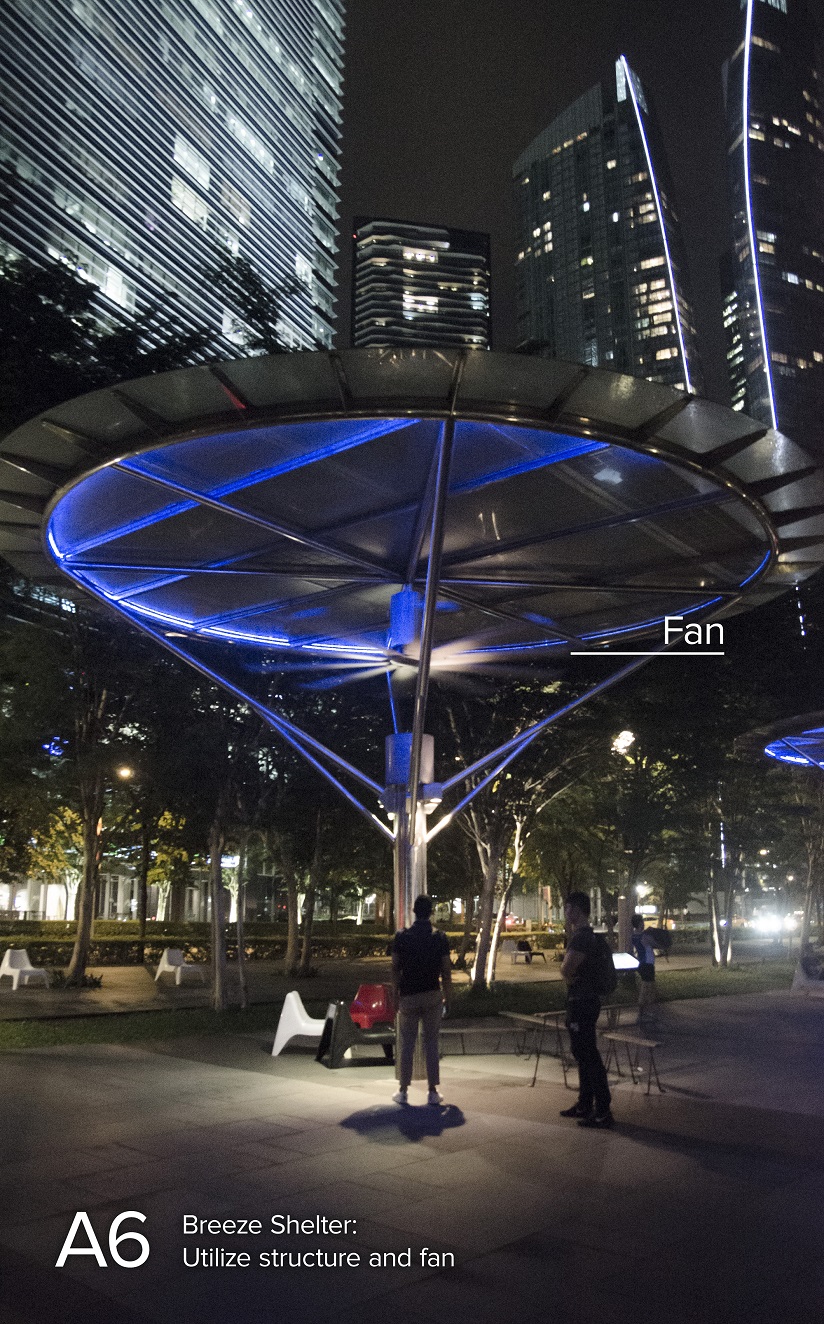
Another ideal spot with a sheltered structure that has prime height to hang our jellyfishes. There are spotlights similar to the Mist Walk which could possibly be used to generate our water ripple background.

One concern is the strong fan under the shelter which might need to be turned off so that we could hang objects on the structure. Ultimately, converting a shelter into an installation will remove its capability to shelter people from rain or even as a sitting and relaxing spot.

The shelters are located somewhat at the side of the main traffic but the structure itself is quite obvious and eye catching so overcrowding should not be an issue while maintaining decent attention from people.

3. A5 – Waterfront Promenade along Marina Boulevard

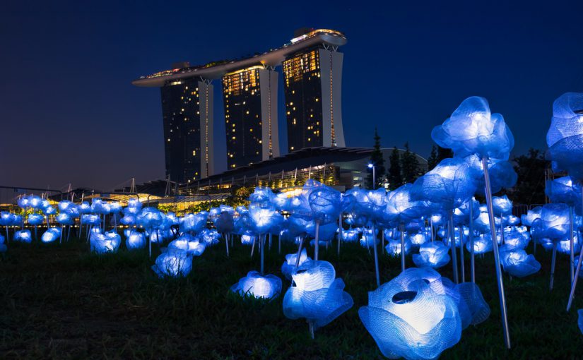
Another possible spot for our installation where we hang our jellyfishes along the road between the trees to provide a better immersive experience, especially since it is a main road where traffic flows.

While it might look and feel great, several concerns are the huge area to be covered. It might pose several technical and budget limitations due to the need to scale up the installation. A long rope-like structure to hang is prone to wind too, especially when hung on small trees with relatively flexible branches.

The trees could be a good spot to hide the motors powering the jellyfishes but the wide road requires longer wiring overall. Utilising trees for motors and hanging the jellyfish will need extra care for the trees too since it is a living being.

4. A3 – Lower Boardwalk

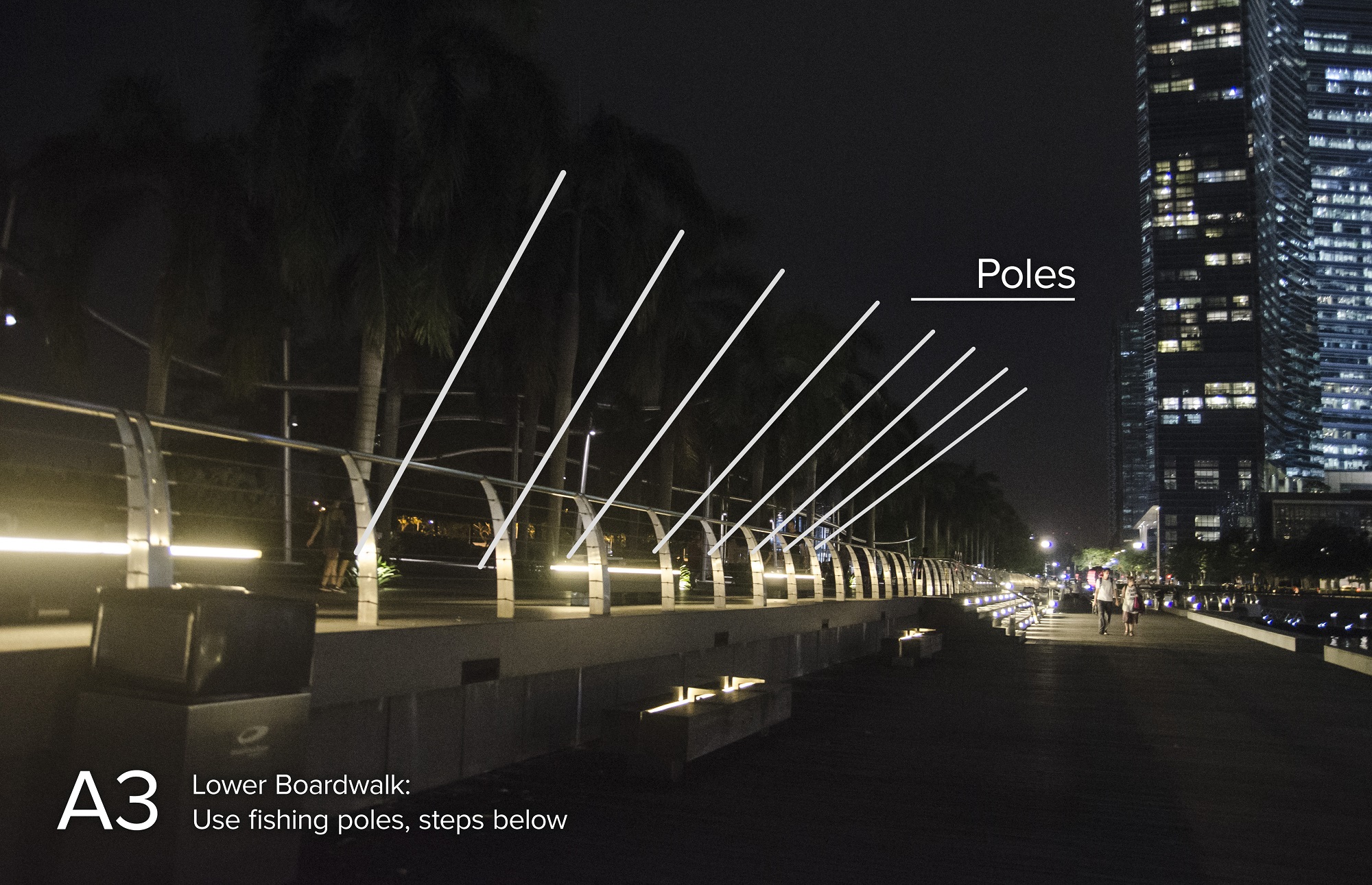
Our final option is to hang the jellyfishes with fishing-pole-like structure from the main road. People will be able to walk on the lower boardwalk to trigger the steps and play with the installation (although there is less traffic below).

The good thing about this area is the technical feasibility. The poles could be attached to the fences for durability purpose. The lower boardwalk has small gaps between the planks so water puddle is nearly impossible. Looking from the main road will give the water body as a background.

The biggest downside is that this area will provide a different experience compared to the previous three due to the difference in structure. A pole is limited to hang one jellyfish only, so we will not be able to display a swarm of jellyfish.

Further Discussions

These four areas have their own strengths and weaknesses and require us to modify the structure for our installation. Further discussions are needed to iterate on our current plan and adapt it for these locations, before we could finally decide on one area for the installation.

Thoughtful Interaction Design

The realm between physical and digital world is blurring. People are now relying on digital products for daily tasks. When digital products can be replicated easily to offer similar functionality, the thoughtfulness put into the design is always unique.

Here are two examples of thoughtful digital product:

1. Slack

Slack is a virtual workspace for any kind of work. More than simply being usable, Slack offers a delightful experience in little things that are often outside our expectation.

Making Work More Enjoyable

Work is often associated with negative emotions, but Slack flipped the paradigm and made it more fun. Emoji, conversational microcopy, cheerful colour palette, personalization, customization, custom-feature extensible, bots to simplify tasks and many more. All of these features seem to be added to enhance the main experience of making work more enjoyable – hence the name Slack.

Accessibility

For most of us normal people, we often forget the existence of people with disabilities. Slack provides multiple accessibility features so everyone can use the product. The features include colour scheme for the colourblind, screen reader and large text.

Failing Gracefully

For various reasons, products inevitably fail at times. Slack did a great job on handling a missing page. Instead of the normal cryptic 404 error page, Slack showed an interactive fantasy screen, giving slight smiles instead of frown.

These are just several examples of how thoughtful Slack’s design towards users. Subtle animation, creative direction, gamification, micro-interactions, and countless number of design decisions are carefully weaved into the very core of Slack.

2. Zendesk

Zendesk is a family of customer service platforms. One word suitable to describe it would be a more “human” digital product.

Customer Relationship

Just like how Slack converted negative emotions into something positive, Zendesk did the same thing with customer. From the brand, how the copy is written, colour, illustration, down to how the company build trust with its customers, everything screams “relationship” – and people like to be in relationship.

Designing for Global Users

Every single feature went through multiple discussions and debates with Product Managers, Designers, Developers and several other teams (I interned here before so I saw the process). Simple decision like font is born through a carefully balanced considerations of brand, feel, legibility, accessibility. Things like adding an extra word might break overall interface when it is translated to multiple languages. Since Zendesk is used worldwide, everything must be accessible in Left-to-Right and Right-to-Left mode. Low-capability browsers are taken into account when adding new features. Ultimately, everything still needs to be tested and slowly iterated to provide a seamless experience for everyone.

These might be things that most of us take for granted, while in fact are there because they are purposely designed.

Reliance on Devices

Day 1: Observation of Mobile Devices Usage
I was attached to my mobile phone the whole day. The recess week in NTU is full of assignments and people are discussing through WhatsApp. I happen to have a group project at school that day, so I used my phone to contact my friend and go together to school. It’s our primary means of contacting each other and checking the time, especially since some of us came late for the meeting.

While I was having dinner in the evening, I saw a lot of people glued to their phone while queuing or eating. Some of them look like playing games and some just casually chat on the phone. One interesting sight I experienced is when someone took a photo of the menu on the stall. I assume he was using it to discuss with their group without overcrowding the stall (the menu is attached to the wall).

Day 2: Electronic Device Ban
First of all, without any electronic device, my only definition of time is my stomach and the sun. I didn’t even know what time I woke up.

Without my phone, I experienced Fear of Missing Out (FOMO) to the fullest (I indeed miss out some information. Luckily it’s not critical). I rarely used my phone except for communication so I can still bear with the hassles it caused. For example, when I’m meeting a friend for dinner, I had to knock on his door to contact him (although we stayed on the same floor).

To be honest I thought I was screwed up with zero access to my computer. I had to postpone most of my assignments (design and programming). The best I could do was sketching website wireframes and listing key points for my essay on a paper. Even so, getting references is difficult without internet so I had to rely on past memory.

Overall, that day was very unproductive. While it’s true that I lazed around because doing even daily tasks was difficult without the help of technology, doing work-related tasks is simply impossible due to my technology-related field.

Photo via VisualHunt

Interactive Environments & Experience Design

On 25th September, Timothy Nohe shared his experience on designing an interactive public art installation.

Tim designed a non-conventional synthesizer with touch inputs in the form of a box. When audience interacts with the box, their actions will generate a sound which is also visualized on a screen.

What makes it interesting is how the interaction is accessible to anyone regardless of their background. The system relies on technical-heavy equipment like oscillator and midi controller, but it is wrapped in a way that the interface is simplified to the core. No button, no dial, no switch, no cable; Just a surface for touch.

Another inspiration we could take from Tim’s installation is how he leverages human curiosity to immerse someone. People understand the touch signifiers from the box but no one knows what the box affords. When the sound appears and the screen lights up because of the interaction, they will be more curious and explore the box. Furthermore, curiosity is contagious so nearby people will even join and interact as a group!

Lastly, we could not ignore how much importance to details that Tim had put into designing the installation. Equipment is weatherproofed. Cold weather is assessed beforehand. Environment sound pollution is considered despite not being visible. Audience’s height is taken into account into positioning the box. A lot more considerations are put into the details “in case something goes wrong”, but even so he still prepared a spare for every single equipment.

[Light City 2017 – “Electron Drawing” by Timothy Nohe. Photo taken from https://umbcarts.files.wordpress.com/2017/03/tim-nohe-electron-drawing.jpg]

Future World @ ArtScience Museum

The field trip to Future World at ArtScience Museum on 18 September is another inspiring learning journey for me.

I have always believed the concept of User Experience could never be applied to an art installation since Art is a self-expression of an individual (there is no “User” per se). This traditional way of thinking, however, is no longer valid when Technology opens up limitless possibilities of interaction – bridging the artist himself with people. Immersive Art proves to be a delightful experience for everyone, regardless of their background.

I think this concept of immersive experience could be used as a guide to design our iLight Festival art installation. The interaction should not simply be doing an input action which outputs another result. It should utilise multiple human senses to truly immerse any audience and let them fully enjoy the exhibition.

iLight 2017

An art installation from iLight Festival 2017 that particularly interests me is the Moonflower by Yun.

Earth is a beautiful wonder and the Moonflower garden perfectly illustrate this feel. I believe every single one of us has to realise that beauty and stop destroying mother nature.

To add more on the sustainability aspect, none of these “flowers” would go to waste since they would be sold to people. The money will then be donated for further sustainability efforts.

p.s. Sorry for the late post.

Photo by The Draft via thedraft.sg

Hidden in Plain Sight – Chapter 4

You Are What You Carry

In chapter 4 of Hidden in Plain Sight, Jan Chipchase wrote interesting insights about our carrying behaviour. The objects we often carry are based on multiple aspects like the range of distribution, the center of gravity and point of reflection. However, it ultimately boils down to survivability. Most of us happen to at least carry three critical objects with us: Keys, money and phone.

We want to feel safe and keep everything primary to our survival close within our reach.

The Technology Advancement

With the significant advancement in technology in the past few decades, our carrying behaviour has changed significantly. Our smartphones now have multiple capabilities on top of simply making calls or sending messages. With the rise of internet and cloud storage, we don’t even need to store it in our smartphone. Everything is readily available online, crossing the physical, time and consciousness boundaries. The “Mesh” sharing model could even potentially allow us to not own anything and use shared tools instead.

It comes down to this point of time where we carry less, remember less and own less – but is this how it is supposed to be? Entrusting everything to a third party introduces risk, and human tends to avoid risk in order to survive. I agree with Chipchase and believe that we need to understand this concept of survival to jump into new opportunities and design tools that really matters.

p.s. Sorry for the late post

Photo credit: DeaPeaJay via Visualhunt /  CC BY-SA

Hidden in Plain Sight – Chapter 5

One of the most important things I learned from photography back then was probably the art of observation. I stopped looking down at the ground. There were tons of things that I have never noticed before!

Observing little details around me should have become a habit, but sometimes forgotten. Reading Jan Chipchase’s Hidden in Plain Sight (Chapter 5, Calibrating your Cultural Compass) reminds me to pay even more attention to my surroundings. Chipchase also mentioned some interesting methods (commuting, social hub, Platzgeist, etc.) to understand the culture of various environments just by looking at everyday objects or events.

Another important lesson I could learn from Chipchase is to balance out formal and informal user research. Walking outside might just be as important as surveys and interviews. A lot of things are in plain sight after all.

Questions:
1. How do we filter and choose which data to use when informal and formal data are conflicting?
2. Should Designers and User Researchers be two separate positions? How much do these two overlap?

The Design of Everyday Things – Chapter 1

Response to Chapter 1:
Humans have always been great at adapting to unknown situations. We connect related (or even unrelated) past experiences to build conceptual models of a new experience. This implies that every single individual might have different way of perceiving things. What seems easy to use to someone might be hard to another.

It is our job as designers to normalise these perceptions by designing multiple signifiers. These subtle cues will make affordances and anti-affordances more obvious for average people (I personally think it’s impossible to create a complete foolproof design due to multiple factors like technology advancement, education and cultural differences). After all, design has to be so obvious that it is transparent.

Question 1:
It seems that we have various “universally-accepted design standards” for various specific products (e.g. ISO, WCAG). These standards could very well form some sort of formula or basic template for a “good design”. Why do you think poor design still happens everywhere?

Question 2:
In the first place, what do you think of iterating on conventions vs. innovating? Does trial-and-error in innovation process hurt people’s common expectation (conceptual model)?

Question 3:
How do you think an “ideal” design solution should be? Given that there are so many considerations to take (usability, aesthetics, accessibility, security, environmental impact, time, money, etc.). I personally think the key is about balance, but is sacrifice really inevitable? Or should there exist a “perfect” solution?