Thoughtful Interaction Design

The realm between physical and digital world is blurring. People are now relying on digital products for daily tasks. When digital products can be replicated easily to offer similar functionality, the thoughtfulness put into the design is always unique.

Here are two examples of thoughtful digital product:

1. Slack

Slack is a virtual workspace for any kind of work. More than simply being usable, Slack offers a delightful experience in little things that are often outside our expectation.

Making Work More Enjoyable

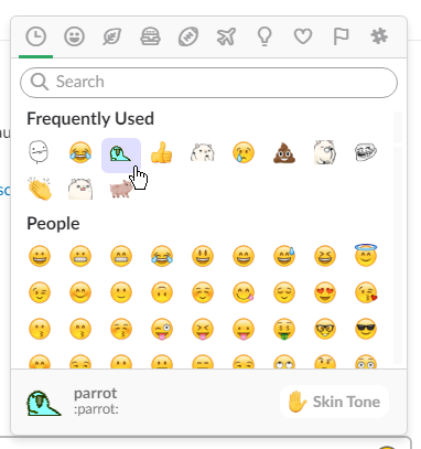
Work is often associated with negative emotions, but Slack flipped the paradigm and made it more fun. Emoji, conversational microcopy, cheerful colour palette, personalization, customization, custom-feature extensible, bots to simplify tasks and many more. All of these features seem to be added to enhance the main experience of making work more enjoyable – hence the name Slack.

Accessibility

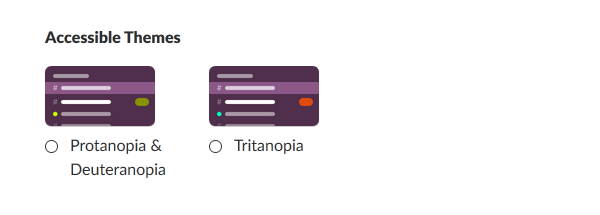
For most of us normal people, we often forget the existence of people with disabilities. Slack provides multiple accessibility features so everyone can use the product. The features include colour scheme for the colourblind, screen reader and large text.
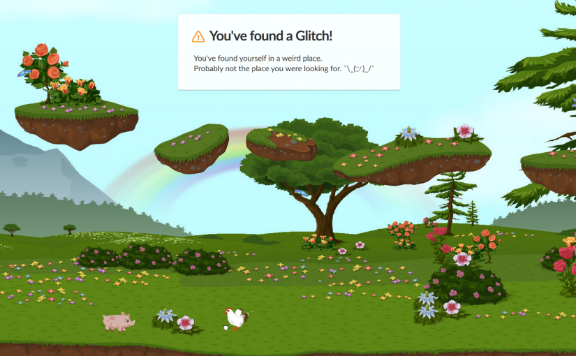
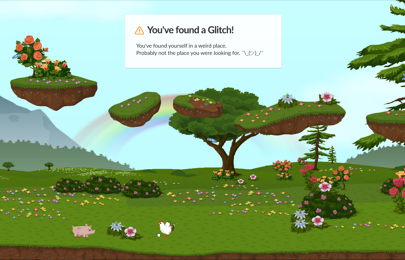
Failing Gracefully

For various reasons, products inevitably fail at times. Slack did a great job on handling a missing page. Instead of the normal cryptic 404 error page, Slack showed an interactive fantasy screen, giving slight smiles instead of frown.

These are just several examples of how thoughtful Slack’s design towards users. Subtle animation, creative direction, gamification, micro-interactions, and countless number of design decisions are carefully weaved into the very core of Slack.

2. Zendesk

Zendesk is a family of customer service platforms. One word suitable to describe it would be a more “human” digital product.

Customer Relationship

Just like how Slack converted negative emotions into something positive, Zendesk did the same thing with customer. From the brand, how the copy is written, colour, illustration, down to how the company build trust with its customers, everything screams “relationship” – and people like to be in relationship.

Designing for Global Users

Every single feature went through multiple discussions and debates with Product Managers, Designers, Developers and several other teams (I interned here before so I saw the process). Simple decision like font is born through a carefully balanced considerations of brand, feel, legibility, accessibility. Things like adding an extra word might break overall interface when it is translated to multiple languages. Since Zendesk is used worldwide, everything must be accessible in Left-to-Right and Right-to-Left mode. Low-capability browsers are taken into account when adding new features. Ultimately, everything still needs to be tested and slowly iterated to provide a seamless experience for everyone.

These might be things that most of us take for granted, while in fact are there because they are purposely designed.

Reliance on Devices

Day 1: Observation of Mobile Devices Usage
I was attached to my mobile phone the whole day. The recess week in NTU is full of assignments and people are discussing through WhatsApp. I happen to have a group project at school that day, so I used my phone to contact my friend and go together to school. It’s our primary means of contacting each other and checking the time, especially since some of us came late for the meeting.

While I was having dinner in the evening, I saw a lot of people glued to their phone while queuing or eating. Some of them look like playing games and some just casually chat on the phone. One interesting sight I experienced is when someone took a photo of the menu on the stall. I assume he was using it to discuss with their group without overcrowding the stall (the menu is attached to the wall).

Day 2: Electronic Device Ban
First of all, without any electronic device, my only definition of time is my stomach and the sun. I didn’t even know what time I woke up.

Without my phone, I experienced Fear of Missing Out (FOMO) to the fullest (I indeed miss out some information. Luckily it’s not critical). I rarely used my phone except for communication so I can still bear with the hassles it caused. For example, when I’m meeting a friend for dinner, I had to knock on his door to contact him (although we stayed on the same floor).

To be honest I thought I was screwed up with zero access to my computer. I had to postpone most of my assignments (design and programming). The best I could do was sketching website wireframes and listing key points for my essay on a paper. Even so, getting references is difficult without internet so I had to rely on past memory.

Overall, that day was very unproductive. While it’s true that I lazed around because doing even daily tasks was difficult without the help of technology, doing work-related tasks is simply impossible due to my technology-related field.

Photo via VisualHunt

Interactive Environments & Experience Design

On 25th September, Timothy Nohe shared his experience on designing an interactive public art installation.

Tim designed a non-conventional synthesizer with touch inputs in the form of a box. When audience interacts with the box, their actions will generate a sound which is also visualized on a screen.

What makes it interesting is how the interaction is accessible to anyone regardless of their background. The system relies on technical-heavy equipment like oscillator and midi controller, but it is wrapped in a way that the interface is simplified to the core. No button, no dial, no switch, no cable; Just a surface for touch.

Another inspiration we could take from Tim’s installation is how he leverages human curiosity to immerse someone. People understand the touch signifiers from the box but no one knows what the box affords. When the sound appears and the screen lights up because of the interaction, they will be more curious and explore the box. Furthermore, curiosity is contagious so nearby people will even join and interact as a group!

Lastly, we could not ignore how much importance to details that Tim had put into designing the installation. Equipment is weatherproofed. Cold weather is assessed beforehand. Environment sound pollution is considered despite not being visible. Audience’s height is taken into account into positioning the box. A lot more considerations are put into the details “in case something goes wrong”, but even so he still prepared a spare for every single equipment.

[Light City 2017 – “Electron Drawing” by Timothy Nohe. Photo taken from https://umbcarts.files.wordpress.com/2017/03/tim-nohe-electron-drawing.jpg]

Future World @ ArtScience Museum

The field trip to Future World at ArtScience Museum on 18 September is another inspiring learning journey for me.

I have always believed the concept of User Experience could never be applied to an art installation since Art is a self-expression of an individual (there is no “User” per se). This traditional way of thinking, however, is no longer valid when Technology opens up limitless possibilities of interaction – bridging the artist himself with people. Immersive Art proves to be a delightful experience for everyone, regardless of their background.

I think this concept of immersive experience could be used as a guide to design our iLight Festival art installation. The interaction should not simply be doing an input action which outputs another result. It should utilise multiple human senses to truly immerse any audience and let them fully enjoy the exhibition.