After reading Fabrizio’s comment, we decided to explore and focus more on repetition and connectivity while maintaining the same concept of a shared space.
Idea 1


Idea 2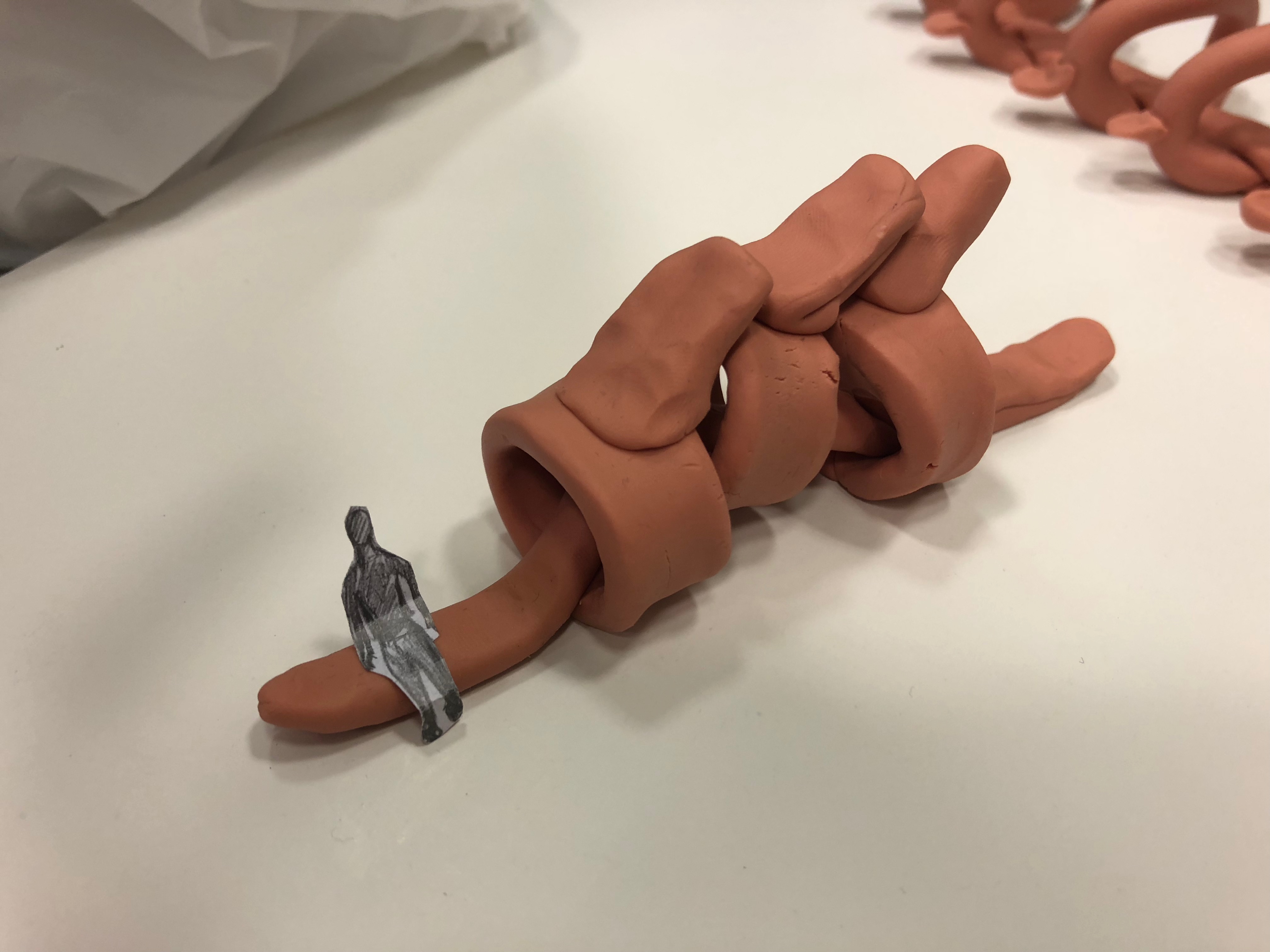

Just another Open Source Studio site
After reading Fabrizio’s comment, we decided to explore and focus more on repetition and connectivity while maintaining the same concept of a shared space.
Idea 1
Idea 2
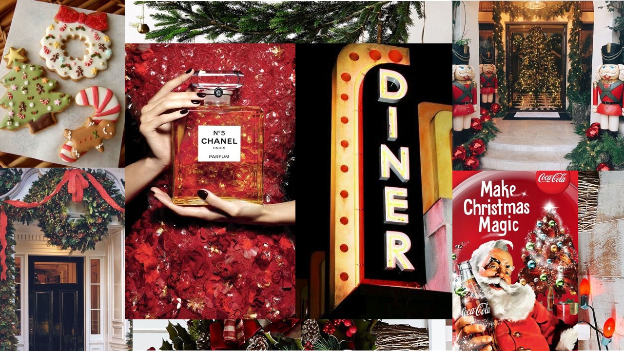
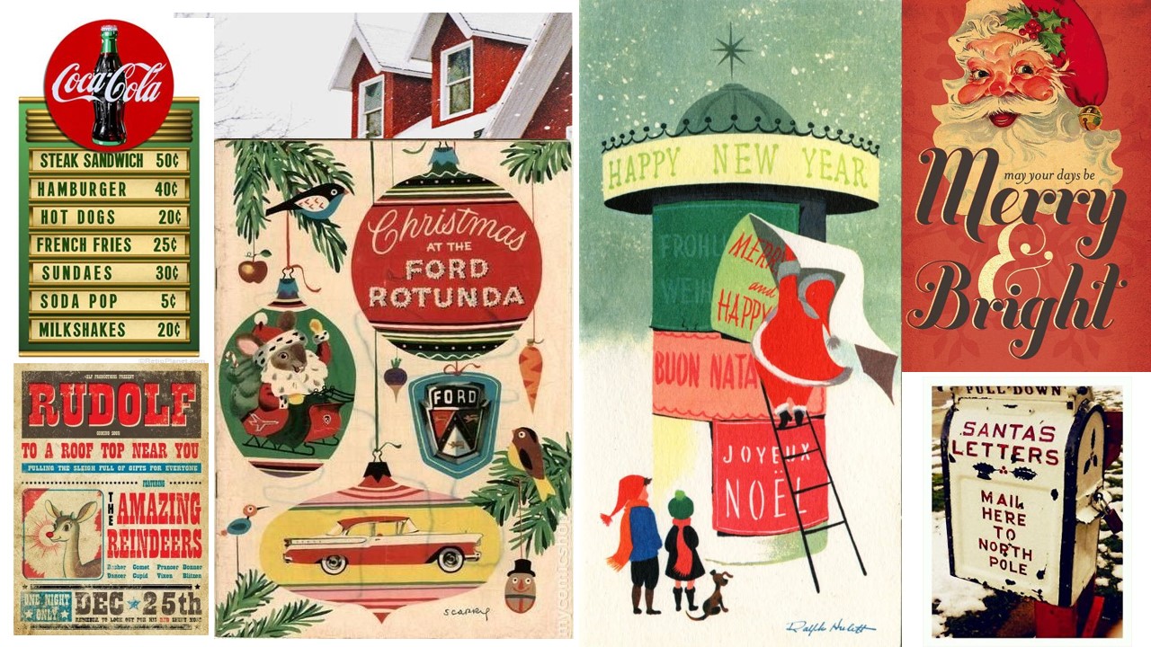
Theme & Concept : Obsession
Below are some thumbnail sketches of trying to portray the obsession for Christmas!
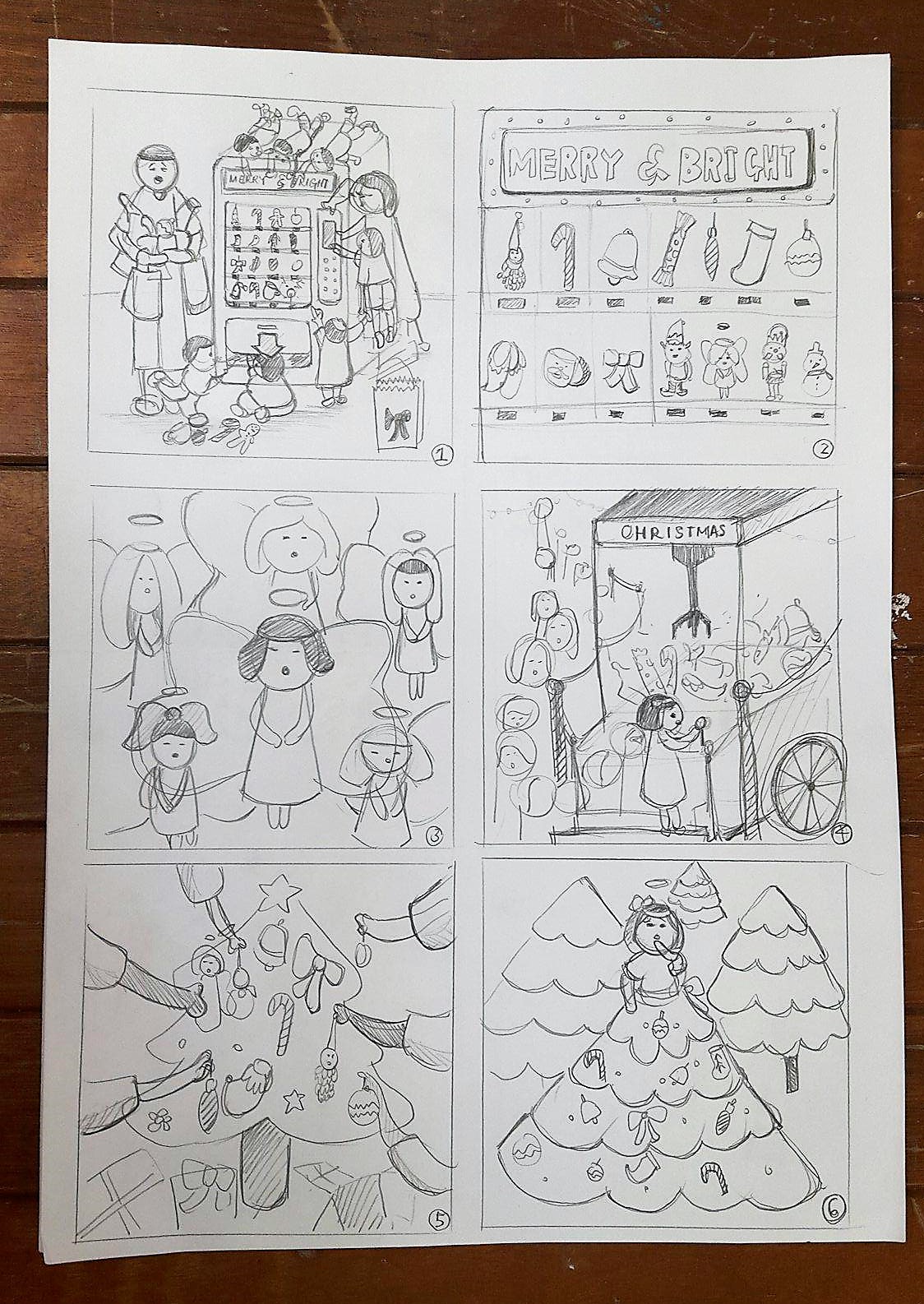
Idea 1: Family trying to get Christmas stuff from the vending machine / The father looking exhausted from carrying all the stuff his wife and children got
Idea 2: A close up of the vending machine and the things sold inside it
Idea 3: A composition of angels clouding the whole space
Idea 4: Young and old queuing up to give a shot at the huge claw machine filled with Christmas goodies!
Idea 5: Everyone helping to decorate the Christmas tree!
Idea 6: Girl wearing a Christmas tree skirt

Idea 7: Family buying stuff for Christmas during sale
Idea 8: Girl eating off a gingerbreadhouse
Idea 9: Wreath filled with Christmas ornaments
Idea 10: Elves helping santa to move gifts around
Idea 11: BAKING COOKIES !!
Idea 12: Elves helping to decorate the Christmas trees
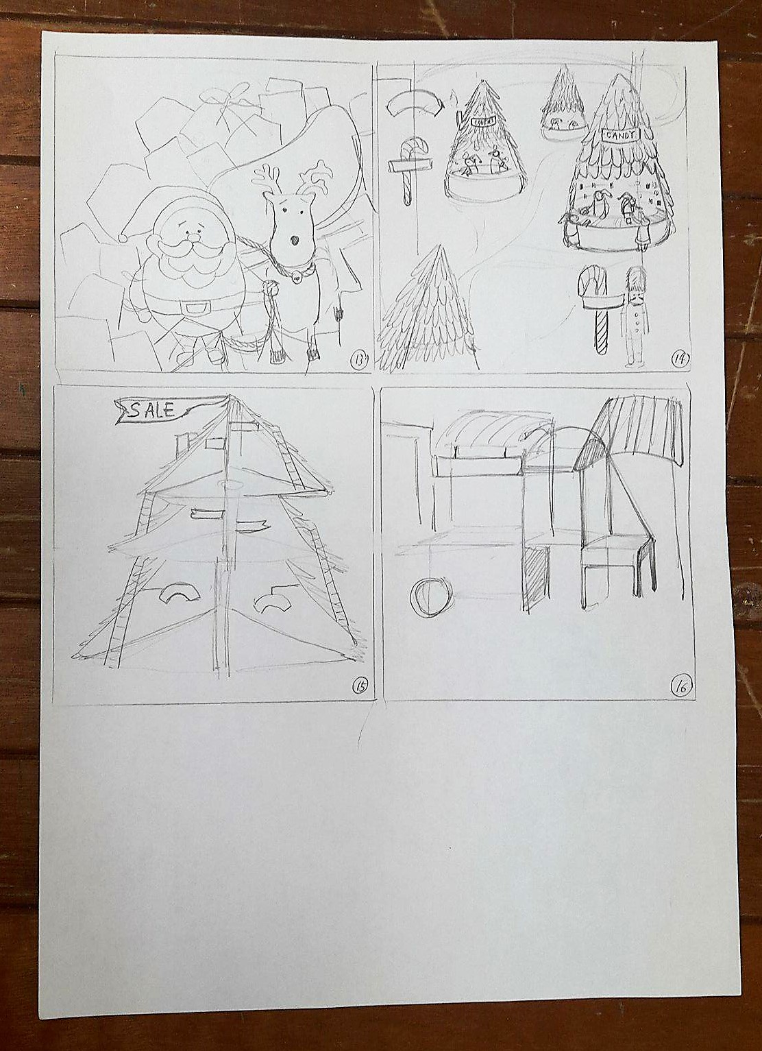
Idea 13: Santa feeling stunned over the amount of gifts he has to send out
Idea 14: Christmas market
Idea 15: Different levels and section of the Christmas tree selling different items
Idea 16: Many rows of Christmas stalls
Choice of idea after feedback
Idea 1, 4 and 8
Suggestions: Use Idea 8 as a main focus and combine the busyness of Idea 1 and 4 into it (eg: by adding snowflakes/ornaments/more crumbs/ mess on the floor to fill up the space)
Inspiration from Henry Moore

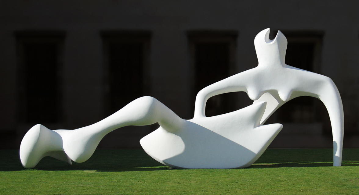
After doing a bit of readings on Henry Moore and his sculptures, there was a surprising fact that most of his sculptures were also inspired by skulls and bones!
Bones are the inside structure that nature uses for both lightness and strength…so in bones you can find the principles which can be very important in sculpture
Henry Moore
Hence, after observing some of his sculptural works, we found it interesting of how he uses positive and negative spaces to create a visually interesting sculpture and how the whole sculpture is connected to each other as a whole. Prior to that, we came out with an idea to create an interesting space that allows the user to use it however they wish to. (eg: sitting, laying down, etc.)
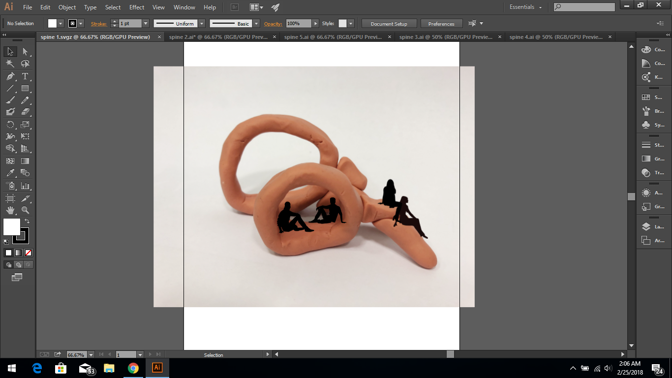
Exploration of possible forms
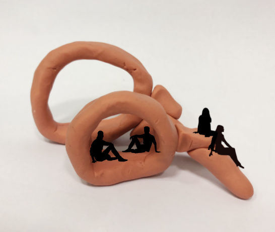
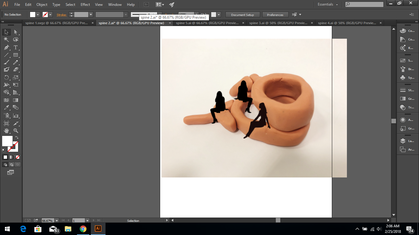
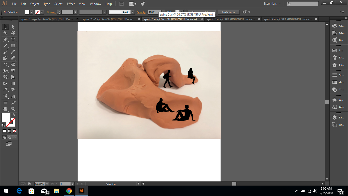
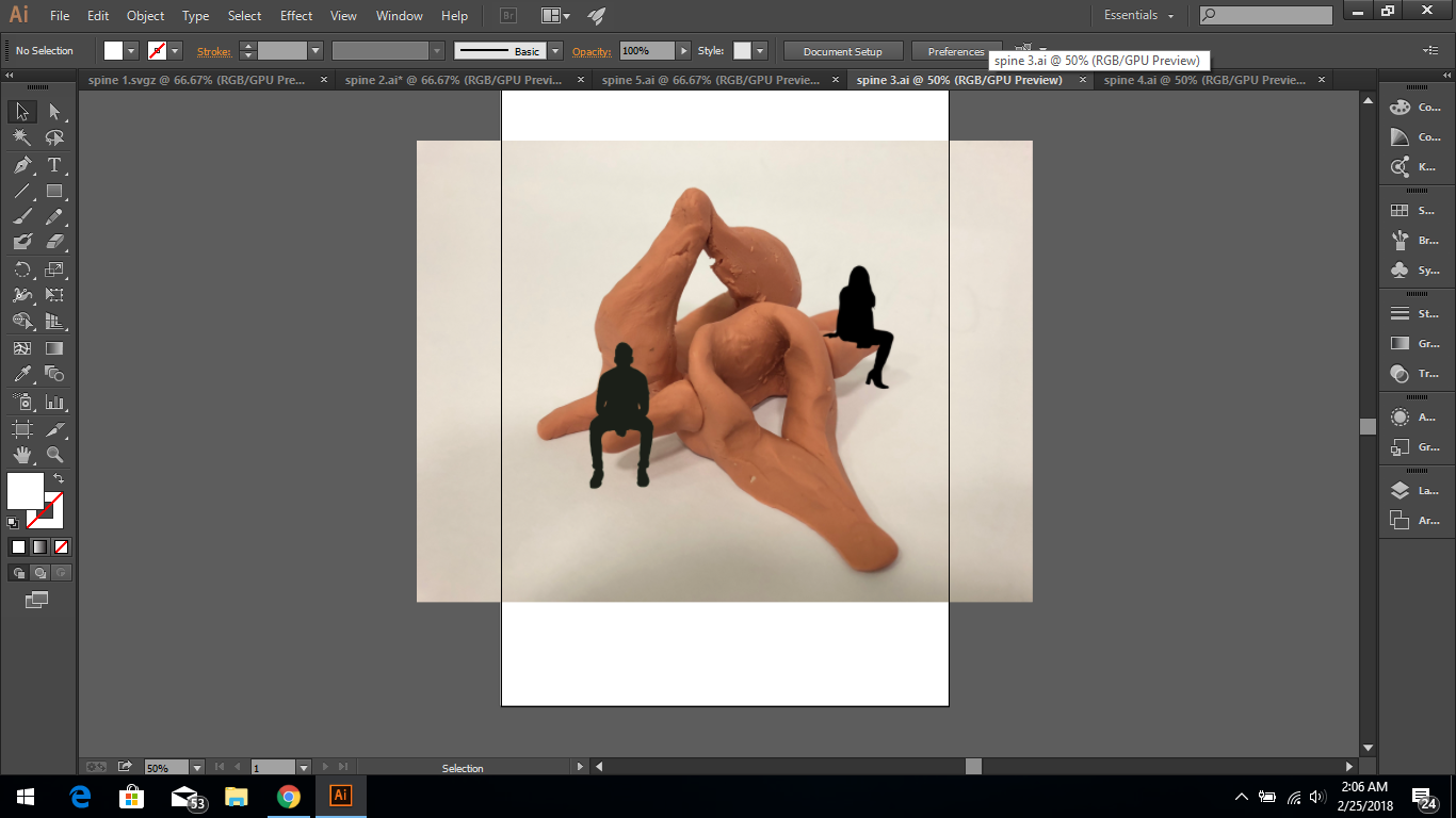

One of our biggest challenge was to experiment creating interesting forms but at the same try to remain its essence of looking like a spine.

-classic
-sparkly/glittery
-bold red, green and gold
-bright/glossy
-wonderland/fun

-vintage
-faded/muted
-reminisce
-collection
-newspaper/story/narrative

target market: female / anyone who loves Christmas!
age:18-30
occupation: working adults and students in the creative field / (anyone who loves creative graphics/appreciates/collects them!)
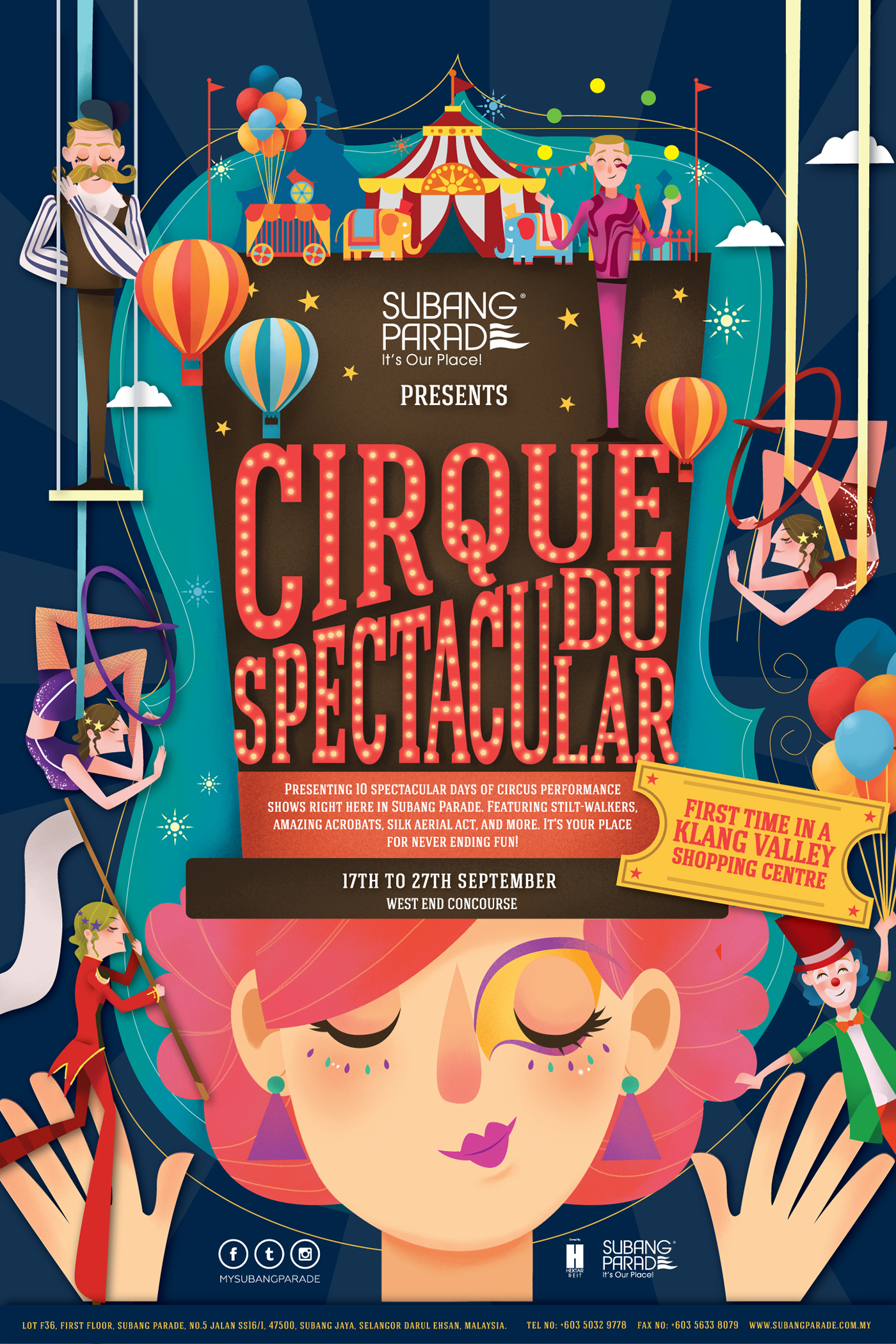
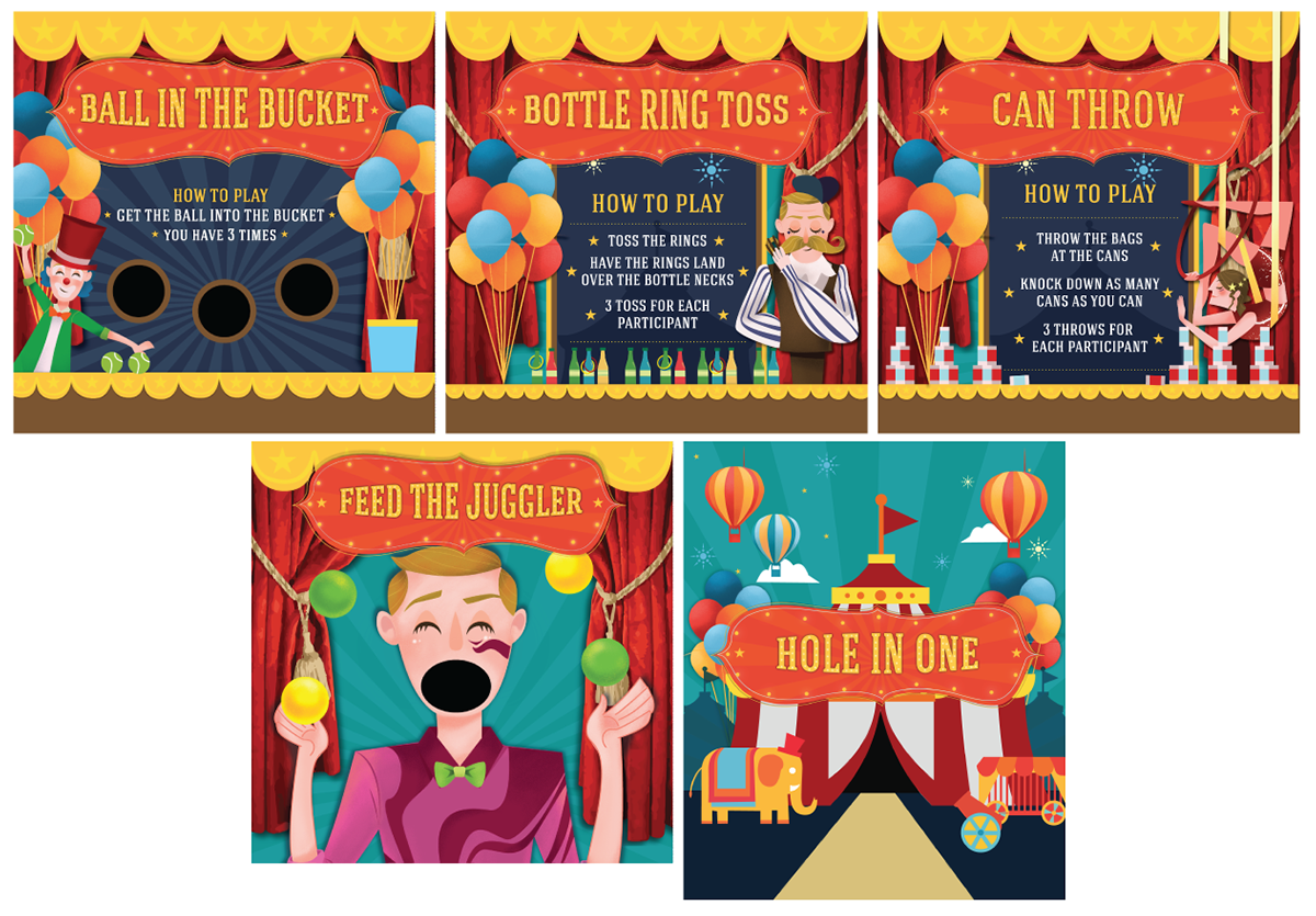
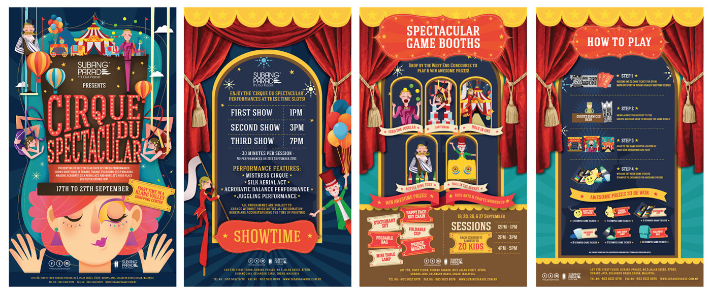
This was a poster designed by Joanne Poon for a circus event! I love how all the colors helped to make the event look inviting and fun! The poster along with the other information templates looked unified and belonging to each other too. I think that it is a very successful poster not only because it managed to grab the audiences’ attention but it also managed to accommodate important information into the poster yet not making it look overcrowded and messy!
2. Marta Leshak
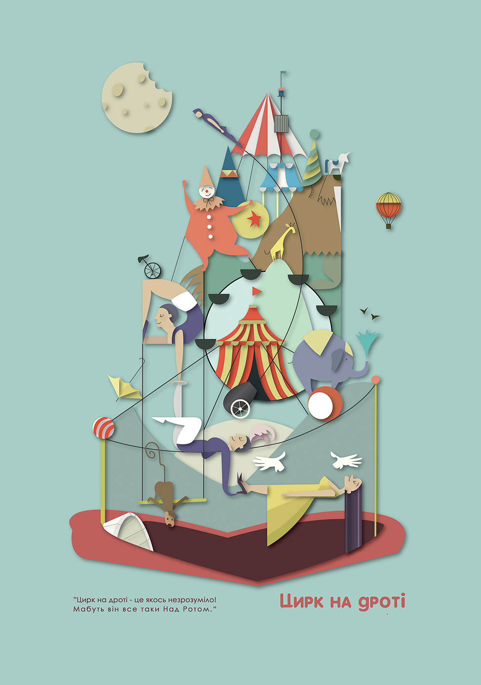
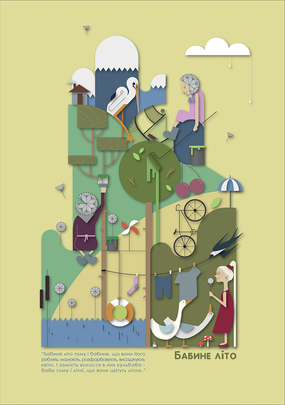
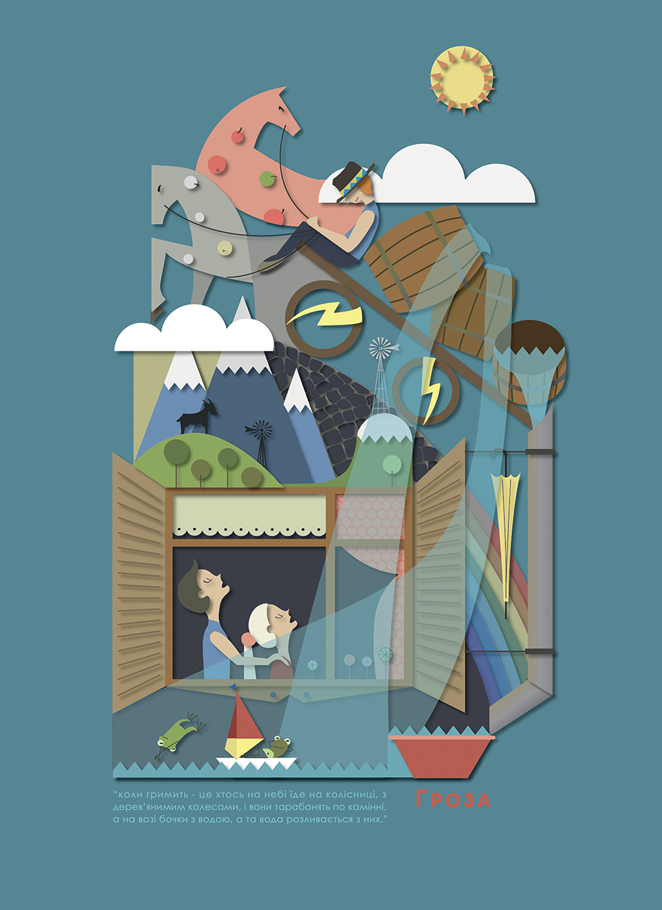
Martha Leshak is a designer and illustrator that is passionate about children’s book and folk topics! These are some of the plots from a series of paper cutting illustration she created to reflect children’s representation of incomprehensible sayings and phraseologism. I love the color that she chose for her target audience that are very pastel and baby-like colors! She managed to create another world of its own in her illustrations and I find that it is a very important element to incorporate into the cover of a magazine design in order to captivate the eyes of the viewer!
3. Hee Eun Lee
![POSTER2017 제 6회 대한민국 도시농업 박람회The 6th Korean urban agriculture Expo[농작물음악제 포스터_ 딸기 콘서트 / 감자 콘서트] contact_hikikomolee@gmail.cominstagram.com/hikikomolee](https://i.pinimg.com/564x/c2/39/62/c239626fa594b99a24a08cc7724264a1.jpg)

![POSTER2017 제 6회 대한민국 도시농업 박람회The 6th Korean urban agriculture Expo[농작물음악제 포스터_ 딸기 콘서트 / 감자 콘서트] contact_hikikomolee@gmail.cominstagram.com/hikikomolee](https://i.pinimg.com/564x/b1/ab/4d/b1ab4d33f6a1f8d8b7c2c66d54a2cea7.jpg)
The design of this illustrator is very pleasing to the eye as she uses muted colors and rounded edges to create her designs! The right way to welcome people to the concert! 🙂
4. The New Yorker Magazine

New Yorker August 2nd, 1958 by Arthur Getz

Ilonka Karasz : Cover art for The New Yorker 1710 – 23 November 1957

Constantin Alajalov Christmas Store New Yorker Cover December 1949

May 6, 1939 by Ilonka Karasz

Feedback and comments to better artwork:
Personal reflection after assignment 1

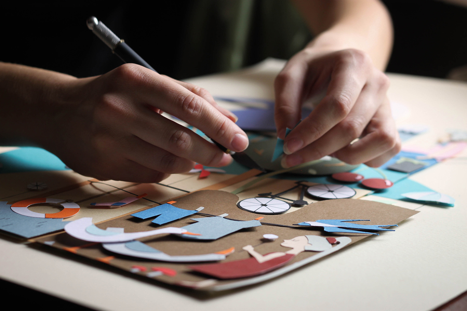
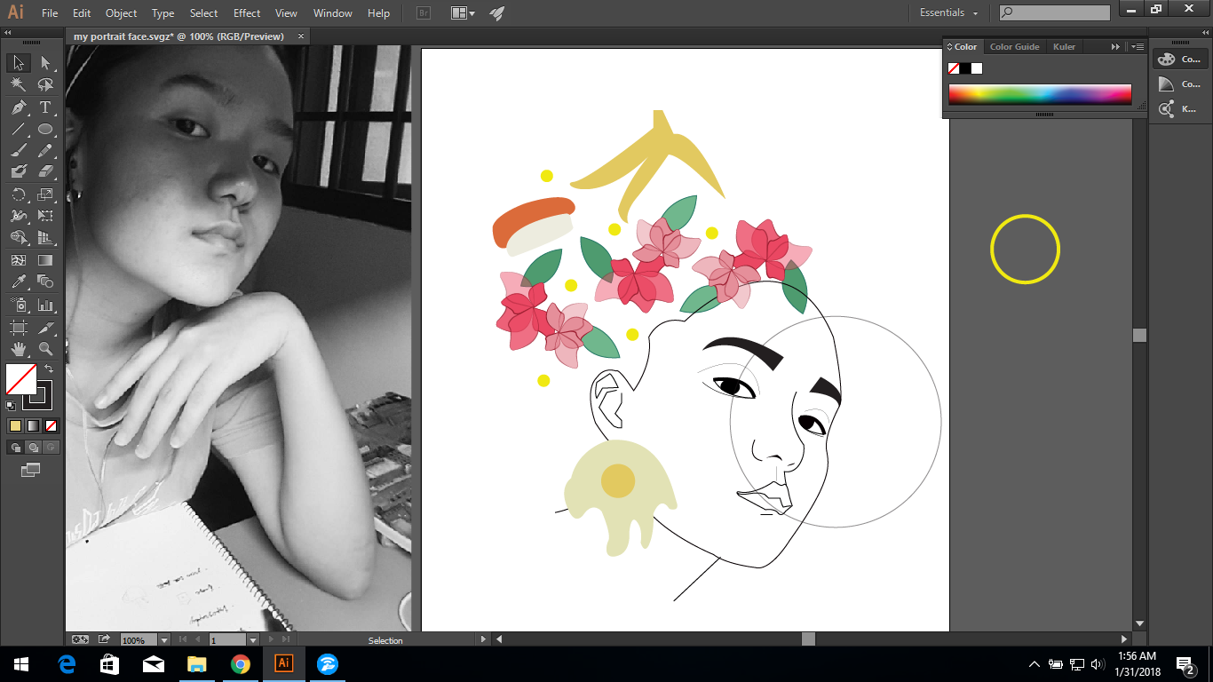
Process of illustrating my self portrait
A list of words that describe me/Things that I adore
-rice and eggs
-matcha latte
-soulful music
-journaling
-typography
-christmas
-nature (flower and greens)
-patterns
-bandana and high bun
-french fries
-sushi
-pizza


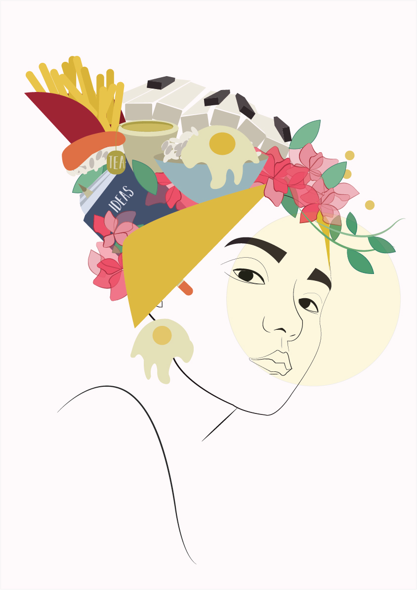
I chose to take a picture of my neutral looking face to show no emotion because I wanted the viewer to have their own interpretation and perception of what the whole portrait is trying to convey. So the first step that I did was to take pictures and finally chose an of angle that I can better work with and illustrate my face.
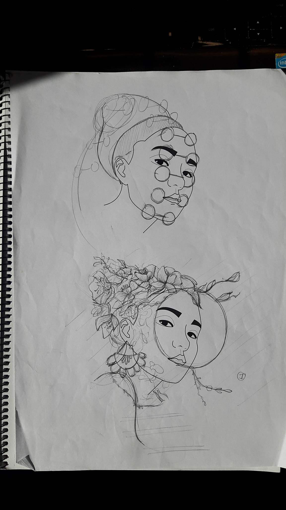
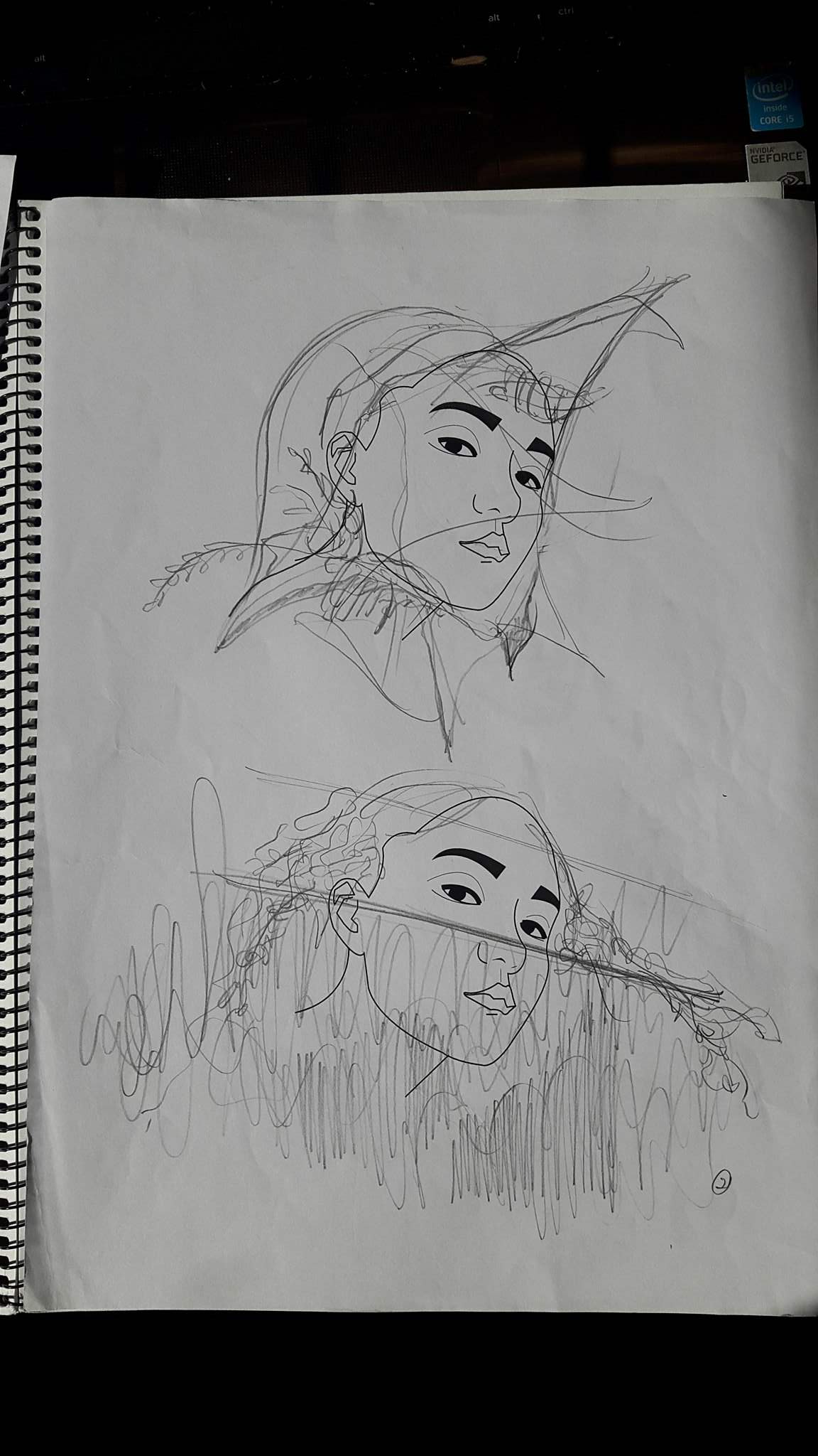
The main concept that I was trying to go for is to portray me as an” observant” person, always being aware of my surroundings. The first sketch above was me wearing many glasses, arranging them from my chin to the back of my head to suggest that I have “many eyes”or “always on the look”. The second sketch is me peeping through a glass window. And the flowers and leaves growing and creeping out gives an idea of wanting to be free or to “come out”. Composition wise, I feel that this is much stronger than the others as the tip of the hair balances out the chin and an earring at the ear gives character to the whole picture. It also shows movement and allows the reader’s eyes to flow through the portrait.
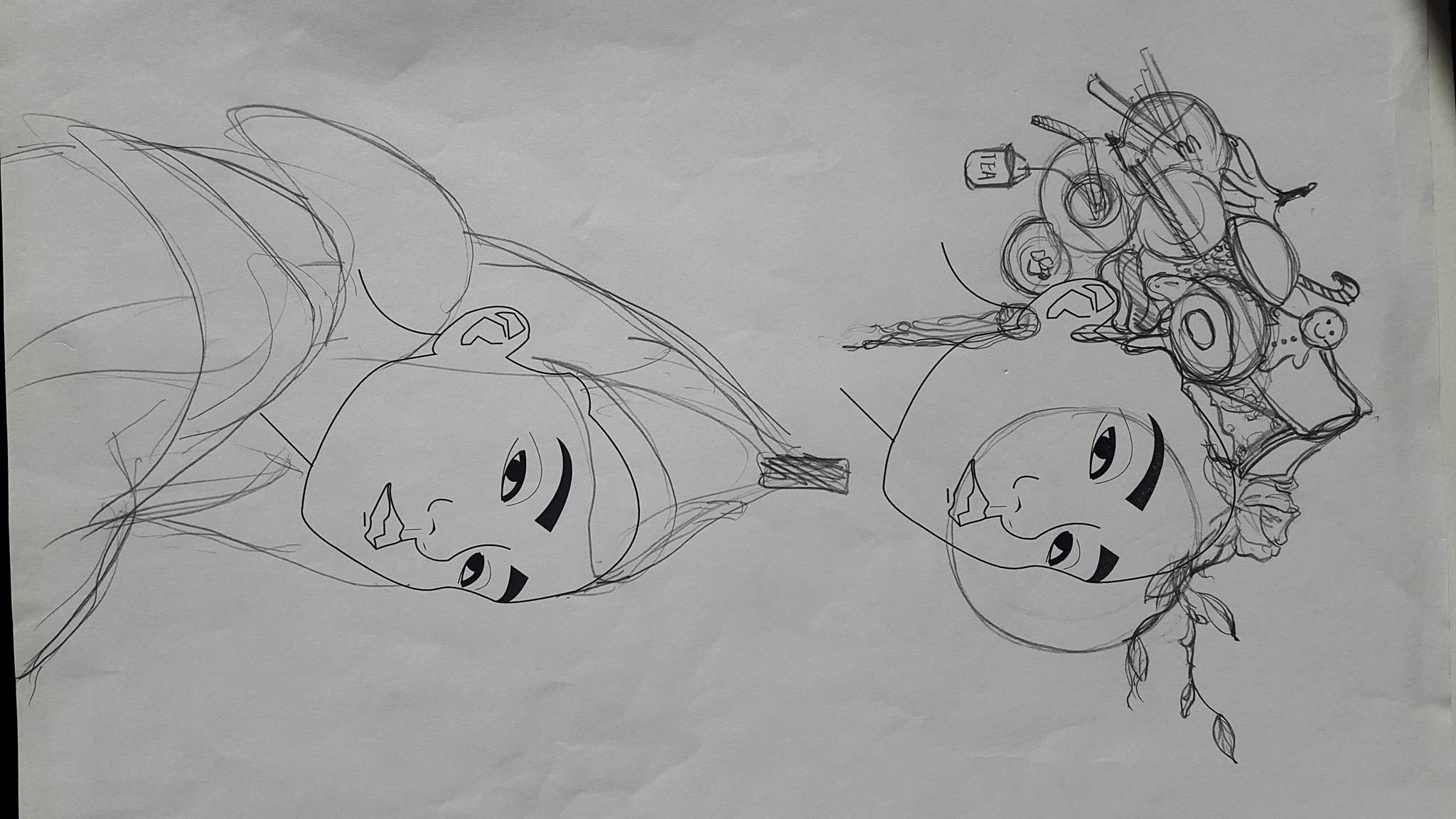
Although I do like the previous sketch and the message behind it. I still find that it still loses some edge and character to it. So rather than just having a garden over my head. I tried to incorporate some of the elements that best describe myself. I find it more visually intriguing and it allows the viewer to want to find out what is exactly IN the hair. However, I find the composition and arrangement was very still and gives off a feeling of solitude and I didn’t want that so I decided to use the composition of the previous sketch because it shows more dynamism .
These two are just sketches of the same concept. One trying to come out of a paper box and another trying to peek over the fence.
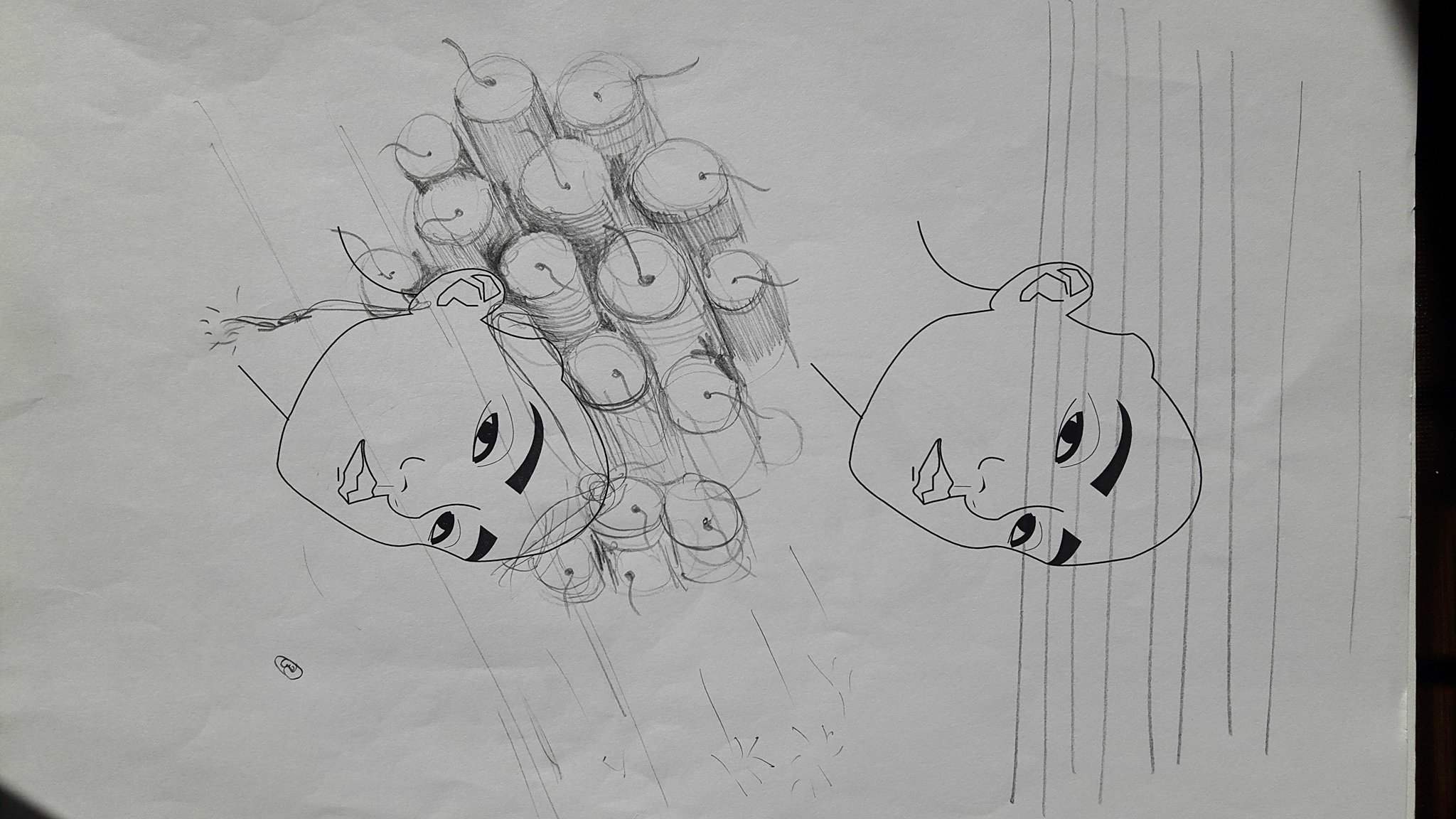
The last idea was to incorporate fireworks and hair curlers but I chose the previous idea at last because it had more narrative and visual interest.
Composition of final self portrait
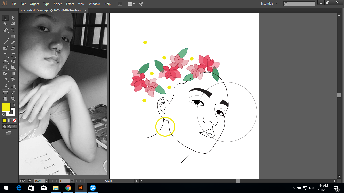
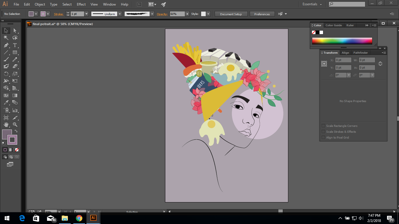
At first I was just playing around with the composition. Trying to figure out how to better portray depth and combine all the objects together without making it look too messy and at the same time remain its elegance.
At this point, i wanted the french fries to mimic a crown. However the keyboard behind although added depth doesn’t look as cohesive as I wanted it to be with the self portrait.
Problems : Struggling to make objects look clear after placing a layer on top of it even after opacity is reduced.

Although this may seem clearer but it fails to use the glass window to give off the message because the objects (flowers) looks as if they are on top of the glass rather than behind it.
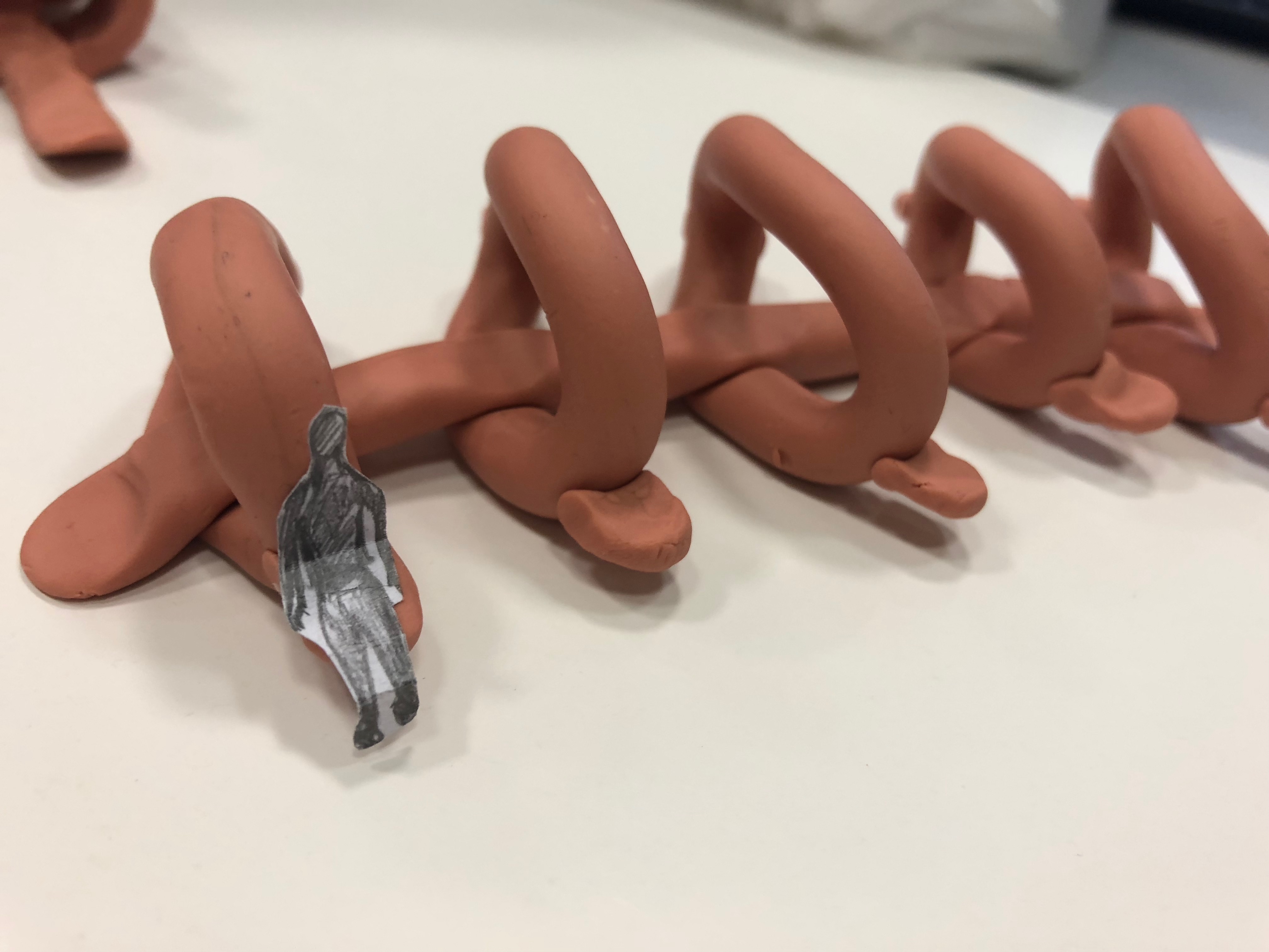
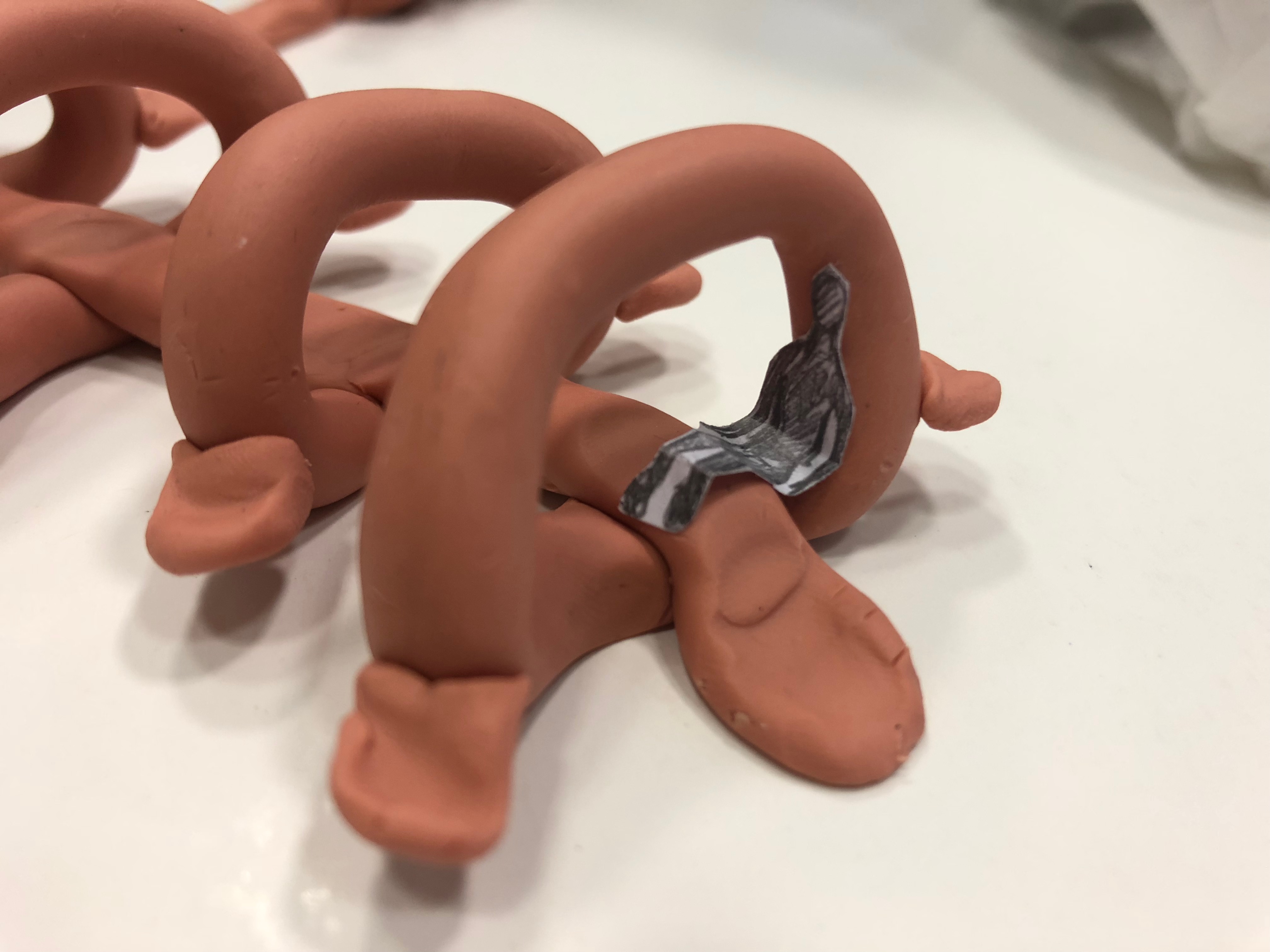
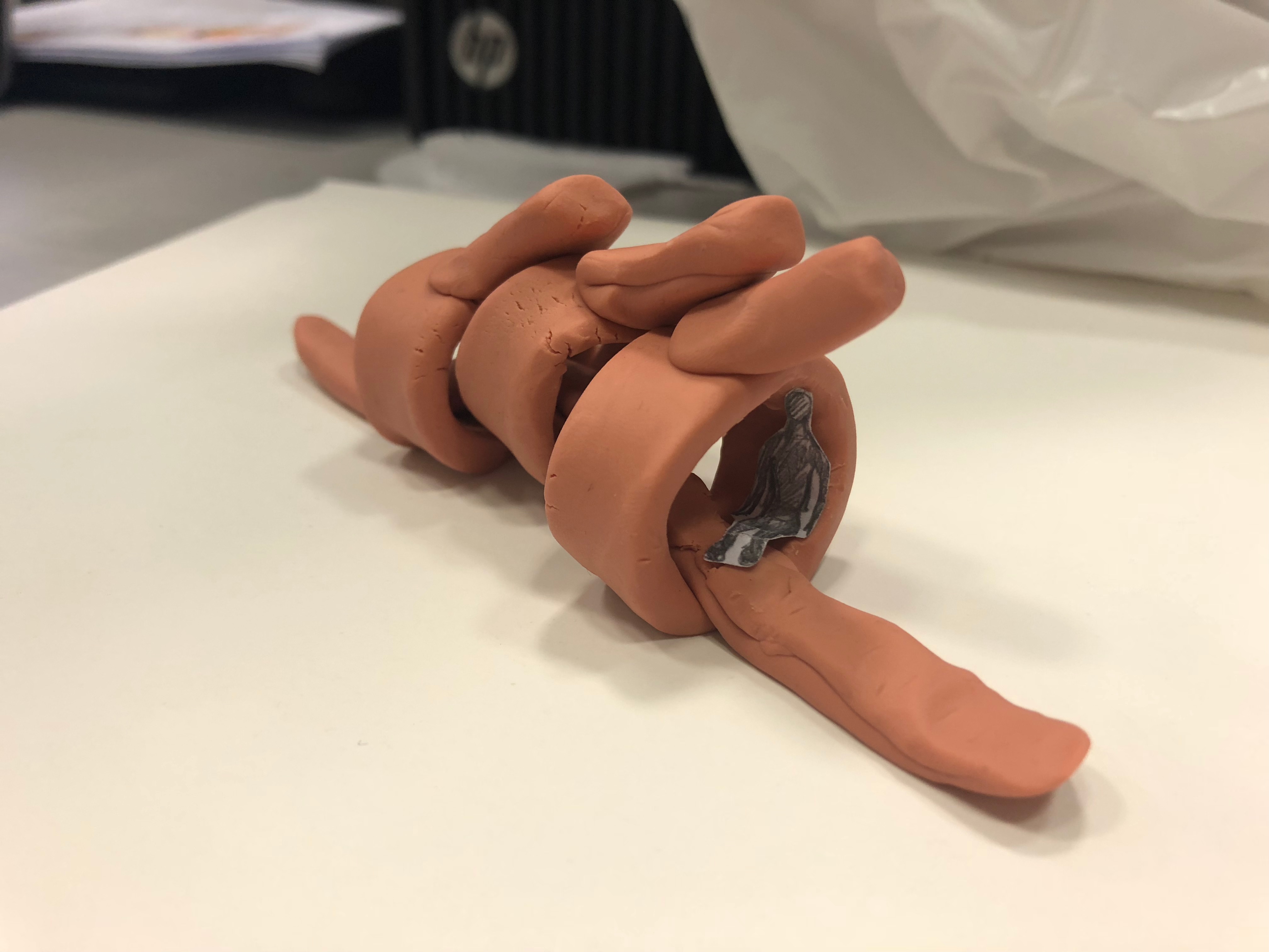
Source of inspiration: The Human Spine
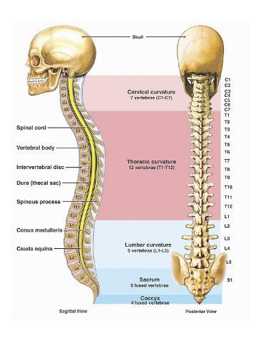

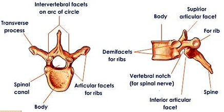
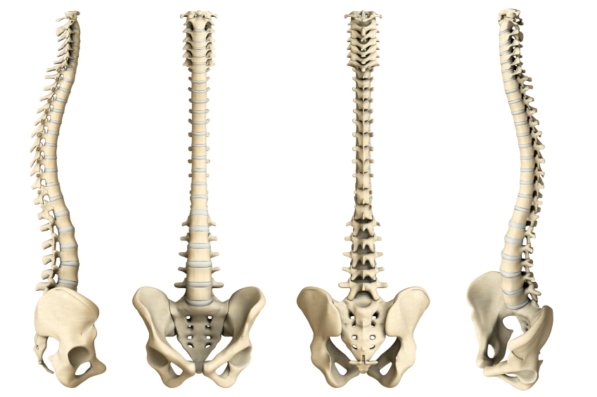
Observations:
1 / Only serves its purpose if the individual bones are connected together.
2 / It does not work if there is no main component.
3 / It is a source of strength, support and stability.
4 / A healthy spine keeps balance, and it also had to be balanced.
What we aim to produce (meaning behind installation, description of installation)
-Like the spine , the students (connected elements) form the school/community (body) not as individuals, but as a whole.
-Without a part, the whole spine cannot function healthily ( Without the active contribution of the students as a community, the school wouldn’t be able to perform at its best )
-Through this sculptural installation we would like to question students the importance of community, using the spine as symbolism.
Ideation
– A sculptural installation that can only work if they are put together.
– A design the requires the dependency of each element to form a whole sculptural form.
Source of inspiration
1) Woven Installation by Studio 400
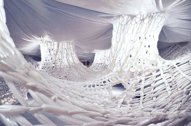
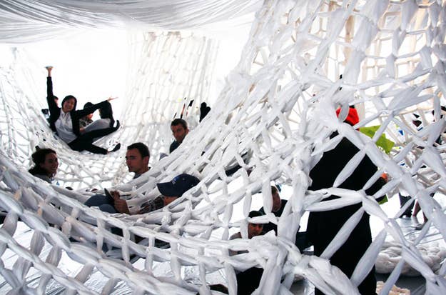
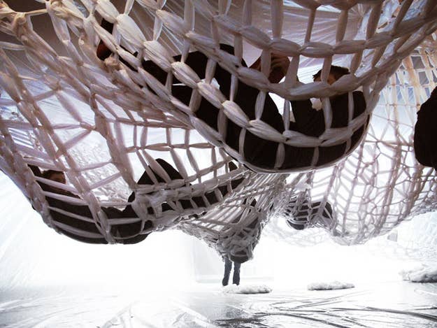
2) Ernesto Neto’s Woven Installations
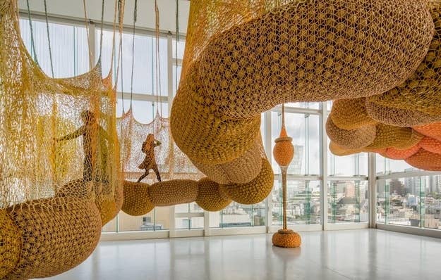
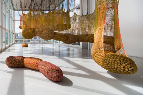
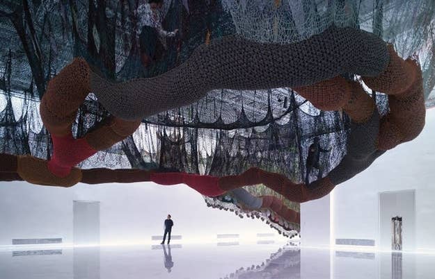
3) Tomás Saraceno’s Biospheric Cloud Cities
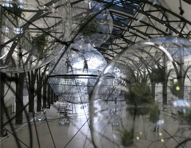
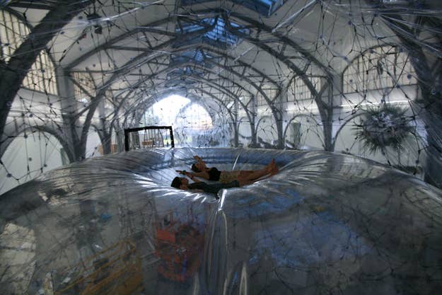
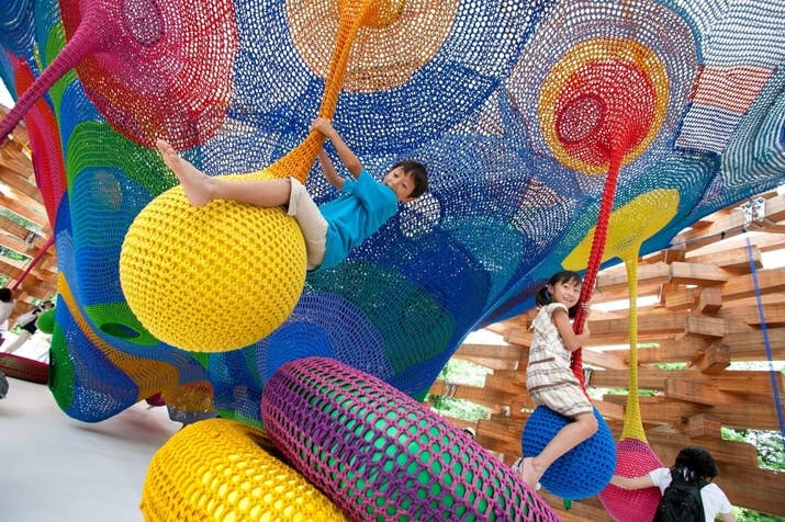
4) Crocheted Playgrounds by Toshiko Horiuchi MacAdam
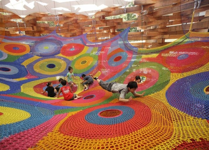
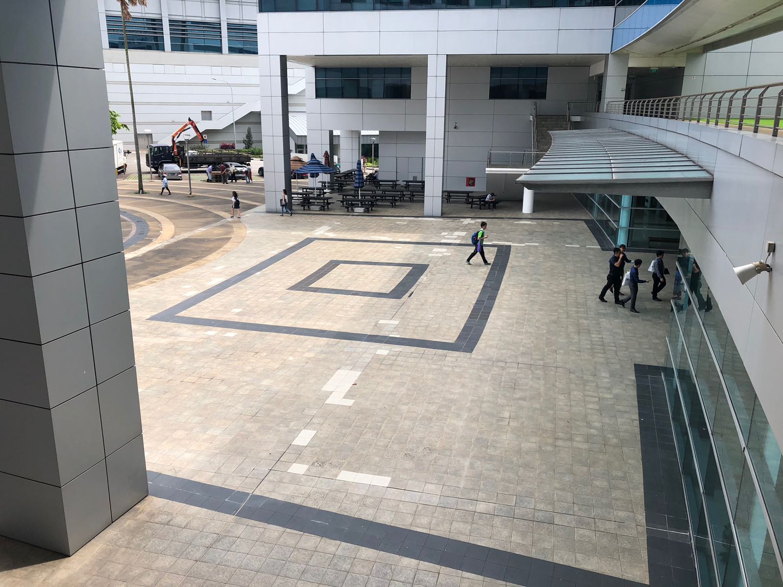
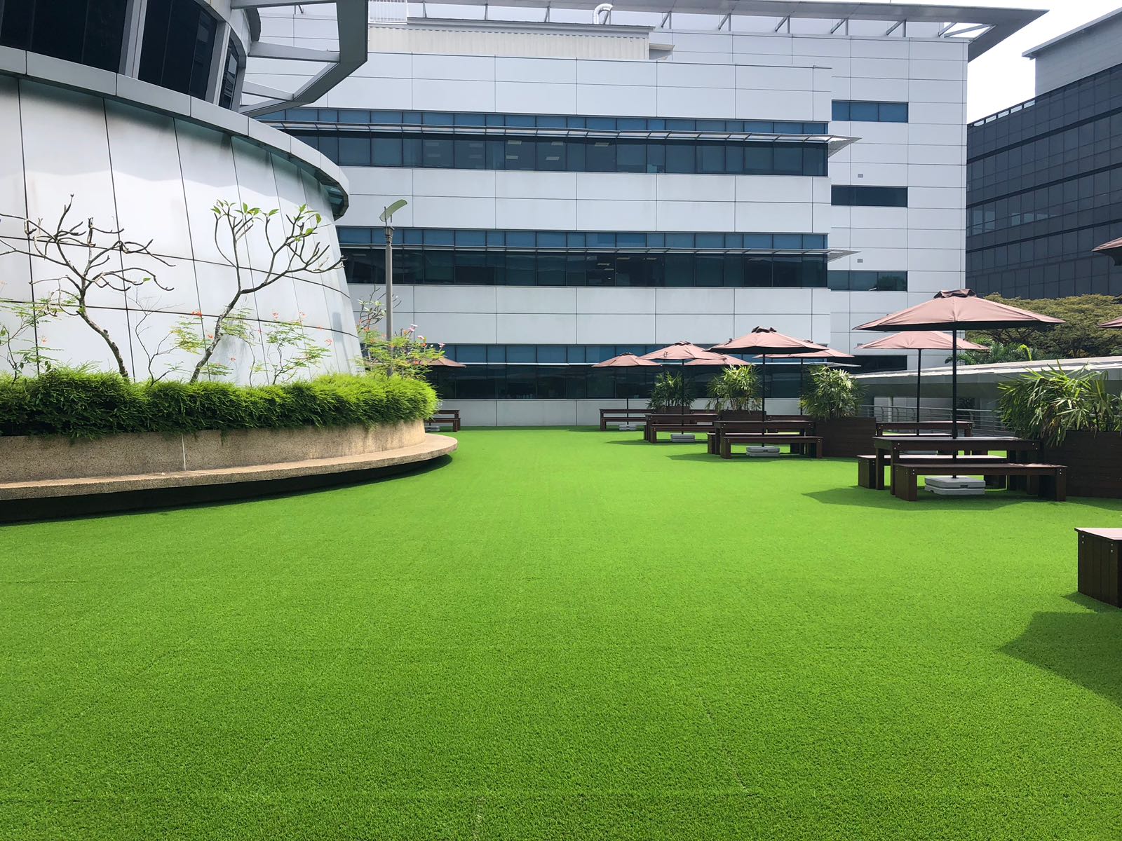
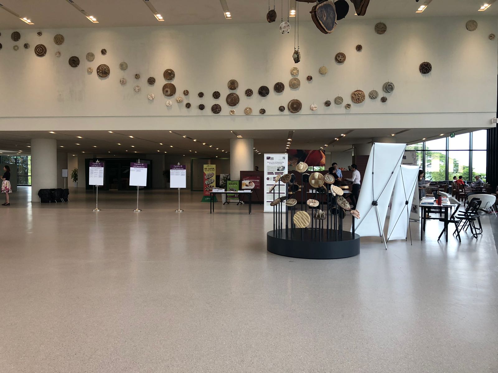
Possible locations for Installation
NTU’s School of Medicine


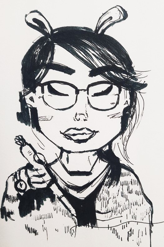
How did the activity made me feel?
This activity made me feel a little nervous at first because I knew that it was timed and I had to stop drawing after a few minutes later.
Why do you think this was so?
I think I felt a little nervous because I was afraid that it was unrecognizable by the person I drew and it would show no similarities. Part of me didn’t want to disappoint her and make her look less charming than she is.
What would you change about your illustration?
If I were to change my illustration, I would have drew her features more similar to her real ones and make her have a friendlier smile in the drawing! 🙂
Do you think your illustration is a good likeness of the person you drew?
I think that there are elements in the drawing that made her look recognizable like her winged eyeliner, rounded spectacles, clothes and accessories but her features like her nose, mouth and the distribution of her features could be improved!
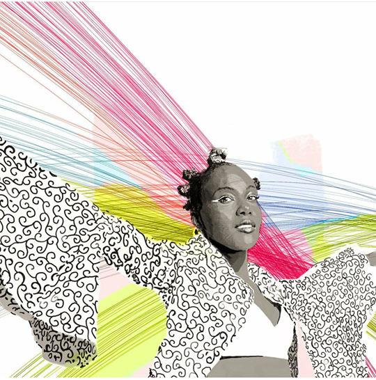
Research on 3 portrait artist that inspires you


The reason I find her artworks inspiring is because the artist has composed her artwork in a very attention seeking way where she does not only draws beautiful portraits, but includes a narrative on the faces. She has used the fine lines of the pencil and soft watercolors to bring out the femininity of the girls. There is a feel of translucency when the watercolor is overlapping the face, giving off a feel of gentleness and a part of the girl’s identity.
2. TITO MERELLO VILAR ( INSTAGRAM ARTIST )

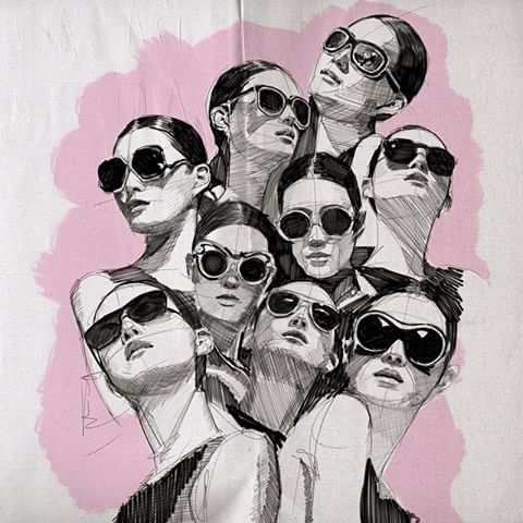

The work of this artist is bold and vibrant (bold strokes and colors). By using mediums such as pencil, pen, watercolor, papers etc, it brings character to the portrait by giving it a more edgy vibe to it.
3. LIUDAS BARKAUSKAS


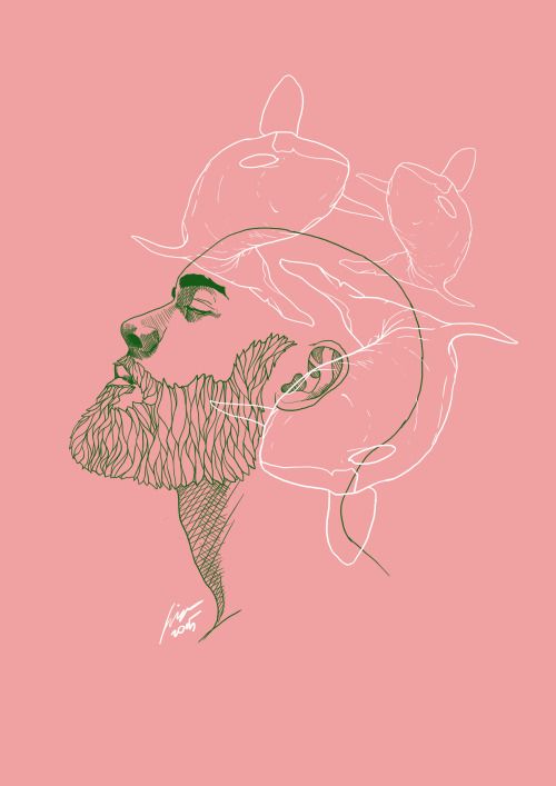
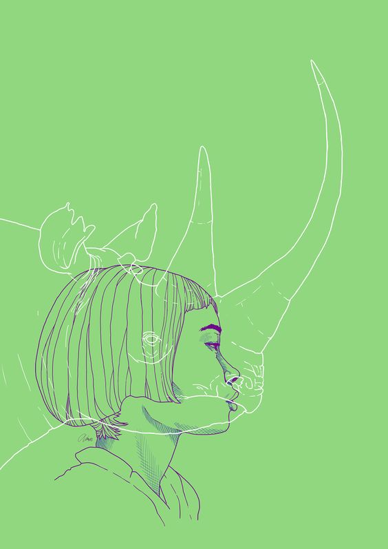
By using contrasting colors of different pen lines. The artist is able to convey his message in a minimalistic way. The use of pastel colors also makes it soothing for the eyes to view and together with the fine pen lines, gives a delicate feeling to it.


Recent Comments