Process of illustrating my self portrait
A list of words that describe me/Things that I adore
-rice and eggs
-matcha latte
-soulful music
-journaling
-typography
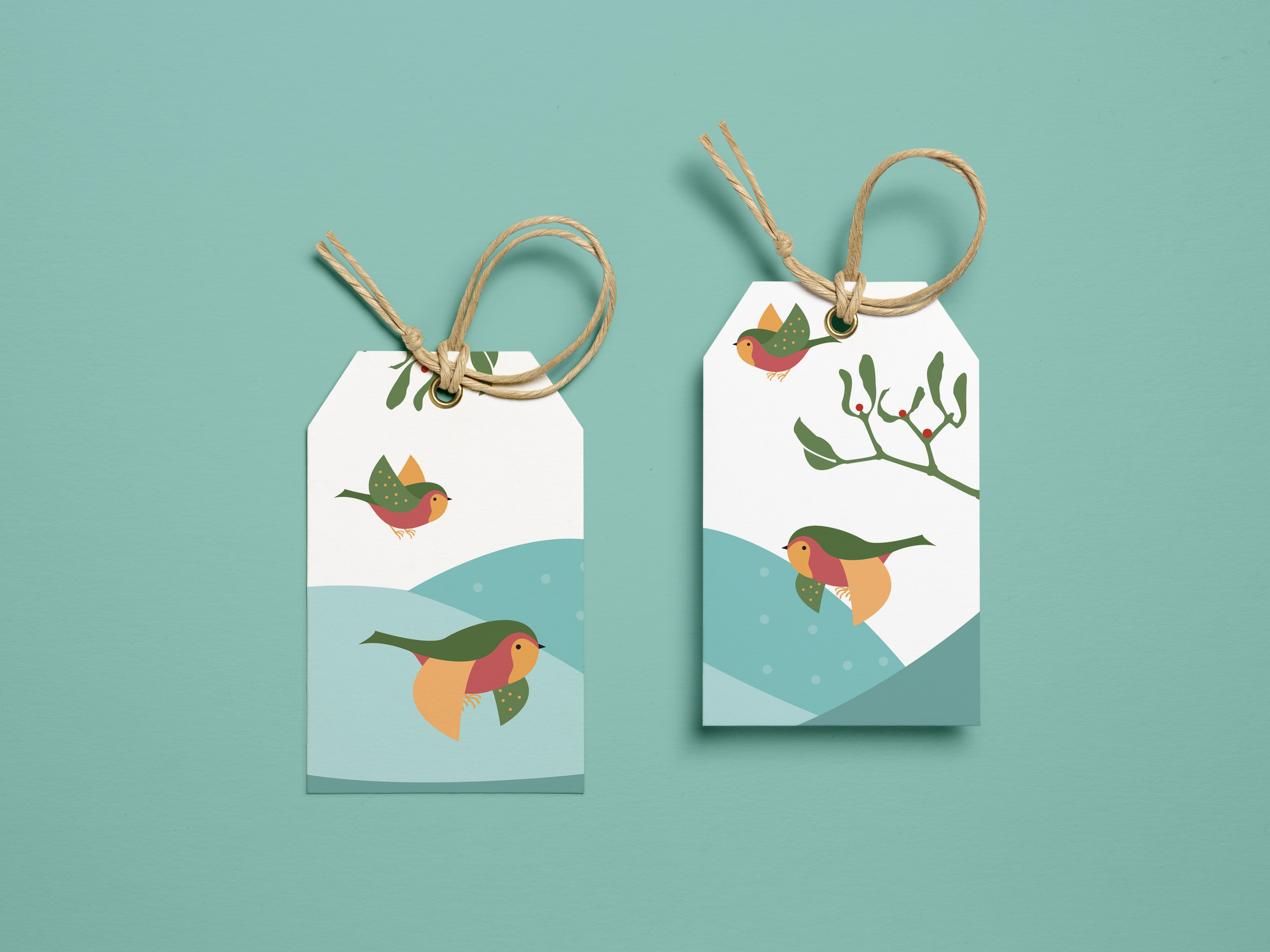
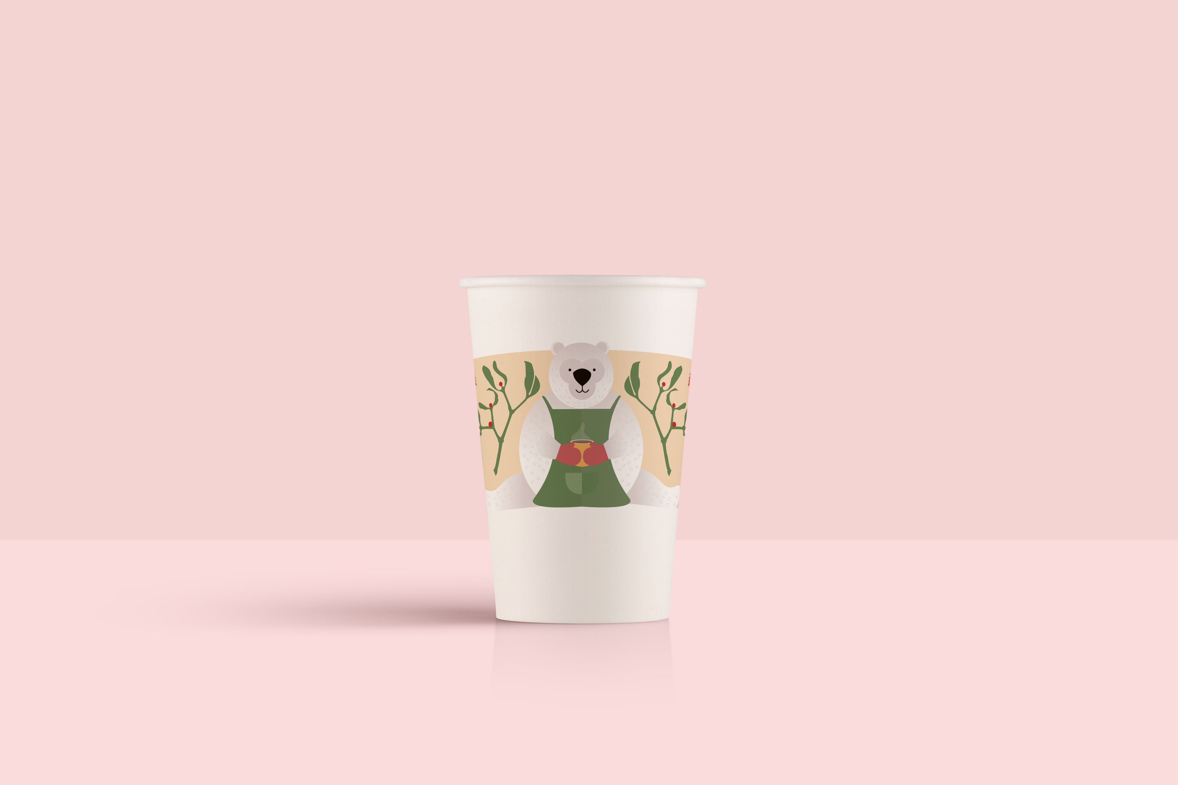
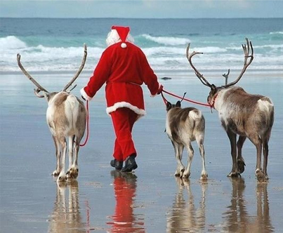
-christmas
-nature (flower and greens)
-patterns
-bandana and high bun
-french fries
-sushi
-pizza


I chose to take a picture of my neutral looking face to show no emotion because I wanted the viewer to have their own interpretation and perception of what the whole portrait is trying to convey. So the first step that I did was to take pictures and finally chose an of angle that I can better work with and illustrate my face.

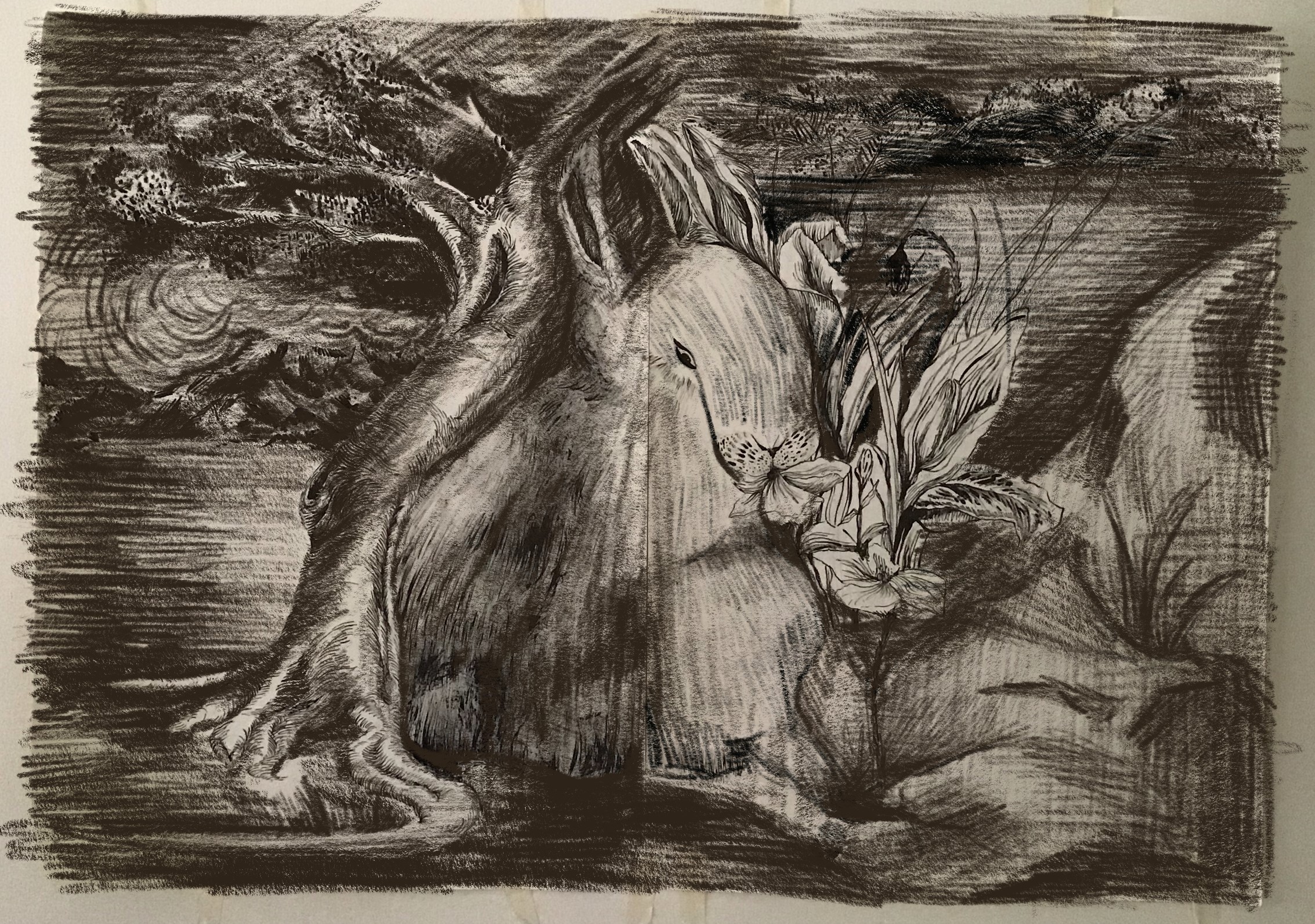
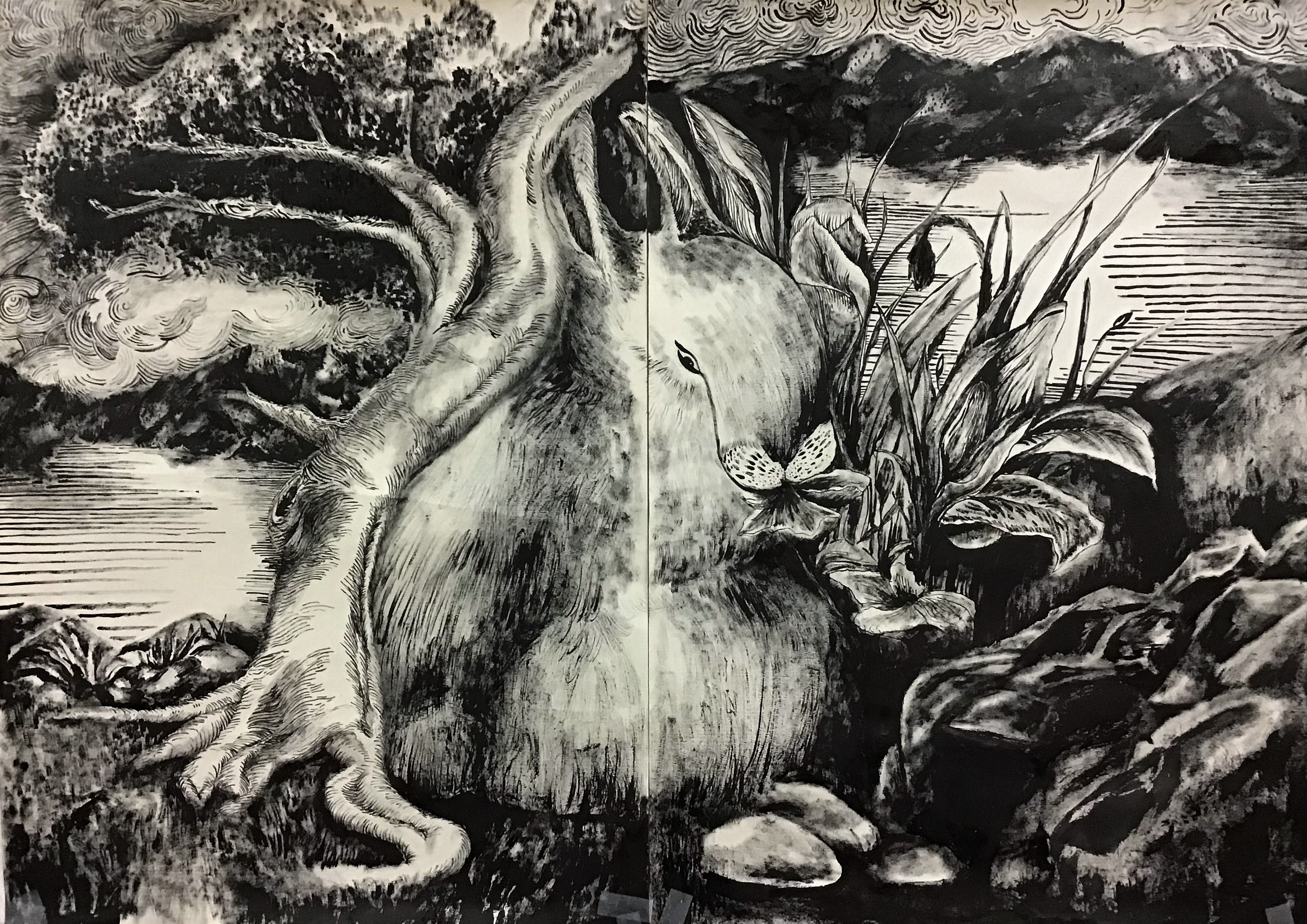
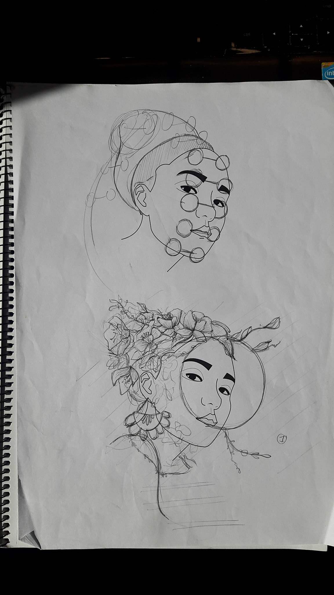
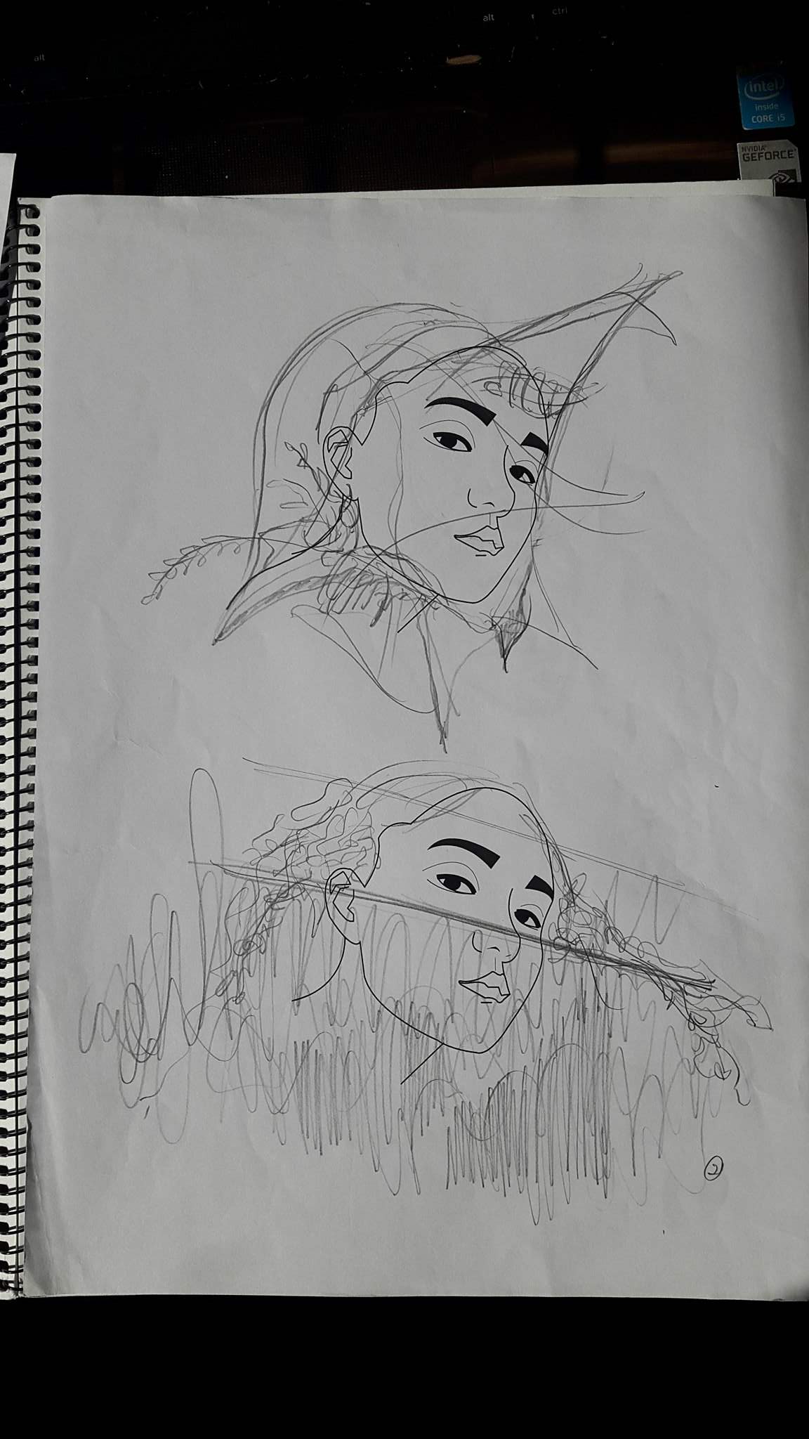
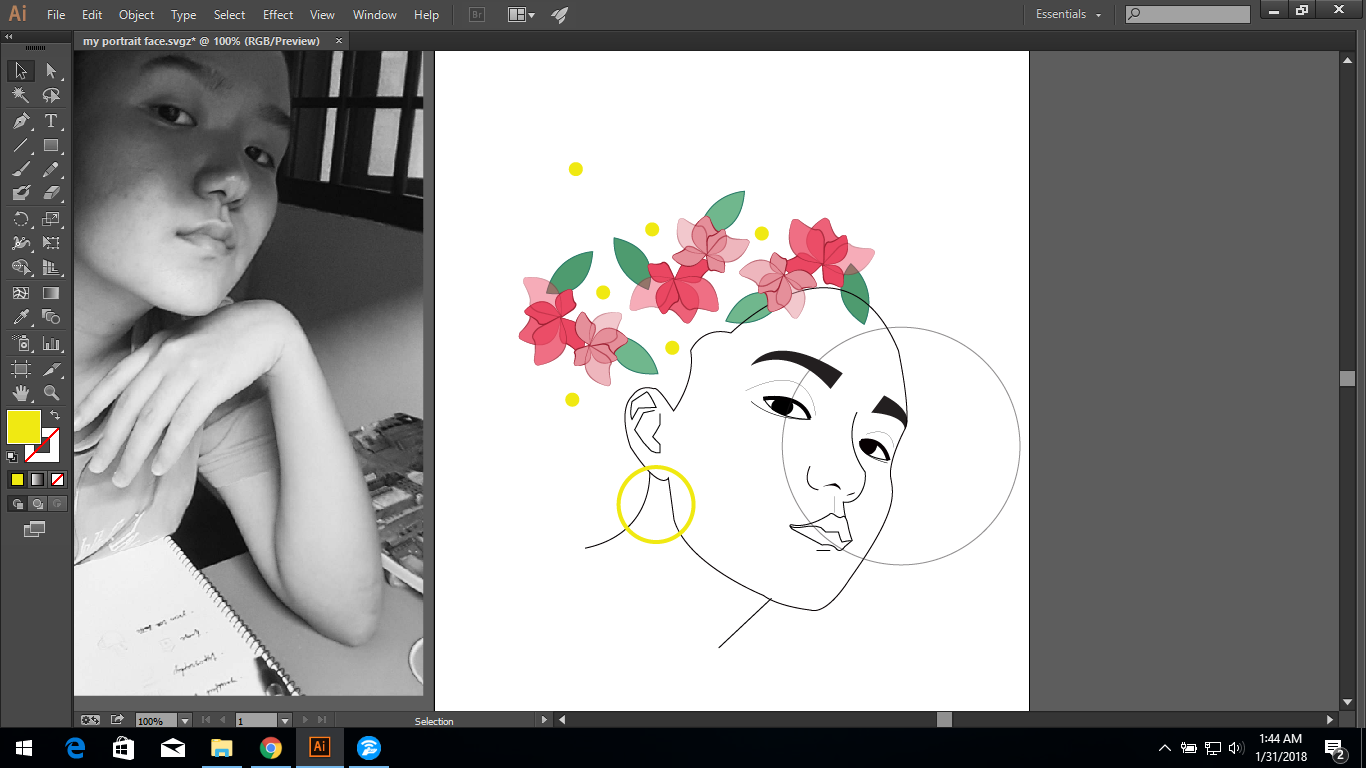
The main concept that I was trying to go for is to portray me as an” observant” person, always being aware of my surroundings. The first sketch above was me wearing many glasses, arranging them from my chin to the back of my head to suggest that I have “many eyes”or “always on the look”. The second sketch is me peeping through a glass window. And the flowers and leaves growing and creeping out gives an idea of wanting to be free or to “come out”. Composition wise, I feel that this is much stronger than the others as the tip of the hair balances out the chin and an earring at the ear gives character to the whole picture. It also shows movement and allows the reader’s eyes to flow through the portrait.

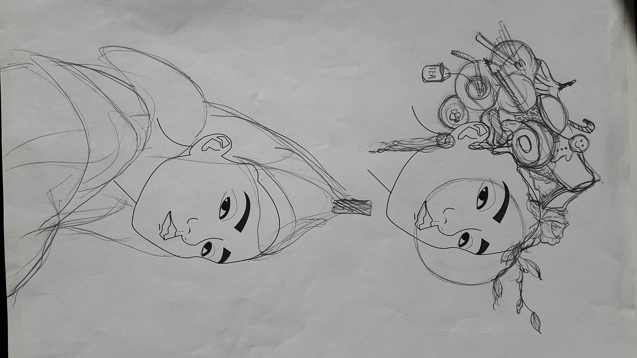
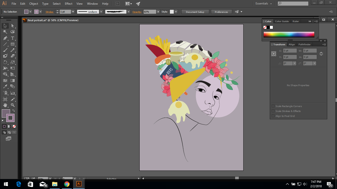
Although I do like the previous sketch and the message behind it. I still find that it still loses some edge and character to it. So rather than just having a garden over my head. I tried to incorporate some of the elements that best describe myself. I find it more visually intriguing and it allows the viewer to want to find out what is exactly IN the hair. However, I find the composition and arrangement was very still and gives off a feeling of solitude and I didn’t want that so I decided to use the composition of the previous sketch because it shows more dynamism .

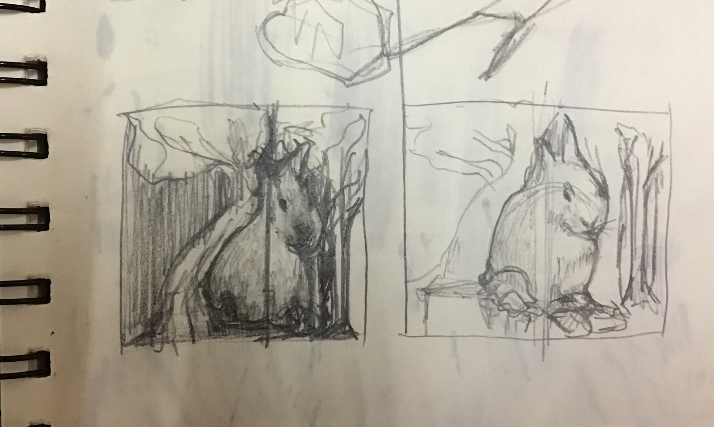
These two are just sketches of the same concept. One trying to come out of a paper box and another trying to peek over the fence.

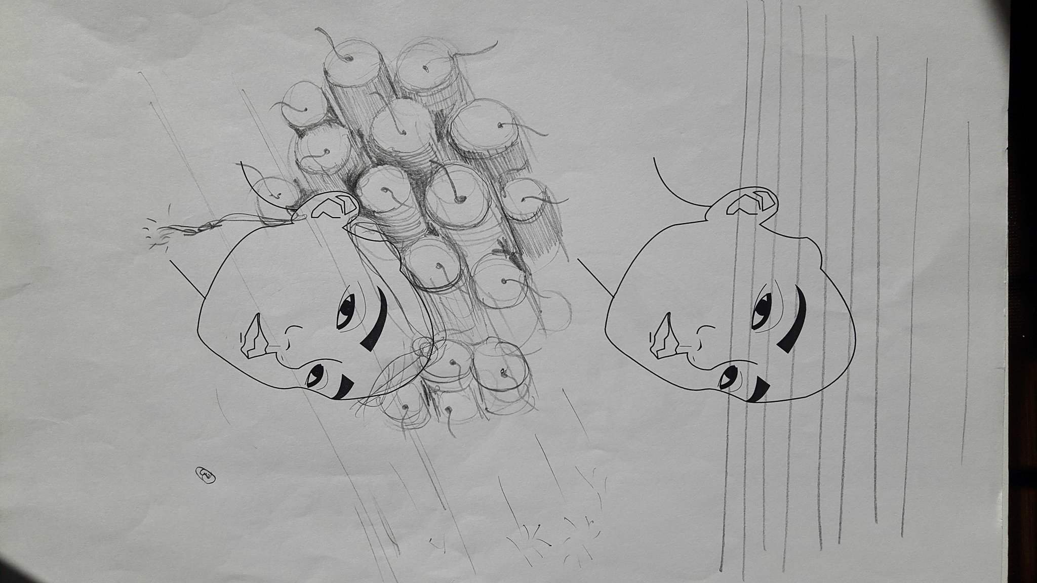
The last idea was to incorporate fireworks and hair curlers but I chose the previous idea at last because it had more narrative and visual interest.
Composition of final self portrait

At first I was just playing around with the composition. Trying to figure out how to better portray depth and combine all the objects together without making it look too messy and at the same time remain its elegance.


At this point, i wanted the french fries to mimic a crown. However the keyboard behind although added depth doesn’t look as cohesive as I wanted it to be with the self portrait.
Problems : Struggling to make objects look clear after placing a layer on top of it even after opacity is reduced.


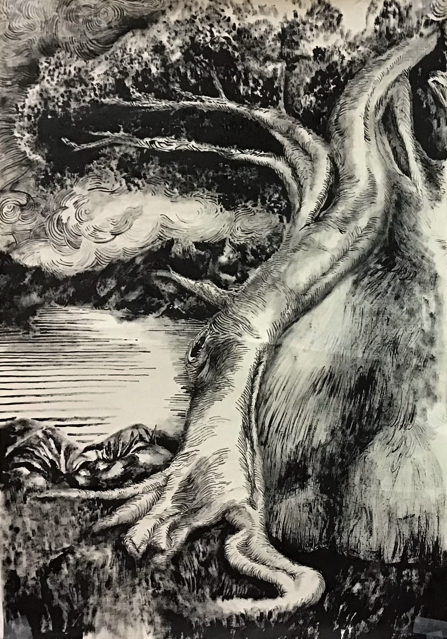
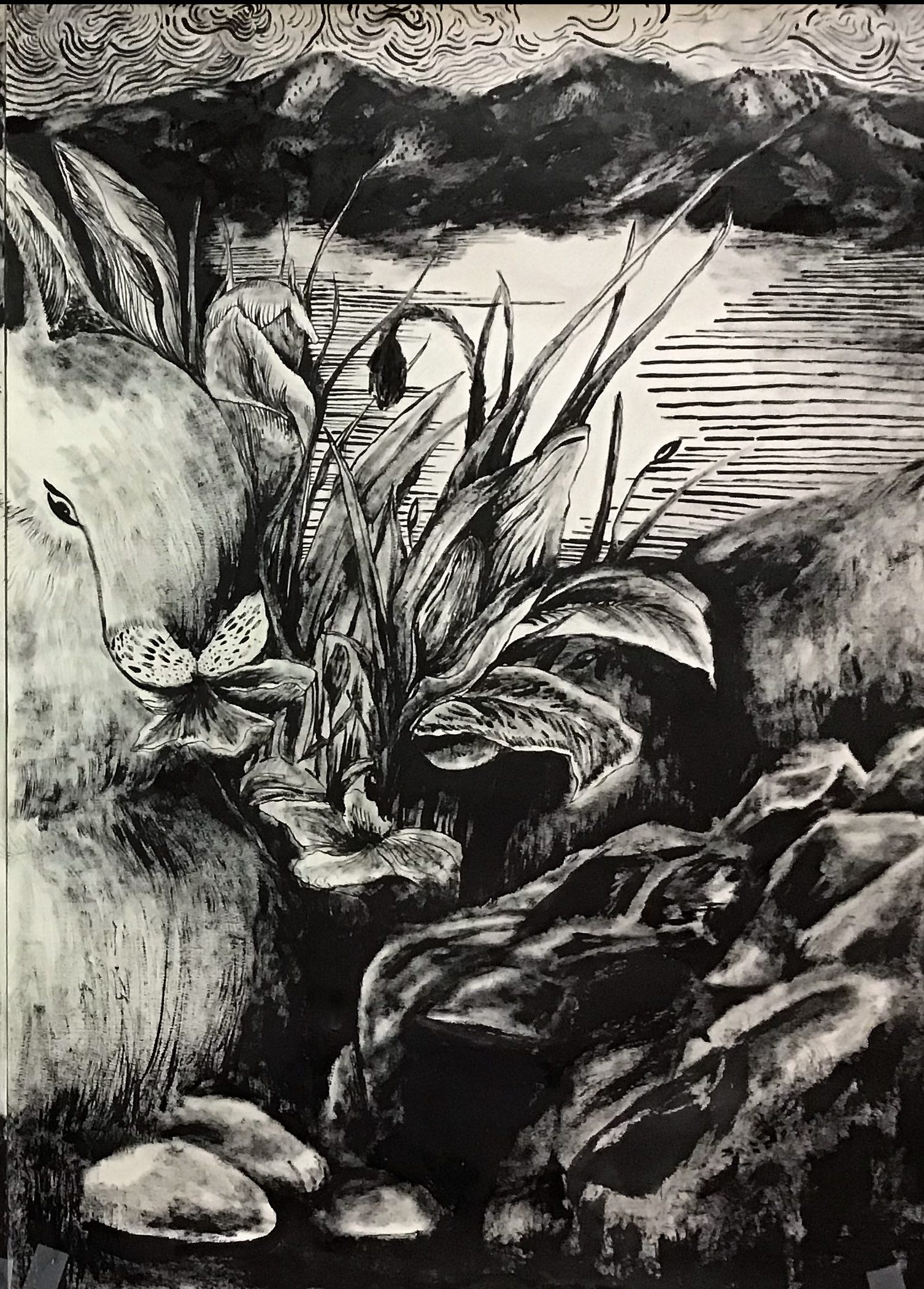
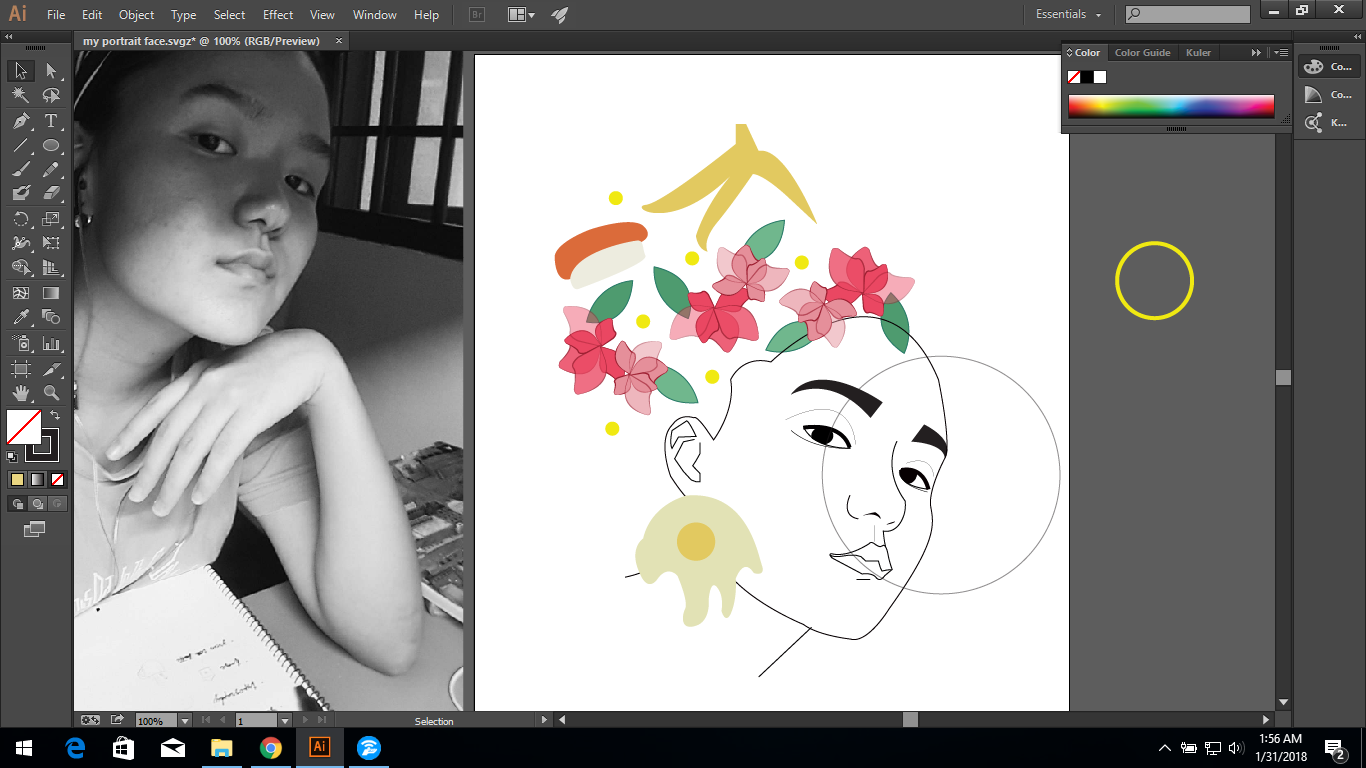
Although this may seem clearer but it fails to use the glass window to give off the message because the objects (flowers) looks as if they are on top of the glass rather than behind it.


Recent Comments