Refer to CPJ for my creative process.
Graphic Form Project 1 Creative Process

Refer to CPJ for my creative process.
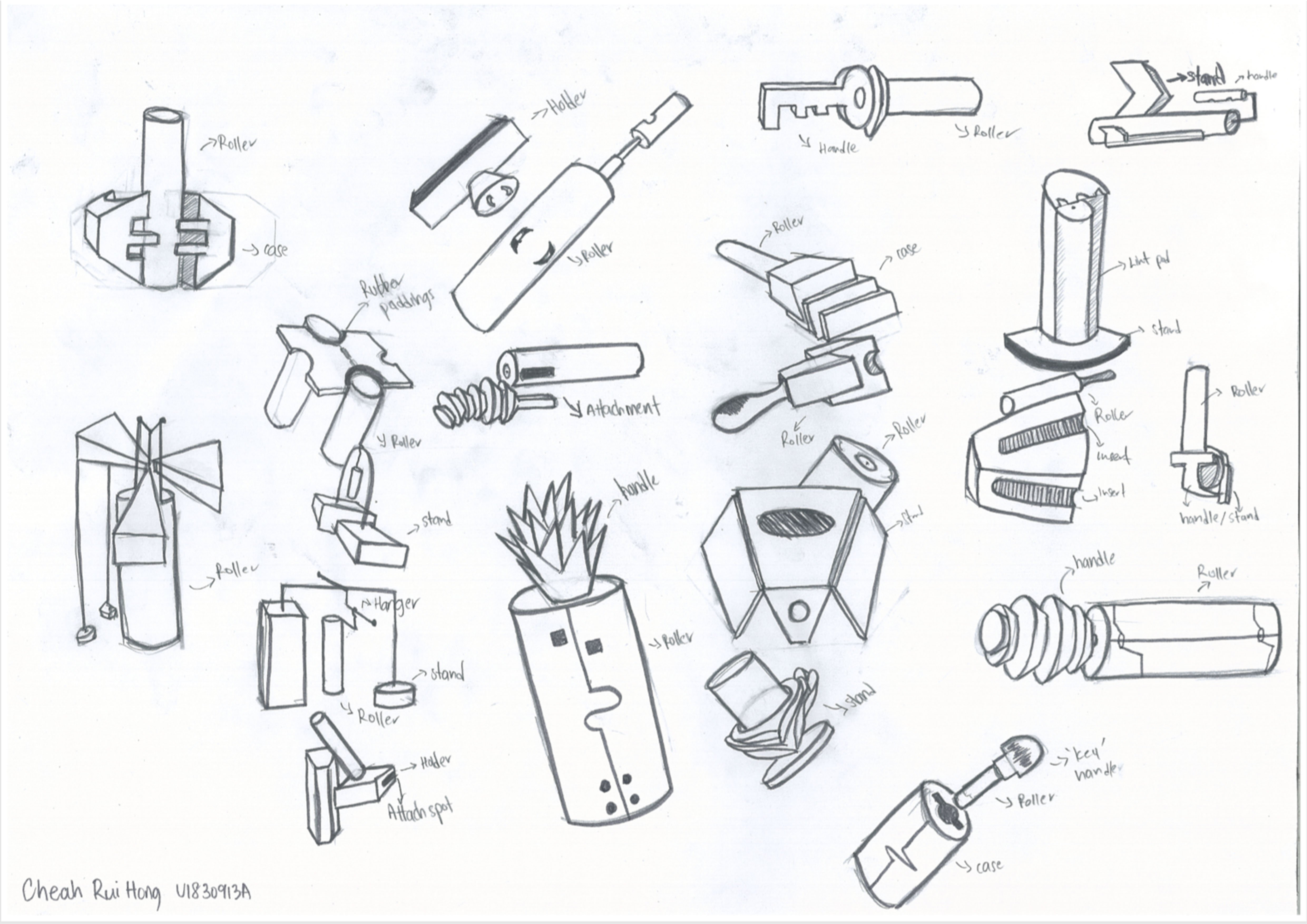
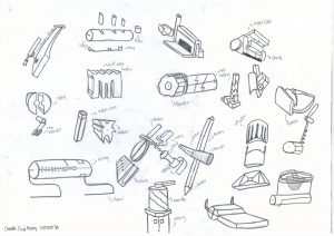
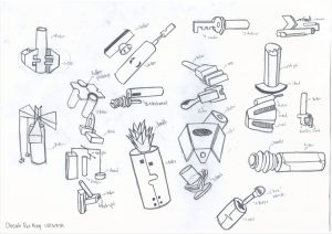
My process to break apart the lint roller.
We were tasked to create 40 individual thumbnail sketches from our Assignment 1 item;
which happened to be a lint roller for me. On hindsight, I did regret choosing lint roller as
my object of choice as it was too simplistic in design and lacked the intricacies of other
objects such as hair dryer or vacuum cleaner, or even a drill. Thus, starting on Assignment
2 felt like a mounting task as I really struggled to come up with new ideas and kept referring
to existing objects to help me come up with my ideas. I really disliked THAT process and I
felt no sense of ownership of my drawings as they fell way below my expectations. Why
would anybody find my idea interesting if it was simply based on another invention?
Thus, after 26 painful sketches… I decided to redo the entire draft. This time round, I looked
long and hard at my previous sketches and used elimination to the sketches I felt were OK
over to my new sketches. After a few youtube videos for inspiration and listening to talk about
how ‘limitless’ and interesting it is to come up with ideation sketching, I picked up my pencil and
marker and just kept going at the paper, erasing from time to time to make sense of my sketches.
What I felt was really intriguing was that I would lean back and try to connect the dots after sketching out.
This kept the process very fascinating and to be honest the hours spent drawing the sketches didn’t
feel as long.
I was really glad to have thrown the old sketches out and start over, instead of ‘salvaging’ it. Breaking
apart the archetypal components of the lint roller allowed for much more creative space.
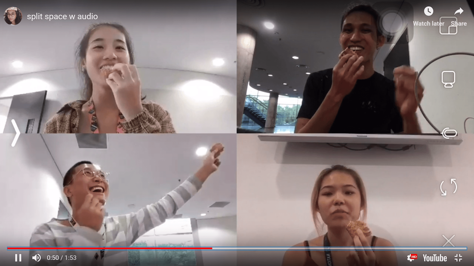
Video done by:
Han Yun, Daryl, Li Xuan and Rui Hong.
This video project tries to incorporate the DIWO concept, which I felt that we had done it in our special way. The project was initially very hard to brainstorm as we thought deeply about the technical aspects of making the video look nice with the visuals. As we discussed further, we realized that that may lead us to miss the point. We shifted our focus to a clearer concept and made the video simple to digest for the audience. That said, we did not take shortcuts and coordinated thoroughly to make a ‘good video’.
Guess what. There were a few screw ups here and there. Instead of being angry at our imperfect video, we laughed instead as we really enjoyed the process and watching others panic on video (obviously) // slightly schadenfreude(ic) . Lets dive into the concept.
We are a group of university students at immensely different settings, with similar lighting conditions to represent morning/afternoon timings that we share. Although we are fair apart, we feel easily connected through the 4 tiny split screens on our mobile phones. Our physical distance was minimized by technology. The video shows the transitions and varieties of things we do in our individual settings. We started and ended off our ‘day’ by tapping in our matriculation card to show the consistency of our timings.
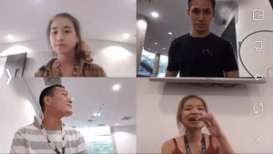
First activity that happened was Li Xuan brushing teeth. Daryl, Han yun and I were onlookers, being ‘updated’ on what Li Xuan was doing at that point of time. She passed up her tooth brush, which transformed into a mobile phone for me to place calls.
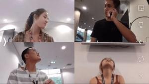
The rest became the onlookers as I placed my calls. Shortly after, I passed my phone to the left which turned into a pair of scissors for Han yun. By this point, you’d realized a bit of cheesy connection we had tried to make.
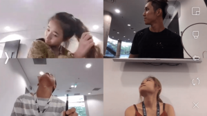
For some reason (not for us to judge), Han yun chose to cut her hair with a pair of scissors (which actually happened) and as you watch the video you can tell by her genuinely surprised look. Immediately regretting her decision, she passes on the pair of scissors to Daryl, who transforms it into a pen to draw on his sketchbook.
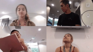
After drawing on his sketchbook, it was lunchtime and we managed to share a virtual – realistic meal together by having Daryl hand out our lunch to us (eating the same food) and stopping whatever we were doing.
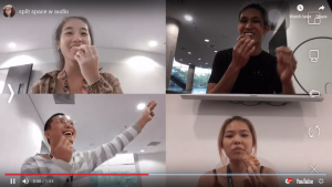
After the meal, we continued our day by connecting our lives together with music, having it played as if we were together and sharing the moment together. We did different things, such as dancing, studying, having a drink and using a laptop. This concluded our journey of our daily lives, which ended off in a ‘unison’.
WALA. Here is the vid:
Overall, I felt that I really enjoyed the process and outcome. The creative freedom given to us made us explore more and I’m glad that we did not just go ahead with some lame idea that we were not passionate about. The stupid grins on our face was mostly from trying to remember our positions on the master screen and where to pass the objects to. There was much coordination and positioning but we did not feel obliged or burnt out from our failures. After a few tries, we managed to come out with the final piece! The wifi was really bad and kept cutting us out of the chat and resetting our positions, so those were some obstacles we faced.
Overall Reflection
I felt that micro-project 3 provided the most creative control. We were not exactly limited by theme or even space, little to no guidance was given meaning to say we could definitely explore more options than normal. The brief was rather hands-free, and other than the duration of the video as a creative control we pretty much had our own space to brainstorm.
For micro project 2, we had to limit our conditioning options as we didn’t want to inflict unnecessary pain and we had trouble in the initial stages to attain our desired number of audience. We could not control the number of participants, nor automatically garner the response we wanted online (thus improvising on posting a Instagram Picture to increase traffic to the Insta Live).
For micro project 1, we were limited in terms of space and posting on a social platform exposed to friends and strangers alike kind of limited and pressured us into taking ‘decent’ photos that were acceptable on the social media site.
Micro project 2 had the most unpredictable outcome in my opinion. Firstly, we have to factor in the traffic that we could do little to control. Secondly, for participants, they weren’t exactly sure that we were doing a project and did not understand the intended purpose. Although we did successfully manage to retrieve the schadenfreude experience from the participants, it was a hard project to control and much improvisation was made.
I felt that if we consider BOTH Open Source concept AND DIWO(do-it-with-others) concept, micro project 1 would win hands down. As you can tell, micro project 1 is technically still on-going. Anyone can edit according to the hashtag and add on their own interpretations onto the hashtag page. Micro project 2 and 3 were rather short lived due to either needing a live audience or limited participants to 4 people(in our case).
Thank you for reading!

 Picture of lint roller

Drawing of lint roller

2 point perspective drawing of lint roller
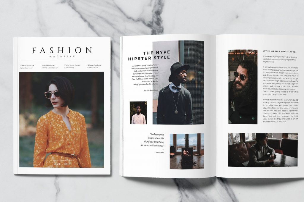
We were tasked to produce a 3rd angle projection of a select household object, an isometric drawing of the object and also a 2-pt perspective drawing of the object. I choose a lint roller for the assignment as it was different from the usual household objects that can be easily found, and although it seems like a very simple object, I’ve come to find that it was intricate in design. I took awhile to resize the images into photoshop and editing them from there, but I was happy with the work I produced. I have learnt to see products in a more sophisticated manner and now have a deeper understanding on how products are designed.
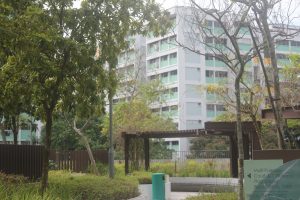
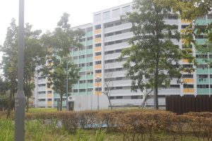
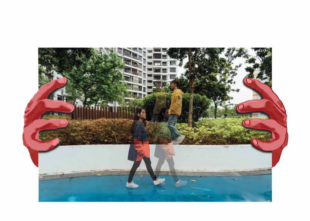
After finishing with the research portion of Yishun, I have found that I did enjoy
taking photos of the architecture. However, the photos around Yishun about
HDBs and HDB motifs did not really interest me. I had initially pitched to Shirley
that I wanted to do something along the lines of a industrial park mama shop
that had personal value to me. However, after revising my plan and thinking it
through carefully, I wanted to do something different from what has been done,
sort of.
When we started on LOCALE, we were given a look at zines done by seniors
previously. One thing I noticed was that almost nobody did photo shoots /
included people in their zine. They were solely focused on elements presented
in their area of research. I was certainly excited about this as I would be doing
something more ‘original’ in that sense. On the contrary, I would have trouble
finding materials to reference. Whatever was the case, I do like a bit of challenge.
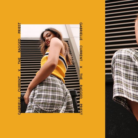
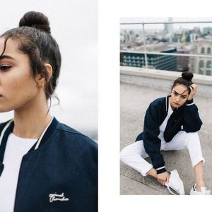
I was inspired to do this zine by this image I found on pinterest. It had a very
simple street wear element which I liked.
As a start, I decided that these were the things I had to complete.
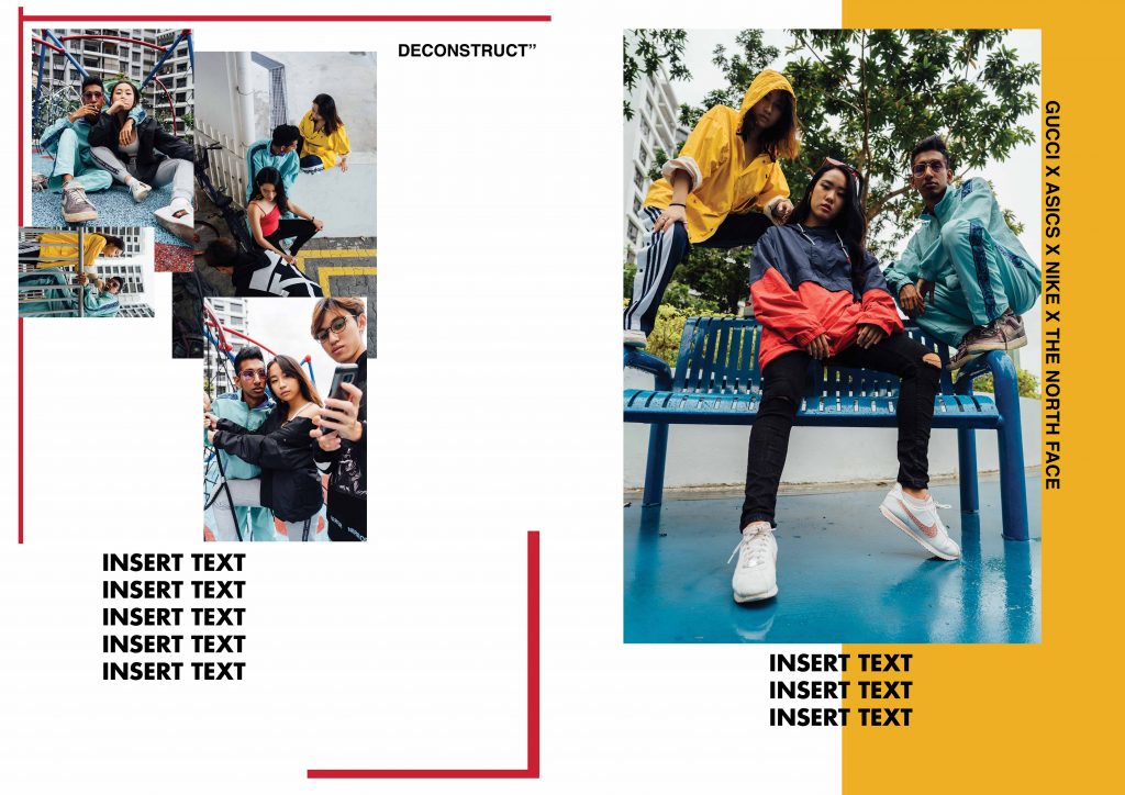
Photo shoot
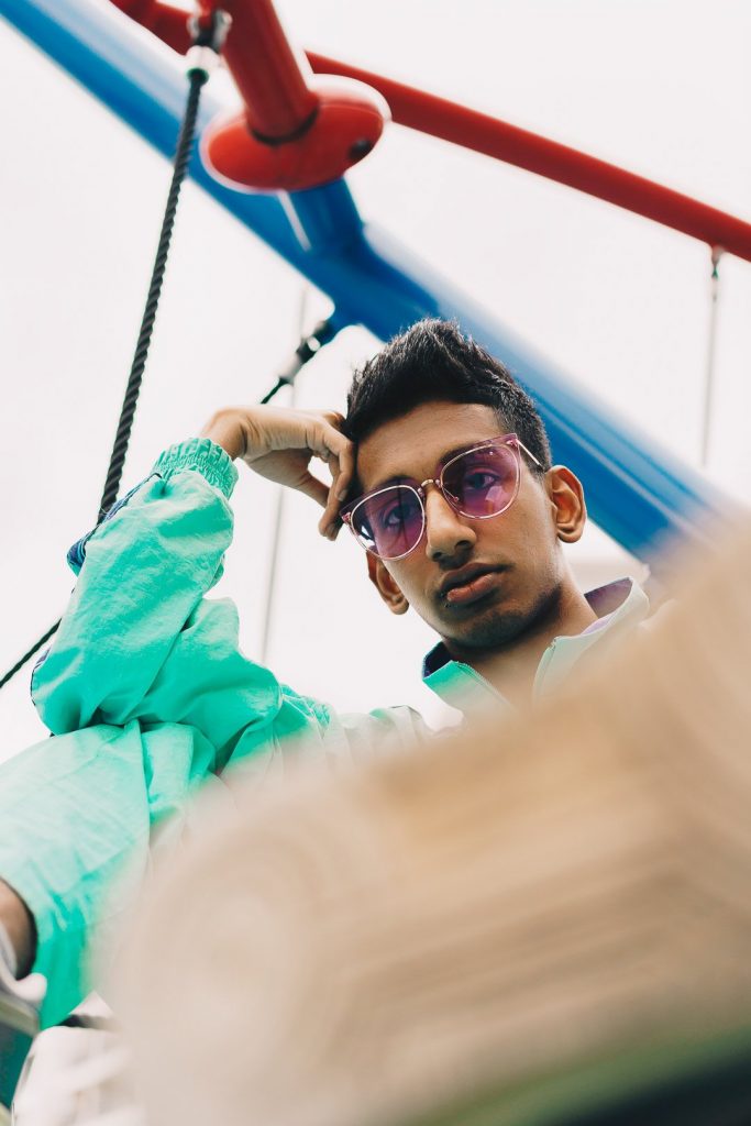
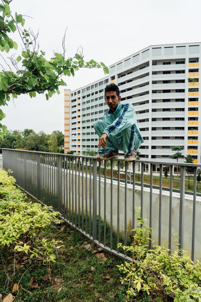
I have never done a photo shoot before, so I went on youtube and watched a
bunch of videos on what to prepare/plan and execute on the day itself. I pulled
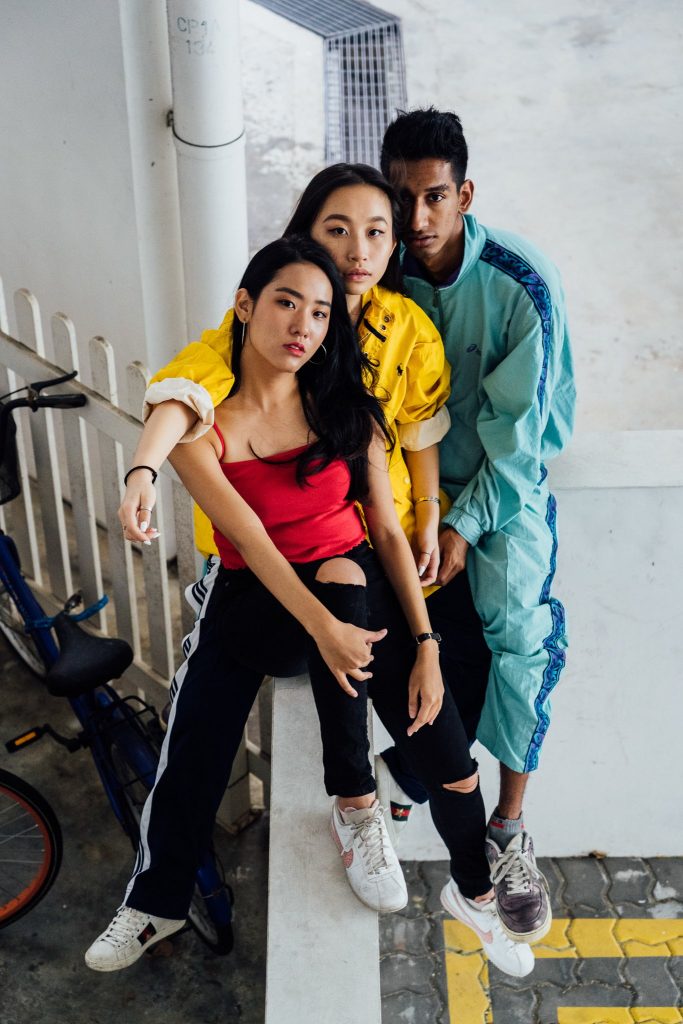
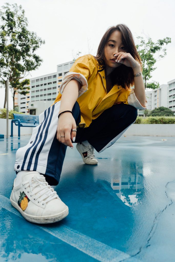
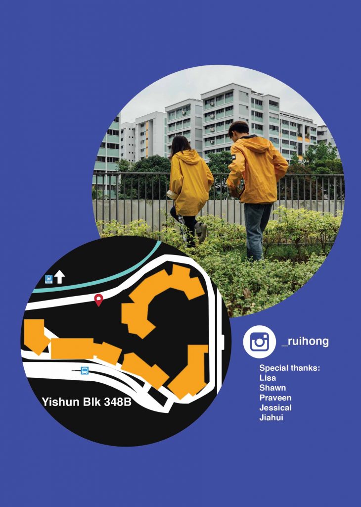
in two friends (Lisa and Shawn) to help with the shoot. I had also asked three
of my friends(Jia Hui, Jessical and Praveen) to model. Sifting through the
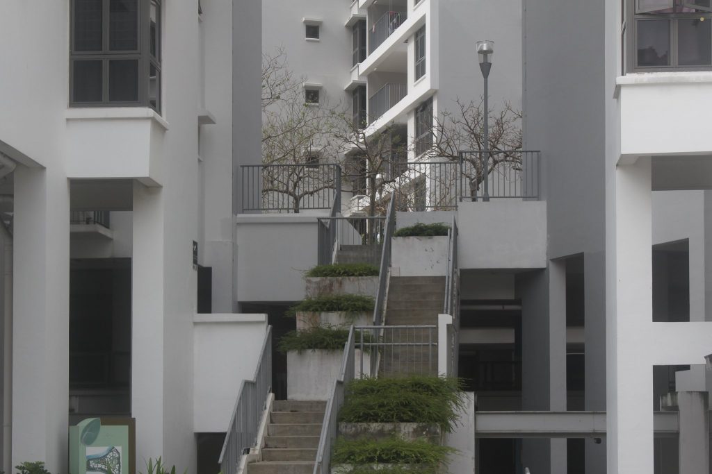
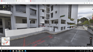
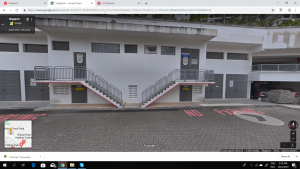
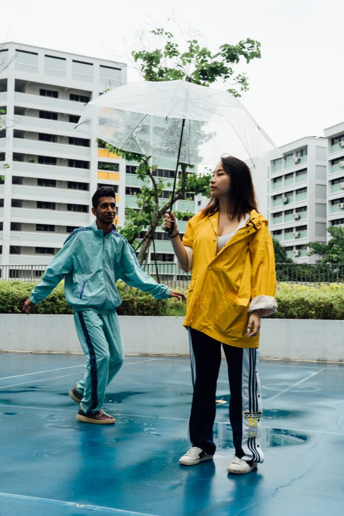
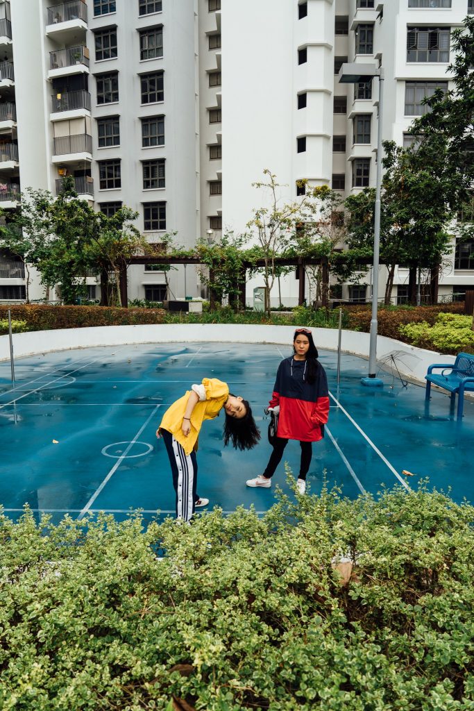
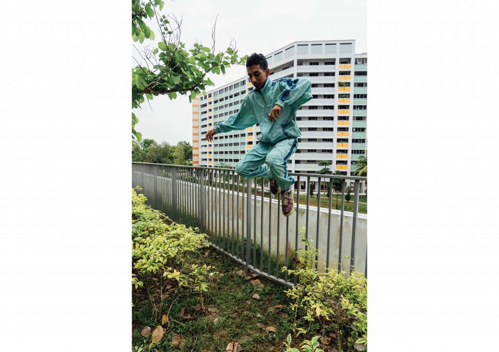
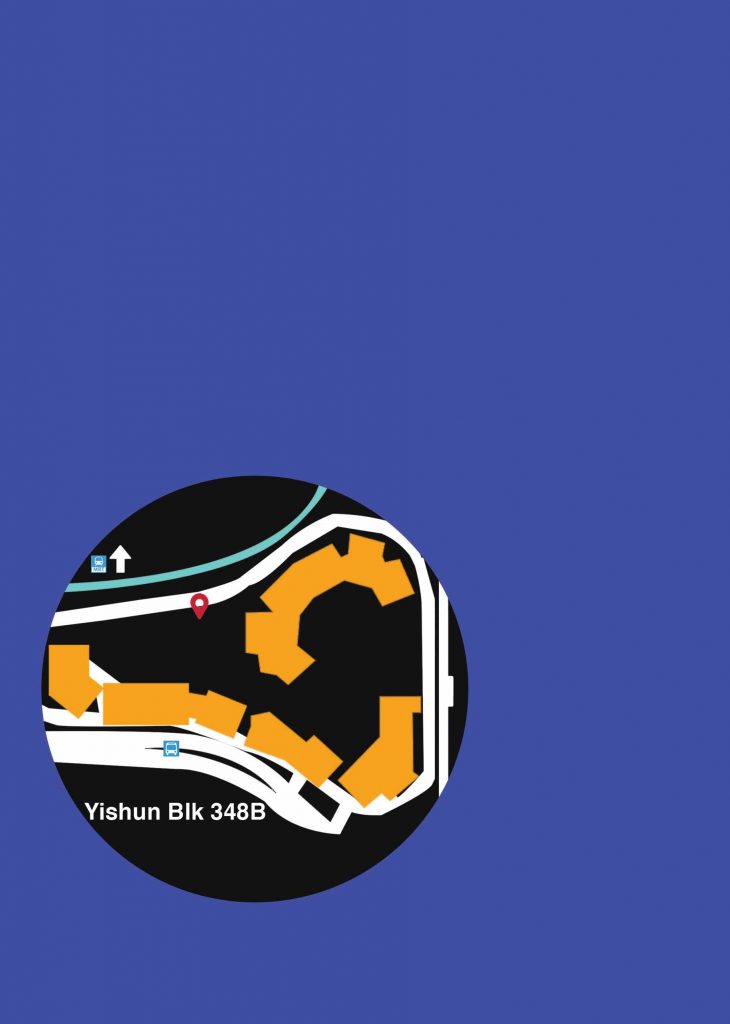
photos that I took from my research, I settled on a location at BLK348B. This
location took me by surprise as I cycled through the Yishun neighbourhood
with a dslr on hand. I really liked the clean look it presented; contrasted to the
old neighbourhood it is surrounded by.
I didn’t really focus too much on this location until I reviewed my photographs
and concept. To do more research on the location, I went on googlemaps to
find more photos.

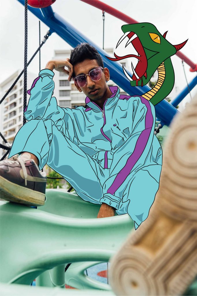
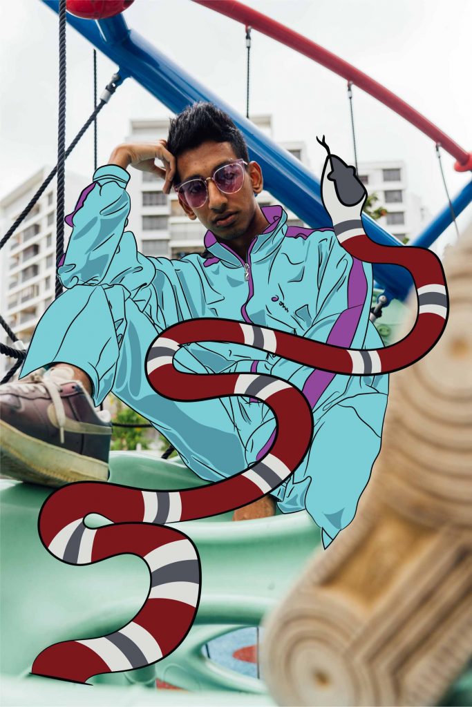
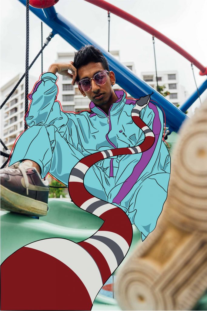
After reviewing the location, I asked my models to bring clothing that were
mustard yellow and turquoise to fit with the location, and red for contrast.
I looked up some photos on pinterest to reference the look/vibe/poses I wanted
for them.
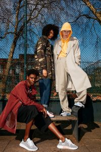
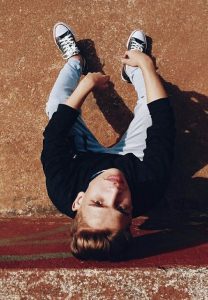
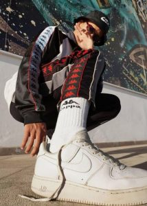
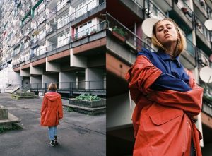

Shooting took about 3 hours and we managed to finish it in a day (30th March)
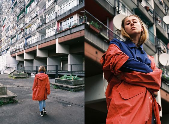
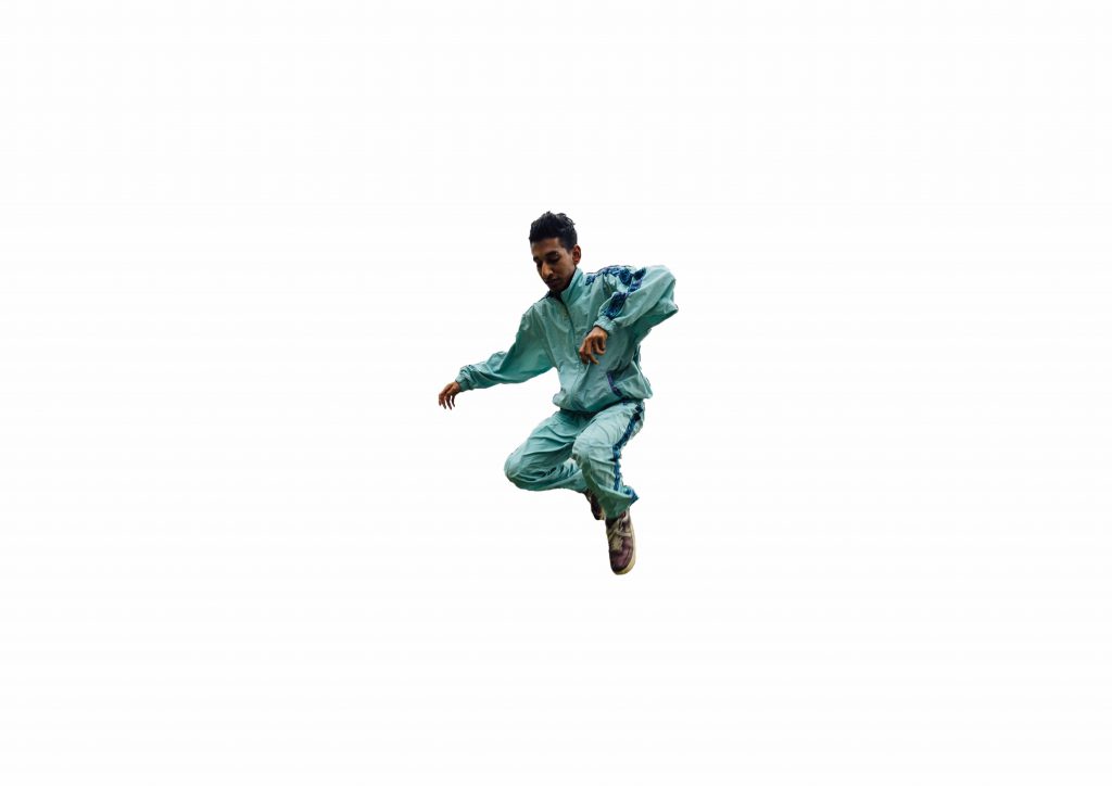
These are some of the photos taken. Some are behind the scenes.


Layout + Editing
I spent the longest time editing and settling on the layout. With over 600 raw shots,
I was rather indecisive and unsure of what photos to use for my final zine. I had to
change them from time to time. However, I really enjoyed this process as I began
to understand what I wanted out from this zine. After choosing the photos, I then
had to decide on how I would place my photos to make them interesting.
At this point, I started placing my images into my desired layout, which I have
gained inspiration from these current layouts.
Cover page:


Zine spread layouts:

Layouts I tried
Cover Page
I roughly stuck to this cover as I thought it looked good.
I did mask some parts of the Fashion word and put in
the Yishun text into the cover page. I had plenty of text
all over the cover page but I decided to remove them in
the end because the clutter was unnecessary and there
wasn’t much text that I wanted to include. I did include a
‘March Edition’ at the bottom to contextualize the zine.
Page 2 and 3
I decided to scale down the photo as I didn’t want the photo to eat up the entire
page. This way, I was able to design more onto the zine and not simply rely on
illustrations.
Page 6 and 7
Initial idea for my pages. The entire spread kind of felt abit block-ish and
uncomfortable. I rearranged the photos later on to form a nice ascending gra-
dient from left to right.
Some masking and editing I done:
Patterns and shapes
In my final zine, you can see that I have certain elements with lowered opacity
and shapes that interact with one another. I decided to do a
polka dot pattern/motif on my page 4 to draw the reader’s attention. At one point
I felt slightly too ambitious since I am using three programmes concurrently
(Photoshop, Indesign and Illustrator).
![]()
Masking and placement
After the shoot I researched on some weird happenings that have occurred in
Yishun. These would help incorporate the unique Yishun element in my zine.
Note: I did not reference everything 1:1, I had made my own creative changes.
Some of these happenings were:
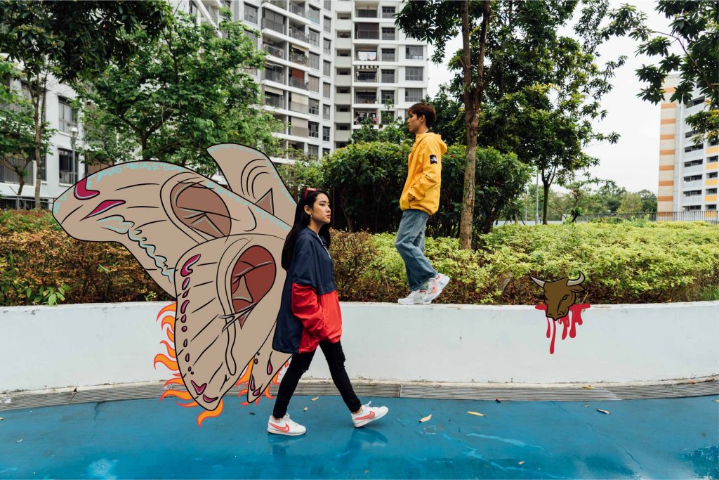
Man brings cow into lift
Cat murders
Man murders wife
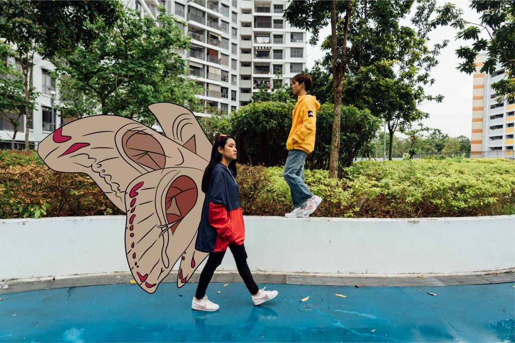
Giant moths and caterpillars
Slashing incident
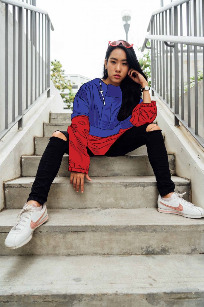
Illustration
Shirley encouraged me to use Illustrator for the drawings. As I am usually
more inclined to using Photoshop for drawings, I struggled to get started
on illustrator. However, I did manage to get myself to sit down and watch
tutorials on illustrator. I thought, since I had to use it in the future anyways,
I should learn on my own as well. I was happy with my progress and I followed
Shirley’s advice; to draw Yishun-quirky elements onto the existing images
to create interest. Some of them were drawn on photoshop to give a more raw
feel to the images. These are some of the drafts:

I took a photo for reference to draw for the scary looking hands ->
I decided not to do illustrations for my cover page to hold the suspense for the
readers, as to not expose my zine elements for my viewers.
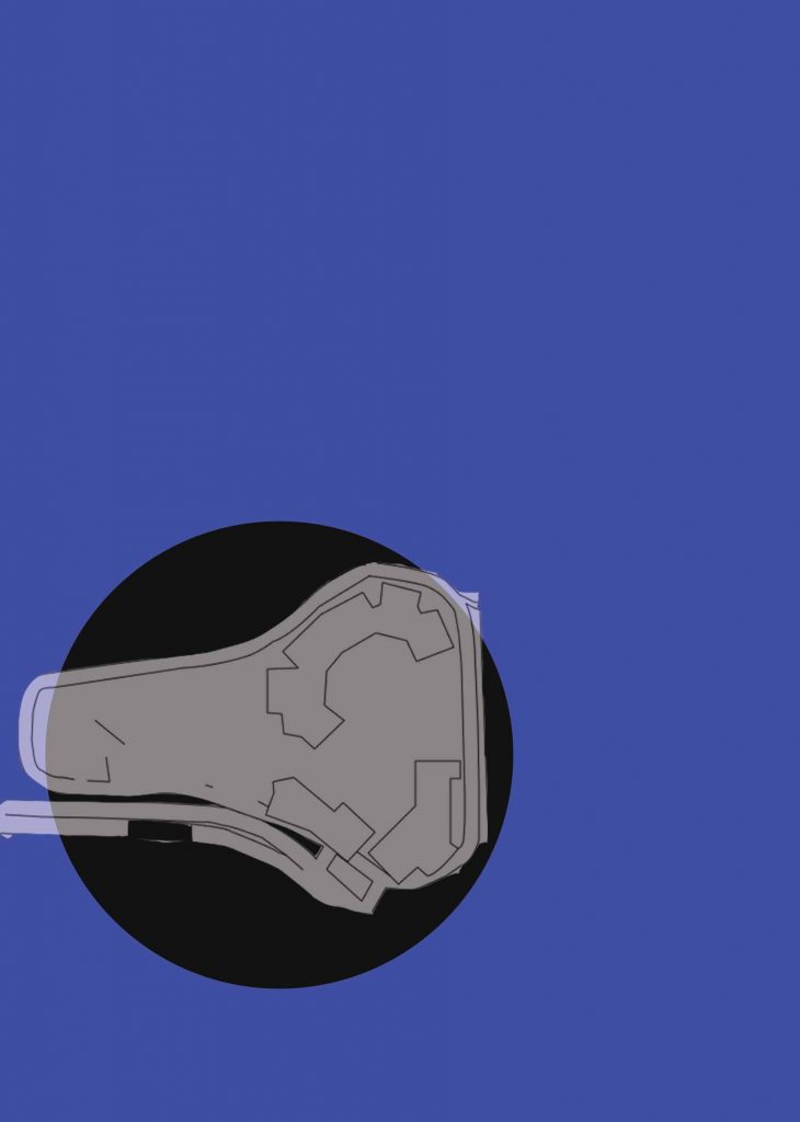
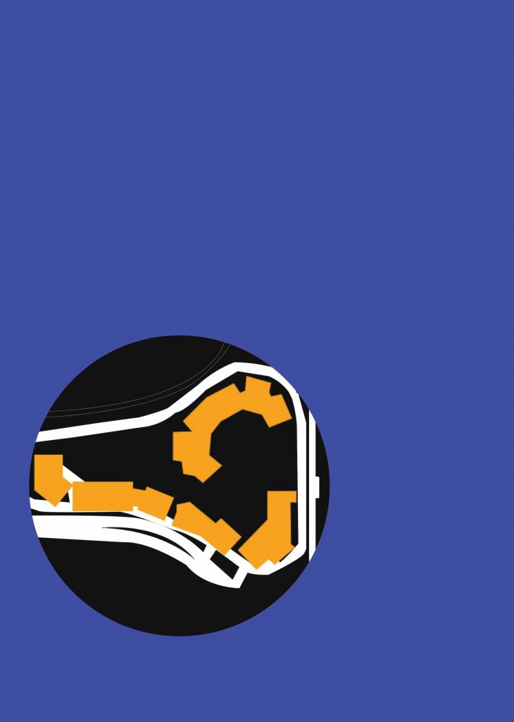
I used Photoshop to create a map for Blk 348B location. This was how it looked
in the process.
Colour correction

Original colours used.
Colours I chose in the end (after consultation with Shirley) as the initial
colours were very saturated and kiddish.
Fonts used:
I had to spend time to find the fonts that were suitable for my zine. From what
I have researched, I could tell that ‘street wear’ fonts were pretty basic, which
made sense, because they followed that of street signs or metro signs. That,
essentially, makes it street-ish as it borrows elements that are true to its form.

I tried out several fonts, namely:
Conclusion:
I was generally pleased with the pace and results of this project. As I had to
sketch out what had to be done beforehand, I was able to give myself ample
time to segment each step so that I can submit on time. There were a lot of
work to be done, and I knew that it wouldn’t be possible to churn out a zine
in a short amount of time. I took my time with every step, changing bits and
pieces and asked my friends on how to improve it. Shirley’s week by week
consultation kept me up to speed and made sure I was able to produce
something to consult and change on a weekly basis.
I felt that the photo shoot was the hardest/most stressful one to plan for as I
was constantly worried that the shots did not turn out the way they should
(or according to my mood board) and it rained for a bit which really threw me
off as I wasn’t sure when it’d stop. Overall, I am glad to be learning something
new with every step and this project forced me to go out of my comfort zone
to experiment and develop my own style. I am immensely relieved that I
abandoned my previous idea of industrialized mama shop to a streetwear
zine.
References:
https://www.pinterest.com/cheahruihong/yishun-inspo/
Why Yishun is the most terrifying place to live in Singapore
For research process of Yishun,
check out: https://oss.adm.ntu.edu.sg/rcheah002/locale-presentation-yishun/
Thank you for reading!

The objective of the work is to allow the crowd to participate in my conditioning. An example of conditioning is training the test subject to react to certain triggers, in this case my group has conditioned me to react to a new ‘joined’ notification by anticipating a flick on my forehead.
We uploaded a post on Instagram to preempt the audience of our project but we did not reveal the purpose of it. Then, we started an Instagram live video that can be accessed by my followers. We started off the project by using tickling as an action and using likes as a trigger. As the participants were either my friends or acquaintances, they enjoyed the little exercise quite a bit by leaving comments such as ‘I spammed likes, tickle him harder’ and so on. They did not take it seriously as they were able to feel satisfied with low consequences as ‘flicking’ was not inherently dangerous. After a while, I stopped reacting to the tickles as I was used to them and the participants were able to spam likes on a live story, making the reaction less responsive.
We decided to create a better conditioning by changing it to flicking my forehead as an action and joining/leaving a comment on my live chat as a trigger. Whenever someone comes to watch the live video, a notification will appear and state ”XXX joined”. When that happens, either Li Xuan or Han Yun will give me a flick on my forehead. After awhile, I become accustomed to the feeling of getting flicked whenever a new person joined, and I had some anticipatory reaction even when the two of them did not flick me. At that point of time, I still flinched whenever new somebody joined as I was conditioned.
The creators of the project were both the crowd and the test subject (me). Without the participants, the work will not achieve the intended outcome as I will not get flicked and be conditioned. It was different than the classic conditioning done by Ivan Pavlov – refer to https://www.youtube.com/watch?v=iawj42z4dPM , as my project involved a crowd that was essential to making the conditioning work. Unlike his experiment having a constant, mine did not have one as my participants were a variable. They were able to choose whenever and how many times they want to appear.
How are we so sure that the participants (my friends) would join the live chat and watch me get flicked? We based it off the schadenfreude experience. Schadenfreude is the experience of pleasure, joy, or self-satisfaction that comes from learning of or witnessing the troubles, failures, or humiliation of another. It is one of four related emotions or concepts. Hence, we were sure that my friends would want to see me get flicked. Indeed, there were some who left the room and rejoined just to see me get flicked more than once.
We had to switch up the project as we did not get the intended response whilst using 3 phones as Li Xuan and Han Yun’s friends did not know me and did not care to inflict pain on me. Additionally, I learnt that having a controlled group of participants were important as the context of the audience would affect the intended outcome of the work.

Siva Vaidhyanathan’s writing on open source culture aids us in the understanding of the longevity of open source thinking, combatting the proprietary model that emerged in the 20th century. Open source usually refers to the sharing of blueprints, recipes, and information that includes, but is not limited to software and manufacturing.
Open source does not encourage monopoly, but rather peer to peer interaction that involves multiple parties to work together to build on a common project, so long as they carry the same license (an official permission). It encourages growth, development and accentuates the benefits of working together. Closed source, on the other hand, rejects third-party interaction and maintains a monopoly to not lose revenue from sharing information. To those that adopt a proprietary ideology, innovation is fuelled by commercial gains (Vaidhyanathan, Open Source, 2005). While this may be true to a certain extent, it is not applicable to those who innovate solely for artistic or non-commercial purposes, or even gestures for themselves or others.
This does not mean that open source should be an entirely ‘selfless’ model, as people can remodify, improve and develop based on the information provided freely and commercialise it (Vaidhyanathan, Open Source, 2005). It is however not done at the expense of the provider of the source, which is why open source works. Wikipedia is an open source online encyclopaedia which allows anyone to edit. Wikipedia Art, a collaborative project by Nathaniel Stern and Scott Kildall, was started as a conventional Wikipedia page and intended for art editors to modify the page however they liked, so long as they adhered to the strict guidelines and rule of Wikipedia. However, it was shrouded in controversy and was officially removed only 15 hours into the project.
Wikipedia Art was a perfect example of a non-commercial interaction shut down by Wikipedia in order to protect the integrity of it as an encyclopaedia. Some argued that Wikipedia Art should be removed as it should not be allowed to reference itself, as this created a paradox. Wikipedia further ‘fenced off’ (Vaidhyanathan, Open Source, 2005) the artists by threatening to take legal action against them for using ‘Wikipedia’ as their domain name, according to https://www.eff.org/deeplinks/2009/04/wikipedia-threatens-. It was out of character for an open source owner to pull copyright claims on a third-party that did not exploit their domain for monetary gains. Wikipedia’s reaction to Wikipedia Art sparked debate with the online community, and at the same time unintentionally garnered traction for the project. For Wikipedia Art, this may well be a successful attempt at creating art, as they have achieved an unintended outcome that aligned with their goals.
Even though Wikipedia Art has been removed from the official Wikipedia page, it continues to be ‘resurrected’ through different users and engaging in a discussion of it. While this can be considered a successful project, it also unintentionally highlighted the flaws of Wikipedia as an open source. In retrospect, I felt that the project could have been approached in a different manner which would have avoided the controversy that it did not mean to spark.
Biblography:
Vaidhyanathan, S. (2005). Open Source . In Open Source (p. 25).
Vaidhyanathan, S. (2005). Open Source . In Open Source (p. 27).
Wikipedia Art – http://wikipediaart.org/archive/wikipedia-art-original-page/


The spray paint area in front of the ADM car park; where I had spent many hours(one day in particular) to finish up a 3D project, captured a still memory of my dilemma. In a flashback which I can perfectly re-enact, Jasmine(classmate) and I were staying back late to complete our 3d project over the weekends. Holding two spray cans in my hands, I was tapping my feet and pacing up and down the spray painting area, thinking about my next step of my 3d assignment. Late hours and hard decisions were a constant in my ADM experience, and I have chosen this space as it brought me back to the moment of dilemma, an alternate space of thoughts and ideas.
This alternate virtual space I created was characterized by my creative thoughts, layered into rooms of hypothetical outcomes and boxes of imagination. The ‘messiness’ and past graffiti on the walls made me ponder on the decisions these ‘street artists’ have made, be it for fun or had meaning behind them.
The outdoor space that distinguished itself from the rest of ADM was almost ‘open-source’, where people can edit, add upon or even remove (by covering over with spray paint), and that in a way modifies the alternate space as a new user of that space comes along. It is also possible to change the space alone or with others, as it is not bound by its physical properties and changes with the intent of users.
Task 1:
Consultation with client. My client was Fatin, and on our first consultation she wanted a desk organiser. As a rigid object, I found it hard to work with and was not easy to come up with a ‘special’ desk organiser, as there were many organisers already made. It did not resonate anything unique about Fatin. I asked her a few more questions about the organiser to add onto the idea and consulted my professor Peter on the subject.
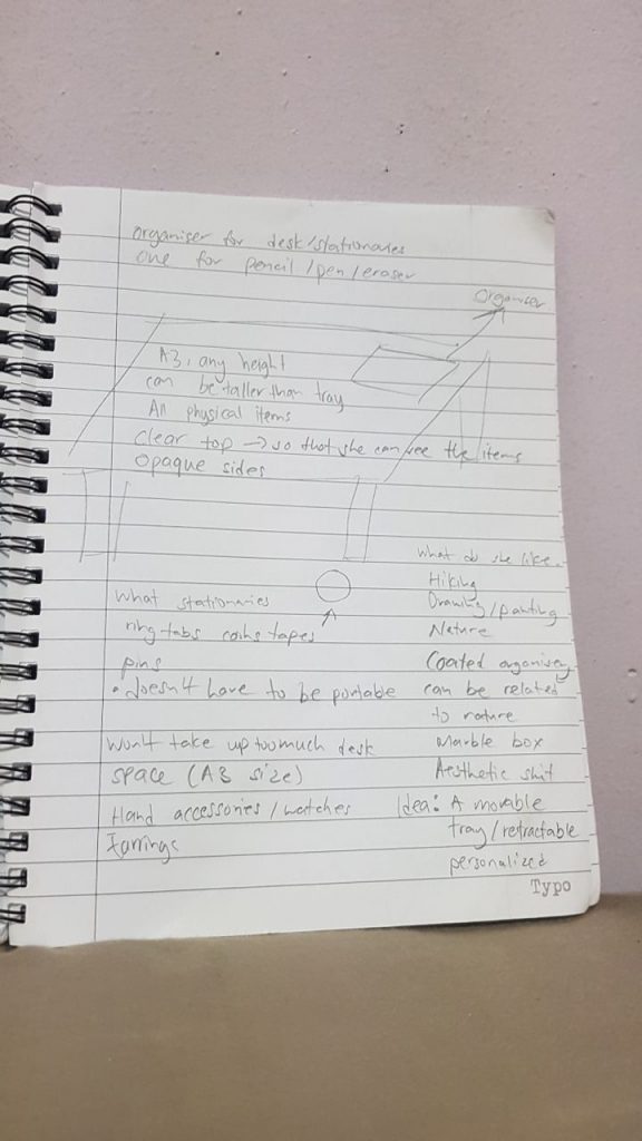
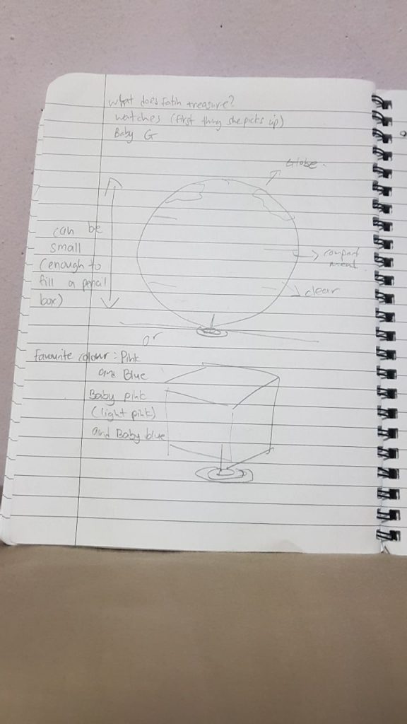
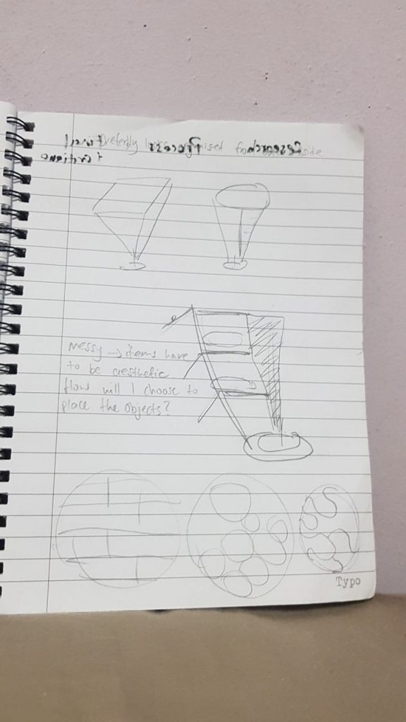
After much thought, I consulted Fatin again and asked if she wanted anything else. This time round, I asked specifically if she had any memories, whether good or bad, that she was comfortable to share and create something to represent that memory. She shared with me her secondary school teacher, Mr. Wee, who would pick on her and make her stand in class for no good reason. He would also shout at her face and caused much emotional hurt to her. I asked what she liked as well, so that I had a wider angle to work with. Fatin enjoys collecting items, such as ring tabs and chains. Her favourite colour was red, but I decided to use blue as a contrast to what she liked (as she detested the memory of Mr. Wee). I used other metallic objects in replacement of ring tabs and chains as they were easier to rust (as part of her story, the relationship between the two deteriorated over time). This was my process, I thought about the design of the bag first.
I gathered my metallic objects (iron and steel based) to rust. I used a solution made of vinegar, salt and hydrogen peroxide to rust the objects. Firstly, I threw the objects into a pail, poured in vinegar for a duration of 5-10mins, and then added hydrogen peroxide and salt. The solution made the objects in the pail bubble up, and formed a thick layer of foam. The objects started rusting, and I left them in the solution for half an hour.
https://youtu.be/bImH4jAjCzw –Link to my rusting process
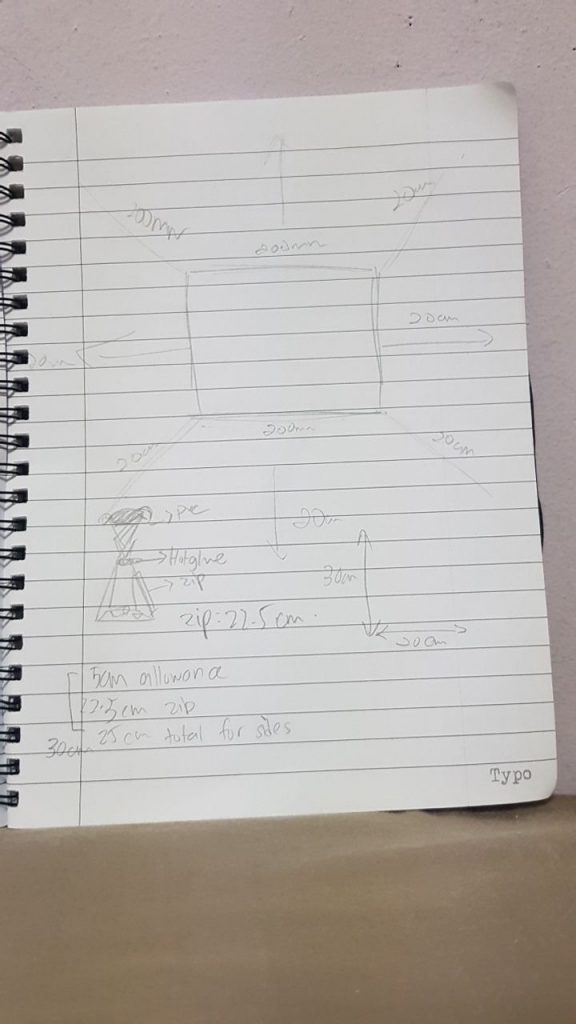
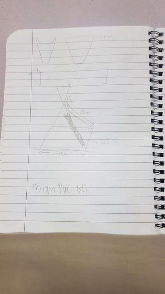
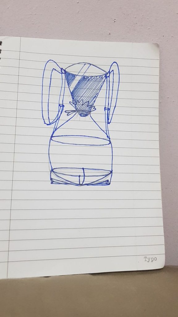
In class, I bent the copper wires and soldered them together to create a frame for my bag, and used pvc roll as my bag (I glued the pvc plastic together according to the dimensions. I sew a zip on the bag for practical purposes (for ease of adding and removing objects from the bag). I placed a cone on the top of the bag to funnel in the salt that represented Fatin’s saltiness towards Mr. Wee. The items in the bag represented the frustrations and restrains of their relationship, and the rawness of the degradation she felt. This was the final product.
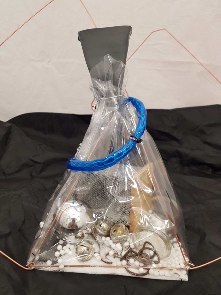
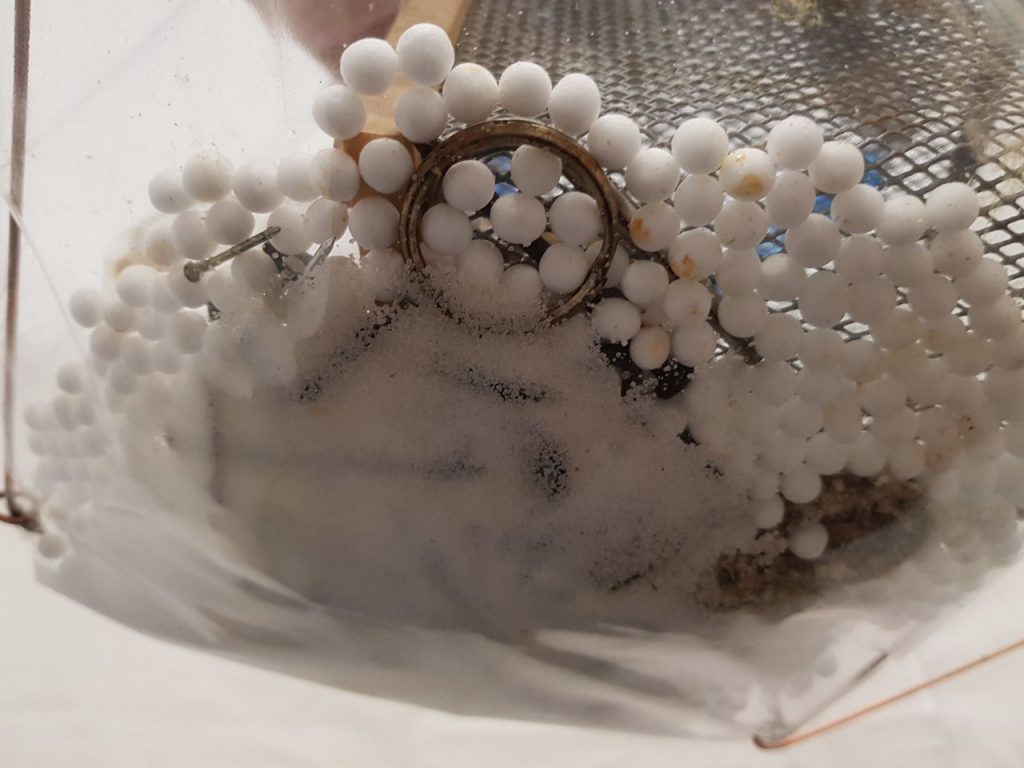
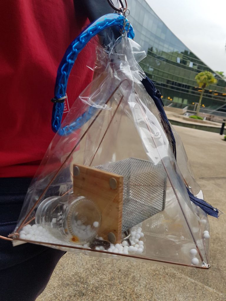
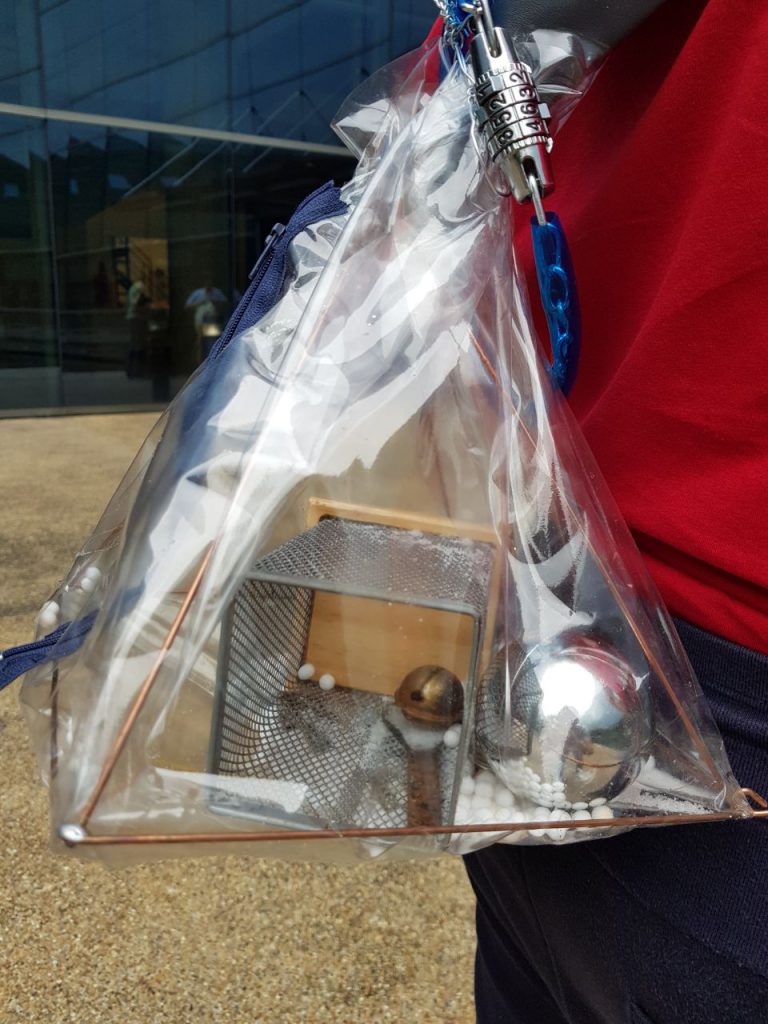
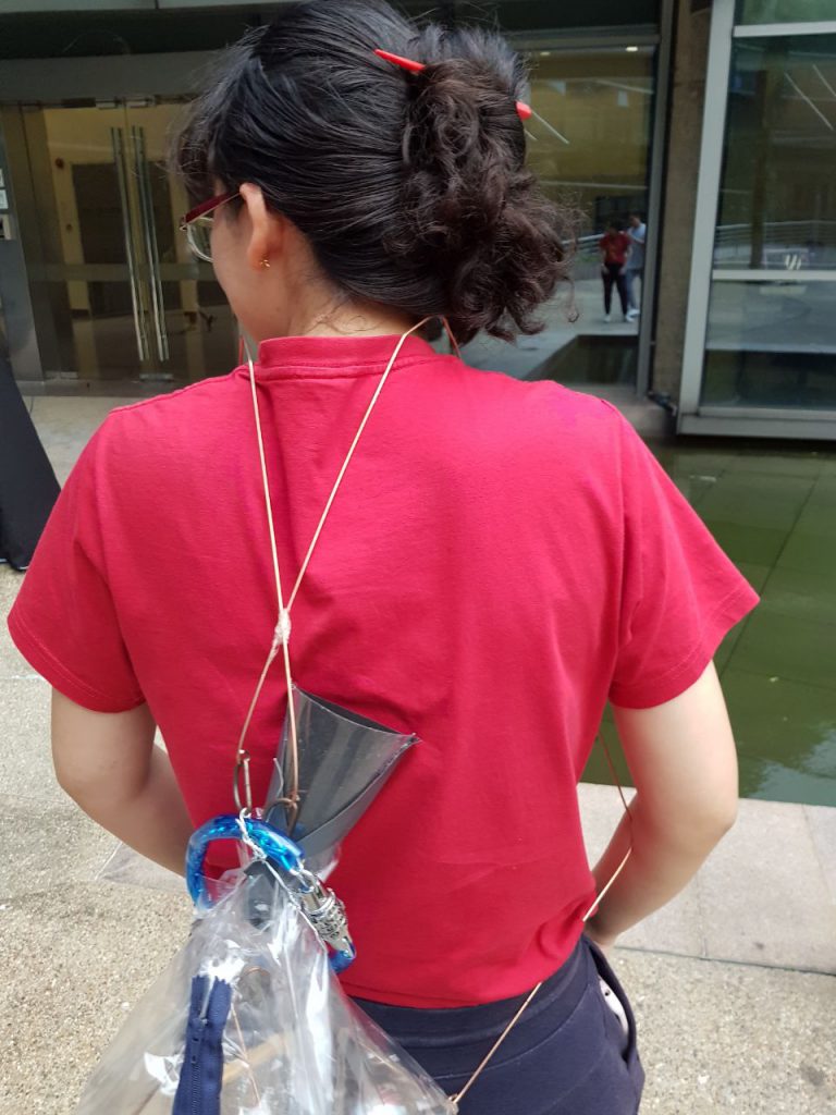

I used copper wires for the bag strap to represent how uncomfortable the emotional baggage would be for her, and added salt into the bag for demonstration in class. Some of the items in Fatin’s bag were not rusted, to show the process of her deteriorating relationship.
Feedback: The styrofoam balls I had placed in initially to represent salt was not removed. I did not do so as it was able to absorb the rust from the metallic objects and gave an overall ‘gross’ and dirty feel to the bag.
Reflection: I was surprised how I was able to work with the objects and create a clear narrative to my work. I really enjoyed the process and am glad that Fatin really enjoys the product I made for her! The bag was more non-functional and more conceptual as I had hope for it to be.
Task 1
We were told to bring objects that either had meaning or we just have in our possession from our homes.Initially, I brought a few random objects that did not really have a meaning, some items from secondary school prom and etc. One of which was a marble, which represented my fear of them when I hear them bouncing on my ceiling (I live on the highest floor). These objects did not provide me a good idea of what I wanted to do, so I went home again and flipped through my memory box. These boxes were all filled with past letters written to me, some of which were very well thought and designed. Most of them were birthday and Christmas cards. As I read them, I was reminded of how fast time has flew and how fast I grew up. I have gone through so ‘many’ life stages at this point, remarkably JC to army to Uni in such a short span of time. These letters meant a lot to me, and were among the few items I choose to keep after renovating my room.
Task 2
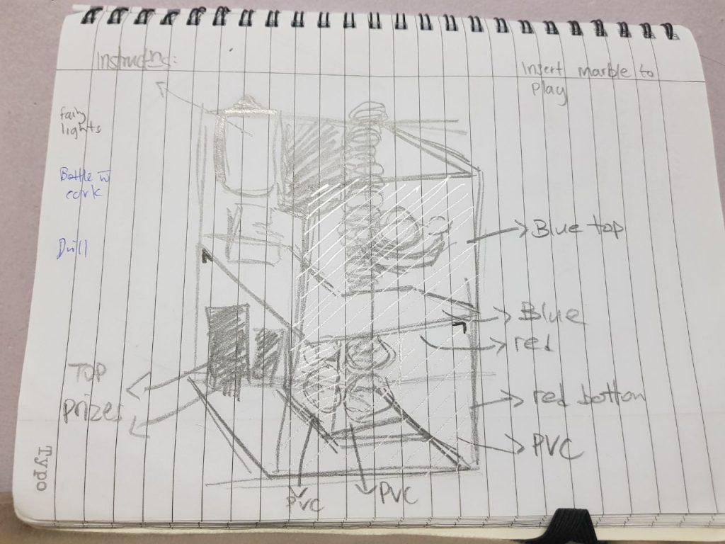
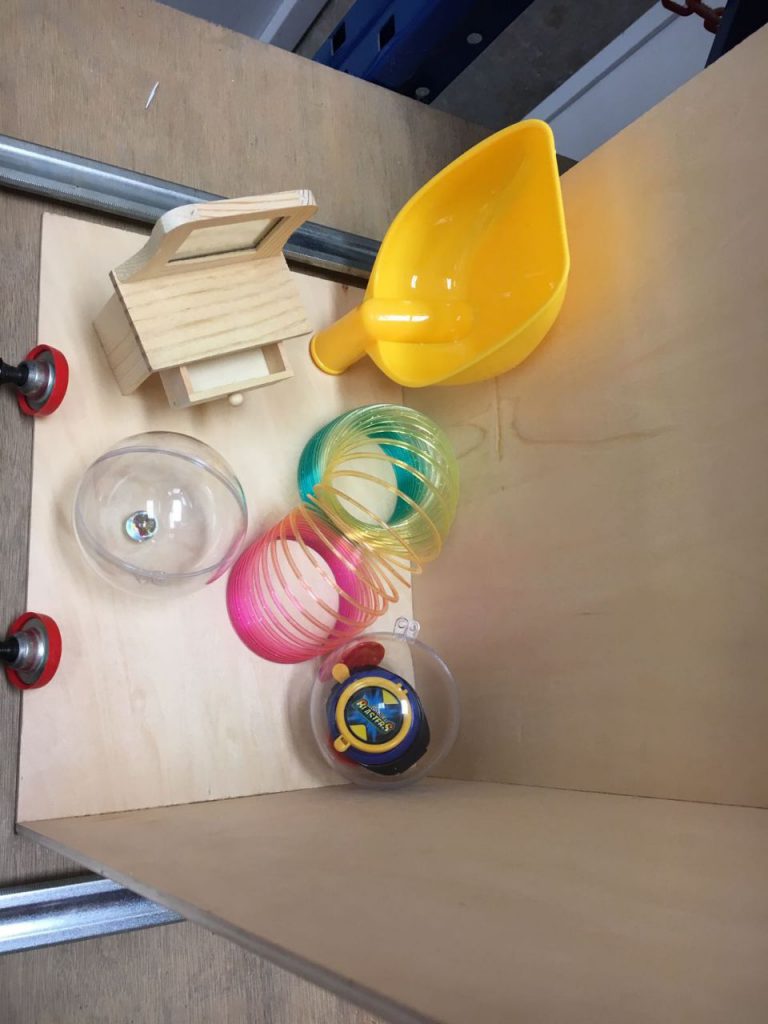
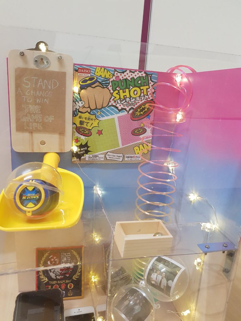
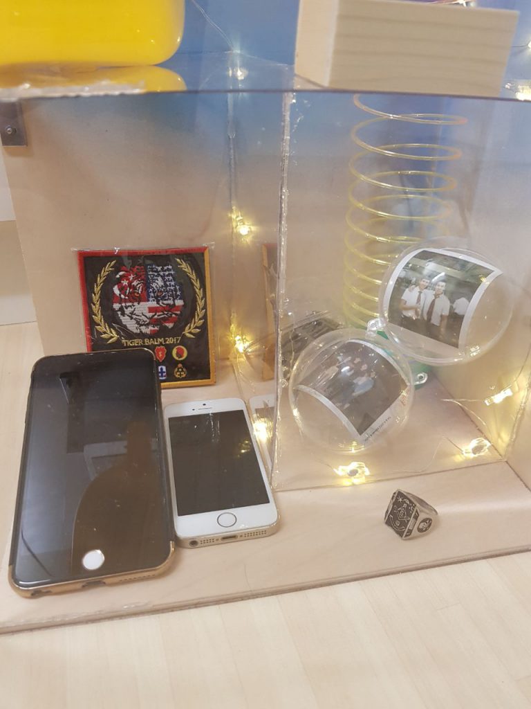
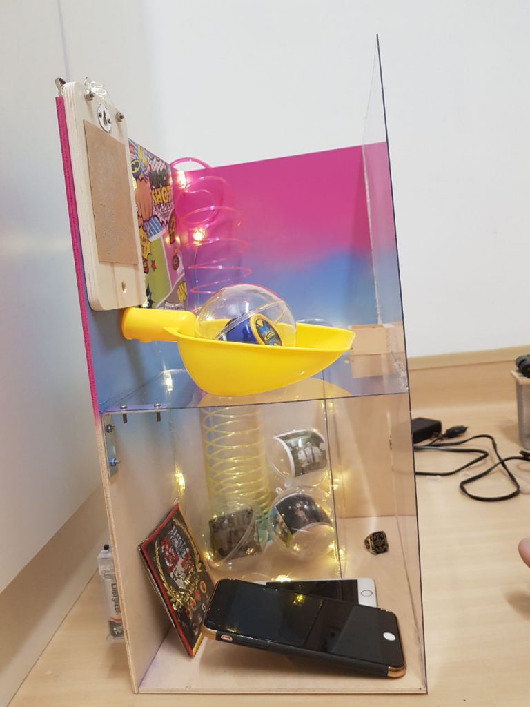
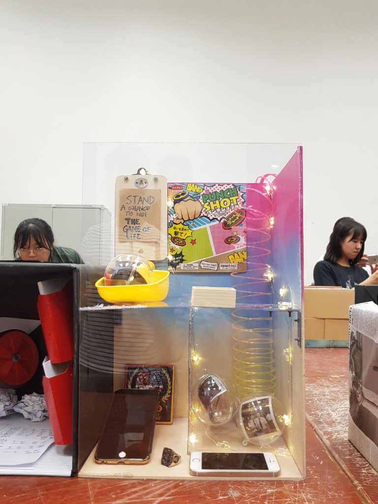
We were told to make a shadow box using the idea/concept that we got from the items we brought. I did not want to use the conventional shoe box as advised. Instead, I wanted to create a shadow box that represented life in a way, and I coined it as ‘The Game of Life’ box. I wanted it to look like a game box, a Gachapon machine as the element of randomness and curiosity was present. The idea of not being able to choose what you received intrigued me, just as how we aren’t able to choose what we get from life. This progression in life was taken from the idea of growing up from my letters. My items were carefully chosen; they were:
The rest were for design purposes.
This was my process; I started off my thinking of how I wanted to build my box.
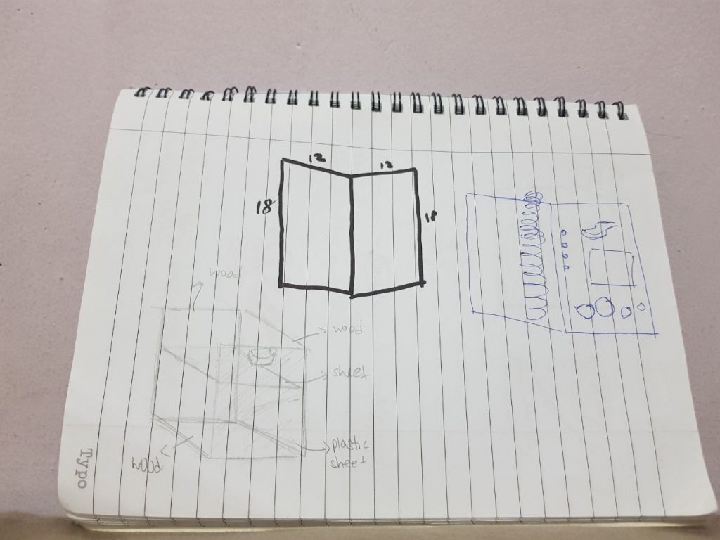
After the brainstorming, I brought my items and glued my boards together as a start. I was careful with the process
because I was afraid of mixing up the steps of creating the box.
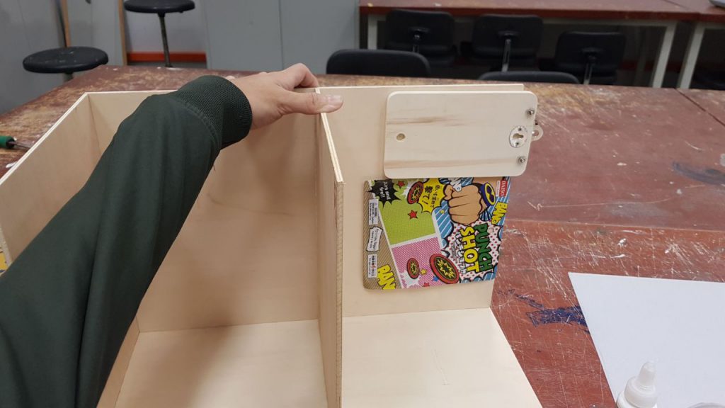
I did not use the ply wood for the middle platform as I wanted it to look clear.
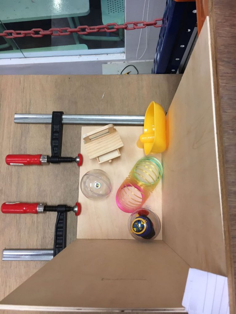
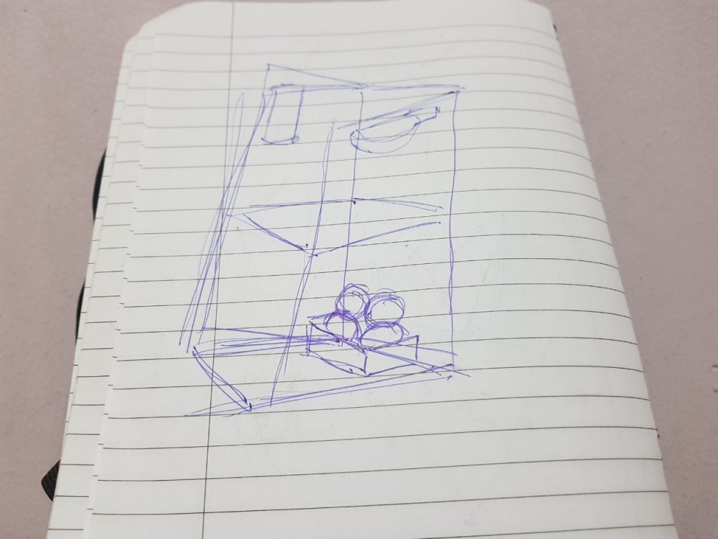
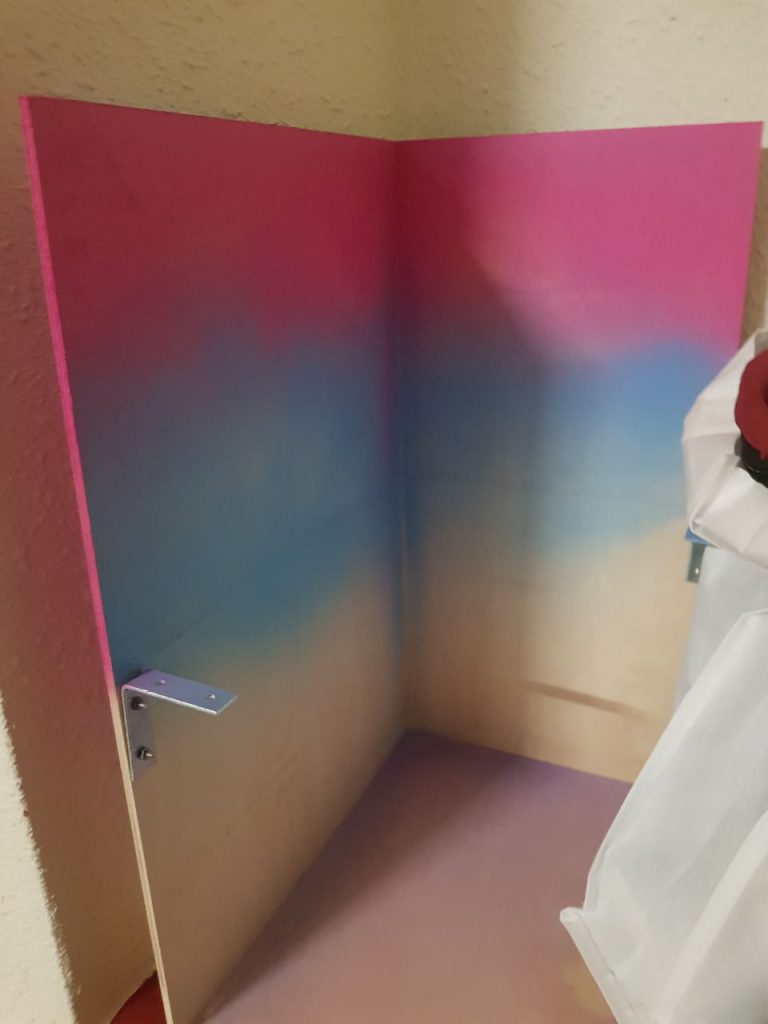
After this step, I coloured the board with spray paint. I screwed in the nuts as well for the middle platform.I tried out the layout for the box as well.
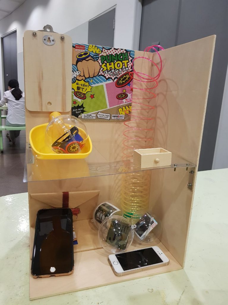
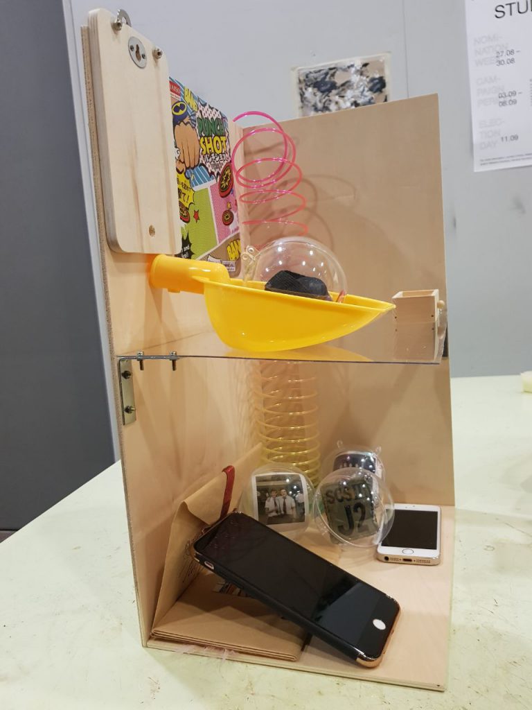
After gluing everything together, placing the items and attaching the fairy lights, this was the final product.
Reflection:
I really enjoyed the process, even though I was not familiar with drilling and gluing things together, it was nonetheless exciting to carefully plan out a box that was meaningful. At first I thought really hard about spray painting the box, and I went ahead with it anyway as I knew what I wanted it to represent (The colours faded at the bottom to show the progression to dull, mundane adulthood).