After finishing with the research portion of Yishun, I have found that I did enjoy
taking photos of the architecture. However, the photos around Yishun about
HDBs and HDB motifs did not really interest me. I had initially pitched to Shirley
that I wanted to do something along the lines of a industrial park mama shop
that had personal value to me. However, after revising my plan and thinking it
through carefully, I wanted to do something different from what has been done,
sort of.
When we started on LOCALE, we were given a look at zines done by seniors
previously. One thing I noticed was that almost nobody did photo shoots /
included people in their zine. They were solely focused on elements presented
in their area of research. I was certainly excited about this as I would be doing
something more ‘original’ in that sense. On the contrary, I would have trouble
finding materials to reference. Whatever was the case, I do like a bit of challenge.
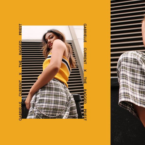
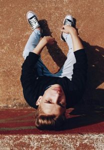
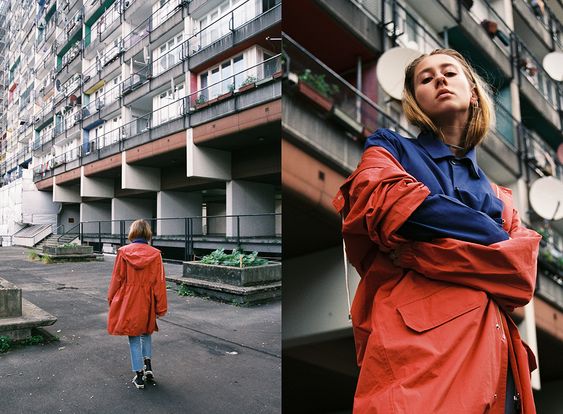
I was inspired to do this zine by this image I found on pinterest. It had a very
simple street wear element which I liked.
As a start, I decided that these were the things I had to complete.
- Plan and execute a photo shoot in Yishun.
- Have them edited.
- Layout of zine.
- Illustrate quirky elements of Yishun with the chosen images.
- Colour correction.
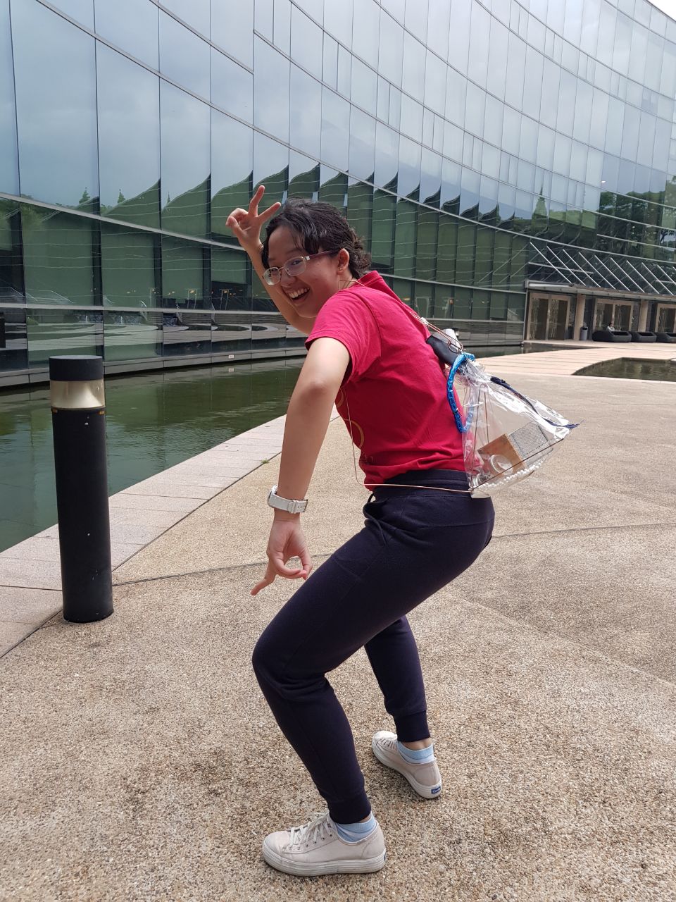
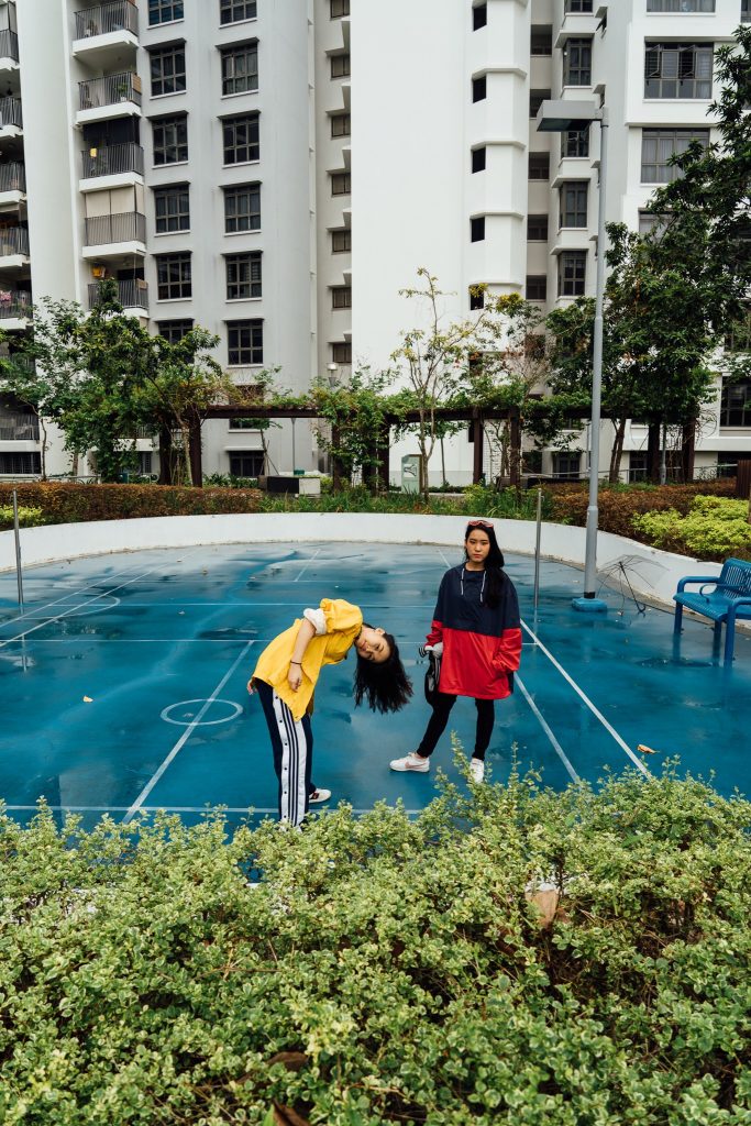
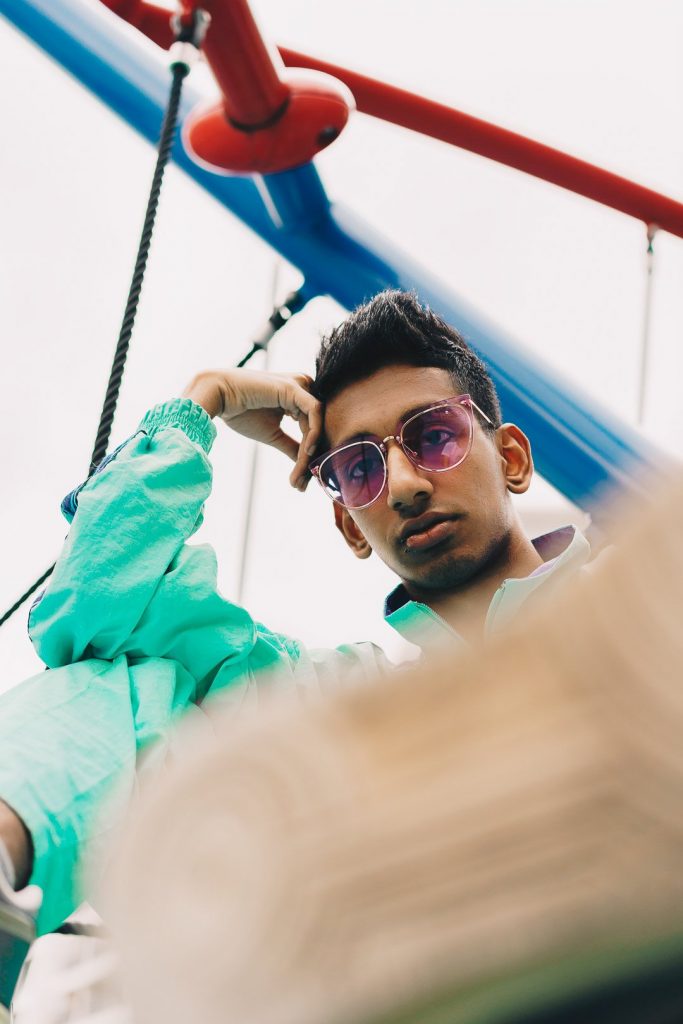
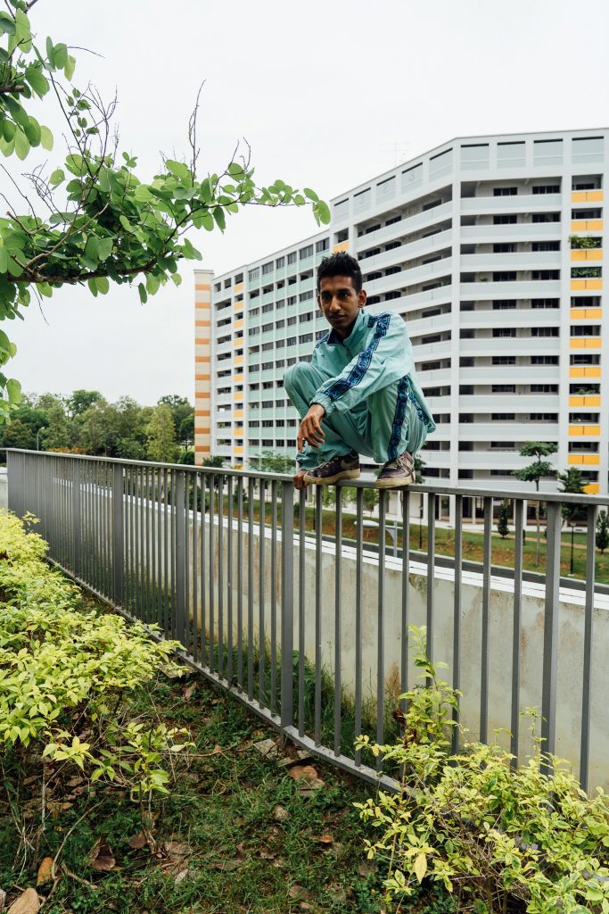
Photo shoot
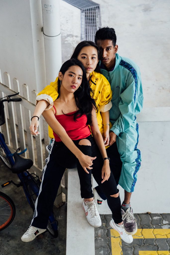
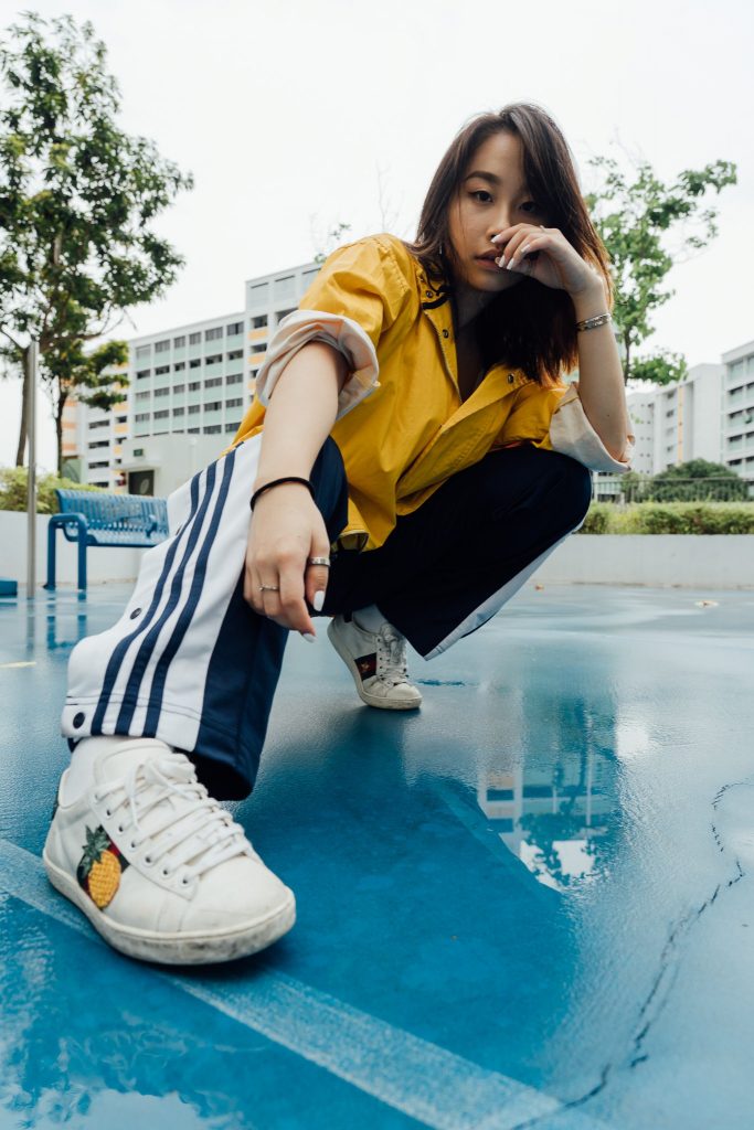
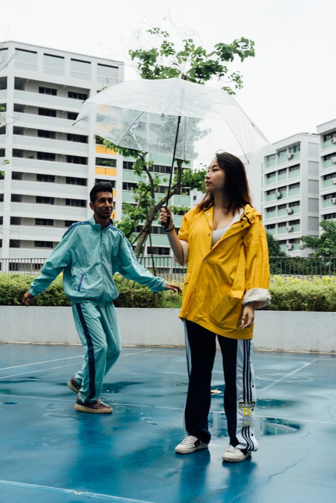
I have never done a photo shoot before, so I went on youtube and watched a
bunch of videos on what to prepare/plan and execute on the day itself. I pulled
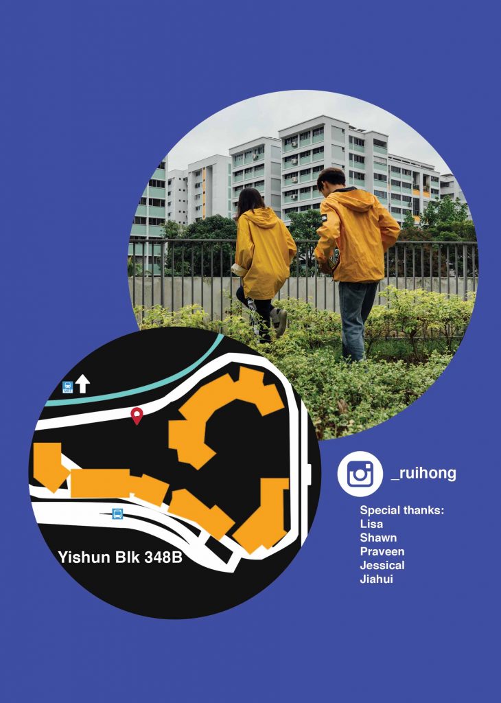
in two friends (Lisa and Shawn) to help with the shoot. I had also asked three
of my friends(Jia Hui, Jessical and Praveen) to model. Sifting through the
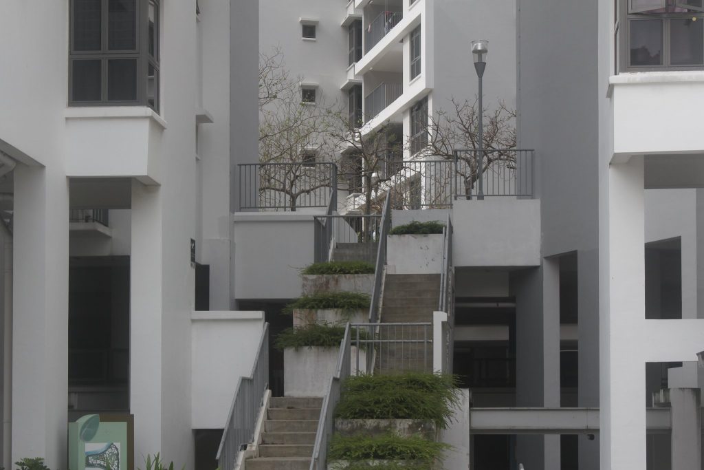
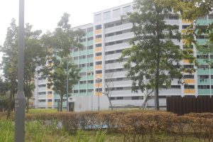
photos that I took from my research, I settled on a location at BLK348B. This
location took me by surprise as I cycled through the Yishun neighbourhood
with a dslr on hand. I really liked the clean look it presented; contrasted to the
old neighbourhood it is surrounded by.
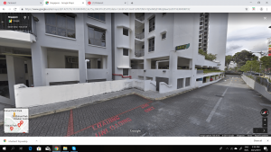
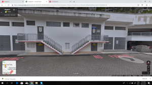
I didn’t really focus too much on this location until I reviewed my photographs
and concept. To do more research on the location, I went on googlemaps to
find more photos.

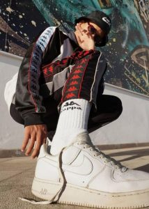
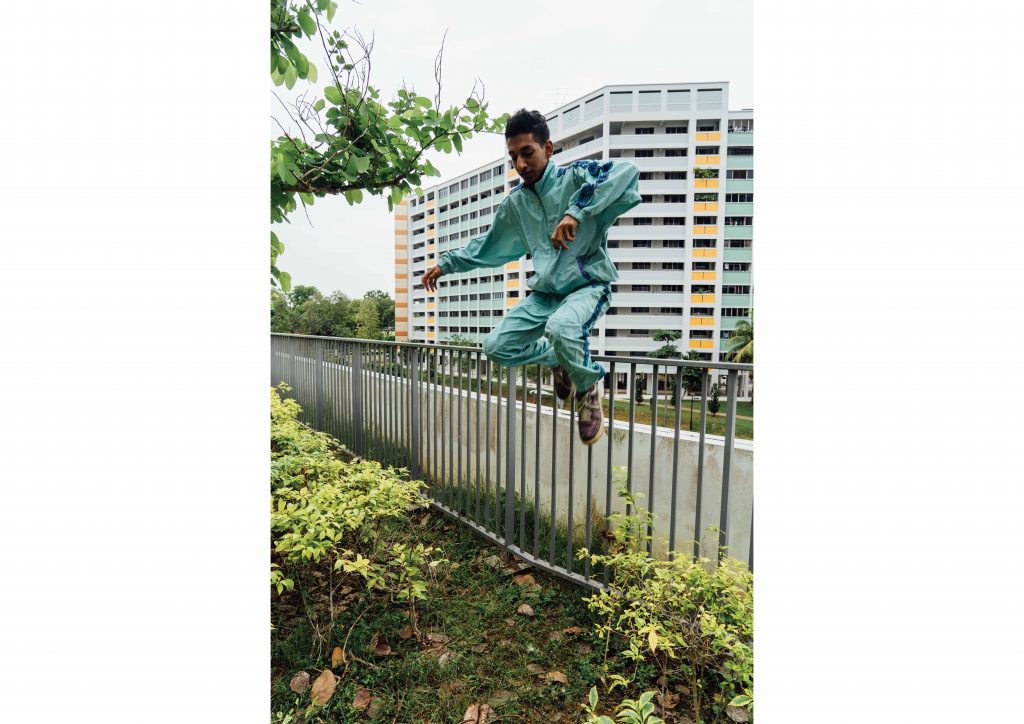
After reviewing the location, I asked my models to bring clothing that were
mustard yellow and turquoise to fit with the location, and red for contrast.
I looked up some photos on pinterest to reference the look/vibe/poses I wanted
for them.
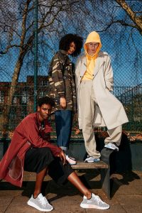
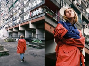
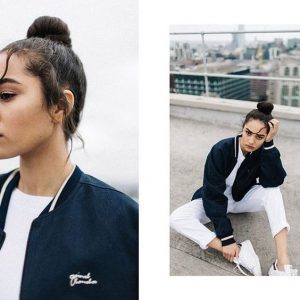

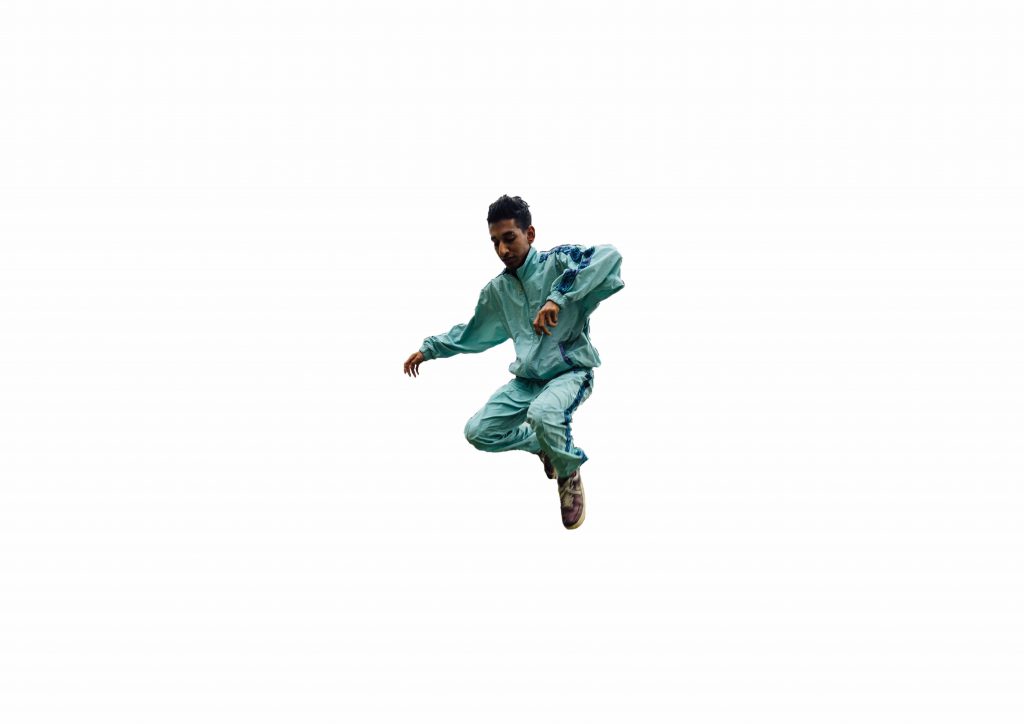
Shooting took about 3 hours and we managed to finish it in a day (30th March)
These are some of the photos taken. Some are behind the scenes.


Layout + Editing
I spent the longest time editing and settling on the layout. With over 600 raw shots,
I was rather indecisive and unsure of what photos to use for my final zine. I had to
change them from time to time. However, I really enjoyed this process as I began
to understand what I wanted out from this zine. After choosing the photos, I then
had to decide on how I would place my photos to make them interesting.
At this point, I started placing my images into my desired layout, which I have
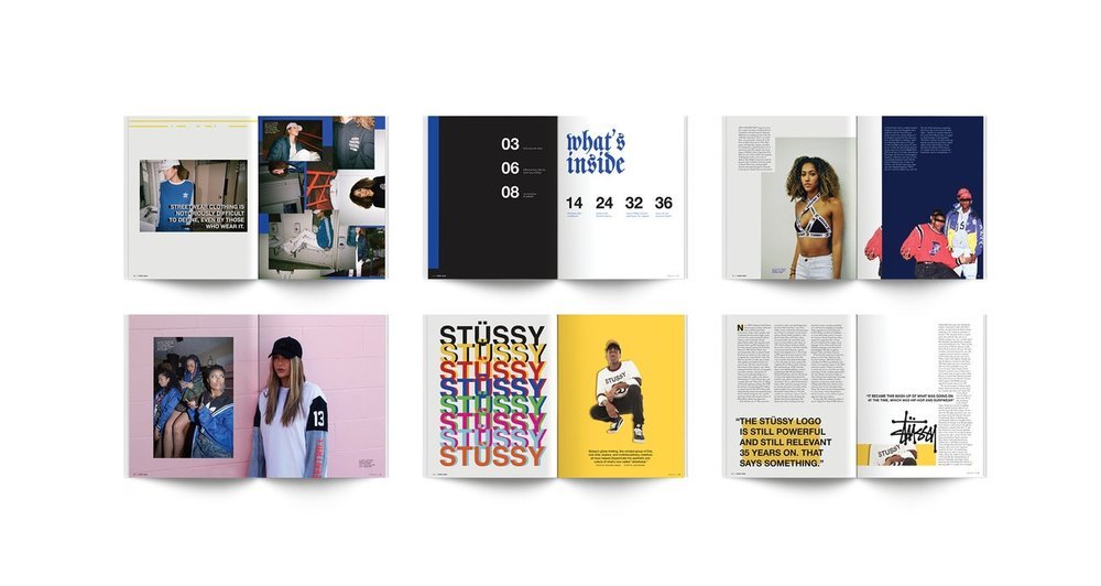
gained inspiration from these current layouts.
Cover page:


Zine spread layouts:
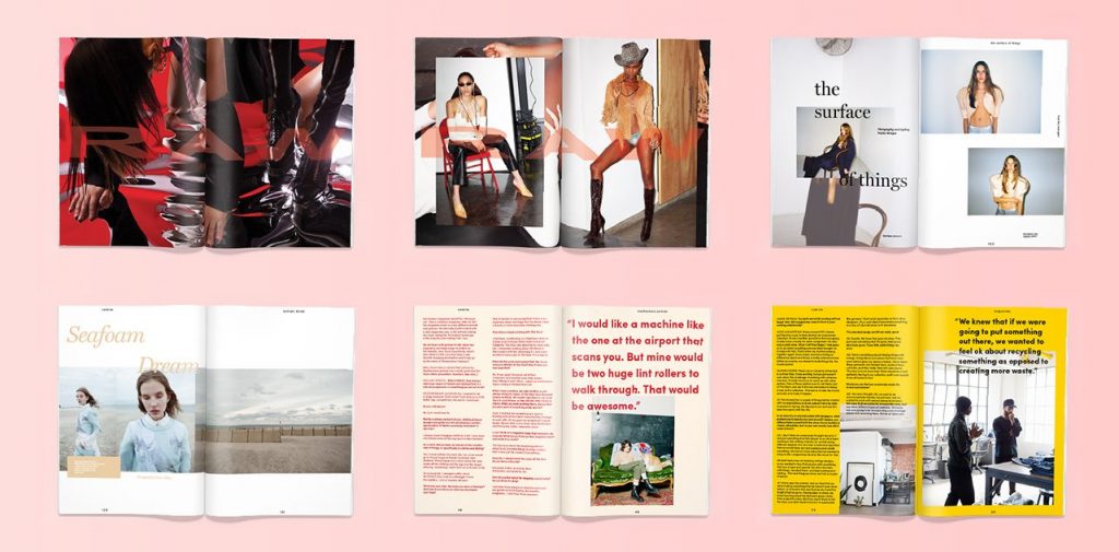

Layouts I tried
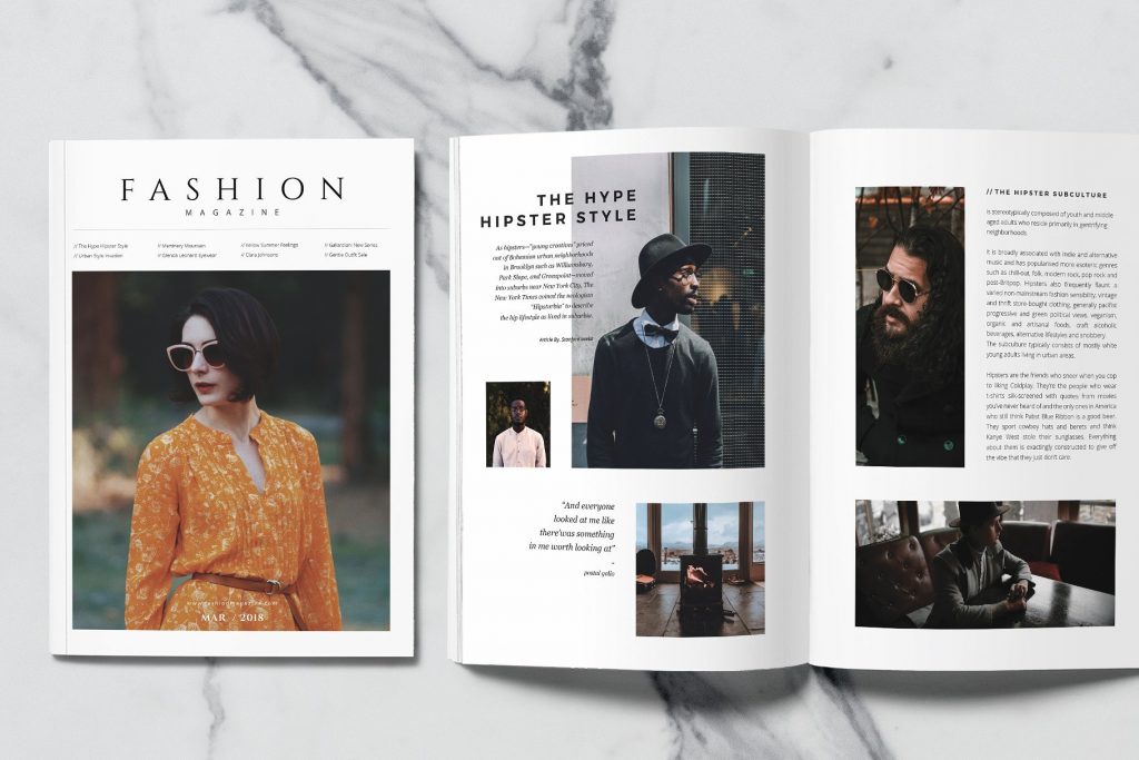
Cover Page
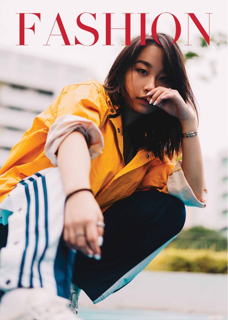
I roughly stuck to this cover as I thought it looked good.
I did mask some parts of the Fashion word and put in
the Yishun text into the cover page. I had plenty of text
all over the cover page but I decided to remove them in
the end because the clutter was unnecessary and there
wasn’t much text that I wanted to include. I did include a
‘March Edition’ at the bottom to contextualize the zine.
Page 2 and 3
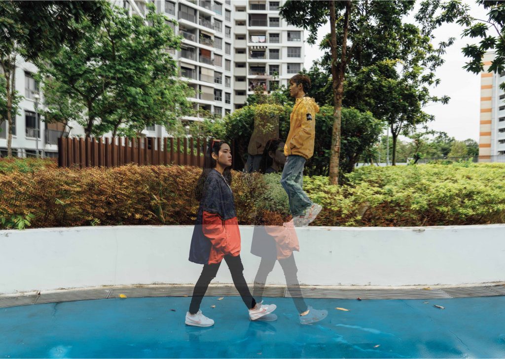
I decided to scale down the photo as I didn’t want the photo to eat up the entire
page. This way, I was able to design more onto the zine and not simply rely on
illustrations.
Page 6 and 7
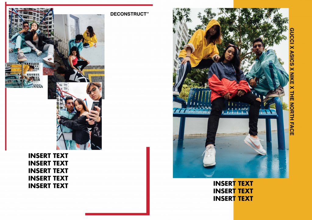
Initial idea for my pages. The entire spread kind of felt abit block-ish and
uncomfortable. I rearranged the photos later on to form a nice ascending gra-
dient from left to right.
Some masking and editing I done:
Patterns and shapes
In my final zine, you can see that I have certain elements with lowered opacity
and shapes that interact with one another. I decided to do a
polka dot pattern/motif on my page 4 to draw the reader’s attention. At one point
I felt slightly too ambitious since I am using three programmes concurrently
(Photoshop, Indesign and Illustrator).
![]()
Masking and placement
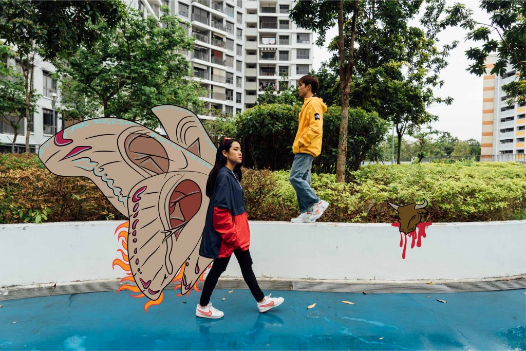
After the shoot I researched on some weird happenings that have occurred in
Yishun. These would help incorporate the unique Yishun element in my zine.
Note: I did not reference everything 1:1, I had made my own creative changes.
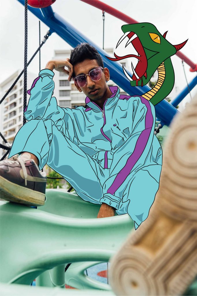
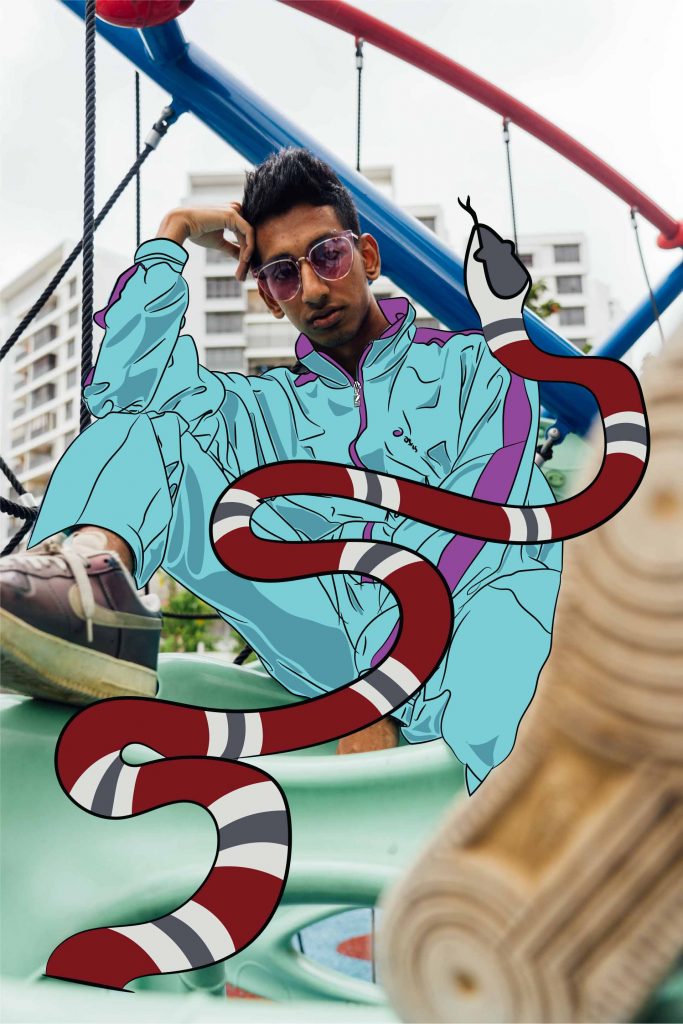
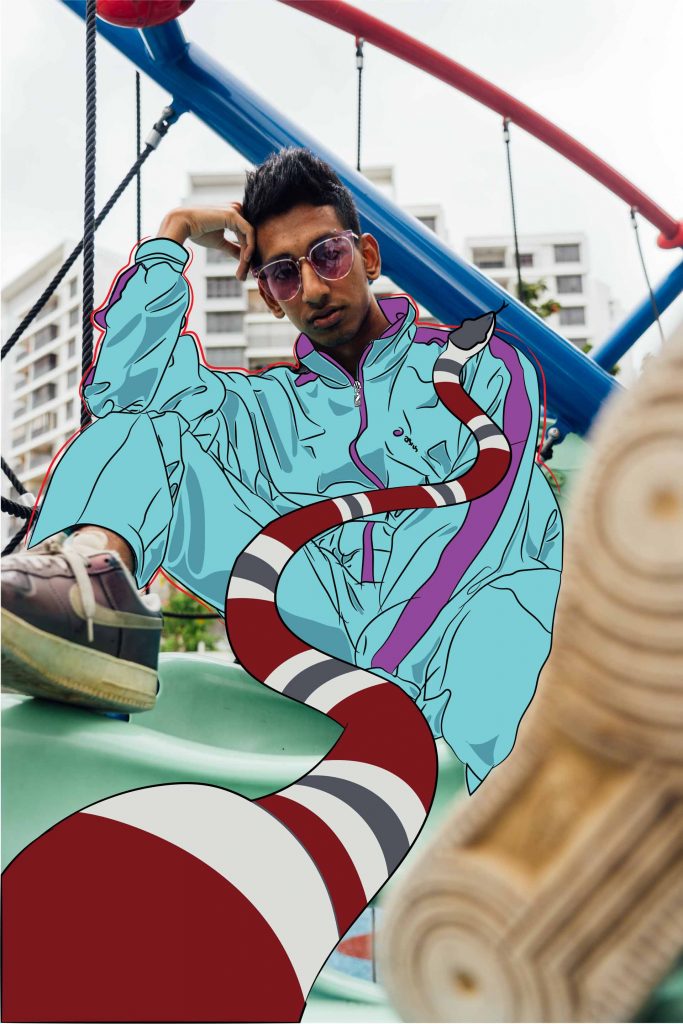
Some of these happenings were:
Man brings cow into lift
Cat murders
Man murders wife
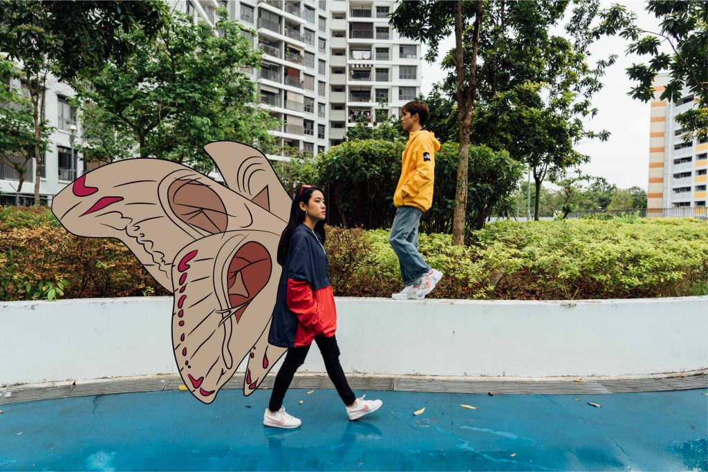
Giant moths and caterpillars
Slashing incident
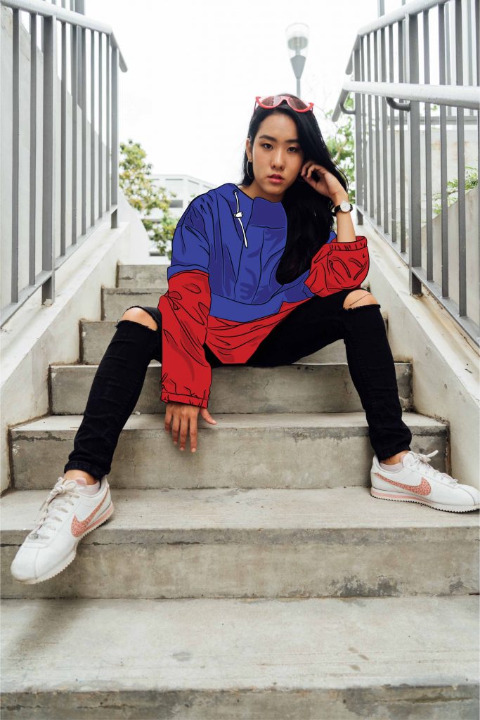
Illustration
Shirley encouraged me to use Illustrator for the drawings. As I am usually
more inclined to using Photoshop for drawings, I struggled to get started
on illustrator. However, I did manage to get myself to sit down and watch
tutorials on illustrator. I thought, since I had to use it in the future anyways,
I should learn on my own as well. I was happy with my progress and I followed
Shirley’s advice; to draw Yishun-quirky elements onto the existing images
to create interest. Some of them were drawn on photoshop to give a more raw
feel to the images. These are some of the drafts:

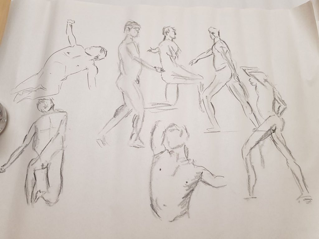
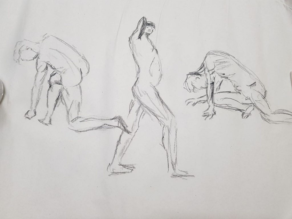
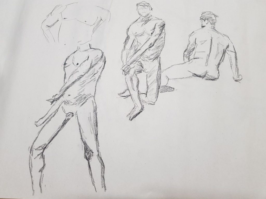
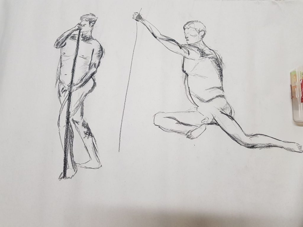
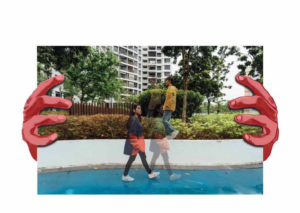
I took a photo for reference to draw for the scary looking hands ->
I decided not to do illustrations for my cover page to hold the suspense for the
readers, as to not expose my zine elements for my viewers.
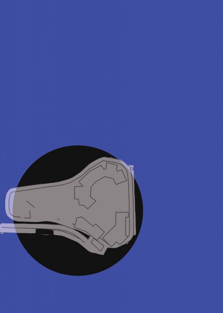
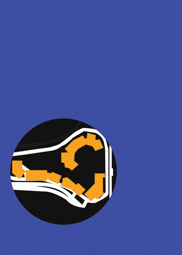
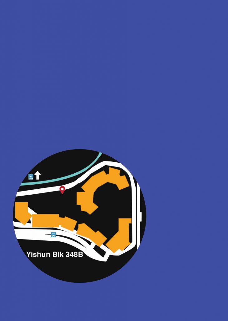
I used Photoshop to create a map for Blk 348B location. This was how it looked
in the process.
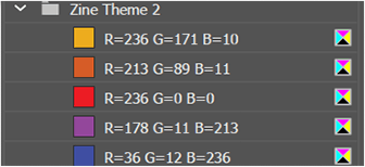
Colour correction

Original colours used.
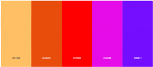
Colours I chose in the end (after consultation with Shirley) as the initial
colours were very saturated and kiddish.
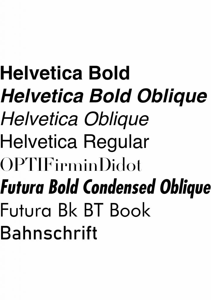
Fonts used:
I had to spend time to find the fonts that were suitable for my zine. From what
I have researched, I could tell that ‘street wear’ fonts were pretty basic, which
made sense, because they followed that of street signs or metro signs. That,
essentially, makes it street-ish as it borrows elements that are true to its form.

I tried out several fonts, namely:
Conclusion:
I was generally pleased with the pace and results of this project. As I had to
sketch out what had to be done beforehand, I was able to give myself ample
time to segment each step so that I can submit on time. There were a lot of
work to be done, and I knew that it wouldn’t be possible to churn out a zine
in a short amount of time. I took my time with every step, changing bits and
pieces and asked my friends on how to improve it. Shirley’s week by week
consultation kept me up to speed and made sure I was able to produce
something to consult and change on a weekly basis.
I felt that the photo shoot was the hardest/most stressful one to plan for as I
was constantly worried that the shots did not turn out the way they should
(or according to my mood board) and it rained for a bit which really threw me
off as I wasn’t sure when it’d stop. Overall, I am glad to be learning something
new with every step and this project forced me to go out of my comfort zone
to experiment and develop my own style. I am immensely relieved that I
abandoned my previous idea of industrialized mama shop to a streetwear
zine.
References:
https://www.pinterest.com/cheahruihong/yishun-inspo/
Why Yishun is the most terrifying place to live in Singapore
For research process of Yishun,
check out: https://oss.adm.ntu.edu.sg/rcheah002/locale-presentation-yishun/
Thank you for reading!