
Hello! I have done up three banners, all playing with the various motifs that I have posted earlier on.
Number 1:
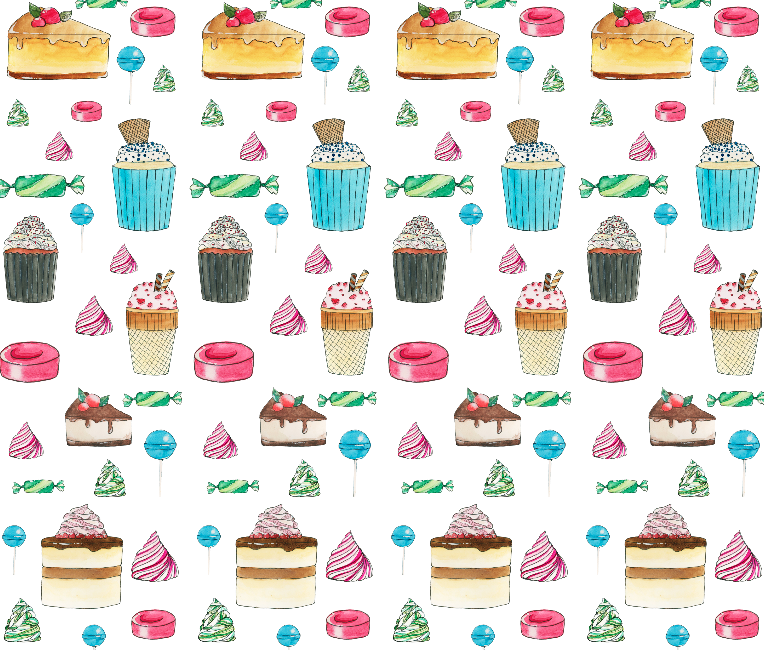
This is the first one I did up, which I wasn’t very satisfied with because I felt it looked too rigid and the motifs were too straight and didn’t relay the playfulness I wanted in the banner.
Number 2:
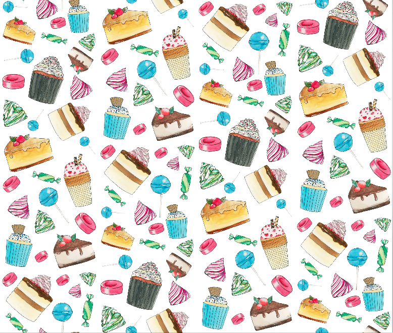
Because I wanted some sort of dynamic component and didn’t like the straightness, I reorganised the motifs and made them slanted and slightly messier, so it would create a sort of falling down effect and the food items would look like they were dropping down from the sky in a haphazard and playful way.
Number 3:
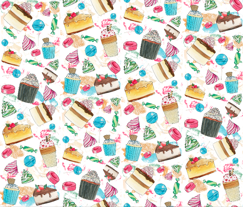
This is the last design I was experimenting with. I kind of like the splashes of colour which I derived from the test sheet 1 and 2, using the colour select tool on photoshop. It gives the background more depth and character, like splashes of paint, so it does not look as flat. I decided to keep the motifs in the falling down/cascading sort of movement from Number 2.