Octavia – Process

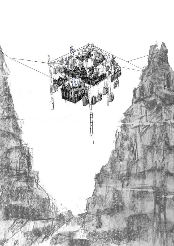
I chose Octavia because I liked the idea of a hanging city, fragile and beautiful in disguise. To me, it was both unique and deadly at the same time. The passage by Italo Calvino can be found below:

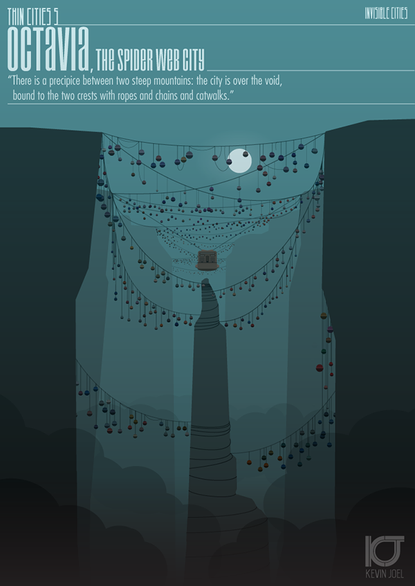
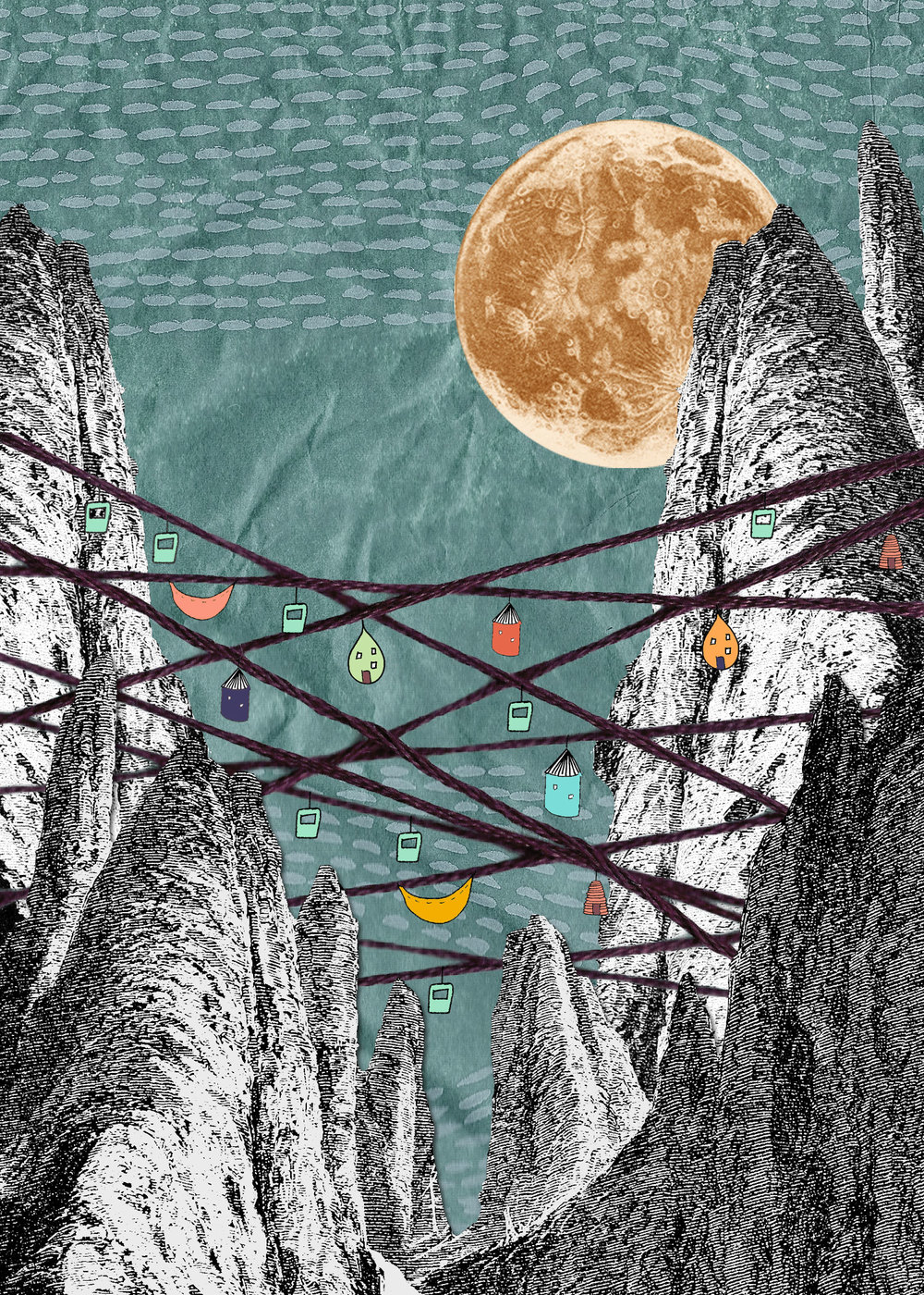
“If you choose to believe me, good. Now I will tell you how Octavia, the spider-web city, is made. There is a precipice between two steep mountains: the city is over the void, bound to the two crests with ropes and chains and catwalks. You walk on the little wooden ties, careful not to set your foot in the open spaces, or you cling to the hempen strands. Below there is nothing for hundreds and hundreds of feet: a few clouds glide past; farther down you can glimpse the chasm’s bed.

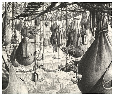
This is the foundation of the city: a net which serves as passage and as support. All the rest, instead of rising up, is hung below: rope ladders, hammocks, houses made like sacks, clothes hangers, terraces like gondolas, skins of water, gas jets, spits, baskets on strings, dumb-waiters, showers, trapezes and rings for children’s games, cable cars, chandeliers, pots with trailing plants.
Suspended over the abyss, the life of Octavia’s inhabitants is less uncertain than in other cities. They know the net will only last so long.
What stood out to me immediately was the sense of loss and death inferred from the last line of the passage, whereby the inhabitants know that the location is dangerous and one day, they could all fall.
I began by searching for visual inspiration online, to see what others thought the city looked like.
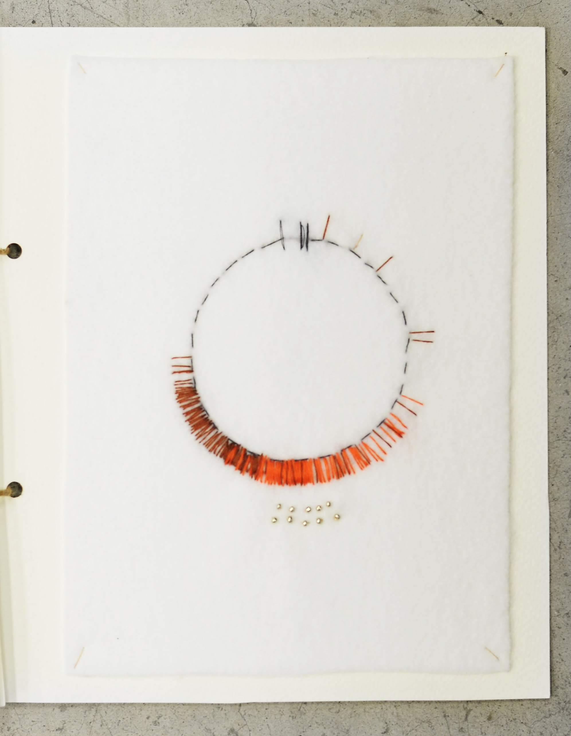
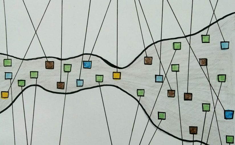
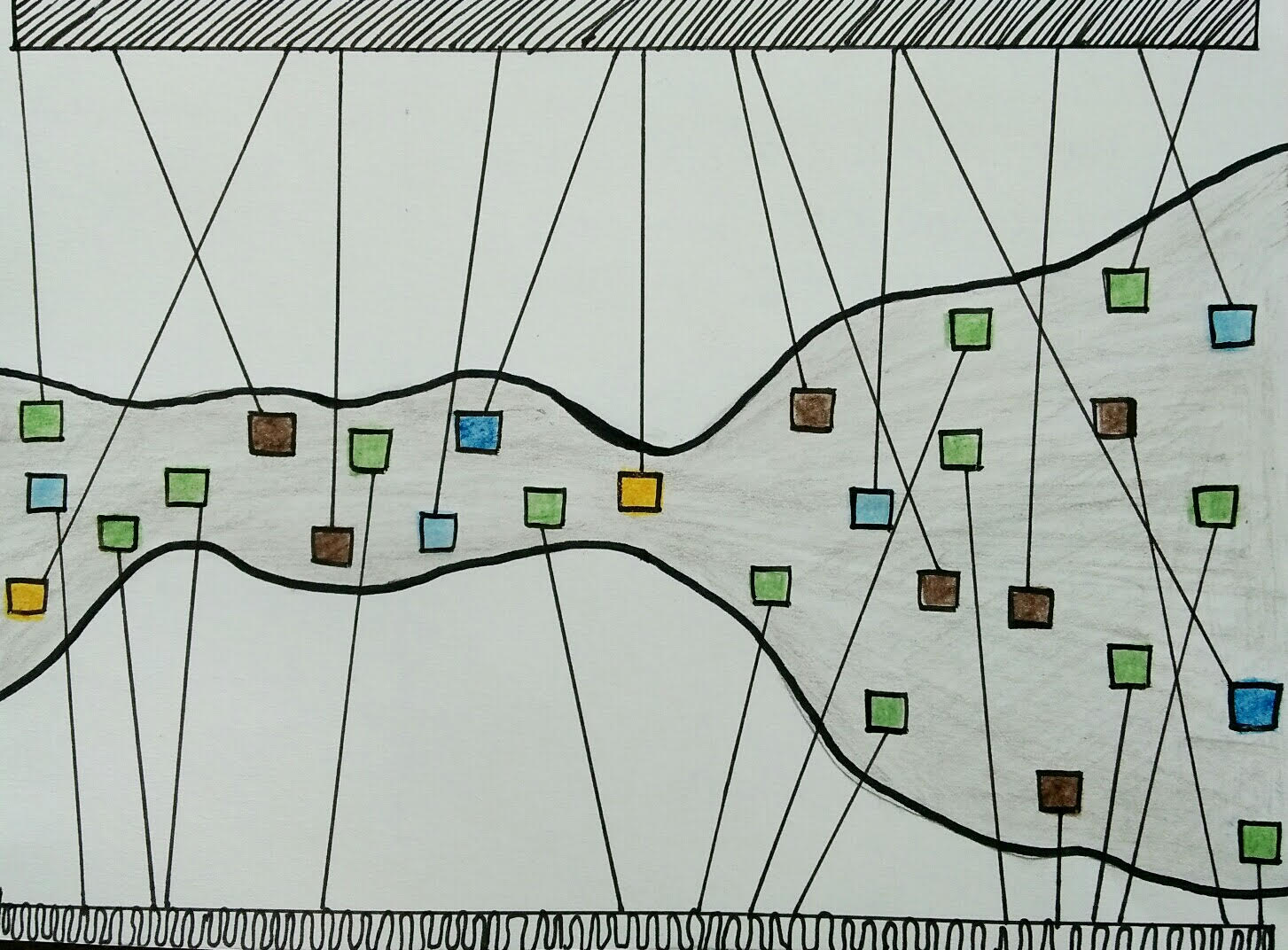
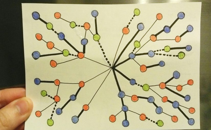
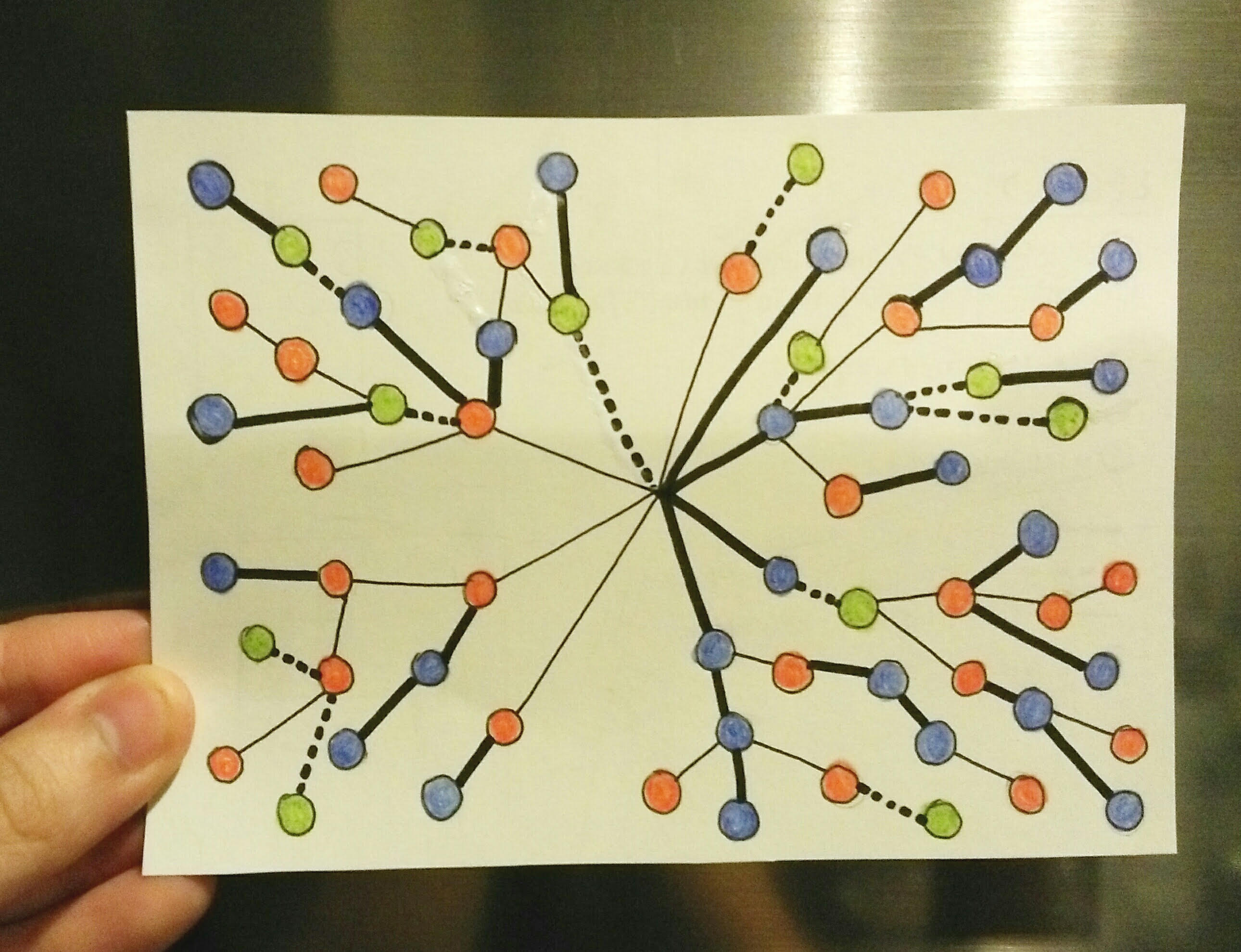
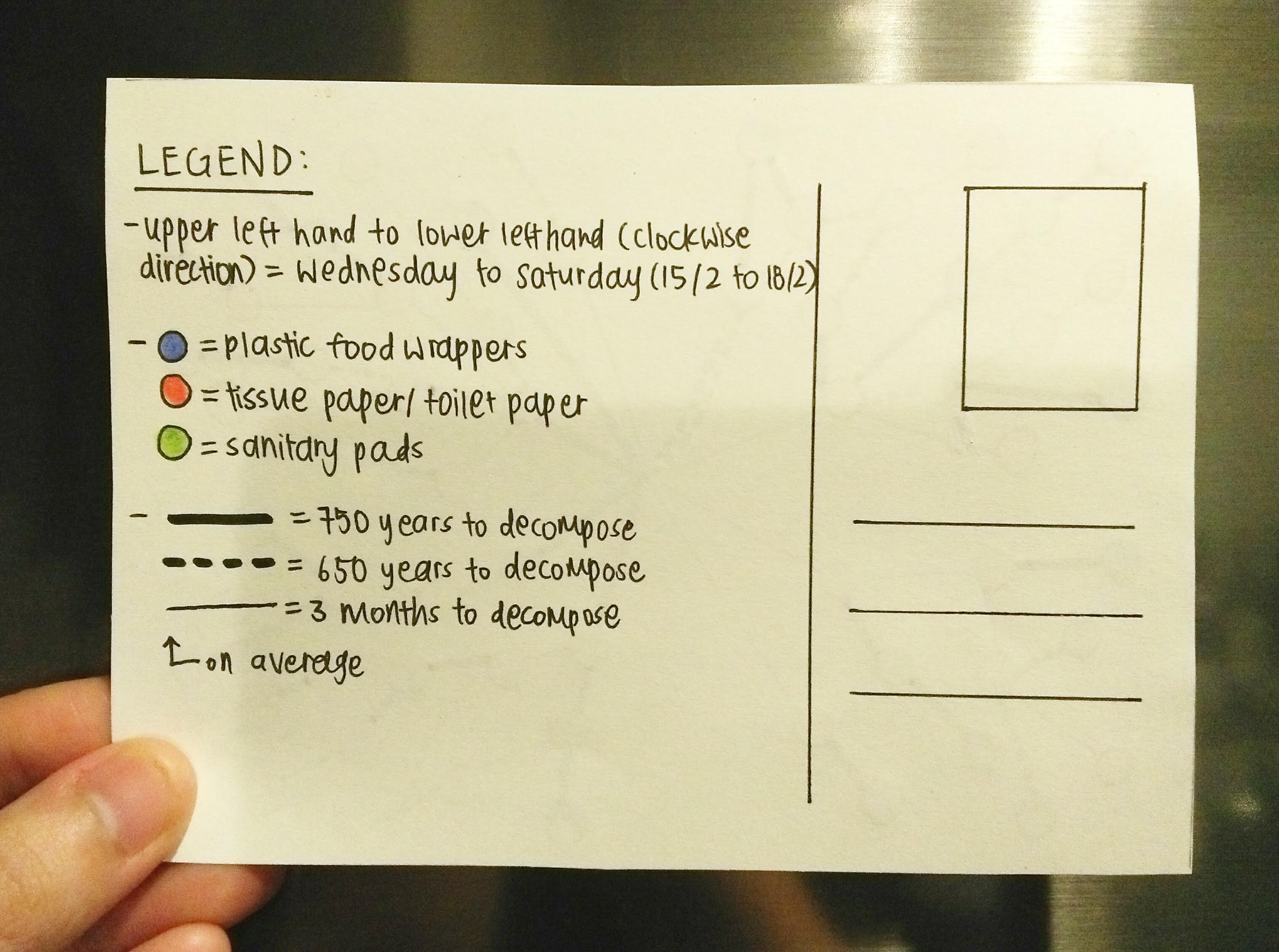
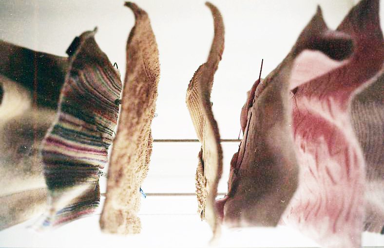
After getting inspiration from these sources, I decided I wanted to play with string as a medium, given that string and rope were the very elements that gave and controlled life and death of the city. Then, I also thought of the causes of death, and instead of the inhabitants falling off that caused the entire city’s demise, I came up with my own statistics and thought that it would be interesting if something else caused the all the deaths, and I wanted it to be also related to the entire structure falling. Therefore, I reached a conclusion that fire would be the cause.
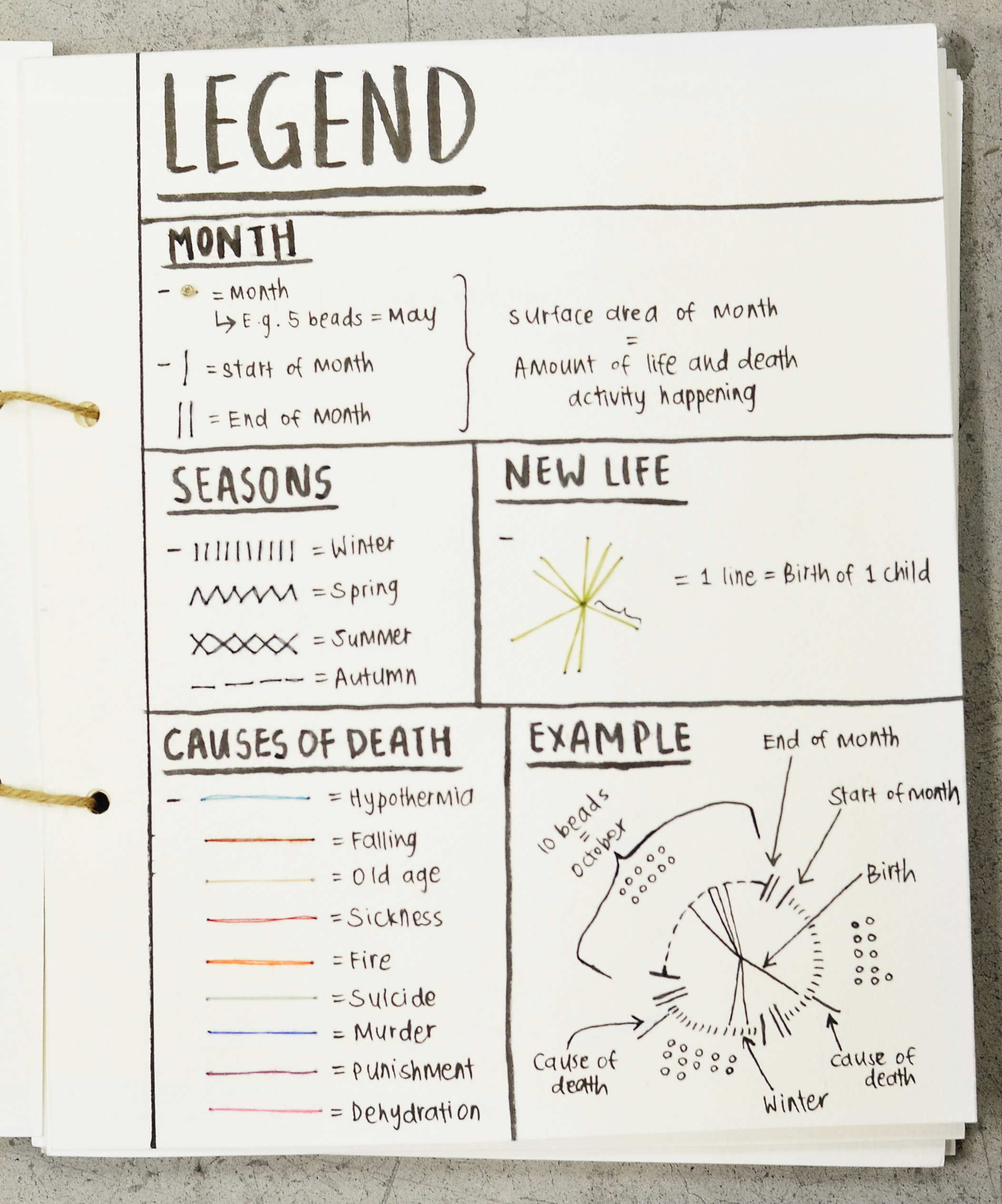
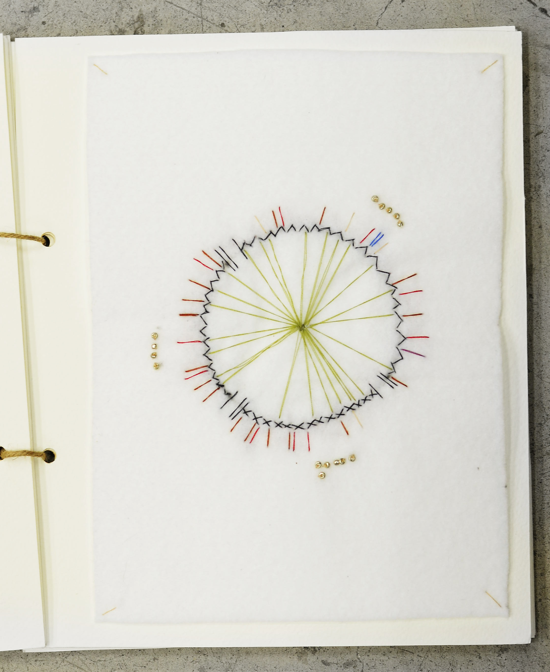
I started by drawing out and making notes, creating statistics that recorded all the deaths in the city. And where there is death, there is life. So I also wanted the births of babies in Octavia to be noted down as well.
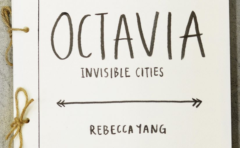
In the end, I came up with a booklet, sort of like an old fashioned hand made journal (given that Octavia was supposed to be read to Kublai Khan, who was alive in 1200s. The entire book was envisioned to be very tactile and physical, instead of a softcopy.
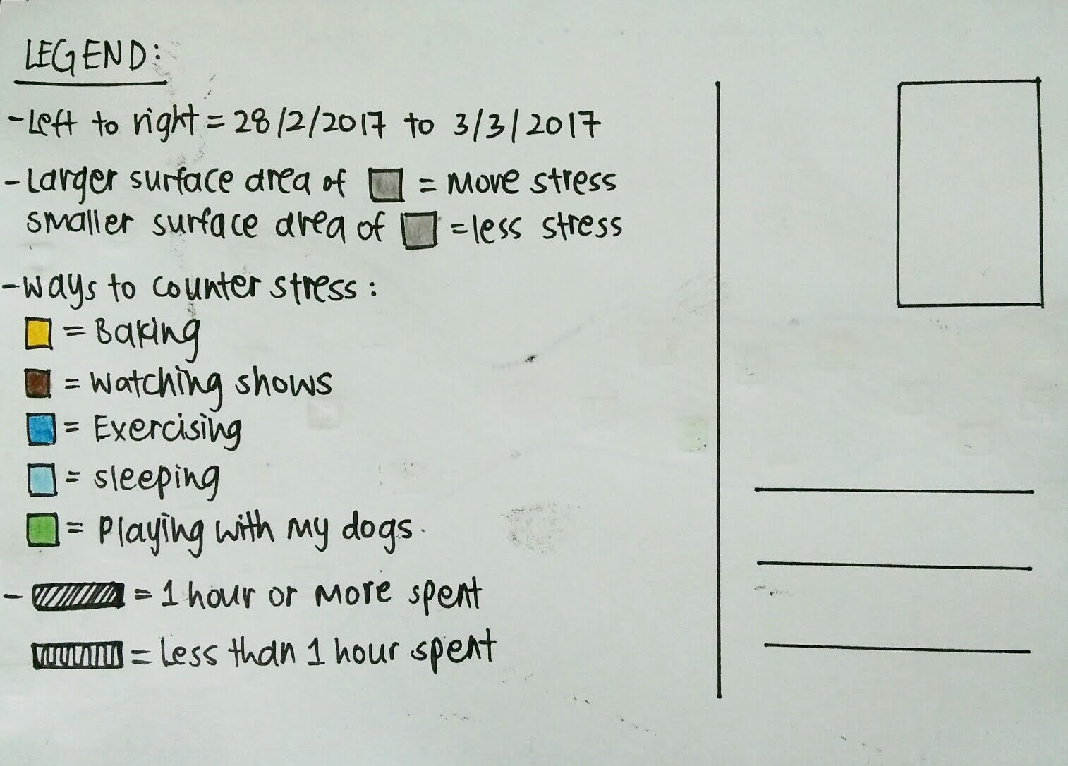
Below are the photos of the pages of the book, with each page showing three months of the year, as well as documenting the different seasons and timeline (it’s over a year because a typical industrial rope would usually last about a year if used daily), so one could see the relation between deaths and time.

FINAL TEST PRINT

Hello! I’ve altered my final banner, which you guys can see below! (:

I prefer this one as the background looks cleaner and allows the motifs and patterns to stand out instead of sinking into the banner itself, so it adds on to the popping out effect. I did this by retaining a light coloured background, meaning I took away the black gradient effect, and replaced it with a almost white (sort of very faint cream colour) background. I added some colour so it wouldn’t look too stark white.

I also increased the space and area of the colour splashes – all colours blue, pink, green and brown – to fill up the banner more and look messier at the same time, so it would appear more energetic and vibrant. Then I also added more variety and number of food motifs so the banner would not look as empty.

As per the last test print:

  1. Left one = original
  2. Middle = +15 brightness, +15 saturation
  3. Right = +30 brightness, +30 saturation

More process!

Here’s a quick update with my process for the Pattern banner before we do the printing!

I decided to draw an oven as a motif as well, and my intention is to put is at the bottom of the banner as a statement piece, almost like a full stop to the story, or like to mark the end of a sentence. In this case, it is to symbolise the end of Hansel and Gretel when the children pushed the witch into the oven.

Above is the scanned drawn and watercoloured oven that I’ve done, before I changed into into a PNG on Photoshop. I wanted the fire to look like it was still burning and in action, to create a more dramatic and ongoing look. I also did not want a conventional looking oven, and sought to create a more whimsical version, so I added the extra details like the swirly legs, funnels, pipes and chutes.


Below are the versions of the banner that I was experimenting with, after incorporating the oven inside. A pity, because I realised the banner is too narrow to place the whole oven in, and to get it to the size I like, which was to be large enough to focus on, so I had to cut out the details at the side, as the main focus was the bricks, metal grills and fire. I also tried layering the bricks on photoshop to make it longer, but that did not look as good (can be seen below).


  1. Above is banner 1, the very start of when I placed the oven in. I shifted the falling motifs and colour splashes up and rearranged it a bit in order to fit everything in and keep everything within the banner. I also placed it such that the blue part at the bottom would appear like it was either being sucked into the oven or being blown out of the oven from the funnel, depending on what the viewer thinks.

2. My second try was to place the black part using the paint bucket and gradient tool above, to create a more dynamic background, and also add a bit of mystery and sinister vibe to the banner.

3. This is the last one, banner 3, which I like the most. I swapped the black and white parts, and I prefer this one because I think it suits the whole banner best, and is kept in lieu with the falling down effect. It also brings the viewer to see the black at the oven, which is the demise of evil in Hansel and Gretel, and allows the top to retain a more innocent, pure look. I also wanted to put smoke wisps in the background, but after scanning them and trying a few, I thought it looked slightly messy and was to strong, so I decided to leave it as such.

Thank you! (:


Work in Progress!

I’ve come up with a couple designs for the banners, but I think it still needs more work.

screen-shot-2017-02-21-at-12-10-03-pm       (1) I found this too uniform still, much like the previous design.


screen-shot-2017-02-21-at-12-10-15-pm(2) This was design 2, and I tried to cover the white parts to make the whole design fuller and more complete, but I still did not like the end result as I feel it’s too messy.


screen-shot-2017-02-21-at-12-10-26-pm

(3) This is the last one, which I like the most, I wanted to go for the feeling that the motifs were exploding out of the colours, and create a more fluid, expressive emotion with the colours as well. I think I may add an oven at the bottom, to symbolise the end of the fairytale whereby the witch was pushed into the oven and killed. I’ll also alter the background a bit, as I think the white is too plain, and likely add some texture to the background as well, like smoke coming out of the oven.

Postcard Tracking Trash

1 2

Here’s my postcard for Week 7, tracking trash. I’ve tried to track my trash and the rate and things I’ve thrown away over Wednesday, Thursday, Friday and Saturday, and have discovered that I throw away most of plastic food wrappers and paper, like tissue paper and toilet paper. By circumstances, the third most common item I threw away over the week was sanitary pads, which I now know takes at least 500 – 800 years to decompose!