Before starting this project, I felt that I needed to know more about how and what made certain designs work, as I had never worked with these elements before. So I started by researching the definitions of the principles of design:
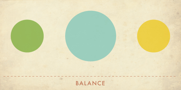
- Balance – Distribution of the visual weight of objects, colors, texture, and space. If the design was a scale, these elements should be balanced to make a design feel stable. In symmetrical balance, the elements used on one side of the design are similar to those on the other side; in asymmetrical balance, the sides are different but still look balanced. In radial balance, the elements are arranged around a central point and may be similar.
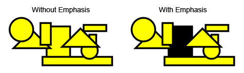
- Emphasis – Part of the design that catches the viewer’s attention. Usually the artist will make one area stand out by contrasting it with other areas. The area could be different in size, color, texture, shape, etc.
- Movement – Where the viewer’s eye follows through the work of art, often to focal areas. Such movement can be directed along lines, edges, shape, and color within the work of art.
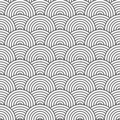
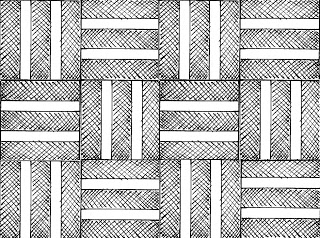
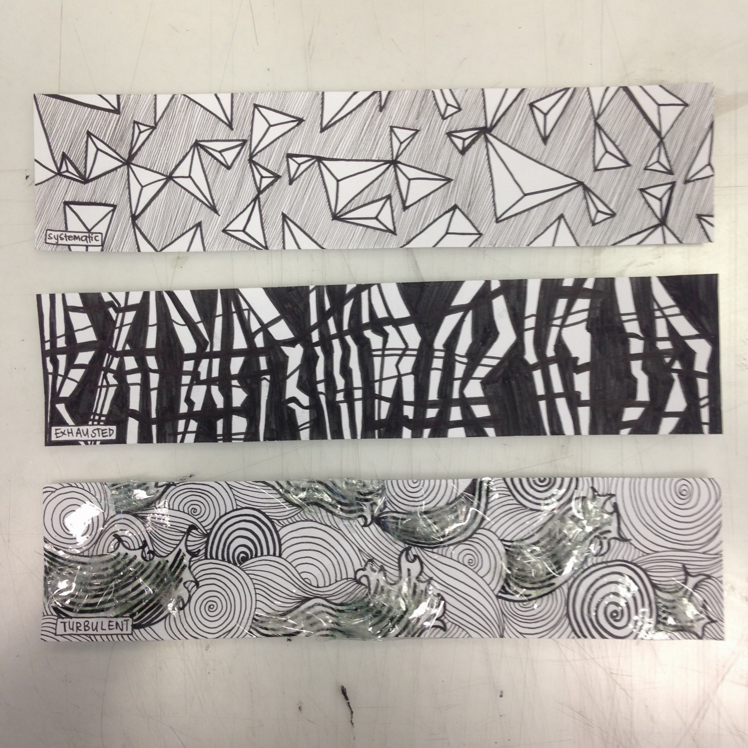
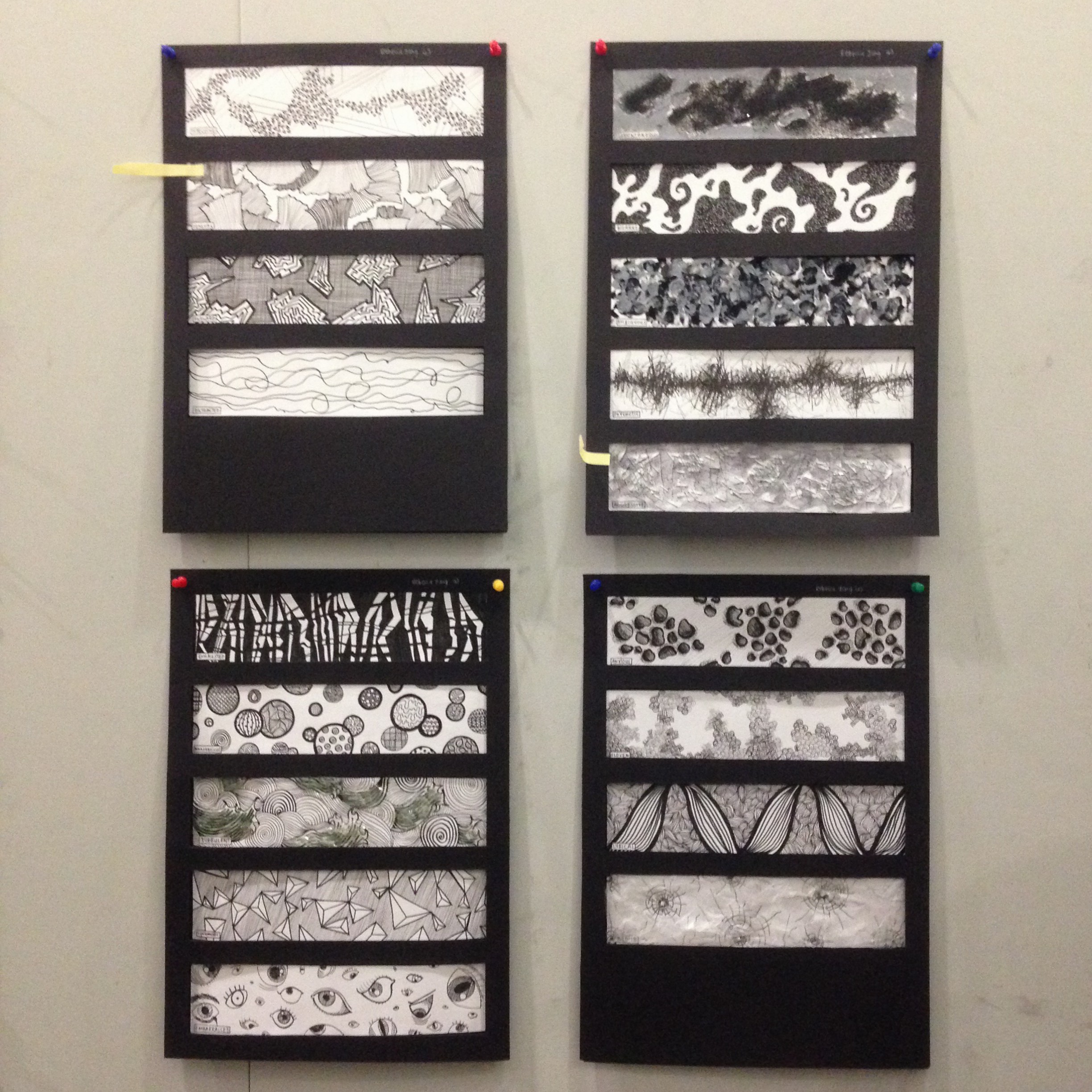
- Pattern – Repeating of an object or symbol all over the work of art.
- Repetition – Works with pattern to make the work of art seem active. The repetition of elements of design creates unity within the work of art
- Proportion – Feeling of unity created when all parts (sizes, amounts, or number) relate well with each other. When drawing the human figure, proportion can refer to the size of the head compared to the rest of the body
- Rhythm – Created when one or more elements of design are used repeatedly to create a feeling of organized movement. Rhythm creates a mood music or dancing. To keep rhythm exciting and active, variety is essential.
- Variety – Use of several elements of design to hold the viewer’s attention and to guide the viewer’s eye through and around the work of art.
- Unity – Feeling of harmony between all parts of the work of art, which creates a sense of completeness.
I realised that personally, I enjoy using emphasis, movement, repetition and rhythm in my finalised art works. In addition, I feel that the rule of thirds plays a major role in the way I design, as I lean towards placing my subject on corners of the image, rather than in the centre.
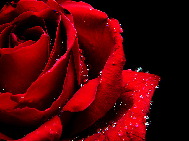
I also enjoy working with different images and adjusting the proportion, size and perspective to create textures. I think that textures in the background can add a lot of information about the art work. A clean background gives the design a sleek and cool look, while a textured background can relay to the viewer that the image is cluttered or quaint, depending on how it is structured.
Confirmed designs:
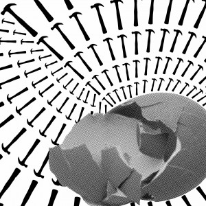
Couldn’t put Humpty together again
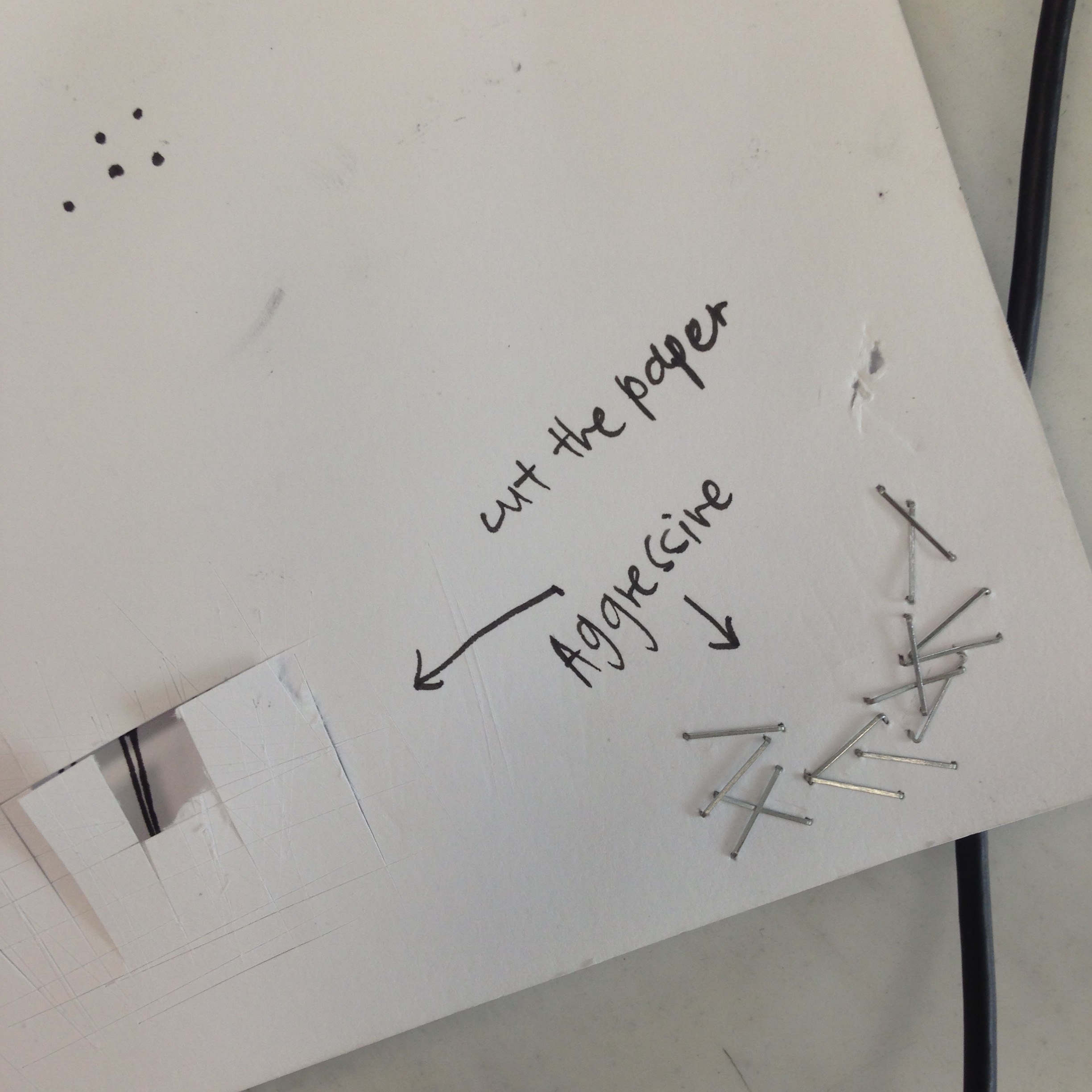
Used repeated hammers to form a rhythmic background. Played around with the size and direction of hammers to make it even more vibrant and interesting, as if the background was an optical illusion. Placed a large foreground image on the right side, bottom half of the image to follow rule of thirds, and chose a different type of image in order to allow it to stand out and pop out at the viewer.
I thought it would be interesting to use hammers, as it would provide a sort of irony that would not be too direct for viewers to pick up immediately. Hammers are typically associated with negative emotions, such as rage, leading to the destruction of things. But hammers can also be used for good purposes, for example, nails are effective in hanging items up because hammers make it an efficient process.
In this way, the king’s horses and men who attempted placing Humpty Dumpty together again could have tried assembling him with pure intentions, but made the situation worse with the use of a wrong tool.

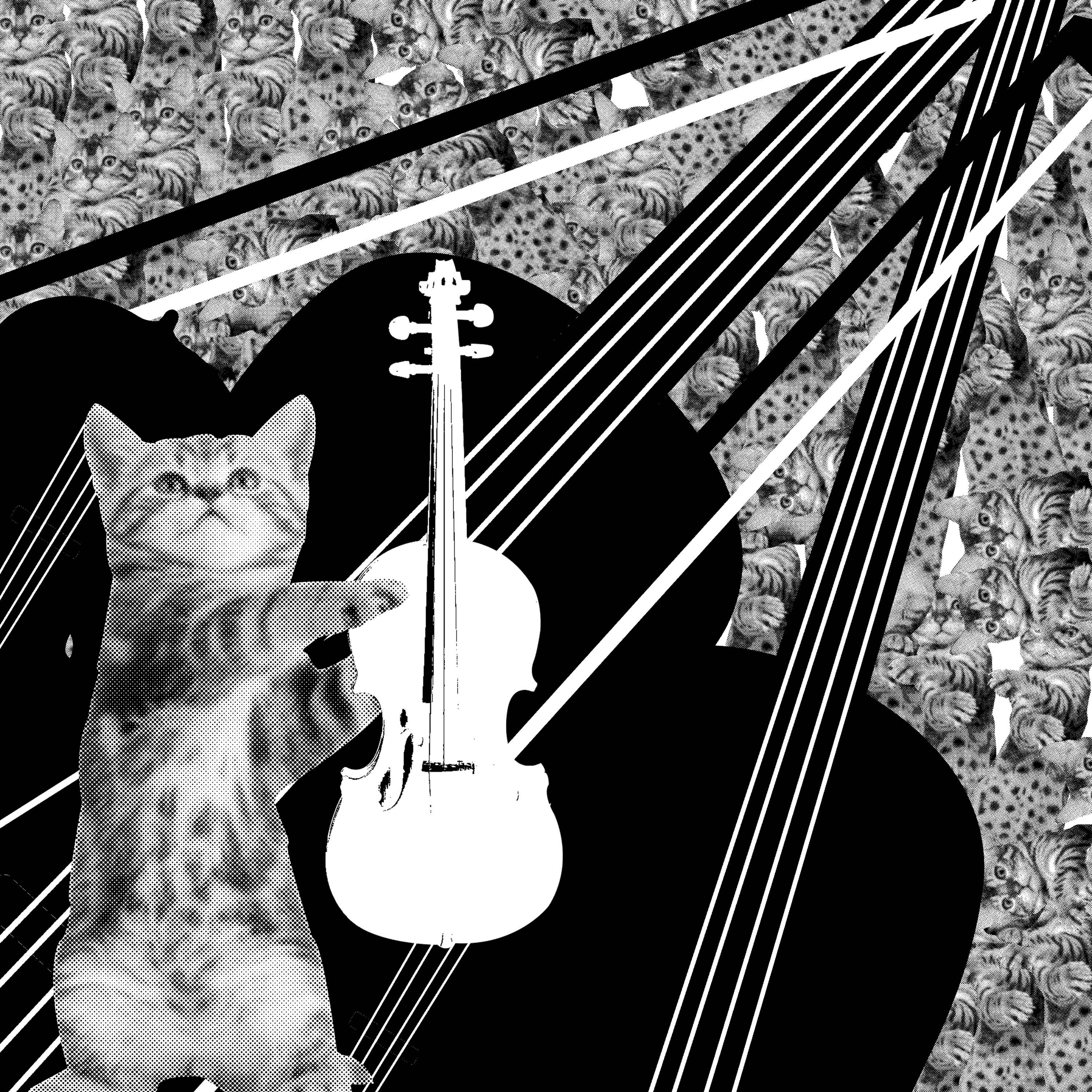
Hey Diddle Diddle the Cat and the Fiddle
Used a variety of leading lines (thick white/black and thin white lines) to bring the viewer’s eyes to the cat in the foreground. The lines are actually made up of many fiddles, as I used the bridge area, because I felt the shape and lines were fascinating. I liked that there was a variety of different lines to switch things up, as it made the leading lines more wholesome and dynamic.
I also switched the colour of the fiddle in the foreground to white, so that it stands out from the black that outlines the cat in the foreground.
I like the elaborate design of the cats in the background, as I found it served to act as an additional texture for the art work, without being too forthcoming or commanding of the viewer’s attention.

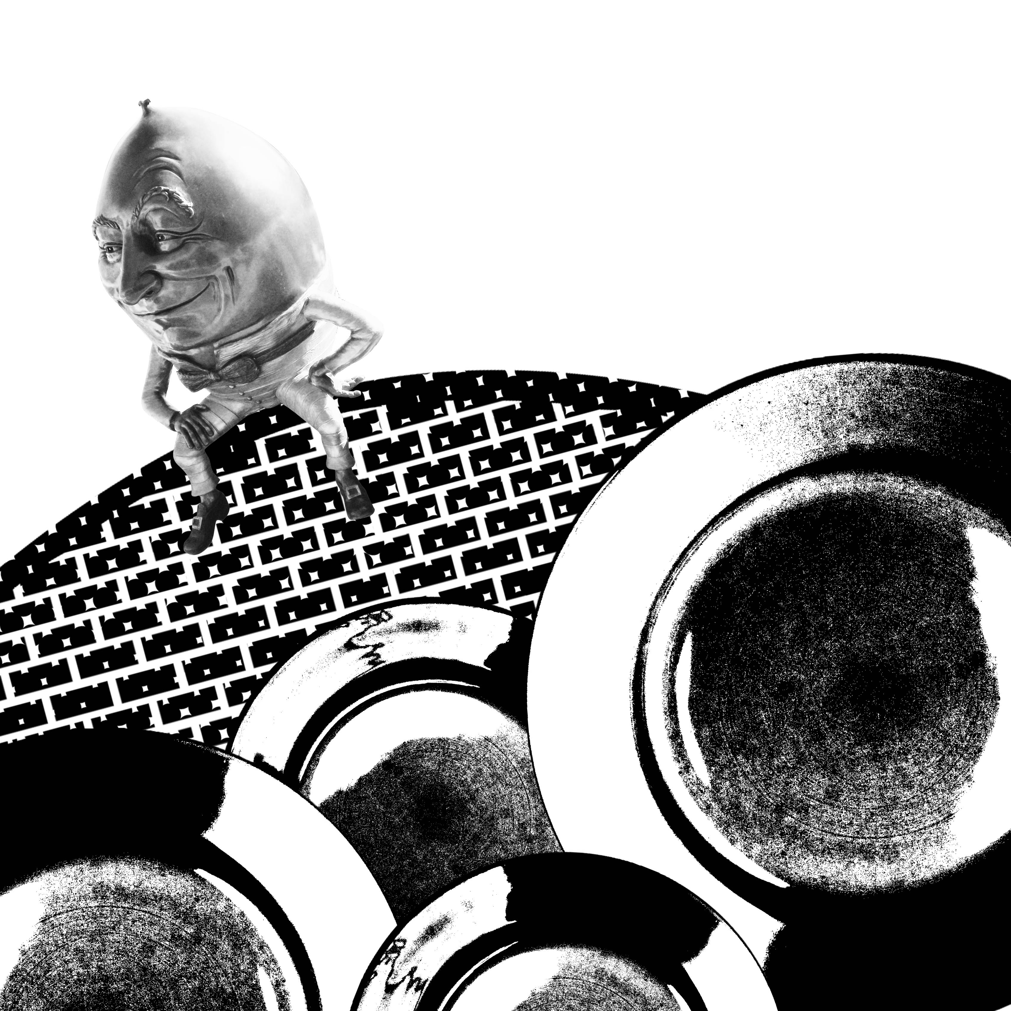
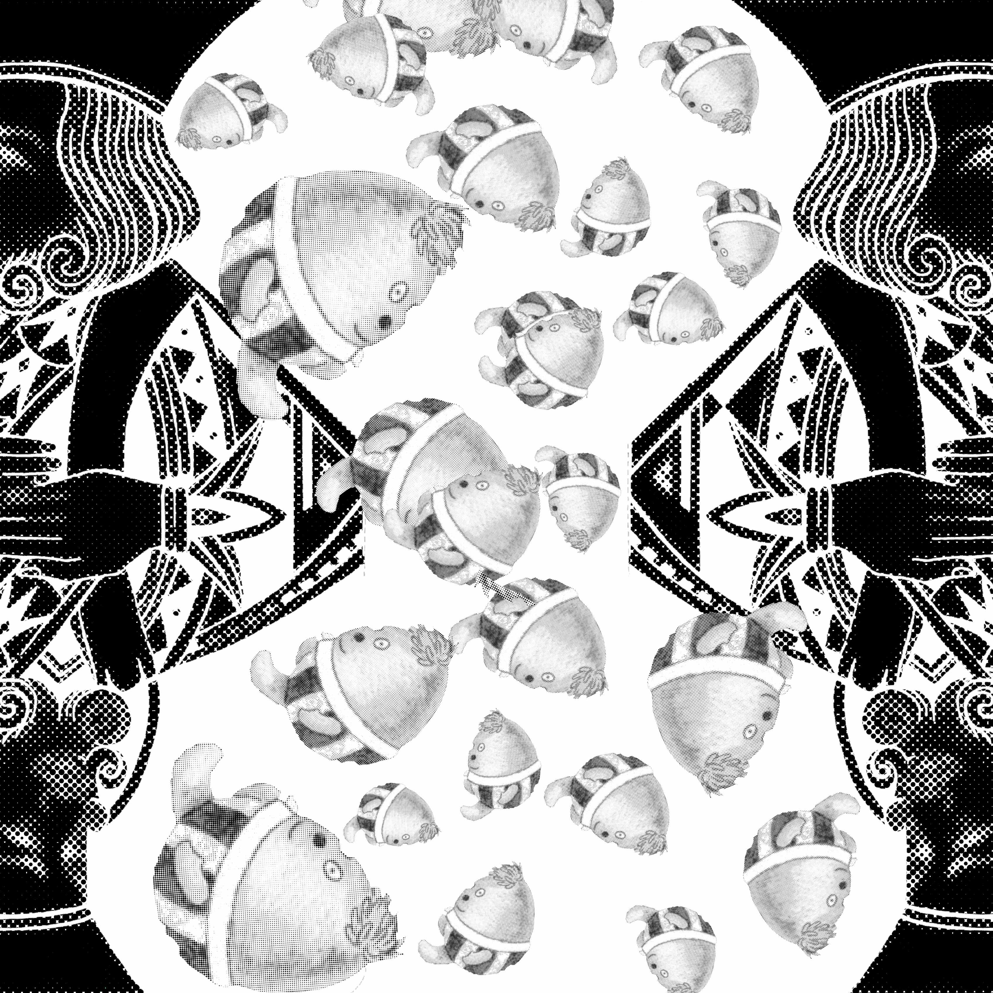
Humpty Dumpty sat on the wall
Rotated and used the same plates but different perspectives to represent the foreground. I found it engaging that the plates reminded me of moving gears, hence the wall which Humpty Dumpty is sitting on is tilted, representing that it is unstable and about to crumble due to the gears in front.
This is because no where in the rhyme mentioned the reason explained the next line – Humpty Dumpty had a great fall. It is unclear why he had fallen, whether he had slipped or someone had pushed him, etc, and the reason is left up to interpretation. I decided to go with the explanation that it was because the wall began slanting diagonally, and hence used the plates. When gears turn, something else typically is affected and moves with it. In this case, I wanted to capture movement, and represent that the wall tipped over, causing Humpty Dumpty to fall.
The largest plate is on the bottom right side of the image, so I wanted to balance it out by placing Humpty Dumpty on the top left hand side.
Additionally, I liked that the wall had a contrast of black with white spots, to make it a more interesting composition.

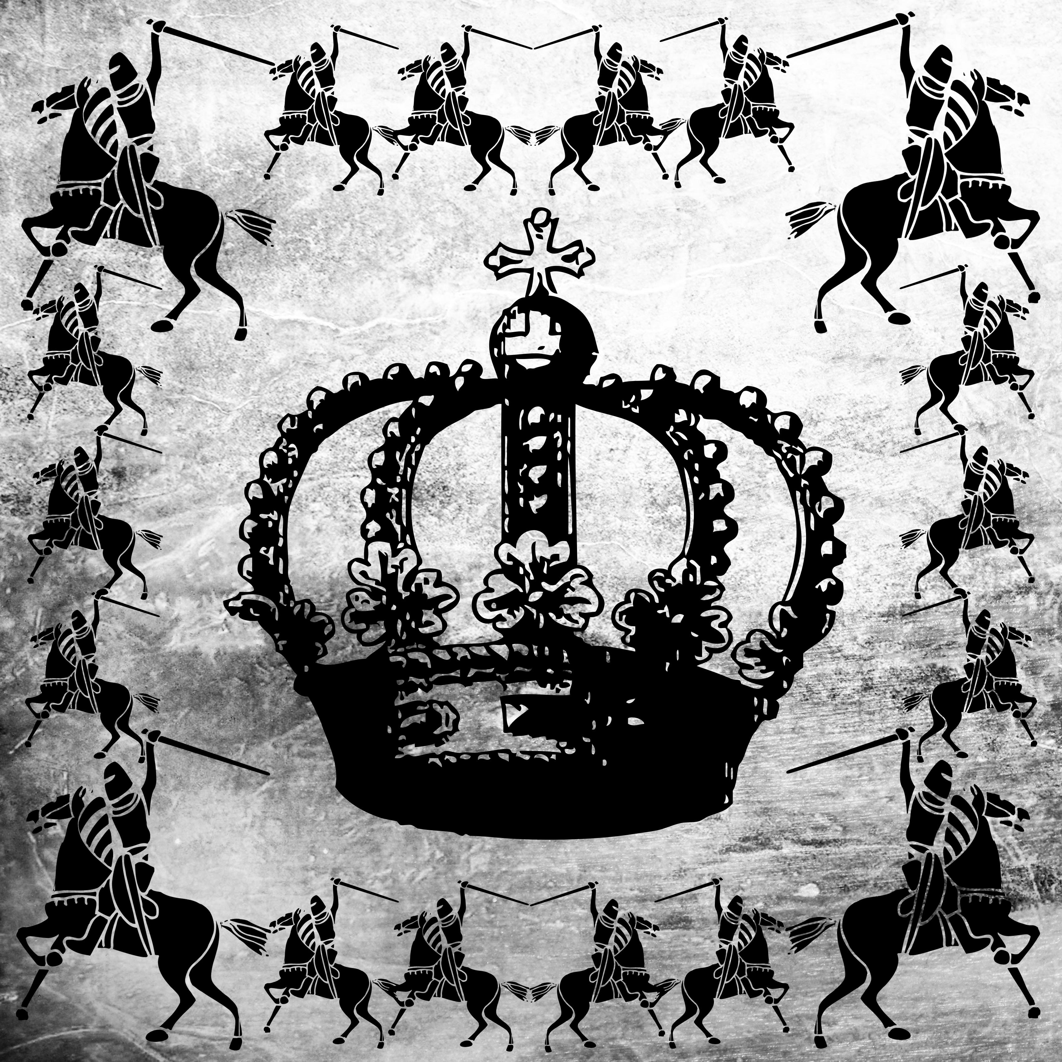
Humpty Dumpty had a great fall
Used two of the same images at the left and right side, in order to frame, as well as create symmetry throughout the image. I thought that the shape formed in the middle using the two images at the side made a bold and lively outline, as it is not a typical shape seen. It reminded me of an hourglass, which leads to the fact that time runs out, and it is especially seen in hourglasses, as they act as timers.
The line ‘Humpty Dumpty had a great fall’, to me, is related to death, as following the rhyme, he was not able to be revived by the king’s horses and men. I felt that the shape of an hourglass was apt, as it embodied that he was running out of time to live.
Also repeated the same image of Humpty Dumpty in the centre to act as a focus, so that the viewer would notice that at first glance. Played around with the direction and size of Humpty Dumpty to create variety, and portray the falling, tumbling effect.
Other designs:
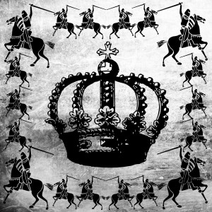
All the king’s horses and all the king’s men

All the king’s horses and all the king’s men
I felt that these two images were too flat, with not enough detail on foreground, background, emphasis, movement and rhythm. Although the both encompass repetition, I discovered that it was still lacking in some aspects to use just one principle of design. It would not captivate viewers, and therefore, did not choose them.


