Exhibition Visit @ NTU CCA

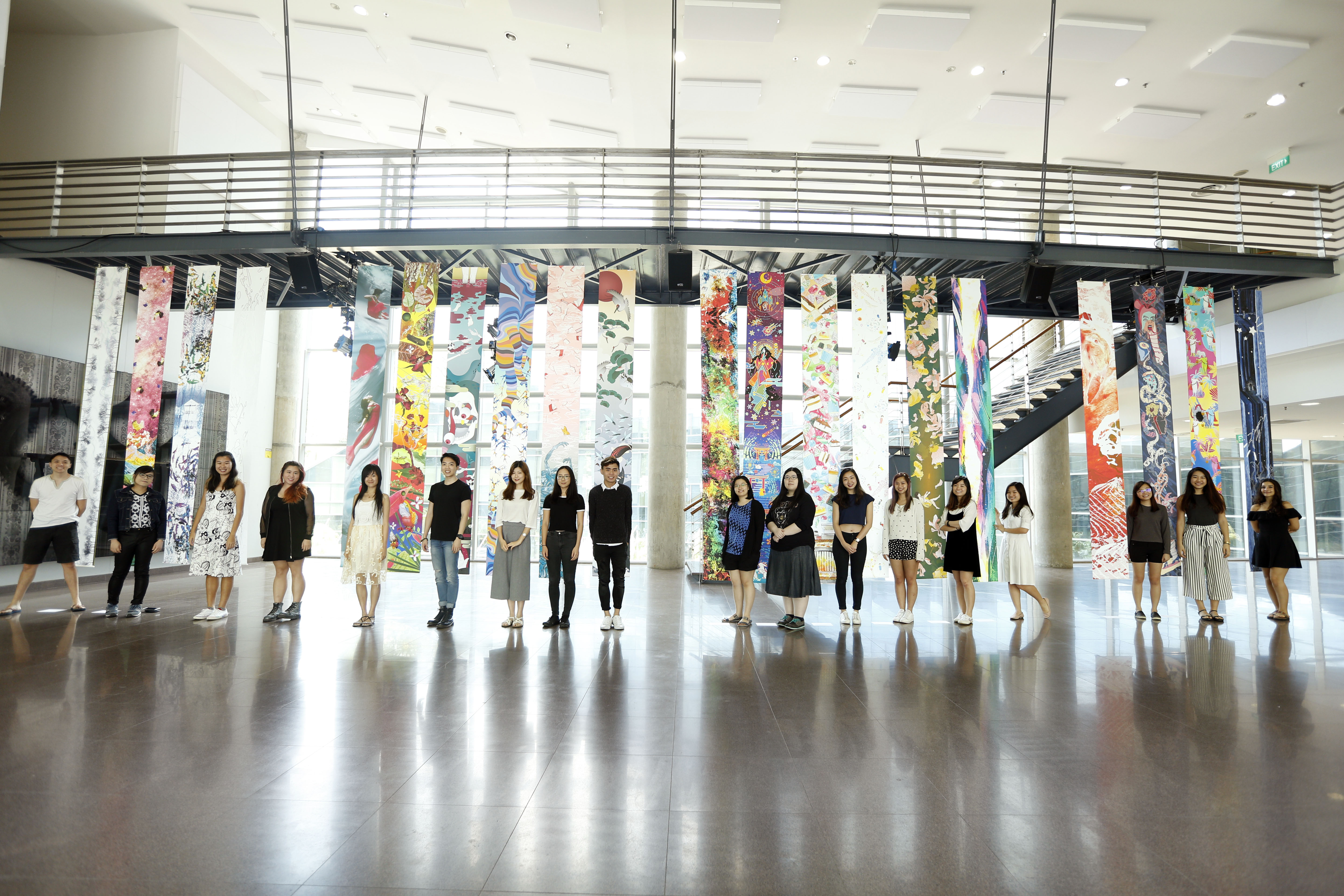
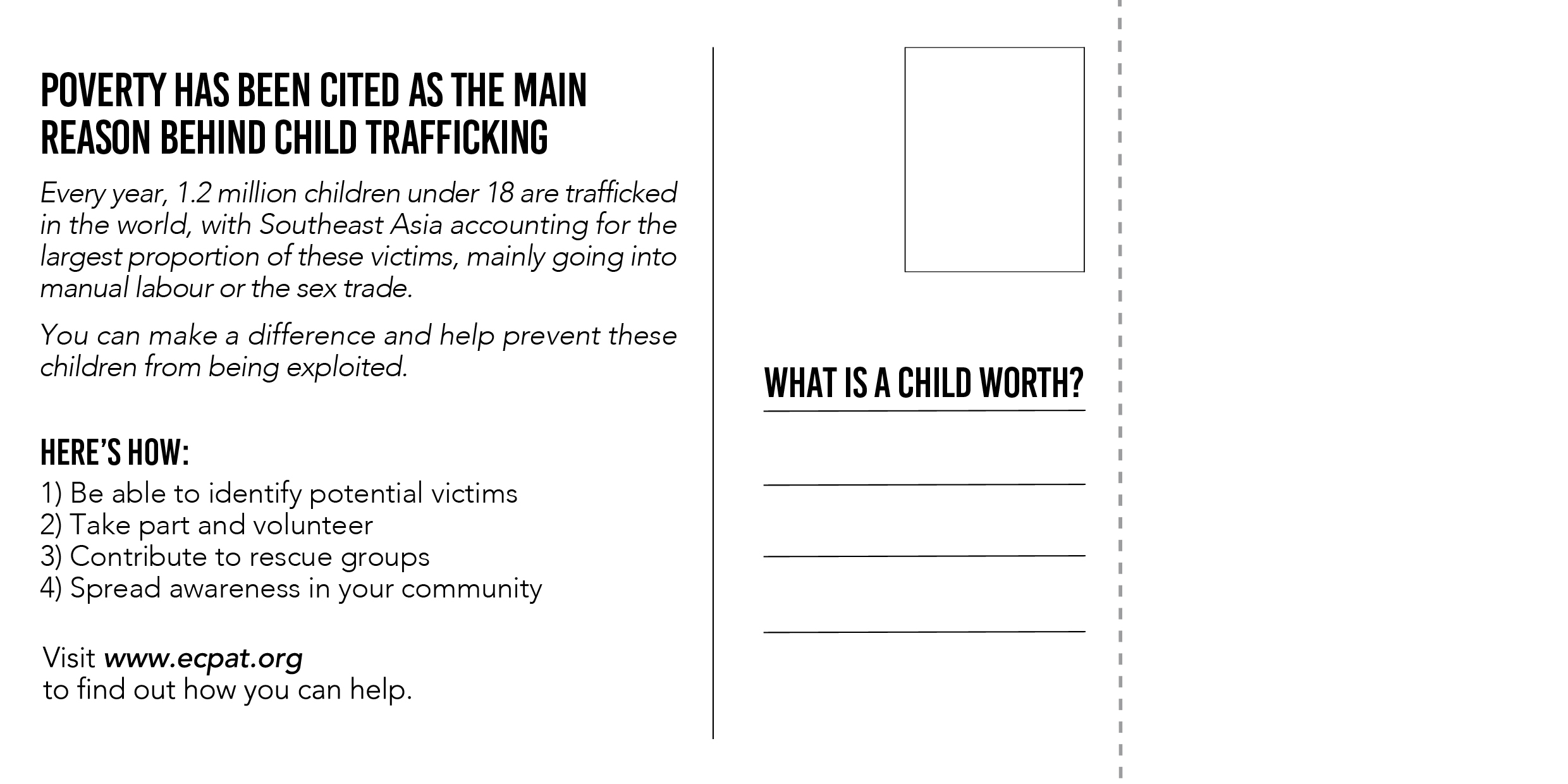
The Oceanic at NTU Centre for Contemporary Art Singapore

The second time I went to The Oceanic exhibition during Singapore Art Week was very beneficial as it allowed me to better understand the work there. I feel that the amount of projects exhibited were just right; just enough for one to digest and think about without being overwhelmed.

I also felt that the work was intriguing because there wasn’t much information displayed in the exhibition (aside from the brochures/handouts) that would skewer the audience’s perspective of the work. I liked that this gave us room to think about the work without being too direct.

1) Tue Greenfort, Tamoya Ohboya, 2017

In this work, jellyfish were taken from their natural habitat and placed in a glass tank with filters and equipment beneath the tank, designed to aid in replicating the natural environment that the jellyfishes were from.

I found this work to be one of the most interesting ones I have seen, as it raised many questions:

  1. What would happen to the jellyfishes after the exhibition? Would they be thrown away or returned to their original place?
  2. Are the jellyfishes that are in the tank the same ones that have been there since the start of the exhibition or have their been changed/died?
  3. In the case that some jellyfishes have died (a few looked to me as though they were floating lifelessly), is it right to use living organisms for art even though there is a possibility of their impending death?
  4. Given the fact that some of the jellyfishes are still alive, does this mean that it is possible to create a falsely constructed home for them where they feel comfortable?

It then made me question the notion of survival and reality. Like these jellyfishes, perhaps there is no such thing as a natural habitat for us humans anymore, as we perpetually eradicate our natural environment to develop new buildings and machinery. Our reality is what we know now, in a modern, urban setting, and we accept this to be what we perceive, because living creatures like ourselves and the jellyfish are adaptable to our surroundings. But how long can humanity survive for?

2) Laura Anderson Barbata, Ocean Calling, 2017

Ocean Calling at NTU CCA was a series of impressive life sized costumes designed by the artist for a performance that took place prior to when I visited the exhibition. The work addressed the relationship between the ocean and the communities that live within close proximity.

I personally felt that I had many questions to ask the artist regarding the process. How long would an artist have to stay around the focus area of the work to fully understand and experience the life, traditions and culture of the people so as to not misaddress or misrepresent any part of the community?

In recent years, there have been many issues of appropriation surfacing in society, whereby people are becoming more outspoken about the topic of people from other cultures taking and using parts another culture, and using it for their own means and benefits. This is an interesting subject to think about because it isn’t something that will ‘go away’ in the future, as modernisation has made it easy for the transfer of information, cultures and practices across the world.

As artists, we always create work that we can relate to or we feel strongly about, and this could cross over to cultures that are not our own. What exactly is appropriation and where do we draw the line?

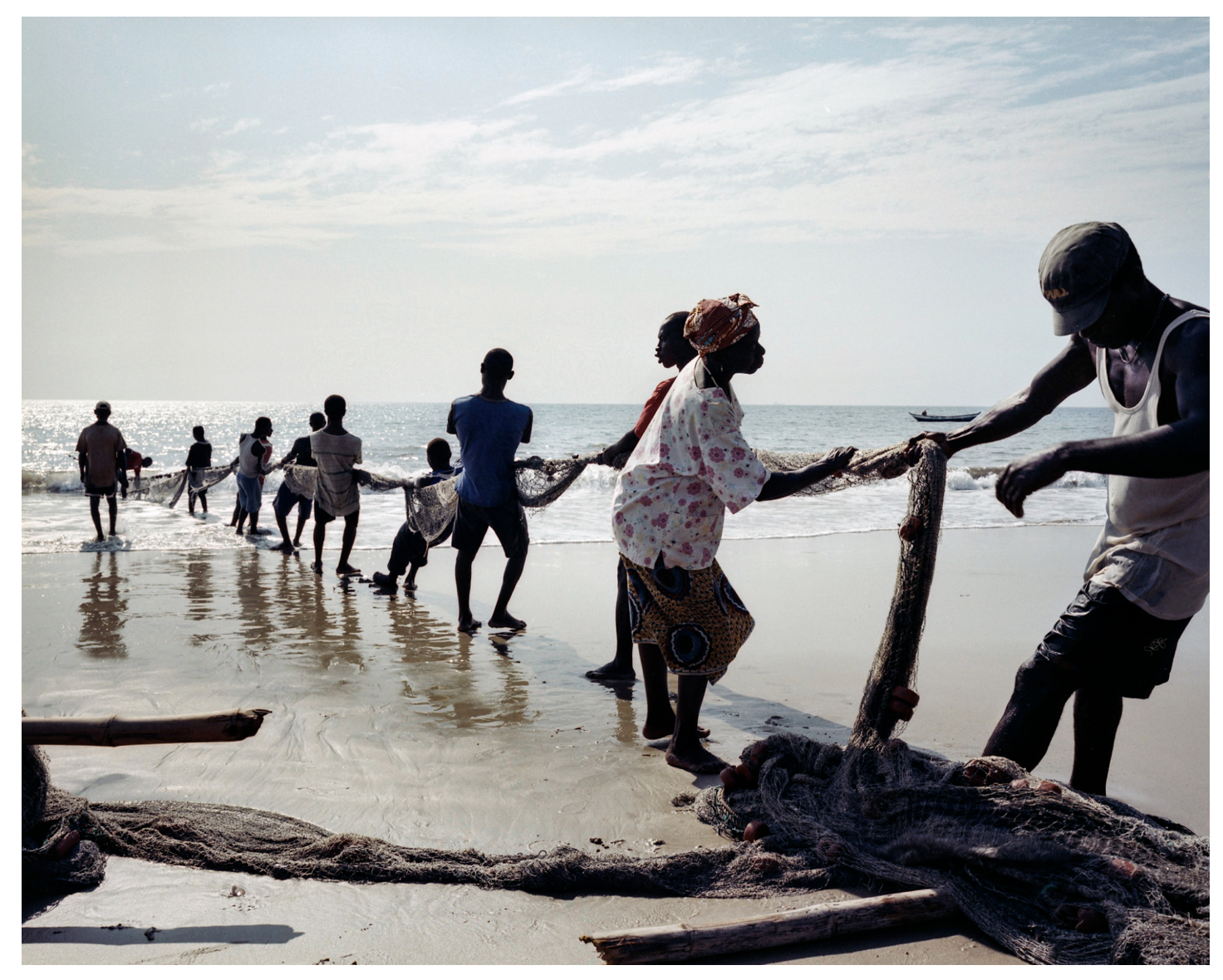
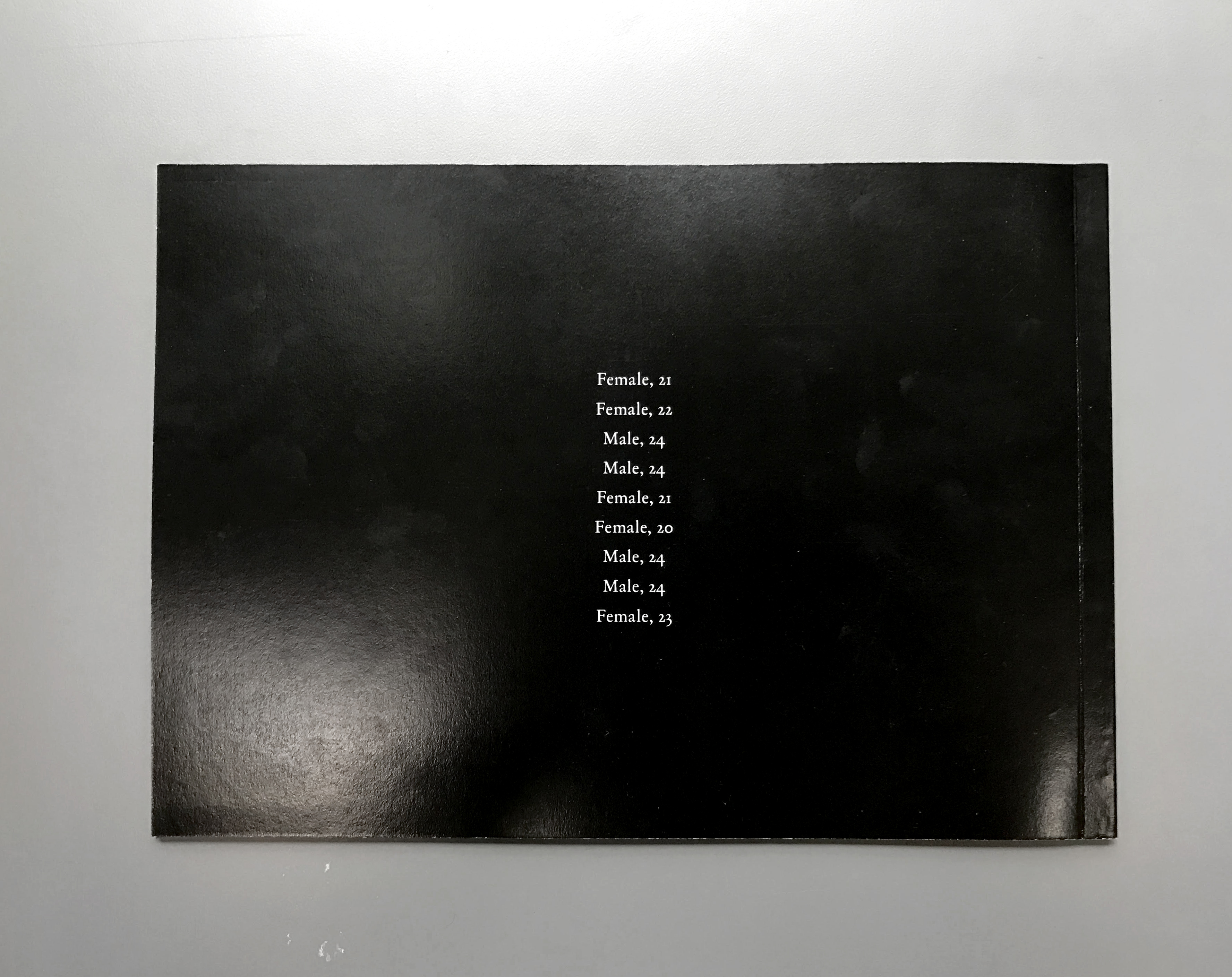
3) Newell Harry, (Untitled) Nimoa and Me: Kiriwina Notes, 2015 – 2016

I thought that out of all the works exhibited at NTU CCA, this had the most relation to this module, in terms of medium and the way it is presented. A series of black and white documentary photographs are displayed, with very snap and go kind of aesthetic of the people in the community living their daily lives.

I felt the whole series was very captivating because as a member of the audience, I did feel as though I was drawn to the beautiful photographs, and it gave me a glimpse of life as a local there. Even though the photos were in black and white, they were very descriptive and rich in information.

Aside from that, I also wondered how the artist decided to use text under certain photographs in the series. By ‘how’, I mean how did he decide which photographs he wanted to incorporate text into, and which could stand alone. There was no pattern to which photographs had text and which did not, and it almost appeared randomly placed. I think the text did change the experience for me, because it was certainly useful in giving me some background information about what was going on in some of the photographs.

Presentation Schedule

Norah – Narrative Structure (20/9/2017)

Rebecca – Timelaspe (20/9/2017)

Clara – Sound and Image (27/9/2017)

Donn – Still Images as a Movie & The Power of Editing (27/9/2017)

Han Feng – The Power of Editing (Battleship Potemkin) (4/10/2017)

Fitri –  Moving the Camera or the Object (Vertigo, Hitchcock) (4/10/2017)

Xuedi – Composition and Colour (11/10/2017)

How Sweet

Hey everyone! This post will summarize very briefly what we’ve been doing for the entire semester, and display the final works for the banner as well as the media wall.


—–

     “It was now three mornings since they had left their father’s house. They began to walk again, but they always came deeper into the forest, and if help did not come soon, they must die of hunger and weariness. When it was mid-day, they saw a beautiful snow-white bird sitting on a bough, which sang so delightfully that they stood still and listened to it. And when its song was over, it spread its wings and flew away before them, and they followed it until they reached a little house, on the roof of which it alighted. And when they approached the little house they saw that it was built of bread and covered with cakes, but that the windows were of clear sugar.”

 – Hansel & Gretel, 1812, Brothers Grimm

—–


BANNER

How Sweet, 2017, Mixed Media, 3560mm x 420mm

Digital
Test for brightness & saturation: Left – original Middle – +15% brightness, +15% saturation Right – +30% brightness, +30% saturation
Printed Out

MEDIA WALL ANIMATION

How Sweet, 2017, Animation, 3860 x 480 pixels

FINAL STILL – 1
FINAL STILL – 2
FINAL STILL – 3

Final Updated Media Wall Animation

Hello! So I’ve reviewed the first video I made after advice from Ina, and I’ve made the speed significantly slower (about 40% to 50% of the speed of the previous animation). In addition, the video has been extended from 30 seconds to 3 minutes.

Please find the new video below!

Just in case that doesn’t work, the link is: https://vimeo.com/215605189

(:

Printing Process & Final Hardcopy

Hello! So this post will conclude the semester of Text & Image, and it was fun, especially rewarding seeing the final product after everything was printed and bound. So this post will address the printing situation and process while putting the hardcopy photo book together.

I printed my book at Sunshine Plaza, and visited three printing shops in total. The first was to print the inner pages of the book, the second to print the cover and back of the book, and the third to bind. This is because the shops all offered different services and paper and sizes, and it was rather difficult finding a particular shop that could provide everything I wanted.

Firstly, I did up my files on InDesign, and then exported as PDF to print. I also had soft copies of the JPEGS, PDFs and Photoshop files for printing, just in case things needed editing or shapes only accepted one file type. I find that it’s useful to over prepare for printing because…things will go wrong (somehow!).

The first shop I went to, I chose to print the inner pages on 190gsm glossy paper to achieve the photo book kind of look and feel. I also printed my transparencies there, and bumped into an issue whereby the scratch marks on the transparencies could not be seen because they were white. I had to change them to black instead to get the ink to show on the transparencies, which was actually ok because I felt the black suited the theme of the book and the cover page, as white would be more stark and may have looked out of place. Another issue was that the colours showed up nicely on my computer and the printing computer, but when they came out, all the photographs had a yellow cast to it, creating golden looking skin that wasn’t accurate, unfortunately.

The shop also did not have A2 paper. Because I wanted my book to be B5, I went to the second shop to print the cover. I needed A2 because I wanted perfect binding, and it would have to include printing space for the book spine in order to accurately fit the B5 size, so I couldn’t print the cover on simply A3. I chose B5 as I felt it was a nice size for a photo book, as A5 was too small and A4 would be too large. I also chose to design it horizontally longer in B5 instead of the usual longer vertical spine as I felt like the shape was nicer and flipping through felt more pleasing.

At the second shop, I printed my A2 cover, back and front in colour on 250gsm glossy paper. The printing quality was really good this time, and the colours turned out pretty accurate so I was really satisfied with it. But that’s also because it was at a really exorbitant price. You really get what you pay for!

Because the first two shops did not have perfect binding services, I went to the third shop to get it done. I also realised given that this is my first time printing a book of this thickness (20 pages), I should always export the document properly so it’s easier to cut and bind. I had crop marks but no bleed, so in the future I’ll definitely remember this. Thankfully, the binding turned out well! The spine was scored well and allowed for easy flipping through the pages.

So that was my printing journey! And I’m quite happy with the end result, except the colour for the inner pages, so I may get it reprinted. Here are some photos of the hardcopy!

Media Wall – Progress & FINAL

Hello! For the media wall, I started off by wanting to animate the motifs in a way that made them fall off the screen in a haphazard way, to add on to the colour and chaos in my project, so I came up with these designs for testing.

These three jpegs are designed in a way to be viewed from 1 to 2 and then to 3, so it would look like a sequence and structured falling of the motifs. It was to be arranged such that the streaks of colour would fall down like paint, like it was dripping, and then the cakes and sweets would follow after that. To achieve this, I started anew on Photoshop, using my motifs that I had drawn out in the beginning. I also created a new version of the paint splashes, as the previous one for the banner was more explosive in nature, but this one was more slow moving in a downward motion.

Initial Design – Media Wall 1
Initial Design – Media Wall 2
Initial Design – Media Wall 3

However, after testing it out at the media wall, I decided to go for something less colourful and vibrant, and instead create something simpler. This is because I found that the scale of the media wall, being very huge and wide, made it difficult for a viewer to take in the whole design, and it made the whole thing rather messy instead. The colours were also a lot more vibrant on the media wall, which I found to be slightly distracting, because of the clash of colours from the background (paint) and the foreground (the motif desserts).

So, I came up with a plain white background instead, and spread out the motifs more so that it would look evenly spread, instead of being too top heavy.

Below are my new designs – there are 3 jpeg stills taken from the final 30 seconds animation. I did the animation using two softwares, Premiere Pro and After Effects. I wanted to keep up the motion and movement of the falling motifs, but at the same time, minimise the distraction. If you compare the 3 jpegs, each of them have a different arrangement of the motifs, because the cakes are continually rotating and spinning.

FINAL STILL – 1
FINAL STILL – 2
FINAL STILL – 3

Final Project – What Is A Child Worth?

For this project, I chose to focus on the topic of child trafficking in Southeast Asia. Child trafficking is a serious and poignant subject to delve into, and it was not very pleasant digging through sources and sources for information because there were many things that were quite terrible stories and facts that I came across, but when choosing the topic for our final, I knew instantly that I wanted to do this because I felt it was something that was sort of taboo to talk about in society and that made it something that wasn’t usually broached. Also, I felt that just because it was not as common in Singapore as it is overseas, it was still something that needed more coverage. 

I began by asking around my peers, to try to see what information they knew about child trafficking. However, time after time, the answer would be the same – vague. I also asked what would really leave an impact on them if they were to be told about the subject, and they mostly said if it were people they know that it happened to, or people they knew who told them about it, and one common answer was the survival stories of victims.

Therefore, I came up with the idea of a way to mail out postcards to people we know, as a method of spreading information and awareness. Each postcard would be unique, with a bit of information that I thought was not nearly known as well, and was shocking. I also found organisations online that helped prevent child trafficking and assisted children who were saved, and thought that it would be good to incorporate ways and a platform the postcard receiver could get in touch with and help. So each postcard also has a link to a different organisation. The postcard could be torn off a booklet that can be kept for yourself, so the person reading it would always have access to information and a list of organisations as well.

Here are some pages of the softcopies:


After that, to tie the whole project together, I created a monthly newsletter that would be mailed either physically or online to people who have helped in any way, whether they volunteered or donated, etc. This would allow them to see how their efforts have contributed to the organisation working against child trafficking, so it would provide some encouragement to show that their efforts were not in vain. 

I chose to ‘partner’ Urban Light, an organisation working in Thailand, and came up with newsletters for the months of January and February 2017 as examples. Some of the information I found on the Urban Light website, some I adapted, and others are based on information from other sites.

Here are some photos from the exhibition! These show the final outcome of this project after printing.