I went with a marble abstract pattern as the background to show the makeup is resting on the table. Also when I do my makeup I have this cool small marble top I lay my makeup on. Adding the marble gives the work personalised touch I feel.
F A S H I O N D E S I G N E R
I decided to use a simple recurring pattern as the background. I felt that the cloth folds I used in my process was too much, and took the attention away from the main subjects.
L O G O D E S I G N E R
Final design for my logo. Added a circle border to make it look more sophisticated.
This is probably my favourite one out of the 4 because I have a whole lot of old makeup and I also loveeee playing with makeup.
I first started by aligning the tools and creating a composition with them on photoshop.
Then I went on to illustrator and traced it out.But after completing the tracing I didn’t really like the technical and clean cut outcome. Everything was too neat and I didn’t fancy that because doing makeup shouldn’t be neat!!! It’s a fun and messy process. So I decided to try photography.
I played around with makeup, tried out different strokes and colour tests.
Link below to videos of me experimenting with makeup tools!! Please switch on your volume because it sounds relaxing HAHA:
I then edited them in photoshop, placed some more makeup along the borders to create a ‘frame’.
It looked a little off and it might be because of the plain background, and wayyy too many things to look at.
F A S H I O N D E S I G N E R :
I thought of sewing at first but then I didn’t want to focus on the sewing aspect of the job. I wanted to show the process of designing and drawing out the designs.
Sorted out a composition on photoshop first to make ‘ANA’
Traced out and coloured the image on illustrator:
I wanted a light-washed watercolour and sketchy effect similar to the references. I also tried different backgrounds:
L O G O D E S I G N E R
I decided I want to make minimalist logos for my name. Came up with different designs:
This looked like ‘Fatz’ instead of ‘Farz’. Scraping that and tried going for ‘Faz’ instead.
I didn’t like that there were too many different alphabets in my name. SO I went with ‘ANA’. I want to have some recurring motifs (2 A’s) thus the change of name.
Too simple.
Still not feeling it.
I also tried inverting the colours to see which one works better.
Ok definitely better and at least I get the logo feels from this final design.
Artist (watercolorist)
I decided to focus on one medium as an artist— Watercolour!! I love painting in watercolour because its very therapeutic and fast. I started with colour schemes first:
After which I scanned in my watercolour splashes and created some background colour:
I used the font lucky turns because I also liked doing brush lettering, especially with watercolour.
I liked the second one, but it felt like a normal brush letter design. So I used illustrator pen tool to make a paintbrush, to show myself as an artist who paints.
Before I first started I actually had a lot of occupations I knew I was interested to explore. But as I go deeper into this project, it wasn’t as easy as it seems. So I cut out a lot of my options, and infact changed lot of my occupations even when I was halfway doing them, because ART BLOCK!!! 🙁 yes sadly I did waste a lot of time
Below are the finalised ones:
Makeup Artist
Logo Designer
Fashion Designer
Artist
I kept changing the medium halfway too because I couldn’t decide.
For makeup artist I went to explore the different types of tools I could somehow use to make alphabets:
:
For Logo Designer I googled some logos for inspiration. I am quite smitten(lol) by cool minimalist B&W logos sooo yep my final work will be something similar.
Fashion Designer reference:
For Artist, I’m using Monet’s works as reference because I love his works so much.
Initially I planned to draw and colour using comic markers. And I did halfway, only to realise how tiring and time consuming it was.
So I did the sleeping beauty and Snow White in copic, and the rest are digitally coloured:
Snow White:
“I have quite a potential, but if I find an easier alternative, I’d rather do it that way.”
This was coloured with copic markers
I completed the rest of the panels.
Sleeping beauty:
“I am hardworking, but if given the opportunity, I’d rather not be.”
Cinderella:
“I complain a lot, but at family gatherings, I shut up.”
Cinderella was the most morbid strip cause the mouse was forcefully stuffed into her mouth to ‘shut herself up’. Initially I just wanted cinderella to bow her head down and mop the floor quietly— but that was too normal.
3 Little Pigs:
“I always give my best, but if I face hardship, I crumble.”
Coloured on photoshop
Background:
From the start, I knew I wanted to have soft, pastel watercolour backgrounds. So I collected these from google.
At first I tried square backgrounds.
But I felt like they were too plain. So I tried circles, which were more messier and playful. Also, the squares looked too constricted and ordered. Didn’t like that.
I love love love childhood stories and Disney princess movies so I decided to work on them in this third project. Of course, to make it less boring, my story plots will come end with a twist.
I worked backwards: I listed down my personalities/reactions and situations first and then thought about the suitable characters. So I came up with these characters:
At the start I had trouble even solidifying any concrete ideas, so I broke down my quotes and focused on the main words (IN BOLD). Then I brainstormed what would best represent them.
To you I am nothing more than a fox like a hundred thousand other foxes.
Nothing: Black backdrop, Empty bottle/Jar/Wine glass, empty hands
Fox: Fox head, Fox tail, Fox silhouette
Hundred thousand: literally lots of foxes in the background, water droplets
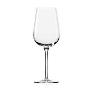
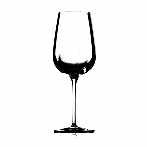
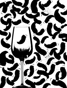
So I first tried the composition with an Empty Wine glass:
After threshold effect on Photoshop
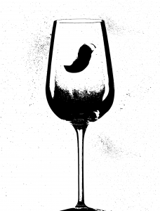
Added a fox tail:
Completed the background with lots of other foxtails:
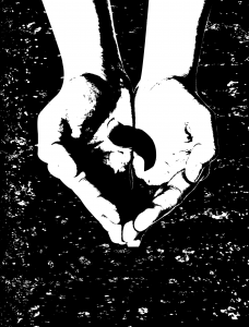
Hold on, this doesn’t seem right- it looks like shit let’s just scrap this. Maybe we should try hands.
Added Background and the fox tail:
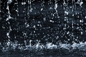
This time I tried using water droplets
Loved how it turned out, but when I think back about the quote, it doesn’t truly portray it. The quote “to you I am nothing more than a fox like a hundred thousand other foxes” is meant to be lonely and sad.
So (sadly), I scraped this idea too as the use of hands made it seem like they’re protecting the fox. Next, I tried an empty milk jar, but used the same background:
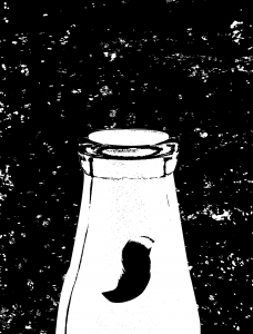
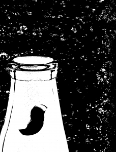
Again, it doesn’t feel quite right so I played around with composition and came up with a zoomed in one.
YES SO MUCH BETTER
OK so then I added in the fox tail:
I liked this concept so I tried a different composition:
Nah, let’s stick to the first one
In the end I stuck to the first one as it seems more lonely and the empty milk jar is placed at the centre of attention, really emphasising the ‘nothingness’.
2. What he now felt was the fear of his own oblivion. It was as though he did not exist.
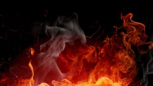
Fear: Zombies, Scary stuff, Blood, fire
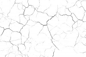
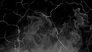
Oblivion: Black backdrop, Cracks
Did not exist: incomplete lines. faded lines, incomplete heart
I first went with a heart being engulfed by fire. It was quite lame and embarrassing but since we need to record our process down, here it is:
A big NO from me
This didn’t really portray the quote well so let’s move on.
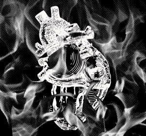
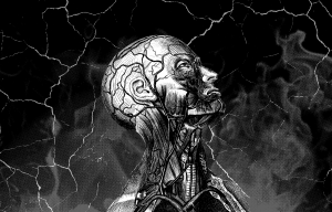
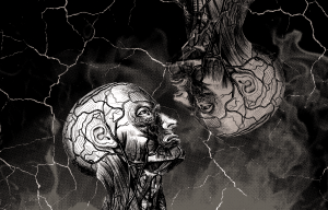
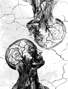
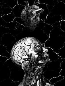
I found this top half of a man(sort of)…He looks scary and zombie-ish so I used him:
I combined a cracked background and a fiery smokey one for fun to see how it goes:
After combining them and changing it to Half-tone
Added the Zombie guy in:
Something from the quote was missing- his own oblivion. So I literally made a copy of him and made his copy ‘faded’.
There wasn’t much contrast so I chose a lighter background:
After that I was still wondering whether I could incorporate the heart somehow:
Preferred him literally staring at ‘himself’ as it looked cooler and its a more symbolic approach of staring at your own oblivion.
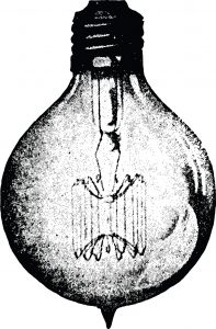
3. In that moment his whole disgust for mankind rose up again within him and completely soured his triumph.
Disgust: puking mouth, cracks
Mankind: Chess pieces, Tie
Triumph: Light bulb, Light
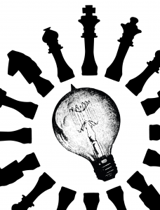
I imagine ‘mankind’ to be attacking the light bulb, circling it:
Combined the two:
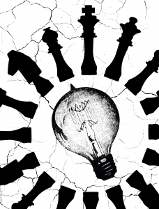
The background seems too plain to I tried adding cracks:
The chess pieces look like they are projecting away from the bulb, so I decided to collect individual chess symbols and arrange them myself. I also added in a tie to create a more interesting visual variety.
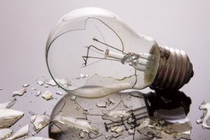
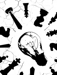
I figured using a broken light bulb will be better to project the ‘completely soured his triumph’ part.
After thresholding and a few arrangements:
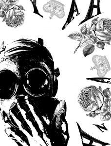
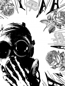
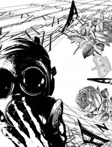
4. For people could close their eyes to greatness, to horrors, to beauty, and their ears to melodies or deceiving words.
Close their eyes: Mask, Hand over eye, Eyes closed
Greatness: Crown, King, Trophy
Beauty: Rose, flowers
Melodies or Deceiving words: Alphabets, Crooked lines, distorted musical symbols
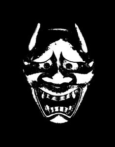
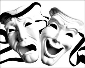
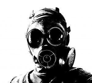
First googled and searched for masks I can use. Here are a few:
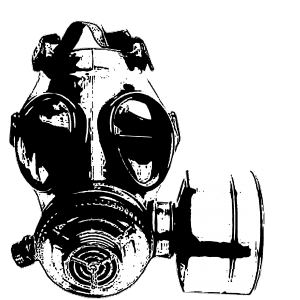
In the end I chose this mask:
The idea of using a gas mask instead of theatre or drama masks gives the idea that the ‘greatness, horrors, beauty, melodies and deceiving words’ are toxic and the character is forced to mask himself.
It’s more of a life and death situation, and not a choice, which is exactly how I want to project the quote.
I arranged the alphabets, flowers and crown in a way that there is a strong circular directional force, all going in toward the character.
The composition looked weird as the elements are very different and looked separated.
I thought it would look better with lines
I had a better idea, where I used distorted musical lines to ‘join’ the elements together:
The state of undergoing immense pain, distress or hardship.
If I were to visualise ‘suffering’ in my head, I’d picture sharp thin tangents intersecting and cutting through one other. Maybe there’d be splatters of blood too.
To get those ‘splatters’ in the middle of the strip, I used soap. From my experimenting, soap makes great dry brush texture.
The splatters also act as a ‘connecting’ medium that connects the two ends of the strip, so that the two masses of ink are not seen as separate.
To get the sharp tangents/lines, I use a pointed palette knife. I got some tears along the process.
Clumsy me accidentally ripped the right end of the paper off but I guess the effect pushed the definition of suffering even more HAHA.
So here are the close ups:
LONGING
Accumulated desire for someone or something.
Longing is a feeling that builds up over time, and with each passing day it grows stronger. Like flower petals, they grow and bud, only to be dispersed and face eternal disappointment in the end. I used dried baby breaths to create this.
Often used at weddings, Baby breaths symbolize everlasting love, pureness, and innocence. Ironically, I will be using it to portray marks of sadness and yearning.
I used the bunch of petals to create wispy lines.
As I approach the end of the strip, I apply more pressure so that the marks gradually get visually ‘heavier’.
To create the ‘spots’, I shake the bouquet vigorously and allow small splatters of ink to drop.
Close-ups:
DISGUST
Strong disapproval aroused by something unpleasant.
It’s a strong repulsive emotion but one gets used to it- over time it just disappears or fades. I used glue to get this effect.
Scooped glue onto paper and mixed ink with a palette knife.
Used the palette knife to even out the glue and create a ‘fade’ at the end. The glue dries glossy so the end product looks wet and ew (yay, disgusting!)
Close-up:
OPTIMISM
Viewing things in a positive or calm light.
Circles, round and enclosed, are comforting and suggest completeness. I cut up aluminium foil into different sizes of circles and pasted them on white paper. I chose aluminium due to its sheen and I like the fact that the aluminium reflects light off. It’s just really calming to stare at.
At first, I used black paper as I thought black would really bring out contrast and accentuate the shine of the foil. However, I find that black paper makes the work quite depressing so I switched to white.
Using an ‘open composition’ where some circles are cropped out of the frame. This creates a more fun and interesting composition.
Adding more circles to complete.
Close up:
SURPRISE
Unexpected and uncontrollable feeling, sudden without warning.
Nothing beats SURPRISE(!!!) like random splats of white against a black backdrop. The splatters extend out of the frame, without boundary or control. Compared to the other works, this technique was left to chance (I had to re-do the splats a lot of times because they didn’t turn out nice). I used string dipped in white ink to create this.
I used two bundles of string- one long and one short.
Short bundle of string
Short strings don’t really create a SPLAT effect, but more of a elaborate pattern. So, for the most part of the work, I used the long strings.
All I really did was a lot of flinging, so there’s nothing much to explain….So let the pictures do the talking-
The final product^
Close-ups:
NERVOUSNESS
Growing anxiety, aggravated over time.
I picture nervousness like countless tiny organisms building up and attacking your gut. Sometimes they combine and grow into big blotches of monsters and gnaw you from the inside.
I used string and ink to create this work. I did not fling the string like I did for ‘Surprise’.
Using less ink at the start, then more ink as I work along the strip to ‘build up’:
The sponge was the first material I used. The rough part of the sponge made more sketchy, thin and broken lines. They look a bit like dry brush effect.
Blotching the sponge on newsprint
The effect I got was more haphazard. Next, I tried the smoother side of the sponge. More of a bold, strong stroke as this side of the sponge was able to absorb more ink.
Strong diagonal bold stroke, as if there is upward movement
I also tried soaking the sponge into the container of ink, and then squeezing the sponge over the paper. This time, I diluted the ink with a little water.
The result was just black drips of ink. Nothing spectacular. I tried to make something more positive(?) and clean cut. I diluted the ink too.
I didn’t like the idea of it being faded so I used saturated ink next.
I prefer it saturated as it comes out bolder and more eye-catching.
Next, palette knife.
I used the sharp edges of the palette knife first and scraped it roughly onto the newsprint. Occasionally there were some tears on the newsprint but I liked the concept of the little tears. Again, the thin sketchy lines along with the tears gave a haphazard effect.
After which, I used the flatter side of the palette knife. A thick, bold straight line was created.
Next I dipped a piece of kook crunch into ink. It has a rough surface and it can’t absorb ink very well so I had trouble even creating ink marks on the newsprint.
So I let the koko crunch soak in the ink for a few minutes and tried again.
The ink came off richer and looked like a crayon effect. The kook crunch became way too soggy to even hold later on so I threw it away.
So I guess these ‘materials’ are more personal to me compared to the above daily items. I see the marks as ‘self-portraits’ as they’re products/results of my bodily parts. But whatever it is, I had fun!!!
The first thing I did was to play with hair. It was quite tricky as I only collected so little strands(mistake no.1), and it didn’t really leave any prominent marks. So I really dipped the whole bunch of hair into the tub of ink, to the point that there was too much ink to even create intricate ‘hair’ marks(mistake no. 2):
Too little strands 🙁Too much ink, so the marks were just big awkward blobs of inkMuch regrets
Thus I don’t think hair would be of much use to me. I didn’t really fancy the bog blobs, so I moved on to use my hands.
I dipped my palms and fingers into ink and wiped the excess onto tissue. I wouldn’t want dark obvious hand prints.
I first smudged my finger tips, as if I’m ‘wiping’ off the ink and cleaning my handsI moved my hands from left to right whilst wipingAs I continued wiping, the ink became more faded and became wispy
I like the wispy and faded effect created so I might consider having this element in my final work.
String timeeeee!!
Next, I dipped string into the container of ink. I flung the string onto the paper to leave everything to chance(lol). Surprisingly the effect came out pretty cool, having some overlaps and even creating weird organic marks.
I continued this fun process of constant flinging and picking till I was satisfied with the effect:
MORE FLINGING:
Splattered effectAllowing drops of ink to drip from the stringCool random patterns made
I also tried making repetitive patterns with the string. They turned out like flowers and I LOVE IT!!! I’m probably going to implement this element in one of my final emotions.
I then tried pressing the string on a black painted Lino pad using a roller.
I decided to kill 2 birds with one stone. I tainted the roller with black paint too, so that both sides of the paper had marks. This is the top:
This is the bottom:
I personally like the bottom one more cause it’s interesting with the intersecting lines and varied textures.
SOAP
So then I tried making marks with soap. I first dipped a small part into the ink, then dragged the bar of soap across the paper. I find that the soap makes great dry brush texture:
Dry-brush texture
After a few strokes and messing up the paper, I find parts of the soap starting to dissolve into the ink. This made the ink on paper develop a chalky effect. The paper also smelled nice.
Chalky effect
If I press hard enough, bits of the soap will come off and dry with the ink. This creates a kind of bumpy texture.
Finally, I dipped the whole bar into the container of ink. This resulted in wider and bolder dry brush strokes.
More defined and bolder strokes
I combined the different techniques above. I tried to make haphazard marks to suit a negative emotion. Feel free to watch the short clip below(click the link) of me having fun with the soap!
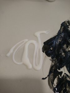
I first squeezed glue onto a palette and slowly added the ink. I used a palette knife to mix both and apply on paper, but I realised this process was too slow for me. So I just squeezed glue straight onto the newsprint.
Using a palette knife to spreadAdded more ink to darken
The ink became super shiny and made abstract ‘marble’ patterns. The palette knife didn’t give me the thick, blotchy effect that I expected so I used my hands.
The more glue I added, the more faded and translucent the ink.
Next, I took some dry flowers. I dipped the flowers into ink and dotted it onto the newsprint. Tiny cute organic spots are made!
Next, I dragged the dried bouquet across the paper. They appear very tangled and give a strong sense of direction.
I dipped the bouquet in ink again and rattled it over the newsprint, so that the ink will drip and fling off. The spots created are smaller and random, as compared to the manual, careful dotting. I prefer this effect more.
Next I tried making marks on aluminium foil.
Using dried flowers to create splattersCreating tears along the foilPasting foil onto black paper to see contrastInk dries shiny on foil


 But after completing the tracing I didn’t really like the technical and clean cut outcome. Everything was too neat and I didn’t fancy that because doing makeup shouldn’t be neat!!! It’s a fun and messy process. So I decided to try photography.


 :
:


 Loved how it turned out, but when I think back about the quote, it doesn’t truly portray it. The quote “to you I am nothing more than a fox like a hundred thousand other foxes” is meant to be lonely and sad.
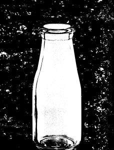


 (yay, disgusting!)