Singapore is practically known for our ridiculously tall buildings, especially within the CBD area. IN my Bauhaus design, I incorporated long vertical blue bars to represent this. They can also be interpreted as bars in bar charts, demonstrating Singapore’s analytical and competitive spirit.
But despite being all serious and ambitious, Singapore also has a softer and artsy side. This is an artwork I really love on display at Changi Airport terminal 1, Kinetic Rain. I incorporated its fluidity into my Bauhaus design with red circles.
The flowers are Bougainvillea, a popular tropical flower that can easily be spotted on the streets of Singapore. I chose it to be in my design as they are often overlooked in Singapore, it being such a common roadside flower.
For the background, I snapped a regular bush I spotted. I chose that bush as I loved the spikey/sharp edges. And they actually reminded me of fireworks!! An annual thing I look forward to seeing during National Day.
The purple ‘butterflies’ are actually leaves. I placed them alongside as Singapore is well known for being a ‘Garden-city’ (or so we’d like to believe).
I edited the hues of the original colours on photoshop as I wanted to make the colours less clashing and contrasting and make it a more harmonious piece as a whole 🙂
Before I started I was like OK my name is going to be difficult because wow there’s a Z in my name and I can’t think of any nouns!!!
But I broke down my name and thought of ‘Far’ but how do you show far? So I scraped that idea and just used a lot of – and + it’s so messy, I know but I can’t change my name so enjoy:
Our project involves the public on the streets and online. Bala and Felicia were the interviewers, while me and Yueling were the models.The interviewers’ jobs were to walk around Bugis, Sim lim square, NAFA and SMU. The models’ jobs were to pick out 5 outfits/accessories from each category, and list them down as vague descriptors. Below is an example of the list:
While the interviewers walk around and find people, the models are on Facebook live with them. Since we had to be at home with our outfits, me and Yueling accompanied Bala and Felicia in the third space instead. Facebook live was to also to show the public on the street how we look like, so that in a way, they can gauge what looks(or sounds) good on us.
This experiment projects culture and identity through fashion. Since we were going to interview and ask people from different areas, age groups and ethnicities, we can see a stark contrast in the way they have chosen to put together an outfit. In our interview, we managed to get someone from Thailand and Malaysia. The outcome was funny. The outfits turned out whacky and fun. The colours don’t even match. But that was what made the whole project fun, the results were unexpected. It could be seen as a glitch in the ‘online shopping’ trends, where what seems or sounds nice online might not be true to reality.
The locations we went to had different demographics. For example, Sim Lim square is known as the ‘geeks’ place. When Bala went there there were mostly middle aged or older people. On the other hand, Felicia went to SMU, NAFA and Lasalle area, where there were more young adults and students.
Sim Lim SquareNAFA area
There are differences in the kind of outfits people chose. For example, the younger people would choose monochrome or ‘trendy’ clothing. The older generation, on the other hand, chose more colourful and decorative outfits, such as stripes or kebaya(a traditional Malay outfit).
After which, we collated the pictures of our outfits and posted them on Instagram. We used the story poll feature on Instagram to allow people to vote which outfit they preferred.
After which, we boiled the 4 most voted outfits down to 1, asking people to comment which outfit they preferred the most:
From my observation, people were more responsive and willing to participate online as compared to the public on the streets. It was difficult for Felicia and Bala to get people to participate in our project.
Overall, I found this project fun because it was an open concept. It was also interesting to see the public’s opinion being involved. The end results of the outfits were interesting to see.
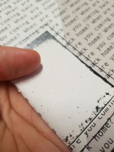
The kind of paper was difficult. I got 2 kinds of paper, 1 heavily textured one, which is wayyyy warmer. You can’t really see the texture here but its pretty in real life!!
I think you can see the textures under light better:
Another one is off-white, not much of a texture but you can see the grains. Is it recycled paper?? idk I’m not a paper pro. Are they even called grains? Just know there are dots.
Here they are side by side:
I choose the one on the right as it is more yellow and textured(since my project was about textures). I also liked that the yellow gave a very old and aging feel(which also matched Dakota crescent’s circumstances).
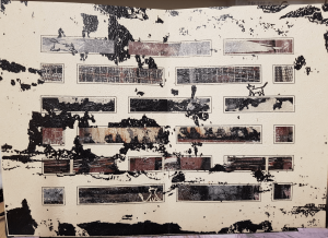
So yes, here are the rest of my pages:
That’s all for my zine! I enjoyed this journey very much. Overall I think my zine turned out like a nice ageing notebook and I’m very satisfied with that.
I wanted a very abstract-y, super textured zine from the start but as I progress I kind of want a lonely, longing feeling to it too. I didn’t want a narrative but maybe some words to imply the feelings of abandonment and longing?
After consulting, a new idea of placing Dakota’s abandoned cats in the zine emerged. The new zine will be developed from the cats’ point of view, where the repeated questions ‘when will you be coming home?’ are their thoughts.
To begin, I photoshopped textures on the buildings:
I also tried making my own textures from Lino-cut. I got a packet of circle pads instead so I can try out different cuts.
This was before the cat idea. I didn’t know what I wanted for the cover page but I didn’t think of adding words at first. This was my first idea:
This was a balcony shot of one of the blocks:
I used threshold to get only the skeletal of the block out. Then I used the texture I made as background:
I also tried using textured background from one of the photos I took while I was there.
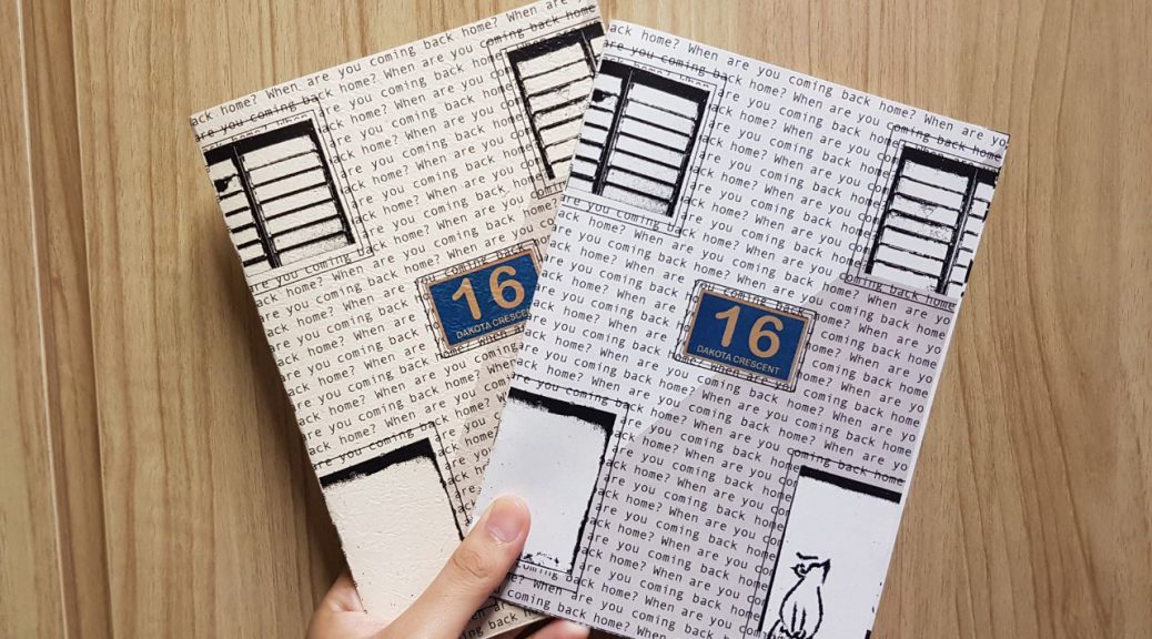
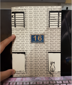
But then I got feedback that the chosen picture doesn’t scream Dakota enough. So in the end I used the Dakota block number as a front cover since it says ‘Dakota Crescent'(which can nicely serve as my title).
Worked on illustrator. Used the rectangle tool to outline the windows etc:
Then I got on photoshop to threshold the windows and imported the windows to illustrator:
This is the end product:
After the introduction of the cat idea, I gave the cover page a little colour, so that the ‘black’ won’t overpower the cat. I tried this first but it felt too much ‘photography’:
So I minimised the colours to only the block sign:
I picture the cat to be siting quietly at a window, looking far away and waiting for the residents to come back. I used very cartoonish/line drawing for the cats so that they contrast from the realistic details of the textures.
Page 2: Bird's eye view of Dakota
What makes Dakota special is the unique arrangement of the blocks— how the face each other and are very closely built. This promotes and encourages the residents to interact with their neighbours. That’s something we don’t see in our modern HDB flats. So I wanted to show that uniqueness in my zine.
Blk 14,20,22
Used rectangle and pen tool to outline the blocks:
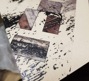
For the fill, I decided to use different photographed textures:
Trying different backgrounds:
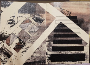
Page 3: Corridor Staircase
I decided I want to dedicate a page to the corridor staircases because they’re so dirty and secluded. They also lead up straight to the people’s homes(so cool). The gates are people’s homes!!! Normal HDB flats would’t have that:
On illustrator, I used the rectangle tool to make out the graphic shape of the staircase, then I tried different backgrounds:
Since I wanted page 2 and 3 to be more ‘linked’, I extended the roads from page 2 onto page 3:
After the ‘cat consultation’, I added the cat to be walking along the ‘roads’. I also used a darker background to seamlessly join the pages together and make it seem more of a spread.
Page 4-5: Block Windows
For the middle section, I decided to do a spread. Since Dakota is known for having low rise buildings of 7 storeys, I wanted to show that. Also, their window arrangement is really cute and unique:
I started on illustrator and traced out the windows:
I added a fill of textures and tried different backgrounds
The solid colours were too jarring so Ms Mimi suggested I use an abstract close up of the textures I took:
I added the cats in the windows (or on the windows), or jumping through the windows. Though its a sad portrayal of the lonely cats wandering from window to window, I think it also ironically shows the playfulness and loyalty of the Dakota cats.
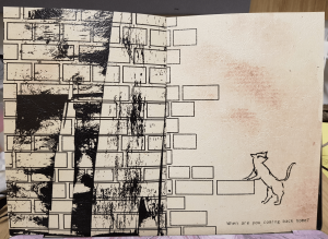
Page 6: Brick Wall
The brick also caught my eye because the bricks used were of different sizes, unlike HDB bricks, where its very well put and organised alternately.
Traced it out on illustrator:
I tried using different textured background to better represent the brick wall as Dakota’s:
Page 7
At first I only thought of editing a corridor on photoshop, adjusting the levels, colour etc:
This was what it looked like next to pg 6:
It didn’t quite match the the pages so I tried to make it a spread:
I added the cat, (standing??) and perching itself up on the brick to make it look impatient, and finally searching instead of wandering.
Page 8
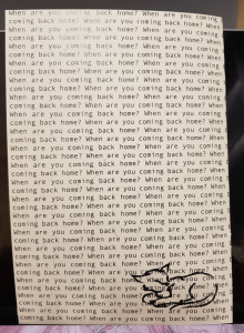
From the start I knew I wanted to connect the first page and last page. So I reused the ‘When are you coming back home’. At first I tried using a picture I took of the rusting railings. But I felt that it didn’t end my zine nicely.
I wanted to end my zine on an ’empty’ and kind of sad note. So I thought the best thing was to leave it empty. Didn’t work out.
So an idea struck. Since my zine was going to be about the sad wandering cats, I will conclude the zine with cats.
I think a sitting cat at the corner concludes my zine nicely— how in the beginning the cats are actively searching, wandering about the estate. In the end, the sitting cat looks sad and defeated, but at the same time there is ambiguity in the conclusion. Are the cats still going to wait? Or have they given up and realise the residents have gone for good?
The last sketch was my last idea I went along with, because it was simple.
For the mock up I used cloth, metal rings, foam and twine.
Since the cloth is too small, I sewed 2 cloths together.
Also I didn’t want my cat to totally drown and flop in the cloth so I wanted a different, harder(but still soft) material as the base. I used foam and cut it into an oval. and placed it in the middle of the cloth.
I folded two ends of the cloth inward, then it down along with the foam.
So moving on to the handle, I used twine. I pleated the twine using a ‘friendship’ band method(I forgot the name of the braid).
But I didn’t like how it was ’roundish’. I wanted a flatter braid so that it really looked like bag straps. I searched up on youtube and tried another braid called Square Knots/Cobra Stitch.
After which I sewed the metal rings to the bag and tied the strap to the metal rings:
Trying out on my cat:
Btw, my cat fell off on her butt 3 seconds later because she slid off backwards so I think one thing to improve on my bag is to have a butt rest or sew the back of the bag. lol
I have a cat who likes to crawl into my bags so I decided to make a bag especially for her and I can carry her around with. Thus I decided to make a cat carrier. I didn’t lie cat cages and cat bags because they were quite bulky so I wanted to avoid those boxy, bulky designs. Here are some references I got:
Then I started sketching the bag. Since I wanted to avoid boxy, bulky designs, I want to avoid using hard material. I was thinking maybe canvas/cloth?
A closer look at my sketch
I was super confident with the first sketch but probably too ambitious, because it was foldable and had wheels and a retractable handle. Also considered having a scratching material on the base so that my cat can scratch her claws while being carried/pulled. And since scratching material gets worn our easily, I considered having velcro at the base so that the scratch patch can be removed and replaced when needed.
Also I treat my cat like a baby so I was thinking I’d like to cradle her in a sarong-like bag. Cute.
When I chose Dakota as my location to do research on I had no clue where Dakota was, and I don’t even know what’s so special about it. So after googling and asking around, I found out about Dakota Crescent.
Dakota Crescent is located between Dakota and Mountbatten MRT station. On the map, its renamed Dakota Close, since there’s a new ‘Dakota Crescent'(most of the residents relocated to the new area).
First thing I realised was that there were lots of peeling paints and rusting metal and trash and how smelly the place was. So I decided to focus on the textures that had naturally occured due to abandonment.
They make nice abstract pictures so I decided to go with it. I thought of re-making my own textures for my zine through various methods, eg. Lino-cut printing, mark making so this was all the reference I got:
I also thought of putting some words/phrases in my zine that show ‘abandonment’.